Embed Size (px)
Citation preview
Draft – Please do not cite or quote
Income Inequality and Health: The Story So Far
and
Its Implications for Understanding Regional Mortality Trends within the US
John Lynch1, Sam Harper1, Marianne Hillemeier1, Nancy Ross2, Michael Wolfson3, George
Kaplan1.
1. Department of Epidemiology, School of Public Health and Center for Social
Epidemiology and Population Health, University of Michigan, USA
2. Department of Geography, McGill University, Montreal, Canada
3. Statistics Canada, Ottawa, Canada.
Paper presented at the Max Planck Institute for Demographic Research Symposium on Regional
Mortality Trends, Rostock, Germany, June, 2002

Draft – Please do not cite or quote 2
Over the last 10 years, there are few issues that have captured the imagination of public
health researchers and advocates, as has the question, whether the extent of income inequality
drives levels of population health – both within and between countries. This theme in social
epidemiologic research has coincided with a heightened awareness and concern over the extent
of income inequality between the rich and poor within countries, and the gaping chasm of
inequality between rich and poor nations. In addition, there has been an increased interest in
understanding the capacity of environmental characteristics, not conceptualized or measurable as
characteristics of individuals - but rather as characteristics of places or aggregates of people - to
affect the health of individuals1. Many so-called “contextual” health effects have been proposed2,
including social capital and the extent of income inequality.
The basic proposition behind questions over income inequality and health is rather
simple. If we consider all the individuals who live within a defined geographic area such as a
country or a region within a country, one could sum the total incomes of those individuals and
calculate the mean. As any introductory statistics course would explain, a distribution - in this
case of individual or household incomes - can be described in terms of its central tendency and
some measure of the variation around that central tendency. Thus, the basic question for income
inequality research has been whether the extent of variation in the distribution of income affects
health, net of absolute income. Or, in other words, after control for absolute income differences,
does relative position in the income hierarchy (i.e., variation) affect health.
This was indeed a “big idea”3 that attracted contributions from scholars motivated by the
humanitarian potential of showing how health could be improved through greater equity and
social justice. It was also an important idea because of its obvious relevance for redistributive
fiscal and tax policies. Just days after we published our analysis of income inequality and

Draft – Please do not cite or quote 3
mortality among US states in the BMJ in 19964, the then Labor Secretary in the Clinton
administration – Robert Reich, a long-time advocate for policies that would decrease inequality –
contacted us to get a copy of the paper. If one accepts the notion that income inequality, or what
it stands for, is a determinant of population health, then places that deliberately even out the life
chances of individuals by having more egalitarian income distribution and social policies, will
produce better overall health for their inhabitants. This is an appealing, intuitive and policy
relevant idea.
One of the questions facing us now is whether this idea has had its fifteen minutes of
academic fame? Our most recent work5 and several papers recently published in the BMJ
prompted an editorial comment by Johan Mackenbach that explained “… evidence for a
correlation between income inequality and the health of the population is slowly dissipating.”6
Thus, it seems this research theme is at something of a crossroads. However, we are now in a
better position to address some of the questions concerning the relevance of income inequality
for population health.
• Does it help explain average differences in population health between countries?
The best evidence we have says probably not, except perhaps for some health outcomes
such as infant and child mortality.
• Does it explain regional differences within countries?
In US studies, the extent of income inequality across states and metropolitan areas has
been consistently and robustly associated with a variety of health outcomes. There are
however, on-going debates about such issues as what constitutes proper control for
Draft – Please do not cite or quote 4
confounding and which group(s) are appropriate for comparisons of “relative
disadvantage.”7
• Does it operate similarly within all countries?
The sum of the evidence suggests that the effects of income inequality on health differs
across countries. There are strong effects on health in the US, some rather weak and
inconsistent effects in the UK8, but no effects have so far been seen within Canada,
Australia, Denmark, Sweden, Japan or New Zealand.
• If the effects are not universal, then under what conditions does the extent of income
inequality affect different aspects of individual and population health?
Gaining answers to this question is the next phase of income inequality research. It is
perhaps premature to completely dismiss the work on income inequality and health. It
remains relevant, especially for less developed countries and countries in transition, to
consider if there are ways to buffer the health effects of income inequality, which
historically has risen with economic development9. It appears that when the extent of
income inequality is strongly linked to many forms of other social investments in health,
and with racial/ethnic diversity10 that income inequality - or as we believe, the health
enhancing infrastructure for which it is a convenient marker - is likely to be linked with
health.
• How should the association between income inequality and health in the US be understood?
While the aggregate cross-sectional association seems solid, questions remain about both
aggregate and cross-level confounding. These issues center around whether income
Draft – Please do not cite or quote 5
inequality is a marker for other contextual characteristics of regions, states or cities in the
US, or whether it is confounded by compositional characteristics of these areas such as
race/ethnicity and individual income.
The first part of this paper will review “the income inequality story” with each short
chapter trying to briefly capture the essence of the main issues as they emerged over time. The
second part of the paper will begin to examine whether income inequality affects regional
differences and trends in mortality in the US.
Chapter 1. The Puzzle
It is widely accepted that at the individual level, higher incomes - and other markers of
socioeconomic position (SEP) - are associated with better health11. This relationship is found for
many but not all disease outcomes, and across many but not all places and over many but not all
time periods. While the consistency of this association is emphasized by most authors12, we often
overlook the heterogeneity of its strength and direction. These are under-investigated aspects of
the link between socioeconomic factors and health that should be pursued in future research13-15.
The relationship between income and health at the individual level involves more than poverty.
Every step up the income ladder is generally associated with an increment - albeit a diminishing
increment - in health, and a reduction in mortality. In other words, there is an individual-level
gradient. Furthermore, with the analysis of powerful datasets that follow individuals in general
populations over time, evidence has converged around the general conclusion that SEP precedes
poor health16. The most persuasive studies have involved prospective analyses of large,
representative cohorts17-19. Wolfson and colleagues20 looked at the relationship between past

Draft – Please do not cite or quote 6
earnings and mortality for over half a million male Canada Pension Plan contributors and
retirees. Figure 1 shows the relationship between mortality in the 65 to 70 age range and each
individual’s average level of earned income between ages 45 and 65. The graph shows a clear
gradient. It must be emphasized that this is not just at a point in time; these are longitudinal data,
so they show the connection between income at as early as age 45 and mortality experienced
decades later, after age 65. The causality, for the majority of cases, must run from income to
mortality, and not the other way around. Moreover, the magnitude of this gradient in terms of
the public health impact is substantial. If the 80% of men with the lowest earnings were
somehow able to achieve survival rates of the top fifth, the increase in life expectancy would be
roughly the same as if cancer as a cause of death were completely eliminated for this cohort of
men.
Figure 1: Career Earnings and Death for 500,000 Canadian Men
02468
1012141618
0 20 40 60 80 100 120
Mortality Rate(age 65-70)
Career Earnings and Deathfor 500,000 Canadian Men
Average earnings (age 45-64, 1998 dollars)
%

Draft – Please do not cite or quote 7
Thus it seems clear that there is an unambiguous causal association between individual
level income and individual health. This relationship is not just about the difference in health
states between the poor and the rich: being middle class is better than being poor, and being rich
is better still in terms of health outcomes.
Similar patterns can be observed if countries are the units of analysis. The well-known
association between GDP per head and life expectancy is seen in Figure 2.
Figure 2. GDP per head and Life Expectancy for 155 Countries.
The curvilinear shape implies that above a certain income threshold the link between
absolute income and health loosens, so that the variation in population health (illustrated in the
circle) is not tied as tightly to average income. Among these richer countries, the strength of the
association depends crucially on which countries are included5,21,22. Nevertheless, it is precisely
35
40
45
50
55
60
65
70
75
80
85
0 5000 10000 15000 20000 25000 30000
Ave
rage
Life
Exp
ecta
ncy
GDP per Head based on Purchasing Power Parity ($US)

Draft – Please do not cite or quote 8
this unexplained variation in average levels of health between countries that in part inspired the
notion that if it was not average income, then perhaps it was the distribution of income within
these countries that helped explain why some rich countries had better levels of health than other
rich countries. Of course the puzzle here is that we know that within each and every one of these
countries, levels of income are strongly related to health among individuals.
Chapter 2. The Big Idea
“The big idea is that what matters in determining mortality and health in a society is less the
overall wealth of that society and more how evenly wealth is distributed. The more equally
wealth is distributed the better the health of that society. One political implication, appealing to
those on the left, is that the best way to improve health in a society might be to take measures to
distribute wealth as equally as possible.”3
Concerns about social inequality are not new. They have been voiced throughout human
history, and are germane to ideas of democracy and justice. For a variety of reasons inequality
has often been seen as an undesirable characteristic of a society, because of its potentially
disruptive effects on civic functioning, or its implications for the rise of reactionary political
movements, or because of its offense to moral sensibilities. Indeed over the last 15 years, there
has been an enormous amount of discussion in both academic and popular circles about the
growth and extent of income inequality within and between countries23,24.
In a seminal 1975 paper25, Preston examined the association between per capita national
income and life expectancy at birth, for three different decades of the 20th century. He
demonstrated that life expectancy in the 1900s, 1930s and 1960s exhibited a non-linear
relationship with per capita national income. Above a certain threshold, gains in life expectancy

Draft – Please do not cite or quote 9
were not related to higher levels of average income. In addition, the relationship between income
and life expectancy had shifted upwards during the 20th century. Preston made several points in
discussing these findings that are pertinent to the topic of this paper. First, he proposed that
upward shifts in the life expectancy/income association were mainly due to "exogenous" factors
that strengthened the public health infrastructure (immunization, technological advances, and
specific disease control campaigns) rather than income growth per se. In other words, social
investments in health-enhancing resources “ramped up” the link between income and health
without changing the basic nature of the association between the two. Second, he suggested that
over time, life expectancy had become progressively more dissociated from absolute income
level, and that at least some of the variation in life expectancy at the upper income levels may be
due to variations in income distribution between countries.
While Preston could not examine this issue directly because the available data were
inadequate, he did show mathematically how income distribution could affect the total mortality
burden of a population. He explained that because the association between income and life
expectancy was asymptotic (increases in income produced diminishing returns on increased life
expectancy), those with incomes below the average lost more years of life, than were gained by
those with higher than average incomes. Preston concluded that, “The distribution of income is
clearly a likely source of variance in the basic relation between national life expectancy and
average national income…”25, p.242
In 1979, Rodgers was the first to elaborate empirically and mathematically how income
distribution was associated with population health26. In a sample of about 50 countries, he
empirically tested a model that predicted life expectancy at birth, at age 5, and infant mortality as
a function of mean income level, and income distribution. Rodgers’ overall concern was to try to

Draft – Please do not cite or quote 10
understand the determinants of mortality change, especially in regard to developing countries,
and he presaged many of the issues that have since occupied researchers in this field. He
recognized that specific factors like clean water, sanitation, food supply and health care - aspects
of health-enhancing infrastructure investment - were important but empirically difficult to
disentangle because they tend to be highly collinear with each other and with income. That
realization certainly remains salient today. He noted that disentangling their specific
contributions was important for policy formulation, but not “ … critical for a description of
mortality changes in the process of development (p. 343).” He thus set aside the messy issues of
figuring out appropriate confounders and specifying causal pathways that might link aspects of
development, income, inequality and population health. Rodgers also explicated what Gravelle
later called the “artefact”27 issue and showed how the curvilinear individual association between
income and health will produce an apparent effect of income inequality on health at the
population level. However, he was unable to directly examine this because he only used
aggregate data.
Rodgers examined different characterizations of the income and inequality variables in
regard to life expectancy and infant mortality. Throughout the paper, Rodgers presented the most
robust formulations of his statistical models, as judged by P-values for coefficients and the
amount of variance explained (R2 value). He was thus primarily concerned with the efficient
predictive statistical functioning of the models, not whether they were causal representations.
Indeed, he offered no substantive interpretation of his findings and clearly left open the
possibility that associations between income inequality and health could be due to confounding
by health and social services, including education. Nevertheless, he argued that there was 5-10

Draft – Please do not cite or quote 11
years difference in life expectancy between relatively egalitarian and inegalitarian countries. And
thus, the first empirical plank in the income inequality and health story was in place.
In a series of papers produced since the mid 1980's Richard Wilkinson demonstrated
important associations between income inequality and differences in mortality between
industrialized countries. His most widely cited study, published in 1992, used income data from
the Luxembourg Income Study and showed that the percentage share of total post-tax and benefit
income held by the least well-off 70% of the population was strongly related to life expectancy at
birth28. This association was unaffected by adjustment for average absolute income level and was
evident across a range of decile shares of the income distribution (Figure 3).
Figure 3. Wilkinson’s results on income inequality and life expectancy
Furthermore, using two other data sources, he showed how changes in income share were
associated with changes in life expectancy. Wilkinson’s observations were extremely important
73
74
75
76
77
44 45 46 47 48 49 50
Life Expectancy and Income Inequality (Late 1970s - Early 1980s)
Income Share Below 70th Percentile
USA
NorwayNetherlands
Sweden
W. Germany
Switzerland
CanadaAustralia
UK
Wilkinson. Unhealthy Societies (1996, p.76) - from an LIS Working Paper
9 Countries
r = 0.86

Draft – Please do not cite or quote 12
and controversial, not just because they could shed light on why income and health were related
within, but not between countries, but also because they had direct relevance to economic
policies that might affect public health.
Chapter 3. Data, Measurement and Interpretive Controversies
In 1995, Ken Judge authored a critique of the work linking income inequality with
mortality29. In his critique, Judge focused almost exclusively on the work of Wilkinson (1992),
and claimed that re-analysis of new data that had been added to the Luxembourg Income Study
data base (LIS) " . . . casts doubt on the hypothesis that inequalities in the distribution of income
are closely associated with variations in average life expectancy at birth among the richest
nations of the world." (p.1282). These same criticisms were repeated by others who also showed
that re-analysis of the updated LIS information failed to support a statistically significant
association between income distribution and life expectancy or changes in life expectancy. At
least part of the problem was that Wilkinson had used an early release of the first wave of LIS
data and there had apparently been an updated version of the income data for some countries - in
73
74
75
76
77
44 45 46 47 48 49 50
Life Expectancy and Income Inequality (Late 1970s - Early 1980s)
Income Share Below 70th Percentile
USA
NorwayNetherlands
Sweden
W. Germany
Switzerland
CanadaAustralia
UK
Wilkinson. Unhealthy Societies (1996, p.76) - from an LIS Working Paper
9 Countries
r = 0.86

Draft – Please do not cite or quote 13
particular Germany. These corrected data markedly changed Germany’s income inequality rank
(Tim Smeeding, LIS Director, personal communication).
These criticisms of Wilkinson's research argued that there were problems with the
validity of some of the data that Wilkinson had used, i.e., they were differentially unreliable,
covered different years, and were not gathered for the purpose of examining income inequality
and health. Second, the basic income data that were used to generate distributional measures of
inequality were not adjusted for taxes, benefits and household size. The idea here was that use of
"raw" household income distributions would overstate the extent of inequality because they did
not reflect the number of people who were supported by the income in each household, nor did
they account for governmental policies that tax, and transfer money and benefits from the rich to
the poor. Third, there was no rationale for the selection of the income inequality measure, and
the association between income inequality and mortality differed according to which measure
was used. Finally, Judge argued that any examination of the income inequality, life expectancy
association must use multivariate techniques that can adequately control for other confounders.
Some of these early criticisms were answered by later within-country studies but two of
them remain important to keep in mind for understanding the direction, findings and
interpretation of later research. They are 1) Wilkinson’s use of the uncorrected data on levels of
income inequality in Germany, and 2) appropriate conceptualization and control for confounding
at the aggregate and individual level.

Draft – Please do not cite or quote 14
Chapter 4. Replications Within the United States
There were 2 papers published in 1996 on the association between income inequality and
age-adjusted mortality that corroborated Wilkinson’s international findings4,30. First, in our
paper, we used 1980 and 1990 US Census data that was based on pre-tax income from all
sources, including governmental benefits, and examined mortality data from 1979-1981, and
1989-1991 provided by the National Center for Health Statistics in Washington, DC. We showed
that the association between income inequality and mortality was not highly sensitive to the
measure employed. In fact, including information from the companion paper by Kennedy and
colleagues, the same substantive conclusions about the aggregate-level association between
income inequality and health would be reached, based on use of the Gini coefficient, Robin
Hood Index, or any percentile share of total income between the 10th and the 80th. Furthermore,
subsequent analyses showed that these associations were also robust to some different definitions
of income that accounted for taxes, benefits, and household size4,31.
Kaplan et al.4, showed that the income share held by the least well-off 50% of the
population in each state, was strongly cross-sectionally associated with overall mortality in 1990
(r=-0.62, p<0.0001). This association was not affected by adjustment for median state income or
poverty levels, was observed for almost all percentile shares of the income distribution, was
consistent across age groups, and in both sexes. Furthermore, the share of total state income held
by the least well-off 50% of the population was strongly associated with a number of other health
outcomes, social and educational indicators – what we postulated as potential pathways between
income distribution per se and health. It is also important to note that we already understood the
importance of race and ethnicity to these findings. While we showed that income inequality
affected mortality within race/ethnic groups, i.e., affected both black and white mortality,

Draft – Please do not cite or quote 15
adjustment for the racial/ethnic composition of states essentially eliminated the overall observed
effect of income inequality on mortality. However, unlike subsequent researchers like Mellor and
Milyo32, and Deaton and his colleagues33, we were less ready to attribute rather simplified racial
composition explanations to observed links between income inequality and mortality. Indeed, we
had many discussions about the “correct” way to handle differences in the race/ethnic
composition of states – something that is obviously and fundamentally deeply rooted in the
historical context of different US states. Thus, we were less willing to simply enter variables like
“% of the state’s population that was black” (or for that matter, dummy variables for state) into
our statistical models and claim that we had ‘put the gini back in the bottle’. We decided that
such approaches to this analysis would leave us with as many questions as answers. We would
merely ber substituting the question - why do states with higher income inequality have higher
mortality? - for the question, why do states with higher proportion of blacks have higher
mortality? If the percent of blacks in the state has a lot to do historically with the extent of
income inequality – which it obviously does, then substitution of one question for another is
perhaps unlikely to move knowledge very far forward.
The association between the share of the total income received by the least well-off 50%
of the state population was consistently more strongly associated with mortality, other health
outcomes, social and educational indicators than was the median absolute income in each state.
In prospective analyses, income inequality levels in 1980 predicted changes in mortality between
1980 and 1990 (r=-0.45, p<0.001). The higher the level of income inequality in 1980, the slower
the decline in mortality between 1980 and 1990. In similar analyses, Kennedy and colleagues34,
used the Gini coefficient, and the "Robin Hood Index". Their findings were entirely consistent
with ours, and showed how the Robin Hood Index was strongly related to infant mortality,

Draft – Please do not cite or quote 16
coronary heart disease, malignant neoplasms, and homicide. Taken together, these two studies
provided the first important corroborative evidence of the strong links between income inequality
and population health. These observations were also later confirmed in US metro areas and
counties35,36.
Chapter 5. Its Just a Mathematical Artefact – The Need for Aggregate and Individual Data
By 1998 it seemed that the evidence for a link between the extent of income inequality
and health was fairly solid – at least at the aggregate level. In fact, Richard Wilkinson had
written in his book that “… there are a number of powerful reasons for thinking that relative
income is more important than absolute income in the rich developed countries … This has now
been demonstrated cross-sectionally and on data dealing with changes over time, and the
relationship cannot be plausibly attributed to some intervening variables … This appears to be
true in cross-country comparisons as well as within countries over time.”37,p.109 This was clearly
an overstatement of the real evidence but it serves to illustrate the status and some of the
enthusiasm for the hypothesis that income inequality drove levels of population health.
In spite of this enthusiasm, or perhaps because of it, criticisms of the work on income
inequality and health were beginning to emerge.
The critiques of the US studies - instead of questioning data comparability and choice of
jurisdictions as Judge had done in the international data - focused on two main lines of argument.
The first was that any finding from an aggregate-level study design (i.e., one where places and
not individuals are the unit of analysis) leaves open the possibility that the individual level
relationship between income and mortality - explicated by Rodgers in 1979 - is sufficient to

Draft – Please do not cite or quote 17
produce a place-level correlation with income inequality and mortality, if there are a
disproportionate amount of poor people living in high inequality places. In other words, the
observed place-level relationship is a “statistical artefact”27,29 generated by cross-level
confounding of individual compositional characteristics. As a general principle, this concern is
legitimate. Indeed, earlier authors38,39 used exactly the same argument as Gravelle to theorize
why we should expect population group level associations between income inequality and
mortality. Nevertheless, the re-surfacing of this point served to call into question the basic
validity of the observed aggregate-level associations.
The essence of Gravelle’s argument is that we already have convincing evidence at the
individual level for an income gradient in health. Statistically speaking then, all that is needed to
generate a population-level relationship between income inequality and mortality (by
aggregating individuals into areas) is a concentration of poor households in unequal areas.
Would it not be possible, therefore, that the population-level results are some sort of statistical
artefact, wherein the population-level relationship between inequality and mortality is nothing
more than an aggregate-level reflection of the already well-established individual-level
relationship? As pointed out before, this was nothing new to anyone working on income
inequality and health, and had been pointed out by Preston and Rodgers more than 20 years
before. It nevertheless, helped focus a more critical stance toward the evidence on income
inequality and health, especially in regard to thinking more clearly about cross-level
confounding.
Wolfson and colleagues employed an ingenious use of data simulation to show that
Gravelle’s argument was weak40. Gravelle’s critique is in fact logically correct, but empirically
appears only marginally significant – at least under the assumptions of the data simulations
Draft – Please do not cite or quote 18
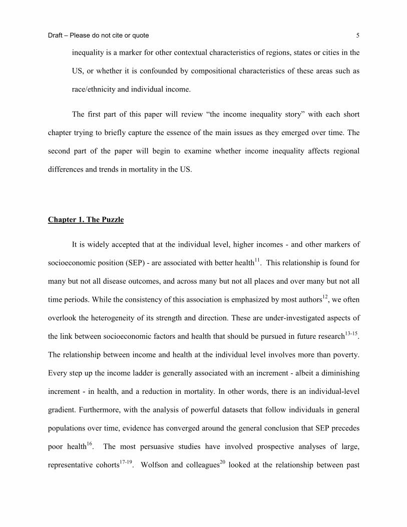
employed. The essence of Gravelle’s critique is based on the fact that the individual-level
relationship between income and mortality is non-linear. For example, Figure 4, shows a clear,
statistically very significant, and non-linear relationship between the risk of dying and household
income. This relationship was estimated from data on household income and other demographic
characteristics from the U.S. Census Bureau’s Current Population Survey matched to the
National Death Index, providing about 7.6 million person-years of mortality exposure from 10
years of follow-up. The other “population density” curve on the same graph shows how many
individuals there were at each income level. It shows the characteristic shape where more than
half the population have incomes below the mean, because of the long upper tail of the
distribution.
Figure 4. Relative Risk of Dying and Population Distribution for U.S. Individuals by Household
Income
0 50,000 100,000 150,000 200,000
Population Density
Relative Risk (RR) +/- 95% Conf idence Interval for beta
RR = 1
Mean Income
Relative Risk of Dying and Population Distribution for U.S. Individuals by Household Income
Household income
Rel
ativ
e ris
k

Draft – Please do not cite or quote 19
Figure 5 illustrates Gravelle’s critique in a very simple case where we have two societies,
A and B, each with two members. Society A is highly unequal, with member a1 having very low
income, while the other member a2 has very high income. In contrast, incomes of b1 and b2 in
society B are much closer together, hence more equally distributed. (By design, both societies
have the same average income, in order to make the basic issue as clear as possible.) We
assume, however, that no matter what the distribution of income is in a society, at the individual
level, the same relationship between the risk of dying and income applies, shown by the
downward sloping curve, with a shape similar to that observed for the U.S. in Figure 4.
Furthermore, based on the research underlying Figure 2, and the regression analysis underlying
the curve in Figure 4, but going beyond it, Wolfson et al., assumed that the relationship between
income and mortality was 100% causal. A more realistic assumption is that it is largely causal,
but certainly for some individuals, unobserved poor health at or before the starting period of the
data leads both to lower incomes and higher risks of dying; i.e. there are some selection effects,
but these are not the major part of the explanation.
Relativerisk
income
AB
empirically observed non-linear relationship between individual income and mortality RR

Draft – Please do not cite or quote 20
Figure 5. Hypothetical Pair of Societies
The larger dots at A and B along this relative risk curve are simply the average mortality
risks of the two societies. Clearly, the dot for A is above that for B, so that the more unequal
society B would be observed to have the higher mortality rate. The important point is that this
aggregate observation would have nothing at all to do with the health effects of income
inequality per se. Rather, it is simply the result of the curvilinear relationship between income
and mortality operating at the individual level. This is the essence of the critique that the
Wilkinson results internationally, or the Kaplan-Lynch results among states or cities in the US, in
fact says nothing about the health effects of income inequality. It is merely a reflection of the
underlying individual-level relationship.
Wolfson et. al.40 provided an empirical assessment of this claim by working through the
implications of Gravelle’s critique as if it were 100% true. They calculated for each state what
its mortality rate would be if the relative risk curve for the US were the sole source of mortality
differences between states. To do this, data from the US census bureau were used on the
numbers of individuals by state, age group, sex, and detailed income group. Analogous to Figure
5, for each state/age/sex/income group, their relative risk was determined using the curve in
Figure 4, and the weighted average was computed for each state based on that state’s income
distribution. The results of these hypothetical calculations for two demographic sub-groups are
shown in Figures 6a and 6b (unfilled circles), and compared to the actual mortality rates (filled
circles).

Draft – Please do not cite or quote 21
Figure 6 (a,b). Scatter Plots of Hypothetical and Actual Mortality Rates for Infants and Working
Age Males by Income Inequality, US States, 1990
0.17 0.19 0.21 0.23 0.25Median Share of State Income
200
600
1000
1800
2200
Mor
talit
y R
ate
per 1
00,0
00 L
ive
Birth
s
Actual RatesHypothetical Rates

Draft – Please do not cite or quote 22
The dashed lines show a simple linear regression for the hypothetical mortality rates,
while the solid line is a fit to the actual data. There is a clear slope to the dashed line, so that
Gravelle is certainly correct – income inequality combined with a curvilinear relationship at the
individual level between income and mortality risk can indeed account for an observed
relationship at the aggregate level between inequality and mortality. However, it is very clear
from these graphs that the slope of the dashed line is nowhere near as steep as the slope of the
observed relationship. Therefore, it seems that something must be going on over and above the
“statistical artefact” in this relationship among U.S. states.
It is important to emphasize that this finding is more than a response to Gravelle’s
concerns. It also raises questions about earlier interpretations of the inequality-mortality
0.17 0.19 0.21 0.23 0.25
Median Share of State Income
200
400
600
1000
1200
Mor
talit
y R
ate
per 1
00,0
00
Actual RatesHypothetical Rates

Draft – Please do not cite or quote 23
association by Duleep38. In these cases, the same argument as Gravelle’s was used to explain
why we should not be surprised to find, as they did, an association between income inequality
and mortality at the level of population groups. These results for US states suggest that
something more is involved - there is something about the broadly defined social context of
economically unequal places - at least within the US - over and above individual characteristics
that influences individuals’ health.
Multilevel Studies
If we could design the perfect study to detect an effect of income inequality on
population health what would we do? Clearly it would be imperative to design a study that
would make explicit the notion that health is a function of both individual characteristics and
features of the environment – both physical and social. Recent advances in the application of
multilevel statistical techniques that allow for the simultaneous modeling of effects at both the
individual level and at the population level41-48 help tease out the net effects on health of societal
level inequality, while controlling for individual characteristics, especially income. However,
like any statistical model, these are not without their interpretive problems related to the proper
control for confounding – something that is a conceptual as well as an empirical issue.
The results of these studies are mixed (for an excellent review see Wagstaff and van
Doorslaer 200049), perhaps due to variations in sample sizes of the studies, different outcomes
employed, and the variety of geographic scales at which income inequality was measured. One
concern with studies that find no effects (e.g. Mellor and Milyo, 199932) is that based on their
non-findings, they draw negative conclusions when all that is warranted is an agnostic one.
Because of the data demands of these multilevel analyses, rather large sample sizes are required,

Draft – Please do not cite or quote 24
so the absence of a statistically significant result may be the result of insufficient statistical
power rather than the absence of a hypothesized relationship. In fact, in our latest, but as yet
unpublished analyses from the National Longitudinal Mortality Study, where we employ more
sophisticated and powerful modeling techniques, shows that indeed there is an independent
effect of income inequality on mortality among 25-64 year olds, over and above control for
individual characteristics like income, education and race. We were even able to show an effect
of income inequality after further control for the racial composition of the state, so that while
income inequality and race are highly correlated across US states, there does appear to be some
residual effect of inequality on mortality. However, after these extensive controls, the mortality
effect of income inequality is not surprisingly modest, but it does offer some “proof of concept”
that under certain social, economic, political, cultural and historical circumstances income
inequality can affect mortality in some age groups after control (or arguably over-control) for
compositional characteristics.
Chapter 6. Comparing the US and Canada
Up to this point in the abbreviated history of the research on income inequality and
health, the main empirical observations supporting an association between income inequality and
health had been Wilkinson’s between-country analysis and the studies conducted within the US.
The next important phase of the research on income inequality and health emerged from the
continuing collaboration between the group at the University of Michigan and Michael Wolfson
and his colleagues at Statistics Canada and the Canadian Institute for Advanced Research. We
set out to compare the association between income inequality and population health in Canada
and the US. We hypothesized that these two countries offered one of the best between-country
comparisons, given their geographical, cultural and economic similarities. Ross and colleagues
Draft – Please do not cite or quote 25
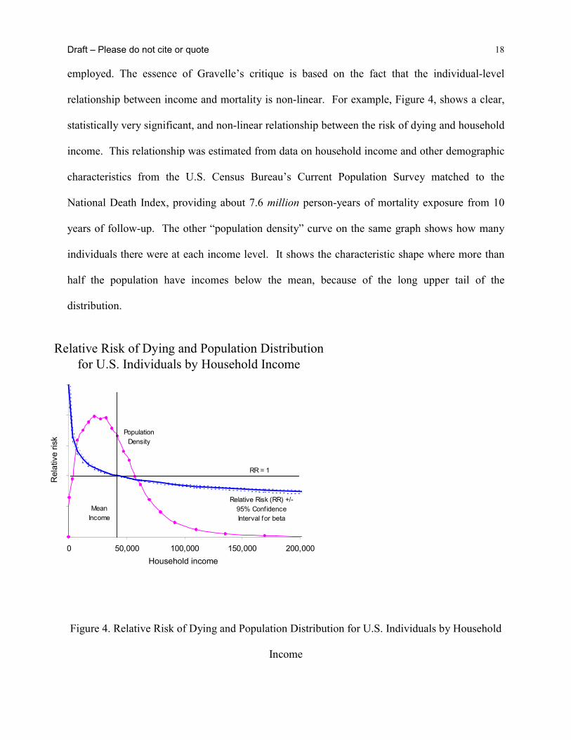
compared the association in US metropolitan areas and across cities in Canada50. What emerged
from these comparisons was that while the strong association across metropolitan areas in the US
was confirmed, there was no association between income inequality and mortality in Canada,
even though we used virtually identical data definitions and concepts. Initially, this was viewed
as the “Canada Paradox”. However, newer data suggest that the association between income
inequality and health among Australian cities is like Canada’s and not like that seen in the US.
Figure 8 shows the results from both the US/Canada comparison plus the later data that added
results for Australian cities. This is an extremely important observation because it is the first
evidence to show that within another rich country other than the US, there is no association
between income inequality and mortality.
Draft – Please do not cite or quote 26
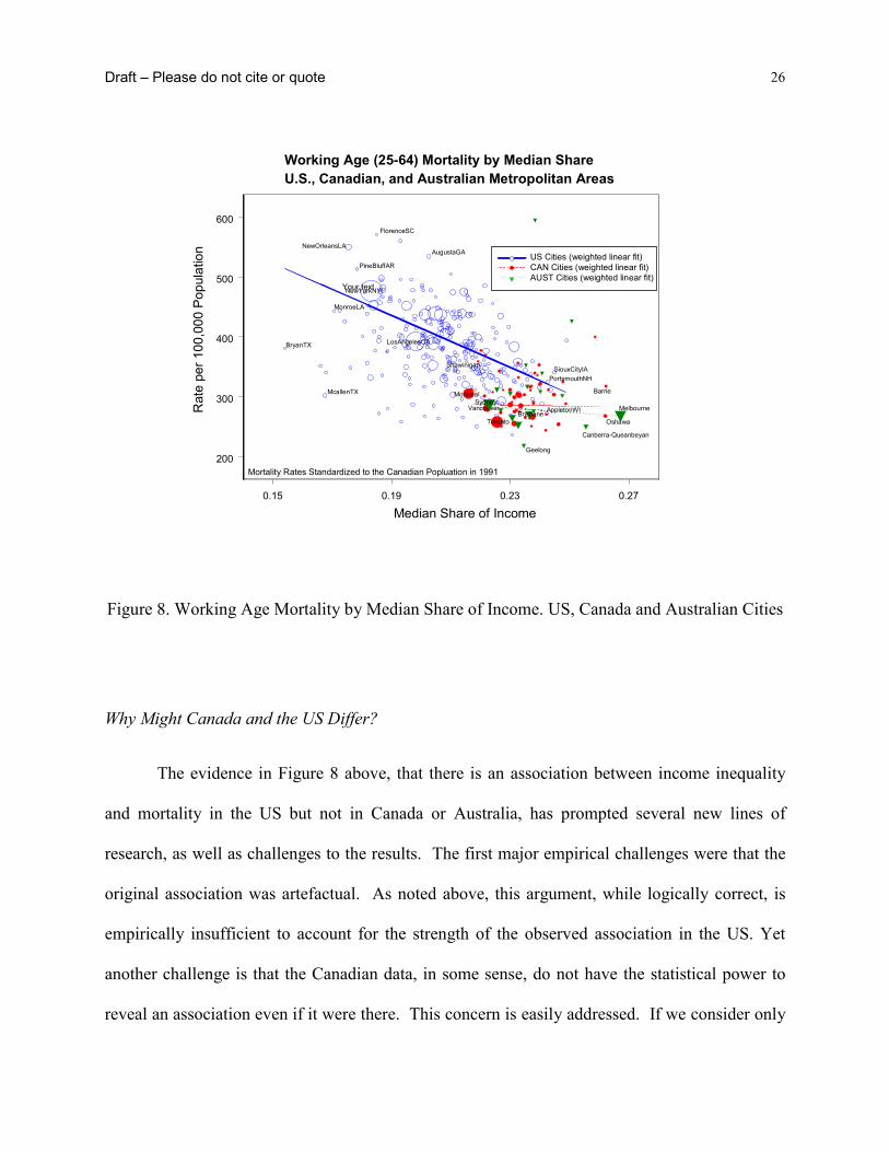
Figure 8. Working Age Mortality by Median Share of Income. US, Canada and Australian Cities
Why Might Canada and the US Differ?
The evidence in Figure 8 above, that there is an association between income inequality
and mortality in the US but not in Canada or Australia, has prompted several new lines of
research, as well as challenges to the results. The first major empirical challenges were that the
original association was artefactual. As noted above, this argument, while logically correct, is
empirically insufficient to account for the strength of the observed association in the US. Yet
another challenge is that the Canadian data, in some sense, do not have the statistical power to
reveal an association even if it were there. This concern is easily addressed. If we consider only
0.15 0.19 0.23 0.27
Median Share of Income
200
300
400
500
600
Rat
e pe
r 100
,000
Pop
ulat
ion
Working Age (25-64) Mortality by Median ShareU.S., Canadian, and Australian Metropolitan Areas
Mortality Rates Standardized to the Canadian Popluation in 1991
NewYorkNY
LosAngelesCA
NewOrleansLA
BryanTX
McallenTX
SiouxCityIA
AppletonWI
PortsmouthNH
PineBluffAR
FlorenceSC
MonroeLA
AugustaGA
Montreal
Vancouver
Toronto
Barrie
Oshawa
Shawinigan
US Cities (weighted linear fit)CAN Cities (weighted linear fit)AUST Cities (weighted linear fit)
Your text
SydneyMelbourne
Geelong
Brisbane
Canberra-Queanbeyan

Draft – Please do not cite or quote 27
that subset of US cities with income inequality measures in the same low range as the Canadian
cities, a significant negative slope remains for the U.S. metropolitan areas (Figure 9), while as
before there is no relationship for Canadian cities51. The evidence therefore suggests real
differences in this relationship between Canada and the US.
Figure 9. Comparison of US and Canadian Cities over Canadian Range of Income Inequality
Of course, these pieces of evidence of an association provide no guidance regarding
causality. We do not know from these data that higher income inequality leads to higher
mortality, for example. Indeed, we now actually know the opposite – even if higher inequality
led to higher mortality in some societies, like the US, this apparently is not always be the case.
The association is not universal so at a minimum some other factors must be involved.
0.21 0.22 0.23 0.24 0.25 0.26
Median Share of Income
250
300
350
400
450
500
Rat
e pe
r 100
,000
Pop
ulat
ion
U.S. cities (n=95) with weighted linear fitCanadian cities (n=53) with weighted linear fit (slope not significant)
Mortality Rates Standardized to the Canadian Population in 1991
Working age (25-64) mortality by median share over Canadian range of median share values, US and Canadian metropolitan areas

Draft – Please do not cite or quote 28
Furthermore, the use of income inequality data does not imply that the distribution of household
money income is the underlying factor that should be the focus of attention in trying to
understand the observed associations. Rather, income and its distribution may just as well be a
marker for a complex of other more deeply rooted factors relating to the extent and character of
social inequality in the two countries52.
For example, some aspects of basic social values, such as trust in government, or
tolerance of inequality, may lie behind the differences between Canada and the US – both in
levels of income inequality and in levels of mortality. Of course, widespread attitudes of trust in
government, which does seem higher in Canada than in the US, is itself the result of social
processes, such as investments in schooling and the social formation of children. Thus trust in
government can be seen as a marker for a history of material and structural social investments,
laws and public policies that are transparently intended to improve the life chances of most of the
population. In fact Lynch, et al.5 show that the countries with the highest levels of overall trust
are the Nordic social democratic welfare states, where such social investments have been at the
core of public policy for decades and in some places for more than a century53.
There are several continuing lines of investigation that attempt to better understand why
the link between income inequality and health appears to exist in the US but not Canada or
Australia54. These include:
• Income definitions and the Nature of the Labor Market - In the US, household income may
be a better marker for labour market income, while in Canada, with its more substantial
tax/transfer system, household income may be too “blurred” to show such a relationship. A
recent analysis of multiple concepts of income, income inequality and working age mortality

Draft – Please do not cite or quote 29
among US and Canadian metropolitan areas, sheds some light on the effect of labor market
inequality on the health of Canadians. Preliminary analyses reveals interesting differences
between aspects of labor market participation. For instance, Canada and the US show
different patterns of linkages between unemployment and income inequality and also
different associations with mortality. In Canada, unemployment appears more strongly linked
with mortality, while in the US, it is income inequality. Work continues on these interesting
and potentially important questions.
• Universal Health Care - Canada has a universal health care system, while in the US access to
health care is significantly constrained at the lower end of the SEP spectrum.
• Taxation and Social Policy – Any health effects of the unequal distribution of incomes
generated by the market are blunted by redistributive and other social policies that buffer the
effects of market driven inequality by providing a more complete infrastructure that is
supportive of better public health.
• Character of the places in which people live - US cities have much more spatially
concentrated areas of affluence and poverty than Canadian cities, with associated differential
patterns of public goods and urban amenities, and these could be the key factors underlying
the difference between Canada and the US.
Canada and the US show fundamentally different patterns. Income inequality may be a
significant determinant of health in the US, but this does not appear to be the case in Canada.
This does not mean that economic inequality in Canada is unimportant to the health of
individuals. Income inequality in Canada does reflect disparities in economic resources at the
individual level, and it there is a well-established individual-level relationship between income

Draft – Please do not cite or quote 30
and health. But it does not appear that there is any contextual effect of income inequality on
health in Canada as there seems to be in the U.S. This is tremendously important, because it
suggests that there may be something implicit in Canada’s social structure that successfully
buffers the adverse health effects of income inequality that have been observed in the US.
This was really the first cogent evidence that while a strong and non-artefactual relationship
between income inequality and mortality was certainly possible, the existence of such a
relationship was certainly not universal. This may also have important implications for how any
observed link between income inequality and health might be interpreted52. The “psychosocial
environment” approach that emphasizes perceptual processes linked to individual feelings of
subordination and relative disadvantage - unlinked to real incomes or material circumstances -
implies universality of the health effects of income inequality. The fact that the extent of income
inequality is associated with health in the US but not in Canada or Australia would seem to raise
serious challenges to the plausibility of a mainly psychosocial interpretation. It seems hard to
argue that Canadians perceive their relative disadvantage differently than their neighbors to the
south. Much more plausible is that the other social investments in people, places and resources
for health has broken the link between income inequality and health.
Chapter 7. Re-examining the International Evidence
Despite these observations of US/Canada differences, the momentum within public
health for affirming the link between income inequality and health continued almost unabated
with enthusiastic and broad promotion of the idea, often in disregard for the emerging evidence.
The theory that income inequality, and its potential influence on aspects of the psychosocial

Draft – Please do not cite or quote 31
environment can account for international health differences had become extremely influential
for interpreting health inequalities and in a number of countries had been embraced in policy
documents focused on strategies to improve population health. Despite the fact that questions
had been raised and there were inconsistent findings, the theory that income inequality and its
psychosocial effects were critical determinants of population health continued to be
indiscriminately accepted and widely promoted55-57.
It was within this context of the evidence perhaps not being as strong as the pro-income
inequality rhetoric, we resolved to revisit the original international observations of Wilkinson.
He studied 9 OECD countries with data from the late 1970s and early 80s28. We decided to carry
out a more complete international examination of associations between income inequality and
low birth weight, life expectancy, self-rated health, and age- and cause-specific mortality among
countries providing data in Wave III of the Luxembourg Income Study (LIS). The LIS is widely
regarded as the premier study of income distribution in the world. We also examined how
aspects of the psychosocial environment such as distrust, belonging to organizations,
volunteering (all proposed as measures of social capital) and perceived control over one’s life
circumstances were associated with between-country variations in health. We also included data
on belonging to trade unions and the proportion of women elected to national government, as
indicators of class relations within the labor market and broader socio-political participation of
women.
We found that using more complete and updated income inequality data, there was little
evidence for an association between income inequality and population health among rich nations,
except for infant and child health outcomes. In discussing our results we argued that it was
important to recognize the inherent limitations of interpreting associations based on sixteen, or

Draft – Please do not cite or quote 32
fewer observations. To illustrate this point, in Panel (a) of Figure 10 we have selected the 9
countries used by Wilkinson in his ground-breaking 1992 analysis that sparked so much interest
in this topic. That study reported a correlation of r=0.86 between more equal income distribution
and life expectancy using data for the late 1970s and early 1980s. Panel (a) shows that when we
used these same 9 countries, but analyzed data for 1989-92, higher income inequality was
associated with lower life expectancy albeit more weakly (r = -0.45).
Figure 10. Panel a). Income inequality and Life Expectancy in the Same 9 Countries used in
Wilkinson’s 1992 Analysis.
Also, recall the argument over the corrected data for Germany that was raised after
Wilkinson published his findings in 1992. You can see that compared to Wilkinson’s plots, the
position of Germany in our data is very different – there are much lower levels of inequality than
were reflected in the data for Germany that Wilkinson had originally used. In fact, if Germany
was given a value for income inequality like that assigned in Wilkinson’s original analysis, we
75
76
77
78
79
20 22 24 26 28 30 32 34
Life Expectancy and Income Inequality (circa 1991)
Gini Coefficient
USA
Norway Netherlands
Sweden
Germany
Canada Australia
UK
Data from LIS website and WHOSIS (June, 2000)
Same 9 countries as Wilkinson r = - 0.45 (weighted)
Switzerland

Draft – Please do not cite or quote 33
can come very close to recreating the association reported in his original finding with our data
from the 1990s.
However, now that data were also available for Italy, Spain, France, Belgium, Finland,
Luxembourg and Denmark, Panel (b) of Figure 10 shows that when these countries were added
to the analysis, there was no longer an association between income inequality and life
expectancy (r=-0.09, p=0.75). Thus, the discrepancy between our results and Wilkinson’s study,
was simply that we had the advantage of being able to include more countries with updated data
as it became available.
Figure 10. Panel b) Income inequality and Life Expectancy in Full Sample of Countries.
The addition of Italy, Spain, France, Belgium, Finland, Luxembourg and Denmark,
highlights the complexity of attempting to come up with universal theories for what explains
variations in population health among rich nations. While not directly comparable to the current
75
76
77
78
79
20 22 24 26 28 30 32 34
Life Expectancy and Income Inequality (circa 1991)
Gini Coefficient
USA
NorwayNetherlands
Sweden
Germany
CanadaAustralia
UK
Data from LIS website and WHOSIS (June, 2000)
Switzerland
France
Finland
Denmark
Luxembourg
Belgium
Spain
Italy
All 16 countriesr = -0.09 (weighted)

Draft – Please do not cite or quote 34
analyses because they were based on within-country differences, Mackenbach58 and Kunst59
clearly showed how deciphering variation in the extent of within-country socioeconomic health
inequalities across Europe is complicated by between-country differences in the cause-of-death
structure, particularly the north-south differences in CHD60. Three of the countries we added in
Panel (b) - Spain, Italy and France are typical of the pattern in southern Europe - higher life
expectancy due largely to lower CHD. The countries added from northern Europe - like
Denmark and Finland - have lower inequality, but higher CHD rates and lower life expectancy.
Assuming that these north-south CHD and life expectancy differences did not emerge between
the 1970s and 1990s, and if the data had been available, it seems likely that Wilkinson’s earlier
study in 1992 would also have found little association between income inequality and life
expectancy for this expanded set of countries.
Cognizant of the dangers of over-interpretation, what can we reasonably conclude from
these new international findings? It appears there is a relatively strong and consistent pattern of
associations between income inequality and child health outcomes. Higher income inequality
was associated with higher infant mortality, low birth weight and mortality aged 1-14 in both
sexes. For a country of such vast wealth, the United States has high levels of both income
inequality and child ill-health. Associations with infant and early-life mortality largely
disappeared when the US was excluded from analyses, but an association with low birth weight
remained (r=0.53, p=0.06) due to high levels of both income inequality and low birth weight in
the UK. Associations with mortality above age 65 were the opposite of that predicted by the
theory that higher income inequality is automatically bad for health. These negative associations
were largely driven by the fact that higher inequality countries like the US and France have

Draft – Please do not cite or quote 35
relatively low mortality above age 65, especially for CHD, compared to countries like Finland,
Denmark, Luxembourg and Germany.
Importantly for the research on income inequality and health, the age-specific pattern of
associations between income inequality and mortality may be consistent with time lags. It is
widely recognized that income inequality within many of these countries narrowed or was at
least stable after WWII, but has increased markedly since the 1970s (relative to levels in 1950s
and 60s) and so it is possible that the associations observed with child health outcomes may be
reflected in differences in adult health at some future point in time, as populations exposed to
this period of increasing inequality age. Longer-term data on changes in inequality and health are
needed to explore this hypothesis but we will revisit this issue in examining trend data within
regions of the US.
Some of the strongest arguments in support of the theory that greater income inequality
produces worse population health have come from analyses of homicide. In some ways,
homicide has been the quintessential example of a cause-of-death that is plausibly affected by the
extent of income inequality in light of the breakdown of social cohesion and the negative
emotions of distrust and hostility it is theorized to engender in individuals. While income
inequality was reasonably strongly correlated with homicide, these associations were almost
entirely induced by the US data point. For instance, excluding the US changed the correlation
between income inequality and homicide from r=0.65 (p=0.01) to r=-0.15.
According to the psychosocial environment theory, income inequality is associated with
health through two main pathways – behaviour and stress. Income inequality was associated with
lung cancer, but only among women. On the other hand, it was not associated with cirrhosis – an

Draft – Please do not cite or quote 36
outcome with a clearly identifiable behavioral component. Nor was income inequality associated
with CHD or diabetes – outcomes linked to both behavior and psycho-neuro-endocrine stress
mediation.
While not directly the topic of this paper it was worth noting the other results on the
effects of the psychosocial environment also derived from this study. The most important piece
of empirical evidence in support of the idea that social capital is an important determinant of
population health came from a study of 38 US states61. This cross-sectional study showed that
levels of distrust and the extent of organizational membership mediated the within-country
association between income inequality and mortality. While we used almost identical indicators
of social capital to those used in the US study, we failed to find any consistent associations with
between-country differences in age- or cause-specific mortality. In fact, one of the stronger
correlations observed in these data was the association between higher distrust and lower CHD
among both men (r=-0.63, p=0.02) and women (r=-0.61, p=0.03). This finding is the exact
opposite of what the current income inequality-psychosocial environment theory would predict.
An examination of the data plots revealed that people in France, Italy and Spain (lower CHD
countries) reported the highest levels of distrust, while those in Finland, Sweden and Norway
(higher CHD countries) reported the lowest distrust. While it seems inherently difficult - perhaps
impossible - to try to interpret aggregated scores for something like “trust” at the nation level,
one could speculate over the reasons for these international differences in the tendency to report
things like distrust. If we were to accept that these represent something real, then they are likely
the product of quite particular historical, social and cultural forces. It is also possible that the
general practice of aggregating individual responses to characterize the psychosocial
environment of a place may be inappropriate for between-country comparisons because of their

Draft – Please do not cite or quote 37
cultural specificity. Additionally, the individual-level correlates of distrust may vary across
countries.
These results do not offer much support for a psychosocial environment theory as a
general explanation for health differences between rich countries. Higher perceived control over
life circumstances was actually significantly associated with higher CHD – the opposite of what
would be predicted by the psychosocial environment theory and the opposite of what would be
inferred from individual-level studies. We concluded that it seemed difficult to sustain the theory
that income inequality and indicators of the quality of the psychosocial environment explain
between-country health differences among these stable, wealthy nations. What theoretically
consistent associations did exist were largely limited to child health outcomes and cirrhosis. Our
results further emphasized the growing body of evidence that neither an income inequality nor
the psychosocial environment theory of health was universally applicable to understanding why
some countries have better population health than others.
Our findings were thus consistent with our previous study that compared the US and
Canada50. While the extent of inequality was strongly related to health differences between US
metropolitan areas, there was no association between income inequality and mortality across
such areas in Canada. Evidence comparing states and cities within the US has been used
extensively to support the income inequality-psychosocial environment theory of population
health. It seems likely that the US is the exception, not the rule, and it is possible that evidence
drawn from studies within the US has less direct applicability to other wealthy nations.

Draft – Please do not cite or quote 38
Chapter 9. US “Exceptionalism”
Two things were beginning to become clearer in the evolving story on income inequality
and health. The original international evidence was clearly questionable. More importantly, the
fact that rigorous comparisons of the US and Canada showed no association within Canada,
could now be more easily reconciled. Far from it being a story about the “Canadian paradox”, it
appears that the real story is one of “US exceptionalism”62.
As we showed in our first study of US states in 19964, higher income inequality within
the US is overwhelmingly associated with more unequal distribution of many potentially
powerful determinants of health. This may not be the case in other wealthy countries where there
has been more widespread and more evenly distributed social investments in public health-
relevant goods and services. There appears to be no necessary association between income
inequality and population health – it may depend on the distribution of other health-relevant
resources and exposures that exist within a country. For example, low CHD in southern Europe
may be related to high prevalence and low social inequality in healthy diets, while the relatively
low life expectancy of Danish women is likely related to the high prevalence and low social
inequality in smoking63. Understanding how different countries generate particular patterns and
trends in population health is likely to be historically and culturally contextualized14,64,65.
It may not be income inequality per se, or the quality of the psychosocial environment
that drive population health. Rather, what may be most important is the current and historical
links between income inequality and the distribution of health-relevant resources and exposures,
and how these links have played out over the lifecourse of different birth cohorts14,66. Levels of
health within a country are the product of complex interactions of history, culture, politics,

Draft – Please do not cite or quote 39
economics, and the status of women and minorities, and may not be adequately described by
current levels of income inequality or aggregate indicators of the psychosocial environment.
The new results for Australia described above, and the similar results from recently
released within-country studies of Denmark67 and Japan68, combined with questions about the
quality of the evidence underlying the original Wilkinson results, all point to the conclusion that
it seems only states and cities within the US that show a clear relationship between income
inequality and mortality. There is apparently something rather different about the way income
inequality is manifested in the US, and we need to understand more about the economic, social,
political and spatial correlates of US-style income inequality.
Having said this, before dismissing the association for other countries completely, there
are two caveats worthy of mention. First, most of the this evidence has focused on mortality or
life expectancy as the measure of population health and it is possible that there are other
important dimensions of health such as psychological morbidity and malaise that are more
strongly linked to income inequality. Second, it is important to consider that there may well be
other countries where income inequality will be linked to population health because of the
particular configuration of health enhancing social investments with income inequality. This may
be of particular relevance to developing countries in Central and Latin America or Asia and for
the countries of Eastern Europe in economic transition. Levels of income inequality in Russia for
instance, far outstrip the US and may well be linked to aspects of population health as they are in
the US.

Draft – Please do not cite or quote 40
Figure 11. GDP, Income Inequality and Life Expectancy in Selected Regions and Countries
Nevertheless, the link between income inequality and health should not be understood as
a necessary relationship, rather it may reflect processes of economic and social development over
which policy makers have control. For instance, it is relatively easy to imagine a situation where
income inequality was growing over time - driven by market forces - and this was linked with
public policies that also fostered the emergence of US-style managed-care health markets, that
the ultimate yield for population health would be rather different if those same levels of income
inequality were buffered by public policies that ensured universal access to health care. There is
no necessary link between income inequality and economic growth. In fact, in recent times the
opposite has been shown to be true69. Nevertheless, it remains to be uncovered exactly which set
of public policies best buffers the health impacts of income inequality and this is an important
0
20
40
60
80
100
120
0
2
4
6
8
10
12
ScandanaviaW Europe British
CommonwealthUSA Russia Mexico
GD
P / L
ife e
xpec
tanc
y
90:1
0 in
com
e ra
tio
GDP per capita as a % of USLife expectancy at birth90th:10th percentile income ratio

Draft – Please do not cite or quote 41
area of future investigation that has enormous practical implications for policy development and
differs markedly from the policy implications that would arise from the view that the effects of
income inequality are an inevitable consequence of humans’ creating social hierarchies70.
Chapter 10. Regional Mortality in the US: A Role for Income Inequality?
Given this background, we can now turn to the other issue posed in the title of this paper
with more certainty that the question is even worth asking. Is income inequality associated with
regional mortality differences in the US? Even the very first studies of US states showed an
apparently strong regional pattern to the link between income inequality and mortality. Figure 11
shows that the most unequal, high mortality states were predominantly in the South – Louisiana,
Mississippi, Alabama, Kentucky, Georgia, W. Virginia, etc.
Figure 11. Income share and mortality, US States, 1990
Income Inequality and Mortality in US States, 1990LA
MS
NY
KYAL WV
TX
TNAR
OK
NM
GA
FL
MO
CA
IL
AZ
MIPA
SC
MA
NC
CT
MT
OH
NJVA
KSCO
RI
SD
OR
NDMN
IDNE WA
NV
WY
IN
IA
ME
HI
MDDE
WI
AK
VT
UT
NH
650
700
750
800
850
900
950
1000
17 18 19 20 21 22 23 24Income Share Held By Poorest 50% of Population
Age
-Adj
uste
d To
tal M
orta
lity

Draft – Please do not cite or quote 42
The analysis of US metropolitan areas is somewhat less clear-cut but there is certainly
some evidence that metropolitan areas in the south were in general more unequal and had higher
mortality (See Figure 8). Furthermore, if we combine information on both low average income
and income inequality, the places that receive the “double-whammy” of lower average income
and higher income inequality are overwhelmingly in the southern US.
Figure 12. Income Inequality and Per Capita Income, US Metro Areas, 1990
So, at first examination there does appear to be some evidence for a regional component
to overall links between mortality and income inequality, in that southern US states and metro
areas have lower average income, higher income inequality and higher mortality. In addition, it
appears that there are regional differences in the strength of association between income
inequality and mortality. Figure 13 shows the associations between income inequality and
mortality (net median income differences) within each Census region of the US. While there is a
high inequalitylow per capita income
low inequalityhigh per capita income
high inequalityhigh per capita income
high inequalitylow per capita incomehigh inequalitylow per capita income
low inequalityhigh per capita incomelow inequalityhigh per capita income
high inequalityhigh per capita incomehigh inequalityhigh per capita income

Draft – Please do not cite or quote 43
statistically significant association between income inequality and mortality in all regions of the
US, it is much stronger in the Midwest and Northeast than in the West. Most interestingly the
weakest association was among the Southern metropolitan areas. So while an important
component of the overall national picture derives from the position of southern states and metro
areas in relation to the others, within the South itself there is a much weaker link between income
inequality and mortality.
Figure 13. Associations between Income Inequality and Mortality across Regions of North
America, 1990
The Southern region is recognized as generally having the worst population health
profiles in the US, although there is obviously a great deal of underlying heterogeneity by place
and outcome. Nevertheless, these data suggest that for the region of the US with the worst
population health profiles, the extent of income inequality (which has a similar range as
nationally) within that region does not appear to be as strongly linked to variations in mortality
0.15 0.20 0.25Median Share of Income
300
400
500
300
400
500
300
400
500
Mor
talit
y R
ate
per 1
00,0
00
Metropolitan Area Working Age (25-64) Mortalityvs. Median Share by Region
beta = -29.23
Southern U.S.
NewYorkNYMiamiFL
ChicagoILLosAngelesCA
Toronto
beta = -33.72beta = -17.30
beta = -1.11
Northeast U.S.
Western U.S. Midwest U.S.
Canada
beta = -8.64

Draft – Please do not cite or quote 44
within the region as it is in other regions of the US. This cannot be simply explained by a
narrower range of income inequality. Thus, there is some evidence that there may be region-
specific compositional and contextual factors that figure into the association between income
inequality and mortality that require further investigation. Table 1 shows some basic
demographic and economic differences between these US regions. It is clear that there are
different race/ethnic compositions of minority groups. These compositional differences and the
way income inequality is expressed across these different groups within regions may be
important to better understanding the regional differences in the strength of the association.
Table 1. Year 2000 Population Distribution1 and Median Income2 by Race/ Ethnicity, and 1989 Income Inequality3 by Race/ Ethnicity, US Census Regions Northeast Midwest South West % US Population 19.0 22.9 35.6 22.5 % White 79.1 85.0 74.1 72.0 % Black 12.2 10.6 19.5 5.5 % Hispanic4 9.8 4.9 11.6 24.3 Median Income 45,118 44,647 38,402 44,759
White 47,205 46,617 40,879 44,592 Black 30,426 30,053 29,778 36,975 White/ Black 16,779 16,564 11,101 7,617 White/ Black Ratio 1.56 1.55 1.37 1.21
Income Inequality 0.45 0.43 0.45 0.44
White 0.44 0.42 0.44 0.44 Black 0.46 0.48 0.46 0.44
1Source: US Census Bureau, Profiles of General Demographic Characteristics, 2000. 2Source: US Census Bureau, Historical Income Tables from the Current Population Survey (2000 US dollars). 3Source: Authors’ calculations based on unpublished 1990 data from the US Census Bureau. 4Note: Hispanics may be of any race.

Draft – Please do not cite or quote 45
The Temporal Component – Regional Mortality Trends and Income Inequality
The suggestive evidence presented above is of course taking a cross-sectional view. It is
worth noting at the outset that in the history of research on income inequality and health there
have been very few longitudinal studies. In the US, only four studies have included a
longitudinal component. Kaplan et al., in 1996 showed that levels of income inequality in 1980
were associated with slower declines in state-level mortality from 1980-90. More recently,
Mellor and Milyo32 examined time-lagged trends of income inequality and mortality from the
1950s onward and found generally negative but somewhat mixed results, depending on the time-
lag employed and the selection of control variables. In short, we find it somewhat difficult to
know what to conclude from the Mellor and Milyo analyses as they rely on their own set of data
limitations and assumptions that may or may not provide informative results. Blakely and
colleagues71 evaluated the lagged effect of state-level income inequality on individual self-rated
health and found that income inequality measured 16 years earlier had a stronger effect than did
inequality measured contemporaneously on those 45 years and older, after adjustment for race
and individual income. However, the results for those ages 15 to 44 were inconclusive and the
authors concluded that there might be insufficient variation in state-level income inequality over
time to detect significant lag effects. In unpublished analyses, Deaton and Paxson argued that
neither trends in income or income inequality showed much resemblance to declining age-
specific death rates in the US from 195072. Thus, the literature so far on understanding mortality
trends is mixed.
Within a broader conceptual framework, David Leon and George Davey Smith have
argued cogently for the importance of thinking about time lags between relevant exposures and
outcomes73, and for how our knowledge of individual-level risk factors might be profitably used

Draft – Please do not cite or quote 46
to interpret temporal trends in population health14,15,74,75. While some of these ideas are not
really new - techniques such as birth cohort analysis have been used for decades76-78- it can be
argued that modern epidemiology is dominated by the identification of individual, proximal risk
factors for disease. It is important however, that we not loose sight of the fact that one of our
fundamental tasks as epidemiologists is to understand why certain diseases wax and wane in
different populations and population sub-groups over time. This involves understanding the
dynamic interplay of individual risk and population level trends in particular diseases. Indeed,
discussion and debate still occurs on the exact contributions of different factors to the 19th
century transition from infectious to chronic diseases that occurred in wealthier countries79-82;
what factors explain the precipitous rise and equally impressive fall in coronary heart disease in
many countries83-85; and what the real contribution of traditional risk factors such as smoking,
lipids and hypertension were to trends in heart disease86,87. A recent example are the discussions
over the rise and fall of peptic ulcer in the population – its association with Helicobacter Pylori
infection and perhaps interactions with other factors such as social stress and diet88-92. The point
here is that there seems something rather fundamental about being able to link our knowledge of
risk exposures at the individual and social level with what we observe in population level health
trends over time.
In the US in particular there is very little attention among epidemiologists, to examining
population-level trends in different diseases. My informal polling of Masters and PhD students in
epidemiology is that they have been taught very little about disease trends. In fact, if I ask them
to write down the major risk factors for coronary heart disease (CHD) and then for stroke, this
proves to be a fairly easy task and they come up with rather similar lists. Indeed, it is very
common to see CHD and stroke combined into one outcome - cardiovascular disease - because

Draft – Please do not cite or quote 47
of these apparent similarities in individual risk factors. However, if one examines the long-term
trends in these two conditions since the turn of the century, then they look dramatically different,
with an unabated decline in stroke - mainly from haemorrhagic stroke - but for CHD, a sharp rise
in the 1920s, to a peak in the 1960s and since then a rapid decline of more than 50%. There are
two important points here. First, it is necessary to pay attention to the temporal component of
links between risk factors and disease outcomes – this so-called “lifecourse approach” is
beginning to be more fully articulated93 and can be applied at both the individual and population
levels. Second, there are good reasons to examine outcome specific trends, in addition to overall
indicators of population health. So while trends in all-cause mortality or life expectancy or
DALYs or self-rated health may be informative for some purposes, they also may obscure
considerable heterogeneity that may be exploited to better understand the dynamic linkages
between changing environments, particular risk exposures and different types of health
outcomes. So in this view there is something fundamental about trying to understand trends in
different types of population health indicators – it is some of the most basic “stuff” of population
health.
In thinking about how income inequality – a population-level characteristic – might be
potentially linked to regional differences in health in the US we begin by displaying 30-year
regional trends in some selected causes of death. Figure 14 shows the designated census regions
of the US.

Draft – Please do not cite or quote 48
Fig 14 Standard Census defined US Regions
The series of figures that follows shows trends in all-cause mortality, ischemic heart
disease (IHD), stroke, lung, breast and prostate cancer, suicide, homicide and diabetes across
these 9 regions. Of course, we could have shown state-level trends or perhaps even different
theoretically driven groupings of states, but for the purposes of this presentation and simplicity
we chose to show the trends in the 9 standard Census regions.
As expected, trends in all-cause mortality over the last 30 years (Figure 15) show that
every region of the US has improved substantially, but with some widening of regional
inequality, whereby there is now a larger gap between the highest and lowest mortality areas -
the East-South-Central and Pacific regions. Between 1968 and 1998 absolute regional
differences increased from 168 to 198 deaths per 100K, while relative regional inequality

Draft – Please do not cite or quote 49
increased from 1.14 to 1.24. Nevertheless, what is striking about these trends is the overall
stability of the relative positions of the regions. The Pacific region has demonstrated the
healthiest mortality profile and it has done that for more than 30 years, perhaps because of
something in the context of the Pacific region and/or perhaps because of the composition of the
population in the Pacific region. In contrast the opposite is true in the East-South-Central region
and this is the area with the highest concentrations of higher income inequality and low per
capita income.
Figure 15. 30-year Trends in All-Cause Mortality, US Regions.
There is evidence of slower declines in all-cause mortality in the West and East-South-Central
regions from the early 1980s, that may coincide with the period of widening income inequality,
600
700
800
900
1000
1100
1200
1300
1400
1500
1968
1969
1970
1971
1972
1973
1974
1975
1976
1977
1978
1979
1980
1981
1982
1983
1984
1985
1986
1987
1988
1989
1990
1991
1992
1993
1994
1995
1996
1997
1998
EAST NORTH CENTRAL
EAST SOUTH CENTRAL
MIDDLE ATLANTIC
MOUNTAIN
NEW ENGLAND
PACIFIC
SOUTH ATLANTIC
WEST NORTH CENTRAL
WEST SOUTH CENTRAL
CAUSE (All)
Sum of AADR
YEAR
DIVNAME
East-South-Central
Pacific

Draft – Please do not cite or quote 50
but this region of the US is also where the links between income inequality and mortality are
weakest. Another feature of these trends is that some regions such as the Middle Atlantic shifted
relative position, nevertheless, the over-riding impression is that knowing where a region started
in 1968 tells you a lot about where it is likely to be relative to other regions 30 years later.
This relative stability in regional trends is also clear when examining cause-specific 30-
year mortality trends. The Middle Atlantic region has had historically the highest levels of IHD
and the Mountain region the lowest. In 1968, they differed by 186 IHD deaths per 100K,
corresponding to a rate ratio of 1.5. In 1998, they still hold those same positions but with
Figure 16. 30-year Trends in IHD Mortality, US Regions.
narrower absolute differences of 77 IHD deaths per 100K and similar relative inequality of 1.6.
However, within these relatively stable patterns, New England shows strong improvements over
time from 3rd worst to 3rd best in 30 years, while the West-South-Central reverses its declines in
0
100
200
300
400
500
600
1968
1969
1970
1971
1972
1973
1974
1975
1976
1977
1978
1979
1980
1981
1982
1983
1984
1985
1986
1987
1988
1989
1990
1991
1992
1993
1994
1995
1996
1997
1998
EAST NORTH CENTRAL
EAST SOUTH CENTRAL
MIDDLE ATLANTIC
MOUNTAIN
NEW ENGLAND
PACIFIC
SOUTH ATLANTIC
WEST NORTH CENTRAL
WEST SOUTH CENTRAL
CAUSE IHD
Sum of AADR
YEAR
DIVNAME
Middle Atlantic
Mountain

Draft – Please do not cite or quote 51
IHD in the late 1980s and for a period of about 3 years is the only region in the US to show
increasing IHD death rates. So over 30 years these two regions swap their relative positions.
As mentioned before, stroke - especially hemorrhagic stroke - has declined spectacularly
since the 1900s and that decline is still evident from 1968-1998 with especially steep declines up
until the early 1980s with the East-South-Central region experiencing declines of 50% in the 15
years between 1968 and 1983. (Figure 17) This is in stark contrast to the generally slower
declines in overall mortality and speaks to the value of examining trends in different causes.
Now cause-specific differences across regional trends also begin to emerge. For stroke, it is the
Middle-Atlantic and New England regions that have had the historically lowest rates - almost the
opposite pattern to IHD, where the Middle Atlantic had the highest rates. What is striking about
the trends in stroke is the narrowing of absolute regional inequality and despite the enormous
secular changes in stroke over time, the relative positions of the US regions stay rather stable.
Again, knowing something about initial mortality conditions says a lot about where that
region will be 30 years later and implies that whatever distinguishes the initial mortality
differences between regions - which also differs by cause - still distinguishes them 30 years later.
If it is initial and/or historical levels of income inequality that help determine these starting
conditions then it seems to do so cause-specifically because the relative orderings of the regions
differ according to cause of mortality. It also implies that regional changes in income inequality
should be reflected in changing mortality trends. It seems already evident that this may argue
against any simple understanding of how income inequality - which by any account has risen
over this same time period across all US regions - may have expressed itself in these mortality
trends.

Draft – Please do not cite or quote 52
Figure 17. 30-year Trends in Stroke Mortality, US Regions.
Now we turn our attention to a cause of mortality that shows an increasing 30-year trend
in all regions – lung cancer – that has a clearly identifiable behavioral component. Figure 17
shows regional lung cancer mortality trends that demonstrate widening absolute and regional
inequality between 1968 and 1998 that logically follows the time-lagged rise in smoking
prevalence from its rise during World War 1, to its peak in the mid 1960s shown in Figure 18. In
1968 (40-50 years after the first cohorts took up smoking in large numbers), there was a
relatively tight clustering of lung cancer rates across regions, with the exceptions being
substantially lower rates historically evident in Mountain and West-Nth-Central regions.
Over 30 years the regional disparity increased enormously, with the East-South-Central
and South-Atlantic showing the largest increases in lung cancer mortality. These are also
unsurprisingly, the main tobacco producing regions of the US. However, whatever was initially
0
50
100
150
200
250
1968
1969
1970
1971
1972
1973
1974
1975
1976
1977
1978
1979
1980
1981
1982
1983
1984
1985
1986
1987
1988
1989
1990
1991
1992
1993
1994
1995
1996
1997
1998
EAST NORTH CENTRAL
EAST SOUTH CENTRAL
MIDDLE ATLANTIC
MOUNTAIN
NEW ENGLAND
PACIFIC
SOUTH ATLANTIC
WEST NORTH CENTRAL
WEST SOUTH CENTRAL
CAUSE STROKE
Sum of AADR
YEAR
DIVNAME
East - South - Central
Middle Atlantic

Draft – Please do not cite or quote 53
protective (contextual and compositional) for the uptake of smoking and of later lung cancer
mortality in the Mountain and West-North-Central regions, it continued to generate the lowest
rates of lung cancer over the next 30 years. It is possible that regional analyses of income
inequality might reveal that these were the places that experienced the largest differentials in
changes in income inequality over this time period – those analyses are underway – but it seems
more likely that a simpler (and yet in itself complex) explanation exists related to the differing
historical roles of tobacco use in the economies and cultures of these contrasting regions – the
tobacco producing areas of the Southern US vs the more religiously and socially conservative
Midwest and mountain areas.
Figure 18. 30-year Trends in Lung Cancer Mortality, US Regions.
0
10
20
30
40
50
60
70
80
90
100
1968
1969
1970
1971
1972
1973
1974
1975
1976
1977
1978
1979
1980
1981
1982
1983
1984
1985
1986
1987
1988
1989
1990
1991
1992
1993
1994
1995
1996
1997
1998
EAST NORTH CENTRAL
EAST SOUTH CENTRAL
MIDDLE ATLANTIC
MOUNTAIN
NEW ENGLAND
PACIFIC
SOUTH ATLANTIC
WEST NORTH CENTRAL
WEST SOUTH CENTRAL
CAUSE LUNG CANCER
Sum of AADR
YEAR
DIVNAME
East - South - Central
Mountain

Draft – Please do not cite or quote 54
Fig 19. Historical Points in Cigarette Consumption in the US, 1900-1998
Finally, Figures 20-23 show 30-year mortality trends for four outcomes that demonstrate
somewhat more stable secular trends - albeit with some large short term fluctuations - prostate
and breast cancer, suicide and homicide. Also, note the regional heterogeneity by cause of death,
with the Mountain region having the lowest breast cancer rates but the highest prostate cancer
and suicide rates. Some of the strongest arguments in support of the theory that greater income
inequality produces worse population health have come from analyses of homicide. As
mentioned above, homicide has been an important part of the argument for the plausibility of
links between income and health, through the breakdown of social cohesion and the negative
emotions of distrust and hostility, it is theorized to engender in individuals37 and importantly, the
Annual adult per capita cigarette consumption and major smoking health events, US 1900-98
0500
100015002000250030003500400045005000
1900
1905
1910
1915
1920
1925
1930
1935
1940
1945
1950
1955
1960
1965
1970
1975
1980
1985
1990
1995
1st World Conference on Smoking and Health
Nicotine Medications Available Over the Counter
Master Settlement Agreement
Great Depression
End of WW II
1st Smoking Cancer Concern
Fairness Doctrine Messages on TV and Radio
Nonsmokers’ Rights Movement Begins
Federal Cigarette Tax Doubles
Surgeon General’s Report on Environmental Tobacco Smoke
1st Surgeon General’s Report
Broadcast Ad Ban 1st Great
American Smokeout
per
capi
ta c
onsu
mpt
ion
*Adapted from Mortality and Morbidity Weekly Report 1999;48(43):986-993

Draft – Please do not cite or quote 55
fact that the time lag between exposure and outcome is likely to be much shorter than for chronic
diseases. These data suggest that any changes in income inequality between 1968 and 1998 do
not produce any obvious trend changes in homicide mortality in any region of the US. In some
regions homicide is rather stable, while in others it fluctuates throughout the time period that
income inequality was consistently rising.
Figure 20. 30-year Trends in Breast Cancer Mortality, US Regions
0
5
10
15
20
25
30
EAST NORTH CENTRAL
EAST SOUTH CENTRAL
MIDDLE ATLANTIC
MOUNTAIN
NEW ENGLAND
PACIFIC
SOUTH ATLANTIC
WEST NORTH CENTRAL
WEST SOUTH CENTRAL
CAUSE BREAST CANCER
Sum of AADR
YEAR
DIVNAME
Middle Atlantic
Mountain
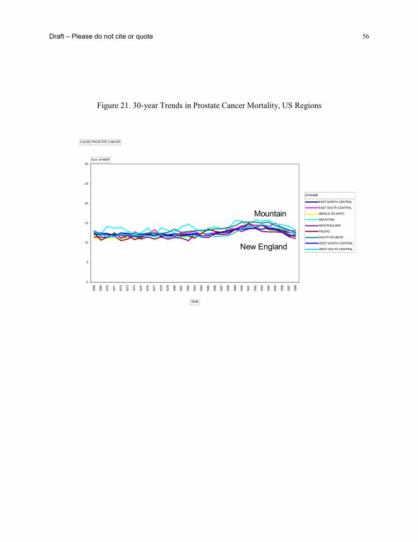
Draft – Please do not cite or quote 56
Figure 21. 30-year Trends in Prostate Cancer Mortality, US Regions
0
5
10
15
20
25
30
1968
1969
1970
1971
1972
1973
1974
1975
1976
1977
1978
1979
1980
1981
1982
1983
1984
1985
1986
1987
1988
1989
1990
1991
1992
1993
1994
1995
1996
1997
1998
EAST NORTH CENTRAL
EAST SOUTH CENTRAL
MIDDLE ATLANTIC
MOUNTAIN
NEW ENGLAND
PACIFIC
SOUTH ATLANTIC
WEST NORTH CENTRAL
WEST SOUTH CENTRAL
CAUSE PROSTATE CANCER
Sum of AADR
YEAR
DIVNAME
Mountain
New England

Draft – Please do not cite or quote 57
Figure 22. 30-year Trends in Suicide Mortality, US Regions
0
5
10
15
20
25
30
1968
1969
1970
1971
1972
1973
1974
1975
1976
1977
1978
1979
1980
1981
1982
1983
1984
1985
1986
1987
1988
1989
1990
1991
1992
1993
1994
1995
1996
1997
1998
EAST NORTH CENTRAL
EAST SOUTH CENTRAL
MIDDLE ATLANTIC
MOUNTAIN
NEW ENGLAND
PACIFIC
SOUTH ATLANTIC
WEST NORTH CENTRAL
WEST SOUTH CENTRAL
CAUSE SUICIDE
Sum of AADR
YEAR
DIVNAMEMountain
Middle Atlantic

Draft – Please do not cite or quote 58
Figure 23. 30-year Trends in Homicide Mortality, US Regions
Examination of these disease specific regional trends suggests a good deal of
heterogeneity across causes. The relative rankings of the regions by cause also shows no clear
patterns, whether the secular trends are stable, increasing or decreasing. Perhaps the most
enduring impression is the cause-specific stability of regional differences over time - in general,
a region’s relative position in 1968 appears to be the strongest determinant of its position in
1998. This is not to say there are no exceptions and it may be interesting to examine some of the
more dramatic shifts in regional trajectories over time – such as the upturn in IHD deaths in the
West–South–Central region in the early 1980s.
0
5
10
15
20
25
30
1968
1969
1970
1971
1972
1973
1974
1975
1976
1977
1978
1979
1980
1981
1982
1983
1984
1985
1986
1987
1988
1989
1990
1991
1992
1993
1994
1995
1996
1997
1998
EAST NORTH CENTRAL
EAST SOUTH CENTRAL
MIDDLE ATLANTIC
MOUNTAIN
NEW ENGLAND
PACIFIC
SOUTH ATLANTIC
WEST NORTH CENTRAL
WEST SOUTH CENTRAL
CAUSE HOMICIDE
Sum of AADR
YEAR
DIVNAME
West - South - Central
New England
Draft – Please do not cite or quote 59
What can be said about the potential for income inequality to influence these disease
specific trends? First, we chose to examine regional trends during the period 1968-1998 because
this is precisely the period when levels of income inequality rose sharply in the US - at least
relative to post-war levels. This assumes that there is no time lag between exposure to income
inequality and its effects on mortality trends. This may be more plausible for some outcomes but
not others. Nevertheless, most of the accumulated evidence on the health effects of income
inequality has ignored specific hypotheses about such time lag effects. If historical, starting
levels and changes in income inequality are important determinants of these mortality trends, it
seems difficult to come up with a straightforward hypothesis for how it could account for the
different secular trends, relative regional stability over time and the heterogeneity of the ordering
of the regions by cause. There would appear to have to be a number of different mechanisms and
time lags involved in producing these patterns, which do not fit easily into a notion that levels of
income inequality, per se, are driving all these cause-specific mortality trends.
Until Census 2000 figures are available, we do not have detailed trend data on regional
income inequality. Certainly, the rise in income inequality experienced in the US as a whole
from the mid-1960s onwards was evidenced in every state and region to a greater or lesser
extent. A very recent report based on the Current Population Survey (CPS) by Bernstein et al.,94
has shown some variability in changes in the “top-to-bottom ratio” (incomes of the top 20% vs
incomes for the bottom 20% of the population) across regions of the US for the period 1978-
2000, which corresponds to the period of the largest rise in inequality. The largest increases in
this measure of income inequality were observed down the eastern seaboard of the US - in the
Middle and Southern Atlantic states and New England. There is no obvious association between
the starting levels of income inequality in 1978 and the changes experienced over the next 20

Draft – Please do not cite or quote 60
years. For instance, in 1978 New England had the lowest ratio at 6.3 and then experienced the
largest absolute and percentage increase to 9.0 (46%). In contrast, the highest levels of inequality
in 1978 were in the West and East-South Central region (which generally has the poorest
population health profiles), but they experienced some of the smallest increases from 1978-2000.
Table 2. Changes in regional income inequality in the US, 1978-2000
Division
Top-to-bottom ratio
1978-80
Top-to-bottom ratio
1998-2000
Absolute and (%) changein
top-to-bottom ratio
EAST NORTH CENTRAL 6.5 8.7 2.2 (34%)
EAST SOUTH CENTRAL 8.3 10.1 1.9 (22%)
MIDDLE ATLANTIC 7.1 10.4 3.3 (46%)
MOUNTAIN 6.8 8.6 1.8 (26%)
NEW ENGLAND 6.3 9.0 2.6 (43%)
PACIFIC 7.5 9.5 2.0 (27%)
SOUTH ATLANTIC 7.8 10.4 2.6 (33%)
WEST NORTH CENTRAL 6.6 8.1 1.5 (23%)
WEST SOUTH CENTRAL 8.5 10.2 1.8 (20%)
Grand Total 7.2 9.3 2.1 (29%)
National Trends in CHD and Income Inequality over the 20th Century

Draft – Please do not cite or quote 61
For the purposes of this paper, it may also be informative to examine longer term national
trends in income inequality with trends in one of the most important diseases of the 20th century
– heart disease. As the analyses above suggest, regional patterns of IHD appear rather stable over
the 30 years between 1968 and 1998, but it is difficult to gain an assessment of the true regional
differences in income inequality with the data at hand. In any event, the trend data on income
inequality (shown in Table 2) suggest that if changes in regional income inequality do affect
regional mortality trends, the associations are complex, so the somewhat more simple national
date are a useful place to start, especially in trying to investigate time lags. Heart disease is a
good example for this sort of trend analysis, because it is probably the most studied disease in
human history and a great deal is known about its causes. Smoking, blood lipids and
hypertension have merged as the three main risk factors for heart disease. While all these factors
clearly have complex social and biological causes of their own that are worthy of explanation,
there is little doubt that they play a major role in causing heart disease.
Figure 24. Race-specific heart disease mortality, US 1900-1998
200
300
400
500
600
700
1900 1905 1910 1915 1920 1925 1930 1935 1940 1945 1950 1955 1960 1965 1970 1975 1980 1985 1990 1995
rate
per
100
,000 all races
white
all other races
black

Draft – Please do not cite or quote 62
Figures 24 and 25 show the race and sex-specific rates of heart disease from 1900-1998.
The designation for “heart disease” is deliberately broad because definitions and diagnoses have
changed over time (See Appendix 1 for ICD codes). We have used a broad definition of heart
disease that while not directly comparable to what we know today as coronary heart disease
(CHD), does provides reasonable comparability across time – and that is more important for
these analyses.
Figure 25. Sex-specific heart disease mortality, 1900-1998, USA.
Both Figures 24 and 25 show that in some ways we have come full circle so that current
rates of heart disease are now back to the levels observed at the turn of the century – 265 in 1900
and 272 per 100k in 1998. This in no way lessens the importance of this disease as it still affects
Age-adjusted mortality rates from heart disease by sex, US 1900-98
0
100
200
300
400
500
600
700
800
1900 1910 1920 1930 1940 1950 1960 1970 1980 1990
rate
per
100
,000 male
female

Draft – Please do not cite or quote 63
substantial numbers of people, but its equally rapid rise and fall is one of the most prominent
features of population health in the 20th century, not just in the US but in many other developed
nations as well95,96. While it is clear that traditional risk factors such as smoking, high fat diet
and hypertension, and advances in medical care have both played an important role in explaining
this mortality trend86, we still do not know the precise ways in which risk factors combined to
produce the epidemic of heart disease97.
One important feature of Figure 24 is how the decline of heart disease has diverged for
blacks and whites during the mid 1970s. From 1975 to 1990 the decline in rates of heart disease
for blacks was significantly slower than for whites – perhaps even stalling, but even this is hard
to match with simultaneous income inequality trends, which continued to rise after the 1990s,
when the rates of decline for blacks and whites were virtually identical. Figure 25 clearly shows
the increasing sex ratio in heart disease from the rise of the epidemic in the 1920s. Whatever
caused the rapid increase in heart disease did so in men to a much greater extent than in women.
This likely reflects different biological predispositions combined with different sex distributions
of the main risk factors86. This means that if income inequality is implicated in these divergent
sex ratios, then it would probably have to affect the sex distributions of the risk factors, so that
rising income inequality would be more potent in its effects on risk factors like smoking and fat
consumption for men than for women. Given these race and sex-specific patterns of heart disease
over the century, how do they coincide with trends in income inequality?

Draft – Please do not cite or quote 64
Figure 26. Income Inequality, US 1913-1998
Figure 26 shows trends in income inequality from when reliable income data became
available in 1913. Two features are important. First, the really big income inequality story in the
20th century seems to be the rise during the inter-war period and the depression, followed by
massive declines during and after World War II. Second, after World War II, income inequality
has been relatively stable - at least as measured by the gini coefficient relative to earlier periods -
so that the recent increases that have drawn so much academic and popular attention are rather
modest compared to the huge declines witnessed after the late 1930s, that helped establish the
economic conditions for the baby-boom generations. Perhaps this also helps in understanding
why changes in income inequality from the late 1960s appear to have no simple association with
disease trends. If income inequality affects population health, these changes were rather modest
when compared to the historical record.
T rends in inco me inequality and po verty in the United States, 1913-96
0
10
20
30
40
50
60
70
80
90
household gini
f amily gini
povert y rat e

Draft – Please do not cite or quote 65
So, if income inequality does play an important role in determining levels of population
health, then it is the much larger changes from the 1930s to the mid 1940s that should be
discernible. Additionally, given the evidence on the rise of late 19th century wealth inequality it
seems reasonable to assume that income inequality was also rising during the later part of the
19th century9. Thus, if a 30-35 year time-lag were imposed on the link between exposure to
income inequality and heart disease mortality, it might be possible to build a story of how the
rise from the late 19th century to a peak in the early 1930s, followed by massive declines up to
the late 1940s affected the subsequent rise and fall in heart disease. Overlaying the trends in
income inequality and heart disease (Figure 27) with a 35-year time lag shows that the decline in
income inequality fits reasonably well with the decline in heart disease. We do not know
precisely what happened to income inequality prior to 1913, but it is plausible that it rose from
the 1850s and was the stable from the 1890 to the 1920 when it peaked after the depression. If
that is plausible, then one might be tempted to argue a case that a 35-year time lag fits these data
reasonably well.
Figure 27. Heart disease mortality and income inequality
Age-adjusted heart disease mortality 1900-98 and gini coefficient 1913-96
0
100
200
300
400
500
600
700
1900 1910 1920 1930 1940 1950 1960 1970 1980 1990 2000
rate
per
100
,000
10
20
30
40
50
60
70
gini
coe
ffici
ent
heart disease
income inequality
~35 years
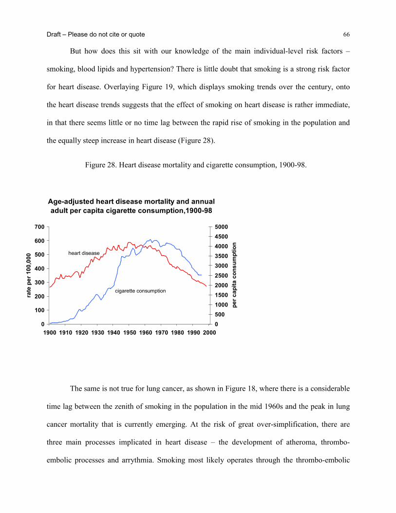
Draft – Please do not cite or quote 66
But how does this sit with our knowledge of the main individual-level risk factors –
smoking, blood lipids and hypertension? There is little doubt that smoking is a strong risk factor
for heart disease. Overlaying Figure 19, which displays smoking trends over the century, onto
the heart disease trends suggests that the effect of smoking on heart disease is rather immediate,
in that there seems little or no time lag between the rapid rise of smoking in the population and
the equally steep increase in heart disease (Figure 28).
Figure 28. Heart disease mortality and cigarette consumption, 1900-98.
The same is not true for lung cancer, as shown in Figure 18, where there is a considerable
time lag between the zenith of smoking in the population in the mid 1960s and the peak in lung
cancer mortality that is currently emerging. At the risk of great over-simplification, there are
three main processes implicated in heart disease – the development of atheroma, thrombo-
embolic processes and arrythmia. Smoking most likely operates through the thrombo-embolic
Age-adjusted heart disease mortality and annual adult per capita cigarette consumption,1900-98
0
100
200
300
400
500
600
700
1900 1910 1920 1930 1940 1950 1960 1970 1980 1990 2000
rate
per
100
,000
0500100015002000250030003500400045005000
per c
apita
con
sum
ptio
n
heart disease
cigarette consumption

Draft – Please do not cite or quote 67
and/or arrhythmic pathways, thus plausibly being able to almost simultaneously affect heart
disease given underlying susceptibility through the development of vulnerable atherosclerotic
plaque – itself associated with blood lipids and hemostatic function. If income inequality worked
through behavioral risk factors like smoking, and given that smoking maps almost directly onto
the heart disease trends, the data here suggests that there would have to also be a 30-35 year time
lag between exposure to income inequality and its effect on smoking. We are currently exploring
long-term trend data on other major heart disease risk factors.
Thus, it may be possible that long-term trends in income inequality play some role in the
rise and fall of heart disease, but it seems unlikely that it could plausibly work through the major
established risk factors like smoking. Proponents of the income inequality hypothesis have
suggested two pathways for income inequality to affect health – behavior and stress. We have
already shown that trends in income inequality do not map easily onto trends in smoking. That
leaves the stress pathway to be explored but it is difficult to see how this could be tested using
historical trend data. To the extent that suicide may be an extreme marker for social stress, it is
interesting to note that trends in suicide mortality shown in Figure 22 do not match the rise in
income inequality over the same time period, but then this also needs to be examined over much
longer time spans.
One final piece of evidence - some studies of income inequality have shown strong
effects on infant and child health, perhaps because the time lags between exposure and outcome
are likely to be relatively short. So is there any evidence that the long-term trends in income
inequality affect infant mortality trends? Figure 29 shows 100-year trends in infant mortality
from 1900-1960 in Panel and 1960-1998 in panel B – this was done to overcome the distorting
effect of such high rates up until the 1920s. There is no clear link between 100-year trends in

Draft – Please do not cite or quote 68
income inequality and the continuous decline in infant mortality in all race groups over the same
time period, so even for a cuase of death that may be plausibly linked to proposed income
inequality mechanisms and that does not involve long time lags, there appears to be little
association between long-term trends in infant mortality and income inequality.
Figure 29. Infant mortality, US, 1900-1998
Conclusion
So what can we say about links between income inequality and regional mortality?
• Figure 13 clearly shows that in the cross-section, income inequality is associated
with all-cause mortality in each region of the US, but that it is the weakest in the
South.
0
5000
10000
15000
20000
25000
30000
35000
40000
1900 1910 1920 1930 1940 1950
rate
per
100
,000 white
non-whiteblack
0
500
1000
1500
2000
2500
3000
3500
4000
4500
5000
1960 1970 1980 1990
Infant mortality by race, US 1900-98

Draft – Please do not cite or quote 69
• 30-year trends in different causes of mortality show reasonable stability over time,
whether the secular trend is increasing, decreasing or flat.
• There is considerable heterogeneity in the relative positions of regions in regard to
different causes of mortality.
• Given the long term trends in income inequality, there appears no direct way that
trends in regional income inequality could explain both the initial levels of these
regional mortality differences or their trends between 1968 and 1998. Any such
explanation would be further complicated by different time lags for different
outcomes.
• At the national level, 20th century trends in heart disease appear more compatible
with what is known about trends in the established risk factors for heart disease than
with trends in income inequality or with how income inequality trends could be
linked with trends in the major risk factors.
• At the national level, 20th century trends in infant mortality do not coincide with
income inequality trends.
The evidence that income inequality affects population and individual health in the US
seems robust in the cross-section but it appears difficult to reconcile either 30-year regional
differences in causes-specific mortality with regional patterns and trends in inequality, or with
100-year national trends in heart disease or infant mortality. While this does not preclude a role
for income inequality in affecting health, the evidence presented here suggests that such effects
certainly cannot be reduced to simple processes that operate in all contexts over time.

Draft – Please do not cite or quote 70
Reference List
1. Diez-Roux AV. Bringing context back into epidemiology: variables and fallacies in
multilevel analysis. American Journal of Public Health 1998; 88(2):216-22.
2. Pickett KE, Pearl M. Multilevel analyses of neighbourhood socioeconomic context and
health outcomes: a critical review. J Epidemiol Community Health 2001;
55(2):111-22.
3. Editor's choice [editorial]. BMJ 1996; 312(7037).
4. Kaplan GA, Pamuk E, Lynch JW, Cohen RD, Balfour J. Inequality in income and
mortality in the United States: analysis of mortality and potential pathways.
British Medical Journal 1996; 312:999-1003.
5. Lynch JW, Davey Smith G, Hillemeier M, Shaw M, Ragunathan T, Kaplan GA. Income
inequality, psychosocial environment and health: comparisons across wealthy
nations. Lancet 2001; 358:194-200.
6. Mackenbach J. Income inequality and population health. British Medical Journal 2002;
324:1-2.
7. Lynch J, Davey Smith G. Income inequality and health: The end of the story?
International Journal of Epidemiology (forthcoming).

Draft – Please do not cite or quote 71
8. Weich S, Lewis G, Jenkins SP. Income inequality and self rated health in britain. J
Epidemiol Community Health 2002; 56(6):436-41.
9. Lindert PH. Three centuries of inequality in Britain and America. In: Atkinson AB,
Bourguignon François, eds. Handbook of Income Distribution. Vol. 1.
Amsterdam: Elsevier, 2000: 167-216.
10. Easterly W. The middle class consensus and economic development. Journal of
Economic Growth 2001; 6(4):317-35.
11. Lynch JW, Kaplan GA. Socioeconomic position. In: Berkman LF, Kawachi I, eds. Social
Epidemiology. New York: Oxford University Press, 2000: 13-35.
12. Adler NE, Boyce T, Chesney MA et al. Socioeconomic status and health. The challenge
of the gradient. American Psychology 1994; 49(1):15-24.
13. Davey Smith G, Ben-Shlomo Y, Lynch JW. Lifecourse approaches to inequalities in
coronary heart disease risk. In: Stansfeld S, Marmot M, eds. Stress and Heart
Disease. London: British Medical Journal Books, 2001: 20-49.
14. Davey Smith G, Gunnell D, Ben-Shlomo Y. Life-course approaches to socio-economic
differentials in cause-specific adult mortality. In: Leon D, Walt G, eds. Poverty,
Inequality, and Health: An International Perspective. Oxford, United Kingdom:
Oxford University Press, 2001: 88-124.

Draft – Please do not cite or quote 72
15. Leon DA. Common threads. In: Leon DA, Walt G, Eds. Poverty, Inequality and Health.
Oxford: Oxford University Press, 2001: 58-87.
16. Blane D, Davey Smith G, Bartley M. Social selection: what does it contribute to social
class differences in health? Sociology Health Illness 1993; 15:1-15.
17. Sorlie PD, Backlund E, Keller JB. US mortality by economic, demographic, and social
characteristics: the National Longitudinal Mortality Study. Am J Public Health
1995; 85(7):949-56.
18. Backlund E, Sorlie PD, Johnson NJ. The shape of the relationship between income and
mortality in the United States. Evidence from the National Longitudinal Mortality
Study. Annals of Epidemiology 1996; 6(1):12-20.
19. Ecob R, Davey Smith G. Income and health: what is the nature of the relationship? Social
Science and Medicine 1999; 48(5):693-705.
20. Wolfson M, Rowe G, Gentleman JF, Tomiak M. Career earnings and death: a
longitudinal analysis of older Canadian men. Journal of Gerontology 1993;
48(4):S167-79.
21. Lynch J, Due P, Muntaner C, Smith GD. Social capital--is it a good investment strategy
for public health? Journal of Epidemiology and Community Health 2000;
54(6):404-8.
Draft – Please do not cite or quote 73
22. Lynch J, Due P, Muntaner C, Smith GD. Social capital--is it a good investment strategy
for public health? [see comments.]. Journal of Epidemiology & Community
Health 2000; 54(6):404-8.
23. Atkinson AB, Rainwater L, Smeeding TM. Income Distribution in OECD Countries:
Evidence from the Luxembourg Income Study. Paris: OECD, 1995.
24. Lindert PH. When did inequality rise in britain and america? Journal of Income
Distribution 2000; 9(1):11-25.
25. Preston SH. The changing relation between mortality and level of economic
development. Population Studies 1975; 29:231-48.
26. Rodgers GB. Income and inequality as determinants of mortality: An international cross-
section analysis. Population Studies 1979; 33:343-51.
27. Gravelle H. How much of the relation between population mortality and unequal
distribution of income is a statistical artefact? British Medical Journal 1998;
316(7128):382-5.
28. Wilkinson RG. Income distribution and life expectancy. British Medical Journal 1992;
304(6820):165-8.
29. Judge K. Income distribution and life expectancy: a critical appraisal. British Medical
Draft – Please do not cite or quote 74
Journal 1995; 311(7015):1282-5.
30. Kennedy BP, Kawachi I, Prothrow-Stith D. Income distribution and mortality: cross
sectional ecological study of the Robin Hood index in the United States. British
Medical Journal 1996; 312(7037):1004-7.
31. Kaplan GA. Where do shared pathways lead? Some reflections on a research agenda.
Psychosomatic Medicine 1995; 57(3):208-12.
32. Mellor JM, Milyo J. Reexamining the evidence of an ecological association between
income inequality and health. Journal of Health Politics, Policy & Law 2001;
26(3):487-522.
33. Deaton A, Lubotsky D. Mortality, inequality and race in american cities and states. Social
Science & Medicine In Press.
34. Kennedy BP, Kawachi I, Prothrow-Stith D. Income distribution and mortality: cross
sectional ecological study of the Robin Hood index in the United States
[published erratum appears in BMJ 1996 May 11;312(7040):1194]. BMJ 1996;
312(7037):1004-7.
35. Soobader M-J, LeClere FB. Aggregation and the measurement of income inequality:
effects on morbidity. Social Science and Medicine 1999; 48(6):733-44.

Draft – Please do not cite or quote 75
36. Lynch JW, Kaplan GA, Pamuk E et al. Income inequality and mortality in metropolitan
areas of the United States. American Journal of Public Health 1998; 88:1074-80.
37. Wilkinson RG. Unhealth Societies. The afflictions of inequality. London: Routledge,
1996.
38. Duleep HO. Mortality and income inequality among economically developed countries.
Social Security Bulletin 1995; 58:34-50.
39. Lynch JW, Kaplan GA. Understanding how inequality in the distribution of income
affects health. Journal of Health Psychology 1997; 2:297-314.
40. Wolfson M, Kaplan G, Lynch J, Ross N, Backlund E. Relation between income
inequality and mortality: empirical demonstration. British Medical Journal 1999;
319(7215):953-5.
41. Fiscella K, Franks P. Poverty or income inequality as predictor of mortality: longitudinal
cohort study. British Medical Journal 1997; 314(7096):1724-7.
42. Kennedy BP, Kawachi I, Glass R, Prothrow-Stith D. Income distribution, socioeconomic
status, and self rated health in the United States: multilevel analysis. British
Medical Journal 1998; 317(7163):917-21.
43. Daly MC, Duncan GJ, Kaplan GA, Lynch JW. Macro-to-micro links in the relation

Draft – Please do not cite or quote 76
between income inequality and mortality. Milbank Quarterly 1998; 76(3):315-39,
303-4.
44. Mellor JM, Milyo J. Income inequality and health status in the United States: Evidence
from the current population survey. Princeton, N.J.: Robert Wood Johnson Found,
1999.
45. Blakely TA, Lochner K, Kawachi I. Metropolitan area income inequality and self-rated
health--a multi-level study. Soc Sci Med 2002; 54(1):65-77.
46. LeClere FB, Soobader MJ. The effect of income inequality on the health of selected US
demographic groups. American Journal of Public Health 2000; 90(12):1892-7.
47. Subramanian SV, Kawachi I, Kennedy BP. Does the state you live in make a difference?
Multilevel analysis of self-rated health in the us. Social Science & Medicine
2001; 53(1):9-19.
48. Ross NA, Tremblay S, Berthelot J-M, Houle C, Dunn JR. Income inequality is not related
to health, disease or death in Manitoba: multilevel analysis. (submitted).
49. Wagstaff A, van Doorslaer E. Income inequality and health: what does the literature tell
us?. [Review] [34 refs]. Annual Review of Public Health 2000; 21:543-67.
50. Ross NA, Wolfson MC, Dunn JR, Berthelot J-M, Kaplan GA, Lynch JW. Income
Draft – Please do not cite or quote 77
inequality and mortality in Canada and the United States: a cross-sectional
assessment using Census data and vital statistics. British Medical Journal 2000;
320:1200-4.
51. Ross NA, Wolfson MC, Dunn JR, Berthelot J-M, Kaplan GA, Lynch JW. Relation
between income inequality and mortality in Canada and in the United States:
cross-sectional assessment using census data and vital statistics. British Medical
Journal 2000; 320:898-902.
52. Lynch JW, Davey Smith G, Kaplan GA, House J. Income inequality and mortality:
importance to health of individual income, psychosocial environment, or material
conditions. British Medical Journal 2000; 320:1200-4.
53. Kautto M, Uusitalo H, Fritzell J, Hvinden B, Kvist J Eds. Nordic Welfare States in the
European Context. London: Routledge, 2001.
54. Ross N, Wolfson M, Kaplan G, Dunn J, Lynch J, Sanmartin C. Income Inequality as a
Determinant of Health. Toronto: Canadian Institute for Advanced Research,
forthcoming.
55. Marmot MG. Improvement of social environment to improve health. Lancet 1998;
351(9095):57-60.
56. Wilkinson RG. The culture of inequality. In: Kawachi I, Kennedy BP, Wilkinson RG,
Draft – Please do not cite or quote 78
Eds. The Society and Population Health Reader-Income Inequality and Health.
New York: The New Press, 1999: 492-8.
57. Marmot M, Wilkinson RG. Psychosocial and material pathways in the relation between
income and health: a response to Lynch et al. BMJ 2001; 322(7296):1233-6.
58. Mackenbach JP, Kunst AE, Cavelaars AE, Groenhof F, Geurts JJ. Socioeconomic
inequalities in morbidity and mortality in western Europe. Lancet 1997;
349(9066):1655-9.
59. Kunst AE, Groenhof F, Mackenbach JP, EU Working Group on Socioeconomic
Inequalities in Health. Occupational class and cause specific mortality in middle
aged men in 11 European countries: comparison of population based studies.
British Medical Journal 1998; 316 :1636-42.
60. Leon D. Commentary: Unequal inequalities across Europe. British Medical Journal 1998;
316:1642.
61. Kawachi I, Kennedy BP, Lochner K, Prothrow-Stith D. Social capital, income inequality,
and mortality. American Journal of Public Health 1997; 87(9):1491-8.
62. Muntaner C. Teaching social inequalities in health: barriers and opportunities. Scand J
Public Health 1999; 27(3):161-5.

Draft – Please do not cite or quote 79
63. Cavelaars AE, Kunst AE, Geurts JJ et al. Educational differences in smoking:
international comparison. BMJ 2000; 320(7242):1102-7.
64. Kunitz S. Disease and Social Diversity. New York: Oxford University Press, 1994.
65. Lynch JW. Income inequality and health: expanding the debate. Social Science and
Medicine 2000; 51:1000-5.
66. Davey Smith G, Lynch JW. Socioeconomic differentials. In: Kuh D, Ben-Shlomo Y, Eds.
A Lifecourse Approach to Chronic Disease Epidemiology. Vol. 2. Oxford:
Oxford University Press, forthcoming.
67. Osler M, Prescott E, Gronbaek M, Christensen U, Due P, Engholm G. Income inequality,
individual income, and mortality in Danish adults: analysis of pooled data from
two cohort studies. [see comments.]. BMJ 2002; 324(7328):13-6.
68. Shibuya K, Hashimoto H, Yano E. Individual income, income distribution, and self-rated
health in Japan: cross sectional analysis of nationally representative sample.
British Medical Journal 2002; 324:16-9.
69. Bruno M, Ravallion M, Squire L. Equity and growth in developing countries: Old and
new perspectives on the policy issues. In: Tanzi V, Chu K-Y, eds. Income
Distribution and High-Quality Growth. Cambridge, MA: MIT Press, 1997: 117-
46.

Draft – Please do not cite or quote 80
70. Wilkinson RG. Mind the Gap. London: Weidenfeld & Nicolson, 2000.
71. Blakely TA, Kennedy BP, Glass R, Kawachi I. What is the lag time between income
inequality and health status? J Epidemiol Community Health 2000; 54(4):318-9.
72. Deaton A, Paxon C. Mortality, income, and income inequality over time in Britain and
the United States. Princeton, NJ: Center for Health and Well-Being, Princeton
University, 2001; Working paper.
73. Davey Smith G, Egger M. Commentary: understanding it all--health, meta-theories, and
mortality trends. BMJ 1996; 313(7072):1584-5.
74. Kuh D, Davey Smith G. When is mortality risk determined? Historical insights into a
current debate. Soc Hist Med 1993; 6(1):101-23.
75. Leon D, Davey Smith G. Infant mortality, stomach cancer, stroke, and coronary heart
disease: ecological analysis. British Medical Journal 2000; 320:1705-6.
76. Kermack WO, McKendrick AG, McKinlay PL. Death-rates in Great Britain and Sweden.
Some genral regularities and their signifcance. Lancet 1934; 31:698-703.
77. Susser M, Stein Z. Civilisation and peptic ulcer. Lancet 1962; 1(7221):115-9.
78. MacMahon B, Terry W. Application of cohort analysis to the study of time trends in
neoplastic disease. J Chron Dis 1958; 7:24-35.
Draft – Please do not cite or quote 81
79. Szreter S. The importance of social intervention in Britain's mortality decline c.1850-
1914. Social History of Medicine 1988; 1(1):1-39.
80. Szreter S. Rapid economic growth and 'the four ds' of disruption, deprivation, disease and
death: public health lessons from nineteenth-century britain for twenty-first-
century china? Tropical Medicine & International Health 1999; 4(2):146-52.
81. Szreter S. Economic growth, disruption, deprivation, disease, and death: on the
importance of the politics of public health for development. Population and
Development Review 1997; 23(4):693-728.
82. McKeown T, Record R. Reasons for the Decline of Mortality in England and Wales
during the Nineteenth Century. Population Studies 1962; 16(2):94-122.
83. Stallones RA. The rise and fall of ischemic heart disease. Scientific American 1980;
243(5):53-9.
84. Vartiainen E, Sarti C, Tuomilehto J, Kuulasmaa K. Do changes in cardiovascular risk
factors explain changes in mortality from stroke in finland? BMJ 1995;
310(6984):901-4.
85. Vartiainen E, Puska P, Pekkanen J, Toumilehto J, Jousilahti P. Changes in risk factors
explain changes in mortality from ischaemic heart disease in finland. BMJ 1994;
309(6946):23-7.

Draft – Please do not cite or quote 82
86. Lawlor DA, Ebrahim S, Smith GD. Sex matters: secular and geographical trends in sex
differences in coronary heart disease mortality. British Medical Journal 2001;
323(7312):541-5.
87. Magnus P, Beaglehole R, Rodgers A, Bennett S. The real contribution of the major risk
factors to the coronary epidemics - time to end the "only-50%" myth. Archives of
Internal Medicine 2001; 161(22):2657-60.
88. Susser M, Stein Z. Commentary: civilization and peptic ulcer 40 years on. International
Journal of Epidemiology 2002; 31(1):18-21.
89. Marshall B. Commentary: helicobacter as the 'environmental factor' in susser and stein's
cohort theory of peptic ulcer disease. International Journal of Epidemiology 2002;
31(1):21-2.
90. Sonnenberg A, Cucino C, Bauerfeind P. Commentary: the unresolved mystery of birth-
cohort phenomena in gastroenterology. International Journal of Epidemiology
2002; 31(1):23-6.
91. Langman M. Commentary: peptic ulcer, susser and stein and the cohort phenomenon.
International Journal of Epidemiology 2002; 31(1):27-8.
92. Levenstein S. Commentary: peptic ulcer and its discontents. International Journal of
Epidemiology 2002; 31(1):29-33.

Draft – Please do not cite or quote 83
93. Ben-Shlomo Y, Kuh D. A life course approach to chronic disease epidemiology:
conceptual models, empirical challenges and interdisciplinary perspectives. Int J
Epidemiol 2002; 31(2):285-93.
94. Bernstein J, Boushey H, McNichol EC, Zahradnik R. Pulling apart: a state-by-state
analysis of income trends. Washington, DC: Center on Budget and Policy
Priorities, 2002.
95. Yusuf S, Reddy S, Ounpuu S, Anand S. Global burden of cardiovascular diseases: part i:
general considerations, the epidemiologic transition, risk factors, and impact of
urbanization. Circulation 2001; 104(22):2746-53.
96. Yusuf S, Reddy S, Ounpuu S, Anand S. Global burden of cardiovascular diseases: part ii:
variations in cardiovascular disease by specific ethnic groups and geographic
regions and prevention strategies. Circulation 2001; 104(23):2855-64.
97. Kelleher CC, Harper S, Lynch JW. What goes up must come down? Evidence for the
contribution of migration, social deprivation and life-course processes to the rise
and fall of the coronary heart disease epidemic in the United States of America.
2002. Unpublished manuscript.