Embed Size (px)
Citation preview
^*i;;it;!(t:ir?ss-;;('i ^if^-^^MJ
j':'.;'ii'.
vfi-::
'"': ":-}r\ :--:'',;r"B''' ;i'


WITHPENAND'INKBY- JAMES HALL
/
THE ' PRi^G - COMPANYNE'W^ YOI^ ^ CHICAGO -BOSTON - ATJLAJSfTA -DALLAS

COPYRIGHT, 1913
BY JAMES HALL
THE'PLIMPTON'PRESSNORWOOD.MASS-U'S-A

PREFACE
SOME years ago the author brought out a httle book called "With
Brush and Pen," being "suggestions for some of the newer phases
of public school art instruction." It seemed to meet a need at
the time of its appearance and received more commendation
than had been expected. The book has been for years out of print,
but requests for it led to the consideration of bringing out a revised edi-
tion. It was then decided that a revision of the earlier production was
out of the question. Excellent advice upon all phases of elementary
work is now available, and the need for such a book as "With Brush
and Pen" no longer exists as it did when the book was written.
There seemed, however, a place for a treatise upon pen drawing which
should discuss the subject with sufficient definiteness and simplicity to
be of use to high school teachers of drawing as well as to art students.
Therefore the portion of the old volume dealing with pen drawing has
been rewritten. A very little of the original matter has been kept, two
or three of the illustrations and the semblance of the old name.
[3]

INTRODUCTION
THE aim of this book is to present a series of definite exercises
which are progressive in sequence and as a whole compre-
hend typical problems in the two kinds of pen drawing which
are here termed decorative and pictorial. The decorative
pen drawing is taken up first because it is by far the simpler
and more definite, and the practice which is here given lays a good foun-
dation for the freer representative work which follows. The two sec-
tions of the book may, however, be studied independently of each other.
In fact to a certain extent each problem is a complete exercise, and it
is not expected that many students will work out all the problems in
the order in which they are given. Such a plan it is believed would be
well worth while where time permits, but it will be evident to anyonewho looks through the following pages that they allow of selection. For
example, still life and flowers may be all that can be attempted in a short
pen and ink course. In such a case it would be easy to omit all else.
In any selected course, however, the first, third, and ninth problems
should be studied.
The book does not aim to treat of drawing or of composition except as
it is inevitable in a discussion of the handling of pen and ink. No trea-
tise upon a special medium, however, is possible that does not constantly
consider the universal principles of art, and so there are occasional appar-
ent digressions from the particular subject. To some it may seem that
the book should deal more fully with the questions of drawing, lettering,
and composition — which are referred to in the text. For such, a short
list of books upon drawing, composition, and design is given which maybe referred to in case of need.
The value of learning to draw with the pen is twofold. First, there is
the educational value of the medium. None, unless it be the etcher's
needle, is so purely a linear tool. Pencil, crayon, and charcoal partake of
the character of the brush. They allow of laying in a value light or dark.
[4]

But the pen is a means of drawing lines only, and is uncompromisingly
the tool for the sharp delineation of shapes. The grays must be obtained
by drawing lines at different distances apart, but the lines are always in
evidence. Therefore the study of pen drawing is essentially the study
of line, and in learning to draw with the pen one learns, as in no other
way, to appreciate precision of draughtsmanship and that beauty of line
which is so important a factor in the graphic arts.
The practical value of pen drawing lies principally in the fact that it
can be reproduced at a reasonable price by means of zinc etching or
photo-engraving. It is therefore the best medium to use in connection
with printing. A pen drawing, moreover, because it is linear, may be
made to harmonize with type better than a drawing in any other medium.
The making of pen drawings for reproduction and use with type has
come to be a common problem in schools where printing presses are
found, and the use for such pen drawings is manifold. There are, there-
fore, good reasons why pen and ink should be made a part of a high
school course. Its continued use in the field of commercial design and
illustration in these days of photography indicates the appeal which
linear art makes to the eye. The inherent charm of a pen and ink
drawing insures its lasting place in the fields of fine and applied art.
Materials
The materials for pen drawing are few and inexpensive.
The best surface is that of Bristol board of perfectly smooth texture.
It should be of a quality which will permit of scratching out with a very
sharp knife without causing the surface to become absorbent. Thestandard makers of Bristol board produce it in various weights. Three
or four sheet thickness is heavy enough for very satisfactory results. Athinner board will serve the purpose for practice work, and in fact a
smooth unruled writing paper presents a fair surface. The best results,
however, require a fairly heavy material with a smooth hard surface
which will remain perfectly flat.
Many pen draughtsmen rely upon three pens for all kinds of work:
Gillott's 303 and 404 and Esterbrook's Bank Pen No. 14. The drawings
in this book are all made with one of the first two and they are all that
the student will require, so no mention need be made of other excellent
finer and more elastic pens or of coarser ones for special work. The pro-
[5]
fessional may use them to advantage. The three pens named are all-
sufficient for the production of excellent work. No finer pen than 303
is necessary, and the Bank Pen is large enough for making an evenly
decorative fairly broad pen line.
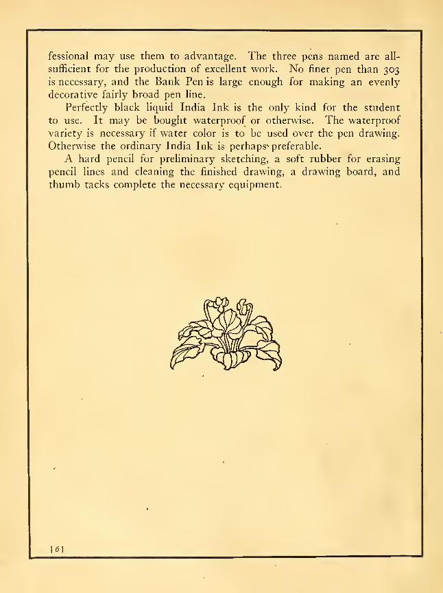
Perfectly black liquid India Ink is the only kind for the student
to use. It may be bought waterproof or otherwise. The waterproof
variety is necessary if water color is to be used over the pen drawing.
Otherwise the ordinary India Ink is perhaps* preferable.
A hard pencil for preliminary sketching, a soft rubber for erasing
pencil lines and cleaning the finished drawing, a drawing board, and
thumb tacks complete the necessary equipment.
6\
CONTENTSPAGE
i! Introduction 4
Matefjals 5
DECORATIVE PEN DRAWINGSFirst Problem
To draw in pure outline a typical leaf or other nature subject 13
Second ProblemTo utilize pure outline in decorative arrangements applied to initials, head
and foot pieces, and book plates 17
Third ProblemTo draw plant forms in outline and solid black 19
Fourth ProblemTo apply outline and black to decorative arrangements of the types consid-
ered in the second problem 23
Fifth ProblemTo apply outline and black to a simple architectural subject 25
Sixth ProblemTo apply outline and black to a figure subject with accessories .... 28
Seventh ProblemTo make a cover design in outline and black, using a decorative floral panel
with the necessary lettering 31
Eighth ProblemTo make a cover design in outline and black by surrounding the panel con-
taining the necessary lettering with a border varying in width to correspond
with the margins of the type page 33
Ninth ProblemTo draw flowers in outline, black, and middle value 37
Tenth ProblemTo render still life or still life with plant forms in several values .... 39
Eleventh ProblemTo render typical landscape subjects in several values 43
Twelfth ProblemTo render a figure subject in several values 45
[/-I
PICTORIAL PEN DRAWINGSGeneral Statement 50Thirteenth Problem
To render simple still life forms in light and shade 5.1
Fourteenth Problem
To render still life in a free manner 55Fifteenth Problem
To render plant life 57Sixteenth Problem
Simple outdoor subjects 61
Seventeenth ProblemThe rendering of trees in winter and in summer 63
Eighteenth ProblemThe drawing of buildings 67
Nineteenth ProblemThe sketching of figures 71
Twentieth ProblemStudies of heads 73
Twenty-First ProblemComplete figure sketches ; 76
-^^
LIST OF ILLUSTRATIONS
DECORATIVE PEN DRAWINGSPlate Page
1. Outlines of plant form 15
2. Initials, book plates, and panels in outline 16
3. Plant drawings in outline and black 21
4. Initials, book plates, and still life compositions in outline and black ... 22
5. Six renderings of an old house in outline and black 27
6. Four renderings of a figure composition in outline and black 29
7. Cover design embodying a floral panel in outline and black 308. Cover design embodying a floral border in outline and black 35
9. Flowers rendered in outline, black, and gray 36
10. Still life and plant form rendered in several values 41
11. Landscapes rendered in several values 4212. Figure compositions rendered in several values 47
PICTORIAL PEN DRAWINGS
13. Still life 53
14. Still life 56
15. Various plant forms .' 5916. Outdoor subjects 60
17. Trees 65
18. Buildings 69
19. A page of small figure sketches 70
20. Typical heads 75
21. A young woman . . . "Jl
22. An old lady 78
[ol

DECORATIVE PEN DRAWINGFIRST PROBLEM
To drazv in pure outline a typical leaf or other nature subject
THE first step in the making of a good pen outline is the makingof a thoroughly good pencil outline. This pencil drawing maybe made in light lines directly upon the Bristol board which
is to contain the final ink drawing, or it may be made on
separate paper and transferred to the Bristol board. Either
plan of procedure has its own difficulties. If the drawing is madedirectly on the Bristol board a moderately hard pencil should be used
with a very delicate touch, or cleanliness of workmanship cannot be
maintained. If the drawing is made on separate paper any amount of
erasure and correction may go on without regard to the appearance of
the paper but great care must be taken lest in transferring the drawing
its character be injured. If the pencil work is well done by either
method a clean, light, firm outline upon the Bristol board will be the
result.
With a Gillott's 404 pen, the inking may now begin. The width of
the line should be that produced naturally when the minimum of pres-
sure is used, and an even line throughout the drawing is to be held in
mind as the ideal toward which to strive. The line should be drawndeliberately and always with thought for the form that is being expressed.
Jf the pen line is merely a tracjng over the pencil line, the final drawing
will be weak and without meaning. While the pencil lines serve as a
guide, the aim should be to correct and refine the forms in the inking.
One is liable to draw the pen line on or within the pencil line with
the result that the spaces within the lines become contracted giving a
shrunken and insignificant character to the drawing. Thus fore-
warned the student should carefully watch the inside of the pen lines as
he proceeds remembering that the significance of the drawing lies in the
shapes which the lines define, rather than in the lines themselves.
[ 13 1
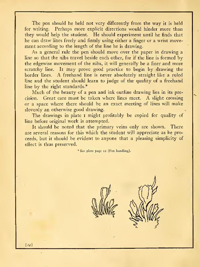
The pen should be held not very diflferently from the way it is held
for writing. Perhaps more explicit directions would hinder more than
they would help the student. He should experiment until he finds that
he can draw lines freely and firmly using either a finger or a wrist move-
ment according to the length of the line he is drawing.
As a general rule the pen should move over the paper in drawing a
line so that the nibs travel beside each other, for if the line is formed bythe edgewise movement of the nibs, it will generally be a finer and more
scratchy line. It may prove good practice to begin by drawing the
border lines. A freehand line is never absolutely straight like a ruled
line and the student should learn to judge of the quality of a freehand
line by the right standards.*
Much of the beauty of a pen and ink outline drawing lies in its pre-
cision. Great care must be taken where lines meet. A slight crossing
or a space where there should be an exact meeting of lines will makeslovenly an otherwise good drawing.
The drawings in plate i might profitably be copied for quality of
line before original work is attempted.
It should be noted that the primary veins only are shown. There
are several reasons for this which the student will appreciate as he pro-
ceeds, but it should be evident to anyone that a pleasing simplicity of
effect is thus preserved.
* See plate page 12 (Pen handling).
[14]
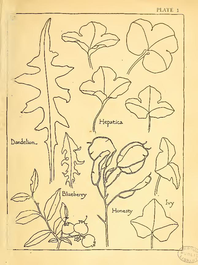
PLATE 1

PLATE 2
BEATRIX3ELL
Ihei^ook
EX L1BR13
HAROLD-HOLT

SECOND PROBLEM
To utilize pure outline in decorative arrangements applied to initials,
head and foot pieces, and book plates
THE illustrations in plate 2 are drawn with the same pen
and with the same considerations in mind as were those in
the previous plate, with the added aim of producing in each
drawing a complete decoration. Therefore there has been
in each case a careful consideration of the composition of lines
and spaces within the enclosing form. In each of the three initials it
should be noticed that a double square has first been drawn. In the
first initial the outer circle of the O is slightly greater in diameter than
the inner square, so that it breaks through the square at the centre of
each of its sides. This gives to the letter a fuller, more dignified appear-
ance than it would have if it were of exactly the diameter of the square,
and moreover a confusion of the lines of the circle and square is avoided.
When the inner elliptical line of the letter is drawn five background
spaces are formed. The twig of blueberry is so disposed that it is well
distributed and each of the five spaces is so cut that a pleasing variety
of sizes and shapes is the result of the division.
The background of the initial H has been broken first by an outline
of a dandelion, semi-formally placed. Then all the remaining spaces
have been filled by freely drawn parallel lines. This treatment really
produces the effect of a light gray surrounding the letter and, leaf and
forecasts another step in decorative pen work. A decorative conven-
tional treatment of the larger veins of the leaf is another point to be
noted in this drawing.
In the case of the letter G the distinctive method is the merging of
the letter with the marginal space.
After copying one of these initials the student should proceed to com-
pose other letters with any appropriate nature material, keeping to
exactly the same kind of treatment that he has used in the copy. Thejudicious selection and composition of plant form with the various
letters will give ample opportunity for the exercise of artistic judgment
and originality.*
* For forms of letters study plain Roman capitals. See alphabets Brown, Strange, Day, Johnston.
(Bibliography p. 79.)
[I7^

The book plate designs are intended to show how very simple mate-
rial can be used with free single line lettering so as to produce pleasant
ensembles. The first book plate might well serve as a type for a numberof experiments, any long stemmed leaf or flower being substituted for the
hepatica leaf here used. The flourish at the base of the stem gives a
finish and decorative character to the drawing which should not be over-
looked. Otherwise the subjects are but slightly modified from natural
forms, although in the blueberry drawing the arrangement of the leaves
has been somewhat formalized to produce the triangular massing which
the decoration possesses.
The two horizontal panels at the bottom of the page are typical of
book decorations which are suitable for use with a medium sized type.
An initial and a footpiece of the character of these shown in the plate
could be used agreeably in the same piece of printing. The width of a
pen line in a decoration to be used with a given kind of type depends
entirely upon the "weight" of the type. If the lines of the type letters
are heavy then a coarser pen should be used. If the type face is "light"
a finer pen should be employed.
\i8]
THIRD PROBLEM
To draw plant forms in outline and solid black
THESE drawings in method are like the outhnes of plate i
with certain parts filled in black to give a suggestion of color.
The filling in is done with the pen by a series of strokes madewith enough pressure to cause the ink to flow freely. Ofcourse some care must be exercised to control the flow of ink
and keep it within the areas to be filled. A brush may sometimes be
used in place of the pen for filling in the blacks, but it may be seen that
the pen strokes which still appear in the blacks of several of the drawings
give added character. Study of the difi^erent drawings will reveal several
methods of effectively translating the contrasts of nature into terms of
outline and black.
In number i the black is used to give color to stems and leaves and
also to the center of the flower. The midribs of the leaves, however,
remain light. It should be noted that slight spaces are left where stems
pass behind leaves, etc., in this drawing, as also in some of the others.
This method of separating forms is employed much by the Japanese in
their brush drawings and is a useful and effective device for avoiding con-
fusion of parts. It is, however, a device that should not be overdone, as
it may easily degenerate into a meaningless trick if resorted to when not
necessary to give clarity of expression.
In number 2 the blacks serve as a means of distinguishing the upper
from the under sides of the leaves. As it will be found that the upper
sides of leaves are usually darker than their under sides, the methodused in this drawing is of very general application in decorative pen workfrom plants. The careful drawing of the veins in the under sides of the
leaves gives reality to those parts.
The radiating lines representing the gills in the mushroom drawing,
besides y the structure, produce a decided gray. Hence draw-
ing nu ;s the effect of a three value drawing, although it does
not go ; limits of outline and black. Thus, as will be shown
later, t on of details may often serve as a means of introducing
desirab of value into a drawing.
[19]

In the snail drawing the black is introduced to give color to the back,
and the endings of the strong pen strokes that produce the black are so
managed that no abruptness is felt where black and white meet.
Number 5 shows a treatment well suited to flowers of the type of our
wild aster. The rays are made easily by one or two pen strokes of slight
pressure for each ray. The sparing introduction of black in stem and
smaller leaves serves the purpose of distributing the color satisfactorily
throughout the drawing. •
The iris shows a treatment of the flower which not only gives variety
of color, but by the direction and character of the strokes hints at the
modeling and textures of the parts. A few touches of dark are added
to the leaves to preserve the balance of the drawing.
After copying any one of these drawings, the student should at once
apply the method employed to original work from nature, selecting a sub-
ject suited to similar treatment. For example, a single rose would lend
itself to the treatment of number i, a dandelion or primrose to number 2,
and so on.
\20]

PLATE 3
FR^E^tLY 'COPIED - FRjOl^ -THE. • HOKU^AI - MANTGNX/A-
t^
.}.
v</B&;',
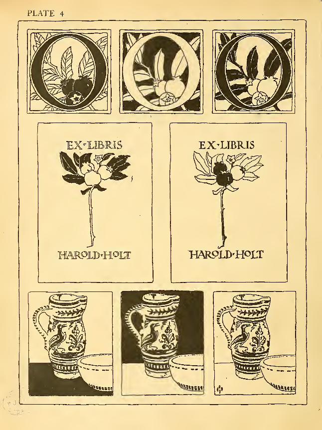
PLATE 4
J
W^
EX'LIBR.1S
W\RPLD'HOLT

FOURTH PROBLEM
To apply outline and black to decorative arrangements of the types
considered in the second problem
INmaking the three initials here shown the outhne composition of
the O given in plate 2 has been used without change. Here is illus- •
trated therefore how various distributions of dark can change the
effect of a subject. In the first initial of plate 4 the veined treat-
ment of the leaves is. an important factor in the result. Another
point to be noted is the outlining outside and inside the black letter,
giving a white boundary of separation between the letter and the back-
ground. In the third version of the O this white line becomes a very
important factor in the composition, since it prevents the confusion that
would result if the black leaves were placed against the black letter. In
the berries of the first initial the separating white lines and the small
high light left in the largest berry are details of treatment not to be
overlooked.
The middle initial shows perhaps the simplest treatment possible andthat most generally applicable to decorative pen work in two values.
Here the background alone is black, put in with a brush after everything
has been outlined with the pen. The pen outlines can be plainly seen
as the brush work here and there has not been carried fully up to the
pen lines. This free treatment therefore is one to be chosen since it
better preserves the pen character of the work than would a more precise
treatment where the pen lines were entirely lost. The same kind of
handling is evident in the leaves of the third initial, as well as in other
examples in this plate and further on in the book. After studying these
examples the student should experiment with his original initial compo-sition in various ways of distributing the blacks.
Perhaps the most important point to note in the two book plate designs
is the difference of treatment in the lettering. In the first instance, as
the dark portion of the blueberry composition seemed to predominate,
light. letters were used. In the second case the composition seemed too
light without the dark of the letters. Of course these two arrangements
of the black and oulline are not the only ones that would be satisfactory.
[23]
The student could, for example, try the effect of filled-in letters in the
first composition, and he might experiment in varying the second by filling
in all the berries, adding veins to the leaves similar to those in the first
initial and leaving the letters in outline. Then he should try all the
reasonable experiments he can think of in the distribution of dark and
light in the original book plate design which he has already made in
connection with the second problem.
The three treatments of the still life composition are identical except
for the introduction of a foreground in the first and of a background in
the .second. The rich all-over ornamentation of the pitcher has been
worked out with the pen so as to suggest considerable color, and the
simple border designs of the bowl help to give it roundness as well as
color, so that the third composition does not seem to lack color without
further addition of dark. Further experimentation might be tried with
this same subject. For example, both background and foreground could
be painted in black, or the bowl could be made dark with ornamentation
left white, etc. The student will find a rich field for experiment in out-
line and black in the realm of still life. It is advisable, however, to limit
the composition to two or three interesting and well related forms.
\24\

FIFTH PROBLEM
To apply outline and black to a simple architectural subject
INthis plate the same outUne drawing is shown with various treat-
ments. The first is pure outline, but it should be noted that the
tree masses are shown by broken lines. Certain minor details of
the old house are also represented by slightly broken lines, but a
contrast of line between house and foliage is needed to suggest the
fact that the house is rigid while the masses of the trees are made up
of moving leaves, which a firm unbroken line would fail to suggest.
The large leaves of the weeds in the foreground are appropriately detailed
in fairly complete outline.
Drawing number 2 typifies a way of introducing black which is often
satisfactory. The roof of a house often may be effectively represented
as the large dark of the picture. In the present instance the smaller roof
gives opportunity for an agreeable repetition of dark, while smaller blacks
are naturally distributed among the windows. A comparison of the
treatment of the windows in numbers 2, 3, and 6 will suggest ways of
getting legitimate variety, although it is well to keep a reasonable uni-
formity of treatment in a drawing, for it does not usually look well to
suggest curtains at different heights in windows on the same floor.
In drawing number 3, where the right hand tree mass is made the
largest dark, the balance is maintained at the left side of the picture bythe dark windows, dark weeds, and the small tree mass behind the house.
Number 4 exemplifies a more reserved use of black, the largest mass
used being in the foreground at the left, while still smaller spots are
distributed at the right for the preservation of balance.
In number 5 the suggestion of the courses of shingles by free lines
gives a gray value to the roofs. The addition of the blacks then produces
in reality a three value drawing, as the effect is that of black, half-tone,
and white. This is also true of number 6, where half-tone is produced
by the delineation of the shingle courses on the sides of the house. It
is instructive to notice the distinctive character of the effect produced
where dark is introduced as sparingly as in this last drawing. The very
slight hint of the individual shingles in number 5 and number 6 should
{^5]

be observed. Much more elaboration of such details would be liable to
result in unpleasant spottiness in drawings of such simple treatment as
these. In making a study of this series of drawings the student is
advised to consider each one carefully and critically with all the others
covered. He can then see each at its best and make up his mind as to the
merits of each treatment. After making copies of such treatments as
he prefers, the student should apply the knowledge thus gained to the
rendering of a sketch of his own. To translate a photograph of a simple
architectural subject into terms of pen outline and black is another good
way of putting the problem.
[-'<?]

SEVENTH PROBLEM
To make a cover design in outline and black, using a decorative floral
panel with the necessary lettering
INmany schools the designing of a program cover is a problem of
regular and not infrequent occurrence. This exercise therefore is
an excellent one for high school students. The best way to present
such a problem to a class is in the form of a competition. All
members of the class may be required to make the design, as a reg-
ular art lesson, the best design being afterwards chosen by a jury and
photo-engraved for final use upon the printing press. The choice of the
flower motive may be made by the teacher or by each pupil, according
to circumstances. Where possible it should be a flower having some
relation to the occasion. In the case of a design for use at the graduation
exercises the class flower would naturally be used, or if the class had
chosen no flower, one appropriate to the month or season would suggest
itself. If the program had to do with some personage closely associated
by birth or otherwise with one of the European countries where the
national flower is well known, the choice would be obvious. For example,
a Shakespearian program might appropriately bear an English rose panel,
or the Scotch thistle would naturally link itself with the name and writ-
ings of Sir Walter Scott. The choice of the fleur-de-lis for the cover
shown in plate 7 was based upon the seasonal idea.
The arrangement of lettering shown in plate 7 is a typical one that maybe followed in a majority of cases. The name of the school and the occa-
sion appear naturally at the top in the larger lettering, while the date at the
bottom makes a good subordinate and balancing mass. The relation that
the width of the flower panel bears to the lettering above and below should
be noted. While it is not necessary to keep the panel and lettering of the
same width, a definite relation between the two must be planned. Thediagrams of possible arrangements on p. 32 will be suggestive.
It should be noticed that in all three instances the width of the rec-
tangle which contains the floral decoration repeats the length of one or
more of the lines of lettering. This repetition of widths has a decidedly
steadying effect upon the composition as a whole. All the space rela-

finirimnn~fnnmnm
oioaiiiniiciMD[rmTTTrmnrnrri
niiiDiiininniirQilCTOLIDI
oiMimnmLDimiiirairnnnioiiiiin)
DiiEiiLninD
imnrnTrTTTOr'inniidrnrrmTiTTi
annniCDaxanTMsp
oiiEiiiixrrrrTrn
tions and the relative heights of the lettering in each of the two masses
are matters for careful consideration. They give opportunity for the
exercise of great nicety of judgment.
In working out an original composition for a cover design the best
way for the student to arrive at success is at first to follow the general
proportions of the design shown in plate 7. He may afterwards try the
effect of making the heights of the letters greater or less than those in
the plate, or of using solid letters in place of the outlines. It will be
noted that the flowers here have been given an effect of light gray through
the outlining of the veins, and a slightly darker gray has been given the
leaves in the same way. The two weights used in the outer border lines
are factors in the harmonious effect of the composition. If this design
were actually to be used on a program it would be improved by being
printed in some lighter value of ink rather than in black. For example,
a grayish purple, a graj^ green, a brown, or a gray might be used.
[32]

EIGHTH PROBLEM
To make a cover design in outline and black by surrounding the panel
containing the necessary lettering with a border varying in width to
correspond with the margins of the type page
THE problem involves a somewhat more difficult type of com-
position than that required by the last problem. The diffi-
culty lies in relating consistently the repeating motive to the
various widths of the border.
The basis for determining the four border widths should
be understood. In well printed books the margins are approximately
in the proportion indicated by the figures below, where an open book
is diagrammed. The margins may be wide or narrow, but they should
bear this relation to each other. All the rectangular masses of type or
"type pages" register; that is, are directly over each other in the closed
book. A well printed folder generally follows the same plan of margining,
so that the cover design for a folder may quite logically carry out the
plan of spacing which good printing requires.
z
11
5—^.^l »->—
_
3
~~-~- .
4-
The rectangle occupied by the lettering in the design (plate 8) shows
the size of the type page. What the margins of the printed page
would be are shown by the spaces between this inner rectangle and the
outermost line. The decoration therefore is an enrichment of what
corresponds to the margins of the type page which would follow.

It should be observed that the darks of the background are all small
in size and well distributed. No exact repetition of units occurs, but a
general plan of repetition and alternation has been adhered to. Not all
flowers will lend themselves to just the plan of arrangement which has
been followed in this case with the crocus, but students who have some
knowledge of design will discover several ways of satisfactorily distrib-
uting floral material in borders thus related to each other in width.
The beautiful borders designed by William Morris for his books of
the Kelmscott Press are fine examples for study in connection with this
problem. It should be remembered, however, that such designs are the
"last word" in a type of design of which plate 8 gives a very elementary
example.
[34]

PLATE 8
V

PLATE 9

NINTH PROBLEM
To draw flowers in outline, black, and middle value
THE new point in this problem is the frank introduction of a
middle value or "half-tone," by means of parallel lines which
do not represent details or texture. The reason for the gray
background in drawing number i lies in the desirability of
representing white flowers more convincingly and dark leaves
with less crudeness of effect than is possible without the middle value
behind.
It is obvious that in drawing number 2, where the white flowers are
seen partly against the white background, they have less of an effect
of whiteness. The use of a gray for the under side of the leaves intro-
duces the third value, which serves the purpose of giving the refinement
which a drawing in outline and black alone cannot possess.
It will be instructive at this time to refer to the previous plates for the
purpose of reconsidering the means by which the effect of another value
has often been obtained through the introduction of blacks broken bypattern or otherwise (plate 6), or by closely drawn lines which suggest
details (plates 5, 7, etc.).
Drawings 3, 4, and 5 of plate 9 do not differ essentially in method from
such foregoing examples, but they are introduced here to illustrate vari-
ous ways of interpreting the same floral subject in three or more values
with lines that are in themselves significant of venation and modeling.
Comparison of the three renderings of the tulip should suggest to the
student very definite methods of interpreting flowers. The tulip itself
presented certain facts of color contrast, as well as facts of form and of
detail. These facts have been variously stated in the different drawings.
In each, however, the inside of the flower is shown darker than its out-
side, and in each the same thing is true of the leaves. Probably draw-
ing number 3 suggests most nearly the actual color values of the flower.
Number 4 introduces a light gray beside middle value and black, and this
also is true of number 5.
The two distinct methods of introducing a gray which are illustrated
in this plate should be distinguished sharply from each other. Both are
[37]
legitimate in decorative pen work, but the method illustrated by the
last three drawings is to be preferred as a rule. It is a method by which
the different parts of a subject can be given individuality of texture and
modeling as well as of color. The method employed in the background
of number i is appropriate to a background because vertical lines thus
used remain "quiet." Oblique or curved lines would, on the contrary,
express motion and be out of place there. In drawing number 2 the
vertical lines on the leaves express value only. Here they might be so
drawn as to express also the modeling of the leaf, but there would be
danger of confusing the effect in a drawing with so many different irreg-
ularly shaped parts. The use of the vertical lines tends to simplify the
composition; moreover, the flowers are of sufficient interest to make it
advisable to treat the leaves as subordinate to them.
[38]
TENTH PROBLEM
To render still life or still life with plant forms in several values
NO new principles are introduced in this problem, although
the results shown in plate lo are quite different from anyin the preceding drawings.
It will be seen that drawings numbered i and 2 are the
same except for the backgrounds, the treatment of the
little jar, and a slightly different rendering of the back of the upper
book.
The careful drawing of the painted ornament of the teapot serves to
give it color and roundness. A point to be observed is the use of the
dotted lines in the top, where a full line would have been confusing, and
again to indicate the line of juncture of spout and body, where a full line
would have produced too distinct a separation of the parts.
The upper book had a black leather back with lines and lettering of
gilt. The rendering of this in drawing number i, where the pen lines
show, hints at the light and shade, while in number 2 the black is put in
solidly. The edge where the black was worn off is shown in each case by
a not too regular line of white. The student should note carefully the
way the mottled paper is treated to suggest the various sized roundish
spots in perspective.
In the lower book the rendering aims to suggest the value and texture
of the silk brocade with which the book was covered. The labels were
of dark leather bearing lettering of gold, the effect of which has been
rendered without any attempt to draw individual letters.
The principal differences between the two treatments' of the little
jar is of course the difference of direction of the lines in the lower por-
tion of the body. There is, however, a difference in value in the two
renderings of the upper glaze. The reason for the lighter value in draw-
ing number 2 is that a greater difference might be shown between the
jar top and the black background for the sake of variety in the picture.
In both drawings a slight suggestion of shadow has been given to the jar
by pulling the parallel lines into a nearly solid black where the surface
would be turned away from the light.
[39]

In drawing number 3 the basket work, being quite literally repre-
sented, gives the effect of a light gray value. The dark glass behind is
rendered in vertical lines made with enough pressure to unite them in
nearly a solid black. The careful drawing of the high light at the top
of the jug and the leaving of the slight reflections below serve to declare
the material. The interpretation of the grass heads to suggest texture and
roundness, while keeping the value light, is a point to be studied carefully.
A similar treatment is not infrequently called for in nature subjects.
The gray value for the horizontal surface on which the vase stands in
drawing number 4 is one point of difference between this drawing and any
other that has been studied thus far. It may be said in passing that,
generally speaking, the student will find it harder to introduce foreground
grays than gray backgrounds. It may be well to plan to cover horizontal
surfaces with a gray only when such surfaces are comparatively small
in area. The rendering of the vase aims to take advantage of its peculiar
markings and texture in giving variety of value and a hint of modeling.
The use of the dot should be noted, but it should generally be sparingly
used. The iris is rendered by the same principles as those used in the
tulip drawings, plate 9. Drawing number 4 presents no new technical
considerations, but is given as an example of another application of
methods already discussed.
[40]

ELEVENTH PROBLEM
To render typical landscape subjects in several values
INtranslating a group of trees into decorative pen rendering, it
becomes necessary to find several contrasting conventions which
suggest the characteristics of different types of trees. The first
drawing in plate ii is presented as one solution of this frequently
met problem. Treating the pine in silhouette gives a leading dark
to the composition and also satisfactorily suggests the color and mass
of the tree. Behind are drawn the birches radially related in their mainlines of growth, and so treated as to give a light and leafy gray. While
the shapes which compose this gray are not literally those of the birch leaf,
nor are the sizes of the leaves right, yet in a generalized way the char-
acter of the tree is fairly satisfactorily shown. The essential points to be
brought out in such treatment are the characteristic growth of the masses,
a value suggestive of the facts of color, and a texture suggestive of the
shapes and growth of the leafage.
The blossoming bush in the foreground introduces a value lighter
than that of the birches, a suggestion of many radial flower forms, and a
spreading mass which contrasts effectively with the other tree shapes of
the picture. Below the bush is placed a gray of about the value of the
birches in the background, but made up of leaf-like shapes differently
placed. This gray is not intended to denote any particular type of
growth, but rather to serve as a contrasting note of color for the bush,
just as in nature the undergrowth seldom declares itself definitely, whenone is looking at a group of trees.
In this drawing, as in parts of all of the others on the page, the white
paper is allowed to stand for the ground. In this way is avoided an
unpleasant complexity and lack of clearness which is almost inevitable
when many closely related values are placed against each other. Thetrees are the subject. Other things are omitted so that the trees maydominate.
The second subject might be named "The Village." Hence the houses
receive full attention, while several of the surrounding trees are merely
defined ^in contour by dotted lines. Enough are fully drawn to give
[43]
reality to the scene and to contribute contrasting shapes and values to
the picture. Three distinct types of trees are in evidence: the tall dark
trees at the left, which may pass for poplars; the ovoidal gray tree at the
right, and the apple tree in the foreground. The leafy suggestions at
the right and left of the apple tree are intentionally less defined in shape
and character. They serve as means of rounding out the composition.
In this picture at least five distinct values are used besides black and
white.
The central landscape is unique among the examples thus far pre-
sented in that it introduces no blacks. This at once places the picture
in a light key and gives it a spring-like appearance, which was the inten-
tion. The treatment of the sky is to be noted, the gray representing the
blue while the white stands for cloud masses. The distant tree masses
have been kept quiet by the use of nearly vertical lines. The almost
patterned treatment of the newly planted fields introduces a bit of tech-
nical, variety which contributes much to the interest of the drawing.
The size of the foreground tree gives opportunity for a rather literal out-
line rendering of the leaves and branches, and a few detailed foreground
leaves and field daisies do much to give perspective to the drawing.
The winter landscape at the bottom of the page depends for its snowyeffect upon the gray sky, the dark masses of evergreens, and the leafless
trees.
Instead of copying the landscapes in toto, the student who prefers to
do so may in each case select a portion of the picture, thereby making
a set of new compositions. This exercise should then be followed by
eff^orts at making similar compositions from new material. This mate-
rial may be photographs from nature or the student's own sketches.
In any case he should select, eliminate, and rearrange the forms for the
sake of good composition.
[44]

TWELFTH PROBLEM
To render a figure subject in several values
AFIGURE with its background, whether indoors or out-of-
doors, gives the widest opportunity for various effective forms
of decorative pen work. In the first place the costume of
the figure may be given any one of an infinite variety of pat-
terns; then the details of the costume — trimming, jewelry,
millinery, hair-dressing, etc.— all offer many possibilities of treatment.
When a landscape background is added the possibilities are doubled.
The free natural pattern of leafage and cloud forms and the embroidery-
like design of field or flower bed may be translated into numberless forms
of pen play.
The dual treatment of the lady of olden days suggests what may be
done in the way of transforming a composition by slightly changing the
costume treatment and by the use of different surroundings.
The student may profitably take each of these compositions as a basis
for experimentation in varying the effect by change of patterns and of
values. For example, the wall could be made black, broken by pattern,
and the floor could be white or broken by the lines of boards or tiles, or bya patterned rug. The figures of the gown could be made different, larger
or closer in distribution. Finally the foliage mass without could be madeup of larger or smaller leaves, thus producing a lighter or a darker value,
and the sky could be made without clouds or with differently formed
clouds. Having once started to experiment in such variations, the stu-
dent will begin to realize that he has one key to the world of artistic
invention, for new creations in the last analysis are often found to be
skillful rearrangements or new combinations of materials that have
been used many times before. The student should realize, however, that
exercises in rearrangement such as are here advocated are. but a means of
learning. Before one has a right to consider his drawing original he must
be able to work out his own compositions. While such compositions will
show the influence of definite study of others' work, they should in no
sense be conscious adaptations or imitations of another's productions. Thestudent who works from nature, and from imagination and memory at
[ 45 ]

the same time that he is studying the language of art as used in the works
of artists, need not fear any danger of becoming an imitator in any wrong
way; for he will learn the language of art for the purpose of expressing
his own ideas of form, and the language will become his own to the same
extent that a spoken language becomes one's own through its natural use.
The second composition worked out with a variation of values simply
adds another example to the one already discussed.
y
,{46]

PLATE 12

PICTORIAL PEN DRAWING

GENERAL STATEMENT
INDecorative Pen Drawing which has thus far occupied our atten-
tion, the third dimension, that of thickness, has been disregarded, at
least so far as it brings in the problem of light and shade. Outline,
which is a conventional means of expressing the limits of form,
has been the basis of all the work. The values were introduced
to express contrasts of color. The one aim was simply beauty of arrange-
ment— decoration— even though we employed a variety of subjects as
motives.
The aim now is more inclusive, for we shall still aim for beauty of
arrangement of line and value, although the arrangements are primarily
pictorial in character. We have, however, opened our eyes to the greater
variety of values produced upon objects and surfaces by the play of light
and shade, the representation of which is considered in the following
problems.
The training of the more formal decorative pen drawing should have
taught the student something of discrimination as to quality of line. In
the freer and more sketchy use of the pen which the following problems
involve, the handling, while more cursive, shows none the less regard for
the quality of each touch. A successful series of rapid strokes, the "care-
fully careless" pen work, is far more difficult than the more formal kind
where all the lines are drawn deliberately. So let the student be on
his guard. Let him realize fully what he is aiming for before he begins,
and let him be prepared to try again and again and yet again before he
can hope to arrive at a good style in "free" pen work. True freedom can
result only from surety or knowledge.
A good pencil drawingwas stated to be the basis for a good pen drawing
at the beginning of the problems in decorative pen work. In pen draw-
ing with light and shade a correct pencil foundation is just as important,
and the more free and sketchy the final ink treatment is to be, the more
sure should be the pencil outlines of both objects and shadows.
[JO]
PICTORIAL PEN DRAWINGTHIRTEENTH PROBLEM
To render simple still life forms in light and shade
THE first drawing of the cardboard box with its cover gives an
example of a semi-formal treatment. Rather slowly drawnparallel lines are used in producing both shades and shadows.
Color values are not found in this drawing, the different
degrees of darkness being representative of light and shade
alone. Cast shadows are darker than surfaces in shade, and someslight gradations are to be noted. Touching in the ink outline is the last
step in making the drawing. It is put in with a slightly broken line and
omitted where the masses of shade or shadow suffice to define the forms.
This omission of outlines is a distinct departure from the practice in the
work heretofore. The student should see that it helps to give an effect
of reality, of light flowing over the objects, and that it is a treatment
in harmony with our present aim of representing the impression of light
and shade.
The second drawing of the same subject differs from the first only
slightly, but is a trifle less obvious in its method. While the lines on
the sides of the cover in the first drawing are straight, of equal length,
and follow the surface, in the second drawing they are more informal,
curve slightly, and for a little distance two short series of strokes are used
instead of one series of the full length. This breaking of the values into
several series of short strokes of not too even length is pursued through-
out this drawing and marks the distinct difference in handling between
this drawing and the first. Learning to produce a practically even value
by means of freely drawn short lines, their ends meeting but not over-
lapping, is a necessary technical achievement to acquire at this stage of
practice.
The old jug so placed that it requires but little shade is rendered by
a handhng conforming to its curved surface. The slight curving of the
\5r\
lines which make up the shade is important, not only because it helps to
suggest the desired roundness and character of surface, but also because
it introduces another element of contrast between the treatment of the
jug and the treatment of the shadow. Hence the lines of the shadow
on the floor while harmonizing in general direction with those upon the
adjacent part of the jug, contrast with them in length, thickness, quality
(the result of a slower stroke), and straightness as opposed to curvature. If
we now analyze the shadow of the handle upon the jug we shall find that
while its lines are naturally slightly curved and finer than those of the
shadow on the floor, their quality is similar. Thus by repeating not
only the value, but the quality of line in opposite parts of the drawing,
a unity of effect is obtained. Both shadows have enough in common,but the shadow upon the curved surface quite logically is made up of
curved lines. The passage from this last shadow to the shade of the
handle should be carefully noted. To appreciate more fully the fore-
going reasons for deciding upon the handling employed in this simple
object, the student should take a similar object and make experiments in
translating it into a satisfactory pen drawing made up of shade and
shadow. He will then see the difficulties that lie in the way of arriving
at a simple treatment. Most people find the simple way of doing things
only after trying many indirect ways. To shorten the search where
possible is the part of good instruction; still each student must redis-
cover his methods and their reasons if they are to have meaning and
vitality.
A single book, preferably an old one, presents a perfect subject for
the pen. The drawing given should serve as a type for several studies
of single books varying in shape, in details, and in the position chosen
for representation. The points of handling to be learned from the ex-
ample given should be easily seen by the student who has followed the
comments upon the three preceding drawings. Note carefully the im-
portance of the contrast of direction of lines used in expressing the leaves
and the edge of the cover upon the shade side. Note also how the sug-
gestions of the ridges upon the back of the binding are but partly defined,
and finally note how slight a factor in the drawing are the outlines. It is
a drawing of shapes of shades and shadows.
The group of three books, apparently carelessly tossed together, was
in reality most carefully selected and placed. The selection was madeto include variety of size, proportion, character of binding, and color.
[ 52 1

PLy\'rK 13
.,<#^ #fiif^^^
It
The placing was the result of experiments, the aim being a pleasing dis-
tribution of values, including the consideration of the shades and shadows.
In this drawing, therefore, we concern ourselves with the interpretation
of both color values and the values resulting from shadows. The tech-
nique throughout is freer, a trifle more sketchy than in any of the
preceding subjects. The graduated delicate gray of the top book, with
its bent paper cover, is a gray produced by rapidly drawn lines. Thelines making up the cast shadows of the lower book are not dis-
similar in character, though they are cross-hatched at a slight angle.
A slight amount of cross-hatching also occurs in the top of the dark
book and again in the shadow upon the lower book. While the beginner
in pen work is advised to avoid the crossing of lines as a means of darken-
ing his values, the occasional appropriate use of cross-hatching to give
definitely contrasting effects is a desirable technical device.
In the last drawing of the plate the basket and glazed jar are placed
together as a study of contrasting textures. It should be noted that the
details of the weave are most in evidence in the part of the basket where
a transition is made from the light side to the shade side.
The rather long, fine, crossed lines used in the jar in connection with
its high lights serve to make up the suggestion of the somewhat uneven
green glazed surface which the object itself presented.
The six drawings given in plate 13 may well serve as types of such still
life as the student should practice. Similar but different subjects are
within the easy reach of anyone. Some subjects suggested are strawberry
baskets, various boxes which contain cereals and other groceries; quaint
jugs, jars, pitchers, bottles, demijohns, flower pots, and simple kitchen
dishes; basket forms of all kinds; simple pottery; quaint old books, and
magazines.
[54]

FOURTEENTH PROBLEM
To render still life in a free manner *
THE lower study of plate 14, being the simpler and bolder, is
recommended for study first. In subject not very different
from the book group of the previous plate, its treatment
is much more flowing. The sketchy handling is in keeping
with the somewhat dilapidated condition of the old books.
The lines conform in general direction with the surfaces of the leather
covered book, and the values and drawing of significant details have
been carefully kept. Various touches which may seem to the student
almost irresponsible will be found to have definite meaning. It would
be well before copying this drawing to hold it at arm's length and
study it with partly closed eyes to grasp thoroughly its general effect so
far as values are concerned. Then an examination of the various parts
under a magnifying glass would reveal the component lines. Experi-
ment and practice alone can give the ability to handle the pen so as to
produce such a drawing. No attempt should be made of course to imi-
tate the exact handling. Rather the effort should be to make a drawing
correct in values and in its suggestion of characteristics with a handling
of similar effect.
In the jar of brushes, ink bottle, etc., the effort has been to tran-
scribe the values of the various objects rather literally with pen lines so
used as to appear unstudied in handling. Considerable careful analysis
on the part of the student will be required if he is to grasp the spirit of
the pen work. Perhaps the only actual technical departure in the twodrawings of this plate from what has preceded is the venturing upon cross-
hatching at practically right angles. As a rule this is difficult to managesuccessfully, though knowingly used it may give a good result.
* If the student desires to do so he may omit this problem and proceed at once to the fifteenth.
[55]
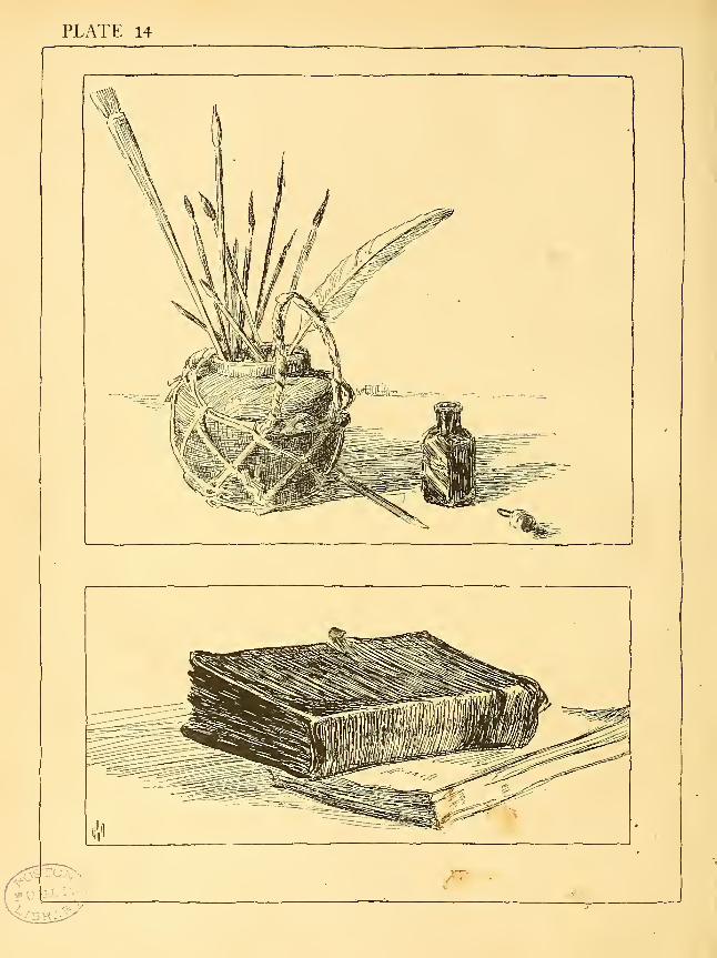
PLATE 14
FIFTEENTH PROBLEM
To render plant life pictorially
DRAWINGS I, 2, and 3 depend for their effect almost as muchupon the nice dehneation of the boundaries of the shadows
as upon the drawing of the contours of the forms, or the
pen technique employed. In the first subject the grada-
tion of the shadows is an important point to be noted. Agradually increasing pressure has been brought to bear upon the pen in
each down stroke which makes up the shadow. A study of these lines
through a reading glass will show clearly the method that has been used.
The exact placing of the details in the half light and their gradual diminu-
tion in strength and disappearance as they pass into the full light are
other factors that make up the interest of the interpretation of this sub-
ject in sunlight and shadow. Only a hint is given of the leaf of the plant.
It serves as a third spot in the composition, but is purposely neglected
in details in order to emphasize the heads with their orderly arrangement
of details.
Two poppy pods, drawings 2 and 3, are given so that different ways of
handling a similar subject may be studied. In number 2 the lines which
make up the values are all deliberately drawn, but with various degrees
of pressure. The result is direct, but more formal than number 3, where
more and finer lines are used. In this latter example one is impressed
more with value and less with the lines themselves, and the result as a
whole is the more refined and truthful on this account.
In number 4 the nasturtium leaf is introduced as a background for
the flower. The cross-hatching therefore serves as a foil for the simpler
and more descriptive handling of the flower, which is the real subject.
As an interpretation of the leaf alone such technical means as are used
would be very unsatisfactory, but as the flower is completely rendered to
express form, texture, color, and light and shade, it is quite proper to
subordinate the leaf, which otherwise might usurp undue attention.
In drawing number 5 is found an example of a subject which lends
itself admirably to exceedingly simple pen interpretation. Indeed the
drawing is scarcely more than an accented outline, though the treatment
I57]
of the spherical blossoms does introduce a hint of shade, and for the sake
of harmony shade is also barely suggested in two or three places on
the grass blades. Much of the effectiveness of this drawing lies in the
variety of weight of the strokes which form the spiny spheres.
Drawings numbers 6 and 8 need little comment. They are simply
free outlines with gray or black added to give contrast enough to sepa-
rate or explain the forms.
In number 7 is shown a rendering of the fleur-de-lis in which the aim
was to express form, color, textures, and light and shade, with consider-
able attention given to the various details of the flower. While all the
lines used are comparatively fine, careful inspection of the drawing will
reveal the fact that there is a good deal of difference among them. Com-parison of the dark parts of this drawing with the darks of the nasturtium
above will show that while the latter are produced with a few wide touches
the darks of the fleur-de-lis are composed of finer lines closely knitted
together. The result is more expressive of the rich velvety texture of
the flower than any that coarse lines could produce. A drawing like
this is more the result of feeling than of detailed reasoning, although it
ought to be easy to justify by reason any point of the treatment if it is
right. If the student copies this drawing or the others, he should be
perfectly clear as to the meaning of all the lines used, the reason for their
directions, weight, lengths, and qualities. If he fully appreciates the
reasons, he should gradually work toward the degree of mastery where
his pen will move almost instinctively and more and more express the
sympathy and understanding which he should feel for the subject he is
drawing. For no drawing can have freedom, charm, or style if it is the
product of the reason alone.
iss]

PLATE 15
PUBLIC

PLATE 16

SIXTEENTH PROBLEM
Simple outdoor subjects
AS an introduction to outdoor sketching, subjects involving
neither trees nor buildings are presented for study in plate
1 6. The chief difficulty in all out-of-door work lies in the
necessity of limiting one's efforts to a very small bit of the
scene that nature spreads before us. The temptation always
is to attempt too much, and the problem lies not only in the selection of a
small portion of the scene suitable for a sketch, but also in reducing that
portion ta very simple terms. While the pen lends itself to the close
delineation of details, only significant details should be delineated.
The first subject, which might be named "On the Beach," has been
selected and treated so as to exemplify clearly certain essentials of effective
pictorial composition. Looking first at the values, we see that the sandy
beach gives a large central light area leading up to the distant line of sea,,
which contributes a contrasting dark mass which is graded from black to
a dark gray. Sky, grass, and shadows serve to introduce the half-tones
which are needed to bring the whole into restful relation.
The upturned boat with its shadow gives a leading form of interest
near the center of the picture; the poles with their lines are subordinate
but related objects of interest, contrasting in their attenuated character
with the low mass of the boat. The distant land and birds serve as added
though minor interests to give balance to the right half of the picture.
Examining the pen work, we find that the more exact and formal
treatment has been allotted to the' boat, as befits a constructed form as
contrasted with the freer forms of nature. The most flowing lines are
appropriately found in the sky, while the direction of the sky lines not
only gives movement, but offsets the direction of the ropes, the shadows
on the beach, and the slanting line of the beach itself. It will be noticed
how well the treatment of the beach grass (not too fully detailed), with
its short, crisp strokes, contrasts with the horizontal lines of the water,
and again with the free, light, generally horizontal lines of the shore at
the right. The slight suggestion of a few stones breaks the monotony
and leads the eye pleasantly into the picture. While this is but a partiaT"
[6i]

statement of the reasoning that had gone into the sketch, it should prove
sufficient. The thoughtful student in copying should be able to criticise
his own effort and to carry some of the lesson over into original work.
The very free but simple treatment of the second subject, that of the
whistling buoy, now needs few comments. The only new type of handling
occurs in the broken reflection expressing the movement of the sea. Theeffectiveness of this simple sketch lies partly in the fact that its one
leading dark is also the leading interest of the composition, the distant
ship and the wheeling gulls giving the subordinate notes of interest. Thepurely artistic interest of the whole subject— its arrangement of line and
value — is perhaps seconded by a certain sentimental interest. Thelonely moan of these ominous ocean guards must have impressed all whohave heard them. Even in fair weather as they rock restlessly they carry
to the mind the sinister suggestion of storm and the dangers of the sea.
[62]

SEVENTEENTH PROBLEM
The rendering of trees in winter and in summer
THE first subject, the white birches, is kept light throughout
to give to the drawing an impression of delicacy in keeping
with the character of these graceful trees. The darks used
to express the shadows in the foreground, the spots on the
trunks, and the pines in the distance are so small in area that
they only serve to accentuate the light quality of the picture as a whole.
Things especially to be noted are the almost total omission of outlines,
the expression of the trunks by the short parallel lines that carry to the
mind the suggestion of the smooth wrapping white bark, and the broken
and almost dotted lines used in the smaller branches and in the trees of
the middle distance. The use of vertical lines in the distance gives a
needed contrast of direction with the horizontality of the mass, and the
broken and not too even character of these lines produces slight varia-
tions of value which are in keeping with the mystery of a mass of distant
forest. The way that the distance and the foreground have been tied
together and yet kept distinct is a point for the student to appreciate,
as is also the simple means used to indicate modeling in the foreground
and in the middle distance.
Contrasted with the birches, the character of the trees in the right
hand picture at the top is indeed marked. Careful comparison of the two
drawings will reveal the fact that the actual differences in handling are
not great, but the great points of dissimilarity are in the actual shapes
of the trees and their manner of branching, and in the value relations.
The effect of a rather rough dark bark is given in number 2 as contrasted
with a smooth light bark in the birches. It is interesting to note that
the secondary object of interest of this picture, the group of distant houses,
is light in contrast with the dark trees, the real subject of the picture.
The secondary spot of interest in the picture of the birches is the dark
spot of the distant pines, making a contrast in value with the light birches.
While no rule can be made in regard to such a matter, it is nevertheless
an element in the effect produced. The treatment of these two drawings
of bare trees and distance is about as simple as it could be, and may serve
[63]
as a type for kindred subjects which the student should, without great
difficulty, compose, for himself.
The purpose of the two foliage studies in the center and right of the
plate is to illustrate two distinct ways of translating a tree in sunlight
into pen and ink. In the first instance the color of the tree in light is
represented by a medium gray, while the shadow masses are shown in
dark approaching black. In the second instance, the color of the tree
in light is translated white, the contours of the tree being warily out-
lined. The shade masses are then shown gray, which places the whole
picture in a high key. The small note of black in the shadows on the
ground only serves to heighten the effect of lightness, as was true in the
case of the composition of the birches. Whether one chooses to key a
landscape to the pitch of number 3 or to that of number 4, pen drawing
by its limitations makes it advisable generally to eliminate from a pic-
ture the representation of the variations of value of ground and sky.
While it is possible for a skillful draughtsman to include these values,
there is generally a question as to whether he thereby improves his pic-
ture; and a beginner courts failure if he refuses to simplify his task bysuch frank omissions as are here exemplified. Drawing foliage is one of
the most difficult problems of pen drawing. To suggest leafiness witliout
drawing the leaves, to get the effect of modeling and form, and at the same
time to avoid all rigidity of outline, to do all this in a free and unaffecteci
way requires full appreciation of the ideal sought and much practice.
The student will do well to practice small bits of numbers 3 and 4 over
and over, until he gets the right swing of the pen. Let him study, most
carefully, the treatment of all the edges of the masses of light and of shade,
and above all let him preserve exact drawing in shapes of shade masses
and in the spots of light seen through the tree. In number 5 is presented
foliage of contrasting types. The treatment is somewhat freer than in
the two previous drawings, and suggests trees of smaller size seen nearer,
so that the leaves are more in evidence. Different color values are' sug-
gested in the different trees as well as different types of growth and of
foliage. Many of the things which have been said in connection with
the previous subjects apply equally well to this. There are also several
bits of handling that are different from anything heretofore given, which
the student should be keen to notice and appreciate the reasons for.
The picture of the haystacks may perhaps seem a little aside from the
main problem of this plate. It does, however, involve the drawing of a
[64]

TWENTIETH PROBLEM
Studies of heads
THE original drawings of plate 20 were slightly larger than they
appear in the reproductions, but the pen manipulation never-
theless is clearly evident. It is unnecessary to enter into
an analysis of the method after what has been said in con-
nection with the last problem. All that will be attempted
therefore is to call the attention of the student to certain things which
were borne in mind in making the studies. In the first the very loose
treatment of the hair should be noted, which gives it the fluffy effect char-
acteristic of the subject and the style in which the hair is worn. Comparethis treatment with that used in the old man's hair, and again with that
of his moustache and of his beard. Shapes of shadows and values are
important, but there is also a difference in the lines themselves. In a
sense, each line is typical of the kind of hair, whether coarse and loose,
fine and close, long or short, straight, curved, or wavy.
The shadow upon the girl's face is drawn with lines that follow and
describe the modeling of that side of the face. Eyes and mouth, as well
as the shadows beneath the nose and on the ear, are formed without
outlines. But slight dependence has been put upon cross-hatching.
Finally, all modeling is omitted from the light side of the face and only
the slightest indication of the neck and shoulders appears. A simplicity
and smoothness of modeling characteristic of youth and a concentration
of interest upon the face is the result.
The old man's head is less direct in its treatment. It is worked out
with more attention to details of modeling, of color, and of shadow grada-
tions. The shadow upon the neck expresses the character of the skin
and flesh, the bony structure of the skull is clearly accentuated, and the
face has the thin, drawn appearance of old age. The pen has felt its wayover the surfaces with care for construction and for external textures.
A sprightly technique like that used in the young girl's head would
have been altogether out of place in this study of old age.
The head of the young Italian girl is not treated altogether differently
from the first drawing. The color contrasts, however, give it as much
{73]
difference of character as do the actual forms represented. The hair,
thick and matted, is expressed in lines to convey that impression, and the
pen work throughout is more brutal, or at least has far less delicacy than
that of the first sketch. The sifbject, with its square jaws and rather
coarse features, does not demand delicacy of touch.
The fourth head is interesting for its simple treatment of the shadowcast by the hat over hair and face. While many fine lines go to make up
the shadow, it is kept transparent and fresh and expresses the modeling
as well as the color contrasts of hair and face. The omission of shade
in the hat and the use of a few strong strokes of dark upon the dress
collar are both points that add interest to the drawing as a whole.
For practice in drawing heads the student would do well to translate
photographs into pen drawings, taking such liberties as 'are necessary to
concentrate the interest and to produce a pleasing result in line and
value.
[74]

PLATE 20
5#̂
^^(SR/s/t.

TWENTY-FIRST PROBLEM
Complete figure sketches
PLATES 21 and 22 show examples of pen sketches from the model
and are of the kind that may be attempted where perhaps an
hour's time may be taken for the study. After making a care-
ful pencil sketch which should insure right action, proportion,
and the correct forms of the larger shadow masses, the begin-
ning of the pen work may well be the laying in of the dark masses of shade,
the pen being used with a good deal of pressure to give the necessary
width of stroke and the lines being drawn without raising the pen, so that
both the upward and downward movements produce lines. This is the
most direct and most rapid method of using the pen as well as the most
informal. It may easily degenerate into carelessness unless the student
keeps close watch of form and values, but it allows more freedom in the
study of full light and shade of large masses than a more sophisticated
technique.
After the shadow masses are put in the general values of the lights
and half lights may be added with the same free swinging lines.
Faces (and hands also) generally require the careful treatment that
has been discussed in connection with the last problem, although it is not
always necessary to concentrate attention upon these parts. The entire
pose may be of greater purport than even these most significant parts.
The further consideration of figure drawing would carry us beyond
the scope of this book into the domain of figure composition. Thestudent who has carried his pen drawing to the present point should be
ready to experiment for himself in the more advanced problems which
confront the illustrator. The serious study of the best examples of mod-
ern pen illustration will do much to help him to form a style suited to his
own needs. No course of study, however good, can give him the impulse
to produce things of interest, for that impulse is a personal matter. Unless
one has the desire to do original work, that is, to express in graphic form
subjects that he sees or that he imagines, no technical instruction can
serve more than the purpose of leading him to an appreciation of the
work of others. This alone, however, is a great deal to gain and in itself
justifies the general study of art, or the study of a special field of art.
\76\
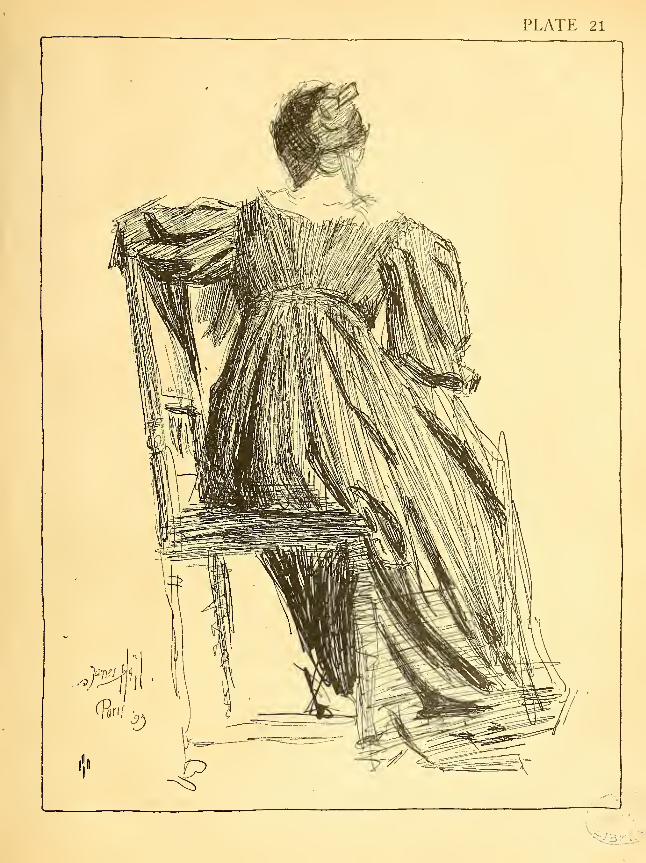
PLATE 21
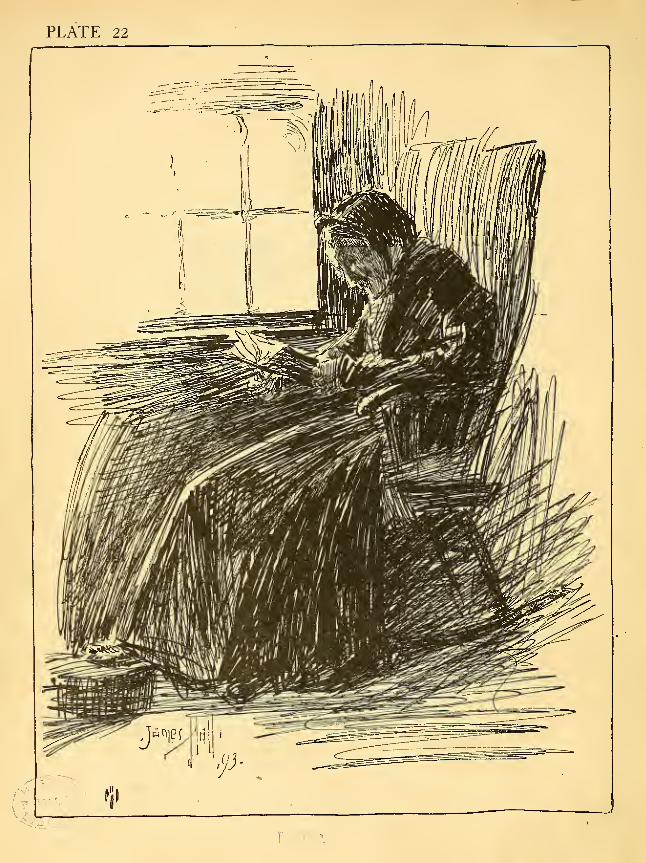
PLATE 22

A SHORT LIST OF BOOKS
PEN DRAWING AND ILLUSTRATION
Pen Drawing and Pen Dranghtsjnen. Joseph Pennell. Macmillan & Co. i!
Modern Illustration. Joseph Pennell. George Bell and Sons. 1898
Pen Drawing. Charles D. Maginnis. Bates and Guild. 1900
The Decorative Illustration of Books. Walter Crane. George Bell and Sons, igoi
Modern Pen Drawings: European and American. Edited by Charles Holme. Offices
of "The Studio." 1901
Pen, Pencil, and Chalk. A Series of Drazvings by Contemporary European Artists. Edited
by Charles Holme. "The Studio." 191
1
Modern Book-Plates and their Designers. "The Studio" Special Winter-Number.
1898-99
Children's Books and Their Illustrators. Gleason White. "The International Studio"
Special Winter-Number. • 1897-98
ALPHABETS AND LETTERING
Letters and Lettering. A Treatise with 200 Examples. Frank Chouteau Brown.Bates and Guild. 1902
Writing and Illuminating and Lettering. Edward Johnston. The Macmillan Com-pany. 1906
Alphabets Old and New. Lewis F. Day. Charles Scribner's Sons. 1899
Lettering in Ornament. Lewis F. Day. Charles Scribner's Sons. 1902
Alphabets. Edward F. Strange. George Bell and Sons. 1895
Manuscript and Inscription Letters. A Portfolio of Plates by Edward Johnston. For
Schools and Classes and for the use of Craftsman. John Hogg. 1909
DRAWING, COMPOSITION, AND DESIGN
Freehand Perspective and Sketching. D. M. Norton. Published by the Author. 1909
Art Education for High Schools. The Prang CompanyComposition. Arthur W. Dow. Doubleday, Page and Company. 1913
Figure Drawing. Richard G. Hatton. Chapman and Hall.
Figure Composition. Richard G. Hatton. Chapman and Hall. 1900.
The Human Figure. J. H. Vanderpoel. The Inland Printer Company. 1908
The Craftsman's Plant Book. Richard G. Hatton. Chapman and. Hall. 1909
The Principles of Design. Ernest A. Batchelder. The Inland Printer Company.
1904
[79]
The Principles of Design. G. Woolliscroft Rhead. Charles Scribner's Sons. 1905
Modern Practical Design. G. Woolliscroft Rhead. B. T. Batsford. 191
2
Nature a7id Ornament. Lewis F. Day. Vol. I. Nature the Raw Material of Design.
Vol. II. Ornament the Pinished Product of Design. Charles Scribner's Sons. 1910
The Bases of Design. Walter Crane. George Bell and Sons. 1902
Line and Form. Walter Crane. George Bell and Sons. 1901
On Drawing and Painting. Denman Waldo Ross. Houghton, Mifflin Company. 1912
A Text-Book of Design. Kelley and Mowll. Houghton, Mifflin Company. 1912
BOOKS LISTED FOR THEIR ILLUSTRATIONS
The Banbury Cross Series of Nursery Rhymes, Fairy Tales, etc. Illustrations by
R. Anning Bell, Alice B. Woodward, Charles Robinson, and H. GranvilleFell. J. M. Dent and Company. 1894-95
A Child's Garden of Verses. Robert Louis Stevenson. Illustrations by CharlesRobinson. Charles Scribner's Sons. 1895.
The Endymion Series. Illustrated by Robert Anning Bell, Byam Shaw, Alfred
Garth Jones and W. Heath Robinson. George Bell and Sons.
Prue and I. George William Curtis. Illustrations by Albert E. Sterner. Har-
per and Brothers. 1893
Old Songs, with drawings by Edwin A. Abbey and Alfred Parsons. Harper and
Brothers. 1889
[Also other books illustrated by Abbey]
The Story of King Arthur and his Knights. Written and illustrated by Howard Pyle.
Charles Scribner's Sons. 1903
[Also other books of the series]
A Midsummer-Night's Dream. Shakespeare. Illustrated by Arthur Rackham.Doubleday, Page and Company. 1908
Undine. De la Motte Fouque. Adapted from the German by W. L. Courtney.
Illustrated by Arthur Rackham. Doubleday, Page and Company. 1909
[Also other books illustrated by Rackham]
The Later Work of Aubrey Beardsley. John Lane. 1901
Bound volumes of the magazines, The Studio, Century, Harpers, Scribners, etc., con-
tain examples of pen drawings from which can be gained a knowledge of the work
of the foremost pen draughtsmen of the present generation.
pi-nfS
So]
\

:3vjo I i-ir^) ruDLi^ LionMni
3 9999 05496 709 4


![sXep-¦-cp-sS kmaq-lnI ]Ým¯ewshodhganga.inflibnet.ac.in/bitstream/10603/7616/8/08... · 2015-12-04 · ]Xn-s\-«p A]pjvS`mj-If-S¡w Ccp-]-¯n-cæp `mj-I-fmWv {ZmhnU tKm{X-¯n-ep-Å-Xv](https://img.dokumen.tips/doc/110x75/5f1a05a8a6bc987a736a7aa4/sxep-cp-ss-kmaq-lni-m-2015-12-04-xn-s-p-apjvsmj-if-sw-ccp-n-cp.jpg)