Embed Size (px)
Citation preview
1
The Stanley Gibbons Group Plc
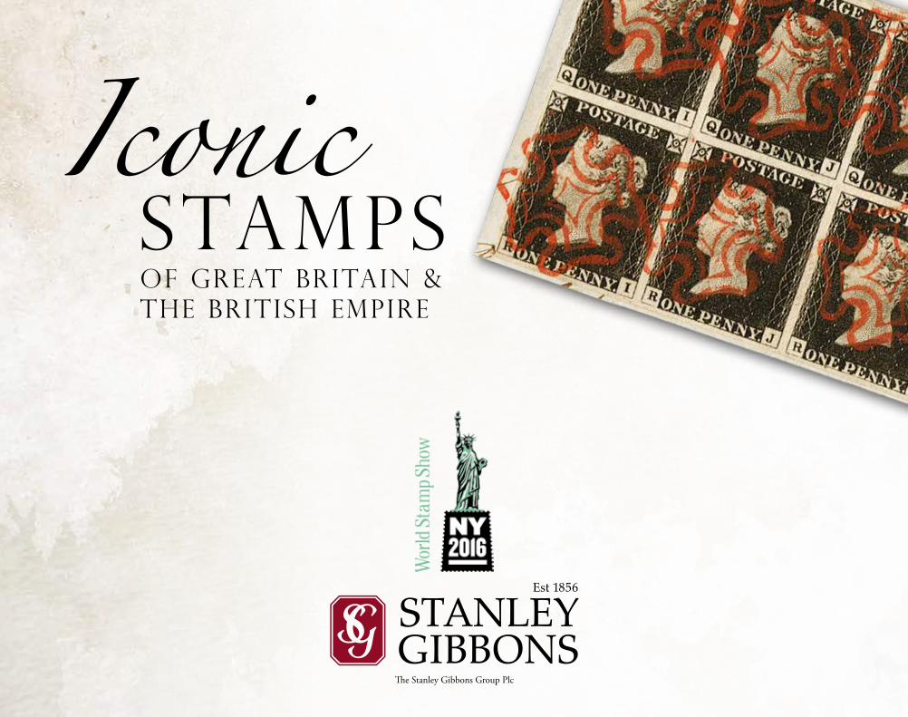
IconicStampsof Great Britain & the British Empire
2
Iconic
Baldwin’s were established in 1872 and specialise in coins, medals,
tokens and banknotes.
Murray Payne were established in 1990 and are the world’s leading dealer in the stamps of the reign of King George VI.
Apex Philatelics were established in 1994 and offer stamps through frequent auctions.
Fraser’s Autographs were established in 1978 and specialise in autographs
and memorabilia.
Dreweatts were established in 1759 and specialise in general estate auctions.
Bloomsbury Auctions were established in 1983 and specialise in books and manuscripts.
Mallett’s were established in 1865 and specialise in fine and rare antiques and decorative arts.
The Home of Stamp CollectingBY APPOINTMENT TO
HER MAJESTY THE QUEEN PHILATELISTS
STANLEY GIBBONS LTD LONDON
3
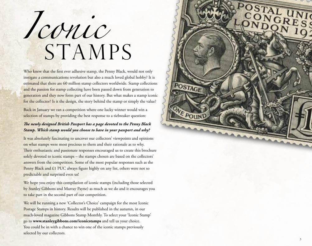
Who knew that the first ever adhesive stamp, the Penny Black, would not only instigate a communications revolution but also a much loved global hobby? It is estimated that there are 60 million stamp collectors worldwide. Stamp collections and the passion for stamp collecting have been passed down from generation to generation and they now form part of our history. But what makes a stamp iconic for the collector? Is it the design, the story behind the stamp or simply the value?
Back in January we ran a competition where one lucky winner would win a selection of stamps by providing the best response to a tiebreaker question:
The newly designed British Passport has a page devoted to the Penny Black Stamp. Which stamp would you choose to have in your passport and why?
It was absolutely fascinating to uncover our collectors’ viewpoints and opinions on what stamps were most precious to them and their rationale as to why. Their enthusiastic and passionate responses encouraged us to create this brochure solely devoted to iconic stamps – the stamps chosen are based on the collectors’ answers from the competition. Some of the most popular responses such as the Penny Black and £1 PUC always figure highly on any list, others were not so predictable and surprised even us!
We hope you enjoy this compilation of iconic stamps (including those selected by Stanley Gibbons and Murray Payne) as much as we do and it encourages you to take part in the second part of our competition.
We will be running a new ‘Collector’s Choice’ campaign for the most Iconic Postage Stamps in history. Results will be published in the autumn, in our much-loved magazine Gibbons Stamp Monthly. To select your ‘Iconic Stamp’ go to www.stanleygibbons.com/iconicstamps and tell us your choice. You could be in with a chance to win one of the iconic stamps previously selected by our collectors.
IconicStamps
3
4
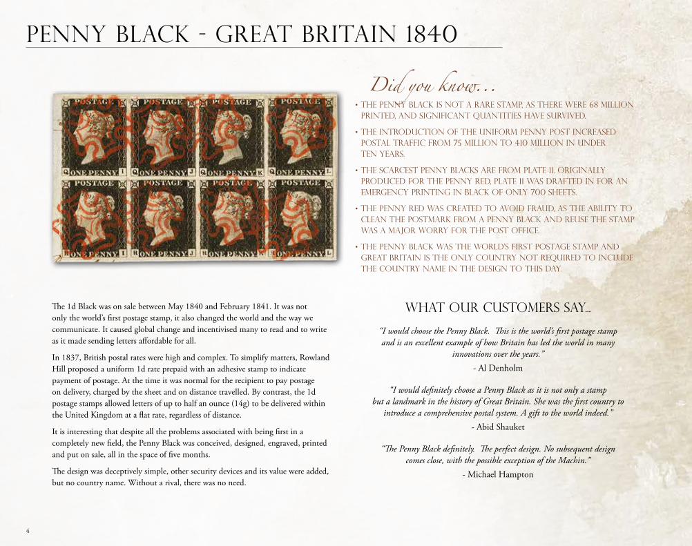
The 1d Black was on sale between May 1840 and February 1841. It was not only the world’s first postage stamp, it also changed the world and the way we communicate. It caused global change and incentivised many to read and to write as it made sending letters affordable for all.
In 1837, British postal rates were high and complex. To simplify matters, Rowland Hill proposed a uniform 1d rate prepaid with an adhesive stamp to indicate payment of postage. At the time it was normal for the recipient to pay postage on delivery, charged by the sheet and on distance travelled. By contrast, the 1d postage stamps allowed letters of up to half an ounce (14g) to be delivered within the United Kingdom at a flat rate, regardless of distance.
It is interesting that despite all the problems associated with being first in a completely new field, the Penny Black was conceived, designed, engraved, printed and put on sale, all in the space of five months.
The design was deceptively simple, other security devices and its value were added, but no country name. Without a rival, there was no need.
Penny Black - Great Britain 1840
What our customers say...
“I would choose the Penny Black. This is the world’s first postage stamp and is an excellent example of how Britain has led the world in many
innovations over the years.” - Al Denholm
“I would definitely choose a Penny Black as it is not only a stamp but a landmark in the history of Great Britain. She was the first country to
introduce a comprehensive postal system. A gift to the world indeed.” - Abid Shauket
“The Penny Black definitely. The perfect design. No subsequent design comes close, with the possible exception of the Machin.”
- Michael Hampton
Did you know...• The Penny Black is not a rare stamp, as there were 68 million printed, and significant quantities have survived.
• The introduction of the uniform penny post increased postal traffic from 75 million to 410 million in under ten years.
• The scarcest Penny Blacks are from plate 11. Originally produced for the Penny Red, plate 11 was drafted in for an emergency printing in black of only 700 sheets.
• The Penny Red was created to avoid fraud, as the ability to clean the postmark from a Penny Black and reuse the stamp was a major worry for the Post Office.
• The Penny Black was the world’s first postage stamp and Great Britain is the only country not required to include the country name in the design to this day.
4
5
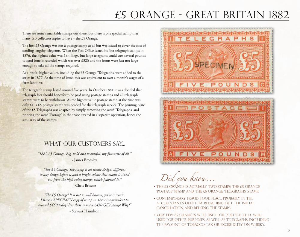
£5 Orange - Great Britain 1882
There are some remarkable stamps out there, but there is one special stamp that many GB collectors aspire to have – the £5 Orange.
The first £5 Orange was not a postage stamp at all but was issued to cover the cost of sending lengthy telegrams. When the Post Office issued its first telegraph stamps in 1876, the highest value was 5 shillings, but large telegrams could cost several pounds to send (one is recorded which was over £32!) and the forms were just not large enough to take all the stamps required.
As a result, higher values, including the £5 Orange ‘Telegraphs’ were added to the series in 1877. At the time of issue, this was equivalent to over a month’s wages of a farm labourer.
The telegraph stamp lasted around five years. In October 1881 it was decided that telegraph fees should henceforth be paid using postage stamps and all telegraph stamps were to be withdrawn. As the highest value postage stamp at the time was only £1, a £5 postage stamp was needed for the telegraph service. The printing plate of the £5 Telegraphs was adapted by simply removing the word ‘Telegraphs’ and printing the word ‘Postage’ in the space created in a separate operation, hence the similarity of the stamps.
What our customers say...
“1882 £5 Orange. Big, bold and beautiful, my favourite of all.” - James Bromley
“The £5 Orange. The stamp is an iconic design, different to any design before it and a bright colour that makes it stand
out from the high value stamps which followed it.” - Chris Briscoe
“The £5 Orange! It is not so well known, yet it is iconic. I have a SPECIMEN copy of it. £5 in 1882 is equivalent to
around £450 today! But there is not a £450 QE2 stamp! Why?” - Stewart Hamilton
Did you know...• The £5 Orange is actually two stamps: the £5 Orange ‘Postage’ stamp and the £5 Orange ‘TELEGRAPHS’ stamp.
• Contemporary fraud took place, probably in the Accountant’s Office, by bleaching out the initial cancellation, and reusing the stamps.
• Very few £5 Oranges were used for postage. They were used for OTHER PURPOSES, AS WELL AS TELEGRAPHS, INCLUDING THE PAYMENT OF TOBACCO tax or excise duty on whisky.
5
6
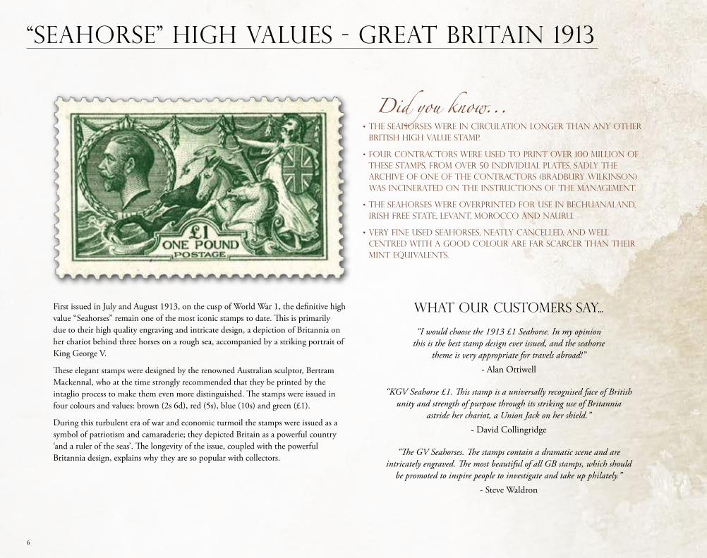
First issued in July and August 1913, on the cusp of World War 1, the definitive high value “Seahorses” remain one of the most iconic stamps to date. This is primarily due to their high quality engraving and intricate design, a depiction of Britannia on her chariot behind three horses on a rough sea, accompanied by a striking portrait of King George V.
These elegant stamps were designed by the renowned Australian sculptor, Bertram Mackennal, who at the time strongly recommended that they be printed by the intaglio process to make them even more distinguished. The stamps were issued in four colours and values: brown (2s 6d), red (5s), blue (10s) and green (£1).
During this turbulent era of war and economic turmoil the stamps were issued as a symbol of patriotism and camaraderie; they depicted Britain as a powerful country ‘and a ruler of the seas’. The longevity of the issue, coupled with the powerful Britannia design, explains why they are so popular with collectors.
What our customers say...
“I would choose the 1913 £1 Seahorse. In my opinion this is the best stamp design ever issued, and the seahorse
theme is very appropriate for travels abroad!” - Alan Ottiwell
“KGV Seahorse £1. This stamp is a universally recognised face of British unity and strength of purpose through its striking use of Britannia
astride her chariot, a Union Jack on her shield.” - David Collingridge
“The GV Seahorses. The stamps contain a dramatic scene and are intricately engraved. The most beautiful of all GB stamps, which should
be promoted to inspire people to investigate and take up philately.” - Steve Waldron
“Seahorse” High Values - Great Britain 1913
Did you know...• The Seahorses were in circulation longer than any other British high value stamp.
• Four CONTRACTORS were used to print over 100 million of these stamps, from over 50 individual plates. Sadly the archive of one of the CONTRACTORS (Bradbury Wilkinson) was incinerated on the instructions of the management.
• The Seahorses were overprinted for use in Bechuanaland, Irish Free State, Levant, Morocco and Nauru.
• Very fine used Seahorses, neatly cancelled, and well centred with a good colour are far scarcer than their mint equivalents.
7
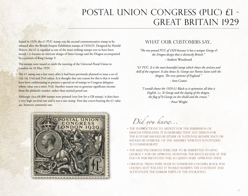
Issued in 1929, the £1 PUC stamp was the second commemorative stamp to be released after the British Empire Exhibition stamps of 1924/25. Designed by Harold Nelson, the £1 is regarded as one of the most striking stamps ever to have been issued – it features an intricate design of Saint George and the Dragon accompanied by a portrait of King George V.
The stamps were issued to mark the meeting of the Universal Postal Union in London on 10 May 1929.
The £1 stamp was a late entry after it had been previously planned to issue a set of ½d, 1d, 1½d and 2½d values. It is thought that one reason for this is that it would have been embarrassing to present a special set of stamps to Congress delegates whose value was a mere 5½d. Another reason was to generate significant income from the philatelic market, rather than normal postal use.
Although circa 68,000 stamps were printed (very low for a GB stamp), it does have a very high survival rate and is not a rare stamp. First day covers bearing the £1 value are, however, extremely rare.
What our customers say...
“The one pound PUC of 1929 because it has a unique George & the Dragon design that is distinctly British.”
- Andrew Woodward
“£1 PUC. It is the most beautiful stamp which shows the artistry and skill of the engraver. It also shows St. George our Patron Saint with the
dragon. The very epitome of England.”- Ann Coates
“I would choose the 1929 £1 Black as it epitomises all that is English, i.e. St George and the slaying of the dragon, the flag of St George on the shield and the crown.”
- Peter Wright
Postal Union Congress (PUC) £1 - Great Britain 1929
Did you know...• The ‘Instructions to Artists’ for the submission of designs stipulated: ‘It is desirable that any design for the £1 stamp should be either of national significance or should be symbolic of the assembly which it is intended to commemorate’.
• The selected designs were due to be submitted to King George V for his approval, however, the King’s illness at the end of 1928 prevented this, so Queen Mary approved them.
• Original trials were made IN numerous colours; black was chosen as it was felt it would sharpen the contrast and accentuate the darker parts of the engraving.
8
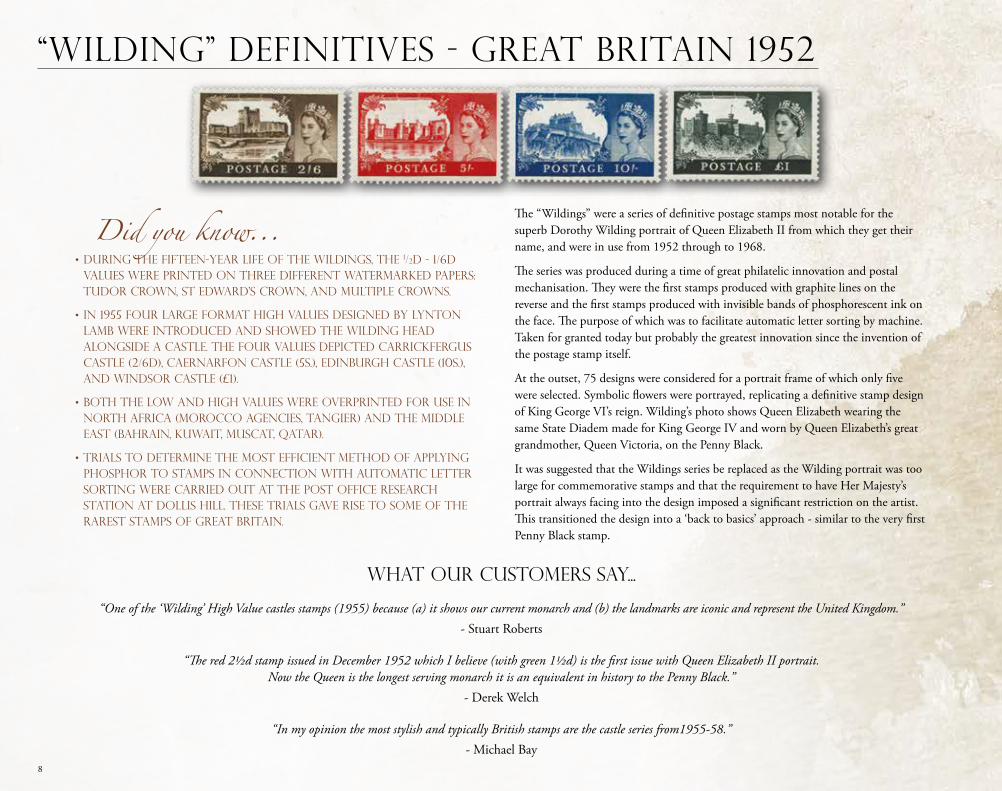
The “Wildings” were a series of definitive postage stamps most notable for the superb Dorothy Wilding portrait of Queen Elizabeth II from which they get their name, and were in use from 1952 through to 1968.
The series was produced during a time of great philatelic innovation and postal mechanisation. They were the first stamps produced with graphite lines on the reverse and the first stamps produced with invisible bands of phosphorescent ink on the face. The purpose of which was to facilitate automatic letter sorting by machine. Taken for granted today but probably the greatest innovation since the invention of the postage stamp itself.
At the outset, 75 designs were considered for a portrait frame of which only five were selected. Symbolic flowers were portrayed, replicating a definitive stamp design of King George VI’s reign. Wilding’s photo shows Queen Elizabeth wearing the same State Diadem made for King George IV and worn by Queen Elizabeth’s great grandmother, Queen Victoria, on the Penny Black.
It was suggested that the Wildings series be replaced as the Wilding portrait was too large for commemorative stamps and that the requirement to have Her Majesty’s portrait always facing into the design imposed a significant restriction on the artist. This transitioned the design into a ‘back to basics’ approach - similar to the very first Penny Black stamp.
What our customers say...
“One of the ‘Wilding’ High Value castles stamps (1955) because (a) it shows our current monarch and (b) the landmarks are iconic and represent the United Kingdom.” - Stuart Roberts
“The red 2½d stamp issued in December 1952 which I believe (with green 1½d) is the first issue with Queen Elizabeth II portrait. Now the Queen is the longest serving monarch it is an equivalent in history to the Penny Black.”
- Derek Welch
“In my opinion the most stylish and typically British stamps are the castle series from1955-58.”- Michael Bay
“Wilding” Definitives - Great Britain 1952
Did you know...• During the fifteen-year life of the Wildings, THE 1/2D - 1/6D values were printed on three different watermarked papers: Tudor Crown, St Edward’s Crown, and Multiple CrownS.
• In 1955 four large format high values designed by Lynton Lamb were introduced and showed the Wilding head alongside a castle. The four values depicted Carrickfergus Castle (2/6d), Caernarfon Castle (5s.), Edinburgh Castle (10s.), and Windsor Castle (£1).
• Both the low and high values were overprinted for use in North Africa (Morocco Agencies, Tangier) and the Middle East (Bahrain, Kuwait, Muscat, Qatar).
• Trials to determine the most efficient method of applying phosphor to stamps in connection with automatic letter sorting were carried out at the Post Office Research Station at Dollis Hill. These trials gave rise TO some of the rarest stamps of Great Britain.
9
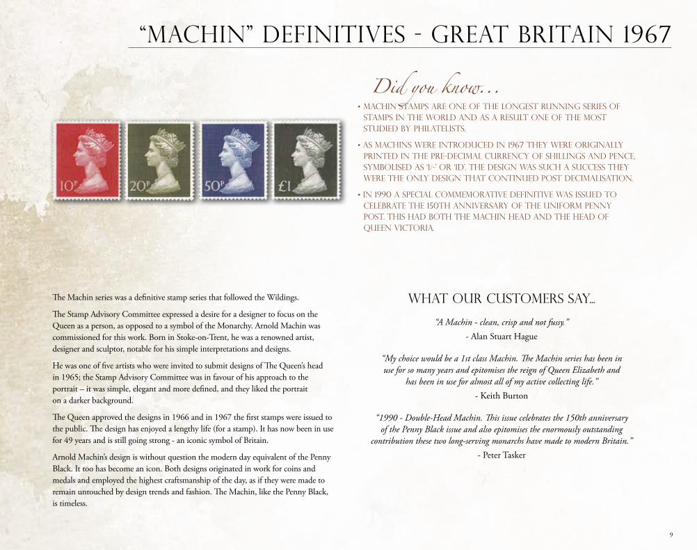
The Machin series was a definitive stamp series that followed the Wildings.
The Stamp Advisory Committee expressed a desire for a designer to focus on the Queen as a person, as opposed to a symbol of the Monarchy. Arnold Machin was commissioned for this work. Born in Stoke-on-Trent, he was a renowned artist, designer and sculptor, notable for his simple interpretations and designs.
He was one of five artists who were invited to submit designs of The Queen’s head in 1965; the Stamp Advisory Committee was in favour of his approach to the portrait – it was simple, elegant and more defined, and they liked the portrait on a darker background.
The Queen approved the designs in 1966 and in 1967 the first stamps were issued to the public. The design has enjoyed a lengthy life (for a stamp). It has now been in use for 49 years and is still going strong - an iconic symbol of Britain.
Arnold Machin’s design is without question the modern day equivalent of the Penny Black. It too has become an icon. Both designs originated in work for coins and medals and employed the highest craftsmanship of the day, as if they were made to remain untouched by design trends and fashion. The Machin, like the Penny Black, is timeless.
What our customers say...
“A Machin - clean, crisp and not fussy.” - Alan Stuart Hague
“My choice would be a 1st class Machin. The Machin series has been in use for so many years and epitomises the reign of Queen Elizabeth and
has been in use for almost all of my active collecting life.” - Keith Burton
“1990 - Double-Head Machin. This issue celebrates the 150th anniversary of the Penny Black issue and also epitomises the enormously outstanding
contribution these two long-serving monarchs have made to modern Britain.”- Peter Tasker
“MACHIN” DEFINITIVES - Great Britain 1967
Did you know...• Machin stamps are one of the longest running series of stamps in the world and as a result one of the most studied by philatelists.
• As Machins were introduced in 1967 they were originally printed in the pre-decimal currency of shillings and pence, symbolised as ‘1/-’ or ‘1d’. The design was such a success they were the only design that continued post decimalisation.
• In 1990 a special commemorative definitive was issued to celebrate the 150th anniversary of the uniform penny post. This had both the Machin head and the head of Queen Victoria.
10
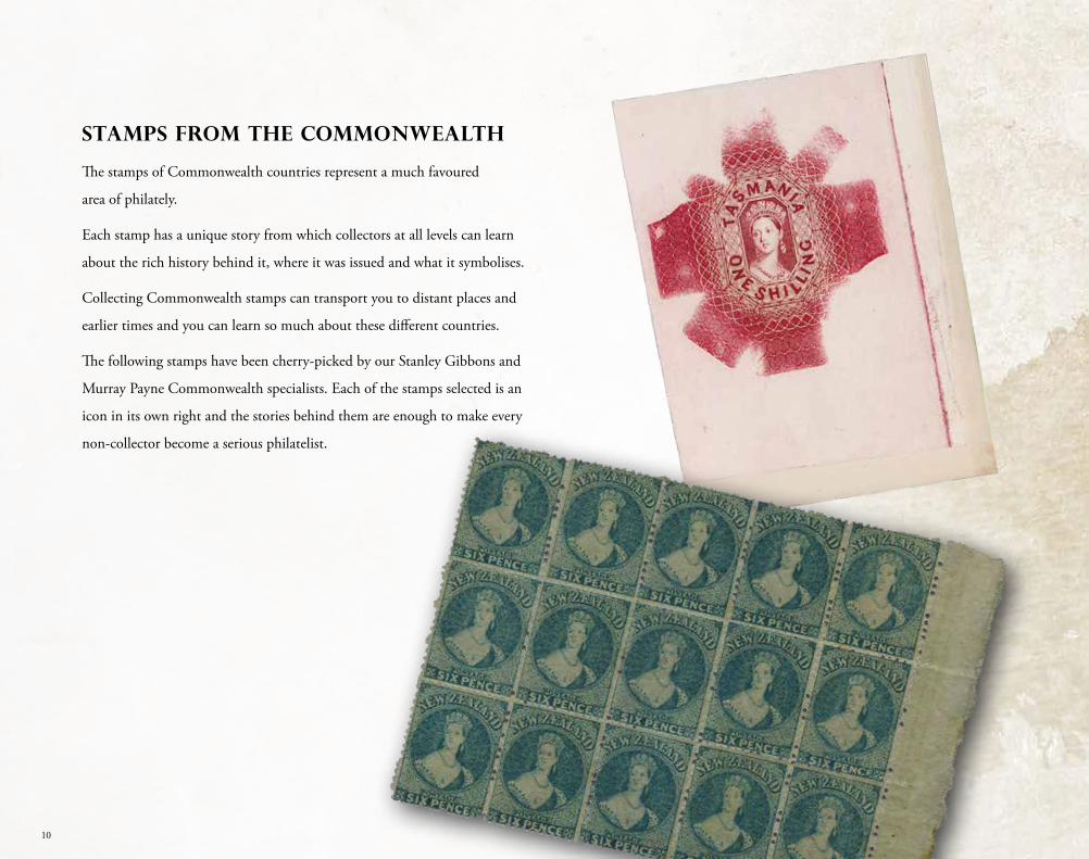
STAMPS FROM THE COMMONWEALTH
The stamps of Commonwealth countries represent a much favoured
area of philately.
Each stamp has a unique story from which collectors at all levels can learn
about the rich history behind it, where it was issued and what it symbolises.
Collecting Commonwealth stamps can transport you to distant places and
earlier times and you can learn so much about these different countries.
The following stamps have been cherry-picked by our Stanley Gibbons and
Murray Payne Commonwealth specialists. Each of the stamps selected is an
icon in its own right and the stories behind them are enough to make every
non-collector become a serious philatelist.
11
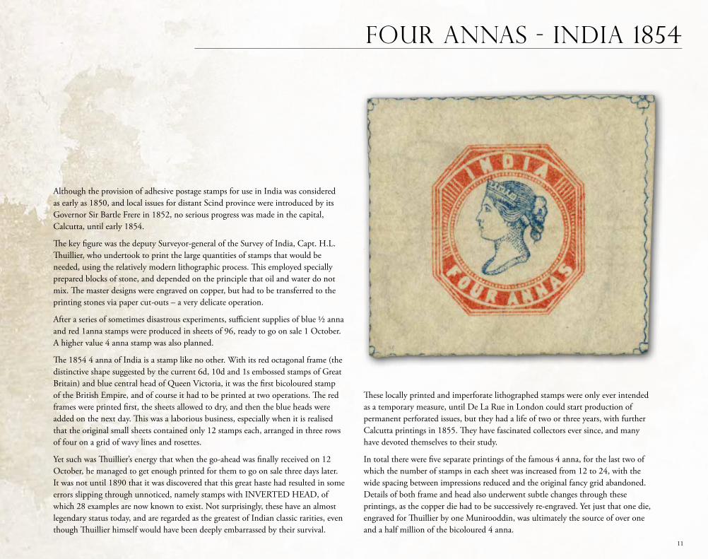
Although the provision of adhesive postage stamps for use in India was considered as early as 1850, and local issues for distant Scind province were introduced by its Governor Sir Bartle Frere in 1852, no serious progress was made in the capital, Calcutta, until early 1854.
The key figure was the deputy Surveyor-general of the Survey of India, Capt. H.L. Thuillier, who undertook to print the large quantities of stamps that would be needed, using the relatively modern lithographic process. This employed specially prepared blocks of stone, and depended on the principle that oil and water do not mix. The master designs were engraved on copper, but had to be transferred to the printing stones via paper cut-outs – a very delicate operation.
After a series of sometimes disastrous experiments, sufficient supplies of blue ½ anna and red 1anna stamps were produced in sheets of 96, ready to go on sale 1 October. A higher value 4 anna stamp was also planned.
The 1854 4 anna of India is a stamp like no other. With its red octagonal frame (the distinctive shape suggested by the current 6d, 10d and 1s embossed stamps of Great Britain) and blue central head of Queen Victoria, it was the first bicoloured stamp of the British Empire, and of course it had to be printed at two operations. The red frames were printed first, the sheets allowed to dry, and then the blue heads were added on the next day. This was a laborious business, especially when it is realised that the original small sheets contained only 12 stamps each, arranged in three rows of four on a grid of wavy lines and rosettes.
Yet such was Thuillier’s energy that when the go-ahead was finally received on 12 October, he managed to get enough printed for them to go on sale three days later. It was not until 1890 that it was discovered that this great haste had resulted in some errors slipping through unnoticed, namely stamps with INVERTED HEAD, of which 28 examples are now known to exist. Not surprisingly, these have an almost legendary status today, and are regarded as the greatest of Indian classic rarities, even though Thuillier himself would have been deeply embarrassed by their survival.
FOUR ANNAS - INDIA 1854
These locally printed and imperforate lithographed stamps were only ever intended as a temporary measure, until De La Rue in London could start production of permanent perforated issues, but they had a life of two or three years, with further Calcutta printings in 1855. They have fascinated collectors ever since, and many have devoted themselves to their study.
In total there were five separate printings of the famous 4 anna, for the last two of which the number of stamps in each sheet was increased from 12 to 24, with the wide spacing between impressions reduced and the original fancy grid abandoned. Details of both frame and head also underwent subtle changes through these printings, as the copper die had to be successively re-engraved. Yet just that one die, engraved for Thuillier by one Munirooddin, was ultimately the source of over one and a half million of the bicoloured 4 anna.
12
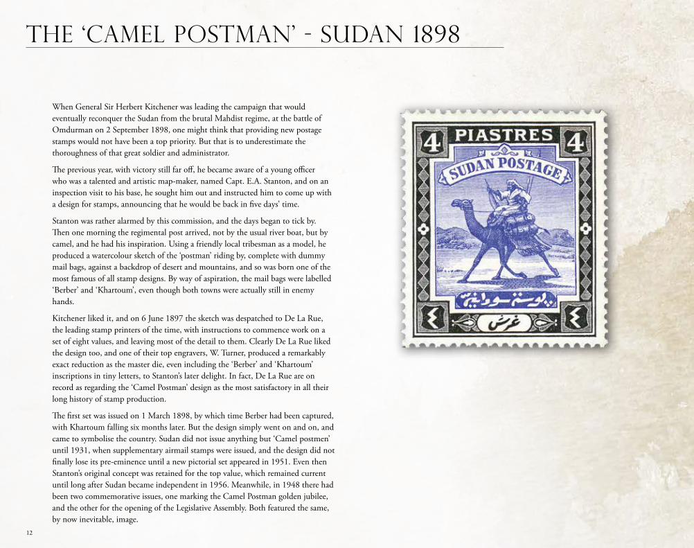
When General Sir Herbert Kitchener was leading the campaign that would eventually reconquer the Sudan from the brutal Mahdist regime, at the battle of Omdurman on 2 September 1898, one might think that providing new postage stamps would not have been a top priority. But that is to underestimate the thoroughness of that great soldier and administrator.
The previous year, with victory still far off, he became aware of a young officer who was a talented and artistic map-maker, named Capt. E.A. Stanton, and on an inspection visit to his base, he sought him out and instructed him to come up with a design for stamps, announcing that he would be back in five days’ time.
Stanton was rather alarmed by this commission, and the days began to tick by. Then one morning the regimental post arrived, not by the usual river boat, but by camel, and he had his inspiration. Using a friendly local tribesman as a model, he produced a watercolour sketch of the ‘postman’ riding by, complete with dummy mail bags, against a backdrop of desert and mountains, and so was born one of the most famous of all stamp designs. By way of aspiration, the mail bags were labelled ‘Berber’ and ‘Khartoum’, even though both towns were actually still in enemy hands.
Kitchener liked it, and on 6 June 1897 the sketch was despatched to De La Rue, the leading stamp printers of the time, with instructions to commence work on a set of eight values, and leaving most of the detail to them. Clearly De La Rue liked the design too, and one of their top engravers, W. Turner, produced a remarkably exact reduction as the master die, even including the ‘Berber’ and ‘Khartoum’ inscriptions in tiny letters, to Stanton’s later delight. In fact, De La Rue are on record as regarding the ‘Camel Postman’ design as the most satisfactory in all their long history of stamp production.
The first set was issued on 1 March 1898, by which time Berber had been captured, with Khartoum falling six months later. But the design simply went on and on, and came to symbolise the country. Sudan did not issue anything but ‘Camel postmen’ until 1931, when supplementary airmail stamps were issued, and the design did not finally lose its pre-eminence until a new pictorial set appeared in 1951. Even then Stanton’s original concept was retained for the top value, which remained current until long after Sudan became independent in 1956. Meanwhile, in 1948 there had been two commemorative issues, one marking the Camel Postman golden jubilee, and the other for the opening of the Legislative Assembly. Both featured the same, by now inevitable, image.
THE ‘CAMEL POSTMAN’ - SUDAN 1898
13
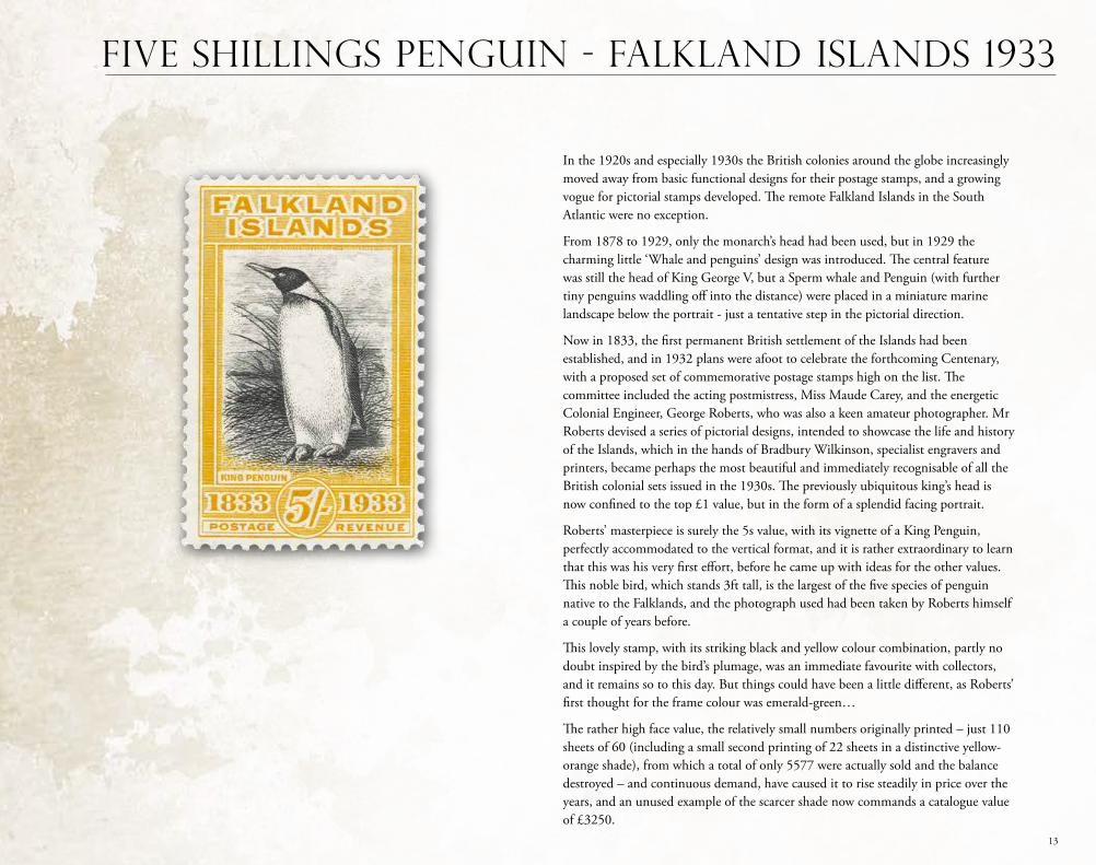
In the 1920s and especially 1930s the British colonies around the globe increasingly moved away from basic functional designs for their postage stamps, and a growing vogue for pictorial stamps developed. The remote Falkland Islands in the South Atlantic were no exception.
From 1878 to 1929, only the monarch’s head had been used, but in 1929 the charming little ‘Whale and penguins’ design was introduced. The central feature was still the head of King George V, but a Sperm whale and Penguin (with further tiny penguins waddling off into the distance) were placed in a miniature marine landscape below the portrait - just a tentative step in the pictorial direction.
Now in 1833, the first permanent British settlement of the Islands had been established, and in 1932 plans were afoot to celebrate the forthcoming Centenary, with a proposed set of commemorative postage stamps high on the list. The committee included the acting postmistress, Miss Maude Carey, and the energetic Colonial Engineer, George Roberts, who was also a keen amateur photographer. Mr Roberts devised a series of pictorial designs, intended to showcase the life and history of the Islands, which in the hands of Bradbury Wilkinson, specialist engravers and printers, became perhaps the most beautiful and immediately recognisable of all the British colonial sets issued in the 1930s. The previously ubiquitous king’s head is now confined to the top £1 value, but in the form of a splendid facing portrait.
Roberts’ masterpiece is surely the 5s value, with its vignette of a King Penguin, perfectly accommodated to the vertical format, and it is rather extraordinary to learn that this was his very first effort, before he came up with ideas for the other values. This noble bird, which stands 3ft tall, is the largest of the five species of penguin native to the Falklands, and the photograph used had been taken by Roberts himself a couple of years before.
This lovely stamp, with its striking black and yellow colour combination, partly no doubt inspired by the bird’s plumage, was an immediate favourite with collectors, and it remains so to this day. But things could have been a little different, as Roberts’ first thought for the frame colour was emerald-green…
The rather high face value, the relatively small numbers originally printed – just 110 sheets of 60 (including a small second printing of 22 sheets in a distinctive yellow-orange shade), from which a total of only 5577 were actually sold and the balance destroyed – and continuous demand, have caused it to rise steadily in price over the years, and an unused example of the scarcer shade now commands a catalogue value of £3250.
FIVE SHILLINGS PENGUIN - FALKLAND ISLANDS 1933
14
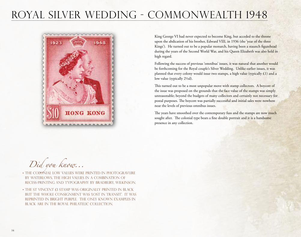
King George VI had never expected to become King, but acceded to the throne upon the abdication of his brother, Edward VIII, in 1936 (the ‘year of the three Kings’). He turned out to be a popular monarch, having been a staunch figurehead during the years of the Second World War, and his Queen Elizabeth was also held in high regard.
Following the success of previous ‘omnibus’ issues, it was natural that another would be forthcoming for the Royal couple’s Silver Wedding. Unlike earlier issues, it was planned that every colony would issue two stamps, a high value (typically £1) and a low value (typically 2½d).
This turned out to be a most unpopular move with stamp collectors. A boycott of the issue was proposed on the grounds that the face value of the stamps was simply unreasonable; beyond the budgets of many collectors and certainly not necessary for postal purposes. The boycott was partially successful and initial sales were nowhere near the levels of previous omnibus issues.
The years have smoothed over the contemporary fuss and the stamps are now much sought after. The colonial type bears a fine double portrait and it is a handsome presence in any collection.
ROYAL SILVER WEDDING - COMMONWEALTH 1948
Did you know...• The colonial low values were printed in photogravure by Waterlows, the high values in a combination of recess-printing and typography by Bradbury, Wilkinson.
• The St Vincent £1 stamp was originally printed in black but the whole consignment was ‘lost in transit’. It was reprinted in bright purple. The only known examples IN BLACK are in the Royal PHILATELIC Collection.
15
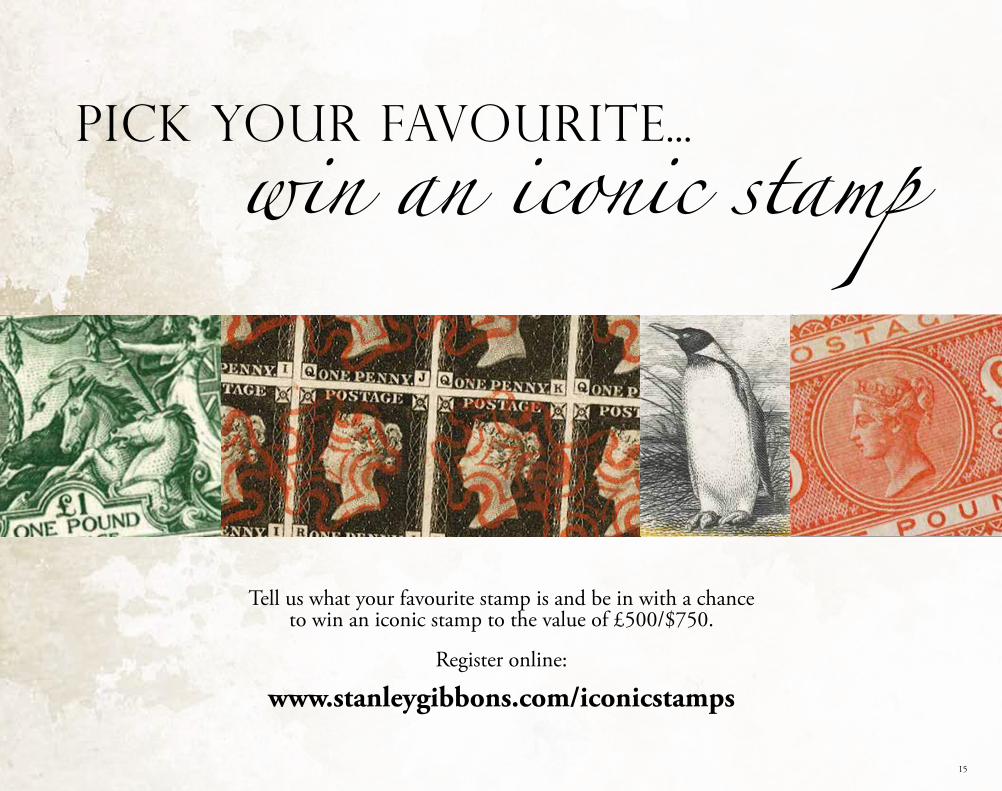
Tell us what your favourite stamp is and be in with a chance to win an iconic stamp to the value of £500/$750.
Register online:
www.stanleygibbons.com/iconicstamps
Pick your favourite...win an iconic stamp
16
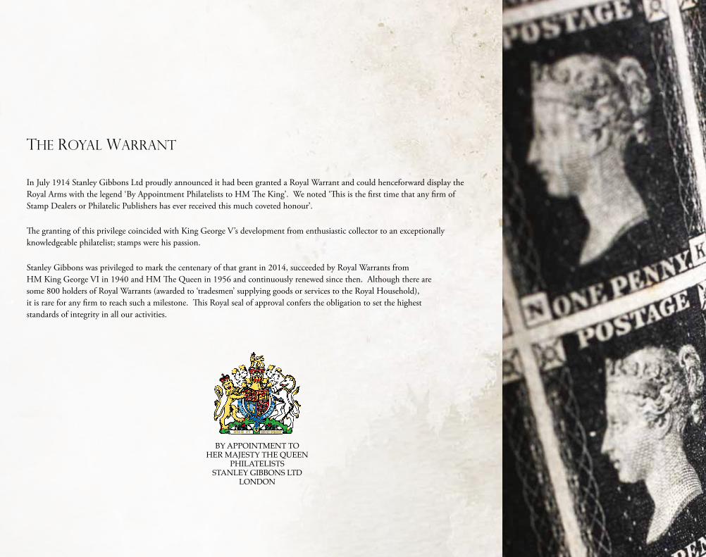
THE ROYAL WARRANT
BY APPOINTMENT TO HER MAJESTY THE QUEEN
PHILATELISTS STANLEY GIBBONS LTD
LONDON
In July 1914 Stanley Gibbons Ltd proudly announced it had been granted a Royal Warrant and could henceforward display the Royal Arms with the legend ‘By Appointment Philatelists to HM The King’. We noted ‘This is the first time that any firm of Stamp Dealers or Philatelic Publishers has ever received this much coveted honour’.
The granting of this privilege coincided with King George V’s development from enthusiastic collector to an exceptionally knowledgeable philatelist; stamps were his passion.
Stanley Gibbons was privileged to mark the centenary of that grant in 2014, succeeded by Royal Warrants from HM King George VI in 1940 and HM The Queen in 1956 and continuously renewed since then. Although there are some 800 holders of Royal Warrants (awarded to ‘tradesmen’ supplying goods or services to the Royal Household), it is rare for any firm to reach such a milestone. This Royal seal of approval confers the obligation to set the highest standards of integrity in all our activities.