Embed Size (px)
DESCRIPTION
As per the latest update from Google, Mobile friendly website will displayed higher and work much better in search engine display. So it is become mandatory for all to convert their current website in Responsive design which can work on any device. It will give better user experience. At TechnoInfonet.com, we have experienced web designer who can convert your current website into responsive and can create new mobile friendly design as well. If you need more detail, kindly visit our website Technoinfonet.com or call on us 91 79 40307527 - PowerPoint PPT Presentation
Citation preview

How Responsive How Responsive Design Can Help Your Design Can Help Your
WebsiteWebsite


1. Recommended By Google
Since Google is the primary search engine to impress with your website, it is smart to follow what Google loves. Google not only recommends Responsive Web Design (RWD) as the best way to target mobile and tablet users, and also favors mobile-optimized sites when presenting results for searches made on a mobile device. This is especially true when mobile users search for local services. It’s important to note more searches are originated on mobile devices.

2. One Website, Multiple Devices
Providing a great user-experience across multiple devices and screen sizes is the most appealing and most critical aspects of responsive web design for today’s uber mobile world. Take the following example. I search for a birthday gift on my smartphone during a break at work. I then continue researching this product on the same site on my MAC when I get home.

3. Easier to Manage
Having a separate desktop and mobile site requires having separate Google Adwords campaigns, SEO campaigns and separate Google Analytics reports. Managing one site is of course, far easier than managing two sites.
There can be an argument made for multiple sites though, such as having a mobile-specific Adwards and SEO strategy, such as optimizing for keywords that are more likely to be searched when someone is on their smartphone.

4. Positive User Experience Is Key
If a user lands on your mobile website and is frustrated or doesn’t see what they are looking for, according to Google’s Think Insights on Mobile, there’s a 61% chance they will leave and go to a different website. Data shows a positive experience with your responsive website a user is 67% more likely to buy a product or use a service.

5. Blogging and Social Activities Bring Mobile Visitors
If you’re like most smart Inbound Marketers and incorporate blogging and social media in your strategy, you have most likely been seeing increased mobile traffic. A recent study by ComScore cites that 55% of social media consumption happens on a mobile device. SHOCKER!

6. Responsive Design is Preferred for SEO
Typically, Responsive Websites perform better and are easier to maintain. One thing not mentioned above is that a challenge of having a separate mobile site is that you will need to build the authority of this site from scratch, and who wants to go to that extra trouble?

7. Responsive Helps Combat a High Bounce Rate
Even if your regular website is sitting pretty in search results, if it looks and performs like crap on my tablet or smartphone, bounce rate will be a big problem. Non responsive websites will suffer from a high bounce rate if the content is too stripped down, or just plain clunky and too challenging to work with compared to the content offered on the main/desktop site. Google will naturally interpret this high bounce rate as a sign that a website irrelevant, which will lead to your drop in rankings, which is why we don’t see mobile versions of sites ranked high.
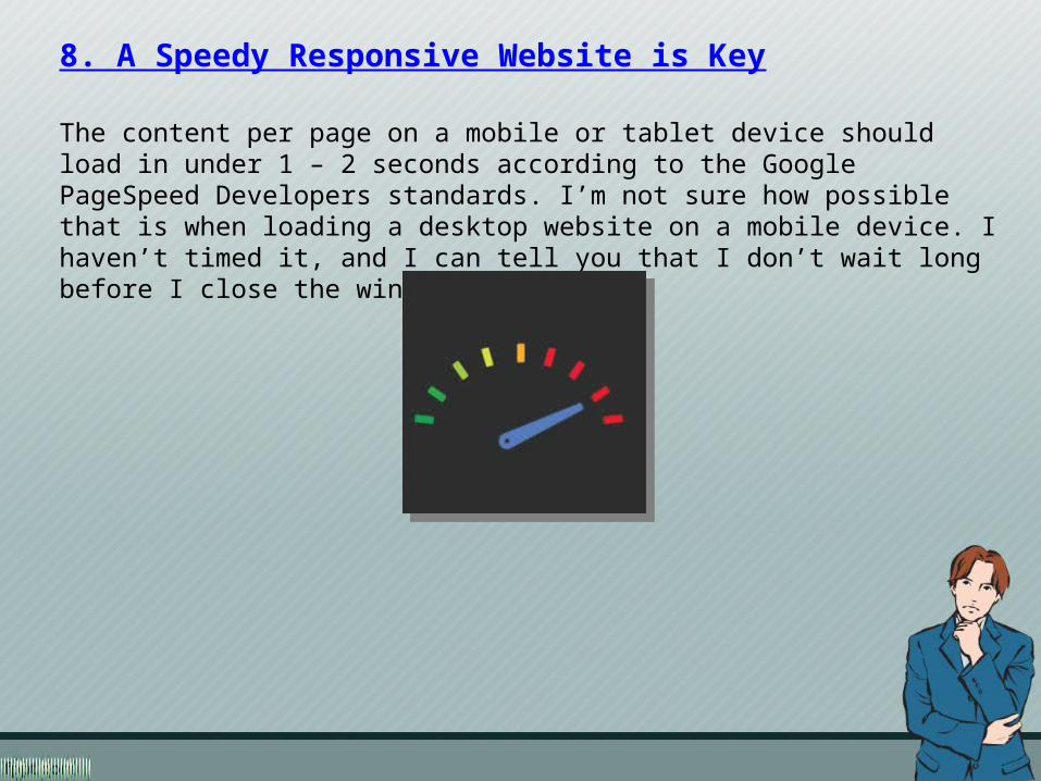
8. A Speedy Responsive Website is Key
The content per page on a mobile or tablet device should load in under 1 – 2 seconds according to the Google PageSpeed Developers standards. I’m not sure how possible that is when loading a desktop website on a mobile device. I haven’t timed it, and I can tell you that I don’t wait long before I close the window.

9. Responsive Adapts to Future Devices
As alluded to earlier, the benefit of responsive design is that the size of the template is designed based on screen size not device. Obviously, regardless of what size screen someone is viewing your website it will display properly for that screen size. Unless, there will be a worldwide movement to standardize on one screen size, responsive design is here to stay. Having a mobile website is no longer just a nice feature or after thought.

10. Responsive Design saves you money
Have you ever heard the saying: You get what you pay for? There is a reason that saying still lives today and applies to Responsive design. Sure, a complicated, well crafted, responsive design could be expensive to develop or implement (Unless you select one of the 1000 options available for WordPress websites), but once published, you can maintain it quite easily. This is much more economical to maintain one site rather than multiple sites, wouldn’t you agree?

Techno InfonetTechno Infonet
FF-107, Abhishree Adroit,Nr. Swaminarayan Mandir,Mansi Circle, Vastrapur,Ahmedabad - 380015Gujarat, India.
T. +91 79 40307527
FF-107, Abhishree Adroit,Nr. Swaminarayan Mandir,Mansi Circle, Vastrapur,Ahmedabad - 380015Gujarat, India.
T. +91 79 40307527
[email protected] [email protected]
http://www.technoinfonet.comhttp://www.technoinfonet.com