Embed Size (px)
Citation preview

Paper ID #20245
How First-Year Engineering Students Develop Visualizations for Mathemat-ical Models
Dr. Kelsey Joy Rodgers, Embry-Riddle Aeronautical University, Daytona Beach
Kelsey Rodgers is an assistant professor in the Engineering Fundamentals Department at Embry-RiddleAeronautical University. She teaches a MATLAB programming course to mostly first-year engineeringstudents. She primarily investigates how students develop mathematical models and simulations and ef-fective feedback. She graduated from the School of Engineering Education at Purdue University witha doctorate in engineering education. She previous conducted research in Purdue University’s First-Year Engineering Program with the Network for Nanotechnology (NCN) Educational Research team,the Model-Eliciting Activities (MEAs) Educational Research team, and a few fellow STEM educationgraduates for an obtained Discovery, Engagement, and Learning (DEAL) grant. Prior to attending PurdueUniversity, she graduated from Arizona State University with her B.S.E. in Engineering from the Collegeof Technology and Innovation, where she worked on a team conducting research on how students learnLabVIEW through Disassemble, Analyze, Assemble (DAA) activities.
Mr. Nanmwa Jeremiah Dala, Embry-Riddle Aeronautical University
Jeremiah is a senior at Embry-Riddle Aeronautical University majoring in Aerospace Engineering andComputational Mathematics. He is currently conducting research on How First-Year Engineering Stu-dents Develop Visualizations for Mathematical Models with Professor Kelsey Rodgers.
Dr. Krishna Madhavan, Purdue University, West Lafayette (College of Engineering)
Dr. Krishna Madhavan is an Associate Professor in the School of Engineering Education. In 2008 hewas awarded an NSF CAREER award for learner-centric, adaptive cyber-tools and cyber-environmentsusing learning analytics. He leads a major NSF-fundedprojectcalled Deep Insights Anytime, Anywhere(http://www.dia2.org) to characterize the impact of NSF and other federal investments in the area of STEMeducation. He also serves as co-PI for the Network forComputationalNanotechnology (nanoHUB.org)that serves hundreds ofthousandsof researchers and learners worldwide. Dr. Madhavanserved as a Visit-ing Researcher at Microsoft Research (Redmond) focusing on big data analytics using large-scale cloudenvironments and search engines. His work on big data andlearninganalyticsis also supported by industrypartners such as The Boeing Company. He interacts regularly with many startups and large industrialpartners on big data and visual analytics problems.He was one of 49 faculty members selected as thenation’s top engineering educators and researchers by the U.S. National Academy of Engineering to theFrontiers in Engineering Education symposium.
c©American Society for Engineering Education, 2017

How First-Year Engineering Students Develop Visualizations for Mathematical Models
Abstract This research paper presents findings about first-year engineering students’ approaches for visualizing models within the Models and Modeling Perspective theoretical framework. This study is a part of a larger investigation into the impact of implementing linked model building and model application activities within a first-year engineering course at a large Midwestern university. The purpose of this research is to further address the need for developing effective curricula to teach students’ mathematical modeling skills and begin to address the need to teach students about simulations. The data for this study consisted of 141 simulations submitted by 98 student teams at the end of the model application activity. The teams developed their simulations with graphical-user interfaces (GUIs) using MATLAB. Each of the 98 teams selected for this study consisted of at least one student that developed a complete simulation based on their original mathematical model. The 141 students’ simulations were analyzed using grounded theory to understand the types of visualizations that students used and how they related to their underlying mathematical models. There was a large range of ways that students decided to incorporate visualization into their simulations. Most students visualized an output of their model, but three students chose to display values that users input into the models. The most common types of visualization consisted of pie charts, bar charts, and line graphs. These findings are described quantitatively and qualitatively in greater detail. The goal of this study was to gain further insight into students’ thought-process of the meaning of their models through simulation development. These understandings can help researchers better investigate potential misconceptions, misunderstandings, and provide opportunities to help students learn about mathematical models and simulations. The findings of this study also help inform practitioners of ineffective and effective types of visualizations that students used in developing simulations; this can enable them give more informed feedback throughout implementation of similar projects.
Introduction The development and use of mathematical models and simulations underlies much of the work of engineers. Mathematical models describe a situation or system through mathematics, quantification, and pattern identification. Simulations enable users to interact with models through manipulation of input variables and visualization of model outputs. Although modeling skills are fundamental, they are rarely explicitly taught in engineering. Since models are embedded in many engineering courses, it is beneficial to help students develop modeling skills early on in their engineering education. Model-eliciting activities (MEAs) represent a pedagogical approach implemented and researched in engineering to teach students mathematical modeling skills through the development of a model to solve an authentic problem.1 Model-adaptation activities (MAAs) were created within the same theoretical framework in mathematics education, but they are scarcely implemented and researched within engineering.2
Simulations are used in education to either enable a student to investigate a concept through an expert-developed simulation or challenge a student to build a simulation.3-6 Activities that involve building simulations typically consist of prescriptive instruction on how to develop a given simulation; such instruction fosters passive learning.3-6 In the literature there is a lack of

open-ended simulation development activities reported. This means that little is known about how students progress from concept generation to a fully developed simulation or how to design simulation development activities that promote active learning. Since 2010, students in a first-year engineering (FYE) course have engaged in a MATLAB-based graphical user-interface design project with a variety of contexts (e.g. games, K-12 engineering education tools, course performance monitoring systems).7 More recent projects have evolved from industry and research center partnerships; these partners have required the development of simulations backed by mathematical models. Rodgers, Diefes-Dux, Kong, and Madhavan (2015) found that students confuse general user-interactivity (e.g. button pushing at an interface), mathematical models, and simulations; this study resulted in a framework for first-year engineering students’ simulation development in a design project.7 Rodgers (2016) began to address how first-year engineering students developed mathematical models through a model-building activity (i.e. MEA) and a subsequent simulation-building design project (i.e. MAA).7 This study is a continuation of the work completed by Rodgers (2016).2 The goal of this study is to address the following research questions: (1) What types of visualization do first-year engineering students use in their simulations? and (2) How do they use visualization in relation to their models?. Literature Review Mathematical models are fundamental to most engineering work and engineering courses.9,10 Although the development and use of mathematical models are critical, they are rarely explicitly taught in engineering.10 Model-eliciting activities (MEAs) are a type of mathematical model building activity that addresses this need in engineering.1 MEAs are open-ended problems that challenge students to work as a team to develop a model for a client within a strategically developed context.1 MEAs require students to analyze a given mathematical problem, mathematize it, and then communicate a model or process to address the problem; this process reveals their understanding of the attributes and limitation of the situation.1 MEAs were designed as a method to allow students to continue to develop their conceptual understandings though problem solving, while revealing their evolving thinking through iterative problem solving.11 An important feature of MEAs is their focus on the student-developed models rather than the results that the models produces.1,11 This emphasis on the model rather than the model results better enables a learning environment that allows for more diverse thinking than traditional mathematics problems that often focus on a single answer. MEAs have been extensively researched in engineering education to understand how to effectively help students develop their mathematical modeling skills.1,2 MEAs were originally developed in mathematics education within the Models and Modeling Perspective (M&MP).11 The M&MP is a theoretical framework that investigates how students develop mathematical modeling skills through interaction with other students and a modeling activity (e.g., MEAs, MAAs).11 Model-adaptation activities (MAAs) are another type of modeling activity within the M&MP framework. MAAs challenge students to apply a mathematical model, typically a model that was originally developed through a MEA. There has been a limited amount of research conducted around the use of MAAs in engineering education.2 One type of MAA is the application of

applying a model through simulation development. Rodgers (2016) found that students’ model development process is impacted by simulation development and determined that building simulations on existing models enables students to further explore mathematical model development and better understand simulations.2 Simulations are a type of tool that enable users to explore and visualize a model.3-6 Simulations consist of a well-developed model, user-input variables, and visualization of the model.6,8
Simulations are used in education settings in two ways: (1) using simulations and (2) building simulations.1 Most active learning environments that implement simulations challenge students to use an expert-developed simulation tool.3,6 Most learning environments that challenge students to build simulations involve lectures and prescribed directions.4-6 Research around student-developed simulations in an active learning environment are limited.2,8 Rodgers, Diefes-Dux, Kong, and Madhavan (2014) categorized the types of GUIs that students submitted for their simulations as four levels: (1) basic interactions – button clicking, but no underlying model, (2) black-box models – user-inputs to the model and outputs without visualization, (3) animated simulations – visualizations of an underlying model based on set inputs without any user-interaction, and (4) simulations – tools that allowed users to interact with an underlying model and displayed visualization.8 The types of visualizations used in student-developed simulations vary and previous research noted the need to further investigate what types and how students create visualizations in simualtions.2,8 This study began to address this gap in current understandings of simulation development in open-ended problem solving environments. Methods The data collected and analyzed for this study was based on the completion of projects in a first-year engineering course in spring 2015 and began with research conducted by Rodgers (2016).2 Participants and Setting Two sequential required first-year engineering courses at a large Midwestern university utilize open-ended mathematical modeling problems and design challenges along with scaffolding through feedback to encourage student learning of modeling and design. This study is set in the second course. This course facilitated students’ achievement of four course learning objectives, as stated on the course syllabus: 1. Practice making evidence-based engineering decisions on diverse teams, guided by
professional habits, 2. Develop problem-solving, modeling, and design skills that you will use as an engineer, 3. Learn how to use computer tools to solve fundamental engineering problems, where the
emphasis will be on MATLAB, and 4. Develop your teaming and technical communication skills. This course primarily consists of lectures and two open-ended projects to help students achieve these goals. The alignment of these course objectives to the course projects is further described by Rodgers, Boudouris, Diefes-Dux, and Harris (2016).13

Spring enrollment in this course is typically 1300-1650 students in 12-15 sections; each section consists of up to 120 students. This course structure for the spring 2015 offering along with the numbers of students that completed the course, sections, and teaching assistants is shown in Figure 1.
Figure 1. Structure of First-Year Engineering Courses This course has two team projects that each span about half of the semester. The teams consisted of three to four students and were assigned at the beginning of the semester using the team formation feature of the Comprehensive Assessment of Team Member Effectiveness (CATME) tool;12 this ensures, at a minimum, that underrepresented students are not isolated and students’ schedules are compatible. The first project challenges the student teams to develop a mathematical model through a MEA with the fundamental purpose of increasing students’ understandings of models and modeling in context. MEAs had been implemented in the FYE course since 2002.1 The second project challenges the students to design MATLAB-based tools to meet the needs of a project partner. GUI design projects of various sorts had been implemented in the course since 2010. This study focuses on a project that was the result of a partnership with an
Total # of TAs: 12 GTA 60 UTA
GTA
UTA
UTA
UTA
UTA
5 TAs in each section
1,165 FYE
students in Spring
2015
up to 120 students
up to 120 students
15 sections
Team
Team
Team
Team
Team
Team
Team
Team
Team
…
up to 30 teams
per a section

NSF-funded nanotechnology research center. The development of the two projects implemented in the course for this study are described by Rodgers, Boudouris, Diefes-Dux, and Harris (2016).13 Within the MEA, teams had to develop one mathematical model to create a solar panel with various quantum dot (QD) materials based on provided data and some relevant equations. Within the GUI design project (i.e. a type of MAA), teams had to develop one simulation per a student on the team based on the model from their MEA and other models they found on nanoHUB.org or other resources. The two implemented projects in spring 2015 were a quantum dot solar cell (QDSC) MEA and a QDSC GUI design project. The implementation of these projects are described in greater detail by Rodgers (2016).2 QDSC Model-Eliciting Activities. This MEA challenged teams to develop a mathematical model to create three different solar panels out of a mixture of five quantum dots for three different goals: (1) minimize the cost, (2) minimize toxicity, and (3) optimize for both minimum cost and toxicity, while adhering to given constraints. All of the project requirements were described to student teams in memos from a designated client, Power-by-Nano Technologies. These MEAs were completed over the course of six weeks and required three submissions. The teams had to describe their models in a memo format to respond to the client. The students’ submissions consisted of the required memos and frequently included additional supporting documents (e.g., spreadsheets, MATLAB code, graphs, tables). For each of the submissions the team received feedback from teaching assistants or their peers. QDSC GUI Design Projects. Following the development of their mathematical models in the QDSC MEA, the same teams had to develop a simulation suite. The requirements of the project were that the team had to determine the audience for their project with the context related to nanotechnology and solar energy, each student on the team had to develop their own simulation, and at least one of the simulations had to be based on their QDSC model. The GUI design project was implemented through a series of milestones that follow a design process from problem scoping, idea generation and reduction, prototyping, development, demonstration, and communication. Along the way, both peers and instructors provide feedback. The milestones are described in Table 1.

Table 1. QDSC Design Project Milestones (M) Implementation Sequence
M Primary Focus/Function Completed by:
Week Due Feedback Individual Team 0 Project Introduction X 6A In-class 1 Problem scoping X 7A TAs
2 User profile and GUI evaluation X 8B TAs and automated
3A Concept generation X 9A TAs 3B Concept reduction X 11A TAs
4 Navigation map and rapid prototype (PowerPoint of potential GUI) X 12A nanoHUB (based
on Project Rubric)
5 Final proposal (final PowerPoint submission of potential GUI) X 13A TAs (based on
Project Rubric)
6 Draft GUI (interfaces completed, but coding behind functionality not yet developed)
X 14B TAs
7 Beta 1.0 demonstration for instructional team (full GUI) X 15B TAs
8 Beta 2.0 demonstration for nanoHUB (full GUI) X 16A nanoHUB (based
on Project Rubric)
9 Final demonstration for instructional team (full GUI) X 16B TAs (based on
Project Rubric) Data Collection The final submissions (Milestone 9) were selected as the data source for this study. The teams’ final deliverable consisted of their final MATLAB-based cohesive package of simulations tools (graphical user interfaces, or GUIs, with the supporting MATLAB codes) and an executive summary describing their work. Only the GUIs that were determined to be complete simulations and based on the QDSC model were analyzed for this study. Based on previous analysis of 230 teams’ solutions conducted by Rodgers (2016),2 122 teams (54%) incorporated the mathematical model originally developed in the MEA in at least one of their GUIs. Within these 122 teams, 187 students developed a GUI based on their QDSC model.2 Based on the analysis on their GUIs, 141 of the submissions (75%) were complete simulations (i.e. backed by a model and front-ended with user-input and visualization capabilities).2,8 The 141 complete simulations were completed by students within 98 teams. Each of the teams had a range of one to four students on the team that completed a simulation based on the QDSC model. This meant the other students on the team focused on different models for their simulations. The teams that had more than one student on the team that created a simulation based on the QDSC model focused on different aspects of the model in their simulation. These 141 complete simulations were analyzed for this study.

Data Analysis Open coding and axial coding14 were applied as the strategies of inquiry to analyze student teams’ design project submissions. Coding categories were developed and refined through multiple sessions amongst two researchers to categorize the nature of the visualization types seen in the data and applying the categories to the data to test and modify them. The resulting categories were four major categories of types of visualization with seven sub-categories (described in Table 2) and two additional codes about the nature of the visualization. One code was to determine if the model visualized the material composition of the resulting QDSC solar panel (the primary output of the original QDSC model) or not. The other code was to determine if the visualization either displayed information about the outputs of the model or not.
Table 2. Types of Visualization Presented in Students’ Simulations Types of Visualization
Variety of Types of Visualizations
Description
Pie Chart Traditional A pie chart of two or more values being compared. Bar Chart Traditional Vertical and horizontal bar charts of two or more bars of displayed
data. These did not include any additional features. Additional features Some bar charts that displayed data for two or more outputs had
additional features, such as split bars in the bar graph. Single outputs Some bar charts were only based on one data point. Some of these
allowed users to change inputs and hold the previous outputs so they could compare single data point results for different inputs.
Line Graph Traditional These consisted of any line with or without displayed points on a graph with a value for both x and y coordinates.
Scatter Plot Traditional These consisted of two or more points on a plot with a value for both an x and y coordinate.
Single outputs Scatter plots that were only based on one data point. Some of these allowed users to change inputs and hold the previous outputs so they could compare single data point results for different inputs.
To ensure reliability, Cohen’s kappa was calculated to determine agreement between the two researchers for the analyses across the established categories.15-16 Each researcher independently coded 20 students’ simulations. Based on the Cohen’s kappa, the researchers agreed 93.5% of the time for the types of visualizations across the seven different subcategories. This is considered very good agreement. 15-16 The researchers agreed 70.0% of the time for the simulations that visualized the material composition of the QDSC model. This is considered good agreement.15-16 Based on Cohen’s kappa, an acceptable agreement could not be attained for the examples of students’ simulations that did not visualize outputs of the model because there were two few examples. All occurrences of these were discussed by both researchers to reach agreement. Once agreement was established, one researcher coded each of the students’ simulations based on the established criteria to determine how many students had visualizations within each of the categories. The results consist of qualitative notes and quantitative analysis of the resulting framework applied. In addition to this analysis, the resulting codes were compared to scores the teams received on their QDSC models to further investigate any potential relationship between visualization types used in simulations and understanding of underlying mathematical models;

these scores were coded in a previous study.2 These scores were coded based on the rubric used to assess teams’ MEAs. The scores assessed the implementation of a given equation as part of their mathematical model (out of 2), the ability of the developed model to address the complexity of the model (out of 6), and the amount that the model limited the search space (i.e. limiting the number of iterations to find the optimal solutions) (out of 2). Table 3 summarizes these criteria.
Table 3. QDSC MEA Rubric for Mathematical Model Elements
Categories of Model Elements
Mathematical Model Elements from Rubric
Fully Addressed (2 pt)
Somewhat Addressed (1 pt)
Inadequately Addressed (0 pt)
Given equation functions
There is a mechanism for achieving the desired (Eg,quantum dot)eff
Optimization strategy
There is a mechanism for minimizing cost
There is a mechanism for minimizing toxicity
There is a mechanism for minimizing cost and toxicity
Search space The solution space is searched with some attention to minimizing the number of iterations
Results The 141 student developed simulations had a range of underlying models because the QDSC model upon completion of the MEA varied across teams and some students modified their QDSC model to focus on different outputs. The original output of the model, as designed in the MEA, was the material composition of the QDSC solar panel. This was the most frequent type of output in all the students’ simulations (78 out of 141 students – 55.3%). All 78 students who developed visualizations of this output used either pie charts or bar charts; more often pie charts (64.1%). The types of visualizations that all 141 students created are summarized in Figure 2 and described in detail below. The most common types of visualizations were pie charts and bar charts. All of the students only used one type of visualization in their simulations. Some of the students’ simulations contained more than one graph or chart in their simulation, but the majority (89.4%) only had one graph or chart. Meaning that some students included multiple charts or graphs of the same style (examples in Figures 4, 5, 6, and 7).

Figure 2. Number of Students’ Simulations across Types of Visualization Categories
Out of the 141 simulations, 53 students used pie charts for visualization in their simulations. The majority of these students (94.3%) used pie charts to display the material composition of the quantum dot materials in the created solar panel, which is an output of the QDSC model. An example of one students’ simulation that displayed a pie chart visualization is shown in Figure 3.
Figure 3. Pie Chart displaying Material Composition
53
44
24
28
3 7
Types of Visualizations Students Used
Pie Chart (Traditional)
Bar Chart (Traditional)
Bar Chart (Additional Features)Bar Chart (Single Bar)
Line Graph (Traditional)
Scatter Plot (Traditional)
Scatter Plot (Single Point)

This team received 8 out of the 10 possible points on their underlying QDSC model (for simualtion shown in Figure 3). The student enabled the user to select any of the three types of models (i.e. minimize cost, toxicity, or both) and change the band gap energy; the user could not include their own weighting for importance of cost and toxicity for the model to minimize both (i.e. they lost one point for this). They also minimized the search space in the underlying model. Out of the 141 simulations, 44 sutdents used bar charts with two or more bars to display data in their simulations. Twenty-eight students (63.6%) used bar charts to display the material composition of the quantum dot materials in the created solar panel, which is an output of the QDSC model; this was the most common use of the bar chart. An example of this in one students’ simualtions is displayed in Figure 4. This team received 5 out of the 10 possible points on their underlying QDSC model because they determined the solutions with minimal cost, toxicity, and both by running through every iteration which meant they only somewhat addressed the task and did not address the search space at all.
Figure 4. Bar Chart displaying Material Composition

Four students created bar charts with one data point to visualize an output for their simualtion; none of these were used to display an input to the model. These were used to display the cost or toxicity of the resulting solar panel. The majority of students (i.e. 3 out of 4) that displayed a single bar on their bar chart enabled users to be able to compare the cost or toxicity of the solar panels for different inputs by adding bars on the chart for different inputs; these displayed the results of inputs for ranging from two to five different runs. An example of one student’s simulation that displayed a single bar for one output then displayed more bars for the output as the user put in different inputs. This team received 5 out of 10 points on their underlying QDSC model for the same reasons as the previously discussed team.
Figure 5. Bar Charts displaying Cost and Toxicity of different QDSC Panels

Line graphs were used by 28 students. These were used various different ways and to display a range of data related to the QDSC model. There was no typical type of output displayed in these simulations, as there was for simulations that used pie charts and bar charts. A couple of different examples are shown in Figures 6 and 7. Figure 6 shows one student’s simulation that presents two line graphs to show the range of possible costs and toxicities for various solar panels generated based on the input QDSC materials and type of model to run (i.e. minimize cost, toxicity, or both). This team also received 9 out of the 10 possible points on their underlying QDSC model because they fully addressed every element other than the search space.
Figure 6. Line Graphs of Solar Panels with various Band Gap Energies

Figure 7 shows one student’s simulation that also presents two line graphs – one related to cost and another related to toxicity. This student’s simulation differs from the previous example in that the user inputs the target band gap energy so this is not the x-axis value, as the previous example. These line graphs display the cost and toxicity for all of the possible QDSDC material combinations in the solar panels based on the user-input values. The best resulting options are then displayed in a table at the bottom of their simulation. This team received 5 out of 10 points on their underlying QDSC model because they only somewhat addressed the three optimization strategies and did not at all attempt to limit the search space.
Figure 7. Line Graphs of possible QDSC Material Combinations in Solar Panels

Scatter plots were not a common type of visualization used in students’ simulations. Plots with single points on them were more commonly used than scatter plots. The most common type of scatter plots and single points on a plot were with the axes of cost (dollars per a gram) versus toxicity (with a rating of 1 to 4 per a material). In scatter plots, students displayed the cost vs. toxicity for each of the materials input in the QDSC model; an example of this is shown in Figure 8. Students that used the cost vs. toxicity axes for plots with single points displayed the cost and toxicity for the solar panel generated by their model (i.e. an output of the model). This team also received 5 out of 10 points on their underlying QDSC model because they only somewhat addressed the three optimization strategies and did not at all attempt to limit the search space.
Figure 8. Scatter Plot of Materials input in the QDSC Model
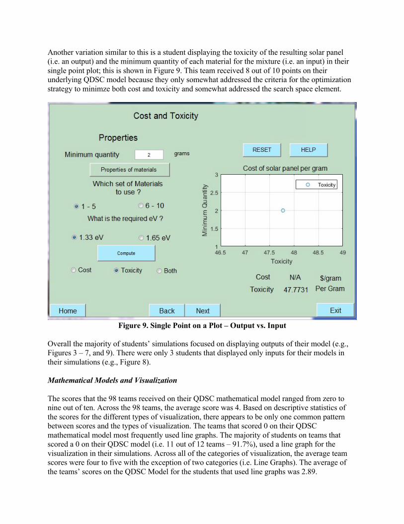
Another variation similar to this is a student displaying the toxicity of the resulting solar panel (i.e. an output) and the minimum quantity of each material for the mixture (i.e. an input) in their single point plot; this is shown in Figure 9. This team received 8 out of 10 points on their underlying QDSC model because they only somewhat addressed the criteria for the optimization strategy to minimze both cost and toxicity and somewhat addressed the search space element.
Figure 9. Single Point on a Plot – Output vs. Input
Overall the majority of students’ simulations focused on displaying outputs of their model (e.g., Figures 3 – 7, and 9). There were only 3 students that displayed only inputs for their models in their simulations (e.g., Figure 8). Mathematical Models and Visualization The scores that the 98 teams received on their QDSC mathematical model ranged from zero to nine out of ten. Across the 98 teams, the average score was 4. Based on descriptive statistics of the scores for the different types of visualization, there appears to be only one common pattern between scores and the types of visualization. The teams that scored 0 on their QDSC mathematical model most frequently used line graphs. The majority of students on teams that scored a 0 on their QDSC model (i.e. 11 out of 12 teams – 91.7%), used a line graph for the visualization in their simulations. Across all of the categories of visualization, the average team scores were four to five with the exception of two categories (i.e. Line Graphs). The average of the teams’ scores on the QDSC Model for the students that used line graphs was 2.89.

Conclusion These findings begin to highlight some of the different paths that students take in developing visualizations for their simulations. This study helps contribute to our understanding of how students develop simulations in an open-ended learning environment, as previous research has noted is lacking.2,6,8 Although there does not appear to be any significant connection between the types of visualizations that students use and the quality of their underlying models, there are some findings that highlight some points that practitioners should target in their feedback to further scaffold students through simulation development in open-ended learning environments. Many students used pie charts and bar charts to display the material composition of their resulting QDSC solar panel, which was the primary output of the model developed through the MEA. Although both charts do display the information, it would be more appropriate to display this information in a pie chart since it is based on a total, equaling 100%, of the solar panel material. The students that used bar charts displayed a lack of understanding on how to effectively display this kind of information. Students should be provided feedback on the types of visualizations that they use and which are most appropriate for different types of data. One infrequent, but problematic finding of this study was that some students saw the need to add visualization, but did not understand the need to display outputs of their models – not inputs. Students that only visualize inputs need to be further prompted to understand that the purpose of visualization is to communicate the underlying model, which requires emphasis on outputs. The previously developed framework of simulation development did not address this problem. The framework developed by Rodgers, Diefes-Dux, Kong, and Madhavan (2015) 8 should be revised to have at least one more level, as shown in Table 4. Assessment based on the previous version of this framework showed that all teams had a complete simulation. Based on this revised version, 98% of the teams have complete simulations (see ranking of teams bolded in the second column of Table 4). This framework was developed to categorize how students develop simulations in problem-based learning environments to further our understandings and enable practitioners to provide more effective feedback through simulation development in active learning environments.

Table 4. Revised Student Developed-Simulations Framework Levels Name of Level Explanation of Student Work 1 Basic Interaction These works would only consist of clicking, button
selection, or other basic interaction. 2 Black-Box Mathematical Model These works would have some type of mathematical
model that the inputs could be changed on, but there would be no visualization or communication of how the mathematical model works.
3 Incomplete Simulation (NEW LEVEL) 3 teams (2%)
These have all three major components: (1) interaction – variable manipulation, (2) underlying mathematical model, and (3) visualization. These are incomplete though because the visualization is focused on the inputs only.
4 Animated Simulation This would be an animation of one particular run of a simulation. There is no opportunity for the user to manipulate the input variables.
5 Simulation 138 teams (98%)
These have all three major components: (1) interaction – variable manipulation, (2) underlying mathematical model, and (3) visualization of outputs.
Alessi (2000)6 discussed the lack of research addressing how to help students learn about simulations through active learning. Rodgers, Diefes-Dux, Madhavan, and Oakes (2013)7 began to address this need through research the Network for Computational Nanotechnology (NCN – nanoHUB.org) looking out how to raise students’ awareness of nanotechnology through design projects that emphasized simulation development. This research into simulation development through problem-based learning was continued within the NCN team. The study presented furthers this investigation into how enable students to learn about simulations and simulation development through problem-based learning. This research needs to continue in other engineering courses, including upper-level undergraduate courses, to understand similarities and differences in this established framework. Acknowledgment This work was made possible by a grant from the National Science Foundation (NSF EEC 1227110). Any opinions, findings, and conclusions or recommendations expressed in this material are those of the author and do not necessarily reflect the views of the National Science Foundation. Bibliography 1. Zawojewski, J. S., Diefes-Dux, H. A., & Bowman, K. J. (Eds.) (2008). Models and modeling in engineering
education: designing experiences for all students. The Netherlands: Sense Publishers. (change 10 to 1, add 1 up to 10 to all so would be 12)
2. Rodgers, K. J. (2016). Development of first-year engineering teams' mathematical models through linked modeling and simulation projects (Doctoral dissertation). Retried from Purdue e Pubs. http://docs.lib.purdue.edu/dissertations/AAI10179096. (change 7 to 2, add 2 up to 7 to all so would be 9)
3. Bell, R.L. & Smetana, L.K. (2008). Using Computer Simulations to Enhance Science Teaching and Learning. National Science Teachers Association.
4. Gould, H., Tobochnik, J. & Christian, W. (2007). An Introduction to Computer Simulation Methods. Addison-Wesley.
5. Leemis, L.M., & Park, S.K. (2006). Discrete-Event Simulation: A First Course. Pearson Prentice Hall. 6. Alessi, S. (2000). “Designing Educational Support in System-Dynamics-Based Interactive Learning
Environments.” Simulation and Gaming. Vol. 31, pp. 178-196. 7. Rodgers, K.J., Diefes-Dux, H.A., Madhavan, K., & Oakes, B. (2013). First-year engineering students’ learning
of nanotechnology through an open-ended project. Proceedings of the 120th ASEE Annual Conference and Exposition. Atlanta, GA.
8. Rodgers, K.J., Diefes-Dux, H.A., Kong, Y., & Madhavan, K. (2015). Framework of basic interactions to computer simulations: analysis of student developed interactive computer tools. Proceedings of the 122nd ASEE Annual Conference & Exposition, Seattle, WA.
9. Hazelrigg, G.A. (1999). On the Role and Use of Mathematical Models in Engineering Design. ASME. J. Mech. 121(3):336-341. doi:10.1115/1.2829465.
10. Carberry, A. & McKenna, A. (2014). Exploring student conceptions of modeling and modeling uses in engineering design. Journal of Engineering Education, 103(1), 77-99.
11. Lesh, R. & Doerr, H.M. (Eds.) (2003). Beyond constructivism: models and modeling perspectives on mathematics problem solving, learning, and teaching. Mahwah, NJ: Lawrence Erlbaum Associates, Publishers.
12. Bullard, L. F., Carter, R. L., Felder, R. M., Finelli, C. J., Layton, R.A., Loughry, M. L., Ohland, M. W., & Schmucker, D. G. (2006). The comprehensive assessment of team member effectiveness (catme): A new peer evaluation instrument. Proceedings of the 2006 ASEE Annual Conference.
13. Rodgers, K. J., Boudouris, B., Diefes-Dux, H. A., & Harris, M. (2016). Integrating exposure to nanotechnology through projectwork in a large first-year engineering course. Proceedings of the 123rd ASEE Annual Conference and Exposition. New Orleans, LA. June 26-29.
14. Strauss, J. & Corbin, A. (1990). Basics of qualitative research: Grounded theory procedures and techniques. Sage Publications.
15. Zaiontz, C. (2013). Cohen’s kappa. Retrieved from http://www.real-statistics.com/reliability/cohens-kappa/. 16. Fleiss, J.L. & Cohen, J. (1973). The equivalence of weighted kappa and the intraclass correlation as measures of
reliability. Educational and Psychological Measurement, 33(3), 613-619.