Embed Size (px)
Citation preview
8/6/2019 HEAP Booklet (TASC)
http://slidepdf.com/reader/full/heap-booklet-tasc 1/17
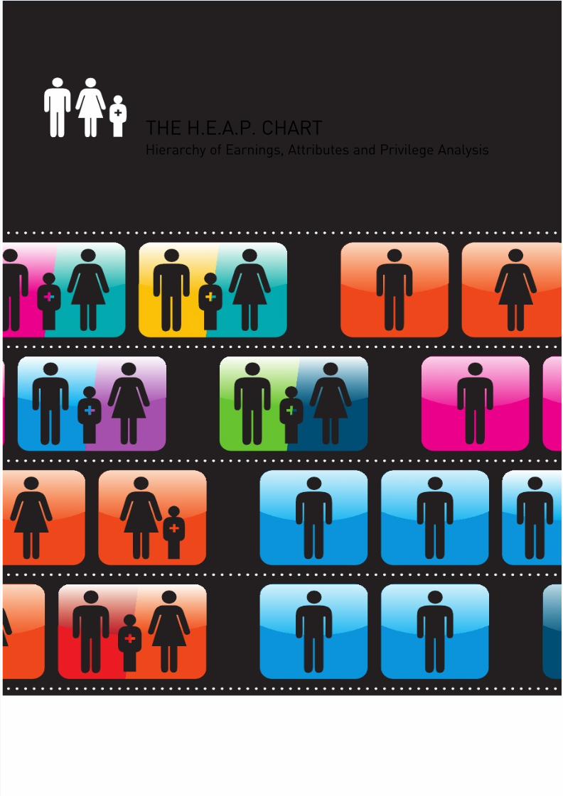
Hierarchy of Earnings, Attributes and Privilege Analysis
THE H.E.A.P. CHART

8/6/2019 HEAP Booklet (TASC)
http://slidepdf.com/reader/full/heap-booklet-tasc 2/1711
Chart Authors:
Terrence McDonough
Jason Loughrey
Booklet Authors:
Terrence McDonough
with
Jason Loughrey
Alex Klemm
Fiona Dunne
Sinéad Pentony
Project supported by:ICTU (Irish Congress o Trade Unions)
TASC (a think tank or action on social change)
SSRC (Social Sciences Research Centre, NUI Galway)
Hierarchy of Earnings, Attributes and Privilege Analysis
THE H.E.A.P. CHART
8/6/2019 HEAP Booklet (TASC)
http://slidepdf.com/reader/full/heap-booklet-tasc 3/17
03
By ICTU and TASC
The purpose o the H.E.A.P. Chart and this booklet is
to provide some o the basic acts relating to income
distribution in Ireland, together with an analysis
o Ireland’s socio-economic structure (i.e. income
distribution, occupation and household type).
The current state o income distribution in Ireland
is not healthy or Irish society.
Inequality is not a new phenomenon, indeed, it
persisted during the good economic times. Ireland is
now in the midst o an economic crisis and a urtherdeepening equality crisis. The current economic
crisis is now the excuse or government inaction on
reducing inequality whilst actively rowing back on
gains made to the equality inrastructure. These acts
cannot be dismissed when assessing willingness and
commitment to deal with inequality in all its orms.
The reality is we cannot aord not to address
inequality. On the contrary, we need to assert equality
as a core societal value – as a benchmark against
which to test and rene any proposed responses to
recession. There is certainly a need or changes in
expenditure and taxation but there is no reason why
such changes cannot be implemented in a way which
reduces rather than reinorces inequality.
There is both a moral and an economic case or
advancing equality.
Equality should be a core value because it underpins
the human dignity and worth o all individuals. The
desire or greater equality is refected in a 2009
Behaviour and Attitudes poll commissioned by TASC,
showing that 72 per cent o adults are concerned at
the level o wealth inequality in Ireland while 85 per
cent believe the government should take steps to
reduce income inequality.
Living in a more equal society has been ound to
benet everyone, not just people previously living
in poverty. Furthermore, research has shown that
organisational mechanisms to promote equality
and diversity enhance productivity, innovation and
employee retention. Income inequality has been
identied as a causal actor or low lie expectancy,
poor educational attainment, high levels o violence
and lower levels o social mobility.
All o this research evidence illustrates that promoting
equality must play a central role in developing an
eective response to economic recession. There will
be no adequate resolution to the economic crisis
without addressing the equality crisis.
A number o practical policy options and strategies
should be considered as a matter o urgency. These
options draw on experience rom other countries.
Investment in Social Protection
I Ireland is to reduce income inequality and makemeaningul social and economic progress it needs
to move towards a higher percentage spend o GDP
on social protection. A recent report published by
the Vincentian Partnership or Social Justice,
‘Minimum Essential Budgets or Six Households
2008’, highlights the challenges aced by people
living on low incomes. Looking at dierent household
types, it ound that most households on social welare
or the minimum wage have insucient income
to sustain a basic standard o living. Although the
overall cost o living is alling, the price o items
that low income amilies buy more o (solid uel,
public transport, childcare) are rising.
In the short term, maintaining current levels o
spending on social protection is essential as there
are signicant economic benets rom social
welare expenditure. Every penny o social welare
expenditure is spent in the economy and stimulates
demand, thus increasing employment, which in turn
generates tax revenue. In the medium to long term,
improvements in social protection spending could be
achieved by making taxation more progressive (i.e.
ensuring that those who earn the most pay the most
taxes), broadening the tax base to include dierent
sources o income and wealth (such as property and
inherited wealth), and reducing those tax breaks
which disproportionately benet the better o.
It is also imperative to ensure that the entitlement to,
and level o, social insurance-based benet payments,
unded by workers, employers and government,
continues to remain in place. Maintaining and
enhancing the integrity o the social insurance
system is central to promoting economic equality.
Reducing the Income Gap
Workable policies aimed at reducing the gap between
high and low incomes constitute a second strategy
that has been used eectively in other countries to
promote economic equality. There are two approaches
that can be used to reduce income dierentials. The
rst involves redistributing income rom rich to poor
households through progressive taxation o income
and wealth, while the second involves having smaller
dierences in incomes beore taxes and benets, which
means there is less need or redistribution. Sweden
achieves greater income equality through redistributionwhile, in Japan, income equality is achieved by having
smaller income dierentials beore taxes.
In the medium to long term this would involve a variety
o measures, ranging rom addressing the excessive
levels o executive pay and bonuses enjoyed by some o
those at the top of the H.E.A.P. Increasing income levels
can be achieved by setting a minimum income foor,
which allows people to live a dignied lie by ensuring
that no-one has an income less than 60 per cent o the
national median income. Preventing excessively high
incomes and concentrations o wealth at the top is as
important as pulling up the incomes at the bottom,
and the rst provides the means or the second to
be achieved.
Investment in Education
A third and crucial policy area impacting on economic
equality involves education. The analysis clearly
demonstrates the relationship between education
and income levels, whereby those with higher
levels o education have the opportunity to earn
higher incomes, and those with lower education
levels (primary and secondary) have signicantly
lower levels o income and are at much greater risk
o poverty.
Ireland continues to spend proportionately less on
education (4.7 per cent o GDP) when compared to the
average spend across 30 OECD countries (5.7 per cent
GDP). The OECD has also ound that Ireland spends
relatively little on early childhood development and
education compared to other countries, and that the
percentage o Irish children living in poor households
(16.3 per cent) is signicantly above the OECD average
(12.4 per cent).
Investment in early childhood development and
education in the rst six years o lie reduces
inequality. In purely economic terms, spending in
this area is one o the best investments a country
can make. Overall, greater investment in education,
and especially early childhood education, is needed
i income inequality is to be addressed. As with
social protection, increased investment in education
would require progressive taxation together with a
broadening o the tax base.
There is no shortage o policy options that can be used
to address income inequality and the three examplesoutlined above demonstrate some practical steps that
can be taken to address the symptoms and the causes
o income inequality.
All the evidence shows that achieving economic
equality is o central importance to our uture
wellbeing. The policy options we choose to advance
are less important than whether or not we ultimately
succeed in transorming Ireland rom a society
suering under the weight o inequality to one
characterised by (and gaining rom) equality.
TASC and ICTU would like to thank Proessor
Terrence McDonough and Jason Loughrey rom the
Social Science Research Centre at NUI Galway or
undertaking this project and bringing it to lie.
FOREWORD

8/6/2019 HEAP Booklet (TASC)
http://slidepdf.com/reader/full/heap-booklet-tasc 4/17
05
We all live in unequal societies in an unequal world. What stands out most
sharply is massive inequality in the lie prospects o the rich and the poor – an
inequality which impacts on a range o outcomes including lie expectancy,
health, happiness, education and income.
Inequalities are embedded in the economic structures o
society in areas such as ownership, wealth, income, taxation,
employment, health, housing and education. Although many
people are aware that economic inequalities exist, some believe
that the solution is to improve the well-being o the poorestin society, without addressing the issue o equality itsel (i.e.
the gap between rich and poor). However, recent research by
Richard Wilkinson and Kate Pickett, published in their book
‘The Spirit Level’, indicates that while it is important to improve
the position o the least well-o in society, the level o equality
also matters. In the words o the book’s subtitle: “more equal
societies almost always do better”.
Many people nd that they associate in their working and personal lives with
others at roughly the same level o income and social status. It is easy to
assume that the majority o people in the country share your income level.
Groups outside our own income level – be it high, low, or middling – tend to be
less visible, and thereore easily orgotten or ignored. In order to get the ‘big
picture’ o equality or inequality in Irish society it is important to step outside
our own personal experience. We hope that the Hierarchy o Earnings, Attributes
and Privilege (H.E.A.P.) Chart and analysis will help us all see that ‘big picture’.
The purpose o the H.E.A.P. Chart and this booklet is to provide some o the
basic acts relating to income distribution in Ireland, drawing on 2006 data.
The analysis provides a clear and eye-opening picture o Ireland’s socio-economic
structure in terms o income distribution, occupation and household type
(e.g. emale-headed households, couples etc).
Once we know the overall situation, we
can start debating whether the current
state o income distribution is healthy
or desirable. And i we conclude it isn’t,
we can start a new debate about how we
address income inequality, and how we
can achieve a just society.
Folded inside this companion booklet, the H.E.A.P. Chart shows colour-coded gures allowing us
to locate household types and occupations within the income distribution. This booklet provides
a clear explanation on how to use the H.E.A.P. Chart, and puts a human ace on the dry statistics
underpinning discussions on inequality.
INTRODUCTION
AND
PURPOSE02. Foreword
05. Introduction and Purpose
07. What is the H.E.A.P. Chart?
– How to use the Chart
– Source o the data used or the Chart
– Occupational denitions
10. Inequality in Ireland
– Measures o inequality
– Poverty rates
– Has inequality worsened?– Wealth inequality
16. Why Inequality Matters
– The Spirit Level
– Inequali ty and Ireland’s current crisis
20. The H.E.A.P. Chart: Interpretation and Analysis
– The eect o government benets and taxation
on inequality
– The role o Social Welare (SW) payments in
addressing poverty
– Gender inequality
– The eect o education on inequality
26. Conclusions
27. Appendix: Suggestions or Workshop Use
28. Acknowledgements
TABLE
OF
CONTENTS

8/6/2019 HEAP Booklet (TASC)
http://slidepdf.com/reader/full/heap-booklet-tasc 5/17
H.E.A.P. stands or the Hierarchy o Earnings, Attributes
and Privilege. Earnings are used to locate households
on the chart rom the bottom to the top. Attributes
include employment status, occupation, and amily type.
Privilege is where households stand in relation to one
another – are they at the top, middle or bottom o the
income heap?
While the H.E.A.P. Chart oers an at-a-glance view o
income distribution in Ireland, it also merits closer study.
In addition to inormation about household income,
the Chart contains inormation about the structure o
Ireland’s amilies and the occupations o the adults in
the amily.
07
Each icon on the Chart represents 2,800 Irish
households. Because o this, some amilies with lesscommon occupations and household types will not
show up on the Chart. I you nd this is the case or
your household, you can choose the closest matching
icon at your income level.
The data is drawn rom surveys carried out in 2006.
The year 2006 was chosen because it represents
the latest available data. It was also the last year o
the boom, so much has changed since. The ongoing
recession has aected incomes at all levels. Thus,
while incomes across the board are reduced, the
picture o overall income inequality still applies.
The Chart will be updated with new data as it
becomes available.
You can nd your household’s level on the Chart by
adding up the incomes o each individual and then
adding government benets received. We have
used people’s “headline” annual income to make
this easier. We could have corrected or taxation
and other actors which infuence take home pay, but
this would have added complications. When adding
up your household income, use 2006 gures where
possible and make sure to include the ollowing:
The incomes of all adults
The incomes o all children under 16 should be
included. Adult children’s incomes should be
included i they are under €20,000. Unmarried adults
in the household who earn more than this amount
are considered independent and are represented
as separate households. Benets in kind rom your
employer, like a company car, should be included.
Perhaps surprisingly, the statistics include employer’s
PRSI in employee income. Consequently, i you havean employer who pays PRSI you must add this amount
to your income to nd your place on the chart. I you
made less than €18,512 you must add 8.5 per cent.
For instance, i you made €10,000 this would be €850.
I you made €18,000 this would be €1,530. I you
made more than €18,512 you must add 10.75 per cent.
This would be €1,075 or every €10,000.
Pensions should be included.
Property income like rent or stock dividends should
be included.
You should also include any money you made rom
the sale o any assets like property or stocks.
Government benefts
These include:
• unemployment benets;
• old age benets;
• child benets;
• housing allowances; and
• education, survivors, sickness, carer’s and
disability benets.
Most amilies (95 per cent) will be able to use the
large chart showing households with incomes o
€134,000 or less. Household incomes up to €330,000
are included in the smaller chart. I this chart were
printed to the same scale as the bigger chart, the
highest icon would be two metres up the chart.
Incomes above this level are too dispersed, and the
households too ew in number, to create an icon,
except or one at €600,000. This icon would be a
couple with two managerial/proessional incomes.
WHATIS THE
CHART?
H.E.A.P.
How to use the Chart

8/6/2019 HEAP Booklet (TASC)
http://slidepdf.com/reader/full/heap-booklet-tasc 6/17
9
Example 1:
A couple with two children. The man is a welder earning
€27,000. The woman is a sales clerk earning €18,000.
Welders come under ‘Crat and related’ occupations.
Sales clerks come under ‘Sales’ occupations.
The welder would have to add 10.75 per cent or
employer’s PRSI.
27,000 x 1.1075 = €29,902.50
The sales clerk would have to add 8.5 per cent or
employer’s PRSI.
18,000 x 1.085 = €91,530
Child benet or two children (2006 rate) is €3,600.
€29,902.50 + €19,530 + €3,600 = €53,032.50
This couple should go to the line o icons between
€52,000 and €54,000 and look or a couple icon with
a colour code divided between ‘Crat and related’
and ‘Sales’.
Example 2:
A single woman with one child, working as a hairdresser
earning €25,000. Her occupation would come under
‘Personal and protective services’.
She would have to add 10.75 per cent or
employer’s PRSI.
€25,000 x 1.1075 = €27,687.50
She would then add €1,800 child benet (2006 rate).
€27,687.50 + €1,800 = €29,487.50
She should go the line o icons between €28,000 and
€30,000 and look or a single emale icon with dependents
colour coded or ‘Personal and protective services’.
Example 3:
A single retired man on the contributory government
pension. He would be receiving just over €10,000 in
pension payments.
He should go to the line o icons between €10,000 and
€12,000 and look or a single male icon colour coded
or ‘Retired’.
S IN GLE M ALE S IN GLE F EM ALE F EM ALE P LU S
DEPENDENT
COUPLES
The data is sourced rom the Irish Survey o Income and
Living Conditions (SILC). EU-SILC is the EU reerence
source or comparative statistics on income distribution,
living conditions and social exclusion at European level.
The purpose o SILC is to allow the Member States
and the European Commission to monitor national and
EU progress towards key EU objectives in the areas
o social inclusion and social protection. EU-SILC is a
multi-dimensional survey ocused on income but also
covering time, housing, material deprivation, labour,
health, demography and education. All the EU countriesand a ew others now conduct comparable SILC surveys.
Plant and machine operativesPower-production operators; water treatmentoperators; assembly-line operators; industrial-robotoperators; chemical-products machine operators;printing-machine operators; sewing-machineoperators; ood-processing machine operators; andvehicle drivers.
Unemployed, people with disabilities and students
This category includes people who are unable toparticipate in the active workorce due to disability;those who are currently unemployed, but availableto take up employment, and ull-time students.
RetiredThis category comprises those who have retired onage grounds.
FarmersCrop growers; vegetable growers; horticulturalists;dairy and livestock producers; poultry producers; armlabourers; orestry workers; and shery workers.
Home DutiesThis category includes people who look ater children,older people and/or people with disabilities on anunpaid basis, and those who, because o home duties,are not available to take up paid employment.
Managerial and proessionalManagers, directors and other executives; scientistsand engineers; health proessionals; teachers;business proessionals; lawyers; writers; andtechnicians.
Clerical and secretarialSecretaries; clerks; cashiers; bank tellers; travelagents; receptionists; telephone operators and call
centre operators.
Crat and relatedBuilders; plumbers; electricians; painters;welders; motor mechanics; handicrat workers;ood processing workers; textile workers; garbagecollectors; construction and maintenance labourers.
SalesModels; shop salespersons; shop demonstrators;market salespersons; and street vendors.
Personal and protective servicesTravel guides; waiters and bartenders; child-careworkers; personal care workers; hairdressers;beauticians; undertakers; re-ghters; policeocers; armed orces; domestic helpers andcleaners; caretakers; messengers and porters.
The SILC survey divides occupations into nine
categories. These are: managers and administrators,
proessionals, associate proessional and technical,
clerical and secretarial, crat and related, personal
and protective services, sales, plant and machinery
and other. In addition, those not in work are counted
in ve categories: unemployed, those on home duties,
students, people with disabilities and retired.
To include all o these categories separately would
create two problems. Firstly, some categories are not
numerous enough, and would tend to disappear whenamilies are aggregated into icons. Secondly, including
all categories would create too many colours on the
chart. We have combined the managerial, proessional
and associate proessional categories into one
‘managerial and proessional’ category. We have also
combined the unemployed, people with disabilities and
student categories.
Examples o the types o jobs within each category are
listed below.
To fnd your household’s position on the chart
First, nd the level o your amily’s annual household
income. Then look along the row to nd the icons
which most closely correspond to your household
type. We have included the ollowing amily types:
The ‘couples’ category includes both couples with andwithout children. Non-retired couples without children
were too ew in number to include as a separate
category. The same consideration applied to single men
with children. Although we would have liked to explicitly
recognise this amily category, they tended to disappear
in the aggregation necessary to create the icons, and
hence were not included as a separate category. We
were also unable to distinguish between same-sex
couples and single people sharing accommodation.
Same-sex single adults sharing accommodation are
usually represented as separate single adult households.
Finally, nd the icon which most closely matches the
occupations o the adults in your household (each
icon is colour-coded to denote occupation). We have
distinguished the ollowing occupational categories:
Managerial and proessional
Clerical and secretarial
Crat and related
Sales
Other
Personal and protective services
Plant and machine operatives
Unemployed, people with disabilities and students
Retired
Farmers
Home duties
Where a couple has dierent occupations, the icon is
split between the two colours. A ull description o the
occupations is ound on the next page, including many
examples o job titles included in each category.
The ollowing illustrates how to locate dierent
households on the chart.
Source o the data used or the chart Occupational denitions

8/6/2019 HEAP Booklet (TASC)
http://slidepdf.com/reader/full/heap-booklet-tasc 7/17
11
A third way to assess inequality is to look at the at-risk–o-poverty rate. This measure
looks at the percentage o individuals who receive 60 per cent or less o the median
income. I you were to list all the incomes in the country rom the highest down to the
lowest, median income would be the one precisely in the middle. Exactly hal o the
country would be richer than the median income and exactly hal poorer. I you have an
income below three-ths o the median, you are judged to be at risk o poverty. The chart
below (rom Eurostat 2007) gives the percentage o the population at risk o poverty or
the EU 15.
We can see rom this that Ireland is among the countries with relatively high levels
o inequality. Ireland’s inequality measure is 33 per cent higher than Denmark or Sweden.
Another measure o inequality is the income quintile share ratio. This involves taking
the share o income o the top one-th o the population and dividing it by the share
o income received by the bottom one-th. The higher this number, the higher the
level o inequality. The chart on the next page gives this number or the EU 15.
INEQUALITY
IN IRELAND
The rst measurement we will examine is the Gini Coecient. This measurement assesses
inequality by comparing a situation in which there is perect equality (everyone in a
country has an equal income share) to one o perect inequality, where one person has
100 per cent o the income and everyone else has nothing. Perect equality gives a GiniCoecient o zero. Perect inequality gives a Gini Coecient o 100. The closer the Gini
Coecient is to 100, the higher the level o inequality. The EU-SILC survey in 2006 ound
that Ireland had a Gini o 32. We can’t get a good sense o what this means until we
compare it to the Gini o other countries. The chart below gives the Gini Coecients o
the EU 15.
It is oten observed that Ireland has a relatively high level o income inequality.
We can investigate this by comparing levels o inequality in Ireland with levels
in other comparable countries. For this purpose, we will look at Ireland in
relation to the other members o the EU 15 (members o the European Union
beore the recent enlargements).
Denmark
Sweden
Austria
Netherlands
Finland
Germany
France
Belgium
Luxembourg
Spain
Italy
UK
Ireland
Greece
Portugal
0 5 10 15 20 25 30 35 40
Denmark
Sweden
Finland
Austria
Netherlands
France
Germany
Belgium
Luxembourg
Ireland
Spain
UK
Italy
GreecePortugal
0 1 2 3 4 5 6 7 8
Again, Ireland is in a group o
relatively unequal countries.
0 5 10 15 20
Netherlands
Sweden
Denmark
Austria
Finland
France
Luxembourg
Germany
Belgium
Portugal
Ireland
UK
Spain
Italy
Greece
Once again, Ireland is high up
the inequality league table.
Measures o inequality
Poverty rates

8/6/2019 HEAP Booklet (TASC)
http://slidepdf.com/reader/full/heap-booklet-tasc 8/17
13
The ollowing example illustrates how a measure o
inequality, like the ratio o the top and bottom incomes,
may ail to capture a rise in inequality. Suppose a
country had two citizens. The poor citizen makes €5 and
the rich citizen makes €50. The ratio o their incomes
is one to ten. The rich citizen is €45 ahead o the poor
citizen. Suppose ater ten years their incomes double to
€10 and €100. The ratio o their incomes is still ten but
the rich citizen is now €90 ahead o the poor citizen. The
gap between them has widened but the ratio measure
remains the same. This is what has happened over
the Celtic Tiger period. The income o all groups has
increased roughly proportionately, and hence the Gini
Coecient and the quintile share ratio don’t change
much. On the other hand, the gap between high incomes
and low incomes has widened considerably in Ireland.
The usual statistical measures o inequality don’t catch
this development.
There has been a great deal o debate around whether inequality in Ireland has worsened
during the Celtic Tiger period. Many observers have noted that the standard measures
o inequality, like the Gini Coecient and the income quintile share ratio, while relatively
high, did not become worse between 1987 and the latest gures. They have concluded that
inequality has not become worse in Ireland in recent years.
This conclusion is not valid, however.
The problem with the standard argument is that measures like the Gini
Coecient and the quintile share ratio are designed to be independent
o the overall level o wealth and income in the country (technicallyspeaking, this is known as mean invariance). This is a useul quality
or a measure to have when comparing two dierent countries. I you
want to compare inequality within Chad to inequality within Germany,
the measure should not be altered just because Chad is poorer than
Germany overall. These measures all down, however, when comparing
the same country during dierent time periods.
On the next page we include a picture o changes in the income
distribution, showing the distribution o income in 1987, 1994,
2001 and 2005.
Has inequality worsened?

8/6/2019 HEAP Booklet (TASC)
http://slidepdf.com/reader/full/heap-booklet-tasc 9/17
15
Statistics about wealth are hard to come by in Ireland. The Bank o Ireland published a study
o wealth in 2007, giving us gures or 2006. They ound that the gross wealth o the top 1%
o the population was an even 100 billion euro. This top 1% owned 20% o the wealth in Ireland.
When the value o residential property is excluded, the gure owned by the top 1% rises to 34%
or more than a third.
Wealth inequality
Wealth – or the accumulated resources owned by
households - is as important a actor in economic
inequality as income. Although there are a range o
wealth categories, common orms include bank deposits,
stocks and bonds, commercial property, investment unds
and pension unds; the value o the amily home is alsosometimes included.
Net wealth subtracts the level o debt rom total wealth.
The red 1987 line shows a distribution with the bulk o incomes bunched closely together and
thereore relatively equal. Only a relatively small number o households make substantially
more than this group, and consequently there isn’t a at tail stretching to the right. By contrast,
the green 2005 line shows ewer incomes bunched together and the population is spread out
along the horizontal side with many at both high and low incomes. The 1994 and 2000 lines
show the movement away rom the more equal distribution o 1987.
Figure #: Equivalised Weekly Disposable Income, 1987-2005
60
50
40
30
20
10
00 50 100 150 200 250 300 350 400 450 500 550 600 650 700 750 800 850 900 950 1000
p e r c e n t a g e o t o t a l
weekly income
1987
1994
2000
2005

8/6/2019 HEAP Booklet (TASC)
http://slidepdf.com/reader/full/heap-booklet-tasc 10/17
17
As on the previous chart, each country’s dot on the let to right scale shows its relative
income inequality. The urther to the right, the higher the income inequality. The dot’s
vertical position shows how well it is doing regarding the level o trust. The higher the
dot, the higher the level o trust. The line sloping down shows that as countries go rom
low to high levels o inequality, on average the levels o trust go down.
There are those who argue that inequality is necessary to promote invention, innovation and creativity,
contending that a high level o inequality is essential to incentivise a high level o international
competitiveness. This, however, does not seem to be the case. On the contrary, inequality reduces
children’s perormance in schools, while Wilkinson and Pickett have ound that more equal societies
produce more patents or inventions. Most studies nd that more equal societies grow aster.
There are many reasons or this. Studies show that inequality creates
high levels o stress, largely as a result o unhealthy competition
and status anxiety. Importantly, overall levels o social trust go down
as inequality goes up. The ollowing graph shows Wilkinson and
Pickett’s ndings about inequality and trust:
Index of:
• Lie expectancy
• Math & Literacy
• Inant mortality
• Homicides
• Imprisonment
• Teenage births
• Trust• Obesity
• Mental illness -
including drug &
alcohol addiction
• Social mobility
Each country’s dot on the let to right scale shows its relative income inequality. The arther
to the right, the higher the income inequality. The dot’s vertical position shows how well
it is doing regarding the health and social problems. The higher the dot, the worse the
perormance. The line sloping up shows that as countries go rom low to high levels o
inequality, on average their ability to avoid health and social problems gets worse.
The Spirit Level
Wilkinson and Pickett have ound that, i you examine
the various dimensions o health and a range o social
problems, you discover that less equal societies have
more problems and poorer records. This is true even
in richer societies.
Wilkinson and Pickett have constructed an index to
measure societies’ perormance in the areas o healthand social problems, going down rom better to worse.
The measure includes things like mental illness, lie
expectancy, inant mortality, educational perormance
and murder rates. They nd that increasing the level
o national income per person in the richer countries
doesn’t improve the score signicantly – but increasing
the level o equality does improve perormance.
Conversely, a country’s perormance declines as
inequality rises. The ollowing picture tells this story:
It is oten argued that inequality is not the issue.
Proponents o this position contend that the
problem is the absolute level o deprivation o the
least well o. I we can raise the well-being o the
poorest in society, or so the argument goes, what
dierence does it make that others are still very
much better o? Recent research, however, indicates that, while the absolute level o well-being o the worst-o is
certainly important, the level o equality matters as well. As the social scientists Richard Wilkinson and Kate Pickett
observe in the subtitle o their book, The Spirit Level, “more equal societies almost always do better.”
Health and Social Problems are Worse in More Unequal Countries
Worse
Better
Income Inequality
Source: Wilkinson & Pickett, The Spirit Level (2009)
Low High
USA
New Zealand
Australia
ItalyCanada
Canada
Sweden
Japan
SwitzerlandNetherlands
Portugal
UK
Greece
Ireland
FranceAustria
Denmark
Finland
Norway
Germany
Belgium
www.equalitytrust.org.uk
I n d e x o h e a l t h a n d s o
c i a l p r o b l e m s
WHY INEQUALITY
MATTERS
LEVELS OF TRUST ARE HIGHER IN MORE EQUAL RICH COUNTRIES
Sweden
Norway
Portugal
Singapore
CanadaGermany
Spain IrelandItaly
UKGreece
0
Low HighIncome Inequality
Source: Wilkinson & Pickett, The Spirit Level (2009)
M o s t p e o p l e c a n b e t r u s t e d ( %
a g r e e i n g
)
20
40
60
80
10
Netherlands
Denmark
Finland
New Zealand
Switzerland Australia
Belgium
Japan
Austria
FranceIsrael
USA

8/6/2019 HEAP Booklet (TASC)
http://slidepdf.com/reader/full/heap-booklet-tasc 11/17
19
Inequality and Ireland’s Current Crisis
Inequality is also a prime actor in the recession. Ireland is currently acing our
interlinked crises. We are in the midst o an international crisis, a nancial or
banking crisis, a scal or government decit crisis, and an unemployment crisis.
High levels o inequality tend to waste
the talents o a large proportion o the
population.
Wilkinson and Pickett conclude:
The international crisis was caused by many actors, but prominent
among them was a high level o inequality in the United States which
led to stagnant consumer demand and high levels o indebtedness.
Facing reduced levels o demand, investment was sluggish, and those
with money turned increasingly to nancial speculation. Financial
speculation was urther driven by the demand by lower income groups
or sub-prime mortgages, and by the bloated bonuses awarded to
bankers or short-term perormance. This bubble eventually burst
precipitating a wider crisis.
Here in Ireland, inequality contributed to
high levels o indebtedness, because people
borrowed to keep up with higher income
consumption levels in housing, cars and
other goods. The high incomes o bankers
and property developers diverted investment
into property rather than more productive
uses. This dynamic helped create Ireland’s
own property bubble. To maintain personal
consumption, all income groups supported
a tax system based on property transactions
rather than income - an unsustainable
system which has now collapsed creating
a budget crisis. The international crisis,
the nancial crisis, the budget crisis,
and high levels o personal debt have all
contributed to a crisis o demand in Ireland,
reducing economic activity and increasing
unemployment.
“I you want to know why one country does better or worse
than another, the rst thing to look at is the extent o
inequality. There is not one policy or reducing inequality in
health or the educational perormance o school children,
and another or raising national standards o perormance.
Reducing inequality is the best way o doing both.”

8/6/2019 HEAP Booklet (TASC)
http://slidepdf.com/reader/full/heap-booklet-tasc 12/17
21
Each country’s dot on the let to right scale shows its level o social protection spending.
The arther to the right, the higher the spending as a percentage o GDP. The dot’s
vertical position shows how well it is doing regarding the level o inequality. The higher
the dot, the higher the level o inequality. The line sloping down shows that as countries
go rom low to high levels o social protection spending, on average the levels o
inequality go down. For instance, Ireland has a low level o at 18.2 percent o GDP and a
relatively high level o inequality with a Gini Coecient at 32. Sweden has a level o social
spending at 30.7 percent o GDP and a correspondingly low level o inequality with a Gini
Coecient o 24.
Ireland 2001 2004 2006 2007
Poverty levels beore Social Welare 35.6 39.8 40.3 41.0
Poverty levels ater Social Welare 21.9 19.4 17.0 16.5
The role o Social Welare -13.7 -20.4 -23.3 -24.5
This table shows that poverty levels (beore Social
Welare) in Ireland increased rom 35.6% to 41% rom
2001 to 2007. The table also demonstrates that social
welare played a critical role in reducing poverty levels
rom 21.9% in 2001 to 16.5% in 2007 (these gures are not
adjusted or purchasing power). Ireland has also entered
into a recession since these gures were published, and
we are likely to see poverty levels increase dramatically
not only as a result o growing unemployment, but also
due to growing pressure on social welare rates.
Ireland’s social protection rates are not generous by
European standards. In 2006, spending in this area
represented 18.2% o GDP, which compares badly with
countries such as France (31.1%) and Sweden (30.7%)
and even countries such as Greece (24.2%) and Portugal
(25.4%). There is a direct correlation between spending
on social welare and income equality: countries that
spend less on social welare have higher levels o income
inequality.
Were the principles o social insurance in Ireland to be
dismantled, this would have a detrimental eect not
only on income inequality but on individuals already
placed in a precarious situation. It would expose more
households to the risk o poverty which would have a
myriad o negative eects on the individual and adverse
consequences or society. The eects o such a model
can be seen in the United States where citizens are not
aorded minimum social protections, the results o
which are in stark contrast to our own”.
The ollowing chart relates the level o inequality as
measured by the Gini Coecient to the percentage o
GDP which is spent on social protection in the EU 15
countries.
While we were not surprised by the overall shape o the chart, two things stood out
when we had laid the icons out. In the horizontal dimension o the chart, the longest
line is that just above the €10,000 line. This is because pensions and social welare
payments prevent people rom alling urther down the chart. This is in contrast to
places like the United States where this kind o foor on income doesn’t exist. In the
vertical dimension, it is striking that the ‘managerial and proessional’ occupation
category is the only one to weave its way rom near the bottom o the chart to the
very top o the heap.
Poverty Rates
The income o all groups in Ireland has increased over the last number o years,
and this could lead one to assume that - i everyone’s income has increased -
poverty levels must have allen. However, this is not the case. The table below
demonstrates how poverty levels increased and the role social welare payments
play in addressing poverty.
THE
AN INTERPRETATION
AND ANALYSIS
HEAP
CHART:
The Eect o Government Benets and Taxation on Inequality
The role o Social Welare (SW) payments in addressing poverty
HIGHER LEVELS OF SOCIAL SPENDING ARE ASSOCIATED WITH LOWER LEVELS OF INEQUALITY
The ollowing chart
relates the level o
inequality as measured
by the Gini coecient
with the percentage o
GDP which is spent on
social protection in the
EU 15 countries.
0
20
22
24
26
28
30
32
34
36
38
40
10 20 30 40
Y
Linear (Y)
% o GDP spent on social protection
G i n i c o e f c i e n t

8/6/2019 HEAP Booklet (TASC)
http://slidepdf.com/reader/full/heap-booklet-tasc 13/17
23
The chart shows women dominating the lower incomes
whereas at higher incomes men are better represented.
All those 16 or over are included.
Women’s income in 2006 was around two-thirds o men’s
income. Ater adjusting or dierences in hours worked,
women’s hourly earnings were around 86% o men’s.
The proportion o men at risk o poverty in 2007, ater pensionsand social transers, was 15% compared to 19% o women.
You can see that the lower incomes are dominated by those
without the qualication while at higher levels the opposite
is the case. Only those 25 and over are included.
The chart demonstrates the central role played by educational
opportunities in determining subsequent income – the
education premium.
In addition to inequality among the general population, there is still inequality between
men and women.
The ollowing gure compares the incomes o men and women.
The ollowing graph compares the incomes o those with a university qualication and
higher to those without such a qualication.
18
16
14
12
10
8
6
4
2
00 1 00 2 00 3 00 4 00 5 00 6 00 7 00 8 00 9 00 1 00 0 1 10 0 1 20 0 1 30 0 1 45 0 1 60 0 1 75 0 1 90 0 2 00 0
Male
Female
p e r c e n t a g e o t o t a l
weekly disposable income
Male
Female
28
26
24
22
20
18
16
14
12
10
8
6
4
2
01 0 0 2 0 0 3 0 0 4 0 0 5 0 0 6 00 7 00 8 00 9 00 1 0 00 1 1 00 1 2 00 1 3 00 1 4 00 1 5 00 1 6 00 1 7 00 1 8 00 1 9 00
p e r c e n t a g e o t o t a l
weekly disposable income
Gender Inequality The Effect of Education on Inequality

8/6/2019 HEAP Booklet (TASC)
http://slidepdf.com/reader/full/heap-booklet-tasc 14/17
25
The table on the let give thes median
gross income by education level achieved.
The median is the middle income i all
incomes in the category were listed
rom top to bottom. Equivalised means a
correction has been made or the size o
the household.
The table on the let shows how higher
educational levels reduce the risk o
poverty. Disposable income takes into
account the payment o things like taxes
which reduce the amount o money
available or spending.
Highest Percentage of Equivalised
Education Level Household Gross Income
Achieved Heads
Median
Primary/No Formal 30 13489
Lower Secondary 18 19742
Upper Secondary 17 24933
Post Leaving Cert 9 26433
Third Level - non degree 9 31812
Third Level - Degree or Above 17 45707
Table #: Highest Education Level Achieved by Household Head
At Risk
Primary/No Formal 33.6
Lower Secondary 23.3
Upper Secondary 15.1
Post Leaving Cert 11.6
Third Level - non degree 8.7
Third Level - Degree or Above 3.2
Table #: At Risk O Poverty i.e. percentage o households below60% o Equivalised Median Disposable Income

8/6/2019 HEAP Booklet (TASC)
http://slidepdf.com/reader/full/heap-booklet-tasc 15/17
27
This insight is particularly disturbing or us in
Ireland. Ireland has or many years been among
the most unequal o the developed societies. Our
boom, now apparently over, raised the overall level
o income in Irish society. Unortunately, however,
studies show that we did not use the benets o
the boom to reduce the level o inequality. On the
contrary, the distance between those at the top and
those at the bottom has widened. This widening
inequality has played a role in our current crisis
by encouraging the expansion o unsustainable
consumption levels and debt, while tax rates have
been cut below those which could sustain decent
public services.
At the time o writing we have been subjected to
a cacophony o voices calling or wage cuts and
warning against raising taxes on the well-to-do.
A continuation o the extreme low tax model and
a programme o wage-cutting will only worsen
Ireland’s inequality problem. It is the neoliberal,
small government, rewarding the rich policies and
institutions which have brought us to this pass. An
end to the crisis cannot be brought about by calling
or more o the same ailed policies.
We must not ask an imaginary international bond
market what kind o society we should have. We
should instead set about building the society we
want. A good society will have a much higher level o
income equality, and the social solidarity that goes
with it, as one o its essential oundation stones.
We hope that the H.E.A.P. Chart has helped to
illuminate an important aspect o lie in Ireland
today. Since we all o necessity occupy only one
place in the heap, it is dicult to know about the
conditions aced by those both above and below us.
Further, studies like those carried out by Wilkinson
and Pickett in The Spirit Level have established that
the shape o the heap is important as well as the
level o income it represents. More equal societiesdo better.
Exercise 1
Place the poster on the foor o the classroom
in a corner o the room opposite the windows.
Have one participant stand 3.6 metres (11 eet,
10 inches) rom the bottom o the poster to
represent the top icon at an income o €600,000.
Have another student stand outside the window
on a premarked spot 6 metres (approx. 20 t.) to
represent a CEO income o €1,000,000. You might
want to represent 4 million, 24 metres (80 t.) also
i you have space. Call everyone back in the roomand engage in discussion. Did they think incomes
in Ireland were this unequal? Is this level o
inequality acceptable? Can it be justied?
Is this level o inequality good or bad or society?
Exercise 3
Ask the participants what level o income it would
take to live comortably or a amily o our in Ireland
today. You may have to speciy a particular place,
like Dublin or Tullamore, depending on where your
participants live. This could be done openly and you
could attempt to arrive at an agreed level o income.Or you could have participants write down a level
anonymously and you could take an average. Hold a
pointer or stick at this level on the chart and examine
how many households all below this level. Ask the
participants i they were surprised by the number
below the comort level.
The at-risk-o-poverty level o income or a amily o
our corresponds roughly to 28,000 on our chart. The
Vincentian Partnership or justice undertook a study
which calculated a “Minimum Essential Budget” or
a amily o our which stood at just under 34,000 or
2006 on our chart. Show these levels on the chart.
Discuss.
Exercise 5
Brainstorm policies which could be adopted by
government which would reduce inequality.
Exercise 4
Ask the participants to indentiy other dimensions o
inequality besides income. Examples might include
place o residence, working conditions, access to
education, settled vs. traveller, etc. Discuss how
these other dimensions o inequality do or do not
relate to income inequality.
Exercise 2
Have each participant add up and write down their
amily income. (This works better with adults or
perhaps older teenagers.) Then have them identiy
their household composition. Then they should
identiy the occupations o the adult members o the
household. Answer any questions about where an
occupation might t in the categories on the poster.
Then allow the students to examine the HEAP Chart
closely (perhaps in small groups) to identiy or
themselves where their household appears on
the chart.
Ask the participants to volunteer any surprises they
may have got. Was anyone surprised at how high
their income was on the chart compared to the
general population? Was anyone surprised at how
low their household was? Did anyone turn up in the
middle when they didn’t expect to?
Collect the descriptions o the participants’
households. Make sure they are not identied
by name. Shufe the descriptions. Locate the
households on the chart and mark them. (use
post-it note types o material to avoid permanently
marking the poster.)
Discuss the position o the workship in relation to
the rest o the population. Did they orm a pattern
or were they bunched up at a certain level. Ask the
participants to explain why this is the case.
CONCLUSIONS
APPENDIx:SUGGESTIONS FOR WORkSHOP USE

8/6/2019 HEAP Booklet (TASC)
http://slidepdf.com/reader/full/heap-booklet-tasc 16/1728
There are many people who have been a great help
in bringing this project to ruition.
Stephen Rose, the author o the original American
Prole Poster, was not only a source o inspiration,
but has also been generous with his help and
encouragement along the way.
Paul Sweeney’s initial and continuing enthusiasm orthis project has been essential in pressing it orward.
At TASC, Paula Clancy, Alex Klemm and Sinéad Pentony
have been central to getting this done.
Sally Ann Kinehan’s active support or this project within
ICTU has been crucial, while Fiona Dunne had the tough
job o holding this project together.
Ricca Edmondson and Oliver Feeney at the Social
Science Research Centre at NUI Galway have been
unailingly supportive. We also received indispensible
assistance rom Cathal O’Donoghue in the School o
Business and Economics at NUI Galway.
One Irish household has provided invaluable support to
Terry McDonough. It is best known in Moycullen and
beyond as “Marian Brady’s house.”
Our colleagues rom Whitenoise Studios in Belast, Alix Britton
and Paul Allen have been enthusiastic rom the beginning and
deserve special mention or their graphic interpretation and
presentation o this topic.
ACkNOWLEDGEMENTS

8/6/2019 HEAP Booklet (TASC)
http://slidepdf.com/reader/full/heap-booklet-tasc 17/17


![Tasc Basic[1]](https://img.dokumen.tips/doc/110x75/5449bfc5af795984188b45cc/tasc-basic1.jpg)