Embed Size (px)
Citation preview

Harry Williams, Cartography 1
THEMATIC MAPS A thematic map shows numeric or character data by colors or symbols. Data displayed in this manner is referred to as a theme. The example shows the numeric data Pop_1990 (population 1990) displayed as a theme on a U.S. base map. Notice that shades of color are used to represent ranges of numeric data. This is probably the most common of the thematic maps - the ranged thematic map or choropleth map.
Note: It’s common to have overlapping ranges like those shown above; by convention, “to” means “up to, but not including.”
Harry Williams, Cartography 2
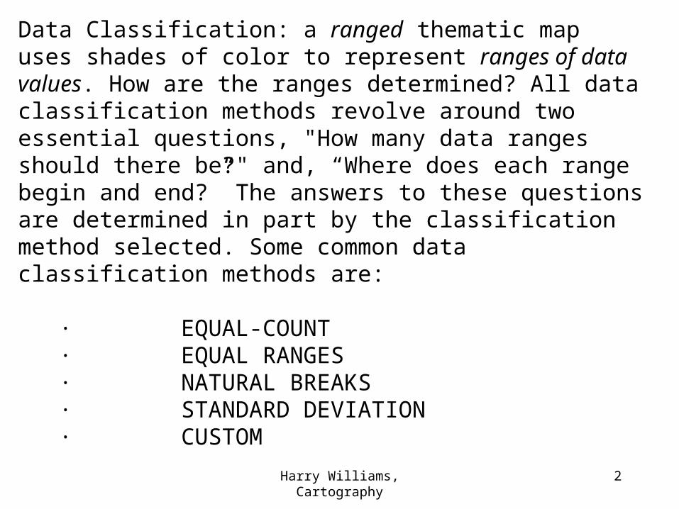
Data Classification: a ranged thematic map uses shades of color to represent ranges of data values. How are the ranges determined? All data classification methods revolve around two essential questions, "How many data ranges should there be?" and, “Where does each range begin and end?” The answers to these questions are determined in part by the classification method selected. Some common data classification methods are:
· EQUAL-COUNT · EQUAL RANGES · NATURAL BREAKS · STANDARD DEVIATION · CUSTOM
Harry Williams, Cartography 3
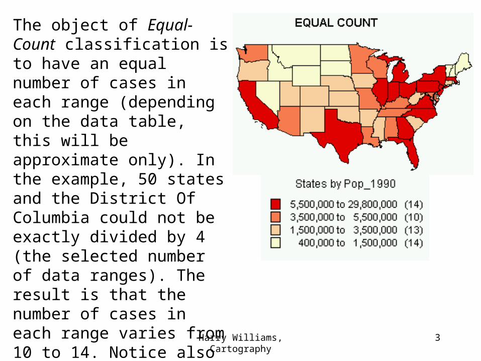
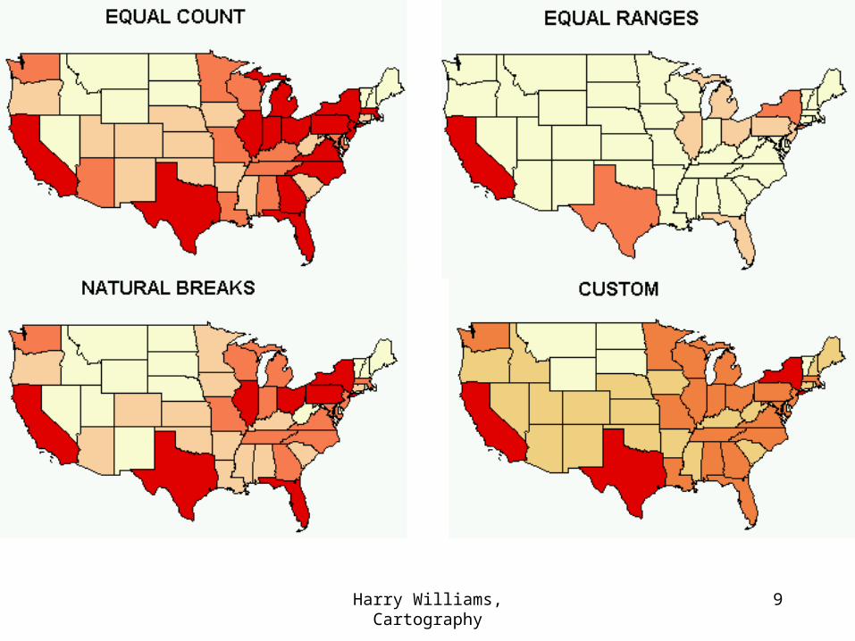
The object of Equal-Count classification is to have an equal number of cases in each range (depending on the data table, this will be approximate only). In the example, 50 states and the District Of Columbia could not be exactly divided by 4 (the selected number of data ranges). The result is that the number of cases in each range varies from 10 to 14. Notice also that the size of ranges varies greatly - from about 1.1 million (the smallest range) to about 24 million (the largest range).

Harry Williams, Cartography 4
The object of Equal Range classification is to have equal-sized ranges. In the example, every range has an interval of about 7 million. This method does not always reflect the data very well. Notice that the lowest range has 42 cases and the highest range has only 1 case, making for a very "unbalanced" map.
Harry Williams, Cartography 5
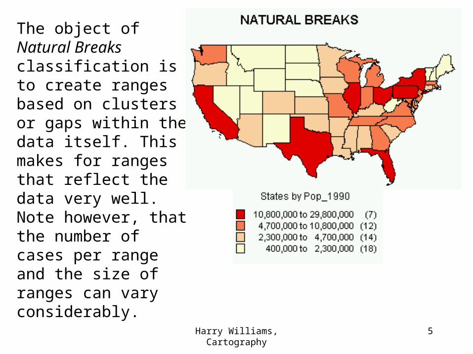
The object of Natural Breaks classification is to create ranges based on clusters or gaps within the data itself. This makes for ranges that reflect the data very well. Note however, that the number of cases per range and the size of ranges can vary considerably.

Harry Williams, Cartography 6
Standard Deviation classification creates classes 1 standard deviation in size around the average. In the example, the average value is about 4.9 million and the standard deviation (SD) is about 4.5 million. In effect, the map shows above and below average values. This type of classification is popular for highlighting extremes of data (either much smaller or much bigger than the average). Three ranges cover all the data values (range 1 = 1 SD below the average; range 2 = 1 SD above the average; range 3 = 2 SD above the average).
The 4th range would be -4.1 million to 0.4 million (2 SD below average), but no data values fall into this range.
Harry Williams, Cartography 7
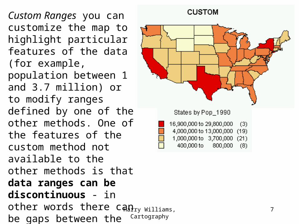
Custom Ranges you can customize the map to highlight particular features of the data (for example, population between 1 and 3.7 million) or to modify ranges defined by one of the other methods. One of the features of the custom method not available to the other methods is that data ranges can be discontinuous - in other words there can be gaps between the ranges, as shown in the example. This is acceptable, as long care is taken to ensure that no data values fall into the gaps.
Harry Williams, Cartography 8
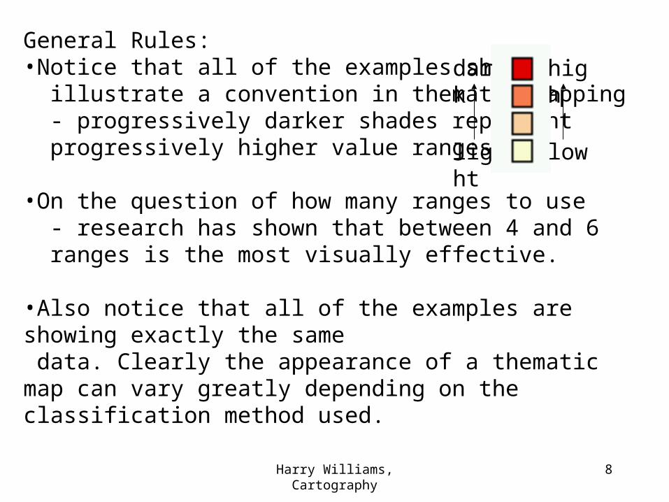
General Rules:•Notice that all of the examples shown illustrate a convention in thematic mapping - progressively darker shades represent progressively higher value ranges.
•On the question of how many ranges to use - research has shown that between 4 and 6 ranges is the most visually effective. •Also notice that all of the examples are showing exactly the same data. Clearly the appearance of a thematic map can vary greatly depending on the classification method used.
light
dark
low
high
Harry Williams, Cartography 9

Harry Williams, Cartography 10
Which method should be used? Again, in terms of visual effectiveness, maps look better when there is a balance between data ranges (about the same number of values in each range) - for this reason, the Equal Count and Natural Breaks methods are probably the best choices for most general mapping purposes (although all these methods are perfectly valid and the actual choice of classification usually depends on the nature of the data being displayed and the purpose of the map).
Harry Williams, Cartography 11
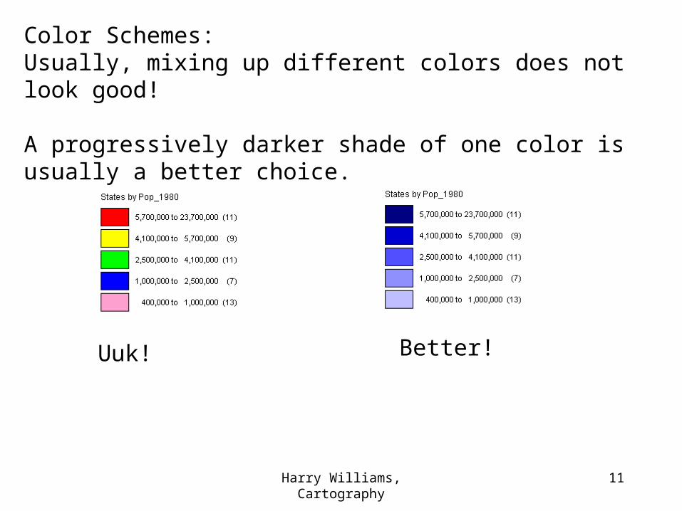
Color Schemes:Usually, mixing up different colors does not look good!
A progressively darker shade of one color is usually a better choice.
Uuk! Better!
Harry Williams, Cartography 12
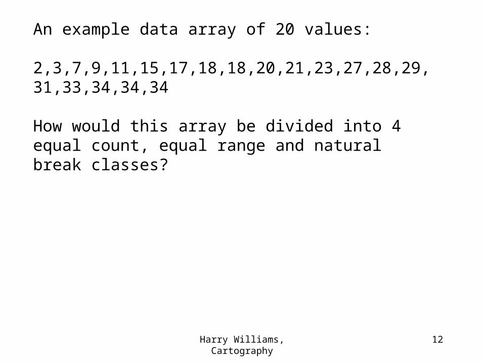
An example data array of 20 values:
2,3,7,9,11,15,17,18,18,20,21,23,27,28,29,31,33,34,34,34
How would this array be divided into 4 equal count, equal range and natural break classes?
Harry Williams, Cartography 13
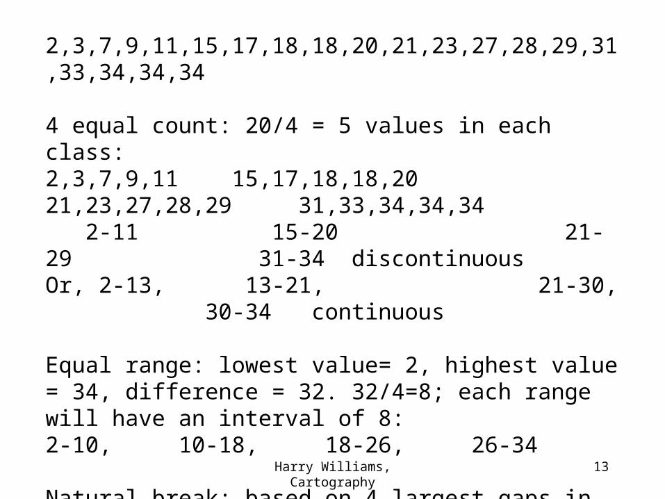
2,3,7,9,11,15,17,18,18,20,21,23,27,28,29,31,33,34,34,34
4 equal count: 20/4 = 5 values in each class:2,3,7,9,11 15,17,18,18,20 21,23,27,28,29 31,33,34,34,34 2-11 15-20 21-29 31-34 discontinuousOr, 2-13, 13-21, 21-30, 30-34 continuous
Equal range: lowest value= 2, highest value = 34, difference = 32. 32/4=8; each range will have an interval of 8:2-10, 10-18, 18-26, 26-34
Natural break: based on 4 largest gaps in array:2-3, 7-11, 15-23, 27-34 (all gaps of 4 values).