Embed Size (px)
DESCRIPTION
Presentation boards for G&B YCN brief
Citation preview
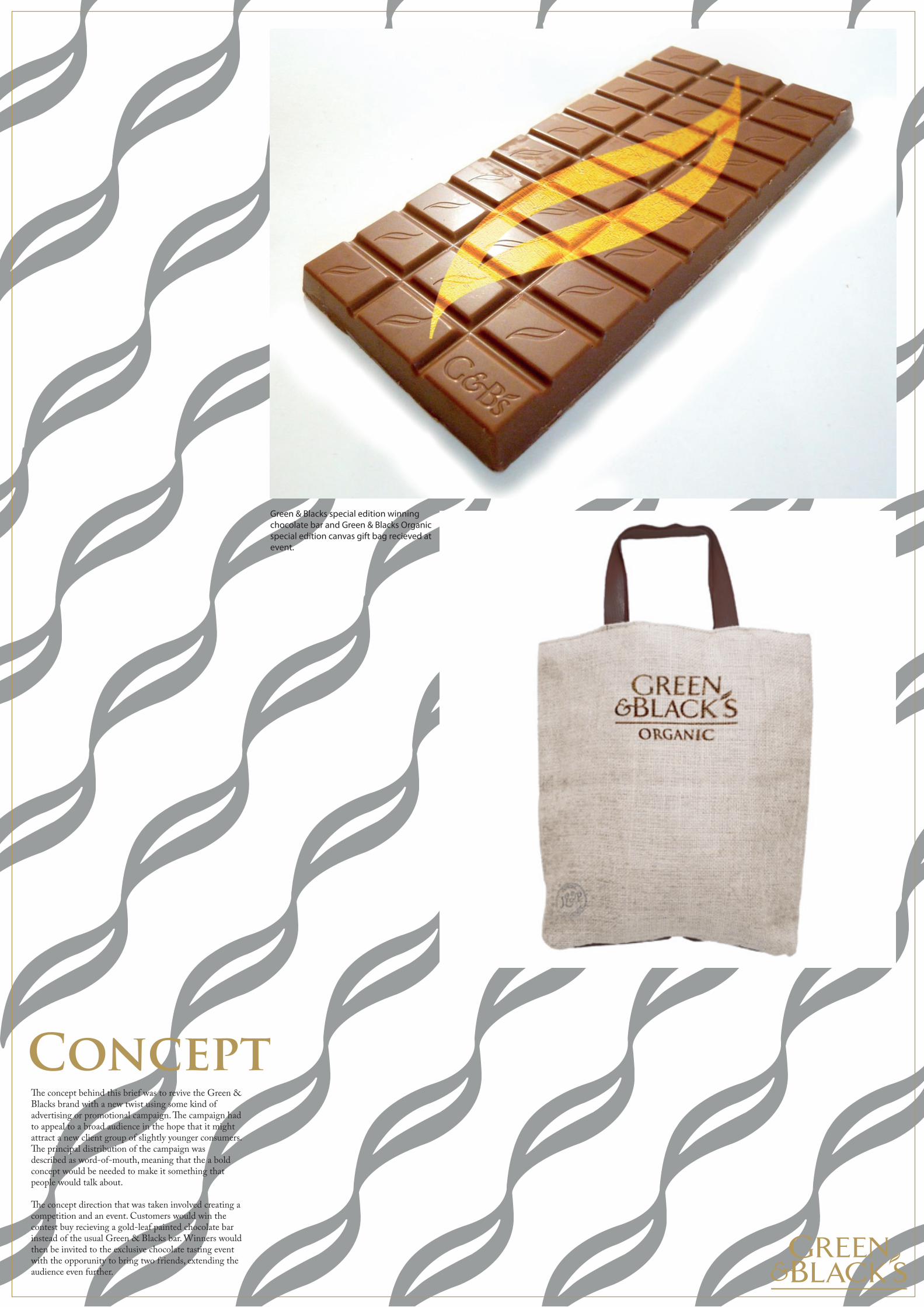
Concept�e concept behind this brief was to revive the Green & Blacks brand with a new twist using some kind of advertising or promotional campaign. �e campaign had to appeal to a broad audience in the hope that it might attract a new client group of slightly younger consumers. �e principal distribution of the campaign was described as word-of-mouth, meaning that the a bold concept would be needed to make it something that people would talk about.
�e concept direction that was taken involved creating a competition and an event. Customers would win the contest buy recieving a gold-leaf painted chocolate bar instead of the usual Green & Blacks bar. Winners would then be invited to the exclusive chocolate tasting event with the opporunity to bring two friends, extending the audience even further.
Green & Blacks special edition winning chocolate bar and Green & Blacks Organic special edition canvas gift bag recieved at event.
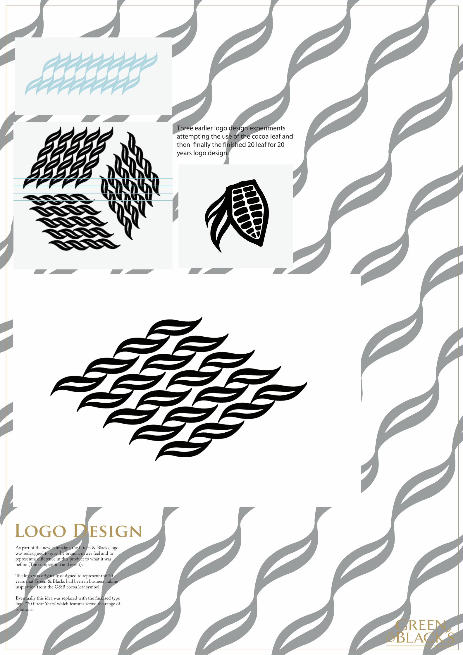
Logo DesignAs part of the new campaign, the Green & Blacks logo was redesigned to give the brand a newer feel and to represent a difference in this product to what it was before (�e competition and event).
�e logo was originally designed to represent the 20 years that Green & Blacks had been in business, taking inspiration from the G&B cocoa leaf symbol.
Eventually this idea was replaced with the finalised type logo, “20 Great Years” which features across the range of solutions.
Three earlier logo design experiments attempting the use of the cocoa leaf and then �nally the �nished 20 leaf for 20 years logo design.
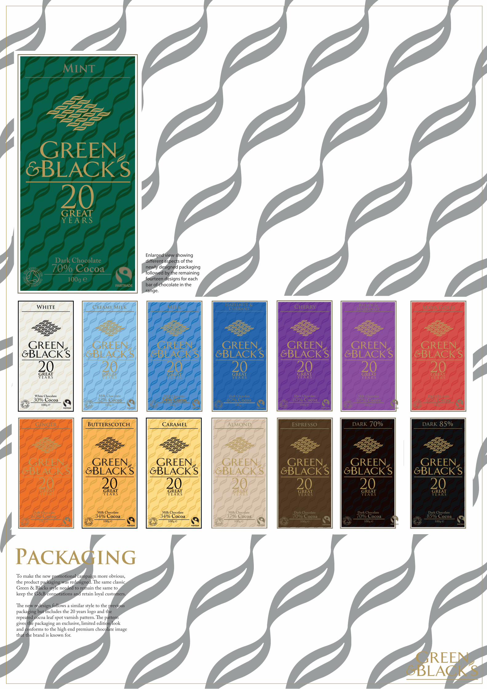
PackagingTo make the new promotional campaign more obvious, the product packaging was redesigned. �e same classic Green & Blacks style needed to remain the same to keep the G&B connotations and retain loyal customers.
�e new redesign follows a similar style to the previous packaging but includes the 20 years logo and the repeated cocoa leaf spot varnish pattern. �e pattern gives the packaging an exclusive, limited edition look and conforms to the high end premium chocolate image that the brand is known for.
℮100g
Mint
Dark Chocolate70% Cocoa
FAIRTRADE
y e a r s
20great
℮100g
White
White Chocolate30% Cocoa
y e a r s
20great
FAIRTRADE
℮100g
Caramel
Milk Chocolate34% Cocoa
FAIRTRADE
y e a r s
20great
℮100g
Butterscotch
Milk Chocolate34% Cocoa
FAIRTRADE
y e a r s
20great
℮100g
Ginger
Dark Chocolate60% Cocoa
FAIRTRADE
℮100gFAIRTRADE
Dark Chocolate60% Cocoa
Hazelnut &Currant
y e a r s
20great
℮100g
Milk
Milk Chocolate34% Cocoa
FAIRTRADE
y e a r s
20great
℮100g
Creamy Milk
Milk Chocolate32% Cocoa
FAIRTRADE
y e a r s
20great
℮100g
Almond
Milk Chocolate37% Cocoa
FAIRTRADE
y e a r s
20great
y e a r s
20great
℮100g
Maya Gold
Dark Chocolate55% Cocoa
FAIRTRADE
y e a r s
20great
℮100g
Cherry
Dark Chocolate60% Cocoa
FAIRTRADE
y e a r s
20great
℮100g
Raisin &Hazelnut
Milk Chocolate40% Cocoa
FAIRTRADE
y e a r s
20great
℮100g
Espresso
Dark Chocolate70% Cocoa
FAIRTRADE
y e a r s
20great
℮100g
DARK 70%
Dark Chocolate70% Cocoa
FAIRTRADE
y e a r s
20great
℮100g
DARK 85%
Dark Chocolate85% Cocoa
FAIRTRADE
y e a r s
20great
Enlarged view showing di�erent aspects of the newly designed packaging followed by the remaining fourteen designs for each bar of chocolate in the range.
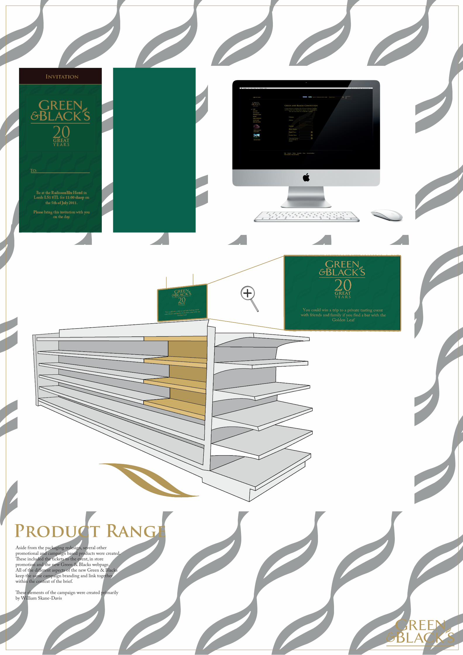
Product RangeAside from the packaging redesign, several other promotional and campaign based products were created.�ese included the tickets to the event, in store promotion and the new Green & Blacks webpage. All of the different aspects of the new Green & Blacks keep the same campaign branding and link together within the context of the brief.
�ese elements of the campaign were created primarily by William Skane-Davis