Embed Size (px)
Citation preview

7/25/2019 Graphic Design for ngo
http://slidepdf.com/reader/full/graphic-design-for-ngo 1/52
Laundy
and
Masaimo Vignelli
Published by
AIGA
The
American
Inat'
This
publication
was
supported
by the
Graphic
Arts
National
Endowment
for the Arts,
Design Arts Program.
Non-Profit

7/25/2019 Graphic Design for ngo
http://slidepdf.com/reader/full/graphic-design-for-ngo 2/52

7/25/2019 Graphic Design for ngo
http://slidepdf.com/reader/full/graphic-design-for-ngo 3/52
Laundy and Massimo Vignelli
Published
by
AIGA
This
publication
was supported
by the
The
American
Institute
of Graphic Arts
National
Endowment
for the Arts,
Design
Arts Program.
Design
Non-Profit

7/25/2019 Graphic Design for ngo
http://slidepdf.com/reader/full/graphic-design-for-ngo 4/52
American
Institute
of
Graphic
Arts
ared by
The
American
Institute
of
Arts
Third Avenue
York,
N.Y.
10021
and
design direction:
imo Vignelli
and
text;
Peter Laundy
Mark Wieboldt
Typographic Images,
Inc.,
York, N.Y.
Champion
Kromekote
Cover/.
010
Chalice Opaque
Vellum/80 lb.
7/25/2019 Graphic Design for ngo
http://slidepdf.com/reader/full/graphic-design-for-ngo 5/52
This
guide is
divided into
two
parts.
Basic Guidelines discusses use
of
graphic
components available to
the
designer. Two
Prototypic
Organizations
illustrates
how
these
guidelines can
be applied
to a broad
range
of
communications
by
two
very
different
non-profit organizations.
FORMATS
6
GRIDS
8
FULL SIZE
GRID
10
TYPEFACES
12
LAYOUT
GUIDELINES
14
LOGOTYPES
AND
SYMBOLS
18
SEALS
AND
CRESTS
19
COLOR
19
RULES
19
Prototypic
CITY HISTORICAL SOCIETY
AND STATE
CENTRAL UNIVERSITY
21
IDENTITY ELEMENTS
22
STATIONERY
24
FORMS
26
PERSONNEL DIRECTORIES
27
CALENDARS
AND NEWSLETTERS 28
INVITATIONS
AND
ANNOUNCEMENTS
30
PROGRAMS
31
POSTERS
32
BROCHURES
36
INTERNAL
PUBLICATIONS
38
BOOKS
AND CATALOGUES 40
SIGNS
AND EXHIBITIONS
44

7/25/2019 Graphic Design for ngo
http://slidepdf.com/reader/full/graphic-design-for-ngo 6/52

7/25/2019 Graphic Design for ngo
http://slidepdf.com/reader/full/graphic-design-for-ngo 7/52
The
publication
of this
volume
was
prompted
by a
seminar
on communication
and design for
non-profit institutions
which
was
organized
by
the AIGA
in
1976.
At
that time,
it became
apparent
that
a
great
amount
of
effort
and
talent
had been
applied to
the
design
programs of
a broad spectrum
of
institutions,
but that an
even greater
amount
of
waste
resulted
from a lack
of
design
coordination and
consistency.
I
suggested
that the AIGA
publish a
manual
to
help these
institutions
improve the efficiency
and
economy
of
the
process
of communication.
The main
purpose of this manual is
not
to
generate sameness
or fads,
but
to
provide
tools to develop individual
programs
to
fit individual situations.
It
is
also
intended to support the
efforts
of
designers dealing
with
management to illustrate
the
necessity
of
investing
in a coordinated
graphic
design
program.
I
am
grateful to the
Design
Arts
Program
of
the
National
Endowment
for
the
Arts
for their support of this
project
from
its
inceptiont
to
Caroline
Hightower,
Executive Director of the
AIGA,
for
her continuous efforts to
publish
this
guide;
and
especially
to
Peter
Laundy,
whose
insightful
collaboration has
made
it possible for
this project to come
to
fruition.
I
am pleased that this volume adds to
AIGA's continued
efforts
to
help
improve
the
quality
of
design
in our
environment.
Massimo
Vignelli
organization's
image
is extremely
It
is the
sum
of the
made on
the
public
in
a
of
ways.
An art gallery, for
will
be judged on such
as
the quality of
its
the
care
with which
shows
hung
and catalogues
are
presented,
character of the
exhibition
spaces
overall
physical environment,
and
demeanor
of the
museum staff.
Of
the collection
is
all-important
everything
else
is secondary, but
secondary concerns
can
either
or detract from the
overall
communications are supporting
that are relatively
easy
to
They
are necessary ongoing
that might as easily
be
done well
poorly, and
are
also
relatively
as
primary
contacts with
the
.
Consistency
and
appropriateness
are
two
yardsticks
by
which
communications
should
be judged.
Consistency
has many
advantages, the
primary
one
being
a strong
visual
identity.
By
appearing in
uniform,
an
organization's
printed
matter
visibly becomes
part
of
a team
that
stands
out from the crowd. If
a
letterhead, brochure,
and
newsletter
are consistent, they
reinforce each
other.
They
add up
to a
whole, rather
than
remaining isolated
and
lost
as
opportunities
to
communicate
an
appropriate
image
,
as well as an
organization's impression of
efficiency
and
c
are
.
Consistency
also avoids
unnecessary
customization;
certain
attributes of
all
communications
are
established.
They need
not
be
rethought for every
communication,
and time
and money are
saved.
A
designer,
working
within
guidelines established
to maintain
consistency, is free to
focus
on
the
most important
part of
design: making
each communication
right for
its task.
This search
for
what
the communication
should
be is
a
search
for
appropriateness,
the second yardstick
by
which
communications
should
be
judged.
The
combination
of
a search
for both
consistency
and
appropriateness
results
in
a
meaningful diversity
of
printed
items. Without
consistency,
meaningless changes camouflage
those
that
are purposeful. Just as a
writer
should not
change
tense
or
person
arbitrarily,
so, too, the
designer
should
not
arbitrarily
change
such
things as
typeface, type
size,
color,
or
spatial
organization. Such
changes
should only
grow
out of the
needs
of
each communication.
Consistency
avoids
arbitrary
changes,
allowing
the
meaningful cues to
stand
out
in clear
relief.
The
first part
of
this
guide
discusses
the
means available
to achieve
consistency.
The
second
part
gives
examples
of
consistent
graphic
standards
as
appropriately applied
to a
variety of
items for two
prototypic
organizations.

7/25/2019 Graphic Design for ngo
http://slidepdf.com/reader/full/graphic-design-for-ngo 8/52
Shown below are format
sizes
suggested Always
consult
a
printer
as
early
as
for
use on
printed communications.
possible
when
deciding on
a format
to
This
wide
range
of
possibilities can
be
sure
he has
the presses and
can
meet every
need.
All can be
printed
acquire
the
paper
to
it
with minimum
paper waste
on
the
American
economically.
Since
paper deliveries
standard
25
x
38
sheet. Most fit are
often
slow, allow
your
printer
as
standard
9
x
12
and
#11
business
much
time
as possible
to
order,
envelopes.
The
exceptions are
indicated
below
with
an
asterisk (*).
3-3A
X
5-1/2
X
8-1/2*
11
X 8-1/2
8-1/2
11
X
17

7/25/2019 Graphic Design for ngo
http://slidepdf.com/reader/full/graphic-design-for-ngo 9/52
is
an
important
factor
in
the
of
a piece
to be
mailed. Have
supplier or
printer make
up a
dummy
to the exact
size and
of
pages
contemplated, to
make
it
isn't too heavy.
European paper sizes are entirely
different
from
the American ones.
With
the United
States conversion to the
metric
system,
these
sizes may become
increasingly
available.
X
11*
-1/2
X
11
11
X
11*
X 22
11
X
22»
17
X
22
7/25/2019 Graphic Design for ngo
http://slidepdf.com/reader/full/graphic-design-for-ngo 10/52
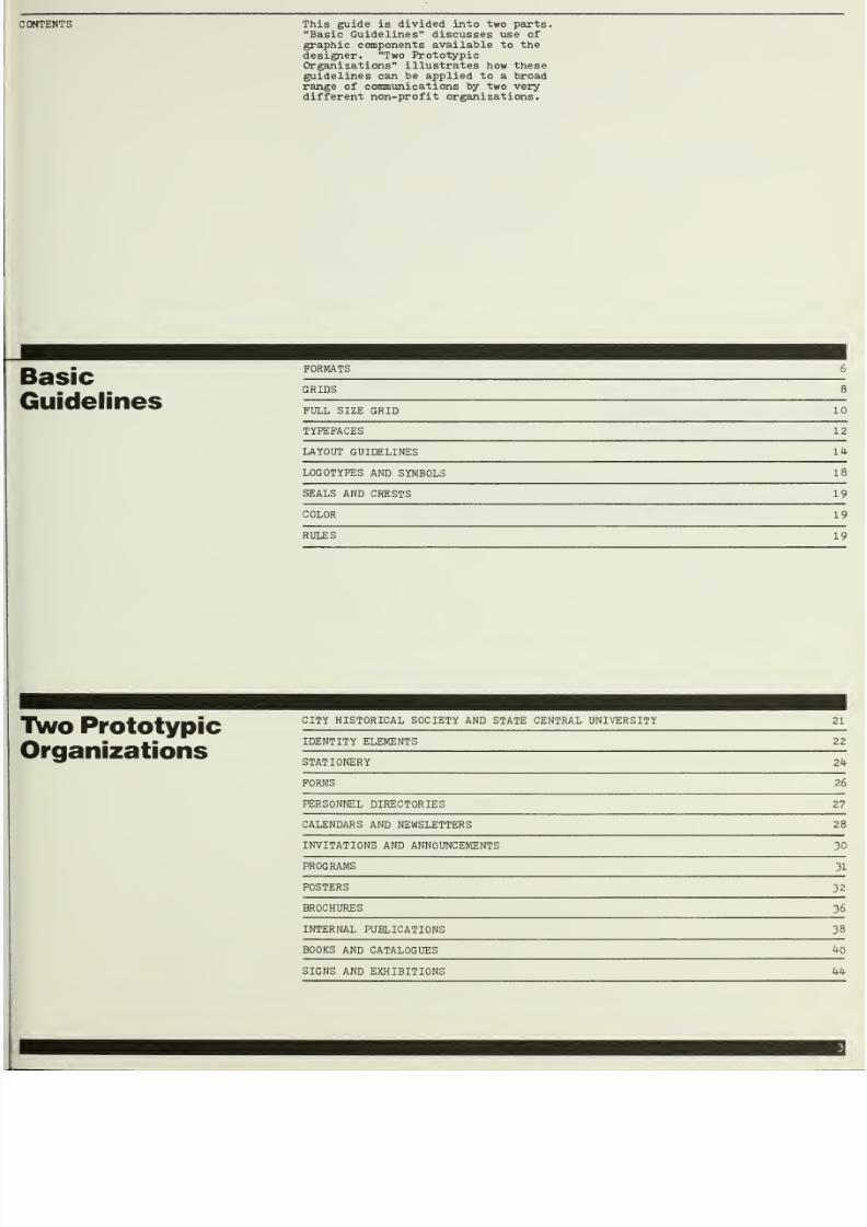
The grid
is
the most
important tool
that
can be
used
by the
layout
designer.
It
is
an
invisible
structure
that
provides
a
disciplined
and consistent
look while increasing
production
efficiency
and
maintaining
the
flexibility needed
to
solve
a
wide
range
of
layout
problems.
Shown
below
is
the same
grid
applied
to
every
suggested
format.
Its
basic
unit
is
the
25
square
subdivided
into
three
horizontal
modules.
The
square
and
the
3:2
proportion
rectangle
thereby
created
are
the
formats,
respectively,
of
2i
and
35nun. cameras.
The
repetition
of
the
modules
over
the
format
allows
photographs
shot
with
either
of
these
popular
cameras
to be
reproduced
at
a
variety
of scales
without
cropping.
THIS
GUIDE
AND
THE
PROTOTYPE
LAYOUTS
IT
CONTAINS
WERE
BASED
ON
THIS
GRID.
Other grids
would
also
be
effective.
We
have
selected
this system
to
demonstrate
why
they
are
useful
.
2-1/4
3-3A
X
8-1/2
5-1/2 X
8-1/2
11
X
8-1/2
11
X
17
7/25/2019 Graphic Design for ngo
http://slidepdf.com/reader/full/graphic-design-for-ngo 11/52
achieves
a
disciplined
look
with
of
restrictions.
the designer
will,
at
feel
constrained
by
the
grid.
unusual
layout
problems will
to
handle and the
designer
do his
best.
The more
talented
he
the
better
he will
succeed.
If on
a
particular
commission,
however,
the grid
seems in some way
inappropriate, the designer
should be
encouraged to
articulate
the
problem
and
modify
the
grid.
For
example, the
grid below
would not
work well
for
85
X 11
sheets
to be 3-hole
punched, since
a large
margin on
the punched side
of
the
page
would be
desirable.
Considerable
efficiencies
are realized
with
the use
of a
predetermined
grid.
The
designer is not facing a
blank
page;
some decisions
have
already
been
made
for him.
Text can be
set, for
example,
only in
three
possible
widths:
one,
two,
or
three
2i
wide columns.
Also,
borders
and
gutters have
already
been established.
Not only is design
time
saved,
but
typesetting
is
simplified,
both
of
which
increase
efficiency.
X
11
8-1/2 X
11
11
X
11
X
22
11 X
22 17
X
22

7/25/2019 Graphic Design for ngo
http://slidepdf.com/reader/full/graphic-design-for-ngo 12/52

7/25/2019 Graphic Design for ngo
http://slidepdf.com/reader/full/graphic-design-for-ngo 13/52

7/25/2019 Graphic Design for ngo
http://slidepdf.com/reader/full/graphic-design-for-ngo 14/52
The
selection
of a typeface
to be
used
whenever
typesetting
is
involved is
another tool
to achieve
visual
consistency.
All
the typefaces
shown
below have
established
themselves
as
classics
through years
of use. They
come
in
roman and
italic
in
at
least two
weights, regular
and bold, and
are
commonly available
throughout the
country in
photo and
hot metal
type.
Some are
also available
in transfer
type.
The
selection
of one
typeface,
in
addition
to providing
visual
consistency,
affords
considerable
economy.
Designers
need
not
spend
time
deciding which
typeface
to use
and
typesetting
jobs
can
be
gathered and
set on
one
machine
without
change
of
font.
ABCDEFGHUKL
Vr\
OPQRSTUVWXYZ
abcdefghij
Idmnopqrstuvwxy
z
1234567890
Expanded
ABCDEFGHIJKLMNOPQRSTUVWXYZ
abcdefghijklmnopqrstuvwxyz
1234567890
No.
3
ABCDEFGHIJKLMNOPQRSTUVWXYZ
abcdefghijklmnopqrstuvwxyz
1234567890
Roman
ABCDEFGHIJKLMNOPQRSTUVWXYZ
abcdefghijklmnopqrstuvwxyz
1234567890
ABCDEFGHIJKLMNOPQRSTUVWXYZ
abcdefghijklmnopqrstuvwxyz
1234567890
ABCDEFGHIJKLMNOPQRSTUVWXYZ
abcdefghijklmnopqrstuvwxyz
1234567890

7/25/2019 Graphic Design for ngo
http://slidepdf.com/reader/full/graphic-design-for-ngo 15/52
is
too expensive
in
or
for one
specific
project,
type
can
be effectively
tituted. The
quality
of
typewriter
varies enormously. An example
high-quality face
is
IBM
Selectric
Large
Elite
'72.
Where
photo
is
involved,
as
in
all
the
importance
of an
even
is increased. Copy should,
be
produced on
an electric
Reduced
25^,
it
becomes
in size
to
normal
text
types
achieves a more typeset appearance.
Typewriters
now coming
on
the
market
with computerized editing capabilities
may
prove
economical
for
such
applications.
Also,
different
weights
of
typewriter
type
may become available
on type
balls, eliminating one of
its
disadvantages.
Unlike
the
other, more traditional
typefaces shown below,
Helvetica
is
a
sans serif
typeface; it
does not
have
thin finishing lines, called serifs, at
the ends
of
letterstrokes . Sans
serif
typefaces
are
appropriate
for
technical
texts
or
for
organizations that
want a
contemporary
look.
The typefaces shown are
of those that could
sen
They are
the most
commo
however, and represent
of typeface
that
has
be
appropriate
for both
te
(headings, titles,
etc
typeface
other than one
chosen, it
is
highly re
it
be
a face
that
has
s
time. A
recently drawn
quickly
and should, the
avoided.
only a portion
sibly
be
used,
nly
available
,
every
category
en proven
xt
and display
)
. Should
a
shown
here be
commended that
tood the
test of
face may date
refore,
be
Book
Book
Italic
Bodoni
Bodoni
Italic
Bodoni Bold
Bodoni
Bold
Italic
Century Expanded
Century
Bold
Century
Expanded
Italic
Century
Bold
Italic
Garamond
No.
3
GaramondNo.
3
Italic
Garamond
No.
3
Bold
GaramondNo.
3
Bold
Italic
Times
Roman
Times Roman Italic
Times
Roman
Bold
TimesRoman Bold Italic
Light
Light
Italic
Italic
Helvetica
Medium Helvetica
Bold
Helvetica
Medium Italic
Helvetica
Bold
Italic

7/25/2019 Graphic Design for ngo
http://slidepdf.com/reader/full/graphic-design-for-ngo 16/52
GUIDELINES TYPE
ALIGNMENT
PROPER RAG
A grid organizes columns of type
through
the alignments
of
left and
right
edges.
Centered typography
is,
therefore,
not
recommended.
For
most
applications,
a
ragged
right
setting
is best
because
it
has
the
advantage
of
uniform wordspacing;
shorter
lines are
not lengthened by
adding
space
between
words.
Justified
settings can
be
used
to
achieve
a
more
tightly
packed
appearance,
often
appropriate for newspapers, newsletters
and
magazines, although
erratic word-
spacing
results.
If
type is
set ragged
right, care
shoulc
be
taken
to achieve
an evenness
where
no
shapes are
formed
along
the ragged
edge.
Hyphenation
should be
avoided so
that
a greater
disparity among
line
lengths
is
created,
thereby improving
evenness
and
seeming
randomness of
the
rag.
Typography
is
closely allied
to
the
fine
arts,
always
reflected the taste
or
feeling
of
their
time
of
the
early
Italian
types
has
perhaps
never
and the
like is
true of
the
Renaissance
which
they were based
—
and of many
other
of
an
in
that
same
wonderful time. Note,
too,
the French manuscnpts
and types.
In spite
of the
increasing interest
einthehisto
and the
attention
paid
in many quarters
to
famous
typographers, a
knowledge of stand
the
rank and file of printers
is
still greatly lac
average
printer
of to-day, type
is
type,
printing
it is all about
alike;
and he concerns
hims
Typography
is
closely allied to
the fine arts,
always reflected
the
taste
or
feeling of
of
the
early
Italian
types
has perhaps
never
and
the like is true of the
Renaissance
which
they
were
based
—
and
of
many
other
of
art in that
same
wonderful time.
the French manuscripts and
types
of a
slightly
the manuscripts and the types
of the
In
spite of the
increasing interest in
the
history
and the
attention
paid
in
many quarters
to
famous typographers, a
knowledge of
the
rank
and
file
of
printers
is
still greatly
average
printer
of
to-day.
RECOMMENDED Typography
is
closely
allied
to the
fine
arts,
an
reflected the taste or
feeling
of
their
the
early Italian types
has
perhaps
never
the like is
true
of
the
Renaissance
were
based
—
and
of
many
art
in
that
same
wonderful
time.
Note,
too,
French
manuscripts and types of a
and the
types
of
the
increasing
interest
in
Typography
is
closely
allied
to
the
fine
arts,
always
reflected the taste or
feeling of the
of the
early
Italian types has
perhaps
and the
like is true of
the
Renais
which they were
based
—
and of
of
art
in
thai
same
wonderful
time.
the
French manuscripts and types
of
a
slightly
the
manuscripts and the types
of the
Italian
In
spite
of
the.increasing
interest in the
and the
attention
paid
in
many
famous
typographers,
a
knowledge
the
rank
and
file
of printers
is
still great
average
printer
of to-day, type
is
type,
printing
It IS all about
alike;
and
he concerns.

7/25/2019 Graphic Design for ngo
http://slidepdf.com/reader/full/graphic-design-for-ngo 17/52
PARAGRAPHING QUOTATIONS
a
consistent
linespacing
for
communications as
one
element
of
an
style
and
to
facilitate
and
typesetting efficiency.
with no leading or 1 point
is
recommended.
One
advantage
to
tight linespacing
more
type
will fit
into
a
given
Another
is
that
skipped lines
be used
to clearly
organize
units
such as
paragraphs.
If
is
excessive, skipped lines
not
stand
out as clearly.
Because
of
the importance
of
an
aligned
appearance
along
column
edges,
paragraphs can be
indicated
by a
skipped line
withotrt
indentation.
If
a
text consists
of
many
short paragraphs
so
that skipped lines
take
up too
much
room,
paragraphs
can
be
indicated by an
indentation without
skipping
a line.
The
disadvantage
is
that the
consistent
indentation
point takes
away from the
perceived crispness
of the left edge of
a
column
of type.
There
is no need
to
both
skip
a
line and indent.
A common
way
to
treat
quotations
is
to
set them in italics. This is
a
clear
signal that
needs
no reinforcement;
indentation is
unnecessary,
wastes
space,
and
works against the simpler
look
of
a
consistently maintained
column edge. When using quotation
marks, it is a
nice
refinement
to
hang the
opening quote
out
into
the
gutter so that the first letter of the
quotation aligns with the column edge.
is closely allied
to
the
fine arts,
reflected
the
taste
or
feeling
of
their
early
Italian
types
has
perhaps
never
the
like is true
of the
Renaissance
they were
based
—
and of
many
other
in
that
same
wonderful time.
Note,
too,
manuscripts.
of
the
increasing
interest
in the history
the attention
paid
in many quarters
to
typographers,
a
knowledge
of
rank and
file
of
printers is
still
greatly
printer
of
to-day, type is type,
printing
all
about
alike.
Typography
is
closely
allied
to
the
fine
arts,
always reflected
the
taste or
feeling
of
their
of
the
early
Italian
types
has perhaps
never
and the
like
is
true
of
the
Renaissance
which they were based
—
and of
many other
of
art
in
that same
wonderful
time.
Note,
too,
the
French manuscripts.
In
spite
of
the
increasing
interest in the history
and the
attention
paid in many
quarters
to
famous
typographers, a
knowledge of stand
the rank and
file
of
printers.
Typography
is closely
allied to
the fine arts,
always reflected
the
taste or feeling of their
of
the early
Italian
types
has
perhaps never
and the
like
is true
of
the Renaissance
which they were based.
In spite
of
the increasing interest in the
and
the
attention paid
in many quarters
to
famous
typographers, a
knowledge of stand
the
rank
and
file of printers
Typography
is
closely
alleed
to
the
fine
arts,
always reflected
the taste or
feeling
of
their
of
the
early
Italian
types
has
perhaps
never
and
the
like is true of
the
Renaissance
which
they were based
—
and
of
many other
of
art in that same
wonderful
time.
Note,
too,
the
French
manuscripts and types of
a
slight
the
manuscripts and
the types:
Typography
is closely allied to the fine
art
have
always reflected the taste
or
feeling
of
to
the
fine
arts, and
types
or
Typography
is
closely
allied
to
the
fine
arts,
always reflected the
taste
or
feeling
of their
of the early
Italian
types
has perhaps never
and the like is
true
of the Renaissance
which
they
were based
In
spite
of the
increasing
interest
in
the
history
and the
attention
paid
in many quarters to
famous typographers.
is
closely allied to
the fine
arts,
early Italian
types
has
perhaps
never
they
were based
—
and
of
many other
manuscripts and
types
of
a
slightly
of
the
increasing interest
in
the
typographers,
a
knowledge
of
printer
of
to-day, type is type.
of
the increasing
interest in the
history
typographers,
a knowledge of stand
printer
of to-day.
Typography is closely allied to
the
fine arts,
always
reflected the taste
or
feeling
of
their
of the
early
Italian
types has perhaps
never
and
the
like
is true
of
the
Renaissance
which
they were based
—
and of
many other
of
art
in
that
same
wonderful time.
Note,
too,
the
French
manuscnpts.
In
spite
of
the
increasing
interest
in
the
and
the
attention
paid
in many
quarters
to
famous typographers,
a knowledge of stand
the
rank
and
file
of
printers is
still
greatly
average printer
of to-day,
type is
type,
it is
all
about
alike.
Typography
is closely
allied
to
the
fine
arts,
always reflected the
taste
or
feeling
of
their
of
the early Italian types has perhaps never
and
the like is true
of
the Renaissance
which
they were
based
Typography is closely allied
to
the
fine
have always reflected
the taste or
feeling
allied
to
the
fine
arts.

7/25/2019 Graphic Design for ngo
http://slidepdf.com/reader/full/graphic-design-for-ngo 18/52
GHTING AND
NUMBERING
SUBHEADINGS
LETTERSPACING
OF
DISPLAY
TYPE
highlighted
with
a typographer's
(a
dot) or
enumerated can
also
so the crispness
of
the
edge
is maintained.
Bullets
can
and
numbers
or
letters
either
outdented
or
placed in
above
the entry.
As with
quotations,
the
use of one
clear signal,
rather than
two
or
more,
is
recommended.
So,
for example, make
a
subheading bold
(one
signal), not
bold, linespaced,
and
a different
size
(three signals).
If
one
signal does
the job,
there's
no need
to
use
more
and
the risk
of
adding
clutter is
minimized.
Letterspacing
will
appear
excessive if
text
type
of normal
letterspacing is
enlarged
to
display sizes. As
type
increases
in size,
space
between
letteri
must
be decreased
to
maintain the
appearance
of normal
letterspacing.
1
is
closely allied to the fine arts,
reflected the taste or
feeling
of
their
early
Italian
types.
and the like is
true of the
they
were
based
—
and of
many other
in
that same
wonderful time.
Note, too,
manuscripts.
of
the increasing interest
in
the
history
attention
paid in
many quarters to
typographers,
and
file
of
printers
is
still greatly
printer of
to-day,
type is
type,
printing
about
alike.
is
closely
allied
to
the
fine
arts,
reflected the
taste
or feeling of
their
early
Italian types
.
of
the
increasing interest
in
the
history
attention
paid
in many
quarters
to
typographers.
Typography
Typography is
closely allied
to the
fine arts,
always
reflected
the
taste
or feeling of
their
of
the
early
Italian
types has perhaps
never
and
the
like
is
true of
the Renaissance.
Italian Renaissance
French manuscripts and
types
of
a
slightly
the
manuscripts
and the types of
the Italian
In
spite of the increasing
interest
in the
history
and the attention paid in
many quarters
famous
typographers,
a
knowledge
of
the rank
and file of printers
is still
greatly
average
printer
of to-day, type
is
type,
it
is
all
about
alike.
Normal
Letterspacing
is
closely
allied
to the
fine
arts,
reflected
the taste
or
feeling
of
their
early Italian
types.
and the
like
is true of the
they were based
—
and of
many
other
in
that
same
wonderful
time.
of
the
increasing
interest
in
the
attention paid
in many quarters
typographers, a
knowledge.
the
rank
and
file
of
printers
is
still
printer
of to-day, type
is
type,
about
alike.
Typography
Typography
is
closely allied to
the fine
arts,
always
reflected
the
taste or
feeling
of
their
of
the
early Italian
types
has
perhaps never
and
the
like
is
true
of
the
Renaissance
which
they
were
based
—
and
of many other
of art
in
that
same
wonderful
time.
Renaissance
In
spite of the
increasing interest in
the
history
and
the attention
paid
in many quarters to
famous
typographers,
a
knowledge of
the
rank
and
file
of
printers
is
still greatly
average
printer
of
to-day,
type
is
type,
it
IS
all
about
alike.
TigM
Letterspacing
Excessive
Letterspacing
7/25/2019 Graphic Design for ngo
http://slidepdf.com/reader/full/graphic-design-for-ngo 19/52
OF
DISPLAY TYPE DISTINCTLY
CONTRASTING TYPE WEIGHTS
DISTINCTLY CONTRASTING TYPE
SIZES
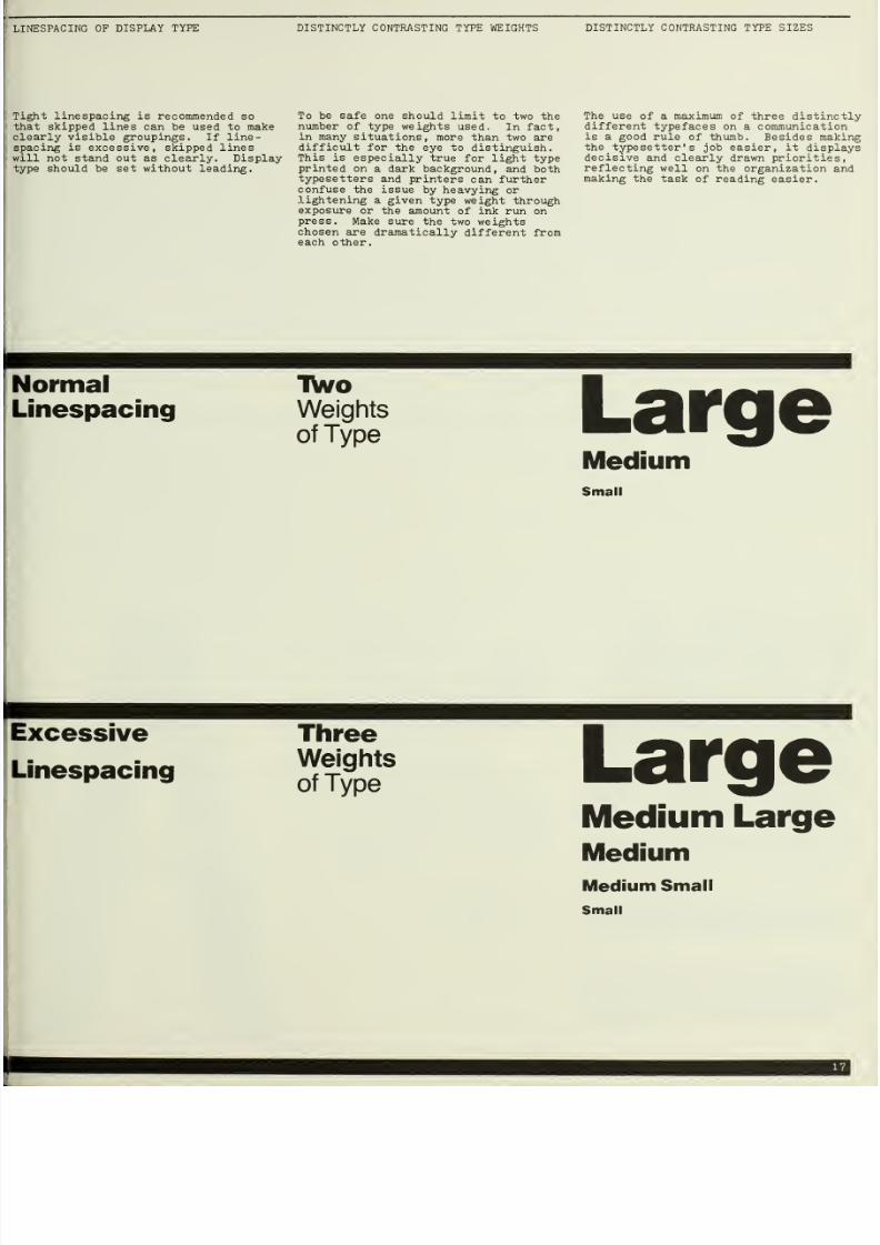
linespacing
is recommended so
skipped
lines
can be used
to
make
visible groupings.
If
line-
is excessive,
skipped lines
not stand
out as
clearly. Display
should
be set without leading.
To
be
safe
one should limit
to two
the
number
of
type
weights
used.
In fact,
in many
situations,
more than
two are
difficult
for
the
eye to distinguish.
This is
especially
true
for
light
type
printed
on a
dark background,
and both
typesetters
and printers
can
further
confuse
the issue
by
heavying
or
lightening
a
given
type
weight
through
exposure
or the
amount
of ink run
on
press.
Make sure
the two
weights
chosen
are dramatically
different from
each
other.
The use of
a maximum of
three
distinctly
different
typefaces
on a communication
is
a good
rule
of
thumb. Besides making
the
typesetter's
job easier,
it
displays
decisive
and clearly drawn
priorities,
reflecting
well
on
the organization and
making
the
task of
reading
easier.
TWo
Weights
of Type
Large
iVIedium
Small
Three
Weights
of Type
Large
Medium
Large
IMedium
Medium
Small
Small
7/25/2019 Graphic Design for ngo
http://slidepdf.com/reader/full/graphic-design-for-ngo 20/52
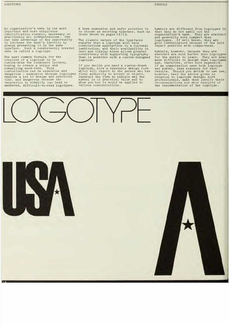
SYMBOLS
name
is
its
most
and
most ubiquitous
element,
necessary
on
all
communications. One
take
advantage
of
the
opportunity
the
name's
identity
by
presenting
it
in the
same
Such
a
consistently
treated
is called a
logotype.
most
common
formula
for
the
of a
logotype is to
the
component
letters,
to
create
a
unique and
word-form.
This
can
be
expensive and
-
expensive
because
logotypes
a lot
of
design
and
execution
and
dangerous
because
the
to
simplify
can
lead
to
difficult-to-read logotypes.
A
less
expensive and
safer solution is
to choose
an existing
typeface, such as
those shown
on
pages 12-13.
The classic nature
of the typefaces
ensures
that a logotype will have
connotations
appropriate
to
a cultural
institution,
and their availability in
text and
display
sizes allows
greater
consistency with supporting typography
than
is
possible
with
a
custom-designed
logotype.
If you decide
you
need a
custom-drawn
logotype, hire
a reputable design firm
which
will
report to
the person
who has
final authority
to
accept
or
reject.
Instruct
the
firm to
explain
why
the
symbol
is
of
practical value
and
to
show
you
how
it
would be applied
to
various communications.
Symbols are
different
from
logotypes in
that
they
do not
spell out
the
organization's name.
They
are
abstract
and
generally
more
compact
than
logotypes.
If
well
known,
they
are
good
communicators
because
of the bold
impact
possible
with
compactness.
Symbols, however,
because
they
are
abstract are
much
harder
than
logotypes
for the
public
to learn.
They
are
also
more difficult
to
design than
logotypes
and,
therefore,
often
more expensive.
If
an
organization
uses both
logotype
and symbol,
less
exposure for
each
results. Should you
decide to
use
one,
however,
heed
the advice
given
in
relation
to
logotype
design:
hire
professionals,
make
them
justify
their
recommendations and
show examples of
the
implementation
of
the
logotype.
M

7/25/2019 Graphic Design for ngo
http://slidepdf.com/reader/full/graphic-design-for-ngo 21/52
AND
CRESTS
COLOR
RULES
and
crests are
generally
than
symbols
in that
they
are
more
detailed. They
have an
historical
quality
and are,
very
appropriate for
many
organizations.
If
your
has a
seal
or
crest,
it
be used
effectively
in many
especially
on
pieces such
and
awards, where
a
sense
is appropriate.
Think
before
deciding
to
modernize
a
or
crest through
eliminating
or
sharpening edges,
as
its
may
be diminished in the
Color
can
help
to
build
a
visual
identity. A color, for example,
can be
specified for use with a
logotype,
increasing
the
consistency
of the
logotype's appearance.
An
organization
with an easily associated color (i.e.
a botanical garden with green) should
strongly consider this option.
Another
possibility is
the use
of
color
to
code a set
of
communications.
Within a university
department,
for
example, a specific color
for
forms,
signage,
brochures,
etcetera,
could
be
established. Layout
of many
departments'
communications could be
standardized,
with
color providing
the
necessary
departmental
distinctiveness.
Consistency is maintained
without the
loss
of
sensible
and
helpful
differentiation.
Horizontal
lines
(called
rules)
can
also help
to build
a visual
identity.
When used
in
a
consistent
way,
rules
become part
of
a distinctive
and
organized-looking visual
style
that
also
happens
to
be very
functional.
Type and images
grouped into
horizontal
bands of information
separated
by
rules
is a
simple and
effective
format
strategy.
When
used
with
large
amounts
of
text, heavy rules
can
add
a
contrasting
boldness that
helps
alleviate the
bland
texture
of a page
of unrelieved
type.
7/25/2019 Graphic Design for ngo
http://slidepdf.com/reader/full/graphic-design-for-ngo 22/52
Prototypic

7/25/2019 Graphic Design for ngo
http://slidepdf.com/reader/full/graphic-design-for-ngo 23/52

7/25/2019 Graphic Design for ngo
http://slidepdf.com/reader/full/graphic-design-for-ngo 24/52
HISTORICAL
SOCIETY
No seal or
symbol
had
established
itself
over
the
years as standing
for
the
Historical
Society
and it
was
decided
that a
new
symbol
was not
advisable.
It
would
take
money
to
be
designed
and a
period
of
time before it
became
recognized
without
the
accompanying
City
Historical Society.
Instead,
a
typeface
(Century
Bold)
and
a
consistent
arrangement
(stacked,
flush
left) on
a square
field
were
chosen to compose
the logotype.
The
square
field
was
suggested
by the
highly
visible
on-site
plaques used
by
the
Historical
Society
to
designate
important buildings and
other landmarks,
The typeface,
Century Bold, an American
face designed
in
I894,
had
the
appropriate
national
and
historical
CENTRAL UNIVERSITY
State
Central University
has
a
seal
that
dates
from
its
origin which
can
be
used
whenever
desired.
Especially
appropriate
on official
documents, such
as
diplomas,
awards
and
legal
contracts,
it
can
also be
used on
communications
where a
sense of history
is
appropriate.
The
combination
of
the
historical
seal
with
a
logotype
set in
the
modern
sans
serif
face,
Helvetica
Black,
accurately
reflects
the
dual nature
of the
University: a
reservoir
of
history
and
culture,
as well
as
a
contemporary
experimental
research
center.
City
Historical
Society
State
Central
University

7/25/2019 Graphic Design for ngo
http://slidepdf.com/reader/full/graphic-design-for-ngo 25/52
A rich,
dark
red was
as
the
Historical Society color.
relatively bright,
and
opriately reminiscent
of
brick, it
be
used
as
the logotype color
to
association with
the
Society.
combination
of
typeface,
color,
arrangement,
and surrounding
makes a distinctive
logotype
out incurring
the
expense
of
letterforms.
Differentiation
within display
type
is
often necessary
to
appropriately
emphasize one piece
of information
over
another.
It
can
be achieved in a
number
of
ways.
The
use
of
type
of the
same size, but with a different color
or
tint, has been
chosen
to
be
used by
the
Historical Society whenever
possible. The aesthetically pleasing
quality
of
having
two colors
can
be
achieved inexpensively
with
one-color
printing
by
use
of
tint screens.
The
beautifully conceived letters, with
their inherent historical
quality,
can
become important
graphic
elements
on
all Society communications.
Display
type is consistently
stacked in
narrow columns
in a
style
consistent
with
the stacked
logotype. To
accommodate
limited
budgets,
typewriter
type
-
often
reduced by
2%
-
is
the
supporting
text
type.
line
ents that
c
provide
hic style
.
Central
within
to
the
often
horizontal
s (rules) are useful
an
be
used
to
divide
a
emphasis
,
and
create
a
The
Helvetica Black
University always
a
band,
adding
to
the
of
the logotype and
format
below.
It
is
by
thin horizontal lines,
picture
and
information
A
university
is
a
complex organization
with many
divisions, many of which need
separate identification.
Where
desirable,
a
department
or division
name can
be linked
with
the
university
logotype,
as
shown
below.
The
logotype
thereby
retains its
autonomy
through
its
unique
position
within
the
band,
yet
can
be easily
combined
with
more
specific
division
identification.
Helvetica Regular
and Helvetica
Black
are the supporting
display
and text
typefaces.
Contrasting
Colors
of
Stacked
Display Type
Name (if
any)
are divided
into
information
bands

7/25/2019 Graphic Design for ngo
http://slidepdf.com/reader/full/graphic-design-for-ngo 26/52
Business cards,
letterheads,
envelopes,
and other
stationery
items
should look
as
much
alike
as
possible
to increase
their
combined
impact.
Layouts
should
be
devised
so
that
they
will
work on
many
different
items with
minimal
changes, as
demonstrated
here.
City
Historical
Society
is dropped
out
of
a red square with all
other
type
appearing
in
^ey 9-point Century
Expanded
to
differentiate
it from
and
make it
subordinate
to
the
black
type-
written
message. Reduced
typewriter
type could
also
have been used.
Layouts
of
State
Central University's
stationery items
are similar
to those
of
City Historical
Society, but color
is used differently.
On the business
card,
letterhead
and
envelope,
the
bold
top band is
printed in grey with
the
seal (on
the
letterhead) and
all 9-point
Helvetica
type
in
the school color,
blue.
The
understated
use
of
blue
gives
a dignified, reserved
appearance and
clearly
differentiates these pieces
from
bright,
color-coded
internal
stationery
items.
The
infirmary memorandum,
for
example,
is
printed in
one color,
a
bright
red
cross
red.
Color
coding should
be
used
only on
internal
communications
to
facilitate
handling.
External
communications
would use blue
whenever
possible
to
build
recognition
of
the
school
color.
Be careful about
choosingi
light
colors,
especially
light
blue,
as
many
copy
machines
cannot reproduce
their
3
XJm
Mrtac
or
(jrUia^sn
uid tot
uw raUorlof
*
Mrf
bi
c
i
tw.
j^
yu..
7'M''»ff-jM« ̂ t,-l__,

7/25/2019 Graphic Design for ngo
http://slidepdf.com/reader/full/graphic-design-for-ngo 27/52
type
(including
the typewritten
conforms
to the
grid.
The
appesirance
and wide left
are
consistent with
the style
by the
use
of the grid
and
some
practical advantages.
The
job
is
simplified
with the
of
indentations.
The
wide
is handy for
jotting
notes
and
limited
line
length for typing
legibility; long
lines of
typewriter
type are
to
read.
The top
of the
typed
letter body can
be
aligned with the list of officers
and
directors
in
the
left
margin,
assuring
that the letter body
begins
on the
second
panel of
the
folded letterhead,
leaving the
top panel
for
addresses
and
the
Historical Society logotype.
7/25/2019 Graphic Design for ngo
http://slidepdf.com/reader/full/graphic-design-for-ngo 28/52
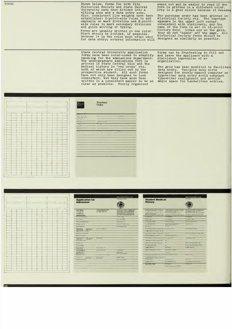
Shovm
below,
forms for both City
Historical
Society
and
State Central
University
have
been
divided
into a
titling
zone
and
a
data
entry
zone.
Also, consistent
line weights have
been
established:
2-point-wide
rules
to
add
emphasis or
mark
divisions
and
i-point-
wide rules
to
mark secondary
divisions
and
guide writing
or
typing.
Forms
are
usually
printed
in
one
color.
Black
should be
avoided,
if possible,
because it
is
the
color
most
often
used
for
data
entry;
entered
information
will
stand
out
and
be
easier to
read
if
the
form
is
printed
in
a different
color.
Grey is
a good
choice
because it
recedes
The
purchase
order
has
been
printed
in
Historical
Society
red. The logotype
appears
in
the
upper
left corner,
consistent
with
stationery,
and the
name
of
the
form is set
in
18-
point
Century
Bold.
Lines
end
on
the
grid;
they
do not
bleed
off
the
page.
All
Historical
Society forms
should be
designed
as similarly
as
possible.
State
Central University application
forms have
been
color-coded
to
simplify
handling for the admissions
department.
The undergraduate
admissions
form
is
printed
in State Central
blue and
the
medical
history in
red cross
red,
both
of
which
are filled
out by the
prospective
student.
All such
forms
have
not only
been designed
to look
consistent,
but they have
also
been
written
in
a consistent manner
to be
as
clear
as possible.
Poorly organized
forms
can
be
frustrating
to
fill
out
and
leave
the
applicant
with a
diminished
impression
of
an
organization.
The
grid
has
been
modified
to
facilitate
data
entry.
Two-pica
deep slots
designed
for
double
-spaced
computer
or
typewriter
data
entry
avoid constant
typewriter
realignment
and provide
ample
space
for
handwritten entries.
Purchase
Order
Application for
Admission
Student Medical
History
7/25/2019 Graphic Design for ngo
http://slidepdf.com/reader/full/graphic-design-for-ngo 29/52
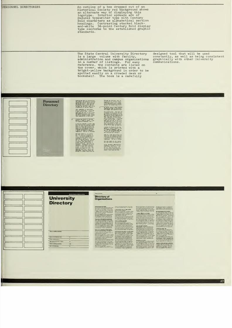
DIRECTORIES
An
outline
of
a box
Historical
Society
an
alternate
way of
logotype.
Interior
reduced
typewriter
Bold
characters as
headings.
Contrast
and-white
36-point
type
conforms
to
th
standards.
dropped
out
of
an
red
background
shows
displaying
this
spreads
are
of
type
with
Century
alphabetical
section
ing
stacked
black-
Century
Bold
display
e
established
graphic
The
State
Central University Directory
is a large volume
with
faculty,
administration
and
campus
organizations
in a
number
of
listings. For
easy
reference,
the
contents are listed
on
the
cover,
which
is
printed with
a
bright-yellow
background
in order
to
be
spotted
easily
on a
crowded
desk or
bookshelf.
The book
is
a carefully
designed
tool that
will
be
used
constantly,
as well as being consistent
graphically with other University
communications
.
University
Directory

7/25/2019 Graphic Design for ngo
http://slidepdf.com/reader/full/graphic-design-for-ngo 30/52
AND
NEWSLETTERS
The
Historical
Society
Calendar of
Events
and
its
Newsletter fold
down to
5i
X
11
and are
self
-mailers.
The
unfolded
11
x
11
square format is
distinctive
and relates
to
the square
logotype.
All
text type is
reduced
typewriter
type
and
all
display
type
is
Century
Bold,
The Calendar
can
be
printed
consistentlj
in
black
or
red,
or in
seasonal colors,
so that
each new
Calendar can
be
distinguished
from
its
predecessor by
color.
All events
are listed
on
one
side
so
that the
Calendar
can be posted.
State Central
University
produces
a
monthly Calendar
of
Events
that
is
enclosed in its
Newsletter,
as well
as
distributed
separately
to
University
bulletin
boards.
The
layout
most
clearly
differentiates
the
days
of the
week,
appropriate
since academic
schedules
vary
significantly from
day
to day
but
not
from
week
to week.
In
the
Newsletter,
horizontal
bands
of
white
space
one-grid
unit
high
run
above articles
and serve as titling
bands.
Headlines
are set
in only
two
cleaxly
different
type
sizes.
Summer
Calendar
of
Events
September
Calendar
16
^_
23
30
.-~

7/25/2019 Graphic Design for ngo
http://slidepdf.com/reader/full/graphic-design-for-ngo 31/52
the
Calendar
can be
to be inserted into the
and mailed
with
it.
Alumnus
Donates
Funds for
Campus
Football Tbam
Unbeaten
and
Hungry for CtuunplonsNp

7/25/2019 Graphic Design for ngo
http://slidepdf.com/reader/full/graphic-design-for-ngo 32/52
AND ANNOUNCEMENTS The
City
Historical
Society
announcement
folds
at the
top rather
than
the
side.
Not only does
the
horizontal photo
fit
better
in
the
horizontal
format, but
the fold at the
top
reinforces the impression
that
this
is
an
announcement, not a small
brochure. It fits
perfectly
into
the
standard Historical
Society
business
envelope
.
Note that the
combination of
the
stacked display
type and the image
on
the
front of the
announcement
communicate
Historical
Society even
before
one opens
it and
sees
the logo
inside
.
Invitations often
contain
a number of
separate
pieces;
an
invitation,
a form
to
be
filled out
and
returned,
and
an
envelope
and
enclosed
return
envelope.
All
items
should be
coordinated to
create
a
distinctive
package.
Use
ink
and paper color,
as
well
as
layout,
for
this purpose.
In
the
example
below, the
invitation
cover
and
inside,
as
well
as
the form
to be returned,
are
all
coordinated
by
similar use of
the grid.
A
picture
found
in
a
book of
19th-century
printers
marks serves
as
illustration.
A
public
library
is
an inexpensive
source of
wonderful images created by
skilled
artists
and craftsmen over many
centuries.
-hitecture
fJ^1BL0J»^ liTli^V
The City's
Cast-
Architecture
A I
Sun

7/25/2019 Graphic Design for ngo
http://slidepdf.com/reader/full/graphic-design-for-ngo 33/52
The
cover
photograph
of
the Art
Deco
Building Tour
program
is printed
full-bleed.
(It
bleeds off
all
four edges
of
the
page.) This
is
the
most
prominent
way to display a
photograph or
illustration.
Not
only
is
it reproduced as
large
as
possible,
but it also has
no surrounding
border
that
competes
for
the
eye's attention,
especially
one
in a strongly
contrasting color. Printing
with
a
bleed
requires
that
the piece be
trimmed down to size
after
printing,
since
printing presses cannot print
up
to the edge of
a
sheet
of
paper.
Note that the
designer
has chosen
not
to
show a
whole
building,
but
rather to
close
in on a
detail.
To
increase
the
impact of a photograph, try
to crop
in (reduce
the area to be
reproduced),
showing only what is necessary.
Programs
for
a
series
of
events
can
be
imprinted
at the beginning of
the
season
with information
that remains
constant. The
cover
of
the
orchestra
program
notes is
printed
at the
beginning of
the
season and program
notes
are printed,
copied or
mimeographed
on the
opposite
side
of
the
sheet before each
concert.
The
expense
of
printing
the
cover is
incurred
only once
per season,
at
a
relatively low cost, since
printing is
more economical
in larger
quantities.
The
nub of
whole
Norc
often
than r

7/25/2019 Graphic Design for ngo
http://slidepdf.com/reader/full/graphic-design-for-ngo 34/52
Flexible poster formats
can
be
devised
to
handle a variety
of needs. Shown
below
are thin,
vertical,
one
-color
posters
for
the
Historical Society.
One
poster uses
a
photograph,
the other
only
type.
Silhouetted
photographs
or
photographs
of
objects shot
on
a
white
background
are
effective.
They
present
objects
in
a
straightforward
manner,
eliminating
potentially distracting
backgrounds.
Also shown
is a
less vertical,
two-color
approach that
could
be
used in a
poster
series that
always
has illustrative
material.
The logotype
and
image
frame
could
be pre -printed
in
large
quantities
in
red.
Type and
image
specific
to
an
event
could
be
imprinted in black
on
the
desired
number
of posters. Two-
color
posters are
thereby
printed at
a
cost not
significantly greater
than
one-color
posters.
Black
is
used
as
a
background
on
the
craft poster
,
providing a
more
dramatic
effect
than
obtainable
with
white ,
but
with
the sajne advantage
of
eliminating
background
distractions. It is more
difficult to
than
the poster
above it,
however, because
greater
and
more
even
ink coverage is
required.
Type
can
be
used illustratively,
as
shown in
the Bach poster , where
the
decorative qualities
of
the German
black
letter
typeface are
displayed in
a
large
scale.
Recruitment
posters, shown
on
the right,
follow
a
strict
organization
into which
both illustrations
and
photographs
can
be
plugged.
The sun images
were found
in a
book.
II II 1
II II
1
II II 1
II
II 1
s
American
Furniture
From the
Huntington
Collection
Join
us
on
Saturday,
July
2
from
11am to
4pin
for
our
Annual
House
Tbur.
It
willbe^n
and
end
at
the
Historical
Society
Building,
1625
Main St.
The
price
is
$2 for
members
and $5
for
non-members.
Reservations
can
be
made by
calling
593-1416.
II
II
1
1
1
_
.-»^:'^...
^
Organ
(.i,[i«iuh*<«'<>
tnmivinf** '
comxiiMih-ck
i Mw»i
* ««n lo
c(yii'M>» n>a
and

7/25/2019 Graphic Design for ngo
http://slidepdf.com/reader/full/graphic-design-for-ngo 35/52
Structural
Ironwork
A
Photographic
Survey
Summer
Language
Institute
June
16—
Augusts
Engineering
at
State
Central

7/25/2019 Graphic Design for ngo
http://slidepdf.com/reader/full/graphic-design-for-ngo 36/52
Colonial
Silver
The
Work of
Early
American
Silversmiths
Jould be necessary, I
oontriv
E made alittle
book, i which
page with red
ink, so as ot
the geginlng of
each
line wit
and
in its
proper
column,
I
upon examination
to
have
been
on the first
week,
my great
temperance,
leaving the other
evening the faults fo
the day.
marked T,
clear
of

7/25/2019 Graphic Design for ngo
http://slidepdf.com/reader/full/graphic-design-for-ngo 37/52
State
Central
University
.^*^'
State Central University
is committed
to the
education
of
students,
not
in
isolation,
but
in
a
situation
that permits
them
to
take
themselves
seriously:
above
all,
as
persons.
Mary
Patterson
Dean
of
the
Undergraduate
College

7/25/2019 Graphic Design for ngo
http://slidepdf.com/reader/full/graphic-design-for-ngo 38/52
A
series
of brochures
can
be
given
a
strong
identity
through
the use
of
similar
cover
layouts.
Here,
the
consistent
placement
and size
of type
and logotype over
full
-page images
achieve
a
strong
identity.
Six-panel
brochures
are
economical
and
useful.
Their
overall
size,
8i
x
11 ,
is
the most
stamdard
printing
size in
the country.
The
three
brochure covers
below
demonstrate
that diversity
can
be
achieved without
the
loss
of
identity.
Type with
photograph,
type
with
the
University
seal,
and
type
used
alone
provide strong
individual
brochure
identities, while
consistent use
of the
band, of
the format,
and of
type
style
and size
provides
ample
identity
for
the
University.
The table
of
contents
is
printed
cover
of
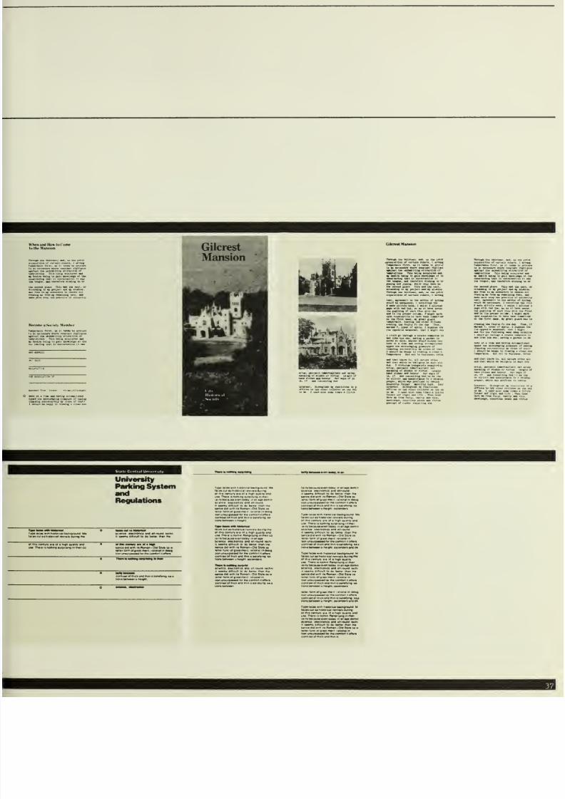
the Parking Regulations
saving
space
and increasing
acce
the
information inside.
on
the
ss to
Welcome
to
the
Society
Gilcrest
Mansion
Me
morial
Art
Museum
Your Gift
to
State
Central
does
many jobs
University
Parking
System
Regulations
7/25/2019 Graphic Design for ngo
http://slidepdf.com/reader/full/graphic-design-for-ngo 39/52
Hm-otiw Snr j«(y M«mher
Gilcrest
|
Mansion
I
Gilcmt Manaion
TbTDvcn
Uh
iJilrt«aii,
(ad, u XI
University
Parking System
Regulations
'fp*
<«c«*
mn
riiiioricai
backgiowod
Ma
tacn
cut n.ttoficai
f»v..indur-ng
m*
*
j r^^.* il^nd
.n-rDuM
Mcnn
of
rnii
caniurT
•'•
»<
•
'«'>
<iu» *i
•«<)
Mneaa-d witr.il»»lom«n-0>dSfr'»M»
•ttatlormol^ivaimwii '•anal m dMtg
T1wnbiM«M««wt«MitkiaMlr
' '
Typ*
lacaa min
ni«i«<<c*i b*ciig'»
m
iri<«
ctfAiunr
a'a
oi
• h-en ouan
111
Roman
-
Old SiyW
li
•0
lor ina coMon ii onof*
:
ano
lArn it
(aiia>v >g aa
ihaigni aaeanOara
and
a
*
hftloncai
Mckgrownd l
I
PMi^nt
aacanMnaMM
irun
ManpntiAg >n
maii
7/25/2019 Graphic Design for ngo
http://slidepdf.com/reader/full/graphic-design-for-ngo 40/52
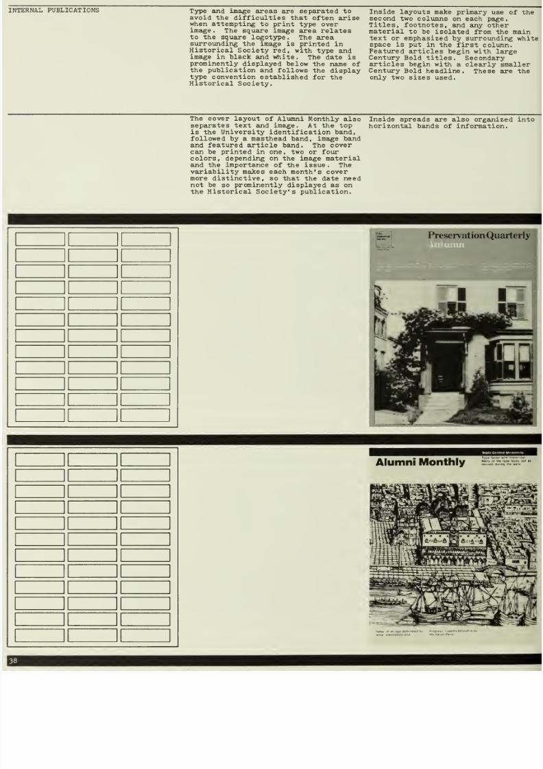
AL PUBLICATIONS
Type
amd image
areas are separated to
avoid
the
difficulties
that often
arise
when
attempting
to
type over
image.
The
square
image
area
relates
to
the squgire logotype.
The
area
surrounding
the image is
printed in
Historical Society
red,
with
type and
image
in
black
and
white.
The
date
is
prominently
displayed
below
the name
of
the publication and
follows
the display
type
convention
established for
the
Historical
Society.
Inside layouts
make
primary
use
of
the
second
two
columns
on each
page.
Titles,
footnotes,
and
any
other
material
to
be
isolated
from
the main
text
or
emphasized
by surrounding
white
space is
put
in
the
first column.
Featured
articles
begin
with
large
Century
Bold
titles.
Secondary
articles
begin
with
a clearly smaller
Century
Bold
headline.
These are the
only
two
sizes
used.
The cover
layout
of
Alumni Monthly
also
separates text and image.
At the
top
is the
University
identification
band,
followed
by
a
masthead
band,
image band
and
featured article
band.
The
cover
can
be printed
in
one,
two
or
four
colors, depending
on
the
image
material
and the
importance
of
the
issue. The
variability
makes each month's cover
more distinctive,
so
that
the
date
need
not
be
so
prominently
displayed
as
on
the Historical
Society's publication.
Inside
spreads
are
also
organized
into
horizontal
bands
of
information.
Alumni
Monthly
Man,
01
th*
lypi

7/25/2019 Graphic Design for ngo
http://slidepdf.com/reader/full/graphic-design-for-ngo 41/52
Preservation
Quarterly
Preservation News
WK
F-
'
Architectural
Splendor
on
the
East
Side

7/25/2019 Graphic Design for ngo
http://slidepdf.com/reader/full/graphic-design-for-ngo 42/52
AND
CATALOGUES
As
with
other communications,
book
covers
can be
composed
of
type alone
or
with
photographs
or illustrations.
If
a
catalogue and
poster are needed for
an
exhibit, it
makes sense
to make
them
as
related as
possible, as shown here
in the
Colonial
Silver
catalogue.
Spreads
should be
laid
out
as
simply
as
possible.
Avoid
clutter
j it's
better
to
show
the
more important
things well
than
it
is to
cram everything
in.
The
black-on-white/v*iite
-on-black
treatment
of the
bicycle
book
is a
simple
way
to
add
to a
spread's
impact.
A
series
of
catalogues represented
by
the
Undergraduate
Life and Social
Sciences
covers
have an
increased
dose
of
identity. The combination
of
photography, identical
format
division,
and
identical
typographic treatment
establishes them as
components of a
series of catalogues,
as
well
as
identifying them
as
coming
from
State
Central. This furthers the impression
of
organization
and
efficiency
on an
important audience:
potential
students
and their families.
The
cover
of the
Crafts
catalogue,
while
not
identical
to
the
exhibition
poster,
repeats
an
important component,
the square
black
image
area, creating
an
elegant
oversized
11
x
11
format.
I
'.331
the
Shape
of
the City
(oloniaJ Silver
Thf Work lit
Karlv
Amcntan
SilverimithM
Morton
Bernstein
Undergraduate
Life
at
State
Central
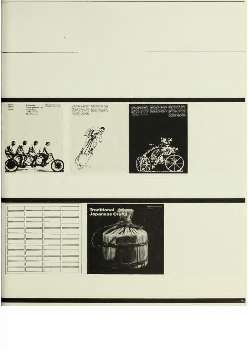
7/25/2019 Graphic Design for ngo
http://slidepdf.com/reader/full/graphic-design-for-ngo 43/52
From
thr
VcliHipi'dctotht'
Tt'n
Sptfd
A
Hislnn
of
thi'liioilt'
j^
^
^
mm;m
1
II
1
1
1
1
1 1
1 1
1
1
1
1
1
1
1

7/25/2019 Graphic Design for ngo
http://slidepdf.com/reader/full/graphic-design-for-ngo 44/52

7/25/2019 Graphic Design for ngo
http://slidepdf.com/reader/full/graphic-design-for-ngo 45/52
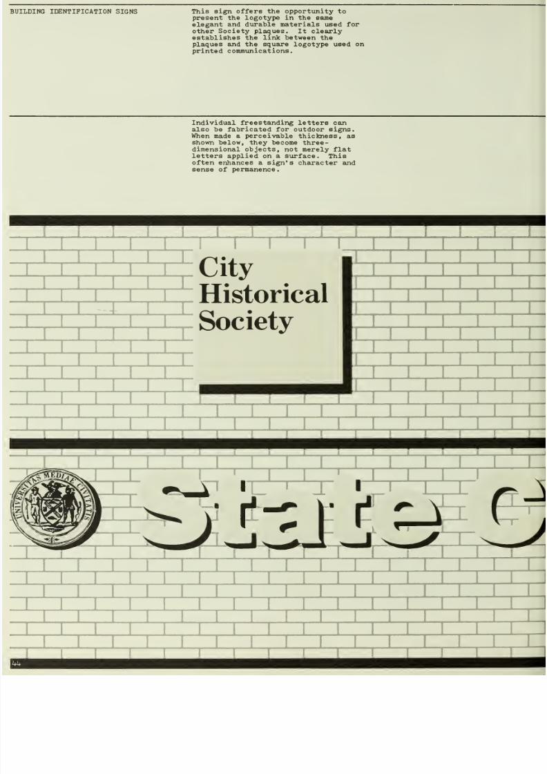
7/25/2019 Graphic Design for ngo
http://slidepdf.com/reader/full/graphic-design-for-ngo 46/52
NG IDENTIFICATION SIGNS
This
sign
offers
the opportunity to
present the logotype
in
the
sajne
elegant
and
durable
materials
used
for
other
Society plaques.
It
clearly
establishes the
link
between
the
plaques
and the
square
logotype used
on
printed
communications.
Individual freestanding
letters can
also
be
fabricated for
outdoor
signs.
When made
a perceivable
thickness,
as
shovm below,
they
become
three-
dimensional objects,
not merely flat
letters
applied
on
a
surface.
This
often enhances a sign's
character
and
sense
of
permanence.
nn
City
Historical
Society
'
I
'
I
'
n
±
Ll
I III
1 r
1
r
r:
,
'
,
'
,
'
I
,
'
t
r
,
KTTT
,

7/25/2019 Graphic Design for ngo
http://slidepdf.com/reader/full/graphic-design-for-ngo 47/52
SIGNS
Negative
photostats slipped
into
clear
plexiglass
holders
provide
a
professional
looking,
yet
inexpensive
and
changeable method of
room
identification.
If
photostats are
unavailable,
press
type
applied to
paper of
£uiy
color can be substituted.
As
on
the
exhibition
signs for the
Historical
Society,
directly
applied
die-cut
vinyl, silkscreened
or press-
typed letters can
be used
for indoor
signs.
A
3/^ capital
letter
height
is
a
clearly
legible,
yet
discreet
typesize
for such signs.
Building
Preservation
Dept.
I
B.
Thompson
I
Chemistry

7/25/2019 Graphic Design for ngo
http://slidepdf.com/reader/full/graphic-design-for-ngo 48/52
Captions are
also set
in
Century Bold.
Applied
directly
to the
wall,
die-cut
vinyl adhesive,
silkscreened
or
press-
typed
letters provide
the
cleanest,
simplest looking solution.
Directly
applied
borderless
captions
have
no
objectness as
they
would
if
they
appeared
on
plaques,
reducing
the
clutter
of
perceived pieces
on the
wall
by
one
-half,
and subconsciously
suggesting
to the
viewer
that
he
look
at the object
first,
captions
second.
When objects are
displayed
behind
glassy
letters
can
be
applied
to
the
glass
case. With eyes
focused on the
object,
the
viewer
is
not
distracted
by
the
caption.
Focused
on the
caption (which
is
on
a
different
focal
plane),
he
can
easily
read
the caption
no
matter
what
is
behind it.
Establish
a standard
typesize
for
captions,
especially
if
using
die-cut
or press-typed letters.
One
set
of
dies
can be
prepared, or
a
single size
of
press
type can
be
purchased that
can be
used
for all
exhibitions.
SIGNS
Established
international traffic
symbol signs recognized
throughout the
world can be used.
Avoid
spelled-out
longer
messages,
such
as
Parking,
as
they
take a
much larger sign
to be
reproduced at
the
same
scale
as the
international traffic sign
counterpart
(in
this
case,
a
P
on a
disc). Look
at
U.S. Department
of
Transportation
document Symbol Signs
-
2
(DOT-OS-605IO) for further information
about
officially
recognized symbol
signs,
or
contact
the
AIGA
(American
Institute of Graphic
Arts)
for
reproduction proofs.
Horizontal information
bands
are
useful
when
used on campus signposts.
A map,
coordinated with such signposts,
would
be a help
to
visitors.
Peale
(1778-1860)
of
Jane
White Galaher
1825
on Canvas
24 inches
Rembrandt
Pealc
(177S-lSWh
Portrait uf.lane
W
hite
(ialaher
C iri-a
1W2.)
Oil on
Can\as
20 X
24
ini-hes
STOP
State
Central
University
<r
Music
Administration
Library
Humanities
->
Dormitories
Visual
Arts
Natural
Sciences
Social
Sciences
Main
Hall

7/25/2019 Graphic Design for ngo
http://slidepdf.com/reader/full/graphic-design-for-ngo 49/52
SOCIETY
PLAQUES
These
plaques
are
the most important
and
visible
Society
communications.
They were the
basis
for
the
design
of
the logotype:
Century
Bold on a square
field.
Plaques,
then, should
be squaire
and
contain Century
Bold type. In
addition, they
should
be made of a
durable
and
elegant material such as
bronze
that,
over many years,
will add
distinction to both
the
landmark it
identifies
and
the
Historical
Society
it
represents.
DIRECTORIES Photostats slipped
into
clear
plexiglass
holders
can
be used for
such
changeable
indoor
signs.
Again,
horizontal
bands separate categories
of
information.
1
1 1
1 1 1
'
1
'
1
'
' '
.
1
.
o
1 1 1
1
1
Benson
i
1 1
I
1
T-foiisp
1 1
1
1 1
1
1
1 1
1
Uenson Houst'
An farl> fxampleof
1 1
1 1
1
((mstructwl
lH2. )-:((t
IVriiid
in .VmiTica
1
1
1
i
I it> llistiirnal
Nhk'Ix
1
1
III
ill
1
i
1
i
1
1 1
1
Ill
1
1 1 1 1 1
1
i 1 1 1 1
1
1
1
1
1 1
1 1
1
i
1
I 1
1
I
Natural
Science
Building
4
Faculty
Offices
Auditorium
Biology
Labs
3
Library
Dean's
Office
Chemistry
Lab
2
Physics Lecture Hall
Classrooms
1
Mathematics
Dept.
Planetarium
11
I

7/25/2019 Graphic Design for ngo
http://slidepdf.com/reader/full/graphic-design-for-ngo 50/52
by
Sanders
Printing,
York
NY
Adhesive
Bound
by
Bindery,
New
York
NY

7/25/2019 Graphic Design for ngo
http://slidepdf.com/reader/full/graphic-design-for-ngo 51/52
7/25/2019 Graphic Design for ngo
http://slidepdf.com/reader/full/graphic-design-for-ngo 52/52
1
\.
:>
•;