Embed Size (px)
Citation preview
1 Introduction
Storytelling is an ancient technology providing the most
impactful ways to teach learn and persuade Analytics
visualization experts are challenged to use new technology
and media to convey information in a story-like fashion
stimulating the readersrsquo curiosity making them want to learn
more and convey a deeper meaning Statistical data may look
deceptively boring but represented in colourful visual views
that can interact with the visualizations to find meaning ndash and
even better if a good story about the numbers is included
these can become interesting and engaging [6]
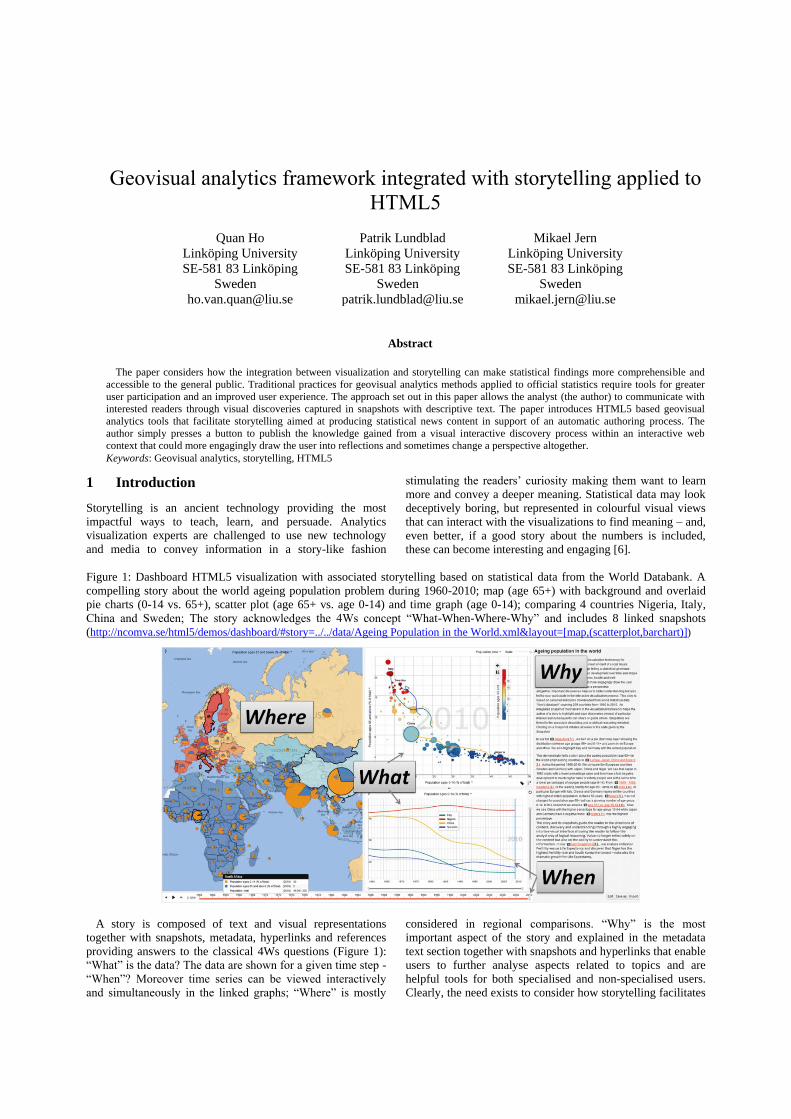
Figure 1 Dashboard HTML5 visualization with associated storytelling based on statistical data from the World Databank A
compelling story about the world ageing population problem during 1960-2010 map (age 65+) with background and overlaid
pie charts (0-14 vs 65+) scatter plot (age 65+ vs age 0-14) and time graph (age 0-14) comparing 4 countries Nigeria Italy
China and Sweden The story acknowledges the 4Ws concept ldquoWhat-When-Where-Whyrdquo and includes 8 linked snapshots
(httpncomvasehtml5demosdashboardstory=dataAgeing Population in the Worldxmlamplayout=[map(scatterplotbarchart)])
A story is composed of text and visual representations
together with snapshots metadata hyperlinks and references
providing answers to the classical 4Ws questions (Figure 1)
ldquoWhatrdquo is the data The data are shown for a given time step -
ldquoWhenrdquo Moreover time series can be viewed interactively
and simultaneously in the linked graphs ldquoWhererdquo is mostly
considered in regional comparisons ldquoWhyrdquo is the most
important aspect of the story and explained in the metadata
text section together with snapshots and hyperlinks that enable
users to further analyse aspects related to topics and are
helpful tools for both specialised and non-specialised users
Clearly the need exists to consider how storytelling facilitates
Geovisual analytics framework integrated with storytelling applied to
HTML5
Quan Ho
Linkoumlping University
SE-581 83 Linkoumlping
Sweden
hovanquanliuse
Patrik Lundblad
Linkoumlping University
SE-581 83 Linkoumlping
Sweden
patriklundbladliuse
Mikael Jern
Linkoumlping University
SE-581 83 Linkoumlping
Sweden
mikaeljernliuse
Abstract
The paper considers how the integration between visualization and storytelling can make statistical findings more comprehensible and
accessible to the general public Traditional practices for geovisual analytics methods applied to official statistics require tools for greater
user participation and an improved user experience The approach set out in this paper allows the analyst (the author) to communicate with
interested readers through visual discoveries captured in snapshots with descriptive text The paper introduces HTML5 based geovisual
analytics tools that facilitate storytelling aimed at producing statistical news content in support of an automatic authoring process The
author simply presses a button to publish the knowledge gained from a visual interactive discovery process within an interactive web
context that could more engagingly draw the user into reflections and sometimes change a perspective altogether
Keywords Geovisual analytics storytelling HTML5
AGILE 2013 ndash Leuven May 14-17 2013
a leap in understanding by the public enabling them to
appreciate how statistical indicators may influence our
society
The use of visualization tools helps to communicate
statistics to non-expert users Many tools offer the capability
to make order in our experiences combining and reading data
through its basic elements (words and text for the natural
language images and graphs for the visual one) but they
usually prevent users from considering other specific issues
For instance it is impossible to extract synthetic snapshot
from texts in natural languages and on the contrary to
highlight single events in for example a thematic map at a
glance
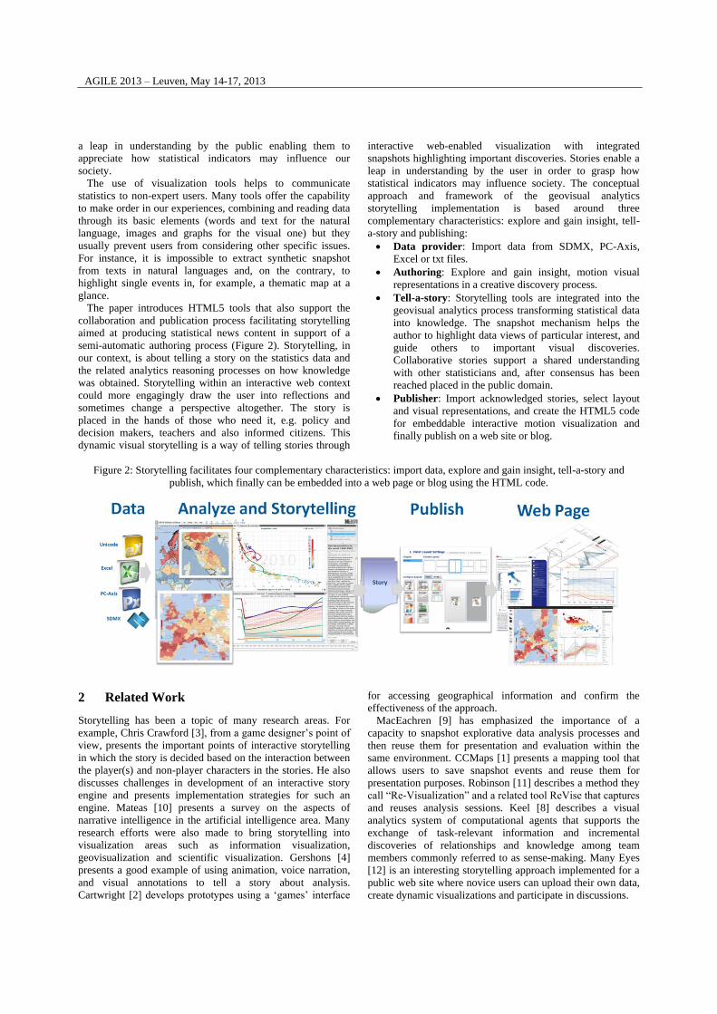
The paper introduces HTML5 tools that also support the
collaboration and publication process facilitating storytelling
aimed at producing statistical news content in support of a
semi-automatic authoring process (Figure 2) Storytelling in
our context is about telling a story on the statistics data and
the related analytics reasoning processes on how knowledge
was obtained Storytelling within an interactive web context
could more engagingly draw the user into reflections and
sometimes change a perspective altogether The story is
placed in the hands of those who need it eg policy and
decision makers teachers and also informed citizens This
dynamic visual storytelling is a way of telling stories through
interactive web-enabled visualization with integrated
snapshots highlighting important discoveries Stories enable a
leap in understanding by the user in order to grasp how
statistical indicators may influence society The conceptual
approach and framework of the geovisual analytics
storytelling implementation is based around three
complementary characteristics explore and gain insight tell-
a-story and publishing
Data provider Import data from SDMX PC-Axis
Excel or txt files
Authoring Explore and gain insight motion visual
representations in a creative discovery process
Tell-a-story Storytelling tools are integrated into the
geovisual analytics process transforming statistical data
into knowledge The snapshot mechanism helps the
author to highlight data views of particular interest and
guide others to important visual discoveries
Collaborative stories support a shared understanding
with other statisticians and after consensus has been
reached placed in the public domain
Publisher Import acknowledged stories select layout
and visual representations and create the HTML5 code
for embeddable interactive motion visualization and
finally publish on a web site or blog
Figure 2 Storytelling facilitates four complementary characteristics import data explore and gain insight tell-a-story and
publish which finally can be embedded into a web page or blog using the HTML code
2 Related Work
Storytelling has been a topic of many research areas For
example Chris Crawford [3] from a game designerrsquos point of
view presents the important points of interactive storytelling
in which the story is decided based on the interaction between
the player(s) and non-player characters in the stories He also
discusses challenges in development of an interactive story
engine and presents implementation strategies for such an
engine Mateas [10] presents a survey on the aspects of
narrative intelligence in the artificial intelligence area Many
research efforts were also made to bring storytelling into
visualization areas such as information visualization
geovisualization and scientific visualization Gershons [4]
presents a good example of using animation voice narration
and visual annotations to tell a story about analysis
Cartwright [2] develops prototypes using a lsquogamesrsquo interface
for accessing geographical information and confirm the
effectiveness of the approach
MacEachren [9] has emphasized the importance of a
capacity to snapshot explorative data analysis processes and
then reuse them for presentation and evaluation within the
same environment CCMaps [1] presents a mapping tool that
allows users to save snapshot events and reuse them for
presentation purposes Robinson [11] describes a method they
call ldquoRe-Visualizationrdquo and a related tool ReVise that captures
and reuses analysis sessions Keel [8] describes a visual
analytics system of computational agents that supports the
exchange of task-relevant information and incremental
discoveries of relationships and knowledge among team
members commonly referred to as sense-making Many Eyes
[12] is an interesting storytelling approach implemented for a
public web site where novice users can upload their own data
create dynamic visualizations and participate in discussions
AGILE 2013 ndash Leuven May 14-17 2013
3 GAV HTML5 Toolkit and Framework
The GAV (GeoAnalytics Visualization) toolkit [5]
programmed in Adobersquos ActionScript was introduced in 2009
[7] and represents the basis for many of todayrsquos statistics
visualization applications such as ldquoOECD Regional eXplorerrdquo
[13] The statistical community required visualization tools
that were accessible to almost 100 of the web users a
solution that was available through Adobe Flash With the
emerging HTML5 standard which is promoted as the future
web content and supported by most devices including mobile
devices the focus has now transferred to include support for
also tablets and smartphones Using HTML5 canvas and
JavaScript also facilitates the integration of the framework
into other web-based systems
The development of a new GAV framework based on
HTML5 and JavaScript faces new challenges mostly coming
from the nature of this programming language JavaScript is a
prototype-based programming language and it is totally
different from conventional object-oriented programming
languages such as C++ or Java It does not have the concepts
of class and class inheritance which facilitate the development
of large scale systems To overcome this problem we have
developed a core library to simulate these concepts in
JavaScript As a result GAV HTML5 is based on the
principle of modularity allowing application developers to
select methods from a wide range of geo- and information
visualization techniques (Figure 3) data providers and data
transforms and combine them in any way they want to
assemble dashboard applications
Visualization components are built based on the top-down
principle Each component is broken down into smaller blocks
which are so-called layers Each layer in turn is broken down
and is built based on primitive graphic elements such as lines
curves or circles The layers can be reused and combined in
different ways to form different components Figure 4 shows
the layer architecture of our map based component which can
have an arbitrary number of layers such as a heat map layer a
glyph layer and an online map service layer
Figure 3 GAV HTML5 includes a collection of interactive
visualizations and can be evaluated in this dashboard
application httpncomvasehtml5demosdashboard
Insight is normally gained through interaction To increase
the performance of visual exploration and analysis processes
visualizations are enhanced with a rich set of interaction
techniques and interactive features For example the map
component is enhanced with selection tooltips details-on-
demand focus-and-context pan zoom animation focusing
(ie bringing selected itemsregions to the centre of the view)
and drill down (eg when applied to a hierarchy of three
NUTS levels) The drill down technique is also applied to
treemaps the focus-and-context and fisheye lens techniques
are applied to bar charts and time graphs [14] and so on
Other interactive features supported in the framework include
visual inquiry conditioned filter mechanisms and methods
supporting multiple coordinated linked views The framework
also supports data analysis algorithms connects the
components to each other and supports data providers that
can load data from various sources
Figure 4 The layer architecture of the map based component
Categorical data most often represented by names in a
multivariate dataset are frequently used in statistics They
require however special visualization methods to measure
similarity between categories comparable to that of numerical
(quantitative) GAV HTML5 supports working with mixed
data sets containing both categorical and numerical data A
method for colouring data items based on a categorical
indicator ldquoHuman Development Index ndash HDIrdquo levels is
demonstrated in Figure 5 Another method is to use
categorical data to build geographical hierarchical structures
for treemap visualizations
Figure 5 An example of using categorical data (HDI levels in
this case) for colouring data items
4 Storytelling with Integrated Snapshot
Mechanism
Storytelling in GAV HTML5 is achieved through a snapshot
manager that supports the storage of interactive events in an
AGILE 2013 ndash Leuven May 14-17 2013
explorative data analysis process through ldquomemorized
interactive visualization viewsrdquo or ldquosnapshotsrdquo that can be
captured at any time during the process Traditional passive
storytelling prohibits interaction on the readerrsquos part GAV
HTML5 is based on interactive approval that allows passive
storytelling to pause at any points and lets readers take
control for example change the visualizationrsquos view
representation and even content Once they are satisfied with
this interactive exploration storytelling continues with
another snapshot Readers can always detach from the story
and engage in interactive visualizations with total freedom
When exploring and making sense of comprehensive
statistical data there needs to be a way for the author to store
discoveries in a coherent and cognitive workspace which can
be organized navigated and maintained within the application
so that discoveries may later be loaded The snapshot service
(Figure 6) includes such means by giving the analyst the
option of capturing saving and packaging the results of an
exploration ldquogain insightrdquo process The insights are captured
in a series of ldquosnapshotsrdquo that could help the analyst to
highlight views of particular interest and subsequently guide
readers to follow important discoveries Snapshots are created
as a series of visualization captures during the exploration
process and form the foundation for a story The analyst is
immersed in the data domain and assembles pieces of the
story while gaining more and more knowledge about the data
locating interesting views and specifies snapshots as key
frames until the exploration is complete and the resulting story
is satisfactory
Snapshots are inserted in the story as highlighted
hyperlinks When the readers follow the story they can click a
highlighted link the state of the visualizations captured in the
corresponding snapshot is recreated so the reader has the same
view as the author The reader may then also make changes to
the application such as changing filter values or highlighting
other areas of interest This new discovery may then be stored
as a new snapshot and be inserted into the story
Incrementally building a story enhancing it with snapshots
and annotations and letting the readers interrupt and control
reduces the risk of presenting an overloaded visualization
thatrsquos poorly understood and thus improve comprehensibility
The author creates a single or discrete series of captures
during the explorative process by selecting relevant indicators
regions-of-interest colour schema filter conditions focusing
on the data-of-interest or a time step for temporal statistics
Associated explanatory text provides a richer functionality
than simple metatext by allowing the reader to click on key
words and learn about topics in the story (Figure 7) A
hyperlink in a story can also link to an external web page
Hyperlinks that instantiate a state in the dashboard application
are a central feature of the storytelling mechanism with
associated descriptive text that can guide the reader A few
words and a snapshot can provide the difference between a
pretty picture and understanding
Figure 6 A scenario where the analyst selects relevant attributes for a snapshot eg time step highlighted regions for
comparisons colour scheme filtering conditions for a reduced dataset and finally highlights the ldquodiscoveriesrdquo in the map view
from a certain angle When captured all the components within the application store their properties thus creating a state which
can later on be recreated
Figure 7 Example of a snapshot linked to the metadata in the story text - A few associated words and a snapshot can provide the
difference between a pretty picture and understanding
AGILE 2013 ndash Leuven May 14-17 2013
5 Case Studies
A case study ldquoStorytelling Applied to European NUTS2
Regions in Dashboardrdquo (Figure 8 and Figure 9) showing
ageing population fertility and gross national product health
and education levels that tend to be measured and debated in
national terms However economic performance and social
indicators can vary within countries as much as between
countries In recent years regional (sub-national) differences
in economic output labour productivity job creation labour
force participation and education within countries have been
at least twice as great as those among countries [7]
Understanding the variety in regional economic structures and
performance is essential knowledge for initiating
developments which could improve regional competitiveness
and in turn increase national growth Interactive European
region-by-region visual comparisons in the form of motion
graphs could lead to better identification of areas that are
outperforming or lagging behind Patterns of growth and the
persistence of inequalities are analysed over time highlighting
the factors responsible for them This significant knowledge
about these statistical facts can now be brought together in
engaging stories and published to analysts and citizens The
HTML5 dashboard application (Figure 9) is optimized to
sustain interactive performance for a larger number of sub-
national European regions (NUTS2 and NUTS3) with
associated indicators and many time steps
Figure 8 The Distribution Plot compares NUTS2 regions in a country and among countries
(httpncomvasehtml5demosdashboardstory=datanuts-regions-ageing-population-in-europe-
2010xmlamplayout=[mapdistributionchart])
Figure 9 HTML5 dashboard visualization with three linked and coordinated views showing the problem related to ageing
population in several regions of Europe Highlighted Liguria and Toscana in Italy Chemnitz and Berlin in Germany and Dorset-
Somerset in England are examples of regions with a dramatic increase in age group 65+ while the younger generation 0-14 at the
same time diminishes Inner London shows an opposite development
httpncomvasehtml5demosdashboardstory=datanuts-regions-ageing-population-in-europe-
2010xmlamplayout=[map(scatterplottimegraph)]
AGILE 2013 ndash Leuven May 14-17 2013
6 Conclusions
This paper tries to consider how the integration between
visualization and storytelling can make statistical findings
more comprehensible and accessible to the general public
Traditional practices for geovisual analytics methods applied
to official statistics have required tools for greater user
participation and an improved user experience The approach
set out in this paper allows the analyst (author) to
communicate with interested readers through visual
discoveries captured in snapshots with descriptive text
Selected indicators and visual representations can be
published with their metadata thus facilitating the
comprehension of statistical information by non-expert
readers At the same time the Vislet technique applied to
statistical visualization can help in developing immediate on-
line publications which draw attention to recent trends in
statistical data This advanced storytelling technology could
also become very useful for educational purposes
The integrated statistics exploration collaboration and
publication process addresses editorial storytelling aimed at
producing statistical news content supported by a semi-
automatic authoring process HTML code representing insight
and knowledge is embedded into a web page or blog and
communicates statistical data using interactive visualization
Open Data and geovisual analytics storytelling tools opens up
for opportunities for journalists and can quickly become a key
technology for tomorrows editorial By simply accessing
open statistical data can journalists be the narrator describing
what a particular statistical development can actually mean to
the world So far the huge manual effort required and only a
few pioneering journalists have shown how data sources can
be drilled down to create deeper insights into the dynamics of
complex situations Furthermore an increasing number small
businesses freelancers think tanks and public institutions
expressed interest The increasing number of mobile tablets
and smartphones is driving the interest for more visual
statistical analysis and related informative knowledge
References
1 D B Carr D White and A M MacEachren Conditioned
choropleth maps and hypothesis generation Journal of
Annals of the Association of American Geographers
95(1) 32-53 2005
2 W Cartwright Using the web for focussed geographical
storytelling via gameplay In Proceedings of the First
International Joint Workshop on Ubiquitous Pervasive
and Internet Mapping Tokyo 2004
3 C Crawford editor Chris Crawford on interactive
storytelling New Riders California 2005
4 N Gershon and W Page What storytelling can do for
information visualization Journal of Communications of
the ACM 44(8) 31-37 2001
5 Q Ho P Lundblad T Aringstroumlm and M Jern A web-
enabled visualization toolkit for geovisual analytics
Journal of Information Visualization 11(1) 22-42 2012
6 M Jern Educating students in official statistics using
embedded geovisual analytics storytelling methods In
Proceedings of Eurographics 2010 Norrkoumlping 2010
7 M Jern L Thygesen and M Brezzi A web-enabled
geovisual analytics tool applied to OECD regional data In
Proceedings of Eurographics 2009 Munich 2009
8 P Keel Collaborative visual analytics Inferring from the
spatial organisation and collaborative use of information
In Proceedings of the IEEE Symposium on Visual
Analytics Science and Technology Baltimore 2006
9 A M MacEachren I Brewer and E Steiner
Geovisualization to mediate collaborative work Tools to
support different-place knowledge construction and
decision-making In Proceedings of the 20th International
Cartographic Conference Beijing 2001
10 M Mateas and P Sengers M Narrative intelligence In
Mateas and P Sengers editors Narrative intelligence
pages 1-25 John Benjamins Pub Co Amsterdam 2003
11 A Robinson Re-visualization Interactive visualization of
the progress of visual analysis In Proceedings of
GIScience Workshop Visual Analytics amp Spatial Decision
Support Muenster 2006
12 F B Vieacutegas M Wattenberg F V Ham J Kriss and M
McKeon Many Eyes a site for visualization at internet
scale Journal of IEEE Transactions on Visualization and
Computer Graphics 13(6) 1121-1128 2007
13 OECD eXplorer httpstatsoecdorgOECDregionalstatistics
14 Example visualizations httpncomvasehtml5
AGILE 2013 ndash Leuven May 14-17 2013
a leap in understanding by the public enabling them to
appreciate how statistical indicators may influence our
society
The use of visualization tools helps to communicate
statistics to non-expert users Many tools offer the capability
to make order in our experiences combining and reading data
through its basic elements (words and text for the natural
language images and graphs for the visual one) but they
usually prevent users from considering other specific issues
For instance it is impossible to extract synthetic snapshot
from texts in natural languages and on the contrary to
highlight single events in for example a thematic map at a
glance
The paper introduces HTML5 tools that also support the
collaboration and publication process facilitating storytelling
aimed at producing statistical news content in support of a
semi-automatic authoring process (Figure 2) Storytelling in
our context is about telling a story on the statistics data and
the related analytics reasoning processes on how knowledge
was obtained Storytelling within an interactive web context
could more engagingly draw the user into reflections and
sometimes change a perspective altogether The story is
placed in the hands of those who need it eg policy and
decision makers teachers and also informed citizens This
dynamic visual storytelling is a way of telling stories through
interactive web-enabled visualization with integrated
snapshots highlighting important discoveries Stories enable a
leap in understanding by the user in order to grasp how
statistical indicators may influence society The conceptual
approach and framework of the geovisual analytics
storytelling implementation is based around three
complementary characteristics explore and gain insight tell-
a-story and publishing
Data provider Import data from SDMX PC-Axis
Excel or txt files
Authoring Explore and gain insight motion visual
representations in a creative discovery process
Tell-a-story Storytelling tools are integrated into the
geovisual analytics process transforming statistical data
into knowledge The snapshot mechanism helps the
author to highlight data views of particular interest and
guide others to important visual discoveries
Collaborative stories support a shared understanding
with other statisticians and after consensus has been
reached placed in the public domain
Publisher Import acknowledged stories select layout
and visual representations and create the HTML5 code
for embeddable interactive motion visualization and
finally publish on a web site or blog
Figure 2 Storytelling facilitates four complementary characteristics import data explore and gain insight tell-a-story and
publish which finally can be embedded into a web page or blog using the HTML code
2 Related Work
Storytelling has been a topic of many research areas For
example Chris Crawford [3] from a game designerrsquos point of
view presents the important points of interactive storytelling
in which the story is decided based on the interaction between
the player(s) and non-player characters in the stories He also
discusses challenges in development of an interactive story
engine and presents implementation strategies for such an
engine Mateas [10] presents a survey on the aspects of
narrative intelligence in the artificial intelligence area Many
research efforts were also made to bring storytelling into
visualization areas such as information visualization
geovisualization and scientific visualization Gershons [4]
presents a good example of using animation voice narration
and visual annotations to tell a story about analysis
Cartwright [2] develops prototypes using a lsquogamesrsquo interface
for accessing geographical information and confirm the
effectiveness of the approach
MacEachren [9] has emphasized the importance of a
capacity to snapshot explorative data analysis processes and
then reuse them for presentation and evaluation within the
same environment CCMaps [1] presents a mapping tool that
allows users to save snapshot events and reuse them for
presentation purposes Robinson [11] describes a method they
call ldquoRe-Visualizationrdquo and a related tool ReVise that captures
and reuses analysis sessions Keel [8] describes a visual
analytics system of computational agents that supports the
exchange of task-relevant information and incremental
discoveries of relationships and knowledge among team
members commonly referred to as sense-making Many Eyes
[12] is an interesting storytelling approach implemented for a
public web site where novice users can upload their own data
create dynamic visualizations and participate in discussions
AGILE 2013 ndash Leuven May 14-17 2013
3 GAV HTML5 Toolkit and Framework
The GAV (GeoAnalytics Visualization) toolkit [5]
programmed in Adobersquos ActionScript was introduced in 2009
[7] and represents the basis for many of todayrsquos statistics
visualization applications such as ldquoOECD Regional eXplorerrdquo
[13] The statistical community required visualization tools
that were accessible to almost 100 of the web users a
solution that was available through Adobe Flash With the
emerging HTML5 standard which is promoted as the future
web content and supported by most devices including mobile
devices the focus has now transferred to include support for
also tablets and smartphones Using HTML5 canvas and
JavaScript also facilitates the integration of the framework
into other web-based systems
The development of a new GAV framework based on
HTML5 and JavaScript faces new challenges mostly coming
from the nature of this programming language JavaScript is a
prototype-based programming language and it is totally
different from conventional object-oriented programming
languages such as C++ or Java It does not have the concepts
of class and class inheritance which facilitate the development
of large scale systems To overcome this problem we have
developed a core library to simulate these concepts in
JavaScript As a result GAV HTML5 is based on the
principle of modularity allowing application developers to
select methods from a wide range of geo- and information
visualization techniques (Figure 3) data providers and data
transforms and combine them in any way they want to
assemble dashboard applications
Visualization components are built based on the top-down
principle Each component is broken down into smaller blocks
which are so-called layers Each layer in turn is broken down
and is built based on primitive graphic elements such as lines
curves or circles The layers can be reused and combined in
different ways to form different components Figure 4 shows
the layer architecture of our map based component which can
have an arbitrary number of layers such as a heat map layer a
glyph layer and an online map service layer
Figure 3 GAV HTML5 includes a collection of interactive
visualizations and can be evaluated in this dashboard
application httpncomvasehtml5demosdashboard
Insight is normally gained through interaction To increase
the performance of visual exploration and analysis processes
visualizations are enhanced with a rich set of interaction
techniques and interactive features For example the map
component is enhanced with selection tooltips details-on-
demand focus-and-context pan zoom animation focusing
(ie bringing selected itemsregions to the centre of the view)
and drill down (eg when applied to a hierarchy of three
NUTS levels) The drill down technique is also applied to
treemaps the focus-and-context and fisheye lens techniques
are applied to bar charts and time graphs [14] and so on
Other interactive features supported in the framework include
visual inquiry conditioned filter mechanisms and methods
supporting multiple coordinated linked views The framework
also supports data analysis algorithms connects the
components to each other and supports data providers that
can load data from various sources
Figure 4 The layer architecture of the map based component
Categorical data most often represented by names in a
multivariate dataset are frequently used in statistics They
require however special visualization methods to measure
similarity between categories comparable to that of numerical
(quantitative) GAV HTML5 supports working with mixed
data sets containing both categorical and numerical data A
method for colouring data items based on a categorical
indicator ldquoHuman Development Index ndash HDIrdquo levels is
demonstrated in Figure 5 Another method is to use
categorical data to build geographical hierarchical structures
for treemap visualizations
Figure 5 An example of using categorical data (HDI levels in
this case) for colouring data items
4 Storytelling with Integrated Snapshot
Mechanism
Storytelling in GAV HTML5 is achieved through a snapshot
manager that supports the storage of interactive events in an
AGILE 2013 ndash Leuven May 14-17 2013
explorative data analysis process through ldquomemorized
interactive visualization viewsrdquo or ldquosnapshotsrdquo that can be
captured at any time during the process Traditional passive
storytelling prohibits interaction on the readerrsquos part GAV
HTML5 is based on interactive approval that allows passive
storytelling to pause at any points and lets readers take
control for example change the visualizationrsquos view
representation and even content Once they are satisfied with
this interactive exploration storytelling continues with
another snapshot Readers can always detach from the story
and engage in interactive visualizations with total freedom
When exploring and making sense of comprehensive
statistical data there needs to be a way for the author to store
discoveries in a coherent and cognitive workspace which can
be organized navigated and maintained within the application
so that discoveries may later be loaded The snapshot service
(Figure 6) includes such means by giving the analyst the
option of capturing saving and packaging the results of an
exploration ldquogain insightrdquo process The insights are captured
in a series of ldquosnapshotsrdquo that could help the analyst to
highlight views of particular interest and subsequently guide
readers to follow important discoveries Snapshots are created
as a series of visualization captures during the exploration
process and form the foundation for a story The analyst is
immersed in the data domain and assembles pieces of the
story while gaining more and more knowledge about the data
locating interesting views and specifies snapshots as key
frames until the exploration is complete and the resulting story
is satisfactory
Snapshots are inserted in the story as highlighted
hyperlinks When the readers follow the story they can click a
highlighted link the state of the visualizations captured in the
corresponding snapshot is recreated so the reader has the same
view as the author The reader may then also make changes to
the application such as changing filter values or highlighting
other areas of interest This new discovery may then be stored
as a new snapshot and be inserted into the story
Incrementally building a story enhancing it with snapshots
and annotations and letting the readers interrupt and control
reduces the risk of presenting an overloaded visualization
thatrsquos poorly understood and thus improve comprehensibility
The author creates a single or discrete series of captures
during the explorative process by selecting relevant indicators
regions-of-interest colour schema filter conditions focusing
on the data-of-interest or a time step for temporal statistics
Associated explanatory text provides a richer functionality
than simple metatext by allowing the reader to click on key
words and learn about topics in the story (Figure 7) A
hyperlink in a story can also link to an external web page
Hyperlinks that instantiate a state in the dashboard application
are a central feature of the storytelling mechanism with
associated descriptive text that can guide the reader A few
words and a snapshot can provide the difference between a
pretty picture and understanding
Figure 6 A scenario where the analyst selects relevant attributes for a snapshot eg time step highlighted regions for
comparisons colour scheme filtering conditions for a reduced dataset and finally highlights the ldquodiscoveriesrdquo in the map view
from a certain angle When captured all the components within the application store their properties thus creating a state which
can later on be recreated
Figure 7 Example of a snapshot linked to the metadata in the story text - A few associated words and a snapshot can provide the
difference between a pretty picture and understanding
AGILE 2013 ndash Leuven May 14-17 2013
5 Case Studies
A case study ldquoStorytelling Applied to European NUTS2
Regions in Dashboardrdquo (Figure 8 and Figure 9) showing
ageing population fertility and gross national product health
and education levels that tend to be measured and debated in
national terms However economic performance and social
indicators can vary within countries as much as between
countries In recent years regional (sub-national) differences
in economic output labour productivity job creation labour
force participation and education within countries have been
at least twice as great as those among countries [7]
Understanding the variety in regional economic structures and
performance is essential knowledge for initiating
developments which could improve regional competitiveness
and in turn increase national growth Interactive European
region-by-region visual comparisons in the form of motion
graphs could lead to better identification of areas that are
outperforming or lagging behind Patterns of growth and the
persistence of inequalities are analysed over time highlighting
the factors responsible for them This significant knowledge
about these statistical facts can now be brought together in
engaging stories and published to analysts and citizens The
HTML5 dashboard application (Figure 9) is optimized to
sustain interactive performance for a larger number of sub-
national European regions (NUTS2 and NUTS3) with
associated indicators and many time steps
Figure 8 The Distribution Plot compares NUTS2 regions in a country and among countries
(httpncomvasehtml5demosdashboardstory=datanuts-regions-ageing-population-in-europe-
2010xmlamplayout=[mapdistributionchart])
Figure 9 HTML5 dashboard visualization with three linked and coordinated views showing the problem related to ageing
population in several regions of Europe Highlighted Liguria and Toscana in Italy Chemnitz and Berlin in Germany and Dorset-
Somerset in England are examples of regions with a dramatic increase in age group 65+ while the younger generation 0-14 at the
same time diminishes Inner London shows an opposite development
httpncomvasehtml5demosdashboardstory=datanuts-regions-ageing-population-in-europe-
2010xmlamplayout=[map(scatterplottimegraph)]
AGILE 2013 ndash Leuven May 14-17 2013
6 Conclusions
This paper tries to consider how the integration between
visualization and storytelling can make statistical findings
more comprehensible and accessible to the general public
Traditional practices for geovisual analytics methods applied
to official statistics have required tools for greater user
participation and an improved user experience The approach
set out in this paper allows the analyst (author) to
communicate with interested readers through visual
discoveries captured in snapshots with descriptive text
Selected indicators and visual representations can be
published with their metadata thus facilitating the
comprehension of statistical information by non-expert
readers At the same time the Vislet technique applied to
statistical visualization can help in developing immediate on-
line publications which draw attention to recent trends in
statistical data This advanced storytelling technology could
also become very useful for educational purposes
The integrated statistics exploration collaboration and
publication process addresses editorial storytelling aimed at
producing statistical news content supported by a semi-
automatic authoring process HTML code representing insight
and knowledge is embedded into a web page or blog and
communicates statistical data using interactive visualization
Open Data and geovisual analytics storytelling tools opens up
for opportunities for journalists and can quickly become a key
technology for tomorrows editorial By simply accessing
open statistical data can journalists be the narrator describing
what a particular statistical development can actually mean to
the world So far the huge manual effort required and only a
few pioneering journalists have shown how data sources can
be drilled down to create deeper insights into the dynamics of
complex situations Furthermore an increasing number small
businesses freelancers think tanks and public institutions
expressed interest The increasing number of mobile tablets
and smartphones is driving the interest for more visual
statistical analysis and related informative knowledge
References
1 D B Carr D White and A M MacEachren Conditioned
choropleth maps and hypothesis generation Journal of
Annals of the Association of American Geographers
95(1) 32-53 2005
2 W Cartwright Using the web for focussed geographical
storytelling via gameplay In Proceedings of the First
International Joint Workshop on Ubiquitous Pervasive
and Internet Mapping Tokyo 2004
3 C Crawford editor Chris Crawford on interactive
storytelling New Riders California 2005
4 N Gershon and W Page What storytelling can do for
information visualization Journal of Communications of
the ACM 44(8) 31-37 2001
5 Q Ho P Lundblad T Aringstroumlm and M Jern A web-
enabled visualization toolkit for geovisual analytics
Journal of Information Visualization 11(1) 22-42 2012
6 M Jern Educating students in official statistics using
embedded geovisual analytics storytelling methods In
Proceedings of Eurographics 2010 Norrkoumlping 2010
7 M Jern L Thygesen and M Brezzi A web-enabled
geovisual analytics tool applied to OECD regional data In
Proceedings of Eurographics 2009 Munich 2009
8 P Keel Collaborative visual analytics Inferring from the
spatial organisation and collaborative use of information
In Proceedings of the IEEE Symposium on Visual
Analytics Science and Technology Baltimore 2006
9 A M MacEachren I Brewer and E Steiner
Geovisualization to mediate collaborative work Tools to
support different-place knowledge construction and
decision-making In Proceedings of the 20th International
Cartographic Conference Beijing 2001
10 M Mateas and P Sengers M Narrative intelligence In
Mateas and P Sengers editors Narrative intelligence
pages 1-25 John Benjamins Pub Co Amsterdam 2003
11 A Robinson Re-visualization Interactive visualization of
the progress of visual analysis In Proceedings of
GIScience Workshop Visual Analytics amp Spatial Decision
Support Muenster 2006
12 F B Vieacutegas M Wattenberg F V Ham J Kriss and M
McKeon Many Eyes a site for visualization at internet
scale Journal of IEEE Transactions on Visualization and
Computer Graphics 13(6) 1121-1128 2007
13 OECD eXplorer httpstatsoecdorgOECDregionalstatistics
14 Example visualizations httpncomvasehtml5

AGILE 2013 ndash Leuven May 14-17 2013
6 Conclusions
This paper tries to consider how the integration between
visualization and storytelling can make statistical findings
more comprehensible and accessible to the general public
Traditional practices for geovisual analytics methods applied
to official statistics have required tools for greater user
participation and an improved user experience The approach
set out in this paper allows the analyst (author) to
communicate with interested readers through visual
discoveries captured in snapshots with descriptive text
Selected indicators and visual representations can be
published with their metadata thus facilitating the
comprehension of statistical information by non-expert
readers At the same time the Vislet technique applied to
statistical visualization can help in developing immediate on-
line publications which draw attention to recent trends in
statistical data This advanced storytelling technology could
also become very useful for educational purposes
The integrated statistics exploration collaboration and
publication process addresses editorial storytelling aimed at
producing statistical news content supported by a semi-
automatic authoring process HTML code representing insight
and knowledge is embedded into a web page or blog and
communicates statistical data using interactive visualization
Open Data and geovisual analytics storytelling tools opens up
for opportunities for journalists and can quickly become a key
technology for tomorrows editorial By simply accessing
open statistical data can journalists be the narrator describing
what a particular statistical development can actually mean to
the world So far the huge manual effort required and only a
few pioneering journalists have shown how data sources can
be drilled down to create deeper insights into the dynamics of
complex situations Furthermore an increasing number small
businesses freelancers think tanks and public institutions
expressed interest The increasing number of mobile tablets
and smartphones is driving the interest for more visual
statistical analysis and related informative knowledge
References
1 D B Carr D White and A M MacEachren Conditioned
choropleth maps and hypothesis generation Journal of
Annals of the Association of American Geographers
95(1) 32-53 2005
2 W Cartwright Using the web for focussed geographical
storytelling via gameplay In Proceedings of the First
International Joint Workshop on Ubiquitous Pervasive
and Internet Mapping Tokyo 2004
3 C Crawford editor Chris Crawford on interactive
storytelling New Riders California 2005
4 N Gershon and W Page What storytelling can do for
information visualization Journal of Communications of
the ACM 44(8) 31-37 2001
5 Q Ho P Lundblad T Aringstroumlm and M Jern A web-
enabled visualization toolkit for geovisual analytics
Journal of Information Visualization 11(1) 22-42 2012
6 M Jern Educating students in official statistics using
embedded geovisual analytics storytelling methods In
Proceedings of Eurographics 2010 Norrkoumlping 2010
7 M Jern L Thygesen and M Brezzi A web-enabled
geovisual analytics tool applied to OECD regional data In
Proceedings of Eurographics 2009 Munich 2009
8 P Keel Collaborative visual analytics Inferring from the
spatial organisation and collaborative use of information
In Proceedings of the IEEE Symposium on Visual
Analytics Science and Technology Baltimore 2006
9 A M MacEachren I Brewer and E Steiner
Geovisualization to mediate collaborative work Tools to
support different-place knowledge construction and
decision-making In Proceedings of the 20th International
Cartographic Conference Beijing 2001
10 M Mateas and P Sengers M Narrative intelligence In
Mateas and P Sengers editors Narrative intelligence
pages 1-25 John Benjamins Pub Co Amsterdam 2003
11 A Robinson Re-visualization Interactive visualization of
the progress of visual analysis In Proceedings of
GIScience Workshop Visual Analytics amp Spatial Decision
Support Muenster 2006
12 F B Vieacutegas M Wattenberg F V Ham J Kriss and M
McKeon Many Eyes a site for visualization at internet
scale Journal of IEEE Transactions on Visualization and
Computer Graphics 13(6) 1121-1128 2007
13 OECD eXplorer httpstatsoecdorgOECDregionalstatistics
14 Example visualizations httpncomvasehtml5
![[MS-HTML5]: Microsoft Edge / Internet Explorer HTML5 ......2.1.55 [HTML5] Section 4.9.5 The tbody element ..... 55 2.1.56 [HTML5] Section 4.9.8 The tr element..... 55 2.1.57 [HTML5]](https://img.dokumen.tips/doc/110x75/5fb29d840f1bb936bf5a22fb/ms-html5-microsoft-edge-internet-explorer-html5-2155-html5-section.jpg)