Embed Size (px)
Citation preview

© 2015 Pathian IncorporatedAll Rights Reserved
Abstract:
In 2010, Pathian Incorporated filed and received a U.S. patent for a new energy benchmarking method called Pathian®
Analysis. This benchmarking process is fundamentally different from all other benchmarking processes that have come
before it. The inventor identified the time period of evaluation, not weather, as the principle barrier to accurately compare
a user’s energy consumption habits. This paper explains the rationale behind this new benchmarking process, the
distinct advantages it has over nationally accepted weather-normalization methods, and how it can be applied to improve
traditional benchmarking processes for both buildings and HVAC equipment.
Overview:
This paper shall first introduce the reader to Pathian® Curves, discuss the difference between Pathian Curves and
traditional baseline comparison energy curves, and show how these weather-normalized energy curves are used to create
performance indices in order to analyze peer group performance for commercial buildings, mechanical systems and
their components. Once the reader has a basic understanding of Pathian Curves, we will introduce the Syrx™ Numbering
System, a peer group classification system used to catalog performance indices for peer comparison. We will then show
how these curves and performance indices can be used to create the first catalog of national performance standards for all
energy-consuming devices affected by weather.
The reader will be introduced to five new types of energy benchmarking methods made possible by this new analysis
technique called Pathian Analysis: Group Benchmarking™; Peer Benchmarking™; Position Benchmarking™; Control
Sequence Benchmarking™; and Load to Position Benchmarking™. As a practical application, it will show how performance
indices and these benchmarking methods can be used to conduct automated energy audits and real-time fault detection of
HVAC mechanical systems. At the conclusion, the reader shall understand how utilization of Pathian Analysis can reduce
instances for inefficient operation of HVAC mechanical systems by effectively using information currently available through
the building’s existing direct digital control (DDC) systems. Using Pathian Analysis, weather normalization is simplified,
allowing more accurate peer comparison of building HVAC systems which shall support more cost-effective identification,
quantification and sustainment of energy conservation projects for the building owner/operator and the HVAC industry.
Generating, cataloging and applying global energy efficiency performance standards– Daniel Buchanan, Founder and President of Pathian Incorporated

2 Generating, cataloging and applying global energy efficiency performance standards
© 2015 Pathian IncorporatedAll Rights Reserved
Discussion:
In general, the energy industry is very good at measuring
the energy consumption habits of commercial buildings.
An excellent example of this is utility company billing. For
decades, companies have produced accurate billings for
their customers. Comparing how peer energy systems
consume energy, however, has proven a much more
difficult task. Differences in weather conditions have long
been considered the primary source of these difficulties.
In 2008, Pathian began developing a new HVAC control
system commissioning software application. The purpose
of the application was to quantify energy savings derived
from modifications of an HVAC’s DDC system algorithms.
To achieve this goal, Pathian revisited the process of how
differences in weather conditions were analyzed in the
benchmarking process. Pathian concluded that differences
in weather conditions were not the problem in energy
benchmarking. Instead, Pathian identified the time period
of analysis as the principle barrier to accurately comparing
our energy consumption habits.
Pathian’s approach was simple: the smaller the time
period, the less effect the differences in weather
conditions had on the benchmarking process. If the time
period was held very small (e.g., 15-minute interval or
less), then weather could essentially be treated as a
constant in the energy benchmarking calculations. Using
this approach, the question asked was simply how much
energy was consumed during a very small time period
at a very specific outside air condition. The resultant
energy curve is shown in Figure 1. Pathian called this new
benchmarking process Pathian Analysis and the energy
curve it generated was named a Pathian Curve (U.S.
Patent No. 8,719,184).
To explain how Pathian’s benchmarking process compares
to other methods, three (3) baseline energy curve
examples are shown. Each energy curve was generated
from the same 15-minute interval data. This information
was gathered from the primary electric meter data of a
large commercial building over a one-year period. The
first two examples evaluate energy consumption by using
contemporary measurement and verification protocols. In
the third example, the baseline curve was generated using
the Pathian Analysis technique.
TraditionalPathian Curve
HVAC Energy This Month
Last Month
Mechanical System Loading Occupancy Load
200
150
100
50
0
5
4.5
4
3.5
3
2.5
2
0 10 20 30 40 50 60 70 80 90 100kw/h
W/SqFt
01 04 07 10 13 16 19 22 23 28 31
Figure 1: Pathian Curve (U.S. Patent No. 8,719,184)

Generating, cataloging and applying global energy efficiency performance standards
© 2015 Pathian IncorporatedAll Rights Reserved
3
Example #1:
The energy curve shown in Figure 2 is a typical scatter
chart plotting energy demand (kW) vs. time (months).
Using Microsoft Excel®, a typical best fit energy curve
has been added to the chart. The result is a sixth-degree
polynomial that describes how the system consumed
energy over the one-year period. This best fit energy curve
is location and time period specific. More significantly, it
is strictly bound to the weather conditions that occurred
during the year it was created.
In order to compare this curve to another time period,
adjustments for differences in weather conditions that
occurred between the two periods must be made. This
weather normalization process can have a significant
impact on the economics of the energy measurement and
verification process. The greater the accuracy required,
the greater the cost of the measurement process.
Example #2:
In Figure 3, the energy curve references the same data
set but plots it in a different way. In this case, energy
demand (kW) vs. temperatures that occurred over the
one-year period of evaluation is plotted in 15-minunte time
intervals. Again, a best fit energy curve has been added to
the chart. Plotting data with this approach normalizes the
building load data to weather conditions, eliminating the
location and time period components from the analysis.
Therefore, data for this curve can be directly compared to
another similar energy curve without any further weather
normalization methods being applied. The fundamental
problem with this energy curve, however, isn’t weather
conditions; it is accuracy. The best fit polynomial
smoothes out all the details of how the energy system
actually consumed energy between one temperature
and another.
Figure 2: Calendar year base energy curve
Figure 3: Traditional weather-based energy curve
Annual Electric Consumption vs. Weather
Annual Electric Consumption vs. Time
Load
, kW
Temperature (°F)
3000
2500
2000
1500
1000
J F M A M J J A S O N D
R2 = 0.68182
Load
, kW
Month
3000
2500
2000
1500
10000 20 40 60 80 100
R2 = 0.66465
4 Generating, cataloging and applying global energy efficiency performance standards
© 2015 Pathian IncorporatedAll Rights Reserved
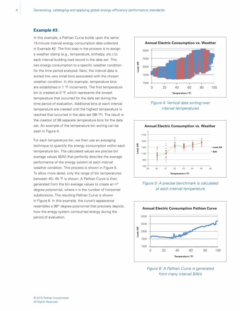
Example #3:
In this example, a Pathian Curve builds upon the same
15-minute interval energy consumption data collected
in Example #2. The first step in the process is to assign
a weather stamp (e.g., temperature, enthalpy, etc.) to
each interval building load record in the data set. This
ties energy consumption to a specific weather condition
for the time period analyzed. Next, the interval data is
sorted into very small bins associated with the chosen
weather condition. In this example, temperature bins
are established in 1 °F increments. The first temperature
bin is created at 0 °F, which represents the lowest
temperature that occurred for the data set during the
time period of evaluation. Additional bins at each interval
temperature are created until the highest temperature is
reached that occurred in the data set (98 °F). The result is
the creation of 98 separate temperature bins for the data
set. An example of the temperature bin sorting can be
seen in Figure 4.
For each temperature bin, we then use an averaging
technique to quantify the energy consumption within each
temperature bin. The calculated values are precise bin
average values (BAV) that perfectly describe the average
performance of the energy system at each interval
weather condition. This process is shown in Figure 5.
To allow more detail, only the range of bin temperatures
between 40 – 45 °F is shown. A Pathian Curve is then
generated from the bin average values to create an nth
degree polynomial, where n is the number of horizontal
subdivisions. The resulting Pathian Curve is shown
in Figure 6. In this example, the curve’s appearance
resembles a 98th degree polynomial that precisely depicts
how the enegy system comsumed energy during the
period of evaluation.
Figure 4: Vertical data sorting over interval temperatures
Figure 5: A precise benchmark is calculated at each interval temperature
Figure 6: A Pathian Curve is generated from many interval BAVs
Annual Electric Consumption vs. Weather
Annual Electric Consumption vs. Weather
Annual Electric Consumption Pathian Curve
Load
, kW
Load
, kW
Temperature (°F)
Temperature (°F)
Load
, kW
3000
2500
2000
1500
1000
0 20 40 60 80 100
1700
1500
1300
1100
900
70039 40 41 42 43 44 45 46
Load, kW
BAV
3000
2500
2000
1500
1000
0 20 40 60 80 100
Temperature (°F)

Generating, cataloging and applying global energy efficiency performance standards
© 2015 Pathian IncorporatedAll Rights Reserved
5
Accuracy of Pathian Baseline Curves Compared to Traditional Methods
The American Society of Heating, Refrigeration, Air
Conditioning Engineering (ASHRAE) and International
Performance Measurement and Verification Protocol
(IPMVP™) publish guidelines for the HVAC industry on how
to measure energy curve accuracies. While a complete
discussion on these methods is beyond this paper’s
scope, it is important to review a key statistical concept
called the coefficient of determination. The coefficient
of determination is denoted as R 2 or r 2 and pronounced
“R squared”. In the context of energy measurement and
verification, the R 2 value is a number between zero (0.00)
and one (1.00) that describes how accurately the data
used for the best fit polynomial curve represents the data
set from which it was generated. Generally speaking, a
value of 0.00 means that there is no correlation between
the energy curve and the data set. A value of 1.00 means
there is a perfect correlation between the energy curve
and the data set. The U.S. federal government requires
R 2 value of at least 0.70 to process payment applications
for energy conservation projects (using Whole Building
Approach — Method C as outlined in FEMP M&V
Guidelines: Measurement and Verification for Federal
Energy Projects).
Establishing an accurate baseline is very important.
Errors in the baseline will propagate throughout the
entire measurement and verification process, making
final results less accurate and actionable. Referring to
our first two baseline curve examples, the coefficient
of determination (R 2) value of Examples #1 and #2
equals 0.6818 and 0.6646, respectively. Based on these
R 2 values, the energy curve of Example #1 is slightly
more accurate describing the data set than Example #2.
Neither curve’s R 2 value, however, is greater than 0.70,
which means they could not be used for measurement
and verification purposes for federal government energy
conservation work. In contrast, the Pathian Analysis
process consistently generates an R 2 of nearly 1.00 for
every energy curve because the benchmarking process
retains the details of how the energy was actually
consumed.
Using Pathian Curves to Calculate Energy Consumption
A Pathian Curve describes the average performance
of an energy system or component across selected
weather bins. To calculate the energy consumption for
a specific weather bin, the count of energy records for
each individual weather bin (i.e., bin count) is simply
multiplied by the calculated bin average value (BAV),
as shown in Equation 1:
(1) E1 = (BAV1) * (BC1)
Where: E1 = Weather Bin Energy Consumption
BAV1 = Bin Average Value
BC1 = Bin Count
For example, if there were 100 hourly readings at a
particular weather bin and the BAV for that weather bin
was 100 kW, the total energy consumption for that period
would be 100 kW *100 hours = 10,000 kWh. This is not
an approximated value. It represents the precise energy
consumption for that particular weather bin. Thus, if this
process is repeated for each individual weather bin and
the results are summed, the exact energy consumption
for that period is precisely calculated with a very high
degree of accuracy by using Equation 2:
(2) Etotal = (BAV1* BC1) + BAV2 * BC2 + …. BAVn * BCn

6 Generating, cataloging and applying global energy efficiency performance standards
© 2015 Pathian IncorporatedAll Rights Reserved
2700
2400
2100
1800
1500
5 10 15 20 25 30 35 40 45
Reported ConsumptionBenchmark Consumption
Using Pathian Curves to Calculate Weather-Normalized Variances in Energy Consumption
Calculation of weather-normalized energy consumption
variances is achieved by comparing Pathian Curve BAVs
between one time period and another. Interval data for
the selected baseline time period is used to generate a
Benchmark Curve by plotting calculated baseline year
BAVs for each weather bin. Similarly, interval data for the
selected report year is used to generate a Comparison
Curve. The BAV difference between the Benchmark Curve
and the Comparison Curve is calculated for each individual
weather bin benchmark value and then multiplied by
the weather bin hour count from Comparison Curve
time period, as expressed in Equation 3:
(3) Ediff1 = (BAVBY1 - BAVCY1) * BCCY1)
Where: Ediff1 = Difference in Energy Consumption
for Weather Bin
BAVBY1 = Benchmark Curve Weather BAV
BAVCY1 = Comparison Curve Weather BAV
BCCY1 = Comparison Curve Bin Count
For example, at 40 °F if the Benchmark Curve’s weather
BAV is 100 kW and the Comparison Curve’s corresponding
weather BAV is 90 kW, then the average difference in
electric demand at 40 °F is 10 kW. For the report year,
if 100 hours were spent within that particular weather
bin (40 °F), the total difference would be (100 kW – 90
kW) X 100 hours = 1,000 kWh for that weather bin. If
this process is repeated for each individual weather bin
and results are summed, the weather-normalized energy
consumption difference between the two time periods
is precisely calculated. This process is represented in
Equation 4 below:
(4) Annual Energy Consumption Difference =
(BAVBY1 - BAVCY1) * BCCY1) + (BAVBY2 - BAVCY2) *
BCCY2 + …. (BAV…BYn- BAV…CYn) * BC…CYn )
where: BAVBY1,2.n = Bin Average Value for Benchmark
Year at Specific Weather Bin
BAVCY1,2.n = Bin Average Value for Comparison
Year at Specific Weather Bin
BCCY1,2.n = Bin Count for Comparison Year
at Specific Weather Bin
In Figure 7, two Pathian Curves are shown. The red
curve is the benchmark year, and the blue curve is called
the comparison curve. In this example, the comparison
curve represents the following year, but it could be any
year of our choosing. Within this two-year span there
were no major changes to building systems or how they
were controlled. As a result, notice how similar the BAVs
are at each interval weather condition. This is expected
if the customer’s energy consumption habits have not
changed during the time period of evaluation. In Figure
8, a difference curve generated from the same data
set is shown. The function of the difference curve is to
graphically illustrate the calculated “difference” between
the benchmark year BAV and the comparison year BAV at
each temperature bin, helping to pinpoint specific areas
of focus and improvement. For example, in Figure 8,
the larger difference between the benchmark year and
comparison for enthalpy values above 30 Btu/lb shows
that more significant efficiency improvements occurred
during cooling season.
Figure 8: Pathian Analysis difference curve
Ave
rag
e el
ectr
ic u
sag
e (k
W)
Enthalpy
kW
Figure 7: Pathian Analysis comparison chart
kWA
vera
ge
elec
tric
usa
ge
(kW
)
Enthalpy
300
200
100
0
-100
-200
-300
5 10 15 20 25 30 35 40 45
Reported ConsumptionBenchmark Consumption
Generating, cataloging and applying global energy efficiency performance standards
© 2015 Pathian IncorporatedAll Rights Reserved
7
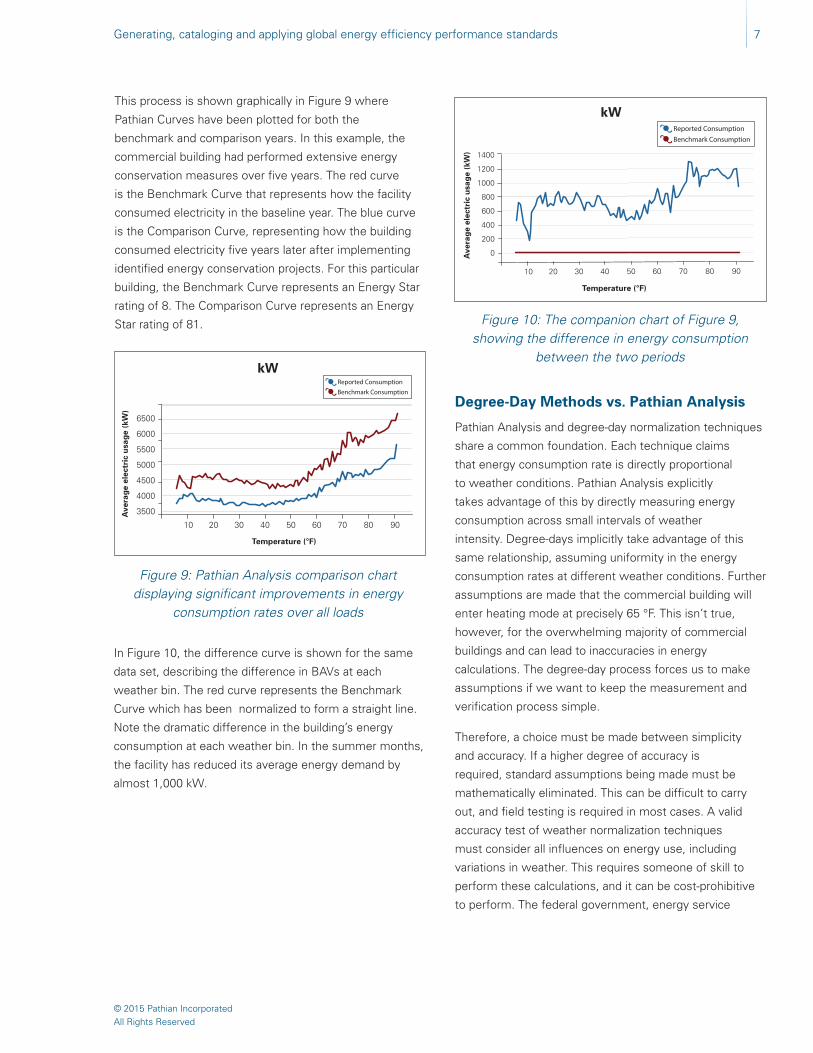
This process is shown graphically in Figure 9 where
Pathian Curves have been plotted for both the
benchmark and comparison years. In this example, the
commercial building had performed extensive energy
conservation measures over five years. The red curve
is the Benchmark Curve that represents how the facility
consumed electricity in the baseline year. The blue curve
is the Comparison Curve, representing how the building
consumed electricity five years later after implementing
identified energy conservation projects. For this particular
building, the Benchmark Curve represents an Energy Star
rating of 8. The Comparison Curve represents an Energy
Star rating of 81.
Degree-Day Methods vs. Pathian Analysis
Pathian Analysis and degree-day normalization techniques
share a common foundation. Each technique claims
that energy consumption rate is directly proportional
to weather conditions. Pathian Analysis explicitly
takes advantage of this by directly measuring energy
consumption across small intervals of weather
intensity. Degree-days implicitly take advantage of this
same relationship, assuming uniformity in the energy
consumption rates at different weather conditions. Further
assumptions are made that the commercial building will
enter heating mode at precisely 65 °F. This isn’t true,
however, for the overwhelming majority of commercial
buildings and can lead to inaccuracies in energy
calculations. The degree-day process forces us to make
assumptions if we want to keep the measurement and
verification process simple.
Therefore, a choice must be made between simplicity
and accuracy. If a higher degree of accuracy is
required, standard assumptions being made must be
mathematically eliminated. This can be difficult to carry
out, and field testing is required in most cases. A valid
accuracy test of weather normalization techniques
must consider all influences on energy use, including
variations in weather. This requires someone of skill to
perform these calculations, and it can be cost-prohibitive
to perform. The federal government, energy service
Figure 9: Pathian Analysis comparison chart displaying significant improvements in energy
consumption rates over all loads
Figure 10: The companion chart of Figure 9, showing the difference in energy consumption
between the two periods
In Figure 10, the difference curve is shown for the same
data set, describing the difference in BAVs at each
weather bin. The red curve represents the Benchmark
Curve which has been normalized to form a straight line.
Note the dramatic difference in the building’s energy
consumption at each weather bin. In the summer months,
the facility has reduced its average energy demand by
almost 1,000 kW.
kW
Ave
rag
e el
ectr
ic u
sag
e (k
W)
Temperature (°F)
kW
Ave
rag
e el
ectr
ic u
sag
e (k
W)
Temperature (°F)
6500
6000
5500
5000
4500
4000
3500
10 20 30 40 50 60 70 80 90
Reported ConsumptionBenchmark Consumption
1400
1200
1000
800
600
400
200
0
10 20 30 40 50 60 70 80 90
Reported ConsumptionBenchmark Consumption

8 Generating, cataloging and applying global energy efficiency performance standards
© 2015 Pathian IncorporatedAll Rights Reserved
companies (ESCOs) and others have developed energy
simulation tools for the purpose of weather normalization,
but this is far from a standardized process. The advantage
Pathian Analysis has over the degree-day technique is
it requires zero assumptions to normalize differences
in weather. Using Pathian Analysis, interval weather bin
benchmarks precisely describe the performance of the
energy system over all-weather loads. No further weather
normalization is required.
Standardized Units of Measurement, Precise Results
In the simplest of terms, there are three primary variables
required to calculate energy consumption using traditional
benchmarking techniques (i.e., degree-day based methods);
time, weather and energy. Most would say that weather
is the most difficult of these three variables to accurately
represent mathematically. It is continuously changing and
is never the same from one time period to the next or
from one location to another.
The Pathian Analysis technique holds the time period
of analysis constant and very small (i.e., less than
15 minutes), essentially making time period a constant
mathematical operator, not a variable (i.e., like a day,
month, year, etc.). This is the key differentiator in the
technique because the result of holding time very small
allows us to treat the weather variable as a constant
mathematical operator as well. This leaves energy as
the only true variable in the benchmarking process.
This is important because it eliminates the need to
make any assumption whatsoever when using the
benchmarking technique to measure and compare our
energy consumption habits. The results generated by the
measurement process is a precise, real number. Anyone
in the world who uses the same data set(s) for analysis
will generate the exact same calculated results with
pinpoint accuracy. This attribute makes the measurement
process an ideal solution for a standardized method to
measure and compare our energy consumption habits on
a national scale.
Figure 11: Hospital peer group comparison
Intensity
Temperature, (°F)
En
erg
y In
ten
sity
(B
TU
/sq
ft)
14
12
10
8
6
4
2
00 20 40 60 80 100
Using Pathian Analysis to Compare Peer Group Performance
A peer group can be defined as a building, system or type
of equipment with similar function or control strategy. In
Figure 11, energy curves for 10 different surgical hospitals
are shown to demonstrate how Pathian Analysis can be
utilized to compare energy utilization rates among peer
buildings, independent of geographic location. Each
curve has been normalized to express energy demand
in units consumed per square foot. This was done by
dividing each hospital’s BAV by the building area within
each weather bin. This approach allows peer comparison
of large buildings to smaller ones. Because they are
peer facilities, the energy consumption patterns are very
similar. Any peer surgical hospital in the world would have
this same general performance profile.
The chart shows that energy deficiencies in peer groups
are generally consistent across the entire temperature
range of analysis. The curve’s Y-axis position on the chart
is directly proportional to its energy efficiency and has a
direct correlation to the commercial building’s Energy Star
rating. For instance, the top curve on the chart is the least
efficient of the peer group. It has a single-digit Energy
Star rating. Moving vertically downward, each hospital is
slightly more efficient than the next. The lowest curve on
our chart is an Energy Star hospital.
Since all the energy curves in Figure 11 are location and
time period neutral, any hospital in the world can directly
be compared to this peer group’s energy consumption
habits. This direct comparison would require no
assumptions or mathematical corrections to be made
for differences in weather conditions among the locations.

Generating, cataloging and applying global energy efficiency performance standards
© 2015 Pathian IncorporatedAll Rights Reserved
9
In addition, the time period during which the energy data
was collected would also have no effect on the comparison
results. The data in the charts could have been collected
decades apart and it would not have an effect on the
analysis or methods used to obtain these results.
Syrx Numbering System, a Catalog for Global Energy Efficiency Performance Standards
The Syrx Numbering System (pronounced Sī-rex) is
the first global cataloging system for energy efficiency
standards. For peer building classification, the Syrx
Numbering System utilizes Standard Industrial Codes
(SIC) and the North American Industrial Classification
System (NAICS) to categorize each building type.
For HVAC equipment within buildings, the Construction
Specification Institute (CSI) Master Format numbering
system is used. This allows flexibility to categorize peer
groups at each component level (i.e., building, system or
Table 1: Example of Syrx numbering system cataloging of control methods for axial fan
Section
23 34 00 HVAC Fans
Equipment
23 34 13 Axial HVAC Fans
Fan Type
23 34 13 001 Supply Air Fan
23 34 13 002 Return Air Fan
Fan Volume Control
23 34 13 002 001 RAF – Constant Volume
23 34 13 002 002 RAF – Inlet Guide Vane Volume Control
23 34 13 002 003 RAF – Variable Frequency Drive Volume Control
Control Method
23 34 13 002 003 001 RAcfm = SAcfm - EAcfm
23 34 13 002 003 002 RAFspd = SAFspd * %
23 34 13 002 003 003 RA Plenum Two-Thirds Transmitter
23 34 13 002 003 004 RAF Discharge Plenum Pressure (Non-POBPC)
23 34 13 002 003 005 POBPC
23 34 13 002 003 006 POBPC w/Static Reduction
23 34 13 002 003 007 Other
23 34 13 002 003 008 Unknown
23 34 13 003 Relief Air Fan
23 34 13 004 Exhaust Air Fan
23 34 13 005 Outside Air Fan
equipment type). In the Syrx Numbering System, a
“component” can be virtually anything that consumes
power or controls the consumption of power (i.e., fan or
pump type, hydronic coil, an HVAC control sequence, valve
position, on/off status, any set point or numeric value,
control loop speed, etc.). This approach allows Pathian to
create an endless hierarchy of globally applicable indices
for peer group performance standards. Presently, there
are more than 23,000 component ID categories used in the
Syrx Numbering System. The numbering system not only
describes what type of component is being measured but
it also categorizes the different control methods used to
control how the component operates. An example of this
numbering system is shown in Table 1, illustrating how
CSI Master Format number 23 34 13, Axial HVAC Fans,
are cataloged in the Syrx Numbering System. The Syrx
number assigned to an axial return air fan equipped with
VFD that is controlled by Pathian Optimal Building Pressure
Control (POBPC) fan tracking method using a static reduction
control algorithms is 23 34 13 002 003 006.
10 Generating, cataloging and applying global energy efficiency performance standards
© 2015 Pathian IncorporatedAll Rights Reserved
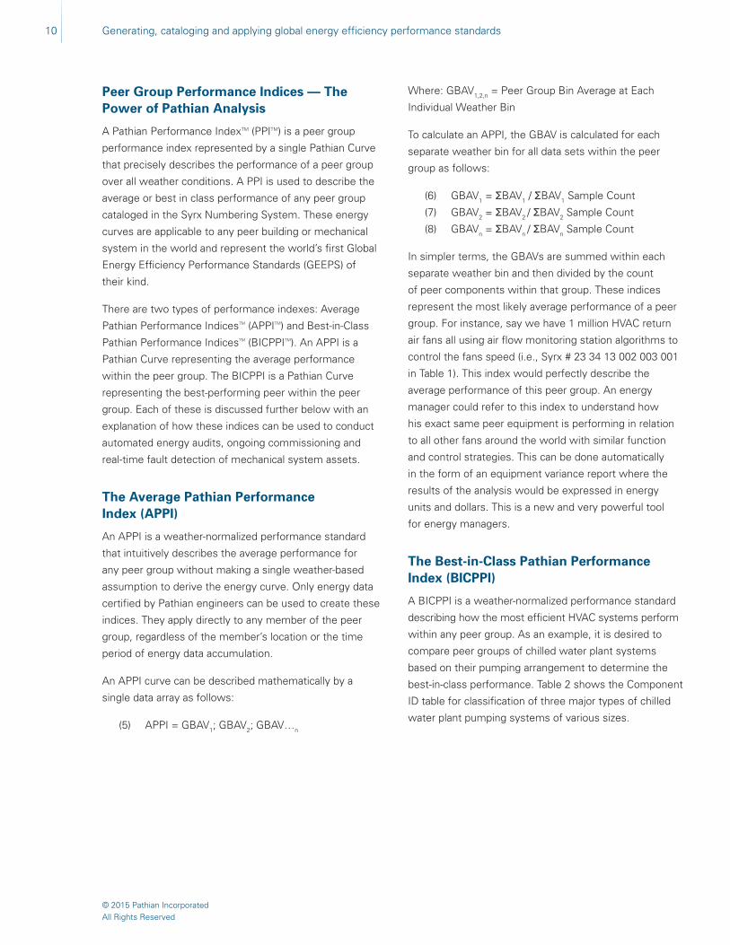
Peer Group Performance Indices — The Power of Pathian Analysis
A Pathian Performance IndexTM (PPITM) is a peer group
performance index represented by a single Pathian Curve
that precisely describes the performance of a peer group
over all weather conditions. A PPI is used to describe the
average or best in class performance of any peer group
cataloged in the Syrx Numbering System. These energy
curves are applicable to any peer building or mechanical
system in the world and represent the world’s first Global
Energy Efficiency Performance Standards (GEEPS) of
their kind.
There are two types of performance indexes: Average
Pathian Performance IndicesTM (APPITM) and Best-in-Class
Pathian Performance IndicesTM (BICPPITM). An APPI is a
Pathian Curve representing the average performance
within the peer group. The BICPPI is a Pathian Curve
representing the best-performing peer within the peer
group. Each of these is discussed further below with an
explanation of how these indices can be used to conduct
automated energy audits, ongoing commissioning and
real-time fault detection of mechanical system assets.
The Average Pathian Performance Index (APPI)
An APPI is a weather-normalized performance standard
that intuitively describes the average performance for
any peer group without making a single weather-based
assumption to derive the energy curve. Only energy data
certified by Pathian engineers can be used to create these
indices. They apply directly to any member of the peer
group, regardless of the member’s location or the time
period of energy data accumulation.
An APPI curve can be described mathematically by a
single data array as follows:
(5) APPI = GBAV1; GBAV2; GBAV…n
Where: GBAV1,2,n = Peer Group Bin Average at Each
Individual Weather Bin
To calculate an APPI, the GBAV is calculated for each
separate weather bin for all data sets within the peer
group as follows:
(6) GBAV1 = ΣBAV1 / ΣBAV1 Sample Count
(7) GBAV2 = ΣBAV2 / ΣBAV2 Sample Count
(8) GBAVn = ΣBAVn / ΣBAVn Sample Count
In simpler terms, the GBAVs are summed within each
separate weather bin and then divided by the count
of peer components within that group. These indices
represent the most likely average performance of a peer
group. For instance, say we have 1 million HVAC return
air fans all using air flow monitoring station algorithms to
control the fans speed (i.e., Syrx # 23 34 13 002 003 001
in Table 1). This index would perfectly describe the
average performance of this peer group. An energy
manager could refer to this index to understand how
his exact same peer equipment is performing in relation
to all other fans around the world with similar function
and control strategies. This can be done automatically
in the form of an equipment variance report where the
results of the analysis would be expressed in energy
units and dollars. This is a new and very powerful tool
for energy managers.
The Best-in-Class Pathian Performance Index (BICPPI)
A BICPPI is a weather-normalized performance standard
describing how the most efficient HVAC systems perform
within any peer group. As an example, it is desired to
compare peer groups of chilled water plant systems
based on their pumping arrangement to determine the
best-in-class performance. Table 2 shows the Component
ID table for classification of three major types of chilled
water plant pumping systems of various sizes.

Generating, cataloging and applying global energy efficiency performance standards
© 2015 Pathian IncorporatedAll Rights Reserved
11
Table 2: Example of Syrx numbering system cataloging of control methods for chilled water plants
Component ID Component Description
23 60 00 001 Central CHW Plant
23 60 00 001 001 Primary CV/Secondary VV
23 60 00 001 001 001 Central CHW Plant, Primary CV/Secondary VV, <250 Tons
23 60 00 001 001 002 Central CHW Plant, Primary CV/Secondary VV, 250–500 Tons
23 60 00 001 001 003 Central CHW Plant, Primary CV/Secondary VV, 500–1,000 Tons
23 60 00 001 001 004 Central CHW Plant, Primary CV/Secondary VV, 1,000–1,500 Tons
23 60 00 001 001 005 Central CHW Plant, Primary CV/Secondary VV, 1,500–2,000 Tons
23 60 00 001 001 006 Central CHW Plant, Primary CV/Secondary VV, >2,000 Tons
23 60 00 001 002 Primary CV/Secondary CV
23 60 00 001 002 001 Central CHW Plant, Primary CV/Secondary CV, <250 Tons
23 60 00 001 002 002 Central CHW Plant, Primary CV/Secondary CV, 250–500 Tons
23 60 00 001 002 003 Central CHW Plant, Primary CV/Secondary CV, 500–1,000 Tons
23 60 00 001 002 004 Central CHW Plant, Primary CV/Secondary CV, 1,000–1,500 Tons
23 60 00 001 002 005 Central CHW Plant, Primary CV/Secondary CV, 1,500–2,000 Tons
23 60 00 001 002 006 Central CHW Plant, Primary CV/Secondary CV, >2,000 Tons
23 60 00 001 003 Primary VV
23 60 00 001 003 001 Central CHW Plant, Primary VV, <250 Tons
23 60 00 001 003 002 Central CHW Plant, Primary VV, 250–500 Tons
23 60 00 001 003 003 Central CHW Plant, Primary VV, 500–1,000 Tons
23 60 00 001 003 004 Central CHW Plant, Primary VV, 1,000–1,500 Tons
23 60 00 001 003 005 Central CHW Plant, Primary VV, 1,500–2,000 Tons
23 60 00 001 003 006 Central CHW Plant, Primary VV, >2,000 tons
In this case, we want to know the most efficient primary
constant volume (CV)/secondary CV chilled water plant
with a total capacity of between 1,000 and 1,500 tons.
Within the Pathian database, this means a comparison
of Pathian Curves generated from total plant kW/ton
energy point values for Syrx account numbers containing
23 60 00 001 002 004 as a component ID and chiller
plant efficiency. The curve with the lowest overall kW/ton
value represents the BICPPI for that peer group.
Figure 12 shows this comparison graphically. For this
peer group comparison, performance data for two peer
chilled water plants (Plants No. 1 and No. 2) have been
collected and plotted. Within the Pathian database, both
peer group APPI and BICPPI curves have been generated
for comparison. Compared to the BICPPI plant efficiency
curve, both Plant No. 1 and No. 2 can make significant
improvements in energy efficiency through operational
and/or equipment efficiency improvements.
Figure 12: APPI and BICPPI curves
Temperature, °F
Pla
nt
Effi
cien
cy, k
W/t
on
1.4
1.2
1.0
0.8
0.6
0.4
0.2
0.00 10 20 30 40 50 60 70 80 90 100
Plant #1
Plant #2
APPI
BICPPI

12 Generating, cataloging and applying global energy efficiency performance standards
© 2015 Pathian IncorporatedAll Rights Reserved
Superior Big Data Processing Speed
Perhaps the single greatest attribute of Pathian
Analysis is the process speed at which peer group
performance comparison data can be analyzed. This is
possible because each Pathian Curve can be perfectly
described by a single data array (i.e., one record). Thus,
only two data array are required to make a comparison
using this measurement and verification technique. Since
Average Pathian Performance Indices (APPI) and
Best-in-Class Pathian Performance Indices (BICPPI)
are represented by Pathian Curves as well, either of
these can be compared against any peer in the world
using just two data arrays. This makes it an ideal solution
for smartphone mobile device deployment or other
applications that have limited processing power.
Automated Energy Auditing, Ongoing Commissioning and Fault Detection
As APPI and BICPPI curves are generated and catalogued
for peer groups within the Pathian database, the ability
to provide automated energy auditing, continuous
commissioning and fault detection is streamlined into a
single application.
Automated Energy Auditing
In Figure 13, the BICPPI curves are shown for two
different types of chilled water plants: a primary/secondary
constant volume plant (CV) and a primary/variable volume
plant (VV). A third plant efficiency curve is plotted for a
new customer’s plant to determine the potential savings
opportunity. With this data, potential savings can be
estimated precisely by using the difference in kW/ton
values and multiplying that difference by the plant’s
load and operating hours at each weather bin. A similar
approach can be applied to any measured value used to
establish peer groups (i.e., buildings, equipment capacity
ratios, etc.) to estimate potential energy savings.
For the most accurate estimate of savings, it is desirable
to obtain at least one year of measurement data, since
one complete year of data will show differences across
the desired temperature range. However, it is also
possible to evaluate potential savings based on as little as
one month of trend data. Typically, the difference in values
shown within a smaller temperature range is consistent
with differences across the entire range. These results
can be extrapolated to provide estimates of savings
sufficient for capital decision making when time is more
limited for data collection.
Figure 13: Using BICPPI curves for automated energy auditing
Temperature (°F)P
lan
t E
ffici
ency
, kW
/to
n
Ongoing Commissioning and Fault Detection
Once a building’s equipment performance has been
optimized, a Pathian Curve representing the specific
component’s “fingerprint” is established, and future
performance can be compared. Deviations in performance
can be caused by many different things, including operator
set point changes, modifications of control strategies and
degradation of equipment efficiencies. In other cases,
original equipment has been replaced with more efficient
equipment as part of an energy conservation measure.
These deviations in performance can be identified
and differences in energy consumption quantified by
comparing Pathian Curves from different time periods.
1.4
1.2
1.0
0.8
0.6
0.4
0.2
0.00 10 20 30 40 50 60 70 80 90 100
New Customer Plant
BICPPI (CV)
BICPPI (VV)

Generating, cataloging and applying global energy efficiency performance standards
© 2015 Pathian IncorporatedAll Rights Reserved
13
100%
90%
80%
70%
60%
50%
40%
30%
20%
10%
0%0 10 20 30 40 50 60 70 80 90 100
CHW Valve
OA Damper
PHC Valve
Figure 14: Using Pathian Curves for Ongoing Commissioning and Fault Detection
Temperature, °F
Po
siti
on
, % o
pen
In Figure 14, the positions of an AHU’s outside air (OA)
damper, preheat coil (PHC) valve and cooling coil valve
have been plotted for comparison years. In each case, the
solid line represents the baseline year and the dashed line
the comparison year. There are several conclusions that
can be drawn from the Pathian Curves plotted for each
component. First, the OA damper position has trended to
25% open below a temperature of 30 °F (1), resulting in
excess heating of outside air. As a consequence, the PHC
valve position for this same temperature range has opened
to provide additional heating. Secondly, between 55–70 °F
(2), the PHC valve is open, indicating a possible change in
control setpoints or a potential maintenance issue. Finally,
between 20–50 °F, both the PHC and chilled water (CHW)
valves are open (3), indicating competing energy and an
opportunity for energy savings. In each case, the deviations
are not one-time occurrences, but trends in performance
based on the recorded BAVs for that component for the
comparison year.
As can be seen from these scenarios, Pathian Analysis
techniques can be used as an ongoing commissioning
and fault detection application. This can help sustain
efficient equipment performance, identify maintenance
issues and quantify the value of losses in dollars,
providing documentation to support justification with
much less effort.
Peer Group Comparison — Beyond the Building Level
As shown in previous examples, it was demonstrated
how Pathian Analysis can provide peer building
comparisons using interval data from building utility
meters. The capability to develop peer comparisons
for HVAC systems, equipment and control strategies
from a building’s DDC system data, however, is the
key differentiator between Pathian Analysis and other
techniques available in the HVAC industry today. To
support this, Pathian has developed several peer group
comparison methods applicable to building HVAC
systems as follows:
• Peer Equipment Benchmarking
• Position Benchmarking
• Load-to-Position Benchmarking
• Control Sequence Benchmarking
Peer Equipment Benchmarking
As with buildings, peer equipment benchmarking requires
size normalization for a proper comparison. In the case
of buildings, each building’s BAV is divided by its building
area to normalize based on energy use intensity (EUI). For
equipment, the design motor ratings, cooling and heating
loads are the key variables which must be normalized to
compare performance of dissimilar-sized peer equipment
types. Pathian developed the Capacity Ratio (CR) as the
standard method for peer equipment comparison. The CR
is simply the measured operating load of the equipment
divided by its rated capacity, with the calculated value
expressed as percentage (%). For any energy-consuming
equipment where the Pathian Curve has been generated,
dividing each BAV (kW, Btu/hr, etc.) by the equipment’s
design capacity (of the same units) yields the normalized
Pathian Curve for CR.
Figure 15: Capacity ratio for supply fans
Capacity Ratio (CR)
Cap
acit
y R
atio
, kW
/kW
d
Temperature (°F)
100%
90%
80%
70%
60%
50%
40%
30%
20%
10%
0%0 10 20 30 40 50 60 70 80 90 100
100 HP, Constant Speed
200 HP, Variable Speed
25 HP, Variable Speed
14 Generating, cataloging and applying global energy efficiency performance standards
© 2015 Pathian IncorporatedAll Rights Reserved
Figure 16: Position Benchmarking Curves for valves and dampers
Figure 15 shows sample CR Pathian Curves generated
for three air handling unit (AHU) supply fans with different
motor sizes. Two of the supply fans are variable speed,
while the other is a constant speed drive. The CR Pathian
Curve provides insight into how each fan operates with
respect to weather conditions. When comparing peer
groups of fans with similar control strategies, differences
in CR values at similar weather conditions demonstrate
potential inefficiencies which can be used to calculate
potential energy savings. Year-to-year comparisons of the
same fan can show the impact of system control changes,
allowing the ability to quantify energy consumption
increases/decreases more cost effectively.
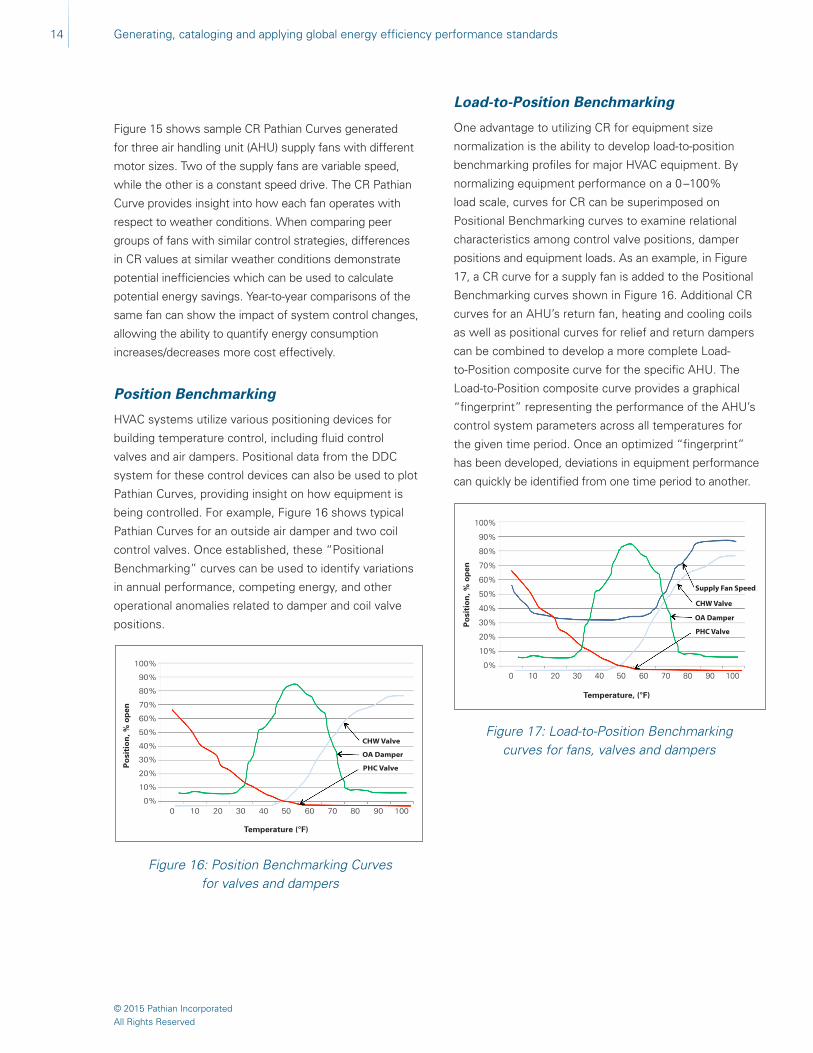
Position Benchmarking
HVAC systems utilize various positioning devices for
building temperature control, including fluid control
valves and air dampers. Positional data from the DDC
system for these control devices can also be used to plot
Pathian Curves, providing insight on how equipment is
being controlled. For example, Figure 16 shows typical
Pathian Curves for an outside air damper and two coil
control valves. Once established, these “Positional
Benchmarking” curves can be used to identify variations
in annual performance, competing energy, and other
operational anomalies related to damper and coil valve
positions.
Figure 17: Load-to-Position Benchmarking curves for fans, valves and dampers
Temperature, (°F)
Load-to-Position Benchmarking
One advantage to utilizing CR for equipment size
normalization is the ability to develop load-to-position
benchmarking profiles for major HVAC equipment. By
normalizing equipment performance on a 0 –100%
load scale, curves for CR can be superimposed on
Positional Benchmarking curves to examine relational
characteristics among control valve positions, damper
positions and equipment loads. As an example, in Figure
17, a CR curve for a supply fan is added to the Positional
Benchmarking curves shown in Figure 16. Additional CR
curves for an AHU’s return fan, heating and cooling coils
as well as positional curves for relief and return dampers
can be combined to develop a more complete Load-
to-Position composite curve for the specific AHU. The
Load-to-Position composite curve provides a graphical
“fingerprint” representing the performance of the AHU’s
control system parameters across all temperatures for
the given time period. Once an optimized “fingerprint”
has been developed, deviations in equipment performance
can quickly be identified from one time period to another.
100%
90%
80%
70%
60%
50%
40%
30%
20%
10%
0%0 10 20 30 40 50 60 70 80 90 100
CHW Valve
OA Damper
PHC ValvePo
siti
on
, % o
pen
Po
siti
on
, % o
pen
Temperature (°F)
100%
90%
80%
70%
60%
50%
40%
30%
20%
10%
0%0 10 20 30 40 50 60 70 80 90 100
CHW Valve
Supply Fan Speed
OA Damper
PHC Valve

Generating, cataloging and applying global energy efficiency performance standards
© 2015 Pathian IncorporatedAll Rights Reserved
15
Control Sequence Benchmarking
Control Sequencing Benchmarking compares the energy
consumption of an existing mechanical system control
sequence method to a best-in-class control sequence for
that equipment peer group. The generation of a Load-
to-Position composite curve for any type of equipment
provides a graphical “fingerprint” for how that equipment
responds to control parameters across all temperatures.
As equipment control sequences are optimized, the
“fingerprint“ can then be used to compare year-to-year
performance changes, which helps sustain optimal
performance for that particular equipment. Even more
powerful, the “fingerprint” can be compared to other peer
equipment with different control strategies, establishing
the ability to identify the most efficient control strategy.
Creation of these best-in-class performance control
sequences provides the ability to conduct automated
energy auditing. An example of this is shown in Figure 18.
In this case, the speed of AHU return fans is compared
for different return fan control strategies.
Figure 18: Control Sequence Benchmarking for different return fan control strategies
Comparative Curves
Best in Class
Method A
Method B
Method C
Method D
Method E
100%
80%
60%
40%
20%
0%
0 10 20 30 40 50 60 70 80 90 100
°F (Dry bulb)
RAF Speed
Comparative Curves
Best in Class
Method A
Method B
Method C
Method D
Method E
100%
80%
60%
40%
20%
0%
0 10 20 30 40 50 60 70 80 90 100
°F (Dry bulb)
RAF Speed
Comparative Curves
Best in Class
Method A
Method B
Method C
Method D
Method E
100%
80%
60%
40%
20%
0%
0 10 20 30 40 50 60 70 80 90 100
°F (Dry bulb)
RAF Speed
Creating Smart Meters From Building DDC Systems
Over the past several years, the use of interval data
meters to measure building utility consumption has
become common practice and is one of the primary
sources of energy data for building level analysis. The
primary data source for building HVAC equipment is the
building’s existing DDC system. Pathian Analysis allows
cost-effective transformation of thousands of DDC
points into virtual smart meters by streaming the Current
Operating Value (COV) of any DDC point type to our
cloud-based data servers.
To organize this data, the first step in this process is to
develop a building-specific directory or object tree for the
HVAC equipment within the building (i.e., chillers, boilers,
AHUs, pumps, etc.). Once the object tree is completed,
Pathian uses the Syrx Numbering System to assign DDC
points associated with each piece of HVAC equipment
with a unique identification number based on its customer,
equipment tag, component ID and point type. Each Syrx
account number is then matched (or mapped) to the DDC
point name as defined by the building control system
manufacturer. For a typical 1 million square foot building,
this equates to approximately 1,500 DDC points. The
amount of data points streamed depends on the end-user
requirements and the type of analysis being performed.
Once mapped, the COV of each DDC point is recorded
every 15 minutes. The data is received in the form of a
CSV file, using HTML XML posting method to transfer
the data. Currently, Pathian has the capability to collect
and process data from all major HVAC control system
manufacturers.

16 Generating, cataloging and applying global energy efficiency performance standards
© 2015 Pathian IncorporatedAll Rights Reserved
Differentiating Pathian Performance Index (PPI) From Traditional Energy Simulation Tools
The single greatest differentiator between PPIs and
traditional energy conservation simulation tools like
DOE’s eQUEST is measuring actual vs. predicted
performance. Simulation tools are used to predict
energy savings for implementing energy conservation
measures (ECM) based on user-defined model inputs
such as equipment type, equipment efficiency, operating
hours, control setpoints and historical bin weather data.
Assumptions made during model development, however,
do not always reflect actual conditions for peer types of
equipment once the equipment in placed into operation.
This leads to unexpected shortfalls in actual vs. predicted
savings for the ECM. In contrast, the PPI is a historical
average generated from actual performance data for
hundreds or thousands of systems and/or equipment
within the peer equipment group for that ECM. Utilizing
this approach, more accurate predictions can be made
to assess potential energy savings for the chosen ECM.
Also, by continuously measuring performance, deviations
in system performance over time can be proactively
identified and corrected to reduce risk of not achieving
savings goals.
Conclusion
HVAC mechanical system energy efficiency is driven
not only by the efficiency of the equipment installed,
but more importantly by the choices made in how these
systems are operated and controlled. But what works
best? And how can we know for sure? Data to validate
these choices are now readily available via utility smart
meters and advanced building management and control
systems. The ability to process large amounts of data has
increased exponentially in the past decade. Absent is an
application that can cost-effectively organize and process
this data into meaningful and actionable information for
use in the HVAC energy management industry. Pathian
Analysis is the solution to systematically identify and
quantify the benefits of implementing best practices
through HVAC system optimization.