Embed Size (px)
DESCRIPTION
Citation preview

Carla Sharpe
EVALUATION

IN WHAT WAY DOES YOUR MEDIA PRODUCT USE, DEVELOP OR CHALLENGE FORMS AS CONVENTIONS OF
THE REAL MEDIA PRODUCTS

In my media product, I did a movie trailer. I have different conventions to make my media product resemble a real movie trailer and make it look more professional. I wanted to do a movie trailer, because I thought that it would be exciting to make. I have chosen to do a horror movie trailer because I thought again that it would be more exciting and challenging to make. The research that I did was also on horror trailers to give me an idea of what I wanted my trailer to be about. I have used this picture because I think that it creates quite a mysterious feel because it doesn’t show the persons face, but their shadow instead. The font that I have used I feel that it is suitable to the genre of the film.
The target audience for my trailer was 15+. This allowed me to have a good idea of what I wanted in my trailer and that it has a wide target audience.
I made sure that my trailer followed some forms of conventions to keep up to date with my target audience. However I didn’t want to copy other trailers in the media, due to copyright, and that if I had of copied other trailers that are in the media because my audience, would have already seen it before.
In my poster there are many different conventions. This includes, the title having a shadow, this is also quite ironic because the title of my trailer is called shadow. The picture could also draw people in because they would want to know what happens in the trailer, this will catch the audiences eye. I took some ideas from other media posters, by using the small writing at the bottom of the poster showing the casting and directing of the film, also I have added a comment and a rating to show the profession side of it. The colour scheme that I have used works quite well with my story line and the genre of my trailer. Although I don’t have much colour in my poster, i think that it works quite well, the red on my title could show that it is a horror trailer. I feel that people would want to see my trailer by seeing my poster, because they would want too see what happens.
I think that a conventional horror poster would include, having the title quite bold, to make it more appealing and eye catching to the target audience. Another typical convention would be having a main picture that would also grab peoples attention. I think that I have achieved some of these typical conventions that would be seen on a horror poster, by adding a main picture that catching the audiences’ eye, but also having a relatively eye catching title, so that people could identify the film easier.

In my DVD cover again I have used the same image throughout my products to keep the link between them all.
On my DVD cover I have used different conventions such as the age certification on each part of the cover, having information about the film at the bottom of the page, also having my logo on the back of the page, this links it to my film trailer. I have also added pictures on the back to show some scenes in the film to make it look more professional. Another convention being the barcode and the DVD logo on the spine of the DVD cover.
I have chosen to keep the colour scheme the same throughout my products, because I feel that people would find it easier to identify the film, if the pictures and colour of each product is the same throughout.
I think that my DVD cover does have some professional qualities to it, some of these being, the bar code, and certification on the cover, but also have a blurb and information about the film at the bottom of the cover. Another quality being the pictures down the side of the cover, showing scenes in the film, this again could show professional qualities on my DVD cover.
In my magazine cover, I have used the same image that is on my poster so that people know that it’s the same film and that there is a link between them.
In my magazines I have used different conventions, such as having a main story on the front cover and then little story's at the bottom of the page. Another being that there is a main title, and a subtitle but also a barcode and the price of the magazine.
I think that my magazine has some professional qualities to it, some of these being the barcode and the price at the bottom of the page. Also that the magazine has a title, subtitle and a slogan, another quality being although there is one big story, the magazine also has little story’s at the bottom of the page.
Although there is conventional prospects, my magazine also has an unconventional prospect because the main image has been darkened, whereas usually there is a full image showing the actors face, but I wanted to keep the same theme throughout my products, and to keep the same mysterious feel about it.
The colour scheme that I have used works quite well with my story line, trailer and my other products.. Although I don’t have a great amount of colour in my magazine, i think that it works quite well. The red on my subtitle could show that it is a horror film. I feel that people would want to see my film by seeing it advertised on the front of my magazine.


HOW EFFECTIVE IS THE COMBINATION OF YOUR MAIN PRODUCT AND ANCILLARY TEXT
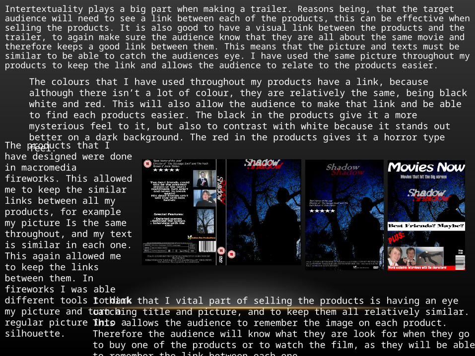
Intertextuality plays a big part when making a trailer. Reasons being, that the target audience will need to see a link between each of the products, this can be effective when selling the products. It is also good to have a visual link between the products and the trailer, to again make sure the audience know that they are all about the same movie and therefore keeps a good link between them. This means that the picture and texts must be similar to be able to catch the audiences eye. I have used the same picture throughout my products to keep the link and allows the audience to relate to the products easier.
I think that I vital part of selling the products is having an eye catching title and picture, and to keep them all relatively similar. This allows the audience to remember the image on each product. Therefore the audience will know what they are look for when they go to buy one of the products or to watch the film, as they will be able to remember the link between each one.
The colours that I have used throughout my products have a link, because although there isn’t a lot of colour, they are relatively the same, being black white and red. This will also allow the audience to make that link and be able to find each products easier. The black in the products give it a more mysterious feel to it, but also to contrast with white because it stands out better on a dark background. The red in the products gives it a horror type feel.
The products that I have designed were done in macromedia fireworks. This allowed me to keep the similar links between all my products, for example my picture Is the same throughout, and my text is similar in each one. This again allowed me to keep the links between them. In fireworks I was able different tools to dark my picture and turn a regular picture into a silhouette.

WHAT HAVE YOU LEARNT FROM YOUR AUDIENCE FEEDBACK

When getting audience feedback I was able to friends and family, because my film is for 15+, this allowed me to know what a different variety of people thought about my film. From this I was able to improve my film to suit people tastes and needs. My feedback also allowed me to understand what different people look for when choosing a film, and what they find eye catching when looking at different products.
One thing I learnt from my feedback was how to suit the needs of my audience by, asking what they found eye catching when looking at different products and what they look for in a good horror film. From this feedback I was able to understand how to improve it better and therefore improving my own knowledge in the film industry. They told me that by experimenting with different fonts and pictures, I would be able to see different aspects of how my products could look. They also said that by looking at different soundtracks it would help me to understand how different soundtrack fit better, therefore I was able to improve all 4 of my products better by experimenting. I found this good feedback, but sometimes I found it hard to see what looked and sounded better. However after keeping at it, I was able to then see what suited and went together well.
After having feedback for my trailer, I found that the soundtrack that I choose suited better, because although it isn’t a typical horror soundtrack, I think that it works well with the rest of the trailer and the footage that I filmed.
The feedback from my products was that to make some of them looking more professional, I should add things such as a barcode and price on my magazine cover. After doing these changes I felt that they did look more profession and that it was more eye catching and easier to identify. From all this feedback I have leant that it is vital when making a film and products to go with it. If I didn’t get feedback, I think that my products would look like they do now. They helped me keep a link between my products and show me how to make it more professional.

HOW DID YOU USE MEDIA TECHNOLOGIES IN THE CONSTRUCTION AND RESEARCH, PLANNING AND
EVALUATION STAGES

I have used different technologies while doing my media. I think that by using different types of technology, I have expanded my knowledge about the different software available to use. When finding my research to make my products, I used different websites to find magazines, posters and DVD covers, rather than going out and looking in shops, I found that finding them on the internet was easier than going out and find them. I thought that this was the best way to do my research as it allowed me to keep going back and looking over them rather than either going back to the shops of carrying them around with me. Also by doing this I was able to zoom in to different parts and take a more closer look at things. When It came to researching my trailer, I also found it was easier to do thins online, I used a site called trailer addict, this allowed me to look at different trailers, new and old, whereas going this in the real world would be quite difficult to do.
This website was easy to use, and enabled me to copy the link and post it to mu blog. It allowed me to look at a verity of different trailers, whether they were new or old. You could either type in the type of genre you were looking for, or a certain type of film. This gave me a good idea of what I wanted to put into my trailer, it also helped me with what I should put at the beginning of my trailer.

Another program I used was pinnacle 12, this allowed me to put my trailer together. I used different translation t make my movie flow better and fit better with the soundtrack. I found this program quite difficult to use at first but, once I new how do work it, It was fairly easy. I was able to add different text to my trailer in order too make it look more professional. My first choice of program to make my trailer in was windows movie maker, but although it was easier to use, I found that it didn’t have a much to offer a pinnacle did, such as more translations and better text quality. Also by using pinnacle I was able to mute the sound easier than in windows movie maker.it was also easier having lots of different time lines for different thing being used.
When making my products I used macromedia fireworks, this allowed me to keep the similar links between all my products, for example my picture Is the same throughout, and my text is similar in each one. I found this program easy to use, because everything is straight forward. A program that I was going to use was Photoshop, but I found that fireworks suited me better and that it was easier to use when making my products. By using fireworks I was able to make pictures darker and ground different photos together to make them look like one picture. I was also able to choose my canvas size to suit which product I was making. Each of the tools I needed, I found easier to use than Photoshop.