Embed Size (px)
Citation preview

FIGURE 5.1
Schematic diagram of basin inflows and outflows forconservation of volume discussion.
TALLEY Copyright © 2011 Elsevier Inc. All rights reserved

FIGURE 5.2
Continuity of mass for a small volume of fluid. By continuity, Vo = Vi.
TALLEY Copyright © 2011 Elsevier Inc. All rights reserved

FIGURE 5.3
Schematic diagrams of inflow and outflow characteristics for (a) Mediterranean Sea (negative waterbalance; net evaporation), (b) Black Sea (positive water balance; net unoff/precipitation).
TALLEY Copyright © 2011 Elsevier Inc. All rights reserved
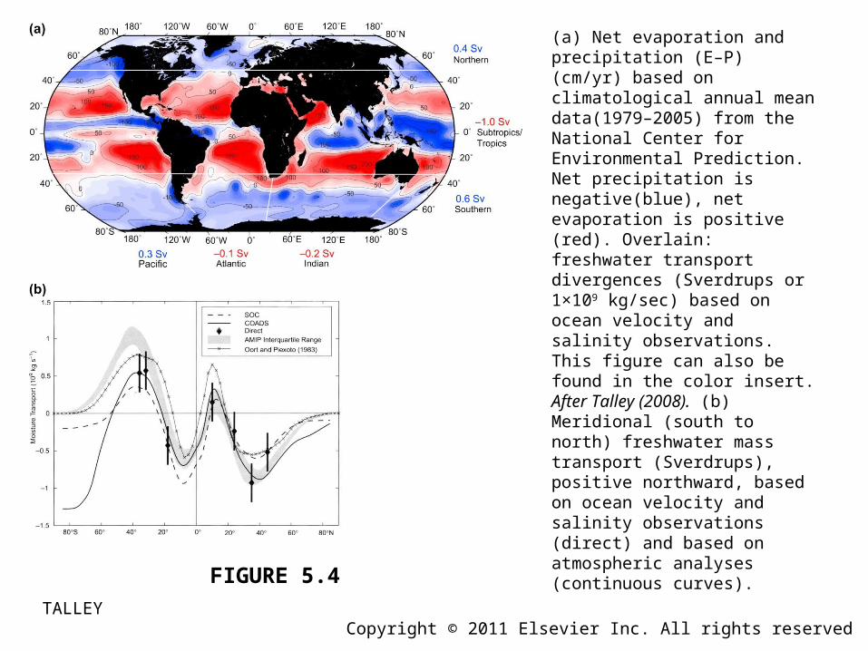
FIGURE 5.4
(a) Net evaporation and precipitation (E–P) (cm/yr) based on climatological annual mean data(1979–2005) from the National Center for Environmental Prediction. Net precipitation is negative(blue), net evaporation is positive (red). Overlain: freshwater transport divergences (Sverdrups or 1×10⁹ kg/sec) based on ocean velocity and salinity observations. This figure can also be found in the color insert. After Talley (2008). (b) Meridional (south to north) freshwater mass transport (Sverdrups), positive northward, based on ocean velocity and salinity observations (direct) and based on atmospheric analyses (continuous curves).
TALLEY Copyright © 2011 Elsevier Inc. All rights reserved

FIGURE 5.5
Distribution of 100 units of incoming shortwave radiation from the sun to Earth’s atmosphere and surface: long-term world averages.
TALLEY Copyright © 2011 Elsevier Inc. All rights reserved

FIGURE 5.6
Sun glint in the Mediterranean Sea.
TALLEY Copyright © 2011 Elsevier Inc. All rights reserved

FIGURE 5.7
Absorption of shortwave radiation as a function of depth (m) and chlorophyll concentration, C (mgm-3). The vertical axis is depth (m). The horizontal axis is the ratio of the amount of radiation at depth z to the amount of radiation just below the sea surface, at depth “0.” Note that the horizontal axis is a log axis, on which exponential decay would appear as a straight line. American Meteorological Society. Reprinted with permission.
TALLEY Copyright © 2011 Elsevier Inc. All rights reserved

FIGURE 5.8
Cloud fraction (monthly average for August, 2010) from MODIS on NASA’s Terra satellite. Grayscale ranges from black (no clouds) to white (totally cloudy).
TALLEY Copyright © 2011 Elsevier Inc. All rights reserved

FIGURE 5.9
Outgoing Longwave Radiation (OLR) for Sept. 15–Dec. 13, 2010. This figure can also be found in the color insert.
TALLEY Copyright © 2011 Elsevier Inc. All rights reserved

FIGURE 5.10
Ice-albedo feedback. In the feedback diagram, arrowheads (closed circles) indicate that an increasein one parameter results in an increase (decrease) in the second parameter. The net result isa positive feedback, in which increased sea ice cover results in ocean cooling that then increases theice cover still more.
TALLEY Copyright © 2011 Elsevier Inc. All rights reserved

Annual average heat fluxes (W/m2). (a) Shortwave heat flux Qs. (b) Longwave (back adiation) heat flux Qb. (c) Evaporative (latent) heat flux Qe. (d) Sensible heat flux Qh. Positive (yellows and reds): heat gain by the sea. Negative (blues): heat loss by the sea. Contour intervals are 50 W/m2 in (a) and(c), 25 W/m2 in (b), and 15 W/m2 in (d). Data are from the National Oceanography Centre,Southampton (NOCS) climatology (Grist and Josey, 2003). This figure can also be found in the colorinsert.
TALLEY Copyright © 2011 Elsevier Inc. All rights reserved
FIGURE 5.11

Annual average net heat flux (W/m2). Positive: heat gain by the sea. Negative: heat loss by the sea.Data are from the NOCS climatology (Grist and Josey, 2003). Superimposed numbers and arrows arethe meridional heat transports (PW) calculated from ocean velocities and temperatures, based on Bryden and Imawaki (2001) and Talley (2003). Positive transports are northward. The online supplement to Chapter 5 (Figure S5.8) includes another version of the annual mean heat flux, from Large and Yeager (2009). This figure can also be found in the color insert.
TALLEY Copyright © 2011 Elsevier Inc. All rights reserved
FIGURE 5.12

FIGURE 5.13
Heat input through the sea surface (where 1 PW = 1015 W) (world ocean) for 1º latitude bands for all components of heat flux. Data are from the NOCS climatology (Grist and Josey, 2003).
TALLEY Copyright © 2011 Elsevier Inc. All rights reserved

Poleward heat transport (W) for the world’s oceans (annual mean). (a) Indirect estimate (light curve)summed from the net air–sea heat fluxes of Figures 5.12 and 5.13. Data are from the NOCS climatology, adjusted for net zero flux in the annual mean. Data from Grist and Josey (2003). A similar figure, based on the Large and Yeager (2009) heat fluxes is reproduced in the online supplement (Figure S5.9). (b) Summary of various direct estimates (points with error bars) and indirect estimates. The direct estimates are based on ocean velocity and temperature measurements. The range of estimates illustrates the overall uncertainty of heat transport calculations. American Meteorological Society. Reprinted with permission. Source: From Ganachaud and Wunsch (2003).
TALLEY Copyright © 2011 Elsevier Inc. All rights reserved
FIGURE 5.14

FIGURE 5.15
Annual mean air–sea buoyancy flux converted to equivalent heat fluxes (W/m2), based on Large and Yeager (2009) air–sea fluxes. Positive values indicate that the ocean is becoming less dense. Contour interval is 25 W/m2. The heat and freshwater flux maps used to construct this map are in the online supplement to Chapter 5 (Figure S5.8).
TALLEY Copyright © 2011 Elsevier Inc. All rights reserved
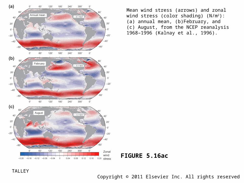
FIGURE 5.16ac
Mean wind stress (arrows) and zonal wind stress (color shading) (N/m2): (a) annual mean, (b)February, and (c) August, from the NCEP reanalysis 1968–1996 (Kalnay et al., 1996).
TALLEY Copyright © 2011 Elsevier Inc. All rights reserved

FIGURE 5.16d
(d) Mean windstress curl based on 25 km resolution QuikSCAT satellite winds (1999–2003). Downward Ekmanpumping (Chapter 7) is negative (blues) in the Northern Hemisphere and positive (reds) in the Southern Hemisphere. Source: From Chelton et al. (2004). This figure can also be found in the color
TALLEY Copyright © 2011 Elsevier Inc. All rights reserved

FIGURE 5.17
Sverdrup transport (Sv), where blue is clockwise and positive is counterclockwise circulation. Wind stress data are from the NCEP reanalysis 1968–1996 (Kalnay et al., 1996). The mean annual wind stress and wind stress curl used in this Sverdrup transport calculation are shown in Figure 5.16a and in the online supplement, Figure S5.10.
TALLEY Copyright © 2011 Elsevier Inc. All rights reserved