Embed Size (px)
Citation preview
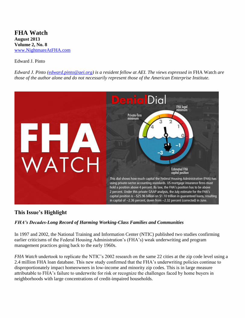
FHA Watch August 2013
Volume 2, No. 8
www.NightmareAtFHA.com
Edward J. Pinto
Edward J. Pinto ([email protected]) is a resident fellow at AEI. The views expressed in FHA Watch are
those of the author alone and do not necessarily represent those of the American Enterprise Institute.
This Issue’s Highlight
FHA’s Decades-Long Record of Harming Working-Class Families and Communities
In 1997 and 2002, the National Training and Information Center (NTIC) published two studies confirming
earlier criticisms of the Federal Housing Administration’s (FHA’s) weak underwriting and program
management practices going back to the early 1960s.
FHA Watch undertook to replicate the NTIC’s 2002 research on the same 22 cities at the zip code level using a
2.4 million FHA loan database. This new study confirmed that the FHA’s underwriting policies continue to
disproportionately impact homeowners in low-income and minority zip codes. This is in large measure
attributable to FHA’s failure to underwrite for risk or recognize the challenges faced by home buyers in
neighborhoods with large concentrations of credit-impaired households.

This Month’s Features
Spotlight on FHA’s Decades-Long Record of Harming Working-Class Families and Communities
Disproportionate Impact on Home Buyers in Low-Income and Minority Zip Codes Continues
Spotlight on Insolvency
FHA’s Estimated GAAP Net Worth Equals –$25.96 Billion, with a Capital Shortfall of $46–66 Billion
Spotlight on Delinquency
Overall Rate Decreases to 14.94 Percent in July from 15.53 Percent in June
Spotlight on Best Price Execution
FHA, VA, and USDA Pricing Dominance Declines
Spotlight on FHA’s Decades-Long Record of Harming Working-Class Families and
Communities
Disproportionate Impact on Home Buyers in Low-Income and Minority Zip Codes Continues
In 1997, the National Training and Information Center (NTIC) published The Devil’s in the Details: An
Analysis of FHA Default Concentration and Lender Performance in 20 U.S. Cities, covering the period 1992–
96.1 In 2002, the NTIC followed up with Families HUD Abandoned: An Analysis of the Federal Housing
Administration’s Loan Default Activity and Lender Performance in 22 U.S. Cities, 1996–2000.2 These studies
confirmed earlier criticisms of the FHA’s weak underwriting and program management practices going back to
the early 1960s.3
The 2002 study, which predates the housing collapse, found “vast differences in FHA default rates in low
income census tracts compared to middle income census tracts. Also, large differences exist in default rates
based on racial composition of census tracts.” Specifically, the study found:
21 of 22 cities had higher FHA loan default rates in low-income census tracts than in middle-income
census tracts.4 The exception was Newark.
19 of 22 cities had higher FHA loan default rates in minority census tracts than in white census tracts.5
The exceptions were Baltimore, Miami, and Washington, DC.
FHA Watch undertook to replicate the NTIC’s 2002 research on the same 22 cities, this time at the zip code
level using a 2.4 million FHA loan database. This new study confirmed that the FHA’s underwriting policies
continue to disproportionately impact homeowners in low-income and minority zip codes. This is in large
measure attributable to FHA’s failure to underwrite for risk or recognize the challenges faced by home buyers
in neighborhoods with large concentrations of credit-impaired households.
Figure 1 shows that little has changed since 2002 in terms of the FHA’s continuing disproportionate impact on
low-income areas. Of 22 cities, 19 had higher FHA projected foreclosure rates in low-income zip codes than in
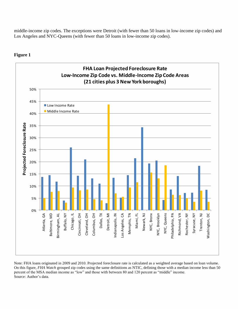
middle-income zip codes. The exceptions were Detroit (with fewer than 50 loans in low-income zip codes) and
Los Angeles and NYC-Queens (with fewer than 50 loans in low-income zip codes).
Figure 1
0%
5%
10%
15%
20%
25%
30%
35%
40%
45%
50%
Atl
an
ta,
GA
Ba
ltim
ore
, M
D
Bir
min
gham
, AL
Bu
ffa
lo, N
Y
Ch
icag
o, I
L
Cin
cin
nat
i, O
H
Cle
vela
nd
, OH
Co
lum
bu
s, O
H
Da
llas,
TX
De
tro
it, M
I
Ind
ian
apo
lis, I
N
Los
An
gele
s, C
A
Me
mp
his
, TN
Mia
mi,
FL
New
ark,
NJ
NYC
, B
ron
x
NYC
, B
roo
klyn
NYC
, Q
uee
ns
Ph
ilad
elp
hia
, PA
Ric
hm
on
d, V
A
Ro
che
ste
r, N
Y
Syra
cuse
, NY
Tre
nto
n,
NJ
Was
hin
gto
n,
DC
Pro
ject
ed F
ore
clo
sure
Rat
e
FHA Loan Projected Foreclosure RateLow-Income Zip Code vs. Middle-Income Zip Code Areas
(21 cities plus 3 New York boroughs)
Low Income Rate
Middle Income Rate
Note: FHA loans originated in 2009 and 2010. Projected foreclosure rate is calculated as a weighted average based on loan volume. On this figure, FHA Watch grouped zip codes using the same definitions as NTIC, defining those with a median income less than 50
percent of the MSA median income as “low” and those with between 80 and 120 percent as “middle” income. Source: Author’s data.

Figure 2 shows that little has changed since 2002 in terms of the FHA’s continuing disproportionate impact on
minority areas. Of 22 cities, 19 had higher FHA loan default rates in minority zip codes than in white zip
codes.6 The exceptions were Indianapolis (with zero loans in minority zip codes), NYC–Bronx (with fewer than
50 loans in white zip codes), and Syracuse (with zero loans in minority zip codes).
Figure 2
0%
5%
10%
15%
20%
25%
30%
35%
40%
45%
Atl
an
ta,
GA
Ba
ltim
ore
, M
D
Bir
min
gham
, AL
Bu
ffa
lo, N
Y
Ch
icag
o, I
L
Cin
cin
nat
i, O
H
Cle
vela
nd
, OH
Co
lum
bu
s, O
H
Da
llas,
TX
De
tro
it, M
I
Ind
ian
apo
lis, I
N
Los
An
gele
s, C
A
Me
mp
his
, TN
Mia
mi,
FL
New
ark,
NJ
NYC
, B
ron
x
NYC
, B
roo
klyn
NYC
, Q
uee
ns
Ph
ilad
elp
hia
, PA
Ric
hm
on
d, V
A
Ro
che
ste
r, N
Y
Syra
cuse
, NY
Tre
nto
n,
NJ
Was
hin
gto
n,
DC
Pro
ject
ed
Fo
recl
osu
re R
ate
FHA Loan Projected Foreclosure RateMinority Zip Code vs. White Zip Code Areas
(21 cities plus 3 New York boroughs)
Minority Rate
White Rate
Note: On this figure, FHA Watch grouped zip codes using the same definitions as NTIC: those with a minority population greater than
80 percent as “minority” and those with fewer than 20 percent as “white.”
Source: Author

The FHA Watch results show that the FHA’s underwriting policies continue to, as the 2002 NTIC report stated,
result in “vast differences in FHA default rates in low income [areas] compared to middle income [areas]. Also,
large differences exist in default rates based on racial composition of [areas].”
Why the Disproportionate Impact?
There are at least three reasons for this unchanging result over the course of many decades.
First, FHA borrowers in low-income and minority neighborhoods tend to have a higher prevalence of low FICO
scores, which generally leads to higher levels of default. For example, in Chicago’s low-income zips, 42.7
percent of FHA borrowers had a FICO score below 660 compared to 31.1 percent for middle-income zips. In
Chicago’s minority zips, 51 percent of FHA borrowers had a FICO score below 660, compared to 26.6 percent
for white zips.
Second, new research by FHA Watch found that loans to FHA borrowers in zip codes with a higher
concentration of residents with low credit scores perform worse than those to FHA borrowers in zip codes with
a low concentration of residents with low credit scores, even when risk factors such as credit score, down
payment, and debt-to-income (DTI) ratio are held constant. For example, in Chicago’s low-income zips, the
average credit score of all residents (not just those of the FHA borrowers) was 643, compared to 713 for the
residents of middle-income zips, and in Chicago’s minority zips, the average credit score for all residents was
633, compared to 729 for residents of white zips.
FHA Watch used credit risk score data [proprietary Equifax Risk Score (ERS) data] to analyze the impact that
varying concentrations of low-credit-score individuals7 in a zip code have on the performance of FHA loans
where credit risk factors were held constant. An FHA borrower living in a zip code in the fourth quartile
(containing zip codes with the lowest credit-risk scores, with mean scores ranging from 519 to 673), on average,
had a 45 percent higher likelihood of being 90+ days delinquent compared to a borrower with the same risk
characteristics living in a zip code in the first quartile (containing zip codes with the highest credit-risk scores,
with mean scores ranging from 721 to 826).
Figure 3 demonstrates that the impact on the 90+-day delinquency rates (90+ rates) was consistent across 245
risk buckets representing five loan-to-value (LTV) categories (LTV includes impact of the upfront premium
charged by the FHA), seven FICO credit score categories,8 and seven DTI categories.

Figure 3
Source: Author
Figure 4 displays the same data, smoothed using a neural net modeling methodology.

Figure 4
Source: Author
In these charts, the five LTV categories are displayed at the bottom along the x-axis. Within each LTV
category, the FICO credit score categories of <580, 580, 600, 620, 660, 680, and 720+ are displayed from left to
right on the x-axis, and the DTI categories of <23, 28, 33, 38, 43, 48, and 55 percent are displayed from bottom
to top on the y-axis. Separate results are shown for the first and fourth quartiles.
Figure 5 is a simplified version limited to the 97.5 percent LTV category to better illustrate the 49 risk buckets
based on FICO credit score and DTI. This more targeted view allows for more detailed labeling; however, the
data displayed for the 97.5 percent LTV segment are identical to figure 4.

Figure 5
Source: Author
Third, separate new research by FHA Watch found that loans to FHA borrowers in zip codes with a higher fraud
risk score perform worse than loans to FHA borrowers in zip codes with a lower fraud risk score,9 even when
risk factors such as FICO credit score, down payment, and DTI ratio are held constant. An FHA borrower living
in a zip code in the fourth quartile (the 25 percent of the zip codes with the highest fraud risk scores), on
average, had a 31 percent higher likelihood of being 90+ days delinquent compared to a borrower with the same
risk characteristics living in a zip code in the first quartile (the 25 percent of the zip codes with the lowest fraud
risk scores).
Figure 6 uses Interthinx Risk Index data to demonstrate the correlation between fraud risk score and the
performance of FHA loans. It compares 90+ rates for both the first and fourth quartiles across 245 risk buckets
representing five LTV categories (LTV includes impact of upfront premium charged by FHA), seven FICO
categories, and seven DTI categories. It was constructed using zip-code-level data from 31 major metropolitan
areas. The data have been smoothed using a neural net modeling methodology. In general, FHA loans in the
fourth quartile (zip codes with a high Interthinx Risk Index) had higher 90+ rates than loans in the first quartile
(zip codes with a lower Interthinx Risk Index), regardless of loan-level risk bucket. This correlation was
strongest for risk buckets in the lower FICO categories across all LTVs and DTIs.

Figure 6
Source: Author
In figure 6, the five LTV categories are displayed at the bottom along the x-axis. Within each LTV category, the
ERS categories of <580, 580, 600, 620, 660, 680, and 720+ are displayed from left to right on the x-axis, and
the DTI categories of <23, 28, 33, 38, 43, 48, and 55 percent are displayed from bottom to top on the y-axis.
Separate results are shown for the first and fourth quartiles.
Figure 7 relates to the Chicago metropolitan area. It illustrates the strong correlation between a zip code’s fraud
risk index and the projected foreclosure rate. At-risk zip codes are primarily ones with below-median incomes
and home prices.

Figure 7
Note: On this figure, zip codes with above-average marketplace Interthinx Fraud Risk Indices (represented by larger dots) are highly
correlated with zips having high projected foreclosure rates and both characteristics concentrated in zip codes with incomes and home
prices below the area median (lower left quadrant). The FHA’s poorly designed lending practices and misaligned incentives expose
working-class families and neighborhoods to excessive foreclosure risk.
Source: Author
Conclusion
The FHA is guilty of inflicting a scourge of foreclosures across America. Over the period 1975 to 2011, more
than 3 million, or one in eight FHA-insured families will suffer a foreclosure—an abysmal record made worse
by the fact that lower-income and minority families have suffered even higher rates of foreclosure.
The FHA has been selling hope and delivering harm. This is the result of systemic deficiencies in the FHA’s
insurance program—a lack of proper alignment of incentives, foreclosure-prone lending practices, and poor
management practices. A long history of cross-subsidizing high-risk loans with lower-risk loans has enabled the
disproportionate impact on lower income and minority families to continue. But as Irving Welfeld observed in
1992, “averaging out is not a defense.”10
What the FHA and the families and communities it serves need is common-sense reform, including the
following:
Reduce coverage below 100 percent [see Section 234 of the Protecting American Taxpayers and
Homeowners Act of 2013 (PATH)];
Advise consumer as to foreclosure risk based applicant’s risk profile (see Section 236 of PATH);
Limit seller concessions to 3 percent (see Section 263 of PATH);
Utilize residual income test (see Section 267 of PATH);

Reinstitute vetted appraisal panels with rotational assignment;
Introduce countercyclical stress test and loan-to-value ratios; and
Underwrite for risk.
Spotlight on Insolvency
FHA’s Estimated GAAP Net Worth Equals –$25.96 Billion, with a Capital Shortfall of $46–66 Billion
This month, the FHA’s private generally accepted accounting principles (GAAP) estimated net worth
deteriorated slightly. The estimate for July of the FHA’s GAAP net worth is –$25.96 billion, down from –
$25.21 billion) in June 2013, up from –$30.41 billion in September 2012, and down from –$20.87 billion in
September 2011. The capital shortfall stands at $47 billion (using a 2 percent capital ratio) and $67 billion
(using a 4 percent capital ratio). The Denial Dial was reset to −2.36 percent.
The FHA has undertaken a series of delinquent mortgage note sales that will impact its GAAP estimated net
worth. The latest sale was in June 2013, when it sold 15,470 nonperforming loans with an unpaid principal
balance of $2.4 billion. The FHA reports its month-to-month cash flow position with a lag of many months. The
impact of these sales will be incorporated as data become available.
Please see the notes to table A1 for a detailed explanation.11
Spotlight on Delinquency
Overall Rate Decreases to 14.94 Percent in July from 15.53 Percent in June
In July, 14.94 percent of all FHA loans were delinquent, down from 15.53 percent in June 2013 and down from
16.52 percent in July 2012. Total delinquencies decreased by 46,573 over June 2013 and declined by 97,353
over July 2012. This continues a slow generally downward trend in overall rate from the high of 17.79 percent,
reached in December 2011.
The serious delinquency rate decreased to 8.25 percent from 8.47 percent in June 2013 and decreased from 9.51
percent in July 2012. The month-over-month decline is presumably is because of 15,470 nonperforming loans
sold in June.
For the monthly data tabulation, see table A2 in the appendix.
Spotlight on Best Price Execution
FHA, VA, and USDA Pricing Dominance Declines
Table 1 demonstrates the pricing advantages the Ginnie/FHA, Ginnie/USDA, and Ginnie/VA divisions have
over Fannie Mae.

The best price execution calculation primarily depends on two factors.
The first is the Ginnie Mae MBS execution relative to the Fannie MBS execution. This month the Ginnie MBS
price spread widened compared to Fannie. While Ginnie’s spread advantage has been quite volatile, it has
tended to trend down. When FHA Watch first started tracking best price execution in February 2012, the
benchmark Ginnie MBS sold at a premium of 1.63 points in price over the benchmark Fannie MBS. In July
2013, it had narrowed to 0.47 points. However, August saw a strong reversal, as the Ginnie execution advantage
widened to 1.03 points. This translates into a one-month increase of $840 in Ginnie’s MBS price advantage on a
$150,000 loan.
The second is the relative cost for mortgage guaranty insurance. The FHA recently implemented a policy
change whereby annual mortgage insurance premiums generally must be paid for the life of the loan, rather than
terminating when the LTV reaches 78 percent. This increased the present value cost of the FHA mortgage
insurance premium by an estimated $2,000 on a $150,000 loan.
While these two factors partially offset each other, the net result was that the FHA’s execution worsened by
about $1,000. Compared to last month, the Fannie execution is now ahead of the FHA’s on loans C and D and
has a widened advantage on E, F, and G.
This continues a two-year trend that has seen Fannie’s price execution improve compared to the FHA’s. As
table 1 demonstrates, this advantage increases as loan risk decreases (generally represented by FICO score). As
a result, in April–June 2013 the FHA had the lowest percentage of its new business with FICO scores above 720
(26.9 percent) since January–March 2011 (37.8 percent).

Table 1. Best Price Execution (Ginnie pricing advantages in bold)
Feature Loan A Loan B Loan C Loan D Loan E Loan F Loan G
MBS coupon 4.00% 4.00% 4.00% 4.00% 4.00% 4.00% 4.00%
Term 30-yr 30-yr 30-yr 30-yr 30-yr 30-yr 30-yr
LTV 95% 96.50% 95% 95% 90% 95% 90%
FICO 620 680 680 700 700 720 740
Risk levelVery
highHigh Medium Medium Medium Medium
Medium-
low
Ginnie/FHA
Execution94.63 94.36 94.63 94.63 94.63 94.63 94.63
Ginnie/USDA
Execution100.18 100.18 100.18 100.18 100.18 100.18 100.18
Ginnie/VA
Execution102.03 101.38 102.03 102.03 102.28 102.03 102.28
Fannie Execution 92.29 93.32 95.46 95.71 97.15 97.42 98.48
Ginnie/FHA
advantage on a
$150,000 loan
compared to Fannie $3,516 $1,558 -$1,239 -$1,614 -$3,774 -$4,187 -$5,777
Ginnie/USDA
advantage on a
$150,000 loan
compared to Fannie $11,841 $10,296 $7,086 $6,711 $4,551 $4,138 $2,548
Ginnie/VA
advantage on a
$150,000 loan
compared to Fannie $14,616 $12,096 $9,861 $9,486 $7,701 $6,913 $5,698
Source: Adapted from JPMorgan’s 2012 Securitized Products Outlook, November 23, 2011, 18.
Note: Mortgage-backed securities (MBS) pricing from MBS Live, published by Mortgage News Daily. Comparison based on MBS
pricing as of August 23, 2013. On that date, a Ginnie 30-year MBS with a coupon of 4.0 percent had a price of 103.53, and a Fannie
30-year MBS with the same 4.0 percent coupon had a price of 102.81. These prices were then adjusted based on the present value
(where necessary) of applicable borrower-paid credit fees, mortgage insurance premiums, and the value of the base servicing fee.
Fannie’s guarantee fee was increased by 10 basis points effective April 2012, as mandated by Congress, and by 10 basis points again
as announced on August 31, 2012, by the Federal Housing Finance Agency. All publicly announced FHA premium increases are
included. USDA and VA premiums are unchanged.
On the whole, the five divisions of the Government Mortgage Complex (along with Freddie Mac) have
substantial pricing and underwriting advantages over the private sector. The result is that the Government
Mortgage Complex’s share of the entire first-mortgage market continues to be at 85–90 percent.

Appendix: Historical Data Tables
Table A1. Insolvency Watch ($ Billions)
Date
FHA’s
“Capital
Resources”
(Assets)
Cash Flow
since end of
fiscal year*
Estimated
Case Loss
Reserve
(Liabilities
on PMI
Basis)**
Estimated
Liability for
Excess
Upfront
Premiums
beyond
GAAP
Allowance
Current
Net
Worth
(PMI
Basis)
Require
d
Capital
Ratio
Required
Capital
Under
Applicable
Ratio***
Capital
Shortfall
(PMI
Basis)
Sept. 30, 2011 $28.18 --- $41.05 $8.00 ($20.87) 2% $18.14 ($39.02)
Sept. 30, 2011 $28.18 --- $41.05 $8.00 ($20.87) 4% $36.29 ($57.16)
Sept. 30, 2012 $25.57 --- $46.88 $9.10 ($30.41) 2% $19.43 ($49.84)
Sept. 30, 2012 $25.57 --- $46.88 $9.10 ($30.41) 4% $38.85 ($69.26)
Oct. 31, 2012 $25.57 ($0.42) $45.18 $9.35 ($29.38) 2% $19.51 ($48.90)
Oct. 31, 2012 $25.57 ($0.42) $45.18 $9.35 ($29.38) 4% $39.02 ($68.41)
Nov. 30, 2012 $25.57 ($0.85) $45.23 $9.60 ($30.11) 2% $19.51 ($49.62)
Nov. 30, 2012 $25.57 ($0.85) $45.23 $9.60 ($30.11) 4% $39.02 ($69.13)
Dec. 31, 2012 $25.57 ($1.27) $45.30 $9.60 ($30.61) 2% $19.51 ($50.11)
Dec. 31, 2012 $25.57 ($1.27) $45.30 $9.60 ($30.61) 4% $39.01 ($69.62)
Jan. 31, 2013 $25.57 ($1.70) $43.30 $9.60 ($29.03) 2% $19.56 ($48.59)
Jan. 31, 2013 $25.57 ($1.70) $43.30 $9.60 ($29.03) 4% $39.12 ($68.15)
Feb. 28, 2013 $25.57 ($2.12) $41.82 $9.60 ($27.97) 2% $19.78 ($47.74)
Feb. 28, 2013 $25.57 ($2.12) $41.82 $9.60 ($27.97) 4% $39.56 ($67.52)
Mar. 31, 2013 $25.57 ($2.54) $39.88 $9.60 ($26.45) 2% $19.96 ($46.41)
Mar. 31, 2013 $25.57 ($2.54) $39.88 $9.60 ($26.45) 4% $39.92 ($66.37)
Apr. 30, 2013 $25.57 ($2.97) $38.53 $9.60 ($25.53) 2% $20.05 ($45.58)
Apr. 30, 2013 $25.57 ($2.97) $38.53 $9.60 ($25.53) 4% $40.10 ($65.63)
May 31 2013 $25.57 ($3.39) $37.60 $9.60 ($25.02) 2% $20.10 ($45.12)
May 31 2013 $25.57 ($3.39) $37.60 $9.60 ($25.02) 4% $40.20 ($65.22)
Jun. 30 2013 $25.57 ($3.82) $38.37 $9.60 ($26.21) 2% $20.06 ($46.27)
Jun. 30 2013 $25.57 ($3.82) $38.37 $9.60 ($26.21) 4% $40.12 ($66.33)
Jul. 31 2013 $25.57 ($4.24) $38.28 $9.60 ($26.55) 2% $20.02 ($46.57)
Jul. 31 2013 $25.57 ($4.24) $38.28 $9.60 ($26.55) 4% $40.04 ($66.59)
Notes: Table A1 estimates the FHA’s current net worth and capital shortfall under accounting rules applicable to a private mortgage
insurer (PMI) such as Genworth. Estimates are based on Genworth having the FHA’s delinquent loans, risk exposure, capital
resources, and capital ratio (under both the 2 percent statutory requirement for the FHA and the 4 percent of risk-in-force requirement
applicable to a PMI). In quarter 2 of 2013, Genworth had loss reserves equaling 59 percent of its risk-in-force on 60-days-plus
delinquent loans, up 1 percent from quarter 1 of 2013. Genworth, Quarterly Financial Supplements, Delinquency Metrics-US
Mortgage Insurance Segment, 44, http://phx.corporate-ir.net/phoenix.zhtml?c=175970&p=irol-quarterlyreports
(accessed August 22, 2013).
*The FHA’s negative cash flow was $424 million per month during Q1 of FY 2013. See exhibit 10, US Department of Housing and
Urban Development, FHA Single-Family Mutual Mortgage Insurance Fund Programs, Quarterly Report to Congress, 13. The FHA

raised its upfront premium from 1 to 1.75 percent (excluding streamline refinances) effective for case numbers assigned on or after
April 9, 2012. Since under private GAAP accounting this amount would not be taken into income immediately, it will be accounted
for in the “Estimated liability for excess upfront premiums beyond GAAP allowance.” The amount of this liability was estimated at
$9.60 billion as of April 30, 2013.
** Outstanding balance of loans 60-days-plus delinquent based on loan counts on applicable date times average loan balance for loans
going to claim of $126,524. Reserve levels have been recalculated based on gross paid claim amounts derived from claim terminations
data in the report series entitled Monthly Report to the FHA Commissioner, 6,
http://portal.hud.gov/hudportal/HUD?src=/program_offices/housing/rmra/oe/rpts/com/commenu (January 2013 is the latest data
update available) and Net Loss on Claims Percentage data from the report series entitled Quarterly Report to Congress on the
Financial Status of the MMI Fund (FY 2012 Q4), Exhibit 5,
http://portal.hud.gov/hudportal/documents/huddoc?id=fhartc_q4_2013.pdf (accessed May 18, 2013). The FY 2013 Q1 report was not
used as it had a number of unique factors present. It will be reevaluated once the FY 2013 Q2 is released.
***Total based on the FHA’s total amortized risk-in-force net of loans covered by loan loss reserve.
Table A2. National Delinquency Watch
End Date 30-Days Delinquency
Rate and Number of
Loans
60-Days-Plus
Delinquency Rate
and Number of Loans
30-Days-Plus
Delinquency Rate
and Number of Loans
Serious Delinquency Total Loans
Jan. 2011 N/A N/A N/A 8.9% / 612,443 6,882,984
Mar. 2011 N/A N/A N/A 8.3% / 580,480 6,983,893
June 2011 5.79% / 411,258 10.55% / 749,204 16.62% / 1,160,462 8.34% / 592,366 7,103,531
Sept. 2011 5.70% / 413,834 11.08% / 803,899 16.78% / 1,217,733 8.77% / 636,778 7,258,328
Dec. 2011 5.72% / 421,404 12.07% / 889,602 17.79% / 1,311,006 9.73% / 716,786 7,370,426
Jan. 2012 5.35% / 397,018 12.18% / 903,748 17.53% / 1,300,766 9.92% / 735,760 7,418,830
Feb. 2012 4.78% / 355,092 11.70% / 871.870 16.47% / 1,226,962 9.73% / 725,002 7,450,480
Mar. 2012 4.57% / 341,213 11.21% / 837,472 15.78% / 1,178,685 9.47% / 707,930 7,471,708
Apr. 2012 4.77% / 358,174 11.20% / 840,803 15.97% / 1,198,977 9.42% / 707,222 7,507,031
May 2012 4.93% / 372,514 11.29% / 852,608 16.23% / 1,225,222 9.43% / 711,612 7,549,730
June 2012 5.19% / 393,894 11.43% / 867,959 16.61% / 1,261,853 9.48% / 719,984 7,594,689
July 2012 5.04% / 384,349 11.48% / 874,802 16.52% / 1,259,151 9.51% / 725,074 7,622,873
Aug. 2012 4.91% / 375,464 11.44% / 874,656 16.35% / 1,250,120 9.49% / 725,692 7,645,912
Sept. 2012 5.58% / 428,351 11.70% / 898,590 17.30% / 1,326,931 9.62% / 738,303 7,671,677
Oct. 2012 5.02% / 387,000 11.54% / 887,959 16.57% / 1,274,959 9.54% / 734,431 7.693,992
Nov. 2012 4.95% / 382,194 11.53% / 888,901 16.48% / 1,271,095 9.56% / 737,251 7,710,077
Dec. 2012 5.23% / 404,686 11.50% / 890,400 16.72% / 1,295,086 9.40% / 728,394 7,744,925
Jan. 2013 5.07% / 392,536 11.63% / 900,852 16.70% / 1,293,388 9.58% / 741,618 7,744,921
Feb. 2013 4.76% / 369,571 11.21% / 869,952 15.97% / 1,239,523 9.39% / 728,860 7,760,200
Mar. 2013 4.52% / 351,478 10.68% / 829,619 15.21% / 1,181,097 9.03% / 701,628 7,767,181
Apr. 2013 4.36% / 338,957 10.32% / 801.694 14.68% / 1,140,651 8.73% / 678,506 7,770.886
May 2013 4.39% / 341,400 10.06% / 782,193 14.46% / 1,123,593 8.45% / 656,909 7,771,948
June 2013 5.27% / 410,172 10.26% / 798,199 15.53% / 1,208,371 8.47% / 659,314 7,781,196
July 2013 4.87% / 378,903 10.10% / 782,895 14.94% / 1,161,798 8.25% / 641,808 7,776,713
Sources: US Department of Housing and Urban Development, “Neighborhood Watch,” https://entp.hud.gov/sfnw/public (Servicing
download, Excel; accessed July 15, 2013) and US Department of Housing and Urban Development, “FHA Outlook,”
http://portal.hud.gov/hudportal/HUD?src=/program_offices/housing/rmra/oe/rpts/ooe/olmenu (accessed October 21, 2012). Rates not
seasonally adjusted. Serious delinquency includes ninety-days-plus delinquency and loans in bankruptcy or foreclosure.

Notes 1 National Training and Information Center, The Devil’s in the Details: An Analysis of FHA Default Concentration and Lender
Performance in 20 U.S. Cities (Chicago: NTIC, October 1997). 2 National Training and Information Center, Families HUD Abandoned: An Analysis of the Federal Housing Administration’s Loan
Default Activity and Lender Performance in 22 U.S. Cities, 1996–2000 (Chicago: NTIC, May 2002). 3 In 1962, the FHA’s mounting foreclosures were noted by Time magazine: “Homeowners of a new and unattractive breed are
plaguing the Federal Housing Administration these days. Known as ‘the walkaways,’ they are people who find themselves unable to
meet their mortgage payments—and to solve the problem simply move out their belongings at night, drop their house key in the
mailbox and disappear. … Because it underwrites low-cost housing for high-risk groups, the FHA’s problems are particularly acute.”
(See “Credit: Beware of the Walkaways,” Time, July 27, 1962, www.time.com/time/magazine/article/0,9171,827500,00.html.)
In 1973, Brian D. Boyer chronicled “how the FHA scandal worked on a day-to-day basis [to destroy whole neighborhoods] in the big
cities of the United States.” (See Brian D. Boyer, Cities Destroyed for Cash: The FHA Scandal at HUD, Chicago: Follett Publishing
Company, 1973.)
In 1986, the New York Times noted the similarities of yet another round of FHA scandals to the horrors experienced during the 1960s
and 1970s in Brooklyn and other cities: “That scandal – as with others at the time that affected such cities as Newark, Philadelphia and
Detroit – was remarkably similar to a pattern of fraud that Federal investigators said last month that they had found in several cities,
including Camden, N.J.; Houston, Seattle and Milwaukee. … The results have been huge numbers of defaults.” (See Martin Gottlieb,
“FHA Case Recalls Bushwick in 70’s,” New York Times, February 2, 1986, www.nytimes.com/1986/02/02/nyregion/fha-case-recalls-
bushwick-in-70-s.html.)
In 1992, former HUD attorney and senior analyst Irving Welfeld summed up HUD’s history with “Mention the Department of
Housing and Urban Development and the word scandal comes to mind.” (See Irving Welfeld, HUD Scandals: Howling Headlines and
Silent Fiascos, New Brunswick, NJ: Transaction Publishers, 1992.) 4 The NTIC defined census tracts with a median income less than 50 percent of the metropolitan statistical area (MSA) median income
as “low” and those between 80 and 120 percent as “middle” income. 5 The NTIC defined census tracts with minority populations greater than 80 percent as “minority” and those with fewer than 20
percent as “white.” 6 Buffalo and Rochester each had fewer than 50 loans in minority zip codes.
7 The ERS is calculated using a proprietary model created by Equifax. The ERS uses a numerical range of 280 to 850—the lower the
score, the greater the likelihood of the consumer becoming severely delinquent. Equifax has calculated ERS for over 218 million
scorable individuals in the United States residing in over 52,000 zip codes. Using data obtained from Equifax, the average ERS for
each zip code was determined. The zip codes were rank ordered by average ERS. The data set was then divided into four equal
quartiles, each representing approximately 54 million individuals. The first quartile was assembled by starting with the zip code with
the highest average ERS (a score of 826) and proceeding downward by average ERS until zip codes with a sufficient number of scored
individuals were selected to account for one-quarter of the total 218 million ERS scored population. This first quartile had an ERS
range of 721–826. This process was repeated for the second, third, and fourth quartiles. The fourth quartile had an ERS range of 519–
673. This process allowed for each zip code to be assigned to a unique quartile. The first versus fourth quartiles were used for
purposes of the analysis, as these best demonstrate the effect of average ERS differences at the zip code level. Up to this point, no
FHA-specific information had been utilized. 8 While ERSs were used to construct the zip code quartiles, FICO credit scores were used as a risk category to define FHA loan risk
buckets at the zip code level. The FICO score (a proprietary model created by Fair Isaac Corporation) uses a numerical range of 300 to
850—again, the lower the score, the greater the likelihood of the consumer becoming severely delinquent. FICOs were the credit score
used to assign each FHA loan to a risk bucket. 9 For this research, the Interthinx Mortgage Fraud Risk Indices were used. The Fraud Risk Indices are calculated based on the
frequency with which indicators of fraudulent activity are detected in mortgage applications processed by Interthinx. The Fraud Risk
Indices consist of the property valuation, identity, occupancy, and employment/income values. 10
Welfeld, HUD Scandals. 11
January–June 2013 estimates were adjusted based on data contained in exhibits 5 and 8, US Department of Housing and Urban
Development, FHA Single-Family Mutual Mortgage Insurance Fund Programs, Quarterly Report to Congress FY 2013 Q3, 9 and 13.