Embed Size (px)
Citation preview

Extending the Linear Models 2: Linear Mixed-Effects Models Lab
Dr. Matteo Tanadini
Angewandte statistische Regression I, HS19 (ETHZ)
Contents
1 Read and check data 21.1 Summarising data . . . . . . . . . . . . . . . . . . . . . . . . . . . . . . . . . . . . . . . . . . 31.2 Graphics . . . . . . . . . . . . . . . . . . . . . . . . . . . . . . . . . . . . . . . . . . . . . . . . 4
2 Fitting a Mixed Effect Model 62.1 Fitting a model with lmer() . . . . . . . . . . . . . . . . . . . . . . . . . . . . . . . . . . . . 62.2 Visualising the fitted values . . . . . . . . . . . . . . . . . . . . . . . . . . . . . . . . . . . . . 8
3 Checking model assumptions 103.1 Tukey-Anscombe plot . . . . . . . . . . . . . . . . . . . . . . . . . . . . . . . . . . . . . . . . 103.2 Scale-location plot . . . . . . . . . . . . . . . . . . . . . . . . . . . . . . . . . . . . . . . . . . 113.3 Quantile-Quantile plots . . . . . . . . . . . . . . . . . . . . . . . . . . . . . . . . . . . . . . . 123.4 Residuals against predictors . . . . . . . . . . . . . . . . . . . . . . . . . . . . . . . . . . . . . 143.5 Temporal correlation . . . . . . . . . . . . . . . . . . . . . . . . . . . . . . . . . . . . . . . . . 173.6 Further diagnostic plots . . . . . . . . . . . . . . . . . . . . . . . . . . . . . . . . . . . . . . . 19
4 Inference procedure 214.1 Testing for fixed effects . . . . . . . . . . . . . . . . . . . . . . . . . . . . . . . . . . . . . . . . 214.2 Assessing the random effects . . . . . . . . . . . . . . . . . . . . . . . . . . . . . . . . . . . . 23
1

Play the game
Below, we show a possible analysis of the Orthodont dataset. To get the most out of this example, pretendthat you collected the dataset. You carried out the study months ago and you are not entirely sure aboutthe data structure any more. Nevertheless, you definitely remember that there were 27 participants, eachmeasured four 4 times.
1 Read and check data
Load data and inspect it:
d.1 <- read.table(file = "OrthodontData.txt")
str(d.1)
’data.frame’: 108 obs. of 4 variables:
$ distance: num 26 25 29 31 21.5 22.5 23 26.5 23 22.5 ...
$ age : int 8 10 12 14 8 10 12 14 8 10 ...
$ Subject : int 1 1 1 1 2 2 2 2 3 3 ...
$ Sex : Factor w/ 2 levels "Female","Male": 2 2 2 2 2 2 2 2 2 2 ...
head(d.1)
distance age Subject Sex
1 26 8 1 Male
2 25 10 1 Male
3 29 12 1 Male
4 31 14 1 Male
5 22 8 2 Male
6 22 10 2 Male
Everything looks good apart from the fact that Subject has class ”integer” instead of ”factor”. Let’s fixthis.
d.1$Subject <- factor(d.1$Subject)
str(d.1)
’data.frame’: 108 obs. of 4 variables:
$ distance: num 26 25 29 31 21.5 22.5 23 26.5 23 22.5 ...
$ age : int 8 10 12 14 8 10 12 14 8 10 ...
$ Subject : Factor w/ 16 levels "1","2","3","4",..: 1 1 1 1 2 2 2 2 3 3 ...
$ Sex : Factor w/ 2 levels "Female","Male": 2 2 2 2 2 2 2 2 2 2 ...
The output of str() indicates that there are only 16 subjects, this sounds suspicious! Let’s check.
levels(d.1$Subject)
[1] "1" "2" "3" "4" "5" "6" "7" "8" "9" "10" "11" "12" "13" "14"
[15] "15" "16"
nlevels(d.1$Subject)
[1] 16
##
table(d.1$Subject)
1 2 3 4 5 6 7 8 9 10 11 12 13 14 15 16
8 8 8 8 8 8 8 8 8 8 8 4 4 4 4 4
2

Some subjects have eight measurements...something must be wrong! Maybe the coding used is not unam-biguous. Let’s check again.
table(d.1$Sex, d.1$Subject)
1 2 3 4 5 6 7 8 9 10 11 12 13 14 15 16
Female 4 4 4 4 4 4 4 4 4 4 4 0 0 0 0 0
Male 4 4 4 4 4 4 4 4 4 4 4 4 4 4 4 4
Ok, problem found. Subjects 1-11 are erroneously male and female at the same time. We must specify that”male 1” is not the same subject as ”female 1”. This problem often occurs in e.g. field experiments wherewe have plots (e.g. A, B, C,...) and subplots (e.g 1-10) in each of them. We must make clear that subplot”A1” is not the same as ”B1”. Let’s correct that.
d.1$Sex <- factor(substr(d.1$Sex, start = 1, stop = 1))
head(d.1$Sex)
[1] M M M M M M
Levels: F M
d.1$id <- interaction(d.1$Sex, d.1$Subject, drop = TRUE)
table(d.1$Sex, d.1$id)
F.1 M.1 F.2 M.2 F.3 M.3 F.4 M.4 F.5 M.5 F.6 M.6 F.7 M.7 F.8 M.8 F.9
F 4 0 4 0 4 0 4 0 4 0 4 0 4 0 4 0 4
M 0 4 0 4 0 4 0 4 0 4 0 4 0 4 0 4 0
M.9 F.10 M.10 F.11 M.11 M.12 M.13 M.14 M.15 M.16
F 0 4 0 4 0 0 0 0 0 0
M 4 0 4 0 4 4 4 4 4 4
Correct! We now remove the variable Subject to avoid confusions and we check everything again.
d.1 <- subset(d.1, select = -Subject)
str(d.1)
’data.frame’: 108 obs. of 4 variables:
$ distance: num 26 25 29 31 21.5 22.5 23 26.5 23 22.5 ...
$ age : int 8 10 12 14 8 10 12 14 8 10 ...
$ Sex : Factor w/ 2 levels "F","M": 2 2 2 2 2 2 2 2 2 2 ...
$ id : Factor w/ 27 levels "F.1","M.1","F.2",..: 2 2 2 2 4 4 4 4 6 6 ...
head(d.1)
distance age Sex id
1 26 8 M M.1
2 25 10 M M.1
3 29 12 M M.1
4 31 14 M M.1
5 22 8 M M.2
6 22 10 M M.2
Excellent, everything looks good. We can start.
1.1 Summarising data
3

table(d.1$id)
F.1 M.1 F.2 M.2 F.3 M.3 F.4 M.4 F.5 M.5 F.6 M.6 F.7 M.7 F.8
4 4 4 4 4 4 4 4 4 4 4 4 4 4 4
M.8 F.9 M.9 F.10 M.10 F.11 M.11 M.12 M.13 M.14 M.15 M.16
4 4 4 4 4 4 4 4 4 4 4 4
table(d.1$Sex)/4
F M
11 16
unique(d.1$age) ## as opposed to levels() for factors
[1] 8 10 12 14
This is a fully balanced design (i.e. everyone has the same number of measurements). There are 11 femalesand 16 males. Measurements are taken at age 8, 10, 12 and 14.
1.2 Graphics
Graphical visualisation of the data is an extremely important part of any data analysis. When dealing withmixed models, this is even more important!
Depending on the research questions you will produce the most suited graphical plots. Here we want to inspecta difference in growth between genders, hence it makes sense to highlight gender differences as follows.
require(lattice)
Loading required package: lattice
xyplot(distance ~ age | Sex, data = d.1, type = c("p", "r"))
4

age
dist
ance
20
25
30
8 9 10 11 12 13 14
F
8 9 10 11 12 13 14
M
By looking at this graph, we would assume that the response variable (i.e. distance) grows faster in malesthan in females. We know that observations are nested in person, and we may want to show this informationin the graph too.
xyplot(distance ~ age | Sex, groups = id, data = d.1, type = "b")
5

age
dist
ance
20
25
30
8 9 10 11 12 13 14
F
8 9 10 11 12 13 14
M
In these graphs we used two very powerful tools: multipanel conditioning and superposition.
2 Fitting a Mixed Effect Model
2.1 Fitting a model with lmer()
require(lme4)
Loading required package: lme4
Loading required package: Matrix
mod.0 <- lmer(distance ~ age * Sex + (1 | id), data = d.1)
summary(mod.0)
Linear mixed model fit by REML [’lmerMod’]
Formula: distance ~ age * Sex + (1 | id)
Data: d.1
REML criterion at convergence: 434
Scaled residuals:
Min 1Q Median 3Q Max
-3.598 -0.455 0.016 0.502 3.686
Random effects:
6

Groups Name Variance Std.Dev.
id (Intercept) 3.30 1.82
Residual 1.92 1.39
Number of obs: 108, groups: id, 27
Fixed effects:
Estimate Std. Error t value
(Intercept) 17.3727 1.1835 14.68
age 0.4795 0.0935 5.13
SexM -1.0321 1.5374 -0.67
age:SexM 0.3048 0.1214 2.51
Correlation of Fixed Effects:
(Intr) age SexM
age -0.869
SexM -0.770 0.669
age:SexM 0.669 -0.770 -0.869
By default REstricted Maximum Likelihood (REML) is used to fit models. This gives better estimates of therandom effects (i.e. variance components). The summary reports the estimated variances and their squareroot (sd) for the random effects and the estimated regression coefficients for the fixed effects.
Single components of the summary output can be extracted singularly.
VarCorr(mod.0)
Groups Name Std.Dev.
id (Intercept) 1.82
Residual 1.39
sigma(mod.0)
[1] 1.4
fixef(mod.0)
(Intercept) age SexM age:SexM
17.37 0.48 -1.03 0.30
##
class(mod.0)
[1] "lmerMod"
attr(,"package")
[1] "lme4"
By looking at the variance components estimated in our model, we can compare the ”among persons vari-ability” with the ”within person variability”. In this case, there seems to be slightly more variation amongpersons than within (1.82 versus 1.39). This information can be very important to design new experiments.
Note that the number of parameters estimated in this model is five. We estimated three fixed effects (age,SexM and the interaction term) and two variance components (for id and the residual variance).
You may want to look at ?vcov, ?coef, ?formula, ?AIC. Add .merMod to the function names to getinformation about the ”method” function (e.g. ?vcov.merMod) .
7

2.2 Visualising the fitted values
To see whether we fitted a meaningful model, it is important to look at the fitted values. We start byvisualising the fitted values that contain the random effects.
xyplot(fitted(mod.0) ~ age | Sex, groups = id, data = d.1, type = c("b", "g"))
age
fitte
d(m
od.0
)
20
25
30
8 9 10 11 12 13 14
F
8 9 10 11 12 13 14
M
The model fit looks reasonable. We may want to look at the fitted values where all random effects presentin the model (here there is only id) are set to zero. These predictions are also called ”population levelpredictions”.
pop.level.predictions <- predict(mod.0, re.form = ~0)
xyplot(pop.level.predictions ~ age | Sex, data = d.1, type = c("b", "g"))
8

age
pop.
leve
l.pre
dict
ions
21
22
23
24
25
26
27
8 9 10 11 12 13 14
F
8 9 10 11 12 13 14
M
Not surprisingly, we obtain a very simple graph (i.e. 4 predictions for males and 4 predictions for females).Note that we can feed the predict function with a new data set for which we want to make predictions. Asan example, we may wish to make 20 equidistant predictions from age 8 to age 14.
d.new <- expand.grid(age = seq(from = 8, to = 14, length.out = 20),
Sex = levels(d.1$Sex))
##
d.new$pred.20 <- predict(mod.0, newdata = d.new, re.form = ~ 0)
head(d.new)
age Sex pred.20
1 8.0 F 21
2 8.3 F 21
3 8.6 F 22
4 8.9 F 22
5 9.3 F 22
6 9.6 F 22
##
xyplot(pred.20 ~ age | Sex, data = d.new,
type = c("b", "g"))
9

age
pred
.20
21
22
23
24
25
26
27
8 9 10 11 12 13 14
F
8 9 10 11 12 13 14
M
This plot is not providing any additional information with these data. However, with more complex datasets,visualising predictions can be very helpful to interpret the results of model fitting.
3 Checking model assumptions
We will use four types of graphs to inspect whether the model assumptions are fulfilled or whether we canimprove it.
3.1 Tukey-Anscombe plot
The Tukey-Anscombe plot can be simply obtained by using the method plot.merMod. This is possiblythe most fundamental plot for model checking. It helps us assessing whether the assumptions about thedistribution of the errors are fulfilled or not. It helps us with:
• model equation (structural assumptions)
• homoscedasticity (stable variance)
• outliers
• symmetry
plot(mod.0, type = c("p", "smooth"), col.line = "black")
10

fitted(.)
resi
d(.,
type
= "
pear
son"
)
−4
−2
0
2
4
20 25 30
The smoother is flat on zero, hence there is no indication that the model equation may be incorrect. Thevariability of the residuals seems to be constant (i.e. does not depend on the fitted values) and symmetricalaround zero. There are a couple of observations with very large residuals (can you spot them on the originalplot?).
3.2 Scale-location plot
This plot is similar to the Tukey-Anscombe plot. It plots the square root of the absolute values of theresiduals. Unfortunately, there is no function to produce this plot automatically.
xyplot(sqrt(abs(resid(mod.0))) ~ fitted(mod.0), type = c("p", "smooth", "g"),
col.line = "black")
11

fitted(mod.0)
sqrt
(abs
(res
id(m
od.0
)))
0.5
1.0
1.5
2.0
20 25 30
The variance of the residuals does not seem to increase (or decrease) with the fitted values. Note that thegrid added to this plot makes it easier to spot this kind of patterns.
3.3 Quantile-Quantile plots
We assumed that both the errors and the random intercepts come from a normal distribution. To graphicallytest this assumption we use a Quantile-Quantile plot (QQ-plot for short). The a-posteriori estimates of therandom intercepts (also known as conditional modes or BLUPs1) can be extracted from the fitted modelobject via the ranef function. This function returns a list with as many components as there are randomeffects (here just one).
qqmath(resid(mod.0))
1BLUP stands for Best Linear Unbiased Prediction.
12

qnorm
resi
d(m
od.0
)
−4
−2
0
2
4
−2 −1 0 1 2
This QQ-plot shows that there is no clear evidence that the data does not follow a normal distribution. Wemay want to add a reference line on the graph to better spot deviations. We now produce the QQ-plot forthe random effects.
str(ranef(mod.0))
List of 1
$ id:’data.frame’: 27 obs. of 1 variable:
..$ (Intercept): num [1:27] -1.111 2.428 0.307 -1.391 0.962 ...
- attr(*, "class")= chr "ranef.mer"
##
qqmath(ranef(mod.0), prepanel = prepanel.qqmathline, panel = function(x, ...) {panel.qqmathline(x, ...)
panel.qqmath(x, ...)
})
$id
13

id
Standard normal quantiles
−2
02
4
−2 −1 0 1 2
(Intercept)
Although not perfect, this plot does not show a clear violation of the normality assumption for the randomeffects.
To get a feeling for the deviations to be expected, when the assumptions are truly fulfilled, we may takeadvantage of the function simulate.merMod. This procedure involves simulating new data from the fittedmodel, fitting the model again and then looking at the residual.
3.4 Residuals against predictors
Another important class of diagnostic plots is obtained by plotting the residuals against the predictors. Westart by plotting the residuals against the predictor Sex. Note that we don’t use a boxplot, which is theusual choice for categorical variables, because we don’t want to make any assumption on the distribution ofthe data2.
xyplot(resid(mod.0) ~ Sex, data = d.1, jitter.x = TRUE,
abline = 0, type = c("p", "g"))
2Note that we add a small amount of noise on the x-axis with the argument jitter.x.
14

Sex
resi
d(m
od.0
)
−4
−2
0
2
4
F M
This graphic indicates that residuals in the male group have a higher variance. Nevertheless, the differenceis not dramatic.
We now plot the residuals against the other predictor used in this model (i.e. age). In order to better identifydeviations from linearity we add a line connecting the average values at each age.
xyplot(resid(mod.0) ~ age, data = d.1, abline = 0, type = c("p", "a", "g"))
15

age
resi
d(m
od.0
)
−4
−2
0
2
4
8 9 10 11 12 13 14
There seems to be no clear deviation from zero. This implies that at this stage there is no evidence against alinear growth of the modelled distance. In addition, the variance of the residuals seems to be constant alongthe four time points (i.e homoscedasticity).
Finally, we plot the residuals against the last predictor (i.e. the random effect id). This is useful to checkwhether all subjects have similar variances.
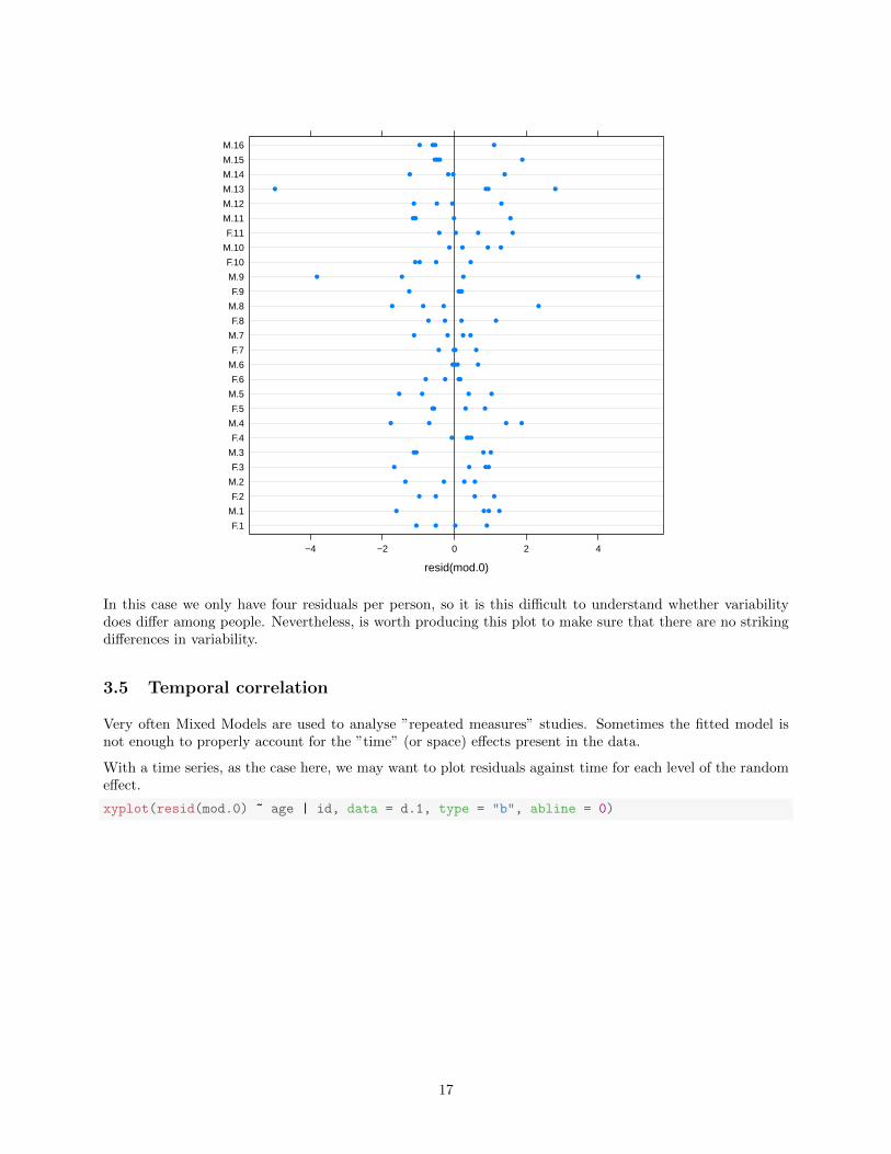
dotplot(id ~ resid(mod.0), data = d.1, abline = list(v = 0))
16
resid(mod.0)
F.1
M.1
F.2
M.2
F.3
M.3
F.4
M.4
F.5
M.5
F.6
M.6
F.7
M.7
F.8
M.8
F.9
M.9
F.10
M.10
F.11
M.11
M.12
M.13
M.14
M.15
M.16
−4 −2 0 2 4
In this case we only have four residuals per person, so it is this difficult to understand whether variabilitydoes differ among people. Nevertheless, is worth producing this plot to make sure that there are no strikingdifferences in variability.
3.5 Temporal correlation
Very often Mixed Models are used to analyse ”repeated measures” studies. Sometimes the fitted model isnot enough to properly account for the ”time” (or space) effects present in the data.
With a time series, as the case here, we may want to plot residuals against time for each level of the randomeffect.
xyplot(resid(mod.0) ~ age | id, data = d.1, type = "b", abline = 0)
17

age
resi
d(m
od.0
)
−4−2
024
8 9 10 12 14
F.1 M.1
8 9 10 12 14
F.2 M.2
8 9 10 12 14
F.3 M.3
F.4 M.4 F.5 M.5 F.6
−4−2024
M.6
−4−2
024
F.7 M.7 F.8 M.8 F.9 M.9
F.10 M.10 F.11 M.11 M.12
−4−2024
M.13
−4−2
024
M.14
8 9 10 12 14
M.15 M.16
There is no evidence of strong time correlation within subject. This does not come unexpected given thelow number of observations per person. A rough rule of thumb says that if each subject is measured morethan 4-6 times, we are likely to have enough power to detect time correlations within subjects (see slides fora striking example of ”within subject time correlation”).
In this study there are about 30 subjects, and therefore we can use panelling. In other studies there may bea larger number of ”subjects”. In these cases the use of panelling is unreasonable. In these cases it is usefulto display all ”subjects” in one plot and to use transparency (via the alpha parameter).
xyplot(resid(mod.0) ~ age, groups = id, data = d.1, type = c("l", "g"), abline = 0,
col.line = "black", alpha = 0.5)
18

age
resi
d(m
od.0
)
−4
−2
0
2
4
8 9 10 11 12 13 14
3.6 Further diagnostic plots
The Tukey-Anscombe plot, the scale-location plot, the Quantile-Quantile plots and the residuals againstpredictors plots are the fundamental graphics that we need to produce to verify the model assumptions.They should always be assessed.
In addition to these plots, one can create additional plots. Usually, these plots are needed to inspect themodel at a finer scale. As an example, the user might want to produce the Tukey-Anscombe plot for bothsexes.
To present a situation where there is some structure left in the data, we produce this residual plot for mod.1where growth is assumed to be the same in both genders (i.e. no interaction between gender and age).
mod.1 <- update(mod.0, . ~ . - age:Sex)
##
xyplot(resid(mod.1) ~ fitted(mod.1) | Sex, data = d.1, type = c("p", "smooth",
"g"), abline = 0, col.line = "red", scales = list(x = "free"))
19

fitted(mod.1)
resi
d(m
od.1
)
−4
−2
0
2
4
18 20 22 24 26 28
F
22 24 26 28 30
M
As we already knew, these plots show that the residuals of males have a slightly higher variance. In addition,the smoother is not perfectly flat on zero indicating that there may be room for improvement. To inspectthis a bit further, we plot the residuals against the predictor age.
xyplot(resid(mod.1) ~ age | Sex, data = d.1, type = c("p", "a", "g"), abline = 0,
col.line = "red")
20

age
resi
d(m
od.1
)
−4
−2
0
2
4
8 9 10 11 12 13 14
F
8 9 10 11 12 13 14
M
There is some evidence that the model equation is not perfect. Indeed, there is a small but clear descendingtrend for females. There also seems to be some structure left for males. Allowing the two sexes to havedifferent slopes for age does improve the model diagnostics.
In addition to that, we could try to improve our model by adding a quadratic effect in age for males only.In our opinion, this would not add much to the model. However, if this is an important piece of informationthat the study is looking for, you should follow this path.
Essentially we now face a fundamental question ”Do we really want to fit a more complex model (e.g allowingfor genders to have different error variances or for the effect of age to be non-linear)?”
In reality, very few datasets perfectly fulfil all assumptions. When analysing large datasets, because of a highpower of detecting differences, you will always find indications that the model can be made more complex.
Therefore, you should beware of this and carefully consider what kind of model you want to fit and interpret.Ifthere are clear violations of the model assumptions, the model should be adapted, if not, it should be madevery clear that the conclusions drawn are not robust and that the inference procedure (p-values) is nottrustworthy.
4 Inference procedure
4.1 Testing for fixed effects
Unlike most other summary functions, summary.merMod does not report p-values. This was a deliberate choiceof the developers as it is not entirely clear how statistical inference should be carried out within the frameworkof Mixed Effects Models.
21

To test the statistical significance of the predictors of a Mixed Model, Likelihood Ratio Tests (LRT) are3
used (this statistic is assumed to be χ2-distributed). For this purpose, the anova or the drop1 functions canbe used. Both functions perform the same testing procedure and give identical results. To be able to useLikelihood Ratio Tests, the models need to be refitted using Maximum Likelihood (ML) instead of REstrictedMaximum Likelihood. Indeed, models that differ in their fixed effects part cannot be compared if fitted withREML. This step is done automatically by the testing functions.
anova(mod.0, mod.1)
refitting model(s) with ML (instead of REML)
Data: d.1
Models:
mod.1: distance ~ age + Sex + (1 | id)
mod.0: distance ~ age * Sex + (1 | id)
Df AIC BIC logLik deviance Chisq Chi Df Pr(>Chisq)
mod.1 5 445 458 -217 435
mod.0 6 441 457 -214 429 6.22 1 0.013 *
---
Signif. codes: 0 ’***’ 0.001 ’**’ 0.01 ’*’ 0.05 ’.’ 0.1 ’ ’ 1
##
drop1(mod.0, test = "Chi")
Single term deletions
Model:
distance ~ age * Sex + (1 | id)
Df AIC LRT Pr(Chi)
<none> 441
age:Sex 1 445 6.22 0.013 *
---
Signif. codes: 0 ’***’ 0.001 ’**’ 0.01 ’*’ 0.05 ’.’ 0.1 ’ ’ 1
There is evidence that the slope of the two groups is different. This confirms what we have seen on thegraphical analysis4.
When no interactions are present in the model, drop1 tests for all main effects. In other words, in a modelwith the formula ”y ∼ A + B + C ∗D” drop1 tests the main effects A and B and the interaction C:D (butnot the main effects C and D)5.
drop1(mod.1, test = "Chi")
Single term deletions
Model:
distance ~ age + Sex + (1 | id)
Df AIC LRT Pr(Chi)
<none> 445
age 1 515 72.1 <2e-16 ***
Sex 1 451 8.5 0.0035 **
---
Signif. codes: 0 ’***’ 0.001 ’**’ 0.01 ’*’ 0.05 ’.’ 0.1 ’ ’ 1
Note that only formally nested models can be compared by Likelihood Ratio Tests. If models are not formallynested (e.g. y ∼ A+B vs y ∼ A+ C +D), AIC or BIC can be used.
3Note that there are many alternatives to this procedure (see ?pvalues).4But doesn’t agree with the model where we omitted person.5In other words, drop1 respects the principle of marginality.
22

4.2 Assessing the random effects
Random effects are usually part of the design and should not be removed from the model6. We prefer toestimate the incertitude of variance components instead of testing them. Note that it is possible to testrandom effects with Likelihood Ratio Tests. However, testing whether the variance of a random effect to bezero is actually wrong, since the tested value lays at the boundary of its space (which fails to fulfil one of theassumptions of Likelihood Ratio Tests)7.
Therefore, we prefer to estimate confidence intervals for variance components. This can be done in variousways. Using profiling likelihood is currently the recommended manner.
prof.0 <- profile(mod.0)
class(prof.0)
[1] "thpr" "data.frame"
str(prof.0, max.level = 1)
Classes ’thpr’ and ’data.frame’: 114 obs. of 8 variables:
$ .zeta : num -4.38 -3.86 -3.33 -2.79 -2.24 ...
$ .sig01 : num 0.872 0.957 1.044 1.137 1.237 ...
$ .sigma : num 1.56 1.51 1.46 1.43 1.41 ...
$ (Intercept): num 17.4 17.4 17.4 17.4 17.4 ...
$ age : num 0.48 0.48 0.48 0.48 0.48 ...
$ SexM : num -1.03 -1.03 -1.03 -1.03 -1.03 ...
$ age:SexM : num 0.305 0.305 0.305 0.305 0.305 ...
$ .par : Factor w/ 6 levels ".sig01",".sigma",..: 1 1 1 1 1 1 1 1 1 1 ...
- attr(*, "forward")=List of 6
- attr(*, "backward")=List of 6
- attr(*, "lower")= num 0 0
- attr(*, "upper")= num Inf Inf
By default, profiling is executed for all estimated parameters present in the model (i.e. all random and fixedeffects). For large models, profiling can be time consuming. In these cases, one should specify its interests.
prof.0.ranef <- profile(mod.0, which = "theta_") ## random effects
prof.0.int <- profile(mod.0, which = 6) ## interaction term
Confidence intervals can be obtained with the method confint().
VarCorr(mod.0)
Groups Name Std.Dev.
id (Intercept) 1.82
Residual 1.39
confint(prof.0.ranef)
2.5 % 97.5 %
.sig01 1.3 2.4
.sigma 1.2 1.6
##
fixef(mod.0)
(Intercept) age SexM age:SexM
17.37 0.48 -1.03 0.30
6It rarely happens that the estimated variance of a random component is numerically equal to zero, in that case the randomeffect can be safely omitted.
7This can be done with covariances/correlations which are not bounded at zero.
23

confint(prof.0.int)
2.5 % 97.5 %
age:SexM 0.067 0.54
Session Information
To make our analysis fully reproducible we make use of sessionInfo. You may also find the packagecheckpoint very useful for collaborative projects. This document was produced with the package knitr.sessionInfo()
R version 3.5.3 (2019-03-11)
Platform: x86_64-redhat-linux-gnu (64-bit)
Running under: Fedora 30 (Workstation Edition)
Matrix products: default
BLAS/LAPACK: /usr/lib64/R/lib/libRblas.so
locale:
[1] LC_CTYPE=en_GB.UTF-8 LC_NUMERIC=C
[3] LC_TIME=en_GB.UTF-8 LC_COLLATE=en_GB.UTF-8
[5] LC_MONETARY=en_GB.UTF-8 LC_MESSAGES=en_GB.UTF-8
[7] LC_PAPER=en_GB.UTF-8 LC_NAME=C
[9] LC_ADDRESS=C LC_TELEPHONE=C
[11] LC_MEASUREMENT=en_GB.UTF-8 LC_IDENTIFICATION=C
attached base packages:
[1] stats graphics grDevices utils datasets methods base
other attached packages:
[1] lme4_1.1-18-1 Matrix_1.2-15 lattice_0.20-35 knitr_1.20
loaded via a namespace (and not attached):
[1] Rcpp_1.0.2 MASS_7.3-51.1 grid_3.5.3 nlme_3.1-137
[5] formatR_1.6 magrittr_1.5 evaluate_0.10.1 highr_0.7
[9] stringi_1.2.4 minqa_1.2.4 nloptr_1.2.0 splines_3.5.3
[13] tools_3.5.3 stringr_1.3.1 compiler_3.5.3
24


![· 2012-12-10 · [10] Faraway J.J., Extending the Linear Model with R: Generalized Linear, Mixed Effects and Nonparametric Regression Models, Chapman & Hall/CRC Texts in …](https://img.dokumen.tips/doc/110x75/5edab19439be4033970bc034/2012-12-10-10-faraway-jj-extending-the-linear-model-with-r-generalized-linear.jpg)