Embed Size (px)
Citation preview

Exploration of the Local Distribution of Major Ethnic Groups in the USASebastian Kay Belle∗
University of KonstanzDaniela Oelke†
University of KonstanzSonja Oettl‡
University of KonstanzMike Sips§
Stanford University
ABSTRACT
Knowledge about the local distribution of major ethnic groups inthe USA is an important source of information upon which thesuccess of political and economic decisions may depend. Enhanc-ing this information with additional attributes, such as the specificincome or spoken languages, reveals interesting aspects on socialconstellations as well as their interdependencies. The presented vi-sualization facilitates the intuitive exploration of such multidimen-sional data sets with references to geographical units. Thus, a quickinsight into the inherent patterns and characteristic features is pro-vided. Thanks to the high scalability of our visualization techniqueit can even be used with an iPod-resolution.
1 INTRODUCTION
Once every ten years the U.S. Census Bureau collects data of thepeople of the United States in a broad demographic survey. Partof the data, the Public Use Microdata Sample (PUMS 1%), can beused by everyone whenever a reliable basis for political, economic,or social decisions is required. Among others, the dataset containsinformation about nationalities, ethnicities, and the linguistic andcultural background of the investigated people. The informationrefers to small geographical units to allow to examine the spatialdistribution of the values across the United States. Values for coun-ties, states or even the whole USA can be obtained by aggregatingcorresponding subunits of the inherent hierarchy.
In our project we analyze the spatial distribution of eight majorethnic groups of the United States on different hierarchical levels.Moreover, we enhance the visualization with information about themedian income of each group in the corresponding geographicalunit and the regionally spoken languages to provide further indica-tors for social constellations and correlations.
2 THE CONCEPT
At first glance it may seem indispensible to use a map for the rep-resentation of data values with such a strong geographic reference.However, a major disadvantages of a map is that it is difficult to dis-play the values of multiple ethnic groups or the spoken languagessimultaneously. This becomes even more decisive if a compari-son between different geographical units (such as different states orcounties) should be possible.Therefore, in our visualization we chose a matrix-like structure in-stead of displaying the values on a map. Each geographical unit isassigned to a column and the corresponding attribute values, such asthe number of people belonging to the different ethnic groups, theirincome, or the spoken languages, are arranged in rows. Within eachcell the single values are encoded with colors.With this approach we may lose the intuitive perception of the ge-ographic context that a map can provide. However, the regular gridstructure also has some crucial benefits. First of all, we can easily
∗e-mail: [email protected]†e-mail: [email protected]‡e-mail: [email protected]§e-mail: [email protected]
display many dimensions at once. Second, different values can becompared efficiently. Since the distribution over the whole matrixcan be perceived at a glance, patterns stick out immediately. Re-arrangement of columns and rows according to the specific task ordetected similarities may even increase this effect.To account for the hierarchical structure of the data we provide adrill-down facility to view each state on a more detailed level.
3 MAPPING OF THE VALUES TO COLOR
There are different methods to normalize the values of the matrixto map them to a color gradient (e.g., linear, square root, or log-arithmic normalization). Furthermore, we have to decide if thenormalization should be done on a row-by-row basis, a column-by-column basis, or with a whole matrix as one unit of normaliza-tion. Depending on the selected strategy, different questions canbe answered. For example, the row-by-row normalization allowsus to view quickly where each ethnic group tends to concentrate,whereas the column-by-column normalization results in visualiza-tions that show the proportion of the different ethnic groups. Takingthe whole matrix as a basis unit for the normalization has the ad-vantage that general trends like patterns on state level can easily berecognized.
4 DATA ANALYSIS
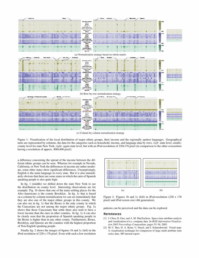
Fig. 1 shows the values for number of households (brown), medianincome (violett) and household languages (green) on state level(left and right) and drilled down for the state New York (middle)1.The subfigures 1a to 1c are calculated with different normalizationstrategies.In fig. 1a (left) patterns on state level can easily be perceived. Forexample, it is obvious that California and Texas are states with ahigh total population.With a row-by-row normalization as in fig. 1b the distribution ofeach ethnic group across the USA can be analyzed. Unsurprisingly,the states with a high population also tend to be the ones in whichmost of the people of each ethnic group live. However, it is interest-ing to notice, that all the ethnic groups have their peak in Californiaexcept for the Afro-Americans who have their highest value in NewYork. The agglomeration areas of the American Indians seem to beCalifornia, Oklahoma, Arizona, and New Mexiko.To see the proportion of each ethnic group the column-by-columnnormalization is the best one to use. In fig. 1c the District-of-Columbia immediately sticks out. It is the only state in whichthe number of Afro-Americans is higher than the number of Cau-casians2. Regarding the median income, in every state Caucasianstend to be better situated than any other ethnic group. Furthermore,
1We avoided direct labelling because there are states with extensivenumbers of counties (e.g., Texas). Columns in fig. 1 (left and right) arethe states in alphabetical order excluding Alaska, Puerto Rico, and Hawaiibut including District of Columbia and Rhode Island. Columns in fig. 1(middle) are the counties of the state New York in alphabetical order. Dur-ing interactive exploration tooltips could be used to weaken the problemof difficult orientation. To ease the interpretation of the screenshots in thispaper we manually added labels for the rows and the addressed columns.
2Caucasian in this context is equivalent to the ethnic group ”White notHispanic or Latino” of the PUMS data set
(a) Normalization strategy based on whole matrix
(b) Row-by-row normalization strategy
(c) Column-by-column normalization strategy
Figure 1: Visualization of the local distribution of major ethnic groups, their income and the regionally spoken languages. Geographicalunits are represented by columns, the data for the categories such as household, income, and language data by rows. Left: state level, middle:county level for state New York, right: again state level, but with an iPod-resolution of 220x176 pixel (in comparison to the other screenshotshaving a resolution of approx. 800x400 pixel).
a difference concerning the spread of the income between the dif-ferent ethnic groups can be seen. Whereas for example in Nevada,California, or New York the differences in income are rather moder-ate, some other states show significant differences. Unsurprisingly,English is the main language in every state. But it is also immedi-ately obvious that there are some states in which the ratio of Spanishspeaking people is also quite high.
In fig. 1 (middle) we drilled down the state New York to seethe distribution on county level. Interesting observations are forexample: Fig. 1b shows that one of the main settling places for theAfro-Americans is the county Brooklyn. In fig. 1c that is basedon a column-by-column normalization we can see immediately thatthey are also one of the major ethnic groups in this county. Wecan also see in fig. 1c that the Bronx is the only county in whichthe Caucasians are not among the major ethnic groups. Fig. 1ashows that those Caucasians that settle there also tend to have alower income than the ones in other counties. In fig. 1c it can alsobe clearly seen that the proportion of Spanish speaking people inthe Bronx is higher than in any other county. Furthermore, Bronx,Brooklyn, and Queens are the counties with the highest proportionof Non-English speaking people.
Finally fig. 2 shows the images of figures 1b and 1c (left) in theiPod-resolution of 220 x 176 pixel. Even with such a low resolution
(a) (b)
Figure 2: Figures 1b and 1c (left) in iPod-resolution (220 x 176pixel) and iPod screen size (4th generation).
patterns can be perceived and the data can be explored.
REFERENCES
[1] J. Chen, D. Guo, and A. M. MacEachren. Space-time-attribute analysisand visualization of u.s. company data. In IEEE Information Visualiza-tion 2005 Proceedings Compendium, pages 55–56, 2005.
[2] M. C. Hao, D. A. Keim, U. Dayal, and J. Schneidewind. Visual map:A visualization technique for comparison of large multi-attribute timeseries data. HP internal report.