Embed Size (px)
Citation preview

Show Me a Picture, Tell Me a Story:
An Introduction to Graphs for the Analysis of Ecological Data from
Schoolyard Science Research Studies
Harvard Forest Schoolyard Ecology Program
Harvard Forest, Petersham, MA, USA
May 29, 2009

This manual is a publication of the Harvard Forest Schoolyard Science Program. The text and
most of the graphs of schoolyard science data in this manual were prepared by Dr. Betsy A.
Colburn, Aquatic Ecologist. Pamela Snow, Harvard Forest Schoolyard Coordinator, compiled
pertinent national and state education standards. Harvard Forest researchers and Schoolyard
Science collaborators Dr. Emery Boose, Information Manager, Dr. John O’Keefe, Fisher
Museum Director, and Dr. David A. Orwig, Forest Ecologist, contributed research graphs and
provided valuable insights and feedback.
Citation: Colburn, B. A. 2009. Show Me a Picture, Tell Me a Story: An Introduction to Graphs
for the Analysis of Ecological Data from Schoolyard Science Research Studies. Harvard Forest
Schoolyard Science Program, Harvard Forest, Harvard University, Petersham, MA.

i
Contents
Acknowledgements iii
Please Provide Feedback iii
Dedication iii
1. Introduction 1
Our Approach to Understanding Graphing 1
What Information is Where? 2
2. Graphs in the Classroom 5
Reasons to Teach Graphing Skills 5
State and National Frameworks and Standards Addressed by Graphing Exercises 6
Sample Lesson Plans 11
Why Graphs Are Useful for Schoolyard Science Investigations 11
3. Understanding Data and Graphs 13
Organizing and Working with Field Research Data 13
Kinds of Data Sets – Some Schoolyard Data Examples 14
Comma-delimited Data 14
What does the data set include? 15
What rules govern the data? 15
How do you interpret the data? 15
How do you read a comma-delimited data set? 16
Spreadsheets 16
Working with spreadsheets 17
Describing data in spreadsheet data bases 17
Simple Data Sets 18
Deciding How to Organize Your Data 21
Data Formats 22
Kinds of Graphs 22
Simple Graphs 24
The aquatic macroinvertebrate community in a vernal pool 24
Graphs with X and Y Axes 25
The X axis 26

ii
The Y axis 26
Interpreting the graph 26
Scatter Diagrams or Scatter Plots 29
Age and size of trees on Wachusett Mountain 29
A long-term study of spring and fall phenology 29
Variations in stream discharge over time 31
Line Graphs 34
Bar Graphs 34
Aquatic macroinvertebrates in a vernal pool on different dates 34
4. Preparing Data for Graphing 37
Steps Involved in Organizing and Graphing Data 37
Sorting and Evaluating Data 38
Sorting Data 38
Removing Rows and Columns with Missing Data 40
Evaluating the Data for Needed Adjustments 41
Adjusting for uneven sampling effort 41
Adjusting for inconsistencies in sampling 42
Extracting Additional Information from the Data 42
5. Graphs of Schoolyard Data 45
Phenology 46
Tree Species in a Sample Population 46
Leaf Fall in One Tree Over Time 48
Dates of First and Last Leaf Fall 48
Leaves Remaining Over Time 50
Leaf Fall in Multiple Trees 51
HWA 53
Egg Density in Three Study Trees 53
Water in the Landscape 54
Water depth in a stream 54
Water level and diameter in vernal pools 56
Graphing Data From Your Own Schoolyard Studies 59

iii
Acknowledgements
This manual (May 29, 2009) and the accompanying hands-on exercises represent a work in
progress. The materials prepared thus far reflect the efforts of many individuals. We especially
want to acknowledge the teachers and students whose schoolyard ecology research projects
provided the data we use in some of the examples.
We extend special thanks to the anonymous donor who provided the funds that made this
educational project possible. Thank you.
Please Provide Feedback
We hope that you will find this material interesting and of practical use. Do give us feedback, so
that the final manual will be as useful as possible to classroom teachers carrying out schoolyard
ecology studies with their students. Whether your students are carrying out research according
to protocols available through the Harvard Forest LTER program or are conducting other kinds
of ecological studies, we would value your input. Please feel free to send us feedback if you run
into difficulties or if you have suggestions for improvements or further refinements. You can
send your comments by email to Pamela Snow, Harvard Forest’s Schoolyard Coordinator,
Dedication
This manual and the accompanying exercises are dedicated to all the classroom teachers who
share their excitement and enthusiasm about science and the natural world with their students.
Your work changes lives and makes the Earth a better place for all of its inhabitants. We salute
you for it!

iv

1. Introduction
Chapter Overview:
This chapter covers
The approach we take to graphing in this manual
How the manual is organized
You and your students are carrying out field studies on an ecological question. Once you have
collected data, how do you look at and interpret the information? Graphs can be valuable tools
for examining and interpreting research results.
Scientists regularly create graphs as a way of visualizing patterns in data, and of showing those
patterns to others. We use pictures – graphs – to help us explain our research results – to tell the
story we are learning about how some aspect of nature works.
Teachers involved in Harvard Forest’s Schoolyard Science Program have requested more
information on ways that they and their students can work with data that they collect in field
research studies. This manual is intended to introduce teachers to some options for organizing,
manipulating, and graphing student data. It includes background information as well as multiple
examples of graphs from data collected by teachers and students in the course of schoolyard
research studies. The basic concepts and approach are applicable to many graphing programs
available on computers, and also to graphing data by hand.
Our Approach to Understanding Graphing
Our intent in developing this manual is to introduce teachers to graphing in the broader context
of how scientists analyze ecological data. We therefore approach graphing of Schoolyard
Science data from several perspectives. This manual presents
an overview of the ways scientists use graphs to help them understand their data,
a discussion of how field data can be organized into different kinds of data sets, including
specific examples pertinent to schoolyard ecology data,
an explanation of the kinds of data manipulations and corrections that are usually
necessary before data can be graphed or otherwise analyzed, using a schoolyard data set
to illustrate key points,
a review of different kinds of graphs,
examples of graphs from Harvard Forest scientists’ research, and
graphs of real field data collected by students whose teachers have been participating in
Harvard Forest’s Schoolyard Science Program.

2
Some data are graphed several ways to illustrate how different kinds of graphs can provide
different insights into research results. Each graph is discussed in terms of the data that it
illustrates, and it is interpreted in relation to patterns that may be brought into focus, suggested
trends that may be worth exploring, any potential anomalies or odd behaviors in the data that
need to be accounted for, and/or other features that may be of particular interest.
What Information is Where?
This manual is divided into five chapters. Following this introductory chapter are chapters on
educational goals and standards, data sets and kinds of graphs, preparing data for graphing, and
examples of graphs prepared from schoolyard science data.
Chapter 2, Graphs in the Classroom, considers graphing in the broad context of Schoolyard
Science, and of education in general. It includes some general thoughts about why teachers may
want to teach their students about graphs and graphing. It also discusses ways that lesson plans
that involve data analysis through graphs help meet formal educational goals in state curriculum
frameworks. This section includes specific state and national educational goals that can be met
through graphing instruction. Finally, it considers specific ways that graphs may contribute to,
and enhance, science education, including but not restricted to Schoolyard Science programs.
Chapter 3, Understanding Data and Graphs, presents a broad overview of some topics that are
key to understanding data, deciding how to present data in graphical form, and interpreting
graphs. It first discusses how to organize and work with data files, including ways to organize
and format data for graphing. Then, it presents an overview of different kinds of graphs,
including pie charts, bar graphs, scatter plots, and line graphs. Examples of graphs developed
from research data collected by Harvard Forest scientists and from Schoolyard Science data from
participating classrooms are used to illustrate how different kinds of graphs can be used to obtain
different kinds of information from a data set. Some data sets are graphed in several different
ways.
Chapter 4, Preparing Data for Graphing, looks at the steps involved in getting data ready for
graphing. It first considers sorting and checking data to find missing data and errors. It then
discusses some indications that the data will need to be standardized or changed, and gives an
example of converting raw data into a percentage. It also shows how you can extract additional
data from a data set and organize the new information for analysis. The steps are illustrated with
a set of fall phenology data collected over a four-year period by middle-school students in Athol,
MA. The data show leaf fall over time for 11 trees studied each autumn from 2004-2007.
Chapter 5, Presenting Schoolyard Ecology Data in Graphs, presents and interprets 15 graphs
illustrating schoolyard science studies. Most of the examples show data on leaf-fall phenology.
3
These graphs are based on the schoolyard leaf-fall data set used in Chapter 4. They include the
following.
Three simple graphs, a pie graph, a stacked bar graph, and a bar graph by species,
showing the composition of the study tree population.
Graphs showing the time course of leaf fall in a single tree over time, in a single year and
over multiple years.
A graph of leaf fall showing the percentage of leaves that remain on the tree over time,
rather than the percentage of leaves that have fallen.
Two graphs, a scatter plot and a bar graph, of the dates of initial and total leaf fall for a
single tree over multiple years.
A graph showing leaf fall in three trees of the same species over three years.
In addition, we include a bar graph that shows data on the abundance of hemlock woolly adelgid
egg masses on three hemlock branches; two options for presenting data on changes in water
depth at four locations in a stream; and two graphs comparing data on water depths and
diameters in two vernal pools studied by classes in two different towns.
Comparable graphs can be made of a wide variety of other field ecological data.

4

5
2. Graphs in the Classroom
Chapter Overview:
This chapter covers
Reasons for teaching graphing skills
Education goals addressed
Where to find related lesson plans
Graphs and Schoolyard Science
Graphs let researchers see patterns in their data, and they can suggest ideas about what might be
happening in the system that is being studied. Graphs are also useful for helping scientists
explain data to other people, as pictures can combine a lot of information into a compact
package. In fact, the applications and uses of graphs extend far beyond scientific research.
This manual has been prepared in the context of Harvard Forest’s Schoolyard Science Program.
Its overall focus is on the graphical presentation of scientific data collected by students involved
in field research projects. In this chapter, we step back and look briefly at the value of graphing
exercises in an educational context.
Reasons to Teach Graphing Skills
There are many reasons why graphing skills should be taught in schools. The ability to graph
data is a valuable mathematical skill in its own right, and the evaluation of graphical data is an
important adjunct to critical thinking.
The basic skills involved in looking at and interpreting graphs are useful in many contexts. In
addition to being useful in scientific research, graphs are used in politics, medicine, economics,
agriculture, business, sports, and almost every other aspect of daily life. They can be highly
effective means for presenting information – we see them in magazines, on television news
broadcasts, in financial reports, and in advertisements. Many people are visual thinkers and learn
best when presented with pictures rather than words. People who have difficulty in reading and
interpreting graphical information may be at a disadvantage, and in some situations they may
find themselves less-well informed than people who understand graphs.
Students who have mastered the simple manipulations involved in preparing graphs by hand or
with basic computer programs have the ability to examine many kinds of scientific, economic,
and social information, on their own. They can create their own graphs and use them to evaluate
whether conclusions that have been drawn by other people seem to be supported by the data.
They can identify patterns and trends, observe inconsistencies, and draw their own conclusions.
Further, they can use graphs to share information with other people.

6
State and National Frameworks and Standards Addressed by Graphing Exercises
Teachers may find that classroom activities and lesson plans that include graphing not only have
a wide range of general educational benefits but also can be used to meet specific educational
goals specified in federal recommendations and state curriculum guidelines. The list below
identifies some specific national and state science and mathematics educational goals addressed
by graphing exercises. The goals are taken from the following sources:
Massachusetts Department of Education. 2000, 2006. Mathematics Curriculum
Framework. (2000), Massachusetts Science and Technology/Engineering Curriculum
Framework (2006). Malden, MA. (―Massachusetts Frameworks‖) Both are available
online at http://www.doe.mass.edu/frameworks/current.html
National Committee on Science Education Standards and Assessment, National
Research Council. 1996. National Science Education Standards. National Academies
Press, Washington, D.C. (―National Standards‖) Available online at
http://www.nap.edu/openbook.php?record_id=4962&page=103
We have not explicitly identified life science standards addressed by graphing exercises. Note,
however, that many standards and frameworks relating to the understanding of life histories,
adaptations, and distributions of living organisms, and of environmental change and ecology, are
encompassed in the research questions investigated as part of schoolyard science projects. The
use of graphs to interpret study results can thus contribute to educational goals in the life
sciences.
A complete list of Massachusetts Frameworks and National Science Standards addressed in
Harvard Forest’s Schoolyard projects can be found at:
http://harvardforest.fas.harvard.edu/museum/data/k12/HF%20sLTER%20State%20Frameworks
%20and%20National%20Standards.pdf.
Scientific Inquiry Skills Standards – Massachusetts Frameworks
SIS3. Analyze and interpret results of scientific investigations.
Present relationships between and among variables in appropriate forms.
Represent data and relationships between and among variables in charts and graphs.
Use appropriate technology (e.g., graphing software) and other tools.
Assess the reliability of data and identify reasons for inconsistent results, such as sources
of error or uncontrolled conditions.
Use results of an experiment [study] to develop a conclusion to an investigation that
addresses the initial questions and supports or refutes the stated hypothesis.
State questions raised by an experiment [study] that may require further investigation.

7
SIS4. Communicate and apply the results of scientific investigations.
Develop descriptions of and explanations for scientific concepts that were a focus of one
or more investigations.
Review information, explain statistical analysis, and summarize data collected and
analyzed as the result of an investigation.
Explain diagrams and charts that represent relationships of variables.
Construct a reasoned argument and respond appropriately to critical comments and
questions.
Use language and vocabulary appropriately, speak clearly and logically, and use
appropriate technology (e.g., presentation software) and other tools to present findings.
Science as Inquiry – National Standard A
Grades K-4:
Abilities necessary to do scientific inquiry:
o Use Data to construct a reasonable explanation
This aspect of the standard emphasizes the students’ thinking as they use
data to formulate explanations. Even at the earliest grade levels,
students should learn what constitutes evidence and judge the merits or
strength of the data and information that will be used to make
explanations. After students propose and explanation, they will appeal
to the knowledge and evidence they obtained to support their
explanations. Students should check their explanations against
scientific knowledge, experiences, and observations of others.
o Communicate investigations and explanations
Students should begin developing the abilities to communicate, critique,
and analyze their work and the work of other students. This
communication might be spoken or drawn as well as written.
Understanding about scientific inquiry:
o Scientists develop explanations using observations (evidence) and what they
already know about the world ( scientific knowledge).Good explanations are
based on evidence from investigations.
Grades 5-8:
Abilities necessary to do scientific inquiry
o Conduct a scientific investigation
Students should develop general abilities, such as …interpret data, use
evidence to generate explanations, propose alternative explanations, and
critique explanations and procedures.

8
o Use appropriate tools and techniques to gather, analyze, and interpret data
The use of computers for the collection, summary, and display of evidence
is part of this standard. Students should be able to access, gather, store,
retrieve, and organize data, suing hardware and software designed for
these purposes.
o Think critically and logically to make the relationships between evidence and
explanations.
Thinking critically about evidence includes deciding what evidence should
be used and accounting for anomalous data. Specifically, students should
be able to review data from a simple experiment, summarize the data, and
form a logical argument about the cause-and –effect relationships in the
experiment.
o Use mathematics in all aspects of scientific inquiry
Mathematics can be used to ask questions; to gather, organize, and present
data; and to structure convincing explanations.
Grades 9-12:
Abilities necessary to do scientific inquiry
o Conduct scientific investigations
The investigation may also require…student organization and display of
data
o Use technology and mathematics to improve investigations and communications.
The use of computers for the collection, analysis and display of
data….charts and graphs are used for communicating results. Mathematics
play an essential role in all aspects of an inquiry. For example,...formulas
are used for developing explanations, and charts and graphs are used for
communicating results.
o Communicate and defend a scientific argument
Students in school science programs should develop the abilities
associated with accurate and effective communication. These include
writing and following procedures, expressing concepts, reviewing
information, summarizing data, using language appropriately, Developing
diagrams and charts, explaining statistical analysis, speaking clearly and
logically, constructing a reasoned argument, and responding appropriately
to critical comments

9
Mathematics – Massachusetts Frameworks
Grades 1-2:
Data Analysis, Statistics, and Probability:
2.D.1 Use interviews, surveys, and observations to gather data about themselves and their
surroundings.
2.D.2. Organize, classify, represent, and interpret data using tallies, charts, tables, bar graphs,
pictographs, and Venn diagrams; interpret the representations.
2.D.3. Formulate inferences (draw conclusions) and make educated guesses (conjectures) about
a situation based on information gained from data.
Grades 3-4, 5-6:
Exploratory Concepts and Skills:
Select, create, and use appropriate graphical representations of data, including
histograms, box plots, and scatter plots.
Compare different representations of the same data and evaluate how well each
representation shows important aspects of the data.
Grades 3-4:
Data Analysis, Statistics, and Probability:
4.D.1 Collect and organize data using observations, measurements, surveys, or experiments,
and identify appropriate ways to display the data.
4.D.2 Match a representation of a data set such as lists, tables, or graphs (including circle
graphs) with the actual set of data.
4.D.3 Construct, draw conclusions, and make predictions from various representations of data
sets, including tables, bar graphs, pictographs, line graphs, line plots, and tallies.

10
Grades 5-6:
Data Analysis, Statistics, and Probability:
6.D.1 Construct and interpret stem-and-leaf plots, line plots, and circle graphs.
6.D.2 Use tree diagrams and other models (e.g., lists and tables) to represent possible or actual
outcomes of trials. Analyze the outcomes.
Grades 7-8:
Data Analysis, Statistics, and Probability:
Formulate questions that can be addressed with data and collect, organize, and display
relevant data to answer them
Select and use appropriate statistical methods to analyze data
Develop and evaluate inferences and predictions that are based on data
8.D.1 Describe the characteristics and limitations of a data sample. Identify different ways of
selecting a sample, e.g., convenience sampling, responses to a survey, random sampling.
8.D.2 Select, create, interpret, and utilize various tabular and graphical representations of data,
e.g., circle graphs, Venn diagrams, scatterplots, stem-and-leaf plots, box-and-whisker
plots, histograms, tables, and charts. Differentiate between continuous and discrete data
and ways to represent them.
8.D.3 Find, describe, and interpret appropriate measures of central tendency (mean, median,
and mode) and spread (range) that represent a set of data. Use these notions to compare
different sets of data.
Grades 9-10:
Data Analysis, Statistics, and Probability:
Formulate questions that can be addressed with data and collect, organize, and display
relevant data to answer them
Select and use appropriate statistical methods to analyze data
Develop and evaluate inferences and predictions that are based on data

11
10.D.1 Select, create, and interpret an appropriate graphical representation (e.g., scatterplot,
table, stem-and-leaf plots, box-and-whisker plots, circle graph, line graph, and line plot)
for a set of data and use appropriate statistics (e.g., mean, median, range, and mode) to
communicate information about the data. Use these notions to compare different sets of
data.
10.D.3 Describe and explain how the relative sizes of a sample and the population affect the
validity of predictions from a set of data.
Grades 11-12:
Data Analysis, Statistics, and Probability:
Formulate questions that can be addressed with data and collect, organize, and display
relevant data to answer them
Select and use appropriate statistical methods to analyze data
Develop and evaluate inferences and predictions that are based on data
12.D.1 Select an appropriate graphical representation for a set of data and use appropriate
statistics (e.g., quartile or percentile distribution) to communicate information about the
data.
12.D.2
Sample Lesson Plans
Several teachers participating in Harvard Forest’s Schoolyard Science Program have developed
lesson plans that include data analysis through graphing. These plans provide further discussion
of educational goals and curriculum frameworks. The plans are available online on the Harvard
Forest website.
http://harvardforest.fas.harvard.edu/museum/data/k12/lesson-plans.html
Why Graphs Are Useful for Schoolyard Science Investigations
With data collected in the Schoolyard Science Program, graphs are useful for several reasons.
1. They let students ―see‖ their data.
2. They make it easy to observe the changes that occur between one sampling date and the
next, as well as the overall pattern of changes throughout the course of the study.
3. They allow each student research team to look at differences between their results and those
of other teams in the class.

12
4. They let students compare their results with those of students in other classes, whether in
the same school at the same time, in other schools, or in past years.
5. They may stimulate students to suggest reasons for patterns of change, and for differences
in different data sets.
13
3. Understanding Data and Graphs
Chapter Overview:
This chapter covers
Kinds of data sets
Examples from schoolyard studies
Ways to organize schoolyard data
Formatting data
Kinds of graphs
It is relatively easy to make a graph from research data. And it can be easy to draw conclusions
about trends and patterns in the data, and to infer relationships among sample variables from
graphs. Before a graph is created, however, the researcher needs to have a basic understanding of
the data, what graphs show, and how different kinds of graphs can influence the way the results
appear.
This chapter begins with a discussion of data. We look at ways that field data can be organized,
discuss pros and cons of different data formats, and suggest how schoolyard data might be
organized in the classroom to simplify the preparation of graphs. We also discuss how individual
kinds of data can – and should – be formatted in a data set, and how improper formatting can
lead to problems when creating graphs.
The rest of the chapter looks at graphs. It starts with a brief overview of different kinds of graphs
and what they show. This overview is followed by some examples of graphs developed as part of
research carried out by Harvard Forest scientists or created from data sets collected by
classrooms participating in Schoolyard Science studies. The examples are intended to show a
range of options for graphing data. For specific graphs, we discuss some of the kinds of
information that can be observed and look at ways that the graphs might be improved.
Organizing and Working With Field Research Data
The specific information included in a data set and the way that the data set is organized can
have a great influence on the amount of work that will be needed to prepare the data for
graphing. Field data-forms, spreadsheets, and computer data bases often contain many kinds of
information. This information may include sampling locations, sampling dates, the researchers’
names, specific plots or organisms that were sampled, and measured results for a number of
study variables.
Often, data are stored in a way that makes it difficult for researchers to read the information, to
observe patterns in the data, or even to identify errors and inconsistencies in the data set. It is
also difficult to graph many kinds of data as they occur in spreadsheets and data bases.

14
Researchers routinely take subsets of data from the comprehensive spreadsheets and data bases
where the data are stored, and reorganize the data into new formats that make it easier to carry
out analyses, including quality control checks of the data, statistical testing, and graphing.
Kinds of Data Sets – Some Schoolyard Data Examples
We illustrate some different ways of organizing and presenting schoolyard research data, below.
The data were collected by students at Athol-Royalston Middle School, Athol, MA, in 2004-
2007 in accordance with the phenology protocols outlined in Harvard Forest’s Schoolyard
Science Program (see http://harvardforest.fas.harvard.edu/museum/phenology.html).
Comma-delimited data. The data from Schoolyard Science studies are collected on field forms,
entered into spreadsheets, and submitted to Harvard Forest for archiving on the computer. The
archived files are saved as a ―comma-delimited‖ data set. Table 1 illustrates part of one of these
data sets. It shows the first 19 rows of a 312-row data set that covers four years of fall phenology
sampling (the ARM data set).
Table 1. An example of a Schoolyard Science phenology data set in comma-delimited text
(.csv) format, as found on the Harvard Forest Schoolyard Science website. The table represents
a subset of the fall phenology data set provided by teacher Judy Miller, Athol-Royalston
Middle School, Athol, MA (ARM data set on Harvard Forest Schoolyard Science website).
Data are described below.
School,Teacher,Date,Julian,TreeID,Species,Ltotal,Lfallen,Tcolor
ARM,Miller,2004-09-06,250,2,CH,5,0,NA
ARM,Miller,2004-09-22,266,1,YB,10,0,NA
ARM,Miller,2004-09-22,266,2,CH,10,0,NA
ARM,Miller,2004-09-22,266,3,RM,5,0,NA
ARM,Miller,2004-09-22,266,4,RM,5,0,NA
ARM,Miller,2004-09-22,266,5,CH,10,0,NA
ARM,Miller,2004-09-22,266,6,WH,10,0,NA
ARM,Miller,2004-09-22,266,7,RM,5,0,NA
ARM,Miller,2004-09-29,273,1,YB,10,0,NA
ARM,Miller,2004-09-29,273,2,CH,5,0,NA
ARM,Miller,2004-09-29,273,3,RM,5,0,NA
ARM,Miller,2004-09-29,273,4,RM,5,0,NA
ARM,Miller,2004-09-29,273,5,CH,10,0,NA
ARM,Miller,2004-09-29,273,6,WH,10,0,NA
ARM,Miller,2004-09-29,273,7,RM,5,0,NA
ARM,Miller,2004-10-06,280,1,YB,10,0,NA
ARM,Miller,2004-10-06,280,2,CH,10,0,NA
ARM,Miller,2004-10-06,280,3,RM,5,2,NA

15
The data in Table 1 represent the combined results of schoolyard sampling of seven trees in early
fall of 2004 (the full data set covers four years and eleven trees). The data are stored in a form
that is relatively efficient in its use of computer space, and at the same time is readily recognized
by many computer programs that are used to store, manipulate, analyze, and graph data.
What does the data set include? Data sets stored in this format are organized very
systematically. The data are presented in rows. The first row is a list of words or abbreviations,
separated by commas. The words identify the data that follow in the rows that make up the rest
of the data set.
In Table 1, the top row contains nine words. Each row that follows represents one sample and
contains nine values, separated by commas, identifying (in order):
the school,
the teacher,
the sampling date (entered in the order year-month-day),
the day of the year (Julian day),
the tree that was sampled,
the tree’s species,
the total number of leaves that were sampled on the tree on the sampling date,
the number of leaves that had fallen, and
the average leaf-color condition of the sampled leaves.
Note that what most people would think of as the actual data of interest, the number of leaves
studied and information on their condition, are found at the end of each row, after six separate
pieces of identifying information!
What rules govern the data? Strict rules govern the data. The variables in each row
must be entered in the order listed in the top row, and in a pre-determined format. Every row
must contain an entry for every variable listed in the top row, with the entries separated by
commas.
NOTE: In addition to the comma-delimited format shown in Table 1, data can be entered using
other delimiters such as tabs, spaces, punctuation other than a comma, and other indicators
selected by a researcher. The basic data structure remains the same.
If there are no data for one of the variables for a sample, a predetermined code is entered in the
place where the data record would otherwise go. (In this data set, NA indicates no data. We can
see that there are no color-change data available for the sampling dates shown in Table 1.)
How do you interpret the data? Without additional information, someone looking at the
data set from the schoolyard phenology study would find it impossible to understand what the
data set represents. The term ―Metadata‖ (literally, ―data about data‖) is used to describe

16
explanatory information that is stored somewhere else and that allows researchers to understand
each of the variables in a data set. Ideally, metadata should define each of the variables, identify
measurement units, explain any codes that are used, specify formats used for data entry, and
explain how data were collected. Sometimes, there are multiple layers of metadata, with some
information needed for data interpretation and other information used for other purposes. For
example, one level might list School Codes and identify the school that each code represents. At
another level, a list of schools might provide information on the school location, grades taught,
teacher(s), projects being carried out, and other details. A third level might include a list of
participating teachers with contact information.
For the data shown in Table 1, the first-level metadata include:
a list of school codes and the associated school names,
a list of the teacher codes, with the name of each teacher, contact information, and other
pertinent details,
an explanation that the Date variable refers to the sampling date, formatted in the order
Year-Month-Day
an explanation that the Julian variable refers to the Julian date, or the consecutive day of
the year starting with January 1
an explanation that TreeID is a code that identifies each of the individual trees sampled
by a classroom research team (additional information on each tree, including its location,
its size, the student teams studying it, and other pertinent details, may be available in
different metadata files)
a list of codes describing tree species
an explanation that Ltotal refers to the total number of leaves sampled for that tree on that
date
an explanation that Lfallen refers to the number of sampled leaves that had fallen from
the tree on the sampling date
an explanation that Tcolor represents an estimate of the color change for the entire tree on
the sampling date
How do you read a comma-delimited data set? Although this kind of data set is
efficient for data managers, uses computer space effectively, and is easy for computers to work
with, the format is very difficult for most humans to read. Comma-delimited data sets can be
especially hard to read if there are many items of data in each row, if there are many rows of
data, and if the data do not line up evenly horizontally across the rows or vertically below the
appropriate data labels. In fact, data sets in this format are not intended to be used directly.
Instead, before working with data, researchers move the data into a format that is easier to read,
such as a spreadsheet.
Spreadsheets. Many, if not most, researchers save their field data in spreadsheets. Table 2
presents the same 19 rows of data as Table 1, but the comma-delimited data set has been
downloaded from the website and converted into a spreadsheet format (the commas do not
appear in the spreadsheet). In the spreadsheet, the data are lined up in columns beneath the data

17
labels, and it is much easier to look at the data – especially the results for leaf-fall – than in the
delimited text list. Note that the data here look pretty much like the data that you submit to
Harvard Forest at the end of sampling each year.
Table 2. The data in Table 1, converted into a spread-sheet.
School Teacher Date Julian TreeID Species Ltotal
Lfallen Tcolor
ARM Miller 9/6/2004 250 2 CH 5 0 NA
ARM Miller 9/22/2004 266 1 YB 10 0 NA
ARM Miller 9/22/2004 266 2 CH 10 0 NA
ARM Miller 9/22/2004 266 3 RM 5 0 NA
ARM Miller 9/22/2004 266 4 RM 5 0 NA
ARM Miller 9/22/2004 266 5 CH 10 0 NA
ARM Miller 9/22/2004 266 6 WH 10 0 NA
ARM Miller 9/22/2004 266 7 RM 5 0 NA
ARM Miller 9/29/2004 273 1 YB 10 0 NA
ARM Miller 9/29/2004 273 2 CH 5 0 NA
ARM Miller 9/29/2004 273 3 RM 5 0 NA
ARM Miller 9/29/2004 273 4 RM 5 0 NA
ARM Miller 9/29/2004 273 5 CH 10 0 NA
ARM Miller 9/29/2004 273 6 WH 10 0 NA
ARM Miller 9/29/2004 273 7 RM 5 0 NA
ARM Miller 10/6/2004 280 1 YB 10 0 NA
ARM Miller 10/6/2004 280 2 CH 10 0 NA
ARM Miller 10/6/2004 280 3 RM 5 2 NA
Working with spreadsheets. Data in a spreadsheet are easy to read, and they can be
sorted and manipulated by a variety of computer programs, as desired by the researcher.
Observe, for example, that the format of the sampling date has been changed, so that the date is
presented in M-D-Y order.
It is easy to insert new columns in a spreadsheet. For example, if you want to perform some
calculations with the data and add the results to the existing data you can do so readily. In
addition, subsets of the data that are of interest, such as the information on leaf fall over time,
can be selected and copied for use in graphing, for statistical analysis, or for other purposes.
Describing data in spreadsheet data bases. Like the comma-delimited data set shown
in Table 1, spreadsheets that contain complex data need to be linked to other data sets that
explain the data. One or more metadata pages may list each of the column headings and provide
information about the variables. Data can also be stored in ―relational databases‖ in which
variables are electronically linked between different data sets. Thus, you might have a database

18
for the phenology data, similar to that in Table 1 or 2, and have it linked to a second database
with information on each of the sampled trees. The tree code would allow you to move between
the two data bases, to obtain information about the tree from the field-results data set, and to
obtain data on the field data from the sample-tree data set.
Simple data sets. For many reasons, schoolyard data sets that teachers submit to Harvard Forest
for long-term archiving include only part of the information collected by the student research
teams. Additional field data recorded as part of schoolyard ecology research protocols can also
contribute to long-term understanding of the research problem being studied, even if these results
are not currently provided to Harvard Forest!
It is not practicable for many teachers, but for those who can manage it there can be
great educational value – and potentially great scientific value – in having individual
student research teams keep track of their own data in simple spreadsheets, and in
looking at these data as well as at the combined summary results that are submitted
for archiving.
This is particularly the case for phenology studies. For example, the data set illustrated in Tables
1 and 2 lists all of the variables that are measured on each sampling date for each study tree, as
submitted to Harvard Forest for long-term archiving of Schoolyard Science data. It is a
consolidated data set, with a combined whole-tree value for each variable based on the data from
all of the branches sampled by the student research teams. It does not include the data from the
individual branches or from individual leaves, and it does not include the one-time measurements
that students make of leaf length. Similarly, archived data from spring phenology studies are a
composite for the study trees, and they lack the results from the individual buds and branches.
To a greater or lesser extent, the same holds for other schoolyard ecology research projects. For
example, the archived data for hemlock woolly adelgid abundance are the average of two (or
more) branches on one date. Especially if your field research goes beyond the limited sampling
specified in the protocols (e.g., if your students take multiple measurements, record information
on plants or animals in or next to vernal pools or study streams, or track hemlock woolly adelgid
over time during the school year), your students’ field data are worth looking at in the classroom.
Table 3 shows a simple spreadsheet that might be kept by students, with autumn leaf-fall data for
one of the trees in the larger ARM data set over the sampling period in fall, 2004. In this data
table, information is provided on the tree, the (hypothetical) branch, the teacher, the name of a
(hypothetical) student team collecting the data, and the year, but this information is at the top of
the form and separate from the research data. The data table simply lists the sampling dates and
provides the number of leaves that were sampled and the number of leaves that had fallen on
each date. These data are the same as in the composite data set provided to Harvard Forest. (The
example assumes that the hypothetical student research team collected all of the leaf-fall data for
chestnut tree #5. If one research team sampled one branch on the tree, and another team sampled
a second branch, then each team could keep track of the data for its branch.)

19
A similar data table could be prepared for the leaf-length data, with one column listing the leaves
individually, and the second column providing the length of each listed leaf. A third column
could provide the date on which the leaf was observed to have fallen. An example of how such a
data table might be organized, with no data, is illustrated in Table 4. The students could then
graph leaf size in relation to the leaf’s position on the branch or look at the date of leaf fall vs.
leaf size, to see if there are any relationships. This would be especially interesting for the data on
all leaves from the whole class, separated by tree species, or not.
Data organized this way are easy to look at, are ready to be manipulated, and can be graphed
with little additional modification. Individual students or research teams can track their own
research results and make graphs or carry out other detailed analyses of their data. It is also easy
for the students to compare their findings with other students’ data.
For forest tree phenology data, comparisons might be across research teams, different individuals
of the same tree species, different tree species, individual leaves or buds, or multiple branches.
Students following the hemlock woolly adelgid might compare adelgid abundance on the
different branches that are sampled on each tree, in different trees, and over time – or even
variations in counts of the same branch by different teams or individuals. Students looking at
streams or vernal pools could compare water levels in different parts of a stream, or
measurements of pool water depth made by multiple teams on the same date, or pool diameters
along different dimensions of a pool relative to water depth, or how observed animals differ
among samples or over time, how water and air temperature vary over time, or how water
temperature varies with water depth.
Table 3. A simple table showing leaf-fall data collected by a hypothetical student research
team in 2004. Data from Athol-Royalston Middle School.
Research Team: CH5
Teacher: Mrs. Miller
Year: 2004
Branch: 1
Tree ID# 5
Tree Species: Chestnut
Date # of Leaves Observed # of Leaves Fallen
9/22 10 0
9/29 10 0
10/6 10 0
10/13 10 0
10/19 10 1
10/26 10 8
10/27 5 4
11/05 10 10

20
Table 4. An example of a simple spreadsheet showing how student research teams might
record data they collect on individual leaves during fall phenology sampling.
School
Teacher
Year
Research Team
Tree Species
Tree ID
Branch ID
Leaf # Leaf length Date of length
measurement
Date when leaf
had fallen from
branch
1
2
3
4
5
6
7
8
9
10
11
12
NOTE: Individual Field Data Sets are Important! Field data recorded as part of schoolyard
ecology research protocols can be very valuable for long-term understanding of the data, even if
these results are not currently provided to Harvard Forest for long-term archiving. You may find
that if you have your students keep track of their own data you will end up with the ability to
document interesting patterns of variation. Some of the data may lend themselves to individual
student research projects, especially for older students. When the class examines the individual
data that are not submitted to Harvard Forest, but that are collected in accordance with the
research protocols, they may find patterns and gain insights into the research questions that are
not readily apparent from the combined data set.

21
Deciding How to Organize Your Data
So, what is the ―Best‖ way to organize Schoolyard Science data? The answer to this question
depends on the nature of the data, the kinds of uses the researcher hopes to make of the data, the
amounts of data that are generated, and whether the data need to be archived for a long time.
From a teaching perspective, data formatted like the classroom data in Table 3 or the other
options described above can be made ready for graphing more readily than the more complex
Schoolyard Science data set shown in Tables 1 and 2. It is easy for students to put together a data
set in this format, and it is easy to create simple graphs from data that are organized in this way.
Individual student research teams might want to use a data file like this to record and track the
results of their weekly sampling trips to a study tree. The combined data for a class, if several
research teams are looking at branches on a tree, could also be organized using this kind of
format. However, this format does not lend itself to complex data, especially when multiple trees
or branches are being studied.
All of the long-term and short-term scientific data generated from research by Harvard Forest
scientists, are archived in the comma-delimited format illustrated in Table 1. When scientists at
the Forest, or researchers from outside, want to use a data set, they typically download the data
and convert it to a format comparable to that illustrated in Table 2, and then work with the data
to modify the results and extract the parts of the data set that they want to work with.
To the extent that schoolyard studies are intended to contribute to Harvard Forest’s scientific
research on the phenology of forest trees, expansion of the hemlock woolly adelgid, and water-
level variations in vernal pools and headwater streams, and especially considering that we hope
that some schoolyard data sets will end up providing long-term data, it is critical to have the
Schoolyard Science data archived in a format that:
is consistent across the many groups collecting data,
allows data from multiple sources to be merged together readily,
does not overload the computer’s storage capacity, and
can be worked with efficiently by data managers and researchers using a variety of
computer programs.
This means that Harvard Forest needs to have data sets that include all of the codes for school,
tree, and the like, organized for maximum efficiency – i.e., as comma-delimited data sets like
Table 1.
The more complex data structures illustrated in Tables 1 and 2 allow the data sets to include
information on many trees, and to include multiple years of data. It is easy to add more trees, and
more sampling dates – and even to add data from other schools. Such data from other classes can
be downloaded easily by teachers for comparison with their own students’ results.
22
Data Formats
When you enter information into a computer, it has a format that the computer is instructed to
recognize, and that has certain properties. Some formats for data include text, date (in various
forms), percent, general number, currency, scientific notation, and fraction. The format used for
some kinds of data is very important. For example, we noted on page 15 that in the data sets
archived on the Schoolyard Science website, the sampling date is entered in the order Year-
Month-Day. The computer has been instructed to recognize information entered into the Date
column as a date, in that particular order. Sometimes, when research data are entered into
spreadsheets, the formatting is not correct, and sometimes, when data are transferred from one
location to another, the formatting can be lost. In either case, problems can arise when you try to
graph data that are not formatted properly.
In general, numbers should be formatted as numbers, text as text, dates as dates, and so on. Most
computers are quick to recognize text, numbers, and dates, but sometimes you will get strange
results, with the computer changing the information you entered into something else. In such
instances, you need to check the format using the procedures appropriate for the software you are
using. Chapter 3 discusses of how to evaluate and manipulate data, and it addresses some
potential formatting problems that may occur when you are preparing data for graphing.
Kinds of Graphs
There are many kinds of graphs. Most computer graphing programs provide many options. Some
examples include bar graphs, pie graphs, scatter plots, box-and-whisker graphs, and line graphs.
How do you decide what kind of graph is appropriate for your data?
The decision as to the type of graph to make depends on several factors. Graphs are designed to
help you understand your data. The kind of graph to use depends, in part, on the nature of the
data themselves, and in part on the kinds of questions you are asking.
First, you need to understand your data. Do you have categories of information, or numbers? Are
you looking at individual components of a single whole, or do you have many separate
measurements you need to display? Are your measured variables organized in relation to some
kind of numerical scale, such as time, space, or the abundance of another variable?
Second, you need to think about your purpose in graphing the data. What are you trying to show
with the graph? Are you looking at how an environmental or biological factor changed over
time? Many of the data collected according to the Schoolyard Science protocols look at changes
in a measured variable over time. Does your research examine how something varied along a
gradient of distance, elevation, or other quantified variable? Do you have specific sets of data
you are trying to compare with each other?
Different kinds of graphs are useful for presenting different kinds of information. Within most
broad categories of graphs, researchers can choose details of how the data are displayed. The

23
choice often comes down to a determination of which format shows the information most
effectively, and is really a matter of personal preference.
Some kinds of graphs are not appropriate for presenting some kinds of data. For example, a line
graph linking leaf-fall percentages in four different trees on the same date would not be
appropriate, because the line suggests a trend or a relationship that does not exist. You might
want to compare the trees using a bar graph, instead (see Figure 1).
Figure 1a shows the dates of last leaf fall in the four trees presented as points connected by a
line. This suggests a trend or relationship between the trees. It is hard to think what such a
relationship might be.
In Figure 1b, the same data on the last dates of leaf fall are compared using a bar graph. This
graph illustrates a pattern (some trees dropped their leaves earlier than others) without suggesting
that there is a connection between the data for the different trees.
a. Line graph – not appropriate b. Bar graph – appropriate
Figure 1. Two graphs showing the date when the last leaf fell for four study trees in 2005.
On the other hand, several of the examples and exercises presented later show lines connecting
the leaf-fall results for an individual tree over time. This is entirely appropriate, because there is
a finite number of leaves sampled in any given year, and they only fall in one direction (that is,
there can’t be an increase in the number of leaves on the tree or branch from one sampling date
to the next within a single autumn season). Similarly, it may be useful to connect data showing
measured phenology events, such as the date when all the leaves had fallen, for a single tree over
multiple years, because one of the questions that the research study is asking is whether there is a
long-term change in the timing of leaf fall.

24
We provide a brief summary of several different graphing options below. Examples are taken
from research carried out by scientists at Harvard Forest. (Graphs of Schoolyard Science data are
presented separately in Chapter 5). For more information on how different kinds of graphs are
used, and for illustrations of the different graph types, you may want to check the following
websites:
Choosing a graph:
http://www.graphicsserver.com/com_products/choosing_a_graph.aspx
How to choose which type of graph to use?
http://nces.ed.gov/nceskids/help/user_guide/graph/whentouse.asp
You may also find it both useful and interesting to look at the publications of Edward Tufte, who
taught political science, computer science and statistics at Yale and has become known for his
insightful publications on graphs and charts—and especially, on ways that poorly designed and
presented graphics can lead to poor decision making and confusion (some key references are
listed below). Among his recommendations are to include all the data, to integrate the graphics
with the words, to make comparisons, to be clear about sources of the data, and to ―tell the
truth.‖
Some of Tufte’s key publications include the following:
Tufte, Edward. 1983, 2001. The Visual Display of Quantitative Information. Graphics Press,
Cheshire, CT. ISBN 0961392142.
Tufte, Edward R. 1990. Envisioning Information. Graphics Press, Cheshire, CT. ISBN
0961392118.
Tufte, Edward R. 1997. Visual Explanations: Images and Quantities, Evidence and Narrative.
Graphics Press, Cheshire, CT. ISBN 0961392126.
Simple Graphs
Some graphs simply break a data set into component parts. In such graphs, bars, circles (―pies‖),
or other shapes reflect the proportional relationships of the data that are being graphed.
The aquatic macroinvertebrate community in a vernal pool. Dr. Betsy Colburn has been
carrying out long-term studies of the aquatic invertebrate communities in vernal pools –
temporary ponds that are important habitats for a variety of aquatic animals that cannot withstand
predation from fish. Figure 2 presents two examples of a pie graph illustrating the broad
distribution of different groups of macroinvertebrates in a vernal pool sampled in April, 1996.
The graphs show that in early spring the pool was dominated by crustaceans, with copepods,
water fleas, and fairy shrimp accounting for more than 90 percent of the animals collected. Of
the aquatic insects, only mosquito larvae were present in any numbers.
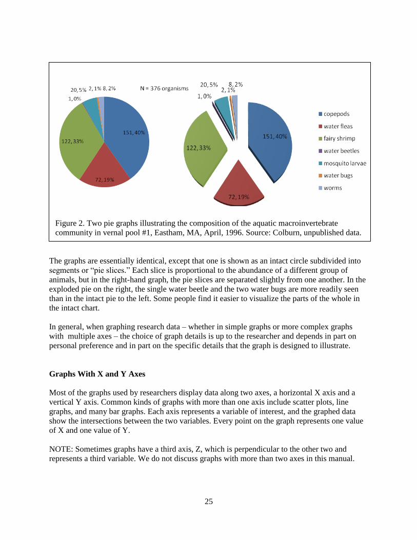
25
Figure 2. Two pie graphs illustrating the composition of the aquatic macroinvertebrate
community in vernal pool #1, Eastham, MA, April, 1996. Source: Colburn, unpublished data.
The graphs are essentially identical, except that one is shown as an intact circle subdivided into
segments or ―pie slices.‖ Each slice is proportional to the abundance of a different group of
animals, but in the right-hand graph, the pie slices are separated slightly from one another. In the
exploded pie on the right, the single water beetle and the two water bugs are more readily seen
than in the intact pie to the left. Some people find it easier to visualize the parts of the whole in
the intact chart.
In general, when graphing research data – whether in simple graphs or more complex graphs
with multiple axes – the choice of graph details is up to the researcher and depends in part on
personal preference and in part on the specific details that the graph is designed to illustrate.
Graphs With X and Y Axes
Most of the graphs used by researchers display data along two axes, a horizontal X axis and a
vertical Y axis. Common kinds of graphs with more than one axis include scatter plots, line
graphs, and many bar graphs. Each axis represents a variable of interest, and the graphed data
show the intersections between the two variables. Every point on the graph represents one value
of X and one value of Y.
NOTE: Sometimes graphs have a third axis, Z, which is perpendicular to the other two and
represents a third variable. We do not discuss graphs with more than two axes in this manual.
26
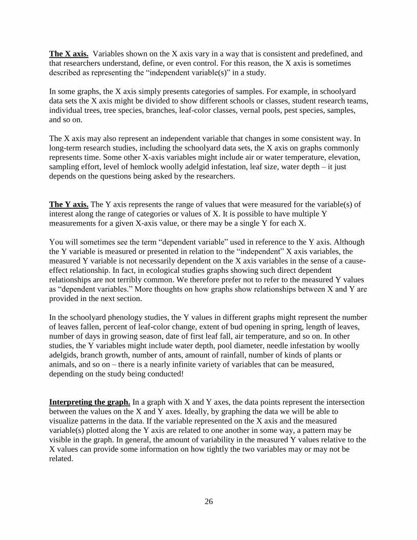
The X axis. Variables shown on the X axis vary in a way that is consistent and predefined, and
that researchers understand, define, or even control. For this reason, the X axis is sometimes
described as representing the ―independent variable(s)‖ in a study.
In some graphs, the X axis simply presents categories of samples. For example, in schoolyard
data sets the X axis might be divided to show different schools or classes, student research teams,
individual trees, tree species, branches, leaf-color classes, vernal pools, pest species, samples,
and so on.
The X axis may also represent an independent variable that changes in some consistent way. In
long-term research studies, including the schoolyard data sets, the X axis on graphs commonly
represents time. Some other X-axis variables might include air or water temperature, elevation,
sampling effort, level of hemlock woolly adelgid infestation, leaf size, water depth – it just
depends on the questions being asked by the researchers.
The Y axis. The Y axis represents the range of values that were measured for the variable(s) of
interest along the range of categories or values of X. It is possible to have multiple Y
measurements for a given X-axis value, or there may be a single Y for each X.
You will sometimes see the term ―dependent variable‖ used in reference to the Y axis. Although
the Y variable is measured or presented in relation to the ―independent‖ X axis variables, the
measured Y variable is not necessarily dependent on the X axis variables in the sense of a cause-
effect relationship. In fact, in ecological studies graphs showing such direct dependent
relationships are not terribly common. We therefore prefer not to refer to the measured Y values
as ―dependent variables.‖ More thoughts on how graphs show relationships between X and Y are
provided in the next section.
In the schoolyard phenology studies, the Y values in different graphs might represent the number
of leaves fallen, percent of leaf-color change, extent of bud opening in spring, length of leaves,
number of days in growing season, date of first leaf fall, air temperature, and so on. In other
studies, the Y variables might include water depth, pool diameter, needle infestation by woolly
adelgids, branch growth, number of ants, amount of rainfall, number of kinds of plants or
animals, and so on – there is a nearly infinite variety of variables that can be measured,
depending on the study being conducted!
Interpreting the graph. In a graph with X and Y axes, the data points represent the intersection
between the values on the X and Y axes. Ideally, by graphing the data we will be able to
visualize patterns in the data. If the variable represented on the X axis and the measured
variable(s) plotted along the Y axis are related to one another in some way, a pattern may be
visible in the graph. In general, the amount of variability in the measured Y values relative to the
X values can provide some information on how tightly the two variables may or may not be
related.

27
There are no hard and fast rules about how much information to show on a given graph.
However, consider the following.
1. Are there some logical or explainable relationships that justify putting different kinds of data
together in the graph?
2. Are there patterns you want to illustrate with the graph?
3. Will other people who look at the graph to be able to make sense of the information?
In addition, you should be sure that you are presenting all of the data so that the data can speak
for themselves.
There may be multiple values of Y for any X. For example, in a study of leaf-color change in
forest trees, on a given sampling date X there is a value for leaf color, Y, for each branch that is
sampled, and there is also a composite leaf-color value Y for each tree. A classroom could
choose to make a graph that shows all of the individual values, the composite value, or the
individual and composite values for each sampling date. The student research teams could also
graph the data for their individual branches. A similar choice is available when graphing leaf-fall
data – again, there is a measurement of leaf fall for each branch and a composite Y leaf-fall value
for the whole tree. If several branches or trees are sampled on each date, there are likely to be
multiple values for leaf color and/or leaf fall on at least some sample dates. Similar options are
available for research teams looking at water levels in different reaches of a study stream; groups
making multiple measurements of the depth, diameter, or temperature of a vernal pool; students
studying hemlock woolly adelgid infestation on different hemlock branches, and so on.
In some cases, the values on the Y axis are ―dependent‖ on the value on the X axis; that is,
changes in Y are caused by changes in X. The simplest examples are seen in the physical
sciences. For example, if you heat a container of water, the water temperature (the measured
variable, which would be plotted on the Y axis) would be caused by – and would vary in a
predictable way with – the amount of heat applied to the container (the independent variable,
which would be shown on the X axis).
In ecology, relationships between measured variables and the independent variables are usually
less clear. Often the X and Y variables may covary – that is, they both change in a consistent
way in relation to each other in response to some external factor(s) – but neither variable is
causing the changes in the other. It is often possible to test the strength of the relationship
between the variables statistically. One of the great challenges in designing ecological research
studies lies in trying to distinguish out cause-effect relationships.
In other cases, the Y values are ―independent‖ of the values on the X axis. For example, if the X
axis represents three different groups of students who are sampling leaf-color changes, and the Y
axis represents the percent of leaves that have changed color, the observed changes in leaf color
are not caused by differences in the students doing the sampling. (At least, we hope that is the
case!)

28
Scatter Diagrams or Scatter Plots
Scatter diagrams plot two sets of data against each other. The data can be related to each other,
or they can be independent. Scatter plots are useful if the data don’t occur at regular intervals or
if they don’t belong to a single series. For example, most of the schoolyard data we collect look
at changes in measured variables over time, with the sampling dates differing from one year to
the next, and with the intervals between sampling dates in each year not always constant. Scatter
plots allow the data to be graphed. Most of the graphs made through the hands-on exercises are
scatter plots.
Scatter plots are very useful because they let you look at all of the actual data you collected. It is
often possible to observe patterns and trends simply by looking at the way the data points are
distributed in the graph. Depending on the kinds of measurements being made, you can
sometimes connect the data points with a line to show the patterns in the data more clearly. This
can be particularly useful when you are making repeated measurements over a period of time,
because the lines connecting the data can help illustrate an overall trend – but it is important to
be sure that the gaps between sampling dates do not hide information that would make the trend
illustrated by the line incorrect.
Also, be sure not to confuse the patterns that may be illustrated by a line that connects data
points, and cause-effect relationships between the X and Y variables.
Scatter plot of age and size of trees on Wachusett Mountain. Figure 3 is a straightforward
example of a basic scatter plot. It presents some data from a study of the age of trees on
Wachusett Mountain in Central Massachusetts.
Dr. David Orwig measured 63 trees, cored their trunks, and counted the growth rings. The graph
plots the age thus determined against the tree diameter, and it uses different markers to
distinguish individuals of the different species sampled.
This graph shows quite a bit of information in a tidy package. We can see that there was not a
very large range of diameter in the study trees; that trees of the same diameter ranged in age
from almost 300 years to about 125 years; that the youngest tree sampled was a c. 100-year old
hemlock; that most of the trees were more than 150-years old (the analysis showed that 40% of
the trees were older than 200 years); and that hemlocks and red oaks span a wide range of ages,
while white pines show only about a 50-year variation in age.
Note that the units on the X axis represent the year when the tree started to grow, based on
subtraction of the number of growth rings from the current year. The axis title, ―Coring height
age,‖ also makes it clear that the age was determined from a core taken at a certain height
(identified in the report as close to the ground at a height of approximately 30 cm). A researcher
who counted growth rings in a stump cut off flush with the ground, or higher up the trunk, might
get a slightly different result.
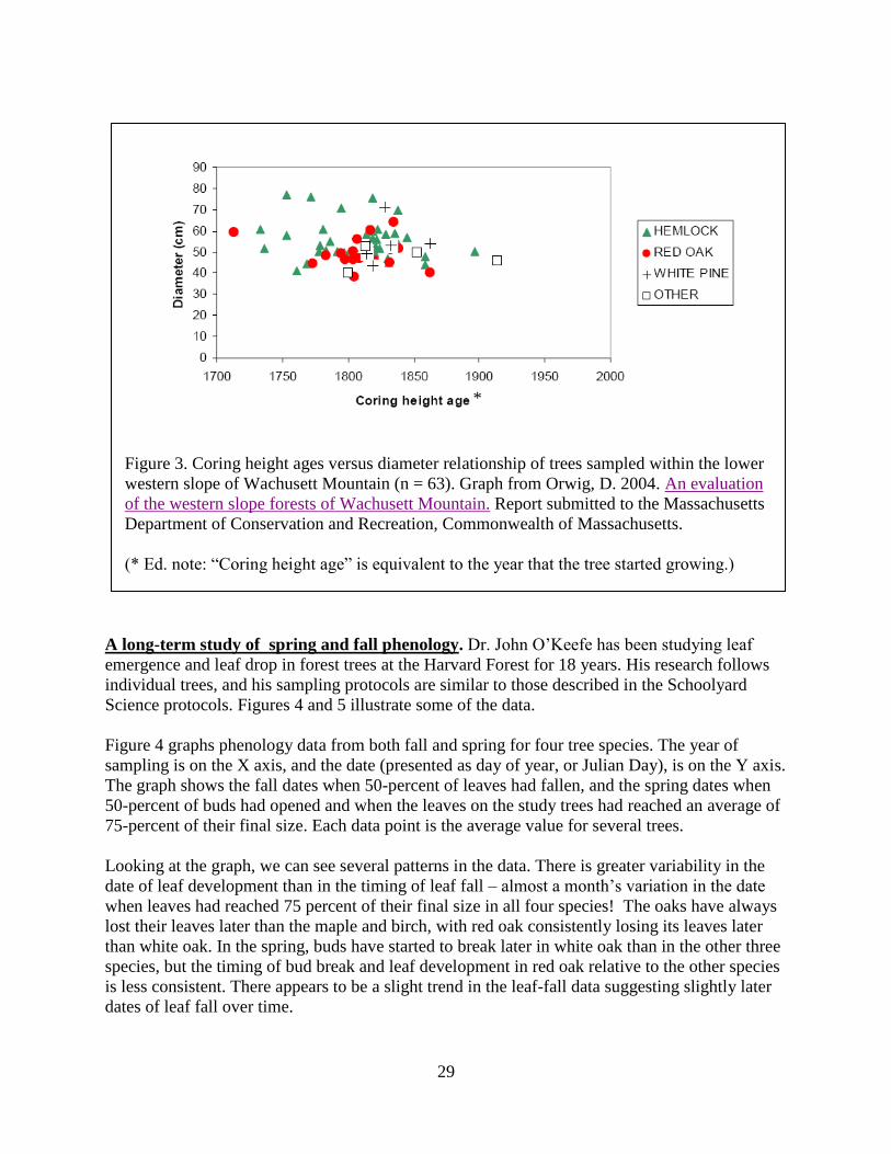
29
Figure 3. Coring height ages versus diameter relationship of trees sampled within the lower
western slope of Wachusett Mountain (n = 63). Graph from Orwig, D. 2004. An evaluation
of the western slope forests of Wachusett Mountain. Report submitted to the Massachusetts
Department of Conservation and Recreation, Commonwealth of Massachusetts.
(* Ed. note: ―Coring height age‖ is equivalent to the year that the tree started growing.)
A long-term study of spring and fall phenology. Dr. John O’Keefe has been studying leaf
emergence and leaf drop in forest trees at the Harvard Forest for 18 years. His research follows
individual trees, and his sampling protocols are similar to those described in the Schoolyard
Science protocols. Figures 4 and 5 illustrate some of the data.
Figure 4 graphs phenology data from both fall and spring for four tree species. The year of
sampling is on the X axis, and the date (presented as day of year, or Julian Day), is on the Y axis.
The graph shows the fall dates when 50-percent of leaves had fallen, and the spring dates when
50-percent of buds had opened and when the leaves on the study trees had reached an average of
75-percent of their final size. Each data point is the average value for several trees.
Looking at the graph, we can see several patterns in the data. There is greater variability in the
date of leaf development than in the timing of leaf fall – almost a month’s variation in the date
when leaves had reached 75 percent of their final size in all four species! The oaks have always
lost their leaves later than the maple and birch, with red oak consistently losing its leaves later
than white oak. In the spring, buds have started to break later in white oak than in the other three
species, but the timing of bud break and leaf development in red oak relative to the other species
is less consistent. There appears to be a slight trend in the leaf-fall data suggesting slightly later
dates of leaf fall over time.
*

30
Environmental information and the results of phenology measurements are plotted together in
Figure 5. This allows leaf-fall data (the pink line) to be looked at in relation to the date when the
first frost occurred each year (dark blue line). The graph differs from Figure 4 in that, instead of
representing leaf fall in a single tree or a single species, the data are an average of all of the trees
studied continuously over time. The graph also shows a five-year running average for the day of
the year on which half of the leaves had fallen from the study trees (the yellow line). The running
average helps to smooth out some of the year-to-year variation, and it can be helpful in
evaluating whether there is a trend in the data toward earlier or later leaf fall. In this graph, the
running average appears to show a general tilt upward from left to right. When Dr. O’Keefe
carried out statistical analyses of the yearly data for leaf fall and date of first frost, the results
indicated that there was a trend toward a later leaf drop of about five days over the course of the
study.
Fall: ______
Date of 50% leaf drop
Spring:
- - - - Date of 75% leaf
development
______ Date of 50% bud break
Figure 4. Patterns of spring leaf emergence and autumn leaf fall in four tree species
at the Harvard Forest, Petersham, MA, USA, 1991-2006. Data points represent the
mean of measurements from multiple individuals of each species: A. rubrum, N = 5;
Q. rubra, N = 4; Q. alba, N = 3; B. alleghaniensis, N = 3. Graph courtesy of John
O’Keefe, Harvard Forest.

31
Notice that in both of these graphs, the measured variable represented on the Y axis is the date
when a certain environmental or phenological event occurred, presented as Day of the Year
(Julian Date). This is in contrast to many of the graphs of schoolyard data for leaf fall and leaf-
color change, in which the date is on the X axis as the independent variable.
Note: These graphs and some of the associated data, as well as additional information on the
broader phenology research project, can be viewed on the Harvard Forest website:
http://harvardforest.fas.harvard.edu/asp/hf/symposium/showsymposium.html?id=179&year=200
6. A poster on this research, with additional graphs and explanations, can be found through
http://harvardforest.fas.harvard.edu/museum/data/k12/presentations.html.
Figure 6. Air temperature and stream discharge for upper Bigelow Brook, Harvard Forest, Mar
10 – Aug 7, 2008.
Variations in stream discharge over time. Dr. Emery Boose is investigating the hydrology of a
small watershed at the Harvard Forest. This research includes a long-term study of discharge in
Bigelow Brook, a small headwater stream, in relation to local weather, long-term climate
patterns, and forest ecology. Automatic data recorders collect data at 15-minute intervals. Figure
6 shows variations in streamflow and air temperature from mid-March through the first week in
August, 2008. Figure 7 shows a small subset of the stream discharge data from July 13-18, along
with data on solar radiation, air temperature, and soil temperature.
Year
Day
of
Yea
r (J
uli
an D
ate)
Figure 5. Long-term pattern of leaf fall in trees studied at Harvard Forest, Petersham, MA,
1991-2005. 1st frost = date when first frost of the year was recorded at the Harvard Forest
meteorological station. 50 % fall = date when half of monitored leaves had fallen from
study trees. 5yr avg fall = date when half of monitored leaves had fallen from study trees,
averaged over the five-year period preceding and including the study year. Graph courtesy of
John O’Keefe, Harvard Forest.

32
The upper part of Figure 6 shows daily temperature fluctuations and the gradual trend of
increasing temperatures from early spring to mid-summer. The lower part of Figure 6 presents
stream discharge at the stream gauge on upper Bigelow Brook for the same time period. We can
see that the base flow remains relatively constant at around 10 liters per second from March 10
to the middle of April, with occasional short-term increases in response to snowmelt and
precipitation events (not shown on this graph), and then starts to decline around day 100 (April
9). The spring decline in base flow occurs at the same time that air temperatures go above
freezing, a point when we know, from other research, that hemlock trees start photosynthesis.
The forest is thus starting to withdraw more water from the soils, and less groundwater makes its
way underground to the stream channel.
Air Temperature
-20
0
20
40
70 80 90 100 110 120 130 140 150 160 170 180 190 200 210 220
Te
mp
era
ture
(C
)
Stream Discharge
0
1
10
100
1000
70 80 90 100 110 120 130 140 150 160 170 180 190 200 210 220
Julian Date 2008
Dis
ch
arg
e (
l/s
)
Figure 6. Stream discharge and air temperature at Upper Bigelow Brook, Harvard Forest,
Petersham, MA, March 10 - August 7, 2008. Graph courtesy of Emery Boose.
Two other things should be noted on the graph. First, there are measurable daily fluctuations in
flow, associated with the forest actively removing water by evaporation and transpiration.
Second, the flow in this stream varies nearly a thousand-fold from the minimum to the maximum
recorded, and the Y axis is shown on a logarithmic scale so that the patterns in low-flow
discharge can be seen.
70 80 90 100 110 120 130 140 150 160 170 180 190 200 210 220
Julian Date 2008 Stream Discharge
Julian Date 2008
Te
mp
erat
ure
(C
) 40
20 0 -20
Dis
char
ge (
l/s)

33
This graph is a typical example of how researchers can present long-term data on environmental
variation over time. It also illustrates how the scale of the Y-axis may need to be varied to show
certain kinds of data.
In Figure 7, five days of data are graphed in greater detail than in Figure 6. Stream discharge is
shown in red, along with solar radiation (black), air temperature (blue), and soil temperature
(green). Data are collected at 15-minute intervals. We see the daily patterns of temperature
increasing and decreasing, the sunlight rising to a peak at midday and setting to a dark night, and
streamflow increasing and decreasing in response to withdrawals by the forest and evaporation
and to inputs of rainfall. We also see that the peaks of the different measured variables occur at
different times of day. Note that solar radiation is decreased on day 196 (July 14), indicating a
cloudy day. Temperatures are correspondingly depressed, with a greater effect in air than in soil.
In contrast, stream discharge is higher on day 196 because (1) forest trees photosynthesize less
under cloudy conditions, and hence they withdraw less water from the ground, (2) evaporation is
lower due to the lower sunlight and lower temperatures, and, most importantly, (3) rainfall (not
shown here) caused an initial increase in discharge followed by a higher-than-usual minimum
daily flow, as the rain that had fallen gradually made its way to the stream.
.
Figure 7. Relationships among solar radiation, air temperature, soil temperature, and stream
discharge in upper Bigelow Brook, Harvard Forest, Petersham, MA, over five days in July,
2008. Graph courtesy of Emery Boose.
Re
lative v
alu
e o
f m
easu
red
va
ria
ble
o solar radiation
o stream discharge
o air temperature
o soil temperature

34
Note that the Y axis on this graph does not show units of measurement; it simply reflects relative
scales for each of the four measured variables. A final version of the graph would provide axis
scales for the different parameters shown.
Complex data such as those shown in this graph, along with information on precipitation,
humidity, evaporation, and a host of other factors, are analyzed statistically by computer
programs, but graphs are very useful in explaining the relationships among the many variables
that influence discharge in forest streams.
Line Graphs
Strictly speaking, line graphs are used to illustrate trends. Scientists often use mathematical
equations to ―fit‖ a line to data, and they can then use statistical tests to figure out how close the
data actually are to the line. This can be useful in figuring out whether the X and Y variables are
related to each other. As noted above, though, you can connect data points together with a line to
illustrate patterns in your data. Just be careful that the lines are not suggesting trends or causal
relationships that are not really clear from the data (as illustrated in Figure 1a), and be careful as
well not to infer causal relationships when the data do not allow you to draw those conclusions.
Bar Graphs
Bar graphs or bar charts are typically used to compare different values or amounts to one
another. You might use a bar graph to compare the date of leaf fall for different trees, to compare
leaf-fall dates for a single tree over time, to describe water levels in water bodies, or to display
the abundance of hemlock wooly adelgids. Several examples of bar graphs of schoolyard
science data are presented in Chapter 5. Bar graphs come in a variety of formats.
Aquatic macroinvertebrates in a vernal pool on different dates. Figures 8 and 9 use stacked
bar graphs to compare the macroinvertebrate community composition of a vernal pool in April,
shown above in Figure 2, with the community observed two months later, in June. Both figures
start with the same data set, but Figure 8 uses the raw numbers of animals collected, and Figure 9
transforms the results into a percent of the total sample.
Although the same data are used in both graphs, the information we obtain from the two graphs
is somewhat different. The bars in Figure 8 emphasize the decline in the number of animals
collected – the June sample numbers were much lower than in April. The composition of the
community also changed, but the details of this change are somewhat difficult to see in Figure 8.
The changes in the proportions of the different taxa are shown more clearly when the data are
graphed as a percent of the total population, as in Figure 9. The crustaceans that dominated the
pool in early spring were mostly absent in June. Aquatic insects made up the majority of the
animals present in the June sample. Water bugs, dragonflies, and damselflies, which were rare or
absent in April, had become an important part of the aquatic community in June.

35
Figure 8. Stacked bar graphs comparing numbers of aquatic macroinvertebrates collected in
vernal pool #1 in April and June, 1996. Source: Colburn, unpublished data.
Figure 9. Stacked bar graphs showing percent composition of the macroinvertebrate
community in vernal pool #1 in April and June, 1996. April: N = 376. June: N = 68. Source:
Colburn, unpublished data.
N = 68
N = 376

36
Figure 10 presents another bar graph of the same data, using the raw numbers as in Figure 8. In
this graph, the different kinds of invertebrates are ranged along the X axis, and the numbers of
individuals collected in the two sample months are stacked in a single column. The data could
also be presented with the data for the two months side-by-side, in separate bars for each
invertebrate group.
This graph illustrates the decrease in the overall numbers of individuals from April to June, the
disappearance of the early spring crustaceans, and the shift to a community dominated by aquatic
insects. It provides a more dynamic sense of the changes that occurred over time in the pool over
the study period. Unlike Figure 8, this graph makes it easy to follow the changes in relative
abundance of all of the invertebrate taxa over the study period.
Figure 10. Stacked bar graphs showing the taxonomic composition of the aquatic
macroinvertebrate community in vernal pool #1 in April and June, 1996. April: N = 376,
June: N = 68. Source: Colburn, unpublished data.
These examples show how you can sometimes extract different kinds of information from a data
set, simply by varying the way you graph the data and by changing the units you use for the
results. As you and your students work with data collected in schoolyard science projects, you
should feel free to experiment with different options for graphing the results, so that you get a
feeling for the kinds of information that may be revealed as you present the data in various ways.

37
4. Preparing Data For Graphing
Chapter Overview:
This chapter covers
Steps involved in getting data ready to be graphed
Selecting data for analysis
Sorting and manipulating data
Converting leaf-fall data to a percent
Extracting tree-species data
Extracting data on first and last dates of leaf fall
Once scientists have collected data in the field or laboratory and entered them into a spreadsheet
or data base, the next step involves looking at the data. First, researchers organize and check
their data to identify errors or problems associated with sampling methodology, field conditions
during sampling, record keeping, or data entry. Then, often, they graph the data to obtain a quick
overview of the results.
In this chapter, the focus is on the steps involved in getting data ready for graphing. We start
with general information that applies to preparing data in general. The focus then moves to more
detailed examples illustrating each of the steps involved. We describe sorting the data and
converting the raw field data into a form that is suitable for graphing. We also give an example
to show how additional data can sometimes be extracted from a data set.
Steps Involved in Organizing and Graphing Data
Usually, before a graph can be created from research data, the original data (as in Tables 1-3 in
Chapter 3) need to be converted into a form that is readily recognized by the computer graphing
program. This tends to be the case for graphing generally, no matter what graphing software is
being used. It is also true even if the graph is being prepared by hand or by a computer program.
Much of the time involved in making graphs from research data is taken up with getting the data
into an appropriate format for the computer.
Getting data organized into a format that the computer can turn into a graph usually involves
several steps. These may include:
selecting the data of interest from a data set,
copying the data into spreadsheets or other formats that allow them to be worked with
easily,
manipulating the data to make the results clearer (for example, sometimes it is preferable
to present results as percentages than as raw numbers),

38
organizing the data into categories that lend themselves to graphing,
lining up columns of data in an order that the computer can work with – this step is often
specific to different graphing programs, and usually the instructions will specify the way
data need to be organized,
choosing the type of graph you want to make,
formatting the graph, and
making final adjustments.
The examples in the rest of this chapter address the steps involved in preparing data for graphing.
We use examples of leaf-fall data collected by Judy Miller’s classes at Athol-Royalston Middle
School in Athol, MA, a portion of which is presented in the tables on pages 14 and 17. The full
data set provides data for eleven trees and includes four years of results.
Sorting and Evaluating Data
Data in spreadsheets and data bases are arranged in a variety of ways. Usually, scientists need to
rearrange the data before they can carry out analyses of the results. This is the case for statistical
analyses, graphing data, and other approaches to data assessment.
In the phenology data sets, data are presented chronologically for each sampling date in each
year, with all trees listed by date (see Table 2, on page 17). However, if we want to prepare a
graph of the data to illustrate the progress of leaf fall in individual trees, we need to do some
manipulations and rearrangements of the file, so that the computer will make the appropriate
graph.
Such data preparation is required for most graphics programs, and also is generally necessary for
statistical analysis of the data.
Sorting Data
It is easy to sort data in most computerized spreadsheets. You select the set of data you want to
work with, tell the computer what variables to sort by, and in what order, and instruct the
computer to sort the data. If your data set is small, you can also sort it by hand, but this is a much
more cumbersome process.
We recommend that you keep the original data set intact when sorting, and that you copy the file
onto a second worksheet or table. You can perform different kinds of manipulations on the copy
without a risk of losing any of the original data.
To begin with, we are going to rearrange the phenology data so that all the results from each tree
(or each branch or other measured entity, depending on the specific data you are looking at) will
be together. Each tree’s data will be organized by date. Thus, the computer is instructed to sort
the data first by Tree ID and then by Date. The same basic procedures are followed when sorting
spring bud-burst data, fall color-change data, and other kinds of data sets.
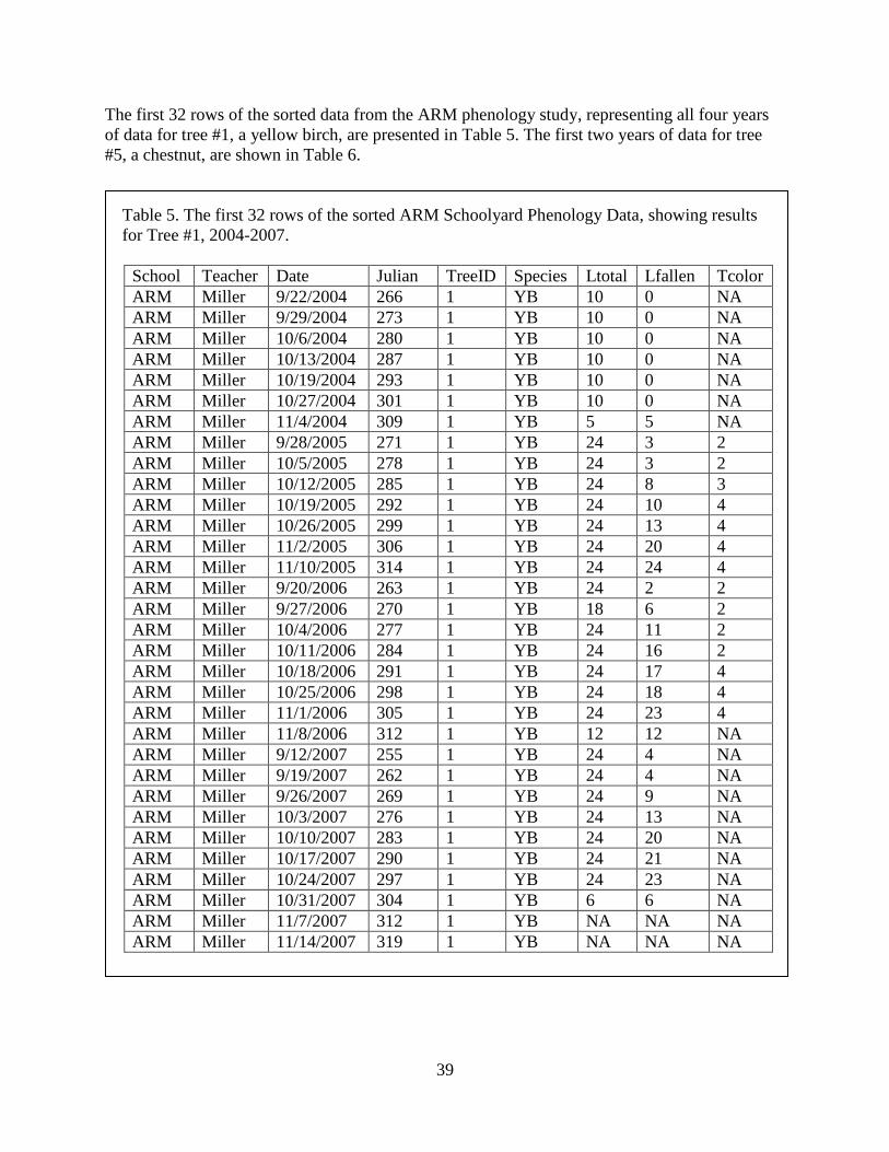
39
The first 32 rows of the sorted data from the ARM phenology study, representing all four years
of data for tree #1, a yellow birch, are presented in Table 5. The first two years of data for tree
#5, a chestnut, are shown in Table 6.
Table 5. The first 32 rows of the sorted ARM Schoolyard Phenology Data, showing results
for Tree #1, 2004-2007.
School Teacher Date Julian TreeID Species Ltotal Lfallen Tcolor
ARM Miller 9/22/2004 266 1 YB 10 0 NA
ARM Miller 9/29/2004 273 1 YB 10 0 NA
ARM Miller 10/6/2004 280 1 YB 10 0 NA
ARM Miller 10/13/2004 287 1 YB 10 0 NA
ARM Miller 10/19/2004 293 1 YB 10 0 NA
ARM Miller 10/27/2004 301 1 YB 10 0 NA
ARM Miller 11/4/2004 309 1 YB 5 5 NA
ARM Miller 9/28/2005 271 1 YB 24 3 2
ARM Miller 10/5/2005 278 1 YB 24 3 2
ARM Miller 10/12/2005 285 1 YB 24 8 3
ARM Miller 10/19/2005 292 1 YB 24 10 4
ARM Miller 10/26/2005 299 1 YB 24 13 4
ARM Miller 11/2/2005 306 1 YB 24 20 4
ARM Miller 11/10/2005 314 1 YB 24 24 4
ARM Miller 9/20/2006 263 1 YB 24 2 2
ARM Miller 9/27/2006 270 1 YB 18 6 2
ARM Miller 10/4/2006 277 1 YB 24 11 2
ARM Miller 10/11/2006 284 1 YB 24 16 2
ARM Miller 10/18/2006 291 1 YB 24 17 4
ARM Miller 10/25/2006 298 1 YB 24 18 4
ARM Miller 11/1/2006 305 1 YB 24 23 4
ARM Miller 11/8/2006 312 1 YB 12 12 NA
ARM Miller 9/12/2007 255 1 YB 24 4 NA
ARM Miller 9/19/2007 262 1 YB 24 4 NA
ARM Miller 9/26/2007 269 1 YB 24 9 NA
ARM Miller 10/3/2007 276 1 YB 24 13 NA
ARM Miller 10/10/2007 283 1 YB 24 20 NA
ARM Miller 10/17/2007 290 1 YB 24 21 NA
ARM Miller 10/24/2007 297 1 YB 24 23 NA
ARM Miller 10/31/2007 304 1 YB 6 6 NA
ARM Miller 11/7/2007 312 1 YB NA NA NA
ARM Miller 11/14/2007 319 1 YB NA NA NA

40
Table 6. Leaf-fall data for Tree #5 in ARM Schoolyard Phenology Study, 2004 and 2005.
School Teacher Date Julian TreeID Species Ltotal Lfallen Tcolor
ARM Miller 9/22/2004 266 5 CH 10 0 NA
ARM Miller 9/29/2004 273 5 CH 10 0 NA
ARM Miller 10/6/2004 280 5 CH 10 0 NA
ARM Miller 10/13/2004 287 5 CH 10 0 NA
ARM Miller 10/19/2004 293 5 CH 10 1 NA
ARM Miller 10/26/2004 300 5 CH 10 8 NA
ARM Miller 10/27/2004 301 5 CH 5 4 NA
ARM Miller 11/5/2004 310 5 CH 10 10 NA
ARM Miller 9/28/2005 271 5 CH 24 0 1
ARM Miller 10/5/2005 278 5 CH 24 0 1
ARM Miller 10/12/2005 285 5 CH 24 0 2
ARM Miller 10/19/2005 292 5 CH 24 4 3
ARM Miller 10/26/2005 299 5 CH 24 12 4
ARM Miller 11/2/2005 306 5 CH 24 19 4
ARM Miller 11/10/2005 314 5 CH 24 19 4
ARM Miller 11/16/2005 320 5 CH 24 24 4
NOTE: Depending on the data set you are working with, you may find it easier to sort the data
set more than once. For example, first you might want to use Date as the primary sort variable,
and look at the results to see if there are issues with repeat samples in the same week, missing
results, or other potential problems associated with sampling dates. Then sort the data set again
using TreeID as the primary sort variable. Every data set is different, so sort based on the kinds
of information in the data and the kinds of information you need to check.
Removing Rows and Columns with Missing Data
Once the data have been sorted, we need to examine the data set to identify features of the data
that may need to be addressed before we can graph the results, and to get a sense of ways that the
data might be graphed. In particular, we will look for missing data, indicating rows or columns
that need to be removed, and inconsistencies in the data.
Data are missing in several rows of the data set; these rows need to be removed. In Table 5, we
see that no data on leaf-fall or leaf color are available for Tree YB #1 on the November, 2007
sampling dates (missing data are entered as NA). Each row that has missing data in one or more
cells should be removed from the data set.
Also, in this data set, leaf-color data are available only for 2005 and 2006. We will not be
looking further at leaf-color data in this manual, so we will remove the Tcolor column.

41
NOTE: If you prefer, you can remove unwanted columns and rows before sorting the data set.
When you carry out these actions is totally up to you and may vary, depending on the
characteristics of each data set you are working with. The idea is, simply, to make life easier by
eliminating information that is not needed, and removing excess clutter from your working area.
Evaluating Data for Needed Adjustments
Once missing or unwanted data have been removed from the working data set, the remaining
data need to be examined to see if there are any adjustments, standardizations, or transformations
that may be necessary, appropriate, or useful in analyzing the results. A researcher is likely to
look at the data to see if any potential problems are evident, and to determine if any
manipulations are needed. This might involve:
(1) checking all of the columns and rows to be sure there aren’t any strange results that need
to be examined more carefully, or that might require some adjustments in the data.
Sorting often lets you identify errors in data entry, or to find missing data that need to be
removed before the data set is analyzed, and
(2) for the leaf-fall results, looking at data for individual trees, and also data for each year.
Depending on the results of the examination, the data may need to be adjusted. It is beyond the
scope of this manual to go through all of the kinds of standardizations, manipulations, and
transformations that may be appropriate for different kinds of data. Instead, we look at some
changes that are appropriate for the sample data set and use them as illustrations of the way you
might want to think about your data.
Some of the kinds of adjustments that might be needed could include consolidating samples
collected on different days in the same week, addressing inconsistencies in numbers of leaves
sampled from one week to the next, accounting for missing data, and dealing with data that do
not make sense (for example, a result that says that some previously fallen leaves on a branch are
back on a later sampling date! – see Figure 17 on page 52).
In the sample ARM data set, observe the following potential problems.
Adjusting for uneven sampling effort. The leaf-fall data are not comparable across sampling
dates (examples are evident in Tables 5 and 6).
For some trees studied in 2004, there are 5 samples for some dates and 10 samples for others.
For all trees, more leaves were studied in years after 2004 than in the first year.
Because the numbers are not comparable across dates within years, or between years, using the
raw numbers for comparisons of the data through graphing will be a problem.
42
The best way to deal with this problem is to convert the data for Lfallen to percentages before
they can be graphed, to account for the fact that different numbers of leaves were examined on
different dates. The easiest way to do this is to use your spreadsheet program to calculate a
percent from the raw leaf-fall numbers. The basic formula for the calculation is:
Lfallen / Ltotal x 100 = percent of all leaves that have fallen.
Adjusting for inconsistencies in sampling. As we look at the sample data, we see that not all
trees were sampled on the same dates, and not all branches on each tree were sampled at the
same time. We may need to adjust how data are presented to reflect these inconsistencies.
In the ARM data set, most samples were collected on one day in each week, but in a few cases a
particular tree was sampled on two successive days. For instance, CH5 was sampled on 10/26
and 10/27 in 2004 (Table 6). Not only were the dates different, but also different numbers of
leaves were sampled on those dates (and, in fact, different branches were sampled by different
classes). In some weeks, certain trees were sampled on one date and others on a second date.
For some kinds of computer-generated graphs, all of the study variables need to be sampled at
the same time, or the graphing program will not plot the data correctly. Other kinds of graphs can
plot every data point on its specific sampling date. Another option is to plot all the data for
different trees or branches together by week, rather than day of sampling. This might be a good
solution if you want to compare among trees, but the trees were sampled on different days of the
week.
If you want to graph the ARM data set, you will need to consider whether you want to graph a
single record or both data points for any tree that was sampled more than once in a given week.
A very good way to handle this problem is to have separate graphs for the data collected by the
different research teams – even if they are sampling the same tree. The graphs can be plotted
next to each other on the same axes, or they can be plotted as two completely separate graphs. (In
the case of chestnut tree #5, the same proportion of leaves had fallen on the two back-to-back
sampling dates, so the interpretation of the data is not as problematic as it would have been if the
results of the two dates’ sampling were not the same!).
NOTE: Designing a research project so that sampling will be consistent over time is a great
challenge. Whenever you are collecting data over time, if the individuals monitored or the
numbers of samples taken were not the same on the different dates, there may be problems with
interpreting the data. Unforeseen problems in study design that result in inconsistent sampling
need to be addressed early on, so that the data will be suitable for analysis and interpretation. In
schoolyard science projects, though, practical and logistical issues sometimes result in sampling
issues such as those noted here – these just need to be recognized and dealt with when working
with the data. Sometimes, you can make use of the differences to obtain some interesting
information that will be valuable for teaching about science. For example, if different classes are
looking at leaves on different branches on the same tree, they can graph the data for each branch
to see how much variability there is between branches.

43
Extracting Additional Information From the Data
A final exercise that can be productive, once initial data evaluation is complete, is to look at the
data to see if there is more information that can be extracted.
The data on leaf fall recorded in this data set represent only some of the information available
from the ARM schoolyard phenology study. As noted in the discussion of data in Chapter 3,
additional information may be found in the Metadata that describe the data set, as well as in the
individual sets of data collected by student research teams. But, even without those sources,
additional information can also be obtained by careful examination of the data presented here.
We have seen that this data set presents results from eleven trees representing six different
species. It might be interesting to graph how the sampling is distributed across species. Table 7
summarizes the species that were sampled in the ARM Schoolyard Phenology project, and the
number of individuals of each species. Three examples of graphs of these data are shown in
Figure 11, on page 47.
Table 7. Breakdown of sampled trees by species, ARM Schoolyard Phenology Study, 2004-
2007.
Tree Species
Beech
Number of Trees
2
Chestnut 2
Hawthorn 1
Red maple 4
Witch Hazel 1
Yellow Birch 1
Looking at these results, you might want to consider whether the distribution of samples parallels
the relative abundance of the different tree species in the schoolyard or neighborhood. Or, if
more trees were to be added to the study, you might want to consider adding a second individual
of species currently represented by only one tree, so that students could look at variation within
the different species. Many other possible questions probably come to mind as you look at this
information.
There are also different ways to look at leaf fall. The chronological data set shows the gradual
progress of trees losing their leaves over the sampling period. It might also be useful to extract
from the data set the dates when the first leaves were observed to fall from each tree (or branch),
and/or the dates when all leaves had fallen. Table 8 shows these data for tree #1; similar data can
readily be extracted for the other 10 trees in the sampled population. Two examples of graphs
created from these data are shown in Figure 13 and Figure 14, on page 49.

44
Table 8. Data Table for first and last leaf-fall dates for tree YB1, 2004-2007. Dates presented
as Julian Day.
Year First leaf fall 100% Fallen
2004 309 309
2005 271 314
2006 263 312
2007 255 304
Overall, depending on the data being collected in a particular research study, a variety of other
reorganizations of information may be possible. The additional information can often provide
new insights into the results of your study.

45
Chapter 5. Graphs of Schoolyard Data
Chapter Overview:
This chapter presents sample graphs of Schoolyard Ecology Data:
Phenology
Tree species in a sample population
Leaf fall in a tree over time
Dates of first and last leaf fall in a tree
Leaf fall in multiple trees
HWA
Egg production on three hemlock trees
Water in the Landscape
Water depth in a stream
Water level and diameter in vernal pools
This chapter gives examples of graphs that we created using data submitted by teachers
participating in Harvard Forest’s schoolyard ecology program. The data used in all of the graphs
can be downloaded from the Harvard Forest websites for the different research protocols and
data (http://harvardforest.fas.harvard.edu/museum/schoolyard.html), as can additional data sets
from other participating classrooms.
Most of the graphing examples shown here illustrate data from fall phenology studies. A few
examples are also presented at the end of the chapter from schoolyard studies of hemlock woolly
adelgid and water in the landscape. You can create similar graphs from your own data, regardless
of the study system, if the data are appropriate for illustration in the chosen graph format. Note,
too, that other graphing options for schoolyard ecology data are available – the examples shown
here only illustrate some potential options.
You should feel free to experiment with graphing your classroom data in many different ways.
Look at how different graphing approaches yield different insights into the research questions.
And, think about what graphing formats are most effective in showing your results to others.

46
Phenology
A variety of options for graphing fall phenology data are shown. All use the schoolyard data set
from Athol-Royalston Middle School, the ARM data set discussed in Chapter 4. Instructions for
downloading this data set are included in the accompanying hands-on exercises. The hands-on
exercises also provide specific instructions for creating several of these graphs. Similar graphs
can be made for many of the data collected for spring phenology and for other schoolyard
ecology protocols.
Tree Species in a Sample Population
The first three examples show how the trees being sampled in the ARM schoolyard study of leaf-
fall phenology vary by species. The tree-species data extracted from the larger data set and
shown in Table 7 (p. 43) are displayed in a pie graph, a stacked bar graph, and a bar graph of the
individual species data (Figure 11).
The pie graph in Figure 11a and the stacked bar graph in Figure 11b both show the proportions
of the tree species as part of the whole study population. If your classes are studying 20 trees
between them, and if the trees are divided among more than one species, you can make a stacked
bar graph or a pie graph that shows how the total population of study trees is divided up, in terms
of species composition.
Usually, a pie graph would be preferred over a stacked bar graph for this kind of presentation.
The stacked bar graph would be more appropriate for a graph comparing how sampled tree
species varied from one year to the next, if the class was looking at different population of trees
each year, or for a comparison of the species of trees sampled by students in different schools –
where, probably, the species sampled and their proportions would differ.
The bar graph in Figure 30c presents the same set of data on tree species, but it shows the
number of trees for each species separately.
Presenting the data in this format emphasizes that red maple is the most heavily sampled tree in
the study. It also makes it very evident that there is only one individual of yellow birch, witch
hazel, and hawthorn in the sample. A graph such as this might be useful if a teacher was thinking
about adding more trees to a study, because it suggests that having more individuals of poorly
represented species might provide information on within-species variability. Or, it might suggest
which species could lose an individual, if it is found necessary to scale down the study for any
reason. On the other hand, it might be desirable to combine the information in this graph with
separate information on the relative abundance of the different species in the neighborhood of the
schoolyard. If the study is trying to obtain an overview of phenology that reflects the local forest,
and if red maples represent 90 percent of the local trees, then this species is under-represented in
the sample, even though it is the most heavily sampled species.

47
Figure 11. Three ways to graph the species of trees sampled in a schoolyard phenology study,
Athol-Royalston Middle School. a. Pie graph. b. Stacked bar graph. (Species codes as in a.)
c. Bar graph.
c.
a. b.
c.

48
Leaf Fall in One Tree Over Time
Figure 12 shows four years of leaf-fall data for a single tree, a yellow birch (tree #1 in the
samples; see data in Table 5, p. 39). From this graph, we can see that in 2004, all of the leaves
fell in one week, between the sampling in the last week of October and the first week in
November. In subsequent years, leaves fell from the tree over the course of more than a month.
If we go to the ARM data set and look at the data for tree YB1 in 2004, we see that only half of
the leaves that were observed during most of the study were sampled on November 4, and that all
of them had fallen on that date. Note that we do not have information on whether all of the leaves
that had been being studied had fallen by November 4! Therefore, it is difficult to draw any
conclusions about what might have been happening on that date. It might be a good idea to
include a note on the graph indicating that some data were missing for November 4, 2004.
Figure 12. Leaf fall over four years in one tree studied by the ARM Schoolyard Phenology
Project.
Dates of First and Last Leaf-fall
Figures 13 and 14 show two ways of comparing the first and last dates when leaves were
observed to fall from Yellow Birch #1 during the four years of the study, using the data
presented in Table 8 (p. 43). Note that in Figure 13, Julian Day has been converted to Date.
In both graphs, it is easy to see how the dates when the students observed the first fallen leaves
became earlier each year over the four years for which data are available. The similar but less

49
consistent trend in the date of last leaf fall is also visible. Note how the date of first leaf fall
occurred earlier in each year of the study. Is there a similar trend in the date of last leaf-fall?
Figure 13. First and Last Dates of Leaf Fall in Yellow Birch #1, 2004-2007.
Figure 14. First and last dates of leaf fall in Yellow Birch #1, 2004-2007.
8/27
9/6
9/16
9/26
10/6
10/16
10/26
11/5
11/15
2004 2005 2006 2007
Yea r
Da
te
F irs t leaf fall
100% F allen
Day
of
Year
(Ju
lian
Day
)
Year

50
This result might seem a bit surprising in the context of a study about climate change and
potential effects of global warming on the growing season. It could provide an opportunity for
examination of local weather data for the study years, classroom discussions of short-term and
long-term trends, and consideration of the importance of looking at more than one source of
information. For example, do all eleven trees in the study show this same pattern of earlier leaf-
drop? What if more leaves had been studied on each tree?
Leaves Remaining Over Time
Figure 15 presents leaf-fall data in a slightly different way. Instead of following leaves that fall,
it tracks the leaves that remain on a hawthorn, HA11, during the sampling period in 2005. The
data are the inverse of the data used in Figures 2, 3, and 5; that is, they represent 100% of
sampled leaves minus % Fallen.
How does the information presented, and the interpretation of the information, change if the data
are presented in this way, rather than in terms of percent of leaves fallen?
Figure 15. Time course of leaf fall in a hawthorn, HA11, in 2005. Data from Athol-Royalston
Middle School Schoolyard Science Program.

51
Leaf-Fall in Multiple Trees
Figure 16 graphs leaf-fall results from seven trees sampled by students at the Athol-Royalston
Middle School in 2004, as well as the progression of leaf fall in the same trees, plus four others,
in 2005.
Figure 16. Progression of autumn leaf fall in trees studied by students at Athol-Royalston
Middle School, Athol, MA. Seven trees were surveyed in fall, 2004, and the same trees plus
four more were examined in 2005. Tree species codes: YB = yellow birch, RM = red maple,
WH = witch hazel, CH = chestnut, BE = beech, HA = hawthorn
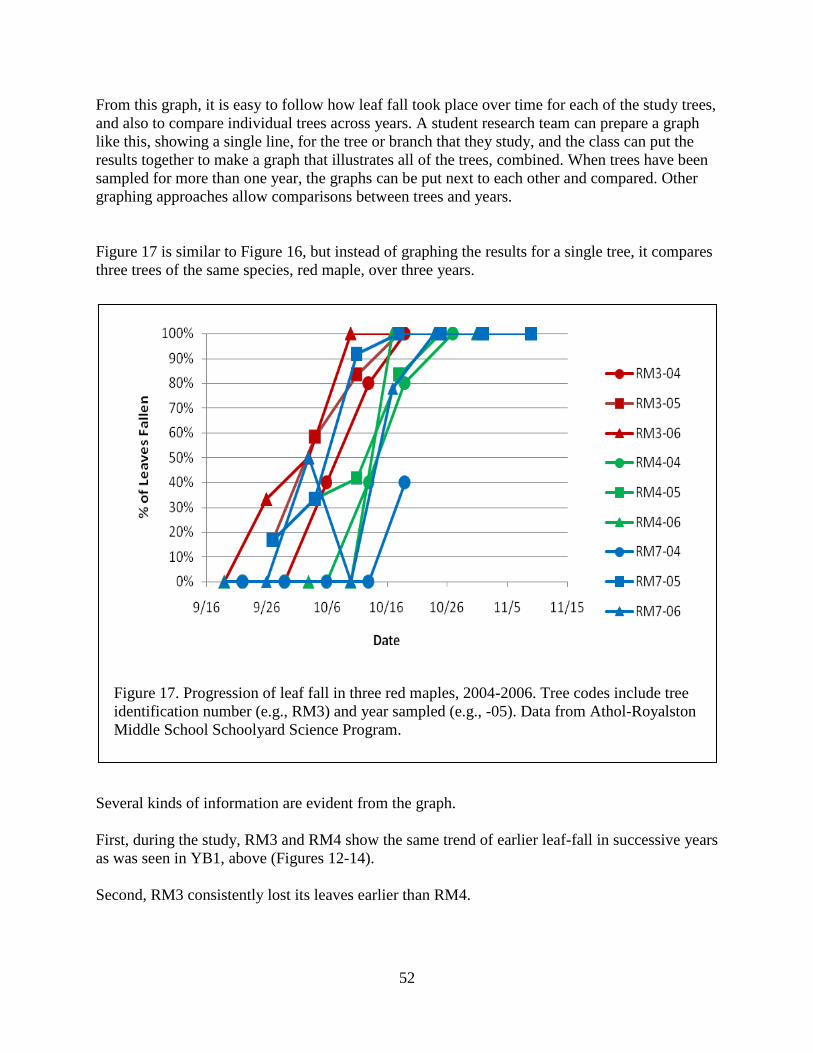
52
From this graph, it is easy to follow how leaf fall took place over time for each of the study trees,
and also to compare individual trees across years. A student research team can prepare a graph
like this, showing a single line, for the tree or branch that they study, and the class can put the
results together to make a graph that illustrates all of the trees, combined. When trees have been
sampled for more than one year, the graphs can be put next to each other and compared. Other
graphing approaches allow comparisons between trees and years.
Figure 17 is similar to Figure 16, but instead of graphing the results for a single tree, it compares
three trees of the same species, red maple, over three years.
Figure 17. Progression of leaf fall in three red maples, 2004-2006. Tree codes include tree
identification number (e.g., RM3) and year sampled (e.g., -05). Data from Athol-Royalston
Middle School Schoolyard Science Program.
Several kinds of information are evident from the graph.
First, during the study, RM3 and RM4 show the same trend of earlier leaf-fall in successive years
as was seen in YB1, above (Figures 12-14).
Second, RM3 consistently lost its leaves earlier than RM4.
53
Third, in 2005, when the first sampling did not occur until late in the last week in September, all
three trees had already lost some of their leaves.
Fourth, RM7 showed the most inter-annual variability in the timing of leaf fall.
Fifth, the data for RM7 in 2006 seem to indicate that the tree lost half of its leaves by the end of
September but miraculously regained them in early October. This result reflects the fact that only
half as many leaves were sampled in the early October sampling period as in the preceding and
successive weeks. In late September, twelve leaves were sampled; of these, six had fallen and six
were still on the tree. The next week only six leaves were sampled and they were all still on the
tree. The following week, all twelve leaves were again sampled, and almost 80% of them had
fallen.
In a case like this, it would be better to leave out the data for the early October sampling date.
Or, you could graph the data from only the six leaves that were sampled through the entire study
period.
NOTE: Graphs comparable to those presented thus far can be created using spring bud-burst
data, instead of autumn leaf-fall data. Instead of number of leaves that have fallen, the data
would be number of buds that have burst, plotted against sampling date.
Similar graphs can be made from any data that measure changes in a variable over time.
Hemlock Woolly Adelgid
Classrooms studying the spread and effects of the invasive insect, the hemlock woolly adelgid,
evaluate the crown health of one or more hemlock trees, look at two or more branches on the
tree(s) to determine if hemlock woolly adelgid is present, count egg masses to get an estimate of
adelgid abundance, and measure each year’s new growth on the study branches.
Graphs of HWA data could include the number of egg masses counted per year on each study
branch; egg mass densities averaged for the whole tree; changes in egg mass densities over time;
and branch growth relative to egg density.
Egg density in Three Study Trees
Figure 18 shows the density of eggs of the hemlock woolly adelgid on three different hemlock
trees sampled by students at the Wildwood Elementary School, Amherst, MA, in 2004. We see
that there is considerable variation between the trees. As additional data are collected over time,
the changes can be tracked in bar graphs or scatter plots comparable to those for leaf-fall data in
the phenology studies.

54
Figure 18. Egg production by the hemlock woolly adelgid on three hemlock trees
sampled by students at Wildwood Elementary School, Amherst, MA, in 2004.
Water in the Landscape
Research protocols for water in the landscape focus on documenting how water levels change
through time. In stream studies, students collect data on water depth at several locations in a
study stream, along with temperature data. Additional information is collected at the discretion
of the teacher involved. In vernal pools, students monitor depth changes in the deepest part of a
pool, record changes in pool diameter, and track temperatures. Some classes also look at aquatic
life. The depth data can be related to additional information on weather (e.g., precipitation, long-
term temperature changes), to animals and other life observed at the study site, and to pool
diameter (or stream width, if measured).
Water Depth in a Stream
Figure 19 illustrates two ways of graphing data on water depth in a study stream. The data
are from Pelham Elementary School. Both graphs show that depth increased between the two
fall sampling dates, and decreased between the two spring sampling dates.
Tree ID

55
Figure 19. Two ways to illustrate depth variation at four locations sampled by students at
Pelham Elementary School, 2006-2007.

56
Note that the lines connecting the points in the upper graph of Figure 19 do not indicate that
the water levels increased consistently along the line, but only that the overall pattern
between the two sampling dates showed an increase. There were probably many changes in
water depth between the sampling dates, as illustrated in the detailed stream discharge graphs
from Bigelow Brook presented on pp. 32 and 33.
Also, note that the relative depth relationships between the four sampling sites changed
during the course of the study. For example, Location 3 was deepest on the first three
sampling dates, but in June, Location 4 was deeper. There may be a need to check the way
the samples are being collected to be sure that the location has not varied. Or, additional
measurements of the stream bottom and how water is distributed at high- and low-flow
conditions may be appropriate.
Water Level and Diameter in Vernal Pools
An understanding of pool depth profiles may contribute to a better understanding of depth-
habitat relationships and the patterns of animal distributions in vernal pools. Figure 20
presents schoolyard data on water levels from two vernal pools, one in Petersham and one in
Ashburnham, MA.
By looking at the water-level data graphed in Figure 20, we can see that both pools appear to
fill in fall and to reach their maximum depth in winter/spring (based on the small number of
seasons studied thus far). The timing of sampling is important for showing this pattern. The
water levels in the Ashburnham pool (JRB) were sampled by two classes. Data for this pool
are available only for fall in the 2005-2006 season; both classes found a dry pool early in fall
and class one, sampling a second time later in the fall, found that the pool had flooded. In the
2006-2007 season, class one (yellow diamonds) started sampling later in the year than class
two (green triangles) and missed the early fall period when the pool was dry. Without the fall
data, one might conclude that the pool is permanently flooded. The combined data show the
typical vernal-pool pattern of dry conditions in early fall, filling in late fall, and water levels
starting to draw down slightly in late spring.
Similarly, in fall, 2005, the Petersham pool (PCS) (purple dots) was not sampled until
November, when it was already flooded. The following year (red dots), this pool was
sampled starting in late August, and it was dry through the end of September; it again
contained water in early November. The timing of flooding is important for the life cycles of
many pool animals and plants, and having an understanding of when a pool fills and dries
can contribute to better knowledge of the biology of pool inhabitants. When a pool dries is
also important in determining whether different kinds of animals and plants have enough
time to finish their development in a given year.
Figure 20 also shows that the pools have different maximum water depths. The greatest depth
measured in the Petersham pool is 140 cm, as compared with a maximum measured depth of
just over 90 cm for the Ashburnham pool.

57
Figure 20. Water levels in two vernal pools studied by classrooms in different towns,
between fall, 2005 and fall, 2007. Data from JR Briggs Elementary School (JRB),
Ashburnham, MA, and Petersham Central School (PCS), Petersham, MA. PCS 2005-2006
data were collected at c. two-month intervals. Pools were not sampled in mid-summer, and
few-or no mid-winter samples were collected by either school due to pool freezing.
The pools differ not only in their absolute depths but also in the amount that the water depth
fluctuates. The measured water depths changed more from one sampling date to the next in
the Petersham pool than in the pool studied by the students in Ashburnham. Measured depths
in the Ashburnham pool remained quite constant from late October in 2006 to early May of
2007. During the same time period, water depths in the Petersham pool varied by more than
one meter.
Comparing data from multiple years can show year-to-year changes in conditions that may
affect animals that live in the pool. At maximum flooding, the Petersham pool was 20 cm
deeper in 2006-2007 than it was the previous year. The timing of maximum observed water
depth in the Petersham pool also varied between the years; in 2005-2006, the pool was at its
deepest in January, and the following year the maximum depth was observed in March. It

58
may be instructive to look at data on snowfall, rainfall, and temperatures, to see if there are
patterns in the local weather that are related to variations in pool water depths over time. If
the students are looking at aquatic life in the pool, they may see changes in the amount of
available habitat or in the distributions of different species as water levels change.
Data on pool diameters in relation to maximum water depths are also of interest. A graph of
the data on the diameter of the same vernal pools in relation to the measured water depths
(Figure 21) shows that the depth-diameter relationships of the two pools are very different.
Figure 21. Pool diameter relative to water depth in two vernal pools in different towns.
Data as in Figure 20.
The Petersham pool has a diameter only about a third as great as the Ashburnham pool when
full, despite being half a meter deeper, and its diameter increases regularly as the depth
increases. A trend line fit to the data suggests that the pool slopes gradually and that as depth
increases, more aquatic habitat becomes available. The sampled points are close to the fitted
line, suggesting a strong relationship. (Classes at appropriate grade levels could test this kind
of relationship statistically.) The one measurement of a 5.5 m diameter at 12 cm depth
suggests possible sampling error, or an interesting irregularity in the pool profile; mapping
the pool bottom when the pool is dry could address this possibility.

59
In contrast, the data suggest that the Ashburnham pool drops rapidly in depth near the shore.
During the sampling period, this pool either contained fairly deep water that covered most of
the basin, or it was dry. The sampling has not covered dates when intermediate water levels
were present. The measured diameters vary by 5 m for a given water depth, suggesting that
the methods for measuring water depth or diameter may need to be adjusted.
Graphing Data From Your Own Schoolyard Studies
The examples presented here should give you some ideas of ways to look at data you and
your students collect in the course of schoolyard ecology research. We hope you will go
ahead and explore your data and different ways of presenting your results through graphs,
and that the experience will contribute to your understanding of the data, and of possible
answers to the research questions you and your students are asking.