Embed Size (px)
Citation preview

Exam
Name___________________________________
MULTIPLE CHOICE. Choose the one alternative that best completes the statement or answers thequestion.
1) The following frequency distribution presents the frequency of passenger vehicles thatpass through a certain intersection from 8:00 AM to 9:00 AM on a particular day.
Vehicle Type FrequencyMotorcycle 5
Sedan 95SUV 65Truck 30
Construct a frequency bar graph for the data.
1)
A)
B)
1

C)
D)
2) The following bar graph presents the average amount a certain family spent, in dollars, onvarious food categories in a recent year.
On which food category was the most money spent?
2)
A) Dairy products B) Cereals and baked goodsC) Fruits and vegetables D) Meat poultry, fish, eggs
3) The following frequency distribution presents the frequency of passenger vehicles thatpass through a certain intersection from 8:00 AM to 9:00 AM on a particular day.
Vehicle Type FrequencyMotorcycle 9
Sedan 54SUV 27
3)
2

Truck 53
Construct a relative frequency bar graph for the data.A)
B)
C)
D)
3

4) The following frequency distribution presents the frequency of passenger vehicles thatpass through a certain intersection from 8:00 AM to 9:00 AM on a particular day.
Vehicle Type FrequencyMotorcycle 9
Sedan 20SUV 25Truck 39
Construct a pie chart for the data.
4)
A) B)
C) D)
5) The following pie chart presents the percentages of fish caught in each of four ratingscategories.
Match this pie chart with its corresponding Parato chart.
5)
4

A)
B)
C)
5

D)
SHORT ANSWER. Write the word or phrase that best completes each statement or answers thequestion.
6) Construct a Pareto chart for the following distribution:
Year in School Number of StudentsFreshmen 28
Sophomores 14Juniors 40Seniors 18
6)
7) Construct a Pareto chart for the following distribution:
Major Number of StudentsBusiness 49Science 15
Engineering 41Social Sciences 8
Liberal Arts 33Education 22
7)
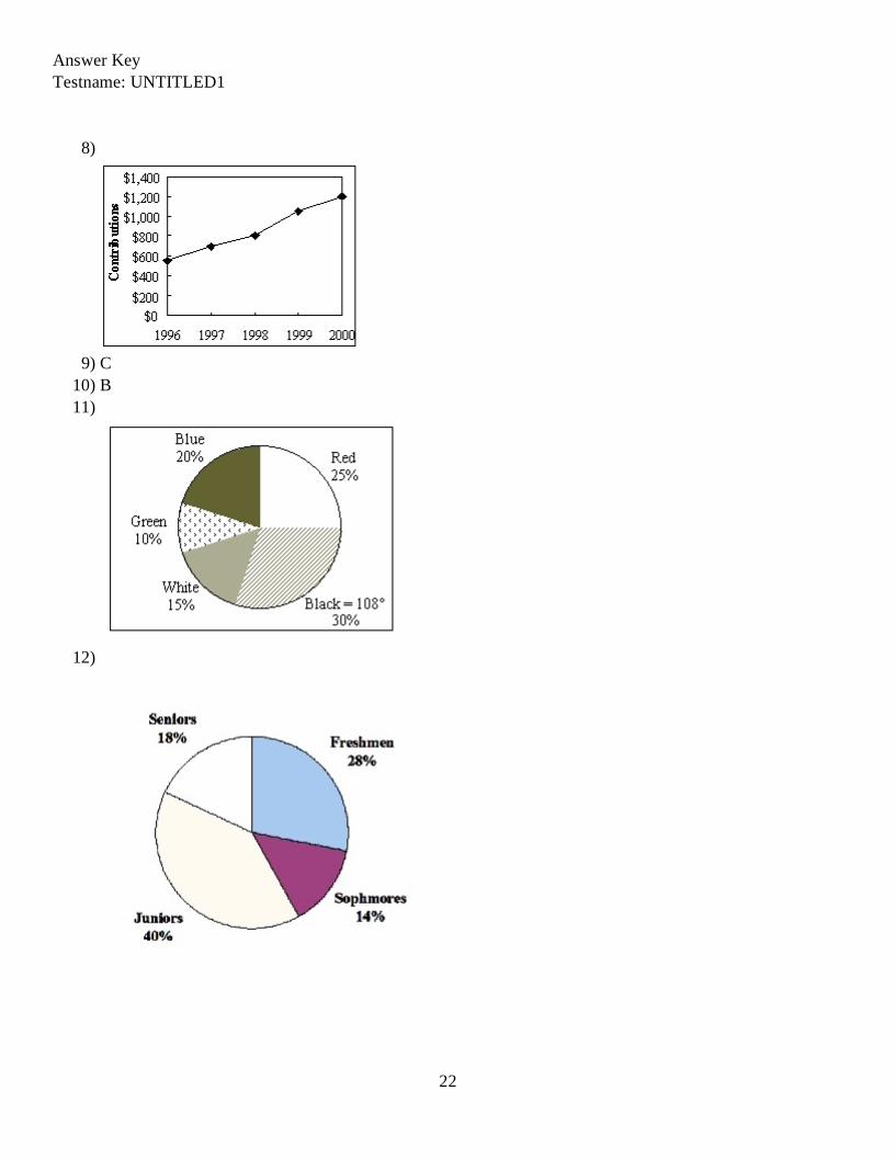
8) A local fundraiser wants to graphically display the contributions he has receivedover the past five years. Construct a time series graph for the following data.
Year Contributions1996 $5501997 $7001998 $8001999 $10502000 $1200
8)
6

MULTIPLE CHOICE. Choose the one alternative that best completes the statement or answers thequestion.
9) The following pie chart presents the percentages of fish caught in each of four ratingscategories.
Match this pie chart with its corresponding bar graph.
9)
A)
B)
7

C)
D)
10) Following is a pie chart that presents the percentages spent by a certain household on itsfive largest annual expenditures. What percentage of the money spent was spent on food,housing, and utilities?
10)
A) 60.4% B) 65.4% C) 52.5% D) 47%
8

ESSAY. Write your answer in the space provided or on a separate sheet of paper.
11) The following information shows the colors of cars preferred by customers. Draw a pie graph andindicate how many degrees that black represents in a pie graph?
Color NumberRed 50Black 60White 30Green 20Blue 40
SHORT ANSWER. Write the word or phrase that best completes each statement or answers thequestion.
12) Construct a pie chart for the following distribution:
Year in School Number of StudentsFreshmen 28
Sophomores 14Juniors 40Seniors 18
12)
13) Construct a pie chart for the following distribution:
Major Number of StudentsBusiness 128Science 36
Engineering 60Social Sciences 40
Liberal Arts 88Education 48
13)
MULTIPLE CHOICE. Choose the one alternative that best completes the statement or answers thequestion.
14) Karen is constructing a pie graph to represent the number of hours her classmates dohomework each day. She found that 8 of 24 classmates did homework for three hourseach day. In her pie graph, this would represent how many degrees?
14)
A) 135° B) 45° C) 240° D) 120°
9

SHORT ANSWER. Write the word or phrase that best completes each statement or answers thequestion.
15) Construct a pie graph using the following data from a local bakery.
Cookie Types Number SoldChocolate Chip 20Peanut Butter 15Oatmeal 30Sugar 10
15)
MULTIPLE CHOICE. Choose the one alternative that best completes the statement or answers thequestion.
16) A weatherman records the amount of rain that fell in Portland, Oregon each day for ayear. What type of graph should he use to show how rainfall changes during the year?
16)
A) Pareto chart B) pie graphC) time series graph D) pictograph
17) A time series graph represents data that occur over a specific time period. 17)A) False B) True
18) A Pareto chart does not have which of the following properties? 18)A) frequencies displayed by the heights of vertical barsB) classes of data are categoricalC) quantitative variable on the horizontal axisD) frequencies arranged from highest to lowest
19) A pie graph is not useful in showing which of the following characteristics of a dataset?
19)
A) categories that make up the smallest proportions of the totalB) frequency changes over timeC) categories that make up the largest proportions of the totalD) relative frequencies for each category in the distribution
20) A time series graph is useful for which of the following purposes? 20)A) representing relative frequencies of categories at a specific timeB) representing the frequencies of the data, sorted from largest to smallestC) representing the cumulative frequencies of the data at a specific timeD) representing the changing frequencies of a data category over a period time
21) A time series graph is useful for detecting trends that occur over the period of time. 21)A) False B) True
10

22) Which graph should be used to represent the frequencies with which certain courses aretaken at Highlands Middle School?
22)
A) pictograph B) Pareto chartC) pie graph D) time series graph
23) A pie graph would best represent the number of inches of rain that has fallen in Ohioeach day for the past 2 months.
23)
A) False B) True
SHORT ANSWER. Write the word or phrase that best completes each statement or answers thequestion.
24) The percentages of white, wheat, and rye bread sold at a supermarket each weekis best shown using a graph.
24)
25) A graph would most appropriately represent the number ofstudents that were enrolled in Statistics for each of the past ten years.
25)
26) The scores on a recent statistics exam are shown below. Construct a stem and leafplot for the data.
98, 73, 64, 69, 86, 89, 77, 86, 91, 73
26)
27) Given the following two sets of data, draw a back-to-back stem and leaf plot.A - 12, 22, 22, 24, 34, 31, 26, 35, 27, 39, 49, 10B - 45, 36, 23, 16, 37, 28, 18, 13, 10, 23, 30, 31
27)
11

MULTIPLE CHOICE. Choose the one alternative that best completes the statement or answers thequestion.
28) Construct a stem-and-leaf plot for the following data. 28)
A) B)
C) D)
12

29) Construct a stem-and-leaf plot for the following data, in which the leaf represents thetenths place.
29)
A) B)
C) D)
30) Construct a dotplot for the following data. 30)
A)
13

B)
C)
D)
14

31) Construct a dotplot for the following data. 31)
A)
B)
C)
D)
32) Following are the numbers of Dean's List students in a random sample of 20 universitycourses. Construct a dotplot for these data.
32)
15

A)
B)
C)
D)
16

33) Which of the following is a Pareto chart? 33)A)
B)
C)
D)
34) An automobile dealer wants to construct a pie graph to represent types of cars sold inJuly. He sold 72 cars, 16 of which were convertibles. How many degrees should beused for the convertibles section ?
34)
A) 100° B) 50° C) 60° D) 80°
35) If a data set showing types of pizza ordered at a particular restaurant indicates 24 out of72 orders were for pepperoni pizza, how many degrees would be needed to representpepperoni pizza in a pie chart?
35)
A) 120° B) 150° C) 60° D) 90°
36) A Pareto chart is useful for showing percentages of the total at different times. 36)A) False B) True
17

37) What type of graph is the figure below? 37)
A) pie graph B) Pareto chart C) pictograph D) ogive
38) Graphs give a visual representation that may enable readers to analyze and interpret datamore easily than simply looking at tables of numbers.
38)
A) False B) True
39) When making Pareto charts, data should be arranged according to frequency.
39)
A) clockwise B) with increasing timeC) from largest to smallest D) from smallest to largest
40) A Pareto chart arranges data from largest to smallest according to frequencies. 40)A) True B) False
41) The following table presents the rate of population growth of a suburb of Atlanta,Georgia for each of the years 1990 through 2009. Construct a time-series plot of thegrowth rate.
41)
18

A)
B)
C)
D)
19

20

Answer KeyTestname: UNTITLED1
1) C2) A3) C4) A5) D6)
7)
21
Answer KeyTestname: UNTITLED1
8)
9) C10) B11)
12)
22

Answer KeyTestname: UNTITLED1
13)
14) D15)
16) C17) B18) C19) B20) D21) B22) B23) A24) pie25) time series
23

Answer KeyTestname: UNTITLED1
26) 6 4 97 3 3 78 6 6 99 1 8
27)2, 0
7, 6, 4, 2, 29, 5, 4, 1
9
1 2 3 4
0, 3, 6, 83, 3, 80, 1, 6, 75
28) B29) B30) B31) C32) C33) C34) D35) A36) A37) B38) B39) C40) A41) B
24