Embed Size (px)
Citation preview

How to Make a Boxplot Using Excel 2010
MS Excel has a number of chart capabilities that make it easy to produce a predefined chart of selected data in an Excel worksheet. However, the statistical boxplot is not one of these. Fortunately we can utilize Excel’s graphing capabilities to generate a boxplot, despite there being no actual boxplot graphics template.
The strategy in this process is to use Excel to produce a stacked bar chart, and then manually add “whiskers” in the form of error bars. We’ll actually produce three bars that will be stacked together: the leftmost bar is a “positioner” bar simply to make the bar representing part of the box from the lower quartile to the overall median actually start at the lower quartile along the horizontal axis; then the bar that represents the part of the box from the overall median to the upper quartile is stacked onto the previous bar. Finally, we’ll assign “no fill” and “no border” to the leftmost bar so that bar is not displayed in the final version of the boxplot.
To demonstrate how to produce a boxplot using Excel, we shall use the Big Bank data from your text’s Chapter 6.
Open Excel to start a blank worksheet and type in the values for Big Bank’s customer wait times as seen here (for simplicity, we have manually sorted the customer wait times in ascending order, but this is not necessary because we can instruct Excel to sort the data for us):
We shall use Excel’s functions to find the minimum value of the data set, the maximum value, the overall median, the lower quartile, and the upper quartile, which are all required parts of a boxplot. In the case for a data set with an odd number of values, the textbook examples for computing the lower and upper quartiles do not include the overall median as a member of either the lower half or upper half of the values in the dataset. Note, Excel does have the QUARTILE function, but it treats the calculation of the lower and upper quartiles differently than your textbook does, so we shall compute the lower and upper quartiles in this exercise exactly the way it’s explained in your textbook. That is, the lower
1

quartile is the median of the lower half of the data values (not including the overall median), and the upper quartile is the median of the upper half of the data values (not including the overall median).
In the A column starting with the row below the last number in the data set (row 13 in this example) type these labels: MIN in cell A13, 1Q in cell A14, MEDIAN in cell A15, 3Q in cell A16, and MAX in cell A17. MIN indicates the minimum in the data set, 1Q indicates the lower quartile, MEDIAN indicates the overall median, 3Q indicates the upper quartile, and MAX indicates the maximum value in the data set. The actual values for these quantities will be calculated in the B column, next to the labels.
In cell B13, type (without the quotes) “=MIN(B2:B12)” which finds the minimum value in this data set and where B2:B12 identifies the range of the data set.
In cell B14, type (without the quotes) “=MEDIAN(B2:B6)” which finds the lower quartile (median of the lower half of the data set according to the way your textbook does). The range of the lower half of this data set is B2:B6, and does not include the overall median.
In cell B15, type (without the quotes) “=MEDIAN(B2:B12)” which finds the overall median of this data set (whose range is B2:B12).
In cell B16, type (without the quotes) “=MEDIAN (B8:B12)” which finds the upper quartile (median of the upper half of the data set according to the way your textbook does.) The range of the upper half of this data set is B8:B12, and does not include the overall median.
In cell B17, type (without the quotes) “=MAX(B2:B12)” which finds the maximum value in this data set and where B2:B12 identifies the range of the dataset. At this point part of your worksheet should look like this:
2

Next we have to compute the lengths of the bars that will make up the stacked bar which will represent the box in our boxplot.
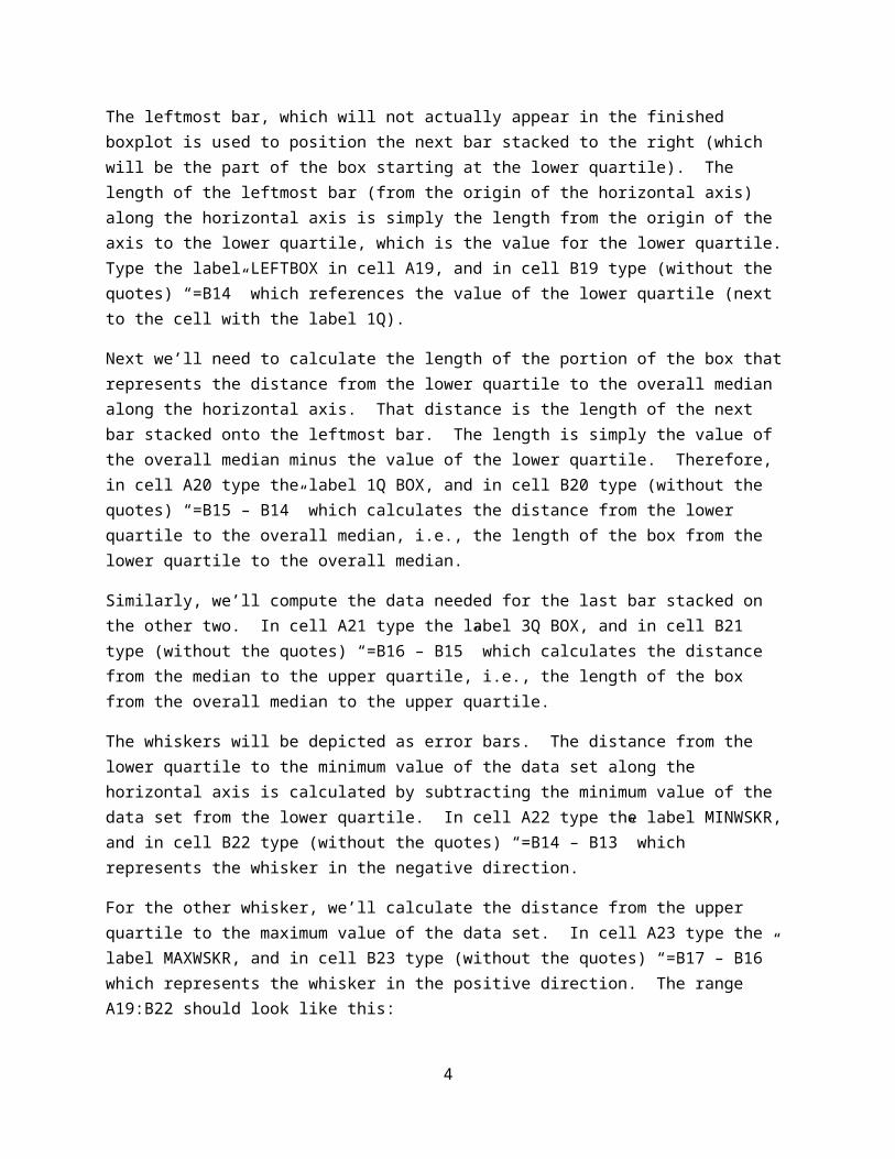
The leftmost bar, which will not actually appear in the finished boxplot is used to position the next bar stacked to the right (which will be the part of the box starting at the lower quartile). The length of the leftmost bar (from the origin of the horizontal axis) along the horizontal axis is simply the length from the origin of the axis to the lower quartile, which is the value for the lower quartile. Type the label LEFTBOX in cell A19, and in cell B19 type (without the quotes) “=B14” which references the value of the lower quartile (next to the cell with the label 1Q).
Next we’ll need to calculate the length of the portion of the box that represents the distance from the lower quartile to the overall median along the horizontal axis. That distance is the length of the next bar stacked onto the leftmost bar. The length is simply the value of the overall median minus the value of the lower quartile. Therefore, in cell A20 type the label 1Q BOX, and in cell B20 type (without the quotes) “=B15 – B14” which calculates the distance from the lower quartile to the overall median, i.e., the length of the box from the lower quartile to the overall median.
Similarly, we’ll compute the data needed for the last bar stacked on the other two. In cell A21 type the label 3Q BOX, and in cell B21 type (without the quotes) “=B16 – B15” which calculates the distance from the median to the upper quartile, i.e., the length of the box from the overall median to the upper quartile.
The whiskers will be depicted as error bars. The distance from the lower quartile to the minimum value of the data set along the horizontal axis is calculated by subtracting the minimum value of the data set from the lower quartile. In cell A22 type the label MINWSKR, and in cell B22 type (without the quotes) “=B14 – B13” which represents the whisker in the negative direction.
For the other whisker, we’ll calculate the distance from the upper quartile to the maximum value of the data set. In cell A23 type the label MAXWSKR, and in cell B23 type (without the quotes) “=B17 – B16” which represents the whisker in the positive direction. The range A19:B22 should look like this:
And the worksheet should look like this (next page):
3
Select cells A1:B2 using the left mouse button, then holding the control key down, release the left mouse button and move the mouse to cell A19, press the left mouse button and select the range A19:B21. Your screen should look like this:
4

Release the control key and the left mouse button, then click Insert on the Ribbon, then click the Bar button in the Charts section of the Ribbon, and when the submenu pops up, click the middle chart template in the top row (stacked bar chart).
A chart showing three bars will appear in your worksheet:
5

Click the Switch Row/Column in the Data Section of the Ribbon, and your chart will turn into a stacked data chart:
Now we want to insert the “minimum” whisker by inserting an error bar in the negative direction onto the chart. Error bars always connect to the right end of a bar, so we want to place the mouse over the leftmost bar and click the left mouse button. Then click the Layout Tab in the Chart Tools section, then over near the right part of that section, click the Error Bars button, then click More Error Bars Options in the window that appears.
6

A Format Error Bars popup window will appear. In that window, under the Horizontal Error Bars section, click the Minus radio button, then at the bottom of that window in the Error Amount section click the Custom radio button, and finally click the Specify Value button, which will cause a smaller window (Custom Error Bars window) to appear. Clear the Negative Error Value register, and while the cursor is blinking in that register, click on cell B22. Click OK, and then click Close on the Format Error Bars window.
Your chart will now display the “whisker” extending from the left edge of the 1Q BOX to the minimum value of the data set:
Big Bank
0.0 1.0 2.0 3.0 4.0 5.0 6.0 7.0 8.0 9.0
LEFTBOX1Q BOX3Q BOX
We’ll not need the legend on the right side of the chart, so select that legend and delete it.
In the same manner as adding the minimum whisker, click on the 3Q BOX and add a whisker in the positive direction (click the correct radio button, and click on cell B23 to set the value of the error bar’s length). Your chart should now look like this:
Big Bank
0.0 1.0 2.0 3.0 4.0 5.0 6.0 7.0 8.0 9.0
We wish to make the leftmost bar invisible, so click on the leftmost bar, then right click Format Data Series. In the Format Data Series window, in the left pane under Series Options, click Fill. In the Fill
7

pane that appears, click the radio button for No Fill. Next, in the left pane select Border Color. In the Border Color pane, select No Line. Click Close at the bottom of that window. Your chart should now look like this:
Big Bank
0.0 1.0 2.0 3.0 4.0 5.0 6.0 7.0 8.0 9.0
In the same manner, for the remaining two bars, click on a bar, select Format Data Series, Fill/No Fill, then Border Color/Solid Line, then black for the color, and Close. Your chart should now have the boxplot with whiskers like this:
Big Bank
0.0 1.0 2.0 3.0 4.0 5.0 6.0 7.0 8.0 9.0
8

If you wish, you may use Excel to change the chart properties such as axes, line weights, titles, labels, etc. For example, let’s eliminate the vertical gridlines as well as the border around the chart in the example above. Move that pointer near (but inside) the border of the chart such that Chart Area appears in a small rectangle. Left click to make sure the chart is selected, then on the Chart Tools area of the Ribbon, make sure the Layout tab is selected. Click on the Gridlines button, select Primary Vertical Gridlines, then click None in the popup menu which appears. The vertical gridlines on your chart will disappear. Next right click on the chart’s border and when the popup menu appears, left click on Format Chart Area. Click on Border Color, then the No Line radio button when the Format Chart Area window appears, then click its Close button. At this point, your chart will look like this:
Let’s change the horizontal axis to show tick marks and labels every 1.0 unit, then resize the chart to fit the line length (6.5 inches) of a document. Chart Tools/Layout should still be active, so left click on the Axes button and click Primary Horizontal Axis on the popup menu that appears, then click More Primary Horizontal Axis Options. When the Format Axis window appears, click the Fixed radio button for the Major unit. In the dialogue box to the right of that radio button edit the contents to 1.0 and then click the window’s Close button. Finally, let’s change the width of the chart to be 6.5 inches, so right click on the chart area and when the popup menu appears, right click Format Chart Area. In the window that appears, click Size in the left hand pane, then in Size and Rotate in the right hand pane, set the Height to 1” and the Width to 6.5”. Click the Close button on that window. You could add chart attributes in Excel, and/or simply right click in the chart area, copy the chart, and paste it onto your document (such as a WORD document) and add labels and annotations there, such as this:
Big Bank
0.0 1.0 2.0 3.0 4.0 5.0 6.0 7.0 8.0 9.0
5.6
7.2
8.5
11.0
9
4.1

Or something like this (note that for example, I’ve set the line weights in the above boxplot and horizontal axis to 1 point, whereas the line weights in the figure below are the default 0.75 point):
Big Bank
0.0 1.0 2.0 3.0 4.0 5.0 6.0 7.0 8.0 9.0
The same strategy, as described in these instructions, can be employed to generate a boxplot for any data.
10
4.1 11.05.6 7.2 8.5
Waiting Times (Minutes)