Embed Size (px)
DESCRIPTION
design & visual culture
Citation preview
design and visual culture
FALL
201
1
25
ill
stud
io
g
rayo
val
feli
x pf
äffl
i
fut
ura
gig
post
ers
arab
ic t
ypog
raph
y
issue 25 FALL 2011GB £25
de E28 it E24
issn 1767-47-51
Printed in France
EI25_couv.indd 1 16/09/11 18:35
6 :
n° 25IMAGES & QUICK HITS
P08
P12
P14
P16
P18
P20
P21
P24
P22
P25
P28
P29
P27
P26
MARCOS CARRASQUER
PYUUPIRU
CHLOÉ POIZAT
P10 MAX & CHARLOTTE
P19
STUDIO 75BAND AKROE
G.V.D COLLECTIVE
ISBN EDIZIONI
ARTWORKLOVE ANDESTUDIO DORIAN
FEDERICO MAGGIONI
SUPERSCRIPT2
KOLLE-BOLLE
RYAN MCGINLEY
RAFVANCAMPENHOUDT
ECAL
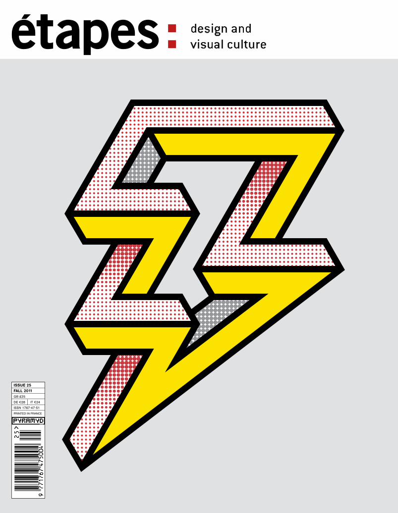
Cover: © Designed by Magpie Studio for Robert Horne paper, in association with Gavin Martin Colournet. www.magpie-studio.comwww.magpie-studio.comFonts: Boton by Albert Boton,Oranda by Gerard Unger, Kievit by Michael Abbink.
ANTOINE+MANUEL
JONGE MEESTERSAND GRUPPEGUT
P50P66
BY CAROLINE BOUIGE
BY M. WLASSIKOFF ANDA. DUMAS DE RAULY
NODE
A CLOSER LOOK
design and visual culture
FALL
201
1
25
ill
stud
io
g
rayo
val
feli
x pf
äffl
i
fut
ura
gig
post
ers
arab
ic t
ypog
raph
y
issue 25 FALL 2011GB £25
de E28 it E24
issn 1767-47-51
Printed in France
EI25_couv.indd 1 16/09/11 18:35
FUTURA
ILLSTUDIO
P58P30
P38
P44 BY ISABELLE MOISY
BY ISABELLE MOISY
BY ANNE-SOPHIE COIFFET
BYMARIE AUMONT
Isabelle Moisy is editorial coordinator of étapes: magazine.
Isabelle Moisy is editorial coordinator of étapes: magazine.
Anne-Sophie Coiffet is a trainee journalist for étapes: magazine.
Marie Aumont is an independentFrench graphic designerand typographer.
GRAYOVAL
STUDIOLAUCKE
SIEBEIN
FELIX
PFAFFLI
Caroline Bouige is a journalist on the editorial staff at étapes: magazine.
M. Wlassikoff is a historian, researcher and exhibition curator. A. Dumas de Rauly is a freelance graphic designer.
EI25_sommaire.indd 6 20/09/11 12:44

: 7
P80 P96 P112
P86 P102P122
BY YOLANDA ZAPPATERRA
BY YOLANDA ZAPPATERRA
BYROLAND FRÜH
BYJOHN STONES
BY N. BAKOURI, I. MOISYAND C. BOUIGE
BYJOHN O’REILLY
BYALEX OGG
OPINION
WWW.ETAPES.COM/ENGLISH
P142 BOOKS
P132 BYJOHN STONES
A journalist and the author of books on design and architecture, J. Stones is a regular contributor to Design Week, Monocle and Elle Decoration.
P136 BY RICK POYNOR
Rick Poynor is a writer and the author of Transgression: graphisme et postmodernisme, published by Pyramyd.
P129
BLOGS
TOBOOKS
BOOKSHOW
TRAININGCOURSES INDESIGNCRITICISM
IITTALA JOSTHOCHU
LICHAUMONT
GIGPOSTERS
ARABICTYPOGRAPY
RUD EBRITANNIA
Yolanda Zappaterra is a writer and designer.
Yolanda Zappaterra is a writer and designer.
A Swiss writer, Roland Früh teaches graphic design at the ECAL in Lausanne.He is a coordinator at Werkplaats Typografie in the Netherlands.
A journalist and the author of books on design and architecture, J. Stones is a regular contributor to Design Week, Monocle and Elle Decoration.
N. Bakouri is a freelance art and design consultant and curator. She was director of the Anatome Gallery from 2005 to 2011.
John O’Reilly is a freelance journalist and editor/contributor for the British illustration magazine, Varoom.
Alex Ogg is a writer and a freelance journalist, musical consultant and project manager.
EI25_sommaire.indd 7 20/09/11 12:44

12 :
PLANETARIAanglais.indd 12 06/09/11 15:01
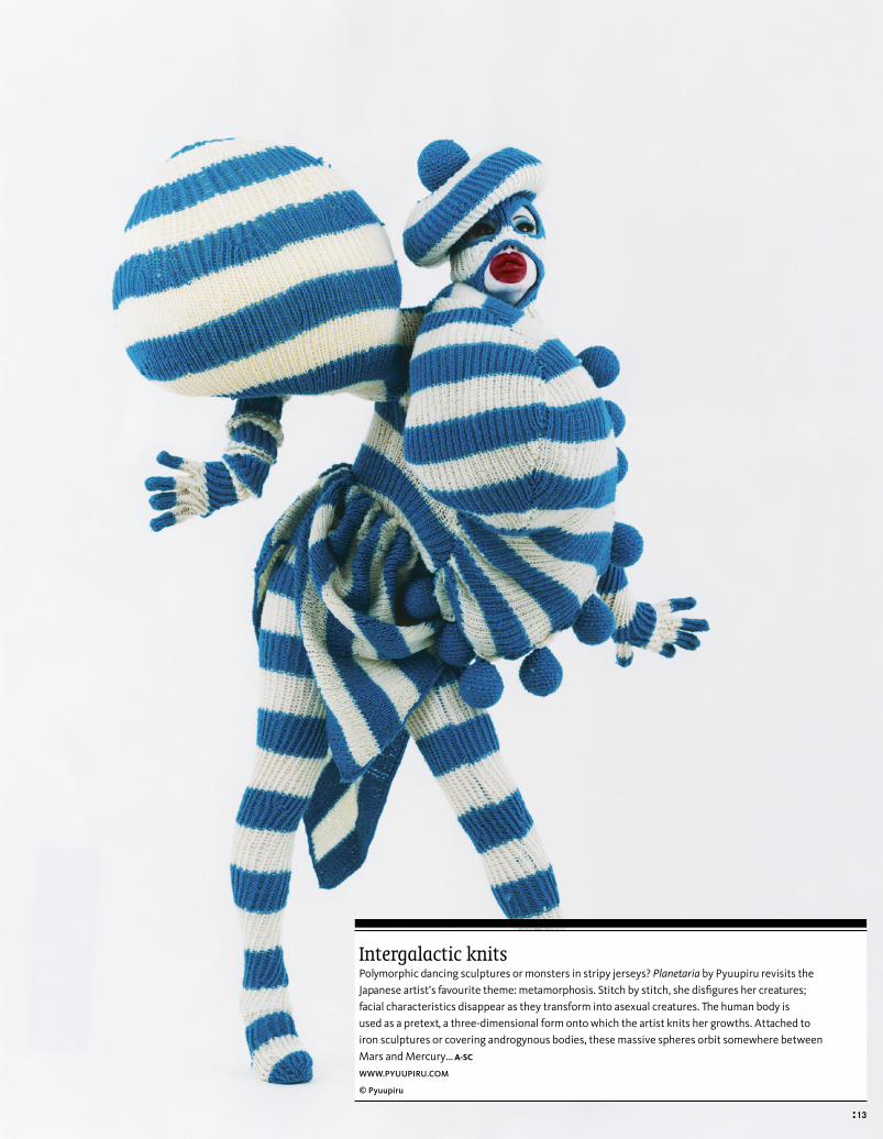
Intergalactic knitsPolymorphic dancing sculptures or monsters in stripy jerseys? Planetaria by Pyuupiru revisits the Japanese artist’s favourite theme: metamorphosis. Stitch by stitch, she disfigures her creatures; facial characteristics disappear as they transform into asexual creatures. The human body is used as a pretext, a three-dimensional form onto which the artist knits her growths. Attached to iron sculptures or covering androgynous bodies, these massive spheres orbit somewhere between Mars and Mercury… A-SC
www.pyuupiru.com
© pyuupiru
: 13
PLANETARIAanglais.indd 13 06/09/11 15:01
18 :
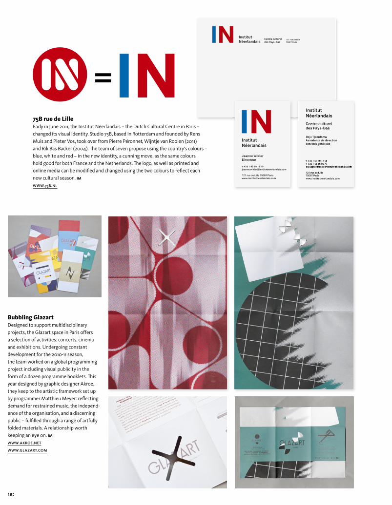
Bubbling GlazartDesigned to support multidisciplinary projects, the Glazart space in Paris offers a selection of activities: concerts, cinema and exhibitions. Undergoing constant development for the 2010-11 season, the team worked on a global programming project including visual publicity in the form of a dozen programme booklets. This year designed by graphic designer Akroe, they keep to the artistic framework set up by programmer Matthieu Meyer: refl ecting demand for restrained music, the independ-ence of the organisation, and a discerning public – fulfi lled through a range of artfully folded materials. A relationship worth keeping an eye on. IM
WWW.AKROE.NET
WWW.GLAZART.COM
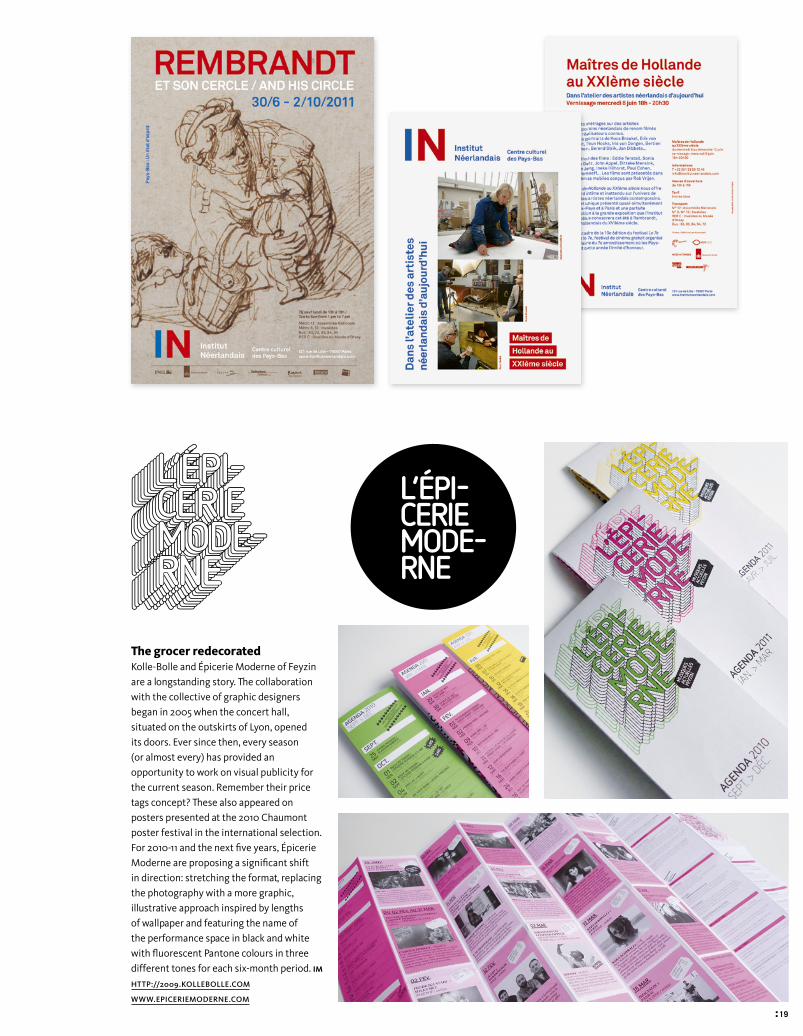
75B rue de LilleEarly in June 2011, the Institut Néerlandais – the Dutch Cultural Centre in Paris – changed its visual identity. Studio 75B, based in Rotterdam and founded by Rens Muis and Pieter Vos, took over from Pierre Péronnet, Wijntje van Rooien (2011) and Rik Bas Backer (2004). The team of seven propose using the country’s colours – blue, white and red – in the new identity, a cunning move, as the same colours hold good for both France and the Netherlands. The logo, as well as printed and online media can be modifi ed and changed using the two colours to refl ect each new cultural season. IM
WWW.75B.NL
=
Découvrez à partir du 1er juin la nouvelle identité visuelle de l’Institut Néerlandais !
=
Découvrez à partir du 1er juin la nouvelle identité visuelle de l’Institut Néerlandais !
Epicerie2.indd 18 09/09/11 16:43
: 19
The grocer redecoratedKolle-Bolle and Épicerie Moderne of Feyzin are a longstanding story. The collaboration with the collective of graphic designers began in 2005 when the concert hall, situated on the outskirts of Lyon, opened its doors. Ever since then, every season (or almost every) has provided an opportunity to work on visual publicity for the current season. Remember their price tags concept? These also appeared on posters presented at the 2010 Chaumont poster festival in the international selection. For 2010-11 and the next fi ve years, Épicerie Moderne are proposing a signifi cant shift in direction: stretching the format, replacing the photography with a more graphic, illustrative approach inspired by lengths of wallpaper and featuring the name of the performance space in black and white with fl uorescent Pantone colours in three different tones for each six-month period. IM
HTTP://2009.KOLLEBOLLE.COM
WWW.EPICERIEMODERNE.COM
Epicerie2.indd 19 09/09/11 16:43

28 :
Sweet Little SixteenSixteen pages or nothing; Un Sedicesimo magazine turns its format into its title. A project by publisher Pietro Corraini, under the direction of Federico Maggioni, this bimonthly magazine offers graphic designers and illustrators an opportunity to create their own art projects, using a standard print format. Resembling a paper art gallery, the format leaves plenty of scope for imaginative interpretations: while Tomi Um makes it into a leafl et for a giant illustration, Wilhelm Staehle uses it to tell a story. Carin Goldberg creates a repertoire of shapes from cardboard packaging and Paul Cox, an advocate of functionality, transforms it into a sober calendar. By offering graphic designers free expression in an ‘independent’ form of publication, the publishers Corraini, allow the profi les and personalities of each graphic designer to emerge. A nice present to offer your main sponsors. CB
HTTP : //UNSEDICESIMO.CORRAINI.COM
Issue 15, Wilhelm Staehle, inside double spread
Issue 17, Leonardo Sonnoli, cover and inside double spread
Issue 19b, Studio Alex Rom and Atelier Vostok, cover and double spread
actus_edizioni_corraini.indd 28 09/09/11 16:51

: 29
Special BooksSpecial Books is a new collection of foreign fi ction published by ISBN Edizioni that uses embossing, spot gloss fi nishes and a range of illustrations. The publisher wanted to make each book distinct: each work has an original cover design relating to the book’s content and the author’s country of origin. The cover of Toxic echoes the page layout inside the book, Io Sono Febbraio by Shane Jones features a group of beaked characters and I Corpi Neri resembles a fi lm poster. There’s just one common feature: all of the back covers use a visual identity that was created for the collection, which is numbered, linear and follows the collection’s colour range. IM
WWW.ISBNEDIZIONI.IT
actus_edizioni_corraini.indd 29 09/09/11 16:51

58 :
How did you discover graphic design and how long ago?You could say that I grew up amongst designers because in my hometown, Lucerne, there are a lot of graphic designers. It’s diffi cult to give you an exact date. Offi cially, I’ve been a freelance graphic designer for a year. Two years ago, I stopped university for a year to do some free-lance design projects. I took a three-month sabbatical in Sweden. Actually, I worked as a graphic designer all through university. That allowed me to set up my own studio after passing my baccalaureate.
How many people are there in the studio?My studio, Feixen, is like a one-man band. But for a year now I’ve also been work-ing for Detektiv Bureau. It’s an association of graphic designers, illustrators, art-ists and political activists, all working in the same premises, organising shows together and dedicating a lot of time to discussions.
How do you usually work? Do you have a specifi c creative process?It depends. Normally,my working style is deter-mined by the content of the project. For example, a design for a publication about an experimental dance per-formance requires a different
By Isabelle Moisy
FelixPfäffliLUCERNE (SWITZERLAND)STUDIO FEIXEN, FOUNDED IN 2009FELIX PFÄFFLI (25)WWW.FEIXEN.CH / WWW.DETEKTIVBUREAU.CH
ei25_38-43_Pfaffi.indd 58 09/09/11 17:01

: 59
approach to a classical play.I think we can distinguish two main creative attitudes: a subjective attitude and an objective attitude. For exam-ple music, from a completely objective point of view, is something you can’t really fully grasp. So I concentrate mainly on the emotion that comes with the music. I ask myself simple ques-tions, like, what kind of land-scapes do I see when I listen to this music? What colours and shapes do I associate with it? When the music is fast or improvised, I try to proceed in the same joyful manner, and when it is strict and reduced I tackle the project in a condensed and restricted manner. Beyond this ‘subjec-tive’ way of working there is also an ‘objective’ way of working. I use this when the content is clearly defi ned – for instance, in a theme-based exhibition or for classical thea-tre. In such cases I really focus on the content. I read the play and I try to reduce the story into a single scene or image. The visual language, typo-graphic choices and graphic design elements are always generated by the content. If the play takes place in the 18th century, I look for fonts and images that could have been used dur-ing this period. Often, I cre-ate a ‘toolbox’ of graphic resources which I systemati-cally base the fi nal design on.
A lot of your work seems to reveal the underlying structure, the functioning of a system or the creative process. Is this your prime concern when you compose your images?Absolutely. I really like work-ing with systems. It’s not much of a surprise, really, when you consider that the Swiss mentality and way of thinking and ‘Swiss Style’ hasn’t really been fully explored yet. It’s simple: a white page is perfect. When we start to place elements on top we have to follow cer-tain rules. However, to me that doesn’t mean I always have to do everything the same way. On the contrary, each project requires differ-ent rules. Most of the time, I set myself two or three rules when I’m working on a project to help me refi ne the design and emphasise the meaning of the content. Making the crea-tive process visible isn’t just about giving the impression of a moment captured in time; it’s also about telling a story.
What’s your relationship to a poster? Do you have a favourite medium or technique?I mainly design posters. That’s probably pretty obvi-ous. It isn’t a preference, it’s just because people hire me to design posters a lot. Actually, I’m interested in all types of design – it doesn’t
matter whether it’s books, posters, clothing or furni-ture. The less I know about the design technique, the more interesting it is to me.
Where do you get your inspiration? Do you have a special interest in everything related to computer code or ‘processing?’In my opinion, it’s vital to learn something from each project. I don’t like repeating myself, especially in my fi nal output. That means I don’t try to design using techniques that I’ve already mastered. I prefer using methods that I might not know already. If, for example, a poster has to be computer generated, I’ll start learning programming. It’s our choice whether or not we let the wide range of design possibilities become limitations or not.
You have been creating visual communicationfor Südpol, a multicultural centre in Switzerland, for two years now. Could you tell us about your relationship with this client? How and when did the collaboration begin and what is the concept behind your work?The poster series was con-ceived by Erich Brechbühl, a graphic designer from Lucerne. In the fi rst year we used a dif-ferent graphic designer for each poster, creating a sort of alternating style. Graphic
designers, illustrators and art-ists all left their mark on this series. But Südpol needed posters for a few events every month and the administra-tive and fi nancial costs became too much. That’s why they asked me if I wanted to con-tinue working on the series on my own over the summer of 2010. The Südpol multicultural centre presents dance per-formances, plays, operas and concerts. Each series of post-ers deliberately conceals the category of the different pro-ductions. Experimental dance incorporates dance, music and theatre, so the boundaries are superfl uous. The series of posters is playful, and some-times daring in its formal aspects. Südpol gave me com-plete free rein. That’s what made everything possible. The collaboration was very productive. The only instruc-tions I received were for the poster heading, the format and the print method. The posters were short exercises in design, experiments or stories....
Do you have plans for the future, or is there something you would like to do? In the future, I’ll proba-bly start designing modu-lar wooden houses with a colleague of mine.
Feli
x P
fäff
liIs
the
re a
re d
esig
ner
or g
raph
ic a
rtis
t w
hose
wor
k yo
u ad
mir
e?
Her
bert
Leu
pin.
View of the exhibition “Graphic Design from Leipzig and Lucerne.” Organised by Weltform in November 2010, Lucerne.
ei25_38-43_Pfaffi.indd 59 09/09/11 17:01

60 :
Feli
x P
fäff
liW
hat
city
or
plac
e in
spir
es y
ou?
Swed
en: N
o m
ount
ains
, not
hing
but
sky
.
ei25_38-43_Pfaffi.indd 60 09/09/11 17:01

: 61
Südpol.Series of posters for a Swiss multicultural centre that stages plays, concerts and dance performances. Each poster is printed in several colours on an A3 sheet using a risograph machine.
Feli
x P
fäff
liD
o yo
u ha
ve a
ny w
orks
of r
efer
ence
? M
y no
tes.
ei25_38-43_Pfaffi.indd 61 09/09/11 17:01

62 :
Feli
x P
fäff
liW
hat
wou
ld y
ou d
o if
you
cou
ldn’
t be
a d
esig
ner?
Cr
y.B-Sides 2009. Screenprinted poster, T-shirt, signs and album cover for the B-Sides Festival 2009 in Lucerne. Formats: A3, A2, and F4.
ei25_38-43_Pfaffi.indd 62 09/09/11 17:01

: 63
Feli
x P
fäff
liIs
the
re a
sch
ool o
r m
ovem
ent
that
has
infl
uenc
ed y
ou d
urin
g yo
ur c
aree
r?
The
peop
le a
roun
d m
e. M
y fr
iend
s. E
ach
pass
ing
day.
B-Sides 11. Poster for the B-Sides Festival 2011 in Lucerne. The poster uses images that were displayed on the website while the poster was being made.
Each of the images illustrates a visual concept or an artistic concept relating to an artist. Offset printed in A3, A2, A1 and A0.
ei25_38-43_Pfaffi.indd 63 09/09/11 17:01

64 :
Feli
x P
fäff
liIs
the
re a
typ
efac
e th
at y
ou u
se r
egul
arly
? O
ld A
kzid
enz
Gro
tesk
typ
ecas
ting
font
s.
ei25_38-43_Pfaffi.indd 64 09/09/11 17:01

: 65
Feli
x P
fäff
liD
o yo
u ha
ve a
favo
urit
e qu
ote
or p
hilo
soph
y fo
r li
fe?
Pass
.
Zufall.Poster series created using data processing. Screenprinted for an exhibition on coincidences in art.
ei25_38-43_Pfaffi.indd 65 09/09/11 17:01
102 :
e191_Posters7+C.indd 102 09/09/11 17:10

: 103
Charting a revolution in the music industry in recent years, with the arrival of digital media, visual and audio interactions and the return of hand-tailored work, GigPosters.com, the website founded by Clay Hayes, bears witness to the evolution of concert posters, from a medium supplying information to a wholly separate space for expression.
Par John O’Reilly
Gig Posters
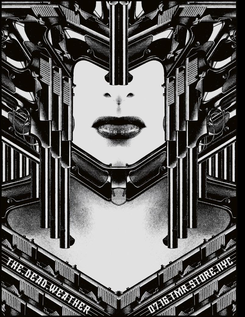
Left-hand page.Rob Jones, postersfor The Dead Weather.
Below.The Raconteurs, Detroit, 2008.
e191_Posters7+C.indd 103 09/09/11 17:10

104 :
The gig poster is fast becoming the visual equivalent of the classic pop single, an instant affective visual thrill. Back in 2001 Apple launched the iPod and iTunes, removing the need for any physical or visual aspect to the purchasing and enjoyment of music. At the same time, in Calgary, Canada, computer programmer Clay Hayes, who also played in a local band, set up a website where people could share images of their gig posters from around the world. Nearly ten years on and GigPosters.com features over 120,000 posters from almost 9,500 designers and contributors. “I have no art or design background at all,” says Hayes. “I have a music background, but mostly, I’m just a fan.” That’s no small advantage, because being a fan means Hayes has some insight into what drives the fan psyche. “Many people who come to GigPoster.com start out by purchasing a poster for a band they love, but once they see all the amazing poster designs out there, it tends to be the artwork that outshines the bands.” Designers too tap into that fan psyche. Since the 1990s, design studios have accepted that unless you are designing for a household name, the music business doesn’t pay. Or, it pays, but as a loss leader, providing a window onto your creativity for more lucrative, potential clients.Justin David Cox is a full-time User Interface designer for a large corporation. His poster designs, for bands such as The Animal Col-lective, The Decemberists and Cut Copy, employ space to focus and direct the eye. His poster work has “led to a few editorial and identity gigs.” That space refl ects one crucial fact; “I have been given a lot of crea-tive freedom, which is a nice change of pace from the world of corporate design.” The GigPoster site is often the starting point for a wider audience. “My Cut Copy poster sold out the day I posted it thanks to being linked on some prominent blogs, such as Notcot and Swiss Miss,” says Cox. “The print run was 100; others have sold out too, but that was by far the fastest.”Cox’s path is not unusual. The gig poster phenomenon is thriving because of a number of innovations; the availability of
Rob Jones. Posters for The Dead Weather and The Raconteurs, 2008.
Opposite page. Justin David Cox. Posters for Cut Copy, Crystal Castles and Animal Collective, 2009.
e191_Posters7+C.indd 104 09/09/11 17:10

: 105
cheap, lo-fi technology at local print shops; the proliferation of screen-printing co-ops (designers want to get their hands dirty); and the affordability of high-quality, digital printers. It also benefi ts from the fact that, arguably, some gig posters don’t have to communicate a whole lot, as they princi-pally function as merchandise for the fans. Many current designs suggest that the rules of the gig poster are changing. With highly effective fan networks on Facebook and Myspace, shout-outs for times and ven-ues are disappearing in favour of more tasteful executions designed with a domes-tic afterlife in mind; these posters are designed for display not to impart informa-tion. The spatially, open designs of Jason Munn, for example, are often printed in two-colour, and stand out in contrast to noisier sales messaging on the streets. Eventually, they’ll look good on the living-room wall, or the pages of a book; his collected works have recently been pub-lished as The Small Stakes: Music Posters (Chronicle Books). If cheap technology fuels the production, and social networking frees up the aes-thetic, then musically the gig poster phe-nomenon is fuelled by bands who value craft, the lo-fi , and the thrill of collecting one-off, pop objects. In this way the gig poster is the modern equivalent of the per-fect pop single, in a picture sleeve of course. Paradoxically, it is collectible because it is throwaway; its value resides in the aura of the ephemeral. The rock poster exists to be fl yposted, ripped by acquisitive fans, worn away by weather and generally effaced by time. Bands such as The White Stripes make music that revels in instant, physical thrill. For designer Rob Jones, gig posters com-prise the bulk of his portfolio, along with other music biz work, “…stage backdrops, albums, singles, shirts, record boxes, cus-tom camera packaging, a box set, etc., but gig posters remain the primary reason for my sleepless weeks.” He began designing for a friend who started a band called the Pink Swords; two years later he caught a lucky break and began working with The White Stripes. His “White Stripes Blackpool 07” poster remains his most popular.
e191_Posters7+C.indd 105 09/09/11 17:10

106 :
“I have a good relationship with the main bands that I work with, The White Stripes, The Raconteurs and The Dead Weather,” he says. All three bands require personal approval; all feature songwriter Jack White. “Generally it’s thumbs up or down, but over the years I’ve gotten to know their tastes so there haven’t been too many thumbs down. The brief is their music, style, and how they present themselves to the public, so in that regard they are highly involved in what I produce. Not too often, but on occasion I’ll be told about a specifi c direction change.”Designer Lil Tuffy Tuffi ngton also has good things to say about Jack White. “I prefer to have as much control over the image as possible,” he says. “Jack White is probably my favourite creative director. He knows what he wants and is great at making that clear and then letting the designer do their work.” Tuffington’s poster work began around 2002 when he was still designing websites as a means of asserting his crea-tive mark. Working on websites he was “…constantly art directed by programmers and salesmen and people who have no business asserting their opinion in the creative process. It was very frustrating.” That sounds familiar. “But, when making posters I rarely work with clients that want to assert their con-trol.” Tuffi ngton’s design is versatile and ideas-based; from his graphic diptych for Vampire Weekend to the painterly pulp for punk band Dwarves, and the simple shad-ing for Spiritualized’s unique form of elec-tric Gospel. “I think my aesthetic lends itself to certain genres but I’ll do work for anyone. For example, I never considered myself a hip-hop designer, but my posters for KRS-One and Wu Tang Clan were very popular despite the fact they weren’t typical hip-hop posters.” Tuffi ngton’s best selling post-ers have a fl avour of that musical diversity, from the electro-disco of Devo, to the delin-quent storytelling of The Raconteurs (for a gig in Kansas City), to the bohemian noiseniks, Sonic Youth. Tuffy’s website cap-tures the culture, soul and rock and roll attitude of the gig poster cult. Called Tuff Shit, his strapline reads, “Everything dies, baby. That’s a fact.”
Jason Mum. Posters for the Pavement and Saint Vincent groups, 2010.
e191_Posters7+C.indd 106 09/09/11 17:10

: 107
Digital technology has changed the music business beyond recognition, and has changed its visual culture, from sleeve art to music promos to websites and online/downloadable clips. But the metamorpho-sis of the gig poster, from a straight com-munication piece to an almost standalone extension of the music, points to a new kind of relationship between the music industry, design and print.
Lil Tuffy Tuffington. Posters for Vampire Weekend, Sonic Youth and The Raconteurs, 2010.
e191_Posters7+C.indd 107 09/09/11 17:10
108 :
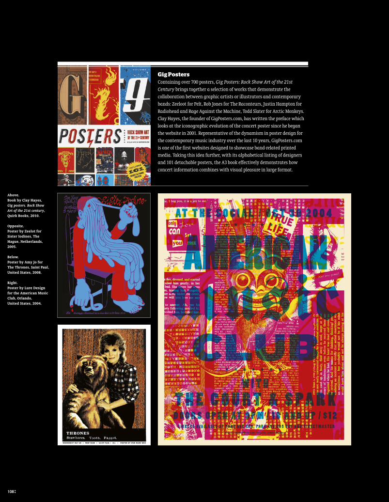
Gig PostersContaining over 700 posters, Gig Posters: Rock Show Art of the 21st Century brings together a selection of works that demonstrate the collaboration between graphic artists or illustrators and contemporary bands: Zeeloot for Pelt, Rob Jones for The Raconteurs, Justin Hampton for Radiohead and Rage Against the Machine, Todd Slater for Arctic Monkeys. Clay Hayes, the founder of GigPosters.com, has written the preface which looks at the iconographic evolution of the concert poster since he began the website in 2001. Representative of the dynamism in poster design for the contemporary music industry over the last 10 years, GigPosters.com is one of the first websites designed to showcase band-related printed media. Taking this idea further, with its alphabetical listing of designers and 101 detachable posters, the A3 book effectively demonstrates how concert information combines with visual pleasure in large format.
Above.Book by Clay Hayes, Gig posters. Rock Show Art of the 21st century, Quirk Books, 2010.
Opposite.Poster by Zeelot for Sister Iodines, The Hague, Netherlands, 2005.
Below.Poster by Amy Jo for The Thrones, Saint Paul, United States, 2008.
Right. Poster by Lure Design for the American Music Club, Orlando, United States, 2004.
108 :
e191_Posters7+C.indd 108 09/09/11 17:11
: 109
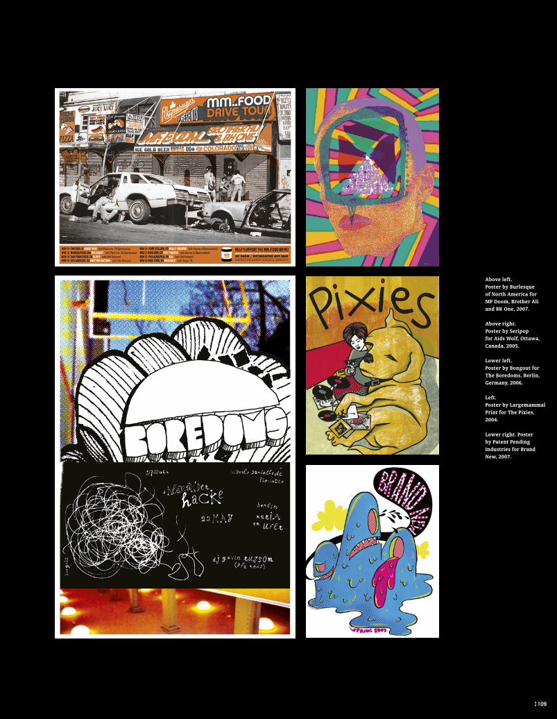
Above left.Poster by Burlesque of North America for MF Doom, Brother Ali and BK One, 2007.
Above right.Poster by Seripop for Aids Wolf, Ottawa, Canada, 2005.
Lower left.Poster by Bongout for The Boredoms, Berlin, Germany, 2006.
Left.Poster by Largemammal Print for The Pixies, 2004.
Lower right. Poster by Patent Pending Industries for Brand New, 2007.
: 109
e191_Posters7+C.indd 109 09/09/11 17:11

110 :
Above.Left. Poster by Denny Schmickle for DJ Z-Trip, Tulsa, United States, 2007.Centre. Poster by Stainboy for Mastodon, Orlando, United States, 2007.Right. Poster by Todd Slater for Ween, Philadelphia, United States, 2007.
Below.Left. Poster by Engine House 13 for Mudhoney, Colombus, United States, 2008.Right. Poster by Justin Hampton for a festival in Chicago, United States, 2008.
e191_Posters7+C.indd 110 09/09/11 17:11

: 111
Above. Left. Poster by 3D Glasses for The Locust, London, United Kingdom, 2007.Centre. Poster by Amy Jo for The Donnas, San Francisco, United States, 2006.Right. Poster by Delicious for Acid Mothers Temple, San Francisco, United States, 2006.
Middle.Left. Poster by Jay Vollmar for Vampire Weekend, Denver, United States, 2008.Centre. Poster by James Rheem Davis for Franz Ferdinand, Sacramento, United States, 2006.Right. Poster by Dale Flattum for Fu Manchu, Minneapolis, United States, 2006.
Below.Left. Poster by Alan Forbes for Sonic Youth, Nashville, United States, 2008.Centre. Poster by Delicious for 1900s, Chicago, United States, 2007.Right. Poster by Ken Taylor for Pearl Jam, Brisbane, Australia, 2006.
e191_Posters7+C.indd 111 09/09/11 17:11

112 :
ei25_ArabicTypography.indd 112 09/09/11 17:47

There are few areas of contemporary typography that are being practiced with the same fervour and enthusiasm as Arabic type design. For so long ignored, now the floodgates have opened. Having been frozen in classical historic forms for centuries, Arabic script is being rejuvenated by a new gen-eration of designers creating typefaces that can happily exist in the modern world. Given the beauty of Arabic calligraphy, it might come as a sur-prise to Western observers that Arab speakers have had to put up with crude, simplified, and sometimes even illegible forms of script in print. Huda Smitshuijzen AbiFarès, founder of the Khatt Foundation, the Netherlands-based centre for the advancement of Arabic typography and focal point of the Arabic typographic community, suggests that the beauty of the calligraphic script may have stifled the development of mod-ern Arabic typography. While calligraphy is held in high cultural esteem, primarily for religious reasons (as Arabic script was originally developed to record the Qur’an), this has had an inhibiting effect on type designers, who have felt that they are dealing with something sacred, which couldn’t or shouldn’t be changed. “It led to the wrong perception that the writing system was connected to the Holy Word, and that you shouldn’t mess with it,” says Mahmoud Hamdy of Dalton Maag’s Cairo office.Taken together with the formidable technical challenges, it is not hard to see why for so long Arabic typography remained starved of development, despite the work of a handful of pio-neering figures such as Thomas Milo. The advent of Opentype significantly diminished the technical problems that Arabic script faces, but the recent renaissance in Arabic typogra-phy is also paradoxically attributable to globalisation. On
the one hand, the desire for global standardisation can lead to dull sameness, but it has also acted as a major spur to the development of a community of contemporary Arab typogra-phers who now serve global brands. Those brands are aiming to develop local versions of their own typefaces, or to create Arabic versions of mainstream Latin fonts.Nonetheless, Arabic script, written right to left, with its cur-sive, calligraphic tradition and the fact that there are four forms for each letter, depending on how it marries up with its neighbour, presents significant challenges when placed in the straightjacket of Latin type conventions. Taken together with different modes inherited from calligraphy, primarily the stark and geometric Kufi and the more lyrical Naskh, it is clear that the development of modern Arabic typography, that can stand alongside or mirror contemporary Latin type, has not always been straightforward. Three typographers who are at the fore-front of recent developments are Nadine Chahine in Germany, Pascal Zoghbi in Lebanon and Mahmoud Hamdy in Egypt.
Long at odds with Western printing techniques and the culture of calligraphy, Arabic script is today a subject of renewed interest. Here we profile three contemporary typographers who reconcile Latin and Arabic forms, for the sake of globalisation.
By John Stones
Arabic Typography
: 113
ei25_ArabicTypography.indd 113 09/09/11 17:47
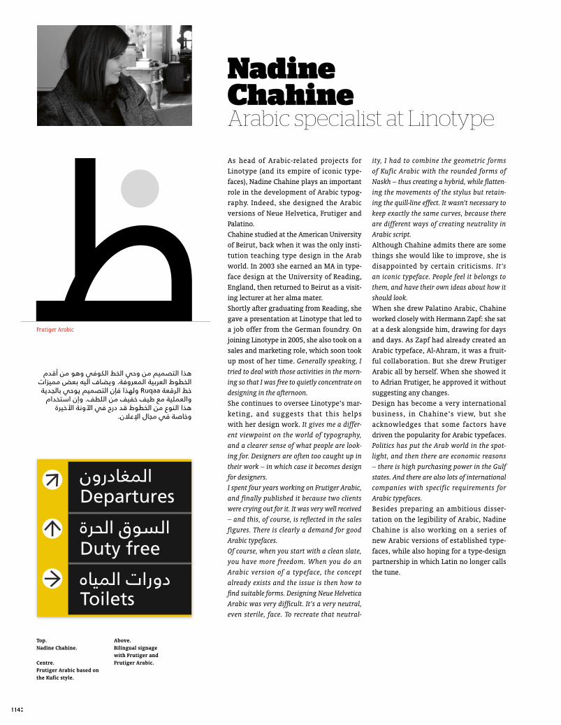
Frutiger Arabic
Nadine ChahineArabic specialist at Linotype
As head of Arabic-related projects for Linotype (and its empire of iconic type-faces), Nadine Chahine plays an important role in the development of Arabic typog-raphy. Indeed, she designed the Arabic versions of Neue Helvetica, Frutiger and Palatino. Chahine studied at the American University of Beirut, back when it was the only insti-tution teaching type design in the Arab world. In 2003 she earned an MA in type-face design at the University of Reading, England, then returned to Beirut as a visit-ing lecturer at her alma mater. Shortly after graduating from Reading, she gave a presentation at Linotype that led to a job offer from the German foundry. On joining Linotype in 2005, she also took on a sales and marketing role, which soon took up most of her time. Generally speaking, I tried to deal with those activities in the morn-ing so that I was free to quietly concentrate on designing in the afternoon.She continues to oversee Linotype’s mar-keting, and suggests that this helps with her design work. It gives me a differ-ent viewpoint on the world of typography, and a clearer sense of what people are look-ing for. Designers are often too caught up in their work – in which case it becomes design for designers.I spent four years working on Frutiger Arabic, and finally published it because two clients were crying out for it. It was very well received – and this, of course, is refl ected in the sales figures. There is clearly a demand for good Arabic typefaces.Of course, when you start with a clean slate, you have more freedom. When you do an Arabic version of a typeface, the concept already exists and the issue is then how to fi nd suitable forms. Designing Neue Helvetica Arabic was very diffi cult. It’s a very neutral, even sterile, face. To recreate that neutral-
ity, I had to combine the geometric forms of Kufic Arabic with the rounded forms of Naskh – thus creating a hybrid, while fl atten-ing the movements of the stylus but retain-ing the quill-line effect. It wasn’t necessary to keep exactly the same curves, because there are different ways of creating neutrality in Arabic script.Although Chahine admits there are some things she would like to improve, she is disappointed by certain criticisms. It’s an iconic typeface. People feel it belongs to them, and have their own ideas about how it should look.When she drew Palatino Arabic, Chahine worked closely with Hermann Zapf: she sat at a desk alongside him, drawing for days and days. As Zapf had already created an Arabic typeface, Al-Ahram, it was a fruit-ful collaboration. But she drew Frutiger Arabic all by herself. When she showed it to Adrian Frutiger, he approved it without suggesting any changes.Design has become a very international business, in Chahine’s view, but she acknowledges that some factors have driven the popularity for Arabic typefaces. Politics has put the Arab world in the spot-light, and then there are economic reasons – there is high purchasing power in the Gulf states. And there are also lots of international companies with specific requirements for Arabic typefaces.Besides preparing an ambitious disser-tation on the legibility of Arabic, Nadine Chahine is also working on a series of new Arabic versions of established type-faces, while also hoping for a type-design partnership in which Latin no longer calls the tune.
Top.Nadine Chahine.
Centre.Frutiger Arabic based on the Kufic style.
Above.Bilingual signage with Frutiger and Frutiger Arabic.
114 :
ei25_ArabicTypography.indd 114 09/09/11 17:47

Palatino Arabic
Kufi c Latin alphabet
Kufi c character in large point size Kufi c Arabic alphabet
Palatino Arabic character in large format
Above.Koufia is an Arabic typeface by Nadine Chahine, inspired by ancient Kufic styles extinct since the 12th century.
Below.Palatino Arabic, by Nadine Chahine and Hermann Zapf, is inspired by classical calligraphic styles. Designed for body text, it can also be used in large formats.
: 115
ei25_ArabicTypography.indd 115 09/09/11 17:47

Bilingual logos by Pascal Zoghbi.
Like many others of his generation, Pascal Zoghbi began his studies in his native country but had to go abroad to learn in depth about typography. He obtained a Master’s in typeface design at the Royal Academy of Art (KABK) in Amsterdam.The process of learning typography doesn’t focus on a specific type of script, but some teachers encouraged me to talk to Arabic spe-cialists. In a nutshell, it was primarily up to me to learn about Arabic typography. When I and other designers, such as Nadine Chahine, graduated in 2005, there was suddenly a heavy demand for Arabic typefaces – a happy coincidence.Zoghbi returned to Beirut to set up his own agency. Seeking an appealing name that alluded to Arabic typography, he opted for 29 Letters. It is generally agreed that the Arabic alphabet has 28 letters, but Zoghbi also included the hamza, the diacritic sign that represents the glottal stop. I also liked the idea of having a number in the title, which made it slightly different.Zoghbi soon specialised in designing log-otypes in both alphabets, often for multi-national companies moving into Middle Eastern markets, and mostly in the Gulf region. There had been a demand for con-temporary Arabic typefaces based on Latin counterparts, and they were often very mediocre. So, as well as design-ing bilingual logotypes, Zoghbi devoted time to improving poor-quality type-faces, and to training the up-and-com-ing generation of Beirut students at the Lebanese-American University (LAU) and Notre Dame University. One of his unfin-ished projects, a remnant of his univer-sity years, was an Arabic interpretation of Gill Sans. The important thing is not to copy and paste, he stresses. To draw the Arabic, you must start again from scratch.
After this initial influx of business, things quietened down, Zoghbi states. But with the global financial crisis now receding, enthusiasm is growing again: international companies are still just as eager to have a bilingual typographic presence. The market is more mature now, and clients know who to work with.Technical problems have been reduced to the minimum, at least from a printing perspec-tive. Arabic typefaces are no longer forced to adapt to the rules of Latin script. It’s more of a creative issue: how not to get trapped in the early forms, which were essentially based on the Ottoman and calligraphic traditions. It’s all about learning ancient, traditional script while drawing it in a modern way, so that it looks new while also remaining legible. It’s all about creating typefaces that are more idiomatic and less dependent on the simplified Arabic typefaces that were previously the only ones available.When laying out newspapers, Arab graphic designers used to have limited options, but things are changing. Zoghbi has designed modern, bold, strong display faces for three Middle Eastern newspapers (Al Rouiah, Al Watan and Imarat). The main challenge was to ensure each had its own visual identity. The only area where technical problems persist is Arabic typefaces for the Internet, where display optimisation (hinting) and problem-solving have resulted in mediocre ergonomics for Arabic speakers and design-ers and the selection of inappropriate type-faces. They are often too small, illegible or cut off. That’s the area where the biggest changes will occur in the next five years, says Zoghbi, as a new generation of design-ers rise to the challenge.
Pascal Zoghbi29 Letters
116 :
ei25_ArabicTypography.indd 116 09/09/11 17:47
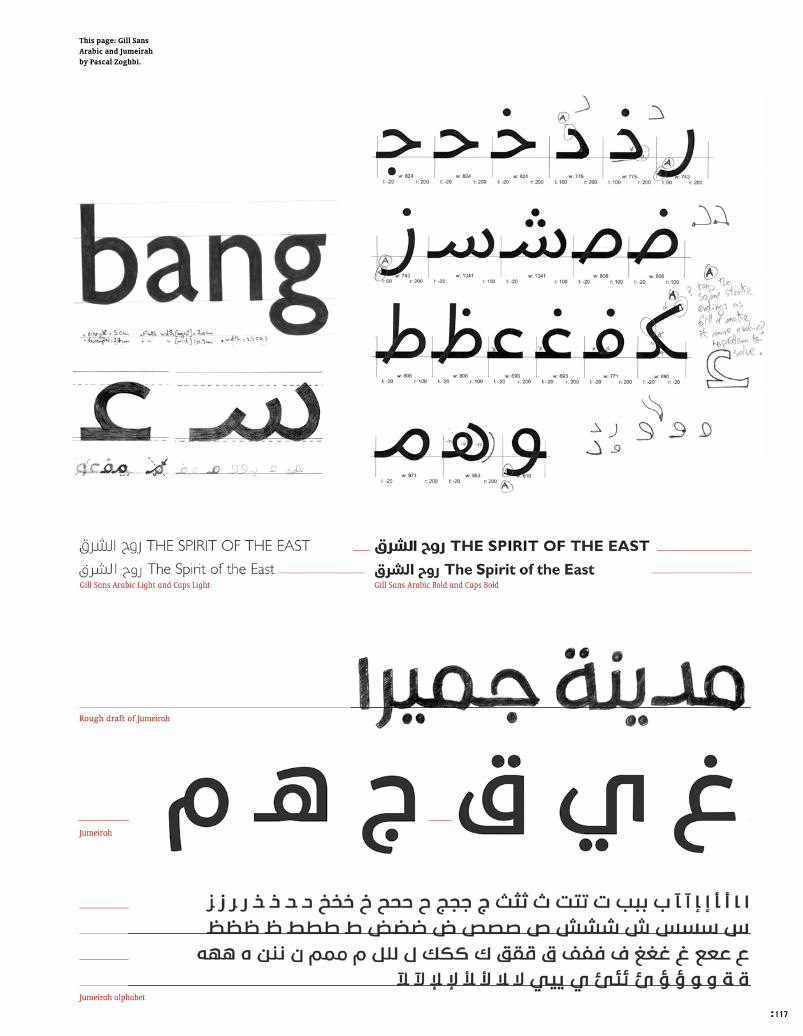
Jumeirah alphabet
Jumeirah
Rough draft of Jumeirah
Gill Sans Arabic Light and Caps Light Gill Sans Arabic Bold and Caps Bold
This page: Gill Sans Arabic and Jumeirah by Pascal Zoghbi.
: 117
ei25_ArabicTypography.indd 117 09/09/11 17:47

After running his own Cairo agency, FC Studio, a chance meeting with Bruno Maag after a lecture event, led to Mahmoud Hamdy opening up a Cairo branch of Maag’s London-based font design studio, Dalton Maag. When I graduated in 2000, there were still just a few graphic-design studios. So I worked in some small studios, then in advertising agencies, and then I started to find my way in Arabic typography and calligraphy. In design terms, there was no such thing as an Egyptian identity. Everything that looked nice always had a European or American feel – that’s how designers used to work, trying to imitate. With a few other designers, I started challenging that, and asking why we couldn’t use Arabic or everyday elements in our graphic projects.In every culture, it’s a cyclical thing. To start with, people just copied or produced clichés. Then they introduced local elements such as Coptic, hieroglyphics or Arabic into design, and then they started using their ingredients in a more authentic way. Now the trend is strengthening, and we’re starting to see really good, authentically Egyptian design.When Bruno Maag came to Cairo to give a lecture on typography at the German University, Hamdy and his colleagues were full of enthusiasm. I was passionate about typography, but I’d never managed to per-suade a client to grant me an interview. I had lots of questions, and I asked Bruno to give a talk at the agency, which was a suc-cess. We started cooperating by email as soon as he needed an Arabic speaker in the coun-try, initially to create a display typeface for McDonald’s. That soon resulted in an invi-tation to set up a regional office for Dalton Maag, to satisfy demand for Arabic typefaces.The main difference between Latin and Arabic typefaces is that in Arabic, the word is the
form, whereas in Latin the letter is the unit. In Arabic, the form changes organically from word to word. A letter has one of four forms, depending on its position: initial, medial, final or isolated. This makes encoding and drawing really hard – it’s basically four times as much work. Maybe one day there’ll be a simplified form of Arabic where the letters don’t have to be connected and we can just use the form. That’s one of my dreams – reaching a stand-ard where I’m capable of doing that.In recent years global brands and corpora-tions have needed to speak to people more directly in their own language, using the rel-evant script. As designers, it’s very difficult for us to find corresponding Arabic scripts, so we end up creating them ourselves.In the Arab world, there’s now a growing awareness of what good design is about. After a large quantity of mediocre output, design-ers and clients are now realising that people can no longer be fooled, and that they have to raise the bar. And as typography is the core ingredient in graphic design, it’s really becom-ing vital to find good Arabic typefaces.Although Hamdy’s primary focus is on originating an Arabic typeface, with the Latin version as simply a spin-off, most of his work involves adapting Latin faces. If you only produce a clone of a Latin typeface, it might satisfy Westerners but to Arab eyes it will be just that – a clone, a zombie. Of course you have to copy and respect certain features, such as width and x-height, but it must also have its own individual character. My generation has had to learn everything, starting from square one. But in light of what’s happening at the moment and with the up-and-coming generation of graphic designers, I feel very optimistic.
Designs and logos by Mahmoud Hamdy.
Mahmoud HamdyDalton Maag
118 :
ei25_ArabicTypography.indd 118 09/09/11 17:47

Above: Typographically. Patterns for vinyl wall coverings. Part of the Mulsaq project for the Khatt Foundation’s design collection design.
Left: The Arabic version of the Q22 typeface, by Mahmoud Hamdy, and the Latin version by Fabio Haag, head of Dalton Maag’s Brazilian office.
: 119
ei25_ArabicTypography.indd 119 09/09/11 17:47

La Typographie arabe, le rythme des lettres, le souffl e des mots, la vie du texte (“Arabic typography: the rhythm of letters, the breath of words, the life of text”) is a recent fourth-year dissertation by Marco Maione and Tristan Maillet, students at the École Nation-ale Supérieure des Arts Décoratifs (EnsAD) in Paris, under Nasser Bouzid’s supervision. It relates the development of Arabic typog-raphy from calligraphic art through to the latest computer-led innovations. This richly documented book addresses the various complexities and specifi cities of Arabic script, as well as its interaction with successive typeface-production techniques.
Approaches and methodsIt is now possible to pick out two main-stream approaches in the design of contem-porary Arabic typefaces. The fi rst approach is championed by a community of Arab designers, mostly Western-trained and of Lebanese origin. They seem to have united around a single conception of Arabic type-face design and made a big contribution to its considerable rise in popularity in recent years. Their work, through the dissemina-tion of many typeface projects via interna-tional publications and events, has become a key source of current developments. The overall approach is well summarised in the tagline used by the Khatt Foundation, Center for Arabic Typography, to define itself: “Building cultural bridges and advancing design.” Typographic concepts are often devised as part of cultural bridges with the West, and designed using typo-graphic methods and forms that consider Arabic’s coexistence with Latin as a core issue. This approach often leads to the syn-thesis and rationalisation of script forms, Helvetica Arabic being an extreme example. The second approach was introduced by the linguist Thomas Milo, who reached another idea of what Arabic typography could become. Through his work with Decotype ACE, he has co-developed with WinSoft an InDesign extension that lets you manage Arabic text with great preci-sion. The Tasmeem technology, which han-dles Arabic script in all its subtlety and calligraphic complexity, lets users exploit the typographic effects, variations and nuances peculiar to Arabic. This approach, faithful to the heritage of calligraphy, opens up huge fi elds of macro and micro type design that are independent of the Latin system. However, designing Tasmeem-compatible typefaces remains a relatively complex affair, beyond the reach of non-specialists. Arabic type design is thus a fi eld shaken by controversies that herald renewal in the world of typography. These two approaches, sometimes described respectively as progressive and traditional, have produced fairly marked divergences.
In progress and future research will yield solutions of greater subtlety, tailored to users’ requirements and applications.
Techniques and developmentThe current status of Arabic typography is closely linked to its history, which has been untouched by the main typographic evolu-tions. This is partly due to the infl uence of Islam, which imposed the use of the kalam (reed pen) for copying the Koran, and long remained hostile to mechanical means of reproduction. In addition, the inherent com-plexity of Arabic script and its fundamental differences from Western systems have raised technical challenges through the ages. Arabic script contains few basic char-acters but many supplementary signs – vowellation and reduplication signs, alternative forms depending on the sign’s position on the word, graphic combinations of certain groups of letters – all of which one can easily enhance with decoration and ornament specifi c to Arab culture. Printing with movable type, which appeared in Europe in the 15th century, and Arabic script seem incompatible at first sight. Adapting a technology to a writing system for which it was not intended poses tremen-dous diffi culties for engravers and foundry workers (high number of characters, forced alignments, problems of inter-sign connec-tion, a much greater risk of mistakes, con-gestion of certain letters, etc.).Only in the 19th century did Ottoman typographers devise a satisfactory system that allowed any letter sequence to be set in fragments, but the system proved too complex and had little impact on society, which continued to prefer writing by hand. The 20th century witnessed many propos-als for reforming and simplifying Arabic. In 1956, Linotype released Yakout, a typeface that halved the character set by keeping only two of each letter’s four possible forms. Yakout met with such success among Arab newspapers and the commer-cial press that this simplifi cation surely had a considerable effect on reading habits.Today, Arabic typography is still a major
It is now possible to pick out two main-stream approaches in the design of contem-porary Arabic typefaces. The fi rst approach is championed by a community of Arab designers, mostly Western-trained and of Lebanese origin. They seem to have united around a single conception of Arabic type-face design and made a big contribution to its considerable rise in popularity in recent years. Their work, through the dissemina-tion of many typeface projects via interna-
Méd. Ini. Iso.
Doâd
Toâ
Zoâd
Fin.
Choice of styles for the same word in Nassim, using the Tasmeem extension.
Most Arabic letters have four forms, determined by their position in the word: initial, medial, final or isolated. The variants shown here are from Thomas Milo’s font family DTP Naskh.
Examples of how letters integrate into the word, with Titus Nemeth’s typeface Nassim, using the Tasmeem extension developed by Decotype and published by WinSoft.
Arabic scriptilluminated by Marco Maioneand Tristan Maillet
120 :
ei25_ArabicTypography.indd 120 09/09/11 17:47

challenge internationally. The relationship between the structure of the script and the technologies at its service is key. Until recently, all technologies supported only limited use of Arabic script (due to prob-lems with writing direction and glyph iden-tification during changes in platform, country or software). However, nowadays, OpenType format and Tasmeem extension have resolved most of these issues.
Styles and formsArab-Muslim civilisation has always favoured calligraphic art and its diversity of techniques, forms and media. Consequently, Arabic script, besides its importance in the visual world of Islam, has retained immense formal variety and richness. Whereas in Latin there is a clear and perceptible distinc-tion between everyday writing, calligraphy and typography, the Arabic disciplines seem less differentiated. Although it is hard to draw up a typographic classifi cation, one can discern, among the abundance of calli-graphic styles, two major families around which the design and writing of today’s Ara-bic letters have been sculpted: Kufi c and Naskh. Kufi c, an angular script, is character-ised by geometric forms adapted to motif art. And this script alone includes many variants ranging from primitive Koranic forms to balanced, airy classicism; from extremely geometric, logotype-like forms to baroque profusion of decorative elements. Naskh, which is more cursive, was originally used for profane and practical texts. Then, in the ninth century, it became the script for everyday writing, as it combined ease of drawing and elegance. A harmonious com-promise between geometric norms and expressive cursiveness, Naskh relegated Kufi c scripts to a titling role. Other styles are equally noteworthy for the potential of contemporary interpretations they offer. Ruq’a, originally used to facilitate administrative writing, stands out for highly economical movement of the kalam and the elimination of all stylistic effects. While its drawing speed and ease of line have made it a popular script in the Arab world, its simplicity also echoes the sobriety of Western type designs. In contrast, more ornamental styles such as Thuluth, mainly used for chapter headings and titles, and Diwani, for offi cial texts, give type designers great inspiration. Contemporary typogra-phy has directly tapped these formal distinc-tions in order to tweak them or apply them to current applications.Like any typographic rule, these principles – fusing geometric rigour, calligraphic vari-ations and formal analogies of language – still leave plenty of latitude for novel and creative interpretation.
Primitive Kufi c
North African Kufi c
“Flat” Kufi c
Oriental Koranic Kufi c
Primitive Koranic Kufi c
Thuluth
Ruq’a
Diwani Al-Jeli
Diwani
Examples of the variety of Arabic scripts before the advent of typeface design.Source: Khatt Foundation.
: 121
ei25_ArabicTypography.indd 121 09/09/11 17:47

publishing by john stones
blessing. Graphic designers in particular have suffered a double whammy. First, their primary fi eld, the printed page with all its visual and tactile pleasure, was usurped. Plus, creativity and authorship have been devalued, with the promise of fi nancial returns really only benefi tting such behemoths as Google. It’s something Jaron Lanier, the dreadlocked, heretic guru of Silicon Valley, has persua-sively argued in his recent polemic, You are not a Gadget (Allen Lane). He highlights the dangers to creativity inher-ent in our current relationship to the Web; music, design, fi lm and journalism are debased and cannibalised, carved up into little bits for blogs, while the creatives that origi-nate new material are sidelined and often deprived of fi nancial recompense for their work.
Back to paperIt is against this backdrop that designers and design critics have turned, after a respectable period of blogging, to pro-ducing the ‘book of the blog’. Quite apart from their natural propensity for print, what are we to make of the results? Is this what Lanier so picturesquely described as “creative people – the new peasants – resembling animals converg-ing on shrinking oases of old media in a depleted desert?”It’s hard not to have some sympathy with this comment made by D. Gions, on the review section of Amazon (itself a blog of sorts), after buying 79 Short Essays on Design
Whatever happened to blogs? Once upon a time, blogs were the epitome of cool. You could casually toss one off, like Carrie Bradshaw, the fi c-tional protagonist of Sex and the City, and the world would lie at your feet. Or so it seemed. But, since those heady days at the turn of the century, blogs have gone from being an exciting novelty to simply ‘required read-ing’, something to trudge though, and we’ve experi-enced the blogging sublime – blogs about blogs. Then, Hollywood got in on the act, producing such blog-inspired fi lms as Julie & Julia (2009). And television followed, with the series, Secret Diary of a Call Girl, inspired by the racy Belle de Jour blog (aired on ITV2 in the UK). And now, irony of ironies, we have the book of the blog too. So, are these tomes the blog’s exhausted epitaph; or are blogs actually reviving the staid world of book publishing?“The Big Blog Dream has largely died”, writes commen-tator Bill Wasik on, you guessed it, his blog. “First, the mainstream media muscled in, using their storehouses of experience and talent to launch scores of their own high-traffi c blogs (and when they didn’t build their own, they hired the best amateurs to join their staff). Second, the Internet-native media that has survived are hardly amateur by any defi nition”.In the rarefi ed enclave of the creative industries, design-ers, writers and photographers have found blogs a mixed
Blogs to BooksThrough blooks, these printed books based on blogs, John Stones analyzes the evolution of online media and looks at the future of such media in the lightof current transformations in publishing.
It’s Nice That Issue #3. April 2010. Collection of the best articles and interviews published on the blog itsnicethat.com between November 2009 and March 2010. © 2010 It’s Nice That.
132 :
ei25_Blog_to_BookS.indd 132 09/09/11 17:17

(Princeton Architectural Press). He/she writes, “These are basically posts from this guy’s blog. It’s fairly interesting, but I had a hard time reading it straight through.” The book is an anthology of writing by Pentagram partner Michael Bierut, largely taken from Design Observer, the blog he co-established in 2003. The ‘essays’ (imagine the title 79 Blog Posts…) have been culled from the website and, for the book, given various typographic treatments. Meanwhile, Design Observer is a victim of its own success, leaving the immediacy of its origins behind to become a major commercial entity (with some blogging attached).At the same time, some very popular design blogs, such as Armin Vit’s Speak Up in the USA and Pingmag in Japan, have shut up shop (though both remain archived and accessible), while others, including the UK’s Dezeen, have become rivals to well-established magazines. There are survivors though. Take DailyMonster.com. Begun in 2006, when Stefan Bucher (a German-born graphic designer resident in Los Angeles) began doo-dling a Rorschach-like monster every day, on his blog, and invited feedback. It was a diverting distraction from the constraints of the daily grind, and the spin-off blog quickly developed a following. Now published as 100 Days of Monsters (How Books), the monsters are relocated from the immediacy of the blog to the highly controlled envi-ronment of the book (replete with an animated DVD).
Bldgblog.blogspot.com, the wide-ranging blog of erstwhile Dwell editor Geoff Manaugh, is another that has made the migration to print, thanks to Chronicle Books. Likewise, It’s Nice That, a blog that is the darling of many graphic design students, now produces biannual Issues in print, reshowing work from the blog in expanded form along-side new material, such as interviews with well-known fi gures (“we’re quite well connected and thought it was a pity not to spend a bit more time with them,” mean-ing celebrated interviewees). MagCulture.com, the blog of editorial designer Jeremy Leslie, is another that has suc-cumbed to the temptation of a print version.The genre has a name, but it hasn’t really caught on. ‘Blook’ was conceived in the first flush of enthusiasm that has since waned, in the same way that our enthusi-asm for instant chat, email and now blogs have. And, of course, the ‘blook’ has gone mainstream too; any narcis-sistic Internet dilettante may ‘immortalise’ his or her blog with a quick trip to ‘print on demand’ websites such as www.blurb.com (“what will your book be?”) or www.lulu.com (“one million authors have used lulu.com”).“The great thing about blogging is the instantaneous nature of content publication, but the flipside is that the content disappears too quickly, becoming buried below the latest posts. This will help you dig out some of those posts”, writes Leslie about the print version of magCulture.com, as if the search function wouldn’t be much quicker. Selling for a tiny sum, magCulture.com/paper is an indulgence (printed incidentally on news-print, by the Newspaper Club, an online facility for cre-ating small-run newspapers). On the other hand, many of the other ‘blooks’ are clearly commercial ventures. Return on investment…There’s the obvious criticism of ‘cashing in’ to deal with, whether in reference to the spin-off book, or to the ini-tial blog (which may merely be a marketing device for either an egocentric/ambitious individual or a company seeking to ‘get in close’). Take this exchange about Speak Up’s last entry, between Vit and reader, Joe Clark, which incidentally also exemplifi es the rude tone or ‘trolling’ so typical of the genre:Joe Clark: So you’re saying that at no time did you start or perpetuate Speak Up so it could advance your career?Armin Vit: I don’t think I said that. I said the contrary, Speak Up made my career basically.JC: As, for example, getting hired by Pentagram?AV: I met Michael Bierut through Speak Up so, yes, I did ‘use’ Speak Up for that. I doubt Michael hired me for my blogging capabilities alone, though.JC: And now that your career is doing so well you can move to Austin, Texas and coast on a couple of clients at a time, you don’t need the blog anymore?AV: Twist words much?Michael Bierut then joins in the discussion.
BLDG Blog Web page showing The BLDG Book, written by Geoff Manaugh in 2009 based on content from the website http://bldg-blog.blogspot.com© 2009 Geoff Manaugh (BLDG Blog)/Chronicle Books LLC.
: 133
ei25_Blog_to_BookS.indd 133 09/09/11 17:17

Magculture.comPage from the website http://magculture.com.And project for the journal magculture.com/paper, initiated by the founder of the Jeremy Leslie blog ,and based on onlinecontent since 2006. © Jeremy Leslie/ Magculture.com
Michael Bierut: I for one am grateful that Armin Vit started Speak Up in order to trick me into hiring him at Pentagram. So much harder than, say, dropping off a portfolio, but that kid never does things the easy way.Vit’s winding up post suggests blogging was a victim of its own success. It simply exhausted itself and frag-mented; discussions dried up as previously regular posters set up their own blogs. He also adds that it’s diffi cult to see the space or desire for new blogs to develop a similar momentum. But with his reputation now secure, commis-sions for work and for prestigious books such as Design Referenced (Rockport) have rolled. And Vit continues to maintain a clutch of more specialised blogs (Brand New, Quipsologies, Word It). Alex Bec, one of the founders of It’s Nice That, is refresh-ingly honest about the marketing function of that web-site. “We make our money as a design agency, all built off awareness of the website. And we use our publica-tions as a shop window, as a way of finding new tal-ent.” Reluctant to call the website a blog, Bec is equally reticent about calling the printed Issue a magazine; “It doesn’t depend on covering current items. We hope people can spend more time with it, have a fuller rela-tionship with it”.
… or looking for recognition?The foreword to Issue #3 states that it allows, “…a for-mat that gives the work the respect it deserves.” Is this not a strange comment from the founders of a highly suc-cessful design blog; that the Web is somehow disrespect-ful? “We mean that in the sense that the work we show was not originally created to be seen at 72dpi in RGB,” Bec replies cannily. Issue has a print run of 5,000 compared with 90,000 hits and 600,000 page views a month for the blog, but both are self-fi nancing. And how does Bucher defend his book of the blog? “Simply, I love books, and I’ll use any excuse to make one,” he says. “The Monsters, of course, thrive on motion. Each day people react to the new Monsters by writing stories, or commenting on what other people have written. It’s a living system. A book can’t replicate that experience, but it can offer a different view. 100 Days of Monsters was a way for me to create a time capsule of the start of this experiment. It also gives people a chance to see the drawings as I did; as opposed to 480 x 320 pixel video images. I think that this is a general impulse for people who build something online; [a book] is a way to create another, more permanent way of looking at a project.” And was there also the idea that he could make some money from it? “Do I hope? Yes. Do I? Not yet. I don’t know why you’d be worried about saying so. The more I can sustain myself fi nancially by drawing
134 :
ei25_Blog_to_BookS.indd 134 09/09/11 17:17

Daily MonsterRight: Drawings of monsters. Books and DVD of the “100 Days of mon-sters” project. Left: Stefan G. Butcher web page www.daily-monster.com© 2008 by Stefan G. Butcher/Daily Monster Inc.
Monsters, the more Monsters I get to draw. And I don’t think that’s a bad thing”.Given the diffi culties for crea-tives of all sorts to survive in the free-for-all of the Web, so well highlighted by Lanier, who would wish to disagree? If major newspapers and music companies can’t make the Internet work though, perhaps individual designers, lighter on their feet, might.
A new type of bookAnd while structural and fi nancial motives may be pri-mary, for the book of the blog, it would be churlish to deny that some interesting creative possibilities are hap-pening. It’s Nice That certainly adds something to the print-media mix with Issues (for which they recruited an editorial designer). But, so far the ‘innovations’ seem very similar to the pleasures of a well-conceived, well-designed magazine or book. Bucher goes a bit further, including a DVD with extra material, but this still can’t capture the freshness of the Web. The BLDGBLOG Book is perhaps the most successful transition to date. Given its futuristic, architectural bent it’s only natural that Manaugh be sensitive to the cha-otic, overwhelming experience of online reading, with its never ending trails of distraction. This is a book that could induce severe indigestion if read cover to cover. Instead, it encourages the reader to either delve or skim.
Like the blog from which it is drawn, Manaugh says the book is built around the pleasure principle of following your desires. “What I wanted to do…was to pull out cer-tain threads from the blog that seemed more worthy of an extended discussion. I wanted to use the book as a book,” Manaugh writes. Too often, however, these ‘extensions’ seem to be a euphemism for less rigorous editing, but the design (by MacFadden & Thorpe) enforces some visual dis-cipline on the book. “For a blog to be in print, there needs to be a very good reason,” Bec says. Certainly in these books of the blogs, the designs, illustrations and photographs work better on the printed page than on screen. But surely, the real reason for these hybrid beasts is that we are still struggling to fi nd a mature way of dealing with the Internet? As the rise and fall of the blog shows, solutions are fast moving. New entrants, such as the iPad, potentially could change the game once again. Book publishers and other media owners are still ‘at sea’, like the rest of us, and will latch on to new trends and content especially when they see proof of an interested audience (one of the blog’s hand-ier features). If this allows designers and other creatives to be viable and recompensed for their work it is surely a good thing; however these blogs to books may only be a curious and anomalous step along the way.
: 135
ei25_Blog_to_BookS.indd 135 09/09/11 17:17

142:
“Alex Steinweiss designed the fi rst illustrated album cover for a 78 rpm disc in 1940, and in 1948, he invented the cardboard sleeve which became the standard for the 33 1/3 rpm LP until the compact disc fi rst appeared in 1983. Steinweiss’s trademark sinuous print remained for a long time a constant feature on album covers.” This is how Steven Heller begins his fore-word to the book Alex Steinweiss: The Inventor of the Modern Album Cover. The book, published by Taschen in the fi rst quarter of 2011, is the size of an A3 format manuscript, and contains the entire career-long output of the American graphic artist, Alex Steinweiss. As Columbia Records’ fi rst artistic director in 1938, he decided how music would be packaged throughout the fi rst half of the twentieth century. The excellent quality, large-format illustrations help the reader discover both the communicational aspects of the music industry in the last century and observe the stylistic variety used to differentiate between very different musical aesthet-ics. For the author, Kevin Reagan, it is not just a matter of looking at the work of a lifetime but of making a journey through the history and representation of twentieth-century music by analysing a discipline’s growth of expression. Jazz and classical music are well represented and account for the majority of his overall album output, although the publication covers all genres. The genius of Alex Steinweiss is certainly revealed in all his extraordinary creative powers, both in the use of novel materials as well as in his constant adapatation to contemporaries’ needs. Although regularly featured in the American and international press, the unusual career of the small-time graphic artist from Brooklyn still leaves us speechless. IM
Alex Steinweiss : The Inventor of the Modern Album Cover
Kevin Reagan, Steven HellerTaschen Books416 pages – 39.6 x 33 cmFrench, German, English – €500
TD 63-73
Ben BosUnit Editions319 pages – 19.5 x 24.5 cmEnglish – £35
Ben Bos tells the story of Total Design from 1963 to 1973, “the agency’s golden era.” When it was founded in 1963, Bos,
Wim Crouwel, Friso Kramer and Benno Wissing formed the core team. The Dutch graphics landscape was then very different from how it is now. The importance of the boundary between advertising and the design business world ruled out any meaningful collaboration. And while in the USA Paul Rand was designing IBM’s logo and com-munications, the members of Total Design were dreamily wondering about investing in such a market. It was only after many meetings with unconventional advertisers and gifted architects that Total Design was able to penetrate this sector, which radically transformed the Dutch graphics scene for decades
to come. TD 63 to 73 shows, as well as the agency’s seminal works (and there are plenty of them: the Post Offi ce, Philips, Amsterdam Airport Schiphol, communications for the Bijenkork store whose logo was designed by Joseph Müller-Brock-mann, etc.), how Total Design was built up with no preconceptions. A team that describes itself as on the political left and is responsible for the identity of many of the coun-try’s banks, an agency that wants to be inspired by sharing and an egalitarian view of job titles and claims to work in the presence of real masters. Total Design have bal-ance things precariously. But these young people who wanted to have
their cake and eat it deserve our congratulations. A minor complaint about the book itself: Although the author warns the reader in the fore-word, this history of Total Design is Bos’s own personal memoire. Thus it is full of his likes, his partners and a great deal of name-dropping, to the extent the narrative some-times comes across as a tribute to his various colleagues. The thread of the story and of the ideas tends to get lost in his ‘small circle’ which the unfamiliar reader cannot relate to. A book for cognoscenti of Dutch graphic design. CB
ei25_livres.indd 73 14/09/11 15:33
books
: 143
IKEA, the book
Staffan Bengtsson Publisher Arvinius Förlag 443 pages – 17 x 23.5 cmEnglish – €56
Pictoplasma, the Berlin festival ded-icated to characters, avatars, figu-rines and other ‘mascots’, published this book in August as a celebration of the appearance on the catwalks of these ‘beings’ and their growing presence in the fields of fashion, photography and visual creation. Produced in conjunction with Ato-pos Contemporary Visual Culture, Not a Toy gives plenty of space to quality pictures and shows a selec-tion of works using a broad range of materials – textiles, plastics, tex-tures – and slick new techniques to bring these hybrid individuals into play. The cover picture of Pyuupiru sets the ball rolling between real-ity and fi ction. With, among others, Agatha Ruiz de La Prada, Alexander McQueen, Ara Jo, Sandra Backlund, Anne De Vries and Nick Cave. IM
Not a toy - Fashioning radical characters
AtoposPictoplasma Publishing Berlin350 pages – 23 x 33.6 cmEnglish – €49.50
Not for the rich but for the smart. The first IKEA store opened its doors in 1958. Initially the brand only sold small items: household gadgets, pencils, objects. The founder, Ingvar Kamprad, then left his mark by selling furniture; the idea was to produce accessible design for everyone and transform the quality of Swedish interiors. To democratize design, the Ingvar relied on three principles: form, function and price. The system of production, marketing and storage brought prices down. The furniture was ready to take away, coming in kit form and sold in fl at packs. This book retraces the fashions that Swedish design has seen over the second half of the twentieth cen-tury. Under artistic director Len-nart Ekmark, IKEA affirmed smart, robust and economical design. Thinking of its customer’s everyday needs by providing play areas and restaurants at its stores, IKEA has grasped the fact that social ideals are not incompatible with profi t. CB
Graphic Design for Fashion
Jay Hess et Simone PasztorekLaurence King240 pages – 21.7 x 28 cm English – €42
With its embossed pink-and-fuchsia hardcover, this book by graphic designers Jay Hess and Simone Pasztorek appears both sculptural and arresting. Organised into four chapters – brands, invitations, pack-aging and catalogues or look books – Graphic Design for Fashion sur-veys a careful selection of graphic design studios or agencies that have worked with the fashion industry in recent years, including Mevis & Van Deursen for Viktor & Rolf, Antoine + Manuel for Christian Lacroix, Studio Newwork for Robert Geller, Hansje Van Halem for Orson+Bodil and Basedesign for Lowe. Each graphic/fashion designer pairing highlights the relationship between two crea-tive entities, recalling that between a client and his designer. Each asso-ciation is an opportunity for graphic experimentation or, on the contrary, for the affirmation of identity of a fashion house, and generally reveals the attempt to push back conven-tions in the use of material, be it paper or fabric. The art of wielding matter in the service of form. IM
If a graphic designer has so much diffi culty in defi ning him-self, it is doubtless because of the profound changes currently affecting the discipline. Drawing, typography, calligraphy, photography, video, multimedia: the technological advances never cease to redefi ne the contours of a multifaceted sec-tor. With its title, I don’t know where I’m going, but I want to be there, this book defends the contemporary graphic scene in which one can fi nd tossed together the collabora-tion between the M/M studio and photographers Inez Van Lamsweerde and Vinoodh Matadin, the short fi lm by H5 that recently won an Oscar and the video clips by James Frost and Yan Thomas. A chronological frieze traces out a century of
history, from the 1900s to the present day, highlighting the graphic connections between the creativity of the past and that of today. The volume is rounded off with a corpus of theo-retical texts on graphic design and ecology, standardisation and the responsibilities of the graphic designer as citizen. While the book does not claim to be exhaustive, it neverthe-less offers both amateur and specialist a thorough reading of a graphic design sector that is expanding on all fronts, and whose invisible limits question the position of graphic design in contemporary society – caught between a mission for gen-eral interest and the frenzy of communication. RRT
I don’t know where I’m going but I want to be there. The expanding field of graphic design 1900-2020
Sophie Krier, Marjolijn Ruyg et Minke KampmanBis165 pages – 17.5 x 25 cmEnglish – €29.50
Scriptes
Steven Heller, Louise Fili Thames & Hudson352 pages – 17.2x 24.5 cm French – €32
Steven Heller and Louise Fili look at the history of script in a book packed with illustrations. Declared the bastard daughter of Roman type and handwriting, this typo-graphical family enjoyed its golden age in the early twentieth century in France, Italy, Germany, Britain and the United States. Used to decorate announcements and call-ing cards, it was a favourite for high society protocol while also featuring prominently in business spheres. Printers at the time would have catalogues with a huge variety of scripts. Later on, the world of advertising gave them a new lease of life before the Dadaists adopted them, thereby criticising the archa-ism of society and the art world. Jan Tschichold also used script in contrast with his sans serif letters, which was typographical heresy at the time. Polite and elegant, script tells the story of propriety… CB
ei25_livres.indd 74 14/09/11 15:33

0,75€*
Creative, conceptual, unusual, wild...
Enjoy 14 million images from 0,75€ each
and feed your creative skills.
Trust the European leader of creative resources!
Phone +44 20 881 67284 **http://eu.fotolia.com
*XS
stan
dard
. XL
stan
dard
from
£5.
04,
8 c
redi
ts –
© O
lly #
222
9745
4 —
**
loca
l cal
l rat
e