Embed Size (px)
Citation preview

Enhancing the accessibility of climate
change data visuals
Recommendations to the IPCC and guidance for researchers
Jordan Harold, Irene Lorenzoni, Kenny R. Coventry, Asher Minns
October 2017

1
About the authors:
Jordan Harold is an Applied Cognitive Psychologist at the School of Psychology and Tyndall Centre for Climate Change Research, University of East Anglia, UK. Jordan has over 10 years’ experience in science communication across industry and academia, and has a particular interest in the communication of climate science within society.
[email protected] @jordanharold
Irene Lorenzoni is an Environmental Social Scientist and Senior Lecturer at the School of Environmental Sciences, Tyndall Centre for Climate Change Research, and 3S Research Group, University of East Anglia, UK. Irene’s expertise is in understandings of, and engagement with, climate change and sustainable development.
Kenny R. Coventry is a Professor of Psychology and Head of the School of Psychology at the University of East Anglia, UK. Kenny has specific expertise in human communication and decision making, is a Chartered Psychologist, a Fellow of the British Psychological Society, and recipient of the 2015 British Psychological Society Cognitive Prize.
[email protected] @KennyCoventry
Asher Minns is Executive Director of the Tyndall Centre for Climate Change Research, with 17 years’ experience in climate change communications. He uses the social science of climate change communication for effective engagement with audiences that are outside of academia, and trains researchers in the theory and practice of these techniques.
[email protected] @AsherMinns
Acknowledgements:
We would like to thank Richard Betts, Corinne Le Quéré and Rachel Warren for their helpful feedback during
the development of the guidance report, and Espen Larsen (Norwegian Environment Agency) and Jonathan
Lynn (IPCC) for their support in initiating the project.
We are also very grateful to the numerous individuals who took part in scoping discussions to help inform the
approach and content of the guidance, including (in alphabetical order), Maarten van Aalst, Mairi Dupar, Jan
Fuglestvedt, Ed Hawkins, Cathy Johnson, Valérie Masson-Delmotte, Cara Pike, Anna Pirani, Jim Skea, Raphael
Slade, James Smith, and Melinda Tignor. We are also very grateful to members of the climate research and
policy communities who provided valuable insights to the project via anonymous completion of an online
survey. We would also like to thank our funders for their support (see below).
Funding:
This work was supported by funding from the Norwegian Environment Agency (Miljødirektoratet) and from
the High-End Climate Impacts and Extremes (HELIX Climate) project funded by the European Union’s Seventh
Framework Programme for research, technological development and demonstration under grant agreement
no 603864.

2
Related work:
This report has been developed in response to calls to enhance the communication of future
Intergovernmental Panel on Climate Change (IPCC) outputs, including:
- 41st Session of the IPCC, Decision IPCC/XLI-4 (Future work of the IPCC), paragraph 10 (p11)
- 43rd Session of the IPCC, Decision IPCC/XLIII-10 (Communications for the Sixth Assessment Report),
decision 3 (p20)
- 44th Session of the IPCC, IPCC/XLIV-10 (Review of the IPCC Communications Strategy), paragraph 17 (p4)
- IPCC Expert Meeting on Communication (9-10 February 2016, Oslo, Norway)
Further, the recommendations and guidance presented in this report build on earlier work by the authors to
synthesize cognitive and psychological science insights relevant to improving climate change data visualization,
published in Nature Climate Change 2016:
Harold, J., Lorenzoni, I., Shipley, T. F., & Coventry, K. R. (2016). Cognitive and psychological science insights to
improve climate change data visualization. Nature Climate Change, 6, 1080-1089.
Further resources related to this report can be accessed from the following websites:
tyndall.ac.uk/datavisuals climatesciencecognition.com
Suggested citation for this report:
Harold, J., Lorenzoni, I., Coventry, K. R., & Minns, A. (2017). Enhancing the accessibility of climate
change data visuals: Recommendations to the IPCC and guidance for researchers. Report published
by the Tyndall Centre for Climate Change Research, Norwich, UK.

3
Contents
Foreword 4
Executive Summary 5
Recommendations to the IPCC 6
Using this guidance 7
Creating better visuals – The MADE principle 8
Cognitive guidelines for effective visuals
Identify your main message 9
Assess your audience’s prior knowledge 10
Consider how your audience ‘thinks’ 11
Choose visual formats familiar to your audience 12
Reduce complexity where possible 13
Build-up information to provide visual structure 14
Integrate and structure text 15
Avoid jargon and explain acronyms 16
Use cognitive perceptual design principles 17
Consider cognitive aspects when using digital animation and interaction 18
Consider cognitive aspects when visually communicating uncertainty 19
Test visuals to check comprehension 20
Examples: applying the guidelines 21
Line graphs 22
Bar charts 23
Thematic maps 24
Further reading 25
References 26

4
Foreword
Making sense of the science
Climate science and assessments consist of two important and clearly
connected parts: scientific work and communications. Fundamentally, there
would be no understanding without the science. But for science to have an
impact on society, it must be understood by non-scientists.
Norway has supported the outreach and communications work of the
Intergovernmental Panel on Climate Change (IPCC) over many years. As part of
this, we hosted the IPCC Expert Meeting on Communications in Oslo in 2016.
The idea for this guide stemmed from discussions at this meeting. The aim has
been to provide guidance for all climate researchers on how to make visuals
easier to understand, without compromising scientific rigour.
The project was made possible thanks to the expertise in both communications
and climate science at the Tyndall Centre for Climate Change Research and at
the Schools of Psychology and Environmental Sciences at the University of East
Anglia, together with the IPCC's and the research community’s interest in
discussing the format of such a guide to make it useful for authors working on
upcoming reports. The IPCC reports and their accompanying visuals are the
responsibility of the IPCC and the authors. We hope this guide can facilitate
their work and provide a useful resource for climate researchers more broadly.
Mr. Øyvind Christophersen
Norwegian Environment Agency, IPCC focal point Norway

5
Executive Summary
Enhancing accessibility, maintaining scientific rigour
Data visuals are integral to the communication of IPCC reports, and to the communication of climate change research more generally. Data visuals often contain important information relevant to diverse stakeholders in society, but they can be difficult for non-experts to understand.
IPCC AR5, Working Group II
Photo by Mokhamad Edliadi / CIFOR
Twelve evidence-based guidelines, encapsulated by the ‘MADE’ principle (see Box 1 below), are provided to help climate researchers enhance the accessibility of their data visuals, while maintaining scientific rigour. Applying the MADE principle and the associated guidelines can enable climate researchers to better communicate their findings with society. Recommendations are also provided for the IPCC (see Box 1 below).
Box 1. Key Recommendations
1. Put guidance into practice
Climate researchers can enhance the accessibility of their data visuals using the MADE principle: consider your Message, your Audience, the Design of the visual, and its Evaluation (see page 8 for further details and guidance).
2. Build capacity for communications
The IPCC has an opportunity to build mechanisms that encourage, support, guide and engage IPCC authors in enhancing the accessibility of data visuals (see page 6 for recommendations).

6
Recommendations to the IPCC
The IPCC Bureau and the IPCC Technical Support Units (TSUs) provide essential support to
IPCC authors in undertaking special reports and assessments. The recommendations
presented below provide actions that could help IPCC authors enhance the accessibility of
data visuals in future reports and assessments. These are particularly relevant to Working
Group Co-Chairs and TSU teams. Some aspects of these recommendations are already being
implemented by the IPCC (see ‘related work’, page 2).
1. Develop a detailed style guide for visual communication with examples – to
support best practice and consistency in communications design across author teams.
2. Profile and summarise audiences of IPCC reports in ‘user personas’ – to provide
clarity to all authors about the target audiences that the content is created for, and/or
will be adapted for.
3. Provide guidance for visuals to authors early in the report writing process – to
enable chapter authors to implement guidance, thus encouraging consistency when
visuals are elevated to summaries and outreach materials.
4. Support discussion and collaboration between authors and communication
specialists throughout production – to bring together expertise from different
disciplines to address communication challenges when visualising data and evidence.
5. Establish focus groups representative of target audiences – to gain perspectives
and feedback on communication at key stages during development of materials.
6. Partner with climate change communicators across nations and regions – who
could, for example, be trained on unified guidance to provide ‘in country/region’
support to authors.
7. Test visuals and text during production, and prior to final publication (e.g. during
review windows) – to ensure that information is understood as intended. If not
understood as intended, the data visual can be revised to improve comprehension.
8. Develop ‘explainers’ of how to read key IPCC data visuals – to provide an extra
layer of explanation that can guide and support readers’ understanding.
9. Encourage, and reflect on, feedback from authors regarding implementation of
guidance for data visuals – to enable evaluation of the application of guidance, and
refinements to guidance, so that it can continue to be fit-for-purpose for the IPCC.

7
Using this guidance
The guidance presented in the following sections is intended to highlight key aspects to
consider when developing data visuals and associated texts that are relevant to improving
the ease of comprehension of IPCC reports. The guidance also extends to non-IPCC
materials and contexts, for example, figures created for academic journals and outreach
materials. However, for this report, the guidance is tailored to the types of figures that may
be relevant to IPCC reports and assessments.
We provide visual examples to demonstrate key ideas and guidelines. The guidelines are
developed from a cognitive and psychological science evidence-base,1 and we hope that
they encourage reflection, provoke thought, and spark ideas. When applying the guidelines
to your visuals, decisions should be informed by the main message you wish to convey and
the audience you are communicating with.
We acknowledge that there are constraints that IPCC authors will face when implementing
this guidance, including limited time windows during which reports are drafted and revised.
Such constraints might limit the extent to which certain aspects of the guidance can be put
into practice by individual authors. In such cases, we encourage the IPCC Bureau and TSUs,
all of which have Heads of Communication, to explore creative solutions to adapt processes
and structures to overcome such constraints.
IPCC authors have important communication skills and a deep understanding of their areas
of specialism. Likewise, communications experts, psychologists, cognitive scientists and data
visualizers have complementary skills that can contribute to effective communication of
IPCC outputs. We believe that bringing this expertise together offers new opportunities in
advancing the visuals of future IPCC reports and assessments.

8
Creating better data visuals – the MADE principle
Effective visuals of scientific evidence are ones that are ‘MADE’. That is, they consider the:
Message Does the visual communicate a clear message?
Audience Is the visual appropriate for the intended audience(s)?
Design Does the visual use evidence-based design principles?
Evaluation Has the visual been tested with the audience(s)?
The MADE principle represents the four key pillars with which to construct effective data
visuals. Each pillar encapsulates cognitive and psychological evidence on how people
comprehend visual information, how they understand text in relation to visuals, and how
good design can make information easier to understand.
Putting MADE into practice
The following sections present 12 guidelines that provide building blocks for putting MADE
into practice. Each guideline outlines when to consider the guideline, the rationale behind
the guideline, and practical steps to apply the guideline. Schematic examples are also
presented to demonstrate key points and/or the guidelines in action.
When applying the guidelines to your visuals, you might encounter situations where
guidance could be implemented in multiple ways, situations where guidelines may conflict
with one another, or situations where constraints limit implementation, e.g. page space
restrictions. In such cases, we recommend discussing options with colleagues, gaining user
feedback, gaining expert opinion from communications specialists, and/or undertaking user
testing, to gain insights on which guidelines may be most appropriate for the specific
circumstances and how they may be best applied.

9
Guideline 1
Identify your main message
MESSAGE
Consider this guideline when:
Constructing a first draft of your visual.
You discover that readers are unable to summarise the main message from your visual.
Rationale:
Identifying the message or ‘communication goal’ of your visual enables you to tailor it so that
it is easy for people to extract the main message from it.
What to do:
1. Write down, as concisely as possible, what message or messages you want your readers to
be able to take away from the visual.
2. Refer back to the message throughout the design process to check that your design
choices support readers in extracting the message.
3. When testing visuals (see page 20) ask readers to summarise what message they take
away from the visual and check to see if it matches your intended message. Use this
iterative feedback to amend the visual as needed.
4. See also guideline 5 (‘Reduce complexity where possible’, page 13).
Schematic example:
The left and right-hand visuals illustrated above show the same data in different layouts. If, for
example, your main message is that there are subtle but important differences between A and B in
the data, then the right-hand visual conveys this message more clearly than the left-hand visual.
When a visual is not tailored to the main message, people’s understanding, such as making
relevant inferences, can be impaired2,3
By identifying your
main message, visuals
can be created to
support associated
inferences.2

10
Guideline 2
Assess your audience’s prior knowledge
AUDIENCE
Consider this guideline when:
Constructing a first draft of your visual.
Adapting an existing visual to a different audience.
Rationale:
Understanding your audience’s prior knowledge enables you to create visuals that match their
information needs and their level of existing knowledge.
What to do:
1. Interact and engage with your target audience(s) as much as possible – try to understand
their information needs, responsibilities, and any constraints under which they operate.
2. Capture key characteristics of your audience(s). One way to do this is by using ‘user
personas’ – these are short summaries that describe a group of readers.4
3. Refer back to your audience’s information needs throughout the design process – at each
design choice, reflect on your options in relation to the audience.
Schematic example:
People often inadvertently assume that other people have the same knowledge or values
that they have, which can obstruct good communication. 5,6
A user persona captures key
characteristics of a group of similar
users. They should be reflective of
real users and informed by research.
For further details see reference 4
and/or www.usability.gov/how-to-
and-tools/methods/personas.html

11
Guideline 3
Consider how your audience ‘thinks’
AUDIENCE
Consider this guideline when:
Constructing a first draft of your visual.
Adapting an existing visual to a different audience.
Rationale:
Understanding how your audience ‘thinks’ can enable you to create visuals that match the
cultural conventions and knowledge states of your audience.
What to do:
1. Represent information in visuals that match culturally accepted visual metaphors and
support relevant inferences (see left-hand example below).
2. Avoid inadvertently representing information that matches culturally accepted visual
metaphors, but doesn’t match relevant inferences (see right-hand example below).
Schematic examples:
‘Up’ is normally associated with ‘good’, and ‘down’ with ‘bad.7 Here, metaphors and inferences match.
For maps, the colour blue is normally associated with the oceans. Hence, blue in the above example may not be automatically inferred as representing data. Here metaphor and inferences could mis-match.
People’s expectations shape the inferences that they make from visuals. Matching visual
design choices to everyday metaphors (which often reflect expectations) can aid thinking.8

12
Guideline 4
Choose visual formats familiar to your audience
DESIGN
Consider this guideline when:
Constructing a first draft, or revised draft, of your visual.
Readers struggle to work out how they should read the data.
Rationale:
Choosing visual formats that are familiar to your audience enables them to quickly grasp how
the data are structured, so that they can then focus on the message of the visual.
What to do:
1. Where possible, use visual formats that your audience is familiar with.
2. Bar graphs and line graphs are the most common graph types across a range of
publications.9 Simple thematic maps are generally well understood.10
3. In some cases, an unfamiliar visual format might better enable readers to make inferences
from the data if they develop an understanding of how the information is structured. In
these circumstances, weigh-up advantages against possible disadvantages (e.g. will readers
spend effort to work out the novel format?), and provide readers with guidance – e.g. build-
up information (see page 14) and/or use text to provide explanations (see page 15).
Schematic example:
Familiar formats:
Bar charts and line graphs are the two most common types of graph, and their formats are therefore generally well understood.
Less familiar formats
Other types of format, and more complex variations of bar charts and line graphs, are less common. If using an unfamiliar format, check that your audience understands it, provide supporting explanations, e.g. in text, or use a more familiar graph format instead.
People develop knowledge of the conventions associated with different graph formats,
known as ‘schemas’.11 People may lack schemas for formats they are unfamiliar with.12

13
Guideline 5
Reduce complexity where possible
DESIGN
Consider this guideline when:
Adapting a visual for a different purpose than the original was created for.
Readers don’t know where to start looking to make sense of your visual.
Readers struggle to find relevant information in your visual and/or struggle to identify the
main message.
Rationale:
Reducing complexity in a visual enables your audience to focus on the main message(s) that
you wish to communicate.
What to do:
1. Identify which information is essential to be included in the visual, which information is
desirable to be included, and which information is not required to communicate your
message.
2. Draft your visual to convey the essential and desirable information and then test it (see
page 20).
3. If your readers struggle to comprehend the visual, consider removing the desirable
information and present the essential and the desirable aspects separately (i.e. for those
readers who are interested in the extra detail).
4. Alternatively, make essential information more salient than desirable information (see
page 17) or consider building-up information (see page 14).
Schematic example:
Before: After (visual complexity reduced):
People’s comprehension can be impaired when visuals contain a lot of visual elements that
create ‘clutter’.13 The main message may be difficult to identify in cluttered visuals.

14
Guideline 6
Build-up information to provide visual structure
DESIGN
Consider this guideline when:
Adapting a visual for a different purpose than that for which it was created.
Readers don’t know where to look within your visual to start making sense of it.
Readers struggle to find relevant information, and removing content is not possible.
Rationale:
Building-up information enables you to focus your readers’ attention on specific points and
guide readers’ thinking in a logical manner.
What to do:
1. Identify if there is a logical sequence to interpreting the information that would support
your readers’ comprehension.
2. Present information in ‘key frames’ – i.e. multiple visuals that progressively add
information – and integrate text to guide your readers through the visuals (see page 15).
3. Numbering features in a visual can also be used to provide structure – explanations for
each numbered feature can then be provided in text.
Schematic example:
Before: After (information sequentially built-up):
Grouping information into visual ‘chunks’ can support readers in making relevant inferences
about the data.2

15
Guideline 7
Integrate and structure text
DESIGN
Consider this guideline when:
The text that refers to a visual appears on a different page to the visual.
Readers struggle to quickly understand what certain visual elements represent.
Readers struggle to make relevant inferences from the data.
Rationale:
Integrating and structuring text enables your readers to easily match up information imparted
in the text with the associated information in the visual.
What to do:
1. Give the visual a meaningful heading and sub-heading that communicates the main
message (see page 9).14
2. Position visuals as close as possible to accompanying text15 – avoiding the requirement for
readers to turn pages or extensively scroll up/down to match the text and visual.
3. Integrate text labels in the visual rather than in separate legends.15
4. Try to avoid rotating text through 90o where possible.14
5. Structure figure captions so that readers can scan the information more easily.
Schematic example:
Before: After (text integrated and structured):
When a visual and associated text are separated, visual attention is split. Readers need to
exert more cognitive effort and the risk of comprehension difficulties increases.16

16
Guideline 8
Avoid jargon and explain acronyms
DESIGN
Consider this guideline when:
Constructing a first draft of your visual.
Readers struggle to understand the terminology you’ve used in the visual.
Rationale:
Avoiding jargon can help to ensure that a wider audience can understand the information,
while explaining acronyms helps to ensure that readers know what they refer to.
What to do:
1. Use terminology that your readers are familiar with as much as possible – e.g. use lay
terms in place of technical jargon.
2. Where unfamiliar terminology is used – e.g. because it has a precise technical meaning –
explain it in the visual.
3. Explain acronyms in the visual, rather than assuming that readers will know where to look-
up their meaning, or will use time / resources to do so.
Schematic example:
Before: After (chemical formulae explained):
Unfamiliar acronyms and abbreviations can alienate readers, because they require the
reader to locate and interpret their meanings.17
17
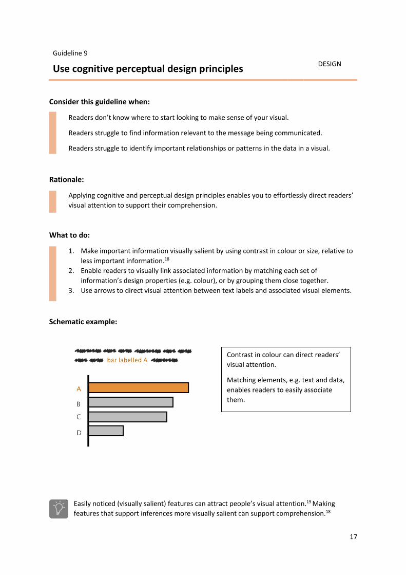
Guideline 9
Use cognitive perceptual design principles
DESIGN
Consider this guideline when:
Readers don’t know where to start looking to make sense of your visual.
Readers struggle to find information relevant to the message being communicated.
Readers struggle to identify important relationships or patterns in the data in a visual.
Rationale:
Applying cognitive and perceptual design principles enables you to effortlessly direct readers’
visual attention to support their comprehension.
What to do:
1. Make important information visually salient by using contrast in colour or size, relative to
less important information.18
2. Enable readers to visually link associated information by matching each set of
information’s design properties (e.g. colour), or by grouping them close together.
3. Use arrows to direct visual attention between text labels and associated visual elements.
Schematic example:
Easily noticed (visually salient) features can attract people’s visual attention.19 Making
features that support inferences more visually salient can support comprehension.18
Contrast in colour can direct readers’
visual attention.
Matching elements, e.g. text and data,
enables readers to easily associate
them.

18
Guideline 10
Consider cognitive aspects when using digital animation and interaction
DESIGN
Consider this guideline when:
Exploring new ways to engage readers with data.
Creating digital versions of printed / static visuals.
Rationale:
Animation and interaction open up new opportunities for communicating data and evidence,
but also introduce cognitive challenges that can impair readers’ comprehension.
What to do:
1. Evaluate whether there is a strong argument to create an animated or interactive visual –
carefully crafted static visuals might be easier for readers to comprehend.20
2. Give your readers control over playback (stop/start) and the playback speed of
animations.21
3. Choose user interfaces (i.e. controls) for interactive visuals that your readers are already
familiar with, or that are intuitive to use.
4. If interactive visuals require certain computing or software requirements that may limit
accessibility, also provide static versions that convey the same message.
5. Test prototypes of animated and interactive visuals early in the design process and refine
them based on feedback.
Schematic examples:
Animated visuals can be difficult to comprehend if they are too complex or move too quickly
for the reader, because information can be difficult to accurately perceive.20
Small multiples (sequences of static visuals)
may work better than animations.20
Provide user controls
for animations.21

19
Guideline 11
Consider cognitive aspects when visually communicating uncertainty
DESIGN
Consider this guideline when:
Uncertainty information is complex and multi-faceted.
Readers struggle to make inferences about uncertainties.
Rationale:
Tailoring visual representations of uncertainty enables important aspects of uncertainty
information (that are relevant to your readers) to be easily noticed (visually salient).
What to do:
1. If aspects of uncertainty information are important to convey, or are particularly helpful to
support readers’ comprehension, directly represent those aspects – avoid readers having
to infer them.
2. Make uncertainty information visually salient – information might not be comprehended if
it is not easily perceived, for example fine hatching and stippling in thematic maps may be
unclear and go unnoticed.
3. Integrating short text labels in your visual can highlight to your readers how uncertainties
should be interpreted.
Schematic example:
Four visual representations of uncertainty
Readers can misattribute the source of uncertainty in graphs of climate data23 and different
representations of model uncertainties can influence readers’ interpretations.22
There is no single ‘correct’ way to
represent uncertainties in data.
Be aware, however, that different
representations may affect
interpretation differently in different
audiences.22

20
Guideline 12
Test visuals to check comprehension
EVALUATE
Consider this guideline when:
It is important that your audience understands your visual correctly.
Throughout the production process of creating a visual.
Rationale:
Objectively testing your visual allows comprehension problems to be identified, enabling you
to refine the visual before finalising, and giving you greater confidence that your audience will
understand the information.
What to do:
1. Test drafts of a visual on your target audience – if representative members of your target
audience are not available, test the visual with people who have a similar level of prior
knowledge as your target audience.
2. Avoid re-testing revised versions of a visual on the same individuals – seeing earlier drafts
will equip them with knowledge that a naïve audience may not have.
3. A basic testing approach is to ask a sample of people to interpret your visual and see if
their interpretations match your intended message (see page 9).
4. Where it is critical that your audience can understand the visual as intended, consider
using more rigorous testing approaches that can help diagnose the reason(s) for
comprehension problems, such as eye-tracking and ‘think aloud’ protocols.
5. If you are unsure how to test a visual, ask a psychological scientist or communications
scientist.
6. Use iterative design (see below) to refine your visual based on insights from testing.
Iterative design cycle:
Peoples’ intuitions of what constitutes an effective design for a visual don’t always match
what people find easiest to understand.24

21
Examples: applying the guidelines
To demonstrate how the guidelines could be applied in practice, we present three examples of
figures from the IPCC Fifth Assessment Report,25,26 one showing a line graph, one showing a bar
chart, and one showing a thematic map.
Each example presents the original IPCC figure and caption, followed by a schematic showing how
the guidelines might be applied to the figure and caption.
Please note:
The schematics help to demonstrate how accessibility can be enhanced while maintaining scientific
rigour. With this in mind, the schematics contain the same data as the original visuals, but aspects of
the layout, design and text have been adapted in line with the guidelines.
More radical changes could be made to the visuals when applying the guidelines, but if doing so, it
would be important to work closely with the figure authors to understand their main communication
goals and their intended audiences, and to uphold the scientific rigour of the content.

22
Line graphs
Original visual and caption: IPCC AR5, Working Group 2, Figure SPM.4, panel b.
Observed and projected changes in annual average surface temperature. This figure informs understanding of climate-related risks in the WGII AR5. It illustrates temperature change observed to date and projected warming under continued high emissions and under ambitious mitigation. [Reproduced from reference 25].
Schematic showing application of guidelines:
Guidelines applied:
Descriptive heading and sub-heading added (Guideline 7) while avoiding/explaining jargon (Guideline 8). Sub-heading articulates a clear message (Guideline 1). Text integrated in the visual to support comprehension (Guideline 7). Caption technical details can provide important additional context, but information to comprehend the main message is included in the visual (Guideline 7). Colour of text in sub-heading matched to colour of data to help direct attention (Guideline 9).
Note: The ‘sketch’ style of the schematic is simply used to indicate that the schematic shows suggested changes.

23
Bar charts
Original visual and caption: IPCC AR5, Working Group 2, Figure SPM.7
Summary of projected changes in crop yields, due to climate change over the 21st century. The figure includes projections for different emission scenarios, for tropical and temperate regions, and for adaptation and no-adaptation cases combined. Relatively few studies have considered impacts on cropping systems for scenarios where global mean temperatures increase by 4°C or more. For five timeframes in the near term and long term, data (n=1090) are plotted in the 20-year period on the horizontal axis that includes the midpoint of each future projection period. Changes in crop yields are relative to late-20th-century levels. Data for each timeframe sum to 100%. [Reproduced from reference 25].
Schematic showing application of guidelines:
Guidelines applied:
Descriptive heading and sub-heading added (Guideline 7) while avoiding jargon (Guideline 8). Sub-heading articulates a clear message (Guideline 1). Colour of text in sub-heading matched to colour of data to help direct attention (Guideline 9). ‘Increase’ and ‘decrease’ aligned with up/down metaphor to aid thinking (Guideline 3). Y-axis provides descriptive labels (Guideline 7). Order of colours in legend matches order of colours in bars, making them easier to match up (Guideline 9). Year ranges are aligned with each column, avoiding possible confusion of each year label being associated with a separate column in the original (Guideline 9). Caption technical details can provide important additional context, but information to comprehend the main message is included in the visual (Guideline 7).
Note: The ‘sketch’ style of the schematic is simply used to indicate that the schematic shows suggested changes.

24
Thematic maps
Original visual and caption: IPCC AR5, Synthesis Report, Figure SPM.7, panel a.
Change in average surface temperature based on multi-model mean projections for 2081–2100 relative to 1986–2005 under the RCP2.6 (left) and RCP8.5 (right) scenarios. The number of models used to calculate the multi-model mean is indicated in the upper right corner of each panel. Stippling (i.e., dots) shows regions where the projected change is large compared to natural internal variability and where at least 90% of models agree on the sign of change. Hatching (i.e., diagonal lines) shows regions where the projected change is less than one standard deviation of the natural internal variability. [Reproduced from reference 26].
Schematic showing application of guidelines:
Guidelines applied:
Descriptive heading and sub-heading added (Guideline 7) while avoiding jargon (Guideline 8). Sub-heading articulates a clear message (Guideline 1). Text integrated in the visual is consistent with earlier visuals, i.e. colour of RCP8.5 and RCP2.6 matches line graph example on page 22 (Guideline 7). Spatial positioning of scenarios (top and bottom) align with ‘high’ and ‘low’ emission scenarios (Guideline 3). Note that left-right layout in original may be misattributed to time (e.g. present-future). Legend rotated to match metaphor of up/down with more/less (Guideline 3). Caption technical details can provide important additional context, but information to comprehend the main message is included in the visual (Guideline 7).
Note: The ‘sketch’ style of the schematic is simply used to indicate that the schematic shows suggested changes.

25
Further reading
Climate change data visuals:
COP21 climate negotiators’ responses to climate model forecasts
Bosetti, V., Weber, E., Berger, L., Budescu, D. V., Liu, N., & Tavoni, M. (2017) Nature Climate Change, 7,
185-189.
Cognitive and psychological science insights to improve climate change data visualization
Harold, J., Lorenzoni, I., Shipley, T. F., & Coventry, K. R. (2016). Nature Climate Change, 6, 1080-1089.
The scientific veneer of IPCC visuals
McMahon, R., Stauffacher, M., & Knutti, R. (2016). Climatic Change, 138(3-4), 369-381.
Interpreting climate data visualisations to inform adaptation decisions
Daron, J. (2015). Climate Risk Management, 10, 17–26.
The unseen uncertainties in climate change: reviewing comprehension of an IPCC scenario
graph.
McMahon, R., Stauffacher, M., & Knutti, R. (2015). Climatic Change, 133(2), 141-154.
Tailoring the visual communication of climate projections for local adaptation practitioners
in Germany and the UK
Lorenz, S., Dessai, S., Forster, P. M., & Paavola, J. (2015). Philosophical Transactions of the Royal
Society A, 373(2055).
Image politics of climate change: Visualizations, imaginations, documentations
Schneider, B. & Nocke, T. (Eds.) (2014). Bielefeld, Transcript Verlag.
Climate model simulation visualization from a visual studies perspective
Schneider, B. (2012) Wiley Interdisciplinary Reviews: Climate Change, 3(2), 185-193.
General reference books:
Presenting Data Effectively: Communicating Your Findings for Maximum Impact
Evergreen, S. D. H. (2014). London, Sage.
Graph design for the eye and mind
Kosslyn, S. M. (2006). Oxford, Oxford University Press.

26
References
1. Harold, J., Lorenzoni, I., Shipley, T. F., & Coventry, K. R. (2016). Cognitive and psychological science
insights to improve climate change data visualization. Nature Climate Change, 6, 1080-1089.
2. Shah, P., Mayer, R. E., & Hegarty, M. (1999). Graphs as aids to knowledge construction: Signaling
techniques for guiding the process of graph comprehension. Journal of Educational Psychology, 91(4),
690-702.
3. Hegarty, M., Canham, M. S., & Fabrikant, S. I. (2010). Thinking about the weather: How display salience
and knowledge affect performance in a graphic inference task. Journal of Experimental Psychology:
Learning, Memory, and Cognition, 36(1), 37-53.
4. Miaskiewicz, T., & Kozar, K. A. (2011). Personas and user-centered design: How can personas benefit
product design processes? Design Studies, 32(5), 417-430.
5. Robbins, J. M., & Krueger, J. I. (2005). Social projection to ingroups and outgroups: A review and meta-
analysis. Personality and Social Psychology Review, 9(1), 32-47.
6. Nickerson, R. S. (1999). How we know—and sometimes misjudge—what others know: Imputing one's
own knowledge to others. Psychological Bulletin, 125(6), 737-759.
7. Meier, B. P., & Robinson, M. D. (2004). Why the sunny side is up: associations between affect and vertical
position. Psychological Science, 15(4), 243–247.
8. Lakoff, G., & Johnson, M. (1980). The metaphorical structure of the human conceptual system. Cognitive
Science, 4(2), 195-208.
9. Zacks, J., Levy, E., Tversky, B., & Schiano, D. (2002). Graphs in print. In Anderson, M., Meyer, B., & Olivier,
P. (Eds). Diagrammatic Representation and Reasoning (pp. 187-206). London, Springer.
10. Gołębiowska, I. (2015). Legend layouts for thematic maps: A case study integrating usability metrics with
the thinking aloud method. The Cartographic Journal, 52(1), 28-40.
11. Ratwani, R. M., & Trafton, J. G. (2008). Shedding light on the graph schema: Perceptual features versus
invariant structure. Psychonomic Bulletin & Review, 15(4), 757-762.
12. Hegarty, M. (2011). The cognitive science of visual‐spatial displays: Implications for design. Topics in
Cognitive Science, 3, 446-474.
13. Neider, M. B., & Zelinsky, G. J. (2011). Cutting through the clutter: Searching for targets in evolving
complex scenes. Journal of Vision, 11(14), 7.
14. Evergreen, S. D. H. (2014). Presenting Data Effectively: Communicating Your Findings for Maximum
Impact. London, Sage.
15. Tufte, E. R. (2006) Beautiful Evidence. Cheshire, Connecticut, Graphics Press.
16. Holsanova, J., Holmberg, N., & Holmqvist, K. (2009). Reading information graphics: The role of spatial
contiguity and dual attentional guidance. Applied Cognitive Psychology, 23(9), 1215-1226.
17. Hales, A. H., Williams, K. D., & Rector, J. (2017). Alienating the audience: How abbreviations hamper
scientific communication. Association for Psychological Science Observer, 30(2), 22-24.
18. Kosslyn, S. M. (1989). Understanding charts and graphs. Applied Cognitive Psychology, 3(3), 185-225.
19. Wolfe, J. M., & Horowitz, T. S. (2004). What attributes guide the deployment of visual attention and how
do they do it? Nature Reviews Neuroscience, 5(6), 495-501.
20. Tversky, B., Morrison, J. B., & Betrancourt, M. (2002). Animation: Can it facilitate? International Journal of
Human-Computer Studies, 57(4), 247-262.
21. Betrancourt, M. (2005). The animation and interactivity principles in multimedia learning. In Mayer, R. E.
(Ed.) The Cambridge Handbook of Multimedia Learning (pp. 287–296). Cambridge, Cambridge University
Press.
22. Bosetti, V., Weber, E., Berger, L., Budescu, D. V., Liu, N., & Tavoni, M. (2017). COP21 climate negotiators’
responses to climate model forecasts. Nature Climate Change, 7, 185-189.
23. McMahon, R., Stauffacher, M., & Knutti, R. (2015). The unseen uncertainties in climate change: reviewing
comprehension of an IPCC scenario graph. Climatic Change, 133(2), 141-154.

27
24. Hegarty, M., Smallman, H. S., Stull, A. T., & Canham, M. S. (2009). Naïve cartography: How intuitions
about display configuration can hurt performance. Cartographica: The International Journal for
Geographic Information and Geovisualization, 44(3), 171-186.
25. IPCC (2014). Summary for Policymakers. In C. B. Field, V. R. Barros, D. J. Dokken, et al. (Eds.), Climate
Change 2014: Impacts, Adaptation, and Vulnerability. Part A: Global and Sectoral Aspects. Contribution of
Working Group II to the Fifth Assessment Report of the Intergovernmental Panel on Climate Change.
Cambridge, UK and New York, USA, Cambridge University Press.
26. IPCC (2014). Summary for Policymakers. In Core Writing Team, R. K. Pachauri, & L.A. Meyer (Eds.),
Climate Change 2014: Synthesis Report. Cambridge, UK and New York, USA, Cambridge University Press.