Embed Size (px)
Citation preview

Chapter OneEnergy use and the carbon performance of transition countries, 1990-2008
The EBRD region has significantly reduced its carbon emissions since 1990, but disparities among EBRD countries are substantial. The fall in carbon emissions in the region was not induced solely by the output collapse of the early 1990s; rapid improvements in carbon intensity have continued throughout the past two decades. But how does the EBRD region compare with the rest of the world? What reform measures were associated with the greatest improvements in carbon performance?
6

1
7

Chapter One
1 The principal gases associated with climate change are carbon dioxide (CO2), methane and nitrous oxide, which together accounted for over 99 per cent of global anthropogenic greenhouse gas emissions in 2005 (OECD, 2008). While activities such as agriculture, industrial processes, waste, land use and land-use change all generate greenhouse gases, energy-related emissions account for over 80 per cent of the anthropogenic greenhouse gases in Kyoto Annex-I countries (IEA, 2010). Of all energy-related greenhouse gases, CO2 accounts for about 94 per cent. The picture varies, however, across countries: emissions in high-income countries are largely dominated by power and transport, while agriculture and land-use change are the leading contributors in low-income countries. In middle-income countries, power, industry and land-use changes are the largest sources, with emissions from land-use change, namely deforestation of tropical forests, mostly concentrated in a handful of countries (World Bank, 2010).
2 All data on energy-related CO2 emissions presented in this chapter were drawn from IEA (2010) by using Sectoral Approach (SA) inventories. SA estimates account for all emissions from fuel combustion and do not include fugitive emissions as leakage or evaporation in the production and/or transformation stage (e.g. from oil refineries). As pointed out by the IEA, SA inventories may differ from countries’ official UNFCCC submissions.
3 Austria, Belgium, Denmark, Finland, France, Germany, Greece, Ireland, Italy, Luxembourg, The Netherlands, Portugal, Spain, Sweden and the United Kingdom.
4 Data for 1971-1990 is presented for comparison purposes. The availability of pre-1990 data does not allow a meaningful assessment of energy and carbon emissions performance.
5 This reduction in emissions in the EBRD region (1.293 GtCO2) is equivalent to the total energy-related emissions of France, Italy and the United Kingdom in 2008 and exceeds the annual energy-related emissions of Japan in 2008.
Energy use and the carbon performance of transition countries, 1990-2008
The EBRD region has witnessed a substantial reduction of carbon-dioxide (CO2) emissions from energy use since 1990.1 This year was chosen as the baseline for the emissions cuts agreed in the Kyoto Protocol. It is also when the countries of eastern Central Europe began the transition from central planning to market economies. This reduction in emissions, which contrasts with the steady worldwide rise over the same period, was initially triggered by the collapse of output in the formerly planned economies. However, it continued until the early 2000s even after output recovered. Since the early 2000s, regional emissions have started to rise again, reaching by 2008 the same level observed in the mid-1970s. However, they remain substantially lower than in the Kyoto Protocol base year of 1990.
What were the main drivers behind these large changes in energy-related CO2 emissions, since the beginning of the transition? This chapter reviews emissions trends and the main driving forces behind them, including the region’s carbon intensity of GDP (carbon emissions per unit of GDP), its energy intensity (energy use per unit of GDP), and per capita emissions.2 It compares the performance of the EBRD region with three other economic regions – China, the US and the EU-15 countries 3 – as well as developments in sub-regions and countries within the EBRD region. It analyses the role of sectoral shifts – from less to more energy- or carbon-efficient sectors – with that of within-sector efficiency improvements.
The chapter then explores firm-level characteristics associated with better energy performance, and shows that there is a link between specific policies and improved energy and carbon performance at the country level.
Finally, the chapter explores trade-related aspects of carbon performance, using estimates of carbon embodied in internationally traded goods and services to compare production-based and consumption-based carbon emissions, and reveal
the ‘balance of trade’ in virtual carbon between EBRD countries and their trading partners.
Trends in carbon emissions from energy use
The EBRD region started the transition from central planning to market economies with a highly distorted economic structure, one strongly focused on energy-intensive production. This was a legacy of the generous endowment of fossil fuel resources in the former Soviet Union, and exacerbated by an economic coordination mechanism that substantially underpriced energy and did not encourage its efficient use. Table 1.1 compares the annual average growth of energy-related CO2 emissions in the EBRD region with other economic regions.4
Table 1.1 CO2 emissions from fossil fuel use 1971-2008
Annual average growth Aggregate
1971-1990 1990-2000 2000-2008 1990-2008 1990-2008
World 2.1% 1.1% 2.8% 2.0% 40.1%
US 0.7% 1.6% -0.2% 0.8% 14.9%
China 5.5% 3.2% 9.9% 6.5% 191.9%
EU-15 0.2% 0.2% 0.0% 0.1% 1.8%
EBRD 3.0% -4.2% 1.2% -1.9% -27.9%
OECD Total 0.9% 1.2% 0.2% 0.8% 14.4%
Non-OECD Total 4.2% 0.9% 5.6% 3.1% 68.9%
Source: IEA and EBRD calculations.Note: Data for 1971-1990 is presented just as a comparison, as the data availability pre-1990 does not allow a meaningful assessment of energy and carbon emissions performance.
During 1971-1990, the two decades before the collapse of central planning, emissions in the EBRD region grew at an annual average of 3 per cent. This was slower than in China, but faster than the world average and much faster than in the US or the EU-15. Since the beginning of transition in 1990, emissions have declined substantially in the EBRD region in contrast to the fast-growing emissions in other regions of the world, particularly in the non-OECD countries. During the transition period, emissions fell sharply in the first decade 1990-2000 and rose moderately in 2000-2008. By 2008, EBRD carbon emissions were almost 28 per cent below their 1990 level.5
Drivers of emissions reductionsTo help understand what drove these trends, the aggregate emissions (C) of a country can be decomposed into three contributing factors: population size, income per capita, and the carbon intensity of GDP.6 These are expressed in the following identity:
C = —— x —— x Pop.7
This identity allows a closer examination of the factors driving the carbon performance of countries and regions. It combines the size of the country (measured by population) with the level of economic activity (as measured by per capita GDP 8) and a carbon performance indicator (which measures the amount of emissions per unit of GDP). This derives the change in emissions over time from the changes in these underlying factors. It is therefore possible to have both income growth and population growth with
CGDP Pop
GDP
8

Special Report on Climate Change
6 The equation is a variation of the IPAT equation. This was developed in the early 1970s to describe the multiplicative contributions of population, affluence and technology to environmental Impact. Many variants of the IPAT equation have been used to decompose energy-related CO2 emissions. For example, the climate change literature refers to the Kaya identity, in which emissions are usually expressed as the product of population, per capita GDP, the amount of energy produced per unit of GDP (the energy intensity of GDP) and the amount of carbon emitted per unit of energy produced (“carbon intensity of the fuel mix”). This chapter uses a reduced version of the Kaya identity, breaking emissions into three general categories: population, per capita GDP (valued using constant purchasing power parity dollars, GDP), and the amount of carbon emitted per unit of GDP.
7 In the context of energy-related emissions, the carbon intensity of GDP (C/GDP) is often further disaggregated
into the carbon intensity of energy (C/E) and the energy intensity of GDP (E/GDP). We will use this further disaggregation in the next section.
8 Throughout this chapter, unless otherwise specified, we use purchasing power parity exchange rate measurements of GDP to account for both the tradable and non-tradable sectors that make up the economy.
9 The results presented here are based on the complete decomposition model proposed by Sun (1998) which provides a method for factor analysis allowing us to link, in an additive form without residuals, changes in the emissions to changes in each of the contributing factors.
10 Sensitivity analysis on the split of the three sub-periods does not alter the results significantly.
stable, or even declining, total emissions, provided that the carbon intensity of GDP declines at least as fast as GDP grows.
Decomposing emissions into these components9 reveals very different driving factors over the past two decades of transition (Chart 1.1). Broadly speaking, the 18 years of data can be split into three distinctive periods:10
• In the initial period (1990-1996), emission declines were determined mainly by the collapse in economic activity.
• Between 1996 and 2002, the economy expanded while carbon emissions continued to decline – an absolute decoupling of emissions and growth, as carbon intensity was declining faster than GDP was growing.
• The period 2002-2008 corresponds to a relative decoupling of emissions and growth. Although the improvement in carbon intensity was even faster than in the previous six years, a 40 per cent increase in income led to a 10 per cent increase in carbon emissions.
The effects of changes in population were modest in the EBRD region as a whole – population growth contributed only one per cent to changes in carbon emissions over the entire period 1990-2008. Overall, in the absence of the observed improvements in carbon productivity, the total energy-related carbon emissions in the EBRD region would have increased by 24.2 per cent in 1990-2008; in fact, they fell by 27.9 per cent precisely due to such improvements.
Decomposition by sub-regionA decomposition of these trends by sub-region depicts a more nuanced picture (Chart 1.2). For the period 1990-1996, during which the largest fall in regional output occurred, the reduction in the carbon intensity of GDP in Central Europe and the Baltic
States (CEB) and South-Eastern Europe (SEE) was the main driver of carbon-emission reductions. In contrast, the countries of the former Soviet Union initially experienced a further increase in the carbon intensity of their GDP. In these countries, the reduction in emissions between 1990 and 1996 was entirely driven by the collapse of their outputs.
The middle period (1996-2002) is associated with an absolute decoupling of carbon emissions from income growth throughout the transition region. All sub-regions experienced significant income growth during this period. The reduction in the carbon intensity of GDP was strongest in CEB, Eastern Europe and the Caucasus (EEC), and Central Asia and Mongolia (CAM). Net carbon emissions registered a double-digit decline in CEB, SEE and EEC, reduced by a more modest 3.4 per cent in Russia, and moderately increased in Turkey and CAM.
This absolute decoupling ended in the early 2000s. However, the EBRD region as a whole still managed to partly offset the effects of economic growth, by further reducing the carbon intensity of GDP after 2002. This period can be referred to as relative decoupling, as carbon emissions increased substantially less than income growth in all the former socialist countries. In the absence of reductions in the carbon intensity of GDP, total regional emissions would have been almost 41 per cent higher during this period, instead of the actual 10 per cent increase.
Turkey has followed a different emissions path from the rest of the region. The country did not experience the output fall and subsequent restructuring process that characterised the formerly planned economies. Moreover, Turkey, over the entire period, did not achieve any reductions in the carbon intensity of its GDP. As a result, carbon emissions, boosted by strong population and income growth, increased by 108 per cent. This figure places Turkey among the world economies with the largest emissions growth since
Chart 1.1Decomposition of CO2 emission changes in the EBRD region
Source: IEA, EBRD calculations.
Causes of percentage change in CO2 emissions
■ Carbon intensity of GDP ■ GDP per capita ■ Population ● CO2 emissions
-50%
-60%
-40%
-30%
-20%
-10%
0%
10%
20%
30%
40%
50%
1990-1996 1996-2002 2002-2008 1990-2008
Chart 1.2Decomposition of CO2 emission changes 1990-2008
Source: IEA, EBRD calculations.
Causes of percentage change in CO2 emissions
■ GDP per capita ■ Population ■ Carbon intensity of GDP ● CO2 emissions
-80
-60
-40
-20
0
20
40
60
80
100
120
1990
-199
6
1996
-200
2
2002
-200
8
1990
-200
8
1990
-199
6
1996
-200
2
2002
-200
8
1990
-200
8
1990
-199
6
1996
-200
2
2002
-200
8
1990
-200
8
1990
-199
6
1996
-200
2
2002
-200
8
1990
-200
8
1990
-199
6
1996
-200
2
2002
-200
8
1990
-200
8
1990
-199
6
1996
-200
2
2002
-200
8
1990
-200
8
CEB SEE EEC Russia CAM Turkey
9

Chapter One Energy use and the carbon performance of transition countries, 1990-2008
even outpacing the relatively fast improvements in the advanced market economies of the US and the EU-15. In contrast, the relative stability in the carbon intensity of energy at the global level between 1990 and 2008 conceals very different trends among the regions. In some developing countries, the carbon intensity of energy increased – by almost 20 per cent in China, for example.
The EBRD region as a whole has achieved a very significant decline in the carbon intensity of its GDP through a balanced mix of improvements in both the energy intensity of economic output (- 40 per cent) and in the carbon intensity of energy (- 8 per cent). This is akin to developments in the US and the EU-15, but different to China, where the beneficial effects of the reduction of the energy intensity of GDP have been partly eroded by the increase in the carbon intensity of energy. In absolute terms, the carbon intensity of energy in the EBRD region stood at 2.46 tonnes of CO2 per tonne oil equivalent (toe). This is comparable to the US (2.47), much lower than China (3.08), but higher than the EU-15 (2.16).
Again, a closer look at trends within the EBRD region reveals substantial differences among countries. For example, the reduction in the carbon intensity of energy contributed to about 40 per cent of the total reduction in the carbon intensity of GDP in Ukraine; in Poland, it accounted for only about 14 per cent, with the rest being a result of the sharp decline in the energy intensity of GDP. In Turkey, the only country in the region that experienced a small increase in the carbon intensity of GDP over the entire period, the increase in the carbon intensity of energy has largely offset the effects of a slight decline in the energy intensity of GDP.
Despite improvements over the past two decades, the EBRD region as a whole remains one of the most carbon-intensive regions in the world. It is also one of the regions with the largest variations in the carbon intensities of GDP among its countries (Chart 1.5). The average amount of energy-related emissions per unit of GDP in the EBRD region is about two and a half times that of the EU-15 and 50 per cent higher than the world average. Several transition countries – Kazakhstan, Russia, Ukraine and Uzbekistan – still produce between 50 and 200 per cent more CO2 per unit of GDP than China.
1990. This is partly because Turkey was already one of the most carbon-efficient economies, even in comparison to mature market economies. Thus, the room for improvement in the carbon intensity of GDP was and remains modest in comparison with the other EBRD countries.
Changes in carbon intensity in the global context
Across much of the world, reductions in carbon intensity have not been enough to offset the increase in CO2 emissions associated with economic growth. In this global context, the EBRD region has outperformed world trends. However, with some notable exceptions, transition countries remain much more carbon intensive on average than either advanced economies or emerging markets like China.
Between 1990 and 2008, the EBRD region, as a whole, reduced the carbon intensity of GDP by 45.2 per cent. This was broadly similar to that achieved by China (48.1 per cent). As Chart 1.3 illustrates, the carbon performance of the EBRD region in the first half of the 1990s was worse than in the US and EU-15, and the world as a whole. However, since 1996 the transition economies have substantially outperformed the world and the mature market economies. Between 2002 and 2008, the EBRD region even outperformed China.
One reason for the weak decoupling of worldwide emissions from economic growth is that the carbon intensity of energy – as measured by the amount of CO2 emissions per unit of total primary energy supply (TPES)11 – has remained almost constant (Chart 1.4). This reflects a global energy supply that is still largely reliant on fossil fuels and, in recent years, an increase in the carbon intensity of energy due to increased use of coal.
While the energy intensity of world economic output (TPES/GDP) fell by 27 per cent from 1990 to 2008, the global carbon intensity of energy (C/TPES) increased by 0.3 per cent. The first of these developments – a decline in the energy intensity of output – reflects global trends, with advances in the EBRD region and China
Chart 1.3Carbon intensity of GDP
Source: IEA, EBRD calculations.Note: The carbon intensity of GDP (in tCO2 per thousand US$ GDP in constant 2000 prices at PPP exchange rates) in 1990 is the reference scenario (100).
Index 1990=100
40
50
60
70
80
90
100
110
19
90
19
91
19
92
19
93
19
94
19
95
19
96
19
97
19
98
19
99
20
00
20
01
20
02
20
03
20
04
20
05
20
06
20
07
20
08
World US China EU-15 EBRD region
Chart 1.4Decomposition of carbon intensity changes 1990–2008
Source: IEA, EBRD calculations.
Percentage change due to
■ Carbon intensity of energy ■ Energy intensity of GDP region
0
-60
-50
-40
-30
-20
-10
10
20
World US China EU-15 EBRD
11 The IEA (2010) defines TPES as the production of primary energy (i.e. hard coal, lignite/brown coal, peat, crude oil, natural gas, combustible renewables and waste, nuclear, hydro, geothermal, solar and the heat from heat pumps that is extracted from the ambient environment), calculated after the removal of impurities (e.g. sulphur from natural gas) + imports – exports – international marine bunkers ± stock changes.
10

Special Report on Climate Change
However, in the course of the transition, some countries have managed to reduce their carbon footprints by achieving levels of carbon intensity that are now well below the world average. In some cases, these levels are close to, or even lower than, those of advanced market economies.
The rest of this chapter looks at the main drivers behind these developments in more detail.
Carbon intensity of energy
Changes in the fuel mix have played a lesser role than declining energy intensity of GDP in bringing down the carbon intensity of GDP in the EBRD region. However, a closer look at the carbon intensity of energy shows some interesting patterns.
The reduction in the carbon intensity of energy in the EBRD region has been driven largely by a shift away from coal and oil, which are carbon intensive, towards more natural gas and, to a smaller extent, nuclear power and renewable sources (Chart 1.6).
A key factor in the decarbonisation of the energy supply was the decline in the energy demand for carbon-intensive fuels for industry and power generation. Essentially this has decreased the demand for coal-based power and heat generation.
This trend was most pronounced in the countries of the former Soviet Union, where substantial coal-based power and heat generation capacities are no longer in use. In contrast, the fall in demand for coal-based power generation in CEB was moderate and the rapid growth in the transport sector was mainly met through oil products. Additionally, many EBRD countries commissioned significant new gas facilities and some nuclear power generation facilities. This led to a further displacement of coal. In Turkey, energy demand grew rapidly and was met with increased gas supplies.
Chart 1.5Carbon intensity of GDP in 2008
Source: IEA, EBRD calculations.Note: GDP in PPP exchange rates and 2000 prices.
Kg CO2 per US$ of GDP
Alba
nia
Latv
ia
Lith
uani
a
Geo
rgia
Arm
enia
Cro
atia
Turk
ey
Hun
gary
Slo
veni
a
Tajik
ista
n
Slo
vak
Rep
.
Rom
ania
Azer
baija
n
Pola
nd
Kyr
gyz
Rep
.
Bos
nia
& H
erz.
FYR
of M
aced
.
Bul
garia
Bel
arus
Mol
dova
Esto
nia
Ukr
aine
Ser
bia
Rus
sia
Turk
men
ista
n
Mon
golia
Kaz
akhs
tan
Uzb
ekis
tan
0
0.2
0.4
0.6
0.8
1.0
1.2
1.4
1.6
1.8
2.0
EU-15 World US China EBRD region average
Chart 1.6Fuel shares in transition economies
Source: IEA, EBRD calculations.Note: The sum may not add up to 100 in the case of high net electricity exports in the ‘Other’ category.
Percentage of total primary energy supply
0
10
20
30
40
50
60
70
80
90
100
1990 2007 1990 2007 1990 2007 1990 2007 1990 2007 1990 2007 1990 2007
EBRD CEB SEE EEC Russia CAM Turkey
■ Coal and peat ■ Oil ■ Gas ■ Nuclear ■ Hydro ■ Combustible renewables and waste ■ Other (incl. geothermal, solar, wind, electricity, heat, etc.)
Consequently the share of fuels in the primary supply – which largely dictates the carbon intensity of energy – has changed substantially. Natural gas use increased substantially in the fuel mix – by more than 20 percentage points in Turkey and CAM, about 10 percentage points in Russia and EEC, and by 4 percentage points in CEB. The share of natural gas only decreased in SEE, where access to the regional pipeline network remains inadequate.
The share of nuclear energy increased in the sub-regions that traditionally used nuclear power (except CAM and Turkey). This is partly due to the commissioning of new nuclear power generation facilities (e.g. in Romania, Russia and Ukraine). Hydropower accounted for about 2 per cent of the fuel mix in 2007 (compared to 1.5 per cent in 1990), but hydropower is the dominant source of electricity in countries with rich water resources, such as Albania, the Kyrgyz Republic and Tajikistan.
The fuel shares of coal and oil have declined, by 5 and 7 percentage points respectively, for the whole EBRD region. The share of coal declined substantially in CEB (more than 13 percentage points), but increased in SEE (by 3 percentage points). The share of oil decreased dramatically in EEC (15.6 percentage points), Turkey (13.7), Russia (10.8) and CAM (10.9). This reflects primarily a decline in the use of oil for transport and to generate power and heat.
By contrast, the share of oil declined by a modest 3 percentage points in SEE, where the fall in use of heavy fuel oil for power generation was partially offset by increased demand for oil products in the road transportation sector. In CEB, the fuel share of oil increased by 3.6 percentage points, largely due to expansion in the transport sector. Combustible renewable sources, such as waste and biomass, reached a non-negligible share in CEB and SEE by 2007. By contrast, the share of combustible renewables and waste in Turkey declined by 8.6 percentage points, in a context of rising energy demand that was mostly met by fossil fuels.
11

Chapter One Energy use and the carbon performance of transition countries, 1990-2008
the sector structure constant).12 The data do not allow for a direct comparison with the energy intensity data presented in the previous sections.13 However, the analysis sheds light on the relative contributions of structural change and intrinsic efficiency improvements in the context of deep and far-reaching changes in the formerly planned economies of the EBRD region. This is particularly relevant in the context of transition, as central planning led to both distortions in the sector structure of the economies and intrinsic inefficiencies in the use of energy.
Charts 1.7a to 1.7f show the results of this decomposition. They reveal that improvements in intrinsic efficiency dominate structural changes across most of the EBRD regions. Over the period 1990-1997, efficiency improved in most transition regions, typically by about 40 per cent. Important exceptions are CEB, with an improvement of more than 60 per cent, and Turkey, which recorded no improvement in energy intensity. This reflects Turkey’s less distorted legacy and low energy intensity from the beginning of the period.
Energy intensity of GDP
About two-thirds of the reduction of the carbon intensity of GDP in the EBRD region can be attributed to reductions in energy intensity. The energy intensity of GDP is determined largely by the structure of each economy and encapsulates a wide range of driving forces, ranging from domestic resource endowments to the energy policy landscape characterising each economy.
Energy intensity and economic structureA reduction in the energy intensity of GDP can be traced back to two main sources – structural change (shifts towards less energy-intensive economic activities) and reductions in sector-level energy intensities (the amount of energy used to produce a unit of sector GDP). This second source reflects more fundamental improvements in energy efficiency throughout the economy.
We employ a standard decomposition method to attribute changes in energy intensity to structural changes in the sectoral composition of GDP (keeping the energy efficiency constant), and efficiency changes in the energy intensity of value added (keeping
Chart 1.7aThe decomposition of energy intensity – CEB
Source: UN, IEA, EBRD calculations.
Index (1990-1)
19
90
19
91
19
92
19
93
19
94
19
95
19
96
19
97
19
98
19
99
20
00
20
01
20
02
20
03
20
04
20
05
20
06
20
07
Structural change Ef�ciency Energy intensity
0.3
0.4
0.5
0.6
0.7
0.8
0.9
1.0
1.1
1.2
1.3
1.41.5
Chart 1.7dThe decomposition of energy intensity – Russia
Source: UN, IEA, EBRD calculations.
Index (1990-1)
0.3
0.4
0.5
0.6
0.7
0.8
0.9
1.0
1.1
1.2
1.3
1.41.5
19
90
19
91
19
92
19
93
19
94
19
95
19
96
19
97
19
98
19
99
20
00
20
01
20
02
20
03
20
04
20
05
20
06
20
07
Structural change Ef�ciency Energy intensity
Chart 1.7cThe decomposition of energy intensity – EEC
Source: UN, IEA, EBRD calculations.
Index (1990-1)
0.3
0.4
0.5
0.6
0.7
0.8
0.9
1.0
1.1
1.2
1.3
1.41.5
19
90
19
91
19
92
19
93
19
94
19
95
19
96
19
97
19
98
19
99
20
00
20
01
20
02
20
03
20
04
20
05
20
06
20
07
Structural change Ef�ciency Energy intensity
Chart 1.7bThe decomposition of energy intensity – SEE
Source: UN, IEA, EBRD calculations.
Index (1990-1)
0.3
0.4
0.5
0.6
0.7
0.8
0.9
1.0
1.1
1.2
1.3
1.41.5
19
90
19
91
19
92
19
93
19
94
19
95
19
96
19
97
19
98
19
99
20
00
20
01
20
02
20
03
20
04
20
05
20
06
20
07
Structural change Ef�ciency Energy intensity
12 Metcalf (2008) has more details on this method – the so-called Fisher Ideal Index. We use UN data on sectoral value added in US$ in market exchange rates in constant 1990 prices and country energy balances to allocate energy use to each sector. The economy is disaggregated into five sectors: Agriculture, Construction, Industry, Services and Transport. The sectoral energy data was aggregated in the following way to match value added data: “Agriculture” includes energy data for Agriculture, Forestry and Fishing. “Industry” includes energy consumption in the Industry sector (including Mining but excluding Construction) and the entire transformation
sector. “Construction” and “Transport” match the energy balances data, whereas the “Service” sector is formed by energy data for Other Sectors excluding Residential, Agriculture and Fishing. The energy data comes from the IEA Energy Balances 2009.
13 The previous sections use GDP data in purchasing power parity in US$ constant 2000 prices. Here, value-added data is used in market exchange rates in US$ 1990 constant prices. However, the trends and magnitude of changes in energy intensity in 1990-2007 are very similar.
12

Special Report on Climate Change
The energy intensity of firmsHaving examined the role of structural changes and intrinsic efficiency improvements at the country level, we now turn to firm-level analysis and ask what specific characteristics are associated with better or worse energy performance by a firm.
As at the firm level, the measure of energy performance is defined by an energy-intensity indicator, that is, the ratio of energy used in production divided by the value of sales generated by that production.15 A firm’s energy input is derived from energy expenditure cost data and energy (electricity) prices for the country.
Several studies have investigated the factors that affect energy efficiency at the industry or firm level. While the techniques, data employed and explanatory factors differ, their results suggest that energy efficiency generally improves with the size of a firm, the degree of research and development/innovation, and appropriate energy price signals.16
The energy intensity of each firm is influenced by sector and country effects, but also by a set of characteristics. Sector effects are important determinants of energy intensity, as production processes and technologies differ by industry in their relative energy intensity. Energy intensity is also dependent on country characteristics, such as weather conditions, but also on more general economic variables, such as the price of energy within the country. Energy subsidies also reduce incentives to use energy efficiently.
Moreover, energy use is likely to be influenced by structural and behavioural effects that are specific to each firm. For example, location and size are structural factors that can impact its energy intensity. The ownership structure, level of competition, capacity utilisation, and whether the firm exports its goods can all influence energy efficiency.
The analysis in this section is based on survey data from the 2009 Business Environment and Enterprise Performance Survey (BEEPS), which contains detailed information about firms’ characteristics, sales, investment, innovation, employment, access to infrastructure
Chart 1.7fThe decomposition of energy intensity – Turkey
Source: UN, IEA, EBRD calculations.
Index (1990-1)
19
90
19
91
19
92
19
93
19
94
19
95
19
96
19
97
19
98
19
99
20
00
20
01
20
02
20
03
20
04
20
05
20
06
20
07
0.3
0.4
0.5
0.6
0.7
0.8
0.9
1.0
1.1
1.2
1.3
1.41.5
Structural change Ef�ciency Energy intensity
Chart 1.7eThe decomposition of energy intensity – CAM
Source: UN, IEA, EBRD calculations.
Index (1990-1)
19
90
19
91
19
92
19
93
19
94
19
95
19
96
19
97
19
98
19
99
20
00
20
01
20
02
20
03
20
04
20
05
20
06
20
07
0.3
0.4
0.5
0.6
0.7
0.8
0.9
1.0
1.1
1.2
1.3
1.41.5
Structural change Ef�ciency Energy intensity
14 The availability of value added or energy consumption data limit our disaggregation to five economic sectors: Agriculture, Construction, Industry, Services and Transport.
15 Due to data availability, we use sales data instead of value added, which is a more appropriate indicator.16 See, for example, Fisher-Vanden et al. (2004), Kumar (2003), and Rohdin et al. (2007).
In terms of structural changes, the picture is more diverse. Only in SEE is there evidence that the structure of the economies moved towards less energy-intensive sectors. In CAM, CEB and Russia, the move appears to be in the opposite direction. This is consistent with the resurgence of activity in the heavy industries in countries like Russia in the 2000s, and with the boom in foreign direct investment in manufacturing in CEB.
The results imply that without efficiency gains, the energy intensity of value added would have increased by 6, 13 and 15 per cent in Russia, CAM and CEB, respectively. It would have remained constant in EEC and declined by 11 per cent in SEE. In Turkey, structural factors could have generated an increase in the energy intensity of GDP of about 11 per cent in the absence of intrinsic efficiency improvements.
The time-path of intrinsic efficiency improvements and structural changes differs across the sub-regions. In CEB, intrinsic efficiency improvements started in the early 1990s and continued throughout the period. In SEE, there was little improvement in intrinsic efficiency in the 1990s, but structural change had a positive impact from the onset. In CAM, EEC and Russia, energy efficiency deteriorated in the 1990s, accompanied by a positive effect due to structural changes. This was reversed after 2000, when the structural effects would have increased the energy intensity of GDP, but this was more than compensated by very rapid intrinsic efficiency improvements, which led to an overall decline in the energy intensity of GDP.
It is important to stress a caveat to these results. The sector data are highly aggregated,14 meaning some of the energy-intensity improvements attributed to efficiency improvements hide structural changes within the sectors. A shift from more energy-intensive manufacturing (e.g. steel) to less energy-intensive manufacturing (e.g. electronics) would be reflected as an efficiency improvement, due to the aggregation of all industrial sectors. But in reality, it is a structural change effect. Thus the results presented here need to be interpreted with caution, noting that the effect of structural change is likely to be underestimated and the effect of efficiency improvements overestimated.
13
Chapter One Energy use and the carbon performance of transition countries, 1990-2008
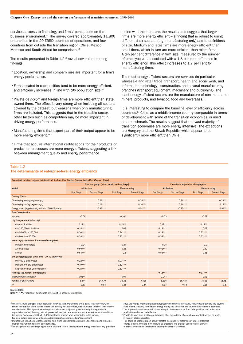
In line with the literature, the results also suggest that larger firms are more energy efficient – a finding that is robust to using different data subsets (e.g. manufacturing only) and to definitions of size. Medium and large firms are more energy efficient than small firms, which in turn are more efficient than micro firms. A ten per cent difference in firm size (measured by the number of employees) is associated with a 1.3 per cent difference in energy efficiency. This effect increases to 1.7 per cent for manufacturing firms.
The most energy-efficient sectors are services (in particular, wholesale and retail trade, transport, health and social work, and information technology), construction, and several manufacturing branches (transport equipment, machinery and publishing). The least energy-efficient sectors are the manufacture of non-metal and mineral products, and tobacco, food and beverages.23
It is interesting to compare the baseline level of efficiency across countries.24 Chile, as a middle-income country comparable in terms of development with some of the transition economies, is used as a benchmark. The results suggest that the vast majority of transition economies are more energy intensive. The exceptions are Hungary and the Slovak Republic, which appear to be significantly more efficient than Chile.
services, access to financing, and firms’ perceptions on the business environment.17 The survey covered approximately 11,800 enterprises in the 29 EBRD countries of operations, and four countries from outside the transition region (Chile, Mexico, Morocco and South Africa) for comparison.18
The results presented in Table 1.219 reveal several interesting findings.
• Location, ownership and company size are important for a firm’s energy performance.
• Firms located in capital cities tend to be more energy efficient, and efficiency increases in line with city population size.20
• Private de novo 21 and foreign firms are more efficient than state-owned firms. The effect is very strong when including all sectors covered by the dataset, but weakens when only manufacturing firms are included. This suggests that in the tradable sector, other factors such as competition may be more important in driving energy performance.
• Manufacturing firms that export part of their output appear to be more energy efficient.22
• Firms that acquire international certifications for their products or production processes are more energy efficient, suggesting a link between management quality and energy performance.
17 The latest round of BEEPS was undertaken jointly by the EBRD and the World Bank. In each country, the sector composition of the survey, in terms of industry versus services, was structured to reflect their relative contribution to GDP. Agricultural enterprises and sectors subject to governmental price regulation or supervision (such as banking, electric power, rail transport and water and waste water) were excluded from the survey. Companies that had 10,000 employees or more were not included in the sample. For more details see: www.ebrd.com/pages/research/economics/data/beeps.shtml
18 Data for non-transition economies comes from World Bank enterprise surveys undertaken using the same methodology and comparable questionnaires.
19 The analysis uses a two-stage approach to distil the factors that impact the energy intensity of any given firm.
First, the energy-intensity indicator is regressed on firm characteristics, controlling for sectors and country-fixed effects. Second, the effect of energy pricing and climate on the country-fixed effects is estimated.
20 This is generally consistent with other findings in the literature, as firms in larger cities tend to be more productive and more cost effective.
21 Private de novo firms are those established after the collapse of central planning that were at no stage in majority state ownership.
22 This could be because export activity creates incentives for better energy use, or that more energy-efficient firms are more likely to be exporters. The analysis used does not allow us to assess which of these factors is causing the other or vice versa.
Table 1.2 The determinants of enterprise-level energy efficiency
Dependent variable: Log energy intensity of the firm (First Stage); Country fixed-effect (Second Stage)
Firm size groups (micro, small, medium, large) Firm size in log number of employees
Model All Sectors Manufacturing All Sectors Manufacturing
First Stage Second Stage First Stage Second Stage First Stage Second Stage First Stage Second Stage
Country Effects
Climate (log heating degree days) 0.24*** 0.24*** 0.24*** 0.23***
Climate (log cooling degree days) 0.14*** 0.16*** 0.14*** 0.15***
Energy prices (log electricity price in USD PPP x-rate) -0.94*** -0.91*** -0.95*** -0.91***
Firm Charactristics
exporter -0.06 -0.10* -0.03 -0.07
city (comparator Capital city)
city over 1 million 0.12** 0.15** 0.12** 0.15**
city 250,000 to 1 million 0.18*** 0.09 0.18*** 0.08
city 50,000 to 250,000 0.30*** 0.24*** 0.29*** 0.23***
city less than 50,000 0.38*** 0.33*** 0.38*** 0.33***
ownership (comparator State-owned enterprise)
Privatised from state -0.04 0.24 -0.05 0.2
Always private -0.50*** -0.25 -0.52*** -0.32
Foreign -0.53*** -0.3 -0.53*** -0.35
firm size (comparator Small firms - 10-49 employees)
Micro (0-9 employees) 0.22*** 0.21***
Medium (50-249 employees) -0.19*** -0.32***
Large (more than 250 employees) -0.24*** -0.32***
Firm size (log number of employees) -0.13*** -0.17***
International certification -0.05** -0.04 -0.04* -0.03
Number of observations 8,244 14,470 3,823 7,326 8,236 15,487 3,823 15,487
R2 0.33 0.88 0.21 0.84 0.33 0.88 0.21 0.87
Source: EBRD.Note: ***, **, * represent significance at 1, 5 and 10 per cent, respectively.
14
Special Report on Climate Change
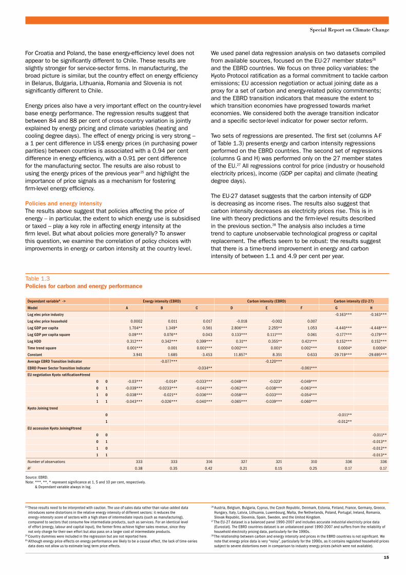
We used panel data regression analysis on two datasets compiled from available sources, focused on the EU-27 member states26 and the EBRD countries. We focus on three policy variables: the Kyoto Protocol ratification as a formal commitment to tackle carbon emissions; EU accession negotiation or actual joining date as a proxy for a set of carbon and energy-related policy commitments; and the EBRD transition indicators that measure the extent to which transition economies have progressed towards market economies. We considered both the average transition indicator and a specific sector-level indicator for power sector reform.
Two sets of regressions are presented. The first set (columns A-F of Table 1.3) presents energy and carbon intensity regressions performed on the EBRD countries. The second set of regressions (columns G and H) was performed only on the 27 member states of the EU.27 All regressions control for price (industry or household electricity prices), income (GDP per capita) and climate (heating degree days).
The EU-27 dataset suggests that the carbon intensity of GDP is decreasing as income rises. The results also suggest that carbon intensity decreases as electricity prices rise. This is in line with theory predictions and the firm-level results described in the previous section.28 The analysis also includes a time trend to capture unobservable technological progress or capital replacement. The effects seem to be robust: the results suggest that there is a time-trend improvement in energy and carbon intensity of between 1.1 and 4.9 per cent per year.
For Croatia and Poland, the base energy-efficiency level does not appear to be significantly different to Chile. These results are slightly stronger for service-sector firms. In manufacturing, the broad picture is similar, but the country effect on energy efficiency in Belarus, Bulgaria, Lithuania, Romania and Slovenia is not significantly different to Chile.
Energy prices also have a very important effect on the country-level base energy performance. The regression results suggest that between 84 and 88 per cent of cross-country variation is jointly explained by energy pricing and climate variables (heating and cooling degree days). The effect of energy pricing is very strong – a 1 per cent difference in US$ energy prices (in purchasing power parities) between countries is associated with a 0.94 per cent difference in energy efficiency, with a 0.91 per cent difference for the manufacturing sector. The results are also robust to using the energy prices of the previous year 25 and highlight the importance of price signals as a mechanism for fostering firm-level energy efficiency.
Policies and energy intensityThe results above suggest that policies affecting the price of energy – in particular, the extent to which energy use is subsidised or taxed – play a key role in affecting energy intensity at the firm level. But what about policies more generally? To answer this question, we examine the correlation of policy choices with improvements in energy or carbon intensity at the country level.
23 These results need to be interpreted with caution. The use of sales data rather than value-added data introduces some distortions in the relative energy intensity of different sectors: it reduces the energy-intensity score of sectors with a high share of intermediate inputs (such as manufacturing), compared to sectors that consume few intermediate products, such as services. For an identical level of effort (energy, labour and capital input), the former firms achieve higher sales revenue, since they not only charge for their own effort but also pass on a larger cost of intermediate products.
24 Country dummies were included in the regression but are not reported here.25 Although energy price effects on energy performance are likely to be a causal effect, the lack of time-series
data does not allow us to estimate long-term price effects.
26 Austria, Belgium, Bulgaria, Cyprus, the Czech Republic, Denmark, Estonia, Finland, France, Germany, Greece, Hungary, Italy, Latvia, Lithuania, Luxembourg, Malta, the Netherlands, Poland, Portugal, Ireland, Romania, Slovak Republic, Slovenia, Spain, Sweden, and the United Kingdom.
27 The EU-27 dataset is a balanced panel 1990-2007 and includes accurate industrial electricity price data (Eurostat). The EBRD countries dataset is an unbalanced panel 1990-2007 and suffers from the reliability of household electricity pricing data, particularly for the 1990s.
28 The relationship between carbon and energy intensity and prices in the EBRD countries is not significant. We note that energy price data is very “noisy”, particularly for the 1990s, as it contains regulated household prices subject to severe distortions even in comparison to industry energy prices (which were not available).
Table 1.3 Policies for carbon and energy performance
Dependant variable& -> Energy intensity (EBRD) Carbon intensity (EBRD) Carbon intensity (EU-27)
Model A B C D E F G H
Log elec price industry -0.163*** -0.163***
Log elec price household 0.0002 0.011 0.017 -0.018 -0.002 0.007
Log GDP per capita 1.704** 1.349* 0.561 2.806*** 2.255** 1.053 -4.440*** -4.448***
Log GDP per capita square 0.09*** 0.076** 0.043 0.133*** 0.111*** 0.061 -0.177*** -0.179***
Log HDD 0.312*** 0.342*** 0.399*** 0.31** 0.355** 0.421*** 0.152*** 0.152***
Time trend square 0.001*** 0.001 0.001*** 0.002*** 0.001* 0.002*** 0.0004* 0.0004*
Constant 3.941 1.685 -3.453 11.857* 8.351 0.633 -29.719*** -29.695***
Average EBRD Transition Indicator -0.077*** -0.120***
EBRD Power Sector Transition Indicator -0.034** -0.061***
EU negotiation Kyoto ratification#trend
0 0 -0.03*** -0.014* -0.033*** -0.048*** -0.023* -0.049***
0 1 -0.039*** -0.0233*** -0.041*** -0.062*** -0.038*** -0.063***
1 0 -0.038*** -0.021** -0.036*** -0.058*** -0.033*** -0.054***
1 1 -0.043*** -0.026*** -0.040*** -0.065*** -0.039*** -0.060***
Kyoto Joining trend
0 -0.011**
1 -0.012**
EU accession Kyoto Joining#trend
0 0 -0.011**
0 1 -0.013**
1 0 -0.012**
1 1 -0.013**
Number of observations 333 333 316 327 321 310 336 336
R2 0.38 0.35 0.42 0.21 0.15 0.25 0.17 0.17
Source: EBRD.Note: ***, **, * represent significance at 1, 5 and 10 per cent, respectively. & Dependant variable always in log.
15

Chapter One Energy use and the carbon performance of transition countries, 1990-2008
In the international climate change debate, it is common to assess the countries’ carbon footprints in terms of their emissions per capita. According to authors like Stern (2009), by the middle of the century annual emissions cannot be more than about 2 tCO2 per person, if we are to limit the likelihood of average global temperature increasing by more than 2°C. The world is a long way from this target. Since 1990, the amount of CO2 emissions per capita related to energy use has increased by about 10 per cent worldwide, reaching 4.4 tCO2 per person in 2008.29
Per capita emissions from energy use alone in the EU-15 are currently around 8 tCO2. This is less than half the amount in the US, but almost twice as much as in rapidly growing China. In the EBRD region, energy-related emissions per capita have declined by almost 29 per cent since 1990. In 2008, they averaged 7.2 tCO2 per person, ranging from 0.44 tCO2 in Tajikistan to 16.8 tCO2 per person in Estonia.
The large worldwide disparities in average carbon footprints – as measured by CO2 emissions produced within sovereign territories – do not merely reflect differences in national per capita incomes. Although the highest emissions per head are largely found in the wealthiest economies, and the lowest ones in the poorest countries, there are substantial differences between economies with very similar per capita incomes. Factors such as climate, resource endowments, economic structure, comparative advantage and distance between markets also matter.
Carbon intensity of international tradeMany of these factors manifest themselves in differences between the carbon intensity of economic activity in a country, and the carbon intensity of the goods and services its population consumes. In other words, there can be large imbalances in the carbon content of countries’ imports and exports. Rather than reflecting substantial changes in lifestyles and shifts towards less carbon-intensive consumption patterns, a decrease in the emissions from production within a country may simply reflect a shift in the carbon-intensive activities to another economy. This may even result in higher global emissions if the imported goods use
The variables in this analysis suggest that policies are important and correlate strongly with energy and carbon performance. Market reforms as measured by the EBRD Transition Indicators (country average and power sector indicator) are both strongly correlated with better energy performance. The effect is roughly twice as strong for carbon intensity. Furthermore, the average transition indicator that captures both demand-side and power sector (supply-side) reforms has a double effect compared to just the power sector supply-side reforms.
These effects are remarkable for two reasons. The regressions separately take account of general improvements over time (through a time trend) that might otherwise be picked up by the transition indicators. Also, they separately capture the effect of electricity prices, which is one channel through which transition affects energy use. Hence, they capture the mechanisms that may accelerate the rate of carbon efficiency improvements, for example through more rapid demand and supply-side responses (e.g. faster replacement of old energy-related capital equipment, due to more competitive pressure or better access to capital and know-how).
For the EBRD countries we find that the start of EU accession negotiations is the most relevant factor in the analysis of each country’s energy and carbon performance. After the negotiations for accession start, we find that the downward trend of carbon and energy intensity accelerates by between 3 and 6 per cent. Ratification or domestic entry into force of the Kyoto Protocol also has a strong effect in accelerating the improvement in carbon and energy intensity. This suggests that participation in internationally binding agreements acts as a policy commitment mechanism, which has a direct or perhaps indirect effect on outcomes. Furthermore, EU accession and Kyoto commitments jointly produce an additional effect, adding up to a total annual reduction of about 3.8 per cent for the EU-27 countries, and in excess of 10 per cent annually for all the EBRD countries.
Emissions per capita and trade in virtual carbon
A key challenge for global climate policy relates to ensuring an efficient and equitable distribution of emissions per capita among countries, to reflect not only production patterns, but also consumption patterns. Economic efficiency may lead to an uneven allocation of emissions among countries, as trade theory would suggest that energy (emission) intensive goods tend to be produced in countries with abundant energy resources. On the other hand, equity concerns would encourage a more even distribution of consumption-related emissions per capita, i.e. after adjusting for the carbon emissions embedded in trade.
Besides cross-country differences in resource endowments, emissions outsourcing (e.g. by relocating energy-intensive production overseas) can occur for other reasons, such as differences in economic policy environments, or legacy issues related to sticky economic structures and slow adjustment speeds. We now explore how the EBRD region compares in terms of consumption-related emissions and patterns of specialisation associated with energy resource endowment.
29 Total greenhouse gas emissions per capita are higher, as they include other greenhouse gases than CO2 and sources of emissions other than energy use.
Chart 1.8The balance of CO2 embodies in trade (2004)
Source: Davis and Caldeira (2010), EBRD calculations.Note: Countries below the zero axis are net importers, countries above are net exporters of carbon.
Mt CO2
■ EU-15 ■ USA ■ Japan ■ China ■ Russia ■ Ukraine ■ India ■ Poland ■ Kazakhstan ■ Canada
-1,200
-900
-600
-300
0
300
600
900
1,200
16

Special Report on Climate Change
At the other end of the spectrum, several transition economies are net carbon importers. The difference between the production-based per capita emissions and the trade-adjusted consumption-based per capita emissions can be high – in Latvia, consumption-based per capita emissions are almost twice as high as production-based per capita emissions, whereas in Georgia they are 60 per cent higher, 41 per cent higher in Lithuania and about 20 per cent in Armenia, Croatia, Hungary and Slovenia.
The data on carbon embedded in trade also offers insights into cross-country differences in the carbon intensity of the import–export mix, defined as the amount of CO2 emissions per US$ of imports or exports. Chart 1.9 shows that the average carbon intensity of exports in many transition economies is higher than the world average amount of emissions embodied in internationally traded goods and services.
According to this data, Ukraine, Russia and Kazakhstan are the first, third and fourth most carbon-intensive exporters, ahead of China and India. But the transition region also includes some of the best performers – Hungary, Latvia and Slovenia are only slightly behind Germany, better or on par with Japan, and ahead of most advanced market economies.
Some transition countries have substantial fossil fuel resources and their economies were built on the availability of abundant cheap energy. It may be expected 31 that in international trade, the energy-rich countries of the EBRD region will specialise in the exporting of energy-intensive (and therefore carbon-intensive) goods, as we have seen in Chart 1.9. Furthermore, the carbon intensity of each country’s exports should correlate with its abundance of energy resources.
Chart 1.10 presents a cross-plot of energy self-sufficiency 32 and the carbon intensity of exports. The scatter plot confirms the hypothesis of a positive relationship – evidenced by the regression line on the chart.33 However, while some transition economies are reasonably close to the regression line (suggesting that the carbon intensity of their exports is broadly in line with what would
more carbon-intensive production processes than the domestically produced goods that they displace.
Various studies provide evidence of large flows of carbon emissions embodied in international trade. These studies have tried to calculate the balance of trade in virtual carbon by estimating the emissions associated with the production of traded goods and services.30 Estimates differ as to how trade relationships are modelled and the carbon intensity of the export–import mix is assessed. But these studies generally suggest that countries’ carbon performances, evaluated according to traditional production-based inventories, underscore the role played by emissions that are produced outside the country but are associated with consumption of goods and services within the country.
Chart 1.8 illustrates the CO2 balances for some of the largest net importers and exporters of carbon embodied in trade, based on analysis by Davis and Caldera (2010). Using a multiregional input–output model constructed from 2004 global economic data, the study estimates consumption-based emissions by taking the emissions directly produced within each country (“production-based CO2 emissions”), subtracting those associated with the exported goods, and then adding back emissions associated with import.
For the most advanced economies (e.g. Japan, EU-15 and the US), the positive difference between consumption and production-based per capita emissions shows that a substantial portion of the emissions embodied in the consumed goods and services is produced abroad – in countries such as China, India, Russia and Ukraine.
In contrast, the larger economies of the EBRD region are big net carbon exporters. Russia and Ukraine are the world’s second and third largest net carbon exporters in absolute terms after China. More than 30 per cent of Ukraine’s 2004 production-based emissions were exported in net terms. Poland and Estonia are also net carbon exporters.
30 Yunfeng and Laike (2009); Atkinson et al. (2010).31 The Heckscher-Ohlin theory of trade predicts that countries tend to export commodities that intensively employ
the cheap and abundant factors of production, and import commodities that use the countries’ relatively scarce factor of production.
32 An ideal measure would be the total energy (fossil fuel) resource reserves. Due to the lack of such data, we
use the energy self-sufficiency defined by the ratio of energy production over total primary energy supply in each country in 2004, based on IEA data.
33 An important caveat is that this analysis is based on a simple correlation between one factor endowment (energy) and carbon intensity and abstracts from the influence of the other factors (labour, capital, land) on the carbon intensity of exports.
Chart 1.9The carbon intensity of trade in 2004
Source: Davis and Caldeira (2010), EBRD calculations.Note: Countries in bold are not transition economies.
Kg CO2 per US$
Ger
man
yH
unga
ryS
love
nia
Japa
nLa
tvia
Cro
atia
Lith
uani
aU
SA
Slo
vak
Rep
.G
eorg
iaCan
ada
Turk
eyCze
ch R
ep.
Alba
nia
Bra
zil
Esto
nia
Aus
tral
iaPo
land
Rom
ania
Bul
garia
Arm
enia
Azer
baija
nK
yrgy
z R
ep.
Bel
arus
Indi
aChi
naK
azak
hsta
nR
ussi
aSou
th A
fric
aU
krai
ne
■ Exports ■ Imports —– World average —– EU-15 exports —– EU-15 imports
0.0
0.5
1.0
1.5
2.0
2.5
3.0
3.5
4.0
Chart 1.10The correlation between energy resource endowment and carbon intensity of exports in 2004
Source: Davis and Caldeira (2010), IEA, EBRD calculations.Note: Energy self-suf�ciency is de�ned as the ratio of energy production to the total primary energy supply.
Kg CO2 per US$ of exports
Energy self-suf�ciency
0
0.5
1.0
1.5
2.0
2.5
3.0
3.5
4.0
y = 0.1786Ln(x) + 0.843
0 0.5 1.0 1.5 2.0 2.5
KAZRUS
AZR
AUS
CAN
GBR
USA
CHN
KYR
BUL ROM POL
BEL
UKR
ARM
TUR
SVKGEOCROLAT SLOHUN
GER FRA
LIT
ALB EST CZE
IND
RSA
17

Chapter One Energy use and the carbon performance of transition countries, 1990-2008
The reduction in the energy intensity of regional GDP was derived in part from the structural changes that EBRD countries underwent in the course of their transition to market economies. However, intrinsic efficiency improvements within sectors played an even more important role. Economic reforms, whether domestically driven or triggered by international commitments, have enhanced the energy and carbon performance of the transition countries. The reform processes associated with EU accession and to a lesser extent the commitment to climate policies under the Kyoto Protocol were both associated with a faster improvement in carbon and energy efficiency in the economy.
Energy pricing is a key incentive mechanism, one that is strongly associated with lower energy intensity both at economy and firm levels. Firm-level data suggests that the energy efficiency of private firms is significantly better than state firms, and exposure to international competition (exporters) is associated with enhanced energy efficiency compared to firms selling on the domestic market only. It also suggests that product innovation is associated with better energy performance, and large firms, as well as firms located in big cities, are more energy efficient.
Despite the strong improvements observed over two decades, the EBRD region continues to be excessively carbon intensive, particularly the large industrial countries of the former Soviet Union. Analysis of the balance of trade in virtual carbon reveals that some EBRD countries are among the world’s largest net carbon exporters. The carbon intensity of exports in Kazakhstan, Russia and Ukraine is extremely high, revealing structural and legacy issues that appear to go beyond their comparative advantage in carbon-intensive goods derived from their energy resource endowment. These countries tend to specialise heavily in energy-intensive goods. As a result, they remain behind the carbon performance standards of both advanced market economies and also emerging economies like China. Yet the EBRD region also includes countries – such as Hungary, Latvia and Slovenia – whose performance in terms of carbon embedded in exports are among the lowest in the world, comparable to Germany and lower than Japan or the US.
Conclusions
Since the beginning of transition, most EBRD countries have made substantial progress in reducing their carbon footprint. Although this has slowed lately, the pace of improvement has exceeded that in the advanced market economies and is comparable with China. Disparities among EBRD countries, however, are substantial. Emissions changes between 1990-2008 vary between a 56 per cent reduction in EEC and a 108 per cent increase in emissions in Turkey.
The region still includes some of the world’s worst performers in terms of the carbon intensity of GDP (e.g. Kazakhstan, Russia, Ukraine and Uzbekistan). But the carbon intensity in a few transition countries is now on par with the advanced market economies. This is either because of reliance on low-carbon energy supply (e.g. Albania, Georgia, Latvia and Lithuania) or due to low energy intensity of output (e.g. Croatia and Hungary).
Substantial improvements in carbon performance since the second half of the 1990s mean that “decarbonisation” was achieved with little impact on output and growth. Indeed the EBRD region underwent a period of absolute decoupling of emissions and economic growth in the second half of the 1990s, before more recently moving to a relative decoupling – strong economic growth associated with modest emissions growth. The improved regional carbon performance was derived in a relatively balanced way between improvements in the carbon intensity of energy, due to switches to cleaner fuels, and improvements in the energy intensity of output.
be expected, based on their energy endowment), in the energy-rich countries of the former Soviet Union the carbon intensity of exports substantially exceeds what is predicted by their resource endowment. Even some new EU members (Bulgaria, Poland and Romania) are substantially more carbon intensive than predicted by their resource endowment.
It is interesting to compare Azerbaijan, Kazakhstan or Russia with similarly energy-independent countries (e.g. Australia or Canada). The carbon intensity of exports in the former group is much higher. This suggests that the legacy of central planning, extremely low energy prices and high energy intensity, continues to mark the former Soviet Union countries. This argument is further strengthened by the position of countries such as Armenia, Belarus, the Kyrgyz Republic and Ukraine, which are not particularly energy rich, but are carbon intensive nonetheless.
The indication is that despite their progress in improving energy and carbon intensity over the past two decades, many transition economies continue to be marked by legacy issues. Further improvements can to be expected as these economies continue their transformation. The transition economies that have transformed and now deliver competitive outcomes in the energy and carbon area, provide evidence of this potential.
18

Special Report on Climate Change
References
G. Atkinson, K. Hamilton, G. Ruta and D. van der Mensbrugge (2010), “Trade in ‘virtual carbon’. Empirical results and implications for policy”, The World Bank, Development Economics, Policy Research Working Paper 5194, January 2010; World Bank, Washington, D.C.
J. Cornillie and S. Fankhauser (2004) “The energy intensity of transition countries”, Energy Economics, Vol. 26, pp. 283-295.
S.J. Davis and K. Caldera (2010) “Consumption-based accounting of CO2 emissions”, Proceeds of the National Academy of Sciences, Vol. 107(12), pp. 5687-5692.
K. Fisher-Vanden, G.H. Jefferson, H. Liu and Q. Tao (2004)“What is driving China’s decline in energy intensity?”, Resource and Energy Economics, Vol. 26(1), pp. 77-97.
International Energy Agency (2009)CO2 emissions from fuel combustion; IEA, Paris.
International Energy Agency (2010)CO2 emissions from fuel combustion; IEA, Paris.
A. Kumar (2003)“Energy intensity: a quantitative exploration for Indian manufacturing”, Indira Gandhi Institute of Development Research Working Paper 152.
G.E. Metcalf (2008)“An empirical analysis of energy intensity and its determinants at the state level”, The Energy Journal, Vol. 29(3), pp. 1-26.
Organisation for Economic Co-operation and Development (2008)OECD Environmental: Outlook to 2030; OECD, Paris.
P. Rohdin, P. Thollander and P. Solding (2007)“Barriers to and drivers for energy efficiency in the Swedish foundry industry”, Energy Policy, Vol. 35(1), pp. 672-677.
N. Stern (2009)A Blueprint for a Safer Planet. How to Manage Climate Change and Create a New Era of Progress and Prosperity; Bodley Head, London.
J.W. Sun (1998)“Changes in energy consumption and energy intensity: a complete decomposition model”, Energy Economics, Vol. 20, pp. 85-100.
World Bank (2010)World Development Report 2010; World Bank, Washington, D.C.
Y. Yunfeng, and Y. Laike (2009)“CO2 emissions embodied in China-US trade”, Chinese Journal of Population, Resources and Environment, Vol. 7(3), pp. 3-10.
19