Embed Size (px)
Citation preview
EVALUATIONMedia Coursework- Music Magazine
Emily Watson

In what ways does your media product use, develop
or challenge forms and conventions of real media
products?
• For a music magazine to look professional there are certain conventions it needs to have. For example it must have a front cover, a double page spread, the editors letter, a contents page, and advertisements.
• The front cover is the most important at first sight, as that is what will attract the readers. To make a successful front cover it must include; the magazine‟s title, the strapline or tagline, different fonts and colours used, the main image, the anchorage and cover lines. Perhaps any other tactics; lures, celebrities, „freebies‟, even the amount of exclamation marks!
• A typical DPS will have two or three columns for your text, horizontal as well as vertical, almost book-like. Sidebars, text wrapped around images and photos which bleed across the grid line. For my magazine I used three columns for my text, before I started to decide which design I would use I did some research on different DPS pages. I have used all my images in black and white which could be a risk but I believe my pages have worked better with no colours, as did my audience feedback- 97% agreed it looked better than the colour pages.
• For the contents page it s important to remember that they offer an overview of the features inside, as well as the brand identity of the title. There are all different types of contents pages, however all of them have page numbers, some more specific than others, and they have the main features and reviews of the magazine. Some include more than one picture and some only the main photo. A page number is not necessary, however typically would be around pages 2-3. You would always see the title of your magazine somewhere else on the page. I used one column for my contents, as my picture was quite strong I didn‟t want to over crowd the page I used a more simple design. I labeled it page 3, and put the name of my magazine „URBAN‟ in the left right hand corner with my page number. There is only one image on my contents, as otherwise it would become cluttered.

How did you attract/address your audience?
• My magazine is targeted at both sexes, from the ages 16 to about 20 years old. This meant I had to make it attractive for both genders, including multi-sex cover lines and content.
• On the front cover I used a male model however the cover lines talk about albums, festivals and fashion. Tyler Ryan is the made-up celebrity I have used for my magazine. He was part of a band who recently split up, called “Little Comets” who are a popular, multi gender band.
• The colours I have chosen are red, grey, black, and white, they are mainly unisex colours and invite a wide range of readers. These colours were approved by a number of students from my college who did a vote on which colours would work best for both genders.
• There is a free “Passenger CD” sticker on the top left corner, this is not only a very popular, well- known artist, but a lure to attract readers, to make them feel that they are getting their moneys worth.
• The front cover talks about having an “exclusive” interview with Tyler Ryan, the word exclusive is key because it makes the interview seem as if it is only featured in this mag, it makes the reader feel special reading about it. It gives the audience a
a chance to connect with URBAN as well as being a part of the interview. I
believe my magazine gives a lot for both male and female, which also could
save money for students, as they can share it, as it is suitable for both.
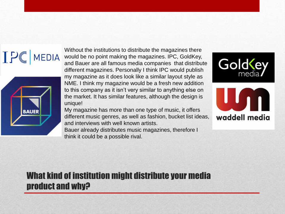
What kind of institution might distribute your media
product and why?
Without the institutions to distribute the magazines there
would be no point making the magazines. IPC, GoldKey,
and Bauer are all famous media companies that distribute
different magazines. Personally I think IPC would publish
my magazine as it does look like a similar layout style as
NME. I think my magazine would be a fresh new addition
to this company as it isn‟t very similar to anything else on
the market. It has similar features, although the design is
unique!
My magazine has more than one type of music, it offers
different music genres, as well as fashion, bucket list ideas,
and interviews with well known artists.
Bauer already distributes music magazines, therefore I
think it could be a possible rival.