Embed Size (px)
Citation preview
Contents6 32
12
24
12 Down to earth Blend shades of green to create a living space that soothes the senses
14 Modern family Choose punchy yet practical colours for a family-friendly living room
16 Pastel dreams Give your kitchen a burst of brightness with pastel-pretty shades
18 From day to night Go from casual to formal dining with a cohesive colour scheme
20 All white now Bring your hallway out of the darkness with light-reflecting paint
22 Work-life balance Improve productivity by decorating your study with stimulating shades
24 His and hers Use a neutral colour scheme to decorate a bedroom designed for two
26 Shades of grey Turn your bathroom into a spa oasis with rich, tranquil tones
28 Child’s play Decorate a gender-neutral nursery with soft, muted colours
30 One, two, tree! Create a bookcase tree perfect for a kids’ room with this easy DIY project
32 Trend alert Glean inspiration and ideas from this season’s hottest decorating trend
Home & decorating ideas
2 Meet the team Who we are and how to find us
4 Pinboard & Ask the experts Online decorating inspiration and expert advice
6 Style file Our favourite new finds and colour inspiration
8 Rising star Meet Will Taylor, the 26-year-old behind famed colour blog Bright Bazaar
10 Dulux™ Service Guide Discover ideas and advice to help you achieve the look you’ve always wanted
News, views & services
C1 Paints that do more Make the decorating process easier with one of our specialist paints
C3 Endurance+™ colours Our super durable Endurance range is designed to stand the test of time
C5 Kitchen+ colours Enhance the heart of the home with our range of washable kitchen paints
C7 Bathroom+ colours Our bathroom paints are specially designed to withstand steam and moisture
C9 One coat paints Save time and money with our Once™ paint range – you only need one coat!
C11 Light+Space™ Brighten small spaces with our wide range of light-reflecting paints
C13 Feature walls Create a feature wall that makes a statement with our range of bold colours
C15 Made by Me Transform tired furniture with a lick of paint from our Made by Me collection
C16 Exterior paint Our super hardy Weathershield™ range will help you make a good first impression
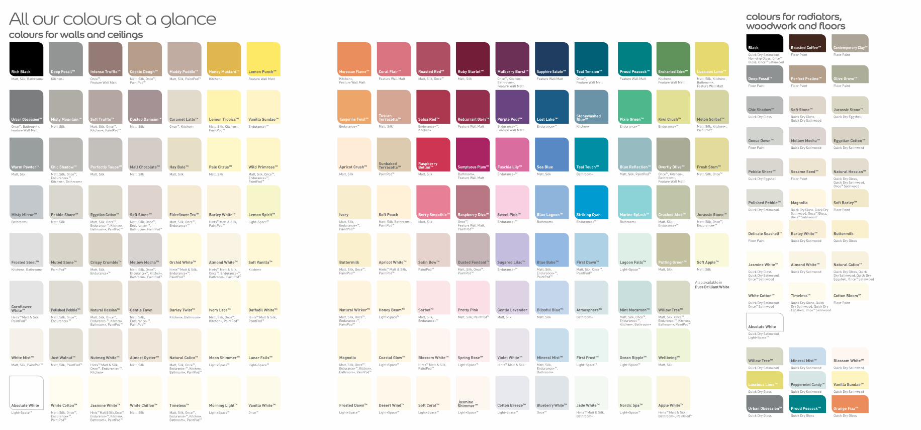
C17 Colour swatches All our colours at a glance
Products & colours
8 30
9
C17
D u l u x L e t ’ s C o l o u r ™
D u l u x L e t ’ s C o l o u r ™ 3
Welcome
Will Taylor, Freelance writer & Bright Bazaar bloggerWill Taylor is a freelance interiors journalist and self-confessed colour addict.
In 2009 Will channelled his love for colourful interiors into his blog, Bright Bazaar,
which was recently named the 7th best interiors website in the world by The Daily
Telegraph. Will works as Market Editor for The Simple Things and Sweet Paul
Magazine, as well as collaborating with globally recognised brands including
Martha Stewart, Laura Ashley, West Elm and many more. Will’s first interior
design book is to be published worldwide in Spring 2014.
ContributorsMarianne Shillingford, Creative Director, Dulux™
Marianne has over 20 years’ experience in the interiors industry ranging from colour,
design and decorating expertise to product development, training and communication.
She is also the Design Director of the Dulux Design Service™ – a national network of highly
skilled interior designers for the domestic and light commercial sectors. Marianne brings
a refreshingly practical, fun and unpretentious approach to the world of interior design,
with a genuine passion for helping people make their homes more beautiful. She has great
communication skills with a wealth of experience in delivering entertaining and informative
advice on the subjects of colour, interior design, decorating and craft skills.
Louise Smith, Senior Global Colour Designer, Dulux™
Louise Smith is an international colour and design expert with over 12 years’
experience in art direction and photography. As a member of the Dulux™
aesthetics centre, Louise works with a team of design experts from around the
world to forecast trends up to two years ahead. She has a passion for interior
design and creating colour collections which inspire people all around the global
from India, China, Brazil to Russia and of course the UK.
Rebecca Thompson, Senior Colour & Design Manager, Dulux™
Rebecca Thompson is the UK colour expert for Dulux™. She is responsible for
developing beautiful new colour ranges, creating the inspirational Dulux™
photography and producing the Dulux™ Colour Guide, packed full of exciting
decorating ideas. With a background in Textile Design, Rebecca has a natural
affinity with colour and works with key global trends to identify the perfect
palettes for the UK. She knows exactly which colours work best in order to
maximise space, giving all the advice needed to achieve stunning results and
ultimately improve our homes.
find us on Pinterest pinterest.com/duluxuk
Customer Advice Centre
08444 817 817
Out of all the hundreds of decisions that we make when
decorating, choosing colours is the one that tends to excite
and overwhelm us in equal measures. Maybe you know
what you love but putting together your favourite hues is
proving a little tricky. Or you’ve got a blank wall and no
idea where – or how – to start.
Here’s where we come in. Inside the new Dulux Let’s Colour™ magazine, you’ll find over 30 pages of real-life
rooms to spark inspiration and inspire new ideas.
Get crafty with our easy DIY projects, glean inspiration
from our style gurus and learn the tricks of the trade.
When inspiration strikes, flip to the back of the magazine
to pick colours from our easy-to-use colour guide. We now
have over 150 colours to choose from, so we’ve made it
even easier for you to find what you’re looking for.
When you’re ready to put paint to wall, head to dulux.co.uk to order tester paints.
Feel free to explore, to trust your instincts and, most
importantly, surround yourself with the colours that
makes your house feel like a home.
Happy decorating!
The Dulux™ team
like us on Facebook facebook.com/dulux
follow us on Twitter twitter.com/duluxuk
Achica Living achicaliving.comFor the latest and greatest interior design finds and decoration
inspiration, you can’t go past Achica Living, the blog from the team
behind luxury lifestyle store Achica. Lust over beautiful homewares,
glean inspiration from their stylish room sets and learn how to
create a stylish, luxurious look on any budget.
Our favourite blog
Made.com facebook.com/Madedotcom
Made.com cuts the middleman out of the
decorating process by connecting you directly
with designers, saving you up to 70 per cent off
retail prices. Like them on Facebook for daily
deals, design trends and interior ideas.
Barbara Chandler twitter.com/sunnyholt
Known as ‘the sharpest eye in London’, Barbara
Chandler is an interiors guru and self-taught
photographer. Her tweets champion the UK’s hottest
design talent and provide a behind-the-lens view on
life in the capital.
Holly Beckerpinterest.com/decor8/Author, blogger and craft queenHolly shows us her favourite design
tips and DIY projects galore.
r
en
gn
Bodie & Fou
pinterest.com/bodieandfou/
Stylish sister act Elodie and
Karine Kong share their favourite
finds and interior wish lists.
Photography: François Kong francoiskong.com
Styling: Karine Kong
pinAutHolH ltttiipsp
Bright Bazaar
pinterest.com/will_uk/
From beautiful blooms to bright
design ideas, you’ll fall in love
with colour all over again.
4 D u l u x L e t ’ s C o l o u r ™
Sharma KingHi, I’m going to be decorating my
hall, stairs and landing and want
a nice inviting/relaxing green
but I don’t want it too dark.
Have you got any suggestions?
Whether you’re looking to spark inspiration, score a design find or unleash your inner craft queen, look no further than the Dulux™ team’s must-visit online sites… Hi Sharma,
thanks for your question.
Greens are perfect for
hallways because they
encourage an atmosphere
of tranquillity in a busy part
of the home. Subtle muted shades work really
well because they act like neutrals and go with
everything but add a lot more interest.
Try combining greens and neutrals with a little
more depth like Jurassic Stone and Overtly Olive in the hallway and landing areas. By using
different tones of similar colours you create a soft
layered effect with colour that flows beautifully
through one open space into another.
Marianne Shillingford Creative Director, DuluxTM
Hi Elizabeth, A frequent dilemma, thanks for your question.
For north-facing rooms, colours
with a little heat are ideal such
as reds, pinks or violets as they
add the warmth that light doesn’t provide. To balance
the intensity of these shades, select a coordinating
neutral with similar undertones to prevent the room
from feeling too cold.
Try teaming Natural Hessian, a modern shade
that acts as a perfect backdrop to any room with
Redcurrant Glory for your accent wall to add
interest. As light is incredibly important when it
comes to how colour is perceived, it’s advisable
to try out a tester before you paint the whole room
to ensure the colour looks perfect. Let us know
how you get on!
Rebecca ThompsonSenior Colour and Design Manager, DuluxTM
For further info visit: dulux.co.uk
Elizabeth Hunt Hi, what are the best colours
for north-facing rooms?
I’d prefer neutrals.
rit
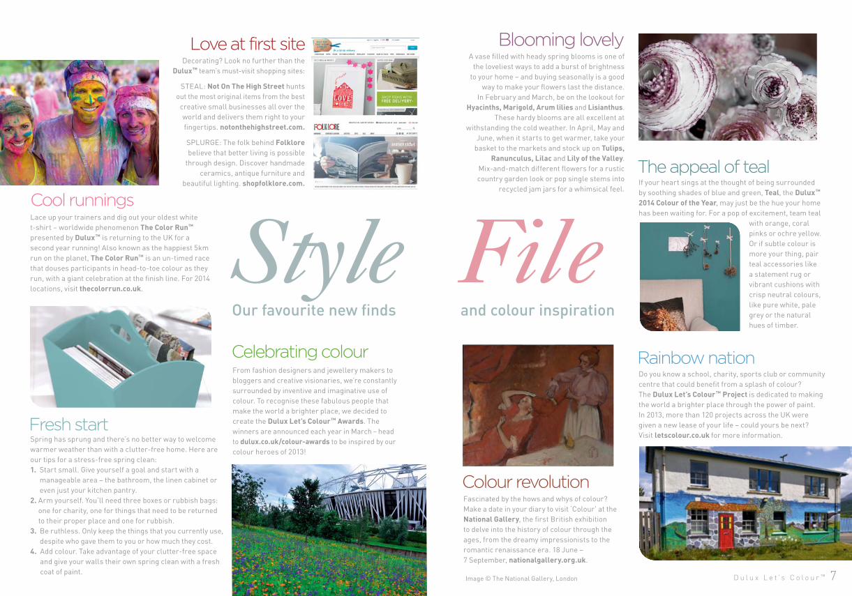
Image © The National Gallery, London D u l u x L e t ’ s C o l o u r ™ 7
Do you know a school, charity, sports club or community
centre that could benefit from a splash of colour?
The Dulux Let’s Colour™ Project is dedicated to making
the world a brighter place through the power of paint.
In 2013, more than 120 projects across the UK were
given a new lease of your life – could yours be next?
Visit letscolour.co.uk for more information.
Cool runningsLace up your trainers and dig out your oldest white
t-shirt – worldwide phenomenon The Color Run™
presented by Dulux™ is returning to the UK for a
second year running! Also known as the happiest 5km
run on the planet, The Color Run™ is an un-timed race
that douses participants in head-to-toe colour as they
run, with a giant celebration at the finish line. For 2014
locations, visit thecolorrun.co.uk.
The appeal of teal
Fascinated by the hows and whys of colour?
Make a date in your diary to visit ‘Colour’ at the
National Gallery, the first British exhibition
to delve into the history of colour through the
ages, from the dreamy impressionists to the
romantic renaissance era. 18 June –
7 September, nationalgallery.org.uk.
Spring has sprung and there’s no better way to welcome
warmer weather than with a clutter-free home. Here are
our tips for a stress-free spring clean:
1. Start small. Give yourself a goal and start with a
manageable area – the bathroom, the linen cabinet or
even just your kitchen pantry.
2. Arm yourself. You’ll need three boxes or rubbish bags:
one for charity, one for things that need to be returned
to their proper place and one for rubbish.
3. Be ruthless. Only keep the things that you currently use,
despite who gave them to you or how much they cost.
4. Add colour. Take advantage of your clutter-free space
and give your walls their own spring clean with a fresh
coat of paint.
Fresh start
Blooming lovely
Colour revolution
Love at first site
Our favourite new finds and colour inspiration
Rainbow nation
If your heart sings at the thought of being surrounded
by soothing shades of blue and green, Teal, the Dulux™ 2014 Colour of the Year, may just be the hue your home
has been waiting for. For a pop of excitement, team teal
with orange, coral
pinks or ochre yellow.
Or if subtle colour is
more your thing, pair
teal accessories like
a statement rug or
vibrant cushions with
crisp neutral colours,
like pure white, pale
grey or the natural
hues of timber.
Celebrating colourFrom fashion designers and jewellery makers to
bloggers and creative visionaries, we’re constantly
surrounded by inventive and imaginative use of
colour. To recognise these fabulous people that
make the world a brighter place, we decided to
create the Dulux Let’s Colour™ Awards. The
winners are announced each year in March – head
to dulux.co.uk/colour-awards to be inspired by our
colour heroes of 2013!
A vase filled with heady spring blooms is one of
the loveliest ways to add a burst of brightness
to your home – and buying seasonally is a good
way to make your flowers last the distance.
In February and March, be on the lookout for
Hyacinths, Marigold, Arum lilies and Lisianthus.
These hardy blooms are all excellent at
withstanding the cold weather. In April, May and
June, when it starts to get warmer, take your
basket to the markets and stock up on Tulips, Ranunculus, Lilac and Lily of the Valley.
Mix-and-match different flowers for a rustic
country garden look or pop single stems into
recycled jam jars for a whimsical feel.
Decorating? Look no further than the
Dulux™ team’s must-visit shopping sites:
STEAL: Not On The High Street hunts
out the most original items from the best
creative small businesses all over the
world and delivers them right to your
fingertips. notonthehighstreet.com.
SPLURGE: The folk behind Folklore
believe that better living is possible
through design. Discover handmade
ceramics, antique furniture and
beautiful lighting. shopfolklore.com.
8 D u l u x L e t ’ s C o l o u r ™
1. Painting furniture“When I moved into my first student house I painted
my flat-pack bedside table grey with a contrasting
yellow drawer. More recently I updated a console
unit in my hallway after being inspired by a laptop
bag I bought in Paris. Using the Dulux™ colour
matching service in my local store, I replicated the
mint and coral colours of the bag’s front pockets.”
2. Farmers’ markets“I was often dragged around farmers’ markets
when I was little. Back then I didn’t appreciate it
but now I often go to enjoy the sensory experience,
always armed with my camera!”
3. Baking“After a busy week I relax to the hum of the oven
and the knowledge that a sweet treat awaits.
It’s rewarding to create something and it makes
my apartment smell divine.”
4. Handmade ceramics“I have a vast array of mismatching handmade
china. My current favourites are pastel bowls
by Swedish ceramicist Mia Blanche; they remind
me of weekends spent in Stockholm.”
5. Photographing colourful buildings“Whenever I travel I’m inspired by colourful shop
fronts, residential homes or even a street sign.
These saturated facades I photographed in the
Balearic Islands last summer are a great
example.”
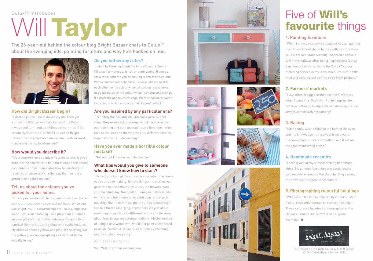
How did Bright Bazaar begin?“I studied journalism at university and then got
a job at the BBC, where I worked on Blue Peter.
It was good fun – and a childhood dream – but I felt
creatively frustrated. In 2009 I launched Bright
Bazaar from my bedroom on a whim. Fast-forward
to now and it’s my full-time job!”
How would you describe it?“It’s a blog written by a guy who loves colour. It gives
people a friendly voice to help them build their colour
confidence and demonstrates how to use decor to
reveal your personality. I often say that I’m just a
gentleman hooked on hue.”
Tell us about the colours you’vepicked for your home. “I’m very experimental. In my living room I’ve layered
zesty, primary accents over a black base. When you
use bright, multi-coloured objects – sofas, rugs and
so on – you risk it looking like a playroom but black
gives sophistication. In the bedroom I’ve gone for a
nautical theme: blue and yellow with rustic textures.
My office combines yellow and pink: it’s soothing but
the yellow gives an energising kick without being
visually tiring.”
The 26-year-old behind the colour blog Bright Bazaar chats to Dulux™
about the swinging 60s, painting furniture and why he’s hooked on hue.
Five of Will’sfavourite things
Dulux™ introduces
Will TaylorDo you follow any rules?“I start by thinking about the kind of basic scheme
I’ll use: harmonious, tonal, or contrasting. If you go
for a tonal scheme you’re picking tones of one colour.
With a harmonious scheme you choose shades next to
each other on the colour wheel. A contrasting scheme
uses opposites on the colour wheel, say blue and orange.
It’s dramatic and takes courage; there’s tension between
two colours which produces that “kapow!” effect.”
Are you inspired by any particular era?“Definitely the 60s and 70s: interiors were so bold
then. They used a lot of orange, which I adore as it’s
eye-catching and both masculine and feminine. I often
look to that era and the way they put different shades
together when I’m decorating.”
Have you ever made a horrible colour mistake?“Not yet, but I’m sure I will do one day!”
What tips would you give to someone who doesn’t know how to start?“Begin by looking at the subconscious colour decisions
you’re already making. Simple things: the clothes you
gravitate to, the colour of your car, the flowers from
your wedding day. Next pull out images that resonate
with you and then move on to paint charts: just pick
out chips that match those pictures. You should begin
to see a theme emerging. From there it’s just about
matching those chips to different rooms and thinking
about how to use any stronger colours. Maybe instead
of using it on a whole wall you’ll just paint a sideboard
or an alcove with it. It can be as simple as switching
out the cushion on a sofa.”
As told to Kassia St Clair.
Visit Will: brightbazaarblog.com All images on this page courtesy of Will Taylor.
© Will Taylor/Bright Bazaar 2013
learn how from the expertsin our ‘how to’ video guides.decorator
The simplest way to ensure true professionalism is to choose your local Dulux™ decorator.
D u l u x L e t ’ s C o l o u r ™ 1110 D u l u x L e t ’ s C o l o u r ™
buy painttesters onlinedelivered straight to your door.
visualise colours Visualise our colours in a room and match paint colours with our online tools.
Ser v ices & tool s
For even more help simply go
online where you’ll find ideas
and advice to help you achieve
that perfect look you’ve
always wanted.
HELPATEVdulux.co.uk
consultationDulux Design Service™
can help you get your home looking exactly
the way you’ve always wanted
simply and
ERYSTEP
calculatorWork out how much paint you need for your room.
get our free appto create colourschemes, order
your neareststockist.
and Android
D u l u x L e t ’ s C o l o u r ™ 1312
Inspir ation: l i v ing room
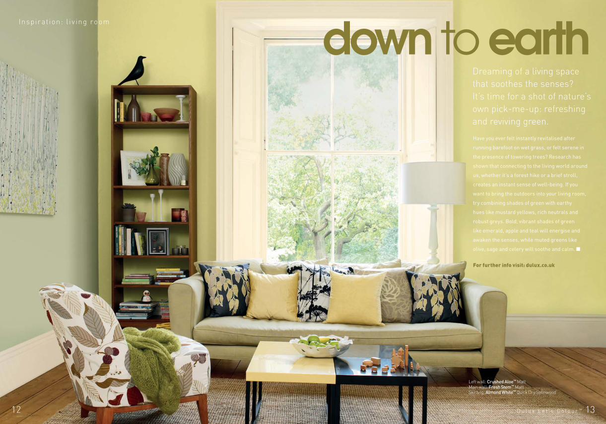
down to earthDreaming of a living space
that soothes the senses?
It’s time for a shot of nature’s
own pick-me-up: refreshing
and reviving green.
Have you ever felt instantly revitalised after
running barefoot on wet grass, or felt serene in
the presence of towering trees? Research has
shown that connecting to the living world around
us, whether it’s a forest hike or a brief stroll,
creates an instant sense of well-being. If you
want to bring the outdoors into your living room,
try combining shades of green with earthy
hues like mustard yellows, rich neutrals and
robust greys. Bold, vibrant shades of green
like emerald, apple and teal will energise and
awaken the senses, while muted greens like
olive, sage and celery will soothe and calm.
Left wall: Crushed Aloe™ Matt Main wall: Fresh Stem™ Matt Skirting: Almond White™ Quick Dry Satinwood
For further info visit: dulux.co.uk
D u l u x L e t ’ s C o l o u r ™ 1514 D u l u x L e t ’ s C o l o u r ™
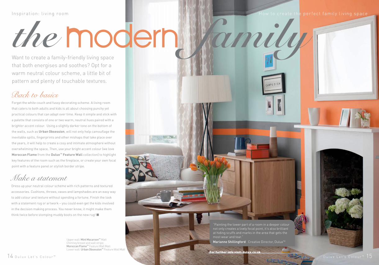
Inspir ation: l i v ing room
Want to create a family-friendly living space
that both energises and soothes? Opt for a
warm neutral colour scheme, a little bit of
pattern and plenty of touchable textures.
Dress up your neutral colour scheme with rich patterns and textured
accessories. Cushions, throws, vases and lampshades are an easy way
to add colour and texture without spending a fortune. Finish the look
with a statement rug or artwork – you could even get the kids involved
in the decision making process. You never know, it might make them
think twice before stomping muddy boots on the new rug!
Forget the white couch and fussy decorating scheme. A living room
that caters to both adults and kids is all about choosing punchy yet
practical colours that can adapt over time. Keep it simple and stick with
a palette that consists of one or two warm, neutral hues paired with a
brighter accent colour. Using a slightly darker tone on the bottom of
the walls, such as Urban Obsession, will not only help camouflage the
inevitable spills, fingerprints and other mishaps that take place over
the years, it will help to create a cosy and intimate atmosphere without
overwhelming the space. Then, use your bright accent colour (we love
Moroccan Flame from the Dulux™ Feature Wall collection) to highlight
key features of the room such as the fireplace, or create your own focal
point with a feature panel or stylish border stripe.
Back to basics
Make a statement
“Painting the lower part of a room in a deeper colour
not only creates a lively focal point, it’s also brilliant
at hiding scuffs and marks in the area that gets the
most wear and tear.”
Marianne Shillingford Creative Director, DuluxTM
For further info visit: dulux.co.uk
modernHow to create the per fec t family l i v ing space
Upper wall: Mint Macaroon™ MattChimney breast and wall stripe: Moroccan Flame™ Feature Wall MattLower wall: Urban Obsession™ Feature Wall Matt
D u l u x L e t ’ s C o l o u r ™ 1716
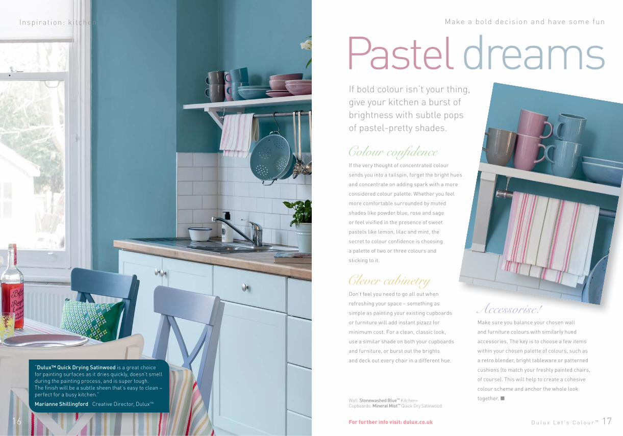
Wall: Stonewashed Blue™ Kitchen+Cupboards: Mineral Mist™ Quick Dry Satinwood
Inspir ation: k i tchen
If bold colour isn’t your thing,
give your kitchen a burst of
brightness with subtle pops
of pastel-pretty shades.
Don’t feel you need to go all out when
refreshing your space – something as
simple as painting your existing cupboards
or furniture will add instant pizazz for
minimum cost. For a clean, classic look,
use a similar shade on both your cupboards
and furniture, or burst out the brights
and deck out every chair in a different hue.
If the very thought of concentrated colour
sends you into a tailspin, forget the bright hues
and concentrate on adding spark with a more
considered colour palette. Whether you feel
more comfortable surrounded by muted
shades like powder blue, rose and sage
or feel vivified in the presence of sweet
pastels like lemon, lilac and mint, the
secret to colour confidence is choosing
a palette of two or three colours and
sticking to it.
Clever cabinetry
Make sure you balance your chosen wall
and furniture colours with similarly hued
accessories. The key is to choose a few items
within your chosen palette of colours, such as
a retro blender, bright tableware or patterned
cushions (to match your freshly painted chairs,
of course). This will help to create a cohesive
colour scheme and anchor the whole look
together.
Pastel dreams
Accessorise!
For further info visit: dulux.co.uk
“Dulux™ Quick Drying Satinwood is a great choice
for painting surfaces as it dries quickly, doesn’t smell
during the painting process, and is super tough.
The finish will be a subtle sheen that’s easy to clean –
perfect for a busy kitchen.”
Marianne Shillingford Creative Director, DuluxTM
D u l u x L e t ’ s C o l o u r ™ 19
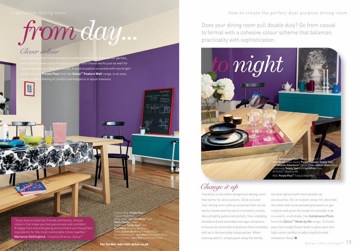
from day... Inspir ation: dining room How to create the per fec t dual purpose dining room
Does your dining room pull double duty? Go from casual
to formal with a cohesive colour scheme that balances
practicality with sophistication.
Flexibility is key when designing a dining room
that works for all occasions. Deck out your
‘day’ dining room with accessories that can be
easily moved and stored at a moment’s notice,
like a brightly patterned oilcloth, free-standing
blackboard and stackable storage containers
to house all those bits and pieces that inevitably
end up in the everyday living spaces. When
evening sets in, simply pack away the family
Change it upfun and replace with more grown-up
accessories. For an instant colour hit, decorate
the table with hand-painted glassware or get
creative and paint the inside of a wooden tray
in a warm, vivid shade, like Sumptuous Plum
from the Dulux™ Made by Me range. To finish,
pop a few single flower buds in glass jars and
light some candles to add a sophisticated
ambiance. Easy!
If your dining room hosts just as many family meals as it does dinner parties,
you’ll want to make sure the colour scheme you choose works just as well for
casual settings as it does for formal. A neutral palette accented with one bright
colour, such as Purple Pout from the Dulux™ Feature Wall range, is an easy
way to create a feeling of comfort and elegance in equal measure.
For further info visit: dulux.co.uk
Feature Wall: Purple Pout™ Feature Wall Matt Other walls: Jasmine White™ and Warm Pewter™ MattSideboard: Totally Teal™ and Cool White Made by Me Gloss Chair: Classic Black Made by Me GlossBlackboard frame: Juicy Red Made by Me GlossPicture frame: Juicy Red Made by Me Gloss
to nightClever colour
Tray: Sumptuous Plum™ Gloss. Picture Frame: Cool White Gloss. Vases: Purple Passion, Totally Teal and Atlantic Adventure™ Gloss. Chair: Classic Black Gloss. Sideboard: Totally Teal and Cool White GlossAll Dulux™ Made by Me
Wall: Purple Pout™ Feature Wall Matt
“If you love to entertain friends and family, choose
colours that make you feel passionate and confident.
A happy host and energising environment are the perfect
ingredients for the most memorable times together.”
Marianne Shillingford Creative Director, DuluxTM
D u l u x L e t ’ s C o l o u r ™ 2120 D u l u x L e t ’ s C o l o u r ™
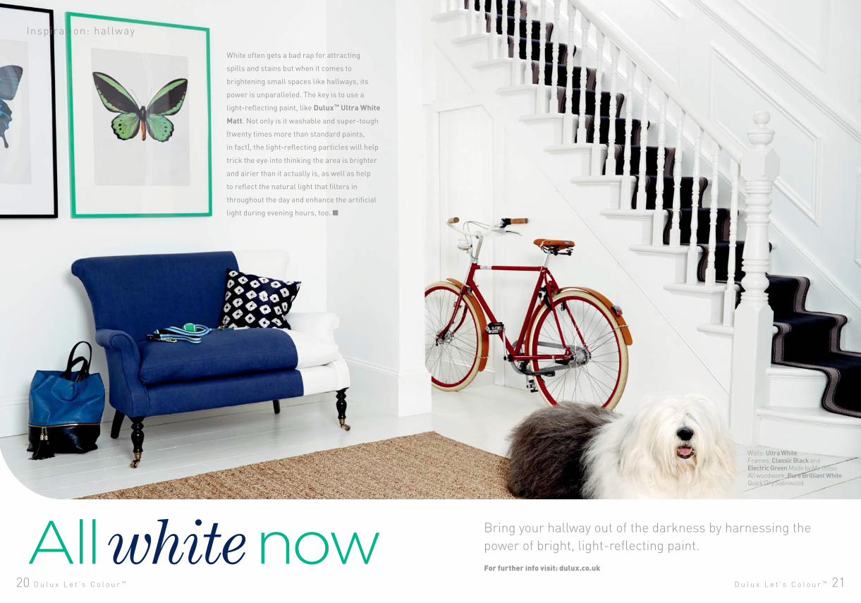
White often gets a bad rap for attracting
spills and stains but when it comes to
brightening small spaces like hallways, its
power is unparalleled. The key is to use a
light-reflecting paint, like Dulux™ Ultra White
Matt. Not only is it washable and super-tough
(twenty times more than standard paints,
in fact), the light-reflecting particles will help
trick the eye into thinking the area is brighter
and airier than it actually is, as well as help
to reflect the natural light that filters in
throughout the day and enhance the artificial
light during evening hours, too.
Inspir ation: hal lway
Bring your hallway out of the darkness by harnessing the
power of bright, light-reflecting paint.All white nowFor further info visit: dulux.co.uk
Walls: Ultra WhiteFrames: Classic Black and Electric Green Made by Me GlossAll woodwork: Pure Brilliant White Quick Dry Satinwood
22 D u l u x L e t ’ s C o l o u r ™
Inspir at ion: home workspace
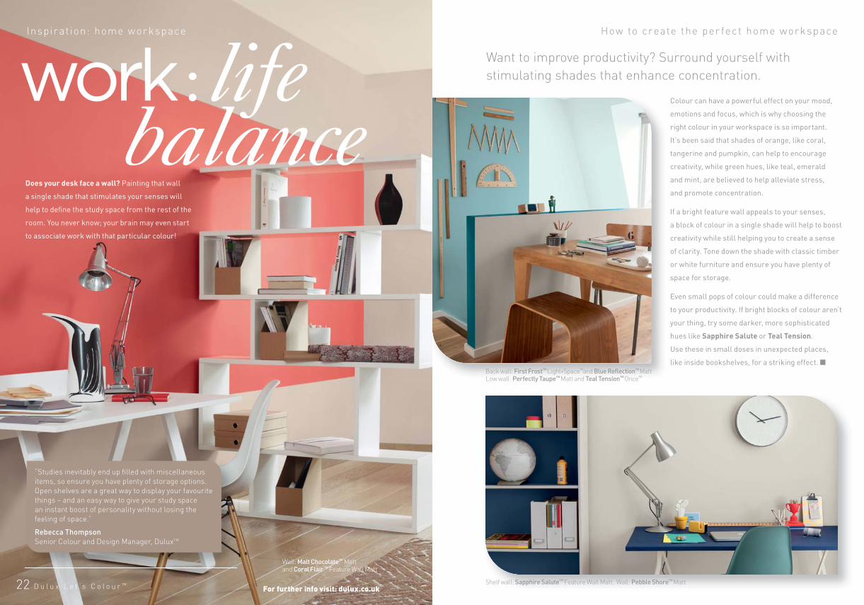
Colour can have a powerful effect on your mood,
emotions and focus, which is why choosing the
right colour in your workspace is so important.
It’s been said that shades of orange, like coral,
tangerine and pumpkin, can help to encourage
creativity, while green hues, like teal, emerald
and mint, are believed to help alleviate stress,
and promote concentration.
If a bright feature wall appeals to your senses,
a block of colour in a single shade will help to boost
creativity while still helping you to create a sense
of clarity. Tone down the shade with classic timber
or white furniture and ensure you have plenty of
space for storage.
Even small pops of colour could make a difference
to your productivity. If bright blocks of colour aren’t
your thing, try some darker, more sophisticated
hues like Sapphire Salute or Teal Tension.
Use these in small doses in unexpected places,
like inside bookshelves, for a striking effect.
How to create the per fec t home workspace
Want to improve productivity? Surround yourself with
stimulating shades that enhance concentration.
Does your desk face a wall? Painting that wall
a single shade that stimulates your senses will
help to define the study space from the rest of the
room. You never know; your brain may even start
to associate work with that particular colour!
Wall: Malt Chocolate™ Mattand Coral Flair™ Feature Wall Matt
Shelf wall: Sapphire Salute™ Feature Wall Matt. Wall: Pebble Shore™ Matt
Back wall: First Frost™ Light+Space™and Blue Reflection™ Matt Low wall: Perfectly Taupe™ Matt and Teal Tension™ Once™
For further info visit: dulux.co.uk
“Studies inevitably end up filled with miscellaneous
items, so ensure you have plenty of storage options.
Open shelves are a great way to display your favourite
things – and an easy way to give your study space
an instant boost of personality without losing the
feeling of space.”
Rebecca Thompson
Senior Colour and Design Manager, DuluxTM
D u l u x L e t ’ s C o l o u r ™ 2524
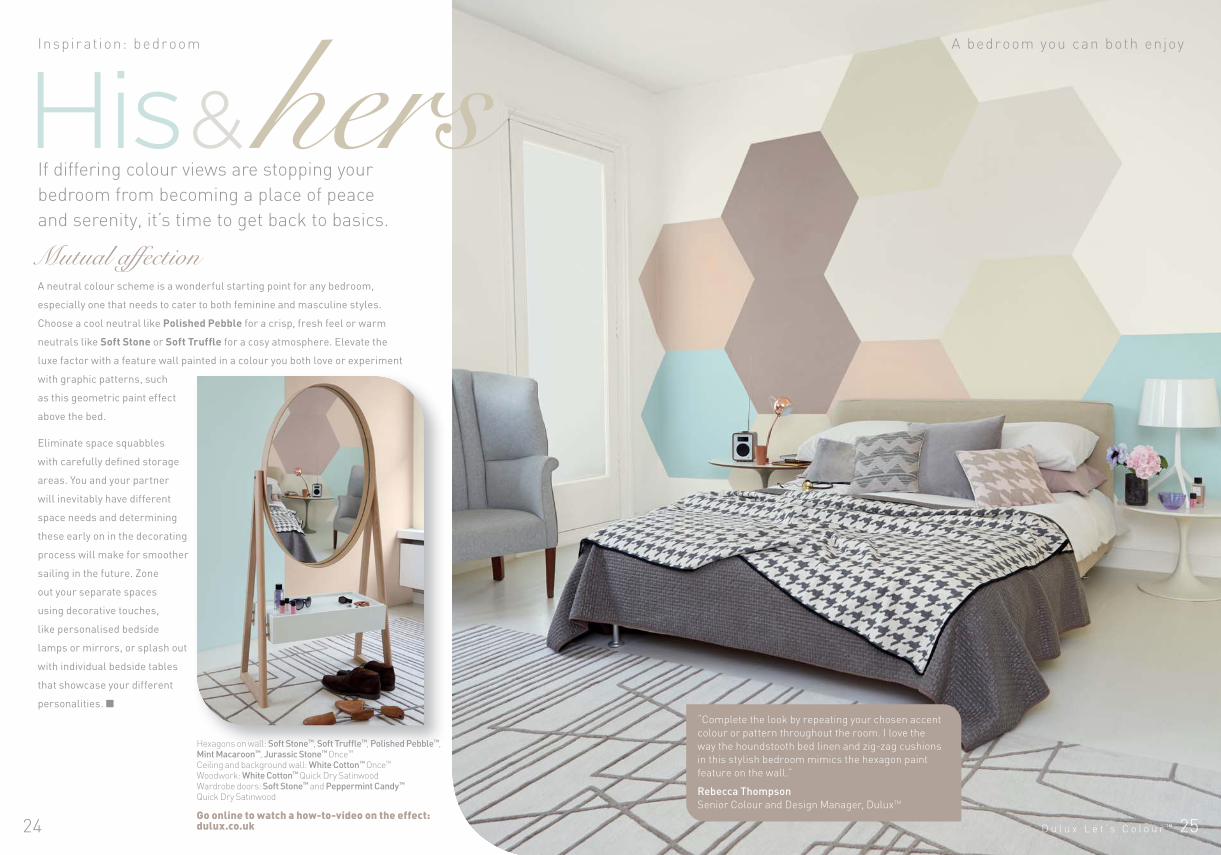
His & hers Inspir ation: bedroom A bedroom you can both enjoy
If differing colour views are stopping your
bedroom from becoming a place of peace
and serenity, it’s time to get back to basics.
A neutral colour scheme is a wonderful starting point for any bedroom,
especially one that needs to cater to both feminine and masculine styles.
Choose a cool neutral like Polished Pebble for a crisp, fresh feel or warm
neutrals like Soft Stone or Soft Truffle for a cosy atmosphere. Elevate the
luxe factor with a feature wall painted in a colour you both love or experiment
with graphic patterns, such
as this geometric paint effect
above the bed.
Eliminate space squabbles
with carefully defined storage
areas. You and your partner
will inevitably have different
space needs and determining
these early on in the decorating
process will make for smoother
sailing in the future. Zone
out your separate spaces
using decorative touches,
like personalised bedside
lamps or mirrors, or splash out
with individual bedside tables
that showcase your different
personalities.
Mutual affection
Hexagons on wall: Soft Stone™, Soft Truffle™, Polished Pebble™, Mint Macaroon™, Jurassic Stone™ Once™
Ceiling and background wall: White Cotton™ Once™ Woodwork: White Cotton™ Quick Dry Satinwood Wardrobe doors: Soft Stone™ and Peppermint Candy™ Quick Dry Satinwood
Go online to watch a how-to-video on the effect: dulux.co.uk
“Complete the look by repeating your chosen accent
colour or pattern throughout the room. I love the
way the houndstooth bed linen and zig-zag cushions
in this stylish bedroom mimics the hexagon paint
feature on the wall.”
Rebecca Thompson
Senior Colour and Design Manager, DuluxTM
D u l u x L e t ’ s C o l o u r ™ 27
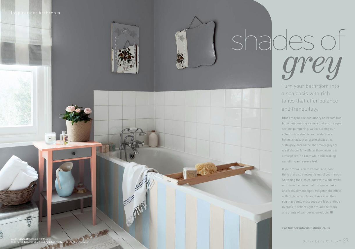
Turn your bathroom into
a spa oasis with rich
tones that offer balance
and tranquillity.
shades ofInspir ation: bathroom
greyBlues may be the customary bathroom hue
but when creating a space that encourages
serious pampering, we love taking our
colour inspiration from this decade’s
hottest shade, grey. Warm shades like
slate grey, dark taupe and smoky grey are
great shades for walls as they create real
atmosphere in a room while still evoking
a soothing and serene feel.
If your room is on the small side, don’t
think that a spa retreat is out of your reach.
Softening the rich colours with white walls
or tiles will ensure that the space looks
and feels airy and light. Heighten the effect
with textured surfaces, like a sisal floor
rug that gently massages the feet, antique
mirrors to reflect light around the room
and plenty of pampering products.
Walls: Urban Obsession™ Bathroom+Bath panel: Mineral Mist™ and Polished Pebble™ Quick Dry Satinwood
For further info visit: dulux.co.uk
2928 D u l u x L e t ’ s C o l o u r ™
Inspir ation: bedroom
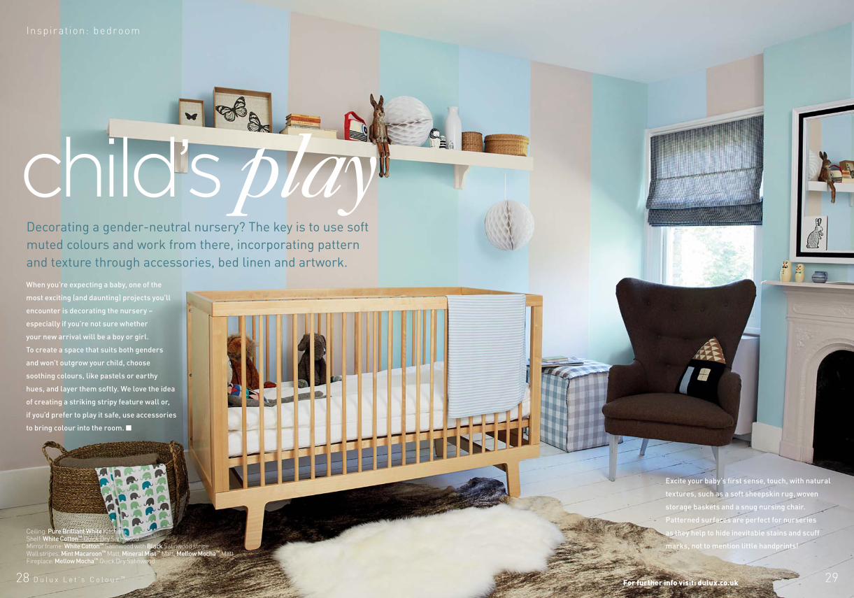
When you’re expecting a baby, one of the
most exciting (and daunting) projects you’ll
encounter is decorating the nursery –
especially if you’re not sure whether
your new arrival will be a boy or girl.
To create a space that suits both genders
and won’t outgrow your child, choose
soothing colours, like pastels or earthy
hues, and layer them softly. We love the idea
of creating a striking stripy feature wall or,
if you’d prefer to play it safe, use accessories
to bring colour into the room.
Decorating a gender-neutral nursery? The key is to use soft
muted colours and work from there, incorporating pattern
and texture through accessories, bed linen and artwork.
Excite your baby’s first sense, touch, with natural
textures, such as a soft sheepskin rug, woven
storage baskets and a snug nursing chair.
Patterned surfaces are perfect for nurseries
as they help to hide inevitable stains and scuff
marks, not to mention little handprints!
Ceiling: Pure Brilliant White Kitchen+Shelf: White Cotton™ Quick Dry Satinwood Mirror frame: White Cotton™ Satinwood with Black Satinwood stripe Wall stripes: Mint Macaroon™ Matt, Mineral Mist™ Matt, Mellow Mocha™ MattFireplace: Mellow Mocha™ Quick Dry Satinwood
For further info visit: dulux.co.uk
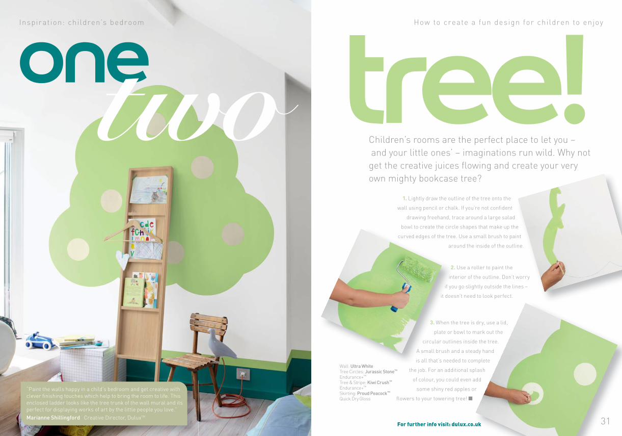
31
oneHow to create a fun design for children to enjoy
1. Lightly draw the outline of the tree onto the
wall using pencil or chalk. If you’re not confident
drawing freehand, trace around a large salad
bowl to create the circle shapes that make up the
curved edges of the tree. Use a small brush to paint
around the inside of the outline.
Inspir at ion: children’s bedroom
tree!Children’s rooms are the perfect place to let you –
and your little ones’ – imaginations run wild. Why not
get the creative juices flowing and create your very
own mighty bookcase tree?
2. Use a roller to paint the
interior of the outline. Don’t worry
if you go slightly outside the lines –
it doesn’t need to look perfect.
3. When the tree is dry, use a lid,
plate or bowl to mark out the
circular outlines inside the tree.
A small brush and a steady hand
is all that’s needed to complete
the job. For an additional splash
of colour, you could even add
some shiny red apples or
flowers to your towering tree!
For further info visit: dulux.co.uk
“Paint the walls happy in a child’s bedroom and get creative with
clever finishing touches which help to bring the room to life. This
enclosed ladder looks like the tree trunk of the wall mural and its
perfect for displaying works of art by the little people you love.”
Marianne Shillingford Creative Director, DuluxTM
Wall: Ultra WhiteTree Circles: Jurassic Stone™ Endurance+™
Tree & Stripe: Kiwi Crush™ Endurance+™
Skirting: Proud Peacock™ Quick Dry Gloss
D u l u x L e t ’ s C o l o u r ™ 3332 D u l u x L e t ’ s C o l o u r ™
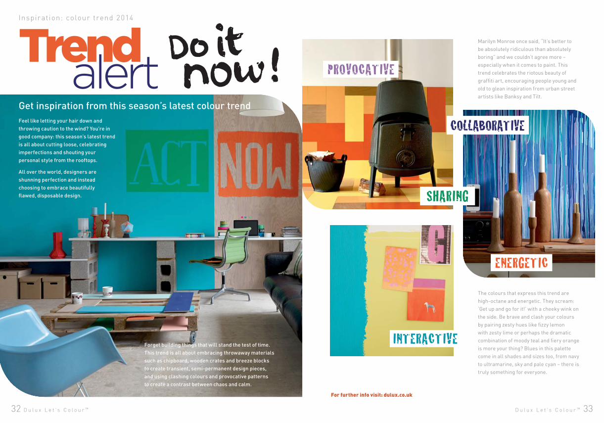
Marilyn Monroe once said, “It’s better to
be absolutely ridiculous than absolutely
boring” and we couldn’t agree more –
especially when it comes to paint. This
trend celebrates the riotous beauty of
graffiti art, encouraging people young and
old to glean inspiration from urban street
artists like Banksy and Tilt.
Forget building things that will stand the test of time.
This trend is all about embracing throwaway materials
such as chipboard, wooden crates and breeze blocks
to create transient, semi-permanent design pieces,
and using clashing colours and provocative patterns
to create a contrast between chaos and calm.
Get inspiration from this season’s latest colour trend
Inspir at ion: colour trend 2014
Trend
For further info visit: dulux.co.uk
alertFeel like letting your hair down and
throwing caution to the wind? You’re in
good company: this season’s latest trend
is all about cutting loose, celebrating
imperfections and shouting your
personal style from the rooftops.
All over the world, designers are
shunning perfection and instead
choosing to embrace beautifully
flawed, disposable design.
The colours that express this trend are
high-octane and energetic. They scream:
‘Get up and go for it!’ with a cheeky wink on
the side. Be brave and clash your colours
by pairing zesty hues like fizzy lemon
with zesty lime or perhaps the dramatic
combination of moody teal and fiery orange
is more your thing? Blues in this palette
come in all shades and sizes too, from navy
to ultramarine, sky and pale cyan – there is
truly something for everyone.
D u l u x L e t ’ s C o l o u r ™ 3534 D u l u x L e t ’ s C o l o u r ™
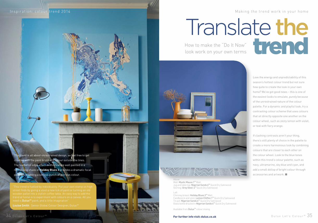
Inspir at ion: colour trend 2014 Making the trend work in your home
Love the energy and unpredictability of this
season’s hottest colour trend but not sure
how quite to create the look in your own
home? We’ve got good news – this is one of
the easiest looks to emulate, purely because
of the unrestrained nature of the colour
palette. For a dynamic and playful look, try a
contrasting colour scheme that uses colours
that sit directly opposite one another on the
colour wheel, such as zesty lemon with violet,
or teal with fiery orange.
If clashing contrasts aren’t your thing,
there’s still plenty of choice in the palette to
create a more harmonious look by combining
colours that are closer to each other on
the colour wheel. Look to the blue tones
within this trend’s colour palette, such as
navy, ultramarine, sky blue and cyan, and
add a small dollop of bright colour through
accessories and artwork.
This trend is all about unrestrained design, so feel free to get
creative with the paint brush and colour outside the lines.
The feathered edge effect on this feature wall painted in a
revitalising shade of Holiday Blues 3 provides a dramatic focal
point while adding a serious punch of glorious colour.
Translate thetrend
LeftChimney breast: Holiday Blues 3™ MattCandlestick and stool: Lemon Chiffon 1™ Quick Dry SatinwoodTin pot: Nigerian Sands 6™ Quick Dry SatinwoodGlass bottle drizzled in Nigerian Sands 6™ Quick Dry Satinwood
Available from Dulux™ colour mixing
AboveWall: Mystic Mauve 1™ MattJug and table top: Nigerian Sands 6™ Quick Dry SatinwoodSkirting: Grey Steel 4™ Quick Dry Satinwood
For further info visit: dulux.co.uk
How to make the “Do It Now”
look work on your own terms
“This trend is fuelled by individuality. Put your own stamp on high
street finds by giving a stool a new lick of paint or turning an old
wooden pallet into a stylish coffee table. An easy way to add the
trend at home is to experiment with colours on a canvas. All you
need is DuluxTM paint, and a little imagination”
Louise Smith Senior Global Colour Designer, DuluxTM
36 D u l u x L e t ’ s C o l o u r ™
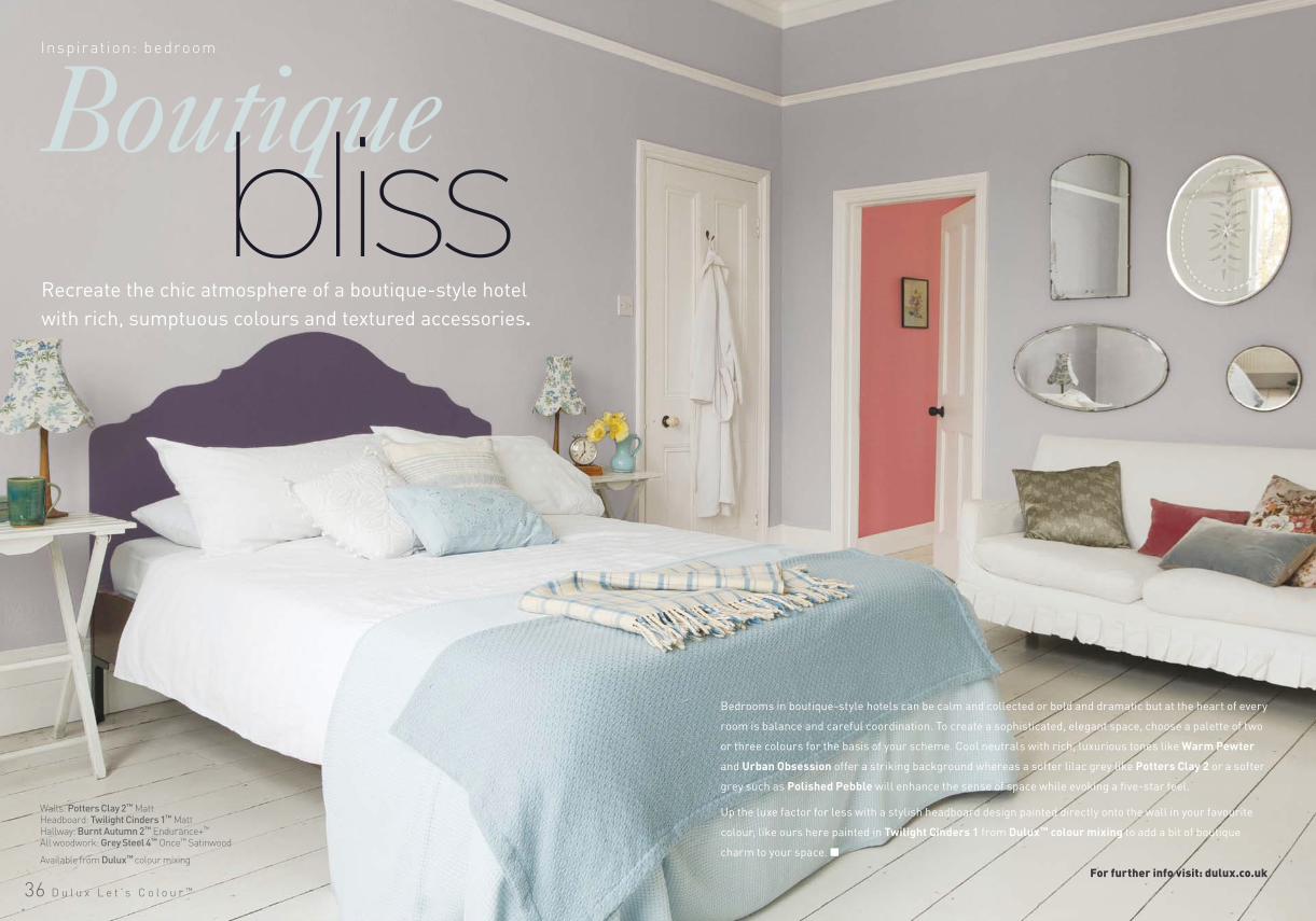
Inspir ation: bedroom
Recreate the chic atmosphere of a boutique-style hotel
with rich, sumptuous colours and textured accessories.
bliss
Bedrooms in boutique-style hotels can be calm and collected or bold and dramatic but at the heart of every
room is balance and careful coordination. To create a sophisticated, elegant space, choose a palette of two
or three colours for the basis of your scheme. Cool neutrals with rich, luxurious tones like Warm Pewter
and Urban Obsession offer a striking background whereas a softer lilac grey like Potters Clay 2 or a softer
grey such as Polished Pebble will enhance the sense of space while evoking a five-star feel.
Up the luxe factor for less with a stylish headboard design painted directly onto the wall in your favourite
colour, like ours here painted in Twilight Cinders 1 from Dulux™ colour mixing to add a bit of boutique
charm to your space.
Walls: Potters Clay 2™ MattHeadboard: Twilight Cinders 1™ MattHallway: Burnt Autumn 2™ Endurance+™
All woodwork: Grey Steel 4™ Once™ Satinwood
Available from Dulux™ colour mixing
For further info visit: dulux.co.uk
D u l u x L e t ’ s C o l o u r ™ 3938
Inspir ation: k i tchen
Whether your heart beats wildly at the sight of
citrus shades or you feel instantly calmed in the
presence of bright berry, a bold wash of colour
throughout your kitchen is a sure-fire way to
satisfy the senses. Get creative by painting
unexpected nooks in vivid brights, or go all out
with fabulous feature walls dressed in colours
inspired by the luscious tones of fresh produce,
such as warm beetroot, raspberry, plum red and
leafy greens like basil and mint.
spice up your kitchen!Not just for the brave, a colour drenched kitchen
is guaranteed to set taste buds tingling.
Walls: Mineral Haze 2™ Kitchen+Woodwork: Mineral Haze 4™ Quick Dry Satinwood Ceiling: Mineral Haze 4™ Kitchen+Panels (from left to right): Fire cracker 4™, Party Surprise 1™, Russian Velvet 4™, Summer Surprise 1™ All Quick Dry SatinwoodTop shelf: Russian Velvet 4™ Quick Dry SatinwoodBottom shelf: Summer Surprise 1™ Quick Dry Satinwood
Available from Dulux™ colour mixing
For further info visit: dulux.co.uk
40 D u l u x L e t ’ s C o l o u r ™
Inspir ation: bathroom Be bold in a small bathroom
Your bathroom doesn’t need to feel as small as it looks.
Create a spacious haven with aquatic shades and cool neutrals.
Bathing
Contrary to popular belief, small spaces love
bright colours. The secret is to choose crisp
shades that reflect light rather than absorb
it, like aquamarine, teal and sea green.
These shades will not only help to reflect
the bathroom’s natural light, they’ll also
help to bounce artificial light around the
room and soften shadows. Make a splash
with a dramatic feature wall (we love the
serene feel of Forest Falls) or paint your
cabinets or shelving in bright hues to draw
the eye away from cramped areas and
create striking focal points.
Offset the bright colours with a palette of
cool neutrals, like pure white, slate and dove
grey, to further intensify the clean lines of
your bathroom. Make your small space work
harder by reducing as much clutter from the
floor and surfaces as you can. If you don’t
have built-in cabinets, stackable storage
containers with lids, wicker baskets and
ladders with plenty of hanging space are all
inexpensive ways to keep clutter at bay.
Create the space
Corbel: Sea Urchin 5™ Quick Dry SatinwoodVenetian blinds: Pure Brilliant White and Azure Fusion 1™
Mirror: Cool White Made by Me GlossLadder: Azure Fusion 1™ and Sea Urchin 5™ Quick Dry GlossCeiling: Forest Falls 6™ Bathroom+, Wall: Forest Falls 2™ Bathroom+ Extended Skirting: Winter Teal 1™ Quick Dry Satinwood Console: Azure Fusion 1™ Quick Dry Gloss
Colours available from Dulux™ colour mixing
For further info visit: dulux.co.uk
“Try extending the colour up from the walls onto the
ceiling to create a fluid look in the bathroom and your
eye will be fooled into thinking that the room is bigger
than it actually is. Choose a shade of the wall colour
but a couple of tones lighter for the ceiling to create a
clever seamless appearance.”
Marianne Shillingford Creative Director, DuluxTM
D u l u x L e t ’ s C o l o u r ™ 4342
Inspir ation: ex ter ior
You don’t need to paint the entire exterior of your
home to make a statement. In fact, few features
have the potential to make an instant impact like
your front door. The best colour for your door
depends a lot on the style of your house, so before
you start dreaming of a glossy new entranceway,
take note of the style of the door, along with the
woodwork that frames it.
If you have a Victorian-era home with an old,
solid door, classic colours painted in a high gloss
finish like navy blue, rich red or claret will help
you create a polished period style. Traditional
homes generally suit nature-inspired hues
like warm muted olive greens or blue greys
while modern façades, like the home pictured,
look fabulous dressed in more contemporary
shades such as deep greys, warm teals or rich
aubergine tones. Complete the look with freshly
painted masonry in a crisp, classic colour, like
Jasmine White or Sandstone from the Dulux
Weathershield™ Exterior Masonry range.
Tired façade? Give your front
door an instant makeover
with smart, inviting colours.
face
Front door: Gallant Grey™ Weathershield™ Exterior SatinMasonry: Jasmine White™ Weathershield™ Smooth MasonryWindow frames: Gallant Grey™ Weathershield™ Exterior SatinWindow boxes: Green Glade™ Weathershield™ Exterior Satin
For further info visit: dulux.co.uk
D u l u x L e t ’ s C o l o u r ™ 4544
The end result saw the daughters and their parents
looking forward to using the space as a family
and regularly coming together. Their favourite
aspect of the new room? Both daughters love the
rich plum tones used, and we’re told that guests
overwhelmingly comment on how striking the
dining chair fabric looks under the sparkling light
of the chandelier.
Style revivalInspir ation: lounge How the exper ts can help you tr ansform a t ired room
A dash of design flair transforms a dowdy room into
a sophisticated dining space.
The Dulux Design Service™ can help you get your home looking exactly
the way you’ve always wanted, simply and affordably. They will bring
you the latest and very best in interior design at competitive prices,
to suit your own individual style and taste.
Call 0845 880 6888 or visit duluxdesignservice.co.uk for more info.
Purchased by a couple for their two adult daughters
as a starter home, this two-storey flat was dingy and
in desperate need of a makeover. The priority was
to brighten up the darker areas of the flat and to inject
some life and personality into the living areas, fit for
hosting friends and family in the future.
This family wanted an exotic theme that reflected
their family heritage – but without making that
the main focus and without being too kitsch. They
were also divided about colour; one daughter worked
in fashion and was pretty colour-savvy, the other
wanted something more muted so it was up to interior
designer Simon Gibbs from the Dulux Design
Service™ to try and find a happy medium for both girls.
Before
After
After
First, the corridor leading into the dining room was
brightened using Dulux Light + Space™, a light-
reflecting paint that helps trick the eye into thinking
the area is brighter and airier than it actually is.
The carpet floor in the dining room was stripped
and replaced with wooden floorboards with an
acoustic underlay to help contain the noise.
To evoke an exotic feel without overpowering the
room, ethnic style fabrics were paired with a simple
colour scheme. Soft Stone was used as the base
colour, with the feature wall created with a splash
of Mulberry Burst from the Dulux™ Feature Wall
range. The striking plum and chartreuse soft
furnishings and textured textiles bring warmth
into the previously dull space, while statement
accessories, like the art deco chandelier, create a
dramatic focal point. Soft furnishings are a great
way to experiment with colour and pattern as
they’re easy to replace and play around with,
giving the family ultimate control over the space.
Before
Mood board
D u l u x L e t ’ s C o l o u r ™ 47
Whether you’re a novice with a paint brush or a regular Picasso,
these easy projects are a great way to inject colour into your home
– no DIY skills needed!
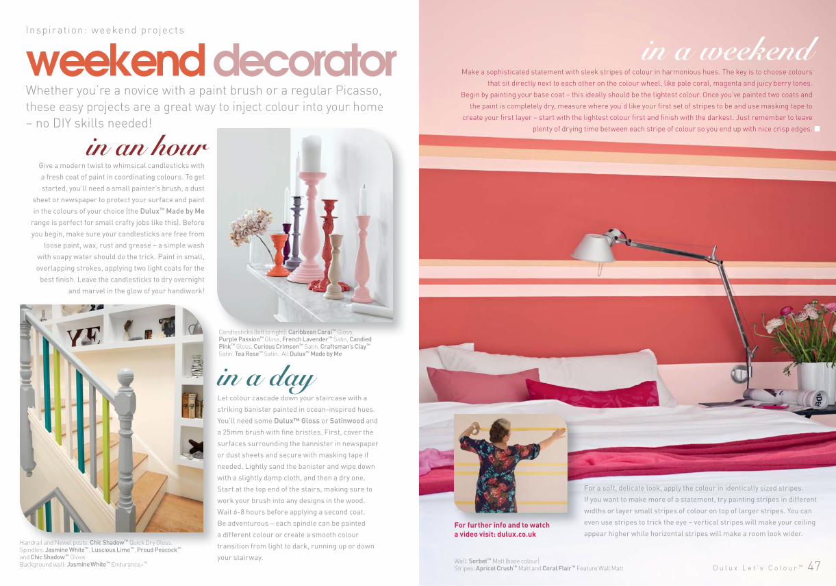
Give a modern twist to whimsical candlesticks with
a fresh coat of paint in coordinating colours. To get
started, you’ll need a small painter’s brush, a dust
sheet or newspaper to protect your surface and paint
in the colours of your choice (the Dulux™ Made by Me
range is perfect for small crafty jobs like this). Before
you begin, make sure your candlesticks are free from
loose paint, wax, rust and grease – a simple wash
with soapy water should do the trick. Paint in small,
overlapping strokes, applying two light coats for the
best finish. Leave the candlesticks to dry overnight
and marvel in the glow of your handiwork!
weekend decorator in a weekend Inspir at ion: weekend projec ts
Let colour cascade down your staircase with a
striking banister painted in ocean-inspired hues.
You’ll need some Dulux™ Gloss or Satinwood and
a 25mm brush with fine bristles. First, cover the
surfaces surrounding the bannister in newspaper
or dust sheets and secure with masking tape if
needed. Lightly sand the banister and wipe down
with a slightly damp cloth, and then a dry one.
Start at the top end of the stairs, making sure to
work your brush into any designs in the wood.
Wait 6-8 hours before applying a second coat.
Be adventurous – each spindle can be painted
a different colour or create a smooth colour
transition from light to dark, running up or down
your stairway.
Make a sophisticated statement with sleek stripes of colour in harmonious hues. The key is to choose colours
that sit directly next to each other on the colour wheel, like pale coral, magenta and juicy berry tones.
Begin by painting your base coat – this ideally should be the lightest colour. Once you’ve painted two coats and
the paint is completely dry, measure where you’d like your first set of stripes to be and use masking tape to
create your first layer – start with the lightest colour first and finish with the darkest. Just remember to leave
plenty of drying time between each stripe of colour so you end up with nice crisp edges.
For a soft, delicate look, apply the colour in identically sized stripes.
If you want to make more of a statement, try painting stripes in different
widths or layer small stripes of colour on top of larger stripes. You can
even use stripes to trick the eye – vertical stripes will make your ceiling
appear higher while horizontal stripes will make a room look wider. Handrail and Newel posts: Chic Shadow™ Quick Dry Gloss. Spindles: Jasmine White™, Luscious Lime™, Proud Peacock™ and Chic Shadow™ Gloss Background wall: Jasmine White™ Endurance+™
Candlesticks (left to right): Caribbean Coral™ Gloss,Purple Passion™ Gloss, French Lavender™ Satin, Candied Pink™ Gloss, Curious Crimson™ Satin, Craftsman’s Clay™ Satin, Tea Rose™ Satin. All Dulux™ Made by Me
For further info and to watch a video visit: dulux.co.uk
in an hour
in a day
Wall: Sorbet™ Matt (base colour)Stripes: Apricot Crush™ Matt and Coral Flair™ Feature Wall Matt
For fufurthrtherer infinfo ao andnd toto watwatchch
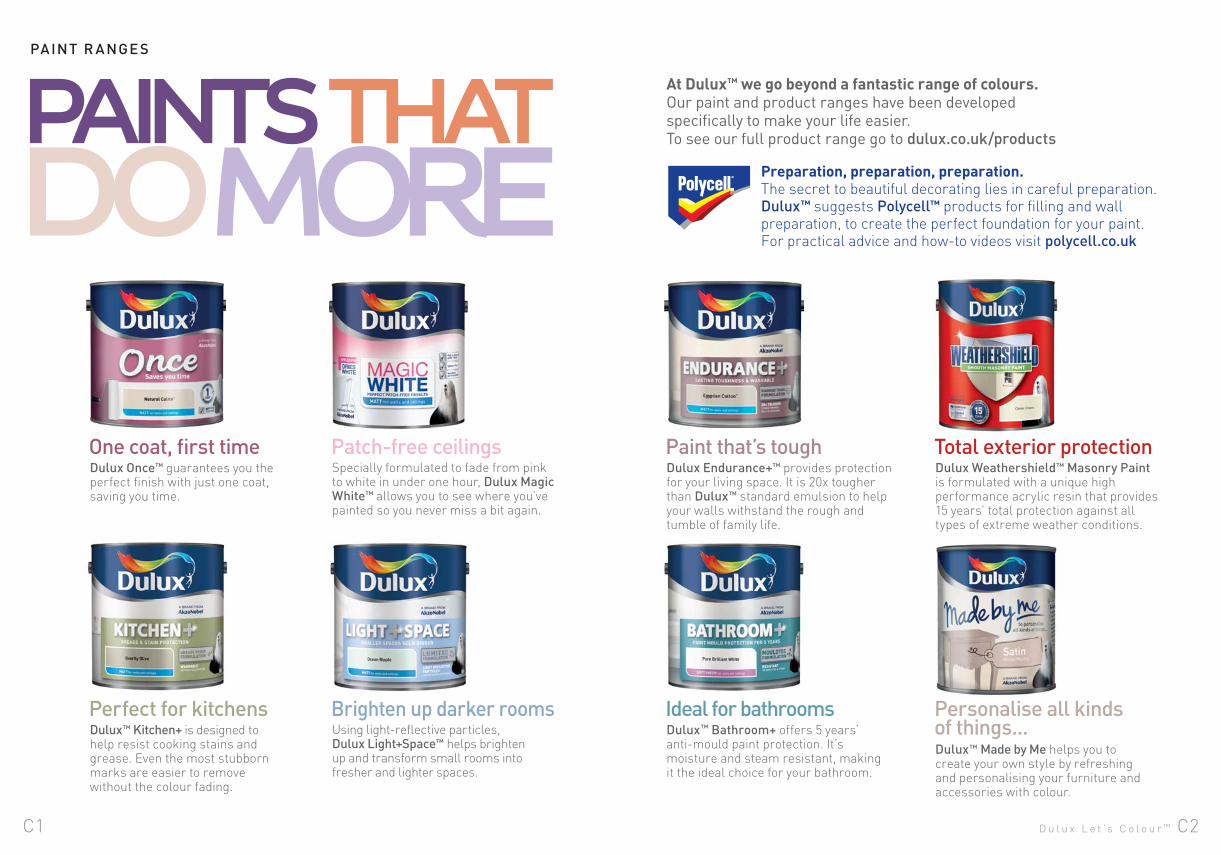
Dulux™ Bathroom+ offers 5 years’ anti-mould paint protection. It’s moisture and steam resistant, making it the ideal choice for your bathroom.
Dulux Endurance+™ provides protection for your living space. It is 20x tougher than Dulux™ standard emulsion to help your walls withstand the rough and tumble of family life.
Dulux Weathershield™ Masonry Paint is formulated with a unique high performance acrylic resin that provides 15 years’ total protection against all types of extreme weather conditions.
Dulux Once™ guarantees you the perfect finish with just one coat, saving you time.
One coat, first timeSpecially formulated to fade from pink to white in under one hour, Dulux Magic White™ allows you to see where you’ve painted so you never miss a bit again.
Patch-free ceilings
Dulux™ Kitchen+ is designed to help resist cooking stains and grease. Even the most stubborn marks are easier to remove without the colour fading.
Perfect for kitchensUsing light-reflective particles, Dulux Light+Space™ helps brighten up and transform small rooms into fresher and lighter spaces.
Brighten up darker rooms
Paint that’s tough
Ideal for bathrooms
Total exterior protection
Personalise all kinds of things...Dulux™ Made by Me helps you to create your own style by refreshing and personalising your furniture and accessories with colour.
PAINT R ANGE S
PAINTS THATDO MORE
At Dulux™ we go beyond a fantastic range of colours. Our paint and product ranges have been developed specifically to make your life easier.To see our full product range go to dulux.co.uk/products
Preparation, preparation, preparation. The secret to beautiful decorating lies in careful preparation. Dulux™ suggests Polycell™ products for filling and wall preparation, to create the perfect foundation for your paint. For practical advice and how-to videos visit polycell.co.uk
D u l u x L e t ’ s C o l o u r ™ C2C1
for HALLWAYS
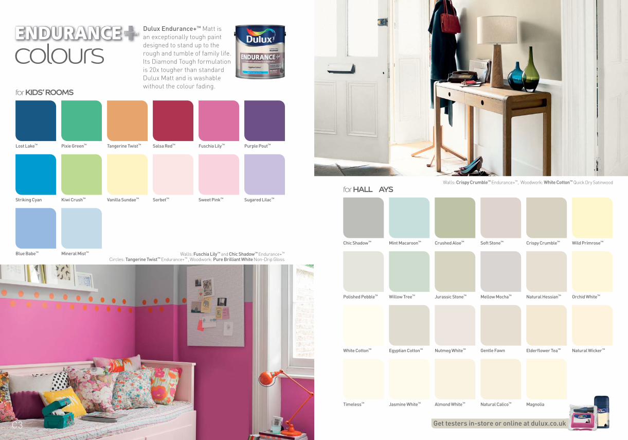
coloursDulux Endurance+™ Matt is
an exceptionally tough paint
designed to stand up to the
rough and tumble of family life.
Its Diamond Tough formulation
is 20x tougher than standard
Dulux Matt and is washable
without the colour fading.for KIDS’ ROOMS
Get testers in-store or online at dulux.co.ukk
Chic Shadow™
Polished Pebble™
White Cotton™
Timeless™
Crushed Aloe™
Jurassic Stone™
Nutmeg White™
Almond White™
Crispy Crumble™
Natural Hessian™
Elderflower Tea™
Magnolia
Mint Macaroon™
Willow Tree™
Egyptian Cotton™
Jasmine White™
Soft Stone™
Mellow Mocha™
Gentle Fawn
Natural Calico™
Wild Primrose™
Orchid White™
Natural Wicker™
Lost Lake™
Striking Cyan
Blue Babe™
Tangerine Twist™
Vanilla Sundae™
Fuschia Lily™
Sweet Pink™
Pixie Green™
Kiwi Crush™
Mineral Mist™
Salsa Red™
Sorbet™
Purple Pout™
Sugared Lilac™
Walls: Fuschia Lily™ and Chic Shadow™ Endurance+™
Circles: Tangerine Twist™ Endurance+™ , Woodwork: Pure Brilliant White Non-Drip Gloss
Walls: Crispy Crumble™ Endurance+™, Woodwork: White Cotton™ Quick Dry Satinwood
C3
coloursfor WALLS & CEILINGS
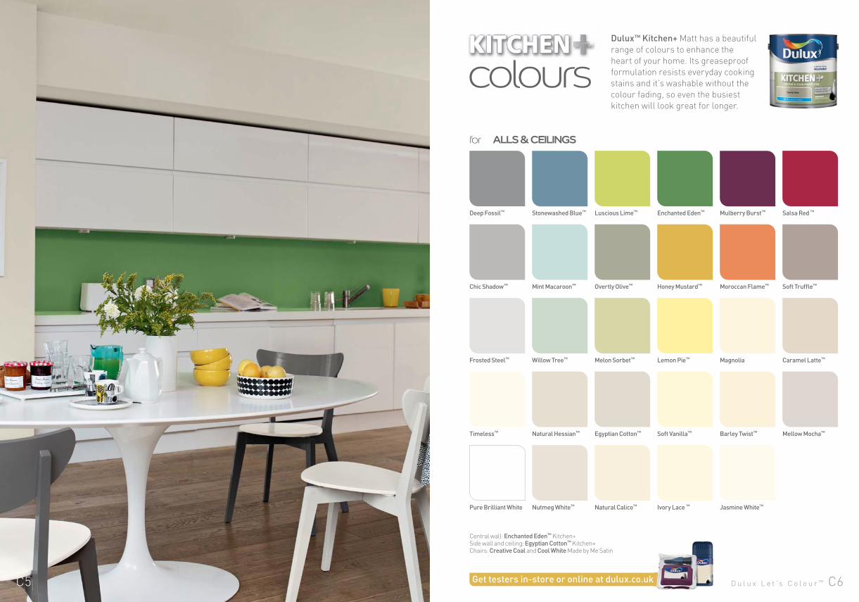
Dulux™ Kitchen+ Matt has a beautiful
range of colours to enhance the
heart of your home. Its greaseproof
formulation resists everyday cooking
stains and it’s washable without the
colour fading, so even the busiest
kitchen will look great for longer.
Deep Fossil™
Chic Shadow™
Frosted Steel™
Timeless™
Pure Brilliant White
Luscious Lime™
Overtly Olive™
Melon Sorbet™
Egyptian Cotton™
Natural Calico™
Mulberry Burst™
Moroccan Flame™
Magnolia
Barley Twist™
Jasmine White™
Mellow Mocha™
Stonewashed Blue™
Mint Macaroon™
Willow Tree™
Natural Hessian™
Nutmeg White™
Enchanted Eden™
Honey Mustard™
Lemon Pie™
Soft Vanilla™
Ivory Lace ™
Salsa Red ™
Soft Truffle™
Caramel Latte™
Get testers in-store or online at dulux.co.ukk
Central wall: Enchanted Eden™ Kitchen+Side wall and ceiling: Egyptian Cotton™ Kitchen+ Chairs: Creative Coal and Cool White Made by Me Satin
D u l u x L e t ’ s C o l o u r ™ C6C5
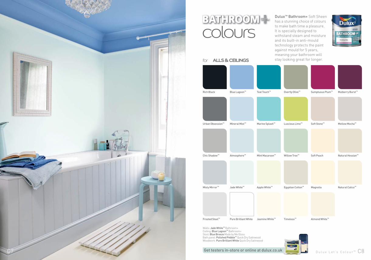
Dulux™ Bathroom+ Soft Sheen
has a stunning choice of colours
to make bath time a pleasure.
It is specially designed to
withstand steam and moisture
and its built-in anti-mould
technology protects the paint
against mould for 5 years,
meaning your bathroom will
stay looking great for longer.for WALLS & CEILINGS
colours
Rich Black
Urban Obsession™
Chic Shadow™
Misty Mirror™
Frosted Steel™
Teal Touch™
Marine Splash™
Mint Macaroon™
Apple White™
Jasmine White™
Sumptuous Plum™
Soft Stone™
Soft Peach
Magnolia
Almond White™
Natural Calico™
Blue Lagoon™
Mineral Mist™
Atmosphere™
Jade White™
Pure Brilliant White
Overtly Olive™
Luscious Lime™
Willow Tree™
Egyptian Cotton™
Timeless™
Mulberry Burst™
Mellow Mocha™
Natural Hessian™
Get testers in-store or online at dulux.co.ukk
Walls: Jade White™ Bathroom+Ceiling: Blue Lagoon™ Bathroom+
Stool: Blue Breeze Made by Me Gloss Bath panel: Polished Pebble™ Quick Dry SatinwoodWoodwork: Pure Brilliant White Quick Dry Satinwood
D u l u x L e t ’ s C o l o u r ™ C8C7
for WALLS & CEILINGS
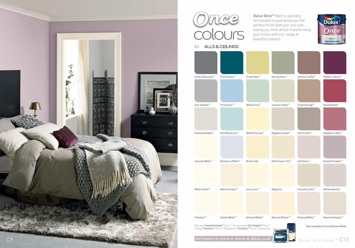
coloursDulux Once™ Matt is specially
formulated to guarantee you the
perfect finish with just one coat,
saving you time whilst transforming
your home with our range of
beautiful colours.
Urban Obsession™
Chic Shadow™
Polished Pebble™
Jasmine White™
White Cotton™
Timeless™
Fresh Stem™
Willow Tree™
Wild Primrose™
Buttermilk
Ivory Lace™
Almond White™
Intense Truffle™
Cookie Dough™
Soft Truffle™
Soft Stone™
Caramel Latte™
Nutmeg White™
Dusted Fondant™
Natural Hessian™
Teal Tension™
First Dawn™
Mint Macaroon™
Blueberry White™
Natural Calico™
Vanilla White™
Overtly Olive™
Jurassic Stone™
Egyptian Cotton™
Elderflower Tea™
Magnolia
Natural Wicker™
Mulberry Burst™
Roasted Red™
Raspberry Diva™
Mellow Mocha™
Get testers in-store or online at dulux.co.uk
Main wall: Dusted Fondant™ Once ™, En-suite wall: Chic Shadow™ Once ™
Ceiling: Timeless™ Once™, Woodwork: Timeless™ Once™ SatinwoodAlso available in Pure Brilliant White
D u l u x L e t ’ s C o l o u r ™ C10C9
for WALLS & CEILINGS
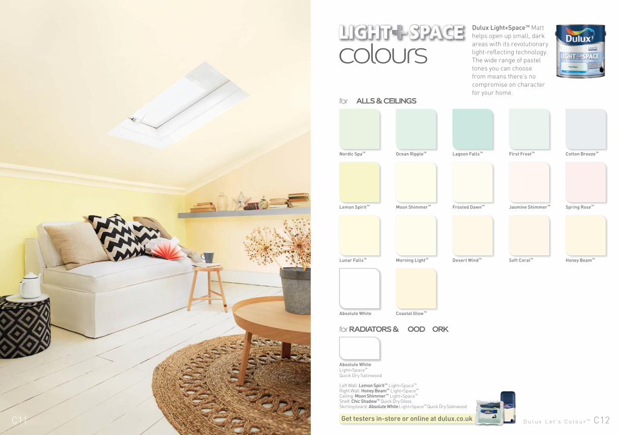
Dulux Light+Space™ Matt
helps open up small, dark
areas with its revolutionary
light-reflecting technology.
The wide range of pastel
tones you can choose
from means there’s no
compromise on character
for your home.
colours
Nordic Spa™
Lemon Spirit™
Lunar Falls™
Absolute White
Lagoon Falls™
Frosted Dawn™
Desert Wind™
Ocean Ripple™
Moon Shimmer™
Morning Light™
Coastal Glow™
First Frost™
Jasmine Shimmer™
Soft Coral™
Cotton Breeze™
Spring Rose™
Honey Beam™
for RADIATORS & WOODWORK
Absolute White
Light+Space™
Quick Dry Satinwood
Get testers in-store or online at dulux.co.ukk
Left Wall: Lemon Spirit™ Light+Space™ Right Wall: Honey Beam™ Light+Space™ Ceiling: Moon Shimmer™ Light+Space™ Shelf: Chic Shadow™ Quick Dry Gloss Skirting board: Absolute White Light+Space™ Quick Dry Satinwood
D u l u x L e t ’ s C o l o u r ™ C12C11
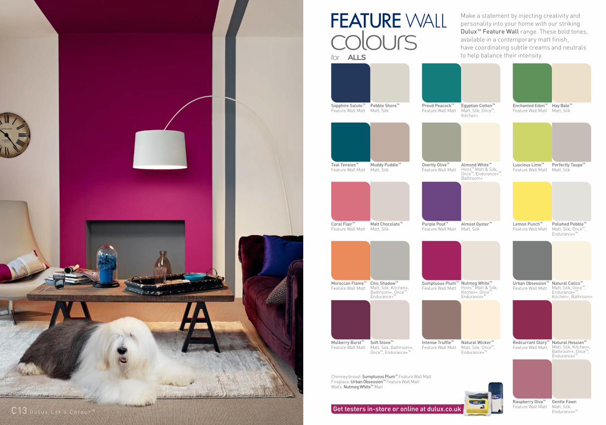
Make a statement by injecting creativity and
personality into your home with our striking
Dulux™ Feature Wall range. These bold tones,
available in a contemporary matt finish,
have coordinating subtle creams and neutrals
to help balance their intensity.for WALLS
colours
Sapphire Salute™ Feature Wall Matt
Teal Tension™ Feature Wall Matt
Coral Flair™ Feature Wall Matt
Moroccan Flame™ Feature Wall Matt
Mulberry Burst™ Feature Wall Matt
Raspberry Diva™ Feature Wall Matt
Proud Peacock™ Feature Wall Matt
Overtly Olive™ Feature Wall Matt
Purple Pout™
Feature Wall Matt
Sumptuous Plum™ Feature Wall Matt
Intense Truffle™ Feature Wall Matt
Enchanted Eden™ Feature Wall Matt
Luscious Lime™ Feature Wall Matt
Lemon Punch™ Feature Wall Matt
Urban Obsession™ Feature Wall Matt
Redcurrant Glory™ Feature Wall Matt,
Pebble Shore™ Matt, Silk
Muddy Puddle™ Matt, Silk
Malt Chocolate™ Matt, Silk
Chic Shadow™ Matt, Silk, Kitchen+, Bathroom+, Once™, Endurance+™
Soft Stone™ Matt, Silk, Bathroom+, Once™, Endurance+™
Gentle Fawn Matt, Silk, Endurance+™
Egyptian Cotton™ Matt, Silk, Once™, Kitchen+
Almond White™ Hints™ Matt & Silk, Once™, Endurance+™, Bathroom+
Almost Oyster™ Matt, Silk
Nutmeg White™
Hints™ Matt & Silk, Kitchen+, Once™, Endurance+™
Natural Wicker™
Matt, Silk, Once™, Endurance+™
Hay Bale™ Matt, Silk
Perfectly Taupe™ Matt, Silk
Polished Pebble™ Matt, Silk, Once™, Endurance+™
Natural Calico™ Matt, Silk, Once™, Endurance+™, Kitchen+, Bathroom+
Natural Hessian™
Matt, Silk, Kitchen+, Bathroom+, Once™, Endurance+™
Chimney breast: Sumptuous Plum™ Feature Wall MattFireplace: Urban Obsession™ Feature Wall MattWalls: Nutmeg White™ Matt
Get testers in-store or online at dulux.co.ukkC13 D u l u x L e t ’ s C o l o u r ™
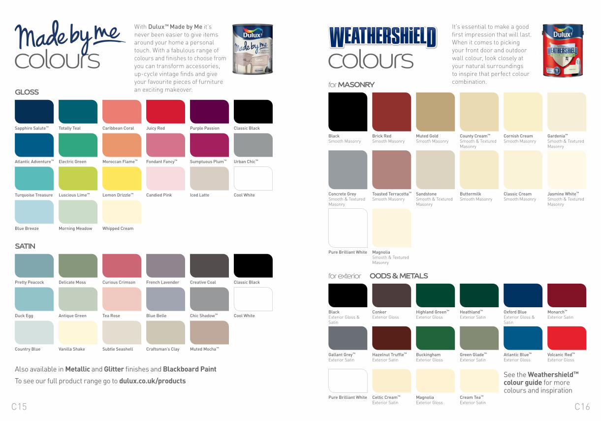
With Dulux™ Made by Me it’s
never been easier to give items
around your home a personal
touch. With a fabulous range of
colours and finishes to choose from
you can transform accessories,
up-cycle vintage finds and give
your favourite pieces of furniture
an exciting makeover.
coloursIt’s essential to make a good
first impression that will last.
When it comes to picking
your front door and outdoor
wall colour, look closely at
your natural surroundings
to inspire that perfect colour
combination.
coloursGLOSS
SATIN
for MASONRY
for exterior WOODS & METALS
Also available in Metallic and Glitter finishes and Blackboard Paint
To see our full product range go to dulux.co.uk/productsSee the Weathershield™ colour guide for more colours and inspiration
Sapphire Salute™
Pretty Peacock
Atlantic Adventure™
Duck Egg
Turquoise Treasure
Country Blue
Blue Breeze
Classic Black
Classic Black
Urban Chic™
Cool White
Cool White
Purple Passion
Creative Coal
Sumptuous Plum™
Chic Shadow™
Iced Latte
Muted Mocha™
Juicy Red
French Lavender
Fondant Fancy™
Blue Belle
Candied Pink
Craftsman’s Clay
Caribbean Coral
Curious Crimson
Moroccan Flame™
Tea Rose
Lemon Drizzle™
Subtle Seashell
Whipped Cream
Totally Teal
Delicate Moss
Electric Green
Antique Green
Luscious Lime™
Vanilla Shake
Morning Meadow
Black Exterior Gloss & Satin
Gallant Grey™
Exterior Satin
Pure Brilliant White
Monarch™
Exterior Satin
Volcanic Red™
Exterior Gloss
Oxford Blue Exterior Gloss & Satin
Atlantic Blue™
Exterior Gloss
Heathland™
Exterior Satin
Green Glade™
Exterior Satin
Cream Tea™
Exterior Satin
Highland Green™
Exterior Gloss
Buckingham Exterior Gloss
Magnolia Exterior Gloss
Conker Exterior Gloss
Hazelnut Truffle™
Exterior Satin
Celtic Cream™
Exterior Satin
BlackSmooth Masonry
Concrete Grey Smooth & Textured Masonry
Pure Brilliant White
Muted Gold Smooth Masonry
Sandstone Smooth & Textured Masonry
Cornish Cream Smooth Masonry
Classic CreamSmooth Masonry
Brick RedSmooth Masonry
Toasted Terracotta™
Smooth Masonry
Magnolia Smooth & Textured Masonry
County Cream™
Smooth & Textured Masonry
Buttermilk Smooth Masonry
Gardenia™
Smooth & Textured Masonry
Jasmine White™
Smooth & Textured Masonry
C16C15
Matt, Silk, Once™
Endurance+™, Kitchen+
Matt, Silk
Matt, Silk
PaintPod™
Matt, Silk, Endurance+™
Hints™ Matt & Silk, PaintPod™
Light+Space™
Matt, Silk
Feature Wall Matt
Bathroom+, Feature Wall Matt
Once™, Feature Wall Matt, PaintPod™
Matt, Silk, Once™, PaintPod™
Matt, Silk, PaintPod™
Light+Space™
Light+Space™
Once™, Kitchen+, Bathroom+, Feature Wall Matt
Endurance+™, Feature Wall Matt
Endurance+™
Endurance+™
Endurance+™
Matt, Silk
Hints™ Matt & Silk
Light+Space™
Feature Wall Matt
Endurance+™
Matt, Silk
Bathroom+
Matt, Silk, Endurance+™, PaintPod™
Matt, Silk
Matt, Silk, Endurance+™, Bathroom+
Once™
Once™, Feature Wall Matt
Kitchen+
Bathroom+
Endurance+™
Matt, Silk, Once™, PaintPod™
Bathroom+
Light+Space™
Hints™ Matt & Silk, Bathroom+
Feature Wall Matt
Endurance+™
Matt, Silk, PaintPod™
Bathroom+
Light+Space™
Matt, Silk, Once™, Endurance+™, Kitchen+, Bathroom+
Light+Space™
Light+Space™
Kitchen+, Feature Wall Matt
Kitchen+, Feature Wall Matt
Matt, Silk, Kitchen+, Bathroom+, Feature Wall Matt
Endurance+™ Endurance+™ Matt, Silk, Kitchen+, PaintPod™
Matt, Silk Once™, Kitchen+, Bathroom+, Feature Wall Matt
Matt, Silk, Once™
Matt, Silk, Endurance+™, PaintPod™
Matt, Silk, Endurance+™
Matt, Silk, Once™, Endurance+™
Matt, Silk, Once™, PaintPod™
Matt, Silk Matt, Silk
Matt, Silk, Once™, Endurance+™, PaintPod™
Matt, Silk, Once™, Endurance+™, Kitchen+, Bathroom+, PaintPod™
Matt, Silk, Once™, Endurance+™, Kitchen+, Bathroom+, PaintPod™
Matt, Silk
Light+Space™ Hints™ Matt & Silk, Bathroom+, PaintPod™
Roasted Red™
Salsa Red™
Berry Smoothie™
Satin Bow™
Sorbet™
Blossom White™
Soft Coral™
Ruby Starlet™
Redcurrant Glory™
Sumptuous Plum™
Raspberry Diva™
Dusted Fondant™
Pretty Pink
Spring Rose™
Mulberry Burst™
Purple Pout™
Fuschia Lily™
Sweet Pink™
Sugared Lilac™
Gentle Lavender
Violet White™
Cotton Breeze™
Sapphire Salute™
Lost Lake™
Sea Blue
Blue Lagoon™
Blue Babe™
Blissful Blue™
Mineral Mist™
Blueberry White™
Teal Tension™
Teal Touch™
Striking Cyan
First Dawn™
Atmosphere™
First Frost™
Jade White™
Proud Peacock™
Pixie Green™
Blue Reflection™
Marine Splash™
Lagoon Falls™
Mint Macaroon™
Ocean Ripple™
Nordic Spa™
Moroccan Flame™ Enchanted Eden™ Luscious Lime™
Tangerine Twist™ Kiwi Crush™ Melon Sorbet™
Apricot Crush™ Overtly Olive™ Fresh Stem™
Ivory Crushed Aloe™ Jurassic Stone™
Buttermilk Putting Green™ Soft Apple™
Natural Wicker™ Willow Tree™
Magnolia Wellbeing™
Frosted Dawn™ Apple White™
Feature Wall Matt
Matt, Silk
PaintPod™
Matt, Silk, Bathroom+, PaintPod™
Hints™ Matt & Silk, PaintPod™
Light+Space™
Light+Space™
Light+Space™
Coral Flair™
Soft Peach
Apricot White™
Honey Beam™
Coastal Glow™
Desert Wind™
Sunbaked Terracotta™
Jasmine Shimmer™
Raspberry Bellini™
Tuscan Terracotta™
Stonewashed Blue™
Also available in Pure Brilliant White
colours for radiators,
Quick Dry Satinwood, Non-drip Gloss, Once™ Gloss, Once™ Satinwood
Floor Paint
Quick Dry Gloss
Floor Paint
Quick Dry Eggshell
Floor Paint
Floor Paint
Quick Dry Eggshell
Quick Dry Satinwood
Quick Dry Gloss, Quick Dry Satinwood, Once™ Satinwood
Floor PaintQuick Dry Gloss, Quick Dry Satinwood, Once™ Gloss, Once™ Satinwood
Quick Dry Satinwood
Floor Paint
Floor Paint
Quick Dry Gloss, Quick Dry Satinwood
Quick Dry Satinwood
Floor Paint
Black
Deep Fossil™
Chic Shadow™
Goose Down™
Pebble Shore™
Contemporary Clay™
Olive Grove™
Jurassic Stone™
Egyptian Cotton™
Natural Hessian™
Soft Barley™MagnoliaPolished Pebble™
Roasted Coffee™
Perfect Praline™
Soft Stone™
Mellow Mocha™
Sesame Seed™
Floor Paint
Quick Dry Gloss, Quick Dry Satinwood, Once™ Satinwood
Quick Dry Satinwood, Once™ Satinwood
Quick Dry Gloss
Quick Dry Gloss, Quick Dry Satinwood, Quick Dry Eggshell, Once™ Satinwood
Floor Paint
Quick Dry Satinwood, Light+Space™
Quick Dry Satinwood
Quick Dry Satinwood
Quick Dry Gloss, Quick Dry Satinwood, Quick Dry Eggshell, Once™ Satinwood
Delicate Seashell™
Jasmine White™
White Cotton™
Buttermilk
Natural Calico™
Cotton Bloom™
Absolute White
Barley White™
Almond White™
Timeless™
Willow Tree™
Luscious Lime™
Urban Obsession™ Orange Fizz™Proud Peacock™
Blossom White™
Vanilla Sundae™
Mineral Mist™
Peppermint Candy™
Quick Dry Satinwood
Quick Dry Gloss
Quick Dry Gloss Quick Dry GlossQuick Dry Gloss
Quick Dry Satinwood
Quick Dry Satinwood
Quick Dry Satinwood
Quick Dry Satinwood
Kitchen+
Matt, Silk
Matt, Silk, Once™, Endurance+™, Kitchen+, Bathroom+
Matt, Silk
PaintPod™
Matt, Silk, Once™, Endurance+™
Matt, Silk, PaintPod™
Matt, Silk, Once™, Endurance+™, PaintPod™
Once™, Feature Wall Matt
Matt, Silk, Once™, Kitchen+, PaintPod™
Matt, Silk
Matt, Silk, Once™, Endurance+™, Kitchen+, Bathroom+, PaintPod™
Matt, Silk, Endurance+™
Matt, Silk, Once™, Endurance+™, Kitchen+, Bathroom+, PaintPod™
Hints™ Matt & Silk, Once™, Endurance+™, Kitchen+
Hints™ Matt & Silk, Once™, Endurance+™, Kitchen+, Bathroom+, PaintPod™
Matt, Silk, Once™,
PaintPod™
Matt, Silk
Matt, Silk
Matt, Silk, Once™, Endurance+™, Bathroom+, PaintPod™
Matt, Silk, Once™, Endurance+™, Kitchen+, Bathroom+, PaintPod™
Matt, Silk, Endurance+™,
PaintPod™
Matt, Silk
Matt, Silk
Matt, Silk, PaintPod™
Once™, Kitchen+
Matt, Silk
Matt, Silk, Once™, Endurance+™
Hints™ Matt & Silk, Endurance+™, PaintPod™
Kitchen+, Bathroom+
Matt, Silk, Once™, Endurance+™, Kitchen+, Bathroom+, PaintPod™
Matt, Silk, Once™, Endurance+™, Kitchen+, Bathroom+, PaintPod™
Kitchen+
Matt, Silk, Kitchen+, PaintPod™
Matt, Silk
Hints™ Matt & Silk, PaintPod™
Hints™ Matt & Silk, Once™, Endurance+™, Bathroom+, PaintPod™
Matt, Silk, Once™, Kitchen+, PaintPod™
Light+Space™
Light+Space™
Feature Wall Matt
Endurance+™
Matt, Silk, Once™, Endurance+™, PaintPod™
Light+Space™
Kitchen+
Hints™ Matt & Silk, PaintPod™
Light+Space™
Once™
Deep Fossil™
Misty Mountain™
Chic Shadow™
Pebble Shore™
Muted Stone™
Polished Pebble™
Just Walnut™
White Cotton™
Intense Truffle™
Soft Truffle™
Perfectly Taupe™
Egyptian Cotton™
Crispy Crumble™
Natural Hessian™
Nutmeg White™
Jasmine White™
Cookie Dough™
Dusted Damson™
Malt Chocolate™
Soft Stone™
Mellow Mocha™
Gentle Fawn
Almost Oyster™
White Chiffon™
Muddy Puddle™
Caramel Latte™
Hay Bale™
Elderflower Tea™
Orchid White™
Barley Twist™
Natural Calico™
Timeless™
Honey Mustard™
Lemon Tropics™
Pale Citrus™
Barley White™
Almond White™
Ivory Lace™
Moon Shimmer™
Morning Light™
Lemon Punch™
Vanilla Sundae™
Wild Primrose™
Lemon Spirit™
Soft Vanilla™
Daffodil White™
Lunar Falls™
Vanilla White™
Matt, Silk, Bathroom+
Once™, Bathroom+, Feature Wall Matt
Matt, Silk
Bathroom+
Kitchen+, Bathroom+
Hints™ Matt & Silk, PaintPod™
Matt, Silk, PaintPod™
Light+Space™
Rich Black
Urban Obsession™
Warm Pewter™
Misty Mirror™
Frosted Steel™
White Mist™
Absolute White
Cornflower White™

Fire your imagination with ideas,
trends and style tips from the
Dulux™ experts or find your own
at dulux.co.uk/inspiration
We have reproduced this colour card as accurately as printing will allow. Please ensure that you use a colour tester on the actual
surface to be painted before decorating; the substrate and texture of the surface can change the appearance of the final colour, as can
soft furnishings and the shape, size and lighting of the room. Please note colour testers indicate the colour of the product only and are
not representative of the quality or sheen of the final product purchased.
Safety, Health and Environment: before using a product ensure you read all instructions on the back of the product, including Health
and Safety warnings.
AkzoNobel, Dulux, the Dulux dog, the flourish logo, the distinctive liveries, Let’s Colour, the Made by Me logo, the Planet Possible logo,
Endurance+, Light+Space, PaintPod, Once, Weathershield, Dulux Design Service, Dulux Select Decorators, Polycell, Magic White and
all colour names marked TM are trade marks of the AkzoNobel group © AkzoNobel 2014.
The Dulux™ and Polycell™ brands are owned by the AkzoNobel group. NATSS14
like us on Facebook facebook.com/dulux
find us on Pinterest pinterest.com/duluxuk
follow us on Twitter twitter.com/duluxuk
Customer Advice Centre
08444 817 817
Presented by
Please recycle this guide
or pass to a friend when
you have finished with it
Let’s create a brighter future for our planet. Join us atwww.dulux.co.uk/pp