Embed Size (px)
Citation preview

7/31/12 DHQ: Digital Humanities Quarterly: Humanities Approaches to Graphical Display
1/23www.digitalhumanities.org/dhq/vol/5/1/000091/000091.html#
1
2
DHQ: Digital Humanities Quarterly2011Volume 5 Number 1
Humanities Approaches to Graphical DisplayJohanna Drucker <drucker_at_gseis_dot_ucla_dot_edu>, Breslauer Professor of Bibliographical Studies Department ofInformation Studies, UCLA
Abstract
As digital humanists have adopted visualization tools in their work, they have borrowedmethods developed for the graphical display of information in the natural and socialsciences. These tools carry with them assumptions of knowledge as observerindependentand certain, rather than observer codependent and interpretative. This paper argues thatwe need a humanities approach to the graphical expression of interpretation. To begin, theconcept of data as a given has to be rethought through a humanistic lens andcharacterized as capta, taken and constructed. Next, the forms for graphical expression ofcapta need to be more nuanced to show ambiguity and complexity. Finally, the use of ahumanistic approach, rooted in a codependent relation between observer andexperience, needs to be expressed according to graphics built from interpretative models.In summary: all data have to be understood as capta and the conventions created toexpress observerindependent models of knowledge need to be radically reworked toexpress humanistic interpretation.
IntroductionAs digital visualization tools have become more ubiquitous, humanists have adopted many applications such asGIS mapping, graphs, and charts for statistical display that were developed in other disciplines. But, I will argue,such graphical tools are a kind of intellectual Trojan horse, a vehicle through which assumptions about whatconstitutes information swarm with potent force. These assumptions are cloaked in a rhetoric taken wholesalefrom the techniques of the empirical sciences that conceals their epistemological biases under a guise offamiliarity. So naturalized are the Google maps and bar charts generated from spread sheets that they pass asunquestioned representations of "what is". This is the hallmark of realist models of knowledge and needs to besubjected to a radical critique to return the humanistic tenets of constructedness and interpretation to the fore.Realist approaches depend above all upon an idea that phenomena are observerindependent and can becharacterized as data. Data pass themselves off as mere descriptions of a priori conditions. Renderingobservation (the act of creating a statistical, empirical, or subjective account or image) as if it were the same as thephenomena observed collapses the critical distance between the phenomenal world and its interpretation,undoing the basis of interpretation on which humanistic knowledge production is based. We know this. But weseem ready and eager to suspend critical judgment in a rush to visualization. At the very least, humanistsbeginning to play at the intersection of statistics and graphics ought to take a detour through the substantial
discussions of the sociology of knowledge and its developed critique of realist models of data gathering[1] At best,we need to take on the challenge of developing graphical expressions rooted in and appropriate to interpretativeactivity.
Because realist approaches to visualization assume transparency and equivalence, as if the phenomenal worldwere selfevident and the apprehension of it a mere mechanical task, they are fundamentally at odds withapproaches to humanities scholarship premised on constructivist principles. I would argue that even for realistmodels, those that presume an observerindependent reality available to description, the methods of presentingambiguity and uncertainty in more nuanced terms would be useful. Some significant progress is being made in
7/31/12 DHQ: Digital Humanities Quarterly: Humanities Approaches to Graphical Display
2/23www.digitalhumanities.org/dhq/vol/5/1/000091/000091.html#
3
4
5
6
7
visualizing uncertainty in data models for GIS, decisionmaking, archaeological research and other domains.[2]
But an important distinction needs to be clear from the outset: the task of representing ambiguity and uncertaintyhas to be distinguished from a second task – that of using interpretations that arise in observercodependence,characterized by ambiguity and uncertainty, as the basis on which a representation is constructed. This is thedifference between putting many kinds of points on a map to show degrees of certainty by shades of color,degrees of crispness, transparency etc., and creating a map whose basic coordinate grid is constructed as aneffect of these ambiguities. In the first instance, we have a standard map with a nuanced symbol set. In thesecond, we create a nonstandard map that expresses the constructedness of space. Both rely on rethinking ourapproach to visualization and the assumptions that underpin it.
To overturn the assumptions that structure conventions acquired from other domains requires that we reexaminethe intellectual foundations of digital humanities, putting techniques of graphical display on a foundation that ishumanistic at its base. This requires first and foremost that we reconceive all data as capta. Differences in theetymological roots of the terms data and capta make the distinction between constructivist and realist approachesclear. Capta is "taken" actively while data is assumed to be a "given" able to be recorded and observed. From thisdistinction, a world of differences arises. Humanistic inquiry acknowledges the situated, partial, and constitutivecharacter of knowledge production, the recognition that knowledge is constructed, taken, not simply given as anatural representation of preexisting fact.
My distinction between data and capta is not a covert suggestion that the humanities and sciences are locked intointellectual opposition, or that only the humanists have the insight that intellectual disciplines create the objects oftheir inquiry. Any selfconscious historian of science or clinical researcher in the natural or social sciences insiststhe same is true for their work. Statisticians are extremely savvy about their artifices. Social scientists may dividebetween realist and constructivist foundations for their research, but none are naïve when it comes to therhetorical character of statistics. The history of knowledge is the history of forms of expression of knowledge, andthose forms change. What can be said, expressed, represented in any era is distinct from that of any other, with allthe attendant caveats and reservations that attend to the study of the sequence of human intellectual events,keeping us from any assertion of progress while noting the facts of change and transformation. The historical,critical study of science is as full of discussions of this material as the humanities.
Thus the representation of knowledge is as crucial to its cultural force as any other facet of its production. Thegraphical forms of display that have come to the fore in digital humanities in the last decade are borrowed from amechanistic approach to realism, and the common conception of data in those forms needs to be completelyrethought for humanistic work. To reiterate what I said above, the sheer power of the graphical display of"information visualization" (and its novelty within a humanities community newly enthralled with the toys of datamining and display) seems to have produced a momentary blindness among practitioners who would nevertolerate such literal assumptions in textual work.
The polemic I set forth here outlines several basic principles on which to proceed differently by suggesting thatwhat is needed is not a set of applications to display humanities "data" but a new approach that uses humanitiesprinciples to constitute capta and its display. At stake, as I have said before and in many contexts, is the authorityof humanistic knowledge in a culture increasingly beset by quantitative approaches that operate on claims ofcertainty. Bureaucracies process human activity through statistical means and when the methods grounded inempirical sciences are put at the service of the social sciences or humanities in a crudely reductive manner, basicprinciples of critical thought are violated, or at the very least, put too far to the side. To intervene in this ideologicalsystem, humanists, and the values they embrace and enact, must counter with conceptual tools that demonstratehumanities principles in their operation, execution, and display. The digital humanities can no longer afford totake its tools and methods from disciplines whose fundamental epistemological assumptions are at odds withhumanistic method.
This paper is a call to imaginative action and intellectual engagement with the challenge of rethinking digital toolsfor visualization on basic principles of the humanities. I take these principles to be, first, that the humanities are

7/31/12 DHQ: Digital Humanities Quarterly: Humanities Approaches to Graphical Display
3/23www.digitalhumanities.org/dhq/vol/5/1/000091/000091.html#
8
9
10
committed to the concept of knowledge as interpretation, and, second, that the apprehension of the phenomena ofthe physical, social, cultural world is through constructed and constitutive acts, not mechanistic or naturalisticrealist representations of preexisting or selfevident information. Nothing in intellectual life is selfevident or selfidentical, nothing in cultural life is mere fact, and nothing in the phenomenal world gives rise to a record orrepresentation except through constructed expressions. The rhetorical force of graphical display is too important afield for its design to be adopted without critical scrutiny and the full force of theoretical insight. Let me suggestwhat that means for the visualization of informational, temporal, and spatial phenomena.
Data as capta: from information visualization to graphical expressionsof interpretationIf I set up a bar chart or graph, my first act is to draw a set of one or more axes and divide them into units. Theconventional forms of the graphical display of information, "data", make use of a formal, unambiguous system ofstandard metrics. Charts use simple (if often misleading) geometric forms that lend themselves to legiblecomparison of values, proportions, or the exhibition of state changes across time. Lines, bars, columns, and piecharts are the common and familiar forms. They render quantitative relations with a transparency that seemsnatural, so that, for instance, if we look at the changes in population across a series of years for a particularlocation, we can simply accept that from one year to the next rises or drops occurred in the numbers of personsalive in X city in X country at X time. A pie chart showing percentage of resource allocation from national budgetsseems completely transparent, selfevident even. A bar chart could compare daylight hours at different longitudes,or the average size of men and women in different countries, or the number of hospital beds in differentinstitutions in a single geographical location and not raise a skeptical eyebrow, right? Yes, but the rendering ofstatistical information into graphical form gives it a simplicity and legibility that hides every aspect of the originalinterpretative framework on which the statistical data were constructed. The graphical force conceals what thestatistician knows very well — that no "data" preexist their parameterization. Data are capta, taken not given,constructed as an interpretation of the phenomenal world, not inherent in it.
To expose the constructedness of data as capta a number of systematic changes have to be applied to thecreation of graphical displays. That is the foundation and purpose of a humanistic approach to the qualitativedisplay of graphical information. Read that last formulation carefully, humanistic approach means that thepremises are rooted in the recognition of the interpretative nature of knowledge, that the display itself is conceivedto embody qualitative expressions, and that the information is understood as graphically constituted. Each ofthese factors contains an explicit critique of assumptions in the conventional "visual display of quantitativeinformation" that is the common currency.
Let me work through a specific case to show how each of these principles — humanistic approach, qualitativedisplay, and graphical information — can be demonstrated. As an example, we can use that bar chart mentionedabove, one that compares the percentage of men and women in various national populations at the present time.
7/31/12 DHQ: Digital Humanities Quarterly: Humanities Approaches to Graphical Display
4/23www.digitalhumanities.org/dhq/vol/5/1/000091/000091.html#
11
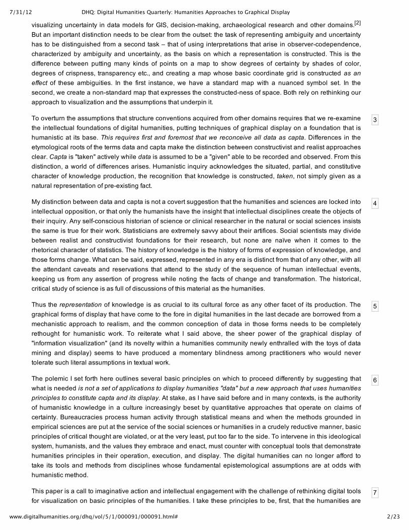
Figure 1.
Figure 1 — A basic bar chart compares the number of men (top bar) and the number of women(bottom bar) in seven different nations, A through F, at the present time (2010). The assumptions arethat quantities (number), entities (nations), identities (gender) and temporality (now) are all selfevident. Graphic credit Xárene Eskandar.
Certain issues immediately arise. A standard critique of data introduces reservations about the appearance ofcertainty such a chart presents. What counts as a nation? Are transient and immigrant populations documented?What kind of time span counts as "at the present time" within which these populations are counted? If the basicbar chart would have looked like a series of bands showing discrete categories of information in finite and certainnumbers (all due statistical caveats noted), what are the problems? Gender definition assumes a simple binarydistinction of men and women, an assumption much debated and highly problematic (gender can be understoodas a factor of behavior, physiological changes, social expectations, dress, etc., and nation as a function ofpermeability of borders, citizenship patterns, naturalization rules, immigration regulations, quotas and borderpolicies). So the bar chart reifies several categories, naturalizing them as discrete and fixed: national populations,time span, and gender defined as a simple binary. The representation can only be modified by changing theterms and premises on which it is constructed. What would a representation of gender by sliding scale look like?How would permeable boundaries to nations whose populations cross each others borders be shown? Howwould they dissolve the bar chart’s basic structure? How would notions of the present be defined?
7/31/12 DHQ: Digital Humanities Quarterly: Humanities Approaches to Graphical Display
5/23www.digitalhumanities.org/dhq/vol/5/1/000091/000091.html#
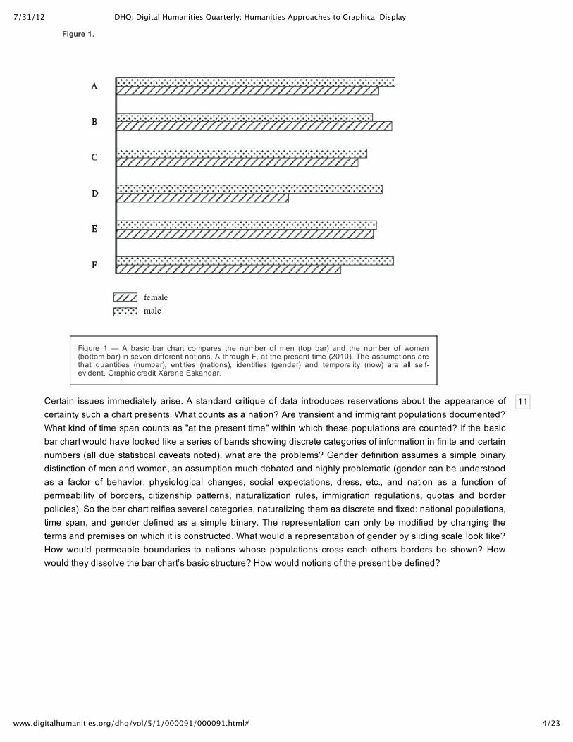
12
13
Figure 2.
Figure 2 — In this chart gendered identity is modified. In nation A, the top bar contains achanging gradient, indicating that "man" is a continuum from male enfant to adult, or incountries E and D, that gender ambiguity is a factor of genetic mutation or adaptation, thusshowing that basis on which gendered individuals are identified and counted is complicated bymany factors. In country F women only register as individuals after coming of reproductive age,thus showing that quantity is a effect of cultural conditions, not a selfevident fact. Themovement of men back and forth across the border of nations B and C makes the "nations"unstable entities. Graphic credit Xárene Eskandar.
The point I’m making is that the basic categories of supposedly quantitative information, the fundamentalparameters of chart production, are already interpreted expressions. But they do not present themselves ascategories of interpretation, riven with ambiguity and uncertainty, because of the representational force of thevisualization as a "picture" of "data". For instance, the assumption that gender is a binary category, stable acrossall cultural and national communities, is an assertion, an argument. Gendered identity defined in binary terms isnot a selfevident fact, no matter how often Olympic committees come up against the need for a single rigid genitalcriterion on which to determine difference. By recognizing the always interpreted character of data we haveshifted from data to capta, acknowledging the constructedness of the categories according to the uses andexpectations for which they are put in service. Nations, genders, populations, and time spans are not selfevident,stable entities that exist a priori. They are each subject to qualifications and reservations that bear directly on andarise from the reality of lived experience. The presentation of the comparison in the original formulationgrotesquely distorts the complexity — but also, the basic ambiguity — of the phenomenon under investigation(gender, nations, populations). If the challenge we are facing were merely to accommodate higher levels ofcomplexity into a data representation model, that would require one set of considerations and modifications. Butthe more profound challenge we face is to accept the ambiguity of knowledge, the fundamentally interpretedcondition on which data is constructed, in other words, the realization of my refrain–that all data is capta.
The humanistic aspect of this approach should be obvious — that knowledge created with the acknowledgementof the fundamentally constructed nature of its premises is not commensurate with principles of certainty guidingempirical or realist methods. Humanistic methods are counter to the idea of reliably repeatable experiments orstandard metrics that assume observer independent phenomena. By definition, a humanistic approach iscentered in the experiential, subjective conditions of interpretation. Phenomena and their observers are co
7/31/12 DHQ: Digital Humanities Quarterly: Humanities Approaches to Graphical Display
6/23www.digitalhumanities.org/dhq/vol/5/1/000091/000091.html#
14
15
16
17
18
19
20
dependent, not necessarily in equal measure. A viewer gazing on a sublime landscape or recording migrations ata large scale may be more affected by the phenomena than the phenomena is by the observation. Theoreticalphysicist Werner Heisenberg never suggested that the relation of intervening observer and effect on phenomenawere symmetrical, merely that they were codependent, when he introduced the concept of uncertainty in the early20th century.
Creating bar charts with ambiguity and degrees of uncertainty or other variables in them might cause championsof legibility and transparency some unease, but the shift away from standard metrics to metrics that expressinterpretation is an essential move for humanists and/or constructivists across disciplines. To emphasize theexpressive quality of interpretation, I’m going to characterize constructed information as subjective – expressingthe marks of its inflection in some formal way. The shift to expressive metrics and graphics is essential in changingfrom the expression of subjective information to the subjective expression of perceived phenomena, butsubjectivity and inflection are not the only features of interpretative approaches. Capta is not an expression ofidiosyncracy, emotion, or individual quirks, but a systematic expression of information understood as constructed,as phenomena perceived according to principles of interpretation. To do this, we need to conceive of every metric"as a factor of X", where X is a point of view, agenda, assumption, presumption, or simply a convention. Byqualifying any metric as a factor of some condition, the character of the "information" shifts from selfevident "fact"
to constructed interpretation motivated by a human agenda.[3]
The standard elements of graphic display for statistical information are simple and limited: scale divisions,coordinate lines, scale figures, circles, rectangles, curves, bars (or columns or percentages of pie charts or otherforms) and labels (numbers and terms), signs of movement, flow, or state change (arrows, vectors, paths). Theordering and arrangement of elements within a chart create another level of information, relational information.Relational information is graphically produced – the ordering of elements by size, by color, by alphabetical order,by texture, shape or other feature happens in graphical space. The resulting arrangement has a semantic valueproduced by features of proximity, grouping, orientation, apparent movement, and other graphical effects.
Now take these basic elements of graphical display and rethink them according to humanistic principles:
In conventional statistical graphics, the scale divisions are equal units. In humanistic, interpretative, graphics, theyare not.
In statistical graphics the coordinate lines are always continuous and straight. In humanistic, interpretative,graphics, they might have breaks, repetitions, and curves or dips. Interpretation is stochastic and probabilistic, notmechanistic, and its uncertainties require the same mathematical and computational models as other complexsystems.
The scale figures and labels in statistical graphics need to be clear and legible in all cases, and all the more so inhumanistic, interpretative, graphics since they will need to do quite a bit of work.
Perhaps the most striking feature distinguishing humanistic, interpretative, and constructivist graphicalexpressions from realist statistical graphics is that the curves, bars, columns, percentage values would not alwaysbe represented as discrete bounded entities, but as conditional expressions of interpretative parameters–a kind ofvisual fuzzy logic or graphical complexity. Thus their edges might be permeable, lines dotted and broken, dotsand points vary in size and scale or degree of ambiguity of placement, and so on. These graphical strategiesexpress interpreted knowledge, situated and partial, rather than complete. They can be employed assystematically as other charting elements, though part of my intention is to disturb the grounds of certainty onwhich conventions of statistical legibility are based. Point of view systems introduced into graphs and charts willmake evident a perspectival position with respect to their information, an inner standing point in the graphicalrendering of space. This is true of all cartographic projections. Every map contains within its coordinate system forgraphical expression, a set of assumptions about the place from which the map is drawn. Information spacesdrawn from a point of view, rather than as if they were observer independent, reinsert the subjective standpoint oftheir creation into the graphical expression. Finally, any point or mark used as a specific node in a humanistic
7/31/12 DHQ: Digital Humanities Quarterly: Humanities Approaches to Graphical Display
7/23www.digitalhumanities.org/dhq/vol/5/1/000091/000091.html#
21
22
graph is assumed to have many dimensions to it – each of which complicates its identity by suggesting theembeddedness of its existence in a system of codependent relations. Information entities, or units, are thusunderstood as fictional abstractions serving a purpose. But their potential to be read again in relation to anynumber of other equally significant relations can be made evident. This approach destroys the ground on whichstandard metrics are used to abstract quantitative information from human circumstances. Humanistic premisesreplace notions of statistical concepts of selfidentity with entangled codependence and contingencies.
All of this may sound unduly complicated to someone merely wanting to count the number of pupils enrolled in agroup, calculate the number of pencils needed, or to show budgetary expenditures on a per capita basis in theclassroom, for example. But this example — an instance of administrative and bureaucratic management —shows that such crudely conceived numeric statistics are useful only in the most reductive circumstances. Theytell us nothing about whether the pencils can be used, whether the pupils are prepared or disposed to their work,or whether the budgets will have any effect on learning outcomes or any of the many other factors that come intoplay in assessments based on metrics extracted from lived experience. But each metric — number of X or Y — isactually a number as a factor of a particular intellectual assumption or decision: pupils as a factor of seats in aroom, birthdates, population, illness, etc. pencils as a factor of resource allocation, and so on. All metrics aremetrics about something for some purpose.
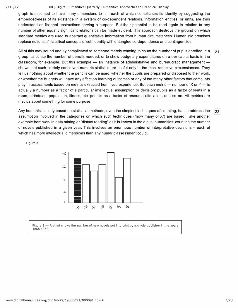
Any humanistic study based on statistical methods, even the simplest techniques of counting, has to address theassumption involved in the categories on which such techniques ("how many of X") are based. Take anotherexample from work in data mining or "distant reading" as it is known in the digital humanities: counting the numberof novels published in a given year. This involves an enormous number of interpretative decisions – each ofwhich has more intellectual dimensions than any numeric assessment could.
Figure 3.
Figure 3 — A chart shows the number of new novels put into print by a single publisher in the years18551862.
7/31/12 DHQ: Digital Humanities Quarterly: Humanities Approaches to Graphical Display
8/23www.digitalhumanities.org/dhq/vol/5/1/000091/000091.html#
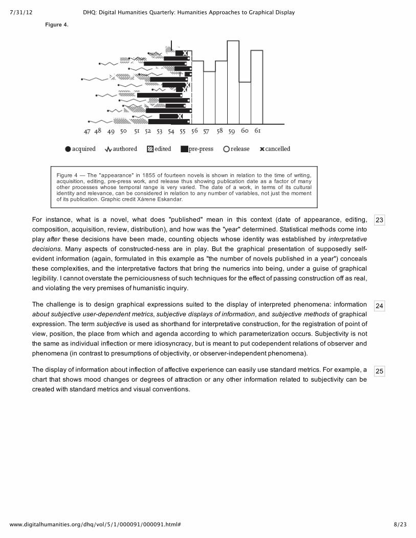
23
24
25
Figure 4.
Figure 4 — The "appearance" in 1855 of fourteen novels is shown in relation to the time of writing,acquisition, editing, prepress work, and release thus showing publication date as a factor of manyother processes whose temporal range is very varied. The date of a work, in terms of its culturalidentity and relevance, can be considered in relation to any number of variables, not just the momentof its publication. Graphic credit Xárene Eskandar.
For instance, what is a novel, what does "published" mean in this context (date of appearance, editing,composition, acquisition, review, distribution), and how was the "year" determined. Statistical methods come intoplay after these decisions have been made, counting objects whose identity was established by interpretativedecisions. Many aspects of constructedness are in play. But the graphical presentation of supposedly selfevident information (again, formulated in this example as "the number of novels published in a year") concealsthese complexities, and the interpretative factors that bring the numerics into being, under a guise of graphicallegibility. I cannot overstate the perniciousness of such techniques for the effect of passing construction off as real,and violating the very premises of humanistic inquiry.
The challenge is to design graphical expressions suited to the display of interpreted phenomena: informationabout subjective userdependent metrics, subjective displays of information, and subjective methods of graphicalexpression. The term subjective is used as shorthand for interpretative construction, for the registration of point ofview, position, the place from which and agenda according to which parameterization occurs. Subjectivity is notthe same as individual inflection or mere idiosyncracy, but is meant to put codependent relations of observer andphenomena (in contrast to presumptions of objectivity, or observerindependent phenomena).
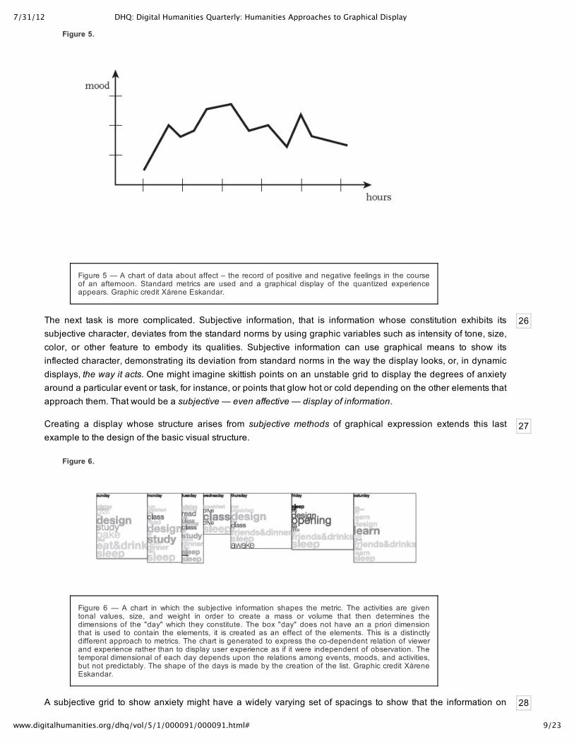
The display of information about inflection of affective experience can easily use standard metrics. For example, achart that shows mood changes or degrees of attraction or any other information related to subjectivity can becreated with standard metrics and visual conventions.
7/31/12 DHQ: Digital Humanities Quarterly: Humanities Approaches to Graphical Display
9/23www.digitalhumanities.org/dhq/vol/5/1/000091/000091.html#
26
27
28
Figure 5.
Figure 5 — A chart of data about affect – the record of positive and negative feelings in the courseof an afternoon. Standard metrics are used and a graphical display of the quantized experienceappears. Graphic credit Xárene Eskandar.
The next task is more complicated. Subjective information, that is information whose constitution exhibits itssubjective character, deviates from the standard norms by using graphic variables such as intensity of tone, size,color, or other feature to embody its qualities. Subjective information can use graphical means to show itsinflected character, demonstrating its deviation from standard norms in the way the display looks, or, in dynamicdisplays, the way it acts. One might imagine skittish points on an unstable grid to display the degrees of anxietyaround a particular event or task, for instance, or points that glow hot or cold depending on the other elements thatapproach them. That would be a subjective — even affective — display of information.
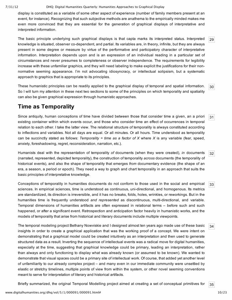
Creating a display whose structure arises from subjective methods of graphical expression extends this lastexample to the design of the basic visual structure.
Figure 6.
Figure 6 — A chart in which the subjective information shapes the metric. The activities are giventonal values, size, and weight in order to create a mass or volume that then determines thedimensions of the "day" which they constitute. The box "day" does not have an a priori dimensionthat is used to contain the elements, it is created as an effect of the elements. This is a distinctlydifferent approach to metrics. The chart is generated to express the codependent relation of viewerand experience rather than to display user experience as if it were independent of observation. Thetemporal dimensional of each day depends upon the relations among events, moods, and activities,but not predictably. The shape of the days is made by the creation of the list. Graphic credit XáreneEskandar.
A subjective grid to show anxiety might have a widely varying set of spacings to show that the information on
7/31/12 DHQ: Digital Humanities Quarterly: Humanities Approaches to Graphical Display
10/23www.digitalhumanities.org/dhq/vol/5/1/000091/000091.html#
29
30
31
32
33
34
35
display is constituted as a variable of some other aspect of experience (number of family members present at anevent, for instance). Recognizing that such subjective methods are anathema to the empirically minded makes meeven more convinced that they are essential for the generation of graphical displays of interpretative andinterpreted information.
The basic principle underlying such graphical displays is that capta marks its interpreted status. Interpretedknowledge is situated, observer codependent, and partial. Its variables are, in theory, infinite, but they are alwayspresent in some degree or measure by virtue of the performative and participatory character of interpretativeinformation. Interpretation depends upon and is an expression of an individual reading in a particular set ofcircumstances and never presumes to completeness or observer independence. The requirements for legibilityincrease with these unfamiliar graphics, and they will need labeling to make explicit the justifications for their nonnormative seeming appearance. I’m not advocating idiosyncracy, or intellectual solipsism, but a systematicapproach to graphics that is appropriate to its principles.
These humanistic principles can be readily applied to the graphical display of temporal and spatial information.So I will turn my attention in these next two sections to some of the principles on which temporality and spatialitycan also be given graphical expression through humanistic approaches.
Time as TemporalitySince antiquity, human conceptions of time have divided between those that consider time a given, an a prioriexisting container within which events occur, and those who consider time an effect of occurrences in temporalrelation to each other. I take the latter view. The relational structure of temporality is always constituted accordingto inflections and variables. Not all days are equal. Or all minutes. Or all hours. Time understood as temporalitycan be succinctly stated as follows: Temporality = time as a factor of X where X is any variable (fear, speed,anxiety, foreshadowing, regret, reconsideration, narration, etc.).
Humanists deal with the representation of temporality of documents (when they were created), in documents(narrated, represented, depicted temporality), the construction of temporality across documents (the temporality ofhistorical events), and also the shape of temporality that emerges from documentary evidence (the shape of anera, a season, a period or epoch). They need a way to graph and chart temporality in an approach that suits thebasic principles of interpretative knowledge.
Conceptions of temporality in humanities documents do not conform to those used in the social and empiricalsciences. In empirical sciences, time is understood as continuous, unidirectional, and homogenous. Its metricsare standardized, its direction is irreversible, and it has no breaks, folds, holes, wrinkles, or reworkings. But in thehumanities time is frequently understood and represented as discontinuous, multidirectional, and variable.Temporal dimensions of humanities artifacts are often expressed in relational terms – before such and suchhappened, or after a significant event. Retrospection and anticipation factor heavily in humanistic works, and themodels of temporality that arise from historical and literary documents include multiple viewpoints.
The temporal modeling project Bethany Nowviskie and I designed almost ten years ago made use of these basicinsights in order to create a graphical application that was the working proof of a concept. We were intent ondemonstrating that a graphical model could be created intuitively as an interpretation and then used to generatestructured data as a result. Inverting the sequence of intellectual events was a radical move for digital humanities,especially at the time, suggesting that graphical knowledge could be primary, leading an interpretation, ratherthan always and only functioning to display what was already known (or assumed to be known). We wanted todemonstrate that visual spaces could be a primary site of intellectual work. Of course, that added yet another levelof unfamiliarity to our already complex project – and many even in our immediate community were unsettled byelastic or stretchy timelines, multiple points of view from within the system, or other novel seeming conventionsmeant to serve for interpretation of literary and historical artifacts.
Briefly summarized, the original Temporal Modelling project aimed at creating a set of conceptual primitives for
7/31/12 DHQ: Digital Humanities Quarterly: Humanities Approaches to Graphical Display
11/23www.digitalhumanities.org/dhq/vol/5/1/000091/000091.html#
36
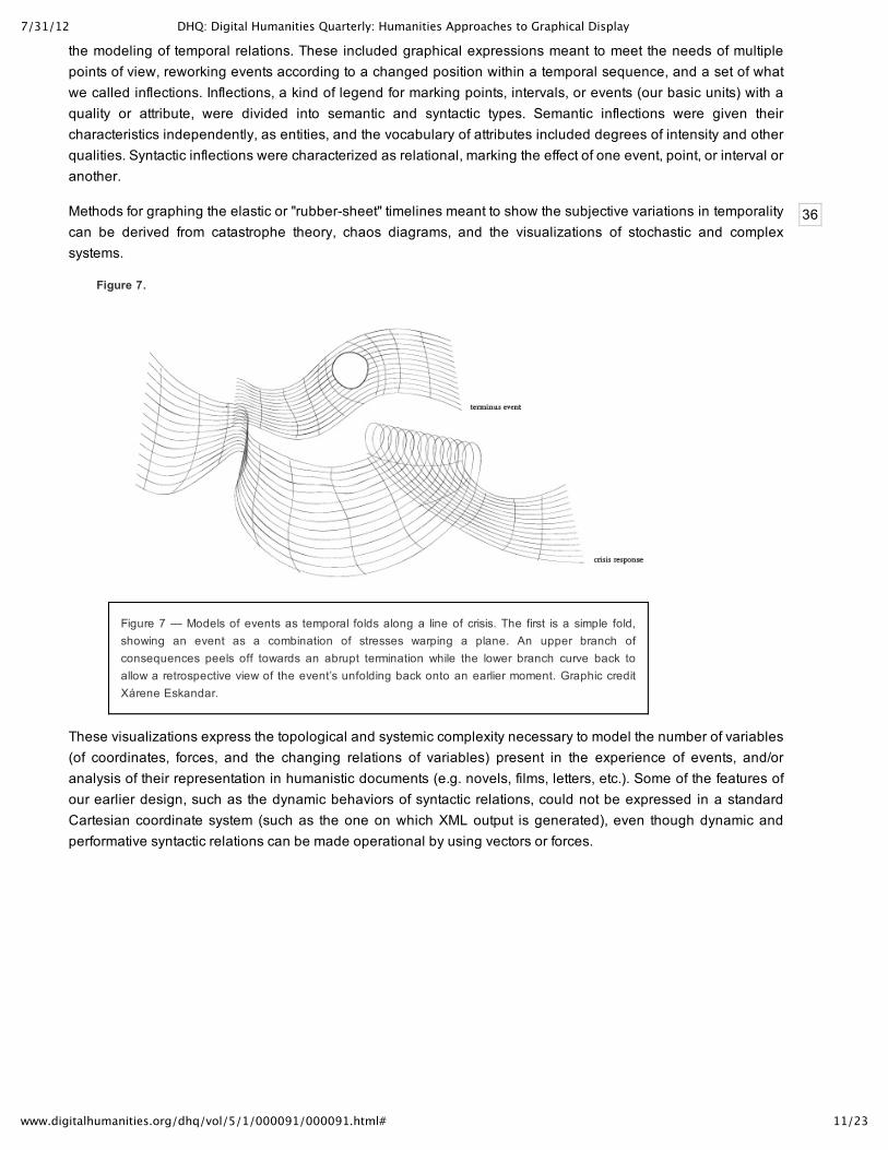
the modeling of temporal relations. These included graphical expressions meant to meet the needs of multiplepoints of view, reworking events according to a changed position within a temporal sequence, and a set of whatwe called inflections. Inflections, a kind of legend for marking points, intervals, or events (our basic units) with aquality or attribute, were divided into semantic and syntactic types. Semantic inflections were given theircharacteristics independently, as entities, and the vocabulary of attributes included degrees of intensity and otherqualities. Syntactic inflections were characterized as relational, marking the effect of one event, point, or interval oranother.
Methods for graphing the elastic or "rubbersheet" timelines meant to show the subjective variations in temporalitycan be derived from catastrophe theory, chaos diagrams, and the visualizations of stochastic and complexsystems.
Figure 7.
Figure 7 — Models of events as temporal folds along a line of crisis. The first is a simple fold,showing an event as a combination of stresses warping a plane. An upper branch ofconsequences peels off towards an abrupt termination while the lower branch curve back toallow a retrospective view of the event’s unfolding back onto an earlier moment. Graphic creditXárene Eskandar.
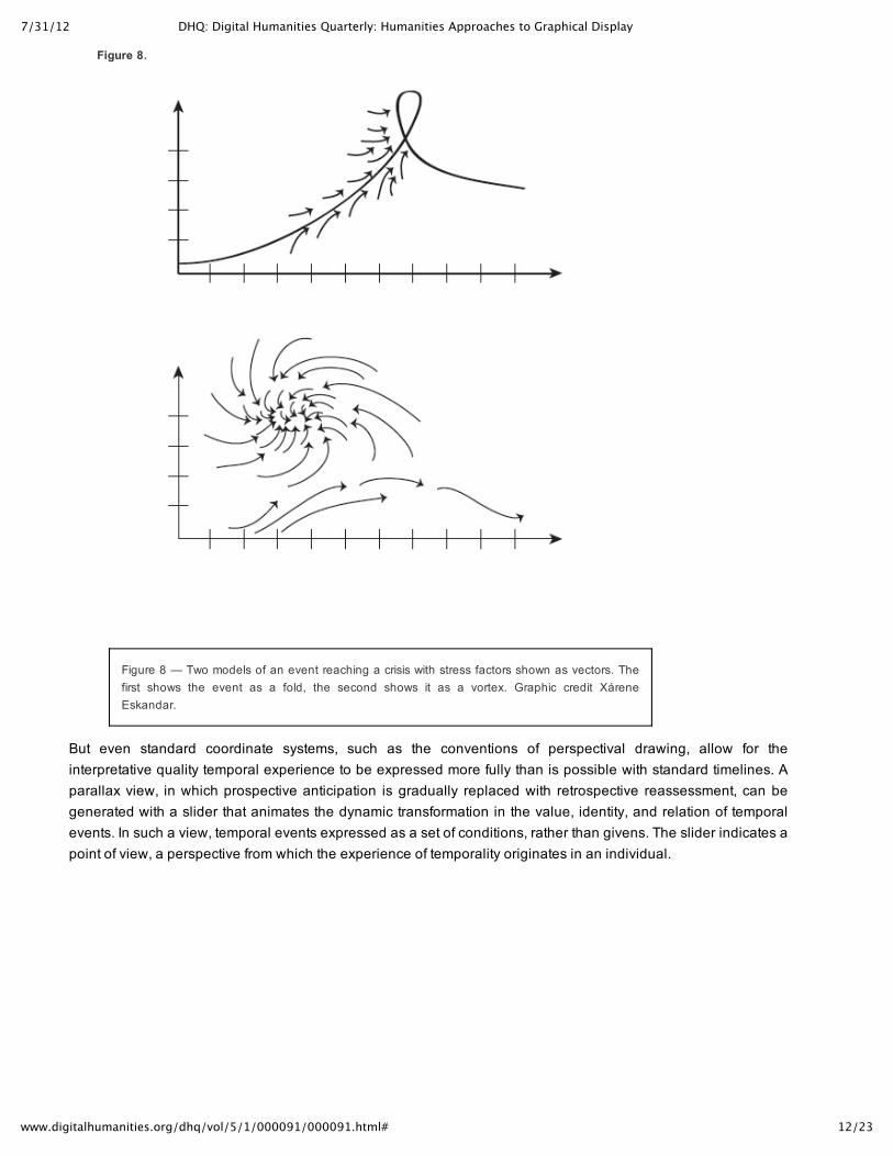
These visualizations express the topological and systemic complexity necessary to model the number of variables(of coordinates, forces, and the changing relations of variables) present in the experience of events, and/oranalysis of their representation in humanistic documents (e.g. novels, films, letters, etc.). Some of the features ofour earlier design, such as the dynamic behaviors of syntactic relations, could not be expressed in a standardCartesian coordinate system (such as the one on which XML output is generated), even though dynamic andperformative syntactic relations can be made operational by using vectors or forces.
7/31/12 DHQ: Digital Humanities Quarterly: Humanities Approaches to Graphical Display
12/23www.digitalhumanities.org/dhq/vol/5/1/000091/000091.html#
Figure 8.
Figure 8 — Two models of an event reaching a crisis with stress factors shown as vectors. Thefirst shows the event as a fold, the second shows it as a vortex. Graphic credit XáreneEskandar.
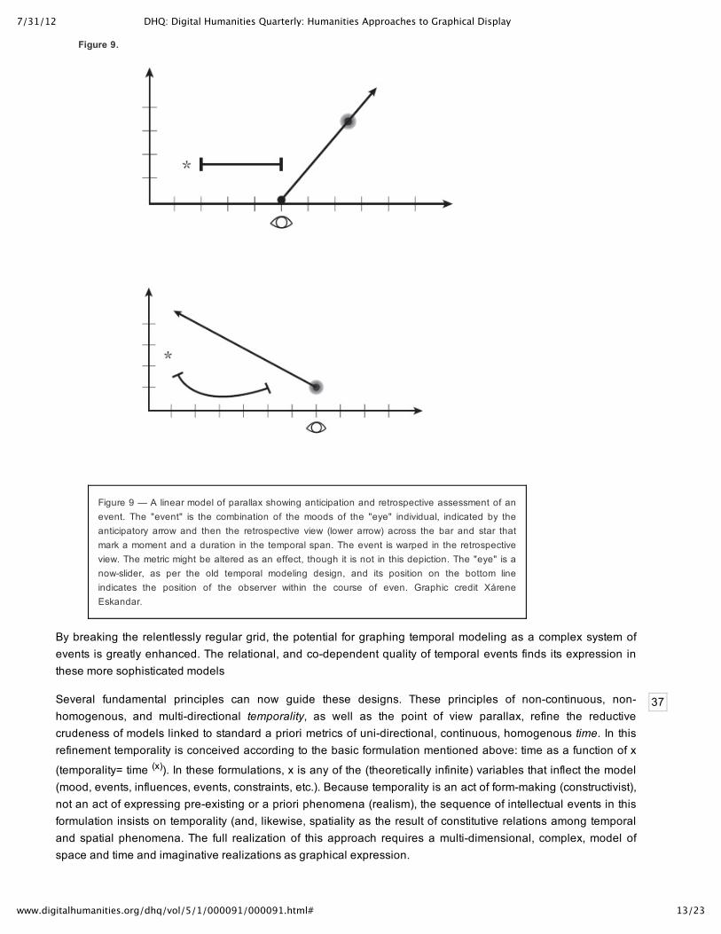
But even standard coordinate systems, such as the conventions of perspectival drawing, allow for theinterpretative quality temporal experience to be expressed more fully than is possible with standard timelines. Aparallax view, in which prospective anticipation is gradually replaced with retrospective reassessment, can begenerated with a slider that animates the dynamic transformation in the value, identity, and relation of temporalevents. In such a view, temporal events expressed as a set of conditions, rather than givens. The slider indicates apoint of view, a perspective from which the experience of temporality originates in an individual.
7/31/12 DHQ: Digital Humanities Quarterly: Humanities Approaches to Graphical Display
13/23www.digitalhumanities.org/dhq/vol/5/1/000091/000091.html#
37
Figure 9.
Figure 9 — A linear model of parallax showing anticipation and retrospective assessment of anevent. The "event" is the combination of the moods of the "eye" individual, indicated by theanticipatory arrow and then the retrospective view (lower arrow) across the bar and star thatmark a moment and a duration in the temporal span. The event is warped in the retrospectiveview. The metric might be altered as an effect, though it is not in this depiction. The "eye" is anowslider, as per the old temporal modeling design, and its position on the bottom lineindicates the position of the observer within the course of even. Graphic credit XáreneEskandar.
By breaking the relentlessly regular grid, the potential for graphing temporal modeling as a complex system ofevents is greatly enhanced. The relational, and codependent quality of temporal events finds its expression inthese more sophisticated models
Several fundamental principles can now guide these designs. These principles of noncontinuous, nonhomogenous, and multidirectional temporality, as well as the point of view parallax, refine the reductivecrudeness of models linked to standard a priori metrics of unidirectional, continuous, homogenous time. In thisrefinement temporality is conceived according to the basic formulation mentioned above: time as a function of x
(temporality= time (x)). In these formulations, x is any of the (theoretically infinite) variables that inflect the model(mood, events, influences, events, constraints, etc.). Because temporality is an act of formmaking (constructivist),not an act of expressing preexisting or a priori phenomena (realism), the sequence of intellectual events in thisformulation insists on temporality (and, likewise, spatiality as the result of constitutive relations among temporaland spatial phenomena. The full realization of this approach requires a multidimensional, complex, model ofspace and time and imaginative realizations as graphical expression.
7/31/12 DHQ: Digital Humanities Quarterly: Humanities Approaches to Graphical Display
14/23www.digitalhumanities.org/dhq/vol/5/1/000091/000091.html#
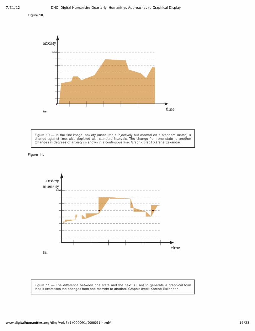
Figure 10.
Figure 10 — In the first image, anxiety (measured subjectively but charted on a standard metric) ischarted against time, also depicted with standard intervals. The change from one state to another(changes in degrees of anxiety) is shown in a continuous line. Graphic credit Xárene Eskandar.
Figure 11.
Figure 11 — The difference between one state and the next is used to generate a graphical formthat is expresses the changes from one moment to another. Graphic credit Xárene Eskandar.
7/31/12 DHQ: Digital Humanities Quarterly: Humanities Approaches to Graphical Display
15/23www.digitalhumanities.org/dhq/vol/5/1/000091/000091.html#
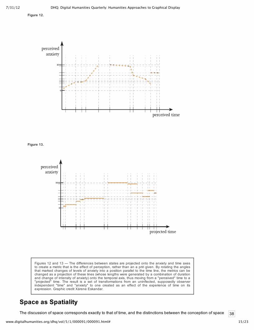
38
Figure 12.
Figure 13.
Figures 12 and 13 — The differences between states are projected onto the anxiety and time axesto create a metric that is the effect of perception, rather than an a priri given. By rotating the anglesthat marked changes of levels of anxiety into a position parallel to the time line, the metrics can bechanged as a projection of these lines (whose lengths were generated by a combination of durationand change of intensity of anxiety) onto the temporal axis, thus moving from a "perceived" time to a"projected" time. The result is a set of transformations from an uninflected, supposedly observerindependent "time" and "anxiety" to one created as an effect of the experience of time on itsexpression. Graphic credit Xárene Eskandar.
Space as SpatialityThe discussion of space corresponds exactly to that of time, and the distinctions between the conception of space

7/31/12 DHQ: Digital Humanities Quarterly: Humanities Approaches to Graphical Display
16/23www.digitalhumanities.org/dhq/vol/5/1/000091/000091.html#
39
40
41
42
43
as an a priori given and that of space as relationally constituted marks the same philosophical division ofapproaches as those that are used in charting or understanding time and temporality. Likewise, spatiality is to be
understood as space as a function of x (spatiality= space (x)).[4]
To give graphical expression to these ideas requires using nonstandard metrics, intuitive and subjectiveprinciples of design. They are meant as provocations to the larger project of creating more systematic renderingsof humanistic phenomena, introducing basic transformations of the graphical fields we created for time lines intomapping and GIS applications. Precedents for such renderings can be found–e.g. Francis Galton’s rendering ofspace as a function of travel time. Galton’s problem, formulated in the mid 19th century, takes into account thatmost statistical phenomena are observerdependent and situated, and can’t be separated from the variousdependencies that bear upon the creation of data. Galton, in other words, recognized that in many circumstances,data were capta. The statistical description of phenomena depend upon the observer’s circumstances. A morerecent demonstration of these principles is a map designed by Tom Carden. His dynamic interface redraws the
London Underground map as function of time of travel from any selected station to any other station.[5]
Subjective parameters are even more difficult to inscribe, since they cannot, by definition, be based on simpleconsensual standards. We can easily understand these distortions– space as a result of travel time. But howcould we visualize the spatial distortions introduced by variables such as fearfulness, anxiety, anticipation,distraction, or dalliance and thus render space as spatiality, space as a factor of x? Some variable is always inplay in the experience of space as well as its representation, so space is also always constructed according to aspecific agenda and a situated experience etc. While this is the common experience of the phenomenal world,representations of spatiality have lagged behind, dominated by the navigational or descriptive systems ofstandard mapping whose conventions are well known and recognized, and which partake of and impose thedominant realist model.
In proposing a new model for humanities’ work, I am suggesting that the subjective display of humanisticphenomena can be applied across the domains with which we are concerned at at least four basic levels ofinterpretation or knowledge production.
Let me describe a concrete example and see how it can be understood across these four different models. Takethe first instance, the modeling of a phenomenon. Three people are waiting for a bus, how long does it take? Oneis late for work and anxious, one is in desperate need of a bathroom, and the other does not want to go to theafterschool program. How can the variations in perception be expressed? Recent experiments on the way time isunderstood in relation to different circumstances and tasks have made this experiential variable apparent topsychologists. So, the initial graphical expression of the humanistic phenomenon requires a variable metric, anelastic timeline, even a field that might fold or break under extreme circumstances.
When we shift from modeling experience to find graphical expressions for the representation of experience, thecomplexity of the problem increases. The modeling of time in documents, in relation to the duration of thedocuments (time of telling) and the experiences they recount (the time of the told) as well as the relations amongthese and possible external temporal references, forms a subset of linguistic and narrative analyses. Thegraphical forms to represent these are generally inadequate to the complexity of the textual or visual (and/or filmic
1. Modelling phenomenological experience in the making of humanities (data as capta, primarymodeling, the representation of temporal and spatial experience);
2. Modeling relations among humanities documents i.e. discourse fields (a different metric is needed tounderstand dates on diplomatic documents in the spring of 1944 than one needed to constituteunderstanding of those dated to the same period of the spring of 1950 etc.);
3. Modeling the representations of temporality and spatiality that are in humanities documents (narrativeis the most obvious);
4. Modeling the interpretation of any of the above (depicting or graphing the performative quality ofinterpretation).
7/31/12 DHQ: Digital Humanities Quarterly: Humanities Approaches to Graphical Display
17/23www.digitalhumanities.org/dhq/vol/5/1/000091/000091.html#
44
45
46
and audio) documents.
Modelling the temporal relations among documents about temporal experience (imagine letters, emails, textmessages, or diary entries from these various bus riders, only some of which is date stamped), gives rise to yetfurther ambiguities and complexities. A letter sent that was delayed, email rerouted, messages held in suspenseon a server will change the temporal effect. For instance, letters or emails arranging family events and travels overthe holidays contain many temporal values that are contingent on each other and often in constant flux as plansare being made. The temporal sequence and the date stamps are not one and the same, a temporal relation ofthe exchanges might include messages that cross in midstream, and whose temporal sequence does not matchthe simple alignment with dates on a line.
Plans change, travel times are altered, arrivals and departures rearranged, moods shift, frustrations intensify,disappointments or unexpected surprises arise in relation to the sequence of events. An email recountingsomething that occurred "yesterday" in relation to a date stamp might also contain more vaguely identified"earlier" and "before" statements that put events into a relative sequence without explicitly identifying when theseoccurred. As the telling unfolds, these relations may change in the writer’s expression and perception, so that thetextual description of a recollected event continues to shift its place in the temporal order. Who was supposed todo what when and who was depending on which order of events? By the time holiday travels and expectationsare sorted out, each family member has a very distinct view of what happened when and how the sequence oflived events occurred and where. Was the bus station large or small, far or near to any other spot in the itinerary,or located in a familiar landscape. How was the space experienced as a function of time spent in it? Theseconstructions of temporality and spatiality from within documents, across documents or a discourse field, and ofphenomena are all created with time/space as functions of interpretation. The act of interpreting a series ofdocuments creates its own temporality, that of the production of a reading, that is not the same as the telling or thetold within the documents, but an independent phenomenon. An interpretation has its own temporality adspatiality.
We can construct a concrete example of spatiality that parallels this example of temporality, and also depends ontemporal models. For instance, imagine an open stretch of beach, relatively unconstrained and unconstructed.When a sailing ship is washed up at a certain point on the beach, not only that point, but the space around it,becomes transformed. The presence of the wreck creates a huge impact, and the space almost palpably bends,compresses, expands, and warps around it, with waves of resonance rippling outward from that point.
7/31/12 DHQ: Digital Humanities Quarterly: Humanities Approaches to Graphical Display
18/23www.digitalhumanities.org/dhq/vol/5/1/000091/000091.html#
47
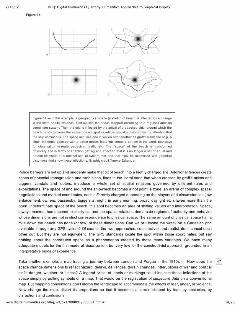
Figure 14.
Figure 14 — In this example, a geographical space (a stretch of beach) is affected by a changein the state or circumstance. First we see the space mapped according to a regular Cartesiancoordinate system. Then the grid is inflected by the arrival of a beached ship, around which thebeach bends because the sense of each spot as relative equal is distorted by the attention thatthe ship commands. The space acquires one inflection after another as graffiti marks the ship, achain link fence goes up with a police notice, footprints create a pattern in the sand, pathwaysfor observation reroute pedestrian traffic etc. The "space" of the beach is transformedphysically and in terms of attention getting and effect so that it is no longer a set of equal andneutral elements of a rational spatial system, but one that must be expressed with graphicaldistortions that show these inflections. Graphic credit Xárene Eskandar.
Police barriers are set up and suddenly make that bit of beach into a highly charged site. Additional fences createzones of potential transgression and prohibition, lines in the literal sand that when crossed by graffiti artists andtaggers, vandals and looters, introduce a whole set of spatial relations governed by different rules andexpectations. The space of and around the shipwreck becomes a hot point, a zone, an arena of complex spatialnegotiations and marked coordinates, each differently charged depending on the players and circumstances (lawenforcement, owners, passersby, taggers at night, in early morning, broad daylight etc.). Even more than theopen, indeterminate space of the beach, this spot becomes an area of shifting values and interpretation. Space,always marked, has become explicitly so, and the spatial relations demarcate regions of authority and behaviorwhose dimensions are not in strict correspondence to physical space. The same amount of physical space half amile down the beach has none (or few) of these dimensions. Can we still locate the wreck on a Cartesian gridavailable through any GPS system? Of course, the two approaches, constructivist and realist, don’t cancel eachother out. But they are not equivalent. The GPS standards locate the spot within those coordinates, but saynothing about the constituted space as a phenomenon created by these many variables. We have manyadequate models for the first mode of visualization, but very few for the constructivist approach grounded in aninterpretative mode of experience.
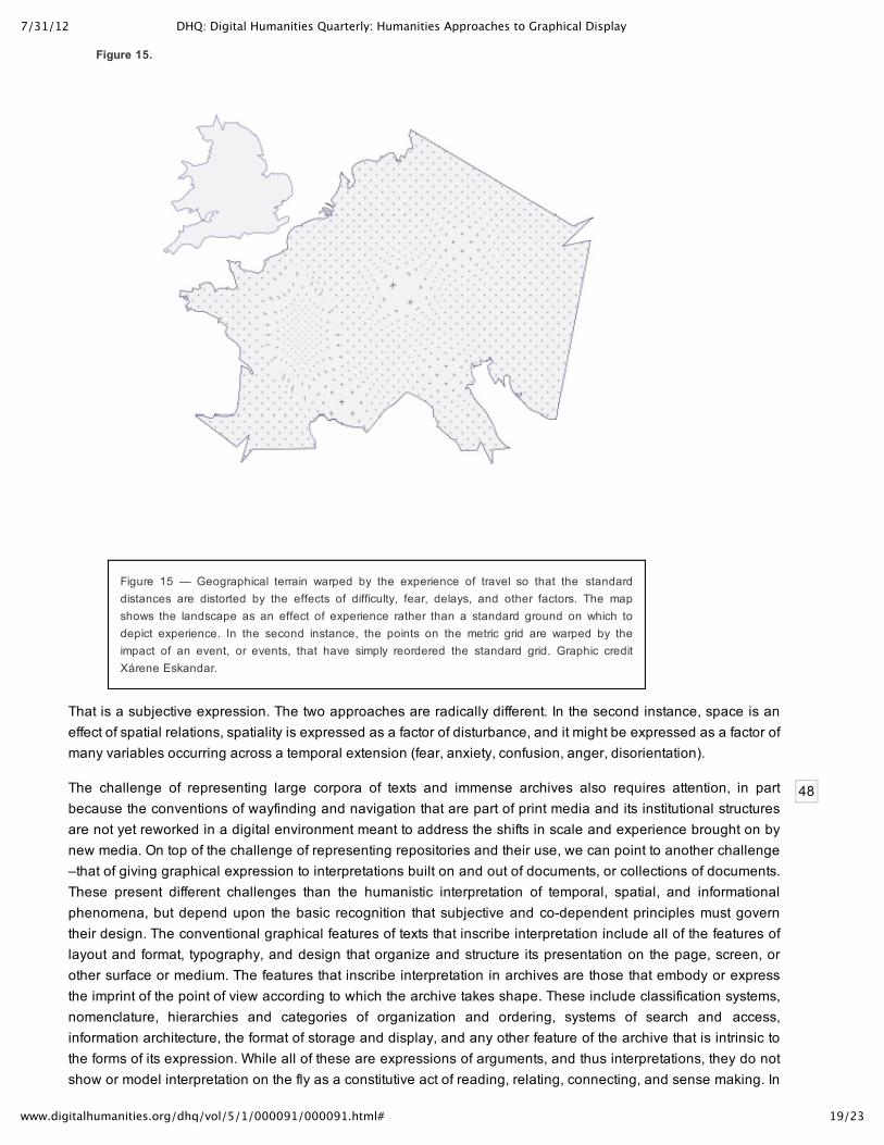
Take another example, a map tracing a journey between London and Prague in the 1810s.[6]; How does thespace change dimensions to reflect hazard, delays, dalliances, terrain changes, interruptions of war and politicalstrife, danger, weather, or illness? A legend or set of labels or markings could indicate these inflections of thespace simply by putting symbols on a map. That would be the registration of subjective data on a conventionalmap. But mapping conventions don’t morph the landscape to accommodate the effects of fear, anger, or violence.Now change the map, distort its proportions so that it becomes a terrain shaped by fear, by obstacles, bydisruptions and confusions.
7/31/12 DHQ: Digital Humanities Quarterly: Humanities Approaches to Graphical Display
19/23www.digitalhumanities.org/dhq/vol/5/1/000091/000091.html#
48
Figure 15.
Figure 15 — Geographical terrain warped by the experience of travel so that the standarddistances are distorted by the effects of difficulty, fear, delays, and other factors. The mapshows the landscape as an effect of experience rather than a standard ground on which todepict experience. In the second instance, the points on the metric grid are warped by theimpact of an event, or events, that have simply reordered the standard grid. Graphic creditXárene Eskandar.
That is a subjective expression. The two approaches are radically different. In the second instance, space is aneffect of spatial relations, spatiality is expressed as a factor of disturbance, and it might be expressed as a factor ofmany variables occurring across a temporal extension (fear, anxiety, confusion, anger, disorientation).
The challenge of representing large corpora of texts and immense archives also requires attention, in partbecause the conventions of wayfinding and navigation that are part of print media and its institutional structuresare not yet reworked in a digital environment meant to address the shifts in scale and experience brought on bynew media. On top of the challenge of representing repositories and their use, we can point to another challenge–that of giving graphical expression to interpretations built on and out of documents, or collections of documents.These present different challenges than the humanistic interpretation of temporal, spatial, and informationalphenomena, but depend upon the basic recognition that subjective and codependent principles must governtheir design. The conventional graphical features of texts that inscribe interpretation include all of the features oflayout and format, typography, and design that organize and structure its presentation on the page, screen, orother surface or medium. The features that inscribe interpretation in archives are those that embody or expressthe imprint of the point of view according to which the archive takes shape. These include classification systems,nomenclature, hierarchies and categories of organization and ordering, systems of search and access,information architecture, the format of storage and display, and any other feature of the archive that is intrinsic tothe forms of its expression. While all of these are expressions of arguments, and thus interpretations, they do notshow or model interpretation on the fly as a constitutive act of reading, relating, connecting, and sense making. In
7/31/12 DHQ: Digital Humanities Quarterly: Humanities Approaches to Graphical Display
20/23www.digitalhumanities.org/dhq/vol/5/1/000091/000091.html#
49
50
51
52
sum, these acts of interpretation make use of the format features of graphical presentation as well as respondingto and thus producing the "content" of these artifacts. Some combination of usercentered but codependentsystems analysis and critical reading practices as performative acts would have to underpin such graphicalvisualizations. But that is also work for another time.
ConclusionMy argument is a polemical call to humanists to think differently about the graphical expressions in use in digitalenvironments. A fundamental prejudice, I suggest, is introduced by conceiving of data within any humanisticinterpretative frame on a conventional, uncritical, statistical basis. Few social scientists would proceed this way,and the abandonment of interpretation in favor of a naïve approach to statistical certainly skews the game from theoutset in favor of a belief that data is intrinsically quantitative — selfevident, value neutral, and observerindependent. This belief excludes the possibilities of conceiving data as qualitative, codependently constituted —in other words, of recognizing that all data is capta.
Again, to reiterate, I am not suggesting that we simply introduce a quantitative analysis of qualitative experienceinto our data sets. I am suggesting that we rethink the foundation of the way data are conceived as capta byshifting its terms from certainty to ambiguity and find graphical means of expressing interpretative complexity. Insome circumstances (the example of the bar chart given earlier that was displaying information about gender,nations, and populations) ambiguity merely requires a higher order level of complexity in the model, so thatapparent "certainties" are qualified by variables and nuances that can be specified in mathematical terms. But theidea of capta as fundamentally codependent, constituted relationally, between observer and observedphenomena, is fundamentally different from the concept of data created as an observerindependent phenomena.That realization has to be at the heart of humanistic approaches to the graphical display of interpretativephenomena, of interpreted artifacts and the acts of interpretation themselves. Because interpretation isperformative, bringing objects into view through a reading or other act of intervention, it forecloses the possibilitythat autonomous objects or phenomena exist within the horizon of human experience. Phenomena of humanexperience are constituted as interpretative acts.
The natural world and its cultural corollary exist, but the humanistic concept of knowledge depends upon theinterplay between a situated and circumstantial viewer and the objects or experiences under examination andinterpretation. That is the basic definition of humanistic knowledge, and its graphical display must be specific tothis definition in its very foundational principles. The challenge is enormous, but essential, if the humanisticworldview, grounded in the recognition of the interpretative nature of knowledge, is to be part of the graphicalexpressions that come into play in the digital environment. If we don’t engage with this challenge, we give thegame away in advance, ceding the territory of interpretation to the ruling authority of certainty established on the
false claims of observerindependent objectivity in the "visual display of quantitative information."[7]
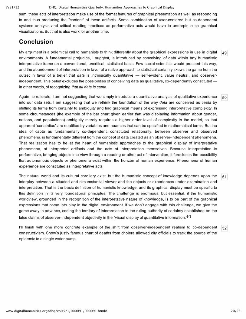
I’ll finish with one more concrete example of the shift from observerindependent realism to codependentconstructivism. Snow’s justly famous chart of deaths from cholera allowed city officials to track the source of theepidemic to a single water pump.
7/31/12 DHQ: Digital Humanities Quarterly: Humanities Approaches to Graphical Display
21/23www.digitalhumanities.org/dhq/vol/5/1/000091/000091.html#
Figure 16.
Figure 16 — Dr. John Snow’s famous chart tracing the source of an epidemic using graphicalmethods that plotted frequency of outbreaks and geographical location. But each outbreak wasan individual, and their degrees of vulnerability, impact of their illness, effect on the family andloved ones, was specific and particular in ways that a single dot cannot express. Seen from thepoint of view of an individual participant in these tragic events, some of these individuals loommuch larger than others when depicted from within the gaze of someone actually seeing themoccur. Graphic credit Xárene Eskandar.
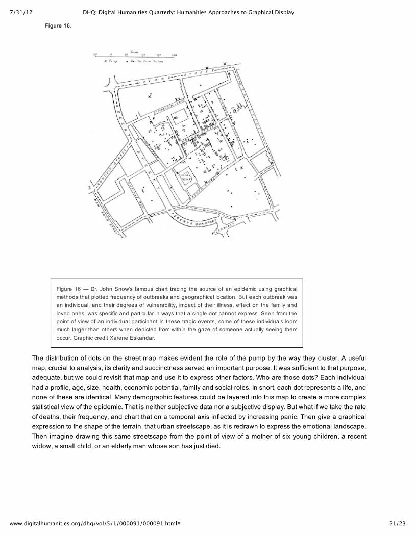
The distribution of dots on the street map makes evident the role of the pump by the way they cluster. A usefulmap, crucial to analysis, its clarity and succinctness served an important purpose. It was sufficient to that purpose,adequate, but we could revisit that map and use it to express other factors. Who are those dots? Each individualhad a profile, age, size, health, economic potential, family and social roles. In short, each dot represents a life, andnone of these are identical. Many demographic features could be layered into this map to create a more complexstatistical view of the epidemic. That is neither subjective data nor a subjective display. But what if we take the rateof deaths, their frequency, and chart that on a temporal axis inflected by increasing panic. Then give a graphicalexpression to the shape of the terrain, that urban streetscape, as it is redrawn to express the emotional landscape.Then imagine drawing this same streetscape from the point of view of a mother of six young children, a recentwidow, a small child, or an elderly man whose son has just died.
7/31/12 DHQ: Digital Humanities Quarterly: Humanities Approaches to Graphical Display
22/23www.digitalhumanities.org/dhq/vol/5/1/000091/000091.html#
Figure 17.
Figure 17 — Snow's chart altered. Graphic credit Xárene Eskandar.
These latter are all instances of the graphical expression of humanistic interpretation. They are as different fromthe visual display of quantitative information as a close reading of a poem is from the chart of an eye trackerfollowing movements across a printed page. They are fundamentally different in character and in their basicassumptions about the role of graphical expression as an aspect of knowledge production. We have a very longway to go in creating graphical expressions that serve humanistic interpretation, but I hope I have suggestedsome of the premises on which this work might begin.
Notes[1][KnorrCetina & Amann 1990][Lynch & Woolgan 1988][Anderson 2007][Anderson 2008][Porter 1995][Lochlann2010][Latour 1986].
[2][Griethe & Schumann 2006][Jones et. al 2008][MacEachren et. al 2005][Shneiderman & Pang 2005][Skeels et.al 2008][Wells 2008]
[3]Subjective carries structuralist connotations, as position and enunciated identity; and is meant to suggest boththe codependent conditions of construction and expressive graphical features.
[4]I first understood this notion when I read Sigfried Giedion's Space Time and Architecture about thirty years ago.His arguments about structure as spacemaking left a deep impression.
[5]See:[Carden]
[6]Alternate example was a street map of Tehran on which points are plotted to show a disturbance in progress.Let the points expand to register degrees of intensity of impact, disruption of normal function, fear and anger,violence. That would be the registration of subjective data on a conventional map. Now change the map, distort itsproportions so that it becomes a terrain shaped by fear, by obstacles, by disruptions and confusions.
[7]This citation is of course the title of Edward Tufte's first volume.
Works Cited
Anderson 2007 Anderson, Margo. "Quantitative History", The Sage Handbook of Social Science Methodology, ed.William Outwaite and Stephen Turner, London: Sage Publications, 2007, 24663.
Anderson 2008 Anderson, Margo. "The Census, Audiences, and Publics", Presidential Address, Social ScienceHistory 32:1, Spring 2008, 118.
Carden Carden, Tom. Travel Time Tube Map http://www.tomcarden.co.uk/p5/tube_map_travel_times/applet/

7/31/12 DHQ: Digital Humanities Quarterly: Humanities Approaches to Graphical Display
23/23www.digitalhumanities.org/dhq/vol/5/1/000091/000091.html#
Griethe & Schumann 2006 Griethe, Henning and Heidrun Schumann. "Visualizing Uncertainty for ImprovedDecision Making", SimVis 2006, 143156.
Jones et. al 2008 Jones, Josh, Remco Chang, Thomas Butkiewicz and William Ribarsky. "Visualizing uncertainty forgeographical information in the terrorism database", SPIE Security Symposium, 2008.dvg.uncc.edu/publications/index.html
KnorrCetina & Amann 1990 KnorrCentina, Karin and Klaus Amann. "Image Dissection in Natural ScientificInquiry", Science, Technology, and Human Values, 15: 1990, 259.
Latour 1986 Latour, Bruno. "Visualization and Cognition: Drawing Things Together", Knowledge and Society, 6:1986, 140.
Lochlann 2010 Lochlann, Jain." Morality Effect: Counting the Dead in the Cancer Trail", Public Culture. 2010, 89117.
Lynch & Woolgan 1988 Lynch, Michael, and Steve Woolgar. "Introduction: Sociological Orientations toRepresentational Practice in Science", Human Studies, 11: 1988, 99116.
MacEachren et. al 2005 MacEachren, Alan M., Anthony Robinson, Susan Hopper, Steven Gardner, Robert Murray,Mark Gahegan and Elisabeth Hetzler. "Visualizing Geospatial Information Uncertainty: What We Know and WhatWe Need to Know", Cartography and Geographic Information Science, Vol. 32, No. 3: 2005, 139160.
Porter 1995 Porter, Ted. Trust in Numbers: The Pursuit of Objectivity, Princeton, NJ: Princeton University Press,1995.
Shneiderman & Pang 2005 Shneiderman, Ben and Alex Pang. Visualizing Uncertainty: Computer SciencePerspective, National Academy of Sciences Workshop, Washington, DC: March 34, 2005.http://www.cs.umd.edu/hcil/pubs/presenations/NASVisUncertainty6_files/frame.htm
Skeels et. al 2008 Skeels, Meredith, Bongshin Lee, Greg Smith and George Robertson. "Revealing Uncertainty forInformation Visualization", Microsoft Publications, 2008. http://research.microsoft.com/pubs/64267/avi2008uncertainty.pdf
Wells 2008 Wells, Audrey Elizabeth. Virtual Reconstruction of a Seventeenth Century Portuguese Nau, Master'sThesis, Texas &M University, Visualization Sciences, 2008.repository.tamu.edu/bitstream/handle/1969.1/86071/Wells.pdf