Embed Size (px)
Citation preview

ARGD
Discussion: Gail Anderson
Sketchbook due: Tuesday, Oct 10th.

ARGD
What is Typography?
Typography is the art and technique of
arranging type to make written language most
appealing to learning and recognition.
Typography | Off Book | PBShttp://www.youtube.com/watch?v=eKKDL6lekmA

ARGD
• Paula Scher talks about building identity in messaging.
(the Public Theater, the Maps Series, jazz album covers)
• Jonathan Hoefler and Tobias Frere-Jones, typeface designers, outline the importance of selecting the right font to convey a particular feeling. (Archer, Gotham,Whitney)
• Eddie Opara uses texture to create reaction.
• Infographic designers Julia Vakser and Deroy Peraza map complicated data sets into digestible imagery, mixing color, graphics and type.

ARGD
1.Typeface vs Font?
Typeface describes an overall family
Example: Time New Roman Helvetica Rockwell

ARGD
1.Typeface or Font?
Font describes a specific member of a family
Example: Futura Condensed Extra Bold Futura Condensed Medium Futura Medium Italic Futura Medium Light (o)
(Futura is a geometric sans-serif typeface designed in 1927 by Paul Renner)
ARGD
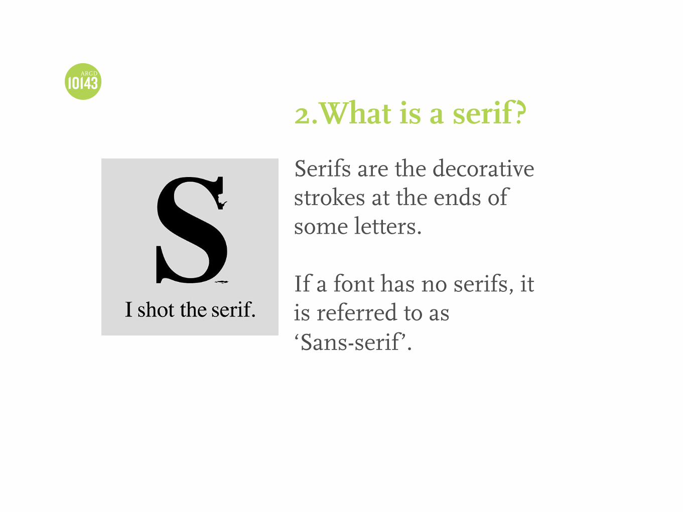
2.What is a serif?
Serifs are the decorative strokes at the ends of some letters.
If a font has no serifs, it is referred to as ‘Sans-serif’.

ARGD

ARGD
Anatomy of Type

ARGD 3.What are some categories of typeface?
1. Serif
Sample:
GaramondGoudyBaskervilleCenturyBodoniDidot
2. Sans-Serif
Sample:
HelveticaGill SansGotham
Futura

ARGD 3.What are some categories of typeface?
3. Slab typeface
Sample:
RockwellArcherSentinel
4. Decorative
Sample:
Cooper BlackStENCIL
ARGD 3.What are some categories of typeface?
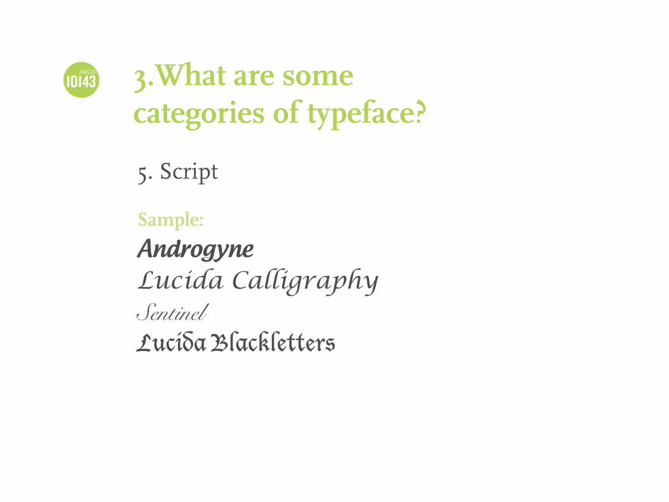
5. Script
Sample:
Androgyne
Lucida CalligraphySentinelLucida Blackletters

ARGD 4.What can we do with type?
Having a high contrast in size, it would capture the attention of the reader.
Screen: 12 ptsPrint: 9-11 pts
Contrast in Size
Bad typography has ruined more than just the Oscars

ARGD 4.What can we do with type?
It refers to how bold type compares with lighter type.
The differences in weight are measured based on the thickness of the strokes between each variation of typefaces.
Heavy areas creates a powerful point of visual attraction or emphasis.
Contrast in Weight

ARGD 4.What can we do with type?
It refers to the distinction between the CAPITAL LETTER of a typeface and its lowercase equivalent, its roman letter, or even its italic variant.
Mixing condensed with expanded types, script types with standard types can be used for dramatic change of form.
Contrast in Form

ARGD 4.What can we do with type?
Vertical or horizontal
Even different angles
The effect of turning one letter, word, or a sentence on its side can have a dramatic effect on layout.
Contrast in Direction

ARGD 4.What can we do with type?
Contrast in Color
A second color is often less empathetic in value than plain black on white.
It’s important to give emphasis to which elements get color.

ARGD 4.What can we do with type?
Texture can be achieved through the density of letter forms.
A small amount of spacing can make a block of text appear as one large black block.
A lot of spacing can create more negative space, and create an opposing texture.
Contrast in Texture

ARGD
5.What are some useful typefaces?
Garamond for books
Helvetica for Web
BODONI for Fashion Magazine
Akzidenz-Grotesk for infographics

ARGD
6.Do not use
Comic Sans
Hobo
Paparus
Curlz
Brush Script

ARGD 7.Do not
Apply dropshadow
Digitally Stretch
Outline your type
STACK
TYPE