Embed Size (px)
DESCRIPTION
Portfolio of Branding, Graphic Design and Illustration for Jeff DeWeerd
Citation preview
DEWEERD IMAGINATION

2
PACKAGING ----------------------- 3
LOGO AND PACKAGING ----------- 4
REBRANDING --------------------- 5
ADVERTISEMENTS ---------------- 7
LOGOS ---------------------------- 10
ILLUSTRATION ------------------- 11
PERSONAL PROJECTS ----------- 12
3
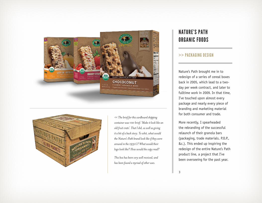
NATURE’S PATHORGANIC FOODS
>> PACKAGING DESIGN
Nature’s Path brought me in to redesign of a series of cereal boxes back in 2005, which lead to a two-day per week contract, and later to fulltime work in 2009. In that time, I’ve touched upon almost every package and nearly every piece of branding and marketing material for both consumer and trade.
More recently, I spearheaded the rebranding of the successful relaunch of their granola bars (packaging, trade materials. P.O.P., &c.). This ended up inspiring the redesign of the entire Nature’s Path product line, a project that I’ve been overseeing for the past year.
<< The brief for this cardboard shipping
container was very brief: ‘Make it look like an
old fruit crate’. That I did, as well as giving
it a bit of a back story. To whit, what would
the Nature’s Path brand look like if they were
around in the 1930’s? What would their
logo look like? How would the copy read?
This box has been very well received, and
has been found a myriad of other uses.

4
GASTOWNMERCHANTSASSOCIATION
>> LOGO DESIGN>> PACKAGING DESIGN
Work with the Tunnels of Moose Jaw lead to work with Storyeum, a tourist destination highlighting Vancouver history. I assisted with branding, naming and early design, and when they wanted a gift shop reminiscent of a turn-of-the century General Store, guess who got to design all the custom packaging for it? The project entailed coming up with an ‘identity’ for the store and designing all of the custom merchandise, including food and other souvenir items.
5
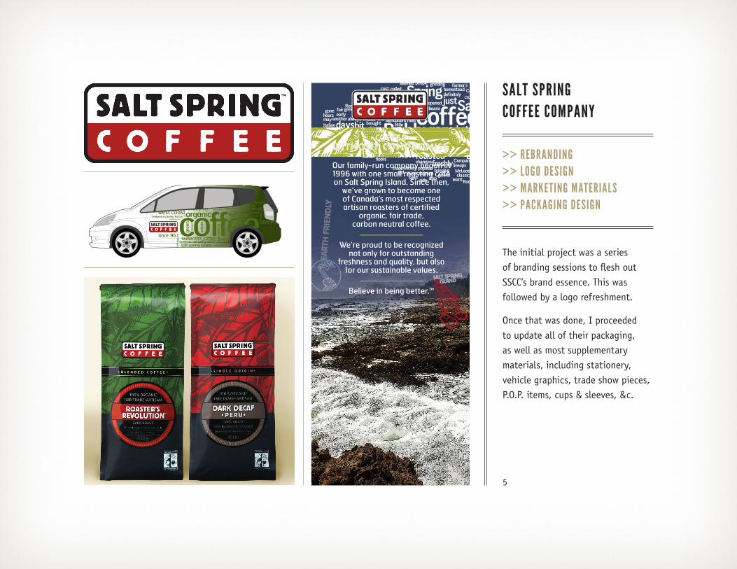
SALT SPRING COFFEE COMPANY
>> REBRANDING>> LOGO DESIGN>> MARKETING MATERIALS>> PACKAGING DESIGN
The initial project was a series of branding sessions to flesh out SSCC’s brand essence. This was followed by a logo refreshment.
Once that was done, I proceeded to update all of their packaging, as well as most supplementary materials, including stationery, vehicle graphics, trade show pieces, P.O.P. items, cups & sleeves, &c.
6
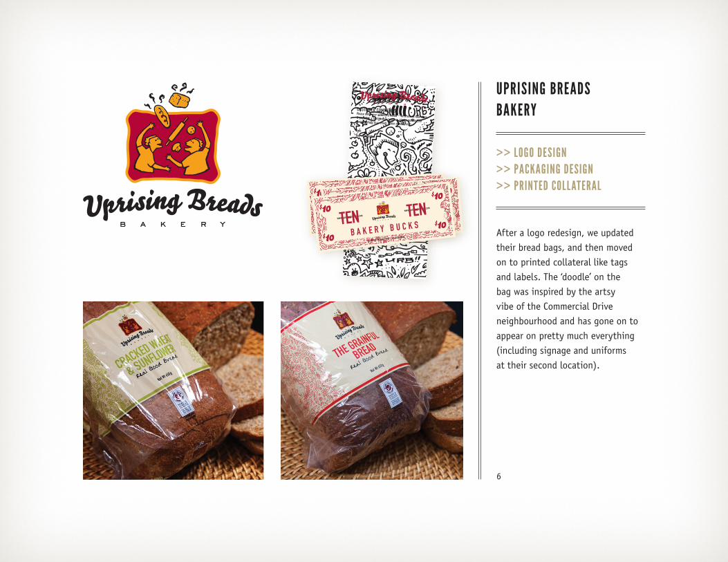
UPRISING BREADSBAKERY
>> LOGO DESIGN>> PACKAGING DESIGN>> PRINTED COLLATERAL
After a logo redesign, we updated their bread bags, and then moved on to printed collateral like tags and labels. The ‘doodle’ on the bag was inspired by the artsy vibe of the Commercial Drive neighbourhood and has gone on to appear on pretty much everything (including signage and uniforms at their second location).
7
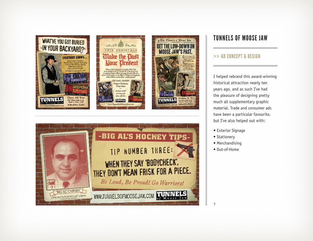
TUNNELS OF MOOSE JAW
>> AD CONCEPT & DESIGN
I helped rebrand this award-winning historical attraction nearly ten years ago, and as such I’ve had the pleasure of designing pretty much all supplementary graphic material. Trade and consumer ads have been a particular favourite, but I’ve also helped out with:
• Exterior Signage • Stationery • Merchandising • Out-of-Home
8
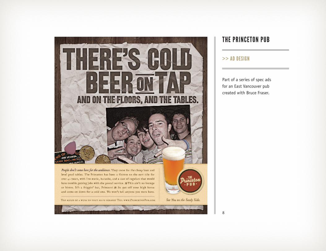
THE PRINCETON PUB
>> AD DESIGN
Part of a series of spec ads for an East Vancouver pub created with Bruce Fraser.

9
MOOSE JAW GETAWAY PACKAGE
>> BROCHURE & AD DESIGN
Working with the Tunnels of Moose Jaw lead to work with a consortium of three Moose Jaw destinations that were looking for a unique brand unto themselves, one that conveyed ‘Historic’ yet ‘Upscale’.
[email protected] CLIENT: Moose Jaw Getaway - 2010
JOB NAME: MJGet_RackCard_Sept10 DATE: October 13, 2010 8:05 PMVERSION: Final Art
SIZE: 4”x 9” COLOURS: process QUANTITY: ?FINISHING: NA
604.582.5802
CLIENT: Moose Jaw Getaway - 2010
JOB NAME: MJGet_RackCard_Sept10
DATE: October 13, 2010 8:05 PM
VERSION: Final Art
SIZE: 4”x 9” COLOURS: process
QUANTITY: ?FINISHING: NA
CLIENT: Moose Jaw GetawayJOB NAME: MJGet_DiscMJ_Fullpage_Mar10.inddDATE: March 11 2010VERSION: First Drraft
SIZE: 8.5” x 11” (full page, full bleed) COLOURS: process REQUIRED BY: March 10 2010FONTS: Casablanca Family
CHANGED: updated price, expiry dateNOTES: has expanded Temple copy from previous ad
10
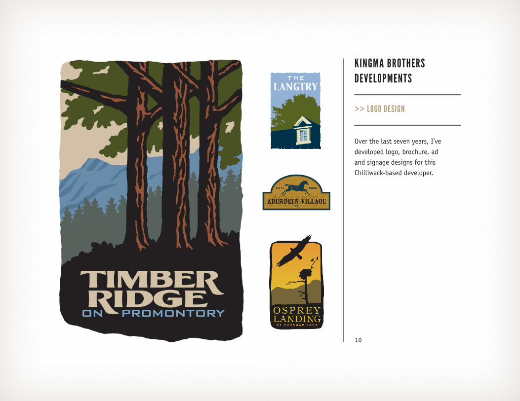
KINGMA BROTHERSDEVELOPMENTS
>> LOGO DESIGN
Over the last seven years, I’ve developed logo, brochure, ad and signage designs for this Chilliwack-based developer.

11
ILLUSTRATION
Since beginning my freelance career over twenty years ago, I’ve done a variety of illustration work as well, mostly in a self-taught ‘wood cut’ style.
You can see more at: Imagezoo / Jeff DeWeerd
12
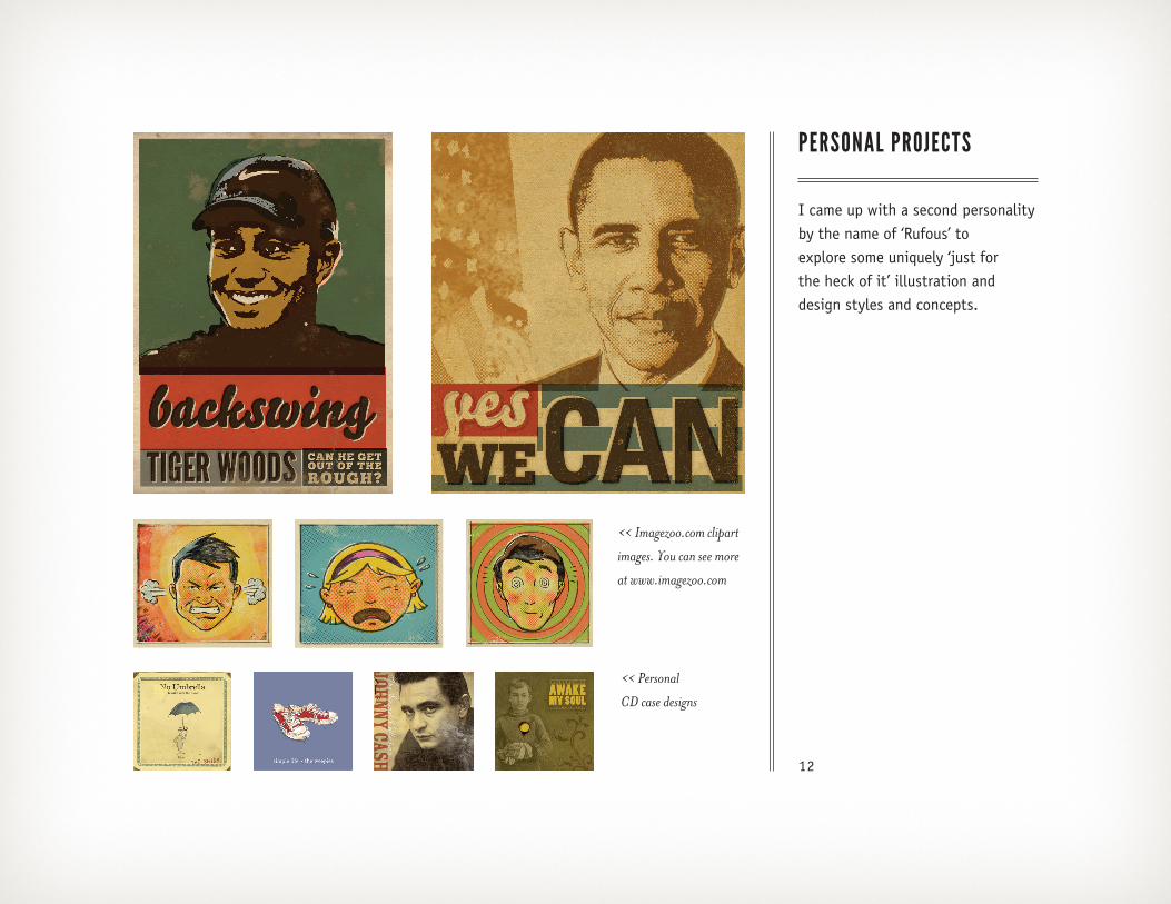
PERSONAL PROJECTS
I came up with a second personality by the name of ‘Rufous’ to explore some uniquely ‘just for the heck of it’ illustration and design styles and concepts.
<< Imagezoo.com clipart
images. You can see more
at www.imagezoo.com
<< Personal
CD case designs