Embed Size (px)
DESCRIPTION
A physical booklet created to highlight the development of the project. Including challenges and realisations.
Citation preview
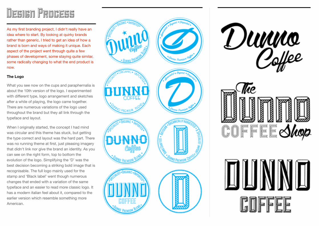
As my first branding project, I didn't really have an idea where to start. By looking at quirky brands rather than generic, I tried to get an idea of how a brand is born and ways of making it unique. Each aspect of the project went through quite a few phases of development, some staying quite similar, some radically changing to what the end product is now.
The Logo
What you see now on the cups and paraphernalia is about the 10th version of the logo. I experimented with different type, logo arrangement and sketches after a while of playing, the logo came together. There are numerous variations of the logo used throughout the brand but they all link through the typeface and layout.
When I originally started, the concept I had mind was circular and this theme has stuck, but getting the type correct and layout was the hard part. There was no running theme at first, just pleasing imagery that didn't link nor give the brand an identity. As you can see on the right form, top to bottom the evolution of the logo. Simplifying the ‘D’ was the best decision becoming a striking bold image that is recognisable. The full logo mainly used for the stamp and ‘Black label’ went though numerous changes that ended with a variation of the same typeface and an easier to read more classic logo. It has a modern italian feel about it, compared to the earlier version which resemble something more American.
Design Process
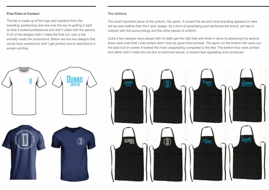
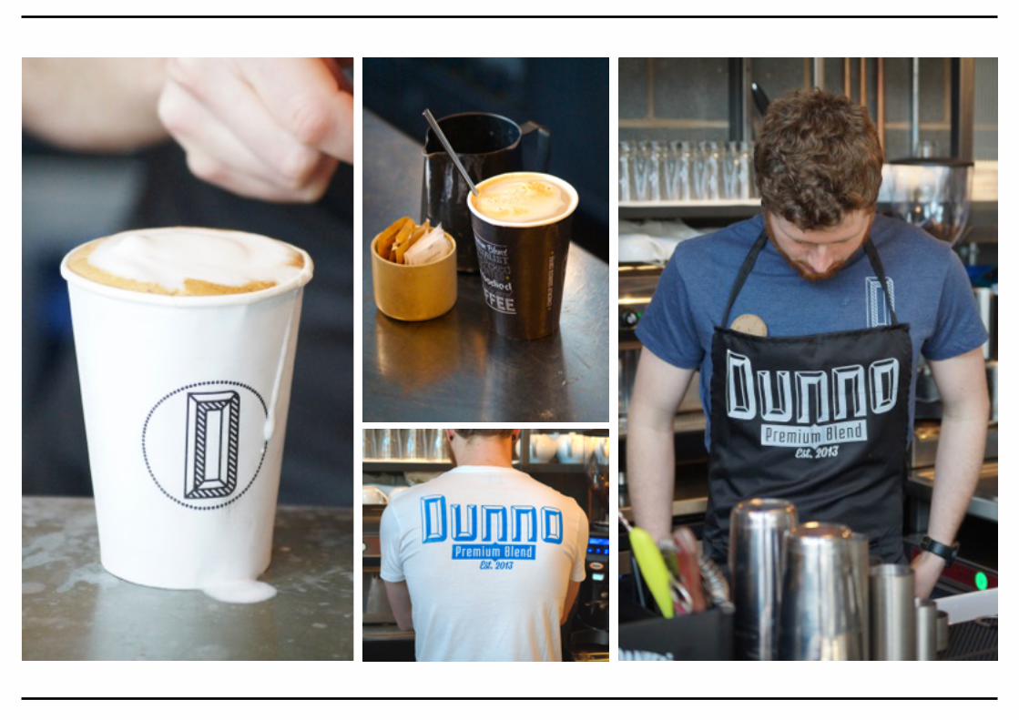
The Uniform
The most important piece of the uniform, the apron. It covers the tee and what branding appears on here will be seen before than the t-shirt design. Its a form of advertising and reinforces the brand, yet has to interact with the surroundings and the other pieces of uniform.
Quite a few designs were played with to really get the right feel and when it came to producing the aprons, there were ones that I was certain didn't look as good when printed. The apron on the bottom left came out the best but on screen it looked the most unappealing compared to the rest. The bottom four were printed and either didn't make the cut due to technical issues, or looked less appealing once produced.
First Point of Contact
The tee is made up of the logo and typeface from the branding, positioning and size was the key to getting it right so that it looked professional and didn't clash with the aprons. A lot of the designs didn't make the final cut, only a few actually made the photoshoot. Below are the two designs that would have worked but didn’t get printed due to restrictions in screen printing.
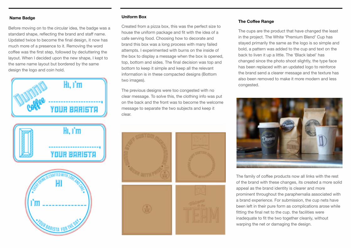
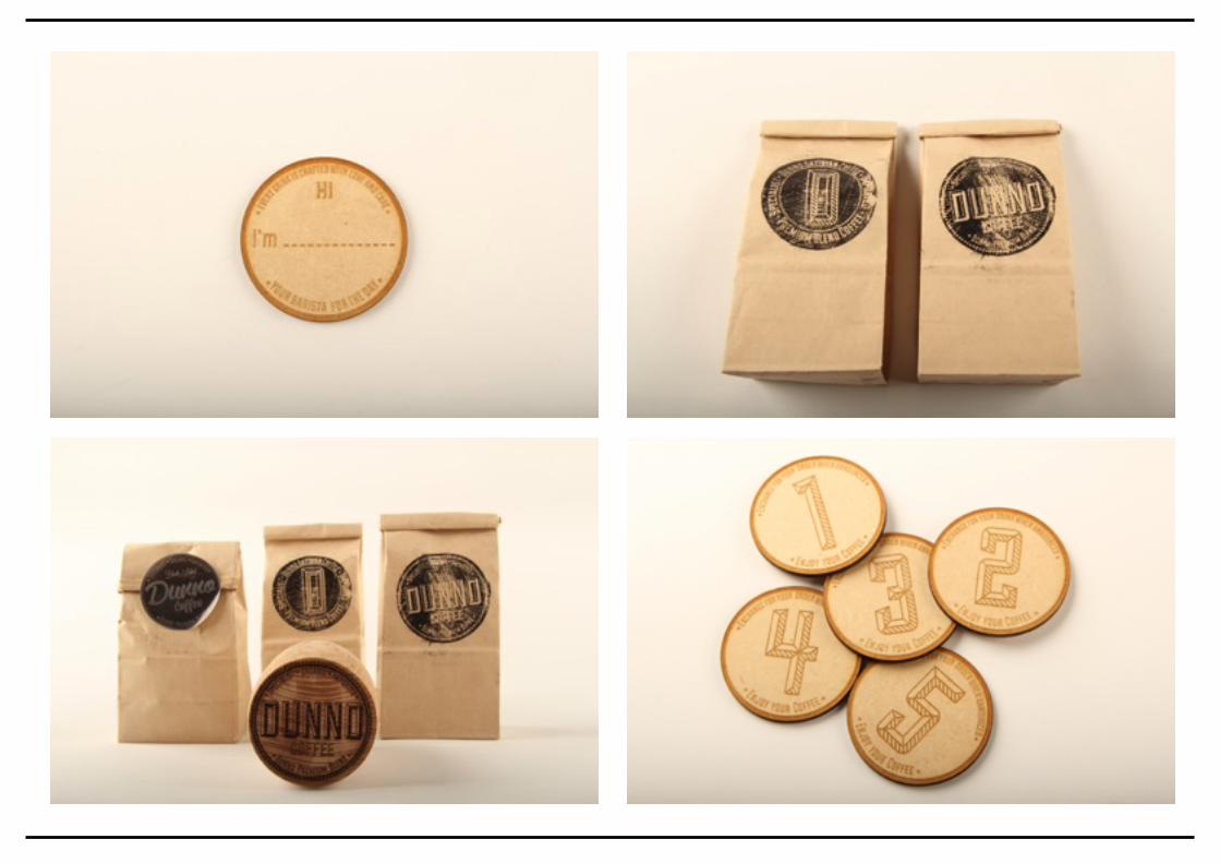
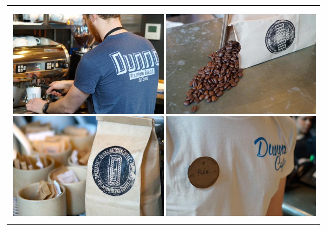
Name Badge
Before moving on to the circular idea, the badge was a standard shape, reflecting the brand and staff name. Updated twice to become the final design, it now has much more of a presence to it. Removing the word coffee was the first step, followed by decluttering the layout. When I decided upon the new shape, I kept to the same name layout but bordered by the same design the logo and coin hold.
The family of coffee products now all links with the rest of the brand with these changes, its created a more solid appeal as the brand identity is clearer and more prominent throughout the paraphernalia associated with a brand experience. For submission, the cup nets have been left in their pure form as complications arose while fitting the final net to the cup. the facilities were inadequate to fit the two together cleanly, without warping the net or damaging the design.
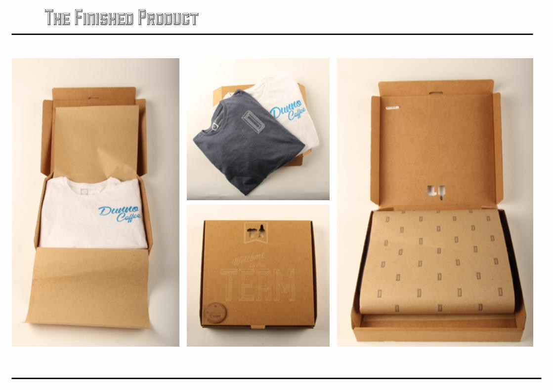
Uniform Box
Created from a pizza box, this was the perfect size to house the uniform package and fit with the idea of a cafe serving food. Choosing how to decorate and brand this box was a long process with many failed attempts. I experimented with burns on the inside of the box to display a message when the box is opened, top, bottom and sides. The final decision was top and bottom to keep it simple and keep all the relevant information is in these compacted designs (Bottom two images).
The previous designs were too congested with no clear message. To solve this, the clothing info was put on the back and the front was to become the welcome message to separate the two subjects and keep it clear.
The Coffee Range
The cups are the product that have changed the least in the project. The White ‘Premium Blend’ Cup has stayed primarily the same as the logo is so simple and bold, a pattern was added to the cup and text on the back to liven it up a little. The ‘Black label’ has changed since the photo shoot slightly, the type face has been replaced with an updated logo to reinforce the brand send a clearer message and the texture has also been removed to make it more modern and less congested.

The biggest challenges in this project were the technical aspects. Using a wide range of processes has produced some satisfying results but getting that finished product was frustrating at times. Laser cutting was one of the most commonly used processes and each piece took many attempts to get the final product i imagined.
The Uniform box Choosing to use this process was for it unique effect on material, i didn't just want to write on the box or put a sticker on it, i wanted it to be one piece, hold all the information about the uniform while still be visually appealing and fit within the brand. Etching tin to cardboard without burning all the way through and after a few attempts, the end result was burnt on a mere 8% power. The result is a minimal burn which is readable but so gentle on the cardboard it has no texture or embossing, its effect was a light pattern on the cardboard.
T-shirts
Screen-printing the t-shirts was the only way of transferring my designs on to the fabric in a timely and effective manner. Due to the studio not being set up for tee printing the results were as best as i could get from the facilities. Numerous designs were printed but only a couple made the photo shoot due to mis-prints, ink bleed and smudging.
Aprons
The same restraints occurred with the Aprons but due to the material the transfer was not as clean as the most successful t-shirts. Even the vacuum in the screen print bed pulled the ink through to create a dotted pattern within the design. The final two which had the strongest, cleanest design were adequate and looked great in the photo shoot. The faults were surprisingly not noticeable and the text was readable swell as striking.
Challenges

Chest Logo The logo on this print was too far over to the right so it touched the arm also rather too large for a t-shirt. It would have pertruded over the apron too much. The transfer wasn't as clean as the other prints so this design was not chosen as a submission or to appear in the photoshoot. Ironically this design was not chosen as the logo and has been further developed now, not being used in the branding as the type faces used are conflicting with the identity.
Apron Front The fabric was the first challenge with the apron, a very thin shinny, non gripping material. The prints weren't as strong as the cotton t-shirts but better than what i expected. The below is the worst of the prints, non - consistent transfer which was too small for the space and the circular design didn't look right on a very square fit apron. There are numerous faults with the type sizing which have since been corrected. The use of capitals and lower case lettering makes the circular design inconsistent so in future designs this has been corrected.
Back Prints The use of back prints was a design quirk that was a must for initial designs. Not enough tee’s in my eyes have them and its making use of empty space in a logical way that reinforces the brand. The problem with producing this print was getting a clean and accurate print without the neckline interfering with the transfer. Using a cardboard insert did stop the problem but also interfered with the quality of the print so to solve the problem the image was moved below the neckline to ensure a clean print. In the photoshoot, the positioning sat just below the shoulders and looked great spread across the models back while he operated the coffee bar.
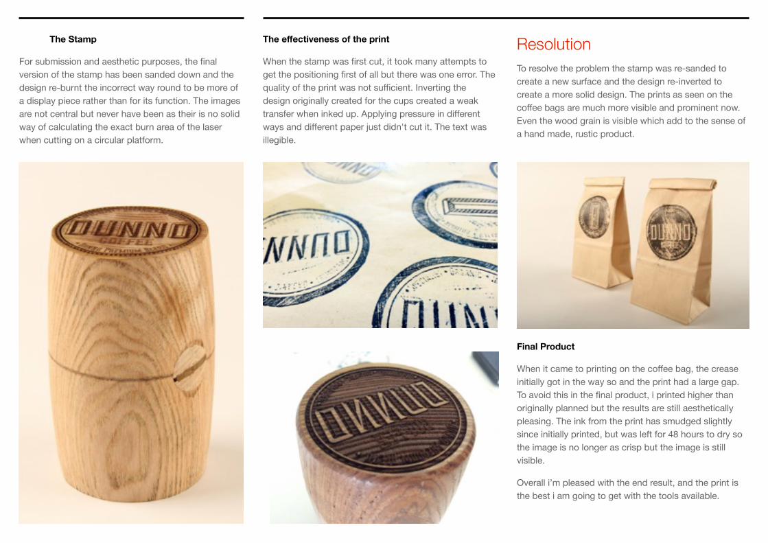
Resolution To resolve the problem the stamp was re-sanded to create a new surface and the design re-inverted to create a more solid design. The prints as seen on the coffee bags are much more visible and prominent now. Even the wood grain is visible which add to the sense of a hand made, rustic product.
The effectiveness of the print
When the stamp was first cut, it took many attempts to get the positioning first of all but there was one error. The quality of the print was not sufficient. Inverting the design originally created for the cups created a weak transfer when inked up. Applying pressure in different ways and different paper just didn't cut it. The text was illegible.
The Stamp
For submission and aesthetic purposes, the final version of the stamp has been sanded down and the design re-burnt the incorrect way round to be more of a display piece rather than for its function. The images are not central but never have been as their is no solid way of calculating the exact burn area of the laser when cutting on a circular platform.
Final Product
When it came to printing on the coffee bag, the crease initially got in the way so and the print had a large gap. To avoid this in the final product, i printed higher than originally planned but the results are still aesthetically pleasing. The ink from the print has smudged slightly since initially printed, but was left for 48 hours to dry so the image is no longer as crisp but the image is still visible.
Overall i’m pleased with the end result, and the print is the best i am going to get with the tools available.

Thinking in Circles The theme of circles developed from a mistake, when initially cutting the stamp in the laser cutter, difficulties arose surrounding the placement of the wooden block and the lasers area of burn. To solve this issue, we used a sheet of mdf to mimic the placement and repeat the process but placing the block exactly where the sheet had been engraved. What remained from the sheet of mdf was one single ‘coin’ with an inverted design. This in turn, inspired the whole circular theme.
The difficulties surrounding this items was consistency. The designs had to be similar but different enough to be distinguishable. Each side of the coin had to be cut as separate discs due to the technical inability to engrave on the sides of the same material. Due to this, the coins are made of two separate discs attached to each other with adhesive. When laser cutting the ‘D’ side of the coin, there was defects in regards to the surrounding dots. Due to the way the file was created, the dots overlapped and the laser cutter struggled to read them and left gaps within the design. Two of the final discs have these visible errors. When separating the discs from the initial sheet of mdf, the machine had to be set on to ‘cut’ not ‘etch’. One file must have been corrupted as one star on the reverse has been cut from the material rather than etched. (Coin 3)
Two designs were cut for the coin originally, but since the logo developed, the original coin design was confusing. (Above left) this logo was to be used with the ‘Black Label product’ and gave a conflicting message. I Since changed the design to the same logo on the Premium blend coffee, its simple and mimics the other side in the sense of design, one large figure surround by a design. The surrounding dots hold the circular theme throughout the brand and also have a second function. On the disc they mimic the markings from a real coin which enforces the idea behind the coin idea, creating more a visible connection.
The Finished Product