Embed Size (px)
DESCRIPTION
Publication, Design, Context
Citation preview

Contents
Studios02 Magic Touch03 Pentagram04 Wiyumi05 Zirkumflex06 Weiss Heiten
Designers08 Otl Aicher09 Paul Rand12 Mueller Weiland13 Kummer & Herrman 14 Robert Brownjohn
Other Influences16 Web Design17 GF Smith & Two Sides18 HKS19 General Public20 Print
Antony WardOUGD 303Final Major ProjectDesign Context
Design is so simple, that’s why it is so complicated.
* Cover Quote by Paul Rand

01 Design Context / Studios
Studios

02
Magic Touch
Design Context / Studios
Magic Touch is a Berlin based, experimental lab in the creative, graphic and illustration domain. They work for clients and also on self initiated projects and exhibitions. The studio creates mostly printed work, from this I have taken inspiration for my own work looking at how the studio has used type and stock and the concepts developed. The studio give a list to outline what they create: Magazine, Book, Folder, Poster, Postcards, Flyer, Sticker, T-shirt, Corporate Identity, Business paper etc. Pretty much everything.
As examples I have included the information brochure for realities:united, a Berlin architecture buro. The design plays with the idea of redefinition, various modular elements can be transformed depending on how the buro wants to present itself and the binding is a simple rubber band. The design inspired me to investigate into alternative stocks for my own work and also to consider different binding methods and how to layout work.
The Amsterdam to Berlin book below is a limited edition networking magazine created using silkscreen. The metaphor of a train is used to connect people about an issue, Amsterdam - Berlin. The design is low budget and this inspired the limited edition booklet work I created for the Occult gallery, making me consider budget methods of packaging and print processes.
A5 information brochure for Realities : United
Amsterdam to Berlin book

Pentagram
03 Design Context / Studios
Pentagram is the world’s largest independent design consultancy. The firm is owned and run by seventeen partners, a group of friends who are all leaders in their individual creative fields. The Berlin office is based in Charlottenburg, the Bohemian centre of the old West Berlin, and they have an impressive roster of companies and institutions in every sector, from high finance to healthcare; from charities to cookbooks. Clients include the airline Network Star Alliance, Sony Centre and German Red Cross.
The Doomsday Clock publication using the graphic symbol of the world’s proximity to nuclear annihilation, this redesign coincides with the group’s decision to move the clock forward from seven to five minutes before midnight, or metaphorical doomsday. The design inspired the idea to use a newspaper publication for the design context and also how to work around limitations imposed by paper stock.
The global cities promotional posters examine five major issues - size, speed, form, density and diversity - and their effects on ten major urban areas. The designs helped inspire the work I created for the Poster For Tomorrow competition. How to use colour, type and layout to create impact and give the work an appropriate feel, although these posters used monotone images - in my own work I prefer to use stock and colour - I could still take inspiration from the design.
Doomsday Clock : Publication for the
Bulletin of the Atomic Scientist
Global Cities Posters for the Tate Modern

Wiyumi
04 Design Context / Studios
Baum! - A book about the relation between realness and reality
Poster For Tomorrow entry promoting freedom of expression
with focus on women’s rights in Iran
Wiyumi is a Berlin based visual communication studio established by Alexander Fuchs, Jana Davidjants and Timur Akhmetov. They specialise in editorial design, identity, information and interaction design. Wiyumi also has a connection with Pictoplasma. The illustration work the studio creates is interesting but I have primarily been interested with the ideas they create for their type based work which are very innovative.
The studio designed a poster to enter into a Poster For Tomorrow competition. It promotes freedom of expression with focus on women’s rights. The design uses short messages and red to signify the issue. This is where I found the organisation Poster For Tomorrow and was inspired to create the posters I have designed for the organisation and entered into their competitions.
Baum! is Book about the relation between realness and reality. The stock used on the book and also how the book was mostly image based interested me, it also influenced the design work for the NOPX brief and also the layout work has influenced this publication.

Zirkumflex
05Design Context / Studios
Zirkumflex, a multi - faceted creative company, it is a design studio, art space and publisher in Berlin. They offer special editions for sale, and design consulting for institutions, private organisations and companies. They design books, magazines, logos, websites, exhibitions and display designs, posters, leaflets and catalogues. It is also a flexible project space hosting art exhibitions, events, and book launches. Their aim is to create connections between art and cutting-edge visual culture.
Botox Cloud was an installation held at the Zirkumflex gallery displaying the limited edition three dimensional jigsaw puzzle designed in conjunction with SAQ. It was developed as a reactive lighting system. I took inspiration from this design for the idea to create a model that was limited in edition for the NOPX space race brief.
Kunstverein is an experimental curatorial platform for exhibitions, research and production of contemporary visual art. Zirkumflex designed their website which has inspired the design work I have done for the Blond gallery exhibition. The design is html and minimal.
Shown above is the Botox Cloud paper model
and right is the packaged model
Kunstverein website
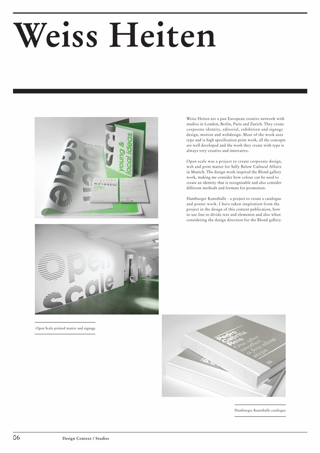
Weiss Heiten
06 Design Context / Studios
Weiss Heiten are a pan European creative network with studios in London, Berlin, Paris and Zurich. They create corporate identity, editorial, exhibition and signage design, motion and webdesign. Most of the work uses type and is high specification print work, all the concepts are well developed and the work they create with type is always very creative and innovative.
Open scale was a project to create corporate design, web and print matter for Sally Below Cultural Affairs in Munich. The design work inspired the Blond gallery work, making me consider how colour can be used to create an identity that is recognisable and also consider different methods and formats for promotion.
Hamburger Kunsthalle - a project to create a catalogue and poster work. I have taken inspiration from the project in the design of this context publication, how to use line to divide text and elementst and also when considering the design direction for the Blond gallery.
Hamburger Kunsthalle catalogue
Open Scale printed matter and signage

07 Design Context / Studios
Designers
OtlAicher
08 Design Context / Designers
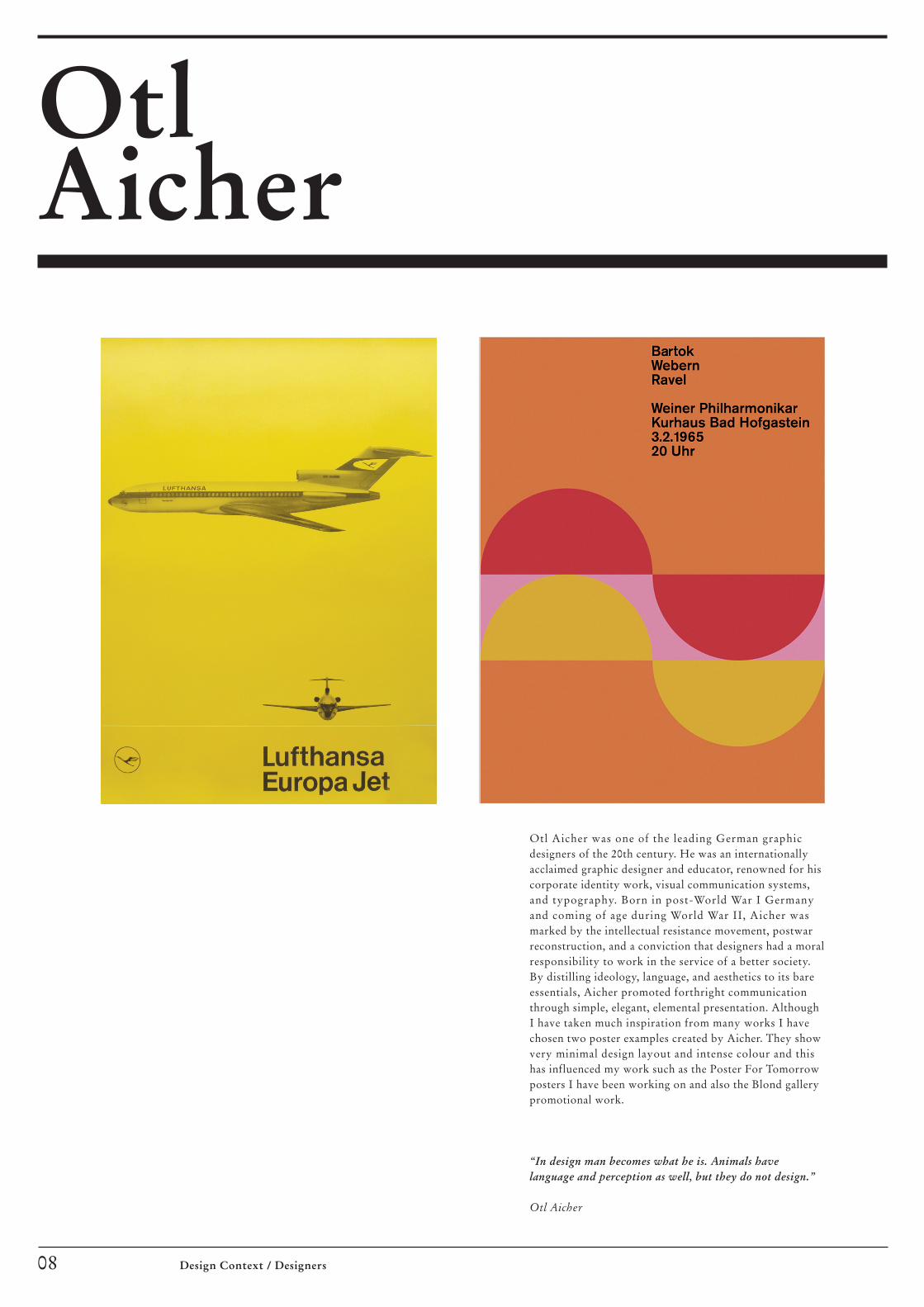
Otl Aicher was one of the leading German graphic designers of the 20th century. He was an internationally acclaimed graphic designer and educator, renowned for his corporate identity work, visual communication systems, and typography. Born in post-World War I Germany and coming of age during World War II, Aicher was marked by the intellectual resistance movement, postwar reconstruction, and a conviction that designers had a moral responsibility to work in the service of a better society. By distilling ideology, language, and aesthetics to its bare essentials, Aicher promoted forthright communication through simple, elegant, elemental presentation. Although I have taken much inspiration from many works I have chosen two poster examples created by Aicher. They show very minimal design layout and intense colour and this has influenced my work such as the Poster For Tomorrow posters I have been working on and also the Blond gallery promotional work.
“In design man becomes what he is. Animals have language and perception as well, but they do not design.”
Otl Aicher

Paul Rand
09Design Context / Designers
A History of Russian Literature Book Cover, 1956
I think it is important to understand were our industry has developed from as much as to understand contemporary design. Paul Rand interests me because he was influential in the development of all areas of our industry. His work using typography has influenced a variety of the pieces of work I have created for the final major project including the concept for the Right To Education poster. I have included specific examples that inspired my own work including the UCLA poster which used colour to create hierarchy and also the Russian literature book cover that influenced the designs for the Occulto quotes books.
When Paul Rand died on 26th November 1996 at eighty-two, his career had spanned six decades, three generations and numerous chapters of design history. In the late 1930’s he began to transform commercial art from craft to profession. By the 1940’s he influenced the look of advertising, book and magazine cover design. By the late 1940s he proffered a graphic design vocabulary based on pure form where once only style and technique prevailed. By the mid-1950s he altered the ways in which major corporations used graphic identity. And by the mid-1960’s he had created some of the world’s most enduring corporate logos, including IBM, UPS, ABC and Westinghouse. He was the channel through which European modern art and design - Russian constructivism, Dutch De Stijl and the German Bauhaus - was introduced to American commercial art. The first of his four books, Thoughts on Design, published in 1946 when he was thirty-two, was a bible of Modernism. In his later years he was a teacher, theorist and philosopher of design. Although intolerant of faddish trends, Rand ended his career with the same guiding belief as when he had begun: good design is good will.
UCLA poster for summer sessions, 1993

Design is the method of puttingform and content together.Design, just as art, has multipledefinitions; there is no singledefinition. Design can be art.Design can be aesthetics.Design is so simple, that’s why it is so complicated.
Paul Rand

Design is the method of puttingform and content together.Design, just as art, has multipledefinitions; there is no singledefinition. Design can be art.Design can be aesthetics.Design is so simple, that’s why it is so complicated.
Paul Rand

MuellerWeiland
12 Design Context / Designers
The website for the new A5 book series for
the Lars Mueller Publishers
Although this is under designer, it is a design studio under the leadership of two designers Jens Mueller and Karen Weiland. In addition to traditional tasks such as conception they also design corporate images, communication media, as well as corporate images, communication media, books, exhibitions and editorial work. The clients include arts institutions like the German Film Museum, agencies like the Federal Ministry of Finance and companies from industry such as Booz and Company.
I have included the website for the new A5 book series for the Lars Mueller Publishers because the design influenced the website for the Blond gallery project. How to layout the information, positioning identities and using colour in the design.
The poster work and flyers for the Film Kunst Grafik were designed for the film museum in Dusseldorf and Frankfurt. The concept for the designs was influenced by the films concepts. The designs influenced me to use a bellyband for the promo work for the Blond and also when considering how to layout the work for the Brownjohn exhibition.
Plakat and flyers for the Film Kunst Grafik exhibition

Kummer& Herrman
13Design Context / Designers
Kummer and Herrman is a Dutch, Utrecht based, design studio founded in 1998 by Jeroen Kummer and Arthur Herrman. They design for a wide range of clients creating books, magazines, identities, annual reports, campaigns, exhibitions and websites. I like the type and print work they create and the ideas are also very good - (although some of the work has type errors if you look closely and are picky) but on the whole really good for inspiration and loads of work on their website.
The newspaper publication shown was published for the Sochi Project, a project highlighting the corrupt situation in Russia within the Sochi region where the olympic games are due to take place. The project won the canon prize for innovative journalism. Part of the concept was for the publication to act as an exhibition of 1.2 x 6 meters, shown in the second image below ‘do it yourself’. The newspaper publication idea inspired the concept to create a newspaper publication for the design context.
The template poster can be folded down into a three dimensional sculpture. This inspired the model concept for the NOPX work were I created model templates for the Sputnik and Lunar Lander. I also to inspiration to understand how to document this kind of work to show how to create the models.
Sochi Project newspaper
Poster & Instructions

RobertBrownjohn
Creating titles for early James Bond films and Rolling Stones album sleeves, the graphic designer and film-maker Robert Brownjohn was responsible for many of the most memorable images of the 1960s. Famed for the simple execution of brilliant graphic design ideas, Brownjohn captured the experimental spirit of the era by applying modernist visual theory to mainstream culture. The designer has inspired me to consider idea and concept generation more in the work I am creating and also different medias.
“ He was always going after the winner. He could spend three weeks chasing a great idea. Then, when he got one, he would jump up and down about how terrific it was. He never just settled. He got a real kick out of solving the problem in a unique way.”
Stanley Eisenman
Experimental Typography Booklet with Instructional
poem on New York City, 1959
Peace Poster, 1969
Moving Words book, 1962
14 Design Context / Designers

Other Influences
15Design Context / Other Influences

Web Design
One of the goals for this module is to understand web design more. So I have been reading into this subject further and it has clarified many of the doubts and problems that I initially had with the subject. I have been using a few books to help, the information online is poor really but the AVA books are where I have been looking for information. Below are all the notes and points I have absorbed.
Websites were intially built as electronic versions of a publication, but as the technology for building them has become increasingly powerful and sophisticated, web designers are able to create web layouts that are more elaborate and function in different ways.
Fixed or FlexibleA web designer can determine the format of the website as fixed or scrolling screen, or a combination of thereof. A fixed screen gives more control and acts more like a physical paper publication, while a scrolling screen can provide a page of infinite dimension that arguably allows for a more democratic presentation, the user has more control over the information.
A fixed width does not change regardless of browser size. This is achieved by having a specific pixel number for the widths of pages, if a users browser is smaller then it will require scrolling. Flexible width pages very depending on how wide the user’s browser window is and this can be make reading passages difficult as the text boxes change. Most web designers design for a maximum of 800 x 600 pixels. The optimal solution is to combine the two methods, having parts that are fixed - text - and part such as backgrounds able to flex.
FormatsWebpage formats do not need to be restricted by screen dimensions as the designer can harness the unlimited virtual space with devices such as pop-up boxes, animations, pull-down menus, rollovers and navigation. However, this can result in an overloaded design, it must be remembered that the aim is the presentation of information in an effective way.
Scanning & NavigationPeople scan a webpage the same way they scan a printed page. The F-pattern - people quickly scan from left to right in two stripes, then down the page in search of something meaningful. In design terms this means that key information and entry points should be located within the ambit of the F-pattern. Navigation is the means whereby users can be directed towards different types of information.
Flash & HTMLFlash is animation software that allows a web page to be brought to life, but as with all design too much can be a bad thing. CSS is a language used to describe how a document written in HTML is to be presented. CSS separates the textual content from design instructions by defining colours, fonts, layout and other elements.
OrientationA digital design can have any dimension and be formed to perfectly to fit the content. Horizontal orientation is suitable for a landscape presentation that scrolls left and right. Vertical orientation is suitable for a portrait presentation that scrolls up and down - This is similar to a traditional editorial with columns that go up and have a limited amount.
An example of a HTML fixed width webpage
16 Design Context / Other Influences

GF Smith & Two Sides
I have been using paper supplied by GF Smith to bring more identity to the work I have been creating. GFSmith have been trading as specialty paper merchants from their warehousing and manufacturing base in Hull, East Yorkshire for over 100 years. They source, develop & manufacture some of the most unusual papers for the Graphics and Printing Industries, promoting new papers for a wide range of applications. These range from simple business cards, to letterheads, folders, promotional brochures, report & accounts, greetings cards & packaging. Alongside paper the Hull factory is capable of embossing & laminating paper and also manufactures envelopes in standard (C6 & DL) sizes alongside bespoke envelope manufacture to any size you might require.
‘Two Sides’ is an initiative by companies from the Graphic Communications Supply Chain including forestry, pulp, paper, inks and chemicals, pre press, press, finishing, publishing and printing. Their common goal is to promote the responsible production and use of print and paper, and dispel common environmental misconceptions by providing users with verifiable information on why print and paper is an attractive, practical and sustainable communications medium.
17 Design Context / Other Influences

HKS
18 Design Context / Other Influences
HKS 3ooo+ colour management system provides digital access to all 3,520 true-to-print HKS spot colours for coated paper and un- coated paper. The “Creative toool HKS 3ooo+” software is easy to use and directly communicates with all professional graphics programmes. HKS are used widely in Germany which is why I have researched further into the companies products.

General Public
19Design Context / Other Influences
General Public is an independent project space run by a group of cultural workers (visual artists, curators, among others) based in Berlin. General Public was founded in Fall 2005 and since produced a number of exhibitions, artist presentations, discussions, film screenings, and performances. Additional to its own program General Public occasionally serves as a host for related external activities and projects.
General Public aims to install and uphold a collaborative, process-related, informal platform for open thought, information exchange, spatial experiments, trans disciplinary approach and the reflection on contemporary visual and auditive culture. Although operating within an international network, General Public’s activities are always informed by and related to its local context and situation. Far from eyeing out individuals and the market’s usual taxations, direct involvement in contemporary creation and discourse on the level of production – paradoxically – ensures critical distance to take positions within what is going on around us culturally and socially.

20 Design Context / Other Influences
I have been using online printers recently for printing. They produce printed materials such as flyers, post cards, folders, leaflets, posters, stationery, business cards, brochures, catalogs, and much more with high-quality offset. I also researched further into large format display boards costings and prices to understand this area of print further. The website papersizes provided a large amount of information to understand all things paper for print.

Page 01 Not Applicable
Page 02 Realities: United A5 Brochure & Amsterdam to Berlin Booklet Images
Available from: www.magictouch-berlin.de
Page 03 Doomsday Clock Publication & Global Cities Posters Images
Available from: www.pentagram.com
Page 04 Poster For Tomorrow Women’s Rights Poster & Baum! Book Images
Available from: www.wiyumi.com
Page 05Botox Cloud Model / Packaging & Kunstverein Website Images
Available from: www.zirkumflex.com
Page 06Open Scale Print / Signage & Hamburger Kunsthalle catalogue Images
Available from: www.weiss-heiten.com
Page 07Not Applicable
Page 08Lufthansa Europa Jet Poster & Bartok Webern Ravel Poster Images
Available from: www.peanutbutterthoughts.com
Markus, R (2006) Otl Aicher, Phaidon Press Limited, London.
Page 09UCLA Poster & Russian Literature Book Cover Images
Available from: www.paul-rand.com
Heller, S (1999) Paul Rand, Phaidon Press Limited, London.
Page 10 / 11Paul Rand Quote
Available from: www.veryownstudio.com
Page 12A5 book series webpage & Plakat / Flyers for Film Grafik Exhibition Images
Available from: www.muellerweiland.de
Page 13Sochi Project Publication & Template Poster / Instructions Images
Available from: www.kummer-herrman.nl
Page 14Peace Poster, Experimental Typography Booklet & Watching Words Move Images
Available from: www.designboom.com
King, E (2005)Sex and Typography, Laurence King, London.
Page 15Not Applicable
Page 16HTML Webpage Image
Available from: www.muellerweiland.de
Ambrose, G (2005) Layout, AVA Publishing, Lausaune.
Ambrose, G (2005) Grids, AVA Publishing, Lausaune.
Page 17GF Smith & Two Sides Images
Available from: www.gfsmith.com & www.twosides.info
Page 18Colour Book & Software Images
Available from: www.hks-farben.de
Page 19General Public Image
Available from: www.generalpublic.de
Page 20Online Printers & Papersizes Images
Available from: www.onlineprinters.com & www.paper-sizes.com
21Design Context / References
List of Illustrations & References


Contents
Studios02 Magic Touch03 Pentagram04 Wiyumi05 Zirkumflex06 Weiss Heiten
Designers08 Otl Aicher09 Paul Rand12 Mueller Weiland13 Kummer & Herrman 14 Robert Brownjohn
Other Influences16 Web Design17 GF Smith & Two Sides18 HKS19 General Public20 Print
Antony WardOUGD 303Final Major ProjectDesign Context
Design is so simple, that’s why it is so complicated.
* Cover Quote by Paul Rand