Embed Size (px)
Citation preview
DESIGN BASICS: MICROSOFT PUBLISHER
What is Microsoft Publisher? Microsoft Publisher is a desktop-publishing application that you can use to design a wide variety of documents in all
sorts of sizes — everything from business cards, newsletters and brochures to cards, fliers and posters.
Do I Have Microsoft Publisher? Publisher is included with Microsoft 365 Personal (one user) or Home (five users), which is the subscription version of
Microsoft Office. You can subscribe to Microsoft 365 for either a monthly or annual fee. Other applications that come
with Microsoft 365 are Word, Excel, PowerPoint, OneNote, Outlook and Access. Publisher is not included with Office
Home & Student, but it is included with Office Professional (both of these are software packages you purchase for a
one-time price). You can also purchase Publisher separately.
In this class, you will create two projects and in the process, learn basic Publisher skills as well as some basic design
principles.
Course Topics: Publisher vs. Word
Review of the Publisher Interface (Ribbon, Thumbnail Pane, Scratch Area)
Creating a New Publication (Page Sizes)
Four Design Principles
Working with Text and Text Boxes
Adding Pages
Adding Pictures
Using Templates
Printing
Publisher vs. Word Publisher is a page layout program used to create documents like fliers, brochures and posters.
Word is a word processor that is better suited for documents like letters, resumes and reports.
Although you can design layouts in Word, Publisher is more flexible and allows you to design more freely.
In Publisher, you start out with an empty page; in Word, you start out with a text cursor.
In Publisher, you work with individual pages; in Word, you work with continuous pages.
In Publisher, you can place items in the scratch area (pasteboard) around your page; in Word you can place
items only on the page.
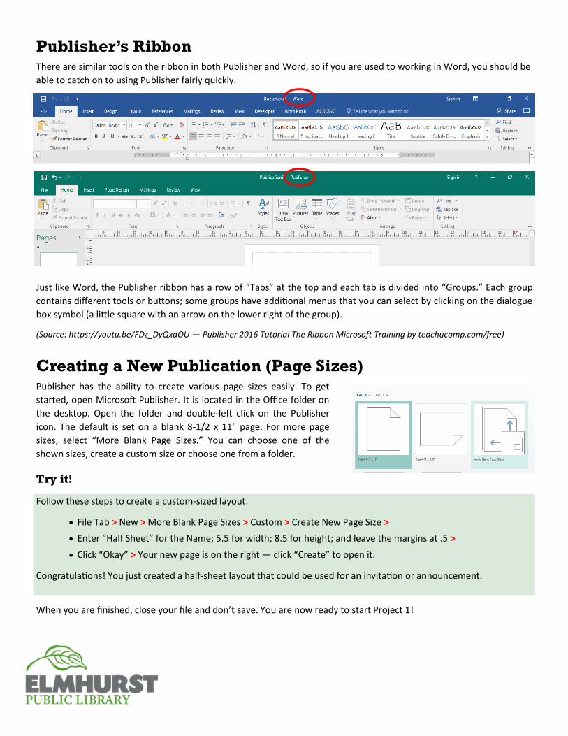
Publisher’s Ribbon There are similar tools on the ribbon in both Publisher and Word, so if you are used to working in Word, you should be
able to catch on to using Publisher fairly quickly.
Just like Word, the Publisher ribbon has a row of “Tabs” at the top and each tab is divided into “Groups.” Each group
contains different tools or buttons; some groups have additional menus that you can select by clicking on the dialogue
box symbol (a little square with an arrow on the lower right of the group).
(Source: https://youtu.be/FDz_DyQxdOU — Publisher 2016 Tutorial The Ribbon Microsoft Training by teachucomp.com/free)
Creating a New Publication (Page Sizes) Publisher has the ability to create various page sizes easily. To get
started, open Microsoft Publisher. It is located in the Office folder on
the desktop. Open the folder and double-left click on the Publisher
icon. The default is set on a blank 8-1/2 x 11" page. For more page
sizes, select “More Blank Page Sizes.” You can choose one of the
shown sizes, create a custom size or choose one from a folder.
Try it!
Follow these steps to create a custom-sized layout:
File Tab > New > More Blank Page Sizes > Custom > Create New Page Size >
Enter “Half Sheet” for the Name; 5.5 for width; 8.5 for height; and leave the margins at .5 >
Click “Okay” > Your new page is on the right — click “Create” to open it.
Congratulations! You just created a half-sheet layout that could be used for an invitation or announcement.
When you are finished, close your file and don’t save. You are now ready to start Project 1!
Project 1: Business Card The purpose of this project is to learn how to use several Publisher tools while also learning four basic design princi-
ples. You will be using a document saved to the desktop that contains a business card layout with text boxes that you
can manipulate to create a better design.
Four Design Principles*:
Proximity — Grouping like items
Alignment — Visual connection (aligning left, right, center or with other elements in the layout)
Repetition — Visual elements (repeating colors, shapes, fonts, sizes, line thickness, etc.)
Contrast — Visual interest (contrasting elements should be very different or they may cause confusion.
Try It!
1. Open the file named “My Business Card_student” (double left-click). Notice how the elements on the page look
disorganized and how your eye moves from element to element without a specific order. You can make this and
other designs look better just by following a few design principles.
2. To correct the design, make a copy to work on by duplicating the card in the “Pages” pane on the left side of the
layout. Right-click on the thumbnail and choose “Insert Duplicate Page.”
3. In the duplicate layout, practice moving the elements by selecting the boxes and dragging them onto the
“scratch area” outside the business card. (Select a text box and left-click on any edge of the box, keep pressing
the button and drag the box with the mouse.)
4. Drag the “Sewing Nook” box to the top of the card and center it. Notice there are guidelines for margins that are
set to .125" (1/8"). (Margins are in the “Page Design” tab > “Page Setup” group > “Margins” menu.)
5. Center “Mary Jane Smith” below “Sewing Nook.” If you slowly drag the box, a center line appears. Let go of the
mouse button when you see the center line. (NOTE: You can also use the arrow keys to move elements.)
6. Move the street address box to the card and center it. The address itself is left aligned. Left-click anywhere on
the address line, then click the “Center” tool on the ribbon (“Home” tab > “Paragraph” group > “Center” icon).
7. Place your cursor after the “d” in “Road” and press the “Enter” key to create a new line. Notice the red dots —
this indicates there is hidden text or space in the box. Left-click on the bottom center handle and drag it down-
ward to make the box larger. The red dots will disappear.
8. Left-click and drag over the city, state and zip. While highlighted, right click and choose copy. Then place your
cursor under the street address, right-click and choose paste. In the “Paste Options” box, choose the icon on the
right, “Keep Text Only.” This will cause the new text to take on the formatting of the line to where it is being
pasted. Copy and paste the phone number in the same way.
9. Next, move the web address to the bottom of the card, center it and make it bold (select the whole address and
click the “B” on the mini pop-up menu or on the ribbon — “Home” tab > “Font” group > “B”).
10. Adjust the vertical spacing between the elements to make it more even, if needed. Delete text boxes left in the
scratch area that are no longer needed. (Click on an outer line of the box and press the “Delete” key.)
11. Success! You have now grouped like items; visually connected the elements with vertical alignment; repeated the
same-sized font for on the address and phone number to give them like importance, and used bold for contrast.
12. Now practice using more contrast and rearranging the elements to come up with an even more interesting design.
(See next page for design suggestions.)
*Source: Williams, Robin. The Non-Designer’s Design Book, 2nd ed. Berkeley, CA: Peachpit Press, 2004.
Business Card Design Suggestions:
Change the font size of “Sewing Nook” to 36 and the font color to white. (“Home” tab > “Font” group > Font
Color tool (click on drop-down menu arrow to select a color).
Change the background of the “Sewing Nook” text box to black by selecting the “Format” tab under “Drawing
Tools.” (Drawing and Text Box tabs pop up on the ribbon when a text box is selected.) Choose the “Shape Fill”
menu (looks like a little bucket) and select black. Stretch the text box to the edges of the business card by
clicking on and dragging the handles of the box.
Change the font size of “Mary Jane Smith” to 20 and turn off “bold.” Stretch the text box, if needed.
You’ve made a lot of improvements at this point, but making the white space around the text a little less even will
create better contrast. Try putting the address and phone number on one line and placing the web address below it:
Select the address and phone number and change the font size to 9. Add a comma and a space after “Road,”
then click the delete key to bring the city, state and zip up to the same line. (Stretch the text box, if needed.)
Add a space, a vertical line and another space after the zip code, then click the delete key to bring the phone
number up. (Hold down the “Shift” key and press the back-slash key for the vertical line).
Change the font size of the web address to 12.
Move the address, phone and web site text boxes to the lower part of the card, adjust the location of the
name text box, and when it looks right, your design is finished!
Project 2: Birthday Card The purpose of this project is to learn how to use a template in Publisher and change it to fit your needs. You’ll create
your design on an 8-1/2 x 11" sheet, which can be printed and folded into a card.
1. Choose a card template by going to File > New and then select “Cards” under the search box. Select the “Mother’s
Day” card and click the “Create” button.
2. On page 1, change “Happy Mother’s Day” to “Happy Birthday”. Choose a font size and color.
3. Click on page 2 in the Pages pane on the left, select all the text and change it to: “Wishing you the best birthday
ever!” Change the font size, color and alignment (centered).
4. Click on page 3 in the Pages pane and change the color of the phrase, “Made for you with love.”
5. To change the images, go to the Master Page view. (“View” tab > “Views” group > Master Page). Placing items on
the master pages “locks” them so they can’t be moved on the regular pages.
6. Click on the “Insert” tab and select “Online Pictures.” Enter the word “Balloons” in the search box, choose an image
that you like, and click on the “insert” button. Resize the image by dragging the corner handle.
7. Drag a box around the flower image and delete it. Move the new image to the center.
8. Pull guidelines from the rulers if needed to align elements on the page.
9. Replace the remaining flower images using the steps above. Then close the Master Page view (left-click the big red
“X” on ribbon). Re-open the Master Page view if you need to make more adjustments.
10. Go to File > Print, to see how your file will look when it is printed. Note that “Top-fold, quarter sheet” is pre-
selected for this template.
Learn More Online
Online Publisher classes are available through the library's web
site at Lynda.com (you must have an Elmhurst library card
number and PIN). Go to: eLibrary > eLearning > Lynda.com