Embed Size (px)
Citation preview

DERIVING HEURISTICS FROM POLITICAL SPEECHES FOR UNDERSTANDING STATISTICS ABOUT SOCIETY
Jim Ridgway*, Phoebe Arnold**, Will Moy** and Rosie Ridgway*
*University of Durham, UK **Full Fact, UK
[email protected] Many governments adopt the mantra of ‘evidence informed policy’ and use ‘evidence’ to justify political decisions. Active citizenship requires an understanding of appropriate and inappropriate uses of statistics about society. A number of groups are dedicated to checking the claims made by politicians, and produce commentaries based on careful analyses of data sources and interpretations. Here, we use the commentaries of one such group (Full Fact) as a source of insight into some misleading statements made by politicians. These lead directly to heuristics that can be employed when faced with evidence claims. Further, the examples provide a basis for a framework for conceptualizing ‘statistical literacy’ in a data rich world. INTRODUCTION
Social statistics are multivariate and are distributed across multiple sources (e.g. Ridgway, 2015). Citizens who encounter social statistics do so in a particular context – often in the form of messages designed to persuade them about the correctness of a particular course of action (planed or past). Examples include political debates, and newspaper articles. Understanding statistics about society requires some understanding of the ways that evidence can be used to inform policy, understanding ways in which evidence is used as a warrant to justify policy decisions that have been made largely on political grounds, and ways that evidence is used to demonstrate the effectiveness of some policy that has been introduced. If statistics education is to promote an understanding of statistics about society, a goal should be the development of heuristics by students which enable them to deconstruct and analyse claims about social statistics (a heuristic is a rule of thumb which is usually - but not always - helpful. See e.g. Tversky and Kahneman (1974))
How might one begin to identify, then teach these heuristics? A first step is to examine use and misuse of evidence in political speeches. Such an analysis can provide both the basis for the development of heuristics, and examples which can be incorporated directly into teaching materials. Fortunately, a number of agencies are devoted to careful analysis of evidence presented in the public domain, and are committed to promoting change in the way powerful people use statistics. These (non-parizan) organisations include: Full Fact, the UK’s leading independent fact checking organization; Washington Post’s Fact Checker, and Politifact in the USA; Chequeado in Argentina; and AfricaCheck.
METHOD
One can identify four distinct phases of policy making where evidence can be relevant. First is in problem identification - is there really an issue to be resolved? Second is causal explanation – are the stories being told about the causes of the problem actually plausible? Third is the plausibility of the solution and the fourth relates to evaluating success. We conducted a secondary analysis of three examples from the extensive collection of analyses published on the Full Fact website, chosen to illustrate heuristics relevant to each of these phases. We identified assertions which were judged to be unsupported (and sometimes wrong), and created heuristics that we believe would sensitise readers to such unwarranted
IASE 2016 Roundtable Paper – Refereed Jim Ridgway, Phoebe Arnold, Will Moy & Rosie Ridgway
In: J. Engel (Ed.), Promoting understanding of statistics about society. Proceedings of the Roundtable Conference of the International Association of Statistics Education (IASE),July 2016, Berlin, Germany. ©2016 ISI/IASE iase-web.org/Conference_Proceedings.php

assertions. It is important to note that in a very large number of the examples checked by Full Fact, politicians (and others) are shown to cite and use data appropriately.
RESULTS Should we reform hospital services?
The UK Secretary of State for Health (Jeremy Hunt) announced changes to the contracts of junior doctors in 2015 (for example, not paying a higher hourly rate until after 10pm at night, and more weekend working) and doctors have responded by striking for the first time in 40 years. One argument used by Mr Hunt in support of this policy was that deaths in hospital are higher at weekends. “…someone is 15% more likely to die if admitted on a Sunday than on a Wednesday because we do not have as many doctors in our hospitals at the weekends as we have mid-week. …we have about 200 avoidable deaths every week in our hospitals.” Hunt (13 Oct 2015).
Note that there are several claims here: first, that hospital admissions on a Sunday are associated with higher death rates than admissions on a Wednesday; second that these deaths are avoidable; and third that there is a single cause of increased mortality: inadequate hospital staffing.
A number of these claims are contested, and an analysis leads to some useful heuristics for statistical literacy. Some supporting evidence for Hunt’s claim can be found in a paper by Freemantle et al (2012) who analysed all deaths within 30 days of admission to hospitals in England in the financial year 2009/10, using statistical models which set out to take account of a range of covariates such as disease classification, comorbidity, emergency or non-emergency admission, sex and ethnicity. They, indeed, concluded “Admission at the weekend is associated with increased risk of subsequent death within 30 days of admission.” (p75). However, the following sentence reads “The likelihood of death actually occurring is less on a weekend day than on a mid-week day”. (p75). The relative hazard ratios (Sunday vs Wednesday) were 1.16 [95% CI 1.14 to 1.18] and (Saturday vs Wednesday) 1.11 [95% CI 1.09 to 1.13]. (It is not clear why the authors chose to compare different time intervals). Freemantle et al (2012) cite data from comparable hospitals in the USA which show a similar pattern. These data reveal some of the problems of ‘evidence informed policy’, and the need for sophisticated statistical literacy. Data claims below are taken from Freemantle et al (2012).
There are interesting measurement issues – 30% of deaths occur within 3 days of admission to hospital, and about one third of patients die after discharge from hospital. Heuristic: what is being measured and how? Does the measure make sense in the context of the decision to be made?
There are questions about sample bias – a lower proportion of patients are admitted on weekend days than on week days (about 0.75); of these, a higher proportion are for emergency treatment. Heuristic: are you comparing like with like?
The statements by Hunt make causal assertions: 200 deaths per week are avoidable; people are more likely to die if admitted on a Sunday because we do not have as many doctors at the weekends. The first assertion is unfounded; the second is highly speculative. This can be illustrated by evidence in a paper (Palmer et al, 2012) which provides evidence to support another of Hunt’s assertions. “At the moment we have an NHS where if you have a stroke at the weekends, you’re 20% more likely to die” Hunt (2016). Palmer et al (2012), however, point to a number of possible causes for the differences in morbidity; a large difference was observed in the proportion of patients for whom a same-day brain scan was available, and for whom thrombolysis was available; they pointed to possible differences in case-mix between weekday and weekend patients; and possible differences
IASE 2016 Roundtable Paper – Refereed Jim Ridgway, Phoebe Arnold, Will Moy & Rosie Ridgway
- 2 -
in the availability of a range of ancillary services (such as lab reports). None of these are related to the availability of doctors. Heuristic: look carefully at causal inferences – beware the ‘third variable’ problem Heuristic: look for all the data relevant to the proposed solution
The caveats offered by Palmer et al (2012) are particularly important in the context of improving hospital services; will the provision of more doctors, without access to appropriate medical evidence, actually improve patient outcomes? Would the provision of 7-day laboratory services improve the mortality figures, without additional doctors? And so on.
We are reducing poverty?
Ellman (2015) in a question to the Prime Minister asserted “Absolute poverty up by 300,000”. The Prime Minister responded “I am afraid that the hon. Lady’s statistics are simply wrong…the fact is that there are 600,000 fewer people in relative poverty”.
This exchange highlights problems around the relationship between different measures of a social phenomenon. It appears that the questioner has asked about one statistic, and the respondent comments on a different statistic. The exchange does credit to neither party. First, Ellman provides accurate data about the increase in children in absolute poverty, from the Social Mobility and Child Poverty Commission. (2104, p25). However, the total number of people in absolute poverty before housing costs actually increased by 800,000 people since 2010/11. The Prime Minister offers a different measure taken over a different time period.
The political exchange raises issues that are central to any analysis of social phenomena, namely, finding ways to measure a complex construct. One can take ‘poverty’ as an example. Here, the politicians referred to both relative and absolute poverty.
For international agencies, absolute poverty measures poverty in relation to the amount of money necessary to meet basic needs such as food, clothing, and shelter. For example, the international standard of extreme poverty is set to the possession of an income of less than 1$ a day (UNESCO, 2016). However, this ignores broader concepts such as the quality of life, or issues such as the level of inequality within a society. Measures of relative poverty set out to take account of social and cultural needs (being able to do what most other people in a society do), and so assess poverty relative to the economic status of other members of a society. In the UK, a household is in relative poverty if its income is below 60% of the median household income. Income is assessed after taxes and benefits are taken into account. A further adjustment is to take account of the number and composition of people in the household (so called equivalised incomes) (Department for Work and Pensions, 2014).
The UK measure of absolute poverty is unlike the UNESCO measure. Income is judged relative to a benchmark established in 2010/11 (again, households whose income is less than 60% of the national median income, adjusted for taxes, benefits and household composition), adjusted for inflation. The measure of relative poverty has some interesting properties. If median national income goes down, relative poverty goes down. If relative poverty is the sole measure of poverty, in the most extreme example where a state collapses and no-one earns any money, the measure would show that no-one is in poverty.
Similarly, absolute poverty provides no information on social inequality, or changes in what is seen as a minimum acceptable standard of living. Both measures are useful; both offer partial but not complete insights into the scale of poverty (e.g. neither of the UK measures takes account of homeless people, or people in care homes). Heuristic: complex phenomena cannot be measured in simple ways; inspect multiple measures, and think carefully about the properties of each
IASE 2016 Roundtable Paper – Refereed Jim Ridgway, Phoebe Arnold, Will Moy & Rosie Ridgway
- 3 -
Vote for us?
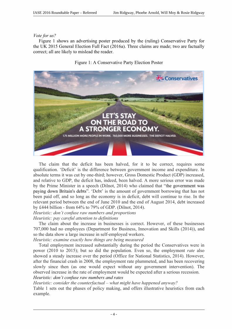
Figure 1 shows an advertising poster produced by the (ruling) Conservative Party for the UK 2015 General Election Full Fact (2016a). Three claims are made; two are factually correct; all are likely to mislead the reader.
Figure 1: A Conservative Party Election Poster
The claim that the deficit has been halved, for it to be correct, requires some qualification. ‘Deficit’ is the difference between government income and expenditure. In absolute terms it was cut by one-third; however, Gross Domestic Product (GDP) increased, and relative to GDP, the deficit has, indeed, been halved. A more serious error was made by the Prime Minister in a speech (Dilnot, 2014) who claimed that “the government was paying down Britain's debts”. ‘Debt’ is the amount of government borrowing that has not been paid off, and so long as the economy is in deficit, debt will continue to rise. In the relevant period between the end of June 2010 and the end of August 2014, debt increased by £444 billion - from 64% to 79% of GDP. (Dilnot, 2014). Heuristic: don’t confuse raw numbers and proportions Heuristic: pay careful attention to definitions
The claim about the increase in businesses is correct. However, of these businesses 707,000 had no employees (Department for Business, Innovation and Skills (2014)), and so the data show a large increase in self-employed workers. Heuristic: examine exactly how things are being measured
Total employment increased substantially during the period the Conservatives were in power (2010 to 2015); but so did the population. Even so, the employment rate also showed a steady increase over the period (Office for National Statistics, 2014). However, after the financial crash in 2008, the employment rate plummeted, and has been recovering slowly since then (as one would expect without any government intervention). The observed increase in the rate of employment would be expected after a serious recession. Heuristic: don’t confuse raw numbers and rates Heuristic: consider the counterfactual – what might have happened anyway? Table 1 sets out the phases of policy making, and offers illustrative heuristics from each example.
IASE 2016 Roundtable Paper – Refereed Jim Ridgway, Phoebe Arnold, Will Moy & Rosie Ridgway
- 4 -

Table 1: Heuristics ~Relevant to Each Phase of Policy Making
Phase
RelevantHeuristic
ProblemIdentification Shouldwereformhospitalservices?whatisbeingmeasuredandhow?areyoucomparinglikewithlike?
CausalExplanation Shouldwereformhospitalservices?bewarethe‘thirdvariable’problem
EvaluatingthePlausibilityoftheSolution Shouldwereformhospitalservices?bewarethe‘thirdvariable’problemlookforallthedatarelevanttotheproposesolution
EvaluatingSuccess Arewereducingpoverty?complex phenomena cannot be measuredin simpleways; inspectmultiplemeasures,and think carefully about theproperties ofeachVoteforus?don’tconfuserawnumbersandproportionspaycarefulattentiontodefinitionsexamine exactly how things are beingmeasureddon’tconfuserawnumbersandratesconsider the counterfactual – what mighthavehappenedanyway?
CONCLUSION
Statistics often provide a firm foundation for policy and action. Politicians make extensive use of evidence in their speeches, sometimes making appropriate use of evidence, and sometimes making mistakes. The three examples used here have been used to derive heuristics that reflect some aspects of statistical literacy, relevant to each phase of the policy making process. These heuristics have a number of potential uses – as a guide to citizens to contribute to statistical literacy, to politicians (and their speech writers) to help them avoid errors in the future, and in statistics education. For statistics educators, the heuristics can contribute to a broader framework of what it means to be statistically literate, and compliment important work done exploring the misuse of data in the media, such as misrepresentation in advertising, or misleading displays of information. (e.g. Best, 2012; Tufte, 2001); and studies focused on problems associated with interpreting tables and graphs, even when the data is presented in appropriate ways. (e.g. Schield, 2000).
In the context of education, the websites of fact checking organisations (such as Full Fact) provide contemporary, authentic examples of the misuse of evidence which is of direct relevance to students’ lives, and can provide vivid illustrations of the need for them to develop literacies relevant to understanding social statistics.
IASE 2016 Roundtable Paper – Refereed Jim Ridgway, Phoebe Arnold, Will Moy & Rosie Ridgway
- 5 -
ACKNOWLEDGMENT: The work reported in this paper was supported in part by ProCivicStat project, funded by the ERASMUS+ program of the European Commission. However the views and opinions expressed in this paper are those of the authors and do not necessarily reflect those of the funding agency. REFERENCES AfricaCheck (2016). https://africacheck.org/ Best, J. (2012). Damned Lies and Statistics. University of California Press: Orland, FL. Chequequeado (2106). https://chequeado.com/ Department for Business, Innovation and Skills (2014).
https://www.gov.uk/government/statistics/business-population-estimates-2014 Department for Work and Pensions. (2014). Households Below Average Income.
https://www.gov.uk/government/statistics/households-below-average-income-hbai-199495-to-201213
Dilnot, A. (2014). https://www.statisticsauthority.gov.uk/wp-content/uploads/2015/12/letterfromsirandrewdilnottochrislesliemp03101_tcm97-44109.pdf
Full Fact (2016a). https://fullfact.org/factcheck/economy/campaign_posters_full_picture-37962 Ellmann, L. (2015). Hansard.
http://www.publications.parliament.uk/pa/cm201415/cmhansrd/cm150128/debtext/150128-0001.htm#15012836000002
Freemantle, N., Richardson, M., Wood, J., Ray, D., Khosla, S., Shahian, D., Roche, W., Stephens, I., Keogh, B., and Pagno, D. (2012). Weekend hospitalisation and additional risk of death: An analysis of inpatient data. J R Soc Med 105: 74-84 DOI 10.1258/jrsm.2012.120009 Hunt, J. (2015). Hansard.
http://www.publications.parliament.uk/pa/cm201516/cmhansrd/cm151013/debtext/151013-0001.htm#151013-0001.htm_wqn5
Hunt, J. (2016). Quoted in http://www.bbc.co.uk/news/health-35294637 Palmer, W., Bottle, A., Davie, C., Vicent, C., and Aylin, P. (2012). Dying for the
Weekend: A Retrospective Cohort Study on the Association Between Day of Hospital Presentation and the Quality and Safety of Stroke Care. Arch Neurol. Published online July 9, 2012. doi:10.1001/archneurol.2012.1030
Poiltifact (2016). http://www.politifact.com Ridgway, J. (2015) Implications of the Data Revolution for Statistics Education.
International Statistical Review, doi: 10.1111/insr.12110. Schield, M. (2000). Statistical Literacy: difficulties in describing and comparing rates and
percentages. Paper presented at the Joint Statistical Meeting, American Statistical Association. http://www.statlit.org/pdf/2000SchieldASA.pdf.
Social Mobility and Child Poverty Commission. (2104). State of the Nation 21014: Social Mobility and Child Poverty in Great Britain. HMSO: London. https://www.gov.uk/government/uploads/system/uploads/attachment_data/file/365765/State_of_Nation_2014_Main_Report.pdf#page=17
Tufte, E. (2001). The Visual Display of Quantitative Information (2nd edition). Cheshire, CT:Graphics Press.
Tversky, A., and Kahneman, D. (1974). Judgment under uncertainty: Heuristics and biases. Science, 185(4157), 1124-1131.
IASE 2016 Roundtable Paper – Refereed Jim Ridgway, Phoebe Arnold, Will Moy & Rosie Ridgway
- 6 -
UNESCO. (2016). Learning to Live Together. http://www.unesco.org/new/en/social-and-human-sciences/themes/international-migration/glossary/poverty/
Washington Post (2016) https://www.washingtonpost.com/news/fact-checker/
IASE 2016 Roundtable Paper – Refereed Jim Ridgway, Phoebe Arnold, Will Moy & Rosie Ridgway
- 7 -