Embed Size (px)
Citation preview

Department of Informatics
Bachelor's Thesis in Informatics
Analyzing State-of-the-art Self-Service BI Tools
Valérianne Walter

Department of Informatics
Bachelor's Thesis in Informatics
Analyzing State-of-the-art Self-Service BI Tools
Analyse aktueller Self-Service BI Werkzeuge
Valérianne Walter
Supervisor: Prof. Dr. Florian Matthes
Advisor: M.Sc. Thomas Reschenhofer
Submission date: 15. August 2015


2
I confirm that this bachelor's thesis is my own work and I have documented all sources and
material used.
Munich, 23. July 2015
Valérianne Walter

3
Abstract
While the data flows generated within a company grow more torrid and complex by the day,
the structures to contain this information adapt by becoming both more elaborated and
complicated to see through. In daily life business life on the other hand it has become of vital
importance for the average non-IT user to access and use this information to take business
relevant decisions.
This growing discrepancy between IT side and the needs of the average user is met by the
concept of self-service business intelligence. It can be understood as a layer hiding the
complexities of the IT structures below and enabling intuitive and simple handling of data.
There has been a growing amount of self-service BI solutions both by speciality vendors and
global IT players. Based on surveys conducted to work out the state-of-the art products in
the field, the goal of this thesis is to analyse the leading self-service business intelligence
front-end tools.
To do so, we elaborated seven steps in the making of reports as well as a concrete business
scenario to test the tools. This allowed us to make a structured review of each tool and work
out their common points and differences.

4
Contents
1. Motivation .................................................................................................................... 7
2. Scope .......................................................................................................................... 9
2.1. Relevant users ...................................................................................................... 9
2.2. Relevant sections of the BI data flow .................................................................... 9
2.3. Relevant self-service BI-tools .............................................................................. 10
2.4. Selection of tools ................................................................................................ 11
3. Literature review ........................................................................................................ 13
4. Method ....................................................................................................................... 14
5. Steps ......................................................................................................................... 15
5.1. Overview ............................................................................................................. 15
5.2. Data access ........................................................................................................ 15
5.3. Data modelling .................................................................................................... 16
5.4. Analysis .............................................................................................................. 17
5.5. Testing ................................................................................................................ 19
5.6. Presenting .......................................................................................................... 20
5.7. Collaboration ....................................................................................................... 21
6. Scenario .................................................................................................................... 23
6.1. Setting ................................................................................................................ 23
6.2. Content and structure of the report ..................................................................... 24
7. Tool analysis .............................................................................................................. 25
7.1. Microsoft Excel ................................................................................................... 25
7.1.1. General information ..................................................................................... 25
7.1.2. Data Access ................................................................................................ 26
7.1.3. Data Modelling ............................................................................................. 27
7.1.4. Data set analysis ......................................................................................... 30
7.1.5. Aggregate-level Analysis ............................................................................. 31
7.1.6. Presenting ................................................................................................... 33
7.1.7. Testing ......................................................................................................... 34
7.2. Excel with Power BI add-ins ................................................................................ 35
7.2.1. General aspects ........................................................................................... 35
7.2.2. Data access ................................................................................................. 35
7.2.3. Data modelling ............................................................................................. 38
7.2.4. Data set Analysis ......................................................................................... 41
7.2.5. Aggregate-level Analysis ............................................................................. 41

5
7.2.6. Testing ......................................................................................................... 43
7.2.7. Presenting ................................................................................................... 43
7.3. Tableau Desktop ................................................................................................. 44
7.3.1. General information ..................................................................................... 44
7.3.2. Data access ................................................................................................. 45
7.3.3. Data modelling ............................................................................................. 47
7.3.4. Analysis ....................................................................................................... 49
7.3.5. Testing ......................................................................................................... 51
7.3.6. Presenting ................................................................................................... 52
7.4. Qlik Sense Desktop ............................................................................................ 54
7.4.1. General information ..................................................................................... 54
7.4.2. Data Access ................................................................................................ 55
7.4.3. Data modelling ............................................................................................. 57
7.4.4. Analysis ....................................................................................................... 59
7.4.5. Testing ......................................................................................................... 61
7.4.6. Presenting ................................................................................................... 62
7.5. SAS Visual Analytics ........................................................................................... 64
7.5.1. General aspects ........................................................................................... 64
7.5.2. Data access ................................................................................................. 65
7.5.3. Data modelling ............................................................................................. 65
7.5.4. Analysis ....................................................................................................... 67
7.5.5. Testing ......................................................................................................... 69
7.5.6. Presenting ................................................................................................... 69
7.6. SAP Lumira......................................................................................................... 70
7.6.1. General aspects ........................................................................................... 70
7.6.2. Data access ................................................................................................. 71
7.6.3. Data modelling ............................................................................................. 72
7.6.4. Analysis ....................................................................................................... 73
7.6.5. Testing ......................................................................................................... 75
7.6.6. Presenting ................................................................................................... 76
7.7. IBM Watson Analytics ......................................................................................... 77
7.7.1. General aspects ........................................................................................... 77
7.7.2. Data Access ................................................................................................ 78
7.7.3. Data modelling ............................................................................................. 79
7.7.4. Analysis ....................................................................................................... 80
7.7.5. Testing ......................................................................................................... 83
7.7.6. Presenting ................................................................................................... 83

6
8. Concluding thoughts .................................................................................................. 84
8.1. Common features and differences between the tools .......................................... 84
8.1.1. General aspects ........................................................................................... 84
8.1.2. Data access ................................................................................................. 85
8.1.3. Data modelling ............................................................................................. 86
8.1.4. Analysis ....................................................................................................... 86
8.1.5. Testing ......................................................................................................... 87
8.1.6. Presenting ................................................................................................... 88
8.2. Trends in self-service BI...................................................................................... 88
8.3. Regarding the Gartner survey ............................................................................. 89
9. Appendix .................................................................................................................... 90
9.1. Figures and Tables ............................................................................................. 90
9.2. Excel Classic ...................................................................................................... 93
9.3. PowerPivot Add-ins ........................................................................................... 101
9.4. Tableau ............................................................................................................. 106
9.5. Qlik Sense ........................................................................................................ 113
9.6. SAS Visual Analytics ......................................................................................... 116
9.7. SAP Lumira....................................................................................................... 121
9.8. IBM Watson Analytics ....................................................................................... 125
10. References ........................................................................................................... 127

7
1. Motivation
With the digitalization of processes, the emergence of new technologies, the networking of
the world, businesses have now an ever-growing amount of data at their hand. The
companies have long noticed the potential that lies in the data that flows through and in and
out of their systems and the pricelessness of the knowledge it holds.
Raw data however is one thing, transforming it into usable knowledge quite another. The
process from one to the other is the core of the business intelligence concept. Indeed
according to Gartner’s definition:
“Business intelligence (BI) is an umbrella term that includes the applications, infrastructure
and tools, and best practices that enable access to and analysis of information to improve
and optimize decisions and performance.” [1]
It can therefore be summarized as the process of collecting, transforming, evaluating data
and taking decisions accordingly.
Decision making is the daily work of a large part of employees, in nearly every department
be it in human resources, controlling or marketing. The company employees need to assert
risks, increase sales and benefits, lower costs, on daily basis, in the most sensible way
possible and they need information for that. Up until recently there has been a gap in the
process with the very complex BI systems on one hand and the average non IT-user needing
the information in those BI systems to do his work on the other but who cannot possibly be
expected to see through the layers and technical details a business intelligence set up
implies. Indeed the focus of the BI development lay on the IT department and certain experts,
expected to fill this gap by providing the business with the information it requires through
standard queries and reports.
This concept entails two main issues. For one the IT department does not necessarily have
the manpower to meet the ever rising demand for information, develop an endless number
of queries and sustain the linked maintenance work. Another bottleneck is the communication
between the IT department and the data users. Both have to work closely together to
understand the needs on one side and the possibilities there are on the other. This may be
a time-consuming procedure bond to misunderstandings and frustration.

8
One way to solve this dilemma is to make the process of handling data manageable for the
mass enabling them to act more independently. In that sense we define self-service business
intelligence tools as software designed for the intuitive completion of analysis and reporting
tasks so as to make better business decisions.
According to the recent surveys of the leading technology and market research companies,
be it Gartner, Forrester or Barc, self-service BI is one of the most if not the most promising
trend in the business intelligence field. [2][ [3] [4].

9
2. Scope
2.1. Relevant users
As in any IT-setting, the needs and skills vary from user to user. There are power users and
experts on one hand and there are not so IT- affine users appealed by possibly less powerful
but more intuitive tools.
We define business users as users with a deep understanding and expertise of their business
area. They are no IT experts however, usually lacking in-depth knowledge about the
functioning of databases. They are used to the handling of spreadsheets and operative
systems. They are generally not disinclined to the learning of new tools if helpful to answer
their specific questions and able to spare them the constant back and forth with the IT-
department.
2.2. Relevant sections of the BI data flow
To understand what part of the BI processes we are about to discuss, we will take a look at
the overall BI data flow.
Although the concrete technical implementation may differ from business to business, the
basic organisation of a BI set-up remains the same in general. The classical BI data flow is
described in the diagram below. [5] [6]
Figure 2-1 Schema of BI work flow
Operative Systems Data repositories Sharing Platforms
External data sources
- ERP
- CRM
...
- OLAP
databases
- OLAP cubes
- Data marts
- Analysis
- Reporting
- Sharing
- Collaboration
- Viewing
BI applications

10
Table 2-1 Steps of BI workflow
At the very beginning of the process, the data is collected from various sources. This data is
still raw. Clean and structured data however is a vital requirement for knowledge acquisition.
The insights we get can only be as good as the data we put in. Through ETL-processes the
data is cleaned, structured and loaded into the data warehouse, a data basis especially
designed for analysis and decision support. The steps up to the storage of data have to be
guaranteed by the IT department. We will therefore presume that these steps are already
fulfilled in the context of our survey.
What we will focus on instead are the tools used to access, analyse and report on the
structured data deposited in the data storage.
2.3. Relevant self-service BI-tools
The idea of stuffing the gap between IT department and the business can be traced back to
the nineties already, when the BI vendors have started to develop so-called business query
tools [5]. In the initial setting-up of such a tool, the IT has to define business view metadata
layers for the tool to access. Afterwards power-users will be able to define queries on behalf
of the corresponding business users. Though they have been a start towards the
independence from the IT department, their focus has not been the business user as we
defined him above. There is still in intermediary in the form of power users acting as an
interface between business and IT and in virtually constant interaction with both to set-up the
queries and maintain them up-to-date.
The tools we will analyse belong to a new generation of self-service BI, the visual data
discovery tools. Their target being the business-user, their goal consists in meeting the
1 Data Generation
2 Data Integration
3 Data Storage
4 Data Access
5 Data Assessment
6 Data Sharing
7 Data Usage

11
interest of latest for intuitive, performing tools with an emphasis on analysis functions and
above all data visualization.
2.4. Selection of tools
Since a complete evaluation of all the self-service BI tools on the market would go beyond
the constraints of a bachelor thesis, we have decided to focus on the self-service solutions
of the most important vendors in the BI market.
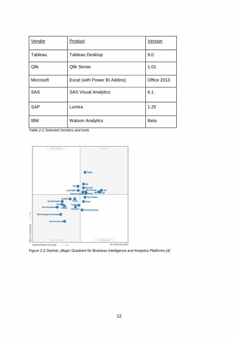
In a yearly survey, Gartner, a world leading IT research and advisory company, ranks BI
businesses through the so-called „Magic Quadrant for Business Intelligence and Analytics
Platforms“ [4]. Based on this Quadrant, we picked the following vendors to have a closer look
at their self-service BI-tools.
- Tableau, Qlik, Microsoft as the top-three regarding their “Ability to execute”. This
category of criteria focusses mainly on the ability of the company to sell their products.
- SAS, SAP, IBM as the top-three regarding their “Completeness of Vision”. This
category on the other hand mainly contains criteria to evaluate the assets of the sold
tools.
Tools from both sets of criteria are interesting to consider. Through the first set we can draw
conclusions on what tools are most widely used whereas the second set gives us a hint on
the products that are best at meeting the old and especially the new trends of the market.
12
Vendor Product Version
Tableau Tableau Desktop 9.0
Qlik Qlik Sense 1.01
Microsoft Excel (with Power BI Addins) Office 2013
SAS SAS Visual Analytics 6.1.
SAP Lumira 1.25
IBM Watson Analytics Beta
Table 2-2 Selected Vendors and tools
Figure 2-2 Gartner „Magic Quadrant for Business Intelligence and Analytics Platforms [4]
13
3. Literature review
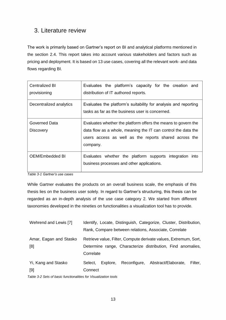
The work is primarily based on Gartner’s report on BI and analytical platforms mentioned in
the section 2.4. This report takes into account various stakeholders and factors such as
pricing and deployment. It is based on 13 use cases, covering all the relevant work- and data
flows regarding BI.
Centralized BI
provisioning
Evaluates the platform’s capacity for the creation and
distribution of IT authored reports.
Decentralized analytics Evaluates the platform’s suitability for analysis and reporting
tasks as far as the business user is concerned.
Governed Data
Discovery
Evaluates whether the platform offers the means to govern the
data flow as a whole, meaning the IT can control the data the
users access as well as the reports shared across the
company.
OEM/Embedded BI Evaluates whether the platform supports integration into
business processes and other applications.
Table 3-1 Gartner’s use cases
While Gartner evaluates the products on an overall business scale, the emphasis of this
thesis lies on the business user solely. In regard to Gartner’s structuring, this thesis can be
regarded as an in-depth analysis of the use case category 2. We started from different
taxonomies developed in the nineties on functionalities a visualization tool has to provide.
Wehrend and Lewis [7] Identify, Locate, Distinguish, Categorize, Cluster, Distribution,
Rank, Compare between relations, Associate, Correlate
Amar, Eagan and Stasko
[8]
Retrieve value, Filter, Compute derivate values, Extremum, Sort,
Determine range, Characterize distribution, Find anomalies,
Correlate
Yi, Kang and Stasko
[9]
Select, Explore, Reconfigure, Abstract/Elaborate, Filter,
Connect
Table 3-2 Sets of basic functionalities for Visualization tools
14
The relevant functionalities of the selected tools were mainly determined through the
instructions and user guides provided by the according vendors and with the help of teaching
books when needed. A complete list can be found in the references part.
4. Method
This analysis has three points of departure. To evaluate each tool in a structured way, we
related to the taxonomies for visualization tools described above. To concretize or
complement these taxonomies, we set up a list of questions that may be of interest for the
user.
The taxonomy elements and the questions were associated to the different steps in the
creation of a query, ranging from accessing the data to testing the developed applications.
To complement the analysis and provide further insights on aspects that are possibly not
covered by either the taxonomies or the questions, we developed a concrete business
scenario to re-enact with each of the tools.
The concrete implementation of the functionalities described in the taxonomy, the questions
and the implementation of the scenario were analysed/answered/performed with the actual
tools.

15
5. Steps
5.1. Overview
In the context of self-service business intelligence we identified 6 typical steps in the making
of queries. They sum up the typical needs and actions of the business users and the ensuing
interactions between user and tool.
Steps
1 Importing of data
2 Data Modelling
3 Analysis
5 Testability
6 Presenting
7 Sharing
Table 5-1 Steps in the creation of reports
5.2. Data access
Before starting to analyse and report, the user first needs to access the data to work on. The
first step will therefore be to establish a connection to the according data sources.
The user may need to access a variety of different sources, some internal sources such as
relational databases and multidimensional cubes as well as sources from the outside
possibly unstructured data, such as tweets or newsfeed. He may also want to integrate files
of his own to have a wider set of data at hand.
Questions here are:
- What are the interfaces to other tools/systems?
- What database vendors are supported?
- Can the user combine data sources?

16
- Can the user import files of his own? What possibilities does he have to integrate
them in his analysis? What type of files can the user import?
- Has the user the possibility to make changes to the data set upon importing?
5.3. Data modelling
Once imported, the data needs to be presented in a structured way. We call this structure
the data model and the elements within data objects.
Functionalities Description
Distinguish Make data object recognizable as such through clear
definitions and labelling
Categorize Class data objects into certain categories
Associate Establish relations between data objects
Compute derived values Develop formulas to derive new data objects from the attributes
of the initial ones
Table 5-2 Functionalities related to Data Modelling [7] [8]
Questions here are:
- What data objects are there? How are they defined?
- What data types are there?
- What types of association are there?
- Can the user extend the data model with objects of his own?
- What type of calculations can be performed?
- What kind of out-of-box functions are there?
17
5.4. Analysis
a) Basic analysis
The next steps are about the actual data analysis. The first move hereby will be to extract
the main characteristics of a given data set.
Functionalities Description
Locate Find a specific data object with corresponding attributes
Filter Find data objects with corresponding attributes
Sort Arrange data objects according to specific attribute such as
amount, size or alphabetically
Rank Select a certain amount of data objects that stand out regarding
a specific criteria such as amount, size, percentage
Determine Range Find the span of values regarding a certain attribute of a data
object
Find extremums Find the data object that has the maximum or minimum
regarding a certain attribute
Table 5-3 Basic functionalities related to analysis [7] [8]
b) Visualization
Another important aspect as far as analysis is concerned, is the visualization of data.
Important taxonomy elements related to this are described in Table 5-4 .
Cluster Find out categories of objects that share common points
Characterize Distribution Find out how data objects are distributed in regard to a certain
attribute
Correlate Find (causal) connections between data objects

18
Compare between
relations
Compare set of data objects
Table 5-4 Functionalities related to visual analysis [7]
There has been a lot of research on the optimal methods to visualize large amount data. In
line with the taxonomies in Table 5-4, Stephen Few, an imminent authority in the field of data
visualization defined seven types of analysis and suited visualizations.
Analysis Description Classical Chart
Nominal comparison Compare objects according to one
or more attributes
Bars, Pie charts
Time-series Show development of an attribute
over time
Line charts, bar charts,
Trend Lines
Ranking Compare only a certain amounts of
objects according to one or more
attributes
Bar charts
Part-to-whole Determine the share of certain data
objects or groups of data objects to
an aggregated value
Pie charts, bar charts, heat
charts, tree maps, maps
Deviation Visualize how much a data object
deviates from a certain value
Box plots, bar charts
Distribution Determine the distribution of values
across the full quantitative range
Box plots, histograms
Correlation Identify potential relationships
among attributes
Scatter plots, line/bar
charts
Table 5-5 Visual analysis types and their charts [10]
c) Interactive analysis
Another important aspect as suggested by the taxonomy proposed by Stasko at. al [9] is
the possibility for interactive analysis.

19
Select Highlight a special point of interest
Explore Show me something
Reconfigure Show data objects in a different arrangement
Connect Show connected data objects
Encode Arrange the data objects in a different way
Abstract/ Elaborate Show more details, less details
Filter Find data objects with corresponding attributes
Table 5-6 Examples of visual operations [9]
Questions here are:
- What is the underlying concept for analysis?
- Are there out of the box solutions? Or does the implementation require scripting?
- What type of functions does the tool provide?
- How can the user create charts?
- What types of chart are supported?
- On what level do we analyse our data?
- What operations are there on charts?
5.5. Testing
After finishing with his analysis, the user will have to test, whether the results are actually
correct. There are various types of error sources mostly in the very first steps. In order to
avoid propagation through the analysis the user has to keep an eye on those error sources,
while checking the results.
Error sources Description
Data quality The data source might already contain errors, missing values,
inconsistencies.

20
Data access Another error source is the usage of self-written queries, where
it is all too easy make mistakes especially when not fully
understanding the underlying data structure.
Data modelling The user will need to associate his data objects in a sensible
way connecting the right tables with the proper keys.
Then when extending his data model, the user will need to
make sure of the correctness of the formulas he used.
Table 5-8 Examples of error sources
Questions here are:
- Are there specific error sources for that tool?
- What is the strategy as far as errors are concerned?
- How does the tool tackle the error-sources named above?
5.6. Presenting
Eventually the user may want to organize his visualizations so as to present them to a wider
range of persons. The formats may vary depending on the required aggregation level.
Functionalities Description
Design Report Design a systematic document to relay information about e.g.
figures, developments
Design Dashboard Special type of report, summarizing the most important
information about a subject on a single page
Design Story Special type of report in the form of a slide-show, using
visualizations to describe developments and connections
Export Export of visual objects to other tools suited for presenting (e.g.
PowerPoint)
Table 5-7 Options to make visualizations presentable
21
Questions here are:
- What type of files can the user export?
- Does the tool provide integrated presenting functionalities?
- Can the user integrate files (images, videos …) into his report?
- Does the tool give the possibility to create interactive dashboards/stories?
5.7. Collaboration
As a final step the user may want to share the results of his work with his team for changes
and improvements or make the results available to others for viewing. The tools should
therefore support collaborative work.
Functionalities Description
Sharing Make the report available to several (chosen) users for
reading/ writing operations
Discussing/Commenting Allow the users to add comments, discuss the report, without
changing its functionality
User access
synchronisation
Synchronized access to the report:
possibility to work on the same report at the same time or if
consistency is not guaranteed, mechanism to prevent parallel
access
Filtering Only show data objects of interest for specific users
Extend report Add tables, diagrams, measures, objects
Table 5-8 Ideas for collaboration and sharing
Questions here are:
- What possibilities does the user have to share his reports? Are there special
platforms linked to the self-service tool?
- Are there versions that support multiple user access?
- What options are there to design the data access?

22
Since an in-depth analysis of this step would require the set-up of a whole platform, we
deliberately decided against evaluating this step. This however would be an exciting
continuation of this survey.

23
6. Scenario
6.1. Setting
The scenario described here deals with a controller team for a large producer of sweets.
Each month, the team has to compile reports giving an overview and an analysis over the
sales achieved this month (this is only one of many reports of course). Up to now they have
relied on standard reports designed for them by the IT, that they would then revise using
spreadsheets.
But the market, the requirements, the questions keep on changing. For that reason the IT
department and the controller team have decided to work on a self-service BI solution so as
to enable the controller team to design and change their reports when they need.
In the context of this work we will accompany the controller team in the making process of
new reports using the different self-service tools we have picked above. The following figure
gives a short overview of the sales structures of the company.
Figure 6-1 Geo-structure and product-structure for the scenario
Overall
Region 1
District 1
District 2
District 3
Region 2
District 4
District 5
District 6
Region 3
District 7
District 8
District 9
Region 4
District 10
District 11
District 12
Region 5
District 13
District 14
District 15
Products
Line 1
Subline 1
Subline 2
Subline 3
Line 2
Subline 1
Subline 2
Subline 3
Line 3
Subline 1
Subline 2
Subline 3
Line 4
Subline 1
Subline 2
Subline 3
24
6.2. Content and structure of the report
The reports are dashboards containing both tables and charts. The team compiled a list of
questions they would like the dashboards to answer:
- How are the overall sales compared to the overall target?
- How does the YTD sales figure evolve compared to the set YTD target?
- How are the sales by product?
- How are the sales by product and by region?
- What is the contribution of the sublines to the YTD?
- What are the top 3 selling districts?
- How do the sales correlate with the average temperature (An important factor for
selling sweets, ice cream doesn’t sell so when it’s cold, chocolate not so well when
it’s warm outside)
The sales and the information on the weather situation of the corresponding months are
saved in separated Excel-sheets that will have to be combined in the course of the creation
process.

25
7. Tool analysis
7.1. Microsoft Excel
7.1.1. General information
Microsoft Excel has been the prevailing tool regarding data organization, analysis and
reporting for decades now.
Excel is a spreadsheet tool. A spreadsheet is a set of cells containing formulas and is
organized into columns and rows. Over the years, through its intuitive usage and constant
extensions, Excel has become an all-rounder, its fields of application ranging from actual
application development to data maintenance work to data analysis and reporting.
This thesis will focus on latest, emphasizing on Excel’s functionalities related to classical self-
service BI tool tasks.
The basic program structure can be found in Figure 7-1. Most functionalities are grouped into
ribbons and most steps are performed within the workspace. The user can create several of
these sheets within a workbook so as to structure his work.
1 Workspace
2 Ribbons
3 Sheets
Figure 7-1 Excel Classic - Overall Interface
1
2
3

26
7.1.2. Data Access
a) Interface description
1 Get external data
sources
2 Connections
Figure 7-2 Excel Classic - Relevant interface element for Data Access
b) How to import data
The user can copy/paste his data into the workspace. The data cannot be refreshed then. To
make the data flexible to change, the user can create a data connection instead. Depending
on the data source there are different types of wizards to guide the user through the creation
process. The user may then refresh his data set when needed. Normally Excel only creates
a connection to the data source. To actually work on and with the data the user needs to
import the data into a worksheet as a table for instance.
Additionally there are several add-ins by different vendors, such as Live Office for SAP
Business Objects or Oracle Business Intelligence Spreadsheet add-in. With these add-ins
the user can import data from these sources too.
c) Supported data sources
- SQL Server tables
- SQL Server Analysis Services cubes
- Azure Marketplace data
- OData data
- XML data
- Access data
- Text file data
- Copy/Paste
2
1

27
For further sources:
- OLEDB (through Data Connection Wizard)
- ODCB (through Microsoft Query)
d) Operations on data set
The user is provided with a wide range of data transformation and manipulation possibilities.
He can change the content of virtually every cell within the workbook.
7.1.3. Data Modelling
a) Interface description
Figure 7-3 Excel Classic – Workspace
Figure 7-4 Excel Classic – Grouping within the Data ribbon
Figure 7-5 Excel Classic – Extending the data model with formulas
1 Rows
2 Columns
3 Cells
1 Grouping
2 Relationship
1 Functions
2 Formula
auditing
1
2
3
1
2
1 2

28
b) Data objects
Cells are the smallest data entity. They can contain virtually anything from images to figures
to dates to simple strings. Modelling of complex data objects and relations using cells only
however is difficult and error-prone.
Figure 7-6 Loose Cells within Excel
A series of rows and columns of cells that contain related data can be linked through a table.
The data object table includes functions such as filtering or sorting for organization and
analysis purposes.
Figure 7-7 Table within Excel
c) Data types
Number (Decimal), Number (Whole), Date & Time, Date, String, Boolean, Currency
d) Modelling relations
Create tables for relations
between cells
To create a link between loose cells, the user has the
possibility to create a table connecting these cells.

29
Formulas The user can connect cells and table columns through
formulas (see e))
VLOOKUP,INDEX
function
Vlookup is a special function that performs a vertical lookup by
searching a certain value in a column and returns a value at
the according row. Index() (in combination with the match
function) is a matrix calculation with a similar purpose.
Relation between tables
through data relations
The user is able to create relationships between tables using
one column in each table as key. Multiple columns cannot be
used as key. Inelegant workarounds for joining over multiple
keys include creating new helper columns, where the values of
the different columns are concatenated.
Grouping
Grouping can be used to organize selected columns and rows
into categories.
e) Extending the data model
On cell level On cell level the data model can be extended by filling a new
cell with a formula, a picture, a value etc.
On table level On table level the model can be extended by adding a new
column. Formulas in a table are automatically
completed/adjusted within a column.
There is a variety of function categories in Excel including text functions, logical functions,
look-up and reference functions and advanced statistical functions. A complete list can be
found at http://www.excelfunctions.net/ExcelFunctions.html.
30
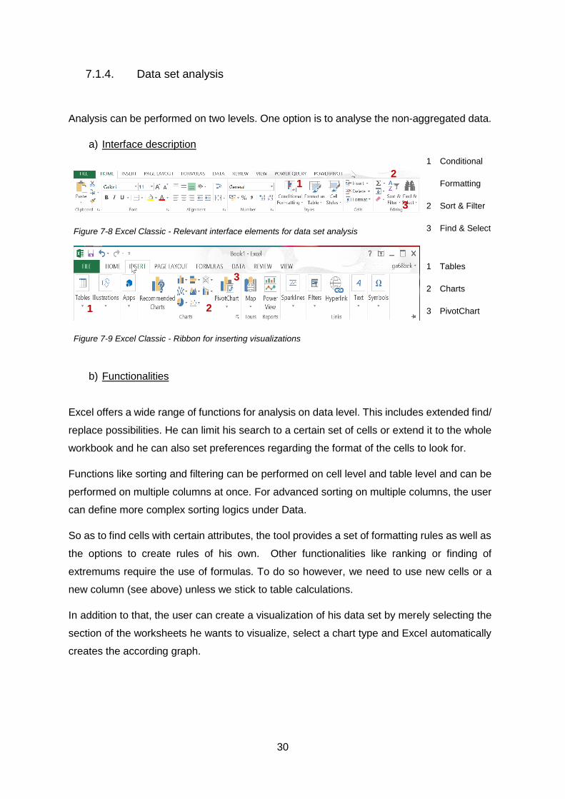
7.1.4. Data set analysis
Analysis can be performed on two levels. One option is to analyse the non-aggregated data.
a) Interface description
Figure 7-8 Excel Classic - Relevant interface elements for data set analysis
Figure 7-9 Excel Classic - Ribbon for inserting visualizations
1 Conditional
Formatting
2 Sort & Filter
3 Find & Select
1 Tables
2 Charts
3 PivotChart
b) Functionalities
Excel offers a wide range of functions for analysis on data level. This includes extended find/
replace possibilities. He can limit his search to a certain set of cells or extend it to the whole
workbook and he can also set preferences regarding the format of the cells to look for.
Functions like sorting and filtering can be performed on cell level and table level and can be
performed on multiple columns at once. For advanced sorting on multiple columns, the user
can define more complex sorting logics under Data.
So as to find cells with certain attributes, the tool provides a set of formatting rules as well as
the options to create rules of his own. Other functionalities like ranking or finding of
extremums require the use of formulas. To do so however, we need to use new cells or a
new column (see above) unless we stick to table calculations.
In addition to that, the user can create a visualization of his data set by merely selecting the
section of the worksheets he wants to visualize, select a chart type and Excel automatically
creates the according graph.
1 2
3
1 2
3
31
Category Example of charts that can be build
Column/Bar Clustered Column, Stacked Column, 100%-Stacked Column, Clustered Bar, Stacked Bar, 100%- stacked Column
Line Line, Stacked Line, 100%-Stacked Line, Line with markers
Area Area, Stacked Area, 100%-Stacked Area
XY (Scatter) Scatter with markers, no markers, smooth lines, straight lines Bubble charts
Stock Open-high-low-Close, High-low-close, Volume-Open-High-low-Close
Surface 3-D surface, Wireframe 3D-surface, Contour, Wireframe Contour
Radar Radar, Radar with markers, Filled Radar
Table 7-1 - Excel Classic - Visualization possibilities for classical charts
Additionally Excel provides some statistical elements to add to the chart such as box plots
and trend lines.
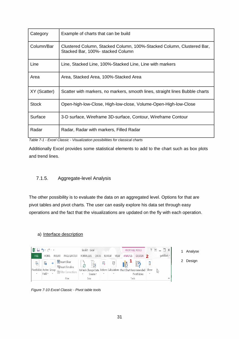
7.1.5. Aggregate-level Analysis
The other possibility is to evaluate the data on an aggregated level. Options for that are
pivot tables and pivot charts. The user can easily explore his data set through easy
operations and the fact that the visualizations are updated on the fly with each operation.
a) Interface description
Figure 7-10 Excel Classic - Pivot table tools
1 Analyse
2 Design
1 2

32
Figure 7-11 Excel Classic – Pivot chart tools
1 Analyse
2 Design
3 Layout
b) How to create a visual data object
For a pivot table To create a pivot table, the user should first select the according
columns in his workspace, he can then create the according pivot
table. So as to see data he then has to choose some fields and add
these to the different sections in the “PivotTable Fields” panel.
For a pivot chart
The procedure to create a pivot chart is similar to the one described
above. The user can create a pivot chart from a table or an existing
pivot table. He can then add fields to the different sections in the
“PivotChart Fields” panel.
c) Visualization possibilities
Category Example of charts that can be build
Pivot table -
Column/Bar Clustered Column, Stacked Column, 100%-Stacked Column, Clustered Bar, Stacked Bar, 100%- stacked Column
Line Line, Stacked Line, 100%-Stacked Line, Line with markers
Area Area, Stacked Area, 100%-Stacked Area
Table 7-2 Excel Classic - Visualization options for pivot charts
1 2 3

33
d) Multidimensional analysis
Depending on which parts of the PivotChart/PivotTable panel the fields are put, they can take
up different roles within the visualization. Fields used as Value are aggregated according to
the distinct values of fields used as row and/or as column in a pivot table ad
Drill down/Roll up
The user can add or remove more fields to use as a row or as a
column. If the data source contains hierarchies he can move up and
down the levels of these hierarchies (the user cannot define
hierarchies of his own with classical Excel however).
In a pivot chart, the user can choose a field to use as Legend to
differentiate between dimensions. The tool automatically creates a
colour gradient for the distinct values of the dimension.
Slice/Dice The user can add the according fields on which to filter to the Filter
section of the panel or create a slicer for more interactive filtering.
Pivot The user can simply change the roles of the fields (switch Region and
Line for example)
e) Further analytical functionalities
Pivot tables and pivot charts offer about the same functionalities as for the non-aggregated
data analysis. There is the possibility to extend the Data Model with calculated fields and
calculated items with the functions described in the Data Modelling part.
7.1.6. Presenting
Figure 7-12 - Excel Classic - Relevant interface elements for layout

34
The user can create an Excel-report by re-arranging the visual objects and layout the
worksheets. There is no explicit functionality to create dashboards or slide-shows. The focus
of Excel lies on analysis mainly.
As far as interaction is concerned, the viewer can initially change any cell. To avoid too much
damage when sharing the workbook with others, the user should lock important cells.
For more sophisticated presenting, the data and visual objects should be exported, either
through copy/paste or saved as a stand-alone image file. Microsoft’s prevailing tool for
presenting purposes is PowerPoint.
7.1.7. Testing
Spreadsheets are known as very error-prone applications. The errors mostly arise from the
flexibility Excel offers when it comes to modelling formulas. The user can build very
complicated interdependencies between cells and tables that are hard to monitor. Other
problems arise from the possibility Excel offers regarding data transformation. The user is
able to change virtually any cell within his sheets. This may lead to accidental changes but it
also increases the viability for fraud. To address these problems, Microsoft implemented a
Formula Auditing function so as to trace dependencies between cells.

35
7.2. Excel with Power BI add-ins
7.2.1. General aspects
In the process of enlarging their Power BI suite, Microsoft has introduced a series of new
add-ins for Excel to further support BI tasks.
Excel Add-in Description
PowerQuery for Excel For data integration and transformation operations
PowerPivot for Excel For relational data modelling within Excel
PowerView for Excel For the creation of interactive reports, especially designed for
drill-down and roll-up operations
PowerMap for Excel Location intelligence
Figure 7-13 Excel Power BI Add-ins
7.2.2. Data access
a) Interface description
Figure 7-14 Excel Power BI Add-Ins - Power Query Ribbon
1 Get external
data sources
2 Tranform 1
1

36
Figure 7-15 Excel Power BI Add-Ins – Relevant interface element within the Power Query
Editor
Figure 7-30 Excel Power BI Add-Ins - Power Pivot ribbon
Figure 7-31 Excel Power BI Add-Ins - Relevant Interface elements within the Power Pivot Data Model
1 Data model
2 External
Data
b) How to import data
Power Query To import data through PowerQuery the user should first select the
according data source. He then has to fill out the information required by
the wizard (the wizard may change from data source to data source)
After selecting the according tables, a query-object is created for each
selected table.
Power Pivot To import data through PowerPivot the user should first select the
according data source. He then has to fill out the information required by
the wizard (the wizard may change from data source to data source). After
selecting tables, the according tables are set up in in the PowerPivot Data
Model.
1
2
2

37
c) Supported data sources
Power Query
- Single files
- Relational sources
- Hadoop sources
- Data feeds
- Multidimensional sources
- ODBC sources
Power Pivot
- Single files
- Relational sources
- Data feeds
- Multidimensional sources
- other OLEDB/ODBC sources
d) Operations on data set
PowerQuery provides the possibility for extensive data manipulation, including replacing
values, removing of columns and rows, as well as out-the-box functions for numerical
operations such as rounding and trimming. When filtering the data set, the filtered entries do
not show when the query is loaded into the data model or into a worksheet.
PowerPivot does not offer such a wide range of data transformation. It offers the possibility
to filter and make changes to the data format and data types.

38
7.2.3. Data modelling
a) Interface description
Figure 7-16 Excel Power BI Add-ins - Relevant interface elements within the PowerQuery ribbon
Figure 7-17 Excel Power BI Add-ins - Relevant interface elements within the PowerQuery Editor
1 Merge
2 Append
3 Add custom
column
Figure 7-18 Excel Power BI Add-ins - Relevant interface elements within the Power Pivot ribbon
Figure 7-19 Excel Power BI Add-ins - Relevant interface elements within the Data Model
1 Calculated
fields/KPIs
2 Columns
3 Calculations
4 Relation-
ships
b) Data objects
Queries Each table imported with PowerQuery corresponds to a data object query.
These queries are similar to classical Excel tables but are managed/edited
outside the worksheets. After editing, the queries can be imported into a
1 2
3
1
2 3 4

39
specific worksheet for further analysis.
.
Figure 7-20 Excel Power BI Add-ins - Query Panel
Tables in
PowerPivot
Tables in the PowerPivot Data Model are similar to classical Excel tables
too. Like queries, they are managed/edited outside the worksheets and can
be imported into a worksheet whenever necessary.
Figure 7-21 Excel Power BI Add-ins - Diagram view of tables within Data Model
c) Data types
Power Query Number (Decimal), Number (Whole), Date & Time & Time
Zone, Date & Time, Date, String, Boolean, Currency,
Binaries, Duration

40
Power Pivot Number (Decimal), Number (Whole), Date & Time, Date,
String, Boolean, Currency
d) Modelling relations
- PowerQuery
Merge Creates a new query where the columns of the second query are joined to
the columns of the first, using one or more columns as key.
Append Creates a new query where the rows from the second query are attached to
the rows of the first query.
Group by To create groups of table entries
- PowerPivot
Create relationship The user can create relationships between the tables within Data
model. He cannot use multiple keys for joining however.
Create hierarchies The user can create hierarchies so as to drilldown/rollup the levels of
the hierarchy when analysing. These hierarchies can only contain
fields from the same table.
e) Extending the data model
In PowerQuery, the user can add so-called custom columns. He defines a new formula which
is then applied to every row of the query. The results then form a new column.
PowerPivot has a similar concept, the calculated column. When pivoting, these calculated
columns are treated as fields and can be added to any of the Pivot-panels. Additionally the

41
user can create a calculated field which is similar to a calculated column. The main difference
however is that a calculated field can only be used as a “Value” when pivoting.
For PowerPivot, Microsoft developed a new formula language, the DAX. This formula
language is similar to the one the standard Excel formula but especially designed for tables
with special functions to work with relational data and perform dynamic aggregation. [11]
7.2.4. Data set Analysis
In the Data Model, PowerPivot offers a slightly less powerful set of functionalities for analysis
on data level than classical Excel does. The user can look-up values, sort and filter.
For further analysis he may extend the data model by adding a new column or a new measure
using formulas [11].
7.2.5. Aggregate-level Analysis
For aggregate-level analysis the user can either use pivot tables or pivot charts as described
in section 7.1.5 or the PowerView add-in as described below. The user can easily explore
his data set through easy operations and the fact that the visualizations are updated on the
fly with each operation.
a) Interface description
Figure 7-22 Power BI Add-ins – PowerView
1 Workspace
2 Fields
3 Filter
4 Visualization
1
2 3
42
Figure 7-23 Power BI Add-ins – PowerView ribbon
b) How to create a Visualization
The user first has to create a PowerView. He can then select the fields to be included in the
visualization. The tool automatically creates an according table in the workspace. The user
can then select one of the available chart type.
c) Visualization possibilities
Table Table, Matrix, Card
Column Chart Stacked, Clustered, 100% Stacked
Bar Chart Stacked, Clustered, 100% Stacked
Other Charts Pie, Line, Scatter
Map -
Figure 7-24 - Excel Power BI Add-ins - Visualization possibilities
d) Multidimensional analysis
Drill down/Roll up
The user can add or remove more fields as a row or as a column or
move up and down the levels of hierarchies.
To differentiate between the dimensions the user can choose a field
as Legend to differentiate between dimensions. The tool
automatically creates a colour gradient for the distinct values of the
dimension.
Additionally the user can choose to create a set of multiple smaller
charts for the distinct values of a dimension.
4

43
Slice/Dice The user can add the according fields on which to filter to the Filter
section on the workspace to create a slicer.
Pivot The user can simply change the roles of the fields (switch Region and
Line for example)
e) Further analytical functionalities on Visualization objects
There are not as many possibilities as in a PivotChart. The user can merely sort the
visualization by dimensions or select some data points of interest. For further analysis the
user can create new columns within PowerPivot.
7.2.6. Testing
Power Query and Power Pivot add two additional layers of data in Excel, so that tasks such
as transforming data and data modelling can be performed outside the actual worksheets.
The goal is to keep these processes apart so as to keep a clear structure, instead of mixing
everything up into some worksheets and overloading them with data and complicated index
functions. Another helpful way of keeping an eye on the overall data model is the diagram
view in the Power Pivot Data Model that visualizes the tables and the relationships between
them.
Other than that, the add-ins do not add any testing relevant functionalities to Excel.
7.2.7. Presenting
The user can add several charts to the PowerView workspace as well as images from
external sources, so that he can design dashboards on the fly. Apart from that the options
are the same as for the classical Excel.

44
7.3. Tableau Desktop
7.3.1. General information
Tableau developed out of a project at Stanford University at the end of the 90’s with the aim
to facilitate data access [12]. The making of user-friendly front-end solutions for data
visualization remains Tableau Software’s main target [12]. As such, Tableau Desktop, a
classical desktop application to create data visualizations, forms the core of the product
portfolio. Next to that, Tableau offers solutions for sharing and hosting visualizations and
dashboards created with Tableau Desktop, such as Tableau Server and Tableau Online.
Visual objects are created within a workbook.
Figure 7-25 Tableau - General structure
1 Data source
2 Sheets
3 Dashboards
4 Stories
The data source tab is for managing the data on which the rest of the workbook will be built
upon. A sheet on the other hand contains a single visualization. Sheets can then be
assembled to dashboards or stories for presenting purposes.
1
2
3 4

45
7.3.2. Data access
a) Interface description
Figure 7-26 Tableau – Relevant interface elements for data access within the Data
source section
1 Tables
2 Data model
3 Data preview
4 Filter
5 Data
Interpreter
b) How to import data
To access the data, the user first has to pick a data source type. He should then fill-in the
required authentication information (if required). After that he can select the tables through
double-click or drag-and-drop onto the data model.
c) Data sources available
The user can import data from various sources at once. To do so, Tableau offers a variety of
native data connectors for:
- Relational data source
- Multidimensional data sources
- Hadoop sources
- Single files (e.g. Excel file)
For data sources that are not covered by native connectors, the user can connect through
the ODCB interface. He also has the possibility to copy/paste data into Tableau.
1
2
3
4
5

46
d) Operations on data sources
- Data source filters
Before working on the data, the user can filter the fields of the selected tables beforehand.
To set up a filter, the user first has to select the attribute he wants to filter on. He can then
define the constraints through a filter wizard. The filter wizard varies with the data types.
- Excel add-in
There is a Tableau Excel add-in designed for data transformation purposes. According to the
website however, this add-in is neither supported nor documented by Tableau [13]. It will
therefore not be taken into consideration for this survey.
- Tableau Data Interpreter
The Data interpreter is a tool to look for, analyse and correct errors in Excel sheets.
47
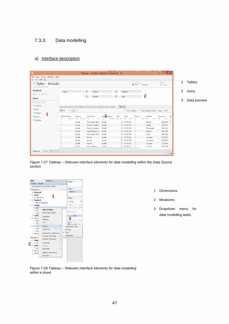
7.3.3. Data modelling
a) Interface description
Figure 7-27 Tableau – Relevant interface elements for data modelling within the Data Source
section
1 Tables
2 Joins
3 Data preview
Figure 7-28 Tableau – Relevant interface elements for data modelling
within a sheet
1 Dimensions
2 Measures
3 Dropdown menu for
data modelling tasks
1
2
3
1
2
3

48
b) Data objects
On data source level, the data is imported in the form of tables. These tables consist of fields
with different data types. On sheet level, the user does not interact with tables but with
dimensions and measures. Each dimension or measure corresponds to one of the fields in
a table. Tableau automatically recognizes whether a field should be used as a dimension or
as a measure.
c) Data types
Number (Decimal), Number (Whole), Date & Time, Date, String, Boolean Geographical Role
(Country/Region Zip Code/Postcode, City…)
d) Modelling relations
On data source level, the user can join related tables using a key or multiple keys. He can
do so for relations across data sources too, by defining the fields on which to join with the
option “Edit Relationships” in the drop-down menu “Data”. On dimension/measure level, the
user can define hierarchies, sets (subset of field entries) and groups.
e) Extending the data model
Calculated fields The user can create new dimensions and measures. He can either
perform row-level calculations or aggregate-level calculations.
Parameters A parameter is a global variable that serves as placeholder and can
be shown as controls on dashboards.
Table calculation A table calculation does not extend the data model as such because
it does not require the creation of another field. It only takes into
account the actual values within the current table and changes the
original values in the visualization for the computed ones.

49
Tableau offers a wide range of functions like number functions, date functions, aggregation
functions or table calculation functions (for table calculations see above) to name a few. [14]
7.3.4. Analysis
The analysis is performed on aggregated level. It is based on visualization mainly. Next to
visualizations, exploring the data set is also encouraged through easy operations and the
fact that the visualizations are updated on the fly with each operation.
a) Interface description
Figure 7-29 Tableau – Structure of a sheet
1 Data
2 Visualization
3 Columns
4 Rows
5 Marks
6 Filters
7 Pages
8 Show- me
b) How to create a visualization
To create a visualization the user has to drag and drop all desired dimensions and measures
onto the “Columns” and “Rows” fields (rows correspond to x-axis, columns correspond to y-
axis). Tableau automatically creates and adequate visualization from this, aggregating the
measures depending on the used dimensions. The user can customize the visualization
through the drop-down menu in the “Marks” card.
50
For unexperienced users, Tableau implemented the Show me”-Table for suggestions on
possibly adequate visualization.
c) Visualization possibilities
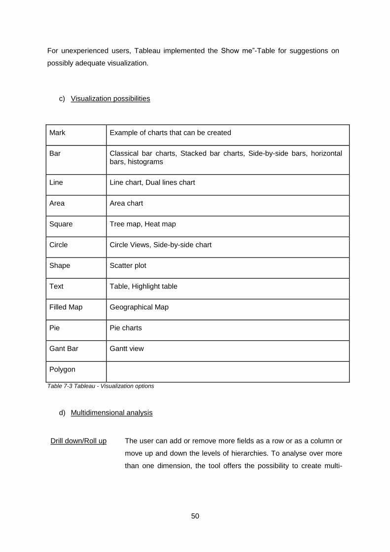
Mark Example of charts that can be created
Bar Classical bar charts, Stacked bar charts, Side-by-side bars, horizontal bars, histograms
Line Line chart, Dual lines chart
Area Area chart
Square Tree map, Heat map
Circle Circle Views, Side-by-side chart
Shape Scatter plot
Text Table, Highlight table
Filled Map Geographical Map
Pie Pie charts
Gant Bar Gantt view
Polygon
Table 7-3 Tableau - Visualization options
d) Multidimensional analysis
Drill down/Roll up
The user can add or remove more fields as a row or as a column or
move up and down the levels of hierarchies. To analyse over more
than one dimension, the tool offers the possibility to create multi-

51
panel charts or the possibility to create a color-gradient changing with
the values of the dimension.
Slice/Dice The user can add the according fields on which to filter to the Filter
card or create a quick filter for more interactive filtering.
Pivot The user can simply change the roles of the fields (switch Region and
Line for example)
e) Other analytical functionalities on visualization objects
Tableau offers out-of-the box solutions for all of the basic analysis functionalities. Next to that
Tableau provides some statistical elements to add to the chart such as box plots and trend
lines and a wide set of functions (see part Extending the Data Model).
7.3.5. Testing
Errors sources are kept as small as possible. The processes require hardly any scripting.
Instead the user is guided through the creation process by wizards and intuitive operations.
Additionally small warning signs draw the user’s attention to incorrectly joined tables or
syntactically wrong formulas. The analysis is kept visual mainly, so that there too the user is
immediately aware of marking anomalies. To further analysis of these errors, he can take
look at the underlying data and export it for further examination.
For possible errors in spreadsheets, Tableau implemented an option called the Data
Interpreter which analyses the data for errors and makes according changes.

52
7.3.6. Presenting
a) Design a dashboard
Figure 7-30 Tableau – Structure of dashboard
1 Sheets
2 Workspace
3 Layout
To fill the dashboard, the user simply has to drag and drop the according sheets onto the
workspace. He can add images and websites to complete his dashboard. Next to this, the
user can create actions such as filtering and highlighting.
b) Design a story
Figure 7-31 Tableau – Structure of a story
1 Sheets/Dash
boards
2 Workspace
3 Layout
1
2
3
1
2
3

53
To fill the story, the user simply has to drag and drop the according sheets and dashboards
onto the workspace. He can add images and websites to complete his work.
c) Exporting options
The user can either copy an image or export it as Bitmap, JPEG or PNG. For further analysis
he may export the underlying data as a crosstab or as a mere list of data points.

54
7.4. Qlik Sense Desktop
7.4.1. General information
For years now, Qlik pursued a single-product-strategy based on Qlik View. Qlik View is a tool
designed for IT users and power users so as to build interactive data visualization
applications for business users.
With its new product Qlik Sense, Qlik has shifted towards a two-product strategy. Just like
Qlik View, Qlik Sense is an entire BI platform designed to cover all of the workflows described
in section 3. Unlike for Qlik View however, the front-end solution for analysis and reporting
tasks is specifically designed to integrate the business users in the development of Qlik
Sense apps.
For the analysis of the front-end, we used Qlik Sense Desktop, a desktop version of Qlik
Sense’s front-end solution that Qlik offers for free.
When opening Qlik Sense, the user first gets to the Qlik-Sense Desktop Hub where apps can
be created and managed. An app is a compilation of different objects on a same topic.
Figure 7-32 Qlik Sense – View of an app
1 Sheets
2 Bookmarks
3 Stories
2
1
3

55
An app can contain three object types. The starting point for the user’s analysis are sheets.
This is where the user can create visualizations of his data. If the user wants to capture a
precise moment in the making of his sheet he can create a bookmark, similar to a screenshot
of the sheet. To organize his sheets in slide-shows, he can then create a story containing
pictures, texts and snapshots of his visualization.
7.4.2. Data Access
a) Interface Description
Figure 7-33 Qlik Sense – Data Editor
1 Editor
2 Connection
management
3 Load
4 Code
sections
Figure 7-34 Qlik Sense – Importing wizard for relational source (Access)
1 Tables
2 Metadata
3 Data preview
4 Script
2
3
1 4
1
2 3
4

56
Figure 7-35 Qlik Sense – Importing wizard for single files (Excel sheet)
1 Tables
2 Data preview
b) How to import data
For spreadsheets and text files Qlik Sense offers the option Quick Data Load. The data
source can either be dragged and dropped onto the workspace or selected through the data
path.
To connect to other sources the user has to create a connection through the connection
manager first. The wizards differ depending on the data source type (see above). The user
can select the table he wants to load, Qlik Sense then generates a script that is inserted in
the editor. Instead of using the connection manager, there is the possibility to write the script
freehand using the Qlik Sense scripting language. To finally import the data, the user has to
run the generated script through clicking on the “Load”-button.
c) Supported data sources
Standard connectors:
- ODBC database connections
- OLE DB database connections
- Folder connections that define a path for local or network file folders
- Web file connections
1
2

57
d) Operations on data set
The Qlik Sense scripting language is a very powerful data transformation tool similar to the
one in Qlik View. It offers the possibility to augment, manipulate, and transform data [15].
Unlike in Qlik View however there are scarcely any wizards or other elements other than the
ones to create the actual connections to facilitate the process.
7.4.3. Data modelling
a) Interface description
Figure 7-36 Qlik Sense – Data model
1 Data model
2 Tables
3 Fields
4 Preview
1
4
3
4

58
Figure 7-37 Qlik Sense – Data model in Sheet view
1 Fields
2 Options for
extending the data
model
b) Data objects
Data is imported in the form of tables. These tables have fields with which the user interacts
when creating a visualization. The field have different data types and can either be used as
dimensions or as measures depending on the user’s needs.
c) Data types
Text string, Date, Time, Timestamps, Currency
d) Modelling relations
On table level Qlik Sense automatically associates tables that have a field with the same
name or automatically appends tables with exact same field names. The tables are not
directly joined, they are still independent tables [11]. This can be customized in the Script
Editor through the join-prefix for instance used to actually join tables.
On dimension level, the user can create drilldown groups which corresponds to creating a
hierarchy in other tools. There are no further out of the box modelling options but the user
can create new dimensions using according formulas. When wanting to group certain fields
for example, the user can define a new field with if-conditions.
1
2

59
e) Extending the data model
The user can extend the data model through calculated fields. The functions that Qlik Sense
offers cover row-level calculations as well as aggregate-level calculation.
7.4.4. Analysis
The analysis in Qlik Sense is performed on aggregated level only and mainly builds on
visualization. There are two modes for a worksheet. In the Edit mode the user can create
visualizations and make changes. In the View mode, the user can look at the visualizations
and perform some analytical operations like drill-down and roll-up or filtering.
a) Interface description
Figure 7-38 Qlik Sense – Structure of a sheet
1 Workspace
2 Visualization objects
3 Fields
4 Library
5 Custom Menu
6 Mode (View, Edit)
7 Snapshots

60
b) How to create a visual data object
The user has to drag and drop the required chart type onto workspace then drag and drop
fields onto chart. After having dropped a specific field onto the visualization the user should
choose whether the field should be used as dimension or measure. The tool then
automatically creates the according chart. The chart can customized through the menu on
the left.
c) Visualization possibilities
Basic chart type Chart options
Bar chart Grouped, Vertical, Horizontal,
Tree map Tree map
Pie Pie Chart, Donut chart
Linechart Line, Area
Map Map
KPI KPI
Gauge Circle, Column
XY Scatter Plot XY Scatter Plot
Pivot table Pivot table
Table Table
Table 7-4 Qlik Sense - Visualization options
The basic chart type can be accustomed through the menu options on the left side.

61
d) Multidimensional analysis
Drill down/Roll up
The user can add or remove fields as a row or as a column or move
up and down the levels of hierarchies. To analyse over more than
one dimension, the tool offers the possibility to create multi-panel
charts or the possibility to create a colour-gradient changing with the
values of the dimension. The amount of dimensions that can be
added is limited to two however for most visualization options.
Slice/Dice The user can add the according fields on which to filter through
adding a slicer to the sheet or setting constraints on the used
dimensions and measures.
Pivot The user can simply change the order of the fields (switch Region
and Line for example).
e) Other analytical functionalities on graphs
The user can sort the visualization or highlight some data points of interest. For further
analysis the user should extend the data model with according measures and formulas. In
view mode there is the possibility for so the so called Global Smart Search where the user
can simply analyse his visualizations by typing in keywords as search terms.
7.4.5. Testing
Qlik Sense is very scripting intensive. The first steps Data Access and Data Modelling mainly
rely on scripting. Although there is a debugger it is still a source for errors. For possible data
source errors, the tool provides an evaluation of each field informing the user on duplicated
values and the density of the field entries. Null-values in the data source are automatically
recognized. The scripting language allows for data shaping so as to correct errors in the data
source.
A great part of the analysis is visual so that the user is immediately aware of anomalies.
There is no out-of-the box solution for numerous operations such as ranking or trend lines.
Here too the user can needs to set up new dimensions and measures with possibly
complicated formulas and therefore increases the possibilities for errors.

62
7.4.6. Presenting
a) Designing a dashboard
Figure 7-39 Qlik Sense – Sheets as dashboards
1 Workspace
2 Visualization
A worksheet can contain multiple visualizations. The user can create a dashboard by simply
adding more visualizations to sheet he is working on. A user can also add texts and images
from external sources. A worksheet allows for extensive interaction, especially filtering with
slicers and search-based data discovery.
b) Designing a story
Figure 7-40 Qlik Sense – Structure of a story
1 Workspace
2 Slides
3 Snapshot
library
4 Text library
5 Form library
6 Effect library
7 Image library
1
2
1
2
3-7

63
The user can integrate various object types in his slide-show. He can insert snapshots of his
visualizations as well as images from external sources. Stories do not provide the possibility
for interactions.
c) Export
Currently Qlik Sense Desktop does not provide the possibility to export images or data.
Update on 24. June 2015: With Qlik Sense Enterprise 2.0, the user has the possibility to
export visualizations as pdf or image file.

64
7.5. SAS Visual Analytics
7.5.1. General aspects
Starting as a project for analysis in agriculture research, SAS Institute is now a leading vendor
for analytics software. With SAS Visual Analytics, SAS has launched a platform-based BI
solution to enable enterprise-wide deployment and administration.
The user accesses the BI platform through a multiple of browser based modules. SAS does
not provide a standalone desktop application with the different functionalities of the modules,
but only sales the platform as a whole. Since the deployment of a whole platform would be
far beyond the scope of this work, we decided to use the browser-based modules provided
by SAS through the Tera Data University Network. This version however is for demonstration
purposes only and only provides access to the modules Hub, Explorer, Designer. The module
Data Builder meant for data management and data designing purposes is not available. This
rendered impossible the evaluation of step one and a complete evaluation of step 2 and 5.
Moreover, it is not possible to upload one’s Excel files and we were therefore forced to use
predefined examples.
Figure 7-41- SAS VA - View on the Hub
1 Data
Explorer
2 Report
Designer
The tool as we see it has three modules. The hub to organize and access the explorations
and reports. The Data Explorer is for discovering and “playing” with data to gain new insights.
The Report Designer as the name already reveals is for designing reports. Both modules
have many common features. Features that are specific for one of the modules will be
marked accordingly.
1
2

65
7.5.2. Data access
Not evaluated
7.5.3. Data modelling
Could not be fully evaluated, since we have no access to the Data Builder module.
a) Interface description
Figure 7-42 SAS VA - Relevant interface elements for Data Modelling
1 Dimensions
2 Measures
3 Properties
1 Options for
Data
modelling
(Data
Explorer)
b) Data objects
There are three types of data objects: categories, measures, geography objects. Categories
are the same as dimensions in the other tools. The categories’ distinct values are used to
aggregate measures. Geography objects are special categories containing geospatial
information.
1
2
3
1

66
c) Data types
Category String, Date, Date time, Time, Numeric
Measures Numeric
Geography
d) Modelling data
(In Data explorer only)
The user can create hierarchies and custom categories which corresponds to grouping in
other tools.
e) Extending the data model
Calculated fields The user can create new measures. The calculation is
performed on row-level. Functions categories here include
numerical functions, text functions , comparison functions etc.
Aggregated measures This kind of measure is to create aggregate-level calculations.
The user can choose the dimensions on which he wants to
aggregate his data.
Parameters A parameter is a global variable that serves as placeholder.
The user can decide what value the parameter should take
and analyse his data set when the parameter takes up
different values.
Table calculation Visual Analytics provides a set of predefined table
calculations. A table calculation does extend the data model
as such because it does not require the creation of another

67
field. It only takes into account the actual values within the
current table and changes the original values in the
visualization for the computed ones.
7.5.4. Analysis
The analysis in Visual analytics is performed on aggregated level only and mainly builds on
visualization.
a) Interface description
Figure 7-43 SAS VA – Analysis within the Data Explorer
Figure 7-44 SAS VA – Analysis within the Report Designer
1 Data objects
2 Workspace
3 Visualizations options
4 Roles
5 Filters
6 Ranks
7 Properties
8 Comments
1 Visualization options
2 Data
3 Ranks
4 Properties
5 Comments
1
2
3 4-8
1
2 3-5

68
b) How to create a visualization
Data Explorer The user can either start by picking one of the available visualization
options or the required dimension and measures. In the latter case,
the tool automatically creates an adequate graph.
Report Designer The user can either start by picking one of the available visualization
options and the required dimension and measures.
c) Visualization possibilities
In Data Explorer Table, Crosstab, Bar Chart, Line Chart, Scatter Plot, Bubble Plot,
Network Diagram, Histogram, Box Plot, Heat Map, Geo Map, Tree
Map, Correlation Matrix, Decision Tree, Word Cloud
In Report Designer List Table, Crosstab, Bar Chart, Targeted Bar Chart, Waterfall Chart,
Line Chart, Pie Chart Scatter Plot, Time Series Plot, Bubble Plot,
Treemap, Dual Axis Bar Chart, Dual Axis Bar-Line Chart, Dual Axis
Time Series Plot, Gauge, Word cloud
Table 7-5 SAS Visual Analytics - Visualization options
d) Multidimensional Analysis
Drill down/Roll up
The user can add or remove more fields as a row or as a column or
move up and down the levels of hierarchies.
Slice/Dice The user can add the according fields on which to filter to the Filter
panel of the panel or create a quick filter for more interactive filtering.
Pivot The user can simply change the roles of the fields (switch Region and
Line for example)

69
e) Further analytical functionalities on visualization objects
Further analytical functionalities are Data Brushing for example as well as ranking and
sorting.
7.5.5. Testing
This step could not be evaluated since the most error-prone processes could not be tested
due to the reasons named above. As in the other tools however a great part of the analysis
is visual so that the user is immediately aware of anomalies.
7.5.6. Presenting
The version we used did not provide any further layouting options for designing dashboard
and reports. The visualizations however can be exported as .png and the underlying data as
.cvs files. In the Report Designer, it is possible to create interaction elements on a
visualization such as controls or sliders.

70
7.6. SAP Lumira
7.6.1. General aspects
SAP is one of the world’s leading vendors for enterprise software. The company has a long-
standing experience in the BI field especially with the SAP BusinessObjects BI-Suite, a suite
offering various front-end solutions for data analysis such as Crystal Reports or
Webintelligence. These tools however are used by power users mainly.
SAP Lumira is a new attempt towards a new generation of BI tools. Lumira is a desktop
application to create visualizations and dashboards. It can be acquired with the Lumira
Server for sharing visualizations and reports with others.
The tool contains four sections.
Figure 7-45 SAP Lumira – General structure
1 Prepare
2 Visualize
3 Compose
4 Share
The first section is for data access and data modelling purposes. In the Visualization part,
the user creates his visualizations for either data discovery purposes or reporting tasks or
both. The third section is designed to bring together the visualisations and images from
external sources so as to create reports, dashboards and story. The last section finally is for
sharing purposes, which we will not cover here however.
1
2
3 4

71
7.6.2. Data access
a) Interface description
Figure 7-46 SAP Lumira – Interface for data shaping and data modelling
1 New data
sets
2 Refresh
3 Data shaping
b) How to import data
Access to files and SAP products is rather well supported. The user can simply import data
files or create a connection to the SAP BO universe or SAP HANA. He can then pick the
tables to import. Other relational sources are accessible but require expertise at writing SQL,
there are no wizards or other elements supporting the process. In both cases the user can
import data from various sources at once.
c) Supported data sources
- Microsoft Excel sheets
- Text files (.cvs or .txt)
- Query with SQL
- SAP BW
- SAP Hana
- SAP BusinessObjects universe
1
2
3

72
d) Operations on data set
SAP Lumira offers some data shaping options especially for strings such as replace, split
and fill. The user can change the data types for instance. Each operation however creates a
new column. The initial column remains visible.
7.6.3. Data modelling
a) Interface description
Figure 7-47 SAP Lumira - Relevant interface elements for Data Modelling
1 Dimensions
/Measures
2 Table
3 Data sets
4 Append/Merge
b) Data objects
The data is imported as a data set, a table with various fields of different data types. These
fields are interpreted as either dimensions or measures. As in the tools described above,
dimensions determine the level of aggregation whereas measures represent the figures to
aggregate.
1 2
3 4
1
73
c) Data types
Integer, Biginterger, Double, String, Date, Boolean
d) Modelling data
The data of each source is imported as data sets. There data sets can either be appended
or merged (just as in PowerPivot). To support the user when merging two columns, Lumira
offers the option to suggest on which columns joining would make sense. The user can group
values in the Prepare section. Other than that the user can create hierarchies between
dimensions.
e) Extending the data model
The use can create calculated dimensions and measures. The formula language does not
seem to support aggregate-level calculations. The calculations are performed on row-level
only. Lumira however offers some table calculations such as running sums and counts. More
complicated table calculations are not allowed for.
7.6.4. Analysis
The analysis in Lumira is performed on aggregated level only and mainly builds on
visualization. Next to visualizations, exploring the data set is also encouraged through easy
operations and the fact that the visualizations are updated on the fly with each operation.
a) Interface description

74
Figure 7-48 SAP Lumira – Visualization
1 Data objects
2 Visualization
options
3 Workspace
4 Roles
5 Operations
b) How to create a visualization
To create visualization, the user first has to pick a type of visualization then drag and drop all
desired dimensions onto the “Dimensions” and all desired measures onto the “Measures”
field in the “Visualization Tools” panel. The tool then automatically creates the according
chart, aggregating the measures depending on the used dimensions.
c) Visualization options
Options Example of charts that can be build
Bar chart Bar Chart, Column Chart, Column Chart with 2 Y-Axes, 3D Column Chart Marimekko Chart
Line chart Line Chart, Area Chart Line Chart with 2 Y-Axes, Combined Column Line Chart, Combined Column Line Chart with 2 Y-Axes
Pie chart Pie Chart, Donut Chart, Pie with Depth Chart
Geo Chart Geo Bubble Chart, Geo Choropleth Chart, Geo Pie Chart, Geo Map
Scatter plots
Scatter Plot Scatter Matrix Chart, Bubble chart
Maps Heat map, Tree map
1
2
3
4
5

75
Table Table, Crosstab
Numeric Point
Numeric Point
Other charts
Tree, Funnel Chart, Network Chart, Waterfall Chart, Box Plot, Parallel Coordinates Chart, Tag Cloud, Radar Chart
Table 7-6 SAP Lumira - Visualization Options
d) Multidimensional analysis
Drill down/Roll up
The user can add or remove more fields as a row or as a column or
move up and down the levels of hierarchies. To analyse over more
than one dimension, the tool offers the possibility to create multi-
panel charts or the possibility to create a colour-gradient changing
with the values of the dimension. Additionally the user can choose to
create a set of multiple smaller charts for the distinct values of a
dimension.
Slice/Dice The user can add the according fields on which to filter to the Filter
section of the panel or create a slicer for more interactive filtering.
Pivot The user can simply change the roles of the fields (switch Region and
Line for example)
e) Further analytical functionalities
There are not so many out-of-box solutions here. The user can merely sort, rank and highlight
some data points.
7.6.5. Testing
As for Tableau, the user is guided through the creation process by wizards and intuitive
operations. The operation set is limited in comparison to other tools but keeps the whole
handling manageable.

76
Here too, the processes are eased by constant visual feedback on possible errors. Small
attention warning signs draw the user’s attention to incorrectly joined tables or syntactically
wrong formulas. The analysis is kept visual mainly, so that there too the user is immediately
aware of marking anomalies.
7.6.6. Presenting
There are three options to organize visualizations.
Infographics - Visualization without interactions - Possibility to integrate further pictograms and forms
Storyboards - Interactive diagrams through entry filters
- To create interactive dashboards and slide-shows
Reports - Interactive diagrams through entry filters
- To create interactive reports
All options offer the possibility to integrate pictures from the outside.
Figure 7-49 SAP Lumira – Presenting
1 Visualizations
2 Workspace
3 Other visual
objects
To make the integrate visualization into the report, the user can simply drag and drop the
according visualization onto the workspace.
f) Export
The user has the possibility to copy/paste single visualizations, to export the entire file as a
.pdf or to export the underlying data to either a .csv file or an Excel file.
1
3
2

77
7.7. IBM Watson Analytics
7.7.1. General aspects
IBM is one of the world leading software and hardware vendor as well as one the world
leading consulting firms for IT subjects.
Just as SAP, IBM has a long standing tradition in business analytics with different product
lines such as IBM Cognos products for classical BI questions and the IBM SPSS products
for advanced analytics including forecasting and data mining tasks.
Recently IBM has started a cloud-service called Watson Analytics. The tool’s purpose is to
ease advanced analytics tasks as much as possible for business users. There are three
purchasing options. First there is the free version, it comes with a limited connectivity and
storage capacity, the personal edition and the professional edition come with more data
sources and a higher storage capacity [16]. We will keep to the free version in this thesis.
The tool contains four modules. The Refine module is for data transformation and modelling.
The Explore module is designed for data exploration to gain new insights on the data
whereas the Assemble module allows the user to create visualizations and arrange them in
dashboards and stories. The Predict module finally is for forecasting purposes.
Figure 7-50 Watson Analytics – Overall structure
1 Explore
2 Predict
3 Assemble
4 Refine

78
7.7.2. Data Access
a) Interface description
Figure 7-51 Watson Analytics – Import menu
Figure 7-52 Watson Analytics – Refinement
b) How to import data
- Drag and drop file onto menu
- Browse for files

79
c) Data sources
- Microsoft Excel 97 – 2003 spreadsheet files (.xls)
- Microsoft Excel 2007 and later spreadsheet files (.xlsx)
- Comma-separated values files (.csv).
The personalized version as well as the professional version enable the user to import data
from feeds and IBM environments [16].
d) Operations on data
There are data source filters but no other data transformation operation.
7.7.3. Data modelling
a) Interface description
Figure 7-53 Watson Analytics – Relevant interface elements for Data Modelling
1 Columns
2 New Column
3 Hierarchies
4 Groups
1
2
3 4

80
b) Data objects and Data types
The user interacts with the columns of the table. Each column has a specific data type. The
data types currently available are: text, numeric and date. The tools detects the data types
automatically but the user cannot change the field type afterwards.
c) Modelling data and extending the data model
The user cannot work with several tables at the same time. On column level he can create
new hierarchies (those are even recognized automatically by the tool) and groups as well as
new columns. The possibilities here are rather restrained here. It’s only possible to perform
simple numerical calculations (plus, minus…) between columns. There are no operations for
aggregate level calculations.
7.7.4. Analysis
The analysis in Watson Analytics is performed on aggregated level only and mainly builds
on visualization.
a) Interface description
Figure 7-54 Watson Analytics – Explorer automatically deduces questions regarding the data
set
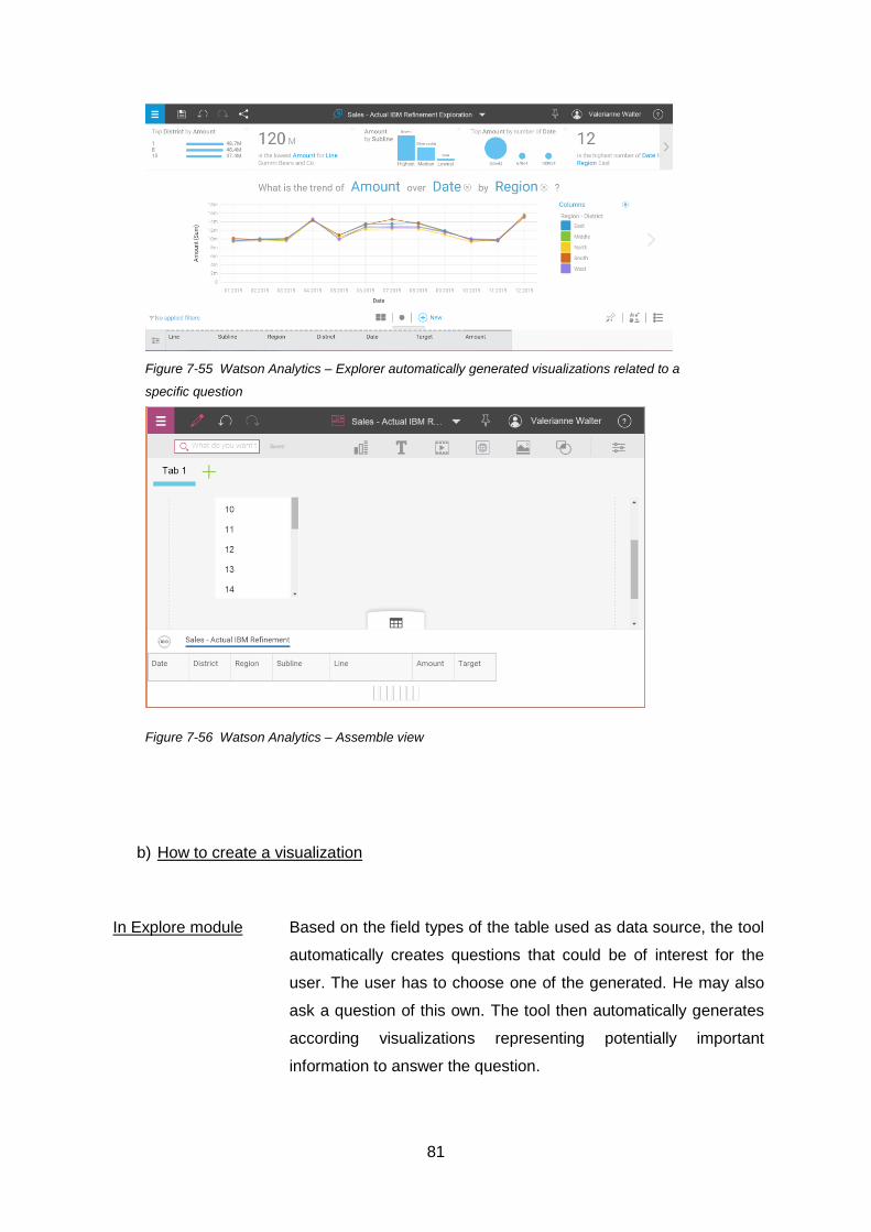
81
Figure 7-55 Watson Analytics – Explorer automatically generated visualizations related to a
specific question
Figure 7-56 Watson Analytics – Assemble view
b) How to create a visualization
In Explore module
Based on the field types of the table used as data source, the tool
automatically creates questions that could be of interest for the
user. The user has to choose one of the generated. He may also
ask a question of this own. The tool then automatically generates
according visualizations representing potentially important
information to answer the question.

82
In Assemble module The user has to pick one of the visualization types, then drag and
drop according measures onto the different roles. The tool then
automatically creates the according chart.
c) Visualization options
In the Explorer module
Line, Area, Grid, Bubble, Tree map, Categorical
In the Assemble module
Area, Bubble, Bar, Column, Line, Heat, Hierarchy, Line +
Column, Map, Packed Bubble, Pie, Point, Radial, Radial Bar,
Scatter Plot, Stack Bar, Stack Column, Summary, Tree map,
Word cloud
d) Multidimensional analysis
Drill down/Roll up
The user can add or remove more fields as a row or as a column or
move up and down the levels of hierarchies.
Slice/Dice The user can add the filters to the according fields.
Pivot The user can simply change the roles of the fields (switch Region and
Line for example)
e) Other analytical functionalities
The user can select single points of interest and sort by one field. There are no further out of
the box functionalities for analysis.

83
7.7.5. Testing
Watson Analytics offers an evaluation of the data source based on missing values and errors.
Aside from that, the user has little opportunity to make any errors since the tool does not
allow for complicated operations and most of processes are automatized.
The tool however still makes errors in the interpretation of data as far as data types are
concerned for example. The tool however does not allow for further interaction nor
modification options yet.
7.7.6. Presenting
a) Dashboard
Figure 7-57 IBM Watson analytics – Dashboard elements
1 Visual
objects
2 Workspace
A view can hold several visualizations so that they can immediately be organized in a
dashboardlike way.
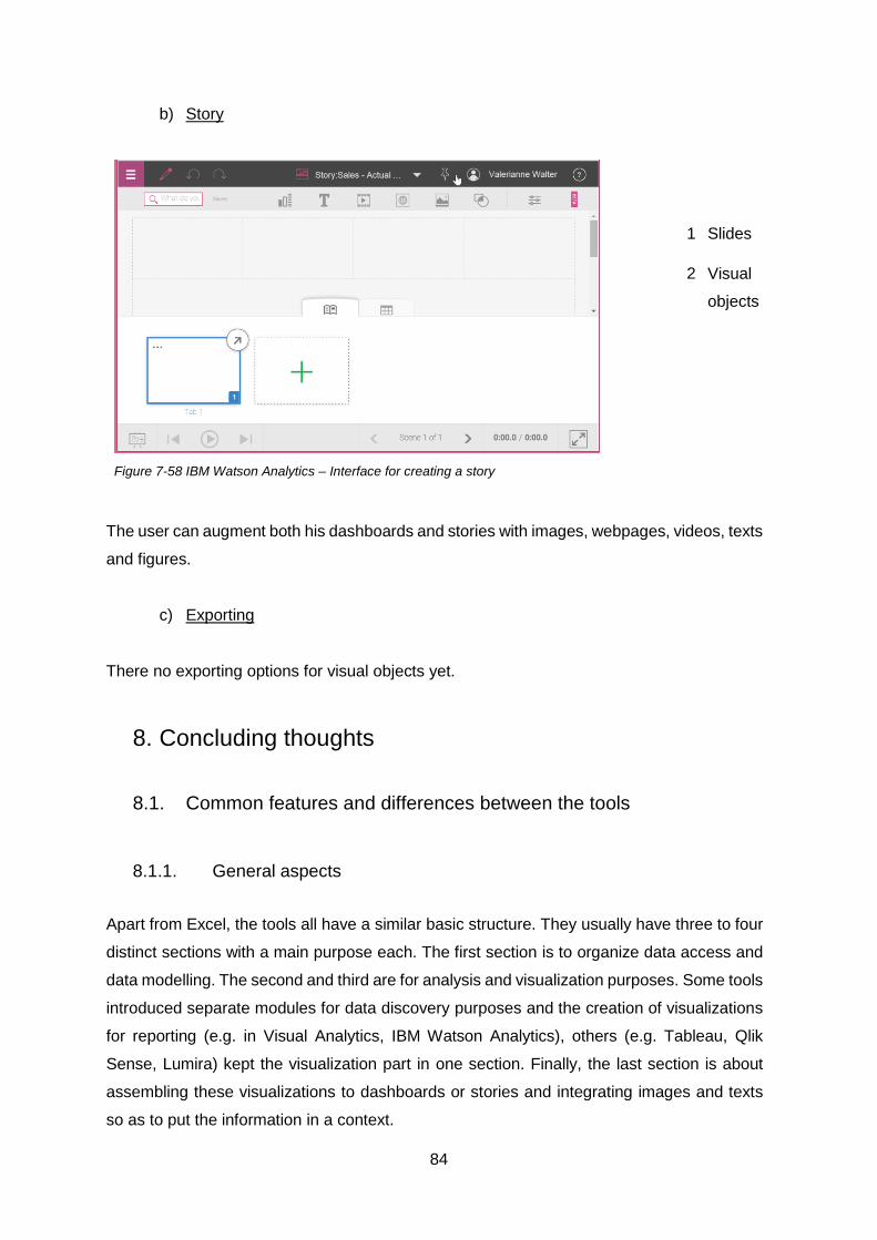
84
b) Story
Figure 7-58 IBM Watson Analytics – Interface for creating a story
1 Slides
2 Visual
objects
The user can augment both his dashboards and stories with images, webpages, videos, texts
and figures.
c) Exporting
There no exporting options for visual objects yet.
8. Concluding thoughts
8.1. Common features and differences between the tools
8.1.1. General aspects
Apart from Excel, the tools all have a similar basic structure. They usually have three to four
distinct sections with a main purpose each. The first section is to organize data access and
data modelling. The second and third are for analysis and visualization purposes. Some tools
introduced separate modules for data discovery purposes and the creation of visualizations
for reporting (e.g. in Visual Analytics, IBM Watson Analytics), others (e.g. Tableau, Qlik
Sense, Lumira) kept the visualization part in one section. Finally, the last section is about
assembling these visualizations to dashboards or stories and integrating images and texts
so as to put the information in a context.

85
The limits between the sections are not completely set. Indeed some elements of data
modelling appear in the visualization part (hierarchies, groups). In some tools (Qlik Sense,
IBM Watson Analytics) the user can create multiple visualizations in one working sheet so
as to create dashboards on the fly. But the idea of introducing modules especially designed
for certain steps remains all the same.
In Excel all steps are mashed-up in worksheets. To separate the steps, Microsoft introduced
the Power BI add-ins. PowerQuery is for data access and data shaping purposes,
PowerPivot for data modelling and PowerView for visualization purposes.
As far as the concrete implementation of the single steps is concerned, the tools share a lot
of common features, they differ on some other points though, especially as far as the range
of possibilities are concerned.
8.1.2. Data access
There are two main aspects to consider for data access, the data sources that are supported
and the possibilities for data transformation.
The products of big players (Lumira and Watson Analytics) integrate best with these vendors’
product lines. Lumira can work with data from SAP HANA and BO universes, Watson
Analytics can connect to the IBM TM1 environment (in the professional version at least). The
user can import files of his own like spreadsheets and text files but others sources are
scarcely supported.
Excel of course is an exception here. It allows the user to import data from a very wide range
of sources. This is certainly also due (and probably also contributed) to Excel’s long-standing
and still dominant position as analysis tool.
Tableau and Qlik Sense too, both specialty vendors, offer a wide range of supported data
sources, Tableau through native connectors and an ODBC interface, Qlik Sense through
OLE DB and ODCB connectors.
As for data transformation, Excel (both the classical version and the Power BI add-ins) and
Qlik Sense offer the widest range of possibilities. Data transformation in Qlik Sense however
still requires thorough scripting skills that business users do not necessarily have. Other tools
such as Lumira already implemented first attempts for data shaping, but the options remain
somewhat limited.

86
8.1.3. Data modelling
Although the terms used may differ from tool to tool, the concepts of data modelling are
widely the same and based on some typical OLAP terminology. Data is imported in the form
of tables. The fields of these tables can either be dimensions or measures. Dimensions are
used to categorize data and determine the level of aggregation. Typical dimensions are
products, customers, regions. Measures on the other hand are the aggregation of figures.
Typical measures are sales figures, amounts, sizes.
The relations between data objects that can be modelled are more or less the same for each
tool. Through joining (-like) operations the tables can be associated. The data points within
a dimension can be grouped, dimensions can be hierarchized. There are limits there
however, usually the hierarchies cannot be created with dimensions from different tables
(Excel) or not created with dimensions from different data sources (Tableau).
The data model can be extended through adding of both new measures and new dimensions.
There are different types of calculation though. Row-level calculation and aggregate-level
calculation are usually implemented in all tools. Only some tools (Tableau, Visual analytics,
Excel) however offer table calculations that are quite useful for keeping the amounts of
measures small and manageable.
8.1.4. Analysis
Apart from Excel, the tools do not provide analysis functionality on data point level. The
data is presented in aggregated manner through visualizations.
The visualization section is the most important part in all tools. Creating a chart is similar in
every tool. The user creates a chart by dragging and dropping the required measures and
dimensions onto the workspace. They can be assigned to different parts of the visualization
like to the columns or to the rows (y-axis and x-axis respectively) as well as to the legend. In
the latter case, the tool creates a color gradient for the different values of the data object.
The tools offer a similar set of visualizations to choose from, covering all types of visual
analysis (contribution, distribution, trend-series etc…).
While the user drags and drops the data objects onto the workspace, the tool automatically
creates the according chart by using the distinct values of the used dimensions and

87
aggregating the measures accordingly. Some tools offer a wider set of aggregation functions
(Excel, Tableau) but the typical ones are sum, average, minimum, maximum, count.
To analyze the data, the tools all offer the possibility for basic OLAP operations. The user
can drill-down and roll-up his visualization. This means he is able to view the data on a
smaller or higher aggregation level depending on the information he needs. To drill-down, he
can either add further dimensions so as to split down the data set or create hierarchies of
dimensions and move down the levels of the hierarchy when needed. To roll-up, he can then
remove dimensions so as to aggregate the data on the remaining dimensions only or move
up the levels of the hierarchy.
As for slicing and dicing operations the tools provide filter options. The user can filter on
dimensions picking some data points with distinct values in this dimension as well design
more sophisticated ones with the help of formulas (latter usually works with measures too).
There can be multiple filters on a visualization enabling to extract more precise information
when needed.
Some tools (Qlik Sense, Tableau and Excel) also provide the possibilities to make slicers for
more interactive filtering.
To pivot the data the user can easily switch the arrangement of the dimensions he uses and
the tool will automatically generate a new chart.
The tools differ most in the variety of out of the box analysis functionalities they provide.
Some tools (Tableau, classical Excel) offer a wide range of functionalities including statistical
elements like trendlines and error bars.
The other tools (Visual Analytics, Qlik Sense and Lumira) confine themselves to
functionalities like sorting, ranking and highlighting.
8.1.5. Testing
The main strategy of the tools for this step is to avoid errors in the first place. For one the
main focus lays on visualization. The user receives constant feedback on the progress of his
work and on possible errors. Some tools start with the feedback at the very beginning of the
process. Watson Analytics, the Power BI Add-ins, Qlik Sense offer an evaluation on the
quality of the data source by looking for missing fields or fields that contain errors. Tableau
offers the possibility to analyse and correct errors in spreadsheets. In the data modelling part,
it is useful to know whether the tables the user is about to join actually match and if there are

88
data points about to drop out when joining. There are some tools that (Power BI Add-ins,
Lumira, and Tableau) give a feedback on whether a join actually makes sense at this point.
Another important visual feedback is a visualization of the actual data model (like in Tableau,
in Qlik Sense or in the Power BI add-ins). As far as formulas are concerned, the user is
usually immediately informed if his formula contains syntactical errors. Semantical errors
however go unverified. When creating visualizations and interacting with them, the user may
immediately see marking errors in his data set.
Another main strategy to reduce errors, is to keep the variability of possibilities (and therefore
the danger of errors) to a minimum by guiding the user through wizards and by keeping
scripting optional.
In general there are scarcely any options for actual debugging. In that context for example it
would be of use to have an overview on how the calculated fields are actually linked to one
another.
8.1.6. Presenting
The presenting options are largely the same. There is the option to integrate the created
visualizations into either a dashboard or a story. The reports can be augmented with pictures,
texts, possibly websites or videos. The possibility for the creation of basic interaction (e.g.
filtering) is implemented in all tools, Qlik Sense (Golbal Smart Search) and Tableau
(implementation of specific interactions) however offer more sophisticated options here.
8.2. Trends in self-service BI
Though only in its beta version, IBM Watson Analytics is a good example of how self-service
BI tools could look like in a couple of years. Although the tools are still in different stages of
development, they seem to converge towards a same standard as far as organization,
structure and functionality are concerned.
But as Gartner says [4], the buzzword here is “smart data discovery”. This is what will make
the difference between the tools. Through algorithms, heuristics, data mining techniques,
tools will have to make data analysis accessible to the most unexperienced users by
automating processes and providing clever support.

89
Watson Analytics generates possible questions on the data set that the user may want to
have answered and creates according visualizations to answer the question. The user may
also ask a question of his own and the tool generates the according visualizations (given it
actually understands the question).
First attempts in Tableau at automated support are the Tableau Data Interpreter looking for
errors in spreadsheets before actual analysis or automatically deciding whether a field of a
table should be treated as a dimension or as a measure.
Another crucial point will be to make advanced analytics like predictive analytics accessible
to the crowd. Again Watson Analytics offers an outlook of how self-service predictive
analytics could look like. Most of the tools already offer a first attempt at this by implementing
forecasting and what-if analysis options. This will have to be fully developed in the future.
8.3. Regarding the Gartner survey
This thesis started from taxonomies, questions and a concrete business scenario and looked
how they were implemented in the front-ends of Gartner’s leading BI platform vendors,
independently from the criteria set by Gartner.
As could have been expected, the tools keep to the criteria and concepts Gartner’s described
in the parts “Business User Data Mashup”, “Free Form Interactive Exploration”, “Analytical
Dashboards & Content” and “Traditional Styles of Analysis”.
As such most of the overall results we describe here are close to Gartner’s criteria. Gartner
however evaluates more criteria still that are not covered by the taxonomies and questions
we used.
It would have been conceivable that a tool stands out somehow with a different concept,
solution or approach not covered by Gartner’s criteria set and that the results would differ
more crassly. This is not the case. A possibility to find different approaches and concepts
would be to look at a wider range of tools, possibly not placed in the Leader segment of the
Quadrant or open source solutions for data visualization which are not covered by Gartner.
The main benefit of our survey is that it relates the different aspects in more detail and
provides a thorough description of the actual tools.

90
9. Appendix
9.1. Figures and Tables
Figure 2-1 Schema of BI work flow ...................................................................................... 9
Figure 2-2 Gartner „Magic Quadrant for Business Intelligence and Analytics Platforms [4] 12
Figure 6-1 Geo-structure and product-structure for the scenario ....................................... 23
Figure 7-1 Excel Classic - Overall Interface ...................................................................... 25
Figure 7-2 Excel Classic - Relevant interface element for Data Access ............................ 26
Figure 7-3 Excel Classic – Workspace .............................................................................. 27
Figure 7-4 Excel Classic – Grouping within the Data ribbon .............................................. 27
Figure 7-5 Excel Classic – Extending the data model with formulas .................................. 27
Figure 7-6 Loose Cells within Excel .................................................................................. 28
Figure 7-7 Table within Excel ............................................................................................ 28
Figure 7-8 Excel Classic - Relevant interface elements for data set analysis .................... 30
Figure 7-9 Excel Classic - Ribbon for inserting visualizations ............................................ 30
Figure 7-10 Excel Classic - Pivot table tools ..................................................................... 31
Figure 7-11 Excel Classic – Pivot chart tools .................................................................... 32
Figure 7-12 - Excel Classic - Relevant interface elements for layout ................................. 33
Figure 7-13 Excel Power BI Add-ins .................................................................................. 35
Figure 7-14 Excel Power BI Add-Ins - Power Query Ribbon.............................................. 35
Figure 7-15 Excel Power BI Add-Ins – Relevant interface element within the Power
Query ................................................................................................................................ 36
Figure 7-16 Excel Power BI Add-ins - Relevant interface elements within the PowerQuery
ribbon ................................................................................................................................ 38
Figure 7-17 Excel Power BI Add-ins - Relevant interface elements within the PowerQuery
Editor ................................................................................................................................ 38
Figure 7-18 Excel Power BI Add-ins - Relevant interface elements within the Power Pivot
ribbon ................................................................................................................................ 38
Figure 7-19 Excel Power BI Add-ins - Relevant interface elements within the Data Model 38
Figure 7-20 Excel Power BI Add-ins - Query Panel ........................................................... 39
Figure 7-21 Excel Power BI Add-ins - Diagram view of tables within Data Model .............. 39
Figure 7-22 Power BI Add-ins – PowerView ...................................................................... 41
Figure 7-23 Power BI Add-ins – PowerView ribbon ........................................................... 42
Figure 7-24 - Excel Power BI Add-ins - Visualization possibilities ..................................... 42
Figure 7-25 Tableau - General structure ........................................................................... 44
Figure 7-26 Tableau – Relevant interface elements for data access within the Data source
section .............................................................................................................................. 45
Figure 7-27 Tableau – Relevant interface elements for data modelling within the Data
Source section .................................................................................................................. 47
Figure 7-28 Tableau – Relevant interface elements for data modelling within a sheet ...... 47
Figure 7-29 Tableau – Structure of a sheet ....................................................................... 49
Figure 7-30 Tableau – Structure of dashboard .................................................................. 52
Figure 7-31 Tableau – Structure of a story ........................................................................ 52
Figure 7-32 Qlik Sense – View of an app .......................................................................... 54
Figure 7-33 Qlik Sense – Data Editor ................................................................................ 55
Figure 7-34 Qlik Sense – Importing wizard for relational source (Access) ......................... 55
Figure 7-35 Qlik Sense – Importing wizard for single files (Excel sheet)............................ 56

91
Figure 7-36 Qlik Sense – Data model ............................................................................... 57
Figure 7-37 Qlik Sense – Data model in Sheet view ......................................................... 58
Figure 7-38 Qlik Sense – Structure of a sheet ................................................................... 59
Figure 7-39 Qlik Sense – Sheets as dashboards .............................................................. 62
Figure 7-40 Qlik Sense – Structure of a story .................................................................... 62
Figure 7-41- SAS VA - View on the Hub............................................................................ 64
Figure 7-42 SAS VA - Relevant interface elements for Data Modelling ............................. 65
Figure 7-43 SAS VA – Analysis within the Data Explorer .................................................. 67
Figure 7-44 SAS VA – Analysis within the Report Designer .............................................. 67
Figure 7-45 SAP Lumira – General structure .................................................................... 70
Figure 7-46 SAP Lumira – Interface for data shaping and data modelling ......................... 71
Figure 7-47 SAP Lumira - Relevant interface elements for Data Modelling ....................... 72
Figure 7-48 SAP Lumira – Visualization ............................................................................ 74
Figure 7-49 SAP Lumira – Presenting ............................................................................... 76
Figure 7-50 Watson Analytics – Overall structure .............................................................. 77
Figure 7-51 Watson Analytics – Import menu .................................................................... 78
Figure 7-52 Watson Analytics – Refinement ..................................................................... 78
Figure 7-53 Watson Analytics – Relevant interface elements for Data Modelling ............. 79
Figure 7-54 Watson Analytics – Explorer automatically deduces questions regarding the
data set Figure 7-55 Watson Analytics – Explorer automatically generated visualizations
related to a specific question ............................................................................................ 80
Figure 7-56 Watson Analytics – Assemble view ............................................................... 81
Figure 7-57 IBM Watson analytics – Dashboard elements ............................................... 83
Figure 7-58 IBM Watson Analytics – Interface for creating a story .................................... 84
Figure 9-1 Excel Classic - Table from loose cells .............................................................. 94
Figure 9-2 Excel Classic – VLOOKUP .............................................................................. 94
Figure 9-3 Excel Classic - Manage Relationships-Wizard ................................................. 94
Figure 9-4 Excel Classic – Grouping ................................................................................. 94
Figure 9-5 Excel Classic – Filling new cell ......................................................................... 95
Figure 9-6 Excel Classic - Inserting a new column ............................................................ 95
Figure 9-6 Excel Classic - Table calculation in pivot table ................................................. 95
Figure 9-7 Excel Classic - Sorting and Filtering within a table ........................................... 95
Figure 9-8 Excel Classic – Slicers ..................................................................................... 96
Figure 9-9 Excel Classic – Conditional formatting options ................................................. 96
Figure 9-10 Excel Classic - Filtering of classical chart ....................................................... 96
Figure 9-11 Excel Classic - Highlighting in classical chart ................................................. 97
Figure 9-12 Excel Classic - Trendlines in classical charts ................................................. 97
Figure 9-13 Excel Classic – Pivot chart and Pivot table panels ......................................... 97
Figure 9-14 Excel Classic – Drill down in pivot chart ......................................................... 98
Figure 9-15 Excel Classic – Slice Dice in pivot chart ......................................................... 98
Figure 9-16 Excel Classic – Pivoting in pivot chart ............................................................ 98
Figure 9-17 Excel Classic – Filtering/sorting of PivotChart ................................................ 99
Figure 9-18 Excel Classic - Highlight with pivot chart ........................................................ 99
Figure 9-19 Excel Classic - Trendlines in pivot chart ......................................................... 99
Figure 9-20 Excel Classic - Conditional formatting within pivot table ................................. 99
Figure 9-21 Excel Classic - Sorting and Filtering in pivot table ........................................ 100
Figure 9-22 Excel Classic - Rank with pivot table ............................................................ 100
Figure 9-23 Excel Classic - Highlight with pivot table ...................................................... 100
Figure 9-24 Excel Power BI Add-ins - Merge wizard ....................................................... 101
Figure 9-25 Excel Power BI Add-ins - Group by wizard ................................................... 101
Figure 9-26 Excel Power Add-ins - Custom Column Wizard............................................ 101

92
Figure 9-27 Excel Power BI Add-ins - Diagram View....................................................... 102
Figure 9-28 Excel Power BI Add-ins - Diagram View Hierarchies .................................... 102
Figure 9-29 Excel Power BI Add-ins – New Calculated Column in Data Model ............... 102
Figure 9-30 Excel Power BI Add-ins - Calculation Area for creating measures ............... 103
Figure 9-31 Excel Power BI Add-ins - Analysis options ................................................... 103
Figure 9-32 Excel Power BI Add-ins – Drill down through adding of dimensions ............. 104
Figure 9-33 Excel Power BI Add-ins – Filters .................................................................. 104
Figure 9-34 Excel Power BI Add-ins – Pivoting ............................................................... 105
Figure 9-35 Excel Power BI - Sorting in PowerView ........................................................ 105
Figure 9-36 Excel Power BI Add-ins - Highlight in PowerView ....................................... 106
Figure 9-37 Tableau - Wizard for managing relationships across data sources ............... 106
Figure 9-38 Tableau - Wizard for creating a hierarchy..................................................... 106
Figure 9-39 Tableau - Wizard for creating groups .......................................................... 107
Figure 9-40 Tableau - Wizard for creating sets................................................................ 107
Figure 9-41 Tableau - Wizard for creating sets................................................................ 107
Figure 9-42 Tableau - Wizard for creating sets................................................................ 108
Figure 9-43 Tableau - Wizard for parameters .................................................................. 108
Figure 9-44 Tableau – Drilldown through hierarchy ......................................................... 109
Figure 9-45 Tableau – Drilldown through adding dimension ............................................ 109
Figure 9-46 Tableau - Filters ........................................................................................... 110
Figure 9-47 Tableau – Quick filters ................................................................................. 110
Figure 9-48 Tableau – Pivoting ....................................................................................... 110
Figure 9-49 Tableau – Highlight table ............................................................................. 111
Figure 9-50 Tableau – Sorting on visualization ............................................................... 111
Figure 9-51 Tableau – Ranking on visualization .............................................................. 111
Figure 9-52 Tableau – Highlight on visualization ............................................................. 112
Figure 9-53 Tableau – Trend lines .................................................................................. 112
Figure 9-54 Qlik Sense – Hierarchy ................................................................................ 113
Figure 9-55 Qlik Sense – Formula editor ......................................................................... 113
Figure 9-56 Qlik Sense – Drill down through hierarchy ................................................... 114
Figure 9-57 Qlik Sense – Quick filters ............................................................................. 114
Figure 9-58 Qlik Sense – Filter on dimensions and measures ......................................... 114
Figure 9-59 Qlik Sense – Pivoting ................................................................................... 115
Figure 9-60 Qlik Sense – Sorting on visualization ........................................................... 115
Figure 9-61 Qlik Sense – Ranking on visualization ......................................................... 116
Figure 9-62 SAS Visual Analytics – Wizard for creating hierarchies ................................ 116
Figure 9-64 SAS Visual Analytics – Wizard for custom categories .................................. 117
Figure 9-63 SAS Visual Analytics – Wizard for creating calculated items ........................ 117
Figure 9-65 SAS Visual Analytics – Wizard for aggregated measures ............................ 117
Figure 9-66 SAS Visual Analytics – Options for table calculations................................... 117
Figure 9-67 SAS Visual Analytics – Wizard for creating a parameter .............................. 118
Figure 9-68 SAS Visual Analytics – Wizard for creating filters ......................................... 118
Figure 9-69 SAS Visual Analytics – Wizard for creating filters ......................................... 119
Figure 9-70 SAS Visual Analytics – Pivoting ................................................................... 119
Figure 9-71 SAS Visual Analytics – Wizard for creating hierarchies ................................ 120
Figure 9-72 SAS Visual Analytics – Wizard for display rules ........................................... 120
Figure 9-73 SAS Visual Analytics – Data Brush .............................................................. 120
Figure 9-73 SAS Visual Analytics – Controls in Report Designer .................................... 121
Figure 9-74 SAP Lumira – Wizard for merging operations .............................................. 121
Figure 9-75 SAP Lumira – Wizard for appending operations ........................................... 121
Figure 9-76 SAP Lumira – Wizard for hierarchies ........................................................... 122

93
Figure 9-77 SAP Lumira – Wizard for creating new dimensions ...................................... 122
Figure 9-78 SAP Lumira – Wizard for creating new measure .......................................... 122
Figure 9-79 - SAP Lumira - Table calculations ................................................................ 123
Figure 9-80 - SAP Lumira – Drilldown through adding of dimensions .............................. 123
Figure 9-80 - SAP Lumira – Filters on visualizations ....................................................... 124
Figure 9-81 SAP Lumira – How to sort on a measure or a dimension ............................. 124
Figure 9-82 SAP Lumira – How to rank ........................................................................... 125
Figure 9-83 IBM Watson Analytics – Grouping ................................................................ 125
Figure 9-84 IBM Watson Analytics – Wizard for hierarchies ............................................ 125
Figure 9-85 IBM Watson Analytics – Wizard for calculations ........................................... 126
Figure 9-86 IBM Watson Analytics – Drilldown/Rolup...................................................... 126
Figure 9-87 IBM Watson Analytics – Slice/Dice ............................................................... 126
Table 2-1 Steps of BI workflow .......................................................................................... 10
Table 2-2 Selected Vendors and tools .............................................................................. 12
Table 3-1 Gartner’s use cases .......................................................................................... 13
Table 3-2 Sets of basic functionalities for Visualization tools ............................................. 13
Table 5-1 Steps in the creation of reports .......................................................................... 15
Table 5-2 Functionalities related to Data Modelling [7] [8] ................................................. 16
Table 5-3 Basic functionalities related to analysis [7] [8] ................................................... 17
Table 5-4 Functionalities related to visual analysis [7] ....................................................... 18
Table 5-5 Visual analysis types and their charts [10] ......................................................... 18
Table 5-6 Examples of visual operations [9] ...................................................................... 19
Table 5-7 Options to make visualizations presentable ....................................................... 20
Table 5-8 Ideas for collaboration and sharing ................................................................... 21
Table 7-1 - Excel Classic - Visualization possibilities for classical charts........................... 31
Table 7-2 Excel Classic - Visualization options for pivot charts ......................................... 32
Table 7-3 Tableau - Visualization options .......................................................................... 50
Table 7-4 Qlik Sense - Visualization options ..................................................................... 60
Table 7-5 SAS Visual Analytics - Visualization options ...................................................... 68
Table 7-6 SAP Lumira - Visualization Options ................................................................... 75
9.2. Excel Classic
Create tables for relations
between cells

94
Figure 9-1 Excel Classic - Table from loose cells
VLOOKUP,INDEX
functions
Functions that performs a vertical lookup by searching a
certain value in a column and returns the value at the given
Figure 9-2 Excel Classic – VLOOKUP
Relation between tables
through data relations
Figure 9-3 Excel Classic - Manage Relationships-Wizard
Grouping
Figure 9-4 Excel Classic – Grouping
95
On cell level
Figure 9-5 Excel Classic – Filling new cell
On table level
Figure 9-6 Excel Classic - Inserting a new column
Table calculation in pivot
table
Figure 9-7 Excel Classic - Table calculation in pivot table
Sorting/Filtering
Figure 9-8 Excel Classic - Sorting and Filtering within a table

96
Figure 9-9 Excel Classic – Slicers
Rank Ranking of cells can be achieved through the function
RANK(number,ref,[order]).
Conditional formatting
Figure 9-10 Excel Classic – Conditional formatting options
Filter
Figure 9-11 Excel Classic - Filtering of classical chart
Sorting Sort through sorting underlying cells
Ranking Rank through sorting underlying cells

97
Highlight
Figure 9-12 Excel Classic - Highlighting in classical chart
Trendlines
Figure 9-13 Excel Classic - Trendlines in classical charts
PivotChart and PivotTable panel
Figure 9-14 Excel Classic – Pivot chart and Pivot table panels

98
Drilldown/ Rollup
Figure 9-15 Excel Classic – Drill down in pivot chart
Slice/Dice
Figure 9-16 Excel Classic – Slice Dice in pivot chart
Pivot
Figure 9-17 Excel Classic – Pivoting in pivot chart

99
Sorting/Filtering
Figure 9-18 Excel Classic – Filtering/sorting of PivotChart
Ranking Through ranking the underlying cells
Highlight
Figure 9-19 Excel Classic - Highlight with pivot chart
Trendlines
Figure 9-20 Excel Classic - Trendlines in pivot chart
Conditional formatting
Figure 9-21 Excel Classic - Conditional formatting within pivot table

100
Sorting
Figure 9-22 Excel Classic - Sorting and Filtering in pivot table
Ranking
Figure 9-23 Excel Classic - Rank with pivot table
Highlight
Figure 9-24 Excel Classic - Highlight with pivot table

101
9.3. PowerPivot Add-ins
Merge (PowerQuery)
Figure 9-25 Excel Power BI Add-ins - Merge wizard
Group by (PowerQuery)
Figure 9-26 Excel Power BI Add-ins - Group by wizard
Add custom column
(PowerQuery)
Figure 9-27 Excel Power Add-ins - Custom Column Wizard

102
Create relationship
(PowerPivot)
.
Figure 9-28 Excel Power BI Add-ins - Diagram View
Create hierarchies
(PowerPivot)
Figure 9-29 Excel Power BI Add-ins - Diagram View Hierarchies
Calculated Columns
Figure 9-30 Excel Power BI Add-ins – New Calculated Column in Data Model
103
Calculated Field
Figure 9-31 Excel Power BI Add-ins - Calculation Area for creating measures
Data set operations
(PowerPivot)
Figure 9-32 Excel Power BI Add-ins - Analysis options
Drilldown/ Rollup
104
Figure 9-33 Excel Power BI Add-ins – Drill down through adding of
dimensions
Slice/Dice
Figure 9-34 Excel Power BI Add-ins – Filters

105
Pivot
Figure 9-35 Excel Power BI Add-ins – Pivoting
Sort (PowerView)
.
Figure 9-36 Excel Power BI - Sorting in PowerView

106
Highlight (Powerview)
Figure 9-37 Excel Power BI Add-ins - Highlight in PowerView
9.4. Tableau
Across data sources
Figure 9-38 Tableau - Wizard for managing relationships across data
sources
Hierarchies
Figure 9-39 Tableau - Wizard for creating a hierarchy

107
Group
Figure 9-40 Tableau - Wizard for creating groups
Sets
Figure 9-41 Tableau - Wizard for creating sets
Create calculated field
Figure 9-42 Tableau - Wizard for creating sets

108
Table calculation
Figure 9-43 Tableau - Wizard for creating sets
Parameters
Figure 9-44 Tableau - Wizard for parameters
Drilldown/ Rollup

109
Figure 9-45 Tableau – Drilldown through hierarchy
Figure 9-46 Tableau – Drilldown through adding dimension
Slice/Dice

110
Figure 9-47 Tableau - Filters
Figure 9-48 Tableau – Quick filters
Pivot
Figure 9-49 Tableau – Pivoting
Conditional formatting
(through highlight table)

111
Figure 9-50 Tableau – Highlight table
Sorting
Figure 9-51 Tableau – Sorting on visualization
Ranking
Figure 9-52 Tableau – Ranking on visualization

112
Highlight
Figure 9-53 Tableau – Highlight on visualization
Trend lines
Figure 9-54 Tableau – Trend lines
Wizard to create
interaction for dashboard
(Filtering)
Figure 9-54 Tableau – Wizard to create interaction for dashboard (Filtering)
113
9.5. Qlik Sense
Create a drilldown
dimension
.
Figure 9-55 Qlik Sense – Hierarchy
Formula editor
Figure 9-56 Qlik Sense – Formula editor

114
Drilldown/ Rollup
Figure 9-57 Qlik Sense – Drill down through hierarchy
Slice/Dice
Figure 9-58 Qlik Sense – Quick filters
Figure 9-59 Qlik Sense – Filter on dimensions and measures

115
Pivot
Figure 9-60 Qlik Sense – Pivoting
Sort
Figure 9-61 Qlik Sense – Sorting on visualization

116
Rank
Figure 9-62 Qlik Sense – Ranking on visualization
9.6. SAS Visual Analytics
Hierarchies
Figure 9-63 SAS Visual Analytics – Wizard for creating hierarchies
Custom Category

117
Figure 9-64 SAS Visual Analytics – Wizard for custom categories
Calculated Item
.
Figure 9-65 SAS Visual Analytics – Wizard for creating calculated items
Aggregated Measure
Figure 9-66 SAS Visual Analytics – Wizard for aggregated measures
Table Calculation
Figure 9-67 SAS Visual Analytics – Options for table calculations

118
Parameter (in Reporter)
Figure 9-68 SAS Visual Analytics – Wizard for creating a parameter
Drilldown/Rollup
Figure 9-69 SAS Visual Analytics – Wizard for creating filters

119
Slice/Dice
Figure 9-70 SAS Visual Analytics – Wizard for creating filters
Pivot
Figure 9-71 SAS Visual Analytics – Pivoting

120
Ranking
Figure 9-72 SAS Visual Analytics – Wizard for creating hierarchies
Conditional formatting
Figure 9-73 SAS Visual Analytics – Wizard for display rules
Data Brush
Figure 9-74 SAS Visual Analytics – Data Brush

121
Controls (In Report
Designer)
Figure 9-75 SAS Visual Analytics – Controls in Report Designer
9.7. SAP Lumira
Merge
Figure 9-76 SAP Lumira – Wizard for merging operations
Append
Figure 9-77 SAP Lumira – Wizard for appending operations

122
Hierarchies
Figure 9-78 SAP Lumira – Wizard for hierarchies
Add calculated dimension
(row-level-calculation)
.
Figure 9-79 SAP Lumira – Wizard for creating new dimensions
Add calculated measure
(row-level-calculation)
Figure 9-80 SAP Lumira – Wizard for creating new measure

123
Table calculations
Figure 9-81 - SAP Lumira - Table calculations
Drilldown/Rollup
Figure 9-82 - SAP Lumira – Drilldown through adding of dimensions
Slice/Dice

124
Figure 9-83 - SAP Lumira – Filters on visualizations
Pivot
SAP Lumira – Pivotting
Sort
Figure 9-84 SAP Lumira – How to sort on a measure or a dimension

125
Rank
Figure 9-85 SAP Lumira – How to rank
9.8. IBM Watson Analytics
Grouping
Figure 9-86 IBM Watson Analytics – Grouping
Hierarchy
´
Figure 9-87 IBM Watson Analytics – Wizard for hierarchies

126
Calculation
Figure 9-88 IBM Watson Analytics – Wizard for calculations
Drilldown/Rollup
Figure 9-89 IBM Watson Analytics – Drilldown/Rolup
Slice/Dice
Figure 9-90 IBM Watson Analytics – Slice/Dice

127
10. References
[1] Gartner, „Gartner IT Glossary - Business Intelligence,“ 2015. [Online]. Available:
http://www.gartner.com/it-glossary/business-intelligence-bi/.
[2] BARC, „BI Survey 2014,“ 15 October 2014. [Online]. Available:
http://barc.de/news/bi-survey-2014-unternehmen-setzen-auf-self-service-business-
intelligence.
[3] B. Evelson, „BI-Self Service Will Close The Business And Technology Gap In 2015,“
06 November 2014. [Online]. Available: http://blogs.forrester.com/boris_evelson/14-
11-06-bi_self_service_will_close_the_business_and_technology_gap_in_2015.
[4] Gartner, „Magic Quadrant for Business Intelligence and Analytics Platforms,“ 23
February 2015. [Online]. Available: https://www.gartner.com/doc/2989518/magic-
quadrant-business-intelligence-analytics.
[5] B. Brijs, Business Analysis for Business Intelligence, CRC Press, 2013.
[6] D. Loshin, Business Intelligence, The Savy Manager's Guide, Morgan Kaufmann,
2012.
[7] S. Wehrend und C. Lewis, „A problem-oriented classification of Visualisation
techniques,“ Proc. 1st Conf. Visualisation (1990), VIS, IEEE Computer Society
Press, p. 139–143, 1990.
[8] A. Amar, R. Eagan und J. T. Stasko, „Low-level components of analytic activity in
information Visualisation,“ INFOVIS, p. 15, 2005.
[9] J. Yi, Y. Kang, J. Stasko und J. Jacko, „Toward a deeper understanding of the role of
interaction in information Visualisation,“ IEEE Trans. Vis. Comput. Graphics 13, p.
1224–1231, 2007.
[10] S. Few, „Eenie, Meenie, Minie, Moe: Selecting the Right Graph for Your Message,“
perceptual edge, 2004.
[11] Microsoft, 13 June 2014. [Online]. Available:
http://social.technet.microsoft.com/wiki/contents/articles/677.powerpivot-data-
analysis-expressions-dax-language.aspx.
[12] Tableau, „Mission Tableau,“ Tableau, [Online]. Available:
http://mission.tableau.com/. [Zugriff am 3 April 2015].
[13] Tableau, „Add-in Reshaping Data Excel,“ 05 December 2014. [Online]. Available:
http://kb.tableau.com/articles/knowledgebase/addin-reshaping-data-excel. [Zugriff
am 06 May 2015].
[14] Tableau, „Functions,“ [Online]. Available:
http://onlinehelp.tableau.com/current/pro/online/mac/en-us/functions.html. [Zugriff am
12 May 2015].

128
[15] Qlik, „Qlik Script Syntax and Chart Functions,“ 2015. [Online]. Available:
https://help.qlik.com/sense/en-
us/pdf/Script%20Syntax%20and%20Chart%20Functions%20Guide.pdf.
[16] IBM, „What is Watson Analytics?,“ [Online]. Available:
http://www.ibm.com/analytics/watson-analytics/. [Zugriff am 5 July 2015].
[17] C. Ilacqua, C. Henric und R. James, Learning Qlik® Sense The Official Guide, Packt
Publishing , 2015.
[18] M. Alexander, J. Decker und B. Wehbe, Microsoft Business Intelligence Tools for
Excel Analysts, For Dummies, 2014.
[19] R. Bosco J, PowerPivot for Advanced Reporting and Dashboards, Packt Publishing,
2013.
[20] SAS Institute, SAS Visual Analytics 6.1: Getting Started with Exploration and
Reporting, SAS Institute, 2013.
[21] R. Shermann, Business Intelligence Guidebook, Morgan Kaufmann, 2014.
[22] SAP, „SAP Lumira, desktop edition User version 1.26,“ SAP, 2015.
[23] J. Milligan, Learning Tableau, Packt Publishing, 2015.
[24] B. Jones, Communicating Data with Tableau, O'Reilly Media, Inc., 2014.
[25] Microsoft, „Tutorial: Create Your First PowerPivot Workbook,“ Microsoft, [Online].
Available: https://msdn.microsoft.com/en-us/library/gg399137(v=sql.110).aspx.
[Zugriff am 02 May 2015].
[26] Microsoft, „Power Pivot Help,“ Microsoft, [Online]. Available:
https://support.office.com/en-us/article/Power-Pivot-Help-241aac41-92e3-4e46-
ae58-2f2cd7dbcf4f?CorrelationId=797f3a8d-6235-4370-8918-4fd9bab122cb&ui=en-
US&rs=en-US&ad=US. [Zugriff am 2 May 2015].
[27] Microsoft, „Introduction to Microsoft Power Query for Excel,“ Microsoft, [Online].
Available: https://support.office.com/en-us/article/Introduction-to-Microsoft-Power-
Query-for-Excel-6e92e2f4-2079-4e1f-bad5-89f6269cd605?ui=en-US&rs=en-
US&ad=US. [Zugriff am 03 May 2015].
[28] Microsoft, „Microsoft Excel Data Types,“ Microsoft, [Online]. Available:
https://msdn.microsoft.com/en-us/library/ms712640%28v=vs.85%29.aspx. [Zugriff
am 4 May 2015].
[29] Tableau, „Quick Start Guides,“ Tableau, [Online]. Available:
http://www.tableau.com/support/manuals/quickstart. [Zugriff am 12 April 2015].
[30] Tableau, „Knowledge Base,“ Tableau, [Online]. Available: http://kb.tableau.com/.
[Zugriff am April 2015].