Embed Size (px)
Citation preview

Engineering the Policy–making Life Cycle
Seventh Framework Programme – Grant Agreement 288147
Document Type: Deliverable
Dissemination Level: PU (Public)
Editor: Tobias Ruppert
Document state: Final version (waiting for EC approval)
Document version: 1.0
Contributing Partners: Fraunhofer IGD
Contributing WPs: WP7
Estimated P/M (if applicable): 6
Date of Completion: 31.05.2014
Date of Delivery to EC:
Number of Pages: 41
ABSTRACT
This document describes the final version of the visual analytics prototype implemented within Task 7.3 of
Work Package 7 “Visual Analytics Techniques for Supporting the Policy Making Process and
eParticipation”. The described prototypes provide an improved version of the visual interface to the global
optimization component implemented in Work Package 3 “Global Policy Modelling: Optimization and
Decision Support System”. Moreover, the prototypes for providing visual access to the opinion mining
component in Work Package 6 “Opinion mining on e-participation data for deriving social impacts” and the
integrated Social Simulation/Incentive Design component implemented in Work Package 4 “Individual
policy modelling: agent-based simulation” and Work Package 5 “Integration of the global and individual
level: game theory interaction” are described.
Deliverable 7.3: Prototype of Visual
Analytics Techniques (Version 2)
The project is co-funded by the European Community under the Information and Communication Technologies
(ICT) theme of the Seventh Framework Programme (FP7/2007-2013). Grant Agreement n°288147.

2
Author of this document:
Tobias Ruppert
Fraunhofer IGD
Email: [email protected]
Reviewers of this document:
Michela Milano, Federico Chesani
University of Bologna
Email: [email protected], [email protected]
Copyright © by the ePolicy Consortium
The ePolicy Consortium consists of the following partners: University of Bologna; University College Cork, National University of
Ireland, Cork; University of Surrey; INESC Porto, Instituto de Engenharia de Sistemas e Computadores do Porto, Fraunhofer-
Gesellschaft zur Foerderung der Angewandten Forschung E.V; Regione Emila-Romagna; ASTER – Società Consortile per Azioni;
Università degli Studi di Ferrara.
Possible inaccuracies of information are under the responsibility of the project team. The text reflects solely the views of its
authors. The European Commission is not liable for any use that may be made of the information contained therein.

3
Contents
Executive Summary ............................................................................................ 5 1
Introduction .......................................................................................................... 7 2
Visual Interface to Global Optimizer Component ...................................... 8 3
3.1 Description of Component ............................................................................................................ 8
3.2 Requirements on the Visual Interface .......................................................................................... 9
3.3 Adaptation of the Visual Interface ............................................................................................. 10
3.3.1 Input Interface ....................................................................................................................... 10
3.3.2 Overview ................................................................................................................................ 12
3.3.3 Compare Plans View ............................................................................................................ 12
3.3.4 Optimized Plan View ........................................................................................................... 14
3.3.5 Impacts View ......................................................................................................................... 15
3.3.6 Pareto View ........................................................................................................................... 16
Visual Interface to Simulation-Incentive Design Component ................ 17 4
4.1 Description of Component .......................................................................................................... 17
4.2 Requirements on the Visual Interface ........................................................................................ 18
4.3 Description of Visual Interface ................................................................................................... 18
4.3.1 Analysis Mode ...................................................................................................................... 19
4.3.2 Exploration Mode ................................................................................................................. 21
Visual Interface to Opinion Mining Component ....................................... 24 5
5.1 Description of Component .......................................................................................................... 24
5.2 Requirements on the Visual Interface ........................................................................................ 24
5.3 Description of Visual Interface ................................................................................................... 25
General GUI design .......................................................................................... 27 6
Summary ............................................................................................................. 29 7
Appendix A – Requirement Analysis (Global Optimizer) ....................... 30 8
Appendix B – Requirement Analysis (Social Simulation) ....................... 35 9

4
This page has been intentionally left blank.
Executive Summary 1
This deliverable describes the 2nd version of visual analytics prototypes derived from the 2nd
implementation round within WP7. The main purpose of the derived visual interfaces is to
provide the different ePolicy stakeholders intuitive access to the data generated and calculated by
the analytical components developed within WP3 (optimization), WP4 (simulation), WP5
(incentive design) and WP6 (opinion mining). While in the 1st implementation round the visual
interface to the optimization component has been developed, in the 2nd implementation round
interfaces to the integrated simulation/incentive design component and the opinion mining
component have been implemented. Moreover, the visual interface to the optimization component
has been adapted to additional features.
For each of the three visual interfaces, we (a) reviewed the functionality of the underlying
analytical component, (b) analyzed the requirements for the respective visual interface, and (c)
implemented the visual interface. In additional, a general GUI has been developed that integrates
all visual interfaces into one single platform.
The goal of the visual interface to the global optimizer is to let users calculate optimal regional
energy plans. The user is enabled to specify one or multiple target functions and additional
constraints on the plan. Then, the energy plans calculated by the optimizer can be analyzed and
compared. The main extensions of the 1st version visual interface consider the specification of
multiple objective functions in the input interface and the visualization of the generated plans in a
new Pareto View. Additionally, the visualization of quantitative emission values has been realized.
Finally, the whole workflow of the interface has been refined in order to match the user feedback
derived from the 1st evaluation round within WP7.
For the integrated simulation/incentive design component a new visual interface has been
implemented. With the interface the user can explore pre-calculated simulation runs and define
input scenarios for the execution of new simulation runs. The main variables of a simulation
scenario to be observed are the budget spent for a photovoltaic subsidy strategy and the produced
energy. The visual interface offers access to these variables. Moreover, a detailed analysis of the
selected policy instruments and the demographic attributes describing the supported households
is provided through the visual interface.
The visual interface to the opinion mining component offers access to the analyzed textual data
crawled from blog(s) about renewable energies. The visual interface supports the selection of
thematic categories (e.g. photovoltaic). The opinion scores of the blog comments addressing these
categories are visualized over time. Moreover, a link to the respective text sources is provided.
Finally, for this deliverable a unified GUI has been designed and implemented that enables the
user to log in to the integrated ePolicy platform and access the visual interfaces to the analytical
components. Moreover, an overview shows the output of each component in one view.

6
This page has been intentionally left blank.

7
Introduction 2
This document describes Deliverable D7.3 “Prototypes of Visual Analytics Techniques (Version
2)”. The implemented prototype is based on the results of Task 7.1 “Study of the State-of-the-Art
in Visual Analytics for Policy Modelling”, Task 7.2 “Design of Concepts for Visual Analytics
Techniques” and the first implementation round of Task 7.3 “Visual Analytics Prototype
Implementation” resulting in Deliverable D7.2 “Prototypes of Visual Analytics Techniques
(Version 1)”.
The main objective of Work Package 7 is to support both the policy makers in their decision
process, and citizens and stakeholders in providing an informed evaluation of policy options.
Since decision makers are often not IT experts, they need to be guided via visual‐interactive
interfaces to be able to analyze impacts of specific policy options. In the same way, visual analytics
techniques will support eParticipation tools by providing a friendly access to data. Citizens and
stakeholders could then provide more informed opinions based on easy‐to‐understand data
visualization.
During the first phase of the project, the focus of WP7 lied on studying the state of the art in visual
analytics for policy modeling in the ePolicy project context. Therefore, relevant visual analytics
techniques related to the main scientific fields of ePolicy had been studied. These fields are:
optimization (WP3),
agent‐based simulation (WP4) / incentive design (WP5)
opinion mining (WP6).
Moreover, the technical components provided by the project partners in the respective work
packages have been studied in order to design visualization concepts that will support the access
to the analytical modules by non-IT-expert user.
The main focus of the first implementation cycle of Task 7.3 described in Deliverable D7.2
“Prototypes of Visual Analytics Techniques (Version 1)” lied on the prototypical implementation
of a visualization component for the Global Optimizer component provided by WP3. In the
second implementation cycle described in this document the designs and implementations of the
visual interfaces for the agent-based simulation and the opinion mining modules were conducted.
Moreover, based on the first evaluation round (see Deliverable D7.2 “Visual Analytics Prototype
Evaluation (Version 1)”) a second, refined version of the visual interface for the optimization
component was implemented.
In the following, we will briefly describe for each interface the underlying technical component
provided by WP3 (Optimization), WP4/WP5 (Integrated Social Simulation/Incentive Design) and
WP6 (Opinion Mining) respectively and recap the user requirements regarding the access to each
of these components. Then, we will provide a description of the web-based prototype enabling the
visual access to the analytical components. Finally, we will provide a brief insight into the
technical aspects of the prototypes and conclude with a summary.

8
Visual Interface to Global Optimizer Component 3
3.1 Description of Component
Goal of the Global Optimizer component developed in WP3 is to calculate an optimal energy plan
at a regional level. An energy plan is created to organize future investments for building energy
plants in a region. The plan contains long term targets of how much energy has to be produced
additionally to the current value. Therefore, multiple aspects have to be considered. The
government has only a limited budget that can be used to incentivize the construction of new
plants but there is a defined value of new energy that has to be produced. There are multiple kinds
of energy sources that can be installed, some are more efficient, and others are more sustainable.
So, the first problem that has to be solved is which mixture of energy sources fits best for the
region. The complexity of the problem rises due to further constraints. Every region has
geographical characteristics that restrict some types of energy sources. For example, a
hydroelectric plant can only be installed if the region has access to enough water resources. In
addition to that there can be governmental laws that have to be satisfied, e.g. EU directives or
Strategic Environmental Assessment (SEA) objectives. Often these objectives are concerned with
the protection of nature and prohibit the extensive use of polluting energy plants. This is also a
claim of the society because the people are directly affected by the consequences. Given all these
dependencies it is very difficult to find a solution that satisfies all requirements of the Agenda
2020. This is where optimization can emulate the problem with a mathematical model and solve it
by considering all requirements. Examples for variables of an energy plan are:
Budget for incentivizing construction of new energy plants
Necessary amount of energy needed in the region
Regional constraints (e.g. resources)
Governmental constraints (e.g. EU Directives)
Impacts on environment (e.g. reduction of air pollution)
Public opinion (e.g. refusal of biomass plants)
The Global Optimizer component provides a model to calculate such an optimal plan considering
these constraints and objective functions. For more details on the Global Optimizer component, the
user is referred to Deliverable D3.2 “Prototype of the global level policy reasoning system -
Version 1”.
In addition to the first version of the global optimizer, in the second version the specification of
multiple objective functions is supported. Moreover, as a new output variable quantitative metrics
on the emissions of the calculated energy plans are provided. Finally, the new version also
considers the decommission of existing power plants. (cf. D3.4 “Prototype of the global level policy
reasoning system – Version 2”)

9
3.2 Requirements on the Visual Interface
At the beginning of the project a meeting including the user groups of policy makers, domain
experts and modeling experts was hold. Requirements for the application were identified and
communicated. Afterwards we created a questionnaire (Appendix A) that was sent to the parties
to confirm the identified requirements and determine further refinements. As a result of the
meeting and the questionnaire analysis, the final requirements for this approach have been defined
as follows:
Functional:
1) Visual definition of target function and constraints (FR1)
2) Visualization of calculated optimized energy plan (FR2)
3) Comparison of energy plans (FR3)
4) Exploration multiple pre-calculated energy plans (FR4)
5) Consideration of environmental, economic and social impacts (FR5)
Technical:
6) Provide application as web-application (TR1)
7) Consider common visual and interaction styles of web-applications (TR2)
8) Connect service to optimization module of WP3 (TR3)
For a detailed discussion about the requirement analysis, the user is referred to Deliverable D7.1
“Prototypes of Visual Analytics Techniques (Version 1)”. In the following, we will mainly focus on
the adaptation and the refinement of the visual interface to the optimization component in order
describe the advancements during the second implementation cycle of WP3.

10
3.3 Adaptation of the Visual Interface
The adatped version of the visual interface presents data in an easy-to-understand way so that the
user can gain knowledge efficiently. According to the given requirement analysis and the results of
the first evaluation round (cf. D7.2) the visual interface is able to receive inputs from the user and
present the optimization results. Additionally, a direct comparison of specific energy plans
resulting from several input scenarios or multiple objective functions is provided. A special focus
lies on the environmental, economic and social impacts, as well as the emmissions an energy plan
would cause if the respective sources were installed. The adapted visual design was divided into
five views with different refinements:
Input Interface
o Refined layout for specifying inputs
o Inclusion of emissions for constraint definition
o Supporting the selection of multiple target functions
Overview and Compare View
o Merge of both views due to evaluation results
o Refined layout
Optimized Plan View -> Detailed Plan View (new naming)
o Refined layout for customization of views
Impacts View
o No adaption
Pareto View
o New visualization of Pareto front
Please find the second version of the prototype at: http://epolicy.igd.fraunhofer.de/D73
An old version for comparisons can be found at: http://epolicy.igd.fraunhofer.de/D71
In the following, the layouts of the views and their basic functionalities are described.
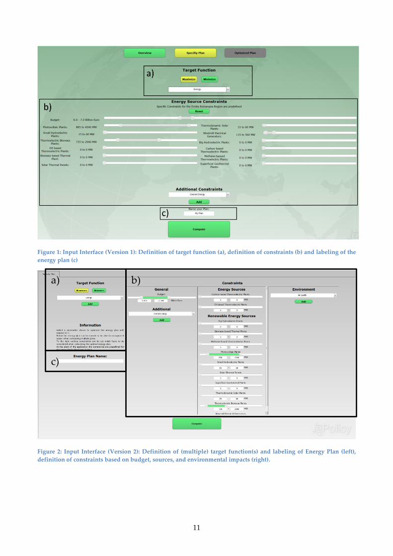
3.3.1 Input Interface
The Input Interface’s primary target is to enable the visual access to all possible degrees of freedom
of the optimization module. With this view the first functional requirement (FR1) is addressed -
the visual definition of input variables. The optimization model accepts a set of variables that can
be used in the optimization function as well as multiple constraints. Thus three areas can be
defined: a) Target function, b) Constraints, c) Labeling of energy plan.
In Figure 1 and Figure 2 the first version and the adapted version of the visual input interface are
shown. The main difference between the two designs concern the new layout of the interface.
Moreover, in the new version the user is enabled to select multiple target functions. As an informal
requirement resulting from the evaluation, all numerical values can be specified with the slider
and an additional text field. Finally, the new variables describing quantitative emmissions are
included in the visual interface. For the general description of the input interface the reader is
referred to D7.1.
11
Figure 1: Input Interface (Version 1): Definition of target function (a), definition of constraints (b) and labeling of the
energy plan (c)
Figure 2: Input Interface (Version 2): Definition of (multiple) target function(s) and labeling of Energy Plan (left),
definition of constraints based on budget, sources, and environmental impacts (right).
a) b)
c)

12
3.3.2 Overview
The Overview (cf. Deliverable D7.1) was considered too complex for the user (cf. evaluation results
in Deliverable D7.2). As a consequence we excluded this view from the second version of the
visual interface. From the workflow perspective the plans generated by the user via the Input
Interface (cf. previous sections) are directly shown in the Compare Plans View. That way, the user
gets an overview of the computed energy plans and can directly compare the variables of the
different plans.
3.3.3 Compare Plans View
The Compare Plans View (Figure 3 (Version 1) and Figure 4 (Version 2)) has the target to compare
energy plans calculated by the global optimizer. This view covers the functional requirement (FR3
and FR4), i.e. the comparison and exploration of energy plans. Multiple visualizations display the
crucial variables separately. The view is organized in three layers of information.
a) Compare energy and cost
b) Compare energy produced by different sources
c) Compare caused impacts on environment
Layer a) allows the user to get a fast overview of the compared plans by presenting overall energy
produced and overall costs of each plan with bar charts. Layer b) splits the costs onto all energy
sources and displays them as grouped bar charts allowing the comparison of the value of an
energy source of one energy plan to the value of another energy plan. And finally the known heat
map (c) shows the different impacts on environment, society and economy. The sidebar to the right
displays the legend with the color encoding. Moreover, the user can select an energy plan from the
combo box or simply click on a bar in the charts. By selecting the “Show Details” button the
selected energy plan is displayed in the Optimized Plan View. By clicking on “Show Multiple
Target Plan Sets” the Pareto View is shown.
The main differences between the two versions of the visual interface concern the layout of the
visualizations, the visualization of impacts and the visualization of emmissions. Moreover, the
user can customize the views in the second version.

13
Figure 3: Compare View (Version 1): (a) Comparison of three energy plans in total produced energy and overall cost.
(b) Energy and cost split up on the different energy sources used by the energy plan. (c) Comparison of
environmental impacts caused by the energy plan.
Figure 4: Compare Plans View (Version 2): User can customize views by selecting the variables to be displayed via
the check boxes. Comparison of six energy plans in total produced energy (top left) and overall cost (top right).
Energy (bottom left) and cost (bottom right) split up on the different energy sources used by the energy plan.
Comparison of environmental impacts caused by the energy plan (right). “Show Details” forwards the user to the
Optimized Plan View. By clicking on “Show Multiple Target Plan Sets” the Pareto View is shown.
a)
b)
c)
14
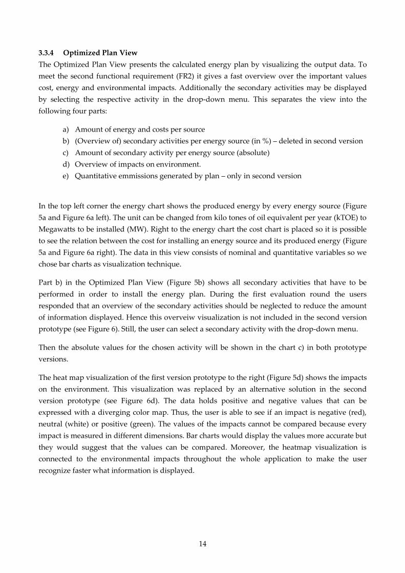
3.3.4 Optimized Plan View
The Optimized Plan View presents the calculated energy plan by visualizing the output data. To
meet the second functional requirement (FR2) it gives a fast overview over the important values
cost, energy and environmental impacts. Additionally the secondary activities may be displayed
by selecting the respective activity in the drop-down menu. This separates the view into the
following four parts:
a) Amount of energy and costs per source
b) (Overview of) secondary activities per energy source (in %) – deleted in second version
c) Amount of secondary activity per energy source (absolute)
d) Overview of impacts on environment.
e) Quantitative emmissions generated by plan – only in second version
In the top left corner the energy chart shows the produced energy by every energy source (Figure
5a and Figure 6a left). The unit can be changed from kilo tones of oil equivalent per year (kTOE) to
Megawatts to be installed (MW). Right to the energy chart the cost chart is placed so it is possible
to see the relation between the cost for installing an energy source and its produced energy (Figure
5a and Figure 6a right). The data in this view consists of nominal and quantitative variables so we
chose bar charts as visualization technique.
Part b) in the Optimized Plan View (Figure 5b) shows all secondary activities that have to be
performed in order to install the energy plan. During the first evaluation round the users
responded that an overview of the secondary activities should be neglected to reduce the amount
of information displayed. Hence this overveiw visualization is not included in the second version
prototype (see Figure 6). Still, the user can select a secondary activity with the drop-down menu.
Then the absolute values for the chosen activity will be shown in the chart c) in both prototype
versions.
The heat map visualization of the first version prototype to the right (Figure 5d) shows the impacts
on the environment. This visualization was replaced by an alternative solution in the second
version prototype (see Figure 6d). The data holds positive and negative values that can be
expressed with a diverging color map. Thus, the user is able to see if an impact is negative (red),
neutral (white) or positive (green). The values of the impacts cannot be compared because every
impact is measured in different dimensions. Bar charts would display the values more accurate but
they would suggest that the values can be compared. Moreover, the heatmap visualization is
connected to the environmental impacts throughout the whole application to make the user
recognize faster what information is displayed.

15
Figure 5: Optimized Plan View: (a) Overview of costs and produced energy (b) Normalized distribution of secondary
activities (c) Absolute distribution for one selected secondary activity (d) Impacts on the environment.
Figure 6: Optimized Plan View: (a) Overview of costs and produced energy (b) Normalized distribution of secondary
activities (c) Absolute distribution for one selected secondary activity (d) Impacts on the environment (e) three
aggregated emission values, min, max and expected value is shown.
3.3.5 Impacts View
The Impacts has not been changed in the second version of the prototype. It was considered less
important by the users. Because of this, the view can be shown to the user on demand.
a) d)
c) e)

16
3.3.6 Pareto View
The Pareto View (see Figure 7) was implemented for the second version of the visual prototype. It
displays the Pareto frontier in the case that the user selects two objective functions. For more
information about the calculation of Pareto samples we refer to D3.4 “Prototype of the global level
policy reasoning system – Version 2”. With the visual interface the two variables defining the two
objective functions are mapped on the x- and y-axis of a scatterplot. The user can select the
calculated plans, she is interested in and compare them in the Compare Plans View. Please note,
that the Pareto view is only provided as add-on. During the final evaluation, it will be decided
whether to include it or not in the final prototype. If more than two objective functions are
selected, this view is not applicable. Then, the calculated plans will be directly shown in the
Compare Plans View (cf. Section 3.3.3).
Figure 7: Pareto View: The Pareto front of the calculated energy plans with the two selected variables energy (x-axis)
and cost (y-axis) is displayed. User can selected plans and add the selection to the Compare Plans View. Blue area
reflects feasible region.

17
Visual Interface to Simulation-Incentive Design Component 4
4.1 Description of Component
In this section, we briefly describe the integrated agent-based simulation/incentive design. For
more information we refer to Deliverables D4.1 “The first complete version of the agent-based
Model”, D4.2 “Description of the actor calibration”, D4.3 “Report on the policy instruments
considered and their likely effectiveness” (all WP4, agent-based simulation), D5.3 “Second
Prototype of incentive policy Mechanism” D5.4 ”First demonstration of the testbed” (all WP5,
incenctive design).
The model is designed to simulate the public adoption of photovoltaic panels supported by
political subsidies. Its purpose is to evaluate different policy options and to support the policy
makers with the selection of the most promising one. In the model the agents represent households
that interact in the geographical region Emilia Romagna in Italy, which constitutes their
environment. The model is designed based on information that the project partners in WP4
acquired through surveys in the respective region. The agent model reflects demographic variables
of the population like age, education and income aggregated on a household level. Further
encoded variables are, e.g., the household's awareness of photovoltaic subsidies, the type of
household, etc. Moreover, the agent's behavior - their action and interaction rules - is modeled.
Based on the agent's individual state, it decides whether to install photovoltaic panels or not.
Further model variables influencing the agent behavior are policy instruments (e.g. financial
subsidies) that may be applied in the simulation to support households in their investments.
A policy option is defined as a set of input parameters for the simulation that constitutes a
simulation scenario. These input parameters can be set by the user, e.g. a policy analyst. The main
input variables of our considered model are the cost to be spent for the photovoltaic panel
installations and the targeted energy. Further input parameters to the simulation model and their
options are:
the policy instruments to be applied: regional incentives (e.g. grants, interest rate), national
incentives (e.g. feed-in tariffs, tax benefits)
the budget distribution over years: no distribution rule (first-come-first-serve), even
distribution, increasing distribution, decreasing distribution
the objective of the scenario: maximize energy, minimize budget, maximize participation
The two main output variables of the simulation are the effectively spent cost and produced
energy. Please note, that these variables are used as input and output. Both output variables -
effective energy and cost - can be analyzed on an agent-level. Each agent is categorized according
to its demographic characteristics.
Hence, for every agent the energy produced per year, the cost spent by the household and the
financial support received through the policy instruments can be extracted as simulation output.
Moreover, the number of subsidy recipients is reported. Each simulation covers several years, in
our use case from 2014 to 2021. This adds another dimension to the output data space. In addition

18
each simulation scenario can be run multiple times in order to measure the variance of the
simulation output.
4.2 Requirements on the Visual Interface
From a visualization perspective, the overall goal of the integrated agent-based
simulation/incentive design component is to detect the optimal policy option (by means of a
subsidy strategy) to reach a energy target with a given budget. Thereby the public behavior
regarding the photovoltaic adoption should be observed. The requirements for our system were
collected through questionnaires and interviews conducted with policy makers from the region
Emilia Romagna in Italy. Based on the overall objective, the extracted qualitative feedback and
informal suggestions, we derived the following concrete tasks to be addressed with the visual
interface.
1) Specification of input parameters to define a single simulation scenario (R1)
2) Visual analysis of output variables. Focus on cost and energy installed (R2)
3) Drill-down into agent-specific output information (e.g. subsidy strategy including
demographic aspects). (R3)
4) Comparison of different scenarios in order to explore dependencies between input and
output of simulation. (R4)
4.3 Description of Visual Interface
The visual interface is based on the two most important analytical tasks that were derived in the
requirement phase: analyzing a single simulation scenario (analysis, R1, R2, R3) and explore
different simulation scenarios (exploration, R4). Both tasks are addressed with distinct visual
modes.
Analysis. The analysis mode enables the user to set the input parameters and run the respective
simulation scenario once or several times with the same input. The user can inspect the results of
the simulation runs including the mean values and standard deviation for all output variables.
Exploration. The exploration mode enables the user to explore the output of multiple simulation
runs generated with different scenarios. The user can observe dependencies between input and
output variables. For example, she might explore how an increase of the maximal costs (input)
might affect the real cost (output).
From an analytical perspective, these two modes complement each other. Following the visual
information-seeking mantra (by Shneiderman et al. in 1996), the user can get an overview first with
the exploration mode, zoom and filter into interesting regions of the parameter space, and get
details-on-demand in the analysis mode. Moreover, in the analysis mode, the user can enlarge the
data set by generating new simulation scenarios and generate its output. In the following we
describe these two visual modes in more detail.

19
4.3.1 Analysis Mode
The analysis mode enables the user to (a) specify the input parameters of a single simulation
scenario (R1), and (b) analyze the simulated output for this scenario (R2, R3). Figure 1 shows the
analysis mode view. To the left the energy target, the budget to be spent by the government, the
budget distribution over time, the policy instruments to be applied and the number of simulation
runs can be specified. After the specification the simulation is executed. The outputs of the
simulation run(s) can be analyzed in a time-oriented (see Figure 8) and a demographics-based
view (see Figure 9).
Figure 8: Analysis mode with time-oriented simulation output. Left: input parameters to be defined. Right: Time-
oriented visualization of simulation output. Three bar charts are illustrating temporal progression of energy
produced (top), costs spent per policy instrument (middle) and number of subsidy recipients including non-
supported households that installed photovoltaic panels (brown bars) (bottom).
The time-dependent view provides details about the energy produced, the cost spent, and the
number of households that installed photovoltaic panels (recipients) over the years 2014 to 2021.
The visualization provides information about the costs spent per policy instrument (interest rate
(bright blue), grant (dark blue), tax (bright green), feed-in tariffs (dark green)) and by the
households themselves. The latter are separated into households that received support (bright
brown) and those that did not (dark brown). The same holds for the number of recipients
separated into households that received funding from one or more of the four policy instruments
(again in blue and green), and those households that did not receive any budget (dark brown).

20
Figure 9: Analysis mode with demographics-based simulation output. Left: input parameters. Right: Nine bar charts
illustrating energy produced, costs spent and number of subsidy recipients (vertically arranged), separated into
demographic categories age, education and income (horizontally arranged).
The agent-dependent view presents details about energy, cost per policy instrument and number
of recipients per policy instrument sorted by the affiliation to demographic groups. In the
visualization these groups are separated by the agents' age, education status and income. The color
mapping is identical to the one described for the time-dependent view.
Following the recommendations of Stephen Few in 2009, we choose bar charts as visualization
techniques in all views of the analysis mode to depict the quantitative information calculated with
the simulation. To raise the awareness of uncertainty in the data, in each view the standard
deviation of the simulated runs is presented with error bars.

21
4.3.2 Exploration Mode
The exploration mode enables the user to detect dependencies between different simulation
scenarios (R4). One specific characteristic of this approach is the exploration of two main variables
that serve as input AND output. In our use case these are energy and cost. The Exploration Mode
supports the observation of dependencies between targeted and effectively reached energy and
costs. We implemented two different visualization techniques for the exploration mode: a discrete
version and a continuous version. In the following we will describe both views.
The Discrete Exploration Mode is realized as a nested visualization in a 2D coordinate system. It
consists of one global grid and multiple local grids being displayed in each cell of the global grid
(see Figure 10). Both grids cover the same parameter space. The value ranges of both axes are
separated into areas of constant width. This results in a regular grid with a fixed number of
rectangles representing the respective value ranges. The input variables of the simulation are
mapped on the global grid. The output variables of the simulation are mapped on the local grids.
Hence, for a given input scenario depicted in a global cell the output is aligned locally. For
example, in Figure 10 the cost is aligned at the x-axis and the power is aligned at the y-axis. The
output simulated with maximum costs and maximum power as input can be seen in the upper
right of the global grid.
Figure 10: Schematic view of the nested visualization. The global grid (left) reflects the input variables. In each cell of
the global grid a local grid displays the input variables (right). The localization of the local grid within the global
grid is supported by a black frame. In the local grid the number of samples per cell is depicted by the size of the
saturated rectangles.
We use the size of the shown local grid cells to visually encode the frequency for a particular
output. Moreover, in each local grid the corresponding input value range is highlighted with a
frame. That way the user can compare the input parameters (framed rectangle) with the output
values (filled rectangles). For example, in the local grid selected in Figure 10, it can be seen, that
some output data samples (pink and grey unframed rectangles) do not match the defined input
(framed rectangle).
In order to support the orientation in the 2D coordinate system, we apply a bipolar color map on
both the global and the local grids. They reflect the position of the values in the grid. In our use
case it ranges from purple (bottom right; low energy with high cost) to green (top left, high energy
with low cost). The color map is applied to the local grid by filling the rectangles and to the global

22
grid by coloring the frames of the global cells. Please note, that the mapping between input and
output can be switched by the user. See Figure 11 for an example of the Discrete Exploration
Mode. In addition, to the grid structure, the user can filter the x-axis and the y-axis to a concrete
value range. As an example in Figure 11 above the global grid, the x-axis (budget) is filtered to an
input range between 200 Million and 1,300 Billion Euros. By clicking on a filled rectangle in the
local grids the respective simulation scenarios and outputs are shown in a pop-up menu (see
Figure 12). By selecting a simulation scenario in this menu, the user is forwarded to the Analysis
Mode where she can analyze the respective output data.
Figure 11: Exploration Mode – Discrete Visualization: Visual exploration of 490 simulation scenarios and their output
with respect to energy (y-axis) and costs (x-axis). Global grid defines input (maximum budget and targeted energy).
Local grids reflect output (effectively reached energy and costs).
Figure 12: Exploration Mode: Context menu. If a user clicks on a rectangle of the output grid, the respective input
scenarios are provided in a context menu. The user can select a scenario and will be forwarded to the analysis mode
with the respective scenario and output data.

23
The Continuous Exploration Mode is implemented as a two dimensional Scatterplot with the
budget on the x-axis and the produced energy on the y-axis (see Figure 13). In the visualization the
blue dots reflect the input values (maximal budget and targeted energy) while the black dots
reflect the output values of the simulation runs (effectively used spent budget and reached
energy). The input scenario and the output values of the simulation are connected via colored
edges. The color reflects the improvement or decline between input and output of the simulation.
The pink edges show a decline of the variables (e.g. higher cost for same amount of energy). Green
reflects an improvement (e.g. more energy for same cost). Grey shows a neutral evolvement
between input and output (e.g. proportional increase of energy and cost). By hovering over a node
the connected nodes are highlighted.
Figure 13: Exploration Mode – Continuous Visualization: Visual exploration of 490 simulation scenarios and their
output with respect to energy (y-axis) and costs (x-axis). Blue dots reflect input values. Black dots reflect simulation
output. Edges show the dependency between input and output. Green edges show an improvement (e.g. more energy
generated with less budget) red edges indicate a decline between input and output values, grey edges reflect a
neutral development between input and output. By clicking on a node a context menu pops up (cf. Figure 12).
Both visualization modes, the discrete and the continuous one, offer different advantages to the
user. While in the continuous version it is easier to spot dependencies between individual input
and output values, an increase of simulation runs will result in over plotting and therefore reduce
the clearness of the presentation. For exploring a large number of simulation scenarios and runs
the discrete visualization mode is the appropriate choice. Moreover, it becomes easier for the user
to detect the overall distribution and deviations of simulation runs from the defined input
parameters. The disadvantage of this mode is its complexity. The user will need some time for
understanding the view. Moreover, direct dependencies between one single input scenario and its
output are more difficult to spot.

24
Visual Interface to Opinion Mining Component 5
5.1 Description of Component
As described in deliverable D6.2 “Prototype of the Opinion Mining System - Version 1” the main
purpose of the Opinion Mining component are:
1) to be able to classify new documents that appear in a pre-defined set of forums of
participation, concerning the expressed sentiment on another pre-defined set of topics;
2) to aggregate the sentiment predicted for the new documents into a single aggregated score
with a certain regularity (e.g. daily);
3) to accept as input a set of topics and a set of e-participation sites, which are to be used to
monitor the sentiment of the population.
The main output of this component from the user’s perspective is a database with blog post
extracted from a predefined set of websites that consider one or more of the predefined topics. For
each of these posts the sentiment towards the predefined topics is calculated on a scale from -2 to
2. Besides the text of the blog post and the calculated sentiment score, the topic affiliation, the date
of post, the author name, the source, and a link to the source URL are stored. This information is
calculated on a daily basis and should help the user to get an overview of the current public
sentiment on a given policy topic (e.g. photovoltaic energy).
5.2 Requirements on the Visual Interface
In contrast to the two visual interfaces described above, the purpose of this visual interface is to
provide visual-interactive access to the output data of the Opinion Mining component that was
processed and stored in a database. No access to the individual parameters of the component has
to be provided. Hence, the informal requirements on the visual interface were not retrieved by a
formal user questionnaire. There have been discussed and specified by the whole consortium.
Since the Region Emilia Romagna and ARPA are part of the consortium and represent potential
users of ePolicy.
The overall objective of the visual interface of the Opinion Mining component is to provide an
intuitive access to the data crawled and processed by the component and stored in a database. The
concrete requirements on the visual interface are:
1) See the temporal progression of the public sentiment score towards one predefined topic
2) Select different levels of aggregation (e.g. daily, monthly, etc.)
3) Compare the temporal progression of the sentiment scores for several predefined topics
4) See the sentiment score of individual posts
5) Get access to the original source of the crawled text

25
5.3 Description of Visual Interface
The visual interface to the Opinion Mining component is structured into four different
visualizations (see Figure 14). On the left side of the visual interface the user can spot different
topics (categories) on which the sentiment analysis has been conducted. In this line chart
visualization the position on the y-axis and the color reflect the moving average of the sentiment
score for the respective category. By clicking on one (e.g. in Figure 14) or several (e.g. in Figure 15)
of these charts the respective chart is shown in the overview visualization (top) with an additional
error band. The sentiment score lies between +2 for positive sentiment and -2 for negative
sentiment. The user can select different aggregation schemes for the moving average from daily to
half year intervals. In order to get more detailed information the user can zoom into an interesting
time interval (e.g. from 2011 to 2012 in Figure 14) and see individual posts in the selected time
interval. These are displayed as dots in an additional scatterplot in the middle of the visual
interface. In this visualization again, the user can select specific posts to be displayed in a table
visualization at the bottom of the visual interface (e.g. in Figure 14 all posts with positive
sentiment are selected). In the table visualization the user gets detailed information about the
selected posts (e.g. date of post, title, author, sentiment score, raw text, source, etc.). Moreover, the
original source can be reached via a provided URL. In Figure 16 a screenshot of a blog is shown.
Figure 14: Visual interface to Opinion Mining component. Left: Categories are displayed by a moving average of the
respective sentiment score over time (green denotes positive sentiment, red denotes negative sentiment). Middle top:
Moving average of sentiment scores for selected category. Middle middle: Zooming into time interval. Middle
middle: Zooming into selected time interval. Individual posts are displayed by dots. Middle bottom: Table with
selected individual posts including link to original source.

26
Figure 15: Visual interface to Opinion Mining component. In this example two topics (categories) are selected in
order to compare the respective sentiment scores over time.
Figure 16: Orignal source - Blog www.energeticambiente.it/. By clicking on a link of the table visualization in Figure
14 the user is forwarded to the original source where the crawled text comes from.

27
General GUI design 6
In the following we will briefly describe the overall GUI design of the WP7 web application
integrating the visual interfaces to the technical components developed within WP3, WP4, WP5
and WP6 of this project.
On the start page of the web application (see Figure 17) the login functionality and a short
introductory text describing the project is provided. The user register as a new user or login if he is
already registered. Moreover, a contact formular and a a “Forgot Password”-button is provided.
Figure 17: Login screen for integrated ePolicy web application
After the login, the overview page is shown (see Figure 19). Here, a short textual description of the
three visual interfaces is shown. The user can navigate to the individual interfaces via the
respective buttons. Moreover, a navigation panel is shown on top of the page. This panel is used as
a static navigation tool being also present when switching to the individual interfaces. The
intermediate results of generated by one of the analysis component is also displayed on the
overview page. An example is shown in Figure 20 where an energy plan calculated by the Global
Optimizer is shown in the overview.
Finally, the overall GUI also includes an account panel where the user can get informaton about
his user profile and the current session. This panel can be reached by clicking on the “Account
Panel” button on the top right of the overall GUI. An example is shown in Figure 18.
Figure 18: Account Panel: By clicking on the account panel arrow basic user management fetaures (e.g. user name,
duration of session, etc.) are provided.

28
Figure 19: Overview showing the three visual interfaces to the three analytical components. A small overview panel
is shown on top of the web application. This enables the navigation, if the user has selected one of the three
interfaces.
Figure 20: Overview showing the three visual interfaces to the three analytical components. A small overview panel
is shown on top of the web application. This enables the navigation, if the user has selected one of the three
interfaces.
29
Summary 7
In this document we have described deliverable D7.3 “Prototypes of visual analytics techniques -
Version 2”. It consists of the refined visual interface to the Global Optimizer component
developed in WP3. Moreover, we describe the implemented visual interfaces to the Social
Simulation/Incentive Design component (WP4/WP5) and the Opinion Mining Component (WP6).
First, we described our methodology for the implementation cycles in WP7. Then, for each
component (coming from WP3, WP4/WP5 and WP6) we summarized its basic functionality. We
recapped the requirements analysis process and summarized the resulting user requirements,
achieved from interviews and questionnaires. The respective questionnaires can be found in the
annex. Then, we described in detail the visual interfaces implemented as web applications
consisting of several views, and interaction modes. Finally, we provided a description of the web
application integrating the three visual interfaces. The visual interface to the Global Optimizer has
been published in the proceedings of the International Symposium on Visual Computing (ISVC
2013)1. The visual interface to the integrated Simulation/Incentive Design component has been
accepted for publication at the i-KNOW conference (i-KNOW 2014)2 and will be presented at this
conference in September this year.
The final step of WP7 will be the evaluation of the visual interfaces regarding their usefulness and
usability (see D7.4). Moreover, the final prototype of WP7 will be evaluated within the activities of
WP9 (see Deliverable D9.3 “Evaluation of the integrated decision support system on the regional
energy plan”).
1 T. Ruppert, J. Bernard, A. Ulmer, A. Kuijper, J. Kohlhammer. Visual Access to Optimization Problems in
Strategic Environmental Assessment. In: G. Bebis et al. (eds.) International Symposium on Visual Computing
(ISVC2013). LNCS, Springer, Heidelberg (2013). 2 T. Ruppert, J. Bernard, A. Ulmer, H. Lücke-Tieke, J. Kohlhammer. Visual Access to Agent-based Simulation
Models to Support Political Decision Making. In: 14th International Conference on Knowledge Management
and Knowledge Technologies (i-KNOW2014). ACM, New York, USA (2014). Accepted for publication

30
Appendix A – Requirement Analysis (Global Optimizer) 8
ePolicy – Engineering the policy making life-cycle
Questionaire
Intro
The ePolicy project is a joint research project funded by the European commission with the goal to support
policy makers in their decision process. One of the use cases in the project focuses on optimizing the
regional energy plan of the region Emilia Romagna in Italy.
At the following Link (URL: …) you will find a first version of the of the ePolicy visualization prototype.
The underlying questionnaire will be used to detect user requirements for the visual interface, and to
evaluate the first version of the visualization prototype. Please fill in the first part of the questionnaire
(“Requirement Analysis”), before exploring the visualization prototype. Please do not resize the window
when using the prototype.
General Questions
Personal Information
Name (optional): _______________________________________________________________
Profession: _______________________________________________________________
Degree of education: _______________________________________________________________
Domain of expertise: _______________________________________________________________
Analysis tasks: _______________________________________________________________

31
Requirements Analysis
What is your role in the policy making process?
Decision Maker
Policy Analyst
Modeling Expert (e.g. mathematician, climate researcher)
Domain Expert (e.g. in energy domain); please specify domain
Public Stakeholder
Other: ______________________________________________________________________
Are you using mathematical methods in the context of policy making?
Yes
No
Which mathematical methods are you currently using in the context of policy making?
Optimization; in which policy domain: ____________________________________________
Simulation; in which policy domain: ______________________________________________
Statistical analysis; in which policy domain: ________________________________________
Game theory; in which policy domain: ____________________________________________
Opinion Mining; in which policy domain: ___________________________________________
Other, in which policy domain:___________________________________________________
Which of these mathematical methods should be included in the future to the policy analysis
process?
Optimization; in which policy domain: ____________________________________________
Simulation; in which policy domain: ______________________________________________
Statistical analysis; in which policy domain: ________________________________________
Game theory; in which policy domain: ____________________________________________
Opinion Mining; in which policy domain: __________________________________________
Other, in which policy domain: __________________________________________________

32
Are you using any analysis software in the context of policy modeling? Which?
__________________________________________________________________________________
Which tasks are you addressing with this software?
__________________________________________________________________________________
Are there any further analysis tasks that are addressed? Who provides the solutions?
__________________________________________________________________________________
__________________________________________________________________________________
In the ePolicy project an energy plan is designed based on the concept of strategical
environmental assessment (SEA). The impact of new policies on the environment is evaluated. An
optimal solution has to fulfill several given constraints while optimizing a given objective function.
Both - objective function and constraints - can be specified by the user.
Which of the following objective functions do you consider relevant?
Maximize energy
Minimize costs
Other, please specify (see annex more options):_____________________________________
__________________________________________________________________________________
Combinations thereof, please specify:_____________________________________________
Which of the following constraints do you consider relevant?
Minimum Maximum
Budget
Installed power (in MW)
Installed power per energy source
Energy to be produced (in KTOE)
Electrical Energy to be produced
Thermal Energy to be produced
Energy to be produced per energy source
Impacts on environment
Please specify which (see webservice
for examples) :______________________________________________________________________

33
Some of the information used for the calculation of an energy plan is hidden in the model. Please specify
which of the following data you might want to adjust!
Cost per installed MW of energy per source
Regional receptivity constraints on maximimum of energy to be installed per source
Dependencies between primary and secondary activities (secondary activities are needed to built
energy plants but do not produce energy themselves (e.g. power lines, etc.))
Qualitative impact of activities on environment (e.g. positive, neutral, negative)
Other:_______________________________________________________________________
Which of the following information should be provided as output of the optimal solution?
Installed power (overall)
Installed power (per source)
Energy produced (overall)
Energy produced (per source)
Costs (overall)
Costs (per source)
Impacts on environment (overall)
Impacts on environment (per source)
Impacts on environment (per source per activity)
Amount of secondary activities (overall)
Amount of secondary activities (per source)
Costs of secondary activities (overall)
Costs of secondary activities (per source)

34
For the comparison several plans, which of the following information should be provided as output of the
optimal solution?
Installed power (overall)
Installed power (per source)
Energy produced (overall)
Energy produced (per source)
Costs (overall)
Costs (per source)
Impacts on environment (overall)
Impacts on environment (per source)
Impacts on environment (per source per secondary activity)
Amount of secondary activities (overall)
Amount of secondary activities (per source)
Costs of secondary activities (overall)
Costs of secondary activities (per source)
Which of the following tasks are relevant for your work?
Analysis of one optimal solution
Comparison of several optimal solutions with different objective function and constraints specified
by user
Exploration of several optimal solutions optimal solutions with different objective function and
constraints precalculated and stored in database
Other, specify: _______________________________________________________________
Thank you very much for your support!
The ePolicy Project Team
35
Appendix B – Requirement Analysis (Social Simulation) 9
ePolicy – Engineering the policy making life-cycle
Requirements Analysis
Introduction
The ePolicy project (www.epolicy-project.eu) is a joint research project funded by the European
commission with the goal to support policy makers in their decision process. Is has two objectives:
(i) To facilitate the policy making process by providing tools that can help policy makers to analyze
the impact of specific policy incentives (e.g. investments grants, feed-in-tariffs, interest rate
subsidies…) and (ii) to apply the thereby gained knowledge to the case study of the regional
energy plan of the Emilia Romagna region in Italy.
Against this background, one aim of the ePolicy project is to provide a computational model to
simulate citizens' adoption of photovoltaic programs and incentives. Solar photovoltaic systems,
or solar panels, are used for generating electrical energy through solar radiation.
To enable an easy access to the complex simulation model a visual interface will be designed. The
underlying questionnaire will be used to detect user requirements for this visual interface. The
questionnaire is structured into two parts: Part 1 will focus briefly on the general case. Part 2
afterwards ask questions with respect to the specific Emilia Romagna energy plan analysis.

36
Part 1
Are you using any models in the context of policy making? Which?
__________________________________________________________________________________
__________________________________________________________________________________
Which tasks are you addressing with these models?
__________________________________________________________________________________
__________________________________________________________________________________
If you would want to analyze the impact of a policy instrument/incentives (e.g. investments
grants, feed-in-tariffs, interest rate subsidies), which results would you typically be interested
in?
__________________________________________________________________________________
__________________________________________________________________________________
Which input parameters (e.g. money over time) would you want to differentiate when analyzing
a policy instrument?
__________________________________________________________________________________
__________________________________________________________________________________
Do you consider the distinction of geographic regions of relevance for a policy instrument
analysis?
Not at all
Only for the input of the analysis
Only for the results of the analysis
Important for both

37
Part 2
The screenshot you are seeing in this part are taken from a simulation model, which attempts to
model the adoption of photovoltaic panels by individual households in the Emilia Romagna region.
38
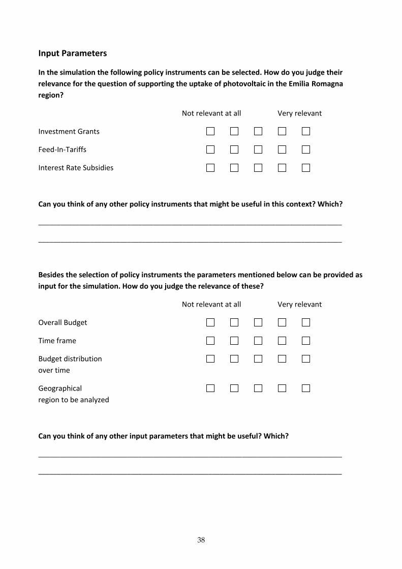
Input Parameters
In the simulation the following policy instruments can be selected. How do you judge their
relevance for the question of supporting the uptake of photovoltaic in the Emilia Romagna
region?
Not relevant at all Very relevant
Investment Grants
Feed-In-Tariffs
Interest Rate Subsidies
Can you think of any other policy instruments that might be useful in this context? Which?
__________________________________________________________________________________
__________________________________________________________________________________
Besides the selection of policy instruments the parameters mentioned below can be provided as
input for the simulation. How do you judge the relevance of these?
Not relevant at all Very relevant
Overall Budget
Time frame
Budget distribution
over time
Geographical
region to be analyzed
Can you think of any other input parameters that might be useful? Which?
__________________________________________________________________________________
__________________________________________________________________________________

39
Output Parameters
The list below indicated which current output plots the simulation is generating. How do you
judge the relevance of these output data generated?
Not relevant at all Very relevant
Number of households with
PV installations at certain point in time
Geographical distribution of PV
installations
Number of households with
PV installations over time
Spatial/Geographic distribution of PV
installations over time
Amount of energy
produced
Cost distribution
over time
Can you think of any other combinations of output information you want to combine and
analyze? Which?
__________________________________________________________________________________
__________________________________________________________________________________
On which granularity level would you like to view the information?
__________________________________________________________________________________
__________________________________________________________________________________

40
Can you specify use cases that exemplify a possible task that can be addressed via the
simulation model? (Find an example below)
Description Stakeholder Input Output
Analyze geographic distribution of PV panels after 1 year by the usage of one instrument
Policy Maker Duration, Policy Instrument, Region
Geographic distribution of PV panels after duration of policy instrument usage
Do you have any open questions, ideas, suggestions, …?
__________________________________________________________________________________
__________________________________________________________________________________
__________________________________________________________________________________
__________________________________________________________________________________

41
Additional Information
Profession/Position: ________________________________________________________
Domain of Expertise: ________________________________________________________
Experience in Years: ________________________________________________________
Analysis task: ________________________________________________________
What is your role in the policy making process (multiple selection possible)?
Decision Maker
Policy Analyst
Modeling Expert (e.g. mathematician, climate researcher)
Domain Expert (e.g. in energy domain); please specify domain: ________________________
Public Stakeholder
Consultant in the Policy Domain
Other: ______________________________________________________________________
Thank you very much for your support!
The ePolicy Project Team