Embed Size (px)
Citation preview

An Introduction to statistics
Counts, proportions and chi square
Written by: Robin Beaumont e-mail: [email protected]
http://www.robin-beaumont.co.uk/virtualclassroom/stats/course1.html
Date last updated Friday, 24/07/2013
Version: 3
“Like fire, the chi-square statistic is an excellent servant and a bad master.” 1965 Sir Austin Bradford Hill
How this chapter should be used: This chapter has been designed to be suitable for both web based and face-to-face teaching. The text has been made to be as interactive as possible with exercises, Multiple Choice Questions (MCQs) and web based exercises.
If you are using this chapter as part of a web-based course you are urged to use the online discussion board to discuss the issues raised in this chapter and share your solutions with other students.
This chapter is part of a series see: http://www.robin-beaumont.co.uk/virtualclassroom/contents.html
Who this chapter is a imed at: This chapter is aimed at those people who want to learn more about statistics in a practical way. It is the eighth in the series.
I hope you enjoy working through this chapter. Robin Beaumont
Acknowledgment My sincere thanks go to Claire Nickerson for not only proofreading several drafts but also providing additional material and technical advice.
Expected values when independent Bloodtype Total
A B AB O
absent 541.2 213.0 92.4 473.4 1320
mild 43.1 16.9 7.4 37.7 105
severe 30.8 12.1 5.3 26.9 75
Total 615.0 242.0 105.0 538.0 1500.0
(1320×615)/1500 = 541.2
Each expected cell value calculated from the marginals =
overall proportion of each category for the variable
Count (expected)
bloodtype Total
A B AB O
absent 543 (541.2)
211 (213.0)
90 (92.4)
476 (473.4)
1320
mild 44
(43.1) 22
(16.9) 8
(7.4) 31
(37.7) 105
severe 28
(30.8) 9
(12.1) 7
(5.3) 31
(26.9) 75
Total 615.0 242.0 105.0 538.0 1500.0
Need to take into account the
actual overall count
Independence and expected values

Counts, proportions and chi square
Robin Beaumont [email protected] D:\web_sites_mine\HIcourseweb new\stats\basics\part12_chi_square.docx page 2 of 45
Contents 1. COUNTS – THE BOTTOM LINE ............................................................................................................................. 3
1.1 COUNTS, FREQUENCIES, PROPORTIONS (Π, P) AND PERCENTAGES ................................................................................ 4
2. SINGLE PROPORTIONS........................................................................................................................................ 5
2.1 IN R COMMANDER AND R .................................................................................................................................. 5 2.1.1 Converting a numeric variable to a factor ............................................................................................... 6 2.1.2 Doing it in R directly - using the counts.................................................................................................... 7 2.1.3 Showing the null hypothesis distribution and explaining the p-value ........................................................ 8
2.2 IN SPSS ........................................................................................................................................................ 8
3. SEVERAL INDEPENDENT PROPORTIONS COMPARED WITH THE AVERAGE.........................................................10
3.1 DOING IT IN R COMMANDER - RAW DATA .............................................................................................................10 3.2 DOING IT IN R COMMANDER - COUNTS ................................................................................................................12 3.3 DOING IT IN R WITH RAW DATA .........................................................................................................................12 3.4 DOING IT IN R WITH COUNTS .............................................................................................................................12 3.5 MOSAIC PLOTS ..............................................................................................................................................13
3.5.1 Mosaic plot options - shading and residual types ...................................................................................13 3.6 WRITING UP THE RESULTS.................................................................................................................................13 3.7 IN SPSS .......................................................................................................................................................14
4. GOODNESS OF FIT/HOMOGENEITY TEST ...........................................................................................................16
4.1 IN R AND R COMMANDER .................................................................................................................................17 4.2 IN SPSS .......................................................................................................................................................18
5. TWO NOMINAL VARIABLES - CONTINGENCY TABLES .........................................................................................20
5.1 CONTINGENCY ...............................................................................................................................................20 5.2 INDEPENDENCE AND EXPECTED VALUES - WHAT DOES IT MEAN? .................................................................................21 5.3 THE NULL HYPOTHESIS .....................................................................................................................................22
5.3.1 Too good a fit ........................................................................................................................................23 5.3.2 Rules of thumb ......................................................................................................................................24
6. EFFECT SIZE .......................................................................................................................................................24
6.1 CARRYING OUT THE ANALYSIS ............................................................................................................................25 6.1.1 R commander ........................................................................................................................................25 6.1.2 R using raw data ...................................................................................................................................25 6.1.3 R using counts .......................................................................................................................................26 6.1.4 SPSS ......................................................................................................................................................27
6.2 GRAPHING THE DATA: MOSAIC PLOTS VERSUS BAR CHARTS ........................................................................................28 6.2.1 In SPSS ..................................................................................................................................................28
7. RESIDUAL ANALYSIS – EXTENDED ASSOCIATION PLOTS ....................................................................................29
8. ASSUMPTIONS FOR THE CHI SQUARE - EXACT P VALUES ...................................................................................30
8.1 POWER AND REQUIRED SAMPLE SIZE ...................................................................................................................31
9. PAIRED DATA MCNES TEST ................................................................................................................................34
9.1 IN R ............................................................................................................................................................34 9.2 IN SPSS .......................................................................................................................................................35 9.3 EFFECT SIZE – PAIRED CASE ...............................................................................................................................35
10. DEVELOPING A STRATEGY AND WRITING UP THE RESULTS ...........................................................................36
11. MULTIPLE CHOICE QUESTIONS ......................................................................................................................37
12. SUMMARY ....................................................................................................................................................41
13. REFERENCES ..................................................................................................................................................42
14. APPENDICES ..................................................................................................................................................43
14.1 R CODE TO PRODUCE HISTOGRAMS WITH EXPECTED PROPORTION LINES ........................................................................43 14.2 MOSAIC PLOTS ..............................................................................................................................................44
Counts, proportions and chi square
Robin Beaumont [email protected] D:\web_sites_mine\HIcourseweb new\stats\basics\part12_chi_square.docx page 3 of 45
1. Counts – the bottom line In much of what we have looked at so far we have been quite subtle considering how a mean value may vary between one or two groups or across many groups by way of a regression equation. However, particularly in medicine the interest is much less subtle than this, the researcher may just want to know if a particular treatment has worked, measuring the number of patents that improved versus no change or got worse or in the most extreme case those who died or survived the treatment! This is where counts are very useful.
The first chapter introduced the concept of data types, notably, nominal, ordinal, interval and ratio data types. Statistics concerning Counts (also called frequencies) are often concerned with nominal data, or treating ordinal/interval/ratio data as if it were nominal.
Exercise. 1.
Review the chapter concerning data types. Make sure you can identify Nominal data and provide examples.
We spent two chapters discussing the ways you can describe interval/ratio data, investigating how you would measure their centre and spread. Subsequently we spent several more chapters seeing how we might evaluate a mean value from one sample, the mean difference between two samples and finally several means by way of regression analysis. We now need to adopt a similar strategy for nominal data. For various reasons I will introduce many of the ideas in this chapter by way of proportions as this seems to be a common thread that runs through the analysis of counts, also traditionally the graphical analysis of counts has been downplayed being restricted to bar charts which I hope to remedy.
Exercise. 2.
Review the section in the graphics chapter looking at Bar charts. How do they differ from histograms? Does order of the categories matter? Justify your answers.
This chapter considers counts/proportions at five levels of complexity:
• Single dichotomous variable • Single nominal variable with several categories • Several independent proportions • Comparing observed proportions to a theoretical distribution • Comparing proportions across two variables
Let's get started with looking at how we describe counts, and proportions.

Counts, proportions and chi square
Robin Beaumont [email protected] D:\web_sites_mine\HIcourseweb new\stats\basics\part12_chi_square.docx page 4 of 45
1.1 Counts, frequencies, proportions (π, p) and percentages
Statisticians have developed ways of describing counts (also called frequencies) and proportions which is useful to know, just in case you ever want to check out a proper statistics book!
'n' or 'f' indicates the number/count/frequency, if you have a number of them they are defined by subscripts thus, n1 means the count is for the first position and n2 is for the second position until you come to the last one often denoted as ni The situation so far described is that of a single column of counts, as shown opposite, notice the use of a dot to indicate how the cells between are not specified.
By allowing the first subscript to designate the row we can add another subscript to indicate the column. However this introduces a potential problem, if we are expressing the rows and columns algebraically, such as i and j we can show this simply by nij however if we wish to indicate the 4th row and 11th column using the same approach we would end up with a subscript of 411 and not know what it means, so to avoid this when referring to actual specific row column values a comma is often inserted between the subscripts. Thus n1,1 is the value for the first row, first column and n2,5 is the value of the second row 5th column, alternatively if the maximum value for the row and column is clear and is less than 10 the comma can be omitted (as in the table opposite).
We often wish to show a summed value, say for a particular row or column which we do by using a + subscript, ni+ indicating the summation of all the values in the ith row and similarly n+j indicates that it is the value for summing over all the values in the jth column, unfortunately this is not a standard, some texts using a dot instead.
A table with I rows and J columns is called a I× J or I by J table.
Along with counts/frequencies come proportions. Consider 100 patients of which 30 have condition X which is equivalent to a proportion of 30/100 = .3 Multiplying this by 100 gives us the percentage or 30%. In this instance a patient can either have or not have the condition (when a variable has only two categories it is said to be dichotomous or binary) letting the total be n (i.e. 100 in this instance) and the other proportion being pb then 1- pa = pb so if we know one proportion we know the other when the possibility is dichotomous. Such a variable follows what is known as a binominal distribution (often indicated in statistics articles by the term 'Bin'). Taking this one step further imagine that our patients have either blue, brown and red eyes and we are interested in investigating this, now we could indicate the three proportions as pa ,
pb and pc proportions. If we have a characteristic that can be divided into k categories we would end up with pa . . ., pk proportions. Each proportion being calculated by ni/n. This time the values follow what is known as the multinomial distribution.
Probability and proportions can be thought of as being synonymous, for example in the long run throwing a six sided dice you would expect the result of a large number of throws to result in a equal number of counts for each value. In other words, we would have (number of observed outcomes for value x)/(total number of throws), which is both a proportion and a probability.
In statistics the sign for a proportion, because we can consider it both as a a parameter for various pdfs, and a sample estimate, needs to be represented by two signs (Agresti 2002 p.39), π and p, unfortunately both the pi character and the 'p' also have other meanings in statistics so context is very important, clearly defining the meaning of the symbol is vitally important.
Throughout this chapter we will be reinforcing the above concepts with practical examples.
n1
n2
·
ni
sample population
p or π̂ π
n11 n12 n1i n1+ n21 n22 n23 n24 n2+ ·· · · · ·
ni1 ni2 ni3 nij ni+ n+1 n+2 n+3 n+j n++
or n grand total
Anatomy of counts in a table Row/column
totals

Counts, proportions and chi square
Robin Beaumont [email protected] D:\web_sites_mine\HIcourseweb new\stats\basics\part12_chi_square.docx page 5 of 45
2. Single Proportions In some situations you know the total number of events so it is possible to work out a proportion, for example the number of live births versus unsuccessful deliveries in the UK each year. In contrast you may only have a count of the number of reported murders that take place a year in the UK. In this second situation you can sometimes create a type of proportion such as murders per million population etc. but there is no validity here in considering a proportion.
The simplest test is to compare an observed (sample) to an expected proportion (a population value), for example say we have 328 post operative infections from a group of 1361 patients (i.e. 1033 non infected patients) and we know that the country wide post operative infection rate is 25%. What is the probability of obtaining a rate like ours or one more extreme given that it is a sample from a population with an incidence of 25%.
2.1 In R commander and R
We will assume to begin with we have the raw data from each person. To use R commander, from within R you need to load R commander by typing in the following command:
library(Rcmdr)
You can obtain the data directly from my website by selecting the R commander menu option:
Data-> from text, the clipboard or URL
I have given the resultant dataframe the name mydataframe, also indicating that it is from a URL (i.e. the web) and the columns are separated by tab characters.
Clicking on the OK button brings up the internet URL box, which you need to type in the following to obtain my sample
data:
http://www.robin-beaumont.co.uk/virtualclassroom/book2data/binary_n1361.dat
Click OK
It is always a good idea to check the data and you can achieve this easily in R commander by clicking on the View data set button. You can see we have 1361 rows and one column, the column being filled with '1's (those infected) and '2's (those uninfected).
Counts, proportions and chi square
Robin Beaumont [email protected] D:\web_sites_mine\HIcourseweb new\stats\basics\part12_chi_square.docx page 6 of 45
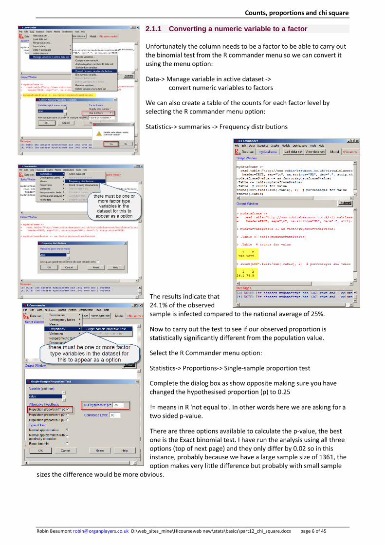
2.1.1 Converting a numeric variable to a factor
Unfortunately the column needs to be a factor to be able to carry out the binomial test from the R commander menu so we can convert it using the menu option:
Data-> Manage variable in active dataset -> convert numeric variables to factors
We can also create a table of the counts for each factor level by selecting the R commander menu option:
Statistics-> summaries -> Frequency distributions
The results indicate that 24.1% of the observed sample is infected compared to the national average of 25%.
Now to carry out the test to see if our observed proportion is statistically significantly different from the population value.
Select the R Commander menu option:
Statistics-> Proportions-> Single-sample proportion test
Complete the dialog box as show opposite making sure you have changed the hypothesised proportion (p) to 0.25
!= means in R 'not equal to'. In other words here we are asking for a two sided p-value.
There are three options available to calculate the p-value, the best one is the Exact binomial test. I have run the analysis using all three options (top of next page) and they only differ by 0.02 so in this instance, probably because we have a large sample size of 1361, the option makes very little difference but probably with small sample
sizes the difference would be more obvious.

Counts, proportions and chi square
Robin Beaumont [email protected] D:\web_sites_mine\HIcourseweb new\stats\basics\part12_chi_square.docx page 7 of 45
Regardless of which method we selected to calculate the p-value it is greater than the standard critical value of 0.05 so we would conclude that the observed proportion of 24.1% of infected patients compared to the population value of 25% is only due to random sampling. To be more precise we can say that given the P value is .452, given that the population proportion is 25%, we are likely to obtain a result equal to or one more extreme around forty five times in every hundred. To help understand this we can show it graphically (see the following section).
Alternatively if we had taken the confidence interval approach we would have noticed that the 95% CI is right in the middle of the estimate .2409 (i.e. 24%) in other words we are 95% confident that the interval .21 to .26 contains the population proportion.
2.1.2 Doing it in R directly - using the counts
In the script/output windows on the previous page you can see the R code generated by the various menu selections we made. Before the prop.test() or binom.test() commands there are several other lines of R code. These other lines of code convert our raw data into a table of frequencies which each subsequently uses. In R a dot is just another character and I find name like '.Table' confusing so I have slightly edited the above code to make it a bit easier to understand.
mytable <- xtabs(~ value , data= mydataframe )
mytable
binom.test(rbind(mytable), alternative='two.sided', p=.25, conf.level=.95)
The important aspect the above discussion of the R code demonstrates that the actual R command that carried out the binomial test uses the counts of the two categories rather than the raw data.
In fact we could have entered the counts directly and obtained our result in a single line of R code:
binom.test(c(328, 1033), alternative='two.sided', p=.25, conf.level=.95)
If we can't even be bothered to work out how many there are in the second category we can use:
binom.test(328, 1361, alternative='two.sided', p=.25, conf.level=.95)
We can show what the associated p-value mean very nicely with a graph using R Commander.
create a table called mytable make the table consist of frequencies from the value column use the value column in mydataframe
show mytable, which consists of two rows: 1 2 328 1033
use mytable; rbind = bind the rows together not really necessary
data consists of a single column with two values one category the other category
one category total number
one column
two columns
Counts, proportions and chi square
Robin Beaumont [email protected] D:\web_sites_mine\HIcourseweb new\stats\basics\part12_chi_square.docx page 8 of 45
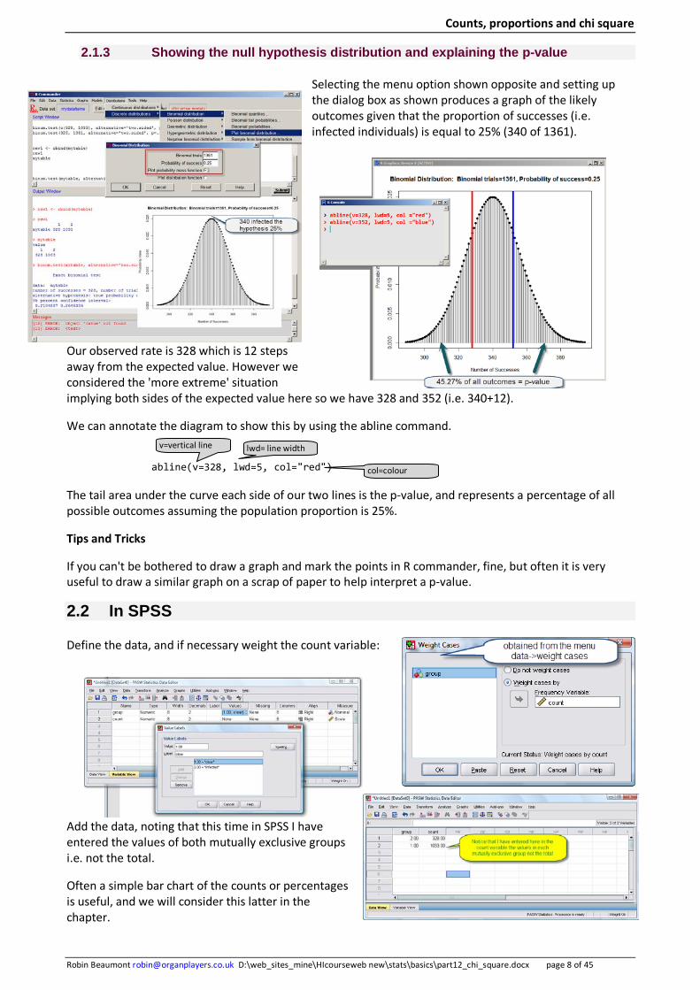
2.1.3 Showing the null hypothesis distribution and explaining the p-value
Selecting the menu option shown opposite and setting up the dialog box as shown produces a graph of the likely outcomes given that the proportion of successes (i.e. infected individuals) is equal to 25% (340 of 1361).
Our observed rate is 328 which is 12 steps away from the expected value. However we considered the 'more extreme' situation implying both sides of the expected value here so we have 328 and 352 (i.e. 340+12).
We can annotate the diagram to show this by using the abline command.
abline(v=328, lwd=5, col="red")
The tail area under the curve each side of our two lines is the p-value, and represents a percentage of all possible outcomes assuming the population proportion is 25%.
Tips and Tricks
If you can't be bothered to draw a graph and mark the points in R commander, fine, but often it is very useful to draw a similar graph on a scrap of paper to help interpret a p-value.
2.2 In SPSS
Define the data, and if necessary weight the count variable:
Add the data, noting that this time in SPSS I have entered the values of both mutually exclusive groups i.e. not the total.
Often a simple bar chart of the counts or percentages is useful, and we will consider this latter in the chapter.
v=vertical line lwd= line width
col=colour
Counts, proportions and chi square
Robin Beaumont [email protected] D:\web_sites_mine\HIcourseweb new\stats\basics\part12_chi_square.docx page 9 of 45
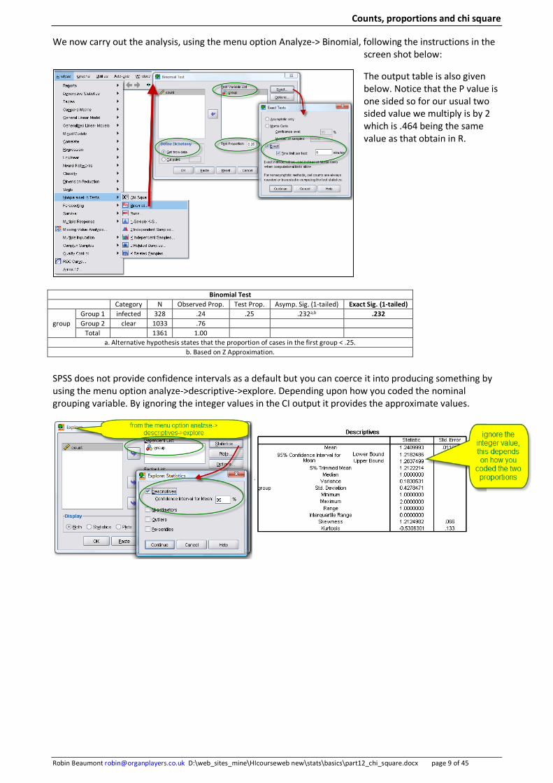
We now carry out the analysis, using the menu option Analyze-> Binomial, following the instructions in the screen shot below:
The output table is also given below. Notice that the P value is one sided so for our usual two sided value we multiply is by 2 which is .464 being the same value as that obtain in R.
SPSS does not provide confidence intervals as a default but you can coerce it into producing something by using the menu option analyze->descriptive->explore. Depending upon how you coded the nominal grouping variable. By ignoring the integer values in the CI output it provides the approximate values.
Binomial Test Category N Observed Prop. Test Prop. Asymp. Sig. (1-tailed) Exact Sig. (1-tailed)
group Group 1 infected 328 .24 .25 .232a,b .232 Group 2 clear 1033 .76
Total 1361 1.00 a. Alternative hypothesis states that the proportion of cases in the first group < .25.
b. Based on Z Approximation.
Counts, proportions and chi square
Robin Beaumont [email protected] D:\web_sites_mine\HIcourseweb new\stats\basics\part12_chi_square.docx page 10 of 45
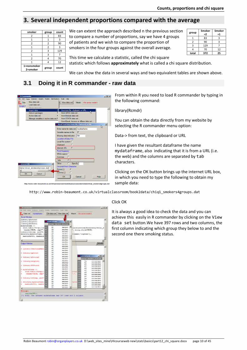
3. Several independent proportions compared with the average We can extent the approach described n the previous section to compare a number of proportions, say we have 4 groups of patients and we wish to compare the proportion of smokers in the four groups against the overall average.
This time we calculate a statistic, called the chi square statistic which follows approximately what is called a chi square distribution.
We can show the data in several ways and two equivalent tables are shown above.
3.1 Doing it in R commander - raw data
From within R you need to load R commander by typing in the following command:
library(Rcmdr)
You can obtain the data directly from my website by selecting the R commander menu option:
Data-> from text, the clipboard or URL
I have given the resultant dataframe the name mydataframe, also indicating that it is from a URL (i.e. the web) and the columns are separated by tab characters.
Clicking on the OK button brings up the internet URL box, in which you need to type the following to obtain my sample data:
http://www.robin-beaumont.co.uk/virtualclassroom/book2data/chiq1_smokers4groups.dat
Click OK
It is always a good idea to check the data and you can achieve this easily in R commander by clicking on the View data set button.We have 397 rows and two columns, the first column indicating which group they below to and the second one there smoking status.
smoker group count 2 1 83 1 1 3 2 2 90 1 2 3 2 3 129 1 3 7 2 4 70 1 4 12
1=nonsmoker 2=smoker group count
group Smoker =2
Smoker =1
1 83 3 2 90 3 3 129 7 4 70 12
total 372 25

Counts, proportions and chi square
Robin Beaumont [email protected] D:\web_sites_mine\HIcourseweb new\stats\basics\part12_chi_square.docx page 11 of 45
Now to carry out the test to see if any of our observed proportions are statistically significantly different from the population value of the overall proportion.
Select the R Commander menu option:
Statistics-> Contingency tables-> two way table
Complete the dialog box as show opposite making sure you have selected both variables.
I have selected besides the chi-square test both the components of the chi square test and the expected frequencies.
The components of the chi square statistic option allows me to see how much any of the categories groups varied from the overall average proportion. Also seeing the expected frequencies allows me to assess the danger of any of the cells having an expected frequency of less than five which effects the validity of the chi square test result.
The results are shown opposite.
The expected count cells give details of the values that should be in each cell if each group had the same proportion of
smokers. Notice that group 4 has 12 smokers compared to the expected 5.2 count. Selecting the row percentages option and re-running the analysis shows that group 4 has 3 times the proportion of nonsmokers compared to the other groups. We could collapse all the other groups data together and see if we still obtained a similar p-value as a final check.
shows the data that the results are based on, always a good thing to check
The result 0.0055 which is less than the usual critical value of 0.05 therefore we have a statistically significant result. Meaning that one or more of the groups proportions of smokers is different to that of the overall proportion.
none of the groups has a expected value of less than 5 so probably the result is valid
Which of the groups have a significantly different proportion of smokers? Group 4 nonsmoker category have a very high residual of 9.05, clearly this is the group.
Counts, proportions and chi square
Robin Beaumont [email protected] D:\web_sites_mine\HIcourseweb new\stats\basics\part12_chi_square.docx page 12 of 45
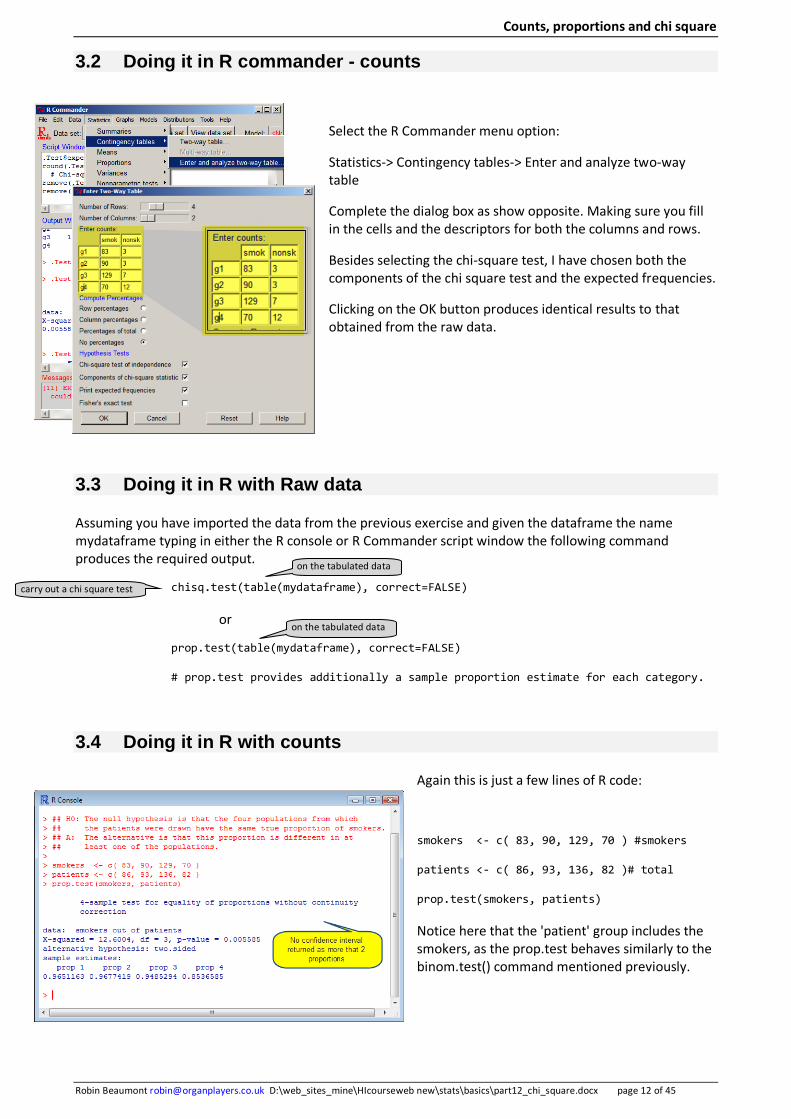
3.2 Doing it in R commander - counts
Select the R Commander menu option:
Statistics-> Contingency tables-> Enter and analyze two-way table
Complete the dialog box as show opposite. Making sure you fill in the cells and the descriptors for both the columns and rows.
Besides selecting the chi-square test, I have chosen both the components of the chi square test and the expected frequencies.
Clicking on the OK button produces identical results to that obtained from the raw data.
3.3 Doing it in R with Raw data
Assuming you have imported the data from the previous exercise and given the dataframe the name mydataframe typing in either the R console or R Commander script window the following command produces the required output.
chisq.test(table(mydataframe), correct=FALSE)
or
prop.test(table(mydataframe), correct=FALSE)
# prop.test provides additionally a sample proportion estimate for each category.
3.4 Doing it in R with counts
Again this is just a few lines of R code:
smokers <- c( 83, 90, 129, 70 ) #smokers
patients <- c( 86, 93, 136, 82 )# total
prop.test(smokers, patients)
Notice here that the 'patient' group includes the smokers, as the prop.test behaves similarly to the binom.test() command mentioned previously.
carry out a chi square test
on the tabulated data
on the tabulated data
Counts, proportions and chi square
Robin Beaumont [email protected] D:\web_sites_mine\HIcourseweb new\stats\basics\part12_chi_square.docx page 13 of 45
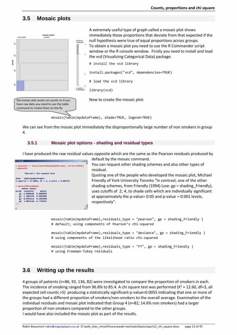
3.5 Mosaic plots
A extremely useful type of graph called a mosaic plot shows immediately those proportions that deviate from that expected if the null hypothesis were true of equal proportions across groups. To obtain a mosaic plot you need to use the R Commander script window or the R console window. Firstly you need to install and load the vcd (Visualizing Categorical Data) package. # install the vcd library
install.packages("vcd", dependencies=TRUE)
# load the vcd library
library(vcd)
Now to create the mosaic plot:
mosaic(table(mydataframe), shade=TRUE, legend=TRUE)
We can see from the mosaic plot immediately the disproportionally large number of non smokers in group 4.
3.5.1 Mosaic plot options - shading and residual types
I have produced the raw residual values opposite which are the same as the Pearson residuals produced by default by the mosaic command. You can request other shading schemes and also other types of residual. Quoting one of the people who developed the mosaic plot, Michael Friendly of York University Toronto "In contrast, one of the other shading schemes, from Friendly (1994) (use: gp = shading_Friendly), uses cutoffs of 2; 4, to shade cells which are individually significant at approximately the p-value= 0:05 and p-value = 0:001 levels, respectively".
mosaic(table(mydataframe),residuals_type = "pearson", gp = shading_Friendly ) # default; using components of Pearson’s chi-squared
mosaic(table(mydataframe),residuals_type = "deviance", gp = shading_Friendly ) # using components of the likelihood ratio chi-squared
mosaic(table(mydataframe),residuals_type = "FT", gp = shading_Friendly ) # using Freeman-Tukey residuals
3.6 Writing up the results
4 groups of patients (n=86, 93, 136, 82) were investigated to compare the proportion of smokers in each. The incidence of smoking ranged from 96.8% to 85.4. A chi square test was performed (X2 = 12.60, df=3, all expected cell counts >5) producing a statistically significant p-value=0.0055 indicating that one or more of the groups had a different proportion of smokers/non-smokers to the overall average. Examination of the individual residuals and mosaic plot indicated that Group 4 (n=82; 14.6% non smokers) had a larger proportion of non smokers compared to the other groups. I would have also included the mosaic plot as part of the results.
-1
0
2
3
Pearsonresiduals:
p-value =0.0055855
smoker.status
grou
pg4
g3g2
g1
nonsmoker smoker
the mosaic plot works on counts so if you have raw data you need to use the table command to create them on the fly
Counts, proportions and chi square
Robin Beaumont [email protected] D:\web_sites_mine\HIcourseweb new\stats\basics\part12_chi_square.docx page 14 of 45
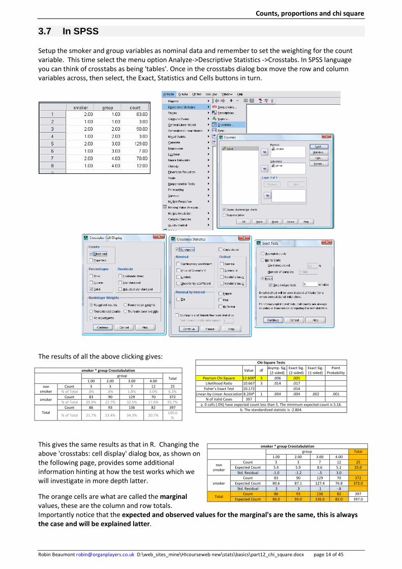
3.7 In SPSS
Setup the smoker and group variables as nominal data and remember to set the weighting for the count variable. This time select the menu option Analyze->Descriptive Statistics ->Crosstabs. In SPSS language you can think of crosstabs as being 'tables'. Once in the crosstabs dialog box move the row and column variables across, then select, the Exact, Statistics and Cells buttons in turn.
The results of all the above clicking gives:
This gives the same results as that in R. Changing the above 'crosstabs: cell display' dialog box, as shown on the following page, provides some additional information hinting at how the test works which we will investigate in more depth latter.
The orange cells are what are called the marginal values, these are the column and row totals. Importantly notice that the expected and observed values for the marginal's are the same, this is always the case and will be explained latter.
Chi-Square Tests
Value df Asymp. Sig. (2-sided)
Exact Sig. (2-sided)
Exact Sig. (1-sided)
Point Probability
Pearson Chi-Square 12.600a 3 .006 .005 Likelihood Ratio 10.667 3 .014 .017
Fisher's Exact Test 10.172 .014 Linear-by-Linear Association 8.204b 1 .004 .004 .002 .001
N of Valid Cases 397 a. 0 cells (.0%) have expected count less than 5. The minimum expected count is 5.16.
b. The standardized statistic is -2.864.
smoker * group Crosstabulation
group
Total 1.00 2.00 3.00 4.00
non smoker
Count 3 3 7 12 25 % of Total .8% .8% 1.8% 3.0% 6.3%
smoker Count 83 90 129 70 372
% of Total 20.9% 22.7% 32.5% 17.6% 93.7%
Total Count 86 93 136 82 397
% of Total 21.7% 23.4% 34.3% 20.7% 100.0%
smoker * group Crosstabulation
group Total
1.00 2.00 3.00 4.00
non smoker
Count 3 3 7 12 25 Expected Count 5.4 5.9 8.6 5.2 25.0
Std. Residual -1.0 -1.2 -.5 3.0
smoker Count 83 90 129 70 372
Expected Count 80.6 87.1 127.4 76.8 372.0 Std. Residual .3 .3 .1 -.8
Total Count 86 93 136 82 397
Expected Count 86.0 93.0 136.0 82.0 397.0
Counts, proportions and chi square
Robin Beaumont [email protected] D:\web_sites_mine\HIcourseweb new\stats\basics\part12_chi_square.docx page 15 of 45
Finally notice the standardised residuals, (this is the same value as produced in R with the $residuals option) representing the difference between the observed and expected score converted to a z score. So you would think a value of +/-1.96 would occur less than .05 of the time (i.e. less than once every 20 times) and a value of +/-2.58 would occur less than .01 of the time. Unfortunately this is only true for large samples, otherwise it is an underestimate. We say in this instance the 'z' value is asymptomatically normally distributed. Other researchers have suggested an improved statistic see Everitt & Hothorn 2006 (p.37 & p.40). Even with this proviso our standardized residual of 3 indicates a large departure from the expected value. From this we can infer that group 4 is the one that deviates the most from the expected proportion the expected proportion being 5.2/82=.063, and because we are
assuming the proportion is equal across all the groups, it is also equal to the marginal totals, 25/397 = 0.06297 We will return to this and investigate how use is made of these observed and expected values in the next section.
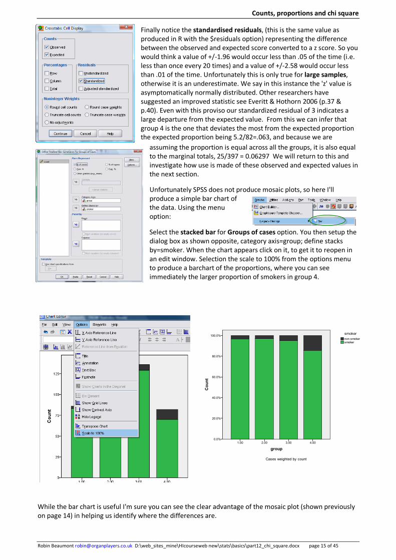
Unfortunately SPSS does not produce mosaic plots, so here I'll produce a simple bar chart of the data. Using the menu option:
Select the stacked bar for Groups of cases option. You then setup the dialog box as shown opposite, category axis=group; define stacks by=smoker. When the chart appears click on it, to get it to reopen in an edit window. Selection the scale to 100% from the options menu to produce a barchart of the proportions, where you can see immediately the larger proportion of smokers in group 4.
While the bar chart is useful I'm sure you can see the clear advantage of the mosaic plot (shown previously on page 14) in helping us identify where the differences are.
Counts, proportions and chi square
Robin Beaumont [email protected] D:\web_sites_mine\HIcourseweb new\stats\basics\part12_chi_square.docx page 16 of 45
4. Goodness of fit/homogeneity test So far we have not considered the chi square statistic and its associated p-value in details so let's remedy the situation.
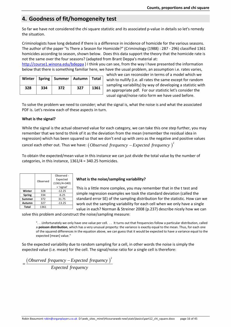
Criminologists have long debated if there is a difference in incidence of homicide for the various seasons. The author of the paper "Is There a Season for Homicide?" (Criminology (1988) : 287 - 296) classified 1361 homicides according to season, shown below. Does this data support the theory that the homicide rate is not the same over the four seasons? (adapted from Brant Deppa's material at: http://course1.winona.edu/bdeppa ) I think you can see, from the way I have presented the information below that there is something familiar here, we have the usual problem, an assumption i.e. rates varies,
which we can reconsider in terms of a model which we wish to nullify (i.e. all rates the same except for random sampling variability) by way of developing a statistic with an appropriate pdf. For our statistic let's consider the usual signal/noise ratio form we have used before.
To solve the problem we need to consider; what the signal is, what the noise is and what the associated PDF is. Let's review each of these aspects in turn.
What is the signal?
While the signal is the actual observed value for each category, we can take this one step further, you may remember that we tend to think of it as the deviation from the mean (remember the residual idea in regression) which has been squared so that we don't end up with zero as the negative and positive values cancel each other out. Thus we have: ( )2Observed frequency Expected frequency−
To obtain the expected/mean value in this instance we can just divide the total value by the number of categories, in this instance, 1361/4 = 340.25 homicides.
What is the noise/sampling variability?
This is a little more complex, you may remember that in the t test and simple regression examples we took the standard deviation (called the standard error SE) of the sampling distribution for the statistic. How can we work out the sampling variability for each cell when we only have a single value in each? Norman & Streiner 2008 (p.237) describe nicely how we can
solve this problem and construct the noise/sampling measure:
". . .Unfortunately we only have one value per cell. . . It turns out that frequencies follow a particular distribution, called a poisson distribution, which has a very unusual property: the variance is exactly equal to the mean. Thus, for each one of the squared differences in the equation above, we can guess that it would be expected to have a variance equal to the expected [mean] value."
So the expected variability due to random sampling for a cell, in other words the noise is simply the expected value (i.e. mean) for the cell. The signal/noise ratio for a single cell is therefore:
( )2Observed frequency Expected frequencyExpected frequency
−=
Winter Spring Summer Autumn Total
328 334 372 327 1361
Observed
Observed -Expected
(1361/4=340) = 'signal'
Winter 328 -12.25 Spring 334 -6.25
Summer 372 31.75 Autumn 327 -13.25
Total 1361

Counts, proportions and chi square
Robin Beaumont [email protected] D:\web_sites_mine\HIcourseweb new\stats\basics\part12_chi_square.docx page 17 of 45
Considering the whole table we simply add all the above values together (one for each cell) to create a chi square statistic denoted X2, which we know approximately follows what is called a chi square PDF,
denoted by the 2χ symbol. we can express this mathematically, remembering that the ~ symbol means 'is defined by PDF':
( )2 22( )2 ~ 1
all cells
Observed frequency Expected frequency O EX distribution with df kExpected frequency Eall cells
χ− −
= = − = −∑ ∑The chi square PDF only takes one parameter, the degrees of freedom, which in this instance (where we are dealing with a single column) is equal to the number of cells (categories) minus 1.
Some things to note; each category is both independent and exclusive, that is a case can only be in one category, and also the total number of categories represents all possible options. Both these assumptions are important, in other words should not be violated: Finally the expected value for each cell must be more than 5 for the chi square statistic, given that the null hypothesis is true, to follow the Chi square distribution. More about this in the Chi square statistic assumptions section.
Let's consider the analysis of the above dataset in both R and spss.
4.1 In R and R commander
In R commander you require the raw data and then use the menu option statistics summaries-> frequency distributions and click on the option: you are then presented with a dialog box asking for the expected frequency in each category.
In R it is just a simple matter of entering the data and requesting the test:
To get a mosaic plot you need to creata an extra column of expected values:
# add the expected values as a second column counts<- matrix(c(328, 340.25, 334, 340.25, 372, 340.25, 327, 340.25 ), ncol=2, byrow=TRUE) rownames(counts) <- c("winter","spring" , "summer", "autumn") colnames(counts) <- c("observed","expected") counts library(vcd) mosaic(counts, residuals_type = "pearson", gp =shading_Friendly)
Exercise 3.
What do you think the result$observed, result$expected, result$residuals do in the above?
-0
0
0
Pearsonresiduals:
B
Aau
tum
nsu
mm
ersp
ring
win
ter
observed expected
result<- chisq.test(c(328,334,372,327)) result result$observed result$expected result$residuals
column names
row names
extra values added
Counts, proportions and chi square
Robin Beaumont [email protected] D:\web_sites_mine\HIcourseweb new\stats\basics\part12_chi_square.docx page 18 of 45
To obtain the confidence intervals we need to consider the proportion for each group separately, as independent tests:
prop.test(328, 1361, p=.25, conf.level = 0.95) # gives:95% CI: 0.2186719 0.2648081 prop.test(334, 1361, p=.25, conf.level = 0.95) # gives:95% CI: 0.2229282 0.2693435 prop.test(372, 1361, p=.25, conf.level = 0.95) # gives:95% CI: 0.2499575 0.2979951 prop.test(327, 1361, p=.25, conf.level = 0.95) # gives:95% CI: 0.2179628 0.2640519
4.2 In SPSS
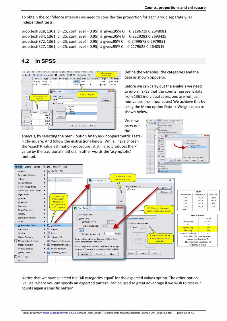
Define the variables, the categories and the data as shown opposite.
Before we can carry out the analysis we need to inform SPSS that the counts represent data from 1361 individual cases, and are not just four values from four cases! We achieve this by using the Menu option Data -> Weight cases as shown below.
We now carry out the
analysis, by selecting the menu option Analyse-> nonparametric Tests -> Chi-square. And follow the instructions below. While I have chosen the 'exact' P value estimation procedure , it still also produces the P value by the traditional method, in other words the 'asymptotic' method.
Notice that we have selected the 'All categories equal' for the expected values option. The other option, 'values' where you can specify an expected pattern can be used to great advantage if we wish to test our counts again a specific pattern.
count Observed N Expected N Residual
327 340.3 -13.3 328 340.3 -12.3 334 340.3 -6.3 372 340.3 31.8
1361
Test Statistics count
Chi-Square 4.035a df 3
Asymp. Sig. .258 Exact Sig. .258
Point Probability .001 a. 0 cells (.0%) have expected
frequencies less than 5. The minimum expected cell
frequency is 340.3.
Counts, proportions and chi square
Robin Beaumont [email protected] D:\web_sites_mine\HIcourseweb new\stats\basics\part12_chi_square.docx page 19 of 45
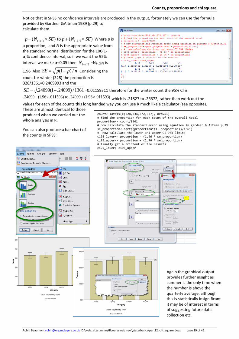
count<-matrix(c(328,334,372,327), nrow=1) # find the proportion for each count of the overall total proportion<- count/1361 # now calculate the standard error using equation in gardner & Altman p.29 se_proportion<-sqrt((proportion*(1- proportion))/1361) # now calculate the lower and upper CI 95% limits ci95_lower<- proportion - (1.96 * se_proportion) ci95_upper<- proportion + (1.96 * se_proportion) # finally get a printout of the results ci95_lower; ci95_upper
Notice that in SPSS no confidence intervals are produced in the output, fortunately we can use the formula provided by Gardner &Altman 1989 (p.29) to calculate them.
1 /2 1 /2( ) to ( )p N SE p N SEα α− −− × + × Where p is a proportion, and N is the appropriate value from the standard normal distribution for the 100(1-α)% confidence interval, so if we want the 95% interval we make α=0.05 then 1 /2N α− =N1-.05/2 is
1.96 Also (1 ) /SE p p n= − Considering the count for winter (328) the proportion is 328/1361=0.2409993 and the
.24099(1 .24099) /1361SE = − =0.01159311 therefore for the winter count the 95% CI is .24099 (1.96 .011593) to .24099 (1.96 .011593)− × + × which is .21827 to .26372, rather than work out the values for each of the counts this long handed way you can use R much like a calculator (see opposite). These are almost identical to those produced when we carried out the whole analysis in R.
You can also produce a bar chart of the counts in SPSS:
Again the graphical output provides further insight as summer is the only time when the number is above the quarterly average, although this is statistically insignificant it may be of interest in terms of suggesting future data collection etc.

Counts, proportions and chi square
Robin Beaumont [email protected] D:\web_sites_mine\HIcourseweb new\stats\basics\part12_chi_square.docx page 20 of 45
5. Two nominal variables - Contingency tables We now come to the most common situation which is where you have two nominal variables. I will use the example in Daniel 1991 (p.546). A research team collect data on 1500 patients with a particular condition which can be classified as Absent, Mild or Severe. Along with this the researchers also record the blood type of each person (A, B, AB, or O). Notice that severity of the condition is really a ordinal variable, but often in contingency tables ordinal or even interval/ratio variables are treated as nominal variables.
What might we be interested in considering in this table? Several things come to mind including:
For each of the condition categories do the proportions vary, between blood types beyond that expected by random sampling.
For each of the blood type categories do the proportions vary, between condition severity, beyond that expected from random sampling.
These types of question can be answered by carrying out a chi square test along with residual analysis and inspection of numerical/graphical output, but before we start all that, several terms used when discussing these types of table need some explanation. First what does contingency mean?
5.1 Contingency
One of the best explanations for the use of this term is in the Wikipedia article, contingency table: http://en.wikipedia.org/wiki/Contingency_table which I have adapted slightly
The number of people with severe, mild or absent condition, and a particular blood group are called marginal totals (the yellow cells in the above table). In contrast the grand total, i.e., the total number of individuals represented in the contingency table, is the number in the bottom right corner of the table.
The table allows us to see at a glance that the proportion of those with a mild condition who have blood type A is about the same as the proportion of those with the absent condition who possess the same blood group although the proportions are not identical. The significance of the difference between the two proportions can be assessed with a variety of statistical tests including Pearson's chi-square test, . . . . If the proportions of individuals in the different columns vary significantly between rows (or vice versa), we say that there is a contingency between the two variables. In other words, the two variables are not independent. If there is no contingency, we say that the two variables are independent.
So contingency and independence when applied to these tables, is concerned with proportions i.e. probabilities:
• The expected values of the individual cells can be calculated from the marginal's, in other words they are contingent on the marginal's.
• The variables are said to be independent if the expected and observed values match each other resulting in a small chi square value and a large associated p-value. This is also often called homogeneity (Agresti 2002 p.39).
• The variables are said to be dependent if the expected and observed differ, as measured by the chi square statistic and its associated P value resulting in a large chi square value and a small associated p-value (i.e. statistically significant p-value).
The term contingency was introduced by Karl Pearson in 1904 (Agresti 2002 p.36).
Blood type Severity of condition O AB B A Total
Severe 31 7 9 28 75 Mild 31 8 22 44 105
Absent 476 90 211 543 1320 Total 538 105 242 615 1500
-1
0
1
Pearsonresiduals:
blood_group
cond
ition
seve
remild
abse
nt
A AB B O
Counts, proportions and chi square
Robin Beaumont [email protected] D:\web_sites_mine\HIcourseweb new\stats\basics\part12_chi_square.docx page 21 of 45
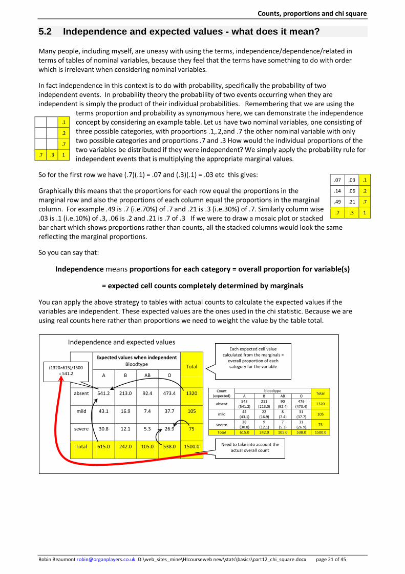
5.2 Independence and expected values - what does it mean?
Many people, including myself, are uneasy with using the terms, independence/dependence/related in terms of tables of nominal variables, because they feel that the terms have something to do with order which is irrelevant when considering nominal variables.
In fact independence in this context is to do with probability, specifically the probability of two independent events. In probability theory the probability of two events occurring when they are independent is simply the product of their individual probabilities. Remembering that we are using the
terms proportion and probability as synonymous here, we can demonstrate the independence concept by considering an example table. Let us have two nominal variables, one consisting of three possible categories, with proportions .1,.2,and .7 the other nominal variable with only two possible categories and proportions .7 and .3 How would the individual proportions of the two variables be distributed if they were independent? We simply apply the probability rule for independent events that is multiplying the appropriate marginal values.
So for the first row we have (.7)(.1) = .07 and (.3)(.1) = .03 etc this gives:
Graphically this means that the proportions for each row equal the proportions in the marginal row and also the proportions of each column equal the proportions in the marginal column. For example .49 is .7 (i.e.70%) of .7 and .21 is .3 (i.e.30%) of .7. Similarly column wise .03 is .1 (i.e.10%) of .3, .06 is .2 and .21 is .7 of .3 If we were to draw a mosaic plot or stacked bar chart which shows proportions rather than counts, all the stacked columns would look the same reflecting the marginal proportions.
So you can say that:
Independence means proportions for each category = overall proportion for variable(s)
= expected cell counts completely determined by marginals
You can apply the above strategy to tables with actual counts to calculate the expected values if the variables are independent. These expected values are the ones used in the chi statistic. Because we are using real counts here rather than proportions we need to weight the value by the table total.
.1
.2
.7
.7 .3 1
.07 .03 .1
.14 .06 .2
.49 .21 .7
.7 .3 1
Expected values when independent Bloodtype Total
A B AB O
absent 541.2 213.0 92.4 473.4 1320
mild 43.1 16.9 7.4 37.7 105
severe 30.8 12.1 5.3 26.9 75
Total 615.0 242.0 105.0 538.0 1500.0
(1320×615)/1500 = 541.2
Each expected cell value calculated from the marginals =
overall proportion of each category for the variable
Count (expected)
bloodtype Total
A B AB O
absent 543 (541.2)
211 (213.0)
90 (92.4)
476 (473.4)
1320
mild 44 (43.1)
22 (16.9)
8 (7.4)
31 (37.7)
105
severe 28
(30.8) 9
(12.1) 7
(5.3) 31
(26.9) 75
Total 615.0 242.0 105.0 538.0 1500.0
Need to take into account the
actual overall count
Independence and expected values

Counts, proportions and chi square
Robin Beaumont [email protected] D:\web_sites_mine\HIcourseweb new\stats\basics\part12_chi_square.docx page 22 of 45
5.3 The null hypothesis
It can be proved that the chi square value from the expected values for the table approximately follows a chi square PDF, in other words the null hypothesis. We can then compare our observed table which is just one from such a population representing some degree of random variability from the fixed marginal values. As it is to do with proportions we can represent this in terms of probabilities or proportions, so remembering that we used the pi symbol earlier to represent population proportions we have
0 : ij i jh π π π+ +=
This can in turn be interpreted as the proportions for each category for each variable is the same as the overall average for each variable. So the alternative is:
0 : ij i jh π π π+ +≠
Looking once again at the Chi square statistic we can see that when the observed value is equal to the expected value for each cell we have a value of zero for each cell which adding together equals zero, where the squared values is also its minimum. Notice how different this is to the other expected values of the other statistics we have come across so far (t and normal) which can also take negative values. Partly because of this for the chi square pdf when we consider 'more extreme values', we only consider the area to the right of the observed chi square value.
Taking the blood group and illness severity example we obtain in R (details in the next section) a chi square value of 5.1163 (df=6) with an associated p-value=0.529
In other words we would expect a table with the observed counts or one which would result in a larger chi square value fifty three times in every hundred on average from a population defined by the marginal values. That is where all the category proportions equal the marginals within random sampling variability.
population
Row/column marginals
fixed = parameters
n1+ n2+ · ni+
n+1 n+2 n+3 n+j n++
or n
Same marginals inner cells vary
Same marginals inner cells vary
Same marginals inner cells vary
Same marginals inner cells vary
samples:
The proportion in cell ij = Marginal proportion of category i
Multiplied by Marginal proportion of category j
( )2
22
2
( ) ~ 1all cells
Observed frequency Expected frequencyX
Expected frequencyall cellsO E distribution withdf k
Eχ
−= ∑
−= − = −∑
0 5 10 15 20 25
0.00
0.02
0.04
0.06
0.08
0.10
0.12
0.14 Chi-Squared Distribution: df = 6
χ 2
Density
Area = .529 =p-value
Chi square = 5.1163
in R 1-pchisq(chi square value) = 1- pchisq(5.1163)

Counts, proportions and chi square
Robin Beaumont [email protected] D:\web_sites_mine\HIcourseweb new\stats\basics\part12_chi_square.docx page 23 of 45
You may think I'm being rather measured in my interpretation of the chi square p-value, this is deliberate. What we have done is basically taken a whole set of counts and converted then into a single value but often the interest is in specific proportions in various categories, all the chi square gives us is an overall measure of fit, it does not tell us to what degree a specific categories proportions vary from the expected value. Hence the graphical and residual analysis.
The chi square pdf is defined by a single parameter known as the Degrees of freedom (df) this is equal to:
(number of rows-1) X (number of columns-1)
In this instance (3-1) x (4-1) = 6
5.3.1 Too good a fit
One aspect that often confuses me is the fact that given that the expected value of the chi square statistic (X2) is zero if there is no difference between the expected and observed frequencies why does not the Chi square PDF bunch near zero. For example the above chi square PDF (for df=6) appears to reach its maximum around 4 to 5. In effect this shift from zero can be thought of as taking into account the danger of expecting a near perfect fit. (Yule & Kendall 1953 p.469, Speigel 1975 p.219). The degree of shift is related to the degrees of freedom, which is related to the number of column and rows. The more cells we have the greater the deviation from zero. In fact where 50% of the area under the curve lies is equal to the degree's
of freedom. Also as the degree's of freedom increases the distribution becomes more symmetrical, and at large values approximates the normal distribution.
Yule & Kendall 1953 explains it this way:
We are just as unlikely to get very good correspondence between observed and expected values as we are to get very bad correspondence and, for precisely the same reasons, we must suspect the sampling technique if we do. In short, very close correspondence is too good to be true.
The student who feels some hesitation about this statement may like to reassure himself with the following example. An investigator says that he threw a die 600 times and got exactly 100
of each number from 1 to 6. This is the theoretical expectation, X2=0 and p-value=1, but should we believe him? We might, if we knew him very well, but we should probably regard him as somewhat lucky, which is only another way of saying that he has brought off a very improbable event. (p.470)
You may be interested to know that when Pearson in 1900 introduced the chi square test he got the degrees of freedom wrong and it was R.A.Fisher in 1922 who corrected him (Agresti, 2002 p.79), so if you have problems calculating them you are in good company! Also interestingly in the 1900 article (quoting Plackett 1983, p68) he had more trouble in evaluating X2 for deviations which sum to zero. This is the longest piece of algebra in the paper, suggesting a discovery more recent than that of the distribution of X2, which occupies only 16 lines.
So now we have a p-value and a null alternative hypothesis we can develop a rule, using the standard steps described in previous chapters.
Finally let's check to see if carrying out a chi square test with a table of expected values produces a p-value of approximately one. The R output opposite is for the expected values for the blood group and illness severity example, showing as expected a p-value of 1.
60 80 100 120 140
0.00
00.
005
0.01
00.
015
0.02
00.
025
ChiSquared Distribution: Degrees
x
Den
sity
Counts, proportions and chi square
Robin Beaumont [email protected] D:\web_sites_mine\HIcourseweb new\stats\basics\part12_chi_square.docx page 24 of 45
5.3.2 Rules of thumb
Ignoring the chi square distribution with df=1 therefore only considering higher values we can say:
50% (approximately) of the chi values are less than the df (this is because the mean for the chi square distribution =df). In other words if the chi square value obtained is less than or equal to the df the associated p value > 0.5
The chi square value needed to produce a p value <0.05 is equal to or greater than the number of cells in the table (ignoring the marginals) (Norman & Streiner 2008 p.237).
Exercise 4.
Using the appropriate R commander menu option. Create chi square PDF's for degrees of freedom of: 1, 5, 10, 20, 40, 50, 100, 500.
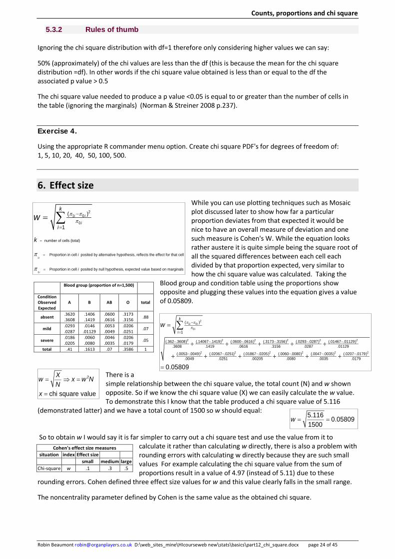
6. Effect size While you can use plotting techniques such as Mosaic plot discussed later to show how far a particular proportion deviates from that expected it would be nice to have an overall measure of deviation and one such measure is Cohen's W. While the equation looks rather austere it is quite simple being the square root of all the squared differences between each cell each divided by that proportion expected, very similar to how the chi square value was calculated. Taking the
Blood group and condition table using the proportions show opposite and plugging these values into the equation gives a value of 0.05809.
There is a simple relationship between the chi square value, the total count (N) and w shown opposite. So if we know the chi square value (X) we can easily calculate the w value. To demonstrate this I know that the table produced a chi square value of 5.116
(demonstrated latter) and we have a total count of 1500 so w should equal: So to obtain w I would say it is far simpler to carry out a chi square test and use the value from it to
calculate it rather than calculating w directly, there is also a problem with rounding errors with calculating w directly because they are such small values For example calculating the chi square value from the sum of proportions result in a value of 4.97 (instead of 5.11) due to these
rounding errors. Cohen defined three effect size values for w and this value clearly falls in the small range.
The noncentrality parameter defined by Cohen is the same value as the obtained chi square.
Blood group (proportion of n=1,500)
Condition Observed Expected
A B AB O total
absent .3620 .3608
.1406
.1419 .0600 .0616
.3173
.3156 .88
mild .0293 .0287
.0146 .01129
.0053
.0049 .0206 .0251 .07
severe .0186 .0205
.0060
.0080 .0046 .0035
.0206
.0179 .05
total .41 .1613 .07 .3586 1
Cohen's effect size measures situation index Effect size
small medium large Chi-square w .1 .3 .5
1
0
21 0
0
number of cells (total)
Proportion in cell posited by alternative hypothesis, reflects the effect for that cell
Proportion in cell posited by null hypothesis, expecte
( )
1
i
i
i i
i
i
i
k
i
k
w π ππ
π
π
=
=
=
−
=
= ∑
d value based on marginals
21 0
0
2 2 2 2 2 2
2 2
( )
1
(.362 .3608) (.14067 .1419) (.0600 .0616) (.3173 .3156) (.0293 .0287) (.01467 .01129).3608 .1419 .0616 .3156 .0287 .01129
(.0053 .0049) (.02067 .0251) (.01867 .020.0049 .0251
i i
i
k
iw π π
π−
=
− − − − − −
− − −
=
+ + + + +
+ + +
∑
2 2 2 25) (.0060 .0080) (.0047 .0035) (.0207 .0179).00205 .0080 .0035 .0179
0.05809
− − −+ + +
=2
chi square value
Xw x w NN
x
= ⇒ =
=
5.116 0.05809 1500
w = =
Counts, proportions and chi square
Robin Beaumont [email protected] D:\web_sites_mine\HIcourseweb new\stats\basics\part12_chi_square.docx page 25 of 45
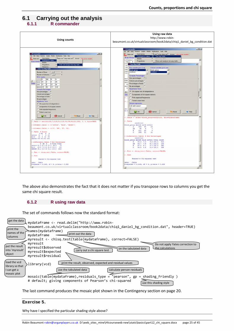
6.1 Carrying out the analysis 6.1.1 R commander
Using counts
Using raw data http://www.robin-
beaumont.co.uk/virtualclassroom/book2data/chiq1_daniel_bg_condition.dat
The above also demonstrates the fact that it does not matter if you transpose rows to columns you get the same chi square result.
6.1.2 R using raw data
The set of commands follows now the standard format:
mydataframe <- read.delim("http://www.robin-beaumont.co.uk/virtualclassroom/book2data/chiq1_daniel_bg_condition.dat", header=TRUE) names(mydataframe) mydataframe myresult <- chisq.test(table(mydataframe), correct=FALSE) myresult myresult$observed myresult$expected myresult$residual library(vcd) mosaic(table(mydataframe),residuals_type = "pearson", gp = shading_Friendly ) # default; giving components of Pearson’s chi-squared
The last command produces the mosaic plot shown in the Contingency section on page 20. Exercise 5.
Why have I specified the particular shading style above?
get the data
print the names of the columns
Do not apply Yates correction to the calculations
carry out a chi square test
print out the data
on the tabulated data put the result into 'myresult' object
print the result, observed, expected and residual values
load the vcd library so that I can get a mosaic plot
use the tabulated data calculate person residuals
use this shading style
Counts, proportions and chi square
Robin Beaumont [email protected] D:\web_sites_mine\HIcourseweb new\stats\basics\part12_chi_square.docx page 26 of 45
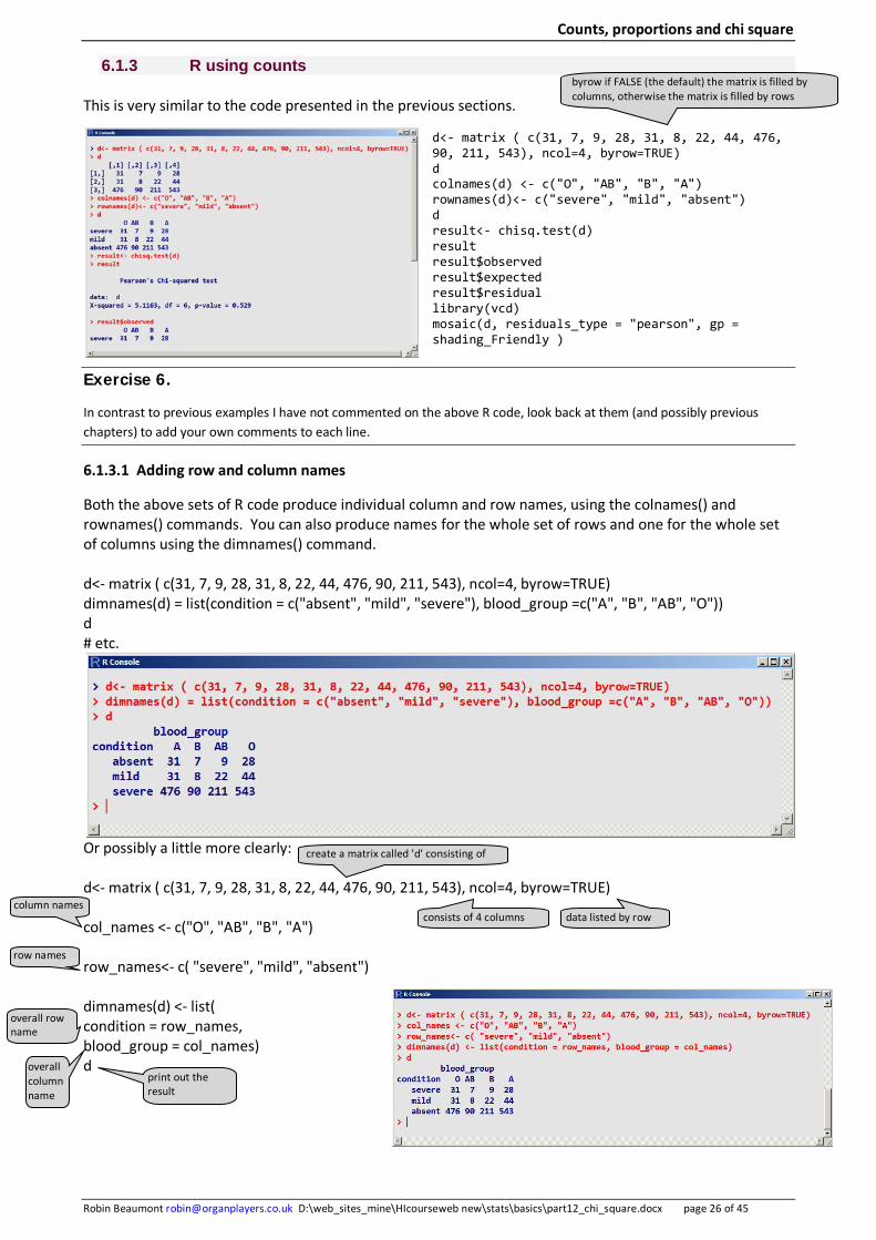
6.1.3 R using counts
This is very similar to the code presented in the previous sections.
d<- matrix ( c(31, 7, 9, 28, 31, 8, 22, 44, 476, 90, 211, 543), ncol=4, byrow=TRUE) d colnames(d) <- c("O", "AB", "B", "A") rownames(d)<- c("severe", "mild", "absent") d result<- chisq.test(d) result result$observed result$expected result$residual library(vcd) mosaic(d, residuals_type = "pearson", gp = shading_Friendly )
Exercise 6.
In contrast to previous examples I have not commented on the above R code, look back at them (and possibly previous chapters) to add your own comments to each line.
6.1.3.1 Adding row and column names
Both the above sets of R code produce individual column and row names, using the colnames() and rownames() commands. You can also produce names for the whole set of rows and one for the whole set of columns using the dimnames() command. d<- matrix ( c(31, 7, 9, 28, 31, 8, 22, 44, 476, 90, 211, 543), ncol=4, byrow=TRUE) dimnames(d) = list(condition = c("absent", "mild", "severe"), blood_group =c("A", "B", "AB", "O")) d # etc.
Or possibly a little more clearly: d<- matrix ( c(31, 7, 9, 28, 31, 8, 22, 44, 476, 90, 211, 543), ncol=4, byrow=TRUE) col_names <- c("O", "AB", "B", "A") row_names<- c( "severe", "mild", "absent") dimnames(d) <- list( condition = row_names, blood_group = col_names) d
column names
row names
create a matrix called 'd' consisting of
consists of 4 columns data listed by row
overall row name
overall column name
print out the result
byrow if FALSE (the default) the matrix is filled by columns, otherwise the matrix is filled by rows

Counts, proportions and chi square
Robin Beaumont [email protected] D:\web_sites_mine\HIcourseweb new\stats\basics\part12_chi_square.docx page 27 of 45
6.1.4 SPSS
This requires the setting up of the data and then the analysis, the stages are shown below.
You can obtain the chi square value from two different menu options. The menu option analyze-> nonparametric tests-> chi-square test or Analyze -> Descriptive statistics -> crosstabs
I usually prefer the crosstabs option as you can easily use the 'cells'
option to request the display of both expected values along with residuals.
condition * bloodtype Crosstabulation
bloodtype
Total A B AB O
condition
absent Count 543 211 90 476 1320
Expected Count 541.2 213.0 92.4 473.4 1320.0 Std. Residual .1 -.1 -.2 .1
mild Count 44 22 8 31 105
Expected Count 43.1 16.9 7.4 37.7 105.0 Std. Residual .1 1.2 .2 -1.1
severe Count 28 9 7 31 75
Expected Count 30.8 12.1 5.3 26.9 75.0 Std. Residual -.5 -.9 .8 .8
Total Count 615 242 105 538 1500
Expected Count 615.0 242.0 105.0 538.0 1500.0
Chi-Square Tests
Value df Asymp. Sig. (2-sided)
Exact Sig. (2-sided)
Pearson Chi-Square 5.116a 6 .529 .530 Likelihood Ratio 5.060 6 .536 .547
Fisher's Exact Test 5.335 .497 Linear-by-Linear Association .216 1 .642 .b
N of Valid Cases 1500 a. 0 cells (.0%) have expected count less than 5. The minimum expected count is 5.25.
b. Cannot be computed because there is insufficient memory.
Counts, proportions and chi square
Robin Beaumont [email protected] D:\web_sites_mine\HIcourseweb new\stats\basics\part12_chi_square.docx page 28 of 45
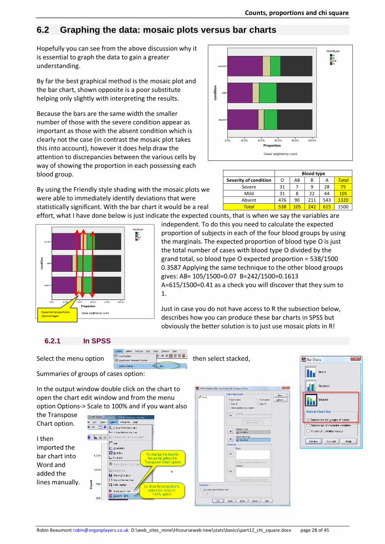
6.2 Graphing the data: mosaic plots versus bar charts
Hopefully you can see from the above discussion why it is essential to graph the data to gain a greater understanding.
By far the best graphical method is the mosaic plot and the bar chart, shown opposite is a poor substitute helping only slightly with interpreting the results.
Because the bars are the same width the smaller number of those with the severe condition appear as important as those with the absent condition which is clearly not the case (in contrast the mosaic plot takes this into account), however it does help draw the attention to discrepancies between the various cells by way of showing the proportion in each possessing each blood group.
By using the Friendly style shading with the mosaic plots we were able to immediately identify deviations that were statistically significant. With the bar chart it would be a real effort, what I have done below is just indicate the expected counts, that is when we say the variables are
independent. To do this you need to calculate the expected proportion of subjects in each of the four blood groups by using the marginals. The expected proportion of blood type O is just the total number of cases with blood type O divided by the grand total, so blood type O expected proportion = 538/1500 0.3587 Applying the same technique to the other blood groups gives: AB= 105/1500=0.07 B=242/1500=0.1613 A=615/1500=0.41 as a check you will discover that they sum to 1.
Just in case you do not have access to R the subsection below, describes how you can produce these bar charts in SPSS but obviously the better solution is to just use mosaic plots in R!
6.2.1 In SPSS
Select the menu option then select stacked,
Summaries of groups of cases option:
In the output window double click on the chart to open the chart edit window and from the menu option Options-> Scale to 100% and if you want also the Transpose Chart option.
I then imported the bar chart into Word and added the lines manually.
Blood type Severity of condition O AB B A Total
Severe 31 7 9 28 75 Mild 31 8 22 44 105
Absent 476 90 211 543 1320 Total 538 105 242 615 1500
Expected proportions /percentages
Counts, proportions and chi square
Robin Beaumont [email protected] D:\web_sites_mine\HIcourseweb new\stats\basics\part12_chi_square.docx page 29 of 45
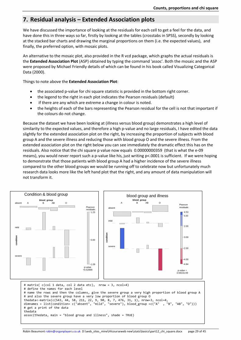
7. Residual analysis – Extended Association plots We have discussed the importance of looking at the residuals for each cell to get a feel for the data, and have done this in three ways so far, firstly by looking at the tables (crosstabs in SPSS), secondly by looking at the stacked bar charts and drawing the marginal proportions on them (i.e. the expected values), and finally, the preferred option, with mosaic plots.
An alternative to the mosaic plot, also provided in the R vcd package, which graphs the actual residuals is the Extended Association Plot (ASP) obtained by typing the command 'assoc'. Both the mosaic and the ASP were proposed by Michael Friendly details of which can be found in his book called Visualizing Categorical Data (2000).
Things to note above the Extended Association Plot:
• the associated p-value for chi square statistic is provided in the bottom right corner. • the legend to the right in each plot indicates the Pearson residuals (default) • if there are any which are extreme a change in colour is noted. • the heights of each of the bars representing the Pearson residual for the cell is not that important if
the colours do not change.
Because the dataset we have been looking at (illness versus blood group) demonstrates a high level of similarity to the expected values, and therefore a high p-value and no large residuals, I have edited the data slightly for the extended association plot on the right, by increasing the proportion of subjects with blood group A and the severe illness and reducing those with blood group O and the severe illness. From the extended association plot on the right below you can see immediately the dramatic effect this has on the residuals. Also notice that the chi square p value now equals 0.00000000359 (that is what the e-09 means), you would never report such a p-value like his, just writing p<.0001 is sufficient. If we were hoping to demonstrate that those patients with blood group A had a higher incidence of the severe illness compared to the other blood groups we would be running off to celebrate now but unfortunately much research data looks more like the left hand plot that the right, and any amount of data manipulation will not transform it.
blood group and illness
-4.84
-4.00
-2.00
0.00
2.00
4.00
4.53
Pearson residuals:
p-value = 3.5922e-09
blood_group
cond
ition
severe
mild
absent
A B AB O
Condition & blood group
-1.09
0.00
1.23
Pearson residuals:
p-value =0.52899
blood_group
cond
ition
severe
mild
absent A B AB O
# matrix( c(col 1 data, col 2 data etc), nrow = 3, ncol=4) # define the names for each level # name the rows and then the columns, give the severe group a very high proportion of blood group A # and also the severe group have a very low proportion of blood group O thedata<-matrix(c(543, 44, 58, 211, 22, 9, 90, 8, 7, 476, 31, 1), nrow=3, ncol=4, dimnames = list(condition= c("absent", "mild", "severe"), blood_group =c("A" , "B", "AB", "O"))) # get a print of the data thedata assoc(thedata, main = "blood group and illness", shade = TRUE)
Counts, proportions and chi square
Robin Beaumont [email protected] D:\web_sites_mine\HIcourseweb new\stats\basics\part12_chi_square.docx page 30 of 45
Exercise 7.
Note the p-value in the right hand extended association plot on the previous page of 3.5899e-09 what does this mean?
The last line of R code produces the extended association plot reproduced below. How would you adapt this line if you had raw data rather than counts?
Hint: look back at the section Several independent proportions compared with the average where I describe the R code there.
assoc(thedata, main = "blood group and illness", shade = TRUE)
While in this chapter we have used the vcd package to produce the mosaic plots you can produce them in R directly and an appendix provides details.
Back to more mundane things obviously our results are dependent upon various assumptions that the chi square statistic needs to be able to do to produce a valid result, let's turn now to these.
Optional Exercise 8.
Visit Michael Friendly's site at: http://www.math.yorku.ca/SCS/Courses/grcat/grcfoils2_4.pdf
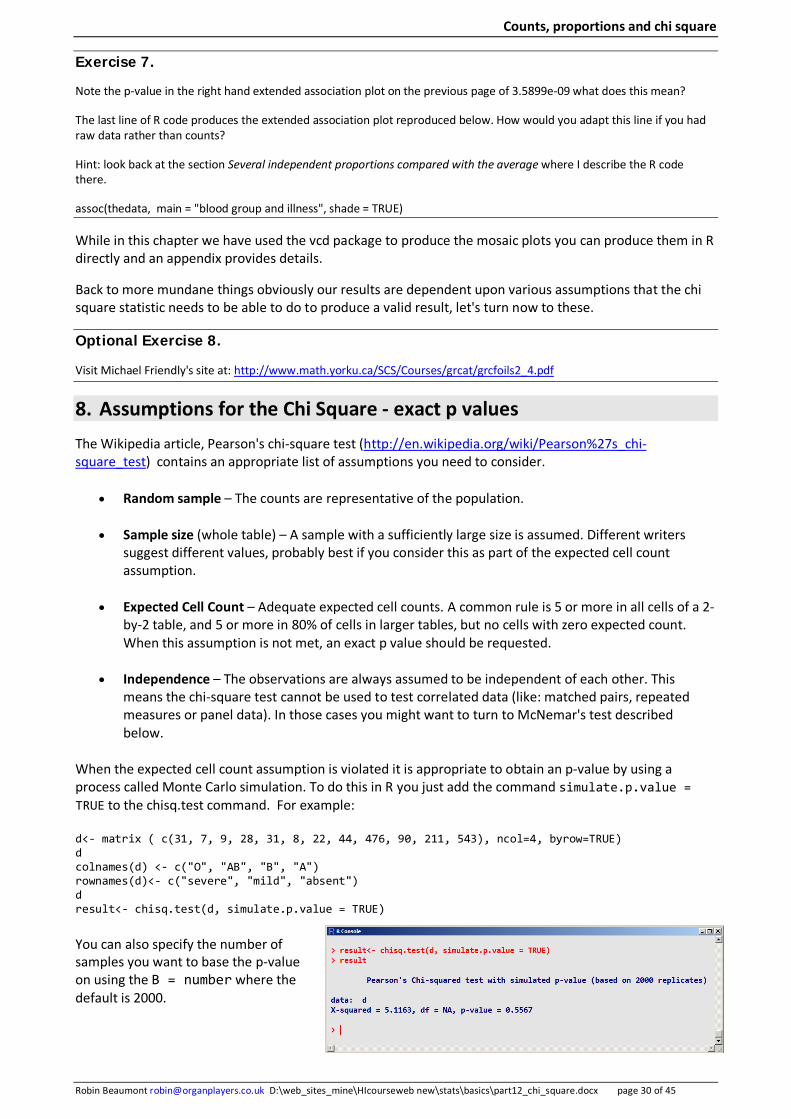
8. Assumptions for the Chi Square - exact p values The Wikipedia article, Pearson's chi-square test (http://en.wikipedia.org/wiki/Pearson%27s_chi-square_test) contains an appropriate list of assumptions you need to consider.
• Random sample – The counts are representative of the population.
• Sample size (whole table) – A sample with a sufficiently large size is assumed. Different writers suggest different values, probably best if you consider this as part of the expected cell count assumption.
• Expected Cell Count – Adequate expected cell counts. A common rule is 5 or more in all cells of a 2-by-2 table, and 5 or more in 80% of cells in larger tables, but no cells with zero expected count. When this assumption is not met, an exact p value should be requested.
• Independence – The observations are always assumed to be independent of each other. This means the chi-square test cannot be used to test correlated data (like: matched pairs, repeated measures or panel data). In those cases you might want to turn to McNemar's test described below.
When the expected cell count assumption is violated it is appropriate to obtain an p-value by using a process called Monte Carlo simulation. To do this in R you just add the command simulate.p.value = TRUE to the chisq.test command. For example:
d<- matrix ( c(31, 7, 9, 28, 31, 8, 22, 44, 476, 90, 211, 543), ncol=4, byrow=TRUE) d colnames(d) <- c("O", "AB", "B", "A") rownames(d)<- c("severe", "mild", "absent") d result<- chisq.test(d, simulate.p.value = TRUE)
You can also specify the number of samples you want to base the p-value on using the B = number where the default is 2000.
Counts, proportions and chi square
Robin Beaumont [email protected] D:\web_sites_mine\HIcourseweb new\stats\basics\part12_chi_square.docx page 31 of 45
Agresti 2002 (p.98) provides a good explanation of what Monte Carlo simulation is:
One can use Monte Carlo [simulations] to sample randomly from the set of tables with the given marginals. The estimated P-value is then the sample proportion of tables having the test statistic value at least as large as the value observed.
8.1 Power and required sample size
Prajapati, Dunne, and Armstrong , 2010 provide a good example concerning the planning of a study that will produce a chi square result.
Consider a study designed to investigate the possible effects of smoking on age-related macular degeneration (AMD). A random sample of elderly people is drawn from the population and they are classified as smokers or non-smokers. Both of these groups are then examined to see whether there is any evidence of the presence of AMD. How big a sample size would be required for 80% power at the 5% alpha level? Firstly the effect size needs to be determined. This is based on the proportions in each cell of the table under the null and alternative hypotheses.
Current literature shows that 12% of the population over 60 smokes and 33% of the elderly population have AMD. Armstrong and Eperjesi stated that although there are studies in the literature that suggest a possible connection between AMD and smoking, the results of an individual study are often inconclusive and generalisations of whether smoking is
considered to be a “risk factor” for AMD are often based on combining together many studies. Armstrong did so and found that smokers are two to five times more likely to develop AMD. Based on this, if we hypothesise that smokers are three times more likely to develop AMD, so we change the 0.06 to 0.03 and 0.09 respectively in contrast the null hypothesis
states that there is no link between smoking and AMD and so the proportions in this case stay the same as shown in the no effects table (null). We assume we want a power of .8 a type one error rate of 0.05 and we calculate the degrees of freedom a being equal to number of columns in the table – 1 multiplied by the number of rows in the table –a = (2-1)x(2-1) =1
We complete the Gpower window as shown on the following page.
Project effect table (alternative hypothesis) Non-smoker smokers
ARMD 0.24 0.09 0.33 No ARMD 0.64 0.03 .067
0.88 0.12 1
No effect (null) table Non-smoker smokers
ARMD 0.27 0.06 0.33 No ARMD 0.61 0.06 .067
0.88 0.12 1

Counts, proportions and chi square
Robin Beaumont [email protected] D:\web_sites_mine\HIcourseweb new\stats\basics\part12_chi_square.docx page 32 of 45
Using these assumptions, GPower shows that a sample size of 226 (113 smokers aged over 60 years and 113 non-smokers aged over 60 years) would be required.
It is interesting to note that the projected effect size w = 0.1865 is what Cohen would class as small.
We can request a power plot by clicking on the 'x-y plot for range of value' button. Selecting the appropriate y axis and x axis (function of) values produces the required graph we can see that the power is very low (below .7) until we get around 200 participants.

Counts, proportions and chi square
Robin Beaumont [email protected] D:\web_sites_mine\HIcourseweb new\stats\basics\part12_chi_square.docx page 33 of 45
Exercise 9.
The Physicians’ Health Study was a clinical trial performed in the United States in the late 1980’s and early 1990’s. It involved approximately 22,000 physician subjects over the age of 40 who were divided into three groups according to their smoking history: current smokers, past smokers, and those who had never smoked. Each subject was assigned randomly to one of two groups. One group of physicians took a small dose of aspirin daily; physicians in the second group took a placebo instead. These physicians were observed over a period of several years; for each subject, a record was kept of whether he had a myocardial infarction (heart attack) during the period of the study.
Data for the 10,919 physicians who had never smoked are provided in the following table.
Taken from Statistical Methods for the Social Sciences, 3rd edition (Alan Agresti and Barbara Finlay, Prentice Hall).
From the information provided and using preferably R commander and R answer the following:
Does the above dataset adhere to the assumptions to allow for a valid chi square analysis?
Carry out a chi square analysis – what does it tell us?
Carry out an analysis of the residuals – what does it tell us?
We will be investigating this dataset in more depth in several chapters including those on risk, rates and odds and the one about logistic regression.
Never smoked group Heart attack No heart attack
Placebo 96 5392 5488
Aspirin 55 5376 5431
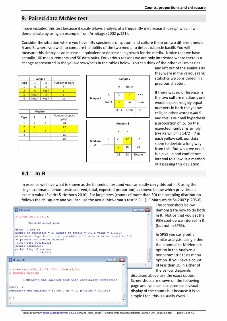
Counts, proportions and chi square
Robin Beaumont [email protected] D:\web_sites_mine\HIcourseweb new\stats\basics\part12_chi_square.docx page 34 of 45
9. Paired data McNes test I have included this test because it easily allows analysis of a frequently met research design which I will demonstrate by using an example from Armitage (2002 p.121).
Consider the situation where you have fifty specimens of sputum and culture them on two different media A and B, where you wish to compare the ability of the two media to detect tubercle bacilli. You will measure this simply as an increase, equivalent or decrease in growth for the media. Notice that we have actually 100 measurements and 50 data pairs. For various reasons we are only interested where there is a change represented in the yellow rows/cells in the tables below. You can think of the other values as ties
and left out of the analysis as they were in the various rank statistics we considered in a previous chapter.
If there was no difference in the two culture mediums one would expect roughly equal numbers in both the yellow cells, in other words π0=0.5 and this is our null hypothesis a proportion of .5. So the expected number is simply (r+s)/2 which is 14/2 = 7 in each yellow cell, our data seem to deviate a long way from this! But what we need is a p value and confidence interval to allow us a method of assessing this deviation.
9.1 In R
In essence we have what is known as the binominal test and you can easily carry this out in R using the single command, binom.test(observed, total, expected proportion) as shown below which provides an exact p-value (Everitt & Hothorn 2010). For large sizes (counts of more than 30) the sampling distribution follows the chi square and you can use the actual McNemar's test in R – (J P Marques de Sá 2007 p.205-6)
The screenshots below demonstrate how to do both in R. Notice that you get the 95% confidence interval in R (but not in SPSS).
In SPSS you carry out a similar analysis, using either the binomial or McNemars option in the Analyze-> nonparametric tests menu option. If you have a count of less than 30 in either of the yellow diagonals
discussed above use the exact option. Screenshots are shown on the following page and you can also produce a visual display of the counts but because it is so simple I feel this is usually overkill.
Sample Type 1 2 Number of pairs
1 A A k 2 A Not A r 3 Not A A s 4 Not A Not A m
Medium
Type 1 2 Number of sputa pairs
1 + + 20 2 + - 12 3 - + 2 4 - - 16 50
Sample 2
A Not A
Sample 1 A k r k + r
Not A s m s + m
k + s r + m N
Medium B
+ -
Medium A
+ 20 12 32
- 2 16 18
22 28 50 pairs
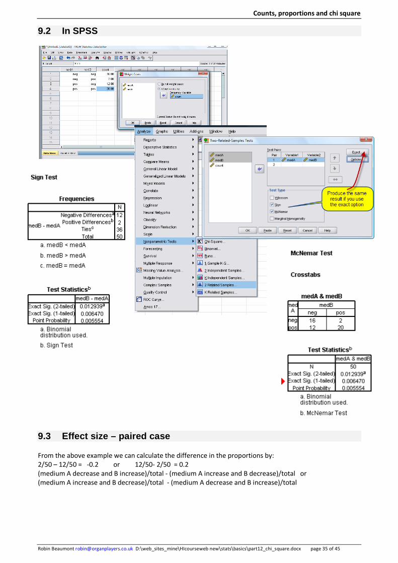
Counts, proportions and chi square
Robin Beaumont [email protected] D:\web_sites_mine\HIcourseweb new\stats\basics\part12_chi_square.docx page 35 of 45
9.2 In SPSS
9.3 Effect size – paired case
From the above example we can calculate the difference in the proportions by: 2/50 – 12/50 = -0.2 or 12/50- 2/50 = 0.2 (medium A decrease and B increase)/total - (medium A increase and B decrease)/total or (medium A increase and B decrease)/total - (medium A decrease and B increase)/total

Counts, proportions and chi square
Robin Beaumont [email protected] D:\web_sites_mine\HIcourseweb new\stats\basics\part12_chi_square.docx page 36 of 45
Multiplying .2 by a 100 gives the percentage of 20% this indicates the difference between the proportions of decreased/increased growth in each of the mediums with a smaller proportion having (medium A increase, medium B decrease) compared to (medium A decrease, medium B increase) We can also calculate a value called the odds ratio which is: 12/2= 6 or 2/12 = 0.166 In the chapter entitled Risks rates and odds we will look in much more depth at odds but for now think of this value as providing another comparator between the two proportions, this time it being a ratio (i.e. a fraction). Taking the first odds ratio: 12/2 = (medium A increase and B decrease)/(medium A decrease and B increase) 6 Therefore the odds of medium A increased and B decreased growth is 6 times that of medium A decreased and B increased growth. You can convert odds to probabilities by using the formula:
Probability = odds/(odds+1)
Therefore an odds of 6 is equivalent to a probability of 6/(6+1) = 6/7 = 0.8571 Similarly an odds of 0.166 has a probability of .166/(0.166+1) = 0.1423 indicating we have a much higher probability (read higher odds) of the situation occurring , that is medium A increased growth and medium B decreased growth. The probably conversions are sometimes difficult to interpret, so it is
often best just to stick with the odds.
10. Developing a strategy and writing up the results 1. Identify the model –How many variables, are they nominal if not is it appropriate to treat them in
this manner? 2. Review chi square assumptions – random sample, sample size for whole table, expected cell count
(if <5 use exact probability or combine categories), Independent (if not is it appropriate to use McNemar's test)
3. Evaluate the exact/Chi square p value and if it is less than the critical value (α) carry out residual analysis to identify which proportions do vary the most from the expected values.
When writing up the results you should make it clear if you have used the exact p value or the chi square approximation, I would also recommend that you present some type of residual analysis by way of displaying the expected values in the cells and/or association/mosaic plots.
Medium B
+ -
Medium A
+ 20 12 32
- 2 16 18
22 28 50 pairs
Counts, proportions and chi square
Robin Beaumont [email protected] D:\web_sites_mine\HIcourseweb new\stats\basics\part12_chi_square.docx page 37 of 45
11. Multiple Choice Questions 1. When describing a table of counts or a matrix statisticians have a standard way of indicating the cell (select one):
a. ncolumn from last one, row b. nrow,column c. ncolumn,row d. nrow,column from last one e. ncolumn from last one, row from last f. nrow from last, column from last one
2. When describing a proportion we talk of the sample estimate and the hypothesised population value, what are the
two symbols used (select one):
a. π = population value; μ = sample value b. π = population value; π = sample value c. ρ = population value; ρ = sample value d. ρ = population value; π = sample value e. π = population value; ρ = sample value
3. When analysing count data the information is often stored in one of two identical formats which you can convert
between, what are they (select TWO):
a. counts b. proportions c. row percentages d. individual subject results e. column percentages f. marginal totals g. expected values
4. When analysing a nominal variable that can only take 2 values and comparing the observed proportion to a
population value what distribution is used (select one):
a. normal b. chi square c. binomial d. uniform e. chi square f. t
5. When analysing a nominal variable that can take more than 2 values and comparing the observed proportions to a population proportion profile what distribution is used (select one):
a. normal b. chi square c. binomial d. uniform e. chi square f. t
6. When analysing TWO nominal variables and comparing the observed proportions to those proportions which would
have occurred from the marginal's what distribution is used: (select one):
a. normal b. chi square c. binomial d. uniform e. chi square f. t

Counts, proportions and chi square
Robin Beaumont [email protected] D:\web_sites_mine\HIcourseweb new\stats\basics\part12_chi_square.docx page 38 of 45
7. The overall Chi square statistic provides the following (select TWO):
a. a detailed analysis of each cell b. an overview of the discrepancy between the expected and observed cell counts c. a indication of the correlation between rows and column d. a measure of the difference between row and cell proportions e. a value which follows, for large samples and where the expected value for each cell is >5, a chi square distribution f. a value which follows, regardless of sample size but where the expected value for each cell is >5, a chi square distribution g. a value which follows, regardless of sample size or the expected cell count, a chi square distribution
8. Following a statistically significant Chi square test result what is recommended: (select TWO):
a. Create a mosaic plot b. there is no need for any further analysis c. Produce a bar chart d. carry out individual chi square tests to identify where exactly the discrepancy is e. inspect the residual values either graphically or pictorially by way of a extended association plot f. calculate confidence intervals
9. A set of results gives a Chi square value of 22 (df=5) what is the p-value likely to be (select one):
a. near 1 b. around .5 c. Less than 0.5 but more than 0.01 d. Less than 0.01 e. unable to predict p-value from above information f. zero
10 A set of results gives a Chi square value of 17 (df=17) what is the p-value likely to be (select one):
a. near 1 b. around .5 c. Less than 0.5 but more than 0.01 d. Less than 0.01 e. unable to predict p-value from above information f. zero
11 A set of results gives a Chi square value of 0.7 (df=17) what is the p-value likely to be (select one):
a. near 1 b. around .5 c. Less than 0.5 but more than 0.01 d. Less than 0.01 e. unable to predict p-value from above information f. zero
12 A set of results gives a Chi square value of 12 what is the p-value likely to be (select one):
a. near 1 b. around .5 c. Less than 0.5 but more than 0.01 d. Less than 0.01 e. unable to predict p-value from above information
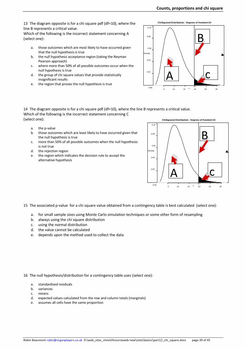
Counts, proportions and chi square
Robin Beaumont [email protected] D:\web_sites_mine\HIcourseweb new\stats\basics\part12_chi_square.docx page 39 of 45
13 The diagram opposite is for a chi square pdf (df=10), where the line B represents a critical value. Which of the following is the incorrect statement concerning A (select one):
a. those outcomes which are most likely to have occurred given that the null hypothesis is true
b. the null hypothesis acceptance region (taking the Neyman Pearson approach)
c. where more than 50% of all possible outcomes occur when the null hypothesis is true
d. the group of chi square values that provide statistically insignificant results
e. the region that proves the null hypothesis is true
14 The diagram opposite is for a chi square pdf (df=10), where the line B represents a critical value. Which of the following is the incorrect statement concerning C (select one):
a. the p-value b. those outcomes which are least likely to have occurred given that
the null hypothesis is true c. more than 50% of all possible outcomes when the null hypothesis
is not true d. the rejection region e. the region which indicates the decision rule to accept the
alternative hypothesis 15 The associated p-value for a chi square value obtained from a contingency table is best calculated (select one):
a. for small sample sizes using Monte Carlo simulation techniques or some other form of resampling b. always using the chi square distribution c. using the normal distribution d. the value cannot be calculated e. depends upon the method used to collect the data
16 The null hypothesis/distribution for a contingency table uses (select one):
a. standardised residuals b. variances c. means d. expected values calculated from the row and column totals (marginals) e. assumes all cells have the same proportion
5 10 15 20 25 30 0.00
0.02
0.04
0.06
0.08
0.10
ChiSquared Distribution: Degrees of freedom=10
x
Density
A
B
c
5 10 15 20 25 30 0.00
0.02
0.04
0.06
0.08
0.10
ChiSquared Distribution: Degrees of freedom=10
x
Density
A
B
c
Counts, proportions and chi square
Robin Beaumont [email protected] D:\web_sites_mine\HIcourseweb new\stats\basics\part12_chi_square.docx page 40 of 45
17 The table shows the expected cell counts what values do A and B take (select one):
a. A= 10, B=20 b. A= 20, B=10 c. A= 20, B=20 d. A= 10, B=10 e. unable to calculate from information provided
18 The table opposite shows the standardised residuals for a contingency table. Which of the following statements is incorrect (select one):
a. The table would most likely produce a statistically significant chi square result b. The value of 3.5 indicates little difference between the expected and observed cell count for that
particular cell c. The value of 3.5 indicates a large difference between the expected and observed cell count for
that particular cell d. The value of -.1 indicates a small difference between the expected and observed cell count for that particular cell e. The value of 0 indicates there is no difference between the expected and observed cell count for that particular cell
19 Which of the following statements concerning the picture opposite is incorrect (select one):
a. it is of a mosaic plot b. the more highly shaded areas represent cells which depart most from
the expected values c. The colouring has no relationship to the chi square value obtained
from the table or its associated p-value d. The colouring has a relationship to the chi square value obtained from
the table and its associated p-value e. The plot is useful in residual analysis
20 Which of the following statements concerning the picture opposite is incorrect (select one):
a. A much larger proportion of those receiving the treatment rather than placebo demonstrated marked improvement
b. there is no difference in the proportions that demonstrated 'some' improvement in the two groups
c. A smaller proportion of those receiving the treatment rather than placebo demonstrated no improvement
d. the size of each block of colour represents the relative size of each group
e. the plot gives little indication of the chi square value along with its associated p-value
Expected cell counts Row totals:
A 10 40 70
5 70 20 95
5 B 5 20
Column totals: 30 90 65 185
Standardised residuals
-.1 -.4 .4
0 -1.5 3.5
.2 .2 -5
Counts, proportions and chi square
Robin Beaumont [email protected] D:\web_sites_mine\HIcourseweb new\stats\basics\part12_chi_square.docx page 41 of 45
12. Summary This chapter has taken a detailed look at proportions, evaluating how these can be analysed in a variety of ways emphasising the importance of residual analysis (expected/ standardised residual cell values, association and mosaic plots). We started with analysing a single proportion using the binominal pdf, then several proportions and the goodness of fit/homogeneity test and finally two nominal variables in a contingency table. While the chapter concentrated on independent designs the matched/paired/pre-post design was discussed by way of NcMemar's test, which incidentally once again made use of the binominal pfd with which we opened the chapter.
Counts, proportions and chi square
Robin Beaumont [email protected] D:\web_sites_mine\HIcourseweb new\stats\basics\part12_chi_square.docx page 42 of 45
13. References
Agresti A, Finlay B, 2009 (4th ed) Statistical Methods for the Social Sciences, Prentice Hall
Bland M 2000 (3rd ed) An introduction to Medical statistics. Oxford University Press.
Crawley M J 2005 Statistics: An introduction using R. Wiley
Campbell M J, Swinscow T D V 2009 (11th ed) Statistics at square one. Wiley-Blackwell and BMJ books
Daniel W W 2006 (8th ed) Biostatistics: A foundation for analysis in the health sciences. Wiley
Field A 2009 Discovering Statistics Using SPSS. Sage
Howell D C 2006 (6th ed) Statistical Methods for Psychology. Thomson Wandsworth
Norman G R, Streiner D L. 2008 (3rd ed) Biostatistics: The bare Essentials.
Prajapati B, Dunne M, Armstrong R, 2010 Sample size estimation and statistical power analysis. Optometry Today, July 16.
Advanced reading:
Agresti A 2002 (2nd ed) Categorical Data Analysis. Wiley
Fleiss J L, Levin B, Paik M C 2003 (3rd ed) Statistical Methods for Rates and Proportions. New York: Wiley.
Plackett R L 1983 Karl Pearson and the Chi-Squared. International Statistical Review / Revue Internationale de Statistique, Vol. 51, No. 1(Apr., 1983), p. 59-72. Stable URL: http://www.jstor.org/stable/1402731
Yule G U, Kendall M G 1953 (14ed) An introduction to The Theory of statistics. Charles Griffin & co. London
Speigel M R 1975 Probability and Statistics (Schaum's Outline Series). McGraw-Hill.

Counts, proportions and chi square
Robin Beaumont [email protected] D:\web_sites_mine\HIcourseweb new\stats\basics\part12_chi_square.docx page 43 of 45
14. Appendices
14.1 R code to produce histograms with expected proportion lines
# matrix( c(col 1 data, col 2 data etc), nrow = 3, ncol=4) # Now define the names for each level # now name the rows and then the columns thedata<-matrix(c(543, 44, 28, 211, 22, 9, 90, 8, 7, 476, 31, 31), nrow=3, ncol=4, dimnames = list(condition= c("absent", "mild", "severe"), blood_group =c("A", "B", "AB", "O"))) # get a print of the data thedata # add the marginals by: margin.table(thedata,1); margin.table(thedata,2) # or addmargins(thedata) addmargins(thedata) # This produces a chart of stacked bars #now would like proportions, the value 1 indicates rows; 2=columns prop_data<-prop.table(thedata,1) # the t function transposes the matrix but not the original one barplot(t(prop_data), xlab="blood grp proportion", main= "Condition and blood grp", legend = colnames(prop_data)) # lwd means line thickness abline(h= prop_data[1,1], lwd=6, col="red") abline(h= prop_data[1,1]+ prop_data[1,2] , lwd=6, col="red") abline(h= prop_data[1,1] + prop_data[1,2] + prop_data[1,3], lwd=6, col="red") # add some text explaining the lines, adj means justified bottom left text(2, .43, "expected proportions red lines", adj = c(0,0))
absent mild severe
O AB B A
Condition and blood grp
blood grp proportion
0.0
0.2
0.4
0.6
0.8
1.0
expected proportions red lines

Counts, proportions and chi square
Robin Beaumont [email protected] D:\web_sites_mine\HIcourseweb new\stats\basics\part12_chi_square.docx page 44 of 45
data
condition
infected non_infected
proportion of smokers in 4 une
condition
smok
er
group1 group2 group3 group4
yes
no
14.2 Mosaic plots
Beside using the vcd package in R you can use the mosaicplot command in R as shown below.
Example 1
data<-c( 328, 1033) dim(data)<- c(2) # two columns data dimnames(data)<-list( condition = c("infected", "non_infected")) data # check the data mosaicplot(data) mosaicplot(data, col=hcl (120), main= "Infection prevalence")
Or via a column: data<-c( 328, 1033) dim(data)<- c(1,2) # 1 row 2 columns data dimnames(data)<-list( group="group", condition = c("infected", "non_infected")) data mosaicplot(data, col=hcl (120), main= "Infection prevalence")
Second example:
data<-c( 83, 90, 129, 70, 3, 3, 7, 12) # 4 rows 2 columns dim(data)<- c(4,2) data dimnames(data)<-list(condition = c("group1", "group2", "group3", "group4"), smoker = c("yes", "no")) data mosaicplot(data) mosaicplot(data, col=hcl (120), main= "proportion of smokers in 4 unequally sized groups")
Infection prevalence
condition
infected non_infected
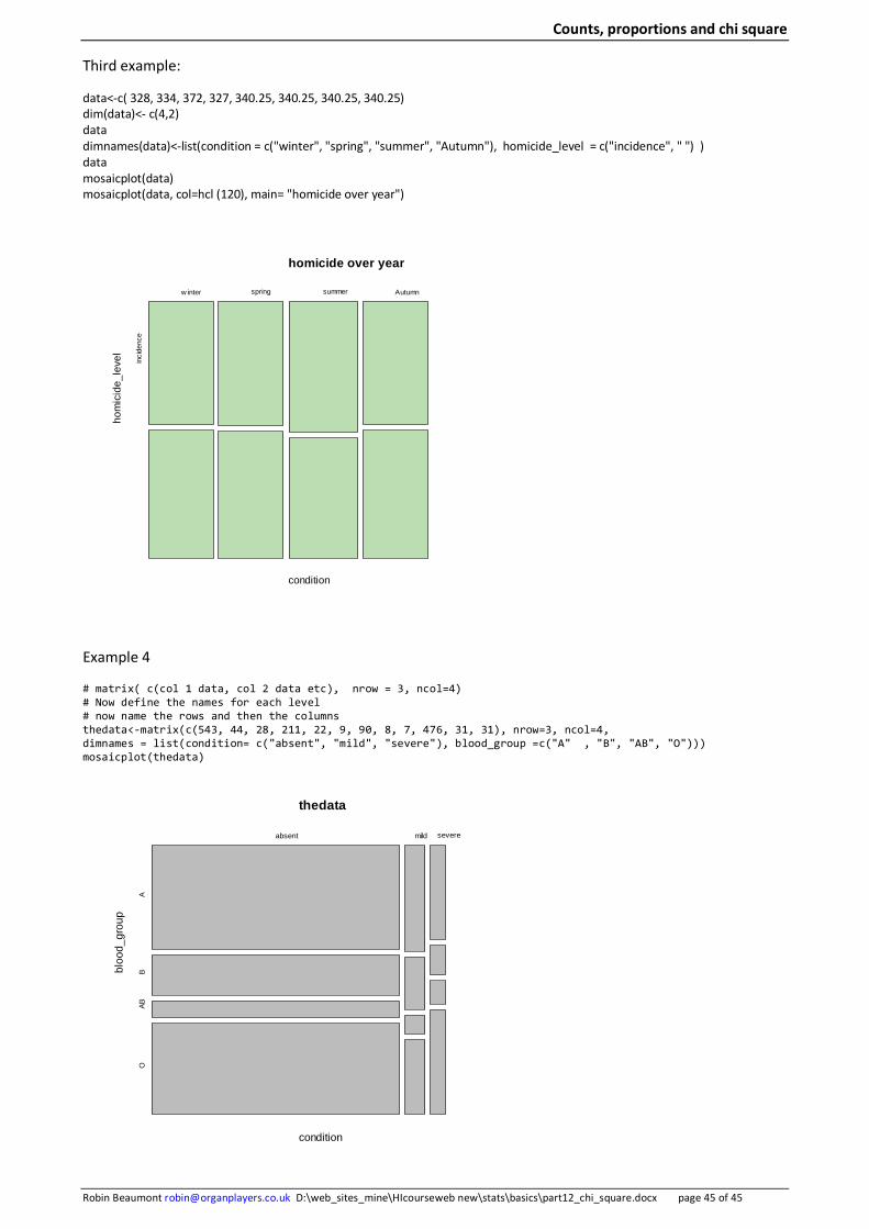
Counts, proportions and chi square
Robin Beaumont [email protected] D:\web_sites_mine\HIcourseweb new\stats\basics\part12_chi_square.docx page 45 of 45
Third example:
data<-c( 328, 334, 372, 327, 340.25, 340.25, 340.25, 340.25) dim(data)<- c(4,2) data dimnames(data)<-list(condition = c("winter", "spring", "summer", "Autumn"), homicide_level = c("incidence", " ") ) data mosaicplot(data) mosaicplot(data, col=hcl (120), main= "homicide over year")
Example 4
# matrix( c(col 1 data, col 2 data etc), nrow = 3, ncol=4) # Now define the names for each level # now name the rows and then the columns thedata<-matrix(c(543, 44, 28, 211, 22, 9, 90, 8, 7, 476, 31, 31), nrow=3, ncol=4, dimnames = list(condition= c("absent", "mild", "severe"), blood_group =c("A" , "B", "AB", "O"))) mosaicplot(thedata)
thedata
condition
bloo
d_gr
oup
absent mild severe
AB
ABO
homicide over year
condition
hom
icid
e_le
vel
w inter spring summer Autumn
inci
denc
e