Embed Size (px)
DESCRIPTION
Data Visualization Brochure 2014
Citation preview

Data Visualization Summit
Influence Decisions With Data Visualization
April 9 & 10, 2014Santa Clara, CA

Confirmed Speakers Speakers
Confirmed Speakers
• Senior Data Scientist, Microsoft• Senior Data Visualization Scientist, Twitter• Lead Data Scientist, Beats MusicPrevious Speakers• Creative Design Director, MIT• Digital Design Director, The Boston Globe• Global Interactive Editor, The AP• Data Visualization Designer, Bloomberg• Chief Operating Officer, Gui.de• Interactive Designer, CNN Money• Graphics Editor, The Wall Street Journal
• Research Scientist, IBM T.J Watson• Design Direcotr, CAST • Founder, TimeScape• Data Visualization & Design, Ray Vella Studio• Web App Developer, Vanderbilt University• Educational Software Architect, CAST • Director & Creative Lead, Parsons Institute • Editorial Producer, GigaOM• Interactive Editor, The Associated Press• VP, User Experience, Empathy Lab• VC, The University of Texas System

Delegates include
• Senior Architecht - Nokia
• Senior Data Scientist - Nasa
• Lead Data Analyst - Google
• Director, Advanced Analytics - Nike
• SVP Research - NBC Universal
• Director, Data Visualization - Yahoo!
Who Will You Meet?There is no question that IE. provides the g o l d s t a n d a r d e v e n t w i t h i n D a t a Visualization, helping you connect with decision makers. You will be meeting senior level executives from major corporations and innovative small to medium size companies.
Job Title Of Attendees
President/Principal
SVP/VP
C-Level
Snr. Director/Director
Global Head/ Head
Snr. Manager/Manager
Academic (1%)
78%
1000+ Employees300-999 Employees50-299 EmployeesLess than 49 Employees
Company Size Of Attendees
8%
11%
25%56% 81%Attendees are
companies with at least 300
employees
3%
21%
12%
42%
13%
8%
Attendees are at Director level or above
F TI L

Data visualization greatly enhances not only data comprehension, but it allows for a greater coverage of trends and patterns within structured & unstructured data.
The Data Visualization Summit brings together leaders and experts in the field to explain and clarify the numerous benefits of using data visualization. One of the top benefits is that data becomes easier to understand, more accessible and presented in a format that helps people better interact with the data as well as analyze it.
Typically data is used for mining and reporting, however there are new sets of data visualization tools that can take your analysis to a whole new level. This has made it possible to quickly understand trends, patterns, and outliers that would not have been noticed with traditional tools.
The Data Visualization Summit will run concurrently with the Big Data Innovation Summit to add to these fantastic networking opportunities.
About The Summit
Previous Speakers
Christine Daniloff is the Creative Design Director at MIT. She lives in Boston and is passionate about beautiful and compelling imagery. She illustrates and designs largely for the world of science and technology and her work has been featured on Wired online, the BBC, NBC News, The Creators Project and Popular Mechanics to name a few. When not making images about algorithms and bio chem., she draws images of people in cities and exhibits her work. She also likes dogs.
The Power of Good Imagery;Visualizing Complex Subject Matter for a Broad AudienceThe data’s been collected, compiled and combed through. Trends detected, advances and discoveries have been made and tested. Publication is imminent. Now it’s time to share the work with the greater world. But words and charts alone are not enough. Often, the most inviting path into complex material is through beautiful, accessible imagery. In fact, visuals are critical to helping the world at large understand the significance and ramifications of important and groundbreaking research. Images that show how deep-science works in the lab, or the significance of information extracted from big data sets, or the promise of more efficient algorithms, can illuminate those things that touch all of us—from the power of our cell phones to drug delivery devices to improved methods of learning online. By looking at effective examples of science and technology imagery – and some that missed the mark – I’ll explore how clear and robust visuals are crucial to our understanding of complex work and how they help us to see more clearly the world we may inhabit in the future.
Christine Vielmetti DaniloffDirector, Creative DesignMIT
F TI L
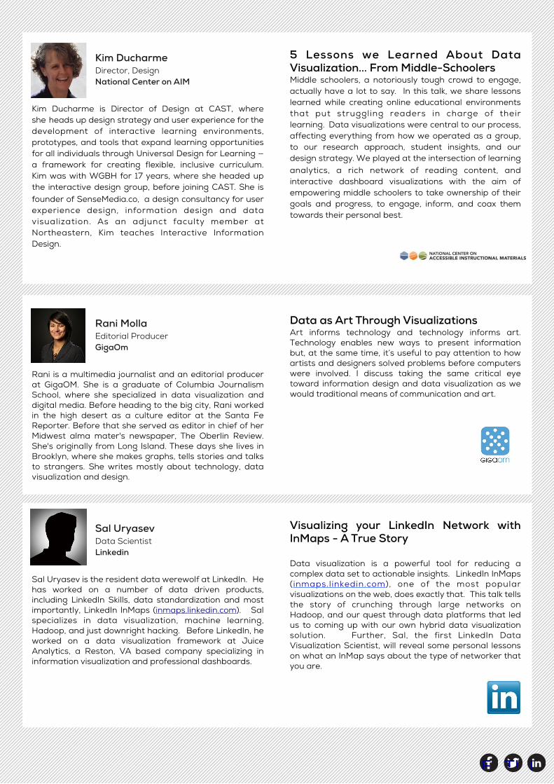
Kim Ducharme is Director of Design at CAST, where she heads up design strategy and user experience for the development of interactive learning environments, prototypes, and tools that expand learning opportunities for all individuals through Universal Design for Learning — a framework for creating flexible, inclusive curriculum. Kim was with WGBH for 17 years, where she headed up the interactive design group, before joining CAST. She is founder of SenseMedia.co, a design consultancy for user experience design, information design and data visualization. As an adjunct faculty member at Northeastern, Kim teaches Interactive Information Design.
5 Lessons we Learned About Data Visualization... From Middle-SchoolersMiddle schoolers, a notoriously tough crowd to engage, actually have a lot to say. In this talk, we share lessons learned while creating online educational environments that put struggling readers in charge of their learning. Data visualizations were central to our process, affecting everything from how we operated as a group, to our research approach, student insights, and our design strategy. We played at the intersection of learning analytics, a rich network of reading content, and interactive dashboard visualizations with the aim of empowering middle schoolers to take ownership of their goals and progress, to engage, inform, and coax them towards their personal best.
Kim DucharmeDirector, DesignNational Center on AIM
Rani is a multimedia journalist and an editorial producer at GigaOM. She is a graduate of Columbia Journalism School, where she specialized in data visualization and digital media. Before heading to the big city, Rani worked in the high desert as a culture editor at the Santa Fe Reporter. Before that she served as editor in chief of her Midwest alma mater's newspaper, The Oberlin Review. She's originally from Long Island. These days she lives in Brooklyn, where she makes graphs, tells stories and talks to strangers. She writes mostly about technology, data visualization and design.
Data as Art Through VisualizationsArt informs technology and technology informs art. Technology enables new ways to present information but, at the same time, it’s useful to pay attention to how artists and designers solved problems before computers were involved. I discuss taking the same critical eye toward information design and data visualization as we would traditional means of communication and art.
Rani MollaEditorial ProducerGigaOm
Sal Uryasev is the resident data werewolf at LinkedIn. He has worked on a number of data driven products, including LinkedIn Skills, data standardization and most importantly, LinkedIn InMaps (inmaps.linkedin.com). Sal specializes in data visualization, machine learning, Hadoop, and just downright hacking. Before LinkedIn, he worked on a data visualization framework at Juice Analytics, a Reston, VA based company specializing in information visualization and professional dashboards.
Visualizing your LinkedIn Network with InMaps - A True Story
Data visualization is a powerful tool for reducing a complex data set to actionable insights. LinkedIn InMaps (inmaps.linkedin.com), one of the most popular visualizations on the web, does exactly that. This talk tells the story of crunching through large networks on Hadoop, and our quest through data platforms that led us to coming up with our own hybrid data visualization solution. Further, Sal, the first LinkedIn Data Visualization Scientist, will reveal some personal lessons on what an InMap says about the type of networker that you are.
Sal UryasevData Scientist Linkedin

F TI L
Michael Workman oversees the design and user experience of The Boston Globe's digital products and leads a team of data visualization programmers who work in the Globe newsroom. He joined the Globe after 14 years as a print and online designer at The Baltimore Sun, where his work was recognized by the Society for News Design.5 Lessons we Learned About Data Visualization... From Middle-Schoolers
Visualizing the NewsUsing data to tell stories on the web presents unique challenges for journalists. How do we decide which stories are broad enough to attract a large audience, yet focused enough to yield a cohesive narrative? How do we present data visualizations on devices of all sizes when the every user comes to our content with the same hunger for information? Find out how The Boston Globe has approached these questions in the context of long-term projects as well as breaking news.
Michael WorkmanDirector, DesignThe Boston Globe
Sarah Slobin is a senior graphics editor on the interactive graphics desk at The Wall Street Journal. Prior to the Journal Sarah was infographics director at Fortune magazine and Fortune.com. She is a 15-year veteran of The New York Times where she worked as a graphics editor across all major news desks and as assistant editor managing the business graphics team. Her work as a visual journalist varies from deep data dives and visualizations to populist stories told with audio, video, photography to illustrative infographics and diagrams. She lives in Brooklyn, NY with her daughter and her husband, illustrator Eric Palma.
And They Lived Happily Ever After... Telling Stories with DataYou've got data, now what? How do you find the story within your metrics in a way that informs and delights your audience? We'll look at the process of extracting narratives from datasets, some of the best practices for visualizing data and dissect some successful (and some not so successful) examples of visual storytelling.
Sarah SlobinSenior Graphics DesignerThe Wall Street Journal
Tal Yellin is an interactive designer at CNNMoney. He focuses on data visualization and infographics. Prior to CNNMoney, Tal was the lead designer for the Business section of The Daily, the first tablet-only news publication. Tal is a graduate of the School of Visual Arts, where he majored in graphic design. He also holds a Bachelor’s degree in history from CUNY—Queens College. Tal enjoys speculating in global financial markets and is interested in using mixed media to explore the intersection of art, finance, and data visualization.
How Do We Filter and Present Data to our Audience in a Clear and Exciting Way?How do we filter and present data to our audience in a clear and exciting way? With millions of daily readers, w i t h v a r y i n g d e m o g r a p h i c s a n d d e g r e e s o f sophistication, we must present information as quickly and clearly as possible. We accomplish this in part by presenting the data in multiple levels of interaction. At first glance, a viewer gets the overall picture, if they continue to explore, more information is revealed. By making the visualization fun, interactive, and visually exciting, our readers can engage with the content while making it easy to understand the key concepts we are trying to convey.
Tal YellinInteractive DesignerCNN Money

F TI L
Brent Meyers is a Data Visualization Developer at the clinical research organization Quintiles. Currently he works on Quintiles Infosario®, which is a suite of SaaS applications that aid in efficiently bringing bio-pharma products to market. Previously he worked at Northrop Grumman where he built dashboard applications that collected and transmitted metrics aboard U.S. naval vessels. Brent’s M.B.A. education and his time as a naval officer have taught him the art of global communication and clean design concepts.
In his free time Brent endeavors to improve his Krispy Kreme Challenge race time, study history, and brew beer.
If Your Audience is Hungry, Feed Them Pie: Processes, Practices and Ruminations on Visualization ReportsIn the midst of witnessing a hysterical debate over the use or non-use of pie charts, I found that the data visualization "world" had fallen under the spell of an inflexible rule-base tyranny. This tyranny not only stymies "good" visualization design, but also "good" data design.For starters, throw out the established rule book. If your customers want pie (charts) then give it to them. These horrid charts can be blended into an effective report after establishing a rapport with your customers. How? This all starts with developing a proactive and iterative framework that is made up of an integrated data visualization cadre. Who is the cadre? A team of visualization developers, analysts, testers, and database developers. How do you find them? That's the cherry on the pie!
Brent MeyersData Visualization DeveloperQuintiles
Jihoon Kang is Associate Director and creative lead at Parsons Institute for Information Mapping, The New School, where he has been the Co-Principal Investigator on four U.S. government awards providing information design, Graphic User Interface (GUI) design and user experience (UX) expertise to design and develop next-generation Electronic Medical Record (EMR) systems as well as the investigation of best practices for big data visualization. He is also the publisher of the Parsons Institute for Information Mapping
Graphic User Interface (GUI) Design and User Experience (UX) DesignJihoon Kang’s presentation will focus on a few of his projects touch on data visualization, information design, and communication with data in conjunction with Graphic User Interface (GUI) design and User Experience (UX) design.
Jihoon KangDirector, Creative LeadParsons Institute for Information Mapping
Somnath Ray is the founder of TIMESCAPE and the architect of its geo-temporal navigation interface. Ray leads the TIMESCAPE team at DPlay Labs, a design and technology lab he founded in 2011, that operates across the domains of interaction and architecture.Ray holds an MSc in Design and Computation from MIT where he worked on the City Car Project as a part of Media Lab's Smart Cities group, under the direction of the late Prof. William Mitchell. Ray also holds a Master’s
degree in Architecture from Columbia University.Ray's works have been published and exhibited in New York, Boston and New Delhi. In 2012, he was awarded the Humanitarian Award for Design Innovation by the MIT Technology Review, and the project was covered by the BBC. Earlier, in 2007 Ray won first place in the eVolo International Skyscraper Competition.
Ray SomnathFounderTimeScape

F TI L
Jon Roberts has ten years of research experience on topics ranging from producing dark matter at the Large Hadron Collider to how the highest energy cosmic rays reach us from distant galaxies. He consults on data science and visualization problems with New York tech startups and can often be found at hackathons in the city, recently winning the NYC NASA space apps challenge and the Bit.ly Hack to the Future events.
Playing With GalaxiesAdding interactivity to a data visualization allows your audience to play with data. Think about how you understand data as a data scientist. You try things, you see how varying one parameter affects the others, and those interaction inform your conclusions. If you provide the same capacity to your audience, they will play with your data and do the work of convincing themselves. I'll talk about my work creating interactive data visualizations to convey conclusions in astroparticle physics, including interactive simulations of all our local galaxies.
Jonathan RobertsResearch ScientistNew York University
Leslie is a passionate entrepreneur, social scientist, data-driven storyteller, and farmer. In addition to serving as the Chief Operating Officer of Guide, a venture-backed newsreader company, she is a Fellow at the US Chamber of Commerce where she explores the economic and policy implications of big data, technology, and entrepreneurship. Having built a world-renowned data visualization company (JESS3) at the age of 24—which counted Nike, Google, NASA, C-SPAN, and Intel as clients, generated over $13M in revenue during her six year tenure as President and COO, and earned the No. 430 spot on the Inc. 500 in 2012—Leslie now advises
storytelling agencies and data visualization startups in her spare time. A Phi Beta Kappa graduate of the University of Chicago and co-founder of her family's pinot noir vineyard in Oregon's Willamette Valley, Leslie is also a regular contributor at Forbes and has been recognized by Fast Company as one of ‘The Most Creative People in Business’, by Inc. Magazine as a ‘Top 30 Entrepreneur Under 30” and by Mashable as one of ’44 Female Entrepreneurs to Know’
Leslie BradshawChief Operating OfficerGui.de
Dan Burger is a web applications developer at Vanderbilt University and is currently active in the development and maintenance of Filtergraph. Prior to working on this project, Dan built a software interface in collaboration with NASA Goddard Space Flight Center to assist in collecting and analyzing data from an instrument that
could be used to determine the composition of materials within our solar system. Dan received his master's degree in computer science at Vanderbilt in May 2013, where he also completed his undergraduate degree in computer engineering.
Dan BurgerWeb App DeveloperVanderbilt Universtiy

Silver Pass
$1495Access to all sessions &
networking events
$1295Early Bird Price(before Aug 08)
Diamond Pass
$1995Access to all Data Visualization, networking
events, annual subscription to IE. membership. Full access to co-located Big Data Innovation
Summit
$1795Early Bird Price(before Aug 08)
Gold Pass
$1795Access to all sessions, networking events & annual subscription to IE. membership
$1595Early Bird Price(before Aug 08)
F TI L
Data Visualization SummitDate: April 9 & 10, 2014 Location: Santa Clara, CA
The Information
Registration Pricing
Group Discount Offers3 Silver Passes: $3000 ($1000 per attendee) 5 Silver Passes: $4500 ($900 per attendee)3 Gold Passes: $3900 ($1300 per attendee)5 Gold Passes: $6000 ($1200 per attendee)
For group discounts on All Inclusive Passes, larger groups or special requests contact Patrick by calling +1 415 992 7632 or email [email protected]* Team discounts are applicable at the point of registration only.
Ways to Register
+1 415 992 7502 +1 323 446 7673 Register Here

NAME OF EACH ATTENDEE
TITLE OF EACH ATTENDEE DEPARTMENT
COMPANY INDUSTRY
ADDRESS CITY
STATE/PROVINCE ZIP/POSTAL CODE COUNTRY
EMAIL OF EACH ATTENDEE BUSINESS PHONE NUMBER
1. Delegate Information...
2. Pass Types...Early Bird Pass Options until Jan 31, 2014
Early Bird Silver: $1295 Attendees ____ Early Bird Gold: $1595 Attendees ____ Early Bird Diamond: $1795 Attendees ____
Regular Pass Options after Jan 31, 2014 Silver Pass: $1495 Attendees ____ Gold Pass: $1795 Attendees ____ Diamond Pass: $1995 Attendees ____
Group Discount Pass Options 3 Silver Passes $3000 ($1000 per attendee) 5 Silver Passes $4550 ($900 per attendee) 3 Gold Passes $3900 ($1300 per attendee) 5 Gold Passes $6000 ($1200 per attendee)
For group discounts on All Inclusive Passes, larger groups or special
requests contact Rose by calling +1 310 598 7733 or email [email protected] Group passes only available when all participants register together.
Pass Descriptions:Silver Pass: Access to all sessions & networking eventsGold Pass: Access to all sessions, networking events & annual subscription to IE. membershipDiamond Pass: Access to all Data Viz sessions, networking events, annual subscription to IE. membership & Strategic Analysis Report
Check (Make checks payable to The Innovation Enterprise Ltd) Invoice me
Visa Mastercard American Express Diners Club Discover
CARD NUMBER EXPIRATION DATE SECURITY NO.
CARDHOLDERS NAME CARDHOLDER’S SIGNATURE
BILLING ADDRESS INDUSTRY
Prices are exclusive of VAT. Places are transferable without any charge to another Summit occurring within 12 months of the original purchase. Team discounts are applicable at the point of registration only. Any cancellations within a group registration will in turn incur an increase in registration fee for the remaining group participants. Cancellations before August 8, 2014 incur an administrative charge of 50%. If you cancel your registration after August 8, 2014 you will be charged the full fee. You must notify The Innovation Enterprise in writing of a cancellation, or you will be charged the full fee. The Innovation Enterprise reserve the right to make changes to the program without notice. NB: FULL PAYMENT MUST BE RECEIVED BEFORE THE EVENT.
Registration FormData Visualization SummitApril 9 & 10, 2014 | Santa ClaraFor registration or more information on the program, please call Rose on +1 310 598 7733 or fax this registration form to +1 (323) 446 7673
3. Payment Options...

Schedule
Networking Drinks 17.00 - 19.00
April 10
Session One 08.30 - 10.00
Coffee Break 10.00 - 10.30
Session Two 10.30 - 12.00
Lunch 12.00 - 13.30
Session Three 13.30 - 15.00
Coffee Break 15.00 - 15.30
Session Four 15.30 - 17.00
Day Two
April 9Day One 08.30
10.00
10.30
12.00
13.30
15.00
15.30
17.00
19.00
08.30
10.00
10.30
12.00
13.30
15.00
15.30
17.00
Session Five 08.30 - 10.00
Coffee Break 10.00 - 10.30
Session Six 10.30 - 12.00
Lunch 12.00 - 13.30
Session Seven 13.30 - 15.00
Coffee Break 15.00 - 15.30
Session Eight 15.30 - 17.00
F TI L

Previous Sponsors
Workshop SponsorExhibitorPlatinum Sponsor
Media PartnerMedia PartnerExhibitor
Sponsorship opportunities are designed to maximize your ROI.
Customizable packages ensure your company, brand, products and services are promoted to senior decision makers in todays leading industry organizations.
“The people we need to be talking to are here!” - 2012 Sponsor
Contact Giles your dedicated sponsorship representative today.Giles - [email protected]

What you get...• Access to over 200 hours of On-demand training on topics that are important to you, like S&OP, FP&A, Predictive
Analytics , Supply Chain, Strategic Planning, Inventory Optimization, Integrated Business Planning and more• Access to our extensive training library. Whenever your team needs to benchmark or gain some key actionable ideas,
they just watch a quick video.• Monthly newsletters with industry insights and important news - vital for up-to-date info and methodology.
Affordable. Cutting Edge. Convenient. Invest in innovative business education that will help you benchmark and validate current and future initiatives that can be leveraged to optimize business results and effective decision making. IE. membership content spans numerous industry sectors and includes presentations from many of the world’s leading companies.
Membership Exclusive Content for Finance, Operations & Business Analytics.
What is the IE. Network?IE. is the premier forum for Finance, Operations Planning & Business Analytics education. Gain insight and optimize results with un-biased actionable business education available on-demand and delivered by your peers. Stay on the cutting edge of the latest trends within S&OP, FP&A & Business Analytics, all without having to leave your desk.
Learn from leading companies including:
Sign UpNow
click here
F TI L