Embed Size (px)
Citation preview

Data Plotting and Curve Fitting with SciDAVisDavid P. Goldenberg12 September 2017
This tutorial was originally written for a biochemistry laboratory class, Biol 3515/Chem3515 at the University of Utah, http://courses.biology.utah.edu/goldenberg/biol.3515/index.shtml. It is centered around data from a particular experiment, the mea-surement of protein concentrations using the Bradford Dye binding assay. However, thisexample should offer a useful guide for a variety of other applications.
SciDAVis an open-source program for graphing and analyzing numeric data. It has ca-pabilities similar to a number of commercial programs, such as Kaleidagraph, SigmaPlot,Origin and IgorPro. The design of SciDAVis is similar to that of Origin, and SciDAViscan import at least some Origin files.
Versions of SciDAVis for Windows and Mac computers can be downloaded from:https://sourceforge.net/projects/scidavis/files/SciDAVis/
Scroll to the bottom of the page for the latest version, which, as of September 2017, is1.21. Download scidavis.1.21-win-dist.msi for Windows and scidavis-1.21.pkg for Macs.
Versions for different flavors of Linux are available at:https://software.opensuse.org//download.html?project=home%3Ahpcoder1&package=
scidavis
Contents
A. Entering and manipulating data . . . . . . . . . . . . . . . . . . . . . 2B. Plotting data . . . . . . . . . . . . . . . . . . . . . . . . . . . . . . . 5C. Modifying the appearance of the graph . . . . . . . . . . . . . . . . . 8D. Curve fitting . . . . . . . . . . . . . . . . . . . . . . . . . . . . . . . . 14E. Exporting graphs . . . . . . . . . . . . . . . . . . . . . . . . . . . . . 28F. Other techniques . . . . . . . . . . . . . . . . . . . . . . . . . . . . . 31G. Some quirks and tips . . . . . . . . . . . . . . . . . . . . . . . . . . . 35
1

A. Entering and manipulating data
1. Start the SciDavis program by “double clicking” on the program icon:
After the program starts, a large window should appear:
Files saved by SciDAVis represent ”projects” and all of the data tables and graphsassociated with a project are displayed, along with other information, in a singlewindow like the one shown above.
2. When a new project window appears, it should contain a sub-window for a data table,as shown in the left portion of the window shown above. Initially the table will onlycontain two columns for data, but more columns can be added.
Begin by entering the data for your Bradford assay calibration curve, using the firstcolumn for the volumes of BSA solution used for each tube and the second columnfor the absorbance measured for each. You can move the cursor among the data cellsusing the mouse, the arrow keys or the return key, which will move the cursor downone cell. The data window should now look something like this:
2

The first column contains the number of microliters of BSA solution used in eachassay and the second contains the absorbance measurements.
Rather than typing in the individual values, you can copy your data from LabArchivesand paste it into the data window. If you do this, however, be sure to copy only thenumeric values, and not any of the text headers from LabArchives. Including thetext will likely cause SciDAVis to recognize all of the data in a column as text, ratherthan numeric data, and you will have trouble later when you try plotting the data.
3. This is a good time to save your project file. This is done using the Save ProjectAs... command in the File menu. On the computers in the lab, it may be mostconvenient to save the file to the Desktop. When you are done, be sure to copy thefiles created in this session to your LabArchives notebook.
4. Next, rename the column names from “1” and “2” to something more meaningful.Next to the data columns themselves, there should be panel in which various prop-erties of each column can be modified. If this panel is not visible, click on the smallarrowhead on the right-hand side of the window. If opening this panel hides thedata columns, the window can be stretched by clicking on the right-hand border anddragging.
If the button labeled Description isn’t already highlighted, click on it, and click onthe top of the first column. You can now type a new name in the field labeled Name.For the first column, use the name “µL BSA”. (To enter the µ symbol, hold downthe option key and type ”m”.) To apply the new name, you must click the Applybutton. (This is a general quirk of SciDAVis: almost all actions require clicking anApply button.) For now, you can ignore the “[X]” that also appears in the columnhead.
Similarly, label the second column A595.
Clicking on the Type button will create another dialog for changing other propertiesof the data column, for instance allowing the use of text or dates or specifying thenumber of digits displayed. The third button, labeled Formula is used to create datafrom a user-specified formula.
5. At this point we could make a plot of absorbance versus BSA volume, but what wereally want is to plot absorbance versus µg of BSA. This is a good opportunity to use
3

SciDAVis to calculate the contents of new data columns.
First, create a new column to hold the µg data. From the Table menu, execute theAdd Column command:
This should create a new column to the right of the existing ones. Use the Descriptiondialog box to label this column “µg BSA”, as you did earlier.
6. Select the new column and click on the Formula button. The new dialog box willenable you to calculate the contents of the new column in terms of the contents ofother columns. The box should initially look like this:
In our case, we want to calculate the number of micrograms of BSA in each sample.Since the stock solution contained 0.1 µg/µL, the number of micrograms is simply0.1 times the number of microliters.
Note the set of four buttons at the bottom. These allow you to add terms to theformula. The upper two buttons are for adding references to other columns in thetable. Clicking on the upper left button will create a drop-down menu with the namesof the existing columns. Use this button to select the item col(“µL BSA”). Thenclick the upper Add button to add this term to the formula. To multiply this term,type “0.1 *” to the left of the term col(“µL BSA”), so that the formula is:
0.1*col(“µL BSA”)
4
In SciDAVis and most other computer programs, multiplication is indicated by theasterisk.
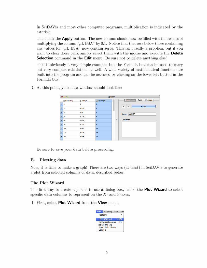
Then click the Apply button. The new column should now be filled with the results ofmultiplying the column “µL BSA” by 0.1. Notice that the rows below those containingany values for “µL BSA” now contain zeros. This isn’t really a problem, but if youwant to clear these cells, simply select them with the mouse and execute the DeleteSelection command in the Edit menu. Be sure not to delete anything else!
This is obviously a very simple example, but the Formula box can be used to carryout very complex calculations as well. A wide variety of mathematical functions arebuilt into the program and can be accessed by clicking on the lower left button in theFormula box.
7. At this point, your data window should look like:
Be sure to save your data before proceeding.
B. Plotting data
Now, it is time to make a graph! There are two ways (at least) in SciDAVis to generatea plot from selected columns of data, described below.
The Plot Wizard
The first way to create a plot is to use a dialog box, called the Plot Wizard to selectspecific data columns to represent on the X- and Y -axes.
1. First, select Plot Wizard from the View menu.
5

2. This will open a dialog box:
This dialog allows you to select any of the columns in a table to use as the X-(horizontal) or Y - (vertical) variables in a plot, and make multiple plots on the samegraph. The individual pairs of X- and Y -variables are referred to as “curves”.
First, click on the New Curve button. Then select “µg BSA” from the column namesand click on the button labeled <->X to make this column the X-variable.
Then, select, “A595” from the column names and click on the button labeled <->Y.
The dialog box should now look like:
6

3. Click on the Plot button. You should now have plot that looks like:
Some of the details of the plot, such as the size and shapes of the symbols or whetherline segments are drawn between the symbols, will depend on preferences that havebeen set for the program.
Before proceeding further, be sure to save the project.
Plotting from selected columns in a Data Table
Data columns in a table can also be selected directly with the mouse and then plottedby using commands in the Plot menu. This requires a bit of care and planning, however,as detailed below.
Columns in a data table are selected by clicking on the header cells (containing thecolumn names) at the top of the window. The columns can be selected individually, oras groups of adjacent columns, as shown below for the columns named “µLBSA” and“A595”.
Note that the two columns are also labeled X and Y, which defines how they will betreated by commands in the Plot... menu. For instance, if the Scatter command in thePlot menu is used with the selection shown above, a plot of A595 (on the Y -axis) versusµL BSA (on the X-axis) will be created.
In the window shown above, the column labeled “µg BSA” is identified as Y and mustbe modified to be used as an X-variable. To do this, select just this column, and selectSet Column(s) As from the Table menu, and select X from the submenu that appears:
7

The headings on the columns will then be changed as shown below:
Notice that the µg BSA column is now labeled X2, and the “µL BSA” and “A595”columns are now labeled X1 and Y1. Although multiple columns in a table can be iden-tified as Y, different X columns must be distinguished. (The exact numbers associatedwith different X and Y columns may differ, depending on the order in which variousassignments were made.)
Another requirement for making plots directly from a data window is that the X-and Y-columns must be placed adjacent to one another. The positions in a table canbe easily changed by using the mouse to click and drag on the column header cells. Tomake a plot of A595 versus µg BSA, the columns should be rearranged and selected asshown below:
Now, the two columns are identified as X2 and Y2 and will be properly plotted by usingthe commands in the Plot menu.
C. Modifying the appearance of the graph
Depending on how the preferences for the program are set, a plot generated from thePlot Wizard dialog will include symbols representing the data points, line segmentsconnecting the data points or both. A plot containing only symbols is called a Scatter
8

plot in SciDAVis, a plot containing only line segments is called a Line plot, and a plotcontaining both is called a Symbol+Line plot. But, there are many options available tomodify the appearance of the plot after it is created.
1. To begin modifying the graph, first make sure that the graph window that you wantto work on is active (selected), and then select Plot... from the Format menu. Thiswill open a new dialog box, as shown below:
The white area on the left of this box indicates the hierarchy of the componentsmaking up a plot window, which can contain multiple layers, each of which cancontain multiple curves, as defined in the Plot Wizard window. Our graph is relativelysimple, with just one layer and one curve. The layer properties include things likethe background and border colors, and can usually be left as they are.
Clicking on the icon representing the curve, changes the dialog box so that it appearslike:
The buttons at the top in the window shown above, labeled Axes and Symbol allowdifferent properties of the curve to be changed. The particular buttons that appeardepend on the the type of plot, as described below.
With the Symbol button clicked, the window shows options for the plot symbols,including their shape, size and colors. You can play with these options to see theireffects. For some (but not all) of them, you will need to click the Apply button inorder to see their effects.
If you chose the option of No Symbol, the plot style is converted to Line, and thedialog box changes to present options for the way in which the line segments aredrawn, as shown below:
9

Among the options for the line style is “No line”, which will convert the plot back toa Scatter plot.
The plot type can also be changed by using the drop-down menu at the lower leftcorner of the dialog box. If the Line+Symbol type is selected then buttons for bothSymbols and Line appear at the top of the dialog box, as shown below:
For our purposes here, the scatter plot is the best option, because we will be fittingcurves representing mathematical functions to the data, and the line segments willbe a distraction.
The default plot type can be set in the program preferences, which are accessed usingthe Preferences command in the scidavis menu. To set this preference, select “2DPlots” and click the Curves button. A variety of other default options can be foundin the preferences. If you make this preference change, or others, on a computer ofyour own, they should be saved for whenever you use the program. On the BiologyDepartment lab computers, the preference changes will be saved during your session,but they will be lost when you logout.
2. The axis scales can also be modified. In this case, I think that the plot would lookbetter if the both the X- and Y -axes were to start with 0. To change the axis, selecteither Scales... or Axes... from the Format menu. Either command will open theGeneral Plot Options dialog box, shown below:
10

The white box to the left is used to select one of the four possible axes. By default,only the bottom and left axis are drawn in a new plot, but top or right axes canbe added later. (An option in the preferences can be set to draw all four axes bydefault.)
First, we will work on the left axis, representing A595. With the left axis selected,click on the Scale button at the top of the dialog box. This will bring up fields inwhich to enter the minimum and maximum values of the axis scale, as well as optionsfor logarithmic or inverted scales, and options to change the number of major andminor ticks on the scale. The same options can be applied to any of the other axesthat are displayed.
Horizontal and vertical grids can also be added to the graph, by selecting optionsthat appear when the Grid button is clicked. Although they are sometimes useful,grids usually just add clutter to a graph and are discouraged.
3. The Axis button brings up a variety of additional options for each axis, including theaxis name and the display of labels on the axis. This window is rather complicatedand is shown below with four regions labeled for reference.:
11

A
B
C D
As described above, the white area in the box labeled A is used to select the axis tobe modified.
The checkbox labeled Show, between the boxes labeled A and B, is used to turn onor off each of the axes. As discussed below, an axis can be turned on, but the labelshidden.
The region labeled B is used to modify the label on an axis. The text of the labelcan be edited in the text field, and the font style and size can be changed by clickingon the box labeled Font. The boxes to the right of the Font button can be used toformat individual characters or to enter special characters:
The two buttons on the left of this row are used to enter subscripts and superscripts,and the three on the right are used for bold characters, italics and underlines.
The four buttons in the middle, labeled α, Γ,∫
and →, each open up a panel withspecial symbols that can be selected and entered into the label by clicking on them.Unfortunately, these special panels are often hidden behind the General Plot Optionswindow, so that you may need to move the windows around a bit to find them.
You should use these options to label the X- and Y -axis “µg BSA” and “A595”,respectively.
The area labeled C in the illustration contains options for the number labels on axes,including the font and color, and the display of the ticks. (The actual placements ofthe major and minor tics are set using options in the Scale panel.)
The area labeled D has additional options for the labels on the axes, including whetheror not the labels will be shown. Often, it is useful to show the top and right axes,
12

but hide the labels. The representation of numbers, in decimal or scientific notationcan also be set, along with the number of decimal places to be shown.
There is also a checkbox labeled “Formula”. Clicking this box opens a new text entrybox that is used to enter a formula for calculating the values used to label the axis.For instance, typing the string “10*x” in the formula box for the bottom axis, willchange the numbers to 10 times the values in the data window. This is a ratherspecialized option, but it could be useful for for adding a second axis, for instancethe top axis, with values that are somehow related to the ones shown on the bottom.
4. The last dialog within the General Plot Options window is for changing the overallappearance of the graph, accessed with the General button and shown below:
This box deals with the way in which the border lines of the graph are drawn. If youlook closely at a plot drawn with the defaults, you will see that in addition to thelines for the axes, there is a box with thinner lines that encloses the plot. The box isreferred to as the canvas frame, and can be turned on and off by the check box withthis name, in the upper left of the General dialog box. The lines representing the axescan be turned on and off with the check box labeled Draw backbones. These optionscan also be set within the program preferences, so that they are used by default.
The best choices for the canvas frame and axes backbones may depend on how theplots are to be used and the file formats used to save the graphs. Some experimenta-tion may be required! For SciDAVis D8, as installed on the computers in the BiologyDepartment labs, the best options seem to be to turn the canvas frame on and theaxes backbones off. The behavior in SciDAVis D9 and later versions has changed abit.
5. The title of the plot can be changed by either executing the Title... command inthe Format menu or by using the mouse to click on the title while holding down the
13

Control key and selecting Properties from the drop-down menu. Either option willopen up a dialog box in which the title and is formatting can be edited.
6. By default, SciDAVis will create a legend for each curve in a plot. This can be editedor deleted by using the mouse to click on the legend while holding down the Controlkey and selecting either Properties or Delete from the drop-down menu. Choosingproperties will open a dialog box for editing the legend.
After the changes suggested above, the plot should look something like:
D. Curve fitting
Fitting to a straight line
Often, we want to fit some mathematical function to our data. This might be just toprovide a visual cue to make any trend in the data more obvious. Alternatively, wemight believe that the data should be determined by a particular mathematical modeland we want to test the predictions of the model or extract the values of parameters thathelp define the model (for instance, Km and Vmax in the Michaelis-Menten equation forenzyme kinetics.) In the case of the Bradford assay, we want a calibration curve that wecan use to calculate protein concentrations from other measurements.
The simplest commonly used function to fit data is a straight line, which is definedby the equation:
Y = m ·X + b
where m is the slope and b is the Y -intercept (the Y -value corresponding to X = 0).When we say that we are “fitting” the data, we mean that we are finding values for mand b that, in some sense, give the best match between the experimental data and thevalues predicted by the equation. For a straight line, a perfectly reasonable way of doingthis is to place a ruler across the graph and adjust its position until it seems to be asclose to the data points as possible, intuitively giving all of the data points roughly equalweight. The slope and intercept can then be read from the graph. There are, however,at least two difficulties with this procedure. First, if the data display much scatter, then
14

drawing a line can become rather subjective, so that any two people are likely to drawslightly different lines, and any preconceived notions about the data might influence theresult. Second, simply drawing a line doesn’t provide any objective measure of how wellthe data and line actually match.
The most common technique used to fit data to a line or other function is the methodof least-squares. This method is based on the idea that if the experimental data aredetermined by a linear function, then the values of each of the individual data points, Xi
and Yi, can be expressed as:
Yi = m ·Xi + b+ εi
where m and b are the “true” values of the slope and intercept, and εi is an error term,presumed to be random, associated with each point. If we try to simulate the data usingvalues we somehow choose for m and b , then the Y -value predicted for a given X willbe:
Y ′i = m′ ·Xi + b′
where Y ′i is the predicted value and m′ and b′ are the chosen parameter values. The
difference between the observed and predicted Y values is called a residual and is givenby:
χi = Yi − Y ′i = Yi − (m′ ·Xi + b′)
In the method of least squares, each of the residuals is squared and then they are allsummed to give a term called χ2:
χ2 =N∑i=1
χ2i
where N is the total number of data points. The actual value of χ2 will depend on thevalues of the data points and the specific values m′ and b′ that are chosen. Qualitatively,it seems reasonable that there would be values of m′ and b′ for which χ2 has a minimumvalue for a given data set, as sketched below:
χ2
b’
χ2
m’
If either of the parameters is made either very large or very small, there will be hugedeviations between the observed and predicted Y values.
For a straight line, it is relatively easy to derive equations that define the values of m′
and b′ that minimize χ2, and these equations are pre-programmed into many handheldscientific calculators and computer programs. The process of fitting a line to data by least
15

squares is often referred to as linear regression, and the resulting equation is sometimescalled a least-squares line.
In SciDAVis, a line can be fit to a data set by selecting the item Quick Fit in theAnalysis menu and then choosing Fit Linear from the drop-down menu, as shown below:
If there is only one data curve on the plot, the program will go ahead and fit thedata and add the calculated line to the graph. If there are more than one data curves, adialog box will appear, allowing you to choose the data set to be fit. In either case, thefit line should appear on the graph:
The properties of the line displayed in the graph can be modified by opening the PlotDetails dialog box, which is accessed with Plot... item in the Format menu. When thisbox is now opened, there will be a new layer identified in the box on the right hand side,as shown below:
16
When the new layer is selected, and the Line button is pressed, as shown above, the style(dash pattern), width and color of the line can be changed.
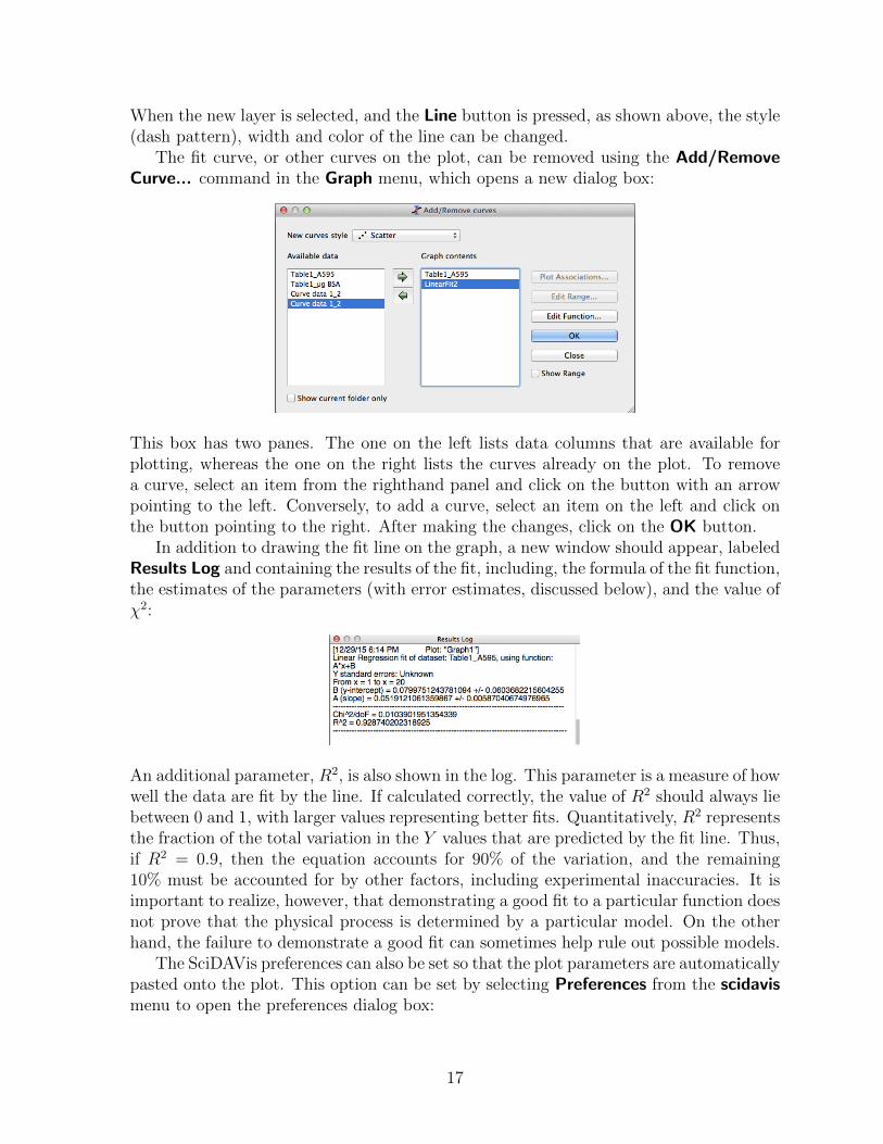
The fit curve, or other curves on the plot, can be removed using the Add/RemoveCurve... command in the Graph menu, which opens a new dialog box:
This box has two panes. The one on the left lists data columns that are available forplotting, whereas the one on the right lists the curves already on the plot. To removea curve, select an item from the righthand panel and click on the button with an arrowpointing to the left. Conversely, to add a curve, select an item on the left and click onthe button pointing to the right. After making the changes, click on the OK button.
In addition to drawing the fit line on the graph, a new window should appear, labeledResults Log and containing the results of the fit, including, the formula of the fit function,the estimates of the parameters (with error estimates, discussed below), and the value ofχ2:
An additional parameter, R2, is also shown in the log. This parameter is a measure of howwell the data are fit by the line. If calculated correctly, the value of R2 should always liebetween 0 and 1, with larger values representing better fits. Quantitatively, R2 representsthe fraction of the total variation in the Y values that are predicted by the fit line. Thus,if R2 = 0.9, then the equation accounts for 90% of the variation, and the remaining10% must be accounted for by other factors, including experimental inaccuracies. It isimportant to realize, however, that demonstrating a good fit to a particular function doesnot prove that the physical process is determined by a particular model. On the otherhand, the failure to demonstrate a good fit can sometimes help rule out possible models.
The SciDAVis preferences can also be set so that the plot parameters are automaticallypasted onto the plot. This option can be set by selecting Preferences from the scidavismenu to open the preferences dialog box:
17

Preferences related to different aspects of the program are set by selecting from the boxeson the right. To automatically add the fit parameters to plots, click on the indicatecheck box. It is also a good idea to change the number of significant figures used for theparameters, from the default 15 to a more reasonable 3.
Fitting to polynomials
The same mathematical method can be used to fit a variety of other functions, such aspolynomials of the form:
Y = m0 +m1 ·X +m2 ·X2 + · · ·+mN ·XN
A polynomial in which the largest power of X is N is referred to as an N th-order poly-nomial. Very likely, your Bradford calibration curve displays some downward curvature,and you may be able to obtain a better fit using a polynomial.
To fit a polynomial to your data, again select Quick Fit from the Analysis menu andchoose Fit Polynomial... from the submenu, to bring up the dialog box shown below:
This box allows you to choose the data set to fit and the order of the polynomial to beused. It also allows you to select the range of data to be used in the fit, and the colorof the curve. First try using a second-order polynomial (a quadratic equation). Since wealready have a red curve for the straight-line fit, we will use blue for this curve.
18

You will likely find that this gives a slightly better fit, as indicated by the parametersin the log:
Note that χ2 has decreased, and R2 has increased, compared to the values for the linearfit. In general, using a more complex equation with more parameters will almost alwaysgive a better fit to a given data set. In fact, with N data points, one can usually obtaina perfect fit (R2 = 1) using a polynomial of order N − 1. The result, however, is usuallypretty meaningless, as illustrated below for a Bradford calibration curve with 8 points:
This extreme example illustrates one of the fundamental issues that arises in curve fitting.One can almost always obtain a better fit using more parameters, but it is not alwaysclear when using a more complex function is justified. In the case of the Bradford data
19

used here, there appears to be a systematic curvature, and so using a non-linear functionis probably justified. But, you don’t want to end up with an elaborate function that isdetermined by the relatively small errors in each data point. In general, the number ofparameters that are extracted should be significantly smaller than the number of datapoints.
Non-linear least-squares fitting
The Quick Fit submenu of the Analysis menu also includes built-in curve-fit routinesfor other simple functions, including exponential functions. More importantly, however,the program includes a tool for fitting data to almost any mathematical function. As anexample, we might want to fit the Bradford data to a function of the form:
Y =a ·Xb+X
This function, with parameters a and b, defines a rectangular hyperbola, for which Yincreases almost linearly for small values of X and then approaches an asymptote whenX is much greater than b. (If this equation isn’t familiar to you, it will be soon!)
The hyperbolic function differs in an important way from the linear and polynomialfunctions in that Y is not a linear function of the parameter b (though it is a linearfunction of a). Because of this, the relatively simple method used to fit a line or polyno-mial cannot be used for a hyperbola, or for most other functions. Instead, an iterativeprocedure must be used. In this procedure, the program is given initial estimates ofthe parameters and then these are modified to minimize the sum of the squares of theresiduals (χ2). The procedure is repeated until χ2 does not decrease further. The mostcommonly used method for this is called the Levenberg-Marquardt algorithm, which isimplemented in SciDAVis, Kaleidagraph and other programs. Because it can be appliedto functions that are not linear with respect to the parameters, it is often called non-linear least-squares fitting, which is a bit confusing because linear least-squares fittingcan be applied to functions more complex than a straight line provided that the functionis linear with respect to its parameters, as in the case of a polynomial.
The following steps describe how to do a non-linear least-squares fit with SciDAVis.
1. For a fresh start, remove any existing fits from your plot, using the Add/RemoveCurve... command in the Graph menu.
2. Select Fit Wizard... from the Analysis menu. This will open a dialog box that lookslike:
20

The top part of the box provides a list of built in functions as well as a list of basicfunctions that can be used as elements in user-defined functions. If previously defineduser functions have been saved, these can also be selected.
To create a new function, the parameters for the function, in this case “a” and “b”,should first be typed into the Parameters box. The function can also be given aname. The expression defining the function is then typed into the larger box at thebottom. The symbol “x” is always used as the independent variable in the expression.If the Save button is clicked, the name and expression are added to the collection ofuser-defined functions at the top of the window, and can be reused later. The windowshould now look like:
21

3. Next, click on the button labeled Fit >>, which will open another panel of the FitWizard window:
This window offers a number of options, some of which will be used later in the course.At the top of the window, there is a drop down menu, from which the data to be fitare chosen, if there are more than one set on the plot.
The most important parameters are the initial guesses for the fit parameters. For somefunctions, including the rectangular hyperbola, the algorithm is not very sensitive tothe initial parameter values. In other cases, however, the initial guess may have to befairly close to the final value, and an initial attempt to fit the data may fail. This willusually result in a message in the Results Log box saying something like “Status:Failed”, or you may get a fit that is obviously wrong, such as a straight horizontal line.If this happens, first check to be sure that you have defined the function properly,and then try using initial parameter estimates that you think may give better fits tothe data. Usually, you should be able to do some sort of “eyeball” fitting that willgive you a reasonably good starting point. For the rectangular hyperbola, the defaultinitial values of 1 for a and b will usually be fine.
4. Before doing the fit, there is one other option that should be set by first clicking onthe button labeled Custom Output>>, which will open another pane:
22

If it they aren’t checked already, click on the checkboxes labeled Paste Parametersto Plot and Write Parameters to Result Log, as shown above. It is also a good ideato change the number of significant digits to 3, if this hasn’t already been done inthe program preferences. Then, click on the <<Fit button, to return to the previouspane.
5. Finally, click on the Fit button in that pane. If successful, the fit curve should appearin the plot window, and the results will appear in the log window. In addition, thevalues in the boxes for the initial guesses will change to the fit values of the parameters.When the Fit Wizard window is closed, the parameters will also be pasted to theplot window (if that option was chosen, as described above).
By default, the fit curve will be drawn over the range of X-values defined by theexperimental values. Sometimes, though, it is nice to extend the curve over a widerrange. The range can be modified by first selecting Plot... from the Format menu
23

to bring up the Plot Details dialog box. Then select the plot corresponding to thenon-linear fit from the box on the right and click on the Line button, as shown below:
Next, click on the button labels Edit... button, to bring up the Edit function boxshown below:
SciDAVIS can be used to plot mathematically defined functions, as well as dataderived from other sources, and the display of fit curves is just one case of this generalfunctionality. The Edit Function window can be used to change the parameters oreven the definition of a previously plotted function, but that is not what we want todo here. Instead, we will just change the range of X-values over which the function iscalculated and plotted, in this case from 0 to 25. After clicking Apply and OK, therange of the curve will be modified to the new values and the dialog box will close.
With this and other manipulations, you may find that the range of the axes in theplot will automatically change. This behavior can be rather annoying, but it can beturned off in the preferences dialog, under the options for 2D Plots. Uncheck the boxlabeled Autoscaling.
The output for all of the curve fits in SciDAVis also lists estimated errors for the fitparameters. These estimates are roughly equivalent to an estimate of the standard errorof the mean (SEM), such as you calculated for your pipette calibration experiment. Inthe case shown above, you will see that the errors are actually quite large. The majorreason for this is that the parameter a reflects a maximum value of Y that is approached
24

when X becomes much larger than b, which doesn’t actually happen in this data set. Atlower X values, Y depends mostly on the ratio of a and b, and different combinations ofthe two parameters that maintain a similar ratio will yield fits that are almost as good.As a consequence, the uncertainties in a and b are rather large, even though the datadisplay relatively little scatter, and the ratio of the parameters is actually fairly welldefined.
A final advantage of the hyperbolic function is that it can be easily rearranged into aform that allows you to calculate X-values from Y -values:
X =b · Ya− Y
This is particularly useful for the Bradford assay calibration curve, since you want to de-termine the protein concentration of an unknown sample from the measured absorbance.You could do this with the quadratic function as well, but it is much less convenient.
The use of non-linear least-squares to fit data has many applications. We will useit extensively to analyze the data from enzyme kinetics experiments. In this case andothers, the method allows one to fit data directly to an equation, rather than usingsome rearranged form of the equation that is usually far less intuitive and can leadto undesirable artifacts, as we will see when we discuss methods for analyzing enzymekinetics.
Deleting points from a fit, but still showing them on the graph
There is often a temptation to remove data points from a graph in order to “improve”the fit to a function. In general, this is something to be very wary of! But, there aretimes when it may be appropriate. For instance, there may be reasons to believe thatsome data values exceed the range where the function is valid, or a data point may lieso far from the trend defined by the other points that one suspects that something wentwrong with that measurement. In these cases, it may be legitimate to exclude pointsfrom the fit, but honest reporting requires that those points also be shown on the graphand be clearly identified. To do this within SciDAVis, it is necessary to split the datainto separate columns, representing the data that will be used for fitting and those thatwill be excluded, but still shown on the graph.
As an example, the data shown above for the Bradford calibration data suggests thatthere is a systematic downward curvature in the data as the protein concentration isincreased. It may, therefore, be reasonable to fit a straight line only to the data pointsfor lower protein concentrations, provided that the fit line will only be used to analyzeresults from other measurements in this range.
We begin by creating a new column (using the Add Column command in the Tablemenu) and copying the absorbance values to a new column:
25

The original column has been renamed “A595-fit” and the new column is named “A595-excluded.”
Next, delete the data to be excluded from the column to be used for fitting, anddelete all but these values from the column of excluded data. This can be done eitherby deleting individual values or by selecting a range of entries and using the DeleteSelection command in the Edit menu. The data window should now look like this:
The data points deleted from the original column will also disappear from the plot.At this point you can choose to create an entirely new plot or add the excluded points
to the existing plot. To add the excluded points to an existing plot, which will preserveany special formatting you have already done, follow the steps below:
1. Use the Add/Delete Curves... command in the Graph menu to open the dialog boxwe used before.
2. Click on the item for the excluded data in the box on the left and then click on thebutton with an arrow pointing to right, to add this data column to the plot.
3. At this point, the excluded points may not appear on the graph, or they may appearin unexpected places. If either of these things happen, click on the button labeledPlot Associations, which will open the little dialog box shown below.
26

All of the curves currently on the plot are listed in the box near the bottom, andclicking on any of them allows the user to select the columns to be used for the Xand Y variables. The new curve should have the correct Y column selected, but theX column may be incorrect, as in the example above, where the column for µL BSAis selected. In this case, the points do not appear on the graph because the X valuesin the column exceed the range of the X-axis. After selecting the correct column forthe X-values and clicking the Update curves button, the points should appear onthe graph in the correct places. Then, just click the OK button.
4. Finally, the plot symbols can be changed in the Plot details window, which is openedby selecting Plot... in the Format window. (See page 9.) A good choice here is to usefilled symbols for the data points that are to be used for fitting and empty symbols,of the same size and shape, for the excluded points. The graph then looks like:
Now, the linear curve fit can be applied to the data without the excluded points:
27

Note that the R2 value is a bit larger than when all of the data were used, but thefit line now diverges quite far from the last two points. The important point, however, isthat the scientist must be very clear in identifying the points that were used for the fit,as well as those that were excluded.
E. Exporting graphs
After creating and modifying a graph in SciDAVis, you will usually need to export it as agraphics file to use it for other purposes, including in your lab reports for this class. Thelab reports should include both the SciDAVis project file and images of the graphs, inthe png (Portable Network Graphics) format described below. For other purposes, youmay want to use other image file formats.
The steps for exporting a graphics file for a graph are described below:
1. First, select the graph window that you want to export.
2. From the File menu, select Export Graph and then Current... from the submenu:
28

3. You should then see a dialog box like the one shown below:
Although this file save dialog box may be slightly different from the ones usually seenon the Mac (or other operating systems) it has most of the same basic functionality.You can navigate to different folders, and create new ones, and specify the name forthe new file.
At the bottom of the window there is a drop-down menu used to select the file type tobe used, which are identified by the standard file name extensions. Without describingall of the options, some of the most commonly used formats are:
• .png - Portable Network Graphics. This file format is representative of thegeneral class of bit-mapped image formats. The important feature of this kindof format is that the image is represented as individual pixels, such as generatedby a digital camera. Other formats of this type include the ubiquitous jpegand tiff formats. Unlike jpeg files, png files are saved without any loss of imagequality, but they are compressed to minimize storage space. The png format isalso completely open, and it is becoming a preferred format for sharing imageswhen it is important to maintain the original data in the image, some of whichis lost each time a jpeg file is saved as a new file. png files are directly viewablein LabArchives, which is why they should be used here. A general limitationof bit-mapped images is that their resolution is limited to that of the originalimage. Although there are methods for increasing the resolution of an image,that is the number of pixels used to represent it, the result is never as good asan original file with the same number of pixels.
• .svg - Scaled Vector Graphics. In contrast to png, jpeg and tiff files, svg files con-tain mathematical descriptions of the objects that make up the image, including
29

lines, squares and text characters, as well as other shapes. svg files can also in-clude bit mapped images that represent part or all of the image. File formats ofthis type are called vector graphics. In general, vector graphics files require lessdata to specify an image than a bit-mapped representation of the same image.More importantly, the mathematical representation of the image can be used todraw the image with what ever resolution the output device (usually a screen orprinter) is capable of. For high quality graphs, such as required for publication,the use of vector graphics files is almost always preferred.
Another advantage of vector graphics files is that the elements in the image canbe individually edited with suitable programs. Adobe Illustrator is one programthat can open svg files and then be used to edit them. Another is Inkscape,which is a free open source program: https://inkscape.org. Although theuser interface for Inkscape is not quite as polished as those of some commercialproducts, it is a very capable program.
In general, programs for editing vector graphics, like Illustrator and Inkscape,are not quite as intuitive as those for editing bit mapped images, and it takes awhile to become proficient. But learning to use a program of this type can be avery worthwhile investment, as most professional graphics are made in this way.
• .eps - Encapsulated PostScript. This is another vector graphics format, andprobably the most widely used one. The eps, ai (Adobe Illustrator) and pdfformats were all developed by Adobe and are all based on the PostScript com-puter language, which was originally developed for specifying the output of high-resolution printers. The eps format, in addition to specifying the graphics, canalso specify the box enclosing the graphics, and it is usually the best format fortransferring one vector-based image from one program to another, for instanceinserting images in a word-processor file. Unfortunately, the eps export func-tion from SciDavis is not yet very well developed, and better results are usuallyobtained with svg exports.
• .pdf - Portable Document Format. This is the familiar format for sharing docu-ments with minimal dependence on specific software. These files can be openedand viewed in the free Adobe Reader program, the Apple Preview program anda variety of other programs, both free and commercial. The pdf files exportedfrom SciDAVis cannot generally be edited, except after converting them to a bit-mapped format. Under some circumstances, this can actually be an advantage,if you want to share a graph while preventing its modification.
Use the drop-down menu to select the format, and then type in a name for the file.The program will automatically add the proper suffix.
4. For some of the file formats, the button labeled<<Advanced is activated, and when itis clicked additional options appear in the window. For some file formats a setting forthe image quality or resolution appears. Unfortunately, these setting don’t actuallydo anything in the current versions of SciDAVis.
30

5. After the file format, name and location of the file have been specified, click on theSave button to create the file.
6. As mentioned on page 11, the settings for specifying the canvas frame and axesbackbones, in the General Plot Options dialog, can sometimes have unexpected effectson the appearance of the these features in exported image files. If the frame is notewhat you expect or want, it may be necessary to experiment with these settings.
F. Other techniques
Although the sections above should cover the methods that you will need for analyzingthe data from Experiment 2, there are a variety of other features of SciDAVis that maycome handy later in the course, or in other contexts. Some of these are described below.
Automatically creating a series of numbers in a data window
Sometimes it is useful to create a series of numerical values for calculations in SciDAVis.For instance, Problem 2 of Experiment 5 requires generating a series of numbers repre-senting pH values from 1 to 11 at intervals of 0.05. Typing such a list would be verytedious! But, SciDAVis provides tools to make it relatively easy, as described below:
1. Create an empty table, or use an existing one.
2. When a table is selected, on the left border of the project window, there should besome small icons:
If these icons are not present, select Table from the Toolbars submenu in the Viewmenu:
Clicking on the icon at the top should open a dialog box in which you can change thenumber of rows and columns in the table. For this case, set the number of rows to201.
31

3. Select the first column in the table. In the Table menu, select the command Fill Se-lection I With Row Numbers.
This should fill the selected column with the numbers 1 to 201.
4. Select the second column and open the formula panel. The formula below should fillthis column with values from 1 to 11, with intervals of 0.05.1+0.05*(col(”1”)-1)
5. You can then use the formula panel to calculate the contents of other columns fromthese values.
Importing an ASCII text file
Text files generated by other programs, including the one that you will be using to collectkinetic data automatically from the spectrophotometers in the lab (MacSpec), can beimported into SciDAVis for plotting and analysis. Before using this feature, however, itis necessary to know something about the structure of data files to be imported. As anexample, if a MacSpec kinetics date file is opened in a text editor, it will look somethinglike this:
#k ine t i c sData#MacSpec data document c rea ted : Sun , Mar 2 , 2014##Assays o f f r e s h l y prepared a f f i n i t y p u r i f i e d t ryp s i n#Trypsin d i l u t e d 500−x from nominal ly 0 .5 mg/mL stock .(min ) 0 t ryp s i n 10 µL 20 µL 40 µL 60 µL0 0.000 0 .000 0 .000 0 .000 0 .0001 0 .000 0 .008 0 .014 0 .018 0 .0442 0 .000 0 .017 0 .029 0 .036 0 .0573 0 .000 0 .026 0 .043 0 .054 0 .1044 0 .000 0 .034 0 .058 0 .072 0 .1525 0 .001 0 .043 0 .073 0 .090 0 .199
The first five lines of the file contain information about the file and data, including anycomments that the user saved with the data. The hash marks (“#”) at the beginningsof these lines are used to indicate that these lines are to be ignored. This a common, butnot universal, convention, and some programs can automatically ignore lines identifiedby this or other labels. When importing text files into SciDavis, the number of lines tobe ignored must be specified.
The next line contains names for each of the data columns, with the first columnrepresenting a time in minutes and the others representing absorbance measurements.
32

The following lines contain the actual data. As shown above, the columns appear tobe separated by ordinary blank spaces. However, the data files generated by MacSpecand many other programs use special (and ordinarily invisible) tab characters to separatedata columns. This allows a distinction between the separation between data values andordinary spaces, such as used in the column names in the example above. Because ofthis distinction, the space between, for instance, “(min)” and “0” is treated differentlythan that between “0” and “trypsin”. The former is a column separator (a tab), whereasthe second is not recognized as a column separator. Files that are structured this wayare commonly referred to as tab-delimited. Columns of data can also be separated bycommas or spaces, and SciDAVis can import files structured in these ways.
The key parameters that are needed in advance to import text data into SciDAVisare the number of lines to skip before reading data, whether or not the file includes aline with the names of columns, and the character used to separate columns.
To import a text file, use the Import ASCII.. command at the bottom of the Filemenu (not the Open command, which only opens SciDAVis project files.) The ImportASCII.. command will open a dialog box:
The top portion of the window is very similar to the one for exporting image files,and is used to select the file for import. The drop-down menu labeled ”Files of Type”allows the user to screen for file types, based on the file name extension (such as .txt,.dat or .csv), but the same basic text file type is assumed.
If the lower portion of the box shown above does not appear at first, click on the boxlabeled <<Advanced. This portion of the box includes a variety of options for specifyingexactly how the text file is to be read. These include the separator to be recognized toidentify multiple columns in the file (set to the tab character in the example above) andhow to deal with the first lines of the file. In the example above, the option is set to treatthe first line as names for the columns of data. There is also an option for skipping a setnumber of lines at the top of the file. In this case, it is set to 5.
33

In the example above, the dialog is set to create a new data table for each file that isto be imported. Multiple files can be imported at the same time. There are also optionsto add the data to an existing table. After selecting one or more files in the dialog, theOpen button becomes active, and clicking the button completes the action. The datashould be entered into a new data table window within the project window.
The imported data can then be used to make one or more plots and for other formsof analysis.
Bar graphs
SciDavis can also create bar graphs, but this option is not available through the com-mands and dialog boxes for adding, removing and adjusting other features of a graph.Instead bar graphs, with either vertical (much preferred!) or horizontal bars, must becreated from a data window and using commands in the Plot that are available when adata window is open, as described on page 7.
To make a bar graph, first enter the data for the x- and y-axes in the columns ofa data window, as discussed earlier and illustrated below for an example based on thebinomial probability distribution function:
Make sure that the columns for the x- and y-axes are properly identified as such and areplaced with the x-data column to the left. Then, select all of the rows with data in bothcolumns and execute the Vertical Bars command in the Plot menu:
A bar graph like the one below should appear in a new plot window:
34

As with other plot types, the appearance of a bar graph can be modified by using thePlot command in the Format menu to open a Plot details window. For a bar graph, thewindow has a special pane for adjusting the spacing between the bars, as shown below:
The space between bars can be adjusted to the improve the appearance of the plot, andsometimes it is useful to adjust the positions of the bars with the respect to the x-axis,depending on exactly how the values represented by the bars are related to the x-values.For instance, the bars may represent a value for a range of x-values, instead of a uniquevalue. In these cases, it makes sense to adjust the positions of the bars so that they startwith one x-value and extend to the next.
G. Some quirks and tips
Although it is very functional and has a number of sophisticated features, SciDAVis isnot as polished as some commercial programs and does have some quirks. The followingare some tips for dealing with some of the quirks that I have discovered.
Opening SciDAVis project files
Unlike most files and programs on a Macintosh, double-clicking a SciDAVis file icon doesnot open the file in the program. If SciDAVis is not already open, double clicking ona project file icon will open the program, but not the project file. Instead, project filesmust be opened using the Open command in the File menu.
35

Resizing Graph Windows
This is an area where SciDAVis clearly lacks the intuitive feel and convenience of mostwell-developed programs with graphical user interfaces. If you try to resize a graphwindow by just clicking and dragging on a corner or edge, you are likely to becomefrustrated quickly. There are two interrelated issues:
1. SciDAVis treats the window containing the graph and the collection of the graphicalelements making up the graph as distinct objects. The latter collection of elementsis defined as a “layer” within the window, a distinction that can be seen by openingthe plot formatting dialog, using the Plot command in the Format menu.
2. Resizing the window with the mouse requires clicking on the very edge of the window,and there isn’t much tolerance there. On the other hand, it is very easy to resize thelayer within a graph window, often leading to something very different from what youwanted and no obvious way of fixing it, as shown below:
Fortunately, situations like the one shown above can be avoided and fixed when theyoccur, but doing so requires knowing a few tricks.
As noted above, the layer in a graph is treated independently from the window, andwhat has happened in the example above is that the layer has been stretched out so thatit is much larger than the window itself, so that only a portion of it is now visible. Theborder of the layer is indicated by the black lines on the left and top edges of the window,with “handles” that can be used to move the edges. However, the handles that are neededto resize the layer are now on the bottom and right sides, and are not accessible!
Going back to a graph window in which the layer is still properly contained, the layerboundaries can be shown by holding down the shift key and clicking somewhere withinthe graph:
36

It is dragging on one of the handles on the bottom, left or lower left corner that expandsthe layer beyond the window boundaries.
To avoid this situation, it may be best to avoid clicking and dragging to resize win-dows, as convenient as that may seem. An alternative method for resizing a windowis to make the window active by clicking on it, and then use the Window Geometry...command in the Windows menu. This will open a dialog box like the one shown below:
This dialog box can also be opened by holding down the control key and clicking on thetop bar of the window (or clicking with the right hand button of the mouse, if it hasone). This will open a drop-down menu, and selecting the Resize Window... item willopen the Window Geometry dialog box.
The two sides of the dialog box allow the user to specify the position of the graphwindow on the larger project window and the dimensions of the window itself. The panelon the left, labeled “Origin” sets the position of the upper-right corner of the windowin the project window. The number entered for “X” sets the number of pixels betweenthe left edge of the project window and the left edge of the graph window. The numberentered for “Y” sets the number of pixels between the top edge of the project window andthe top edge of the graph window. The convention used to specify the vertical positionmay seem odd, since it is the opposite of what is used in a conventional two-dimensionalgraph, but it is common in computer graphics programming.
The panel on the right of the Window Geometry dialog box is used to specify the sizeof the graph window, by entering the number of pixels for the width and height. Whenthe dialog box is first opened, the numbers in the boxes reflect the current dimensions,and the box labeled “Keep aspect ratio” is checked. With this box checked, changing the
37
numbers for either the width or height will change the other, so as to keep the relativedimensions constant. When the size is changed, the layer(s) within the window will alsochange in proportion to the window size. If the “Keep aspect ratio” box is unchecked,the width and hight can be changed independently of one another.
The effects of changing either the position or dimensions of the window can be pre-viewed by clicking the Apply button in the dialog box. Though this procedure for resizingisn’t quite as convenient as clicking and dragging on a window’s boarder, in SciDAVis itseems to be more reliable.
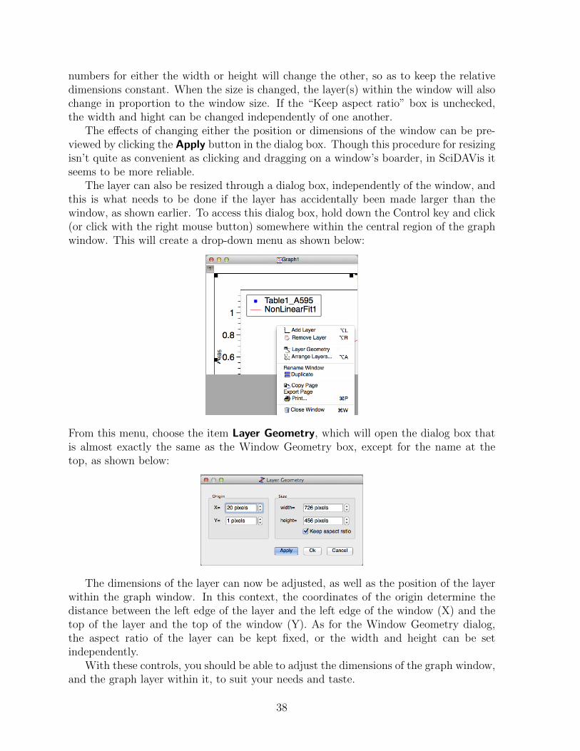
The layer can also be resized through a dialog box, independently of the window, andthis is what needs to be done if the layer has accidentally been made larger than thewindow, as shown earlier. To access this dialog box, hold down the Control key and click(or click with the right mouse button) somewhere within the central region of the graphwindow. This will create a drop-down menu as shown below:
From this menu, choose the item Layer Geometry, which will open the dialog box thatis almost exactly the same as the Window Geometry box, except for the name at thetop, as shown below:
The dimensions of the layer can now be adjusted, as well as the position of the layerwithin the graph window. In this context, the coordinates of the origin determine thedistance between the left edge of the layer and the left edge of the window (X) and thetop of the layer and the top of the window (Y). As for the Window Geometry dialog,the aspect ratio of the layer can be kept fixed, or the width and height can be setindependently.
With these controls, you should be able to adjust the dimensions of the graph window,and the graph layer within it, to suit your needs and taste.
38

Text boxes on graphs
Depending on how the preferences for SciDAVis are set, the results of a curve fit maybe automatically added to a graph. This information is added in the form of a text box,which can be modified. Text boxes can also be added manually to provide additionalinformation.
To edit an existing text box, simply double click on it to open a dialog like the oneshown below:
The text itself can be edited in the box at the bottom of the dialog box, and the appear-ance of the text and box can be modified in various ways using the controls in the upperportion of the dialog box.
One thing to be aware of is that the text entered in the box is not “soft wrapped”when it appears on the graph. That is, everything that appears as a single line on in thedialog box, will appear as a single line in the box on the graph, expanding the width ofthe box as necessary. Thus, it is necessary to manually break the lines, using the returnkey, to manage the overall width of the text box in the graph.
To add a new text box to a graph, select the graph window by clicking on it, and thenuse the Add Text command in the Graph window. This command will open a dialogbox asking if you want to add the text to an existing layer or create a new one. Aftermaking this choice a text cursor will appear, and moving this cursor to a position on thegraph and clicking will open a Text Option box like the one shown above, in which youcan enter your text and control its appearance.
39