Embed Size (px)
Citation preview

CSE 512 - Data Visualization
Multidimensional Vis
Jeffrey Heer University of Washington

Last Time: Exploratory Data Analysis

Exposure, the effective laying open of the data to display the unanticipated, is to us a major portion of data analysis. Formal statistics has given almost no guidance to exposure; indeed, it is not clear how the informality and flexibility appropriate to the exploratory character of exposure can be fitted into any of the structures of formal statistics so far proposed.


Antibiotic Effectiveness

Original graphic by Will Burtin, 1951
How do the drugs compare?

Mike Bostock Stanford CS448B, Winter 2009
How do the drugs compare?

Do the bacteria group by resistance? Do different drugs correlate? Wainer & Lysen
American Scientist, 2009

[The Elements of Graphing Data. Cleveland 94]

[The Elements of Graphing Data. Cleveland 94]

[The Elements of Graphing Data. Cleveland 94]

[The Elements of Graphing Data. Cleveland 94]

How well does the curve fit the data?
Transforming Data
[Cleveland 85]

Plot vertical distance from best fit curve Residual graph shows accuracy of fit
Plot the Residuals
[Cleveland 85]

Multiple Plotting Options
[Cleveland 85]
Plot model in data space Plot data in model space

Use visualization software to form & answer questions First steps: Step 1: Pick domain & data Step 2: Pose questions Step 3: Profile the data Iterate as needed
Create visualizations Interact with data Refine your questions
Make a notebook Keep record of your analysis Prepare a final graphic and caption
A2: Exploratory Data Analysis
Due by 5:00pm
Friday, April 15

Visualization Tools Tue 4/12, 3:00-4:20pm PAA 114A Introduction to Tableau, plus a few others.
d3.js: Data-Driven Documents Tue 4/19, 3:00-4:20pm PAA 114A Focus on D3, touches on HTML/CSS/JS
Tutorials!

The Design Space of Visual Encodings

Univariate Data A B C1
factors
variable
A B C D

Univariate Data
7
5
3
1
0 20
Median
low highMiddle 50%
Tukey box plot
A B C1
factors
variable
A B C D
A B C D E

Scatter plot is common
A B C12
A
B
C
D
E
F
Bivariate Data

3D scatter plot is possible
A B C123
A
B
C
D
E
F
A
B
C
D
E
F
G
Trivariate Data

Two variables [x,y] can map to points Scatterplots, maps, …
Third variable [z] must use Color, size, shape, …
Three Variables

[Bertin, Graphics and Graphic Info. Processing, 1981]
Large Design Space

Multidimensional Data

Position (X) Position (Y) Size Value Texture Color Orientation Shape
~8 dimensions?
Visual Encoding Variables

Sales figures for a fictional coffee chain
Sales Q-Ratio Profit Q-Ratio Marketing Q-Ratio Product Type N {Coffee, Espresso, Herbal Tea, Tea} Market N {Central, East, South, West}
Example: Coffee Sales

Encode “Sales” (Q) and “Profit” (Q) using Position

Encode “Product Type” (N) using Hue

Encode “Market” (N) using Shape

Encode “Marketing” (Q) using Size

A trellis plot subdivides space to enable comparison across multiple plots.
Typically nominal or ordinal variables are used as dimensions for subdivision.
Trellis Plots

[MacEachren 95, Figure 2.11, p. 38]
Small Multiples
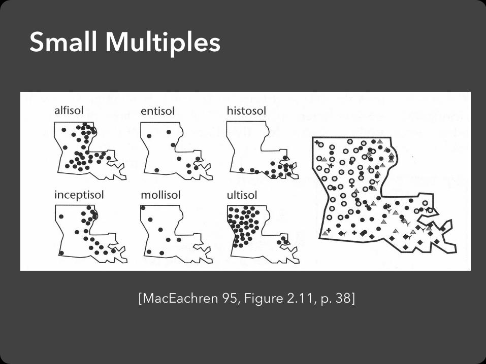
Small Multiples
[MacEachren 95, Figure 2.11, p. 38]
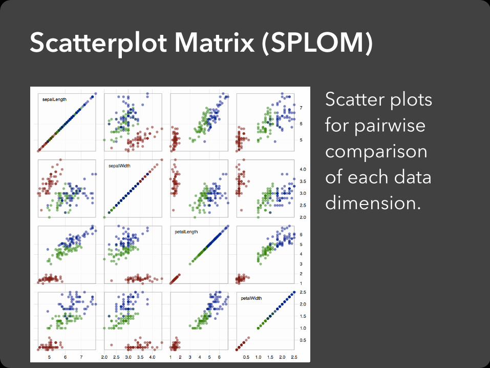
Scatter plots for pairwise comparison of each data dimension.
Scatterplot Matrix (SPLOM)


Multiple Coordinated Views
select high salaries
avg career HRs vs avg career hits (batting ability)
avg assists vs avg putouts (fielding ability)
how long in majors
distribution of positions played

Linking Assists to Position


Observation: We have evolved a sophisticated ability to interpret faces.
Idea: Map data variables to facial features.Question: Do we process facial features in an uncorrelated way? (i.e., are they separable?)
This is just one example of nD “glyphs”
Chernoff Faces

Strategies: Avoid “over-encoding” Use space and small multiples intelligently Reduce the problem space Use interaction to generate relevant views
Rarely does a single visualization answer all questions. Instead, the ability to generate appropriate visualizations quickly is key.
Visualizing Multiple Dimensions

Parallel Coordinates

Parallel Coordinates [Inselberg]
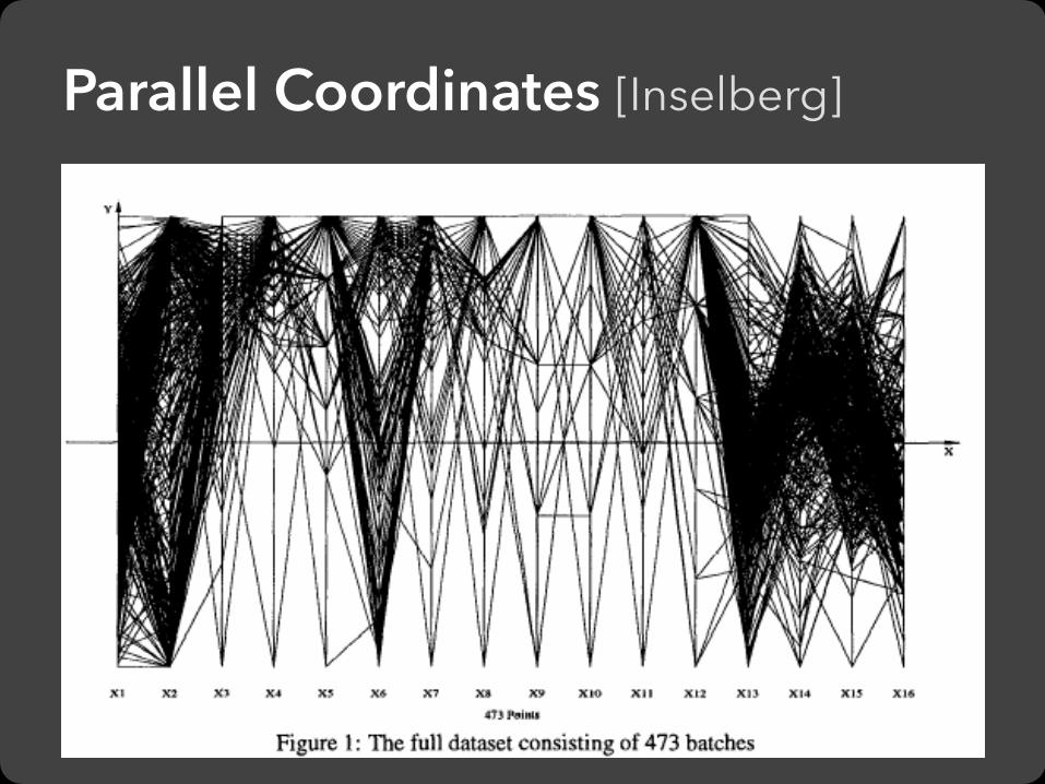
Parallel Coordinates [Inselberg]

Production data for 473 batches of a VLSI chip 16 process parameters X1: The yield: % of produced chips that are useful X2: The quality of the produced chips (speed) X3-12: 10 types of defects (0 defects shown at top) X13-16: 4 physical parameters Objective: Raise the yield (X1) and maintain high quality (X2) A. Inselberg, Multidimensional Detective, Proc. IEEE InfoVis, 1997
The Multidimensional Detective

Parallel Coordinates [Inselberg]

1. Do not let the picture scare you.
2. Understand your objectives. Use them to obtain visual cues.
3. Carefully scrutinize the picture.
4. Test your assumptions, especially the “I am really sure of’s”.
5. You can’t be unlucky all the time!
Inselberg’s Principles

Each line represents a tuple (e.g., VLSI batch) Filtered below for high values of X1 and X2

Look for batches with nearly zero defects (9/10) Most of these have low yields -> defects OK.


Notice that X6 behaves differently. Allow 2 defects, including X6 -> best batches

Radar Plot / Star Graph
“Parallel” dimensions in polar coordinate space Best if same units apply to each axis

Dimensionality Reduction

1. Mean-center the data.
2. Find ⊥ basis vectors that maximize the data variance.
3. Plot the data using the top vectors.
Principal Components Analysis

PCA of Genomes [Demiralp et al. ’13]

Time Curves [Bach et al. ’16]
Wikipedia “Chocolate” Article
U.S. Precipitation over 1 Year

Principal Components Analysis (PCA) Multidimensional Scaling (MDS) Locally Linear Embedding (LLE) t-Dist. Stochastic Neighbor Embedding (t-SNE) Isomap Auto-Encoder Neural Networks Topological methods …
Many Reduction Techniques!

Tableau / Polaris
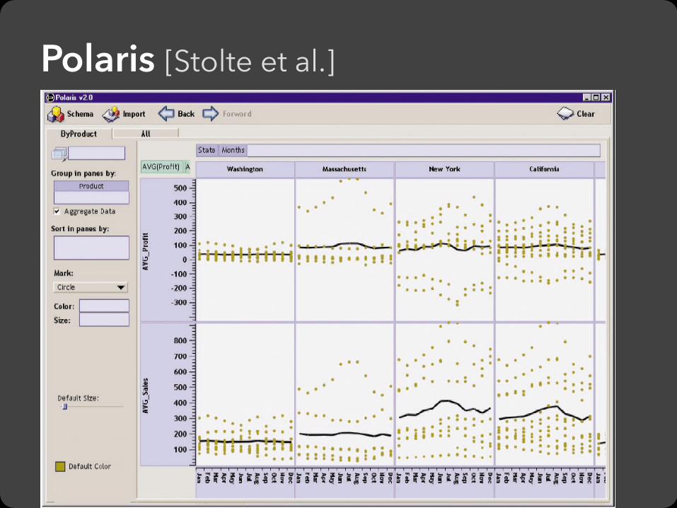
Polaris [Stolte et al.]
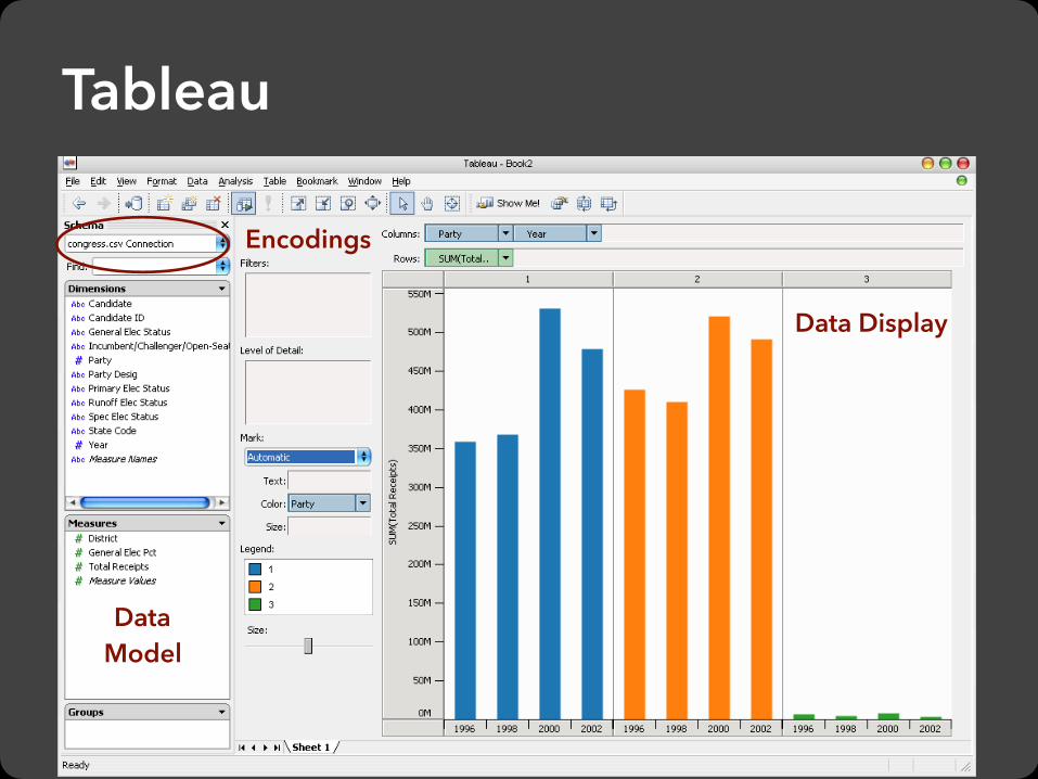
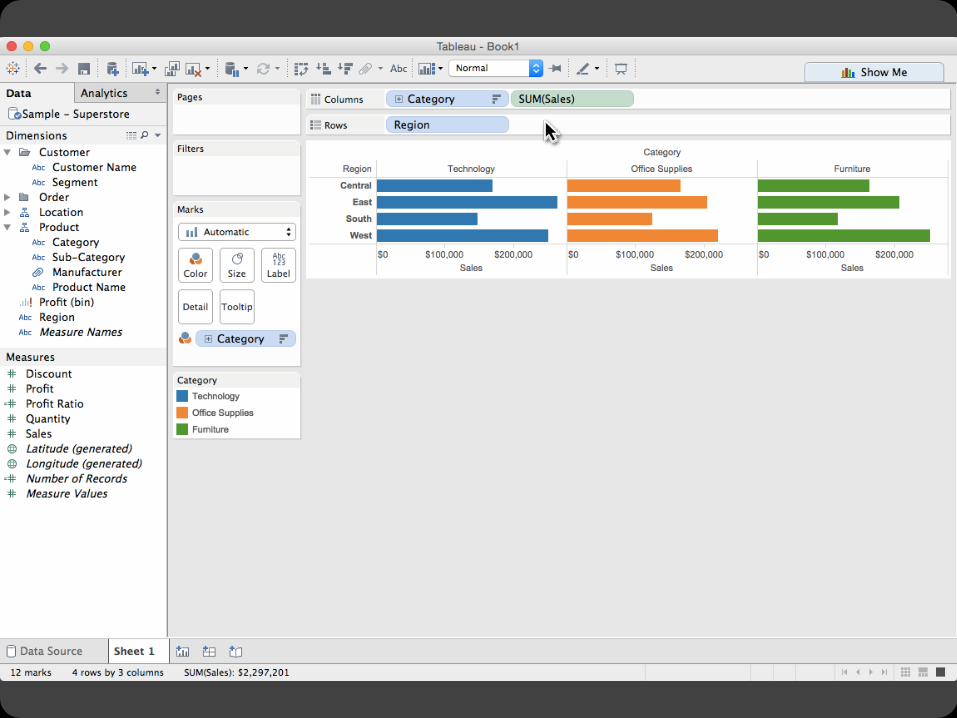
Tableau
Data Display
Data Model
Encodings

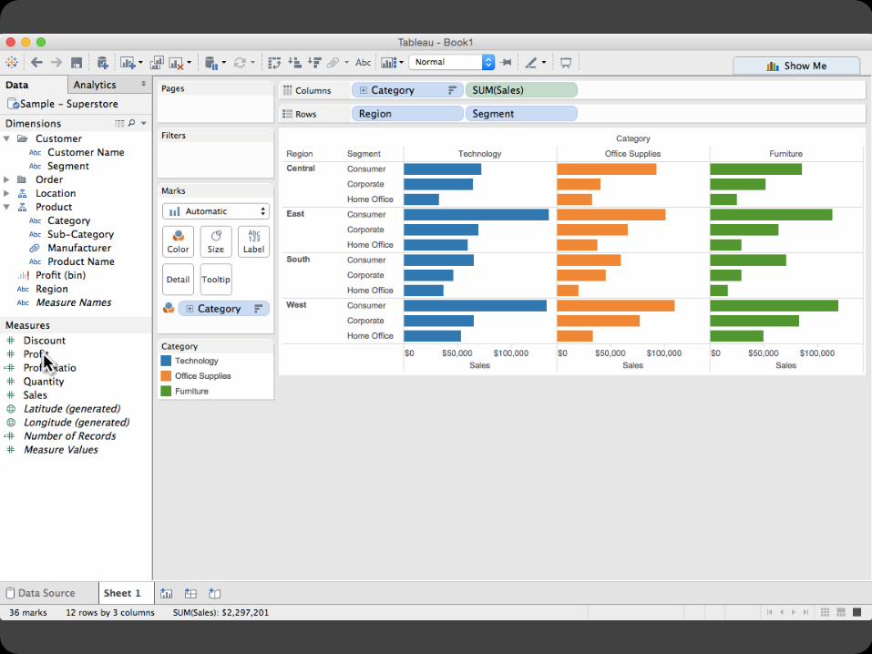
The dataset: Federal Elections Commission Receipts Every Congressional Candidate from 1996 to 2002 4 Election Cycles 9216 Candidacies
Tableau Demo

Year (Qi) Candidate Code (N) Candidate Name (N) Incumbent / Challenger / Open-Seat (N) Party Code (N) [1=Dem,2=Rep,3=Other] Party Name (N) Total Receipts (Qr) State (N) District (N) This is a subset of the larger data set available from the FEC.
Dataset Schema

What might we learn from this data?
Hypotheses?

What might we learn from this data? Correlation between receipts and winners? Do receipts increase over time? Which states spend the most? Which party spends the most? Margin of victory vs. amount spent? Amount spent between competitors?
Hypotheses?

Tableau Demo

Insight: can simultaneously specify both database queries and visualization
Choose data, then visualization, not vice versa Use smart defaults for visual encodings More recently: automate visualization design
Tableau/Polaris Approach

Operands are the database fields Each operand interpreted as a set {…} Quantitative and Ordinal fields treated differently
Three operators: concatenation (+) cross product (x) nest (/)
Specifying Table Configurations


x\
+—> GROUP BY Category, Region, Segment

Ordinal fields: interpret domain as a set that partitions table into rows and columns.
Quarter = {(Qtr1),(Qtr2),(Qtr3),(Qtr4)} ->
Quantitative fields: treat domain as single element set and encode spatially as axes.
Profit = {(Profit[-410,650])} ->
Table Algebra: Operands
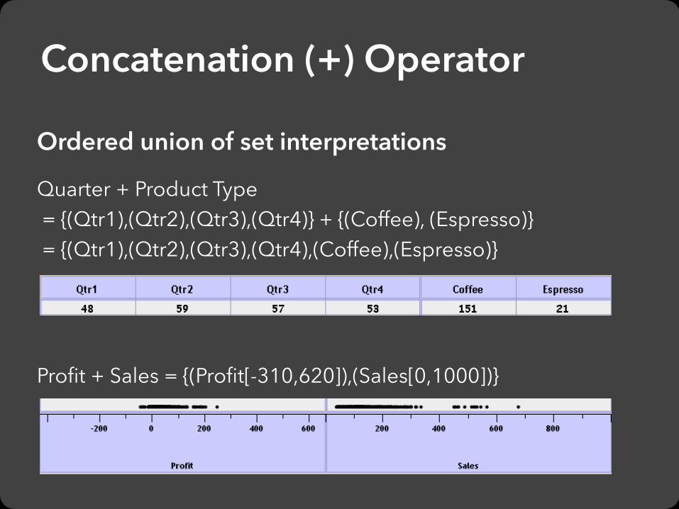
Ordered union of set interpretations
Quarter + Product Type = {(Qtr1),(Qtr2),(Qtr3),(Qtr4)} + {(Coffee), (Espresso)} = {(Qtr1),(Qtr2),(Qtr3),(Qtr4),(Coffee),(Espresso)}
Profit + Sales = {(Profit[-310,620]),(Sales[0,1000])}
Concatenation (+) Operator

Cross-product of set interpretations
Quarter x Product Type = {(Qtr1,Coffee), (Qtr1, Tea), (Qtr2, Coffee), (Qtr2, Tea), (Qtr3,
Coffee), (Qtr3, Tea), (Qtr4, Coffee), (Qtr4,Tea)}
Product Type x Profit =
Cross (x) Operator

Cross-product filtered by existing records
Quarter x Month -> creates twelve entries for each quarter. i.e.,
(Qtr1, December)
Quarter / Month -> creates three entries per quarter based on
tuples in database (not semantics)
Nest (/) Operator

The operators (+, x, /) and operands (O, Q) provide an algebra for tabular visualization.
Algebraic statements are then mapped to: Visualizations - trellis plot partitions, visual encodings Queries - selection, projection, group-by aggregation
In Tableau, users make statements via drag-and-drop Note that this specifies operands NOT operators! Operators are inferred by data type (O, Q)
Table Algebra

Ordinal-Ordinal

Quantitative-Quantitative

Ordinal-Quantitative

Querying the Database

Strategies: Avoid “over-encoding” Use space and small multiples intelligently Reduce the problem space Use interaction to generate relevant views
Rarely does a single visualization answer all questions. Instead, the ability to generate appropriate visualizations quickly is key.
Visualizing Multiple Dimensions