Embed Size (px)
Citation preview

Creating Effective Posters & Preparing for Poster Sessions
First Year ExperienceFall 2013
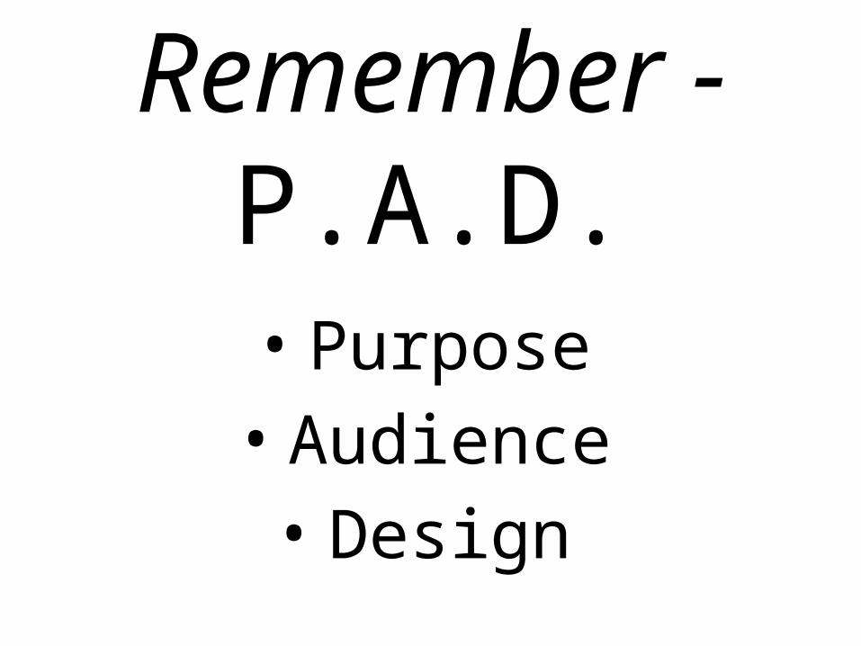
Remember - P.A.D.• Purpose• Audience• Design

PURPOSE
• Display graphically the highlights and main points of your research and paper
• Don’t try to include everything.• Don’t copy and paste paragraphs onto your
temple• Everything on your poster – images and texts
– should be visually clear, accessible, and appealing

Purpose: ACTION ITEM
• Consider only including thesis statements, topic sentences, and major examples and illustrations

AUDIENCE
• Multidisciplinary
• Experts and non-experts
• Students, Professors, Staff, and Administrators
• Interested but not necessarily knowledgeable about your topic

Audience: ACTION ITEM
• You might have to provide some more background information that wasn’t in your paper, such as definitions of key terms.

DESIGN
• Science Posters and Social Science and Humanities Posters have different guidelines.
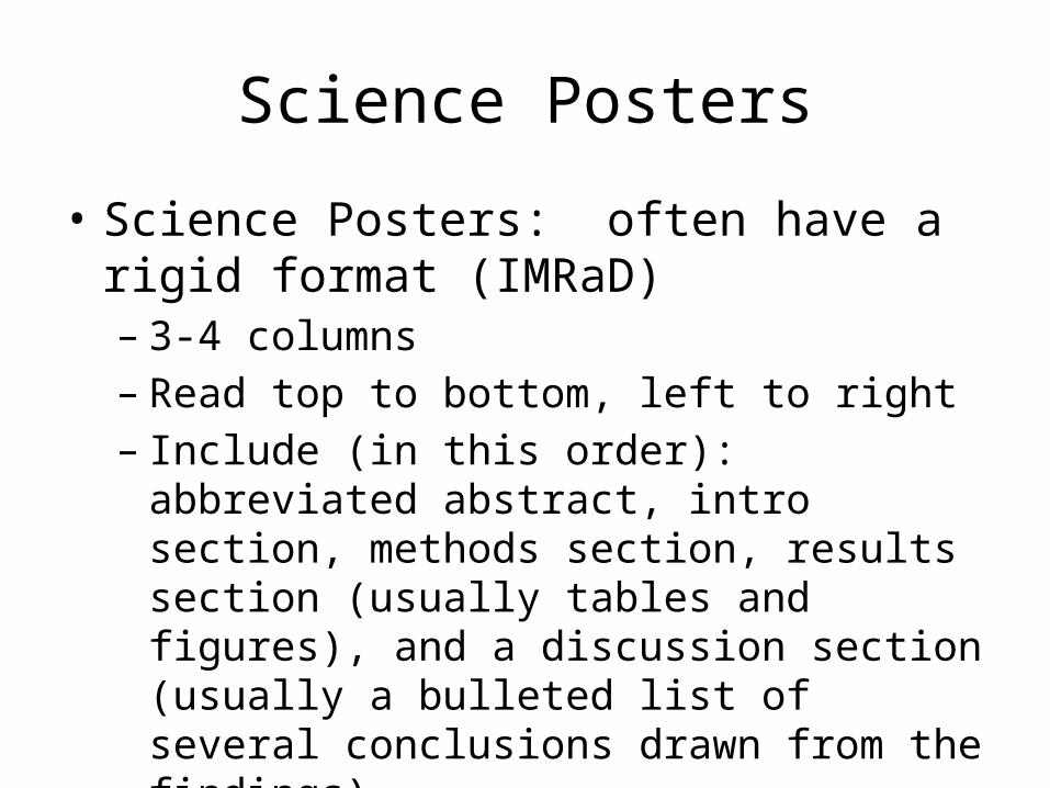
Science Posters
• Science Posters: often have a rigid format (IMRaD)– 3-4 columns– Read top to bottom, left to right– Include (in this order): abbreviated abstract, intro
section, methods section, results section (usually tables and figures), and a discussion section (usually a bulleted list of several conclusions drawn from the findings)
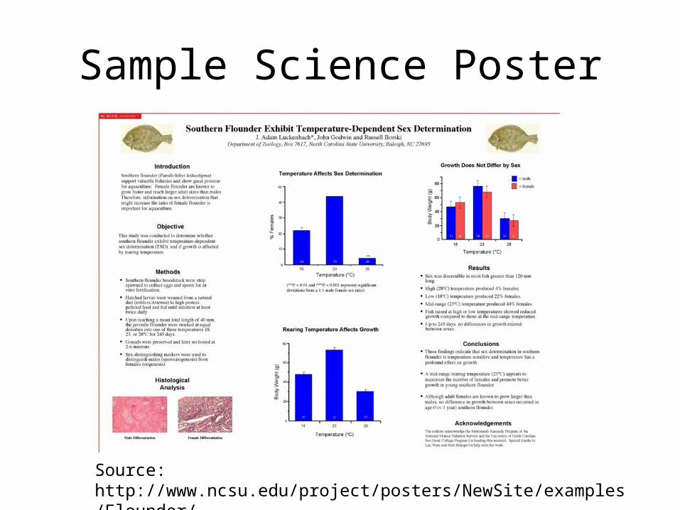
Sample Science Poster
Source: http://www.ncsu.edu/project/posters/NewSite/examples/Flounder/

Humanities and Social Science
• Can use same format as Science posters, if appropriate
• More freedom to develop alternative formats to tell a story and make an argument
• The flow can be the same (top-down, left-right), but the themes and headings are different
• Visuals can be more creative

Sample Poster in the Scientific Style
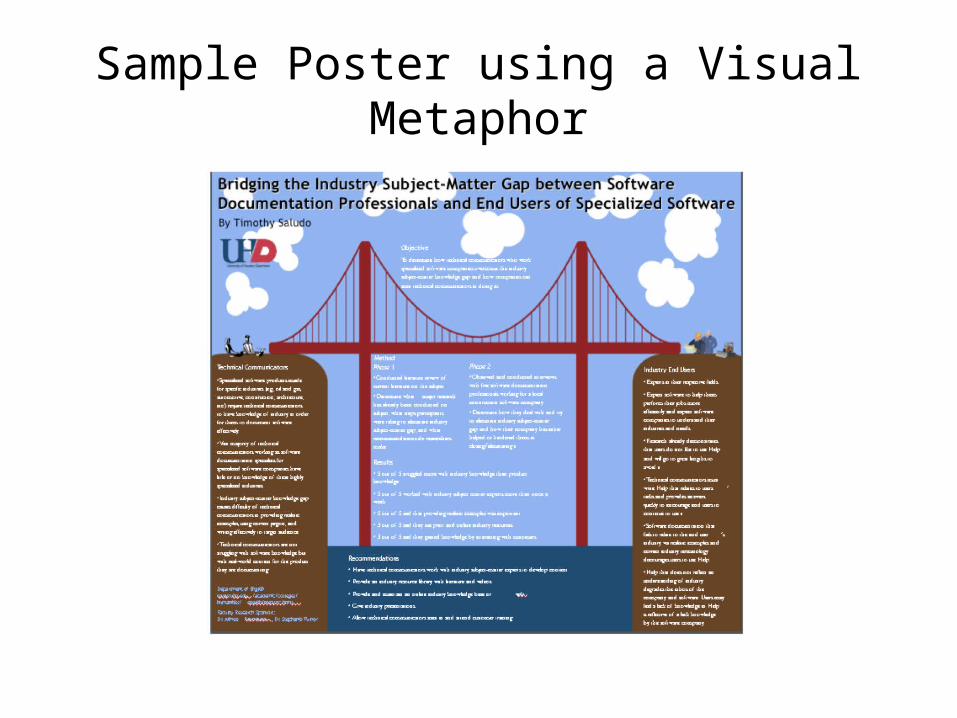
Sample Poster using a Visual Metaphor
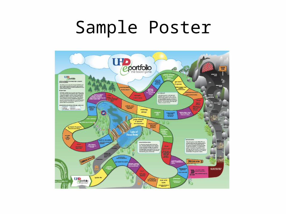
Sample Poster

DESIGN TIP #1: Treat Text Visually
• Borrow from magazine layouts:– Pull quotes– Create sidebars– Frame or box text
• Use bulleted lists or tables to organize text
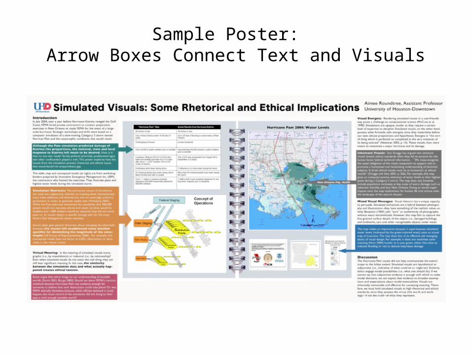
Sample Poster: Arrow Boxes Connect Text and Visuals

DESIGN TIP #2: Use Color Harmony in Your Poster when Choosing a Color Scheme
OPTION 1: Complementary Colors: Use contrasting colors – the colors at the opposite ends of the color wheel.
OPTION 2: Analogous Colors: Use colors that are side by side on the color wheel.

DESIGN TIP #3: Font Size
•Title (6-8 words) should be 90-120 points (or more)
• Headings should be between 36-48 points.• The body text should be 30-36 points.• BIG = IMPORTANT; small = subordinate

DESIGN TIP #4:Blank Space
• Don’t be afraid of blank space. In other words, don’t try to fill every available square inch of your poster
• Blank space helps the viewer understand the scale and structure of your poster and how navigate your poster
• Light text on a dark background is very hard to read.

DESIGN TIP #5: Proofread, Edit, and Ask for Feedback
• Include your major sources• When pulling images from other sources, credit
the source below the image (this can be in small font)
• Check for consistent formatting and fonts• Correct grammar• Correct spelling• Have friends view and critique your poster
before you create the final version

Sample Bad Poster

PRESENTING YOUR POSTER
• Making the physical poster is only part of preparing for a poster session.
• You must be prepared to orally explain your poster.
• While your poster should stand on its own, you should be prepared to answer questions and interact with the audience.

Preparing to Present
• Make sure you can sum up your poster’s key points and conclusions in 2-3 sentences
• Think about which parts of your poster will be the most challenging to explain
• Anticipate people’s questions and how you will answer them
• Practice a 2-minute and a 5-minute talk on your poster
Presenting Your Poster, Part One: The Connection
• Greet people with a smile and show your enthusiasm for your work
• Find out why they are interested in your poster BEFORE you launch into your spiel so that you are able to address their needs and expectations
Presenting Your Poster, Part II: The Talk
• Don’t stand in front of your poster where you might block people’s view
• Maintain eye contact with people as you present your poster.
• Use hand gestures to illustrate and reinforce key concepts and relationships by referring to specific parts of the poster

Presenting the Poster, Part III:The End
• If people approach when you are in the middle of a spiel, pause to welcome them and explain where you are in your talk.
• Maintain your professionalism: thank people for listening and talking to you. Make your comment show that you were listening to them (“Thanks for your feedback on . . . “). Don’t apologize or undermine yourself.

FINAL THOUGHTS
• The purpose of poster sessions is to get a conversation started between yourself and your audience
• Make sure that your poster can be read from 5 feet away
• Your poster should be 36”x48” on a corrugated tri-fold display board
Sources
• Principles of Poster Design: www.uhd.edu/academic/colleges/sciences/.../workshop-poster.pdf
• Color Theory: http://www.colormatters.com/color-and-design/basic-color-theory
• Colin Purrington on Poster Design: http://colinpurrington.com/tips/academic/posterdesign
• Creating Effective Poster Presentations: http://www.ncsu.edu/project/posters/NewSite/Resources.html