Embed Size (px)
Citation preview
CREATING EFFECTIVE OOH ADVERTISING
Crea
ting
Effec
tive
OO
H A
dver
tisin
g
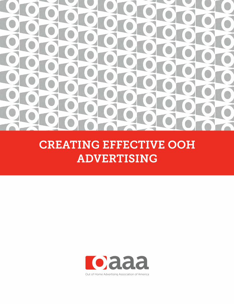
There are a few basic guidelines to consider when designing for the OOH medium, but they are not rules. There are always exceptions. However, adapting the guidelines does require an appreciation for the fundamental principles of good OOH design.
The OOH medium presents limitless options and approaches for creative design. There are dozens of sizes and shapes, seemingly endless locations and stunning technologies offering boundless opportunities for designing effective advertising.
2
Wisconsin Department of Tourism

Crea
ting
Effec
tive
OO
H A
dver
tisin
g Designing for OOH advertising is visual storytelling. The expression of an idea can surprise viewers with words or excite them with pictures. Through the use of humor or drama, OOH designs can influence consumer decisions and sell products.
According to noted media researcher Erwin Ephron, “The ad on an OOH unit is the face of the medium. Creative becomes an active media variable. Not in terms of attention paid or engagement with, but by the message itself attracting eyes to the medium by being noticeable.”
However, creating for the OOH medium is a challenging communication task that requires the expression of a concept with clarity and austere focus. When OOH advertising is well designed, it will entertain and intrigue consumers with arresting influence.
The environment in which OOH advertising appears is considerably different from other media, as there is typically no programming or editorial associated with the medium. It is pure advertising. That’s why innovative, aesthetic, or humorous OOH executions can often be more memorable than literal advertising. People are intelligent, and good OOH designs engage viewers by stimulating their imagination to solicit a response. Good advertising is storytelling. Dramatic tension or suspense influences viewer interest, which can be expressed on three different cognitive levels: rational, emotional, and cultural.
3
Presbyterian Health Plan, Inc.
The Creative Challenge
Associated Bank
“You know you’ve achieved perfection in design, not when you had nothing more to add, but when you had nothing more to take away.”
Antoine de Saint-Exupery, Artist
Crea
ting
Effec
tive
OO
H A
dver
tisin
g
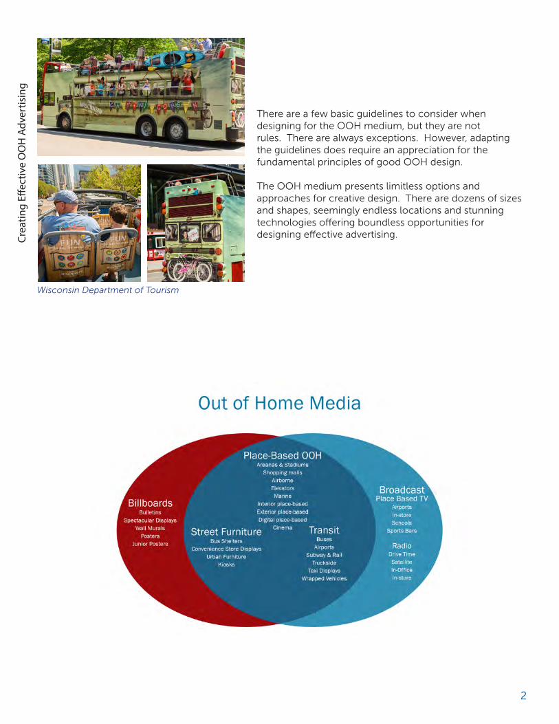
Tide #SharkWeek
Scharffen Berger Transit shelters displayed selfies shared on Insta-gram using #wonderfullycomplicated.
SHOEme.ca Transit posters allowed commuters to visit a short URL or scan a QR code using their smartphones to shop at the SHOEme.ca virtual store.
OOH designs depicting positive product or social benefits will achieve better recall responses among viewers than designs with inaccurate or misleading product information. A call to action is an effective technique for engaging a viewer. OOH displays that include Internet addresses, #hashtags, and special offers can produce impressive results.
Combining interactive mobile technology with OOH messages can be particularly effective by facilitating two-way connectivity between brands and consumers. Both Instagram and Twitter technology can be used to enhance the overall impact of an OOH campaign.
4

Crea
ting
Effec
tive
OO
H A
dver
tisin
g
Humor Humor is a powerful design choice for OOH executions. Both humorous and intriguing designs can build awareness faster than mundane executions. The element of surprise can grab a viewer’s attention. Studies have shown that humor arouses the most favorable response among viewers. Humor often includes wit, an essential component for ensuring an effective response to intriguing or aesthetic designs.
5
Miller Lite
Seattle Aquarium
Boy Scouts of America
Chipotle
Crea
ting
Effec
tive
OO
H A
dver
tisin
g
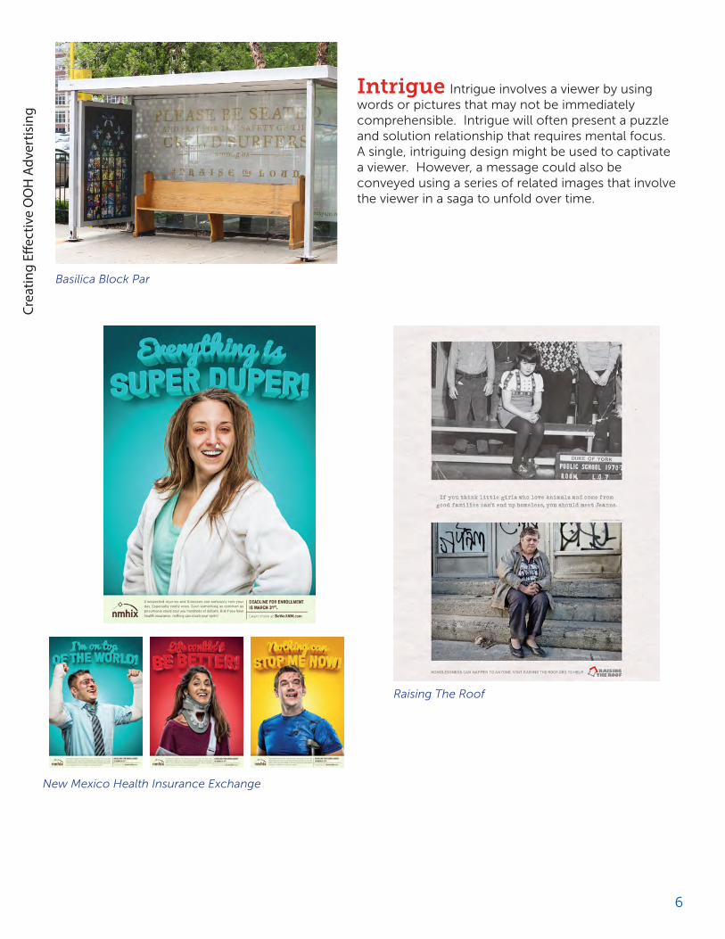
Intrigue Intrigue involves a viewer by using words or pictures that may not be immediately comprehensible. Intrigue will often present a puzzle and solution relationship that requires mental focus. A single, intriguing design might be used to captivate a viewer. However, a message could also be conveyed using a series of related images that involve the viewer in a saga to unfold over time.
6
New Mexico Health Insurance Exchange
Basilica Block Par
Raising The Roof

Crea
ting
Effec
tive
OO
H A
dver
tisin
g
Surprise Surprise stimulates a viewer using unexpected or unusual design elements. A surprised viewer will do a double-take and generally experience an emotional response once the essence of the message is understood. Sometimes the message is serious, so a powerful image with a searing headline can be an effective design choice.
7
M&T Bank
Federal Credit Union
ProHealth Care

Crea
ting
Effec
tive
OO
H A
dver
tisin
g
Aesthetic Aesthetic designs present pleasurable images or ideas to a viewer. They may be soothing when observed or enjoyable to study in detail. Aesthetic designs are often more dependent on pictures than on words. Although vivid, colorful photography can aesthetically enhance OOH designs, high-quality illustrative artwork can be an effective design choice.
Literal Extremely literal designs generally produce the lowest recall among OOH advertising viewers. Although pure branding can be very effective over an extended period of time, literal advertising won’t quickly increase brand awareness.
8
Red Bull
KC Royals
Tampa Bay Lightning

Crea
ting
Effec
tive
OO
H A
dver
tisin
g
The BIG IdeaThe OOH viewing audience is mobile. Most people travel swiftly in vehicles and walk at a brisk pace while they perform the activities of daily life. Mobility limits the potential viewing time of an OOH message to only a few seconds. Because of limited exposure time, OOH designs require a disciplined and succinct creative approach. However, high frequency is a fundamental strength of the medium, and repeated exposures will ensure that a message is absorbed and retained over time.
Less is more -- much more when creating OOH advertisements. The most effective designs focus on a single idea or concept. An advertiser should consider the most important product benefit to communicate and express that message to consumers.
OOH advertising should be a quick burst of essential information. Additional messages dilute the essence of the primary benefit and reduce the impact of the advertising. It is equally important to limit design elements. Too many elements may confuse a viewer or make them work too hard to understand the meaning of the message.
If an advertising campaign requires multiple messages, one option is to create a series of designs that feature different core ideas presented as different OOH executions.
However, some place-based OOH formats are viewed by consumers for a considerably long span of time. These advertisements are often located in places where people wait, such as airports, train stations, checkout lines, or waiting rooms. In these situations, OOH designs could include more details as there is typically more time for viewers to digest the information.
9
Denver Water
Mudler’s Moving & Storage
“Solve the creative brief on a poster, and you’ll have an idea that will work in virtually any medium.”
David Berstien

Crea
ting
Effec
tive
OO
H A
dver
tisin
g
Memorable MessagesIn 2000, Sensory Logic, Inc. conducted a groundbreaking study that measured the relative effectiveness of advertising messages designed for the OOH medium. A total of 40 subjects were tested using the firm’s proprietary BodyTalk methodology with projectable sample. The results of the report led to the following recommendations for creating an OOH campaign:
• Rely on imagery over words• Relate messages to familiar ideas and easily understood concepts• Use playful, lively elements• Draw on universal elements of life, like home and family• Offer comfort• Avoid intimidating viewers• Emphasis brands as “heroes or helpers”
10
1st Class Painting
Nespresso
Acura TLX
Arizona Tourisml
Crea
ting
Effec
tive
OO
H A
dver
tisin
g
11
San Diego Humane Society
Buick Shiner Beer

Crea
ting
Effec
tive
OO
H A
dver
tisin
g
12
“Oh how difficult it is to be simple.”
Vincent Van Gogh
“With an apple, I will astonish Paris.”
Paul Cezanne
The ABCs Of Simplicity
via Thrift Store
Kuhn & Kuhn
McDonald’s

Crea
ting
Effec
tive
OO
H A
dver
tisin
g
The spectrum of full color, vividly and faithfully reproduced, is one of the distinct advantages when creating OOH campaigns. Designs bursting with brilliant color can evoke emotional responses that will inspire lasting impressions and create stopping power.
It is essential that OOH designs are easy to read. Choose colors with high contrast in both hue and value. Contrasting colors are viewed well from great distances while colors with low contrast will blend together and obscure a message. In fact, research demonstrates that high color contrast can improve OOH advertising recall by 38 percent.
13
Sonic
Vimeo
iPhone 5c Oreo

Crea
ting
Effec
tive
OO
H A
dver
tisin
g
These 14 color combinations represent the best use of color contrast for advertising readability. The chart evaluates primary and secondary color combinations taking into account hue and value. Example 1 is the most legible color combination with example 14 is the least legible.
Hue is the identity of color, such as red, yellow, or blue.
Value is the measure of lightness or darkness and can be separated into shades and tints.
Shades are the relative darkness of colors. Tints are the relative lightness of colors.
A standard color wheel illustrates the importance of contrast in hue and value. Like sound waves, light rays have varying wave lengths or frequencies. Some pigments absorb light while others reflect it. Reflected frequencies are perceived as color.
Opposite colors on a wheel are complementary. An example is red and green. They represent a good contrast in hue, but their values are similar. It is difficult for the cones and rods of the human eye to process the wavelength variations associated with complementary colors. Consequently, a quivering or optical distortion is sometimes detected when two complementary colors are used in tandem.
Adjacent colors, such as blue and green, make especially poor combinations since their contrast is similar in both hue and value. As a result, adjacent colors create contrast that is hard to discern.
Alternating colors, such as blue and yellow, produce the best combinations since they have good contrast in both hue and value. Black contrasts well with any color of light value and white is a good contrast with colors of dark value. For example, yellow and black are dissimilar in the contrast of both hue and value. White and blue are also a good color combination.
14
Crea
ting
Effec
tive
OO
H A
dver
tisin
g
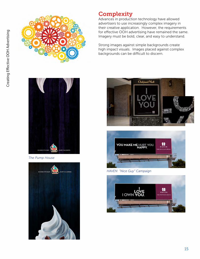
ComplexityAdvances in production technology have allowed advertisers to use increasingly complex imagery in their creative application. However, the requirements for effective OOH advertising have remained the same. Imagery must be bold, clear, and easy to understand.
Strong images against simple backgrounds create high impact visuals. Images placed against complex backgrounds can be difficult to discern.
15
The Pump House
HAVEN “Nice Guy” Campaign

Crea
ting
Effec
tive
OO
H A
dver
tisin
g
Fonts selected for OOH designs must be easy to read from variable distances. Use large and legible typefaces. Choose fonts that are easily read at long distances. Fonts with thin strokes or ornate script will be difficult to read.
Adequate spacing between letters, words, and lines will enhance visibility. The relative size of letter characters is also an important consideration. When designing for roadside displays, a one foot letter height is unreadable, while a two-foot letter height is marginal. A letter height greater than three feet is clearly readable. Words comprised of both upper and lower characters are generally easier to read than words constructed solely of capital letters.
16
Text Legibility Guide
Bolthouse Farms Without mentioning a single health ben-efit, Bolthouse used bold messaging to establish a persona for broccoli that was bold and refused to be ignored.

Crea
ting
Effec
tive
OO
H A
dver
tisin
g
KerningSufficient kerning between letters assures legibility from far distances. Tight kerning reduces legibility causing adjacent letters to attach together visually. Without proper kerning “clear morn” could be interpreted as
StackingA single horizontal line of text allows rapid assimilation of a message without interruption. Multiple text lines increase the time needed to discern a message.
LeadingIf more than one text line is necessary, use adequate leading between lines. When a line of text rides on the line below the interplay of descenders and ascenders, it will make a message difficult to read.
Overcrowding. Compressed type or too many words will reduce the clarity of a message.
Excessive. Extreme variations between ascending and descending letter segments and serifs greatly reduces legibility.
Anemia. Fine typefaces will fade into a background, becoming indistinguishable as the viewing distance increases.
Overweight. Heavy typefaces lose their basic shape when the viewing distance is increased.
Illegibility. Ornate and sans serif typefaces can be difficult to read, reducing the effectiveness of an OOH design.
17
First Bank
Weber
Dr. Pepper
Crea
ting
Effec
tive
OO
H A
dver
tisin
g
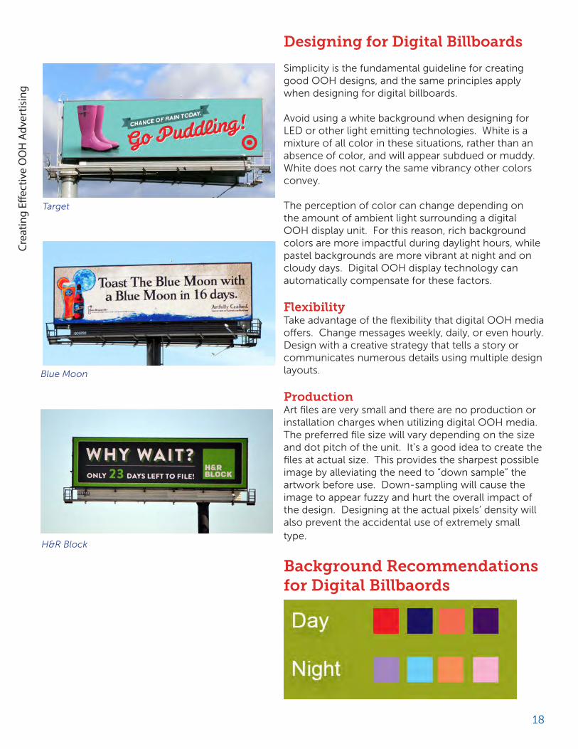
Designing for Digital Billboards
Simplicity is the fundamental guideline for creating good OOH designs, and the same principles apply when designing for digital billboards.
Avoid using a white background when designing for LED or other light emitting technologies. White is a mixture of all color in these situations, rather than an absence of color, and will appear subdued or muddy. White does not carry the same vibrancy other colors convey.
The perception of color can change depending on the amount of ambient light surrounding a digital OOH display unit. For this reason, rich background colors are more impactful during daylight hours, while pastel backgrounds are more vibrant at night and on cloudy days. Digital OOH display technology can automatically compensate for these factors.
FlexibilityTake advantage of the flexibility that digital OOH media offers. Change messages weekly, daily, or even hourly. Design with a creative strategy that tells a story or communicates numerous details using multiple design layouts.
ProductionArt files are very small and there are no production or installation charges when utilizing digital OOH media. The preferred file size will vary depending on the size and dot pitch of the unit. It’s a good idea to create the files at actual size. This provides the sharpest possible image by alleviating the need to “down sample” the artwork before use. Down-sampling will cause the image to appear fuzzy and hurt the overall impact of the design. Designing at the actual pixels’ density will also prevent the accidental use of extremely small type.
Background Recommendations for Digital Billbaords
18
Target
Blue Moon
H&R Block

Crea
ting
Effec
tive
OO
H A
dver
tisin
g
19
One of the strongest attributes of OOH is the creative impact it makes with consumers. Great creative can produce highly effective results for advertisers, but poorly executed creative can hurt even the most compelling advertising messages.
To help clients and prospects visualize the power of well-executed OOH ads, OAAA developed a creative testing tool. This valuable tool allows users to view OOH creative from three environments: urban, suburban, and highway and in these formats:
• Building • Bus Back • Queen Bus • Taxi • Bulletin • Extension • Shelter
One of the tool’s best features is its flexibility. A distance function allows users to change the viewing perspective within a range of distances. In addition, users can upload a variety of file formats, and each user can save individual files into a private folder. The files can be printed, emailed, or saved, creating time efficiencies in communicating with clients.
OAAA Creative Testing Tool

Crea
ting
Effec
tive
OO
H A
dver
tisin
g
Location, Location, Location
OOH advertising conveys the right message, to the right audience, at the right time, in the right place. Understanding the dynamics of the marketplace is essential for designing effective OOH campaigns. Finding the relevant and hidden relationships between the message, and the environment makes the advertising smart.
20
Sprint Ask.com used NYC subway wraps to create a library and promote its brand as having the answers to everything.

Crea
ting
Effec
tive
OO
H A
dver
tisin
gAlthough many OOH panels have a horizontal format, some displays are vertical. The physical orientation of an OOH unit will significantly affect the placement of design elements such as product identity and the headline. Orientation will also affect the overall balance of a design. It is important to remember that the demography, orientation and geography – DOG – of a display are all necessary considerations when designing for the OOH medium.
Another important factor is distance. The impact an OOH unit will produce is relative to the distance from where it is viewed. A transit shelter advertisement positioned curbside and in close proximity to vehicular traffic and pedestrians can have the similar impact as a bulletin positioned many yards away.
Time is a factor. It is important to consider the amount of time required for a viewer to fully perceive an OOH message. The actual viewing time for a specific OOH unit will vary by location and media format. A subway station poster or airport diorama design might contain a complex message, since viewers may have several minutes to reflect on the message while they wait for or ride a train. Mobile advertisements should generally use fewer design elements than stationary OOH units.
21
Eddie Bauer
Denver Water
DOGan advertiser’s best friend!DemographyOrientationGeography
Game of Thrones

Crea
ting
Effec
tive
OO
H A
dver
tisin
g
Standard OOH Formats
Size specifications for the most standard OOH displays:
Large BulletinViewing area: 20’h x 60’w
Standard BulletinViewing area: 14’h x 48’w Junior BulletinViewing area: 10’6”h x 36’w
Standard Poster & Mobile Billboard PosterViewing area: 10’5”h x 22’8”w
Junior Poster & Rail Junior PosterViewing area: 5’h x 11’w
Mall Vertical Double Sided SkyBannerViewing area: 16’h x 14’w
Mall Horizontal Double Sided SkyBannerViewing area: 8’h x 14’w Newsstand Backlit PanelViewing area: 67”h x 119”w
Airport Vertical Backlit Panel,Bus Shelter Vertical Backlit Panel,Mall Vertical Standard Backlit Directory &Rail Vertical Backlit PanelViewing area: 67”h x 46”w
Bus King PanelViewing area: 30”h x 144”w
Queen Bus PanelViewing area: 30”h x 88”w
22

Crea
ting
Effec
tive
OO
H A
dver
tisin
g
Street Banner on poleViewing area: 60”h x 30”w
Mall Vertical Medium Backlit DirectoryViewing area: 50”h x 40”w
Rail 2-sheet PanelViewing area: 46”h x 60”w
Rail 1-sheet PanelViewing area: 46”h x 30”w
Airport Diorama Extra Large Backlit PanelRail Diorama Extra Large Backlit PanelViewing area: 41”h x 120”w
Airport Diorama Large Backlit PanelRail Diorama Large Backlit PanelViewing area: 41”h x 60”w
Airport Diorama Standard Backlit PanelRail Diorama Standard Backlit PanelViewing area: 41”h x 41”w
Taxi Top Backlit PanelViewing area: 14”h x 48”wPrinted on backlit vinyl
Horizontal Urban Backlit PanelViewing area: 30”h x 60”w
Bus Bench PanelViewing area: 24”h x 72”w
Rail CardViewing area: 21”h x 22”w
Bus Rack Large CardRail Rack Large CardViewing area: 11”h x 46”w
Bus Rack Standard CardRail Rack Standard CardViewing area: 11”h x 28”w
Mall Spectacular PanelWall MuralVariable Sized
23

Crea
ting
Effec
tive
OO
H A
dver
tisin
g
Standard DOOH Formats
Size specifications for themost standard DOOH displays:
Digital Large Bulletin1800 x 600 Pixel Ratio/3:1 Aspect Ratio
Digital Standard BulletinDigital Junior Bulletin1400 x 400 Pixel Ratio/7:2 Aspect Ratio
Digital Square Bulletin840 x 840 Pixel Ratio/1:1 Aspect Ratio
Digital Standard PosterDigital Junior Poster840 x 400 Pixel Ratio/21:10 Aspect Ratio
Digital Airport Horizontal ScreenDigital Mall Horizontal Screen Digital Newsstand Horizontal ScreenDigital Rail Horizontal ScreenDigital Place-Based Horizontal Screen1920 x 1080 Pixel Ratio/16:9 Aspect Ratio Digital Airport Vertical ScreenDigital Bus Shelter Vertical ScreenDigital Mall Vertical Screen Digital Newsstand Vertical ScreenDigital Rail Vertical ScreenDigital Place-Based Vertical Screen1080 x 1920 Pixel Ratio/9:16 Aspect Ratio
Digital StaticDigital with Limited AnimationDigital with Full-Motion VideoDigital with Full-Motion Video & AudioDigital with Interactive Touch ScreenDigital with Dynamic Content Activation (Triggers)Common Digital Interactive Capabilities
24

Crea
ting
Effec
tive
OO
H A
dver
tisin
g
Going Green Taking environmentally conscious measures isn’t new for the OOH industry. The industry has been committed to finding supplemental uses for used billboard vinyl for many years. More recently, traditional paper-and-paste poster methods have been replaced with a new poster installation system that accommodates polyethylene (PE) and other single sheet substrates. The material is lightweight, flexible, and extremely strong. As a replacement to paper and paste posters, the new single-sheet posters have some significant advantages.
• Single sheet posters typically last longer than conventional paper and paste posters.
• Single sheet posters are easier and safer for workers to install
• When PE posters are removed, they are packaged and shipped to US recycling facilities where they are converted into new products that include railroad ties, significantly reducing landfill waste
25
PE Poster
PE railroad ties
PE pellets

Crea
ting
Effec
tive
OO
H A
dver
tisin
g
Recency Theory
OOH advertising is a frequency medium that provides multiple exposures to a message throughout the full duration of a campaign period.
According to Herbert E. Krugman, the manager of corporate public opinion research at General Electric, repeated exposure to advertising can lead to changes in the perceptions of what is important about a brand without the conscious or verbal recognition on the consumer’s part. This can also be considered in terms of increasing awareness. Repeated exposure to advertising creates top-of-mind awareness and recall.
Defined in the book “When Ads Work” by John Philip Jones, recency reminds people who are already in the marketplace that a brand, store, or service is a good choice. To avoid memory decline, multiple design executions for a campaign should be implemented simultaneously or introduced at appropriate intervals during the campaign period.
26
American Airlines Going for Great

Crea
ting
Effec
tive
OO
H A
dver
tisin
g
Factors Affecting Message RetentionMultiple Executions Campaigns that use multiple executions and a variety of display formats deliver impact and continuity that can extend the awareness of a campaign over time.
Media Weight OOH campaigns can experience awareness decline once consumers learn about message benefits. Therefore, fresh creative executions introduced over time will continue to build the awareness and impact of a campaign.
Established Presence Effective OOH designs, using an appropriate level of media weight, can sustain awareness after a campaign has ended. Studies have shown there is no significant drop in awareness up to six weeks after an OOH campaign concludes.
Target Audiences The composite of primary and subsequent target audiences can affect the longevity of an OOH campaign. By positioning an OOH message in relation to specified geographic targets, the message will more accurately impact the intended demographic audiences.
Competition Competitive influences can affect the longevity of an OOH campaign. Competitors who advertise similar product benefits or use similar design elements in a campaign will confuse a viewer.
Seasonality People are mobile year-round, so OOH advertising is not affected by seasonal cycles of behavior.
Source: Journal of Advertising Research
27

Crea
ting
Effec
tive
OO
H A
dver
tisin
g
The OBIE AwardsThe OBIE Awards are one of the oldest and most prestigious honors for creative excellence in advertising. The OBIE name is derived from the ancient Egyptian Obelisk, a tall stone structure that was used to publicize laws and treaties thousands of years ago. Many historians consider the obelisk as the first true form of advertising.
Sometimes a simple idea is enough to express an emotion or message. In fact, sometimes a simple idea can be worth an OBIE Award. These winning campaigns need no explanation, and that’s exactly why they are OBIE Award winners. www.obieawards.org
HISTORY Houdini Gold OBIE
Wisconsin Department of Tourism Gold OBIE
28
Dice.com Silver OBIE
Colorado Crisis Services Gold OBIE
Citi Field Silver OBIE
Art Everywhere US Campaign Gold OBIE

1850 M Street, NW Suite 1040Washington, D.C. 20036
202.833.5566www.oaaa.org
Outdoor Advertising Association of America 2016