Embed Size (px)
Citation preview
CPSC 601.28Colour
Sheelagh Carpendale

References
• Colin Ware. (2004) Information Visualization: Perception for Design. Morgan Kaufmann.
• Maureen Stone. (2003) A field guide to digital color. AK Peters
• Bernice E. Rogowitz and Lloyd A. Treinish. (1996) How Not to Lie with Visualization. Computers In Physics 10(3), pp 268-273. http://www.research.ibm.com/dx/proceedings/pravda/truevis.htm
• C. Brewer. (1999) Color use guidelines for data representation. http://www.personal.psu.edu/faculty/c/a/cab38/ColorSch/ASApaper.html
• Andrew Glassner (1995) Principles of Digital Image Synthesis. Morgan Kaufmann Publishers.

Effective Colour
Materials
Aesthetics
Perception
Illustrators, cartographersArtists, designers
A few scientific principles
From: M. Stone
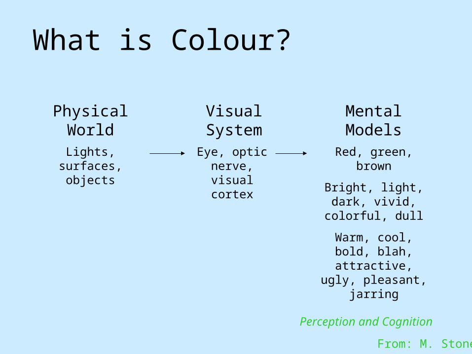
What is Colour?
Physical World Visual System Mental Models
Lights, surfaces, objects
Eye, optic nerve, visual
cortex
Red, green, brown
Bright, light, dark, vivid, colorful, dull
Warm, cool, bold, blah, attractive, ugly,
pleasant, jarring
Perception and Cognition
From: M. Stone

Colour Introduction
Some definitions:• colour: the appearance that something has as a result of reflecting light
• chrominance: the difference between a colour and a chosen reference colour of the same luminous intensity (hue)
Colour (chrominance) vision may not help us to determine:• layout of objects in space• how objects move• shape of objects
but does help :• break camouflage • get useful information about an object
colour is an attribute

Physical World
• Spectral Distribution– Visible light– Power vs. wavelength
• Any source– Direct– Transmitted– Reflected– Refracted
From A Field Guide to Digital Color, © A.K. Peters, 2003

Colour The Retina
photoreceptors: rods and cones
neurons (receptive fields): intermediate neural layers – image processing
http://school.discovery.com/homeworkhelp/worldbook/atozpictures/lr001100.html
http://www.ccrs.nrcan.gc.ca/ccrs/eduref/sradar/chap2/c2p2_g2e.html

Cone Response
• Encode spectra as three values– Long, medium and short (LMS)– Trichromacy: only LMS is “seen”– Different spectra can “look the same”
From A Field Guide to Digital Color, © A.K. Peters, 2003

Effects of Retinal Encoding
All spectra that stimulate the same cone responseare indistinguishable
Metameric match

Chromaticity Diagram

RGB Chromaticity• R,G,B are points (varying lightness)• Sum of two colors lies on line• Gamut is a triangle
– White/gray/blacknear center
– Saturated colorson edges
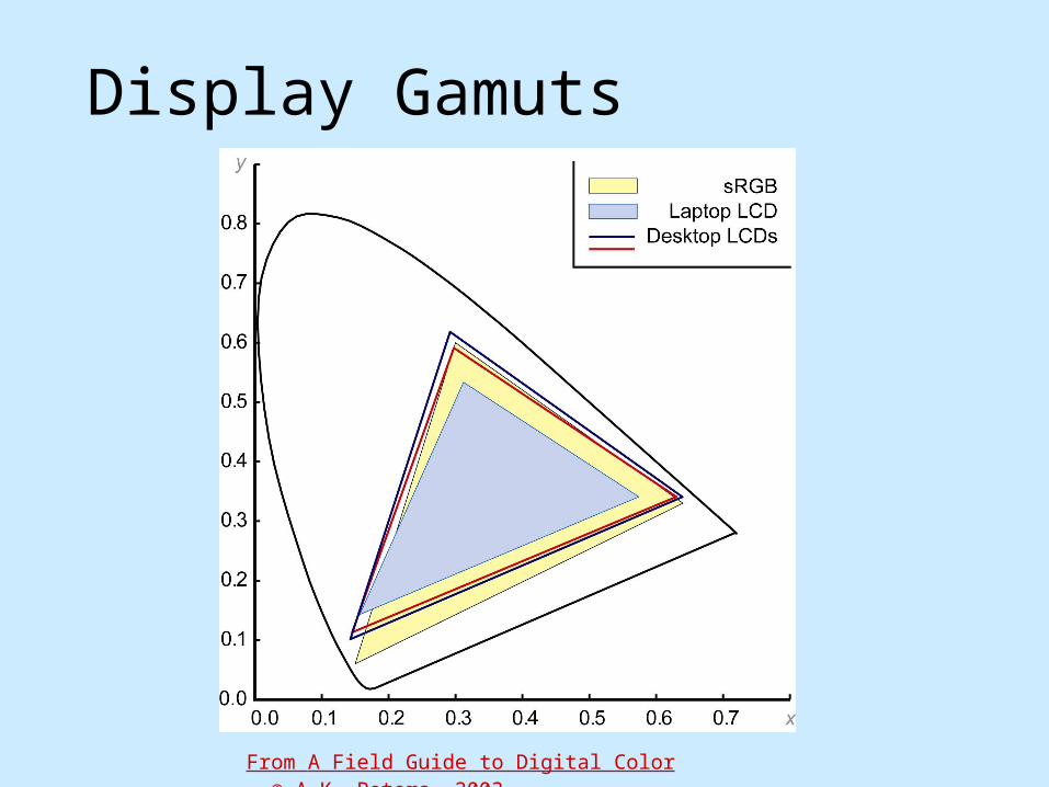
Display Gamuts
From A Field Guide to Digital Color, © A.K. Peters, 2003

Projector Gamuts
From A Field Guide to Digital Color, © A.K. Peters, 2003

Opponent Colour
• Definition– Achromatic axis– R-G and Y-B axis– Separate lightness & chroma
• First level encoding– Linear combination of LMS– Before optic nerve– Basis for perception– Defines “color blindness”

Munsell Atlas
Courtesy Gretag-Macbeth

Colour Blindness
• Simulates color vision deficiencies– Web service or Photoshop plug-in– Robert Dougherty and Alex Wade
• www.vischeck.com
Deuteranope Protanope Tritanope

Genes in Vischeck

2D Colour Space
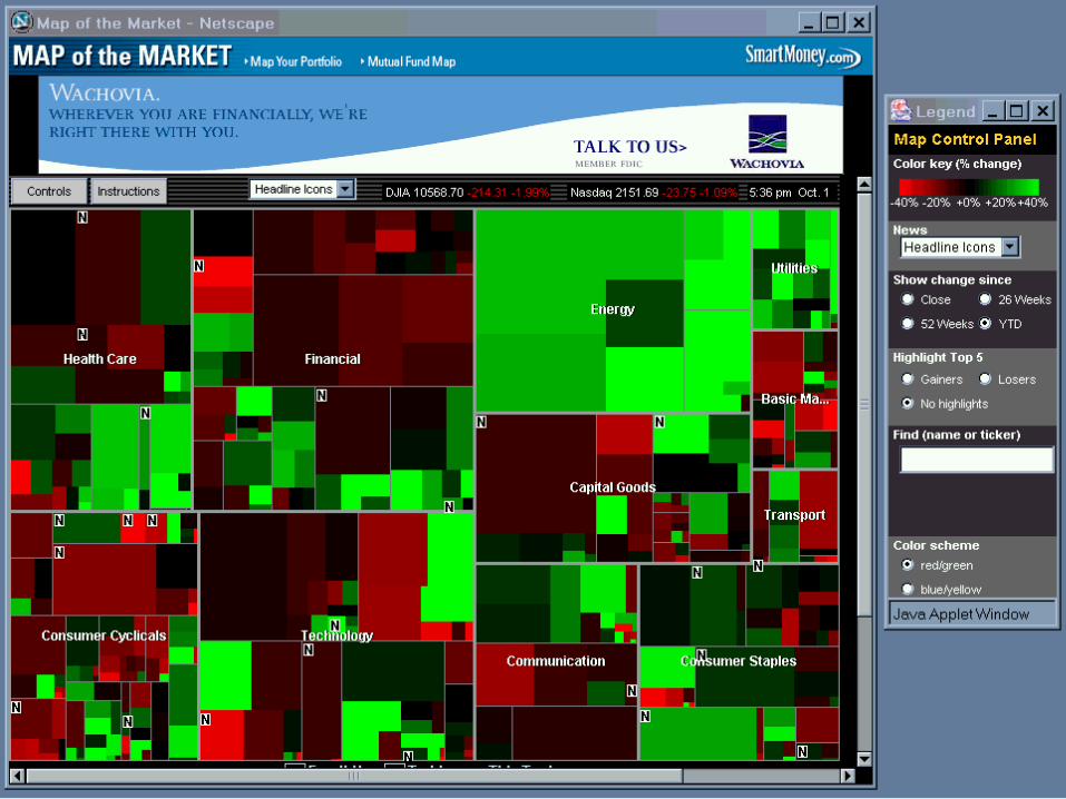

Smart Money

small-field tritanopia
Colour Blindness

Color Appearance

• colour constancy• colour perception

Simultaneous Contrast
• Add Opponent Color– Dark adds light– Red adds green– Blue adds yellow
These samples will have both light/dark and hue contrast

Bezold Effect

Spreading
• Spatial frequency– The paint chip
problem– Small text, lines,
glyphs– Image colors
• Adjacent colors blend
Redrawn from Foundations of Vision© Brian Wandell, Stanford University
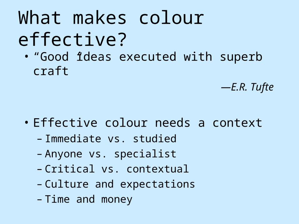
What makes colour effective?• “Good ideas executed with superb
craft”—E.R. Tufte
• Effective colour needs a context– Immediate vs. studied– Anyone vs. specialist– Critical vs. contextual– Culture and expectations– Time and money

Why Should You Care?
• Poorly designed colour is confusing– Creates visual clutter– Misdirects attention
• Poor design devalues the information– Visual sophistication– Evolution of document and web design
• “Attractive things work better”—Don Norman

Information Display• Graphical presentation of information
– Charts, graphs, diagrams, maps, illustrations– Originally hand-crafted, static
• Now computer-generated, dynamic
• Colour is a key component– Colour labels and groups– Colour scales (colourmaps)– Multi-variate colour encoding– Colour shading and textures– And more…
www.nps.gov

Color Addition • computer monitors• red, green, and blue • absence all three colors gives black, • all three gives white.
Color Subtraction • printers ink• cyan, magenta, and yellow • absence all three colors gives white, • all three gives black.

Colour Paint
primary
secondary
tertiary

Colour Design• Goals
– Highlight, emphasize– Create regions, group– Illustrate depth, shape– Evoke nature– Decorate, make beautiful
• Colour harmony “…successful color combinations, whether
these please the eye by using analogous colors, or excite the eye with contrasts.” –Principles of Color Design, by Wucius Wong

Colour Design Terminology• Hue (colour wheel)
– Red, yellow, blue (primary)– Orange, green, purple (secondary)– Opposites complement (contrast)– Adjacent are analogous– Many different colour wheels*
• *See www.handprint.com for examples
• Chroma (saturation) – Intensity or purity– Distance from gray
• Value (lightness)– Dark to light– Applies to all colours, not just gray
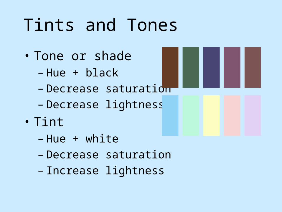
Tints and Tones
• Tone or shade– Hue + black– Decrease saturation– Decrease lightness
• Tint– Hue + white– Decrease saturation– Increase lightness

Colour
Hi-Key/Low Key Colours – choosing a value range–another way to unify
Hi-Key colour schemes –tints of colours (paler)–bright, cheerful.
Low-Key colour scheme. –Shades (tones) of colours (darker)–subdued gloomy mysterious

ColourColour Triads• color scheme composed of three colours spaced equally apart on the colour wheel• tend to be uncomfortable• good visual distinction• Primary colours form one triad – ( red, blue, yellow).
• Secondary colours – (orange, green, purple)

Colour
Analogous Colours–colours next to each other on the colour wheel with a common hue
–the common hue creates a feeling of unity in the design

Colour
Complementary Colours–Complementary colors are opposite each other on the colour wheel
–two pure complementary hues placed next to each other attract attention

Colour
Monochromatic Colours– shades, tints and tones of only one colour. – causes an immediate unifying or harmonious effect.
– all parts of the design have something in common,
– pulls it all together.

Colour
Warm and Cool Colours• two specific sets of analogous colours. Cool–blue, green and purple–cold, icy feeling
Warm–red, orange and yellow –warm, sunny feeling.
When used together–cool colours seem to move away
– warm colours move towards

Gradations

Colour
Split Complements
• two colours on either side of its complement are used together. • similar to complementary colours• offers a little more variety to work with

Maximum hue separation

Analogous, yet distinct

Sequential


Colouring categorical data– limited number readily distinct (spatially separate colour patches)
– think about selection, association, and adjacent distinction
–Ware’s maximally discriminable colours

Colour Design Principles
• Control value (lightness)– Ensure legibility– Avoid unwanted emphasis
• Use a limited hue palette– Control colour “pop out”– Define colour grouping– Avoid clutter from too many competing
colours• Use neutral backgrounds
– Control impact of colour– Minimize simultaneous contrast

Envisioning Information
“… avoiding catastrophe becomes the first principle in bringing color to information:
Above all, do no harm.”
—E. R. Tufte
www.edwardtufte.com

Fundamental Uses
• To label• To measure• To represent or to imitate reality• To enliven or decorate

To Label
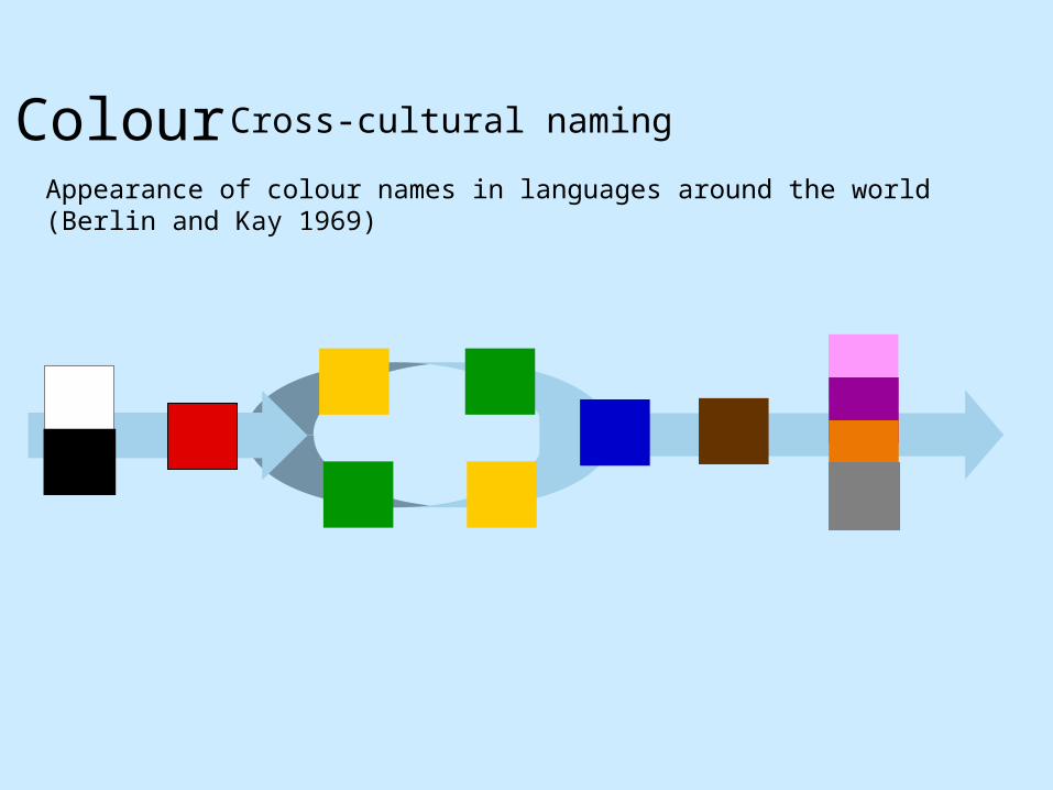
Colour Cross-cultural naming
Appearance of colour names in languages around the world (Berlin and Kay 1969)

Colour Opponent Process Theory - continued
Many lines of scientific evidence worth examining
• Naming
• Cross-Cultural naming
• Unique Hues
• Neurophysiology
• Categorical colours

Color Names
• Basic names (Berlin & Kay)– Linguistic study of names– Similar names– Similar evolution– Many different languages
blackwhitegray
redgreenblue
yellow
orangepurplebrownpink
Perceptual primaries
Distinct colors = distinct names?

Distinct, but hard to name

Color Names Research• Selection by name
– Berk, Brownston & Kaufman, 1982– Meier, et. al. 2003
• Image recoloring– Saito, et. al.
• Labels in visualization– D’Zmura, Cowan (pop out conditions)– Healey & Booth (automatic selection)
• Web experiment– Moroney, et. al. 2003
• World Colour Survey (Kay & Cook)– http://www.icsi.berkeley.edu/wcs/

Identify by Color
Information VisualizationInformation Visualization Colin WareColin Ware

Product Categories
Created by Tableau - Visual Analysis for DatabasesTM
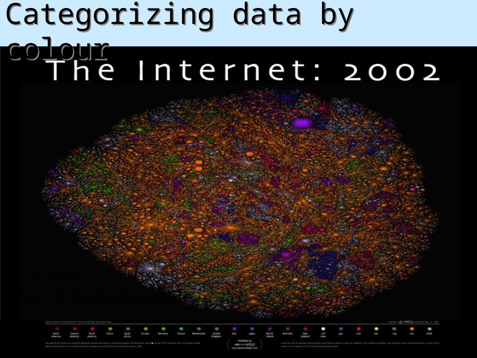
Categorizing data by colourCategorizing data by colour
22 colours, only ~8 distinguishable

Categorizing data by colour
22 colours, only ~8 distinguishable

Grouping, Highlighting

Considerations for Labels• How critical is the colour encoding?
– Unique specification or is it a “hint”?– Quick response, or time for inspection?– Is there a legend, or need it be memorized?
• Contextual issues– Are there established semantics?– Grouping or ordering relationships?– Surrounding shapes and colours?
• Shape and structural issues– How big are the objects? – How many objects, and could they overlap?– Need they be readable, or only visible?

Controls and Alerts• Aircraft cockpit design
– Quick response– Critical information and conditions– Memorized– 5-7 unique colours, easily distinguishable
• Highway signs– Quick response– Critical but redundant information– 10-15 colours?
• Typical colour desktop– Aid to search– Redundant information– Personal and decorative– How many colours?

Psychophysics of Labeling
13579345978274055249379164782541372387659727710386619874367259047362956372836491056763254378795483675456840378465485690
Time proportional to the number of digits
13579345978274055249379164782541372387659727710386619874367259047362956372836491056763254378795483675456840378465785690
Time proportional to the number of 7’s
13579345978274055249379164782541372387659727710386619874367259047362956372836491056763254378795483675456840378465785690
Both 3’s and 7’s“Pop out”
• Preattentive, “pop out”

Contrast Creates Pop-out
Hue and lightness Lightness only

Pop-out vs. Distinguishable• Pop-out
– Typically, 5-6 distinct values simultaneously– Up to 9 under controlled conditions
• Distinguishable– 20 easily for reasonable sized stimuli– More if in a controlled context– Usually need a legend

To Measure

Data to Colour
• Types of data values– Nominal, ordinal, numeric– Qualitative, sequential, diverging
• Types of colour scales– Hue scale
• Nominal (labels)• Cyclic (learned order)
– Lightness or saturation scales• Ordered scales• Lightness best for high frequency• More = darker (or more saturated)• Most accurate if quantized

Colour Scales
• Long history in graphics and visualization– Ware, Robertson et. al– Levkowitz et. al– Rheingans
• PRAVDA Colour– Rogowitz and Treinish– IBM Research
• Cartography– Cynthia Brewer – ColorBrewer

Colour scales (maps)
Rainbow (hue)- No ordering- Good name space
Greyscale/luminance/saturation
- ordered
http://www.research.ibm.com/dx/proceedings/pravda/index.htmhttp://www.research.ibm.com/visualanalysis/perception.html
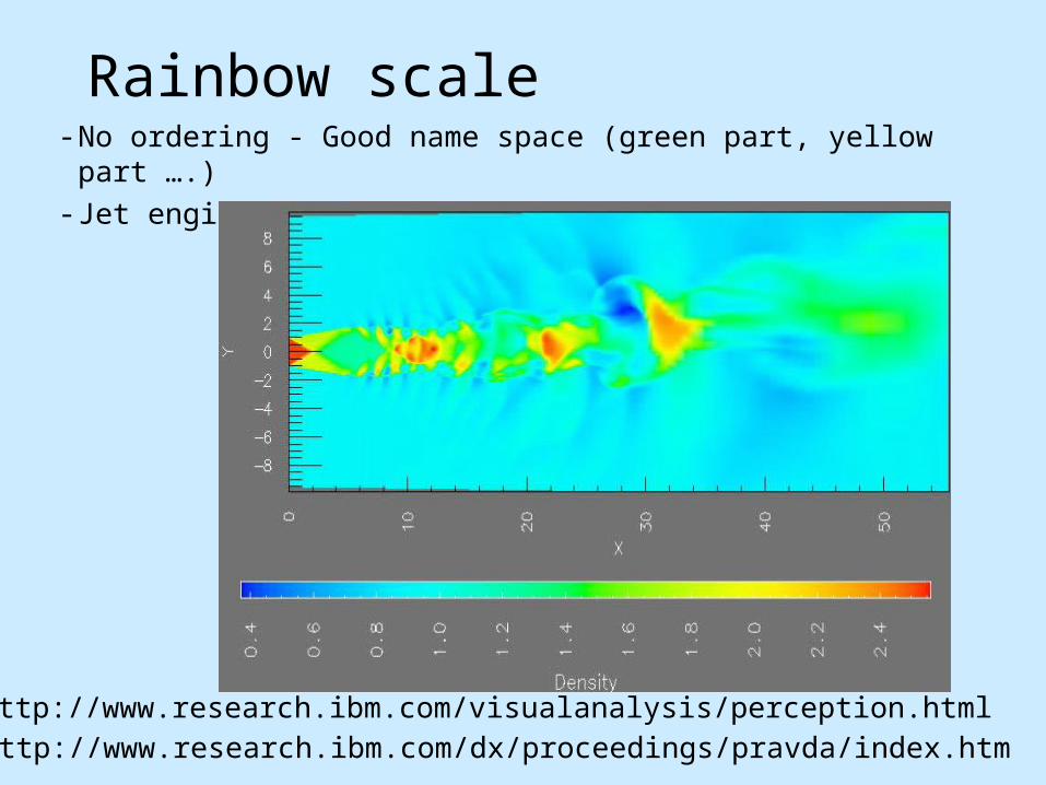
Rainbow scale- No ordering - Good name space (green part, yellow part
….)- Jet engine noise simulation
http://www.research.ibm.com/dx/proceedings/pravda/index.htmhttp://www.research.ibm.com/visualanalysis/perception.html

Two-Hue scale
- Easier to see small variations
http://www.research.ibm.com/dx/proceedings/pravda/index.htmhttp://www.research.ibm.com/visualanalysis/perception.html

Heat scale
- Ordering? (Surface Magnetic Field)
http://www.research.ibm.com/dx/proceedings/pravda/index.htmhttp://www.research.ibm.com/visualanalysis/perception.htmlhttp://www.research.ibm.com/visualanalysis/perception.html

Heat scale
- Ordering? (Surface Magnetic Field)
http://www.research.ibm.com/dx/proceedings/pravda/index.htmhttp://www.research.ibm.com/visualanalysis/perception.htmlhttp://www.research.ibm.com/visualanalysis/perception.html

Different Scales
Rogowitz & Treinish, “How not to lie with visualization”
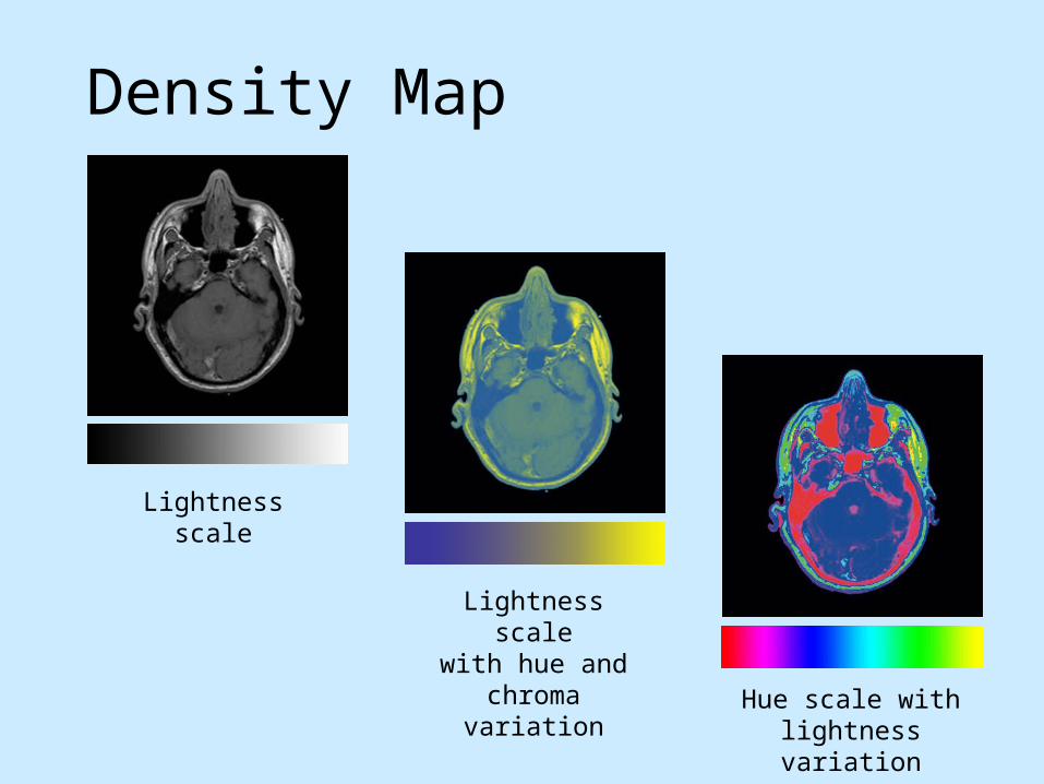
Density Map
Lightness scale
Lightness scalewith hue and
chroma variationHue scale with
lightness variation
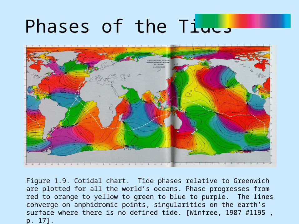
Phases of the Tides
Figure 1.9. Cotidal chart. Tide phases relative to Greenwich are plotted for all the world’s oceans. Phase progresses from red to orange to yellow to green to blue to purple. The lines converge on anphidromic points, singularities on the earth’s surface where there is no defined tide. [Winfree, 1987 #1195 , p. 17].

Brewer Scales
• Nominal scales– Distinct hues, but similar emphasis
• Sequential scale– Vary in lightness and saturation– Vary slightly in hue
• Diverging scale– Complementary sequential scales– Neutral at “zero”

Brewer’s Categories
Cynthia Brewer, Pennsylvania State University

Colour Brewer
www.colorbrewer.org

Thematic MapsUS Census Map
Mapping Census 2000: The Geography of U.S. Diversity
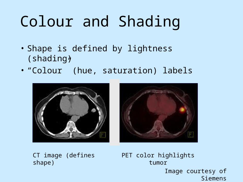
Colour and Shading
• Shape is defined by lightness (shading)• “Colour” (hue, saturation) labels
Image courtesy of Siemens
CT image (defines shape) PET color highlights tumor

Colour Overlay (Temperature)3D line integral convolution to visualize 3D flow (LIC).
Colour varies from red to yellow with increasing temperature
http://www-users.cs.umn.edu/~interran/3Dflow.html
Victoria Interrante and Chester Grosch, U. Minnesota

Multivariate Colour Sequences

Multi-dimensional Scatter plot
• Variable 1, 2 X, Y• Variable 3, 4, 5 R, G, B
Using Color Dimensions to Display Data Dimensions
Beatty and Ware
Do people interpret colour blends as sums of variables?

Colour Weaves6 variables = 6 hues, which vary in brightness
Additive mixture (blend) Spatial texture (weave)
Weaving versus Blending (APGV06 and SIGGRAPH poster)Haleh Hagh-Shenas, Victoria Interrante, Christopher Healey and Sunghee Kim
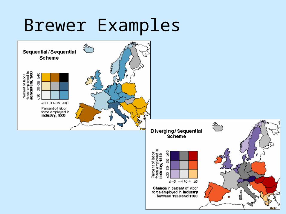
Brewer Examples

To Represent orImitate Reality

Illustrative Color
www.bartleby.com/107/illus520.html
Gray’s Anatomy of the Human Body Map of Point Reyes
www.nps.gov

ThemeView (original)
Courtesy of Pacific Northwest National Laboratories

ThemeScape (commercial)
Courtesy of Cartia

To Enliven or Decorate

Visualization of isoelectron density surfaces around molecules
Marc Levoy (1988)
Which has more information?Which would you rather look at?

More Tufte Principles
• Limit the use of bright colors– Small bright areas, dull backgrounds
• Use the colors found in nature– Familiar, naturally harmonious
• Use grayed colors for backgrounds– Quiet, versatile
• Create color unity– Repeat, mingle, interweave

Controlling Value

Get it right in black & white• Value
– Perceived lightness/darkness– Controlling value primary rule for design
• Value defines shape– No edge without lightness difference– No shading without lightness variation
• Value difference (contrast)– Defines legibility– Controls attention– Creates layering

Controls Legibility
colorusage.arc.nasa.gov

Legibility
Drop Shadows
Drop ShadowDrop ShadowDrop shadow adds edge Primary colors on black
Primary colors on black
Primary colors on black
Primary colors on black
Primary colors on black
Primary colors on black
Primary colors on white
Primary colors on white
Primary colors on white
Primary colors on white
Primary colors on white
Primary colors on white

Readability
If you can’t use color wisely,it is best to avoid it entirelyAbove all, do no harm
If you can’t use color wisely, it is best to avoid it entirelyAbove all, do no harm.

Legibility and Contrast
• Legibility– Function of contrast and spatial frequency– “Psychophysics of Reading” Legge, et. al.
• Legibility standards– 5:1 contrast for legibility (ISO standard)– 3:1 minimum legibility– 10:1 recommended for small text
• How do we specify contrast?– Ratios of foreground to background
luminance– Different specifications for different patterns

Contrast and Layering
Context
Context
Normal
Normal
UrgentContext
Context
Normal
Normal
Urgent Context
Context
Normal
Normal
Urgent
colorusage.arc.nasa.gov
• Value contrast creates layering
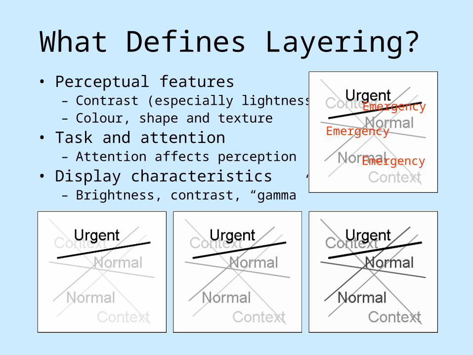
What Defines Layering?• Perceptual features
– Contrast (especially lightness)– Colour, shape and texture
• Task and attention– Attention affects perception
• Display characteristics– Brightness, contrast, “gamma”
Emergency
Emergency
Emergency

Grid Example
Grid sits unobtrusively in the background Grid sits in foreground, obscuring map
Great Grids: How and Why? (APGV06 and SIGGRAPH poster)Maureen Stone, Lyn Bartram and Diane Gromala

Additional Resources
•Maureen Stone’s website– http://www.stonesc.com/Vis06
•A Field Guide to Digital Color– A.K. Peters


![[hal-00978437, v2] Constructive Visualization - InnoVisinnovis.cpsc.ucalgary.ca/innovis/uploads/Publications/Publications/... · Constructive Visualization Samuel Huron 1,2,Sheelagh](https://img.dokumen.tips/doc/110x75/5ac394f57f8b9ae06c8c4bb5/hal-00978437-v2-constructive-visualization-visualization-samuel-huron-12sheelagh.jpg)