Embed Size (px)
Citation preview

1
Consolidation in California’s Health Care Market 2010-2016: Impact on Prices and ACA Premiums
Nicholas C. Petris Center on Health Care Markets and Consumer Welfare
School of Public Health University of California, Berkeley
March 26, 2018

2
CONTENTS
Executive Summary .................................................................................................................... 9
Introduction .............................................................................................................................. 10
Data and Methods ..................................................................................................................... 10
Health Care Market Concentration Trends ................................................................................ 12
Changes in the Percent of Physicians Working for Foundations Owned by a Hospital or Health System ...................................................................................................................................... 24
The Association between Health Care Market Concentration and Health Care Prices/ACA Premiums ................................................................................................................................. 26
The Association between the Percent of Physicians Working for Foundations Owned by Hospitals or Health Systems and Outpatient Procedure Prices ................................................... 32
Prices and Premiums in Rating Areas with HHIs Above and Below the HHI Thresholds Used by the Horizontal Merger Guidelines ............................................................................................. 36
A Tale of Prices and Premiums in Northern vs. Southern California ......................................... 40
Limitations ............................................................................................................................... 44
Conclusion ............................................................................................................................... 44
References ................................................................................................................................ 44
Appendix .................................................................................................................................. 46

3
LIST OF FIGURES
Figure 1. Hospital Market Concentration, 2016 ......................................................................... 12
Figure 2. Hospital Market Concentration Changes from 2010 to 2016 ...................................... 13
Figure 3. Insurer Market Concentration, 2016 ........................................................................... 15
Figure 4. Insurer Market Concentration Changes from 2010 to 2016......................................... 15
Figure 5. Primary Care Market Concentration, 2016 ................................................................. 16
Figure 6. Primary Care Market Concentration Changes from 2010 to 2016 ............................... 17
Figure 7. Cardiology Market Concentration, 2016 .................................................................... 18
Figure 8. Cardiology Market Concentration Changes from 2010 to 2016 .................................. 19
Figure 9. Hematology/Oncology Market Concentration, 2016 .................................................. 20
Figure 10. Hematology/Oncology Market Concentration Changes from 2010 to 2016 .............. 20
Figure 11. Orthopedics Market Concentration, 2016 ................................................................. 21
Figure 12. Orthopedics Market Concentration Changes from 2010 to 2016 ............................... 22
Figure 13. Radiology Market Concentration, 2016 .................................................................... 23
Figure 14. Radiology Market Concentration Changes from 2010 to 2016 ................................. 23
Figure 15. Percent of Physicians in Each County Who Work for Foundations Owned by a Hospital or Health System ........................................................................................................ 25
Figure 16. Percent of Primary Care Physicians in Each County Who Work for Foundations Owned by a Hospital or Health System ..................................................................................... 25
Figure 17. Percent of Specialist Physicians in Each County Who Work for Foundations Owned by a Hospital or Health System ................................................................................................. 26
Figure 19. Heart Attack (Acute Myocardial Infarction) Price and Hospital HHI Correlation ..... 28
Figure 20. Upper Respiratory Infection/Common Cold Price and Primary Care HHI Correlation ................................................................................................................................................. 29
Figure 21. Cardiomyopathy (Heart Muscle Disease) Price and Cardiology HHI Correlation ..... 30
Figure 22. Breast Cancer Exam Price and Hematology/Oncology HHI Correlation ................... 30
Figure 23. Ankle Fracture/Sprain Price and Orthopedics HHI Correlation................................. 31
Figure 24. Covered California Benchmark Premium and Insurer HHI Correlation .................... 32
Figure 25. Upper Respiratory Infection/Common Cold Price and the Percent of Primary Care Physicians Working for Foundations Owned by a Hospital or Health System Correlation ......... 33

4
Figure 26. Cardiomyopathy (Heart Muscle Disease) Price and the Percent of Cardiologists Working for Foundations Owned by a Hospital or Health System Correlation .......................... 34
Figure 27. Breast Cancer Exam Price and the Percent of Hematologists/Oncologists Working for Foundations Owned by a Hospital or Health System Correlation .............................................. 35
Figure 28. Knee Ligament Injury Price and the Percent of Orthopedists Working for Foundations Owned by a Hospital or Health System Correlation .................................................................. 36
Figure A1. Covered California Rating Areas ............................................................................. 46
Figure A2. Partial Hip Replacement Revision Price and Hospital HHI Correlation ................... 47
Figure A3. Premature Baby (Extremely Low Weight) Price and Hospital HHI Correlation ....... 47
Figure A4. Cervical Cancer Screening Converted Price and Primary Care HHI Correlation ...... 48
Figure A5. Colon Cancer Screening Price and Primary Care HHI Correlation........................... 48
Figure A6. Diagnostic Blood Fecal Price and Primary Care HHI Correlation ............................ 49
Figure A7. Diverticular Disease Price and Primary Care HHI Correlation ................................. 49
Figure A8. Fibroids Price and Primary Care HHI Correlation ................................................... 50
Figure A9. Kidney (Renal) Failure Price and Primary Care HHI Correlation............................. 50
Figure A10. Sore Throat Price and Primary Care HHI Correlation ............................................ 51
Figure A11. Urinary Tract Stone Price and Primary Care HHI Correlation................................ 51
Figure A12. Cardiovascular Symptoms (Other) Price and Cardiology HHI Correlation............. 52
Figure A13. Coronary Artery Diseases with Heart Bypass Surgery Price and Cardiology HHI Correlation ............................................................................................................................... 52
Figure A14. Lung, Bronchi, or Mediastinum Cancer Price and Hematology/Oncology HHI Correlation ............................................................................................................................... 53
Figure A15. Prostate Cancer Price and Hematology/Oncology HHI Correlation ....................... 53
Figure A16. Knee Ligament Injury Price and Orthopedics HHI Correlation .............................. 54
Figure A17. Wrist or Hand Fracture/Dislocation/Sprain Price and Orthopedics HHI Correlation ................................................................................................................................................. 54
Figure A18. Cervical Cancer Screening Converted Prices and the Percent of Primary Care Physicians Working for Foundations Owned by a Hospital or Health System Correlation ......... 55
Figure A19. Colon Cancer Screening Price and the Percent of Primary Care Physicians Working for Foundations Owned by a Hospital or Health System Correlation ......................................... 55

5
Figure A20. Diagnostic Blood Fecal Price and the Percent of Primary Care Physicians Working for Foundations Owned by a Hospital or Health System Correlation ......................................... 56
Figure A21. Diverticular Disease Price and the Percent of Primary Care Physicians Working for Foundations Owned by a Hospital or Health System Correlation .............................................. 56
Figure A22. Fibroids Price and the Percent of Primary Care Physicians Working for Foundations Owned by a Hospital or Health System Correlation .................................................................. 57
Figure A23. Kidney (Renal) Failure Price and the Percent of Primary Care Physicians Working for Foundations Owned by a Hospital or Health System Correlation ......................................... 57
Figure A24. Sore Throat Price and the Percent of Primary Care Physicians Working for Foundations Owned by a Hospital or Health System Correlation .............................................. 58
Figure A25. Urinary Tract Stone Price and the Percent of Primary Care Physicians Working for Foundations Owned by a Hospital or Health System Correlation .............................................. 58
Figure A26. Cardiovascular Symptoms (Other) Price and the Percent of Cardiologists Working for Foundations Owned by a Hospital or Health System Correlation ......................................... 59
Figure A27. Coronary Artery Diseases with Heart Bypass Surgery Price and the Percent of Cardiologists Working for Foundations Owned by a Hospital or Health System Correlation ..... 59
Figure A28. Lung, Bronchi, or Mediastinum Cancer Price and the Percent of Hematologists/Oncologists Working for Foundations Owned by a Hospital or Health System Correlation ............................................................................................................................... 60
Figure A29. Prostate Cancer Price and the Percent of Hematologists/Oncologists Working for Foundations Owned by a Hospital or Health System Correlation .............................................. 60
Figure A30. Ankle Fracture/Sprain Price and the Percent of Orthopedists Working for Foundations Owned by a Hospital or Health System Correlation .............................................. 61
Figure A31. Wrist or Hand Fracture/Dislocation/Sprain Price and the Percent of Orthopedists Working for Foundations Owned by a Hospital or Health System Correlation .......................... 61

6
LIST OF TABLES
Table 1. Level of Concern and Scrutiny Based on HHI Change and Resulting HHI Level ......... 11
Table 2. Hospital Market Concentration – High Concern and Scrutiny Counties ....................... 14
Table 3. Insurer Market Concentration – High Concern and Scrutiny Counties ......................... 16
Table 4. Primary Care Market Concentration – High Concern and Scrutiny Counties ............... 17
Table 5. Cardiology Market Concentration – High Concern and Scrutiny Counties ................... 19
Table 6. Hematology/Oncology Market Concentration – High Concern and Scrutiny Counties . 21
Table 7. Orthopedics Market Concentration – High Concern and Scrutiny Counties ................. 22
Table 8. Radiology Market Concentration – High Concern and Scrutiny Counties .................... 24
Table 9. Prices (2014) and ACA Premiums (2016) by HHI Level ............................................. 37
Table 10. Input cost adjusted Prices (2014) and ACA Premiums (2016) by HHI Level ............. 39
Table 11. Northern California vs. Southern California Prices (2014) and ACA Premiums (2016) ................................................................................................................................................. 41
Table 12. Input Cost Adjusted Northern California vs. Southern California Prices (2014) and ACA Premiums (2016) ............................................................................................................. 43
Table A1: Rating Area-Level Hospital and Physician HHIs, 2014............................................. 62
Table A2: Insurer HHIs and Covered California Benchmark Plan Monthly Premiums, 2016 .... 63
Table A3. The association between inpatient procedure prices and hospital market concentration (HHI), 2014. ............................................................................................................................. 64
Table A4. The association between outpatient primary care procedure prices and primary care market concentration (HHI), 2014............................................................................................. 65
Table A5. The association between outpatient cardiology procedure prices and cardiology market concentration (HHI), 2014. ....................................................................................................... 66
Table A6. The association between outpatient hematology/oncology procedure prices and hematology/oncology market concentration (HHI), 2014. ......................................................... 67
Table A7. The association between outpatient orthopedics procedure prices and orthopedics market concentration (HHI), 2014............................................................................................. 68
Table A8. The association between ACA premiums and insurer market concentration (HHI), 2016. ........................................................................................................................................ 69
Table A9. The association between inpatient procedure prices and hospital market concentration (HHI), 2014. (weighted by rating area population) .................................................................... 70

7
Table A10. The association between outpatient primary care procedure prices and primary care market concentration (HHI), 2014. (weighted by rating area population) .................................. 71
Table A11. The association between outpatient cardiology procedure prices and cardiology market concentration (HHI), 2014. (weighted by rating area population) .................................. 72
Table A12. The association between outpatient hematology/oncology procedure prices and hematology/oncology market concentration (HHI), 2014. (weighted by rating area population) 73
Table A13. The association between outpatient orthopedics procedure prices and orthopedics market concentration (HHI), 2014. (weighted by rating area population) .................................. 74
Table A14. The association between ACA premiums and insurer market concentration (HHI), 2016. (weighted by rating area population) ............................................................................... 75
Table A15: Rating Area-Level Percent of Physicians Working for Foundations Owned by Hospitals or Health Systems, 2014 ............................................................................................ 76
Table A16. The association between primary care procedure prices and the percent of primary care physicians in a rating area who work for foundations owned by a hospital or health system, 2014. ........................................................................................................................................ 77
Table A17. The association between cardiology procedure prices and the percent of cardiologists in a rating area who work for foundations owned by a hospital or health system, 2014. ............ 78
Table A18. The association between hematology/oncology procedure prices and the percent of hematologists/oncologists in a rating area who work for foundations owned by a hospital or health system, 2014. ................................................................................................................. 79
Table A19. The association between orthopedics procedure prices and the percent of orthopedists in a rating area who work for foundations owned by a hospital or health system, 2014. ............ 80
Table A20. The association between primary care procedure prices and the percent of primary care physicians in a rating area who work for foundations owned by a hospital or health system, 2014 (weighted by rating area population) ................................................................................ 81
Table A21. The association between cardiology procedure prices and the percent of cardiologists in a rating area who work for foundations owned by a hospital or health system, 2014 (weighted by rating area population) ......................................................................................................... 82
Table A22. The association between hematology/oncology procedure prices and the percent of hematologists/oncologists in a rating area who work for foundations owned by a hospital or health system, 2014 (weighted by rating area population) ......................................................... 83
8
Table A23. The association between orthopedics procedure prices and the percent of orthopedists in a rating area who work for foundations owned by a hospital or health system, 2014 (weighted by rating area population) ......................................................................................................... 84
Table A24. Individual Procedure Prices (2014) and ACA Premiums (2016) by HHI Level ....... 85
Table A25. Input Cost Adjusted Individual Procedure Prices (2014) and ACA Premiums (2016) by HHI Level ............................................................................................................................ 86
Table A26. Northern California vs. Southern California Individual Procedure Prices (2014) and ACA Premiums (2016) ............................................................................................................. 87
Table A27. Northern California vs. Southern California Input Cost Adjusted Individual Procedure Prices (2014) and ACA Premiums (2016) ................................................................ 88

9
Executive Summary1
This report details the rapid consolidation of the hospital, physician, and insurance markets in California from 2010 to 2016. According to the U.S. Department of Justice and Federal Trade Commission’s Horizontal Merger Guidelines, 44 counties had highly concentrated hospital markets. For physician markets, 12 counties had highly concentrated primary care markets, 20 counties had highly concentrated orthopedics markets, 22 counties had highly concentrated cardiology markets, 24 counties had highly concentrated hematology/oncology markets, and 26 counties had highly concentrated radiology markets. The commercial insurance market was also highly concentrated with 42 counties considered highly concentrated according to the Guidelines. There was also an increasing trend of hospitals purchasing physician practices. The percent of physicians working for foundations owned by hospitals increased from 24% to 39% between 2010 and 2016.
We found evidence that highly concentrated markets are associated with higher prices for a number of hospital and physician services and Affordable Care Act (ACA) premiums. In markets with Herfindahl-Hirschman Indices (HHIs) above 1,500, average inpatient procedures prices were 79% higher than the prices in markets with HHIs below 1,500. Likewise, average outpatient physician prices ranged from 35% to 63% higher (depending on the physician specialty) in markets with HHIs above 1,500. In Northern California – which is considerably more concentrated than Southern California across all measures of health care market concentration that we analyzed – inpatient prices were 70% higher, outpatient prices were 17-55% higher (depending on the specialty of physician performing the procedure), and ACA premiums were 35% higher than they were in Southern California. Even after adjusting for input cost differences (i.e. wages) between Northern California and Southern California, procedure prices are still often 20-30% higher in Northern California than Southern California.
In sum, the pace of market consolidation in California has increased significantly. The vast majority of counties in California warrant concern and scrutiny according to the DOJ/FTC Guidelines. Consumers are paying more for health care as a result of market consolidation. It is now time for regulators and legislators to take action.
1 We are grateful to Ted Frech (Professor of Economics, Department of Economics, University of California, Santa Barbara), Sherry Glied (Dean and Professor of Public Service, Robert F. Wagner Graduate School of Public Service, New York University), and Tom Rice (Distinguished Professor, Department of Health Policy and Management, UCLA Fielding School of Public Health, University of California, Los Angeles) for helpful comments and suggestions on this report. All remaining errors are our own.

10
Introduction
Following a national trend (Fulton 2017), California insurer and provider markets are becoming more concentrated (Scheffler 2017, Melnick and Fonkych 2016). Market concentration is important because it is well known that as health care markets become more concentrated, prices and premiums for consumers increase (Scheffler and Arnold 2017, Scheffler et al. 2016, Scheffler et al. 2015, Gaynor et al. 2015). This report details the changes in health care market concentration in California from 2010 to 2016. The three objectives of the report are (1) to describe trends in market concentration for hospitals, physician organizations, and insurers (2) to demonstrate the increase in the percent of physicians who work for foundations owned by hospitals or health systems (3) to analyze the relationship between market concentration and health care procedure prices, as well as Affordable Care Act (ACA) premiums.
The report proceeds as follows. In the next section, we describe the data and methods used in our analysis. The following section presents California health care market concentration trends from 2010 to 2016. We then analyze changes in the percent of physicians working foundations owned by a hospital or health system that occurred from 2010 to 2016. The report concludes with a section that describes the association between health care market concentration and health care procedure prices/ACA premiums. This section that discusses the differences in prices and premiums that exist between Northern and Southern California, and a summary of our findings.
Data and Methods
Our first set of analyses use the well-known Herfindahl-Hirschman Index (HHI) to measure insurer, hospital, and physician market concentration. HHI is used in the U.S. Department of Justice and Federal Trade Commission (DOJ/FTC)’s Horizontal Merger Guidelines (U.S. Department of Justice and the Federal Trade Commission 2010) and can range from 0 to 10,000. The measure is calculated by summing the squared market shares of firms. For example, if a market included two firms, one with 80% market share and the other with 20% market share, the HHI of the market would be 6,800 (or 802 + 202). The Horizontal Merger Guidelines consider markets with HHIs between 1,500 and 2,500 points to be moderately concentrated and markets with HHIs in excess of 2,500 points to be highly concentrated. In the context of mergers, the Guidelines assign the highest concern and scrutiny to mergers that would increase the HHI in a market by over 200 points and leave the market with an HHI of over 2,500. Other HHI changes and levels trigger different degrees of concern and scrutiny (see Table 1 for details). For this report, we defined markets using counties, but other definitions such as metropolitan statistical areas (MSAs) are possible. We highlight the counties that increased by over 200 HHI points from 2010 to 2016 and had HHIs of over 2,500 in 2016.

11
Table 1. Level of Concern and Scrutiny Based on HHI Change and Resulting HHI Level
HHI Level in 2016
< 1,500 1,500 to 2,500 >2,500
HHI Change 2010 to 2016
<100 Low Low Low
100 to 200 Low Moderate Moderate
>200 Low Moderate High
Low: “Unlikely to have adverse competitive effects and ordinarily require no further analysis” Moderate: “Potentially raise significant competitive concerns and often warrant scrutiny” High: “Presumed to be likely to enhance market power” Source: Authors’ analysis of U.S. Department of Justice and Federal Trade Commission’s 2010 Horizontal Merger Guidelines (pg. 19) Note: HHI=Herfindahl-Hirschman Index.
We measured the market shares of health insurers and hospitals using commercial enrollment (both fully- and self-insured) and inpatient admissions, respectively. Hospital systems were treated as a single firm for the purposes of our market share calculations, and we only accounted for short-term general hospitals when computing market share.2 Our measures of the market shares of specialist and primary care groups are based on the number of physicians within each group.3 The data sources we used to calculate these measures included: for health insurers, the Managed Market Surveyor provided by Decision Resources Group (formerly HealthLeaders-Interstudy); for hospitals, the American Hospital Association’s (AHA) Annual Survey Database; and for physicians, the SK&A Office Based Physicians Database provided by QuintilesIMS.
For physicians, we computed an HHI for five separate specialties: primary care, cardiology, hematology/oncology, orthopedics, and radiology. These specialties were chosen because there was ample sample size (at least 10,000 physicians) in the data source and because the four specialty physicians are among the most highly compensated specialties.
Our second set of analyses look at the percent of physicians in a market who work for foundations owned by a hospital or health system.4 In both the first set of analyses with HHIs and this second set, we use counties to define a market geographically. Using counties as the geographic market has been used frequently for research purposes (Frech et al. 2015, Baker et al. 2014).
Our next set of analyses correlate health care prices and ACA premiums with measures of market concentration. The prices we analyze are the median 2014 ACA rating area-level prices 2 Specialty hospitals (e.g. rehabilitation centers) or hospitals not open to the general public (e.g. VA hospitals) are not included. 3 See Fulton (2017) for methodological details. 4 Corporate practice of medicine laws in California restrict physicians from being directly employed by corporations. See Martin and Neville (2016) for details.

12
displayed on the California Healthcare Compare website.5 The prices we analyze are the median amount paid by insurers and consumers for procedures in a specific rating area and were calculated using data from Truven Health MarketScan.6 Since the prices we have available to us are rating area-level, we correlated the prices with rating area-level HHIs rather than the county-level HHIs in our first set of analyses.
We chose which measure of market concentration to correlate with each procedure prices as follows. If the procedure was an inpatient procedure, we correlated it with hospital market concentration. If the procedure was an outpatient procedure, we identified which physician specialty would be associated with the procedure, and then correlated the market concentration of that specialty with procedure prices. For example, we correlated rating area-level cardiomyopathy prices with rating area-level cardiology HHI.
Finally, we correlate ACA premiums with the market concentration of commercial insurers using ACA rating areas.
Health Care Market Concentration Trends
Figure 1 shows the hospital HHI, by California county, in 2016. Of the 54 California counties with a hospital in 2016, 44 were highly concentrated (HHI above 2,500), and six were moderately concentrated (HHI between 1,500 and 2,500). The mean HHI across the 54 counties analyzed was a staggering 5,613 in 2016.
Figure 1. Hospital Market Concentration, 2016
Source: Authors’ analysis of the American Hospital Association’s Annual Survey Databases. Note: HHI=Herfindahl-Hirschman Index.
5 http://www.cahealthcarecompare.org/cost_select.jsp 6http://article.images.consumerreports.org/prod/content/dam/cro/news_articles/health/PDFs/CAHealthCareCompare_methods.pdf

13
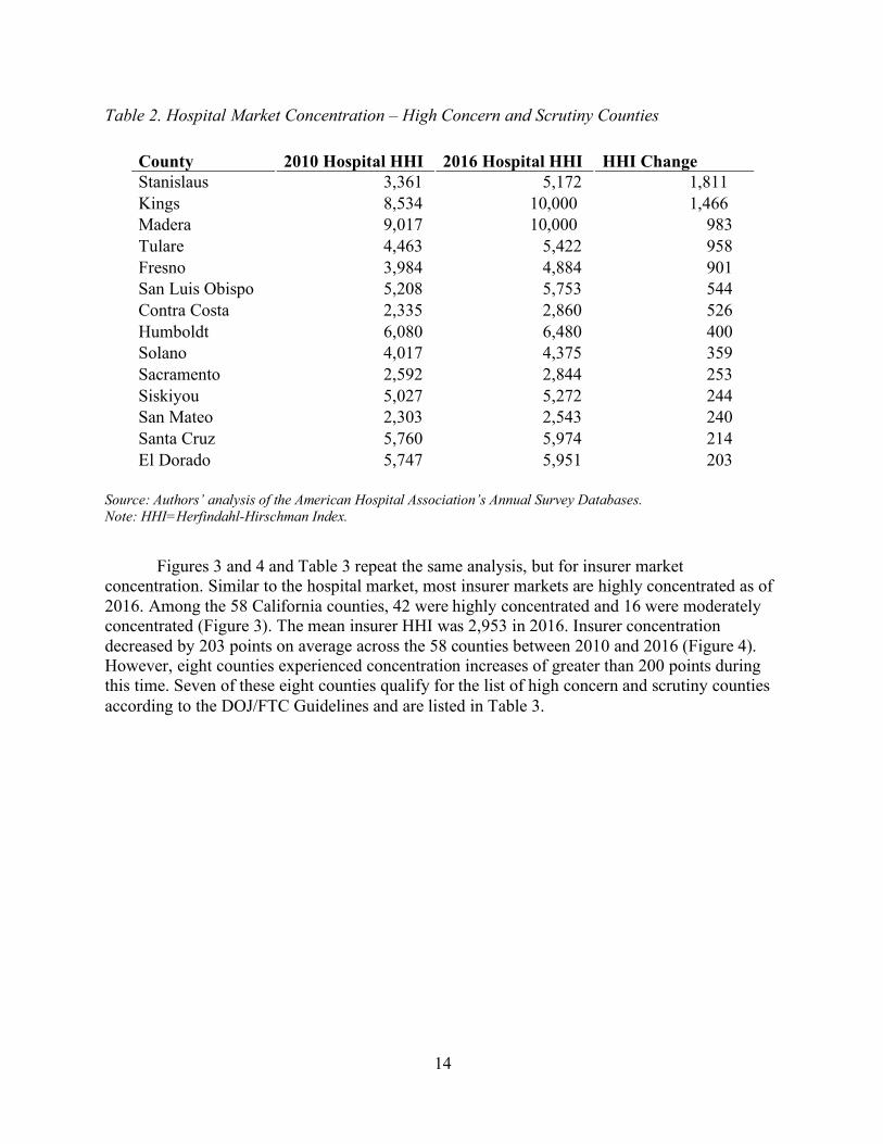
Figure 2 examines the changes in hospital HHI that occurred across counties between 2010 and 2016. Hospital concentration was stable during this period with a mean decrease of only 24 HHI points during the period. However, there was significant variation across counties, with 14 counties experiencing HHI increases of over 200 points from 2010 to 2016. These 14 counties qualify for the list of high concern and scrutiny counties according to the DOJ/FTC Guidelines (2016 HHI > 2,500 and HHI change > 200). The list of high concern and scrutiny counties is presented as Table 2.
Figure 2. Hospital Market Concentration Changes from 2010 to 2016
Source: Authors’ analysis of the American Hospital Association’s Annual Survey Databases. Note: HHI=Herfindahl-Hirschman Index.
14
Table 2. Hospital Market Concentration – High Concern and Scrutiny Counties
County 2010 Hospital HHI 2016 Hospital HHI HHI Change Stanislaus 3,361 5,172 1,811 Kings 8,534 10,000 1,466 Madera 9,017 10,000 983 Tulare 4,463 5,422 958 Fresno 3,984 4,884 901 San Luis Obispo 5,208 5,753 544 Contra Costa 2,335 2,860 526 Humboldt 6,080 6,480 400 Solano 4,017 4,375 359 Sacramento 2,592 2,844 253 Siskiyou 5,027 5,272 244 San Mateo 2,303 2,543 240 Santa Cruz 5,760 5,974 214 El Dorado 5,747 5,951 203
Source: Authors’ analysis of the American Hospital Association’s Annual Survey Databases. Note: HHI=Herfindahl-Hirschman Index.
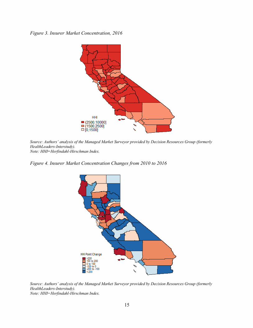
Figures 3 and 4 and Table 3 repeat the same analysis, but for insurer market concentration. Similar to the hospital market, most insurer markets are highly concentrated as of 2016. Among the 58 California counties, 42 were highly concentrated and 16 were moderately concentrated (Figure 3). The mean insurer HHI was 2,953 in 2016. Insurer concentration decreased by 203 points on average across the 58 counties between 2010 and 2016 (Figure 4). However, eight counties experienced concentration increases of greater than 200 points during this time. Seven of these eight counties qualify for the list of high concern and scrutiny counties according to the DOJ/FTC Guidelines and are listed in Table 3.
15
Figure 3. Insurer Market Concentration, 2016
Source: Authors’ analysis of the Managed Market Surveyor provided by Decision Resources Group (formerly HealthLeaders-Interstudy). Note: HHI=Herfindahl-Hirschman Index. Figure 4. Insurer Market Concentration Changes from 2010 to 2016
Source: Authors’ analysis of the Managed Market Surveyor provided by Decision Resources Group (formerly HealthLeaders-Interstudy). Note: HHI=Herfindahl-Hirschman Index.

16
Table 3. Insurer Market Concentration – High Concern and Scrutiny Counties
County 2010 Insurer HHI 2016 Insurer HHI HHI Change Solano 3,333 4,742 1,409 Humboldt 3,106 3,634 528 Butte 3,815 4,286 471 San Joaquin 2,471 2,906 435 Sacramento 2,536 2,951 415 Contra Costa 2,634 2,952 318 Santa Barbara 2,803 3,008 205
Source: Authors’ analysis of the Managed Market Surveyor provided by Decision Resources Group (formerly HealthLeaders-Interstudy). Note: HHI=Herfindahl-Hirschman Index.
Figures 5 and 6 show the market concentration of primary care physicians in 2016 and the change in primary care market concentration between 2010 and 2016, respectively. The mean HHI across counties was 1,984 in 2016. Of the 57 counties analyzed, 12 were highly concentrated and 21 were moderately concentrated. The seven counties that warrant high concern and scrutiny according to the DOJ/FTC Guidelines are listed in Table 4.
Figure 5. Primary Care Market Concentration, 2016
Source: Authors’ analysis of the SK&A Office Based Physicians Database provided by QuintilesIMS. Note: HHI=Herfindahl-Hirschman Index.

17
Figure 6. Primary Care Market Concentration Changes from 2010 to 2016
Source: Authors’ analysis of the SK&A Office Based Physicians Database provided by QuintilesIMS. Note: HHI=Herfindahl-Hirschman Index. Table 4. Primary Care Market Concentration – High Concern and Scrutiny Counties
County 2010 Primary Care HHI
2016 Primary Care HHI
HHI Change
Amador 655 2,934 2,279 Plumas 6,303 8,515 2,212 Calaveras 2,888 4,831 1,943 Lake 799 2,505 1,707 Colusa 3,585 4,314 729 Inyo 2,166 2,873 707 El Dorado 2,526 2,902 376
Source: Authors’ analysis of the SK&A Office Based Physicians Database provided by QuintilesIMS. Note: HHI=Herfindahl-Hirschman Index.
18
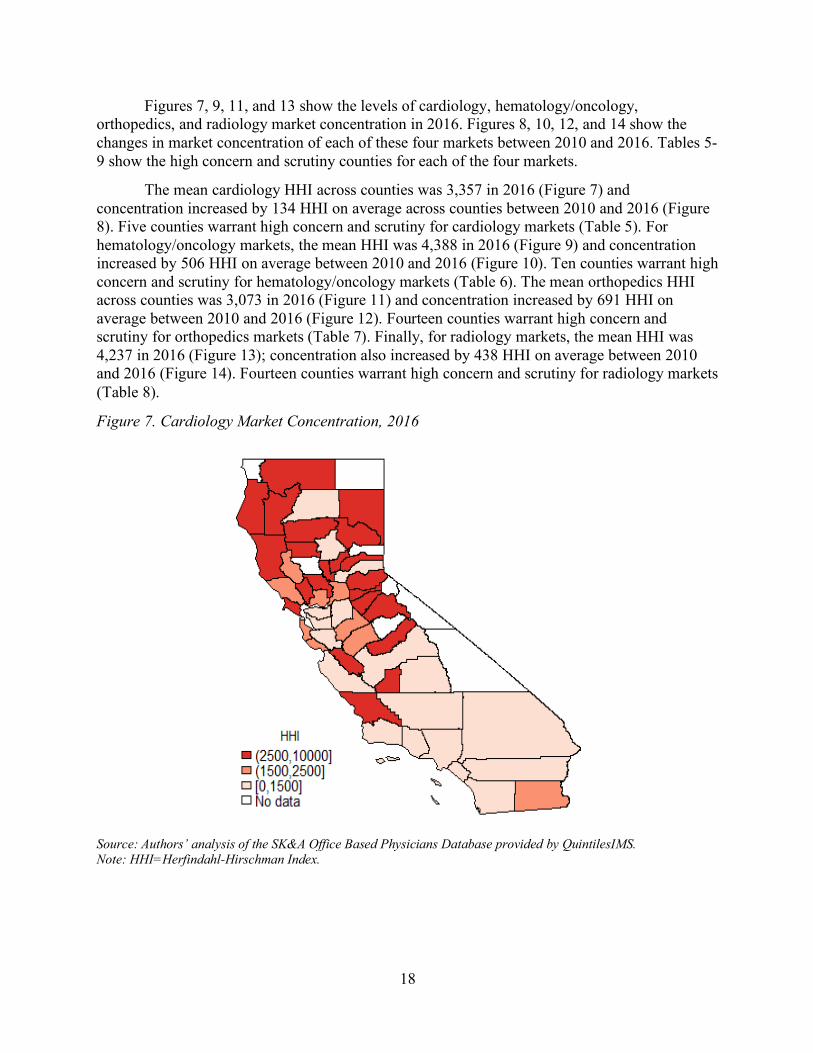
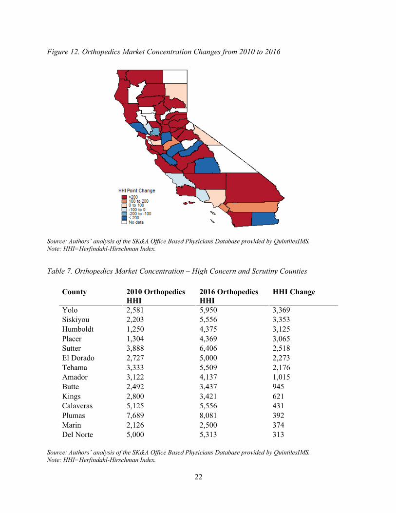
Figures 7, 9, 11, and 13 show the levels of cardiology, hematology/oncology, orthopedics, and radiology market concentration in 2016. Figures 8, 10, 12, and 14 show the changes in market concentration of each of these four markets between 2010 and 2016. Tables 5-9 show the high concern and scrutiny counties for each of the four markets.
The mean cardiology HHI across counties was 3,357 in 2016 (Figure 7) and concentration increased by 134 HHI on average across counties between 2010 and 2016 (Figure 8). Five counties warrant high concern and scrutiny for cardiology markets (Table 5). For hematology/oncology markets, the mean HHI was 4,388 in 2016 (Figure 9) and concentration increased by 506 HHI on average between 2010 and 2016 (Figure 10). Ten counties warrant high concern and scrutiny for hematology/oncology markets (Table 6). The mean orthopedics HHI across counties was 3,073 in 2016 (Figure 11) and concentration increased by 691 HHI on average between 2010 and 2016 (Figure 12). Fourteen counties warrant high concern and scrutiny for orthopedics markets (Table 7). Finally, for radiology markets, the mean HHI was 4,237 in 2016 (Figure 13); concentration also increased by 438 HHI on average between 2010 and 2016 (Figure 14). Fourteen counties warrant high concern and scrutiny for radiology markets (Table 8).
Figure 7. Cardiology Market Concentration, 2016
Source: Authors’ analysis of the SK&A Office Based Physicians Database provided by QuintilesIMS. Note: HHI=Herfindahl-Hirschman Index.

19
Figure 8. Cardiology Market Concentration Changes from 2010 to 2016
Source: Authors’ analysis of the SK&A Office Based Physicians Database provided by QuintilesIMS. Note: HHI=Herfindahl-Hirschman Index.
Table 5. Cardiology Market Concentration – High Concern and Scrutiny Counties
County 2010 Cardiology HHI
2016 Cardiology HHI
HHI Change
El Dorado 2,653 7,222 4,569 Humboldt 1,000 5,556 4,556 Napa 857 3,288 2,431 Amador 2,171 4,136 1,965 San Benito 3,930 5,000 1,070
Source: Authors’ analysis of the SK&A Office Based Physicians Database provided by QuintilesIMS. Note: HHI=Herfindahl-Hirschman Index.

20
Figure 9. Hematology/Oncology Market Concentration, 2016
Source: Authors’ analysis of the SK&A Office Based Physicians Database provided by QuintilesIMS. Note: HHI=Herfindahl-Hirschman Index. Figure 10. Hematology/Oncology Market Concentration Changes from 2010 to 2016
Source: Authors’ analysis of the SK&A Office Based Physicians Database provided by QuintilesIMS. Note: HHI=Herfindahl-Hirschman Index.

21
Table 6. Hematology/Oncology Market Concentration – High Concern and Scrutiny Counties
County 2010 Hematology/ Oncology HHI
2016 Hematology/ Oncology HHI
HHI Change
Kings 3,750 10,000 6,250 Mendocino 4,335 10,000 5,665 Imperial 5,000 10,000 5,000 Butte 1,515 5,062 3,547 San Francisco 1,343 4,192 2,849 Fresno 600 2,868 2,268 Santa Clara 1,190 3,130 1,940 Nevada 3,333 5,000 1,667 Placer 2,613 3,127 514 El Dorado 9,763 10,000 237
Source: Authors’ analysis of the SK&A Office Based Physicians Database provided by QuintilesIMS. Note: HHI=Herfindahl-Hirschman Index.
Figure 11. Orthopedics Market Concentration, 2016
Source: Authors’ analysis of the SK&A Office Based Physicians Database provided by QuintilesIMS. Note: HHI=Herfindahl-Hirschman Index.
22
Figure 12. Orthopedics Market Concentration Changes from 2010 to 2016
Source: Authors’ analysis of the SK&A Office Based Physicians Database provided by QuintilesIMS. Note: HHI=Herfindahl-Hirschman Index.
Table 7. Orthopedics Market Concentration – High Concern and Scrutiny Counties
County 2010 Orthopedics HHI
2016 Orthopedics HHI
HHI Change
Yolo 2,581 5,950 3,369 Siskiyou 2,203 5,556 3,353 Humboldt 1,250 4,375 3,125 Placer 1,304 4,369 3,065 Sutter 3,888 6,406 2,518 El Dorado 2,727 5,000 2,273 Tehama 3,333 5,509 2,176 Amador 3,122 4,137 1,015 Butte 2,492 3,437 945 Kings 2,800 3,421 621 Calaveras 5,125 5,556 431 Plumas 7,689 8,081 392 Marin 2,126 2,500 374 Del Norte 5,000 5,313 313
Source: Authors’ analysis of the SK&A Office Based Physicians Database provided by QuintilesIMS. Note: HHI=Herfindahl-Hirschman Index.

23
Figure 13. Radiology Market Concentration, 2016
Source: Authors’ analysis of the SK&A Office Based Physicians Database provided by QuintilesIMS. Note: HHI=Herfindahl-Hirschman Index. Figure 14. Radiology Market Concentration Changes from 2010 to 2016
Source: Authors’ analysis of the SK&A Office Based Physicians Database provided by QuintilesIMS. Note: HHI=Herfindahl-Hirschman Index.

24
Table 8. Radiology Market Concentration – High Concern and Scrutiny Counties
County 2010 Radiology HHI
2016 Radiology HHI
HHI Change
Mono 1,667 10,000 8,333 Humboldt 4,050 10,000 5,950 San Benito 5,000 10,000 5,000 Mendocino 3,889 6,800 2,911 San Francisco 1,385 3,781 2,396 Shasta 1,441 3,579 2,138 Sonoma 1,557 3,081 1,523 Napa 5,460 6,676 1,216 Sutter 6,600 7,813 1,213 Imperial 1,947 2,796 849 Tehama 2,500 3,333 833 Monterey 2,792 3,373 581 Merced 2,097 2,653 556 El Dorado 4,397 4,776 378
Source: Authors’ analysis of the SK&A Office Based Physicians Database provided by QuintilesIMS. Note: HHI=Herfindahl-Hirschman Index.
Changes in the Percent of Physicians Working for Foundations Owned by a Hospital or Health System
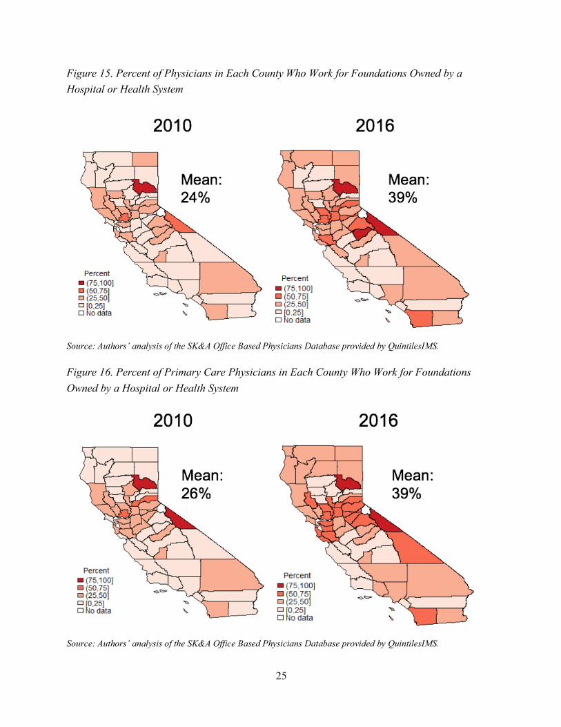
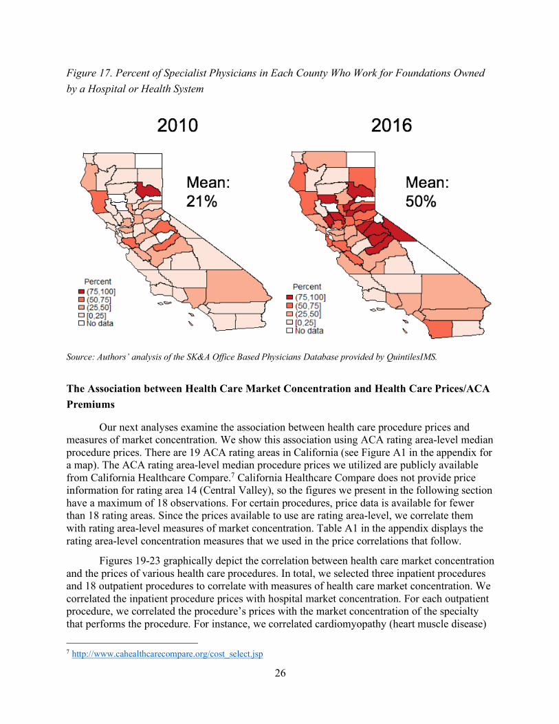
The next set of results examine how the percent of physicians working foundations owned by a hospital or health system changed from 2010 to 2016. For these analyses, we show the results for three groups: all physicians, primary care physicians, and specialist physicians, where we define specialist physicians to consist of the four specialists we analyzed previously – cardiologists, hematologists/oncologists, orthopedists, and radiologists. Figure 15 displays the results for all physicians. In 2010, 24% of a California county’s physicians worked for a foundation owned by a hospital or health system, on average. By 2016, the percent had jumped to 39%. We found a similar pattern for primary care physicians. Figure 16 shows the same measure to increase from 26% to 39% between 2010 and 2016 for primary care physicians. Figure 17 shows the increase to be even more dramatic for specialist physicians. In 2010, the average county had 21% of its specialist physicians working for a foundation owned by a hospital or health system. By 2016, the average county had 50% of its specialist physicians working for a foundation owned by a hospital or health system.
25
Figure 15. Percent of Physicians in Each County Who Work for Foundations Owned by a Hospital or Health System
Source: Authors’ analysis of the SK&A Office Based Physicians Database provided by QuintilesIMS. Figure 16. Percent of Primary Care Physicians in Each County Who Work for Foundations Owned by a Hospital or Health System
Source: Authors’ analysis of the SK&A Office Based Physicians Database provided by QuintilesIMS.
26
Figure 17. Percent of Specialist Physicians in Each County Who Work for Foundations Owned by a Hospital or Health System
Source: Authors’ analysis of the SK&A Office Based Physicians Database provided by QuintilesIMS.
The Association between Health Care Market Concentration and Health Care Prices/ACA Premiums
Our next analyses examine the association between health care procedure prices and measures of market concentration. We show this association using ACA rating area-level median procedure prices. There are 19 ACA rating areas in California (see Figure A1 in the appendix for a map). The ACA rating area-level median procedure prices we utilized are publicly available from California Healthcare Compare.7 California Healthcare Compare does not provide price information for rating area 14 (Central Valley), so the figures we present in the following section have a maximum of 18 observations. For certain procedures, price data is available for fewer than 18 rating areas. Since the prices available to use are rating area-level, we correlate them with rating area-level measures of market concentration. Table A1 in the appendix displays the rating area-level concentration measures that we used in the price correlations that follow.
Figures 19-23 graphically depict the correlation between health care market concentration and the prices of various health care procedures. In total, we selected three inpatient procedures and 18 outpatient procedures to correlate with measures of health care market concentration. We correlated the inpatient procedure prices with hospital market concentration. For each outpatient procedure, we correlated the procedure’s prices with the market concentration of the specialty that performs the procedure. For instance, we correlated cardiomyopathy (heart muscle disease)
7 http://www.cahealthcarecompare.org/cost_select.jsp

27
prices with measures of cardiology market concentration. The full list of the three inpatient procedures and the 18 outpatient procedures (by specialty) we analyzed are footnoted below.8 For brevity, we discuss the results of one procedure price correlation each for hospital, primary care, cardiology, hematology/oncology, and radiology (Figure 19-23, respectively). Graphical depictions of the remaining 17 procedure price/market concentration correlations are available in the appendix (Figures A2-A17). Additionally, the regression estimates that underlie Figures 19-23 and Figures A2-A17 are also available in the appendix as Tables A3-A8. Tables A3-A8 estimate the association between both unadjusted and input cost adjusted procedure prices and market concentration. Tables A9-A14 are identical to Tables A3-A8, except that the regressions in Tables A9-A14 are weighted by rating area population to account for the fact that population varies considerably across rating areas. While all the figures presented within the main text of the report use unadjusted prices (i.e. actual prices that are paid), the regression tables in the appendix present the results for both unadjusted and input cost adjusted prices. We used the Medicare wage index to input cost adjust prices.9 The Medicare program uses the Medicare wage index to adjust standardized amounts paid to hospitals to account for differences in hospital wage levels across regions. Results using input cost adjusted prices are similar to the unadjusted price results that we present in the main text (see the appendix for details).
Figure 19 shows the correlation between heart attack (acute myocardial infarction) prices and hospital market concentration. The average median heart attack price across the 17 rating areas analyzed was $20,809. In Los Angeles – East, which had a hospital HHI of 656 in 2014, the median price to treat a heart attack was $15,795. In contrast, in the Eastern rating area, where hospital HHI was 3,851, the median price to treat a heart attack was $28,477 – 80% above the price to treat a heart attack in Los Angeles.
8 Inpatient procedures (3): heart attack (acute myocardial infarction), partial hip replacement revision, premature baby (extremely low weight) Outpatient procedures (18): Primary Care (9) – cervical cancer screening converted, colon cancer screening – sigmoidoscopy, diagnostic blood fecal test, diverticular disease, fibroids, kidney (renal) failure, sore throat, upper respiratory infection/common cold (adult), urinary tract stone; Cardiology (3) – cardiomyopathy (heart muscle disease), cardiovascular symptoms (other), coronary artery disease with heart bypass surgery; Hematology/Oncology (3) – breast cancer, lung, bronchi, or mediastinum cancer, prostate cancer; Orthopedics (3) – ankle fracture/sprain, knee ligament injury, wrist or hand fracture/dislocation/sprain 9 https://www.cms.gov/Medicare/Medicare-Fee-for-Service-Payment/AcuteInpatientPPS/wageindex.html

28
Figure 19. Heart Attack (Acute Myocardial Infarction) Price and Hospital HHI Correlation
Note: HHI=Herfindahl-Hirschman Index. The slope of the regression line in the figure is statistically significant at the p<0.10 level. See Table A3 in the appendix for the regression output that corresponds to this figure.
Our analysis of the correlation between outpatient procedure prices and the market concentrations of the physician specialties that perform the procedures begins with Figure 20. The figure shows the correlation between upper respiratory infection/common cold (adult) prices and primary care market concentration. The average median upper respiratory infection/common cold (adult) price across the 18 rating areas analyzed was $151. In Orange County, which had a primary care HHI of 513 in 2014, the median price to treat a common cold was $131. Alternatively, in San Mateo, where primary care HHI was 1,892, the median price to treat a common cold was $215 – 64% above the price to treat a common cold in Orange County.

29
Figure 20. Upper Respiratory Infection/Common Cold Price and Primary Care HHI Correlation
Note: HHI=Herfindahl-Hirschman Index. The slope of the regression line in the figure is statistically significant at the p<0.01 level. See Table A4 in the appendix for the regression output that corresponds to this figure.
Figure 21 shows the correlation between cardiomyopathy (heart muscle disease) prices and cardiology market concentration. The average median cardiomyopathy price across the 17 rating areas analyzed was $1,867. In Los Angeles – East, which had a cardiology HHI of 259 in 2014, the median cardiomyopathy price was $1,500. In San Francisco, where cardiology HHI was 1,237, the median cardiomyopathy price was $3,023 – about double the cardiomyopathy price of Los Angeles.

30
Figure 21. Cardiomyopathy (Heart Muscle Disease) Price and Cardiology HHI Correlation
Note: HHI=Herfindahl-Hirschman Index. The slope of the regression line in the figure is statistically significant at the p<0.01 level. See Table A5 in the appendix for the regression output that corresponds to this figure.
The correlation between breast cancer exam prices and hematology/oncology market concentration is shown in Figure 22. The average median breast cancer exam price across the 18 rating areas analyzed was $4,686. In San Diego, which had a hematology/oncology HHI of 1,298 in 2014, the median breast cancer exam price was $4,310. In San Francisco, where hematology/oncology HHI was 4,331, the median breast cancer exam price was $5,898 – 37% above the median breast cancer exam price in San Diego.
Figure 22. Breast Cancer Exam Price and Hematology/Oncology HHI Correlation
Note: HHI=Herfindahl-Hirschman Index. The slope of the regression line in the figure is statistically significant at the p<0.05 level. See Table A6 in the appendix for the regression output that corresponds to this figure.

31
Figure 23 shows the correlation between ankle fracture/sprain prices and orthopedics market concentration. The average median ankle fracture/sprain price across the 18 rating areas analyzed was $537. In Orange County, which had an orthopedics HHI of 240 in 2014, the median ankle fracture/sprain price was $404. In the Eastern rating area, where orthopedics HHI was 2,612, the median ankle fracture/sprain price was $911 – over double the median ankle fracture/sprain price in Orange County.
Figure 23. Ankle Fracture/Sprain Price and Orthopedics HHI Correlation
Note: HHI=Herfindahl-Hirschman Index. The slope of the regression line in the figure is statistically significant at the p<0.01 level. See Table A7 in the appendix for the regression output that corresponds to this figure.
Figure 24 shows the correlation between ACA premiums and insurer market concentration (see Table A2 in the appendix for benchmark premiums and insurer HHIs by rating area). The premiums shown in the figure are the second-lowest cost silver plan (hereafter, benchmark plan) in each rating area in 2016. The premium of the benchmark plan in each rating area is used to compute the advance premium tax credits available to household between 138% and 400% of the federal poverty level. The average monthly benchmark plan premium for an unsubsidized 40-year old across the 19 rating areas analyzed was $342 in 2016.10 In San Diego, which had an insurer HHI of 1,539 in 2016, the average monthly benchmark plan premium was $296 for an unsubsidized 40-year-old. In the Monterey Coast rating area, where insurer HHI was 3,380, the average monthly benchmark plan premium was $421 for an unsubsidized 40-year-old – 42% above the monthly premium in San Diego.
10 http://www.chcf.org/aca-411/explore-the-data#chart%2Caffordability%2Cpremiums%2Cprem_assistance%2CRegionMap%20(totalprem)%2C2016%2Cregion12

32
Figure 24. Covered California Benchmark Premium and Insurer HHI Correlation
Notes: HHI=Herfindahl-Hirschman Index. The benchmark premium shown in the figure is the monthly premium an unsubsidized 40-year-old would pay for the second-lowest-cost silver plan in each rating area. The slope of the regression line in the figure is statistically significant at the p<0.01 level. See Table A8 in the appendix for the regression output that corresponds to this figure.
The Association between the Percent of Physicians Working for Foundations Owned by Hospitals or Health Systems and Outpatient Procedure Prices
The next set of analyses (Figures 25-28) repeat the analyses in Figures 20-24 above, but with the percent of physicians who work for foundations owned by hospitals or health systems. Based on previous studies, we predict that rating areas with a higher percent of physicians working for foundations owned by hospitals or health systems will be associated with higher outpatient procedure prices (see Post et al. (2017) for a review of this literature). Table A15 in the appendix displays the rating area-level percent of physicians working for foundations owned by hospitals or health systems that we used in the price correlations that follow. We did performed the analysis for the same 18 outpatient procedures we analyzed in the previous section.11 Again, for brevity, we show the result for one procedure with each specialty in the main text. The graphical depictions of the results for the remaining 14 procedures are available in the appendix as Figures A18-A31. The regressions from which the figures were produced are also available in the appendix. Tables A16-A19 show unweighted regressions while the regressions in Tables A20-A23 are weighted by the population in each rating area. Tables A16-
11 Outpatient procedures (18): Primary Care (9) – cervical cancer screening converted, colon cancer screening – sigmoidoscopy, diagnostic blood fecal test, diverticular disease, fibroids, kidney (renal) failure, sore throat, upper respiratory infection/common cold (adult), urinary tract stone; Cardiology (3) – cardiomyopathy (heart muscle disease), cardiovascular symptoms (other), coronary artery disease with heart bypass surgery; Hematology/Oncology (3) – breast cancer, lung, bronchi, or mediastinum cancer, prostate cancer; Orthopedics (3) – ankle fracture/sprain, knee ligament injury, wrist or hand fracture/dislocation/sprain

33
A23 all perform the analysis using both unadjusted prices and input cost adjusted prices. All the figures shown in the main text use unadjusted prices.
Figure 25 shows the correlation between upper respiratory infection/common cold (adult) prices and the percent of primary care physicians in a rating area who work for foundations owned by a hospital or health system. The average median upper respiratory infection/common cold (adult) price across the 18 rating areas analyzed was $151. In Orange County, which had 22% of its primary care physicians working for a foundation owned by a hospital or health system, the median price to treat a common cold was $131. Alternatively, in San Francisco, where 49% of primary care physicians work for a foundation owned by a hospital or health system, the median price to treat a common cold was $205 – 56% above the price to treat a common cold in Orange County.
Figure 25. Upper Respiratory Infection/Common Cold Price and the Percent of Primary Care Physicians Working for Foundations Owned by a Hospital or Health System Correlation
Note: % PC Own by Hosp = the percent of primary care physicians in a rating area who work for foundations owned by hospital or health systems. The slope of the regression line in the figure is statistically significant at the p<0.01 level. See Table A16 in the appendix for the regression output that corresponds to this figure.
Figure 26 shows the correlation between cardiomyopathy (heart muscle disease) prices and the percent of cardiologists in a rating area who work for foundations owned by a hospital or health system. The average median cardiomyopathy price across the 17 rating areas analyzed was $1,867. In Los Angeles – East, which had 14% of its cardiologists working for a foundation owned by a hospital or health system, the median cardiomyopathy price was $1,500. In San Francisco, where 58% of cardiologists work for a foundation owned by a hospital or health system, the median cardiomyopathy price was $3,023 – about double the cardiomyopathy price of Los Angeles.

34
Figure 26. Cardiomyopathy (Heart Muscle Disease) Price and the Percent of Cardiologists Working for Foundations Owned by a Hospital or Health System Correlation
Note: % CAR Own by Hosp = the percent of cardiologists in a rating area who work for foundations owned by hospital or health systems. The slope of the regression line in the figure is statistically significant at the p<0.10 level. See Table A17 in the appendix for the regression output that corresponds to this figure.
The correlation between breast cancer exam prices and the percent of hematologists/oncologists in a rating area who work for foundations owned by a hospital or health system is shown in Figure 27. The average median breast cancer exam price across the 18 rating areas analyzed was $4,686. In the Central Coast, which had 16% of its hematologists/oncologists working for a foundation owned by a hospital or health system, the median breast cancer exam price was $3,516. In San Francisco, where 77% of hematologists/oncologists work for a foundation owned by a hospital or health system, the median breast cancer exam price was $5,898 – 68% above the median breast cancer exam price in the Central Coast.

35
Figure 27. Breast Cancer Exam Price and the Percent of Hematologists/Oncologists Working for Foundations Owned by a Hospital or Health System Correlation
Note: % HEM/ONC Own by Hosp = the percent of hematologists/oncologists in a rating area who work for foundations owned by a hospital or health system. The slope of the regression line in the figure is statistically significant at the p<0.01 level. See Table A18 in the appendix for the regression output that corresponds to this figure.
Figure 28 shows the correlation between knee ligament injury prices and the percent of orthopedists in a rating area who work for foundations owned by a hospital or health system. The average median knee ligament injury price across the 18 rating areas analyzed was $279. In Orange County, which had 17% of its orthopedists working for a foundation owned by a hospital or health system, the median knee ligament injury price was $270. In San Mateo, where 56% of orthopedists work for a foundation owned by a hospital or health system, the median knee ligament injury price was $326 – 21% above the median breast cancer exam price in the Central Coast.

36
Figure 28. Knee Ligament Injury Price and the Percent of Orthopedists Working for Foundations Owned by a Hospital or Health System Correlation
Note: % ORS Own by Hosp = the percent of orthopedists in a rating area who work for foundations owned by a hospital or health system. The slope of the regression line in the figure is statistically significant at the p<0.05 level. See Table A19 in the appendix for the regression output that corresponds to this figure.
Prices and Premiums in Rating Areas with HHIs Above and Below the HHI Thresholds Used by the Horizontal Merger Guidelines
Tables 9 and 10 show how prices and premiums vary in rating areas above and below Horizontal Merger Guidelines thresholds (U.S. Department of Justice and the Federal Trade Commission 2010). For hospital and physician prices, we use HHI=1,500 as our cutoff for dividing rating areas. According to the Guidelines, 1,500 is the threshold for a moderately concentrated market.
Table 9 shows that 6 rating areas have hospital HHIs below 1,500 while 12 rating areas have hospital HHIs above 1,500 (see Table A1 in the appendix for the list of rating area-level hospital and physician HHIs). The average inpatient procedure price was $139,909 in rating areas below HHI=1,500 and $250,203 in rating areas above HHI=1,500 – a 79% difference. The three inpatient procedures used to compute average inpatient procedure price are listed in the notes below the table. Results for individual procedures are available in Table A24 in the appendix.
Likewise, average outpatient primary care, hematology/oncology, and orthopedics procedure prices were much higher in rating areas above HHI=1,500 than in rating areas below HHI=1,500. Average outpatient primary care procedure prices were 35% higher ($898 vs. $665), average outpatient hematology/oncology procedure prices were 51% higher ($20,819 vs. $13,762), and average outpatient orthopedics procedure prices were 63% higher ($715 vs. $439).

37
At the bottom of Table 9, we show how ACA premiums differ in rating areas above and below HHI=2,500 – the Guidelines’ threshold for a highly concentrated market. In the 9 rating areas below insurer HHI=2,500 average ACA benchmark plan monthly premiums were $318 versus $363 in the 10 rating areas with insurer above HHI=2,500 – a 14% difference.
Table 9. Prices (2014) and ACA Premiums (2016) by HHI Level
HHI < 1,500 HHI ≥ 1,500 % Difference Avg. Inpatient Procedure Price $139,909 $250,203 79% # of rating areas (Hospital HHI) 6 12 Avg. Outpatient Primary Care Procedure Price $665 $898 35% # of rating areas (Primary Care HHI***) 12 6 Avg. Outpatient Hematology/Oncology Procedure Price $13,762 $20,819 51% # of rating areas (Hematology/Oncology HHI) 11 7 Avg. Outpatient Orthopedist Procedure Price $439 $715 63% # of rating areas (Orthopedics HHI) 17 1 HHI < 2,500 HHI ≥ 2,500 % Difference Avg. ACA Benchmark Plan Monthly Premium $318 $363 14% # of rating areas 9 10
Notes: The procedures below were used to compute average prices for each provider category. The average reported above is a straight average across the procedures within each category. Cardiology prices are not reported as no rating areas had a cardiology HHI below 1,500 (see Table A1 in the appendix). The premiums listed in Table A2 were used for the analysis of Avg. ACA Benchmark Plan Monthly Premiums. *** Primary Care HHI was calculated at the primary care service area (PCSA)-level and then weighted up to the rating area-level (see Goodman et al. (2003) for details on PCSAs). All other HHIs were calculated directly at the rating area-level. Inpatient procedures (3): heart attack (acute myocardial infarction), partial hip replacement revision, premature baby (extremely low weight) Outpatient procedures (15): Primary Care (9) – cervical cancer screening converted, colon cancer screening – sigmoidoscopy, diagnostic blood fecal test, diverticular disease, fibroids, kidney (renal) failure, sore throat, upper respiratory infection/common cold (adult), urinary tract stone Hematology/Oncology (3) – breast cancer, lung, bronchi, or mediastinum cancer, prostate cancer Orthopedics (3) – ankle fracture/sprain, knee ligament injury, wrist or hand fracture/dislocation/sprain

38
Table 10 repeats the analysis performed in Table 9 but with input cost adjusted prices. Results for individual procedures are available in Table A25 in the appendix. In Table 10, all procedure prices and premiums were input cost adjusted using the Medicare wage index. The Medicare program uses the Medicare wage index to adjust standardized amounts paid to hospitals to account for differences in hospital wage levels across regions.12 Table 10 shows that while accounting for regional input cost differences generally shrinks the price (ACA premium) difference, there are still considerable differences in procedure prices (ACA premiums) in rating areas above and below HHI=1,500 (HHI=2,500). For instance, unadjusted inpatient procedure prices are 79% higher in rating areas above HHI=1,500 than in rating areas below HHI=1,500 (Table 9), while input cost adjusted inpatient procedure prices are 52% higher in rating areas above HHI=1,500 than in rating areas below HHI=1,500 (Table 10).
12 The Centers for Medicare & Medicaid Services currently defines “hospital geographic areas (labor markets areas) based on the definitions of Core-Based Statistical Areas (CBSAs) established by the Office of Management and Budget and announced in December 2003.” We population-weighted CBSA-level Medicare wage indices to construct the rating area-level Medicare wage indices used in our analysis.

39
Table 10. Input cost adjusted Prices (2014) and ACA Premiums (2016) by HHI Level
HHI < 1,500 HHI ≥ 1,500 % Difference Input cost adjusted Avg. Inpatient Procedure Price $108,483 $165,119 52% # of rating areas 6 12 Input cost adjusted Avg. Outpatient Primary Care Procedure Price*** $472 $622 32% # of rating areas 12 6 Input cost adjusted Avg. Outpatient Hematology/Oncology Procedure Price $10,370 $13,269 28% # of rating areas 11 7 Input cost adjusted Avg. Outpatient Orthopedist Procedure Price $311 $577 85% # of rating areas 17 1 HHI < 2,500 HHI ≥ 2,500 % Difference Input cost adjusted Avg. ACA Benchmark Plan Monthly Premium $233 $256 10% # of rating areas 9 10
Notes: The procedures below were used to compute average prices for each provider category. The average reported above is a straight average across the procedures within each category. Cardiology prices are not reported as no rating areas had a cardiology HHI below 1,500 (see Table A1 in the appendix). The premiums listed in Table A2 were used for the analysis of Avg. ACA Benchmark Plan Monthly Premiums. Prices and ACA premiums were input cost adjusted using the Medicare wage index to adjust for input cost differences across regions. The Centers for Medicare & Medicaid Services currently defines “hospital geographic areas (labor markets areas) based on the definitions of Core-Based Statistical Areas (CBSAs) established by the Office of Management and Budget and announced in December 2003.” We population-weighted CBSA-level Medicare wage indices to construct the rating area-level Medicare wage indices used in our analysis. *** Primary Care HHI was calculated at the primary care service area (PCSA)-level and then weighted up to the rating area-level (see Goodman et al. (2003) for details on PCSAs). All other HHIs were calculated directly at the rating area-level. Inpatient procedures (3): heart attack (acute myocardial infarction), partial hip replacement revision, premature baby (extremely low weight) Outpatient procedures (15): Primary Care (9) – cervical cancer screening converted, colon cancer screening – sigmoidoscopy, diagnostic blood fecal test, diverticular disease, fibroids, kidney (renal) failure, sore throat, upper respiratory infection/common cold (adult), urinary tract stone Hematology/Oncology (3) – breast cancer, lung, bronchi, or mediastinum cancer, prostate cancer Orthopedics (3) – ankle fracture/sprain, knee ligament injury, wrist or hand fracture/dislocation/sprain

40
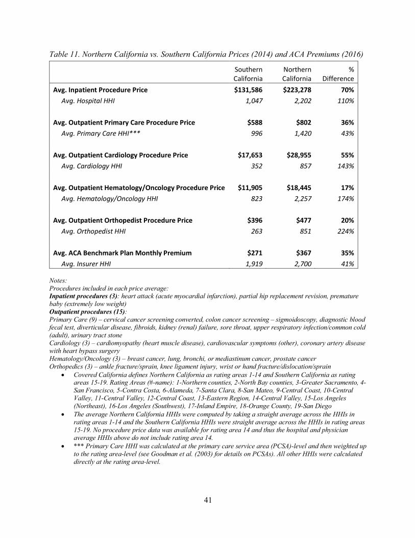
A Tale of Prices and Premiums in Northern vs. Southern California
There are stark differences in prices and ACA premiums between Northern and Southern California. Covered California defines Northern California as rating areas 1-14 and Southern California as rating areas 15-19.13 Table 11 compares the average median price in Northern California to the average median price in Southern California for the same 21 procedure prices we have been analyzing throughout the report. Results for individual procedures are available in Table A26 in the appendix. Inpatient procedure prices were 70% higher in Northern California than Southern California $131,586 vs. $223,278) while hospital HHI was 110% higher in Northern California than Southern California (2,202 vs. 1,047) in 2014. Among outpatient procedures, Northern California prices were 17-55% higher than Southern California prices in 2014, depending on the physician specialty. The average outpatient hematology/oncology procedure price was 17% higher in Northern California than Southern California ($11,905 vs. $18,445) while hematology/oncology HHI was 174% higher in Northern California than Southern California (2,257 vs. 823). Average outpatient cardiology procedure price was 55% higher in Northern California than Southern California ($17,653 vs. $28,955) while cardiology HHI was 143% higher in Northern California than Southern California (857 vs. 352).
ACA premiums were similarly much higher in Northern California than Southern California. In 2016, benchmark monthly premiums for an unsubsidized 40-year-old were 35% higher in Northern California than Southern California ($367 vs. $271) while insurer HHI was 41% higher in Northern California than Southern California (2,700 vs. 1,919).
13 Rating Areas (#-name): 1-Northern counties, 2-North Bay counties, 3-Greater Sacramento, 4-San Francisco, 5-Contra Costa, 6-Alameda, 7-Santa Clara, 8-San Mateo, 9-Central Coast, 10-Central Valley, 11-Central Valley, 12-Central Coast, 13-Eastern Region, 14-Central Valley, 15-Los Angeles (Northeast), 16-Los Angeles (Southwest), 17-Inland Empire, 18-Orange County, 19-San Diego. No pricing data for rating area 14 was available from California Health Care Compare, so the north vs. south price comparison we show is for rating areas 1-13 (north) vs. rating areas 15-19 (south).
41
Table 11. Northern California vs. Southern California Prices (2014) and ACA Premiums (2016)
Southern California
Northern California
% Difference
Avg. Inpatient Procedure Price $131,586 $223,278 70% Avg. Hospital HHI 1,047 2,202 110% Avg. Outpatient Primary Care Procedure Price $588 $802 36% Avg. Primary Care HHI*** 996 1,420 43% Avg. Outpatient Cardiology Procedure Price $17,653 $28,955 55% Avg. Cardiology HHI 352 857 143% Avg. Outpatient Hematology/Oncology Procedure Price $11,905 $18,445 17% Avg. Hematology/Oncology HHI 823 2,257 174% Avg. Outpatient Orthopedist Procedure Price $396 $477 20% Avg. Orthopedist HHI 263 851 224% Avg. ACA Benchmark Plan Monthly Premium $271 $367 35% Avg. Insurer HHI 1,919 2,700 41%
Notes: Procedures included in each price average: Inpatient procedures (3): heart attack (acute myocardial infarction), partial hip replacement revision, premature baby (extremely low weight) Outpatient procedures (15): Primary Care (9) – cervical cancer screening converted, colon cancer screening – sigmoidoscopy, diagnostic blood fecal test, diverticular disease, fibroids, kidney (renal) failure, sore throat, upper respiratory infection/common cold (adult), urinary tract stone Cardiology (3) – cardiomyopathy (heart muscle disease), cardiovascular symptoms (other), coronary artery disease with heart bypass surgery Hematology/Oncology (3) – breast cancer, lung, bronchi, or mediastinum cancer, prostate cancer Orthopedics (3) – ankle fracture/sprain, knee ligament injury, wrist or hand fracture/dislocation/sprain
• Covered California defines Northern California as rating areas 1-14 and Southern California as rating areas 15-19. Rating Areas (#-name): 1-Northern counties, 2-North Bay counties, 3-Greater Sacramento, 4-San Francisco, 5-Contra Costa, 6-Alameda, 7-Santa Clara, 8-San Mateo, 9-Central Coast, 10-Central Valley, 11-Central Valley, 12-Central Coast, 13-Eastern Region, 14-Central Valley, 15-Los Angeles (Northeast), 16-Los Angeles (Southwest), 17-Inland Empire, 18-Orange County, 19-San Diego
• The average Northern California HHIs were computed by taking a straight average across the HHIs in rating areas 1-14 and the Southern California HHIs were straight average across the HHIs in rating areas 15-19. No procedure price data was available for rating area 14 and thus the hospital and physician average HHIs above do not include rating area 14.
• *** Primary Care HHI was calculated at the primary care service area (PCSA)-level and then weighted up to the rating area-level (see Goodman et al. (2003) for details on PCSAs). All other HHIs were calculated directly at the rating area-level.

42
Table 12 repeats the analysis of Table 11 but with input cost adjusted prices. Results for individual procedures are available in Table A27 in the appendix. In Table 12, all procedure prices and premiums were input cost adjusted using the Medicare wage index.14 Table 12 shows that while accounting for regional input cost differences generally shrinks the price difference between Northern and Southern California, the difference is still often considerable in magnitude. For instance, unadjusted inpatient procedure prices are 70% higher in Northern California than Southern California (Table 11), while input cost adjusted inpatient procedure prices are 32% higher in Northern California than Southern California .
14 The Centers for Medicare & Medicaid Services currently defines “hospital geographic areas (labor markets areas) based on the definitions of Core-Based Statistical Areas (CBSAs) established by the Office of Management and Budget and announced in December 2003.” We population-weighted CBSA-level Medicare wage indices to construct the rating area-level Medicare wage indices used in our analysis.

43
Table 12. Input Cost Adjusted Northern California vs. Southern California Prices (2014) and ACA Premiums (2016)
Southern California
Northern California
% Difference
Input Cost Adjusted Avg. Inpatient Procedure Price $111,816 $147,922 32% Avg. Hospital HHI 1,047 2,202 110% Input Cost Adjusted Avg. Outpatient Primary Care Procedure Price $495 $532 8% Avg. Primary Care HHI*** 996 1,420 43% Input Cost Adjusted Avg. Outpatient Cardiology Procedure Price $14,844 $18,954 28% Avg. Cardiology HHI 352 857 143% Input Cost Adjusted Avg. Outpatient Hematology/Oncology Procedure Price $10,042 $12,071 20% Avg. Hematology/Oncology HHI 823 2,257 174% Input Cost Adjusted Avg. Outpatient Orthopedist Procedure Price $333 $324 -3% Avg. Orthopedist HHI 263 851 224% Input Cost Adjusted Avg. ACA Benchmark Plan Monthly Premium $228 $251 10% Avg. Insurer HHI 1,919 2,700 41%
Notes: Procedures included in each price average: Inpatient procedures (3): heart attack (acute myocardial infarction), partial hip replacement revision, premature baby (extremely low weight) Outpatient procedures (15): Primary Care (9) – cervical cancer screening converted, colon cancer screening – sigmoidoscopy, diagnostic blood fecal test, diverticular disease, fibroids, kidney (renal) failure, sore throat, upper respiratory infection/common cold (adult), urinary tract stone Cardiology (3) – cardiomyopathy (heart muscle disease), cardiovascular symptoms (other), coronary artery disease with heart bypass surgery Hematology/Oncology (3) – breast cancer, lung, bronchi, or mediastinum cancer, prostate cancer Orthopedics (3) – ankle fracture/sprain, knee ligament injury, wrist or hand fracture/dislocation/sprain
• Covered California defines Northern California as rating areas 1-14 and Southern California as rating areas 15-19. Rating Areas (#-name): 1-Northern counties, 2-North Bay counties, 3-Greater Sacramento, 4-San Francisco, 5-Contra Costa, 6-Alameda, 7-Santa Clara, 8-San Mateo, 9-Central Coast, 10-Central Valley, 11-Central Valley, 12-Central Coast, 13-Eastern Region, 14-Central Valley, 15-Los Angeles (Northeast), 16-Los Angeles (Southwest), 17-Inland Empire, 18-Orange County, 19-San Diego
• The average Northern California HHIs were computed by taking a straight average across the HHIs in rating areas 1-14 and the Southern California HHIs were straight average across the HHIs in rating areas 15-19. No procedure price data was available for rating area 14 and thus the hospital and physician average HHIs above do not include rating area 14.
• *** Primary Care HHI was calculated at the primary care service area (PCSA)-level and then weighted up to the rating area-level (see Goodman et al. (2003) for details on PCSAs). All other HHIs were calculated directly at the rating area-level.

44
• All procedure prices and premiums were input cost adjusted using the Medicare wage index. The Centers for Medicare & Medicaid Services currently defines “hospital geographic areas (labor markets areas) based on the definitions of Core-Based Statistical Areas (CBSAs) established by the Office of Management and Budget and announced in December 2003.” We population-weighted CBSA-level Medicare wage indices to construct the rating area-level Medicare wage indices used in our analysis.
Limitations
Our analyses of the association between prices of hospital and physician services in California and the market power of hospitals and physicians does have limitations. The analyses are based on one year of price data. With more years of price data we would be able to relate the changes in market power to the changes in prices. Moreover, with additional data, we would be able to have more measures of prices, including the mean prices and the variation of prices within areas. Finally, we have not adjusted for possible quality differences between hospitals and physicians in different regions of California.
Conclusion
It is clear that the market for health care and health insurance is now highly concentrated in California. The vast majority of counties in California warrant concern and scrutiny according to the DOJ/FTC Guidelines. This has likely reduced the level of competition, which has resulted in higher prices and ACA premiums in California. The significant variation in prices and ACA premiums across the state suggests regulatory and legislative solutions need to be implemented. Consumers are paying prices for health care that are considerably above what a more competitive market would produce.
References
Baker, Laurence C., M. Kate Bundorf, and Daniel P. Kessler. 2014. "Vertical integration: hospital ownership of physician practices is associated with higher prices and spending." Health Affairs 33 (5):756-763.
Frech, H.E., III, Christopher Whaley, Benjamin R. Handel, Liora Bowers, Carol J. Simon, and Richard M. Scheffler. 2015. "Market Power, Transactions Costs, and the Entry of Accountable Care Organizations in Health Care." Review of Industrial Organization 47 (2):167-193.
Fulton, Brent D. 2017. "Health Care Market Concentration Trends In The United States: Evidence And Policy Responses." Health Affairs 36 (9):1530-1538.
Gaynor, Martin, Kate Ho, and Robert J. Town. 2015. "The Industrial Organization of Health-Care Markets." Journal of Economic Literature 53 (2):235-84.
Goodman, David C., Stephen S. Mick, David Bott, Therese Stukel, Chiang-hua Chang, Nancy Marth, Jim Poage, and Henry J. Carretta. 2003. "Primary Care Service Areas: A New Tool for the Evaluation of Primary Care Services." Health Services Research 38 (1p1):287-309.
Martin, Pamela, and Anne Neville. 2016. "The Corporate Practice of Medicine in a Changing Environment." Sacramento, CA: California Research Bureau. Available from: http://www.onlinelaege.com/pdf/c101.pdf.
45
Melnick, Glenn A., and Katya Fonkych. 2016. "Hospital Prices Increase in California, Especially Among Hospitals in the Largest Multi-hospital Systems." INQUIRY: The Journal of Health Care Organization, Provision, and Financing 53:0046958016651555.
Scheffler, Richard. 2017. "When Markets Are Heavily Concentrated, Managed Competition Cannot Work: Lessons From California." Health Affairs Blog, December 5, 2017. Available from: https://www.healthaffairs.org/action/showDoPubSecure?doi=10.1377%2Fhblog20171204.626710&format=full.
Scheffler, Richard M., and Daniel R. Arnold. 2017. "Insurer Market Power Lowers Prices In Numerous Concentrated Provider Markets." Health Affairs 36 (9):1539-1546.
Scheffler, Richard M., Daniel R. Arnold, Brent D. Fulton, and Sherry A. Glied. 2016. "Differing Impacts Of Market Concentration On Affordable Care Act Marketplace Premiums." Health Affairs 35 (5):880-888.
Scheffler, Richard M., Eric Kessell, and Margareta Brandt. 2015. "Covered California: The Impact of Provider and Health Plan Market Power on Premiums." Journal of Health Politics, Policy and Law 40 (6):1179-1202.
U.S. Department of Justice and the Federal Trade Commission. 2010. "Horizontal Merger Guidelines." Washington, DC: DOJ/FTC. August 19, 2010. Available from: http://www.justice.gov/sites/default/files/atr/legacy/2010/08/19/hmg-2010.pdf.
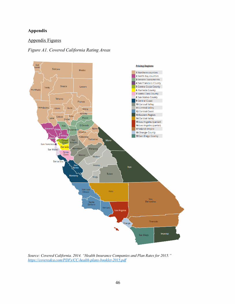
46
Appendix
Appendix Figures
Figure A1. Covered California Rating Areas
Source: Covered California. 2014. “Health Insurance Companies and Plan Rates for 2015.” https://coveredca.com/PDFs/CC-health-plans-booklet-2015.pdf
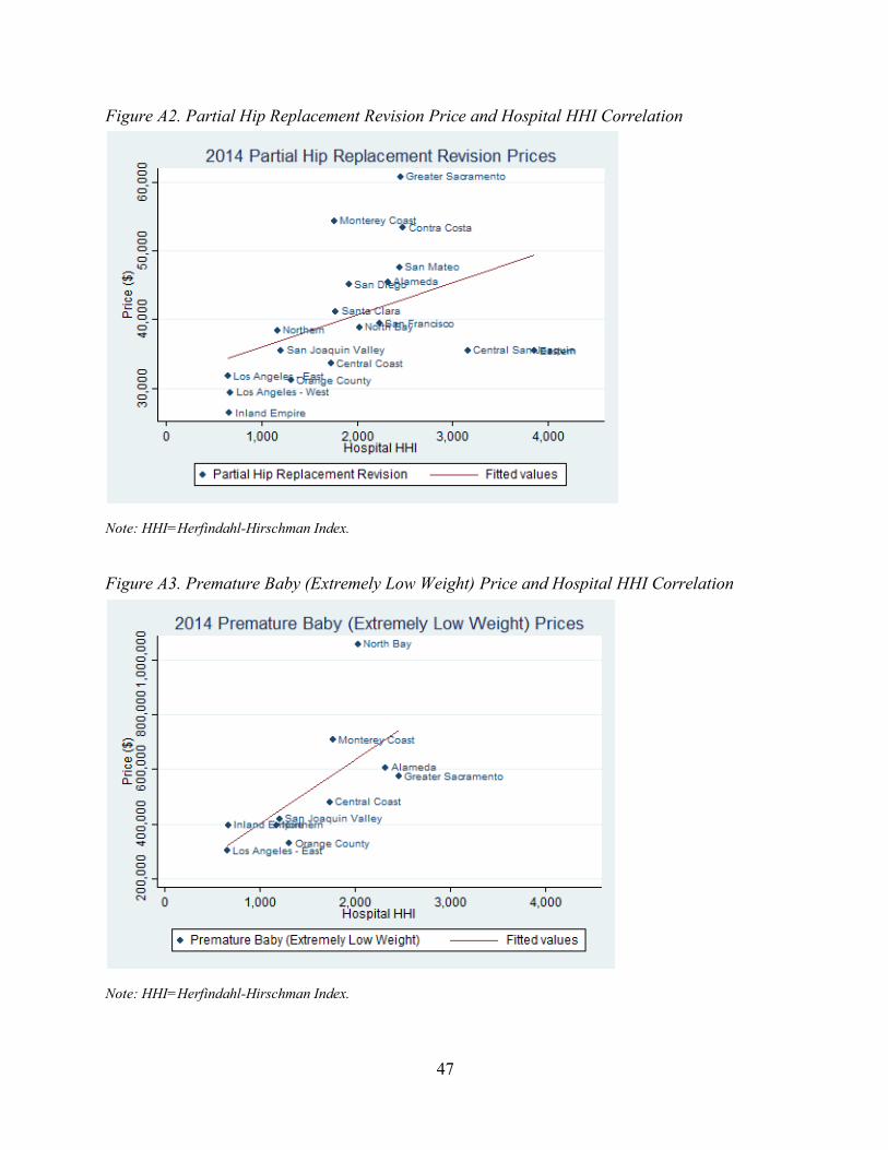
47
Figure A2. Partial Hip Replacement Revision Price and Hospital HHI Correlation
Note: HHI=Herfindahl-Hirschman Index.
Figure A3. Premature Baby (Extremely Low Weight) Price and Hospital HHI Correlation
Note: HHI=Herfindahl-Hirschman Index.

48
Figure A4. Cervical Cancer Screening Converted Price and Primary Care HHI Correlation
Note: HHI=Herfindahl-Hirschman Index. Figure A5. Colon Cancer Screening Price and Primary Care HHI Correlation
Note: HHI=Herfindahl-Hirschman Index.

49
Figure A6. Diagnostic Blood Fecal Price and Primary Care HHI Correlation
Note: HHI=Herfindahl-Hirschman Index.
Figure A7. Diverticular Disease Price and Primary Care HHI Correlation
Note: HHI=Herfindahl-Hirschman Index.

50
Figure A8. Fibroids Price and Primary Care HHI Correlation
Note: HHI=Herfindahl-Hirschman Index.
Figure A9. Kidney (Renal) Failure Price and Primary Care HHI Correlation
Note: HHI=Herfindahl-Hirschman Index.

51
Figure A10. Sore Throat Price and Primary Care HHI Correlation
Note: HHI=Herfindahl-Hirschman Index.
Figure A11. Urinary Tract Stone Price and Primary Care HHI Correlation
Note: HHI=Herfindahl-Hirschman Index.
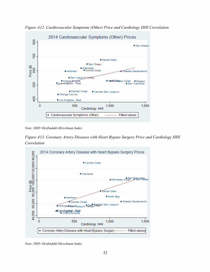
52
Figure A12. Cardiovascular Symptoms (Other) Price and Cardiology HHI Correlation
Note: HHI=Herfindahl-Hirschman Index. Figure A13. Coronary Artery Diseases with Heart Bypass Surgery Price and Cardiology HHI Correlation
Note: HHI=Herfindahl-Hirschman Index.

53
Figure A14. Lung, Bronchi, or Mediastinum Cancer Price and Hematology/Oncology HHI Correlation
Note: HHI=Herfindahl-Hirschman Index. Figure A15. Prostate Cancer Price and Hematology/Oncology HHI Correlation
Note: HHI=Herfindahl-Hirschman Index.

54
Figure A16. Knee Ligament Injury Price and Orthopedics HHI Correlation
Note: HHI=Herfindahl-Hirschman Index. Figure A17. Wrist or Hand Fracture/Dislocation/Sprain Price and Orthopedics HHI Correlation
Note: HHI=Herfindahl-Hirschman Index.

55
Figure A18. Cervical Cancer Screening Converted Prices and the Percent of Primary Care Physicians Working for Foundations Owned by a Hospital or Health System Correlation
Note: % PC Own by Hosp = the percent of primary care physicians in a rating area who work for foundations owned by a hospital or health system Figure A19. Colon Cancer Screening Price and the Percent of Primary Care Physicians Working for Foundations Owned by a Hospital or Health System Correlation
Note: % PC Own by Hosp = the percent of primary care physicians in a rating area who work for foundations owned by a hospital or health system

56
Figure A20. Diagnostic Blood Fecal Price and the Percent of Primary Care Physicians Working for Foundations Owned by a Hospital or Health System Correlation
Note: % PC Own by Hosp = the percent of primary care physicians in a rating area who work for foundations owned by a hospital or health system Figure A21. Diverticular Disease Price and the Percent of Primary Care Physicians Working for Foundations Owned by a Hospital or Health System Correlation
Note: % PC Own by Hosp = the percent of primary care physicians in a rating area who work for foundations owned by a hospital or health system

57
Figure A22. Fibroids Price and the Percent of Primary Care Physicians Working for Foundations Owned by a Hospital or Health System Correlation
Note: % PC Own by Hosp = the percent of primary care physicians in a rating area who work for foundations owned by a hospital or health system Figure A23. Kidney (Renal) Failure Price and the Percent of Primary Care Physicians Working for Foundations Owned by a Hospital or Health System Correlation
Note: % PC Own by Hosp = the percent of primary care physicians in a rating area who work for foundations owned by a hospital or health system

58
Figure A24. Sore Throat Price and the Percent of Primary Care Physicians Working for Foundations Owned by a Hospital or Health System Correlation
Note: % PC Own by Hosp = the percent of primary care physicians in a rating area who work for foundations owned by a hospital or health system
Figure A25. Urinary Tract Stone Price and the Percent of Primary Care Physicians Working for Foundations Owned by a Hospital or Health System Correlation
Note: % PC Own by Hosp = the percent of primary care physicians in a rating area who work for foundations owned by a hospital or health system

59
Figure A26. Cardiovascular Symptoms (Other) Price and the Percent of Cardiologists Working for Foundations Owned by a Hospital or Health System Correlation
Note: % CAR Own by Hosp = the percent of cardiologists in a rating area who work for foundations owned by a hospital or health system Figure A27. Coronary Artery Diseases with Heart Bypass Surgery Price and the Percent of Cardiologists Working for Foundations Owned by a Hospital or Health System Correlation
Note: % CAR Own by Hosp = the percent of cardiologists in a rating area who work for foundations owned by a hospital or health system

60
Figure A28. Lung, Bronchi, or Mediastinum Cancer Price and the Percent of Hematologists/Oncologists Working for Foundations Owned by a Hospital or Health System Correlation
Note: % HEM/ONC Own by Hosp = the percent of hematologists/oncologists in a rating area who work for foundations owned by a hospital or health system Figure A29. Prostate Cancer Price and the Percent of Hematologists/Oncologists Working for Foundations Owned by a Hospital or Health System Correlation
Note: % HEM/ONC Own by Hosp = the percent of hematologists/oncologists in a rating area who work for foundations owned by a hospital or health system

61
Figure A30. Ankle Fracture/Sprain Price and the Percent of Orthopedists Working for Foundations Owned by a Hospital or Health System Correlation
Note: % ORS Own by Hosp = the percent of orthopedists in a rating area who work for foundations owned by a hospital or health system Figure A31. Wrist or Hand Fracture/Dislocation/Sprain Price and the Percent of Orthopedists Working for Foundations Owned by a Hospital or Health System Correlation
Note: % ORS Own by Hosp = the percent of orthopedists in a rating area who work for foundations owned by a hospital or health system

62
Appendix Tables
Table A1: Rating Area-Level Hospital and Physician HHIs, 2014
Rating Area # Rating Area Name
Hospital HHI
Primary Care HHI
Cardiology HHI
Hematology/ Oncology
HHI Orthopedics
HHI Radiology
HHI 1 Northern 1,171 1,781 367 1,063 319 663 2 North Bay 2,031 1,811 957 1,638 657 1,102 3 Sacramento Valley 2,459 1,748 1,161 2,188 955 2,097 4 San Francisco 2,233 1,576 1,237 4,331 544 2,820 5 Contra Costa 2,483 1,377 636 811 1,499 2,366 6 Alameda 2,319 1,384 590 1,529 889 1,067 7 Santa Clara 1,779 1,458 870 2,728 727 1,372 8 San Mateo 2,443 1,893 1,345 1,948 1,318 1,277 9 Monterey Coast 1,760 1,422 1,010 1,493 550 2,012 10 San Joaquin Valley 1,207 1,315 420 383 354 501 11 Central San Joaquin 3,160 925 758 480 373 1,693 12 Central Coast 1,731 990 429 743 262 442 13 Eastern 3,851 779 1,358 10,000 2,613 3,421 15 Los Angeles - East 656 908 259 1,093 224 266 16 Los Angeles - West 680 698 246 674 185 537 17 Inland Empire 669 982 316 568 354 693 18 Orange 1,308 513 263 481 240 567 19 San Diego 1,920 1,878 675 1,298 313 675 AVERAGE 1,881 1,302 717 1,858 688 1,310
Note: HHI=Herfindahl-Hirschman Index.
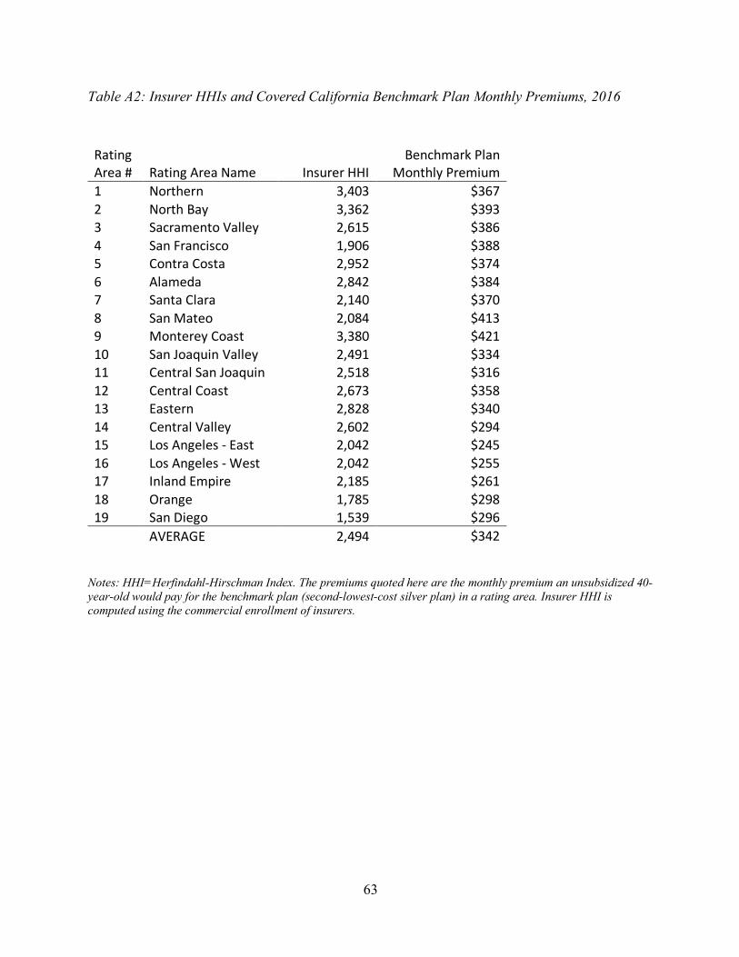
63
Table A2: Insurer HHIs and Covered California Benchmark Plan Monthly Premiums, 2016
Rating Area # Rating Area Name Insurer HHI
Benchmark Plan Monthly Premium
1 Northern 3,403 $367 2 North Bay 3,362 $393 3 Sacramento Valley 2,615 $386 4 San Francisco 1,906 $388 5 Contra Costa 2,952 $374 6 Alameda 2,842 $384 7 Santa Clara 2,140 $370 8 San Mateo 2,084 $413 9 Monterey Coast 3,380 $421 10 San Joaquin Valley 2,491 $334 11 Central San Joaquin 2,518 $316 12 Central Coast 2,673 $358 13 Eastern 2,828 $340 14 Central Valley 2,602 $294 15 Los Angeles - East 2,042 $245 16 Los Angeles - West 2,042 $255 17 Inland Empire 2,185 $261 18 Orange 1,785 $298 19 San Diego 1,539 $296 AVERAGE 2,494 $342
Notes: HHI=Herfindahl-Hirschman Index. The premiums quoted here are the monthly premium an unsubsidized 40-year-old would pay for the benchmark plan (second-lowest-cost silver plan) in a rating area. Insurer HHI is computed using the commercial enrollment of insurers.

64
Table A3. The association between inpatient procedure prices and hospital market concentration (HHI), 2014.
Unadjusted Prices
Heart Attack (Acute
Myocardial Infarction) Partial Hip
Replacement Revision
Premature Baby (Extremely Low
Weight) Hospital HHI 2.351* 4.716* 231.8**
(0.0754) (0.0710) (0.0419)
Observations 17 18 10 Avg. Median Price $20,809 $40,162 $526,580 R-squared 0.196 0.189 0.423
Input cost adjusted Prices
Heart Attack (Acute
Myocardial Infarction) Partial Hip
Replacement Revision
Premature Baby (Extremely Low
Weight) Hospital HHI 1.576 2.592* 112.7
(0.194) (0.0618) (0.108)
Observations 17 18 10 Input cost adjusted Avg. Median Price $15,193 $28,460 $367,682 R-squared 0.110 0.201 0.290
Notes: HHI=Herfindahl-Hirschman Index. p-values in parentheses. *** p<0.01, ** p<0.05, * p<0.1

65
Table A4. The association between outpatient primary care procedure prices and primary care market concentration (HHI), 2014.
Unadjusted Prices
Cervical Cancer Screening Converted
Colon Cancer Screening -
Sigmoidoscopy Diagnostic
Blood Fecal Test Diverticular
Disease Fibroids
Primary Care HHI 0.0617*** 0.124** 0.0167*** 0.421** 0.738***
(0.00807) (0.0103) (0.00882) (0.0170) (0.000374)
Observations 18 18 18 18 18
Avg. Median Price $96 $246 $19 $1,118 $1,104
R-squared 0.364 0.346 0.357 0.307 0.557
Kidney (Renal)
Failure Sore Throat
Upper Respiratory Infection/ Common
Cold (Adult) Urinary Tract Stone
Primary Care HHI 0.490*** 0.0615*** 0.0573*** 1.518***
(0.00125) (0.00276) (0.00393) (0.00326)
Observations 18 18 18 18
Avg. Median Price $1,217 $153 $151 $2,580
R-squared 0.489 0.438 0.415 0.427
Input cost adjusted Prices
Cervical Cancer Screening Converted
Colon Cancer Screening -
Sigmoidoscopy Diagnostic
Blood Fecal Test Diverticular
Disease Fibroids
Primary Care HHI 0.0347** 0.0578** 0.0096** 0.146 0.406***
(0.0187) (0.0321) (0.0124) (0.156) (0.00312)
Observations 18 18 18 18 18 Input cost adjusted Avg. Median Price $67 $172 $12 $791 $776
R-squared 0.300 0.256 0.332 0.121 0.430
Kidney (Renal)
Failure Sore Throat
Upper Respiratory Infection/ Common
Cold (Adult) Urinary Tract Stone
Primary Care HHI 0.198** 0.0238** 0.0208* 0.817***
(0.0269) (0.0464) (0.0708) (0.00612)
Observations 18 18 18 18 Input cost adjusted Avg. Median Price $860 $109 $107 $1,801
R-squared 0.271 0.226 0.190 0.384 Notes: HHI=Herfindahl-Hirschman Index. p-values in parentheses. *** p<0.01, ** p<0.05, * p<0.1

66
Table A5. The association between outpatient cardiology procedure prices and cardiology market concentration (HHI), 2014.
Unadjusted Prices
Cardiomyopathy
(Heart Muscle Disease) Cardiovascular
Symptoms (Other) Coronary Artery Disease
with Heart Bypass Surgery Cardiology HHI 0.960*** 0.107* 38.74**
(0.00329) (0.0648) (0.0224)
Observations 17 18 17 Avg. Median Price $1,867 $551 $74,476 R-squared 0.448 0.197 0.302
Input cost adjusted Prices
Cardiomyopathy
(Heart Muscle Disease) Cardiovascular
Symptoms (Other) Coronary Artery Disease
with Heart Bypass Surgery Cardiology HHI 0.327 0.0134 15.74*
(0.150) (0.735) (0.0537)
Observations 17 18 17 Input cost adjusted Avg. Median Price $1,324 $394 $51,517 R-squared 0.133 0.007 0.226
Notes: HHI=Herfindahl-Hirschman Index. p-values in parentheses. *** p<0.01, ** p<0.05, * p<0.1

67
Table A6. The association between outpatient hematology/oncology procedure prices and hematology/oncology market concentration (HHI), 2014.
Unadjusted Prices
Breast Cancer
Lung, Bronchi, or Mediastinum
Cancer Prostate Cancer Hematology/Oncology HHI 0.201** 7.147** 0.352***
(0.0199) (0.0452) (0.00399)
Observations 18 13 17 Avg. Median Price $4,686 $38,299 $4,957 R-squared 0.295 0.317 0.435
Input cost adjusted Prices
Breast Cancer
Lung, Bronchi, or Mediastinum
Cancer Prostate Cancer Hematology/Oncology HHI 0.148*** 3.245* 0.283***
(0.00243) (0.0880) (0.00314)
Observations 18 13 17 Input cost adjusted Avg. Median Price $3,340 $26,912 $3,584 R-squared 0.447 0.242 0.451
Notes: HHI=Herfindahl-Hirschman Index. p-values in parentheses. *** p<0.01, ** p<0.05, * p<0.1

68
Table A7. The association between outpatient orthopedics procedure prices and orthopedics market concentration (HHI), 2014.
Unadjusted Prices
Ankle Fracture/
Sprain Knee Ligament Injury
Wrist or Hand Fracture/
Dislocation/ Sprain Orthopedics HHI 0.150*** 0.0488*** 0.152***
(0.000440) (0.00343) (6.85e-05)
Observations 18 18 18 Avg. Median Price $537 $279 $549 R-squared 0.548 0.424 0.639
Input cost adjusted Prices
Ankle Fracture/
Sprain Knee Ligament Injury
Wrist or Hand Fracture/
Dislocation/ Sprain Orthopedics HHI 0.0993*** 0.0274* 0.0989***
(0.00918) (0.0938) (0.000371)
Observations 18 18 18 Input cost adjusted Avg. Median Price $386 $201 $392 R-squared 0.354 0.166 0.558
Notes: HHI=Herfindahl-Hirschman Index. p-values in parentheses. *** p<0.01, ** p<0.05, * p<0.1

69
Table A8. The association between ACA premiums and insurer market concentration (HHI), 2016.
Unadjusted Monthly Premiums
Benchmark Plan Monthly Premium Insurer HHI 0.0526***
(0.007)
Observations 19 Avg. Monthly Premium $342 R-squared 0.283
Input cost adjusted Monthly Premiums
Benchmark Plan Monthly Premium Insurer HHI 0.0218*
(0.063)
Observations 19 Input cost adjusted Avg. Monthly Premium $245 R-squared 0.094
Notes: HHI=Herfindahl-Hirschman Index. p-values in parentheses. *** p<0.01, ** p<0.05, * p<0.1

70
Table A9. The association between inpatient procedure prices and hospital market concentration (HHI), 2014. (weighted by rating area population)
Unadjusted Prices
Heart Attack (Acute
Myocardial Infarction) Partial Hip
Replacement Revision
Premature Baby (Extremely Low
Weight) Hospital HHI 2.375* 9.302*** 195.7**
(0.0696) (0.0003) (0.0295)
Observations 17 18 10 Weighted Avg. Median Price $19,716 $37,099 $459,341 R-squared 0.203 0.558 0.467
Input cost adjusted Prices
Heart Attack (Acute
Myocardial Infarction) Partial Hip
Replacement Revision
Premature Baby (Extremely Low
Weight) Hospital HHI 0.741 4.459*** 88.44
(0.537) (0.0050) (0.110)
Observations 17 18 10 Input cost adjusted Weighted Avg. Median Price $15,114 $27,795 $340,143 R-squared 0.026 0.398 0.288
Notes: HHI=Herfindahl-Hirschman Index. p-values in parentheses. *** p<0.01, ** p<0.05, * p<0.1

71
Table A10. The association between outpatient primary care procedure prices and primary care market concentration (HHI), 2014. (weighted by rating area population)
Unadjusted Prices
Cervical Cancer Screening Converted
Colon Cancer Screening -
Sigmoidoscopy Diagnostic Blood
Fecal Test Diverticular
Disease Fibroids
Primary Care HHI 0.0632*** 0.0946** 0.0117** 0.278** 0.794***
(0.00152) (0.0243) (0.0194) (0.0394) (5.57e-05)
Observations 18 18 18 18 18 Weighted Avg. Median Price $90 $229 $15 $1,032 $955
R-squared 0.477 0.279 0.297 0.239 0.648
Kidney (Renal) Failure Sore Throat
Upper Respiratory Infection/ Common Cold
(Adult) Urinary Tract Stone
Primary Care HHI 0.470*** 0.0453*** 0.0415** 1.529***
(0.000688) (0.00585) (0.0104) (0.000148)
Observations 18 18 18 18 Weighted Avg. Median Price $1,132 $147 $146 $2,372
R-squared 0.524 0.387 0.345 0.604
Input cost adjusted Prices
Cervical Cancer Screening Converted
Colon Cancer Screening -
Sigmoidoscopy Diagnostic Blood
Fecal Test Diverticular
Disease Fibroids
Primary Care HHI 0.0388*** 0.0418* 0.00657** 0.0701 0.486***
(0.00446) (0.0724) (0.0268) (0.352) (9.27e-05)
Observations 18 18 18 18 18 Input cost adjusted Weighted Avg. Median Price $67 $169 $11 $775 $704
R-squared 0.406 0.188 0.271 0.054 0.626
Kidney (Renal) Failure Sore Throat
Upper Respiratory Infection/ Common
Cold (Adult) Urinary Tract Stone
Primary Care HHI 0.217** 0.0157 0.0127 0.899***
(0.0107) (0.102) (0.175) (0.000696)
Observations 18 18 18 18 Input cost adjusted Weighted Avg. Median Price $848 $110 $110 $1,764
R-squared 0.342 0.158 0.112 0.523 Notes: HHI=Herfindahl-Hirschman Index. p-values in parentheses. *** p<0.01, ** p<0.05, * p<0.1

72
Table A11. The association between outpatient cardiology procedure prices and cardiology market concentration (HHI), 2014. (weighted by rating area population)
Unadjusted Prices
Cardiomyopathy
(Heart Muscle Disease) Cardiovascular
Symptoms (Other) Coronary Artery Disease
with Heart Bypass Surgery Cardiology HHI 0.706*** 0.156** 39.82**
(0.00551) (0.0105) (0.0114)
Observations 17 18 17 Weighted Avg. Median Price $1,774 $533 $63,191 R-squared 0.411 0.344 0.356
Input cost adjusted Prices
Cardiomyopathy
(Heart Muscle Disease) Cardiovascular
Symptoms (Other) Coronary Artery Disease
with Heart Bypass Surgery Cardiology HHI 0.135 0.0155 15.97**
(0.494) (0.747) (0.0335)
Observations 17 18 17 Input cost adjusted Weighted Avg. Median Price $1,345 $403 $46,652 R-squared 0.032 0.007 0.267
Notes: HHI=Herfindahl-Hirschman Index. p-values in parentheses. *** p<0.01, ** p<0.05, * p<0.1

73
Table A12. The association between outpatient hematology/oncology procedure prices and hematology/oncology market concentration (HHI), 2014. (weighted by rating area population)
Unadjusted Prices
Breast Cancer
Lung, Bronchi, or Mediastinum
Cancer Prostate Cancer Hematology/Oncology HHI 0.373** 10.22** 0.350
(0.0163) (0.0172) (0.187)
Observations 18 13 17 Weighted Avg. Median Price $4,461 $32,759 $4,594 R-squared 0.310 0.417 0.113
Input cost adjusted Prices
Breast Cancer
Lung, Bronchi, or Mediastinum
Cancer Prostate Cancer Hematology/Oncology HHI 0.0740 4.751* 0.0409
(0.428) (0.0544) (0.853)
Observations 18 13 17 Input cost adjusted Weighted Avg. Median Price $3,369 $24,449 $3,504 R-squared 0.040 0.296 0.002
Notes: HHI=Herfindahl-Hirschman Index. p-values in parentheses. *** p<0.01, ** p<0.05, * p<0.1
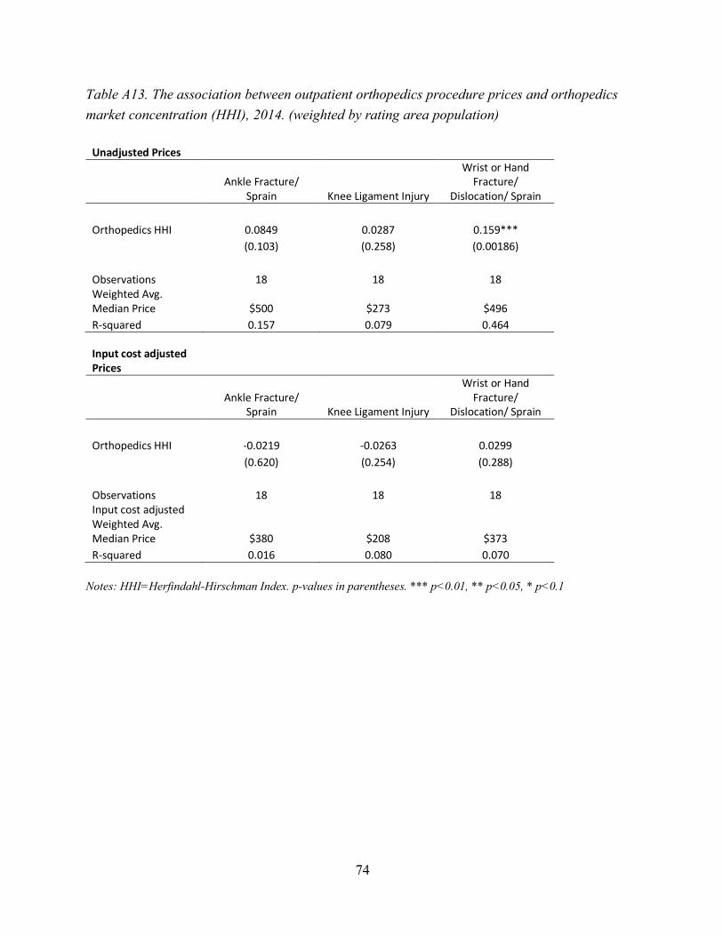
74
Table A13. The association between outpatient orthopedics procedure prices and orthopedics market concentration (HHI), 2014. (weighted by rating area population)
Unadjusted Prices
Ankle Fracture/
Sprain Knee Ligament Injury
Wrist or Hand Fracture/
Dislocation/ Sprain Orthopedics HHI 0.0849 0.0287 0.159***
(0.103) (0.258) (0.00186)
Observations 18 18 18 Weighted Avg. Median Price $500 $273 $496 R-squared 0.157 0.079 0.464
Input cost adjusted Prices
Ankle Fracture/
Sprain Knee Ligament Injury
Wrist or Hand Fracture/
Dislocation/ Sprain Orthopedics HHI -0.0219 -0.0263 0.0299
(0.620) (0.254) (0.288)
Observations 18 18 18 Input cost adjusted Weighted Avg. Median Price $380 $208 $373 R-squared 0.016 0.080 0.070
Notes: HHI=Herfindahl-Hirschman Index. p-values in parentheses. *** p<0.01, ** p<0.05, * p<0.1

75
Table A14. The association between ACA premiums and insurer market concentration (HHI), 2016. (weighted by rating area population)
Unadjusted Monthly Premiums
Benchmark Plan Monthly Premium Insurer HHI 0.0715***
(0.001)
Observations 19 Weighted Avg. Monthly Premium $313 R-squared 0.394
Input cost adjusted Monthly Premiums
Benchmark Plan Monthly Premium Insurer HHI 0.0151
(0.171)
Observations 19 Input cost adjusted Weighted Avg. Monthly Premium $236 R-squared 0.109
Notes: HHI=Herfindahl-Hirschman Index. p-values in parentheses. *** p<0.01, ** p<0.05, * p<0.1

76
Table A15: Rating Area-Level Percent of Physicians Working for Foundations Owned by Hospitals or Health Systems, 2014
Rating Area # Rating Area Name
% PC Own by Hosp
% CAR Own by
Hosp
% HEM/ONC
Own by Hosp
% ORS Own by
Hosp 1 Northern 32 34 52 38 2 North Bay 44 59 47 39 3 Sacramento Valley 64 51 84 57 4 San Francisco 49 58 77 32 5 Contra Costa 51 17 45 28 6 Alameda 40 22 39 30 7 Santa Clara 54 51 86 42 8 San Mateo 54 35 40 56 9 Monterey Coast 24 31 13 16 10 San Joaquin Valley 27 32 33 23 11 Central San Joaquin 32 17 26 17 12 Central Coast 18 4 16 7 13 Eastern 42 22 100 33 15 Los Angeles - East 21 14 43 13 16 Los Angeles - West 28 34 52 31 17 Inland Empire 25 25 39 27 18 Orange 22 15 35 17 19 San Diego 46 47 64 33 Avg. across rating areas 37 32 49 30
Note: PC = primary care physician, CAR = cardiologists, HEM/ONC = hematologists/oncologists, ORS = orthopedists

77
Table A16. The association between primary care procedure prices and the percent of primary care physicians in a rating area who work for foundations owned by a hospital or health system, 2014.
UNADJUSTED PRICES
Cervical Cancer Screening Converted
Colon Cancer Screening -
Sigmoidoscopy Diagnostic
Blood Fecal Test Diverticular
Disease Fibroids
% PC Own by Hosp 1.711** 4.944*** 0.542*** 12.77** 18.57***
(0.0252) (0.000474) (0.00729) (0.0244) (0.00999)
Observations 18 18 18 18 18
Avg. Median Price $96 $246 $19 $1,118 $1,104
R-squared 0.276 0.544 0.371 0.279 0.348
Kidney (Renal)
Failure Sore Throat
Upper Respiratory Infection/ Common
Cold (Adult) Urinary Tract Stone
% PC Own by Hosp 20.08*** 2.183*** 2.178*** 31.06*
(3.98e-07) (0.000470) (0.000195) (0.0825)
Observations 18 18 18 18
Avg. Median Price $1,217 $153 $151 $2,580
R-squared 0.808 0.545 0.591 0.177
INPUT COST ADJUSTED PRICES
Cervical Cancer Screening Converted
Colon Cancer Screening -
Sigmoidoscopy Diagnostic
Blood Fecal Test Diverticular
Disease Fibroids
% PC Own by Hosp 0.929* 2.580*** 0.318*** 5.127 10.40**
(0.0544) (0.000975) (0.00853) (0.117) (0.0245)
Observations 18 18 18 18 18 Input cost adjusted Avg. Median Price $67 $172 $12 $791 $776
R-squared 0.212 0.503 0.360 0.147 0.278
Kidney (Renal)
Failure Sore Throat
Upper Respiratory Infection/ Common
Cold (Adult) Urinary Tract Stone
% PC Own by Hosp 10.22*** 0.989*** 0.988*** 15.75
(9.87e-06) (0.00598) (0.00355) (0.125)
Observations 18 18 18 18 Input cost adjusted Avg. Median Price $860 $109 $107 $1,801
R-squared 0.715 0.385 0.421 0.141 Notes: % PC Own by Hosp = % of primary care physicians who work for a foundation owned by a hospital or health system. Input cost adjusted prices were computed by deflating unadjusted prices by the Medicare Wage Index https://www.cms.gov/Medicare/Medicare-Fee-for-Service-Payment/AcuteInpatientPPS/wageindex.html . p-values in parentheses. *** p<0.01, ** p<0.05, * p<0.1
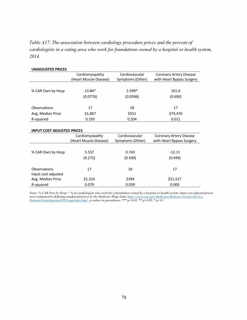
78
Table A17. The association between cardiology procedure prices and the percent of cardiologists in a rating area who work for foundations owned by a hospital or health system, 2014.
UNADJUSTED PRICES
Cardiomyopathy
(Heart Muscle Disease) Cardiovascular
Symptoms (Other) Coronary Artery Disease
with Heart Bypass Surgery % CAR Own by Hosp 13.84* 2.599* 161.6
(0.0776) (0.0596) (0.690)
Observations 17 18 17 Avg. Median Price $1,867 $551 $74,476 R-squared 0.193 0.204 0.011
INPUT COST ADJUSTED PRICES
Cardiomyopathy
(Heart Muscle Disease) Cardiovascular
Symptoms (Other) Coronary Artery Disease
with Heart Bypass Surgery % CAR Own by Hosp 5.537 0.743 -12.11
(0.275) (0.430) (0.949)
Observations 17 18 17 Input cost adjusted Avg. Median Price $1,324 $394 $51,517 R-squared 0.079 0.039 0.000
Notes: % CAR Own by Hosp = % of cardiologists who work for a foundation owned by a hospital or health system. Input cost adjusted prices were computed by deflating unadjusted prices by the Medicare Wage Index https://www.cms.gov/Medicare/Medicare-Fee-for-Service-Payment/AcuteInpatientPPS/wageindex.html . p-values in parentheses. *** p<0.01, ** p<0.05, * p<0.1

79
Table A18. The association between hematology/oncology procedure prices and the percent of hematologists/oncologists in a rating area who work for foundations owned by a hospital or health system, 2014.
UNADJUSTED PRICES
Breast Cancer
Lung, Bronchi, or Mediastinum
Cancer Prostate Cancer % HEM/ONC Own by Hosp 21.32*** 345.9* 20.69*
(0.00633) (0.0732) (0.0981)
Observations 18 13 17 Avg. Median Price $4,686 $38,299 $4,957 R-squared 0.381 0.263 0.172
INPUT COST ADJUSTED PRICES
Breast Cancer
Lung, Bronchi, or Mediastinum
Cancer Prostate Cancer % HEM/ONC Own by Hosp 15.31*** 179.9* 16.85*
(0.000419) (0.0731) (0.0869)
Observations 18 13 17 Input cost adjusted Avg. Median Price $3,340 $26,912 $3,584 R-squared 0.551 0.263 0.183
Notes: % HEM/ONC Own by Hosp = % of hematologists/oncologists who work for a foundation owned by a hospital or health system. Input cost adjusted prices were computed by deflating unadjusted prices by the Medicare Wage Index https://www.cms.gov/Medicare/Medicare-Fee-for-Service-Payment/AcuteInpatientPPS/wageindex.html . p-values in parentheses. *** p<0.01, ** p<0.05, * p<0.1

80
Table A19. The association between orthopedics procedure prices and the percent of orthopedists in a rating area who work for foundations owned by a hospital or health system, 2014.
UNADJUSTED PRICES
Ankle Fracture/
Sprain Knee Ligament Injury
Wrist or Hand Fracture/
Dislocation/ Sprain % ORS Own by Hosp 2.862 1.980** 3.407
(0.207) (0.0113) (0.104)
Observations 18 18 18 Avg. Median Price $537 $279 $549 R-squared 0.097 0.339 0.156
INPUT COST ADJUSTED PRICES
Ankle Fracture/
Sprain Knee Ligament Injury
Wrist or Hand Fracture/
Dislocation/ Sprain % ORS Own by Hosp 0.817 0.671 1.158
(0.670) (0.381) (0.444)
Observations 18 18 18 Input cost adjusted Avg. Median Price $386 $201 $392 R-squared 0.012 0.048 0.037
Notes: % ORS Own by Hosp = % of orthopedists who work for a foundation owned by a hospital or health system. Input cost adjusted prices were computed by deflating unadjusted prices by the Medicare Wage Index https://www.cms.gov/Medicare/Medicare-Fee-for-Service-Payment/AcuteInpatientPPS/wageindex.html . p-values in parentheses. *** p<0.01, ** p<0.05, * p<0.1

81
Table A20. The association between primary care procedure prices and the percent of primary care physicians in a rating area who work for foundations owned by a hospital or health system, 2014 (weighted by rating area population)
UNADJUSTED PRICES
Cervical Cancer Screening Converted
Colon Cancer Screening -
Sigmoidoscopy Diagnostic Blood
Fecal Test Diverticular
Disease Fibroids
% PC Own by Hosp 2.005*** 4.878*** 0.413** 11.95*** 22.64***
(0.00389) (6.45e-05) (0.0143) (0.00617) (0.00207)
Observations 18 18 18 18 18
Weighted Avg. Median Price $90 $229 $15 $1,032 $955 R-squared 0.415 0.642 0.320 0.383 0.457
Kidney (Renal) Failure Sore Throat
Upper Respiratory Infection/ Common
Cold (Adult) Urinary Tract Stone
% PC Own by Hosp 20.70*** 2.031*** 2.020*** 47.86***
(1.00e-08) (2.89e-05) (1.16e-05) (0.000835)
Observations 18 18 18 18
Weighted Avg. Median Price $1,132 $147 $146 $2,372 R-squared 0.878 0.675 0.709 0.512
INPUT COST ADJUSTED PRICES
Cervical Cancer Screening Converted
Colon Cancer Screening -
Sigmoidoscopy Diagnostic Blood
Fecal Test Diverticular
Disease Fibroids
% PC Own by Hosp 1.126** 2.500*** 0.228** 4.212* 13.20***
(0.0194) (0.000233) (0.0231) (0.0892) (0.00486)
Observations 18 18 18 18 18 Input cost adjusted Weighted Avg. Median Price $67 $169 $11 $775 $704 R-squared 0.297 0.582 0.283 0.170 0.400
Kidney (Renal) Failure Sore Throat
Upper Respiratory Infection/ Common
Cold (Adult) Urinary Tract Stone
% PC Own by Hosp 10.36*** 0.840*** 0.569** 26.43***
(3.04e-05) (0.00539) (0.0176) (0.00546)
Observations 18 18 18 18 Input cost adjusted Weighted Avg. Median Price $848 $110 $110 $1,764 R-squared 0.673 0.393 0.304 0.392
Notes: % PC Own by Hosp = % of primary care physicians who work for a foundation owned by a hospital or health system. Input cost adjusted prices were computed by deflating unadjusted prices by the Medicare Wage Index https://www.cms.gov/Medicare/Medicare-Fee-for-Service-Payment/AcuteInpatientPPS/wageindex.html . Regressions are weighted by rating area population. p-values in parentheses. *** p<0.01, ** p<0.05, * p<0.1
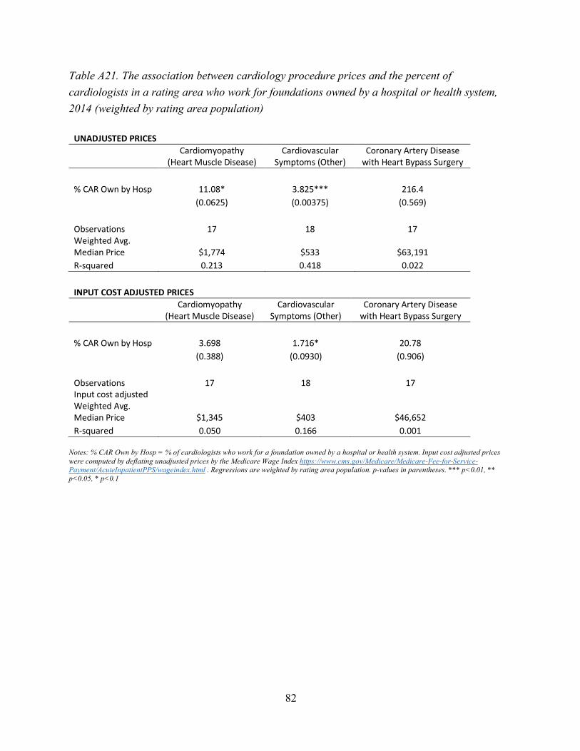
82
Table A21. The association between cardiology procedure prices and the percent of cardiologists in a rating area who work for foundations owned by a hospital or health system, 2014 (weighted by rating area population)
UNADJUSTED PRICES
Cardiomyopathy
(Heart Muscle Disease) Cardiovascular
Symptoms (Other) Coronary Artery Disease
with Heart Bypass Surgery % CAR Own by Hosp 11.08* 3.825*** 216.4
(0.0625) (0.00375) (0.569)
Observations 17 18 17 Weighted Avg. Median Price $1,774 $533 $63,191 R-squared 0.213 0.418 0.022
INPUT COST ADJUSTED PRICES
Cardiomyopathy
(Heart Muscle Disease) Cardiovascular
Symptoms (Other) Coronary Artery Disease
with Heart Bypass Surgery % CAR Own by Hosp 3.698 1.716* 20.78
(0.388) (0.0930) (0.906)
Observations 17 18 17 Input cost adjusted Weighted Avg. Median Price $1,345 $403 $46,652 R-squared 0.050 0.166 0.001
Notes: % CAR Own by Hosp = % of cardiologists who work for a foundation owned by a hospital or health system. Input cost adjusted prices were computed by deflating unadjusted prices by the Medicare Wage Index https://www.cms.gov/Medicare/Medicare-Fee-for-Service-Payment/AcuteInpatientPPS/wageindex.html . Regressions are weighted by rating area population. p-values in parentheses. *** p<0.01, ** p<0.05, * p<0.1

83
Table A22. The association between hematology/oncology procedure prices and the percent of hematologists/oncologists in a rating area who work for foundations owned by a hospital or health system, 2014 (weighted by rating area population)
UNADJUSTED PRICES
Breast Cancer
Lung, Bronchi, or Mediastinum
Cancer Prostate Cancer % HEM/ONC Own by Hosp 21.69** 367.6* 4.928
(0.0116) (0.0771) (0.722)
Observations 18 13 17 Weighted Avg. Median Price $4,461 $32,759 $4,594 R-squared 0.337 0.257 0.009
INPUT COST ADJUSTED PRICES
Breast Cancer
Lung, Bronchi, or Mediastinum
Cancer Prostate Cancer % HEM/ONC Own by Hosp 10.29** 192.9* -2.520
(0.0360) (0.0949) (0.822)
Observations 18 13 17 Input cost adjusted Weighted Avg. Median Price $3,369 $24,449 $3,504 R-squared 0.247 0.233 0.003
Notes: % HEM/ONC Own by Hosp = % of hematologists/oncologists who work for a foundation owned by a hospital or health system. Input cost adjusted prices were computed by deflating unadjusted prices by the Medicare Wage Index https://www.cms.gov/Medicare/Medicare-Fee-for-Service-Payment/AcuteInpatientPPS/wageindex.html . Regressions are weighted by rating area population. p-values in parentheses. *** p<0.01, ** p<0.05, * p<0.1

84
Table A23. The association between orthopedics procedure prices and the percent of orthopedists in a rating area who work for foundations owned by a hospital or health system, 2014 (weighted by rating area population)
UNADJUSTED PRICES
Ankle Fracture/
Sprain Knee Ligament Injury
Wrist or Hand Fracture/
Dislocation/ Sprain % ORS Own by Hosp 2.439 1.712** 3.178*
(0.113) (0.0135) (0.0535)
Observations 18 18 18 Weighted Avg. Median Price $500 $273 $496 R-squared 0.149 0.325 0.214
INPUT COST ADJUSTED PRICES
Ankle Fracture/
Sprain Knee Ligament Injury
Wrist or Hand Fracture/
Dislocation/ Sprain % ORS Own by Hosp 0.308 0.373 0.777
(0.814) (0.590) (0.350)
Observations 18 18 18 Input cost adjusted Weighted Avg. Median Price $380 $208 $373 R-squared 0.004 0.019 0.055
Notes: % ORS Own by Hosp = % of orthopedists who work for a foundation owned by a hospital or health system. Input cost adjusted prices were computed by deflating unadjusted prices by the Medicare Wage Index https://www.cms.gov/Medicare/Medicare-Fee-for-Service-Payment/AcuteInpatientPPS/wageindex.html . Regressions are weighted by rating area population. p-values in parentheses. *** p<0.01, ** p<0.05, * p<0.1

85
Table A24. Individual Procedure Prices (2014) and ACA Premiums (2016) by HHI Level
HHI < 1,500 HHI ≥ 1,500 % Difference
Avg. Inpatient Procedure Price $139,909 $250,203 79%
# of rating areas (Hospital HHI) 6 12
Heart Attack (Acute Myocardial Infarction) $19,210 $21,681 13% Partial Hip Replacement Revision $32,086 44,200 38%
Premature Baby (Extremely Low Weight) $368,431 $684,728 86%
Avg. Outpatient Primary Care Procedure Price $665 $898 35%
# of rating areas (Primary Care HHI***) 12 6
Cervical Cancer Screening Converted $88 $110 25% Colon Cancer Screening – Sigmoidoscopy $224 $290 29%
Diagnostic Blood Fecal Test $15 $27 80%
Diverticular Disease $967 $1,419 47% Fibroids $918 $1,475 61%
Kidney (Renal) Failure $1,106 $1,438 30%
Sore Throat $139 $183 32% Upper Respiratory Infection/Common Cold (Adult) $137 $180 31%
Urinary Tract Stone $2,388 $2,964 24%
Avg. Outpatient Hematology/Oncology Procedure Price $13,762 $20,819 51%
# of rating areas (Hematology/Oncology HHI) 11 7
Breast Cancer $4,255 $5,362 26% Lung, Bronchi, or Mediastinum Cancer $32,466 $51,421 58%
Prostate Cancer $4,564 $5,675 24%
Avg. Outpatient Orthopedist Procedure Price $439 $715 63%
# of rating areas (Orthopedics HHI) 17 1
Ankle Fracture/Sprain $515 $911 77% Knee Ligament Injury $272 $387 42%
Wrist or Hand Fracture / Dislocation / Sprain $531 $849 60%
HHI < 2,500 HHI ≥ 2,500 % Difference
Avg. ACA Benchmark Plan Monthly Premium $318 $363 14%
# of rating areas 9 10 Notes: The average reported above is a straight average across the procedures within each category. Cardiology prices are not reported as no rating areas had a cardiology HHI below 1,500 (see Table A1 in the appendix). The premiums listed in Table A2 were used for the analysis of Avg. ACA Benchmark Plan Monthly Premiums. *** Primary Care HHI was calculated at the primary care service area (PCSA)-level and then weighted up to the rating area-level (see Goodman et al. (2003) for details on PCSAs). All other HHIs were calculated directly at the rating area-level.

86
Table A25. Input Cost Adjusted Individual Procedure Prices (2014) and ACA Premiums (2016) by HHI Level
HHI < 1,500 HHI ≥ 1,500 % Difference
Input Cost Adjusted Avg. Inpatient Procedure Price $108,483 $165,119 52%
# of rating areas (Hospital HHI) 6 12
Heart Attack (Acute Myocardial Infarction) $14,933 $15,334 3% Partial Hip Replacement Revision $24,974 $30,202 21%
Premature Baby (Extremely Low Weight) $285,543 $449,820 58%
Input Cost Adjusted Avg. Outpatient Primary Care Procedure Price $472 $622 32%
# of rating areas (Primary Care HHI***) 12 6
Cervical Cancer Screening Converted $61 $78 28% Colon Cancer Screening – Sigmoidoscopy $159 $198 25%
Diagnostic Blood Fecal Test $10 $18 80%
Diverticular Disease $704 $965 37% Fibroids $656 $1,017 55%
Kidney (Renal) Failure $794 $993 25%
Sore Throat $100 $126 26% Upper Respiratory Infection/Common Cold (Adult) $99 $124 25%
Urinary Tract Stone $1,662 $2,078 25%
Input Cost Adjusted Avg. Outpatient Hematology/Oncology Procedure Price $10,370 $13,269 28%
# of rating areas (Hematology/Oncology HHI) 11 7
Breast Cancer $3,198 $3,562 11% Lung, Bronchi, or Mediastinum Cancer $24,470 $32,404 32%
Prostate Cancer $3,442 $3,842 12% Input Cost Adjusted Avg. Outpatient Orthopedist Procedure Price $311 $577 85%
# of rating areas (Orthopedics HHI) 17 1
Ankle Fracture/Sprain $365 $735 101% Knee Ligament Injury $194 $312 61%
Wrist or Hand Fracture / Dislocation / Sprain $375 $685 83%
HHI < 2,500 HHI ≥ 2,500 % Difference
Avg. ACA Benchmark Plan Monthly Premium $233 $256 10%
# of rating areas 9 10 Notes: The average reported above is a straight average across the procedures within each category. Cardiology prices are not reported as no rating areas had a cardiology HHI below 1,500 (see Table A1 in the appendix). *** Primary Care HHI was calculated at the primary care service area (PCSA)-level and then weighted up to the rating area-level (see Goodman et al. (2003) for details on PCSAs). All other HHIs were calculated directly at the rating area-level.

87
Table A26. Northern California vs. Southern California Individual Procedure Prices (2014) and ACA Premiums (2016)
South North % Difference Avg. Inpatient Procedure Price $131,586 $223,278 70% Avg. Hospital HHI 1,047 2,202 110% Heart Attack (Acute Myocardial Infarction) $19,371 $21,408 11% Partial Hip Replacement Revision $32,741 $43,017 31% Premature Baby (Extremely Low Weight) $342,646 $605,408 77% Avg. Outpatient Primary Care Procedure Price $588 $802 36% Avg. Primary Care HHI*** 996 1,420 43% Cervical Cancer Screening Converted $83 $100 20% Colon Cancer Screening – Sigmoidoscopy $187 $268 43% Diagnostic Blood Fecal Test $9 $22 144% Diverticular Disease $897 $1,203 34% Fibroids $700 $1,259 80% Kidney (Renal) Failure $1,020 $1,292 27% Sore Throat $136 $160 18% Upper Respiratory Infection/Common Cold (Adult) $134 $158 18% Urinary Tract Stone $2,125 $2,755 30% Avg. Outpatient Cardiology Procedure Price $17,653 $28,955 64% Avg. Cardiology HHI 352 857 143% Cardiomyopathy (Heart Muscle Disease) $1,735 $1,922 11% Cardiovascular Symptoms (Other) $503 $570 13% Coronary Artery Disease with Heart Bypass Surgery $50,720 $84,374 66% Avg. Outpatient Hematology/Oncology Procedure Price $11,905 $18,445 55% Avg. Hematology/Oncology HHI 823 2,257 174% Breast Cancer $4,185 $4,878 17% Lung, Bronchi, or Mediastinum Cancer $27,187 $45,243 66% Prostate Cancer $4,343 $5,213 20% Avg. Outpatient Orthopedist Procedure Price $396 $477 20% Avg. Orthopedist HHI 263 851 224% Ankle Fracture/Sprain $474 $561 18% Knee Ligament Injury $270 $282 4% Wrist or Hand Fracture / Dislocation / Sprain $445 $589 32% Avg. ACA Benchmark Plan Monthly Premium $271 $367 35% Avg. Insurer HHI 1,919 2,700 41%
Notes: The average reported above is a straight average across the procedures within each category. Cardiology prices are not reported as no rating areas had a cardiology HHI below 1,500 (see Table A1 in the appendix). The premiums listed in Table A2 were used for the analysis of Avg. ACA Benchmark Plan Monthly Premiums. *** Primary Care HHI was calculated at the primary care service area (PCSA)-level and then weighted up to the rating area-level (see Goodman et al. (2003) for details on PCSAs). All other HHIs were calculated directly at the rating area-level.
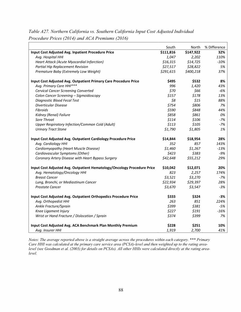
88
Table A27. Northern California vs. Southern California Input Cost Adjusted Individual Procedure Prices (2014) and ACA Premiums (2016)
South North % Difference Input Cost Adjusted Avg. Inpatient Procedure Price $111,816 $147,922 32% Avg. Hospital HHI 1,047 2,202 110% Heart Attack (Acute Myocardial Infarction) $16,315 $14,725 -10% Partial Hip Replacement Revision $27,517 $28,822 5% Premature Baby (Extremely Low Weight) $291,615 $400,218 37% Input Cost Adjusted Avg. Outpatient Primary Care Procedure Price $495 $532 8% Avg. Primary Care HHI*** 996 1,420 43% Cervical Cancer Screening Converted $70 $66 -6% Colon Cancer Screening – Sigmoidoscopy $157 $178 13% Diagnostic Blood Fecal Test $8 $15 88% Diverticular Disease $754 $806 7% Fibroids $590 $848 44% Kidney (Renal) Failure $858 $861 0% Sore Throat $114 $106 -7% Upper Respiratory Infection/Common Cold (Adult) $113 $105 -7% Urinary Tract Stone $1,790 $1,805 1% Input Cost Adjusted Avg. Outpatient Cardiology Procedure Price $14,844 $18,954 28% Avg. Cardiology HHI 352 857 143% Cardiomyopathy (Heart Muscle Disease) $1,460 $1,267 -13% Cardiovascular Symptoms (Other) $423 $383 -9% Coronary Artery Disease with Heart Bypass Surgery $42,648 $55,212 29% Input Cost Adjusted Avg. Outpatient Hematology/Oncology Procedure Price $10,042 $12,071 20% Avg. Hematology/Oncology HHI 823 2,257 174% Breast Cancer $3,521 $3,270 -7% Lung, Bronchi, or Mediastinum Cancer $22,934 $29,397 28% Prostate Cancer $3,670 $3,547 -3% Input Cost Adjusted Avg. Outpatient Orthopedics Procedure Price $333 $324 -3% Avg. Orthopedist HHI 263 851 224% Ankle Fracture/Sprain $399 $381 -5% Knee Ligament Injury $227 $191 -16% Wrist or Hand Fracture / Dislocation / Sprain $374 $399 7% Input Cost Adjusted Avg. ACA Benchmark Plan Monthly Premium $228 $251 10% Avg. Insurer HHI 1,919 2,700 41%
Notes: The average reported above is a straight average across the procedures within each category. *** Primary Care HHI was calculated at the primary care service area (PCSA)-level and then weighted up to the rating area-level (see Goodman et al. (2003) for details on PCSAs). All other HHIs were calculated directly at the rating area-level.