Embed Size (px)
Citation preview
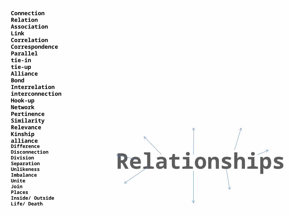
ConnectionRelationAssociationLinkCorrelationCorrespondenceParalleltie-intie-upAllianceBondInterrelationinterconnectionHook-upNetworkPertinenceSimilarityRelevanceKinshipallianceDifferenceDisconnectionDivisionSeparationUnlikenessImbalanceUniteJoinPlacesInside/ OutsideLife/ Death
Relationships
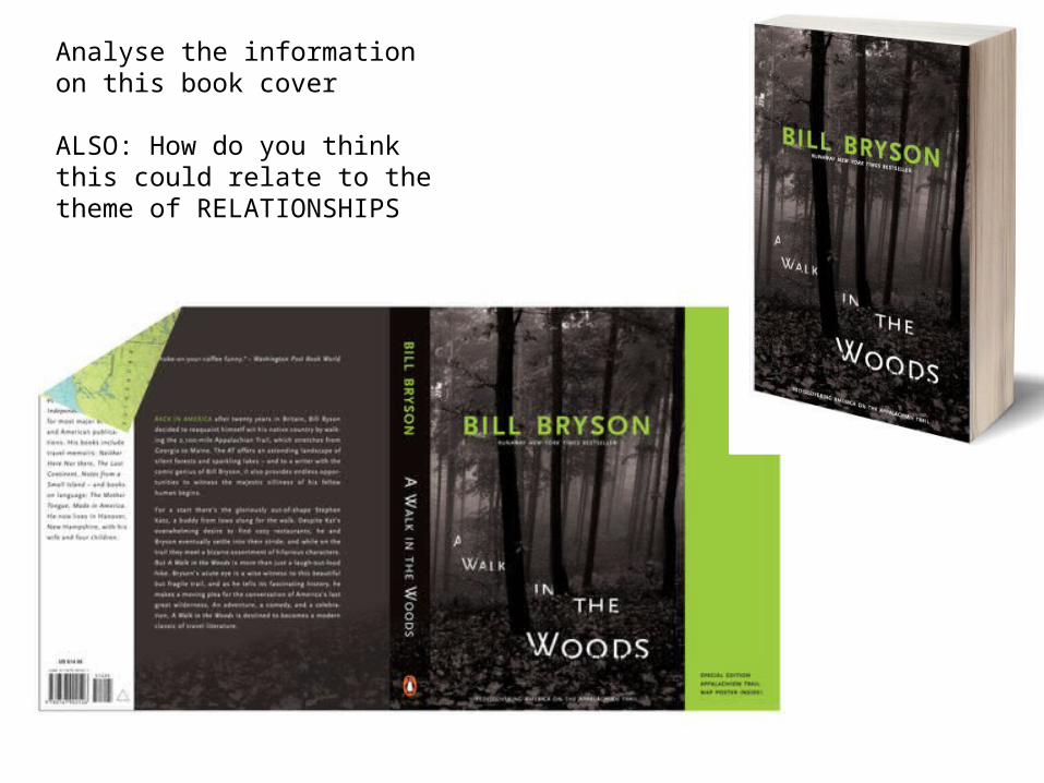
Analyse the information on this book cover
ALSO: How do you think this could relate to the theme of RELATIONSHIPS

Analyse the information on this book cover
ALSO: Think about how this could relate to the theme RELATIONSHIPS
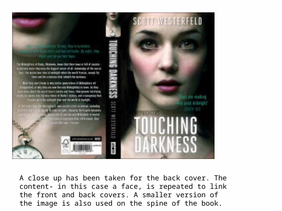
A close up has been taken for the back cover. The content- in this case a face, is repeated to link the front and back covers. A smaller version of the image is also used on the spine of the book.
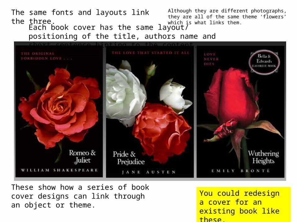
These show how a series of book cover designs can link through an object or theme. You could redesign a cover
for an existing book like these.
The same fonts and layouts link the three. Although they are different photographs, they are all of the same theme ‘flowers’ which is what links them.
Each book cover has the same layout/ positioning of the title, authors name and short sentence hinting to the content.
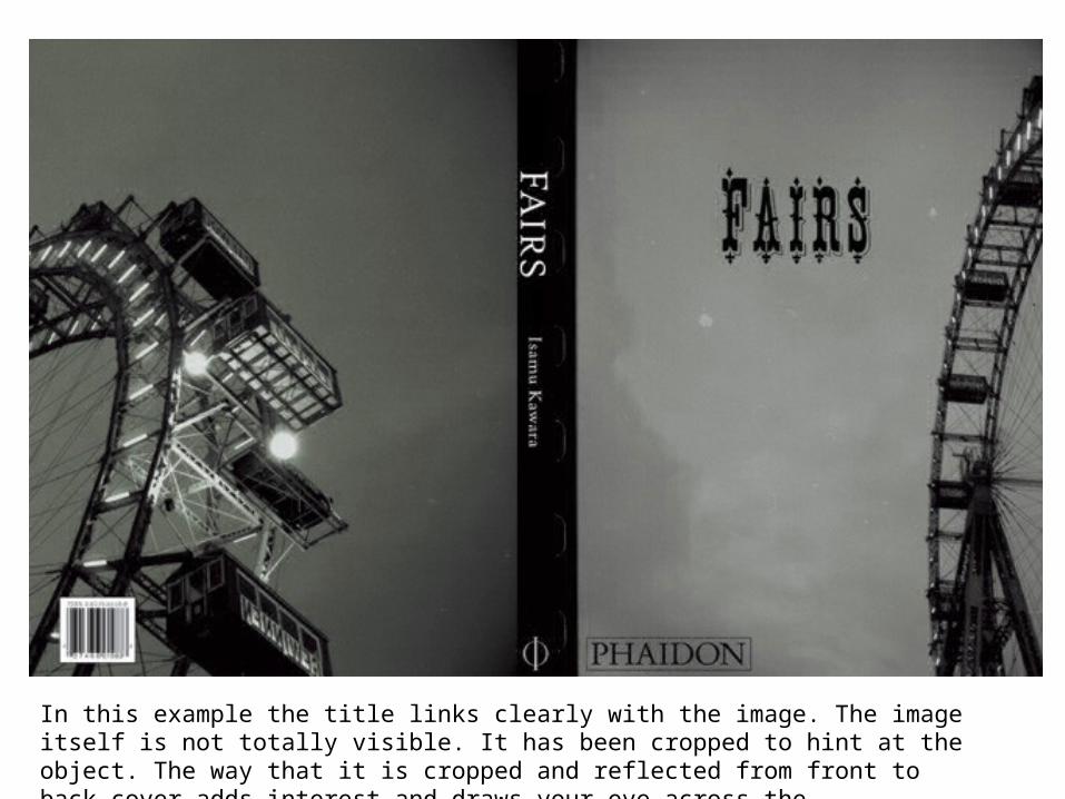
In this example the title links clearly with the image. The image itself is not totally visible. It has been cropped to hint at the object. The way that it is cropped and reflected from front to back cover adds interest and draws your eye across the composition.
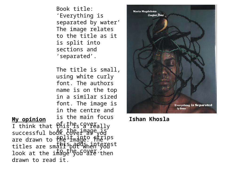
Book title: ‘Everything is separated by water’The image relates to the title as it is split into sections and ‘separated’.
The title is small, using white curly font. The authors name is on the top in a similar sized font. The image is in the centre and is the main focus of the cover. As the image is split into strips this adds interest to the cover.
Ishan KhoslaMy opinionI think that this is a really successful book cover as you are drawn to the image. The titles are small but when you look at the image you are then drawn to read it.
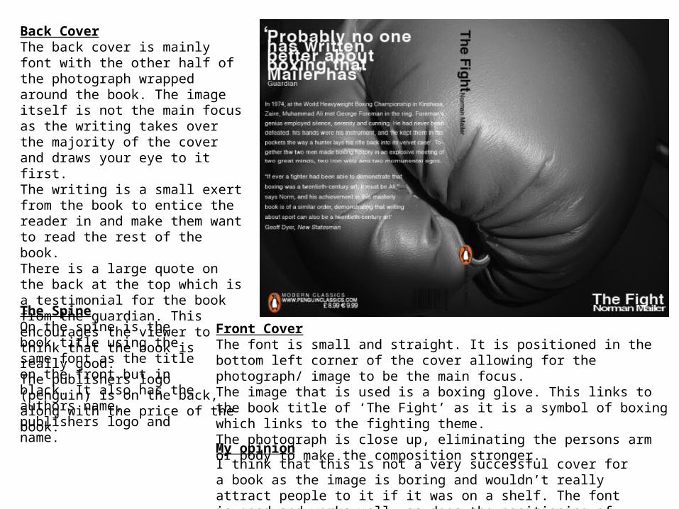
Front CoverThe font is small and straight. It is positioned in the bottom left corner of the cover allowing for the photograph/ image to be the main focus. The image that is used is a boxing glove. This links to the book title of ‘The Fight’ as it is a symbol of boxing which links to the fighting theme. The photograph is close up, eliminating the persons arm or body to make the composition stronger.
Back CoverThe back cover is mainly font with the other half of the photograph wrapped around the book. The image itself is not the main focus as the writing takes over the majority of the cover and draws your eye to it first. The writing is a small exert from the book to entice the reader in and make them want to read the rest of the book. There is a large quote on the back at the top which is a testimonial for the book from the guardian. This encourages the viewer to think that the book is really good. The publishers logo (penguin) is on the back, along with the price of the book.
The SpineOn the spine is the book title using the same font as the title on the front but in black. It also has the authors name, publishers logo and name.
My opinionI think that this is not a very successful cover for a book as the image is boring and wouldn’t really attract people to it if it was on a shelf. The font is good and works well, as does the positioning of the titles and authors name.

What other images could you use on this book cover to illustrate the title ‘The Fight’?• • • • • •
Do you think that the image works when the book is folded. Why/ Why not?
Sketch out TWO alternative book cover designs for the ‘Fight’ title.

Front Cover
Back Cover
My opinion
The Spine

Front Cover
Back Cover
My opinion
The Spine
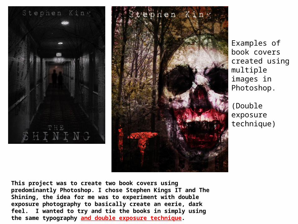
This project was to create two book covers using predominantly Photoshop. I chose Stephen Kings IT and The Shining, the idea for me was to experiment with double exposure photography to basically create an eerie, dark feel. I wanted to try and tie the books in simply using the same typography and double exposure technique.
Examples of book covers created using multiple images in Photoshop.
(Double exposure technique)
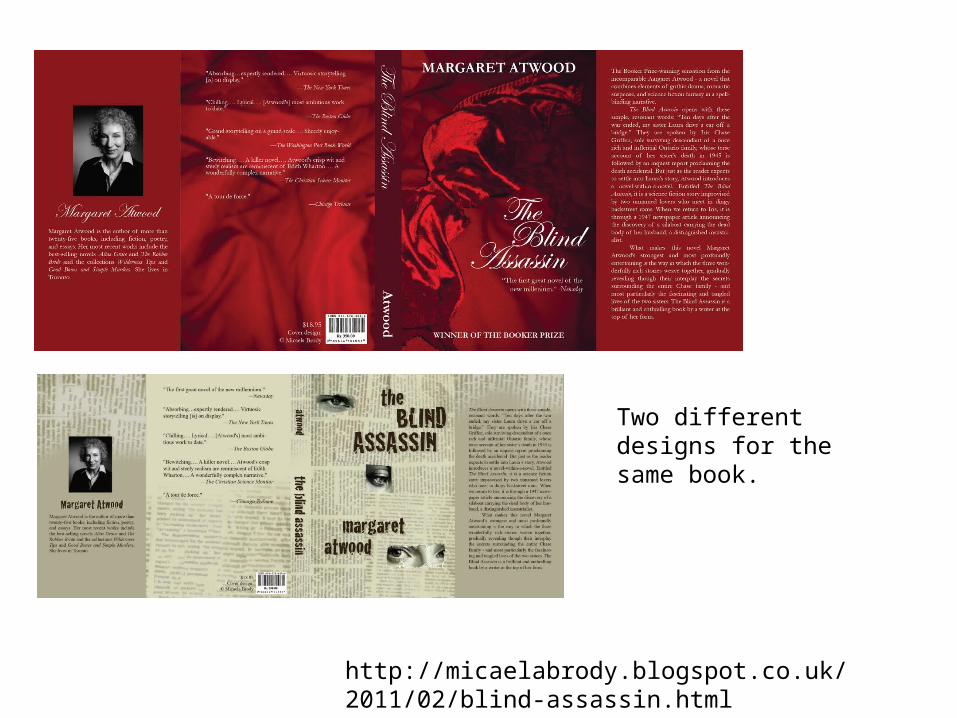
http://micaelabrody.blogspot.co.uk/2011/02/blind-assassin.html
Two different designs for the same book.
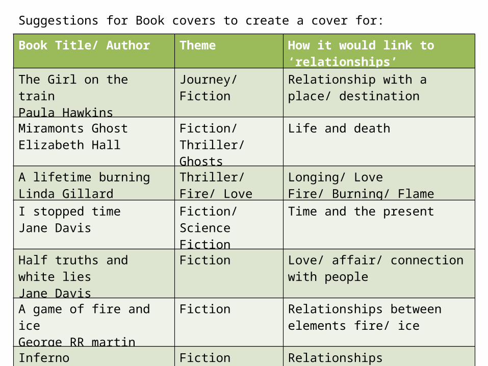
Suggestions for Book covers to create a cover for:
Book Title/ Author Theme How it would link to ‘relationships’
The Girl on the trainPaula Hawkins
Journey/ Fiction Relationship with a place/ destination
Miramonts GhostElizabeth Hall
Fiction/ Thriller/ Ghosts
Life and death
A lifetime burningLinda Gillard
Thriller/ Fire/ Love Longing/ LoveFire/ Burning/ Flame
I stopped timeJane Davis
Fiction/ Science Fiction
Time and the present
Half truths and white liesJane Davis
Fiction Love/ affair/ connection with people
A game of fire and iceGeorge RR martin
Fiction Relationships between elements fire/ ice
InfernoDan Brown
Fiction Relationships Fire/ burning/ flame
Flesh and BloodPatricia Cornwell
Fiction Family/ Kin bonds with people
Bones of the LostKathy Reichs
Fiction/ Thriller Inside/ Outside- the body/ bones

Book/ Author Theme Link with relationships
Possible imagery/ photography idea
Use the internet to find possible book titles that you could use to create a cover design for. Think about links to your theme of ‘Relationships’ and what type of photographs you could take for this theme.


These covers were designed to bring realism to the viewer. Each cover was designed to be interactive with the story(ex. wrapped in duct tape, burned, or stabbed), depicting events to come inside. Lighting was a crucial factor in the photography.