Embed Size (px)
Citation preview
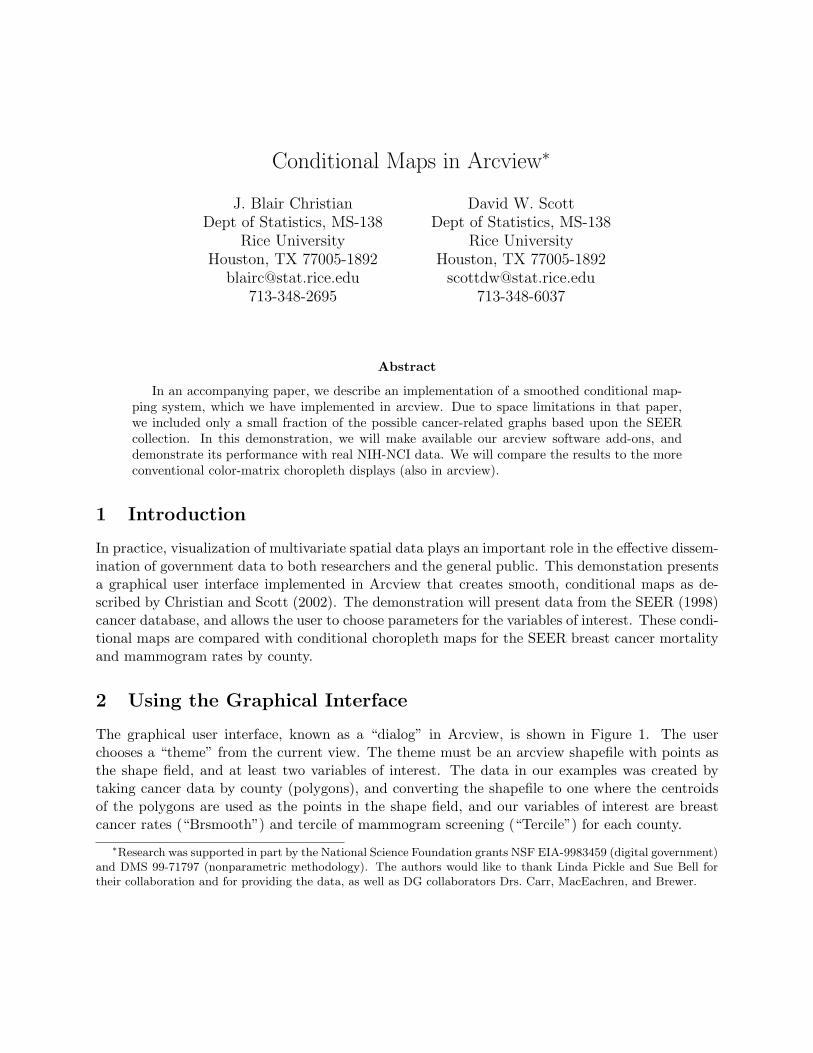
Conditional Maps in Arcview∗
J. Blair ChristianDept of Statistics, MS-138
Rice UniversityHouston, TX 77005-1892
David W. ScottDept of Statistics, MS-138
Rice UniversityHouston, TX 77005-1892
Abstract
In an accompanying paper, we describe an implementation of a smoothed conditional map-ping system, which we have implemented in arcview. Due to space limitations in that paper,we included only a small fraction of the possible cancer-related graphs based upon the SEERcollection. In this demonstration, we will make available our arcview software add-ons, anddemonstrate its performance with real NIH-NCI data. We will compare the results to the moreconventional color-matrix choropleth displays (also in arcview).
1 Introduction
In practice, visualization of multivariate spatial data plays an important role in the effective dissem-ination of government data to both researchers and the general public. This demonstation presentsa graphical user interface implemented in Arcview that creates smooth, conditional maps as de-scribed by Christian and Scott (2002). The demonstration will present data from the SEER (1998)cancer database, and allows the user to choose parameters for the variables of interest. These condi-tional maps are compared with conditional choropleth maps for the SEER breast cancer mortalityand mammogram rates by county.
2 Using the Graphical Interface
The graphical user interface, known as a “dialog” in Arcview, is shown in Figure 1. The userchooses a “theme” from the current view. The theme must be an arcview shapefile with points asthe shape field, and at least two variables of interest. The data in our examples was created bytaking cancer data by county (polygons), and converting the shapefile to one where the centroidsof the polygons are used as the points in the shape field, and our variables of interest are breastcancer rates (“Brsmooth”) and tercile of mammogram screening (“Tercile”) for each county.
∗Research was supported in part by the National Science Foundation grants NSF EIA-9983459 (digital government)and DMS 99-71797 (nonparametric methodology). The authors would like to thank Linda Pickle and Sue Bell fortheir collaboration and for providing the data, as well as DG collaborators Drs. Carr, MacEachren, and Brewer.

Figure 1: The Arcview dialog window that controls the smooth conditional maps.
After choosing a theme, the user then chooses the variable of interest in the “Select Response”box, which is cancer mortality in our case. Next the user chooses the variable that she wishes tocondition on; this variable is the cancer screening rate in our example.
Finally, the user chooses the bin widths and smoothing parameters. For data over the entireUnited States, spatially square bins seem to produce more appealing pictures, so typically thehorizontal smoothing parameter is chosen to be twice the size of the vertical smoothing parameterin order to preserve this geographically square bin shape. Smoothing parameters are also typicallychosen to be 10% or less of the number of horizontal bins.
3 Examples
We briefly examine the spatial distribution of breast cancer rates as a function of the percentage ofadults having a mammogram during a two year period; see Pickle and Su (2002) and SEER (1998).In Figure 2, we begin by displaying the original data, choropleth maps of both the breast cancerrates and the mammogram rates. Below each of those are smoothed maps of the rates.
Next in Figure 3, we present the conditional maps, a 3×3 conditional choropleth map and threeslices from an ASH conditional regression map. Clearly, the fine detail in the conditional regressionmaps is more easily comprehended.
Please note that the files needed to make conditional maps in Arcview are available via ftp atftp://ftp.stat.rice.edu/pub/blairc/GIS. Also note that the 9-class sequential legend was created us-ing Brewer’s (1999) recommendations via the Color Brewer, available at http://www.colorbrewer.org.

Figure 2: Breast Cancer Rates (left), and Mammogram rates (right).
References
Brewer, Cynthia A. (1999), “Color Use Guidelines for Data Representation,” Proceedings of theSection on Statistical Graphics, American Statistical Association, Baltimore, pp. 55-60.Pickle, L. W. and Su (2002), “Within-state geographic patterns of health insurance coverage andhealth risk factors in the United States,” Am J Prev Med 22(2):75-83.Scott, D.W. and Christian, J.B. (2002), “A Theory and Implementation of Smooth ConditionalMaps,” Proceedings of the Second National Conference on Digital Government, E Hovy, Ed., DigitalGovernment Research Center, Los Angeles.SEER (Surveillance, Epidemiology, and End Results) Program Public-Use Data (1973-1998), Na-tional Cancer Institute, DCCPS, Surveillance Research Program.
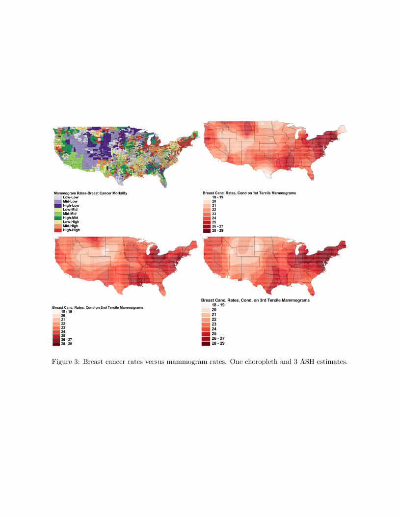
Figure 3: Breast cancer rates versus mammogram rates. One choropleth and 3 ASH estimates.