Embed Size (px)
Citation preview

ED 044 044
DOCUMENT RESUME
24 EM 008 538
AUTHOR Chen, Yih-WenTITLE Visual Discrimination of Color Normals and Color
Deficients. Final Report.INSTITUTION Indiana Univ., Bloomington. Audio-Visual Center.SPONS AGENCY Office of Education (DHEW), Washington, D.C. Bureau
of Research.BUREAU NO BR-9-E-033PUB DATE Nov 69GRANT OEG-245033-042-010NOTE 73p.; Thesis submitted to the School of Education of
Indiana University
EDRS PRICEDESCRIPTORS
IDENTIFIERS
EDRS Price MF-$0.50 HC-$3.75Chalkboards, *Color Presentation, EducationalResearch, Handicapped Children, Instructional Films,Instructional Materials, *Instructional Media,Learning Difficulties, Media Research, TextbookResearch, Visual Discrimination, *VisuallyHandicapped OrientationAO H R R Pseudiosochromatic, ICI, InternationalCommission on Illumination, *Munsell Hue Circle
ABSTRACTSince visual discrimination is one of the factors
involved in learning from instructional media, the present study wasdesigned (1) tc investigate the effects of hue contrast, illuminantintensity, brightness contrast, and viewing distance on thediscriminaticn accuracy of those who see color normally and those whodo not, and (2) to investigate the extent to which the discriminationaccuracy of color deficients improves, as compared with that of colornormals, as a function of brightness contrast. Color deficiencies oftwo types--deuternopia (green blindness) and protanopia (redblindness)--were represented by six children each in the experiment.With six color normals, they were paid to discriminate theorientation of the gap in chromatic rings presented on chromaticsurrounds. The decrees of hue contrast in Part I of the study were36, 72, 108, 144, and 180 on the Munsell Hue Circle. The illuminantintensities were 25, 50, 75, and 100 footcandles., Viewing distancewas 3 meters. Brightness contrast in Part II of the study had fourvalues between 30 and 80 percent. Illuminant intensity was 50footcandles, and viewing distances were 5, 6, 7, and 8 meters. On theevidence of the study the recommendation is that a brightnesscontrast of 30 percent or more be provided in colored instructionalmaterials. (IMF)

U.S. DEPARTMENT OF HEALTH, EDUCATION & WELFARE
OFFICE OF EDUCATION
THIS DOCUMENT HAS BEEN REPRODUCED EXACTLY AS RECEIVED FROM THE
PERSON OR ORGANIZATION ORIGINATING IT. POINTS OF VIEW OR OPINIONS
STATED DO NOT NECESSARILY REPRESENT OFFICIAL OFFICE OF EDUCATION
POSITION OR POLICY.
VISUAL DISCRIMINATION OF COLOR NORMALS
AND COLOR DEFICIENTS
BY
YIH -WEN CHEN
Submitted in partial fulfillment of the requirementsfor the Doctor of Philosonhy degree
in the Graduate School
0 Indiana UniversityNovember, 1969

FINAL REPORTProject No. 9-E-033
Grant No. 0EG-245033-042-010
7ISUAL DISCRIMINATION OF COLOR NOPMALSAND COLOR DEFICIENTS
Yih-wen Chen, Principal InvestigatorAudiovisual CenterIndiana University
Bloomington, Indiana 47401
November 1969
U.S DEPARTMENT OFHEALTH, EDUCATION, AND WELFARE
Office of EducationBureau of Research

FINAL REPORT
Project No. 9-E-033Grant No 0EG-245033-042-010
VISUAL DISCRIMINATION OF COLOR NORMALSAND COLOR DEFICIENTS
Yih-wen ChenAudiovisual CenterIndiana University
Bloomington, Indiana
November 1969
The research raported herein was performed pursuant to a grant with the°Moe of Education, U.S. Department of Health, Education, and Welfare.Contractors undertaking such projects under Government sponsorship areencouraged to express freely their professional judgment in the conductof the project. Points of view or opinions stated do not, therefore,necessarily represent official Office of Education position or policy.
U.S. DEPARTMENT OFHEALTH, EDUCATION, AND WELFARE
Office of EducationBureau of Research
ACKNOWLEDGMENT
The author is deeply indebted to Dr. Lawson H. Hughes for his
patient guidance and continuous encouragement throughout the course of
this study.
Special thanks are due to Drs. Laurence Brown, Malcolm Fleming
and Sherman Guth for their kind comments on the preparation of this
thesis.
Y.W.C.
iii
TABLE OF CONTENTS
ChapterPage
I. PROBLEM .. .0.0.. . ........ . 1
II. RELATED RESEARCH AND EXPERIMENTAL HYPOTHESES 7
III. METHOD . 0 0 0 00 ....... 0 0 0 16
IV. RESULTS26
V. DISCUSSION AND CONCLUSIONS 52
VI. SUMMARY60
REFERENCES62
iv

LIST OF TABT.P.S
Table Page
1. Applied Voltage and Number of Lamps Used to ObtainRequired Illuminant Intensities, Color Temperature ofthe Illuminants and the Luminance of a Surface Having30 Percent Reflectance 17
2. Visual Angles Subtended by the Surround, the Target and theGap in the Target at Each Viewing Distance 18
3. Visual Acuity, Side of Dominant Eye and Color Defectivenessof Ss 22
4. Analysis of Variance for the Main Effects of Type of ColorVision, Hue Contrast and Illuminant Intensity 26
5. Mean Percentage Correct Responses at Each Amount of HueContrast by Ss Having Each Type of. Color Vision 28
6. Analyses of Trends of the Simple Main Effects of HueContrast for Each Type of Color Vision 30
7. Significant Ranges in the Simple Main Effects of Hue Con-trast for Each Type of Color Vision 31
8. Mean Percentage Correct Responses at Each IlluminantIntensity by Ss Having Each Type of Color Visior 32
9. Analyses of Trends of the Simple Main Effects of IlluminantIntensity for Each Type of Color Vision 35
10. Significant Ranges in the Simple Main Effects of IlluminantIntensity for Each Type of Color Vision 36
11. Analysis of Variance for the Main Effects of Type of ColorVision, Brightness Contrast and Viewing Distance 37
12. Mean Percentage Correct Responses at Each Brightness Con-trast by Ss Having Each Type of Color Vision 39
13. Analyses of Trends of the Main Effects and the Simple MainEffects of Brightness Contrast for Each Type of ColorVision 41
14. Significant Ranges in the Simple Main Effects of BrightnessContrast for Each Type of Color Vision . ....... 43

Table Page
15. Mean Percentage Correct Responses at Each Viewing Distanceby Ss Having Each Type of Color Vision . . 44
16. Analyses of Variance for the Main Effects and the SimpleMain Effects of Viewing Distance for Each Type of ColorVision.. 000Gso,o.oc.occ zso eoty 46
17, Mean Percentage Correct Responses for Each BrightnessContrast at Each Viewing Distance . . .
If 9
18, Analyses of Trends ever the Simple Main Effects of ViewingDistance for Each Brightness Contrast
vi
LIST OF FIGURES
Figure Page
1. Munsell Hue Circle 19
2. Profiles of the Simple Main Effects of Hue Contrast inPart I . 0 0 0 0 ....... 0 0 0 ....... 29
3. Profiles of the Simple Main Effects of Illuminant Intensity 33
4. Profiles of the Main Effects and Simple Main Effects ofBrightness Contrast ............ 40
5. Profiles of the Main Effects and the Simple Main Effects ofViewing Distance 45
6. Profiles of the Simple Main Effects of Viewing Distance forEach Brightness Contrast . c . . 0 0 0 0 000 0 0 0
vii
48

1
CHAPTER I
Problem
Recent years have seen an extensive use of color in instructional
media. More and more instructional films have been made in color,
various coloring methods have been introduced fcrr making transparencies
and color plates have been abundantly used in textbooks.
Further, an emphasis on such factors as aesthetic design and
balanced overall illumination in the classroom has resulted in a pref-
erance for the green chalkboard over the traditional blackboard. Also,
it has been commonly accepted that colored chalks can be used with good
effect to highlight important aspects of the instructional materials
displayed on the chalkboard. However, it seems apparent that people in
using color in instructional situations often assume, with insufficient
empirical evidence, that the use of color in a given case will improve
or at least will not impair learning.
VanderMeer (1952) investigated the comparative effectiveness of
color and black and white instructional films for nearly 600 ninth and
tenth grade high school students. In the five films included in his
experiment, the variable of color was either intrinsic to the learning
of subject matter, or color was used to increase the aesthetic effect
and to highlight important parts of films or both. None of the color
films used resulted in significantly more learning than their black and
white counterparts.
May and Lumsdaine (1958) studied the contribution of color to the
learning of seasonal phenomena by fifth and ninth graders. Two films,
2
a color version and a black and white version printed from this color
version, were used for their experiment. None of the differences between
the amount of learning, which was assessed by multiple-choice items,
resulting from students° viewing the two films reached statistical
significance.
Another approach has been taken by a number of investigators.
They have investigated the effect of the use of color cues on the legi-
bility of printed matter. Results of some of these studies will be
summarized in the Related Research chapter. Unfortunately, this research
has left some important questions unanswered. Firstly, in several of
these studies the variable of brightness contrast was confounded with
the variable of hue contrast. AE a result, if, for example, a particular
target-surround color combination resulted in high legibility, it might
have been due to the contribution of the relatively high brightness con-
trast that happened to exist between the target and the surround rather
than to the contribution of hue contrast.
Secondly, stimulus materials have not always been specified in
ways that make replication of the reported studies possible. For
instance, a color named "red" by one observer could be named "orange"
by another observer. Also, two colors that are easily discriminated
may be called by the same name. In experimental research, it seems
clear that vernacular color names should be replaced with standardized
units such as International Commission on Illuminatinn (ICI) tristimulus
coefficients, wavelength, the Ostwald System or the Munsell. System of
Color Notation.
3
Thirdly, apparently no serious effort has been made to determine
how color should be used so that color deficients may make adequate
visual discrimination when colored materials are involved.
Many instances of learning require that the organism first of all
make accurate visual discriminations of stimuli. Therefore, finding
answers to such questions as to whether color should be used and how it
can most effectively be used presumably will occur through investigating
the discriminability of color stimuli and exploring methods which can be
used to improve their discriminability for all observers including color
deficients.
Visual discrimination of a target is a function of quite a number
of variables, such as light intensity, spectral composition of illumi-
nating light, brightness contrast, hue contrast, saturation contrast,
exposure time, type of target, target size, viewing distance, whether
observation is made binocularly or monocularly, whether the target is
stationary or moving, visual acuity, age and color vision of the
observer. The magnitude of the effect of any one of these variables is
dependent very importantly on the values of the other variables. Con
sequently, strict control of these variables is essential if the func-
tional relations between them and the accuracy of visual discrimination
of a target are to be specified precisely.
Introduction of color in an otherwise achromatic situation, with
brightness contrast and saturation contrast between the target and the
surround held constant, should improve or at least should not impair
visual discrimination for the reason that observers with normal color
vision are provided with an additional basis for discrimination.

4
However, in practice the use of color in instructional media is
apt to involve low brightness contrast between the target and the sur-
round. In other words, a higher brightness contrast is usually present
in the achromatic materials than in chromatic materials simply because
it is easier to build a high brightness contrast in black and white than
it is in color. For example, the Munsell System of Color Notation pro-
vides a brightness contrast range of 1:26 or more in its achromatic value
scale, but this brightness contrast range is reduced to about 1:8 in its
chromatic value scales for relatively well saturated colors. As will be
pointed out in the Related Research chapter, it has been found in several
s'.,.idieS that the brightness contrast between the target and the surround
is more important than the hue contrast in influencing the accuracy of
visual discrimination.
Up to this point the discussion has been focused on observers
with normal color vision. The fact that nearly 8.5 percent of school
children are color deficients of one kind or another (Burnam, Hanes and
Bartleson, 19639 Graham, 1966) also demands a critical evaluation of the
consequences of introducing color on the chalkboard and in other instruc-
tional media.
Rod monochromats9 who cannot discriminate hues at all, and
dichromats9 who can discriminate only two of the three primary hues,
depend greatly on the brightness contrast between the target and the
surround for visual discrimination. Hence, if color is introduced at
the cost of reduced brightness contrast between the target and the
surround, then color deficients will not see as well and, other things
equal, presumably will not learn as well as color normals.

5
Although there is not sufficient evidence to specify with any
precision the circumstances under which the use of color has a positive
effect on learning, the trend seems to be toward more and more extensive
use of color in instructional media. It is evident that additional
studies on how to use color most effectively for instructional purposes
are needed. If color cues can be used effectively to facilitate the
visual discrimination of color normals, then it would not seem advisable
to be content with abolishing the use of color in instructional media
just for the sake of the minority group of color deficients. Rather,
a strenuous effort should be made to find ways in which color can be
used to facilitate the visual discrimination of color normals and color
deficients as well.
The purpose of the present study is to obtain empirical evidence
in a laboratory situation, on the basis of which recommendations can be
made with respect to using color in instructional media for color normals
and partixdlarly for color deficients, such that visual discrimination
of color normals can be facilitated without reducing visual discrimina-
tion of color deficients and vice versa.
The present study is intended to accomplish the followings
1. To measure the effect of hue contrast between the target andthe surround on the discrimination accuracy of color normalsand color deficients. The purpose of this is to investigatethe contribution of hue contrast to the visual discriminationof color normals and to investigate the extent to which colordeficients may be handicapped by the use of chromatic stimuli.
2. To measure the effect of illuminant intensity within themedium photopic range, in which vision is predominantlydependent upon the function of cones9 on the discriminationaccuracy of color normals and color deficients. Illuminantintensity is the amount of light emitted by a source such asa light bulb. The purpose of this is to find out the minimum

6
illuminant intensity which is most effective for visual dis-crimination of chromatic stimuli by color normals and colordeficients.
3. To measure the effect of brightness contrast between chromatictargets and chromatic surrounds on the discrimination accuracyof color normals and color deficients. The purpose of thisis to investigate how brightness contrast in chromatic stimulican be used to increase discrimination accuracy of colornormals and to investigate the extent to which the discrimina-tion accuracy of color deficients imprcires as brightnesscontrast in chromatic stimuli is increased.
4. To measure the effect of viewing distance on the discrimina-tion accuracy of chromatic stimuli of color normals and colordeficients. The purpose of this is to determine whetherchanging the viewing distance affects the discriminationaccuracy of color normals and color deficients to the seamextent.
7
CHAPTER II
Related Research and Experimental Hypotheses
Related Research
Hue Contrast
The three properties of color, namely, hue, brightness and satura-
tion are so closely interrelated that a change in one property usually
causes a simultaneous change in the other two properties. For instance,
when a particular green of 520 nanometers (nm., synonymous with milli-
microns) is shifted to a green of 500 nm., the apparent brightness and
saturation also change unless they are deliberately controlled.
As Walls (1943) pointed out, discriminating an object is a func-
tion of contrasts of hue, brightness and saturation. It will be seen
from some of the descriptions below of prior studies that a difficulty in
interpreting them may arise because of lack of control of one or more of
these variables.
Bishop (1966) investigated resolution visual acuity using colored
bars against an equiluminous white surround and also against a dimmer
black surround. The subject adjusted, with alternating ascending and
descending orders, for the minimum separation of the bars which was
just noticeable. The colored bars seen against a dimmer black surround
resulted in a higher visual acuity. However, a relatively fine visual
acuity was obtained with the colored bars seen against an equiluminous
white surround. This indicates that hue contrast alone is sufficient
for a rather fine visual discrimination.
8
Cavonius and Schumaker (1966) investigated grating visual acuity
as a function of hue contrast. The subject was required to line up the
upper halves with the lower halves of alternating bars which had equal
brightness but different wavelengths. A high grating visual acuity was
obtained when the wavelengths of the alternating bars were very different
from each other. In other words9 hue contrast between the alternating
bars resulted in a fine visual discrimination that was, in fact, as good
as that resulting from a considerably high brightness contrast between
the adjacent bars. Furthermore, once a relatively high grating visual
acuity was obtained by means of a high hue contrast between the equilumi-
nous bars, increasing the brightness contrast did not improve visual
acuity even though there was still room for ivorovement. The writers
therefore concluded that a fine visual acuity can occur via hue contrast
alone and that brightness contrast is not the sole factor and probably
not even a predominant factor for visual discrimination.
MacAdam (1949) investigated recognition visual acuity as a func-
tion of hue contrast between the target and the surround. He reported
that in order to be equally effective for visual discrimination, the
amount of brightness contrast between a neutral target and a neutral
surround must be equal to the square root of the sum of the squares of
brightness contrast and hue contrast when chromatic stimuli are used.
MacAdam9s finding indicated a positi':Je summation effect of brightness
contrast and hue contrast when a chromatic target is presented on a
neutral surround. Therefore, with the brightness contrast between the
target and the surround held constant, the addition of hue should
improve visual discrimination. In other words9 a chromatic target on
9
a neutral surround should contribute more to visual discrimination than
should an equiluminous gray target on the same surround. To obtain the
same discrimination accuracy, the brightness contrast between a neutral
target and a neutral surround presumably would have to be somewhat
greater than the brightness contrast between a chromatic target and a
neutral surround. MacAdam's data are highly accurate measures of the
comparative effectiveness of hue contrast on visual discrimination.
Intensity and Wavelength of Illuminant
Accuracy of visual discrimination can be measured by visual
acuity tests which require the observer to discriminate certain aspects
of the target.
Within the range from mesopic level9 at which cone function
gradually takes over 2..od function9 to low photopic level9 at which
vision is primarily cone function9 visual acuity is a linear function
of the illumination. Beyond an illumination of 10 millilamberts (mL.)
however, the rate of increase of visual acuity diminishes as the
illumination is further increased. Finally, at the high photopic level
of about 19000 mL., visual acuity no longer increases as illumination
increases (Hecht, 19349 in Graham9 1966).
The ideal level of luminance for comfortable reading is 10 mL.
(Graham9 1966). The National Council on School House Construction (1964)
reports that illumination of 50 foot-candles (fa.) is commonly available
in classrooms today. If colored media such as green chalkboards and
blue tackboards have an average of approximately 30 percent reflectance
from their surfaces, then the overall luminance in classrooms under the

10
illumination of 50 fc. is approximately 50 mL. Konig's (Graham, 1966)
data show that the visual acuity of average observers increases only
slightly when luminance of achromatic stimuli is increased from 10 to
100 mL.
The effect of illuminant intensities of 25, 509 75 and 100 fco
on visual discrimination was investigated in Parr I of the present study
in order to find whether Konig's data apply for all observers including
color deficients when chromatic stimuli are used. An illumination of
50 fc. was chosen for Part II of the study for two reasons. Firstly,
according to Konig, discrimination accuracy is increased very little as
a function of illumination above this level. Secondly, this level of
illumination is said to be commonly available in classrooms. Thus, the
data obtained under this condition may provide useful information for
real classroom situations.
It might be argued that it is not the external stimulus intensity
but the retinal illumination on which visual discrimination is really
dependent. However, the data obtained by Shlaer (Berger, 1941) on the
dependency of visual acuity on retinal illumination coincide very well
with Konig's data on the dependency of visual acuity on external
illumination. The agreement between the data of these two authors
indicates that external light intensity can be used a valid way as
an index of retinal illumination.
The spectral composition (wavelengths) of the illuminant, as well
as its intensity, affects discrimination accuracy. Brown, Phares and
Fletcher (1960) determined discrimination threshold as a function of
spectral composition of the illuminant for a given level of resolution

11
visual acuity. In order for average observers to show a resolution
visual acuity of 100 lines per inch, the intensity of the illuminant at
both ends of the spectrum had to be considerably higher than the illu-
minant at the central region of the spectrum. For instance, illuminants
of 400 nm. and 680 nm. must have approximately 100 times as much energy
as an illuminant of 500 nmo in order for average observers to see 100
lines per inch.
The illuminant used in the present study was an approximation of
Source "C" which is standardized by the ICI. This illuminant was chosen
for the present study for two reasons. Firstly, the stimulus materials
were to be constructed with Munsell color paper, which is supposed to be
used with Source "C". Secondly, the color temperature (°K) of this
illuminant approximates closely that of fluorescent lights commonly used
in classrooms today.
Brightness Contrast
It has been found in numerous studies that the brightness contrast
between the target and the surround is an important variable for visual
discrimination. For example, Ludvigh (1941) reported that recognition
visual acuity of achromatic stimuli increased markedly when the brightness
contrast between the target and the surround was increased from 5 percent
to about 34 percent. Further increase in brightness contrast contributed
little to visual acuity. Presumably, Ludvigh used subjects with normal
color vision. In view of his finding, it seemed likely that if in the
present study a brightness contrast of approximately 34 percent between
the target and the surround were provided, then color deficients would be

12
able to recognize the target almost as well as color normals even if
chromatic stimuli ,,:ere used.
Miyake (1930), Tinker and Patterson (1931), Preston and Schwanke
(1932) and Sumner (1932) investigated the effect of color on the legi-
bility of printed matter. The results of these studies indicated that
brightness contrast between printed matter and the background had more
effect than hue contrast on legibility.
MacNeil (1965) compared the legibility of white letters on an
international-orange background, white letters on a red background, red
letters on a black background, black letters on a red background and
white letters on a black background under low-red, low-white and high-
white illumination conditions. Black letters on a yellow background
and white letters on a black background resulted in a significantly
better legibility than other letter-background color combinations under
the three illuminations. However, MacNeil pointed out that the above-
mentioned two particular letter-background color combinations had the
highest brightness contrast, which fact may very well account for their
being most legible. Indeed, MacNeil concluded that reading sped is
proportional to the brigMneJs contrast between the letters and the back-
ground.
McLean (1965) investigated the effect of color contrast on the
legibility of a circular dial. Legibi-ity increased whenever the bright-
ness contrast was increased. Chromatic numerals resulted in signifi-
cantly better legibility than equiluminous achromatic numerals when the
numerals were lighter than the background. However,, this advantage of
chromatic stimuli was not observed when the numerals were darker than the
background.

13
The results of the above-mentioned studies confirm that bright-
ness contrast is a major variable affecting legibility. However, they
also indicate the contribution of hue contrast to visual discrimination.
Their weakness is either that brightness contrast was confounded with hue
contrast, or that not enough target-surround hue combinations were used
or both.
In the present study the intent was to equalize the apparent
brightness of the target and the surround in measuring the effect of hue
contrast (Part I) by using hues of equal brightness and saturation as
standardized by the Munsell System of Color Notation.
Saturation Contrast
Of course, saturation of a color can be changed by such means as
adding various amounts of gray to a given hue. However, there are
factors that result in changes in apparent saturation. For example, the
apparent saturation of a color changes as a function of brightness con-
trast and hue contrast between the target and the surround.
Liebman (in Koffka, et al., 1931) pointed out that a chromatic
target and a surround having equal brightness and saturation but differ-
ing in hue when viewed independently, do not look equally saturated when
they are paired together. In order to make them look equally saturated
the brightness of one of them must be adjusted. The results of a study
by Koffka and Harrower (1931) supported the Liebman effect.
MacAdam (1949) also reported the effect of saturation contrast
on visual discrimination. For example, for an illuminant of about 575
nm., where the target and the surround are of the same hue, a saturation
14
contrast of approximately 35 percent is as effective as a 5 percent
brightness contrast between the target and the surround for visual dis-
criminatl_on.
Color Deficients
Hecht and Shlaer (1936a) reported that protanopes and deuteranopes
could discriminate a wavelength difference of 1 nm, in the region of
500 nma on the spectrum. However, their ability to discriminate wave-
length, relative to color normals, is low at both ends of the spectrum
(Graham, 19659 p. 402).
Protanopes and deuteranopes discriminate wavelength by the rela-
tive saturation of lights (Hecht and Shlaer, 1936b)0 In other words,
protanopes and deuteranopes discriminate hues but not in the way color
normals do. This conclusion is supported by the fact that these two
types of color deficients can match any spectral light either by desatur-
ating a 440 nme light or a 650 nmo light with white light (Hecht, et al.,
1939b)0
Hecht and Shlaer (1943) reported that rod monochromats had maximum
sensitivity at 520 nmo on the spectrum and that their brightness dis-
crimination was as good as color normals'.
According to Hecht and Shlaer's findings, it is plausible to
assume that if there is sufficient contrast of either saturation, bright-
ness or both between the target and the surround, then color deficients
will be able to make a visual discrimination which is as fine as color
normals'.

15
perimental Hypotheses
The present study was designed to investigate the effect of hue
contrast, illuminant intensity, brightness contrast and viewing distance
on the discrimination accuracy of color normals and color deficients when
chromatic stimuli are used. It was of special interest to determine the
conditions under which color deficients discriminate as accurately as
color normals on the basis of brightness contrast in chromatic stimuli.
The experimental hypotheses for the present study were as follows:
1. Discrimination accuracy of color normals, deuteranopes andprotanopes increases as the amount of hue contrast betweentargets and surrounds is increased.
2. Discrimination accuracy of color normals, deuteranopes andprotanopes does not increase by raising illuminant intensityfrom 25 fc. to 100 fc.
3. Discrimination accuracy of color deficients is lower thanthat of color normals if there is hue contrast betweenchromatic targets and chromatic surrounds but nether bright-ness contrast nor saturation contrast.
4. Discrimination accuracy of color deficients is as good asthat of color normals if the brightness contrast betweenchromatic targets and chromatic surrounds is approximately30 percent or more.
5. As the viewing distance is increased, discrimination accuracyof color deficients decreases more than that of color normals.

16
CHAPTER III
Method
Subjects
Six subjects (Ss) with normal color vision, six deuteranopes and
six protanopes participated in this experiment. All of them were male
except one in the color normal group. One deuteranope was a fifteen-
year-old junior high boy. The rest of the Ss were Indiana University
students with an age range of 19 to 28. The Ss are identified by two
ini%ials such as "W.D 0"
Apparatus
Instrumentation. A 'black box 36" high, 82" wide and 26" deep
with a circular hole of 4 3/4" diameter in its front side was used to
exclude extraneous light from the stimuli, namely, targets and their
surrounds. The stimuli were supported in a frame, behind a black mask,
located 20" from the front of the box. There was a circular hole of
2 2/5" diameter at the center of the black mask. The center of this
circular hole where each target was placed was aligned with the center
of the circular hole of the black box. The stimuli were illuminated by
four GE Type PH/211 bulbs placed approximately 90° from each other in a
plane parallel with that of the target. A cone-shaped reflector of 5"
diameter was used for each bulb. The light from each bulb passed
through a Macbeth Roundel Filter No. 55590000 to give an approximation
of the ICI Source "C" illumination. The illuminant intensity was con-
trolled both by the voltage supplied by a variac to the bulbs and by the
number of lamps used. Either the horizontal pair of lamps, the vertical

17
pair of lamps or all four lamps were used at any one time. The relation-
ship between the applied voltage, illuminant intensity, luminance from a
surface with 30 percent reflectance and color temperature is shown in
Table 1.
TABLE 1
Applied Voltage and Number of Lamps Used to Obtain RequiredIlluminant Intensities, Color Temperature of the Illuminantsand the Luminance of a Surface Having 30 Percent Reflectance
Requiredilluminantintensity
(fc.)
Appliedvoltage
(v.)
Numberof lampsused
Colortemperature
( °K)
Luminance(mL.)
100 117.5 4 6500 101.46
75 110.0 4 6000 76.10
50 112.0 2* 5750 50.73
25 102.5 2** 4900 25.37
*The horizontal pair of lamps.
**The vertical pair of lamps.
A chinrest with a headrest was used to obtain central fixation.
A photographic timer ("Time-O-Lite") was used to give an approximately
eight-second exposure for each stimulus.
Stimulus materials. Each stimulus consisted of a target and a
surround, 'aoth made of Munsell color paper. The target was a Landolt-
type broken circle with an outside diameter of six millimeters (mm.), a
thickness of two mm. and a gap of two mm. Each target was placed at the
center of a 3" x 5" surround. The visual angles subtended by the
18
surround, the target and the gap in the target at each viewing distance
are shown in Table 2. The viewing distance is that between the target
and S's eye.
TABLE 2
Visual Angles Subtended by the Surround, the Target and the Gapin the Target at Each Viewing Distance
Viewing distancein meters
Visual angles in degrees(0), minutes(') and seconds(")
Surround Target Gap in target
3
5
108157u
41125"
6'53"
If 8u
2.118'1
1'25"
6 54'2911 3'27" 1' 9"
7 29°33" 2°57u 1' oil
8 25150H 2°35" 52"
The complete specification of a chromatic color according to the
Munsell System of Color Notation is written symbolically in the order
of hue, brightness and saturation. A hue is specified by a numeral and
an alphabetic letter following this numeral. A brightness and a satura-
tion are specified, respectively, by two numerals with a slash in between
them. For example, in the notation 5R 4/6, the R stands for red hue and
the 5 specifies the position of this specific red in the entire region
of red hue on the Munsell Hue Circle (Fig. 1). The expression
specifies that the brightness and saturation of this specific color are
ranked, respectively, at the 4th and 6th position in the Munsell scales

19
360
0°
IIIIIIrr ,
/,tp 5R 1,y,2,,,,,, 2..5Ft 7.5R '-' A' 1 /,
S /(0tfIc 1 - ' '> /P e,41 ....4,
e, ....I ;,P 0,An.72° -::-' 11- 72°
a c* ,-
...13. 0 ...-AO A _
a :4 -w a. _
m N ...c
a. >-
_ .- 0 140 ..---C1 e-,d)`::3-- 0 ,,,,
A...-
.... .0 P....
108 ° , oo -'..1,
, o e . 108....) -d, fc. 0a& V
360/
./0, .8 P- \\it /0 .513G 2.5a
5BG ,
11+40 11+40
180°
Fig. 1. Munsell Hue Circle (Courtesy of Munsell Color Company)
for brightness and saturation. It will be seen below that saturation
was held constant at the 6th position throughout the entire study.
R stands for red, G green, B blue, RP red-purple, P purple, PB
purple-blue, BG blue-green, GY green-yellow, Y yellow, and YR yellow-red.
An achromatic color is denoted by N followed by a numeral which specifies
its brightness. Achromatic colors having no hue at all are not in the
Munsell Hue Circle, and there is no saturation scale for achromatic
colors. Thus, N 6/ denotes a neutral gray with a brightness ranked at
the 6th position in the Munsell brightness scale.
For Part I of the study the target colors were 5R 6/6, 5G 6/6, and
5B 6/6 in the Munsell System of Color Notation. The surround colors were
20
5R 6/6, 5RP 6/6, 5P 6/6, 5PB 6/6, 5B 6/6, 5BG 6/6, 5G 6/6, 5GY 6/6,
5Y 6/6, 5YR 6/6 and N 6/. There were 30 stimuli, each composed of a
particular target-surround pair.
For Part II of the study the target colors were 5R 7/6, 5G 7/6
and 5B 7/6. The surround hues were 5R, 5RP, 5P, 5PB, 5B, 5BG, 5G, 5GY,
5Y, 5YR and N. The brightnesses and saturations of the surrounds were
6/6 for Group A of the stimuli, 5/6 for Group B, 4/6 for Group C and
3/6 for Group D. According to the Munsell `System of Color Notation,
brightness contrast between the target and the surround was approxi-
mately 30.23 percent in Group A of the stimuli, 53.49 percent in Group B,
72.09 percent in Group C and 83.72 percent in Group D. Each group con-
sisted of 33 stimuli. Each stimulus consisted of a particular target-
surround pair. Thus, there were 33 different target-surround pairs
making up each of the four groups of stimuli.
The orientations of the targets were such that the gap was either
upward, up-right, right, down-right, downward, down-left, left and up-
left. The loci of the gap in terms of degrees were, respectively, 0,
45, 90, 135, 180, 225, 270 and 315. One of these eight orientations was
randomly assigned to each stimulus.
Specification of the amount of hue contrast between the target and
the surround. The amount of hue contrast between the target and the
surround was specified by the angular displacement between the target hue
and the surround hue on the Munsell Hue Circle.
The angular displacement between a pair of adjacent major hues on
the circle is 36°. Likewise, the angular displacement between a pair of
major hues two steps apart on the circle is 72°. The magnitudes of hue

21
contrast between the target and the surround included in the experiment
were 36°, 7209 108°, 144°, and 180°9 the latter being the largest amount
of hue contrast obtainable on the Munsell Hue Circle. The Munsell Hue
Circle is constructed according to the principles of equal visual space.
That is, based on an equal-appearing-intervals method each of 100
separate hues is perceptually equally different from each of its two
adjacent hues on the circle. For example, the perceived difference in
hue between 5R and 5YR is equal to that between 5YR and 5Y. Thus, 5YR
is perceptually at the middle point between 5R and 5Y. The simplicity
of the Munsell Hue Circle makes it a very convenient way of specifying
hues for preparing instructional materials.
Procedure
Tests on color vision and visual acuity. Each S's color vision
was tested with AO H-R-R Pseudoisochromatic Color Plates under the
illumination from a Macbeth Lamp ADE-10. A Paraboline Slide Model 11179
and a projector Model 11082 manufactured by the American Optical Company
were used to project Snellen-type letters on a silver surface for testing
S's recognition visual acuity. The results of these tests are shown in
Table 3.
22
TABLE 3
Visual Acuity, Side of Dominant Eyeand Color Defectiveness of Ss
Colorvision
Visual acuityof thedominant eye
Side of thedominant eye
Extent ofdefectivecolor vision*
Color Normals
W.D. 20/15+2 LeftC.D. 20/15-1 LeftT.S. 20/15-1 Rigi,t
D.S. 20/15-2 RightT.D. 20/15-2 RightG.W. 20/20+2 Left
Deuteranopes
P.J. 20/15+2 Right MediumM.Y. 20/15 Right MediumK.L. 20/15 Right MediumD.L. 20/15-1 Right MediumJ.J. 20/15-2 Right MildT.N. 20/20+3 Left Strong
Protanopes
D.G. 20/15 Right MediumT.W. 20/15-1 Right MediumE.S. 20/15-2 Right MildJ.H. 20/15-2 Left MildS.D. 20/15-3 Right MediumJ.D. 20/20-2 Right Strong
*According to the AO H-R-R Pseudiosochromatic Plates Record Sheet;2nd Edition, 1957.
Each S used his dominant eye for monocular observation throughout
the entire experiment. The dominant eye of each S was determined as
follows:
a. The experimenter (E) stood in front of S at a distance ofapproximately 2 m.

23
b. S stretched his hands straight in front, forming a small holewith his palms and looked at E's forehead with binocularvision.
c. The eye of S which E saw through the hole formed by S's palmswas said to be S's dominant eye.
Instructions. Before test trials E showed S eight samples of
targets, each with a separate orientation with respect to the position
of the gap in the broken circle. Of course, conditions were such that S
could easily see the gap. E gave S brief verbal instructions concerning
the task to be performed. No verbatim instructions were given for the
reason that the task was so simple that the wording of the instructions
was judged not to be a critical variable in this experiment.
Test trials. The response required of Ss was to attempt to state
aloud the orientation of the gap in each target. Since this was a fairly
straightforward task, no practice was given before the experiment. Ss
were encouraged to make guesses when they were uncertain of the orienta-
tions of the targets. The failure by S to make a response was counted as
an incorrect response. If more than one response was made to the same
target, the last response was the one recorded.
For each S there were two experimental sessions on separate days.
S participated jn Part I first. S proceeded to the first half of Par.: II
on the same day. The second half of Part II occurred on another day.
The first half of Part II covered observations from two randomly chosen
and randomly ordered viewing distances and the second half observations
from the remaining two viewing distances which were also randomly
ordered. A short rest period was given after the completion of each 30
observations in Part I and 33 observations in Part II. The experiment

24
was conducted in a darkened room, but a certain level of light adaptation
was maintained by the successive presentations of the targets and by the
light of approximately 8 fc. on the wall behind the box whose source was
the lamp inside the box. Room lights of approximately 125 footcandles
were turned on during rest periods.
Sequence of stimulus presentation and randomization of experimental
variables. For Part I of the study the viewing distance was fixed at
3 meters (m.) from the target. Four different illuminant intensities,
namely, approximately 25, 50, 75 and 100 fc. see Table 1) were used.
Sequences of these four illuminant conditions were randomized for each
S, with the restriction that each stimulus was presented once under each
of the four different illuminant conditions. Thus, the total number of
observations for each S in Part I was 30 stimuli under each illuminant
condition x 4 illuminant conditions = 120. The 30 stimuli were randomly
arranged in 25 different sequences, and four of these 25 sequences were
randomly selected for each S to cover the 120 observations in Part I.
For Part II of the study the illuminant intensity was fixed at
50 fc. Four different viewing distances, namely, 5, 6, 7 and 8 m. and
four different brightness contrast groups of stimuli as described earlier
in this chapter were used. There were 33 stimuli in each brightness
contrast group. Thus, the number of observations for each S in Part II
at each of the four viewing distances was 33 stimuli in each brightness
contrast group x 4 brightness contrast groups = 132. All 132 observations
at each viewing distance were made successively without changing the view-
ing distance. The order of the four viewing distances was randomized for
each S. Also, sequences of presenting the four brightness contrast groups

25
of stimuli were randomized for each S. The 33 stimuli in each brightness
contrast group were randomly arranged in 25 different sequences. Sixteen
out of these 25 sequences were randomly selected for each S to cover the
528 observations in Part II.
26
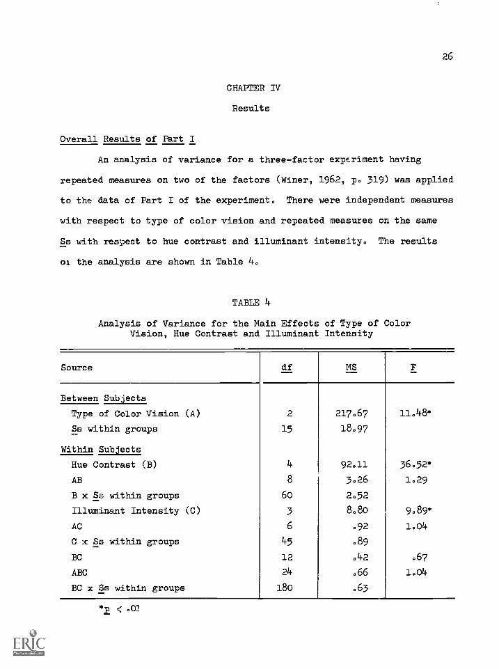
CHAPTER IV
Results
Overall Results of Part I
An analysis of variance for a three-factor experiment having
repeated measures on two of the factors (Winer, 1962, p. 319) was applied
to the data of Part I of the experiment. There were independent measures
with respect to type of color vision and repeated measures on the same
Ss with respect to hue contrast and illuminant intensity. The results
of the analysis are shown in Table 4.
TABLE 1+
Analysis of Variance for the Main Effects of Type of ColorVision, Hue Contrast and Illuminant Intensity
Source df MS F
Between Subjects
Type of Color Vision (A) 2 217.67 11.48*
Ss within groups....
15 18.97
Within Subjects
Hue Contrast (B) 4 92.11 36.52*
AB 8 3.26 1.29
B x Ss within groups 60 2.52
Illuminant Intensity (C) 3 8.80 9.89*
AC 6 .92 1.04
C x Ss within groups 45 .89
BC 12 .42 .67
ABC 24 .66 1.04
BC x Ss within groups 180 .63
*2 < .01

27
The .01 critical region was adopted for testing the significance
of experimental effects and components of trends in this and in later
analyses.
The main effects of type of color vision were significant. Color
normals' discrimination accuracy was the highest followed by deuteranopes'
and then by protanopes'. The mean percentage correct responses was 74.84
for color normals, 66.95 for deuteranopes and 32.26 for protanopes.
Results of the Newman-Keuls test revealed that color normals' discrimina-
tion accuracy was significantly higher than that of deuteranopes which in
turn was significantly higher than that of protanopes. Thus, color
normals' discrimination accuracy was also significantly higher than that
of protanopes in Part I.
The main effects of hue contrast were also significant. Discrim-
ination accuracy increased at: hue contrast was increased from 36° to
180°. The mean percentage correct responses was 31.02 at 36°, 45.60 at
72°, 64.58 at 108°, 72.22 at 144° and 75.00 at 1800.
The main effects of illuminant intensity were also significant.
Discrimination accuracy increased as illuminant intensity was raised from
25 to 100 fc. The mean percentage correct responses was 50.74 at 25 fc.,
56.48 at 50 fc., 61.48 at 75 fc. and 61.85 at 100 fc. None of the
interactions was significant.
The Simple Main Effects of Hue Contrast
The mean percentage correct responses at each amount of hue con-
trast by Ss having each type of color vision in Part I is shown in
Table 5.
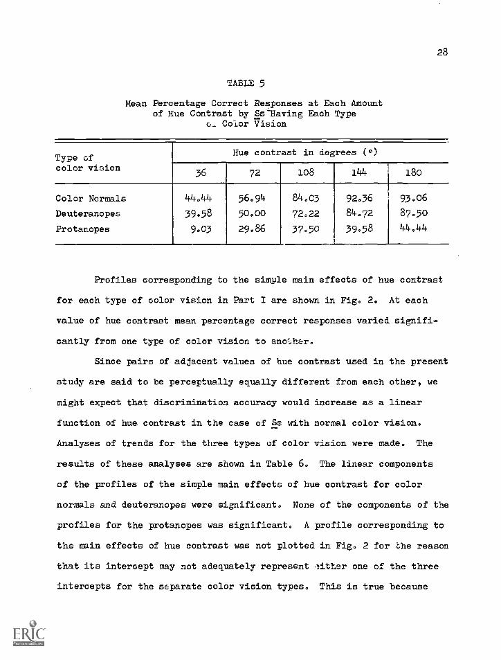
28
TABLE 5
Mean Percentage Correct Responses at Each Amountof Hue Contrast by Ss-Having Each Type
0_ Color Vision
Type ofcolor vision
Hue contrast in degrees (°)
36 72 108 144 i8o
Color Normals
Deuteranopes
Protanopes
44.44
39589003
56.9450.00
29.86
84.03 92036
72022 84.72
3750 3958
93.06
87,50
44.44
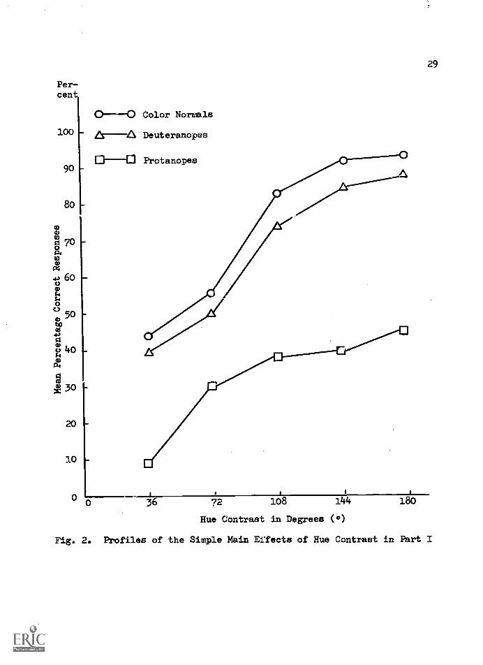
Profiles corresponding to the simple main effects of hue contrast
for each type of color vision in Part I are shown in Fig, 2. At each
value of hue contrast mean percentage correct responses varied signifi-
cantly from one type of color vision to another.
Since pairs of adjacent values of hue contrast used in the present
study are said to be perceptually equally different from each other, we
might expect that discrimination accuracy would increase as a linear
function of hue contrast in the case of Ss with normal color vision.
Analyses of trends for the three types of color vision were made. The
results of these analyses are shown in Table 6. The linear components
of the profiles of the simple main effects of hue contrast for color
normals and deuteranopes were significant. None of the components of the
profiles for the protanopes was significant. A profile corresponding to
the main effects of hue contrast was not plotted in Fig. 2 for the reason
that its intercept may not adequately represent ,either one of the three
intercepts for the separate color vision types. This is true because
Percent
100
90
8o
00007o
0
43 600AA0
C.3500
ti300
A0O 4o
(0 30
20
10
0
Color Normals
Deuteranopes
0 36 72 1o8 144
Hue Contrast in Degrees ( °)
180
29
Fig. 2. Profiles of the Simple Main &Teats of Hue Contrast in Part I

30
TABLE 6
Analyses of Trends of the Simple Main Effects of HueContrast for Each Type of Color Vision
Source df- MS- F-
Percentage ofthe sum ofsquares foroverall trend
COLOR NORMALS
Overall trend 4 169.78 18.74*
Linear 1 608.02 29.97* 89.53Quadratic 1 44.30 6.48 6.52Cubic 1 17.07 8.26 2.51
Between individualtrends 20 9'004
Linear 5 23.42Quadratic 5 6.84Cubic 5 2.07
DEUTERANOPES
Overall trend 4 155.70 22.24*
Linear 1 589.07 62.76* 94.58Quadratic 1 15.43 1.58 2.48Cubic 1 16.02 9.44 2.57
Between individualtrends 20 7.00
Linear 5 9.39Quadratic 5 9.77Cubic 5 1.70
PROTANOPES
Overall trend 4 66.95 4.77*
Linear 1 224.27 5.81 83.74Quadratic 1 34.71 3.52 12.90Cubic 1 8.82 1.32 3.29
Between individualtrends 20 14.05
Linear 5 38.59Quadratic 5 9.86Cubic 5 6.70
< .01
NOTE: The total percentage of linear, quadratic and cubic components isless than 100 for each type of color vision because the quarticcomponent was not included in this table.
31
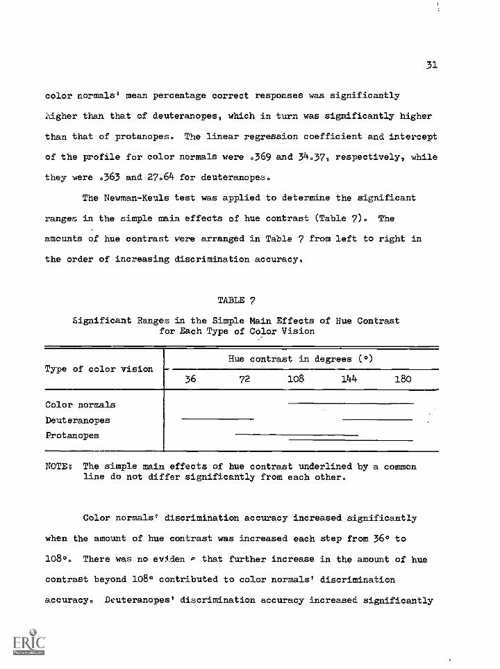
color normals' mean percentage correct responses was significantly
higher than that of deuteranopes, which in turn was significantly higher
than that of protanopes. The linear regression coefficient and intercept
of the profile for color normals were .369 and 34.379 respectively, while
they were .363 and 27.64 for deuteranopes.
The Newman-Keuls test was applied to determine the significant
ranges in the simple main effects of hue contrast (Table 7). The
amounts of hue contrast were arranged in Table 7 from left to right in
the order of increasing discrimination accuracy.
TABLE 7
Significant Ranges in the Simple Main Effects of Hue Contrastfor Each Type of Color Vision
Type of color visionHue contrast in degrees (0)
36 72 108 144 180
Color normals
Deuteranopes
Protanopes
NOTEs The simple main effects of hue contrast underlined by a commonline do not differ significantly from each other.
Color normals' discrimination accuracy increased significantly
when the amount of hue contrast was increased each step from 36* to
1080. There was no eviden P that further increase in the amount of hue
contrast beyond 108° contributed to color normals' discrimination
accuracy. Deuteranopes' discrimination accuracy increased significantly

32
when the amount of hue contrast was increased each step from 72° to
1440. Their discrimination accuracy did not differ significantly within
the hue contrast ranges of 36° to 72° and 1440 to 1800. Protanopes2
discrimination accuracy increased significantly when the amount of hue
contrast was increased from 36° to 72° and from 72° to 180°. Their dis-
crimination did not differ significantly within the hue contrast ranges
of 72° to 144° and 108° to 180°.
The Simple Main Effects of Illuminant Intensity
The mean percentage correct responses at each illuminant intensity
by Ss having each type of color vision is shown in Table 8.
TABLE 8
Mean Percentage Correct Responses at Each IlluminantIntensity by Ss Having Each Type of Color Vision
Type of color visionIlluminant intensity in footcand les (fc.)
25 50 75 100
Color normals 66.11 72.78 78.89 78089
Deuteranopes 56.67 68.33 69.44 72.22
Protanopes 29.44 28033 35000 34.44
Profiles corresponding to the simple main effects of illuminant
intensity for each type of color vision are shown in Fig. 3. At each
value of illuminant intensity mean percentage correct responses varied
significantly from one type of color vision to another.

33Per-cent
100 0 -0 Color Normals
f ADeuteranopes
90 Protanopes
80
4.)60 4177r'270
50eoal
430g 40tia.
a) 30
20 -
10 -
0
0
0 25 50 75 100
Illuminant Intensity in Footcandles (fc.)
Fig. 3. Profiles of the Simple Main Effects of IlluminantIntensity
34
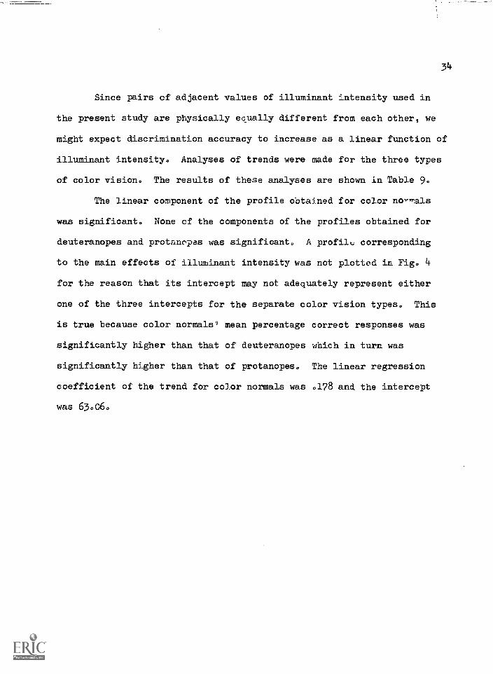
Since pairs of adjacent values of illuminant intensity used in
the present study are physically ecually different from each other, we
might expect discrimination accuracy to increase as a linear function of
illuminant intensity. Analyses of trends were made for the three types
of color vision. The results of these analyses are shown in Table 9.
The linear component of the profile obtained for color no -'als
was significant. None of the components of the profiles obtained for
deuteranopes and protanopas was significant. A profile corresponding
to the main effects of illuminant intensity was not plotted in Fig. 4
for the reason that its intercept may not adequately represent either
one of the three intercepts for the separate color vision types. This
is true because color normals° mean percentage correct responses was
significantly higher than that of deuteranopes which in turn was
significantly higher than that of protanopes. The linear regression
coefficient of the trend for color normals was .1_78 and the intercept
was 63.06.
35
TABLE 9
Analyses of Trends of the Simple Main Effects of IlluminantIntensity for Each Type of Color Vision
Source df- MS- F-
Percentage ofthe sum ofsquares foroverall trend
COLOR NORMALS
Overall trend 3 20.06 16041
Linear 1 53 33 135059* 88.64Quadratic 1 6.00 4.00 9097Cubic 1 .83 .47 1.39
Between individualtrends 15 1.22
Linear 5 .39Quadratic 5 1.50Cubic 5 1.77
DEUTERANOPES
Overall trend 3 2.71
Linear 1 61.63 3.19 80.74Quadratic 1 10.67 4.00 13.98Cubic 1 4.03 .66 5.28
Between individualtrends 15 9.38
Linear 5 19.31Quadratic 5 2.67cuoic 5 6.15
PROTANOPES
Overall trend 3 7.71 2.81
Linear 14.01 3.14 60.58 .
Quadratic 1 .04 .03 .18Cubic 1 9.08 3.76 39.24
Between individualtrends 15 2.74
Linear 5 4.47Quadratic 5 1.34Cubic 5 2.42
< .01

36
The Aewman-Keuls test was applied to determine the significant
ranges in the simple main effects of illuminant intensity (Table 10).
The amounts of illuminant intensity were arranged in Table 10 from left
to right in the order of increasing discrimination accuracy.
TABLE 10
Significant Ranges in the Simple Main Effects of IlluminantIntensity for Each Type of Color Vision
Type of color visionIlluminant intensity in footcandles (fc.)
25 50 75 100
Color normals
Deuterancpes
Protanopes
NOTEz The simple main effects of illuminant intensity underlined by acommon line do not differ significantly from each other.
Color normals, discrimination accuracy increased significantly
when illuminant intensity was raised each step from 25 to 75 fc. There
was no evidence that further increase in illuminant intensity beyond
75 fc. contributed to their discrimination accuracy. Deuteranopes'
discrimination accuracy increased significantly when illuminant intensity
was raised from 25 to 50 fc. There was no evidence that further increase
in illuminant intensity beyond 50 fc. contributed to their discrimination
accuracy. Protanopese discrimination accuracy increased when illuminant
intensity was raised from 50 to 75 fc. Their discrimination accuracy did
not differ significantly within the illuminant intensity rangss of 25 to
50 fc. and 75 to 160 fc.

37
Overall Results of Part II
As in Part I of the experiment, an analysis of variance for a
three-factor experiment having repeated measures on two of the factors
was applied to the data obtained in Part II of the experiment. There
were independent measures with respect to type of color vision and
repeated measures on the same Ss with respect to brightness contrast
and viewing distance. The results of the analysis are shown in Table 11.
TABLE 11
Analysis of Variance for the Main Effects of Type of ColorVision, Brightness Contrast and Viewing Distance
Source df MS F
Between Subjects
Type of color vision (A) 2 231.50 .39
Ss within groups 15 592.12
Within Sub ects
Brightness contrast (B) 3 3658.62 309.95*
AB 6 6.27 53B x Sc within groups 45 11.80
Viewing distance (C) 3 3333.41 109.68*
AC 6 14.13 .47
C x Ss within groups 45 30.39
BC 9 45.99 2.79*
ABC 18 7.78 .47
BC x Ss within groups 135 16.54
*2, <001
38
The main effects of type of color vision were not significant.
Thus, there was no evidence that color normals, deuteranopes and pro-
tanopes differed in their discrimination accuracy in Part II of the
experiment. The mean percentage correct responses in Part II was 61.34
for color normals, 57.83 for deuteranopes and 53.25 for protanopes.
The main effects of brightness contrast were significant. Dis-
crimination accuracy increased as the amount of brightness contrast
between the target and the surround waG increased from 30.23 to 83.72
percent. The mean percentage correct responses was 28.75 at the bright-
ness contrast of 30.23 percent, 57.20 at the brightness contrast of 53.49
percent, 72.39 at the brightness contrast of 72.09 percent and 7639 at
the brightness contrast of 83.72 percent.
The main effects of viewing distance were also significant. Dis-
crimination accuracy decreased significantly as viewing distance was
increased from 5 to 8 m. The mean percenta6 )rrect responses was
81.78 at 5 m., 67.59 at 6 m., 51.34 at 7 m. and 34.01 at 8 m.
The interaction between brightness contrast and viewing distance
was significant. The nature of this interaction will be described later
in this chapter and its implications will be discussed in Chapter V.
The Simple Main Effects of Brightness Contrast
The mean percentage correct responses at each brightness contrast
by Ss having each type of color vision is shown in Table 12.

39
TABLE 12
Mean Percentage Correct Responses at Each Brightness Contrastby Ss Having Each Type of Color Vision
Type of color visionBrightness contrast in percent
30023 53.49 72.09 33.75
Color normals 30.43 61.36 75.88 78.66Deuteranopes 31.44 60.73 74062 78003
Protanopes 24.37 49.50 66.67 72048
NOTE: An average hue contrast of approximately 108° was available ineach brightness contrast.
Profiles corresponding to the main effects and the simple main
effects of brightness contrast for each type of color vision are shown
in Fig. 4. Since pairs of adjacent values of brightness contrast used
in the present stud- are said to be perceptually equally different from
each other, we might expect that discrimination accuracy increases as a
linear function of brightness contrast. Analyses of trends were made
for the three types of co?.- vision. The results of these analyses
are shown in Table 13. The linear and quadratic components of the pro-
files of the main effects of brightness contras; as well as those of the
simple main effects of brightness contrast for each type of color vision
were significant. Since neither the main effects of type of color
vision nor the interaction between type of color vision and brightness
contrast was significant, the profile corresponding the main effects
of brightness contrast may adequately represei,::: the effect of brightness
contrast on discrimination accuracy fcr all three types of color vision.

Per-cent
100
90
80
70
60
50
40
30
20
10
Color Normals
Deuteranoya
Protancpes
ft- - -410 Main Effects
B C
Brightness Contrast
Fig. 4. Profiles of the Main Effects and Simple Main Effects ofBrightness Contrast
NOTE: A represents a brightness contrast of 30.23 percent,B represents 53.49 -ercent, C represents 72.09 percentand D represents 85.75 percent.

TABLE 13
Analyses of Trends of the Main Effects and the Simple Main Effectsof Brightness Contrast for Each Type of Color Vision
Source df- MS__ F_
Percentage ofthe sum ofsquares foroverall trend
MAIN EI,TECTS
Overall trend 3 14634.50 309095*
Linear 1 39208.47 728,76* 89,31Quadratic 1 4688.35 70.41* 10.68Cubic 1 6.67 . ..,_
71 .02
Between individualtrends 45 47.22
Linear 15 53.80Quadratic 15 66.59Cubic 15 21.26
COLOR NORMALS
Overall trend 3 5111.49 105.71*
Linear 1 13251.01 344.65* 86.41Quadratic 1 2072.04 29.42* 13.51Cubic 1 11.41 .32 .07
Between individualtrends 15 48.35
Linear 5 38.45Quadratic 5 70.44Cubic 5 36.17
DEUTERANOPES
Overall trend 3 4702004 68.5o,
Linear 1 12342.41 145,,12* 87.50Quadratic 1 1751.04 1C,58* 12.41Cubic 1 12.68 .83 .09
Between individualtrends 15 68.64
Linear 5 85.05Quadratic 5 105.64Cubic 5 15.24
< .01

1+2
TABLE 13 (Continued)
Source df ,..,--
F
Percentage ofthe sum ofsquares foroverall trend
PROTANOPES
Overall trend 3 4871.15 197.59*
Linear 1 13632.01 359.61* 93.23Quadratic 1 975.38 41.20* 6.67Cubic 1 6.08 .49 .04
Between individualtrends 15 24.65
Linear 5 37.91Quadratic 5 23.68Cubic 5 12.38
The linear regression coefficient and intercept for the profile of the
main effects of brightness contrast were, respectively, 15.865 and 18.98.
The quadratic regression coefficients for the same profile were 46.653
and -6.158. The intercept for the quadratic regression was -11.81.
The Newman-Keuls test was applied to determine the significant
ranges in the simple main effects of brightness contrast (Table 13).
The amounts of brightness contrast were arranged iL Table 14 from left
to right in order of increasing discrimination accuracy.

TABLE 14
Significant Ranges in the Simple Main Effects of BrightnessContrast for Each Type of Color Vision
Type of color visionBrightness contrast in percent
30.23 53 49 72.09 83.75
Color normals
Deuteranopes
Protanopes
NOTE: The simple main effects of brightness contrast underlined by acommon line do not differ significantly from each other.
Color normals' and deuteranopes' discrimination accuracy increased
significantly when the amount of brightness contrast was raised each step
from 30.23 to 72.09 percent. Further increase in the amount of bright-
ness contrast beyond 72.09 percent did not contribute to their discrimina-
tion accuracy. Protanopes° discrimination accuracy increased significant-
ly each step as the amount of brightness contrast was raised from 30.23
to 83.75 percent.
The Simple Main Effects of Viewing Distance
The mean percentage correct responses at each viewing distance by
Ss having each type of color vision is shown in Table 15.

TABLE 15
Mean Percentage Correct Responses at Each Viewing Distanceby Ss Having Each Type of Color Vision
Type of color visionViewing distance in meters (m.)
5 6 7 8
Color normals 84.09 69.44 52.27 40.53
Deuteranopes 83.84 70.20 54.8o 35.98
Protanopes 77.40 63, _ 46.97 25051
Profiles corresponding to the main effects and the simple main
effects of viewing distance for each type of color vision are shown in
Fig. 5. Since neither the main effects of type of color vision nor the
interaction between type of color vision and viewing distance was
significant, a profile corresponding to the overall main effects of
viewing distance may adequately represent the effect of viewing distance
on discrimination accuracy for all three types of color vision.
Since pairs of adjacent values of viewing distance included in
the present study are physically equaay different from each other, we
might expect that discrimination accuracy decreases as a linear function
of viewing distance. Analyses of trends for the three types of color
vision were made. The results of these analyses are shown in Table 16,
The linear components of the profiles of the main effects and the simple
main effects of viewing distance for e &ch type of color vision were
significant. The linear regression coefficient for the profile of the
main effects of viewing distance was -15.952 and the intercept was
162.38.

Per-cent
100
90
80
70
6o
50
1+0 Color Normals
Deuteranopes30
Protanopes
20 111-- AI Main Effects
10
If1
7 8
Viewing Distance in Meters (m.)
Fig. 5. Profiles of the Main Erfects and the Simple Main Effectsof Viewing Distance

TABLE 16
Analyses of Variance for the Main Effects and the Simple Main Effectsof Viewing Distance for Each Type of Color Vision
Source df MS- F-
Percentage ofthe sum ofsquares foroverall trend
MAIN EFFECTS
Overall trend 3 13333.64 109.68*
Linear 1 39921.34 178.35* 99.80Quadratic 1 78.13 1.71 .20Cubic 1 1.47 .02 .00
Between individualtrends b5 121.57
Linear 15 223.84Quadratic 15 45.72Cubic 15 95.15
COLOR IORMALS
Overall trend 3 3827.38 20.61*
Linear 1 11427.01 27.15* 99.52Quadratic 1 22.04 .26 .20Cubic 1 33.08 .65 .29
Between individualtrends 15 185.71
Linear 5 420.89Quadratic 5 85.04Cubic 5 51.20
DEDTERANOPES
Overall trend 3 4426.82 45.38*
Linear 1 13209.01 74.78* 99.46Quadratic i 70.04 2.80 .53Cubic 1 1.41 .02 .01
Between individualtrends 15 97.55
Linear 5 i76.65Quadratic 5 25.04Cubic 5 90.97
*2 < 001
TABLE 16 (Continued)
Source df MS F
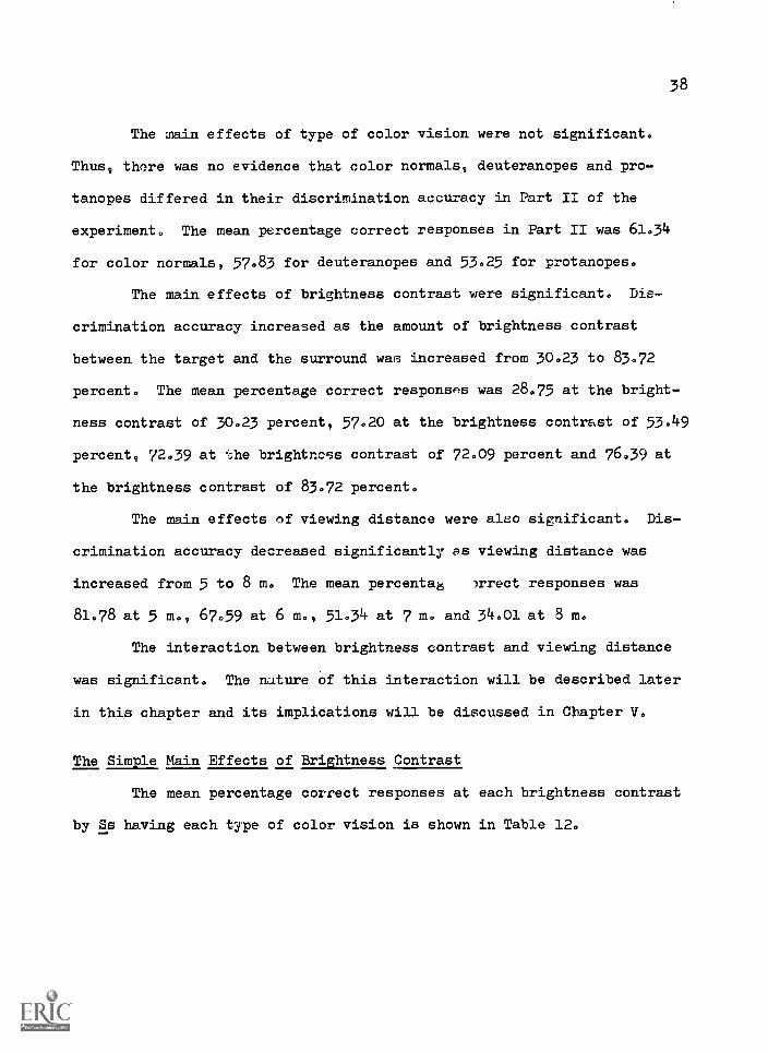
PROTANOPES
Overall trend 3 5192.49 '3.75*
LinearQuadraticCubic
111
15436.01155.386008
208.63*5000.o4
Between individualtrends 15 81.45Linear 5 73.99Quadratic 5 27008Cubic 5 143030
47
Percentage ofthe sum ofsquares foroverall trend
99.o9.87
.o4
*E < 001
Results of Newman-Keuls tests revealed that color normals',
deuteranopes' and protanopes' discrimination accuracy decreased signif-
icantly each step as viewing distance was increased from 5 to 8 m.
Interaction
The mean percentage correct responses for each brightness con-
trast at each viewing P.stance is shown in Table 170
Profiles corresponding to the simple main effects of viewing
distance for each brightness contrast 8.2e shown in Fig. 60

4E
a
Per-cent
100
90
80
a 70
a1:4
4) 60
050
to
40
3o
20
10
0 10-4/ 5 6 7
Viewing Distance in Meters (m.)
Fig. 6. Prfiles of the Simple Main Effects of Viewing Distancefor Each BrightnAss Contrast
NOTE: Profile A representm a brightness contrast of 30.23 per-cent, Profile B 53.49 percent, Profile C 72.09 percentand Profile D 83.75 percent.

TABLE 17
Mean Percentage Correct Responses for Each BrightnessContrast at Each Viewing Distance
Brightness contrastin percent
Viewing distance in meters
6 7 8
30.23 47.31 33.33 14.93 11.11
53.49 83.33 67.84 48.99 26.82
72009 92.76 82.83 68.35 45.62
83.75 95.45 86.36 73.06 50.67
Analyses of trends for each of the four brightness contrasts are
shown in Table 18.
TABLE 18
Analyses of Trends "rer the Simple Main Eftects ofViewing Distance for Each Brightness Contrast
Source df MS F
Percentage ofthe sum ofsquares foroverall trend
30.23 PERCENT (PROFILE A)
Overall trend
LinearQuadraticCubic
Between individualtrends
LinearQuadraticCubic
3
111
51
171717
870.35
225;.0o165.0111.03
20.18
37.3211.2212.01
40.16*
60.42*14.71*
.92
92.766.79.45
* <.01