Embed Size (px)
Citation preview

Comparative Analysis of Social
Vulnerability Indices:
CDC’s SVI and SoVI®
Hannah A. Tarling
Division of Risk Management and Societal Safety
Lund University, Sweden
Riskhantering och samhällssäkerhet
Lunds tekniska högskola
Lunds universitet
Lund 2017
2
Comparative Analysis of Social Vulnerability
Indices: CDC’s SoVI and SoVI®
Hannah A. Tarling
Supervisor: Per Becker (PhD)
Lund 2017

3

4
Division of Risk Management and Societal
Safety
Faculty of Engineering
Lund University
P.O. Box 118
SE-221 00 Lund, Sweden
http://www.risk.lth.se
Telephone: +46 46 222 73 60
Riskhantering och samhällssäkerhet
Lunds tekniska högskola
Lunds universitet
Box 118
221 00 Lund
http://www.risk.lth.se
Telefon: 046 - 222 73 60
Comparative Analysis of Social Vulnerability Indices Hannah A. Tarling Number of pages: 74 Illustrations: 13 Word count: 14,947 Keywords Social vulnerability, social vulnerability index, SoVI®, CDC SVI, social vulnerability in San Francisco, California Abstract As interest in social vulnerability to hazards grows, more indices are formulated for identifying and
mapping population groups that may experience differential consequences from natural hazards.
However, less attention has been given to the underlying choices researchers make when creating these
indices. With the aim to contribute to understanding the issues surrounding social vulnerability indices,
this research will analyze and compare two popular methods for social vulnerability mapping: CDC SVI
and SoVI®, using San Francisco, California, U.S.A. as a case study. To do so, this research focuses on
the impact of each model’s unique components: the type of social vulnerability each model exhibits and
the overall usability of each model. Using Pearson correlation analysis to assess the association of age
dependency variables, the two models, different geographic scales and statistical choices, it is clear that
index variable selection has the biggest impact on index results. Geographic units within San Francisco
that have the largest difference between the two models, when classified, are analyzed to understand what
underlying variables the models use to represent social vulnerability to create different results. Results
show that CDC SVI better represents a socioeconomic related social vulnerability, while SoVI® focuses
on old age related social vulnerability. Furthermore, a SWOC analysis is employed to understand which
model works best for an organization internally vis a vis ease of use and time and cost and externally,
regarding the type of social vulnerability they intend to reduce. Findings suggest that for internal use,
CDC SVI is easier to use, but for external use, the organization should consider the variables that
compose each index to understand what kind of social vulnerability they aim to reduce.
© Copyright: Riskhantering och samhällssäkerhet, Lunds tekniska högskola, Lunds universitet, Lund 2017. THIS THESIS IS SUBMITTED IN PARTIAL FULFILMENT OF THE REQUIREMENTS FOR THE DEGREE MASTERS IN DISASTER RISK MANAGEMENT AND CLIMATE CHANGE ADAPTATION- DRMCCA
5
Acknowledgements I would like to acknowledge a few people who were invaluable in the journey to complete this
thesis.
First and foremost, my supervisor, Per Becker. Thank you for the time you dedicated to reading my
thesis and providing instrumental feedback, for encouraging me to step outside my comfort
zone. Finally, thank you for believing in me and in this thesis when I did not, your positive attitude
was very important.
To my parents who always encourage me to seek out any path I am interested in, who blindly
support me in whatever path I take, and who always believe in me. Without your endless love and
support, I would not be here today.
Special thank you to Alicia Johnson and everyone at the San Francisco Department of Emergency
Management for welcoming me into your office, working with me, and providing your assistance
and guidance.

6
Table of Contents Acknowledgements........................................................................................................5
LISTOFTABLES..................................................................................................................9
LISTOFFIGURES................................................................................................................9
AcronymsandTerminology.............................................................................................11
1. Background..............................................................................................................12
1.1Introduction.......................................................................................................................12
1.2OrganizationalFocus..........................................................................................................13
1.3TheModels.........................................................................................................................14
1.3.1CenterforDiseaseControlSocialVulnerabilityIndex(CDCSVI).........................................14
1.3.2SocialVulnerabilityIndex®(SoVI®)....................................................................................15
1.3.3TheData..............................................................................................................................15
1.4StudyArea..........................................................................................................................16
2.ConceptualFramework................................................................................................17
2.1Risk....................................................................................................................................17
2.2SocialVulnerability.............................................................................................................18
2.3MethodologicalResearchofSocialVulnerabilityIndices.....................................................19
2.4OtherSocialVulnerabilityIndices.......................................................................................20
2.5LimitsofSocialVulnerabilityIndexing................................................................................23
3. Methodology.............................................................................................................24
3.1TheModels.........................................................................................................................24
3.2CorrelationAnalysis............................................................................................................25
3.2.1SoVI®AgeDependencyVariableAnalysis...........................................................................25
3.2.2BaseModelsAnalysis..........................................................................................................25
3.2.3GeographicScaleAnalysis...................................................................................................25
3.2.4StatisticalChoices................................................................................................................26
3.2.5SoVI®YearlyAnalysis...........................................................................................................26
3.3Variables............................................................................................................................26

7
3.4UsabilityAnalysis................................................................................................................27
3.5Limitations.........................................................................................................................27
4. Results......................................................................................................................30
4.1CorrelationAnalysisResults................................................................................................30
4.1.1SoVI®AgeDependencyVariableAnalysis...........................................................................30
4.1.2BaseModelAnalysisResults...............................................................................................30
4.1.3GeographicScaleAnalysisResults......................................................................................33
4.1.4StatisticalChoicesAnalysisResults.....................................................................................35
4.1.5SoVI®YearlyAnalysis...........................................................................................................37
4.2MostDifferentTractsAnalysis............................................................................................37
4.2.1NormalizedValues..............................................................................................................37
4.2.2RankedValues.....................................................................................................................41
4.2.3QuantileClassification.........................................................................................................42
4.2.3ValuesAnalysisResults.......................................................................................................43
5. Discussion.................................................................................................................48
5.1CorrelationAnalysisofModelComponents........................................................................48
5.2MostDifferentTractsAnalysis............................................................................................49
5.2.3Normalized,RankedandQuantileTracts............................................................................49
5.2.4ValueAnalysis.....................................................................................................................50
5.3Usability.............................................................................................................................52
6. Conclusion................................................................................................................55
References....................................................................................................................57
Appendices.....................................................................................................................61
1.CensusTractMap,SanFrancisco..........................................................................................61
2.VariablesforCDCSVIandSoVI®...........................................................................................62
3.StepsforcarryingoutSoVI®.................................................................................................64
3.DatasetNamesandCorrelationAnalysis..............................................................................67
4.CorrelationAnalysisResults.................................................................................................69
4.1Age.........................................................................................................................................69
4.2BaseMaps..............................................................................................................................69
4.3GeographicScale....................................................................................................................69

8
4.4StatisticalChoices...................................................................................................................70
4.5Year........................................................................................................................................71
5.VariableValueTables...........................................................................................................72

9
LISTOFTABLESTable 1: Variables used to represent social vulnerability in six models .................................. 21
Table 2: Principle Components Analysis Output Example ................................................... 28
Table 3: Tracts that are two classes more socially vulnerable in SoVI® than CDC SVI ................. 43
Table 4: Tracts that are two classes more socially vulnerable in CDC SVI than SoVI® ................. 46
Table 5: Tracts that are two classes more socially vulnerable in SoVI® than CDC SVI ................. 50
Table 6: Comparing the rankings of variables representing old age in both SoVI® and CDC SVI
models .............................................................................................................. 46
Table 7: "Per capita income" variable value discrepancy. First four rows show SoVI® and CDC SVI
ranking within the four tracts, as well as the assigned z-score or percentile ranking. The last row,
shows the census value for mean per capita income ........................................................ 45
Table 8: Tracts that are two classes more socially vulnerable in CDC SVI than SoVI® ................. 51
Table 9: SWOC Analysis of CDC SVI and SoVI® ............................................................... 53
LISTOFFIGURES Figure 1: SoVI® Base map ....................................................................................... 30
Figure 2: CDC SVI Base map ..................................................................................... 30
Figure 3: CDC SVI compared only to census tracts within San Francisco ................................ 32
Figure 4: CDC SVI for San Francisco compared only to census tracts within California ............... 32
Figure 5: CDC SVI for San Francisco compared to all U.S. tracts ......................................... 32
Figure 6: Results when using SoVI®’s z-score method with CDC SVI variables. Inset map, provided
for reference, is CDC SVI base map ............................................................................ 34
Figure 7: Results when using CDC SVI's percentile ranking method with SoVI® variables. Inset map,
provided for reference, is SoVI® base map .................................................................. 34
Figure 8: Spatial distribution of normalized difference from (CDC SVI) - (SoVI®) ..................... 37
Figure 9: Scatterplot of normalized values ordered by census tract ..................................... 38
Figure 10: Scatterplot of normalized values with CDC SVI values linearly ordered .................... 38
Figure 11: Scatterplot of normalized values with SoVI® values linearly ordered ...................... 38
Figure 12: Spatial distribution of difference between tracts ranked (1. low social vulnerability -
195. high social vulnerability) from (CDC SVI) - (SoVI®) .................................................... 39
Figure 13: Spatial distribution of difference between quantiled tracts (1. low social vulnerability to
4. high social vulnerability) from (CDC SVI) - (SoVI®) ....................................................... 40

10

11
AcronymsandTerminologyAcronyms
CDC Center for Disease Control
CDC SVI Center for Disease Control Social Vulnerability Index
GIS Geographic Information System
SFDEM San Francisco Department of Emergency Management
SoVI® Social Vulnerability Index ®
U.S. United States of America
Terminology
ArcGIS: Any computer program that visualizes geographic data. ArcGIS is the brand of GIS used in
this research.

12
1. Background
1.1 Introduction
Disaster risk management has traditionally focused on physical science and built infrastructure
(Juntunen, 2006). In the 1970s scholarship took aim at socioeconomic factors that create
differential impacts of hazards (ibid). Research began to study how socioeconomic factors,
environmental aspects and the built environment interact to create a disaster. Part of this was the
phenomenon of social vulnerability, or the way social groups experience differential impacts from
hazards. Assessing this type of vulnerability can provide specific evidence that can be used to
direct resources for reducing risk and the effect that hazards have on society. In order to
understand and prepare for social disparities in disaster risk management, governments,
organizations and researchers have proposed numerous methodologies for assessing social
vulnerability.
Globally, regions with the same hazards experience different consequences. For instance, floods of
similar size in Pakistan, Chile, and England do not have the same effect because the social fabric,
built environment, and natural aspects are vastly different. However, this disparity also occurs on a
local level. Across a city, rates of recovery post-hazard are related to wealth/poverty, occurrence
of racial minority/majority, education levels, and other social aspects (e.g. New Orleans after
Hurricane Katrina) (Flanagan, et al., 2011).
The Sendai Framework for Disaster Risk Reduction (2015-2030) promotes the importance of
developing tools for analyzing vulnerability:
“Policies and practices for disaster risk management should be based on an
understanding of disaster risk in all its dimensions of vulnerability, capacity,
exposure of persons and assets, hazard characteristics and the environment.”
(UNISDR, 2015)
To obtain a better understanding of social vulnerability in particular, researchers need to work out
issues impeding vulnerability data and models (ibid). By developing an understanding of social
vulnerability, researchers aim to improve sustainable development and risk reduction initiatives.
Researchers agree that vulnerability mapping needs to have a practical focus for use in emergency
management for preparedness, mitigation, response, and recovery (Van Zandt, et al., 2012),
especially as it relates to the delivery of aid and services (Cutter, 2010). However, there is a gap
between theory and practice. In practice, emergency managers do not use vulnerability mapping
consistently, or with consistent methods (Wolkin, et al., 2015). As varying methods arise for

13
representing social vulnerability (e.g. SoVI® and CDC SVI), comparing the results and components
of different methods is key to improving data and models, as different results mean different areas
of vulnerability are highlighted and will guide resources and money for disaster risk reduction.
Social vulnerability index developers have often given little reason for the choices behind their
methodologies, and how the components of methodologies inform the output (Tate, 2012).
By questioning different methods, and their components, we can better understand the present
state and how to employ sustainable development for risk reduction to improve our future situation
and avoid risk scenarios. Becker writes that the first step in sustainable development, “requires us
to analyze the current situation” (2014, p. 136), but if there are many ways to analyze it, which is
best or correct? This research will explore different “current situations” and the practical
implication of each method is.
Using San Francisco, California, U.S.A. as a case study, this research intends to compare and
analyze two methods for quantifying social vulnerability to find out what model is most suitable for
the organization, and by doing so, contribute to understanding issues surrounding social
vulnerability models. To achieve the purpose, this research will answer the following questions:
● To what extent do the components of each model contribute to the varying results?
● What type of social vulnerability do the different models exhibit?
● What is the usability of each model?
1.2 Organizational Focus
This research is carried out in partnership with the San Francisco Department of Emergency
Management (SFDEM). Their mandate includes working with the public and coordinating with other
actors. To do so, it is important that SFDEM know where the most socially vulnerable communities
are, and the composition of different communities, so it can curtail “planning, preparedness,
communication, response, and recovery” (sfdem.org, n.d.) to the needs and capacities of unique
neighborhoods.
SFDEM has requested information on socially vulnerable neighborhoods to understand where the
greatest need is for resources and where communities with limited capability to prepare for,
respond to, and recover from a disaster are located (A Johnson 2017, personal communication, 30
May). They do have, and continue to develop, outreach mechanisms to communities in need
through trusted community based organizations and other government organizations (ibid). Social
vulnerability maps can be used before a disaster to build relationships with and strengthen capacity
of community-based organizations and individuals, so populations can better interact with the
formal emergency management system, limiting disaster related consequences.

14
Furthermore, social vulnerability mapping will create a basis for SFDEM to lobby for grants and
funding specific to community needs. SFDEM is within a large emergency management system,
including state and national systems, so being able to advocate is important. As their mandate
suggests, SFDEM coordinates and communicates with other organizations. It is through all of these
activities that social vulnerability mapping can be used to dictate funds, services and coordinate
with organizations in the most in-need communities.
1.3 The Models Both models, CDC SVI and SoVI® aim to find the most socially vulnerable communities by using data
from the U.S. census to represent various aspects of social vulnerability. Data is transformed in
statistical procedures, resulting in a numerical index each geographic unit (a census tract, or
tract). A tract is a geographic unit within a county for the purpose of tracking population changes
within groups of about 4,000 people (Census.gov, 2012).
1.3.1 Center for Disease Control Social Vulnerability Index (CDC SVI)
This model of social vulnerability, referred to as “CDC SVI” for the purpose of this research, was
created by the United States Center for Disease Control, Agency for Toxic Substances and Disease
Registry (ATSDR) to save lives and identify populations that need more resources to improve the
effectiveness of disaster preparedness, mitigation, response and recovery (Flanagan, et al., 2011).
The research article associated with this model is by Flanagan, et al. (2011).
CDC’s SVI model is a public good that has been available online since 2011 (ATSDR, 2014). With an
Internet accessible interactive map, the CDC’s SVI model quantifies social vulnerability for each
tract, relative to other census tracts at either the state or national level (ATSDR, 2014). It has
released social vulnerability maps with data from 2000, 2010 and 2014 (released 2016), and will
continue to release every other year (E. Hallisey, Personal Communication, 2017). It has used the
same fifteen attributes to represent social vulnerability, making the model easy to compare to past
years and observe population changes (ATSDR, 2014).
The methodology for this model, referred to as percentile methodology for the purpose of this
research, ranks variables for each census tract from zero to one, sums all the variables, then ranks
the variables again from zero to one, least to most socially vulnerable (ranking is inverted for “per
capita income”). This method allows the user to interpret the scores easily. For instance, census
tract 331 has ranking of .149 (or 14.9%), so we know it is more socially vulnerable than 14.9% of
census tracts it is compared to. Percentile rankings are based on either percentage of the variable
in the population, or based on the mean. For example, the percentage of unemployed people in all
tracts is ranked from zero to one. This model uses hierarchical design as the researchers grouped
variables by social vulnerability themes (Tate, 2012), as opposed to SoVI®, which groups variables
based on principle components analysis.

15
1.3.2 Social Vulnerability Index ® (SoVI ®)
Cutter, as one of the most important researchers in the field of vulnerability science, is the co-
author of the Social Vulnerability Index (SoVI®) published under the title “Social Vulnerability to
Environmental Hazards” (2003), designed for US counties (Cutter, et al., 2003), but modeled in
other contexts (e.g. Frigerio et. al. 2015). The purpose of SoVI® is to quantify social vulnerability
to environmental hazards in the U.S. When mapped, the results show where there is uneven
capacity for disaster risk reduction, and pinpoints areas where policy and resources for disaster risk
management would be most useful (Hazards & Vulnerability Research Institute, 2013). This well-
used method has evolved over time to account for new findings in research (ibid). The most recent
2017 model, by Cutter and Emrich, is used for the purpose of this study.
The methodology for SoVI®, referred to as z-score methodology for the purpose of this research,
uses census values in percentages or whole numbers then converts them to z-scores (Cutter &
Emrich, 2017). Using z-scores standardizes values with a mean of zero and standard deviation of
one, so the values are easy to interpret, i.e., all negative values are smaller than the mean (ibid).
Furthermore, 68% of variables in a dataset fall within one standard deviation from the mean; 95%
within 2; and 99.7% fall within 3 (Oswego.edu, n.d.). For SoVI® variables, this means 68% of data
points are between -1 and one; 95% are between -2 and two, and 99.7% are between -3 and three.
Once numbers are standardized, a principle components analysis is run and variables are grouped
into factors, then an additive model is applied for an overall social vulnerability score. This model
is inductive as it takes a large group of variables, and groups them into related factors (Tate,
2012).
1.3.3 The Data
Most of the data both methods use is sourced from the U.S. Census’ American Community Survey
(ACS) 5-year dataset, 2014. This population data is collected yearly from about 3-million
households (about 1 in 12 for 5-year set) and aggregated in 1-, 3-, and 5-year sets (Donelly, 2013).
Each measured data metric has a margin of error with a 90% confidence interval (ibid). However,
there are issues with the accuracy of the ACS. Before 2016, ACS data was considered highly
volatile (Hallisey, et al., 2011).
The 5-year dataset is used for social vulnerability mapping because it provides the largest sample
size, includes data for all geographic areas, and is best for studying small populations, although is
the least accurate (U.S. Census, 2016). One metric, “Percentage of People in Nursing Homes”, in
SoVI®, is from the Decennial Census, which is more accurate, but becomes outdated.
Although the data is not perfect, and will never be 100% accurate, the U.S. Census is the most
practical option available for inputs to social vulnerability indices.

16
1.4 Study Area The City and County of San Francisco (referred to as San Francisco) is a relatively small
municipality at 121.4km^2, with 840,736 residents (ACS, 2015). The city is exposed to at least six
natural hazards, including: earthquakes, fires, flooding, landslides and tsunamis (SFDEM, n.d.). San
Francisco has experienced two large disasters initiated by earthquakes in its short history as part of
the U.S.
The city today is part of the second most racially/ethnically diverse urban region in the nation (The
San Francisco Foundation, 2014). However, populations of color have declined in growth, and by
2040, San Francisco is expected to be majority white non-Hispanic, while the surrounding region
becomes more racially/ethnically diverse (ibid). Regionally, income for the top and middle earners
increased significantly between 2000 and 2012, while income for the lowest earners decreased
(ibid).
A large homeless population persists in San Francisco. In 2017, there were counted to be 7,499
homeless people; 68% of whom were living on the street; 56% reported not being able to afford
rent and 25% responded a lack of housing availability as obstacles to permanent housing (Applied
Survey Research, 2017). In a 2016 response, the city government spent $275-million to support the
homeless population, while 2017 and 2018 are expected to see a $30- and $35-million bolster in
that funding (Swan, 2017).

17
2.ConceptualFrameworkThe following section explores the theoretical framework this research is founded on, including
risk, vulnerability, and their components. Then, other researchers’ findings in social vulnerability
index research will be presented to place this research within the current knowledge.
2.1 Risk Risk, at its most basic definition is the potential for harm. There are many definitions of risk, but
three underlying themes are apparent through many definitions (Becker, 2014):
1. Risk is a future possible scenario (Tehler, 2015; Becker, 2014)
2. The scenario threatens something humans value (Renn, 1998; 1998; 2008, cited in Becker,
2014 p. 133)
3. Risk must be related to a desired outcome (Kaplan & Garrick, 1981; Kaplan et al., 2001;
Luhmann, 1995; Zinn, 2008, cited in Becker, 2014 p. 133)
In other words, because the future is uncertain, we attempt to define and understand what could
happen in the future that will negatively affect what is valued to change the outcome and preserve
what is valued. Complete definitions of risk include Blaikie, et al., “The probable level of loss to be
expected from a predictable magnitude of hazard” (2004, p. 50). And the simpler, common
equation, “Risk = Likelihood * Consequence” (Copolla, 2011). As simple as this is, it conveys future
by using “likelihood” and the threat of something of value with “consequence”. As hazard is
represented with likelihood, and vulnerability is represented in consequence, these concepts will
be explored.
Hazards, being the root of risk, are defined by having the potential to negatively affect what
human’s value, including repercussions for human existence (Coppola, 2011; Blaikie, et al., 2003).
Being “an action, event, or object” (Blaikie, et al., 2003, p. 2.), they exist on personal, communal,
regional, national, and international levels. This includes the potential of tripping on one’s
shoelaces, to a dry forest crossing international borders with high fire potential. Hazards can be
rapid or slow onset (Blaikie, et al., 2003). For example, an earthquake occurs without warning,
lasting less than a minute, but can have damaging consequences, while a system can creep towards
drought for months until defined as a drought and can last for years (Coppola, 2011).
To reduce risk, individuals, organizations and governments carry out disaster risk reduction
activities or initiatives before, during and after a hazard. This could be anything from insulating
one’s home to reduce the effects of colds snaps, to planting ocean mangroves to reduce powerful
storm sea swells. On a larger community or societal level, this is also referred to as sustainable
development, or the act of improving the current situation without compromising future
generations’ ability to meet their needs (Becker, 2014).

18
A hazard becomes a disaster when the human-environment system does not have the ability to
protect valuable assets from the consequences of a hazard. Consequences are caused by
vulnerability; therefore, disasters are the result of hazards interacting with vulnerable parts of a
system, (Blaikie, et al., 2004). The results of my analysis compare two methods for defining the
“current state” of social vulnerability to support disaster risk reduction. However, the differences
in the indices are based on choices that authoring researchers made to create a picture of social
vulnerability. In other words, the authors chose metrics to make a picture of social vulnerability.
Therefore, the choices they made were subjective.
2.2 Social Vulnerability At the most basic level, vulnerability is the propensity for loss from a stressor (Cutter, et al.,
2000). Vulnerability, as a science, aims to understand the complex, multi-faceted aspects of a
person or a community that contribute to their susceptibility to disasters with the aim of providing
scientific bases to improve public policy, especially hazard mitigation strategies (Cutter, 2003;
2010). The researchers behind CDC SVI and SoVI® use different definitions of social vulnerability.
In Flanagan et al. (2011) (CDC SVI) social vulnerability is twice blatantly defined. The former
definition, presented in the abstract, defines social vulnerability as, “the socioeconomic and
demographic factors that affect the resilience of communities” (Flanagan et al., 2011, no
pagination). This describes a group’s social strata and social identity as contributing to the
resilience of a place (ibid). The researchers use census data to represent the “socioeconomic and
demographic factors” that contribute to social vulnerability. There is a plethora of evidential
research in the U.S. context that measurable factors, like income and race, contribute to social
vulnerability (e.g. Fothergill and Peek, 1999; Noriega & Lundwig, 2012), providing support for using
census data to construct a social vulnerability index.
Resilience is never defined in the research, and therefore, it is necessary to define it to understand
the social vulnerability definition. Looking to Becker (2014, p. 154) for a definition,
“resilience is an emergent property determined by the ability of the human–environment
system to anticipate, recognize, adapt to and learn from variations, changes, disturbances,
disruptions and disasters that may cause harm to what human beings value”.
Bringing the different pieces together, aspects of a community group that dictate their social
strata, informs the ability of the community, as a whole, to “anticipate, recognize, adapt to and
learn from” (ibid) local stressors.

19
The second definition, explained for use in a risk equation/definition, defines vulnerability
generally as, “the extent to which persons or things are likely to be affected” (Flanagan et al.,
2011, p. 1). It provides a basis for index creation by using the words, “extent to”, begging the
question, “to what extent is a system vulnerable?” A vulnerability index answers just that question
as it compares the vulnerability of different enumeration units. While this definition gives a
statement on the implications of being vulnerable (e.g. “affected”), there is no hint as to what
makes a community vulnerable.
The original SoVI® research was published in 2003, other versions of the model have been
produced. In the most recent set of directions, Cutter and Emrich (2017, p. 1), write, “Social
vulnerability is a broad concept examining the differential impact of hazards on society based on
the existing socio-demographic conditions and community characteristics”.
Cutter and Emrich (2017) are more specific in their definition. The SoVI® contributors discuss how
hazards have different consequences through society, a generally accepted viewpoint of social
vulnerability. Furthermore, they refer to the “current state” of a community’s makeup, by writing
“existing… conditions… [and] characteristics” (ibid, p. 1). Doing so is a reminder that future risk
scenarios are informed by existing conditions. Similar to Flanagan, et al. (2011), Cutter and Emrich
(2017), discuss social and demographic factors, leading the way to use census data to define social
vulnerability in a geographic location.
The definition of vulnerability varies from researcher to researcher (Cutter, et al., 2010). For the
purpose of this research, social vulnerability will be defined as:
One or more characteristic resulting in a predisposition for: injury or death; loss of property or
income; and greater challenges in engaging in forms of preparedness, mitigation, response, or
recovery (Cutter et al, 2010; Frigerio et al., 2016; Van Zandt et al., 2012).
2.3 Methodological Research of Social Vulnerability Indices
Although an important issue, little is known about the effect of methodological components on
social vulnerability indices (Tate, 2013). In order to find where this research fits in the field of
social vulnerability indexing, I examined articles that aim to deconstruct social vulnerability indices
to understand the consequences of methodological choices, limiting results to research specifically
analyzing social vulnerability indices. This was challenging, as such articles are limited and not
easily searchable. Most searches resulted in articles about an index, not articles examining the
implications of methodological choices. I started by examining the references of two articles
forwarded to me by a USGS researcher, finding two more articles. From there, I was able to deduct
terms for a search engine. Searching “Social Vulnerability” and “Uncertainty Analysis” or
“Methodology” led me to three articles. No applicable or new results were found by searching

20
“Social Vulnerability” and “Sensitivity Analysis”. In the end, there were seven relevant articles,
one found by “word of mouth”, three from using LUB Search, and three from the “snowball
effect”. Common points of analysis in these articles include, the effects of weighting variables,
variable selection, and the statistical choices made in index creation.
Several researchers found output results are sensitive to weighting of factors (e.g. Jones and
Andry, 2007; Schmidtlein, et al., 2008; Willis and Fitton, 2016). Tate (2013) writes this is a point of
great uncertainty after he applied weights from subject matter experts. Rygel, et al. (2005),
acknowledges problems with weighting, but also problems with not weighting because high
vulnerability results for one factor (e.g. not having a car), may be diminished by other factors that
reduce vulnerability (e.g. high income), this is compensatory logic (Jones & Andry, 2012). As a
solution, “Pareto Ranking” is proposed, which assigns social vulnerability to geographic units on the
inclusion of one high-ranking factor, not averages (Rygel, et al., 2005). Jones and Andry point out
that selecting more than one variable to represent an aspect of social vulnerability can have
implicit weighting for that aspect (2007), while Chakrabordy, et al., proposes averaging variable
values that are representative of the same social vulnerability aspect (2005).
Additionally, Chakraborty, et al. (2005), found that variables are highly influential on the end
result. Tate (2013) found high uncertainty related to variables correlated with areas of high social
vulnerability. Working directly with SoVI®, Schmidtlein, et al., found it is a robust method that can
withstand small changes in variables, but is more sensitive to quantitative change (2008).
Six articles analyze how statistical methods and data transformation affect index output. Jones and
Andry (2007), found that data transformation has implications on results, specifically using rate of
occurrence verse absolute value, Tate agreed (2012; 2013). In performing an uncertainty analysis
on different models, it was found that inductive models (e.g. SoVI®) have values close to the mean
(ibid). Furthermore, Tate went on to find that models are less precise in areas of greater social
vulnerability (2013). Willis and Fitton, in their comparison of methods, found that Pareto ranking
caused greater heterogeneity of results, and concluded that different statistical methods in the
same geographic context can have vastly different results (2016).
2.4 Other Social Vulnerability Indices
Other researchers have created methods, including, Noriega and Ludwig (2012), Van Zandt et al.
(2012), Rygel, et al. (2005), and Martin (2014). The author’s articles were first found by searching
"Social Vulnerability" and "Earthquakes" on Scopus.com, then only articles related to the U.S.
context were selected. This resulted in one article: Noriega and Ludwig, 2012. Then, the need
came to expand the search to find research that used indicators in an all-hazards approach or a
hazard other than earthquakes, but could still be justified as useful for the context. Next, I

21
searched, "Social Vulnerability" and "Hazard" on Scopus.com, and found Cutter et. al., 2003 and
Van Zandt, et. al., 2012. No other relevant articles were found through this search. Other articles
were found through a "snowball" effect, which came from inspecting the reference list of articles
used for other purposes. Through this I found, Flanagan, et al., 2011, and Rygel et al., 2012. Lastly,
through word of mouth, I came upon Martin, 2014.
The causes of social vulnerability are generally agreed upon: “lack of access to resources, limited
access to political power and representation, social capital, beliefs and customs, building stock and
age, frail and physically limited individuals, type and density of infrastructure and lifelines”
(Cutter et al., 2003 p. 245). However, there is no consensus as to what themes and indicators one
should use to represent it (Cutter et al., 2003). Even still, there are common indicators used. The
most popular themes from my review are shown in the following table (theme names may be
different in table than in original article). Additionally, geographic units to assign social
vulnerability is inconsistent, as seen in the bottom row. SoVI® and CDC SVI are included for
comparison.
Table 1: Variables used to represent social vulnerability in six models
Researcher
Theme
Cutter et. al (2016)
Flanagan et. al. (2011)
Martin (2014)
Noriega & Ludwig (2012)
Rygel et. al. (2005)
Van Zandt, et al. (2012)
Poverty/Wealth
Race or Ethnicity
Age
Occupation and Workforce
Living Situation or Family Structure
Education or Language
Transportation

22
Gender
Disability or Illness
Geographic Unit County Tract Tract Municipality Block-Groups
Block-Groups
Clearly, poverty/wealth and race/ethnicity are acknowledged for being important in social
vulnerability, while themes like gender and disability are not as common. Researchers, such as,
Martin (2014), accounted for many more aspects than what has been listed, including sexual
orientation, on the contrary, Noriega and Ludwig (2012), only used three variables; income/wealth,
race/ethnicity, and tenure.
Another aspect that does not have consensus is what geographic unit to use. Van Zandt et al.,
(2012) says that census tracts are too big and can homogenize neighborhoods, and census blocks
have too limited information, therefore, used a hybrid— block groups. Conversely, Flanagan et al.
(2011) used census tracts because they are designed to be homogenous, and they are frequently
used in government and public health decision-making. Some researchers do not qualify their
selection for geographic unit (e.g. Martin, 2014).
A debated aspect of social vulnerability is how to weigh different factors in a vulnerability index.
“Since there is not a common methodology in the scientific community for assigning weights (Rygel
et al. 2006), several authors used different methods to weight the index” (Frigerio et. al. 2015 pg.
16 cited in Cutter et al. 2003; Rygel et al. 2006; Fekete, 2009). For social vulnerability mapping,
different researchers use different weighting systems, or argue for none at all (ibid). Tate (2013)
suggests stakeholder consultation or subject experts to apply weights (cited from Hoskins and
Macherini, 2009). Furthermore, he suggests that weighting can be applied based on the purpose of
the index (ibid). It is generally agreed that it is difficult to assign weights because one must make
assumptions if a theme or indicator is more important than another (Clark, et al. 1998; Cutter et
al, 2003).
Noriega and Ludgwig (2012) had results that showed racial and ethnic minorities are more
vulnerable to earthquakes and conclude, cities with large number of renters will have larger
medical and shelter needs. Likewise, Van Zandt et al. (2012), in a reactive study of social
vulnerability to Hurricane Ike, found that neighborhoods with greater racial and ethnic minorities
experienced greater damage.
Gaps still arise in research. Most social vulnerability researchers focus on the hazards of storms and
hurricane (e.g. Clark et al., 2008; Van Zandt et al., 2012; Rygel et al., 2005), while there is less
23
research on earthquakes, and even less research on other natural hazards (e.g. tornados,
volcanoes). In regards to specific aspects of social vulnerability in the U.S., research relating to
race and ethnicity tends to focus on black, Latino/Hispanic, and white people, while Asian and
Native Americans have noticeably been left out of case studies and general research (Fothergill et
al., 2000; e.g.: Van Zandt et al., 2012).
2.5 Limits of Social Vulnerability Indexing Social vulnerability is only one part of what contributes to differential consequences from hazards.
The social and built environment and the natural systems unique to a place are key to
understanding major aspects of vulnerability (Cutter, 2003). Therefore, only analyzing the social
vulnerability of a place is not enough to make disaster risk reduction decisions. Furthermore, social
vulnerability needs to be hazard and place specific (ibid). Physical systems are the natural
elements of a place that can cause a natural hazard (ibid). Human systems are buildings and
institutions that are built, like housing developments, insurance policies, and emergency
management systems (ibid). Local characteristics, such as socio-demographic specifics, provide a
basis to analyze a place’s social vulnerability (ibid). Together, these three aspects can be used to
analyze the vulnerability of a context and provide the basis for informed decision making for
development for disaster risk reduction.

24
3. Methodology
Pearson correlation will be used to understand how age-related variables, geographic scale and
statistical choices, and yearly change affect the results. From the results, census tracts are divided
into four quantiles. Then, by computing how much each tract changes between models, the tracts
with the largest class change will be analyzed by examining the variable values, this will answer
the question, “What type of social vulnerability do the different models exhibit?”. Lastly, to
analyze the usability of each model, a SWOC analysis will be employed.
3.1 The Models While there are many social vulnerability models, few are as widely used as CDC SVI and SoVI®. As
previously mentioned, the CDC’s model is publically available and easily downloadable. The
original SoVI® article (Cutter, et al., 2003) is the most cited social vulnerability index, at minimum
1200 times (Scopus, 2017). Considering the availability of CDC SVI and the popularity of SoVI®,
these are two practical choices for SFDEM to quantify social vulnerability in San Francisco. Using
the latest version of CDC SVI, data from 2014, SoVI® data is also from 2014, as such, results are
comparable. From this point forward, these models are referred to as “SoVI_Base” and
“CDC_Base”, as they are the models SFDEM would use, and are the jumping off points for other
parts of analysis. The following model-related information regards, if the model was changed for
this research and how the results were classified, visualized, and analyzed.
Social Vulnerability Index® (SoVI®)
Once the index was complete, results were added to ArcGIS and visualized using quantile
classification, in four groups.
Center for Disease Control Social Vulnerability Index (CDC SVI)
Conversely, CDC SVI is a hierarchical model, so it does not require a principle components analysis,
it organizes the variables by themes. Data was downloaded from the CDC website in two
documents: State of California and United States. The former compares all census tracts within
California (~8,000), and the latter compares all census tracts within the U.S. (~73,000). The state
data was uploaded to ArcGIS, and then data solely for the City and County of San Francisco was
extracted. Data only for San Francisco was extracted so computer processing can occur at a faster
rate. In other words, tracts not in San Francisco were deleted from the dataset, so ArcGIS does not
load all ~8,000 CTs, which would make working with the map more challenging. In an emergency
management situation, SFDEM would not need all California tracts to analyze social vulnerability in
the city. However, this means that the index results for San Francisco are relative to the entire
state, not just San Francisco. Therefore, when visualizing CDC SVI data into quantiles, per CDC SVI
methodology, the 195 census tracts are evenly divided by four (Low, Medium Low, Medium High,
and High Social Vulnerability). This is different than the state map, and the interactive online map,

25
because it classifies into four groups based on the ~8,000 CTs in California, so it is visually
different. The differences between geographic scale were tested in a correlation analysis.
3.2 Correlation Analysis In order to examine how strongly the results from the different data sets are associated, bivariate
correlation analysis (Pearson Correlation) was employed via SPSS. Correlation, a simple and popular
form of statistical analysis, was chosen because it describes the relationship between two variables
(Trochim, 2006). The degree to which datasets are linked is the “correlation coefficient” (ibid),
and is expressed on a zero to one scale, the higher the result, the higher the correlation. It is
applicable to this research because the differences between index results are analyzed. Beyond
analyzing how similar CDC_Base and SoVI_Base are, other versions of the models are tested with
Pearson Correlation. Pearson was used because all variables are interval measurements, meaning
that the distance between variable numbers is meaningful (ibid), as it describes the quantity of
social vulnerability. Both CDC SVI and SoVI® results are the sum of different variables, meaning
that the difference between geographic units is the result of having a higher/lower amount of a
variable. Other methods of bivariate correlation (Spearman and Kendall), were not used as they
are for ordinal variables, i.e. variables that are ranked, but the difference between the ranking is
not representative of anything concrete (ibid). All dataset names and correlation details are listed
in the appendices in “3. Dataset Names and Correlation Analysis” and “4. Correlation Analysis
Results”.
3.2.1 SoVI® Age Dependency Variable Analysis
SoVI® directions suggest either using “UNDER_5” or “OVER_65” as a variable to represent social
vulnerability related to dependency. To understand if either variable impacts SoVI® results, I
completed the index twice, one for each variable. The index results were correlated, and then
results were analyzed for the difference between the two variables. Beyond examining the
correlation results, I studied the average percentage of people over sixty-five and under five in the
tracts to see what population was larger, and would thus, have more disaster related needs.
Furthermore, other variables related to age were considered to see if the elderly or very young are
indirectly represented in other variables. However, the results of the 2014 results, were used to
select the “base”, to be compared to CDC_Base, as such, this is the first analysis to be conducted.
3.2.2 Base Models Analysis
To analyze how CDC_Base and SoVI_Base differed, a correlation analysis was applied. This allowed
for a jumping off point to other parts of analysis. The rest of the research is based on the
differences within these index results.
3.2.3 Geographic Scale Analysis
Another difference between these models is the geographic scale they are indexed at. Since the
results of indices are relative to the geographic areas included, the scale (i.e. how many units are
included in the index) could be important. CDC SVI data provided a jumping off point to as data for

26
the state and nation are available online. To analyze the local level (same level as SoVI®), CDC
Documentation (2017) and Flanagan, et al. (2011) provided direction. The state level index
compares ~8,000 census tracts, while the national compares ~73,000, and the local, 195 tracts. To
understand how geographic scale may affect the results of social vulnerability analysis, a
correlation analysis was performed between different levels of the CDC SVI. This aspect was chosen
to be analyzed as one of the large differences between the base models.
3.2.4 Statistical Choices
A second way the models are different is the statistical choices the authors construct their index
with. CDC SVI ranks variables in percentiles, sums the percentiles, then ranks the summed values in
percentiles (referred to as percentile method) (CDC Documentation, 2017). SoVI® converts variable
values to z-scores, applies a principle components analysis, then employs an additive model to find
the final index result (referred to as z-score method) (Cutter and Emrich, 2017).
To compare the effects of the different methods, I applied the different methods to the opposite
data set. In other words, I applied the percentile method to SoVI® variables and applied the z-
score method to CDC SVI variables. The latter method was applied only to data for the City of San
Francisco, not to the entire state of California (as the CDC_Base model is). Therefore, the
correlation analysis is between CDC SVI z-score model and the local version of percentile index,
and the SoVI® z-score model (SoVI_Base). Analysis with SoVI® percentile method was conducted
between SoVI_Base, CDC_Base and CDC SVI local percentile index. These correlation analysis help
understand the effect of using the same variables, but different statistical choices, and different
variables, but the same statistical choices.
3.2.5 SoVI® Yearly Analysis
Although SoVI_Base had to be completed with 2014 data, I also completed the model for 2015 to
understand how SoVI® results change yearly. I correlated the 2014 and 2015 maps that used the
variable OVER_65. Time-related sustainability is being analyzed as a comparison point with CDC SVI
because the CDC model is released every other year, but for data that is dated by two years (e.g.
2016 model is based on 2014 data). Since SoVI® for San Francisco would be a smaller operation, it
could be completed at any time with the most recent data (although data would be, at best, dated
one year; Census.gov, 2017), it is important to test if the model is less sustainable than CDC SVI.
This also relates to the usability analysis, to follow.
3.3 Variables In this section, the base models are returned to. To dive deeper into the analysis, index results
were normalized, tracts were ranked from 1-195, and then quantile in four classes, as they would
be mapped. These three points of analysis allowed for an understanding of how exactly each tract
differed in each model. Results were normalized on a zero to ten scale and visualized in three

27
scatterplots, each with both index values; first, values were ordered by tract number, second, CDC
values were ordered linearly, third, SoVI® variables were ordered linearly. These three graphs
prompted analysis of the indices’ numeric relationship; it showed how the index results related to
each other and showed overall trend. Lastly, the difference between normalized, ranked, and
quantile values were displayed visually via ArcGIS to find where spatial trends differ between the
models. The quantile difference provided the results needed to analyze where the base models
would differ most, if used for emergency management operations.
Analyzing the variables of the most extreme class change tracts, the largest contributing variables
to the different results can be identified. As variables represent different socially vulnerable
groups, identifying ones with the largest impact on overall scores means we can answer the
question, “what type of social vulnerability does each model exhibit?”
3.4 Usability Analysis Because this research is in partnership with SFDEM, it is important to consider the real-life usability
of the social vulnerability models. In other words, how applicable is each model to the
organization? This will be analyzed in a SWOC analysis. Results will be based on, not only the
results and discussion of this analysis, but also firsthand experience working with the models.
Therefore, the usability analysis will be presented at the end of the discussion, not in the results.
A SWOC analysis is used in product development and development projects (e.g. Abrahamsson and
Becker, 2010). It is a simple method for analyzing internal factors of strengths and weakness, and
external factors of opportunities and challenges (Becker and Abrahamsson, 2012). In this case,
internal factors refer to the internal use at SFDEM, while external refers to real world application
of SFDEM achieving their mission.
3.5 Limitations This research is limited to the two models of social vulnerability previously presented; therefore,
other models will not be discussed or compared to in the analysis. Additionally, the validity of the
variables the models use will not be analyzed. This research aims to uncover the affects of
methodological choices the model creators made; it does not assess the appropriateness of
selected variables. A local sensitivity analysis was employed, meaning this research changes only a
single part of an index in order to attribute the results to one component. This research does not
change many parts of the model to find assess varying results. For instance, only the statistical
choices are changed in the models to find how statistics affect the end result. Because I had to
create SoVI® model independently, assumptions directly related to the SoVI® model were made.

28
SoVI® directions from September 2016, write that classification is done using 3 or 5 grouping by
standard deviation or quantile method. Since standard deviation visualization was only available for
6 or more classes, quantile method was chosen. Furthermore, four classes were used, instead of
three or five, to compare the SoVI® and CDC SVI map classification.
SoVI® is an inductive model, meaning variables are grouped from principle components analysis
results. By analyzing the z-values for each track, principle components analysis groups variables (in
factors) based on their numeric relationship. Then the researcher decides if each factor increases
or decreases social vulnerability based on factor loadings (the impact the variables have on the
group). Then, the associated sign (i.e. plus or minus) is applied to the variable’s values in the
group. In other words, if it is clear that the factor decreases social vulnerability, values would be
multiplied by -1 to invert their effect. For example, the higher values in “Medium Home Value”
reduce social vulnerability because a higher home value is associated with wealth, therefore
positive values (values greater than the mean of zero) are assigned a negative value, so when they
are put in an additive model, they reduce the overall social vulnerability score. However, assigning
positive/negative signs are based on groupings, not an individual variable’s effect on social
vulnerability. This caused a problem in the results of my principle components analysis, because
variables that reduce social vulnerability were outnumbered in groups by variables that increase
social vulnerability (Table 16). The green variables clearly reduce vulnerability, but the factor
loadings of the red variables show these variables are more impactful than green variables, and the
grey variable is neutral. Therefore, a positive directionality was applied to the variables. This
means that higher values of the green variables increase social vulnerability, when that is not true
to the context.
Table 2: Principle Components Analysis Output Example
Name Direction Variable Factor Loading
Race (Asian) and
Social Status
+ Per Capita Income -0.728 Median Rent -0.591
% Population with less than twelve years of education
0.847
% Population speaking English less than well
0.936
% Population on social security benefits
0.588
% Population working in service industry 0.769
% Households earning more than $200,000 per year
-0.672
% Population Asian 0.842
Median house value -0.471

29

30
4. Results The results for the analysis are in two sections: Correlation Analysis Results and Most Different
Tracts Analysis. Results for the usability analysis are displayed in a SWOT analysis in the discussion,
as the results are based on the discussion.
4.1 Correlation Analysis Results Pearson correlation analysis was conducted to understand how strongly associated two data sets
are. Since this research aims to answer the question “To what extent do the components of each
model contribute to the varying results?”, understanding the relationship between datasets
representing different model components, tells us how the component effects the relationship of
the datasets. Pearson correlation was conducted for “Age Dependency Variable Analysis”, “Base
Model Analysis”, “Geographic Scale Analysis”, “Statistical Choices Analysis”, and “SoVI® Yearly
Relevancy Analysis”.
4.1.1 SoVI® Age Dependency Variable Analysis
Since SoVI® directions instruct the user to represent age related vulnerability with % population
under 5 years or age 65 and over (referred to as “UNDER_5” and “OVER_65”) (Cutter and Emrich,
2017), two versions of SoVI® were created to find which variable to use; one with each variable. To
test the correlation, Pearson analysis was used. The datasets correlate extremely strongly, at over
90%, so neither variable changed the results much. From here, population data was analyzed. The
2014 population distribution of “OVER_65” is 14%, compared to 4% of population “UNDER5”. With
10% more of the population, people over 65 will have more disaster related needs. To ensure
selecting “OVER_65” was the correct decision, other variables were examined to see how the two
groups could be represented in “proxy” variables. They are both considered in “median age”, while
“OVER_65” is represented in “population in nursing homes”, and “UNDER_5” is represented in
“children in married families”. Since index results correlate strongly, both are represented by two
proxy variables, the variable “OVER_65” was selected to represent age related vulnerability
because there are more people in that population group. This means that the “OVER_65” 2014 map
will be used as the SoVI® base map. The results from the age dependency variable analysis allowed
for research to continue with assessing the base index results.
4.1.2 Base Model Analysis Results
The base index results for CDC SVI and SoVI® were correlated with the Pearson method to
understand how correlated the two models are. (Figure 1 & Figure 2) The association is strong:
78%. The maps generally exhibit the same areas of high social vulnerability, concentrated in the
eastern and southern regions of the city. However, SoVI® highlights three tracts of high social
vulnerability in the western part of San Francisco. Additionally, the SoVI® results tend to be more
scattered; in some parts of the city, all four classes border each other. It is apparent that CDC SVI

31
index results are more homogenous. For example, the southwestern area is mostly in the high-
middle social vulnerability class, with one outlier. As such, it is fair to assume that SoVI® is more
sensitive to geographic units that are outliers; not similar to their neighbors, and unique to the
area. CDC SVI method creates a map where closer geographic units are more like their nearest
neighbor. From a sustainable development decision-making platform, SoVI® focuses on areas within
a city that have unique needs, while CDC SVI forces focus to certain regions within a city. Although
this map is highly correlated, it is the lowest pair in the study.
To find why these maps are different, three points of analysis have been considered: geographic
scale, statistical choices, and an analysis of the variables that compose the most different tracts.

32
Figure 1: SoVI® Base map
Figure 2: CDC SVI Base map

33
4.1.3 Geographic Scale Analysis Results
Geographic scale is analyzed to understand the extent to which scale of the indices affects the
results (Figures 3, 4, 5). Social vulnerability indices compare geographic units against each other to
find relative social vulnerability. Because CDC SVI has state and national data, it creates a prime
opportunity to test the effects of geographic scale on index results. State and national data was
downloaded from the CDC website, while the local version, with 195 tracts, was replicated to test
scale on the local level. To test the correlation, only index values for the San Francisco were used;
195 from each data set, cut down from ~8,000 and ~73,000.
Pearson correlation was used to test the association of the local vs state, state vs national and
national vs local datasets. Results correlated extremely strong, all over 97%. The local version
concentrates the highest social vulnerability in the southern and eastern halves of the city, very
similar to the base map, which is not surprising, considering how strong the correlation is with the
state data. The state and national maps, with near identical results, have the most socially
vulnerable areas in the southeast and northeast.
The implications of these results are that CDC SVI data can be used at any geographic level, and
nearly the same results will be found. However, this is likely not the case across the board, and it
is fair to assume that it only is applicable when a high number of geographic units are included.
Furthermore, because the correlation is strong, it is assumed, the geographic scale of the CDC SVI
base map uses does not have much influence in making the map different than SoVI®.

34
Figure 3: CDC SVI index compared only to census tracts within San Francisco
Figure 4: CDC SVI index for San Francisco compared only to census tracts within California
Figure 5: CDC SVI index for San Francisco compared to all U.S. tracts

35
4.1.4 Statistical Choices Analysis Results
The authors of CDC SVI and SoVI® chose different statistical options to construe variable values to
create an index (Figures 6 & 7). The decisions behind the indices affect the overall results, so,
because the statistical choices are different, it is something that can be analyzed. The CDC SVI
model uses percentile ranking methodology, ranking values in each variable from zero to one, sums
all variables ranks in each track, then ranks the sum from zero to one (Flanagan, et al., 2011).
SoVI® assigns z-scores to values in each variable (i.e. mean value is zero, values below mean are
negative), applies a principle components analysis, then places the values in an additive model
(Cutter and Emrich, 2017). To understand if the statistical choices influence the index results,
percentile methodology was applied to SoVI® variables, and z-score methodology was applied to
CDC SVI variables.
Like past Pearson correlation results, all from the statistical choices analysis are extremely strong.
The weakest correlation being between SoVI® variables with (1) z-score and (2) percentile ranking
79%, while the strongest is between (1) CDC SVI variables with percentile ranking and (2) SoVI®
variables with percentile ranking at 92%. Lastly, (1) CDC variables with z-values and (2) SoVI ®
variables with z-values are strong at 81%. In these example, using the same variables with different
statistical methods has a weaker correlation than different variables with the same statistical
method, the results imply that differences between the base indices lies in the statistical
construction, not necessarily in the variables. However, using CDC SVI variables with z-score
methodology correlates stronger with CDC SVI variables with percentile methodology, implying that
CDC variables are less sensitive to statistical changes.
The takeaways from the statistical analysis are that SoVI® is more sensitive to statistical change.
CDC variables stayed creating homogenous areas, like the base model, and SoVI® variables also
showed regional outliers, as did the base model. This means the variables are the most influential
part of the models.

36
Figure 6: Results when using SoVI®’s z-score method with CDC SVI variables. Inset map, provided for reference, is CDC SVI base map.
Figure 7: Results when using CDC SVI's percentile ranking method with SoVI® variables. Inset map, provided for reference, is SoVI® base map

37
4.1.5 SoVI® Yearly Analysis
The data from 2014 and 2015 was analyzed to understand if there is a yearly need for a new map if
SFDEM were to use SoVI®. CDC releases new maps every two years, so if SoVI® needs to be updated
yearly, SFDEM may choose to use the CDC SVI model.
Not surprisingly, the maps correlate at 91%. Patterns of social vulnerability are just about the
same; high social vulnerability tracts are in the southern half of the city, but are also apparent in
the eastern and western half, avoiding the central areas of the city. The implications of this is that
these maps are sustainable for more than a year, and SoVI® does not need to be updated as often
as CDC SVI is released.
4.2 Most Different Tracts Analysis The Pearson correlation analysis results showed that the comparisons in age analysis, base maps,
geographic scales, statistical choices, and yearly analysis, do not exhibit great differences, and are
very similar. This next section digs deeper to find where disparities are in the base models by
analyzing the tract values of the base models. First, normalized values are examined. Then, ranked
values and finally, quantile values. Lastly, the tracts that changed the most social vulnerability
classes in quantile classification between the models are analyzed by looking at the values that
contribute to their overall score.
4.2.1 Normalized Values
After normalizing the indices’ results from zero to ten, the difference between them was found by
using the formula: (CDC SVI) – (SoVI®), then the difference was visualized in ArcGIS (Figure 8). The
same equation was applied to ranking the tracts, and quartile classification. Light orange tracts
represent very low difference between the values, while the negative values (in blue and green)
describe tracts that are more socially vulnerable in SoVI® model, positive values (in red and
orange) represent tracts that are more socially vulnerable in CDC SVI model. About 37% of the
normalized values in CDC SVI and SoVI® are between -1 and one, so are about equal. However, 121
tracts are negative so it seems they may be more social vulnerability in the SoVI® model. However,
since the results are relative, the significance of this is unclear. The overall index results are
relative to the other results in the index. So, while there are 121 more higher values in SoVI®, this
means that SoVI® typically assigns higher values that CDC SVI, but may not have consequential
implications because the higher values are only in relation to one another.
The relationship of the normalized values is clear when visualized in scatterplots (Figure 9, 10, 11).
With data points ordered by tract (Figure 9), the values generally move up and down together. The
plots are most similar at the highest values, but when the plots dip, CDC SVI results are much
smaller, hence SoVI® having more negative values in the above analysis. This is further observed
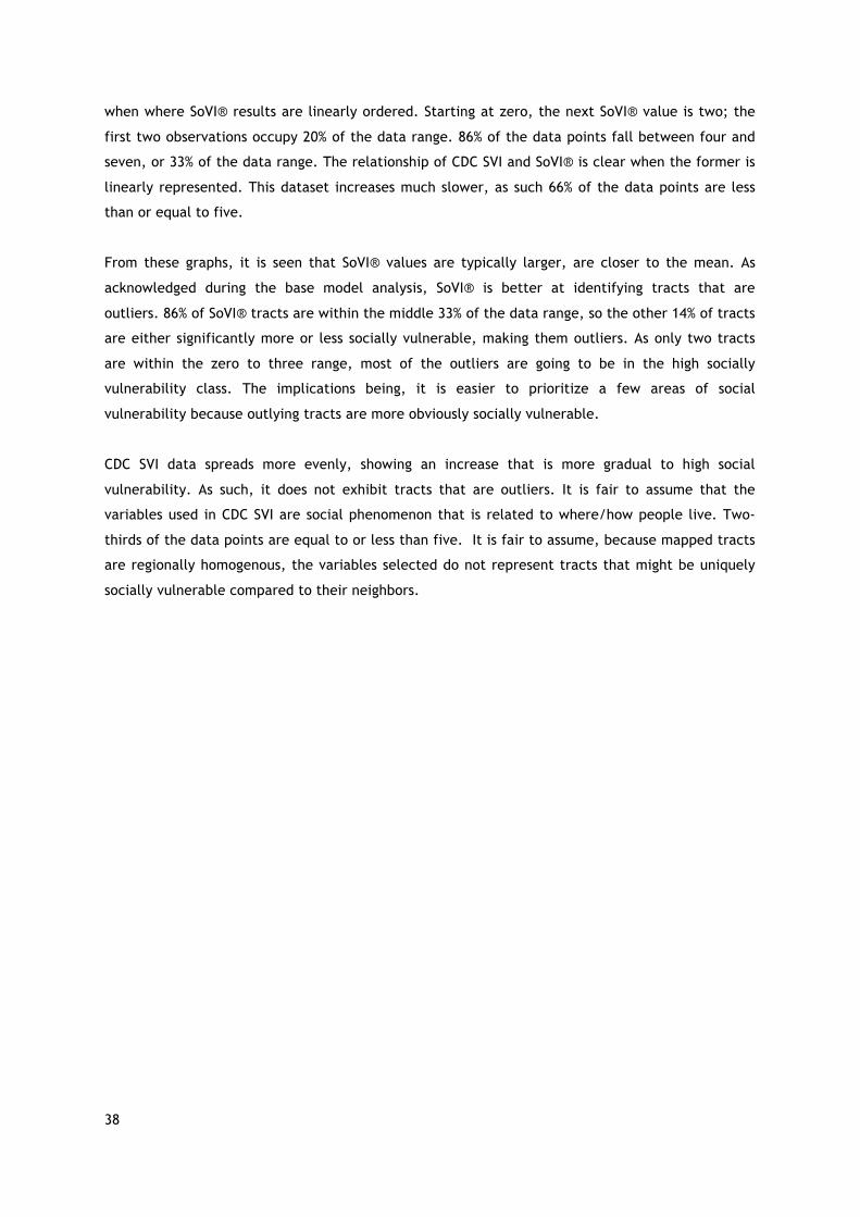
38
when where SoVI® results are linearly ordered. Starting at zero, the next SoVI® value is two; the
first two observations occupy 20% of the data range. 86% of the data points fall between four and
seven, or 33% of the data range. The relationship of CDC SVI and SoVI® is clear when the former is
linearly represented. This dataset increases much slower, as such 66% of the data points are less
than or equal to five.
From these graphs, it is seen that SoVI® values are typically larger, are closer to the mean. As
acknowledged during the base model analysis, SoVI® is better at identifying tracts that are
outliers. 86% of SoVI® tracts are within the middle 33% of the data range, so the other 14% of tracts
are either significantly more or less socially vulnerable, making them outliers. As only two tracts
are within the zero to three range, most of the outliers are going to be in the high socially
vulnerability class. The implications being, it is easier to prioritize a few areas of social
vulnerability because outlying tracts are more obviously socially vulnerable.
CDC SVI data spreads more evenly, showing an increase that is more gradual to high social
vulnerability. As such, it does not exhibit tracts that are outliers. It is fair to assume that the
variables used in CDC SVI are social phenomenon that is related to where/how people live. Two-
thirds of the data points are equal to or less than five. It is fair to assume, because mapped tracts
are regionally homogenous, the variables selected do not represent tracts that might be uniquely
socially vulnerable compared to their neighbors.

39
Figure 8: Spatial distribution of normalized difference from (CDC SVI) - (SoVI ®)
40
Figure 9: Scatterplot of normalized values ordered by census tract
Figure 11: Scatterplot of normalized values with CDC SVI values linearly
Figure 10: Scatterplot of normalized values with SoVI® values linearly

41
4.2.2 Ranked Values
The normalized values tell us little about the overall implication of the index because the results
are in relation to one another. However, by ranking the results, we can better tell the relation.
When the results are ranked for each model from one (least socially vulnerable) to 195 (most
socially vulnerable), the difference is found by subtracting CDC SVI from SoVI® (Figure 12). Similar
results are exhibited in the normalized map, where the negative values are representative of the
tract ranking as more socially vulnerable in SoVI®. If tracts move at least forty-nine ranks, they will
have moved one class in the quartile classification, if the tract moves ninety-eight or more, it will
have moved two classes. A tract in the northeastern corner has moved -97 places, but as will be
seen in the quartile classification, only moves one class. Some tracts rank very differently in the
two models, but only move one class. Although tracts may be significantly more socially vulnerable
in one model, the quantile classification can mute the difference in social vulnerability.
Figure 12: Spatial distribution of difference between tracts ranked (1. low social vulnerability - 195. high social vulnerability) from (CDC SVI) - (SoVI®)

42
4.2.3 Quantile Classification
To find the most different tracts when the base results are in four classes, the SoVI® class value is
subtracted from the CDC SVI class value. The purpose of finding the difference between the
quantile classification results is to know what tracts will be the most different when SFDEM is using
the map to make disaster risk reduction decisions.
When comparing the different quantiles classes (Figure 13), most (110) are classified at the same
level of social vulnerability. Eighty-five tracts deviate as either one class higher or lower. Four
tracts are represented two classes less socially vulnerable in the SoVI® model, and forty are
represented as one class lower in the CDC SVI model. In CDC SVI, seven tracts are rated as two
classes more socially vulnerable, while thirty-four are ranked one class higher than the CDC SVI
model. No tract moved from the highest class to the lowest class. This means that the base maps
rank most tracts about the same, and the eleven outlying tracts that moved two classes may have
unique populations that are seen in the variables of the base models. The real-world implication of
this is the attention that these tracts could be given by decision makers. However, it is always
important to analyze the variable values that compose the tracts social vulnerability score to
understand why it is considered vulnerable and how to curtail sustainable development for the
population.
Next, the composition of the eleven tracts that are the most different in quantile classification will
be analyzed. The variable values from both CDC SVI and SoVI® will be examined to understand
what variables make the largest contribution to the overall score. First, the four tracts that are
more socially vulnerable in SoVI® will be analyzed, then the eleven tracts that are more socially
vulnerable in CDC SVI will be analyzed.
Figure 13: Spatial distribution of difference between quantiled tracts (1. low social vulnerability to 4. high social vulnerability) from (CDC SVI) - (SoVI®)
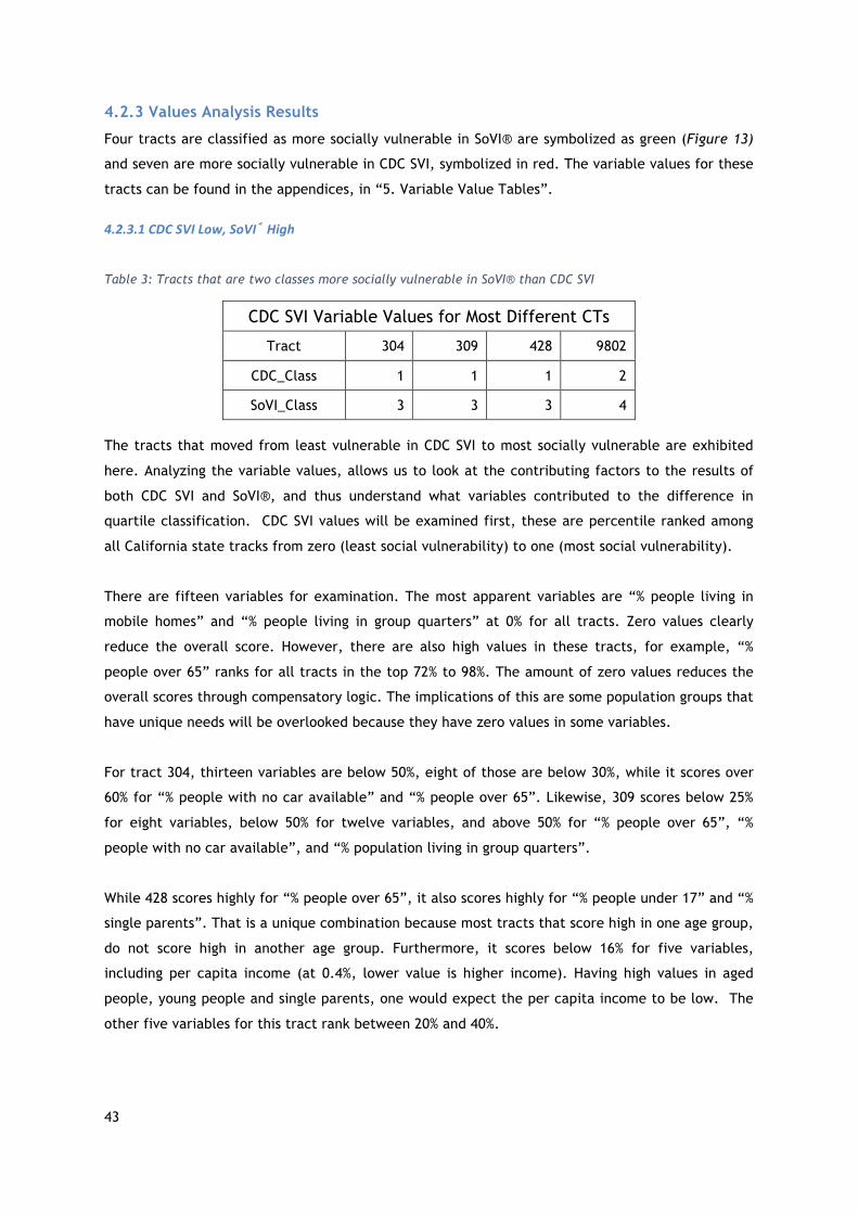
43
4.2.3 Values Analysis Results
Four tracts are classified as more socially vulnerable in SoVI® are symbolized as green (Figure 13)
and seven are more socially vulnerable in CDC SVI, symbolized in red. The variable values for these
tracts can be found in the appendices, in “5. Variable Value Tables”.
4.2.3.1CDCSVILow,SoVI®High
Table 3: Tracts that are two classes more socially vulnerable in SoVI® than CDC SVI
CDC SVI Variable Values for Most Different CTs
Tract 304 309 428 9802
CDC_Class 1 1 1 2
SoVI_Class 3 3 3 4
The tracts that moved from least vulnerable in CDC SVI to most socially vulnerable are exhibited
here. Analyzing the variable values, allows us to look at the contributing factors to the results of
both CDC SVI and SoVI®, and thus understand what variables contributed to the difference in
quartile classification. CDC SVI values will be examined first, these are percentile ranked among
all California state tracks from zero (least social vulnerability) to one (most social vulnerability).
There are fifteen variables for examination. The most apparent variables are “% people living in
mobile homes” and “% people living in group quarters” at 0% for all tracts. Zero values clearly
reduce the overall score. However, there are also high values in these tracts, for example, “%
people over 65” ranks for all tracts in the top 72% to 98%. The amount of zero values reduces the
overall scores through compensatory logic. The implications of this are some population groups that
have unique needs will be overlooked because they have zero values in some variables.
For tract 304, thirteen variables are below 50%, eight of those are below 30%, while it scores over
60% for “% people with no car available” and “% people over 65”. Likewise, 309 scores below 25%
for eight variables, below 50% for twelve variables, and above 50% for “% people over 65”, “%
people with no car available”, and “% population living in group quarters”.
While 428 scores highly for “% people over 65”, it also scores highly for “% people under 17” and “%
single parents”. That is a unique combination because most tracts that score high in one age group,
do not score high in another age group. Furthermore, it scores below 16% for five variables,
including per capita income (at 0.4%, lower value is higher income). Having high values in aged
people, young people and single parents, one would expect the per capita income to be low. The
other five variables for this tract rank between 20% and 40%.

44
9802 is an outlier of this group; it is above the 50% for five of variables, while it is in 0% for four
variables. It has the most zero values, but also has some of the highest values. As such, this tract’s
overall score is reduced, allowing it to be in the second least socially vulnerable class.
The SoVI® values for the corresponding tracts will now be discussed. These variable values are
ranked by z-values, having a standard deviation of one. Therefore, all negative values are below
the city mean, and any values greater than three or less -3 are highly unusual.
For these four tracts, most of the values (72%) are between -1 and one; within 68% of the
distribution. Only 30 data points (out of 108), are outside of 68%, it is these outlying data points
that are the most important for understanding why these four tracts were ranked in the higher
social vulnerability classes. There are twenty-seven variables to be examined.
There are four extreme outliers; three data points in 9802 and one in 428. The three outlying
variables in 9802 are all age related: “% population over 65”, “median age” and “% people living in
nursing homes”. The latter variable, with a value of 12, is high. This value compensates for low
values, making it one of the most socially vulnerable tracts in SoVI®. The other twenty-four
variables in this tract have lower social vulnerability than the other variables. 309 and 304
scores1.1 and 1.2 for “median rent” and “% of children in married couple families”, respectfully.
The other twenty-two variables are all below one, seventeen being negative. In sum, this tract is
classified as highly socially vulnerable in SoVI® because it ranks high on three out of twenty-seven
variables. The three variables all relate to old age, and thus, the model implicitly weights old age-
related vulnerability.
Tract 309 is high in “% population over sixty-five” and “median age”, both variables being
representative of aged people. Again, here is another example of old age-related vulnerability
given implicit weight, as it has high z-values for both age related variables. There are also a high
portion of people on government benefits in this tract, but it also has nigh median rent. People
that are supplementing their income or are dependent on external aid, and also live in an area
with high rent, probably spend a high portion of their income on their home, and thus are
considered more socially vulnerable due to lack of emergency funds that may be required during or
after a disaster.
The other outlying data point is “% households with income over $200,000 per year” is for tract
428. Tracts 304 and 309 also have high z-scores for this tract, (both 2). They are classified as
having high social vulnerability, but they are quite wealthy, as seen in the CDC SVI analysis. Due to
complications with the principle components analysis, the values for this variable were not
inverted, as they should have been, so a high z-values means high “% households with income over
$200,000 per year”. This variable has high values that should decrease the overall score, but

45
because the principle components analysis results, the higher census value increases the overall
score, making some tracts look more socially vulnerable than others.
428, 304, and 309 do not have any other values outside of -3 to three range. However, they are
composed of variables between one and three that contribute to a higher ranking of social
vulnerability. 428 has four variables, 304 has two, 309 has six. The common variable is “median
household value”, which is another variable that should have been inverted because high household
value is a sign of wealth.
Three of four variables that rank high in 428, are variables that should have been inverted. Besides
those previously mentioned, it includes “per capita income”. An ambiguous variable is “median
rent”. Whether rent is considered high or low, the amount of money spent per month is meaningful
in terms of one’s monthly income.
A large discrepancy between these tracts are the variable values for per capita income, used by
both models (Table 4). Values are high in SoVI®, and low in CDC, due to issues with the principle
components analysis. This is especially clear in tracts 428 and 9802, where 428 is given a z-score of
two, but a percentile ranking of .04%, while 9802 has a z-score of -.67, and percentile ranking of
33%. For per capita income, SoVI® puts 428 is in the 95% most socially vulnerable, while in CDC SVI,
it is in the lowest percentile. Since 9802 is the highest value in PCI, all the PERCAP all other values
should be smaller than its z-score, instead, 9802 has the highest value in PERCAP and PCI. As seen
in Table 20, 9802 has the smallest average income, but the lowest z-score.
Table 4: "Per capita income" variable value discrepancy. First four rows show SoVI® and CDC SVI ranking within the four tracts, as well as the assigned z-score or percentile ranking. The last row, shows the absolute mean value for per capita income
Tract: 304 309 428 9802
SoVI Rank 3 2 4 1
PERCAP 0.9467 0.4944 2.2140 -0.6747
CDC Rank 2 3 1 4
EPL_PCI 0.0295 0.0539 0.0045 0.3376
Absolute Per Capita Income 75,650 63,888 108,604 33,490
When SoVI® class is more socially vulnerable, and CDC SVI is low, a few variables are apparently
influential. Old age-related variables are strong influencers in these SoVI® CTs. There are three
variables in SoVI® that rank highly and are age related, and two in CDC SVI (Table 4). When

46
comparing the values for these four tracts in both models, they rank the same (as seen in Table
XX). Looking at the population map, 9802 has 299 people, has one of the lowest populations, but
63% of residents live in a nursing home, the highest in San Francisco, as such, the associated z-
score is 12.3597, an extreme outlier. Tract 9802 is an outlier in all age-related variables in both
models. As both models’ values are based on a variable’s rate of occurrence (versus absolute
value), smaller populations with high portion of a social phenomenon can be rated as more social
vulnerability, as is the case with tract 9802.
Table 5: Comparing the rankings of variables representing old age in both SoVI® and CDC SVI models
Tract: 304 309 428 9802
Rank: 1 2 3 4 % over 65 0.1759 0.8849 1.0586 3.6631 % in nursing homes -0.1499 -0.1499 -0.1499 12.3597 median age 0.7939 0.8769 1.7073 3.8332 % over 65 0.722 0.8795 0.9054 0.9896 % in institutionalized group home 0 0 0.563 0.9905
4.2.3.2SoVI®Low,CDCSVIHigh
The seven tracts that are more socially vulnerable in CDC SVI are: 111, 121, 178, 180, and 202. All
of these tracts are in the northeast corner of San Francisco, visualized in red in Figure 13. First,
the variable values of CDC SVI will be presented, then the variable values of SoVI® will.
Table 6: Tracts that are two classes more socially vulnerable in CDC SVI than SoVI®
CDC SVI Variable Values for Most Different CTs
Tract 111 121 124.02 158.01 178.02 180 202
CDC_Class 3 3 3 3 4 3 3
SoVI_Class 1 1 1 1 2 1 1
Across the board, all are in the highest percentiles for the three variables: “% population without
access to a vehicle”, “% of multi-unit buildings”, “% population in institutionalized group quarters”.
All are at least 60% for “% of disabled population”. SoVI® does not consider the last three variables
mentioned, which is a reason they are more classified as more socially vulnerable in CDC SVI. These
four variables are the only consistently high-ranking variables in this group of tracts. The variables
logically make sense. It is assumed that people living in multiunit buildings are less likely to have
cars, as cars are difficult and expensive to park. Additionally, people living in institutionalized

47
homes are more likely to be disabled. As all these numbers are based on the census, in which
people self-respond to (i.e. there is no “fact-checking” of responses), sometimes people may not
want to identify as “disabled” or are not aware that they are considered disabled. So, when filling
out the census it is assumed that disabled people in institutional homes are more likely to respond
as disabled as it is possibly apparent by their living situation, additionally, a person with a
disability may have an assistant help with the census. This could be the reason people in
institutionalized group homes and disabled people are both high in all tracts. The first two are not
considered in SoVI®, while the third is partially considered, and the last is fully considered. The
inclusion of the first three named variables is likely the driving force creating discrepancy between
the models. As seen in the mapped results of CDC SVI, there are areas of homogeneity, which can
be traced to variables that tend to be trends in neighborhoods (e.g. the prevalence of multiunit
buildings and no car access).
However, these tracts generally rank very low in per capita income, because CDC SVI inverts the
ranking for these variables, it means income in these tracts is high. High income is unexpected in
areas with high percentage of group homes and disabled people. However, the populations in those
groups could be relatively small compared to the whole population. Therefore, even if a variable is
high in some population groups, those groups can have a small number of people in them.
Furthermore, when groups with special needs are concentrated in areas where resources specific to
them are, it can change the index results. In other words, people concentrated in one tract
increase the social vulnerability score for that tract, and reduces it for the other tracts because
the scores are relative. This can be good for concentrated populations with unique needs, as
delivering services to these areas is obvious. Yet, it can make other areas with smaller populations
more vulnerable if services are not distributed.
Turning to SoVI®, these tracts are within the least socially vulnerable class. As such, there are not
many data points that fall outside of the 68% distribution range.
111, 121 and 124.02 are all greater than one standard deviation for “% renters”, “% people with no
car”. These values make them uniquely vulnerable, renters can be delayed in moving back into
their homes, and people without cars have fewer opportunities to evacuate. The low values in the
tracts compensate for these high values, placing these three tracts in the least vulnerable class.
Other than these three tracts and these two variables, there are no other patterns of high or low
ranking in this dataset.

48
5. Discussion Now that the results have been unpacked, the discussion will focus on the implications of them.
5.1 Correlation Analysis of Model Components The Pearson correlation was employed to inform how impactful different components of the CDC
SVI and SoVI® models are. First, the age dependency variable options in SoVI® were analyzed to
establish what the SoVI® base index would be. Next, the CDC SVI base model and SoVI® base model
were correlated to understand how strongly associated they are. To understand the nuances in the
base models, the components of geographic scale and statistical choices were analyzed. Finally,
2014 and 2015 versions of SoVI® were analyzed to understand if the model needs to be updated
yearly.
Every correlation analysis showed strong association. It is fair to assume that changing one
component of a complicated index does not have far-reaching consequences. This is called a
sensitivity analysis; when one component is changed, and the rest stays constant. However, it is
not easy to employ a global analysis (when many components are changed) to a complicated index
because it is difficult to trace the influence of each component in the results (Tate, 2012).
Two models of SoVI® were created to find which age dependency variables should be used
(UNDER_5 or OVER_65. Neither greatly changed the outcome of the index. As Schmidtlein et al.
found, SoVI® is robust enough to withstand small changes in variable selection (2008), so results
here are not surprising. However, the difference between the actual average tract percentage of
the over sixty-five and under five population is quite significant at 10%. So, although the final
results are not greatly impacted, San Francisco’s age related social vulnerability is greater linked
to people over sixty-five. Within an index, the real-life significance of single variables is often
forgotten (Rygel, 2005). Since the results are strongly correlated, it would appear that selecting
either will suffice for the index. However, if you look at the actual percentage of these
populations, it is clear that SFDEM should focus on the unique needs of aged people.
The base models correlated the weakest (although still considered strong), likely because they
have the most different components, as compared to the other analysis. Yet they have different
patterns of social vulnerability. CDC SVI has more homogenous patterns, while SoVI® shows more
outliers. This means that social vulnerability diversity is more apparent in SoVI®. If SFDEM wants to
strengthen relationships in socially vulnerable neighborhoods, SoVI® provides more evidence of
where socially vulnerable populations are throughout the city, beyond not just large regions.
Furthermore, it is important to look into the variables that compose the outliers in SoVI® model to
know why the tracts are socially vulnerable, and employ appropriate disaster risk reduction
initiative for that tract.

49
Most surprisingly, the geographic scale correlation coefficients were extremely strong, meaning
SFDEM could use any of the data sets for assessing social vulnerability in the city. Over 10% of all
U.S. tracts are in California, therefore, by sheer numbers, it has the largest impact on USA_CDC
dataset. Furthermore, using a high number of diverse geographic units in a CDC SVI map could
smooth results to be for similarity at all levels.
Like the other correlation coefficients, statistical choices analysis results were also similar. Both
models transform census data from either “percentage of the population” or “average values” (e.g.
percent minority and average per capita income), into percentile rankings or z-values, in which
numbers are ranked from lowest socially vulnerable to highest socially vulnerable. Correlation was
likely to be strong because both methods used the same type of census value (Jones and Andry
(2007). Perhaps more change would have been exhibited if one model used absolute values (i.e.
the number of a variable occurring in the tract) (ibid).
Expanding on the base model analysis, it is clear that CDC SVI’s percentile methodology made areas
more homogenous because of the variables chosen, not because of the statistical choices. When
percentile methodology is applied to SoVI® variables, the resulting map still has areas with
outliers, showing that the variables are more influential than the statistical choices. This tells us
why CDC SVI base map is more homogenous, and SoVI® has more outliers, however, in a
complicated index, it is impractical to attribute all of a resulting aspect to one component.
5.2 Most Different Tracts Analysis The base models had very similar results, as both maps show the highest areas of social
vulnerability in the northeast and southern parts of the city. While the results are similar, and do
not have far reaching differential impacts, the variables that make up the indices have impacts on
the results. To analyze how different the results are, normalized values, ranked values, and the
quantile classification will be discussed, to show the overall differences between the maps. Then,
the variables that compose the most different tracts from quantile classification will be discussed.
5.2.3 Normalized, Ranked and Quantile Tracts
The scatterplots make it clear that CDC SVI variables are more evenly distributed, and SoVI®
variables are distributed close to the mean, as Schmidtlein, et al. (2008) found. When looking at
the index values, SoVI® makes identifying outliers and drawing boundaries of different social
vulnerability classes easier because the divisions are more obvious. Other than what is gathered
through observing trends of the normalized values, the implications of the normalized value
analysis are not far reaching, because the end result of each index is based on the relationship
tract values have to one another.
Ranking values shows the relationship that each individual tract has. If SFDEM wants to focus on the
top most socially vulnerable tracts (or communities), they should look to what tracts are in the top

50
rankings, then observe the values of those tracts to understand why they are considered more
vulnerable than other tracts.
While the merits to analyzing the most socially vulnerable by ranking is clear, CDC SVI and SoVI®
visualize their results in classes. Quantile classification (four classes, low to high) was chosen for
this analysis. When comparing the two models, most tracts stayed in the same class or moved one
class. Eleven tracts moved two classes, which is considered significant. However, the very low
number of tracts that moved two classes, is not significant. As analysis earlier in this research has
shown, the two base models are very similar.
The most meaningful information from this part of analysis are the scatterplots and ranking
analysis. The scatterplots tell us how the index results are in relation to each other, and the
relationship within the index. The ranking analysis informs the individual relative placement of
social vulnerability. As acknowledged, analyzing the ranking difference is not as important as
analyzing the quantile class change, so the tracts that are the most different in the quantile
analysis will be discussed.
5.2.4 Value Analysis
This section will explore the underlying aspects of classification change between the models. Five
of the examined tracts move from the third class to the first class, while only two tracts moved
from the fourth to second class.
5.2.4.1CDCSVILowandSoVI®High
Table 7: Tracts that are two classes more socially vulnerable in SoVI® than CDC SVI
CDC SVI Variable Values for Most Different CTs
Tract 304 309 428 9802
CDC_Class 1 1 1 2
SoVI_Class 3 3 3 4
Because SoVI® uses two variables to directly represent age related social vulnerability, and
includes a group quarters variable that is typically for elderly people, age related social
vulnerability is compounded, and is thus, implicitly weighted (Jones and Andry, 2007).
Although these tracts all rank high in for “% over 65” in CDC SVI, their overall score is reduced by
zero values. Tract 9802 has four zeros, while the other tracts have two. Compensatory logic can be
harmful in social vulnerability indices because it diminishes the unique vulnerability one population
group may have (Jones and Andry, 2007). 9802 is classified as having lower social vulnerability in
CDC SVI, but that does not mean the area is not socially vulnerable, people over sixty-five are

51
typically physically less able to respond to a hazard, more prone to illness and injury, and more
socially isolated, these factors can make them more dependent on others, but less able to be
helped. However, as explored in the “Limitations of social vulnerability” section, social
vulnerability needs to be associated with the built environment, a specific hazard, and the place-
specific social, political, economic situation, to understand how the identity of a population makes
them vulnerable to a hazard.
Compensatory logic exists in both models. Rygel, et al., proposes a solution to compensatory logic;
Pareto Ranking, a method that orders geographic units by how many high variables there are
(2006). Tracts 304, 309, and 428 are all considered the least socially vulnerable in CDC SVI, but
they all rank high for “% population over 65”. It is fair to assume that with Pareto Ranking none
would be in the lowest socially vulnerable class, as they rank high on at least one variable.
In sum, the SoVI® model exhibits old age-related vulnerability because it uses multiple variables to
represent it. When age related variables are ranked, CDC SVI tracts are ranked the same as SoVI®.
While CDC SVI, shows these tracts are socially vulnerable because of old people, they are not more
socially vulnerable than most other tracts because other variables compensate, and reduce the
overall score. SoVI® index results show tracts that are more socially vulnerable because of an aged
population.
5.2.4.2SoVI®LowandCDCSVIHigh
Table 8: Tracts that are two classes more socially vulnerable in CDC SVI than SoVI®
Tract 111 121 124.02 158.01 178.02 180 202
SoVI_Class 1 1 1 2 1 1 1
CDC_Class 3 3 3 3 4 3 3
Tracts that rank high in CDC SVI, and low in SoVI®, are all in the northeastern corner of San
Francisco. They score low in the SoVI® index as most variables are very low.
There is only one high scoring trend for the variables “% renters” and “% no car” for tracts 111,
121, and 124.02, as they score between one and 2.5. While their score is reduced with low values,
like “person per unit”, compensatory logic diminishes the reality that people in this area could
need evacuation assistance and have recovery needs unique to home renters. Again, this can be
harmful to this population if decision makers do not examine the variables to understand the
unique social vulnerability of different populations.

52
There are four CDC SVI variables that rank these tracts as very socially vulnerable, including: “%
disabled”, “% multiunits”, “% in group quarters”, “% no car”. It is fair to assume, that first two
variables relate, as do the latter two.
Clearly, the variable analysis has shown a many important aspects of these models. First, the
principle components analysis required by SoVI® creates a unique challenge, as it cannot tell what
variables create a social vulnerability community. A hierarchical model, like CDC SVI, gives more
control and more opportunities to apply contextual aspects to the results. This provides motivation
to continue to bridge the gap between qualitative and quantitative research. It is also seen that
small numbers of population groups can have high impact, especially if they are concentrated in
one area, where services may be. Both models give greater attention to small population groups
that have unique needs. It is seen in SoVI® with the aged population, and seen in CDC SVI with
group home and disabled population. The CDC SVI model also gave attention to areas with a high
percentage of multiunit structures and people without car access.
Some variables can be hidden in a large number of variables as social vulnerability indices combine
a diverse range of aspects that make a community social vulnerable, but translating that to specific
needs and sustainable development goals requires analysis of the variables. As seen in this analysis,
the tracts that are the most different have different needs, according to each model.
5.3 Usability Finally, the usability of each model will be discussed. The analysis for this section is based on a
SWOC analysis (Table 9). This approach looks at the internal and external pros and cons of the two
models. The internal analysis relates to the strengths and weaknesses that SFDEM will encounter
when using the model in their office, while the external analysis refers to the application disaster
risk reduction initiatives that SFDEM might carry out.

53
Table 9: SWOC Analysis of CDC SVI and SoVI®
Strengths Weaknesses
SFDE
Mfa
ctors
CDCSV
I
1. Time and cost2. Sustainability: released every other year3. Easy to use: can be simply download from
a website4. Variable and index output in percentiles
are easy to interpret5. Do not need basic knowledge of statistics,
although helpful 6. Has extensions for ArcGIS to improve
analysis7. Includes supplemental data (e.g. daytime
population)
1. Not updated to consider developments in social vulnerability research (or has not been updated as of 2017)
2. Percentile ranking makes it difficult to know if a variable is an outlier
3. Difficult to edit methodology to suit users’ needs
4. Dependent on funding from U.S. government
SoVI®
1. Sustainability: maps are applicable for at least two years
2. Z-value methodology makes it easy to understand if value is an outlier, and its relation to the mean
3. Updated to consider developments in social vulnerability research
4. Creative license: user can make changes to methodology while creating index to fit context
5. By creating the index, user has better knowledge of the index elements
1. Need basic knowledge of statistics2. Time and cost3. Ease of use: need to find and download data at
ACS website4. Lack of clarity around using principle
components analysis 5. Overall: disconnect to use in the real world,
seems more like a research tool and jumping off point for researchers, than a tool emergency management systems can use
Opportunities Challenges
DisasterRisk
Reductio
nap
plicationfactors
CDCSV
I
1. Can be easily applied to different geographic scales for coordination with other units
2. Directs focus to two main areas ofhighsocialvulnerability(insteadofmanysmallerareasscatteredthroughoutthecity)
3. Highlights disability, group home population, people without vehicles, and multiunit structures
1. With homogenous areas of social vulnerability, regionally unique tracts may go unnoticed
SoVI®
1. Shows tracts within regions that are more socially vulnerable than their nearest neighbor; does not homogenize areas of a city
2. Easy to find outliers 3. Highlights old age related social
vulnerability
1. Implicitly weighs old age

54
From the internal view, SoVI® may involve knowledge of statistics, but when examining variable
values, z-values are useful, as they are informative of the tract being an outlier, as well as its
relation to the mean. SoVI® is more challenging to apply, requires time and money, knowledge of
statistics and associated tools. SoVI® feels more like an academic tool, and less like a product for
emergency managers to use. It has provided a jumping off point into social vulnerability research
for many researchers and students. However, the real-world applicability is questioned.
CDC SVI, on the other hand, requires much less time and money. It is easy to download, and
provides clearer directions. This model feels more like a product, made by an organization with the
intent for it to be used by other organizations. The percentiles values are intuitively understood,
although, they do not provide information to say how much of an outlier a value is, or if it is
above/below the mean. Conversely to SoVI®, it has never been updated to account for new aspects
of social vulnerability.
Externally, SoVI® makes it easier to find tracts that are outliers. In different regions of the city it
shows a range of social vulnerability. Furthermore, it tends to focus on old age-related
vulnerability, as it implicitly weighs. On the other hand, CDC SVI variables tend to homogenize
areas of the city, and places socially vulnerable tracts in two regions; meaning uniquely vulnerable
tracts may go unnoticed. Furthermore, because CDC SVI is downloadable in state and national
dataset, it can easily be applied regionally. This is convenient if SFDEM is working with other
municipalities. The CDC SVI model tends to highlight disability, group home population, people
without vehicles, and multiunit structures.

55
6. Conclusion
At last, the research questions can be answered. From a Pearson correlation analysis, to variable
examination and SWOC analysis, these different approaches showed how the models’ components
contribute to their differences, the type of social vulnerability each exhibits, and the usability of
each model.
To what extent do the components of each model contribute to the varying results?
Pearson correlation results make it apparent that the tested components do not contribute greatly
to varying results in the base models. It should be noted that the CDC SVI and SoVI® base models
are not greatly different, as seen in the strong correlation coefficient. The analysis tested the
following components: the age dependency variables in SoVI®, the geographic scale at which CDC
SVI is indexed, and the statistical choices that transform census data into an index. Exchanging one
age related variable for another, as was done the age dependency variable analysis, showed strong
correlation, and therefore, SoVI® is not sensitive to one variable change. Three levels of
geographic scale were correlated from the CDC SVI model (local, state, national), and all
correlated extremely strongly, therefore, the state-level index that the CDC SVI base uses, does
not contribute to the varying results, any more than using the local- or national- level index would.
Finally, the statistical choices contributed the most, albeit small, to the varying results. The CDC
SVI’s variables more evenly distributes results, with areas of high social vulnerability concentrated
in some regions, while the SoVI® results are better at finding outliers, with areas of high social
vulnerability made apparent in each region, not just on an all-encompassing regional basis. It is
clear that the variables contribute the most to the end results of the models, in each model that is
age related in SoVI® and socioeconomic in CDC SoVI®.
What type of social vulnerability do the different models exhibit?
By analyzing the variables that contribute to the composition of the greatest changed classes, it is
apparent what population groups the models bring attention to, and inform their differential
results. Both models give greater attention to small population groups that have unique needs. It is
seen in SoVI® with the aged population, and seen in CDC SVI with the group home and disabled
population variables. The CDC SVI model also gave attention to areas with a high percentage of
multiunit structures and people without car access. All of these variables have different
implications for emergency management, as well, the implications depend on the hazard. In sum,
CDC SVI is better at finding socioeconomic related vulnerability, while SoVI® is more equipped to
finding age related vulnerability.
What is the usability of each model?

56
For internal use, the CDC SVI model has high usability; it is easy and simple.
For external use, the answer is less clear. SoVI® is better at finding tracts that are regionally
unique, which can force users to consider a tract they might not have. However, SoVI® implicitly
weighs old age, making some tracts more socially vulnerable than they should be. CDC SVI exhibits
homogenous patterns of social vulnerability, so uniquely vulnerable tracts may go unnoticed. On
the bright side, the components contributing to the more socially vulnerable tracts in the “variable
analysis” are more diverse, and thus, give a bigger picture of social vulnerability than SoVI®.
Neither of these models are specific to San Francisco, therefore, they do not consider place
specific social vulnerability. For example, neither model considers the homeless population, which
can complicate disaster response and recovery if residents with permanent housing need temporary
shelter. Furthermore, these maps do not take into consideration hazards or built environment
specific to San Francisco. When using maps solely focused on social vulnerability, it is important to
keep in mind that the most socially vulnerable areas may not be the most exposed or damaged
areas after a disaster, and that “policies and practices for disaster risk management should be
based on an understanding of disaster risk in all its dimensions” (UNISDR, 2015).
These indexes attempt to app8ly their model nation-wide, but if SFDEM uses either model, it is
imperative to examine the variables that compose the index, as they are directly related to the
type of vulnerability an organization would try to reduce. By not examining variables, an
emergency management organization assumes that an initiative to reduce vulnerability or
sustainably develop is successful and applicable across socioeconomic spectrums. For example, it
could be more effective to make public assistance more attainable in areas with a low rate of
private insurance verse an area with high damage that may have high rate of private insurance.
Moreover, if social vulnerability varies throughout a city because of a unique social fabric,
organizations aiming to sustainably develop and reduce disaster risk need to curtail initiatives to
suite the unique needs of a community.
As local and global organizations aim to reduce risk and vulnerability, “understanding risk in all its
components” (UNISDR, 2015) is important as risk is rooted not only in the hazard, built environment
or social systems, but in all three aspects. In other words, to reduce risk, efforts need to focus on
the multidimensional aspects of risk. Furthermore, how risk and vulnerability are understood is at
the root of effort to reduce risk. This research aims to contribute to understanding how social
vulnerability (one component of risk) is represented in indices and why it is represented as so, by
comparing two indices. In doing so, contribute to issues surrounding social vulnerability models to
support better decision-making. By comparing and analyzing the different “current state” models,
efforts to reduce disaster risk are improved, as decision makers can be more aware of the
implications of data that they base their efforts on.

57
References Abrahamsson, M. & Becker, P., 2010. Scoping study for partner driven cooperation in disaster risk
management between Sweden and Botswana.
Agency for Toxic Substances & Disease Registry. (2014). The Social Vulnerability Index (SVI).
Center for Disease Control. https://svi.cdc.gov/
An Equity Profile of the Five-County San Francisco Bay Area Region, 2017. Policy Link and PERE.
Available at:
http://nationalequityatlas.org/sites/default/files/5cntyBayAreaProfile_final.pdf
An, R, & Xiang, X 2016, 'Original Research: Age–period–cohort analyses of obesity prevalence in US
adults', Public Health, 141, pp. 163-169, ScienceDirect, EBSCOhost, viewed 18 August 2017.
Becker, P., 2014. Chapter 5 – Conceptual Frames for Risk, Resilience and Sustainable Development. Sustainability Science, pp.123–148.
Becker, P. & Abrahamsson, M., 2012. Designing Capacity Development for Disaster Risk Management: A Logical Framework Approach,
Blaikie, P. et al., 2003. At Risk: natural hazards, people’s vulnerability and disasters. Framework, p.134.
Bolin, R. and Stanford, L. M.: 1993, Emergency sheltering and housing of earthquake victims: The case of Santa Cruz County, In: P. A. Bolton (ed.), The Loma Prieta, California, Earthquake of October 17, 1989: Public Response, U.S. Government Printing Office, Washington, DC, pp. B43–B50.
Census.gov. (2012). Geographic Terms and Concepts – Census Tract. United States Census Bureau.
https://www.census.gov/geo/reference/gtc/gtc_ct.html
Census.gov (2016). When to Use 1-year, 3-year or 5-year Estimates.. United States Census Bureau.
https://www.census.gov/programs-surveys/acs/guidance/estimates.html
Census.gov. (2017). 2016 Data Release Schedule. United States Census Bureau.
https://www.census.gov/programs-surveys/acs/news/data-releases/2016/release-
schedule.html
Census.gov, 2015. American Community Survey and Puerto Rico Community Survey. United States
Census Bureau. https://www2.census.gov/programs-
surveys/acs/tech_docs/subject_definitions/2015_ACSSubjectDefinitions.pdf

58
Chakraborty, J., Tobin, G. a. & Montz, B.E., 2005. Population Evacuation: Assessing Spatial Variability in Geophysical Risk and Social Vulnerability to Natural Hazards. Natural Hazards Review, 6(1), pp.23–33.
Clark, G.E. et al., 1998. Assessing The Vulnerability Of Coastal Communities To Extreme Storms: The Case Of Revere, MA. Mitigation and Adaptation Strategies for Global Change, pp.59–82.
Coppola, D., 2011. Risk and Vulnerability. Introduction to International Disaster Management, pp.167–200.
Cutter, S.L., 2010. Social Science Perspectives onHazards and Vulnerability Science. East, (Icsu 2005), pp.41–55. Available at: http://www.springerlink.com/index/10.1007/978-90-481-3236-2.
Cutter, S.L., Boruff, B.J. & Shirley, W.L., 2003. Social Vulnerability to Environmental Hazards n. Social Science Quarterly, 84(2), pp.242–261. Available at: http://www.colorado.edu/hazards/resources/socy4037/Cutter Social vulnerability to environmental hazards.pdf.
Cutter, S.L. & Emrich, C.T., 2017. Social Vulnerability Index ( SoVI®): Methodology and Limitations.
Cutter, S.L., Mitchell, J.T. & Scott, M.S., 2000. Revealing the Vulnerability of People and Places: A Case Study of Georgetown County, South. Source: Annals of the Association of American Geographers, 90(4), pp.713–737. Available at: http://www.jstor.org/stable/1515440%5Cnhttp://www.jstor.org/page/.
Disease, C.C. for, 2017. SVI 2014 Documentation,
Donnelly, F.P., 2013. The American Community Survey: practical considerations for researchers. Reference Services Review, 41(2), pp.280–297. Available at: http://www.emeraldinsight.com/10.1108/00907321311326228.
Flanagan, B.E. et al., 2011. A Social Vulnerability Index for Disaster Management. Journal of Homeland Security and Emergency Management, 8(1), pp.1–22.
Fothergill, A., Maestas, E.G.M. & Darlington, J.D., 1999. Race, ethnicity and disasters in the United States: a review of the literature. Disasters, 23(2), pp.156–73. Available at: http://www.ncbi.nlm.nih.gov/pubmed/10379098.
Fothergill, A. & Peek, L.A., 2004. Poverty and Disaster in the United States: A Review of Recent Sociological Findings. Natural Hazards, 32(1), pp.89–110.
Frigerio, I. et al., 2016. A GIS-based approach to identify the spatial variability of social vulnerability to seismic hazard in Italy. Applied Geography, 74, pp.12–22.
Hallisey, E. et al., 2010. A Social Vulnerability Index (SVI) from the CDC. Cdc.
Hazards & Vulnerability Research Institute. (N.d.) SoVI®.
http://artsandsciences.sc.edu/geog/hvri/sovi%C2%AE-0
Horney, J, Nguyen, M, Salvesen, D, Tomasco, O, & Berke, P 2016, 'Engaging the public in planning
for disaster recovery', International Journal Of Disaster Risk Reduction, 17, pp. 33-37,
ScienceDirect, EBSCOhost, viewed 18 August 2017.

59
Jensen, A., 2006. San Francisco., pp.1906–1906.
Jones, B. and Andry, J., 2007. Vulnerability index construction: methodological choices and their influence on identifying vulnerable neighborhoods. Int. J. Emergency Management, 4(2), pp.2452–2455.
Juntunen, L., 2006. ADDRESSING SOCIAL VULNERABILITY TO HAZARDS,
LOUISIANA OFFICE OF COMMUNITY DEVELOPMENT, D.R.U., 2017. DISASTER RECOVERY INITIATIVE U.S. DEPARTMENT OF HOUSING AND URBAN DEVELOPMENT Allocations,
Noriega, G.R. & Ludwig, L.G., 2012. Social Vulnerability Assessment For Mitigation Of Local Earthquake Risk In Los Angeles County. Natural Hazards, 64(2), pp.1341–1355.
Martin, S.A., 2015. A framework to understand the relationship between social factors that reduce resilience in cities: Application to the City of Boston. International Journal of Disaster Risk Reduction, 12, pp.53–80. Available at: http://dx.doi.org/10.1016/j.ijdrr.2014.12.001.
Oswego.edu. n.d. The 68-95-99.7 Rule for Normal Distribution. Statistics @ SUNY Oswego.
OxFam America. (2017) Mapping Social Vulnerability in Southeastern States and the Gulf Coast. Oxfam America.
Rygel, L. & Yarnal, B., 2006. A Method For Constructing A Social Vulnerability Index: An Application To Hurricane Storm Surges In A Developed Country., pp.741–764.
Schmidtlein, M.C. et al., 2008. A sensitivity analysis of the social vulnerability index. Risk Analysis, 28(4), pp.1099–1114.
UNISDR, 2015. Sendai Framework for Disaster Risk Reduction 2015 - 2030. Third World Conference on Disaster Risk Reduction, Sendai, Japan, 14-18 March 2015., (March), pp.1–25.
sfdem.org, n.d. Our Hazards. http://sfdem.org/our-hazards
sfdem.org, n.d. Our Hazards. http://sfdem.org/mission.O
State Disaster Management Course, Unit 3: Disaster Sequence of Events,
Swan, R. Lee plans spending increase on SF homeless programs. 1 June 2017.
http://www.sfgate.com/bayarea/article/Lee-plans-spending-increase-on-SF-homeless-
11186826.php
Tate, E., 2012. Social vulnerability indices: A comparative assessment using uncertainty and sensitivity analysis. Natural Hazards, 63(2), pp.325–347.
Tate, E., 2013. Uncertainty Analysis for a Social Vulnerability Index. Annals of the Association of American Geographers, 103(3), pp.526–543.
Tehler, H., 2015. A general framework for risk assessment., 4, pp.1–26.
The San Francisco Foundation, 2014. Annual Report. http://powerofcommunity.sff.org/
Trochim, W. (2006). Levels of Measurement. Research Methods Knowledge Base.

60
U.S. Census Bureau; American Community Survey, 2014 American Community Survey 5-Year
Estimates.
Van Zandt, S. et al., 2012. Mapping social vulnerability to enhance housing and neighborhood resilience. Housing Policy Debate, 22(1), pp.29–55. Available at: http://www.scopus.com/inward/record.url?eid=2-s2.0-84868125092&partnerID=40&md5=5ec67d33fda5e1598581a1bf38e42c2c%5Cnhttp://www.tandfonline.com/doi/abs/10.1080/10511482.2011.624528%5Cnhttp://www.tandfonline.com.libproxy.ucl.ac.uk/doi/abs/10.1080/10511482.2.
Willis, I. & Fitton, J., 2016. A review of multivariate social vulnerability methodologies: A case study of the River Parrett catchment, UK. Natural Hazards and Earth System Sciences, 16(6), pp.1387–1399.
Wolkin, A. et al., 2015. Reducing Public Health Risk During Disasters: Identifying Social Vulnerabilities., 12(4), pp.809–822.
Wood, N.J., Burton, C.G. & Cutter, S.L., 2010. Community variations in social vulnerability to Cascadia-related tsunamis in the U.S. Pacific Northwest. Natural Hazards, 52(2), pp.369–389.

61
Appendices
1. Census Tract Map, San Francisco

62
2. Variables for CDC SVI and SoVI®
CDC SVI Variable Abbreviations and Name
Abbreviation Name Abbreviation Name
EPL Estimated Percentile EPL_MINRTY Minority
EPL_POV Below Poverty EPL_LIMENG Speak English “Less than Well”
EPL_UNEMP Unemployed SPL_THEME3 All EPLs for this theme summed
EPL_PCI Per Capita Income 1 EPL_MUNIT Multi-Unit Structures
EPL_NOHSDP No High School Diploma EPL_MOBILE Mobile Homes
SPL_THEME1 All EPLs for this theme summed EPL_CROWD Crowding
EPL_AGE65 Aged 65 or Older EPL_NOVEH No Vehicle
EPL_AGE17 Aged 17 or Younger EPL_GROUPQ Group Quarters
EPL_DISABL Civilian with a Disability SPL_THEME4 All EPLs for this theme summed
EPL_SNGPNT Single-Parent Households SPL_THEMES All themes summed
SPL_THEME2 All EPLs for this theme summed RPL_THEMES The overall social vulnerability score (The percentile ranking of SPL_THEMES)
SoVI® Variable Abbreviations and Names for Tract Level Analysis
Abbreviation Name Abbreviation Name
QASIAN % Asian QNOAUTO % Housing units with no car available
QSSBEN % Households receiving Social Security benefits QPOVTY % Persons living in poverty
QSERV % Employment in service occupations PPUNIT % Average number of
people per household
QRICH200K % Families earning more than $200,000 per year QAGEDEP % Population under 5 years
or age 65 and over
PERCAP Per capita income QNRRES % Population living in nursing facilities
MDGRENT Median gross rent for renter-occupied housing units
MEDAGE Median age
QED12LES % Population over 25 with less than 12 years of education QFEMLBR % Female participation in
the labor force
QESL % Population speaking English as a second language with limited English proficiency
QFEMALE % Female
MHSEVAL Median dollar value of owner-occupied housing units
QEXTRCT % Employment in extractive industries
QBLACK % African American (Black) population QHISP % Hispanic population
QCVLUN % Civilian labor force unemployed QUNOCCHU % Unoccupied housing units
1 This is the only variable in the CDC SVI dataset that has inverted values. High PCI is represented with low percentile ranking, so when added with other values, it reduces social vulnerability.

63
QFHH % Families with female-headed households with no spouse present QNATAM % Native American
population
QFAM % Children living in married couple families QMOHO % Population living in
mobile homes
QRENTER % Renter-occupied housing units SoVI® Total Total social vulnerability score

64
3. Steps for carrying out SoVI®
After reviewing the “recipe” for SoVI, I downloaded census data for San Francisco’s 197 census
tracts. Two tracts were then excluded, as they had no occupancy: a patch of the Pacific Ocean and
the remote Farollon Islands, to conclude with 195 tracts. I extracted the data for twenty-eight
variables, as seen in the following table. Because the directions suggest using either “% Population
under 5 years or age 65 and over”, I carried out the methodology twice, with both variables to
make an informed decision of which to use in the final SoVI® map, and understand how inclusion of
either group could change the appearance of social vulnerability. These variables are referred to as
“UNDER5” and “OVER65”.
Data was downloaded2 then refined to delete irrelevant data, and combined to one document.
Changes to the data sets were applied as follows. For the variables, “MDGRENT” and “MHSEVAL”,
there was a maximum of 2000 USD and 1,000,000 USD, respectively, expressed as “+2000” and
“+1,000,000” in the data, so was to “2000” and “1,000,000” for use in calculations. This was
applied to thirty census tracts for “MDGRENT” and thirty-eight for “MHSEVAL”. Additionally, the
latter variable, missing data for ten census tracts, so per SoVI® directions, it was replaced with
variable mean.
Next, values were converted to applicable percentages or whole numbers then standardized, using
z-score formula for each census variable. The z-score formula standardizes values with a mean of
zero and standard deviation of one, so the values are easy to interpret, i.e., all negative values are
smaller than the mean. For example, for all the values associated with the variable “% of Civilian
Labor Force Unemployed”, the mean (µ) and standard deviation (σ) of the values were found using
the application StatsPlus, then each value (χ) was put into the below formula using Excel.
After standardizing all values associated with the twenty-eight variables, a principle components
analysis (PCA) was performed via SPSS. A PCA groups variables that have strong correlation. The
purpose of the grouping is to create categories of correlated variables to understand variables’
relationships (i.e. which rise or fall together) (as seen in the PCA results table, below). A varimax
rotation with 100 iterations was used to extract components greater than one Eigen value,
resulting in six components, after thirteen iterations (see below). The recipe suggests examining
the scree plot for significant drops in Eigen value, after the first few drops. However, that was
difficult to decipher, and based on other researchers use of SoVI® (e.g. Frigerio et al., 2016), as
2 Data downloaded from:
https://factfinder.census.gov/faces/nav/jsf/pages/searchresults.xhtml?refresh=t

65
well as common statistical procedures (Costello & Osborn, 2005), Eigen values greater than one
were extracted.
The rotated component matrix (RCM) from the PCA results was analyzed to group the variables in
components. Components are grouped based on the highest “component loading score”, as seen in
the below table. The RCM is used (instead of the component matrix) because…
Once the variables could be categorized in components, they were named, based on component
themes. Then, variables were given cardinality, based on their tendency to increase or decrease
vulnerability.
Rotated Component Matrix from PCA for SoVI 2014 for San Francisco Census Tracts Rotation Method: Varimax with Kaiser Normalization.a
a. Rotation converged in 13 iterations.
Component
% Variance Explained
Component Name
Cardinality
Eigen Value Indicator Component Loading
1 31.227
Race (Asian) and Social
Status
+ 8.43
PERCAP -0.728 -0.498 0.024 -0.064 -0.201 0.034
MDGRENT -0.591 -0.438 0.454 -0.124 -0.037 -0.128
QED12LES 0.847 0.283 -0.065 0.141 0.152 0.036
QESL 0.936 0.111 0.016 0.164 0.063 -0.001
QSSBEN 0.588 0.095 0.375 0.539 -0.125 -0.098
QSERVE 0.769 0.398 -0.155 -0.016 0.254 0.065
QRICH200K -0.672 -0.448 0.285 0.026 -0.1 0.046
QASIAN 0.842 -0.145 0.175 0.174 -0.256 -0.033
MHSEVAL -0.471 -0.58 -0.026 -0.065 -0.17 -0.039
2 14.908 Race (Black) and Social Status
+ 4.03
QCVLUN 0.256 0.678 0.159 -0.172 0.077 0.158
QFAM -0.2 -0.631 0.257 0.074 -0.207 0.076
QFHH 0.361 0.749 0.352 -0.112 0.055 -0.033
QBLACK -0.052 0.890 -0.066 0.047 -0.067 0.169
3 12.477 Home Attributes + 3.37
QPOVTY 0.37 0.556 -0.585 0.107 0.049 0.14
QRENTER -0.071 0.039 -0.918 -0.204 0.007 -0.001
QNOAUTO 0.271 0.036 -0.891 0.029 0.008 0.1
PPUNIT 0.499 0.356 0.702 -0.118 0.172 -0.045
4 6.162 Age (Old) + 1.66
MEDAGE 0.284 -0.317 0.104 0.765 -0.079 0.122 OVER65 (AGEDEP) 0.332 -0.158 -0.09 0.813 -0.244 -0.142
QFEMLBR -0.486 -0.198 0.144 -0.62 0.023 0.038
QNRRES -0.262 0.071 0.052 0.660 0.205 -0.017
5 4.98
Ethnicity (Hispanic) and Extractive Industry
+ 1.34
QHISP 0.207 0.369 0.062 -0.201 0.716 0.049
QEXTRCT 0.093 0.012 0.031 0.024 0.687 -0.026
QFEMALE 0.296 0.094 0.245 -0.064 -0.447 -0.437

66
6 3.976
Housing and Race (Native Americans)
+ 1.07
QUNOCCHU -0.016 -0.066 -0.462 0.092 0.071 0.557
QNATAM 0.053 0.121 -0.06 0.016 0.441 0.573
QMOHO 0.046 0.207 0.063 -0.159 -0.184 0.677 Total Variance:
73.729
In my study, PCA is used to group the variables and understand how they are connected, not to
exclude the variables. Through researching via the SoVI® homepage, and associated academic
articles, there is no mention of eliminating variables. Opaque elements within the SoVI®
methodology are at the discrepancy of the user. Furthermore, it is potentially problematic to the
use of PCA to eliminate variables simply because PCA shows they do not geographically correlate
with other variables (Jones & Andrey, 2007).
Once components were identified, the z-values were added for each variable, then each
component was added together for an overall score.
Once the results were defined for age dependency datasets, I did a bivariate correlation analysis
with SPSS. I additionally, examined the mean percentage of populations of “OVER65” “UNDER5”,
and examined how these groups may be represented in other variables to understand which
variable is more important.
The data was then added to ArcGIS and visualized using quantile classification in five groups. SoVI®
directions from September 2016, write that classification is done using 3 or 5 grouping by standard
deviation or quantile method. Since standard deviation was only available for 6 or more classes,
quantile method was chosen. Furthermore, five classes, instead of three, was chosen to bring more
detail to the maps. SoVI® directions from March 2017, exclude any mention of quantile
classification, but the decision to use quantile classification had been made before the directions
were released.

67
3. Dataset Names and Correlation Analysis
NamesofDatasets
Name Explanation
CDC_Base 2014resultsforSanFranciscotracts,comparingalltractsonastate-widescalefromtheCDC,usingpercentile-rankingmethodology.Thisdatasetisthefocusoftheresearch
CDC_Normalized Sameasabove,butresultshavebeennormalizedona0to10scale.UsedforthepurposeofcomparingresultstoSoVI®.
SF_CDC 2014dataforSanFranciscotracts,comparingallcensustractsonacity-widescalefromtheCDC,usingpercentile-rankingmethodology.Thisdatasetwascreatedbytheauthorforthepurposeofthisresearch.
USA_CDC 2014dataforSanFranciscotracts,comparingalltractsonanation-widescalefromtheCDC,usingpercentile-rankingmethodology.
SF_CDC_ZScore 2014dataforSanFranciscotracts,comparingallcensustractsonacity-widescalefromtheCDCusingtheSoVI®Z-scorerankingmethodology.
SoVI_Base The2014SoVIresultsforSanFranciscocensustracts,includesthevariableOVER65andusingtheSoVI®Z-scorerankingmethodology.Thisdatasetisthefocusofthisresearch.UsedforthepurposeofcomparingresultstoCDC’sSVI.
SoVI_Normalized Sameasabove,butresultshavebeennormalizedona0to10scale.UsedforthepurposeofcomparingresultstoCDCSVI.
SoVI_2014_U5 The2014SoVIresultsforSanFranciscocensustracts,includesthevariableUNDER5andusingtheSoVI®Z-scorerankingmethodology.
SoVI_2015_U5 The2015SoVIresultsforSanFranciscocensustracts,includesthevariableUNDER5andusingtheSoVI®Z-scorerankingmethodology.
SoVI_2015_O65 The2015SoVIresultsforSanFranciscocensustracts,includesthevariableOVER65andusingtheSoVI®Z-scorerankingmethodology.
SoVI_Minority The2014SoVIresultsforSanFranciscocensustracts,includesthevariableMINORITY,andexcludesvariablesforindividualraceorethnicity.UsestheSoVI®Z-scorerankingmethodology.
SoVI_Percentile The2014SoVIresultsforSanFranciscocensustracts,includesthevariableOVER65,usingtheCDC’sSVIpercentilerankingmethodology
DatasetsAnalyzedviaPearsonCorrelationAnalysis
Analysis Dataset1 Dataset2 Purpose
StandardModel CDC_Standard SoVI_Standard
Tounderstandhowsimilarthetwodatasetsare,asthesearethetwooptionsthatwouldbeusedbySFDEM.
SoVI®Age SoVI_Standard SoVI_2014_U5 Tounderstandhowthesimilartheresultsaredependingontheagedependencyvariable.
SoVI®Age SoVI_2015_O65 SoVI_2015_U5 Tounderstandhowthesimilartheresultsaredependingontheagedependencyvariable.
68
SoVI®Year SoVI_Base SoVI_2015_O65Tounderstandhowsimilartheresultsarebetweenyearlydatatounderstandhowoftentheindexshouldtoberecreated.
Geographic SF_CDC CDC_BaseComparingthelocalandstateresultstounderstandhowsimilartheyare,andifusingeithermakesasignificantdifference.
Geographic SF_CDC USA_CDCComparingthelocalandstateresultstounderstandhowsimilartheyare,andifusingeithermakesasignificantdifference.
Geographic USA_CDC CDC_BaseComparingthelocalandstateresultstounderstandhowsimilartheyare,andifusingeithermakesasignificantdifference.
Statistical SF_CDC_ZScore SoVI_Base
ComparingtheCDCversionofZ-valuemethodologytotheSoVI®versiontoseehowsimilartheyare,andifthedifferencesinthebasemodelcanbecorrectedthroughstatisticalmeans.
Statistical SF_CDC_ZScore SF_CDCComparingmodelsusingthesamevariables,butdifferentstatisticalprocedurestounderstandifstatisticaldifferencescreatedifferentresults
Statistical SoVI_Base SoVI_PercentileComparingmodelsusingthesamevariables,butdifferentstatisticalprocedurestounderstandifstatisticaldifferencescreatedifferentresults
Statistical SoVI_Percentile CDC_Base
UsingtheSoVI®variablesinpercentilemethodologytotheCDCversiontoseehowsimilartheyare,andifthedifferencesinthebasemodelcanbecorrectedthroughstatisticalmeans.

69
4. Correlation Analysis Results
4.1 Age
4.2 Base Maps
4.3 Geographic Scale

70
4.4 Statistical Choices

71
4.5 Year

72
5. Variable Value Tables
CDC SVI Variable Values for Most Different CTs
Tract 304 309 428 9802
CDC_Class 1 1 1 2
SoVI_Class 3 3 3 4
EPL_POV 0.4516 0.1476 0.2655 0.3949
EPL_UNEMP 0.2318 0.1378 0.054 0.5552
EPL_PCI 0.0295 0.0539 0.0045 0.3376
EPL_NOHSDP 0.2734 0.2696 0.1051 0.192
EPL_AGE65 0.722 0.9054 0.8795 0.9896
EPL_AGE17 0.2797 0.2405 0.722 0.015
EPL_DISABL 0.1746 0.3325 0.1582 0
EPL_SNGPNT 0.19 0.1286 0.577 0
EPL_MINRTY 0.4444 0.4416 0.2154 0.1633
EPL_LIMENG 0.457 0.2927 0.365 0.6293
EPL_MUNIT 0.3446 0.1728 0.2387 0.6791
EPL_MOBILE 0 0 0 0
EPL_CROWD 0.3311 0 0.1226 0
EPL_NOVEH 0.6149 0.555 0.4069 0.5356
EPL_GROUPQ 0 0.563 0 0.9905
RPL_THEMES 0.1498 0.121 0.1073 0.2611

73
SoVI® Variable Values for Most Different CTs
Tract 304 309 428 9802
SoVI_Class 3 3 3 4 CDC_Class 1 1 1 2
QASIAN 0.6439 0.5654 -0.4497 -0.8317
QSSBEN 0.6822 1.6529 0.8567 0.8240
QSERVE -0.3821 -0.9717 -1.3445 -1.5872
QRICH200K 2.2855 1.8956 3.0351 0.6262
PERCAP 0.9467 0.4944 2.2140 -0.6747
MDGRENT -0.1688 1.1352 1.0493 1.1352
QED12LES -0.3544 -0.3619 -0.6380 -0.4962
QESL -0.2497 -0.5520 -0.7229 -0.3811
MHSEVAL 1.2126 1.2126 1.2126 -0.1731
QBLACK -0.5140 -0.4645 -0.6129 -0.0393
QCVLUN -0.2191 -0.7097 -1.0871 -1.0116
QFHH 0.2804 0.0131 0.3215 -0.8709
QFAM 0.7863 0.9974 0.8948 1.1780
QRENTER -1.8577 -2.2770 -1.7669 -0.3358
QNOAUTO -1.0049 -1.0518 -1.1505 -1.0659
QPOVTY -0.2108 -0.8954 -0.6473 -0.3596
PPUNIT 0.4973 0.5844 0.2507 -1.0696
OVER_65 0.1759 1.0586 0.8849 3.6631
QNRRES -0.1499 -0.1499 -0.1499 12.3597
MEDAGE 0.7939 1.7073 0.8769 3.8332
QFEMLBR -0.1712 -0.6183 -2.2608 -1.4030
QFEMALE 0.8350 0.3811 0.5382 -2.4296
QEXTRCT 0.2660 -0.4350 0.7333 -0.4350
QHISP -1.0264 -0.6045 -0.7251 -1.0350
QUNOCCHU -0.7095 -0.4423 0.7031 0.9130
QNATAM -0.7486 -0.2403 -0.8333 0.0986
QMOHO -0.0367 -0.2696 -0.2696 -0.2696 SoVI Total 1.6021 1.6541 0.9127 10.1619
74
SoVI® Variable Values for Most Different CTs
Tract 111 121 124.02 158.01 178.02 180 202
SoVI_Class 1 1 1 2 1 1 1
CDC_Class 3 3 3 3 4 3 3
CDC SVI Variable Values for Most Different CTs
Tract 111 121 124.02 158.01 178.02 180 202
CDC_Class 3 3 3 3 4 3 3
SoVI_Class 1 1 1 1 2 1 1
EPL_POV 0.4171 0.619 0.8484 0.5082 0.6685 0.7484 0.4351
EPL_UNEMP 0.0223 0.3743 0.1694 0.1751 0.4588 0.2012 0.4087
EPL_PCI 0.114 0.2729 0.2713 0.1707 0.1517 0.0533 0.1406
EPL_NOHSDP 0.443 0.3911 0.2006 0.2845 0.5374 0.4836 0.3951
EPL_AGE65 0.6782 0.4617 0.5359 0.5893 0.3084 0.0735 0.5153
EPL_AGE17 0.0271 0.0123 0.0347 0.0987 0.0436 0.0302 0.0425
EPL_DISABL 0.7507 0.6062 0.9668 0.7116 0.9796 0.7881 0.9292
EPL_SNGPNT 0.0364 0.0547 0.0551 0.2111 0.3068 0.0332 0.1408
EPL_MINRTY 0.3536 0.3931 0.4914 0.4857 0.4856 0.5011 0.387
EPL_LIMENG 0.642 0.5371 0.7211 0.5754 0.5908 0.4572 0.3978
EPL_MUNIT 0.9733 0.9933 0.9996 0.9008 0.9541 0.9789 0.8928
EPL_MOBILE 0 0 0 0 0 0 0
EPL_CROWD 0.5514 0.7535 0.6472 0.3897 0.6093 0.6207 0.4984
EPL_NOVEH 0.9968 0.9994 0.998 0.9892 0.9935 0.9559 0.992
EPL_GROUPQ 0.7467 0.9718 0.9663 0.8531 0.9627 0.9846 0.7539
RPL_THEMES 0.428 0.5182 0.5747 0.4557 0.595 0.4504 0.4529
75
QASIAN -0.0573 -0.2195 0.2148 -0.8317 -0.0939 -0.5282 -0.9782
QSSBEN -0.5284 -0.8447 -0.9320 -0.4848 -1.2046 -2.1644 -0.3212
QSERVE 0.2248 -0.2000 0.2248 -0.2260 -0.0613 -0.7983 -0.1654
QRICH200K -0.5232 -1.0430 -1.0430 -0.6032 0.1265 1.5558 -0.6132
PERCAP 0.0156 -0.5349 -0.5301 -0.2364 -0.1663 0.5007 -0.1208
MDGRENT -0.2695 -0.4193 -1.1781 -0.9498 -1.1045 1.1352 -0.3211
QED12LES 0.0263 -0.1081 -0.4813 -0.3320 0.3174 0.1457 -0.1006
QESL -0.1971 -0.0328 -0.1708 -0.5980 -0.3022 -0.5783 -0.6309
MHSEVAL 0.1328 -1.5868 -2.1555 -0.2887 -0.7359 -0.1758 -0.5515
QBLACK -0.3953 -0.2469 -0.1085 2.3936 0.2673 1.0288 -0.0788
QCVLUN -1.2004 0.3470 -0.5965 -0.3701 0.3848 -0.4833 0.5357
QFHH -0.4186 -0.6962 -0.5728 0.7018 -0.3158 -0.7579 -0.1514
QFAM 0.9219 -0.1876 0.9714 0.2574 0.3122 0.3915 0.4004
QRENTER 1.0693 1.3676 1.2033 0.6240 0.4338 -0.2450 0.9007
QNOAUTO 1.6544 2.5894 2.1665 0.6959 0.9684 -0.1404 0.8322
QPOVTY -0.3001 0.3250 1.4957 -0.0421 0.5333 0.9103 -0.2505
PPUNIT -1.0986 -1.3742 -1.3887 -0.3732 -0.4892 -1.2437 -0.7504
OVER_65 0.0312 -0.4752 -0.3160 -0.2003 -0.7790 -1.3289 -0.3594
QNRRES -0.1306 -0.1499 -0.1499 -0.1499 -0.1499 -0.1499 -0.1499
MEDAGE -0.6843 -1.3818 -0.2691 -0.4185 -0.0864 -0.2192 -0.3189
QFEMLBR 0.5861 0.5679 -1.1476 -0.3628 -0.4815 0.2759 0.7777
QFEMALE -0.2823 -0.5616 -0.8759 0.1018 0.0145 -3.3025 -2.2201
QEXTRCT -0.4350 -0.4350 0.4997 -0.4350 -0.4350 -0.4350 0.4997
QHISP -0.5185 0.4027 -0.1052 -0.3635 0.0411 0.0497 0.4715
QUNOCCHU -0.0414 -1.2249 0.9512 -0.7859 2.4974 1.1421 0.0540
QNATAM -1.0027 0.4375 -0.3250 -0.6639 -0.0708 0.4375 -0.8333
QMOHO -0.2696 -0.2696 -0.2696 -0.2696 -0.2696 -0.2696 -0.2696
SoVI Total -3.6904 -5.9550 -4.8880 -4.2108 -0.8493 -5.2471 -4.7132