Embed Size (px)
Citation preview

NCHRP REPORT 55ONational Cooperative Highway Research Program
TCRP REPORT 11OTransit Cooperative Research Program
COMMUTING IN AMERICA IIIThe Third National Report on Commuting Patterns and Trends

OFFICERS
Chair: Michael D. Meyer, Professor, School of Civil and Environmental Engineering, Georgia Institute of Technology
Vice Chair: Linda S. Watson, Executive Director, LYNX—Central Florida Regional Transportation Authority
Executive Director: Robert E. Skinner, Jr., Transportation Research Board
MEMBERS
MICHAEL W. BEHRENS, Executive Director, Texas DOT
ALLEN D. BIEHLER, Secretary, Pennsylvania DOT
JOHN D. BOWE, Regional President, APL Americas, Oakland, CA
LARRY L. BROWN, SR., Executive Director, Mississippi DOT
DEBORAH H. BUTLER, Vice President, Customer Service, Norfolk Southern Corporation and Subsidiaries, Atlanta, GA
ANNE P. CANBY, President, Surface Transportation Policy Project, Washington, DC
DOUGLAS G. DUNCAN, President and CEO, FedEx Freight, Memphis, TN
NICHOLAS J. GARBER, Henry L. Kinnier Professor, Department of Civil Engineering, University of Virginia, Charlottesville
ANGELA GITTENS, Vice President, Airport Business Services, HNTB Corporation, Miami, FL
GENEVIEVE GIULIANO, Professor and Senior Associate Dean of Research and Technology, School of Policy, Planning, and Development, and Director, METRANS National Center for Metropolitan Transportation Research, USC, Los Angeles
SUSAN HANSON, Landry University Professor of Geography, Graduate School of Geography, Clark University, Worcester, MA
JAMES R. HERTWIG, President, CSX Intermodal, Jacksonville, FL
GLORIA J. JEFF, General Manager, City of Los Angeles DOT
ADIB K. KANAFANI, Cahill Professor of Civil Engineering, University of California, Berkeley
HAROLD E. LINNENKOHL, Commissioner, Georgia DOT
SUE MCNEIL, Professor, Department of Civil and Environmental Engineering, University of Delaware
DEBRA L. MILLER, Secretary, Kansas DOT
MICHAEL R. MORRIS, Director of Transportation, North Central Texas Council of Governments
CAROL A. MURRAY, Commissioner, New Hampshire DOT
JOHN R. NJORD, Executive Director, Utah DOT
SANDRA ROSENBLOOM, Professor of Planning, University of Arizona, Tucson
HENRY GERARD SCHWARTZ, JR., Senior Professor, Washington University, St. Louis, MO
MICHAEL S. TOWNES, President and CEO, Hampton Roads Transit, Hampton, VA
C. MICHAEL WALTON, Ernest H. Cockrell Centennial Chair in Engineering, University of Texas at Austin
EX OFFICIO MEMBERS
THAD ALLEN (Adm., U.S. Coast Guard), Commandant, U.S. Coast Guard
THOMAS J. BARRETT (Vice Adm., U.S. Coast Guard, ret.), Pipeline and Hazardous Materials Safety Administrator, US DOT
MARION C. BLAKEY, Federal Aviation Administrator, US DOT
JOSEPH H. BOARDMAN, Federal Railroad Administrator, US DOT
REBECCA M. BREWSTER, President and COO, American Transportation Research Institute, Smyrna, GA
GEORGE BUGLIARELLO, Chancellor, Polytechnic University of New York, and Foreign Secretary, National Academy of Engineering
SANDRA K. BUSHUE, Deputy Administrator, Federal Transit Administration, US DOT
J. RICHARD CAPKA, Federal Highway Administrator, US DOT
EDWARD R. HAMBERGER, President and CEO, Association of American Railroads
JOHN C. HORSLEY, Executive Director, American Association of State Highway and Transportation Officials
DAVID H. HUGEL, Acting Administrator, Federal Motor Carrier Safety Administration, US DOT
J. EDWARD JOHNSON, Director, Applied Science Directorate, National Aeronautics and Space Administration
ASHOK G. KAVEESHWAR, Research and Innovative Technology Administrator, US DOT
WILLIAM W. MILLAR, President, American Public Transportation Association
NICOLE R. NASON, National Highway Traffic Safety Administrator, US DOT
JULIE A. NELSON, Acting Deputy Administrator, Maritime Administration, US DOT
JEFFREY N. SHANE, Under Secretary for Policy, US DOT
CARL A. STROCK (Maj. Gen., U.S. Army), Chief of Engineers and Commanding General, U.S. Army Corps of Engineers
TRANSPORTATION RESEARCH BOARD 2006 EXECUTIVE COMMITTEE (Membership as of June 2006)

Subject Areas Planning and Administration; Public Transit; and Highway Operations, Capacity, and Traffic Control
NCHRP REPORT 55ONational Cooperative Highway Research Program
TCRP REPORT 11OTransit Cooperative Research Program
Alan E. Pisarski
COMMUTING IN AMERICA IIIThe Third National Report on Commuting Patterns and Trends
Transportation Research BoardWashington, D.C.www.trb.org2OO6

ii | COMMUT ING IN AMER I CA IIIii | COMMUT ING IN AMER I CA III
NATIONAL COOPERATIVE HIGHWAY RESEARCH PROGRAM
The highway administrators of the American Association of State Highway and Transportation Officials initiated in 1962 an objective national highway research program employing modern scientific techniques. This program is supported on a continuing basis by funds from participating member states of the Association, and it receives the full cooperation and support of the Federal Highway Administration of the U.S. Department of Transportation.
The Transportation Research Board (TRB) of the National Academies was requested by the Association to administer the research program because of the Board’s recognized objectivity and understanding of modern research practices. TRB is uniquely suited for this purpose as it maintains an extensive committee structure from which authorities on any highway transportation subject may be drawn; it possesses avenues of communications and cooperation with federal, state, and local governmental agencies, universities, and industry; and its relationship to the National Academies ensures objectivity.
Each year, specific areas of research needs to be included in the program are proposed to the National Research Council and TRB by the American Association of State Highway and Transportation Officials. Research projects to fulfill these needs are defined by TRB, and qualified research agencies are selected from those that have submitted proposals. Administration and surveillance of research contracts are the responsibilities of the National Research Council and the Transportation Research Board.
The needs for highway research are many, and the National Cooperative Highway Research Program makes significant contribu-tions to the solution of highway transportation problems of mutual concern to many responsible groups.
NCHRP REPORT 550Project 20-24(34)ISSN 0077-5614ISBN-10: 0-309-09853-XISBN-13: 978-0-309-09853-3Library of Congress Control Number 2006924489
NOTICE
The project that is the subject of this report was a part of the NCHRP and TCRP conducted by the Transportation Research Board with the approval of the Governing Board of the National Research Council. Such approval reflects the Governing Board’s judgment that the project concerned is appropriate with respect to both the purposes and resources of the National Research Council.
The members of the technical panel selected to monitor this project and to review this report were chosen for recognized scholarly competence and with due consideration for the balance of disciplines appropriate to the project. The opinions and conclusions expressed or implied are those of the research agency that performed the research, and while they have been accepted as appropriate by the technical panel, they are not necessarily those of the TRB, the National Research Council, AASHTO, the TDC, or the FHWA and the FTA of the U.S. Department of Transportation.
Each report is reviewed and accepted for publication by the technical panel according to procedures established and monitored by the Transportation Research Board Executive Committee and the Governing Board of the National Research Council.
TRANSIT COOPERATIVE RESEARCH PROGRAM
The nation’s growth and the need to meet mobility, environmental, and energy objectives place demands on public transit systems. Research is necessary to solve operating problems, to adapt appropriate new technologies from other industries, and to introduce innovations into the transit industry. The Transit Cooperative Research Program (TCRP), modeled after the longstanding and successful National Cooperative Highway Research Program, serves as one of the principal means by which the transit industry can develop innovative near-term solutions to meet demands placed on it.
The need for TCRP was originally identified in a 1987 TRB report, Research for Public Transit: New Directions, based on a study sponsored by the Urban Mass Transportation Administration—now the Federal Transit Administration (FTA). A report by the American Public Transportation Association (APTA), Transportation 2000, also recognized the need for local, problem-solving research.
Established under FTA sponsorship in July 1992, TCRP was authorized as part of the Intermodal Surface Transportation Efficiency Act of 1991. In 1992, a memorandum agreement outlining TCRP operating procedures was executed by the three cooperating organizations: FTA; The National Academies, acting through the Transportation Research Board (TRB); and the Transit Development Corporation, Inc. (TDC), a nonprofit educational and research organization established by APTA. TDC is responsible for forming the independent governing board, designated as the TCRP Oversight and Project Selection (TOPS) Committee.
Research problem statements for TCRP are solicited periodically but may be submitted to TRB by anyone at any time. It is the responsibility of the TOPS Committee to formulate the research program by identifying the highest priority projects.
TCRP REPORT 110Project J-6 Task 55ISSN 1073-4872ISBN-10: 0-309-09853-XISBN-13: 978-0-309-09853-3Library of Congress Control Number 2006924489
COPYRIGHT PERMISSION
Authors herein are responsible for the authenticity of their materials and for obtaining written permissions from publishers or persons who own the copyright to any previously published or copyrighted material used herein.
Cooperative Research Programs (CRP) grants permission to reproduce material in this publication for classroom and not-for-profit purposes. Permission is given with the understanding that none of the material will be used to imply TRB, AASHTO, FAA, FHWA, FMCSA, FTA, APTA, or Transit Development Corporation endorsement of a particular product, method, or practice.
It is expected that those reproducing the material in this document for educational and not-for-profit uses will give appropriate acknowledgment of the source of any reprinted or reproduced material. For other uses of the material, request permission from CRP.
Published reports of the COOPERATIVE RESEARCH PROGRAMS
are available from:
Transportation Research BoardBusiness Office
500 Fifth Street, N.W.Washington, D.C. 20001
and can be ordered through the Internet at http://www.national-academies.org/trb/bookstore
Printed in the United States of America© 2006 Transportation Research Board

The National Academy of Sciences is a private, nonprofi t, self-perpetuating society of distinguished scholars engaged in scientifi c and engineering research, dedicated to the furtherance of science and technology and to their use for the general welfare. On the authority of the charter granted to it by the Congress in 1863, the Academy has a mandate that requires it to advise the federal government on scientifi c and technical matters. Dr. Ralph J. Cicerone is president of the National Academy of Sciences.
The National Academy of Engineering was established in 1964, under the charter of the National Academy of Sci-ences, as a parallel organization of outstanding engineers. It is autonomous in its administration and in the selection of its members, sharing with the National Academy of Sciences the responsibility for advising the federal government. The National Academy of Engineering also sponsors engineering programs aimed at meeting national needs, encour-ages education and research, and recognizes the superior achievements of engineers. Dr. William A. Wulf is president of the National Academy of Engineering.
The Institute of Medicine was established in 1970 by the National Academy of Sciences to secure the services of eminent members of appropriate professions in the examination of policy matters pertaining to the health of the pub-lic. The Institute acts under the responsibility given to the National Academy of Sciences by its congressional charter to be an adviser to the federal government and, on its own initiative, to identify issues of medical care, research, and education. Dr. Harvey V. Fineberg is president of the Institute of Medicine.
The National Research Council was organized by the National Academy of Sciences in 1916 to associ-ate the broad community of science and technology with the Academy’s purposes of furthering knowledge and advising the federal government. Functioning in accordance with general policies determined by the Acad-emy, the Council has become the principal operating agency of both the National Academy of Sciences and the National Academy of Engineering in providing services to the government, the public, and the scien-tifi c and engineering communities. The Council is administered jointly by both the Academies and the In-stitute of Medicine. Dr. Ralph J. Cicerone and Dr. William A. Wulf are chair and vice chair, respectively, of the National Research Council.
The Transportation Research Board is a division of the National Research Council, which serves the National Acad-emy of Sciences and the National Academy of Engineering. The Board’s mission is to promote innovation and prog-ress in transportation through research. In an objective and interdisciplinary setting, the Board facilitates the sharing of information on transportation practice and policy by researchers and practitioners; stimulates research and offers research management services that promote technical excellence; provides expert advice on transportation policy and programs; and disseminates research results broadly and encourages their implementation. The Board’s varied activities annually engage more than 5,000 engineers, scientists, and other transportation researchers and practitioners from the public and private sectors and academia, all of whom contribute their expertise in the public interest. The program is supported by state transportation departments, federal agencies including the component administrations of the U.S. Department of Transportation, and other organizations and individuals interested in the development of transportation. www.TRB.org
www.national-academies.org
COMMUT ING IN AMER I CA III | iii

iv | COMMUT ING IN AMER I CA III
COOPERATIVE RESEARCH PROGRAMS STAFF FOR NCHRP REPORT 55O/TCRP REPORT 11O
ROBERT J. REILLY, Director, Cooperative Research Programs
CRAWFORD F. JENCKS, Manager, NCHRP
CHRISTOPHER W. JENKS, Manager, TCRP
EILEEN P. DELANEY, CRP Director of Publications
Cathy Frye, The Fresh Eye, Reston, Virginia
Dever Designs, Laurel, Maryland
Cover: Carpooling Image © Lawrence Manning/CORBIS
PROJECT PANEL FOR COMMUTING IN AMERICA III
DEBRA L. MILLER, Kansas DOT (Chair) Topeka, Kansas
FRANCES T. BANERJEE, Banerjee & Associates, San Marino, California
RICHARD C. FEDER, Port Authority of Allegheny County, Pittsburgh, Pennsylvania
PATRICIA S. HU, Oak Ridge National Laboratory, Oak Ridge, Tennessee
JONETTE R. KREIDEWEIS, Minnesota DOT, St. Paul, Minnesota
TIMOTHY J. LOMAX, Texas Transportation Institute, College Station, Texas
STEVEN E. POLZIN, University of South Florida, Tampa, Florida
CHARLES L. PURVIS, Metropolitan Transportation Commission–Oakland, California
SANDRA ROSENBLOOM, University of Arizona, Tucson, Arizona
PHILLIP A. SALOPEK, U.S. Census Bureau, Washington, D.C.
ROBERT G. STANLEY, Cambridge Systematics, Inc., Bethesda, Maryland
MARTIN WACHS, RAND Corporation, Santa Monica, California
JOHN C. HORSLEY, AASHTO Liaison
WILLIAM W. MILLAR, APTA Liaison
CHARLES D. NOTTINGHAM, FHWA Liaison
RICHARD P. STEINMANN, FTA Liaison
GEORGE E. SCHOENER, US DOT Liaison
THOMAS PALMERLEE, TRB Liaison

COMMUT ING IN AMER I CA III | v
Author AcknowledgmentsA document like this requires many hands and minds coming together. Many deserve recognition for their efforts to help make Commuting in America III a success. The project panel assembled for this effort was the dream team for anyone taking on this kind of study task. My thanks go to all of them. They were very helpful at every opportunity. I wish that I could have pursued all the vistas that they opened for me. Their chair, Secretary Deb Miller of Kansas DOT, was always available to help and to guide, despite her very weighty duties.
In addition to the panel, there was a technical team consisting of those close to NHTS/NPTS and the CTPP: Susan Liss and Elaine Murakami of FHWA and their consultants, Nancy McGuckin and Nanda Srinivasan, who worked on a continuing basis with Fahim Mohamed of MacroSys Research and Technology, which so ably supported me with data processing assistance. Mr. Mohamed, who handled all of the data conversion, worked with Robert Cohen and Phillip Salopek’s team at the Census Bureau that, as always, produced very impressive products with sound support and willingness to help.
There also was a team assembled by the TRB Urban Data Committee, which was led by Charles Purvis, and later Ed Christopher, that produced really remarkable datasets regarding downtown CBD commuting and transit corridor commuting that are unique and from which all will benefit.
In terms of putting the document together, TRB’s Cooperative Research Programs Publications Office hand-picked and supervised the resources needed to bring the report from manuscript to its final form. The document has been importantly improved by editor Cathy Frye who really did bring a fresh eye to the massive drafts I had compiled and did it with grace and good humor.
The sponsors of my work—NCHRP and TCRP—deserve special thanks. Overall thanks go to Executive Director Bob Skinner and the TRB, who were unstinting in their assistance. The team of Crawford Jencks and Christopher Jenks, managers of NCHRP and TCRP, respectively, and Bob Reilly, director of TRB’s Cooperative Research Programs, provided both support and encouragement during the hard sledding.
Finally, special thanks go to John Horsley who insisted that there would be a Commuting in America III, supported it vigorously from its inception, and assured that AASHTO, as it had with the predecessor documents, would provide the leadership to make it a success.
Alan E. Pisarski
vi | COMMUT ING IN AMER I CA III
ForewordCommuting in America III provides a snapshot view of commuting patterns and trends derived principally from an analysis of the 2000 decennial U.S. census and will be a valuable resource for those interested in public policy, planning, research, and educa-tion. This is the third report in this series authored by Alan E. Pisarski, transportation consultant, over the last 20 years. His first two reports, published in 1987 and 1996 along with decennial census data dating back to 1960, also have afforded Mr. Pisarski the opportunity for evaluations of patterns and trends over time. A full appreciation of commuting (the journey-to-work trip) requires an understanding of population and worker trends, the demographics of a changing population and households, vehicle availability, modal usage, travel times, congestion, and work locations—all covered by Commuting in America III. Previous Commuting in America reports presented an objective base for policy discussions of commuting-related issues. This third edition is expected to do the same.
Representatives of the American Asso-ciation of State Highway and Trans-portation Officials (AASHTO) and the American Public Transportation Association (APTA) initiated the idea of support for this third version of Com-muting in America through the National Cooperative Highway Research Program (NCHRP) and the Transit Cooperative Research Program (TCRP)—programs managed by the Transportation Research Board of the National Academies. Mr. Pisarski conducted work under the joint sponsorship of NCHRP Project 20-24(34) and TCRP Project J-6 Task 55. Mr. Pisarski was assisted by MacroSys Research and Technology in assem-bling the necessary data. Guidance and reviews of draft material were provided by a joint NCHRP and TCRP project panel, identified elsewhere in the report.
Through AASHTO’s pooled fund process, the Census Bureau provides special data tabulations related to the journey to work to participating states and metropolitan planning organiza-
tions. From these special tabulations, which comprise the Census Trans-portation Planning Package (CTPP), Mr. Pisarski is supplied with national summaries. For Commuting in America III, the supporting tabular information developed by the U.S. Census Bureau is available on the U.S. Department of Transportation, Research and Innova-tive Technology Administration, Bureau of Transportation Statistics’ website at www.transtats.bts.gov/DataIndex.asp for those interested in pursuing the findings and the characteristics of commuting in more depth. The summary tables can be found under “Census Transportation Planning Package (CTPP) 2000.” These data are a valuable resource and should be fully utilized.
Business and government leaders and others involved in public policy and planning will find Commuting in America III a vital resource for making

COMMUT ING IN AMER I CA III | vii
decisions affecting the provision of trans-portation facilities and services. Decision makers involved in land use and social issues will benefit from a review of the report as well.
Academics will want to use Commut-ing in America III as a resource document in developing and teaching classes on transportation planning and engineering and in research. The snapshot views of commuting patterns and trends over the years based on census data provide illus-trative examples of the evolution of the United States and the impact of transpor-tation on its citizens and vice versa.
Curious commuters will be interested in comparing one’s daily work trip to that of others. Commuting is an activity—an event—that many experience on a regular basis. It consumes time and effort; it is central to how one goes about business and plans personal time.
And lastly, Mr. Pisarski provides commentary on the future of census data available for analyzing commuting pat-terns and trends. The decennial system of the “long-form questionnaire” as the fundamental source for commuting data will be replaced by an annual sampling process called the American Community Survey (ACS). Some early results from this process have been included by Mr. Pisarski in his analyses.
Crawford F. JencksManagerNational Cooperative Highway Research Program
Christopher W. JenksManagerTransit Cooperative Research Program

viii | COMMUT ING IN AMER I CA III
Contents
EXECUTIVE SUMMARY
PART 1—UNDERSTANDING COMMUTING PATTERNS AND TRENDS
Chapter 1 Introduction Commuting and Overall Travel Study Structure
Chapter 2 Background Data Sources Geography Evolving Concepts
PART 2—COMMUTERS IN THE NINETIES
Chapter 3 Population and Worker Growth Some Surprises Parallel Labor Force Trends
Looking Beyond the Numbers—The Group Quarters PopulationBaby Boom Workers Approaching Retirement Male–Female Labor Force Trends Race and Ethnicity in Worker Trends About the Surprises in Worker GrowthAdjustments to the 2000 Decennial Census
Chapter 4 Population and Household TrendsGeographic Distribution of Growth
Regional Growth State GrowthMetropolitan GrowthLooking Beyond the Numbers—Gross and Net Flows
Population by Age and Gender The Impact of the Immigrant Population Households and PopulationHouseholds and Housing
Chapter 5 Vehicle Availability Patterns and TrendsDriver LicensingVehicle Ownership
Vehicle Type and AgeVehicle Ownership and Income Link between Home Ownership and Vehicle Ownership
xii
1
128
10
101214
15
15
15
16
18
18
19
20
22
23
24
24
24
25
26
27
31
32
32
33
35
35
38
39
40
40

COMMUT ING IN AMER I CA III | ix
EXECUTIVE SUMMARY
PART 1—UNDERSTANDING COMMUTING PATTERNS AND TRENDS
Chapter 1 Introduction Commuting and Overall Travel Study Structure
Chapter 2 Background Data Sources Geography Evolving Concepts
PART 2—COMMUTERS IN THE NINETIES
Chapter 3 Population and Worker Growth Some Surprises Parallel Labor Force Trends
Looking Beyond the Numbers—The Group Quarters PopulationBaby Boom Workers Approaching Retirement Male–Female Labor Force Trends Race and Ethnicity in Worker Trends About the Surprises in Worker GrowthAdjustments to the 2000 Decennial Census
Chapter 4 Population and Household TrendsGeographic Distribution of Growth
Regional Growth State GrowthMetropolitan GrowthLooking Beyond the Numbers—Gross and Net Flows
Population by Age and Gender The Impact of the Immigrant Population Households and PopulationHouseholds and Housing
Chapter 5 Vehicle Availability Patterns and TrendsDriver LicensingVehicle Ownership
Vehicle Type and AgeVehicle Ownership and Income Link between Home Ownership and Vehicle Ownership
Vehicles and WorkersZero-Vehicle Households
Where Are the Vehicle-Less?Who Are the Vehicle-Less?
PART 3—COMMUTING IN THE NINETIES
Chapter 6 Commuter Flow PatternsPresent State of Commuting PatternsCounty Patterns
County-to-County FlowsCounty Trends
Changing Work Trip LengthsMetropolitan TrendsIntermetropolitan Trends
Destination PatternsCentral City DestinationsSuburban Destinations Nonmetropolitan Destinations
Commuting BalanceLooking Beyond the Numbers—The Case of Fairfax County, Virginia
Chapter 7 Broad Modal Usage PatternsLooking Beyond the Numbers—Usual versus Actual Mode Used
Regional TrendsModal Usage Patterns by Age and Gender
Looking Beyond the Numbers—Modal Usage in Group Quarters Workers Over Age 55The Effect of Hours Worked
Modal Usage Patterns by Race and Ethnicity The Effect of Years in the United States
Modal Usage Patterns by Income and Vehicle OwnershipGeographic Considerations in Modal Shares
State Modal Usage Metropolitan Modal Usage Metropolitan Vehicle AccumulationsModal Shares in Urban Clusters of Nonmetropolitan AreasModal Shares by Flow Patterns
Recent Trends in Modal Shares
Chapter 8 Individual Modal PatternsPrivate Vehicle Usage CarpoolingPublic Transportation Commuting to Downtowns
Commuting in Transit Corridors Looking Beyond the Numbers—Transit and Carpooling
41
42
42
43
46
4646484850515253
54
55
56
56
56
58
60
63
65
65
66
68
68
70
71
72
75
75
76
77
78
79
82
85
85
87
89
93
95
96

x | COMMUT ING IN AMER I CA III
Working at Home Walking to WorkAll Nonmotorized Travel and Other Measures of Modal UsageOther Modes
Chapter 9 Commuter Travel TimesReliability of Commuter EstimatesTravel Times Less Than 20 Minutes or More Than 60 Minutes
Looking Beyond the Numbers—The “Extreme” CommuteState Travel TimesTravel Times by Mode of TransportationDemographic Attributes and Travel Times
Looking Beyond the Numbers—Isolating Travel Time and Distance
Chapter 10 Time Left Home Patterns by GenderPatterns by Age Patterns by Race and EthnicityPatterns by Mode of Transportation Used
Chapter 11 Congestion Congestion ComponentsMeasurementRecurring and Nonrecurring CongestionAttitudes Toward Congestion
Chapter 12 Commuter Costs Transportation and Consumer ExpendituresVehicle CostsTransportation Spending Based on Workers in the Consumer Unit Other Commuting CostsTransit Fare Costs
PART 4—CLOSING PERSPECTIVES
Chapter 13 New Approaches to Commuting Data The Census Long Form and Its Role in TransportationThe ACS and the Continuous Measurement Concept
Looking Beyond the Numbers—The Basic ACS Program Approach
Chapter 14 Opportunities and Challenges What Are the Transportation Opportunities?What Are the Transportation Challenges?
Chapter 15 Patterns to Watch Past Patterns
1. Will the Force of Immigration Continue or Taper Off?2. Will Immigrants Join the Typical Patterns of Vehicle Ownership and Travel Behavior or Will New Patterns Emerge?
Contents96
98
99
100
101 102
102
104
108
109
112
116
117119120123
123
125125126
127
129
131
131
133
133
135
136
137
137
137138
140
141
141
141
145
145
145
145
COMMUT ING IN AMER I CA III | xi
3. Will Greater Suburban Jobs/Worker Balance Occur or Will Things Stabilize at Present Levels?4. Will Racial and Ethnic Minorities Fully Join the Mainstream Car-Owning Classes?5. Will Technological Fixes Continue to Be Effective in Responding to Environmental Concerns?6. Will Telecommunications and the Growth in Working at Home Abet Dispersal and Take the Edge Off Commuting Problems in Many Areas?7. Will ITS Technologies Begin to Assert an Influence on Travel Times or Other Factors of Commuting?8. Will Aging Commuters Generate Shifts in the Style of Commuting?9. Will Population Growth Shift toward the Lower End of the Metropolitan Size Spectrum?10. Will the Public Find the New, Higher Density Communities Attractive Alternative Lifestyles?
Emerging Patterns Who and Where Will the Workers Be? Will Long-Distance Commuting Continue to Expand?Will the Role of the Work Trip Decline, Grow, or Evolve?Will the Value of Time in an Affluent Society Be the Major Force Guiding Decisions?Will the Value of Mobility in Our Society Be Recognized?
ConclusionAppendix 1 Glossary of Terms Appendix 2 Census Questions Appendix 3 CTPP TabulationsAppendix 4 Major Metropolitan Area Names and Population in 2000
LIST OF FIGURES AND TABLES
145
146
146
146
147
147
147
147
148
148
149
151
151
151
152
153
157
159
165
167

xii | COMMUT ING IN AMER I CA III
Commuting in America III examines current com-muting patterns in light of longstanding trends and emerging factors that affect commuting every day. The Census Bureau’s 2000 decennial census and its prede-cessor long-form surveys in the 1990, 1980, 1970, and 1960 decennial censuses form the primary informa-tion source for this and the two previous Commut-ing in America reports. Such detailed, geographically comprehensive data on commuting patterns provide uniform nationwide demographic information associ-ated with work travel and are consistent with most other national sources. One common finding in the 20-year Commuting in America series is that the nature of commuting continues to evolve and to challenge us.
In the 1970s, the arrival of the baby boom genera-tion on the work scene changed the entire dynamic of commuting trends. This change was compounded by the major surge of women into the workforce, which produced a permanent change in American com-muting. In the 1980s, those patterns broadened and solidified to reveal that the dominant story remained the boom in jobs supporting the job needs of the baby boomers, the boom in suburbanization and commuting from suburb to suburb, and the boom in vehicle ownership and commuting based on the private vehicle. The 1990s, while not seeing an end to those patterns, began to exhibit emerging patterns that indicated greater variability in the trends than previously encountered. These shifts in patterns made the national trend less of a template for individual local trends than it had been in the past.
Based on examination of the underlying fac-tors that govern trends, a new pattern also grew in prominence to reveal a series of dichotomies. There are noticeable differences in commuters who
■ Live in areas under or over 5 million inhabitants, ■ Are under or over 55 years old,■ Commute less or more than 20 minutes, and■ Leave for work before or after 8 a.m.
Examining these natural breakpoints in the con-tinuum of travel produces an insightful understand-ing of the trends. The persistence or discontinuation of previously noted patterns, as well as the acknowl-edgment of a series of surprises, also provides insights as described here.
THE SURPRISES OF CENSUS 2000To address these issues, understanding must have a foundation in the demographic, economic, and social trends affecting America over the years. Any discussion of current American demography must begin by recognizing that Census 2000 revealed
■ A population increase that was far greater than expected;
■ An immigration bubble; and ■ A simultaneous, unexpected decrease in the num-
ber of new workers added in the decade.
Population IncreaseA very simple but reliable approach to understanding the nation’s population growth and its projections into the future that served well for the last half of the past century was that roughly 25 million persons were added each decade from 1950-1990 and about 25 million per decade were expected to be added out to 2050—thus 100 years of very stable, predictable growth.
When the Census 2000 results were announced, instead of about 25 million in the period from 1990-2000, the census showed an increase of about 33 million, reaching a total population over 281 million. The 30-year decline in the rate of population growth as the baby boom waned took a sharp reversal in the 1990s and returned to the growth rates of the 1970s.
Immigration BubbleThe cause of the unexpected bubble was greater than anticipated immigration. Immigration matters greatly to commuting, changing both its scale and scope because immigrants are very often instant additions to the workforce. The foreign-born popu- lation arriving in the 1990s was particularly con-centrated in the 25-45 age group.1 Only 29% of the native population was in this group but 44% of immigrants were in that range. Thus, a shift in population due to immigration has an immediate impact on the number of workers and their com-muting. In this case, the size of the age group from
Executive Summary
1 Throughout this report, numbers in a range go to, but do not include, the ending number in the range.

COMMUT ING IN AMER I CA III | xiii
in immigrants that are largely of working age. Table ES-1 shows the growth patterns over the baby boom era in both workers and population.
16-65, the main working age group, reached a level in 2000 that had not been expected until 2003.
Unexpected Worker DecreaseDespite the sharp increase in population, worker growth reported by the decennial census was sharply lower than past decades—13 million versus more than 18 million in each of the previous decades. This sharp decline in the number and the rate of growth in workers in the 1990s comes as another demographic surprise. Some decline, certainly in percentage terms, was expected.2 However, many are hard-pressed to understand the sharper than expected declines, particularly given the larger than expected increases
The Impact of Immigration
The two major demographic forces affecting commuting are the declining infl uence of the baby boom generation and the simultaneous advent of a large immigrant population joining the labor force. Among those who arrived in the U.S. within the 5 years just prior to Census 2000, 80.5% were of working age in the 16-65 age group; less than 3% were over 65.
Although immigrants still constitute less than 14% of all workers, their role in most non–single occupant vehicle (SOV) modes of transportation are far greater. Immigrants constitute almost 20% of two-person carpools and more than 40% of large carpools. In particular, Hispanic immi-grants are strongly oriented to carpooling and are largely responsible for this mode’s resurgence. As shown in the fi gure below detailing modal usage by the total foreign-born population in the nation, immigrants also play substantial roles in transit, walking, and bicycling.
These modal patterns change with increased years of U.S. residency as shown in the fi gure to the right. This is consistent with transit’s historical role of introducing immigrant workers into the workforce and the nation’s economic mainstream.
Modal Usage by Immigrants by Years in the United States
The Foreign Born as a Share of Modal Usage
2 Commuting in America II noted that 1990 would be seen as the turning point that signaled the end of the worker boom.
TABLE ES-1 Worker and Population Increase, 1950-2000
Year Total Workers (Millions)
Worker Increase (Millions)
Worker Increase (%)
Population Increase (%)
1950 58.9 N/A N/A N/A
1960 65.8 6.9 11.7 18.5
1970 78.6 12.8 19.5 13.3
1980 96.7 18.1 23.0 11.4
1990 115.1 18.4 19.2 9.7
2000 128.3 13.2 11.5 13.2
Overall Change 69.4 117.8 86.0
Years in U.S.
Perce
nt
0
10
20
30
40
50
60
70
80
90
100
20+
15-20
10-15
5-10
< 5
Nativ
ebo
rn
OtherWork at homeWalkBikeTransit Carpool Drive alone
05
1015202530354045
Walk
Bike
Taxi
Ferry
Railro
ad
Subw
ayBus
4-pers
onca
rpool
3-pers
onca
rpool
2-pers
onca
rpool
Othe
r
Work
at ho
me
Motor
cycle
Stre
etcar
7-pers
on+
carpo
ol
5 or
6-pers
onca
rpool
Drive
alon
e
Mode
Fore
ign
born
(per
cent
)

THE 5-MILLION MARKSuburbanization Patterns Suburbanization has influenced commuting throughout the twentieth century, especially in the latter half of the century. Figure ES-1, which depicts the pattern since 1950, indicates that half of the nation’s population is now in suburbs. Of the 128 million commuters in 2000, 65 million were sub-urban residents, with roughly 35 million in central cities, and the remaining 29 million in nonmetro-politan areas.
Changes in geographic definitions from census to census tend to muddy appreciation of what is happening. If the census data are restructured so that year 2000 data are tallied using those metropolitan definitions that were in place in 1980, the results illustrate the strong but hidden pull of rural areas. Close inspection reveals that about one-third of “metropolitan” population growth has been in rural counties on the fringe of metropolitan areas that, when they reach certain commuting characteristics, become part of the defined metropolitan area. In fact, in the 1990s there was a net migration flow out of metropolitan areas to rural areas. This expansion of the size of metropolitan areas has substantial repercussions for commuting and travel times.
Emerging Megalopolitan AreasAreas over 5 million in population added over 8 million inhabitants between 1990 and 2000, for a growth rate of just under 11%, slightly below the national rate. As of Census 2000, there were nine3 areas of the nation over 5 million in population,
not five as in 1990, and the 1990 figure used as a base for growth reflects that new base. In fact, the population as presented in 1990 for the five areas over 5 million was under 52 million. So, for the purposes of transportation analysis, the key number is that the population living in metropolitan areas over 5 million grew by over 32 million, or about 60% growth—8 million in change in the same area over 10 years and 24 million as a result of shifts of areas into the 5 million category. A contributing factor was the decision to merge the Washington, D.C. and Baltimore metropolitan areas together, thus creating a new area over 5 million. Preliminary estimates, as of June 2005, put the count at 12 mega-metropolitan areas over 5 million with over 100 million population, or one-third of the nation. The areas added are Miami, Atlanta, and Houston. These 12 areas constitute a major part of the com-muting focus, particularly when congestion is a primary concern.
A related point is that as of 2000 there were 50 metropolitan areas identified as over 1 million in population (contrasted to 39 in 1990). Their popu-lation was over 162 million, contrasted to about 124 million in 1990, a dramatic increase. More than 40 counties were added to the top 50 metropolitan areas between 1990 and 2000. Most of these met-ropolitan areas are predominantly suburban with a tendency for greater suburban shares with increasing metropolitan size. In 2005, preliminary estimates of areas over 1 million put the number at 53.
Shifts in Metropolitan FlowsFrom 1990-2000, about 64% of the growth in metropolitan commuting was in flows from suburb to suburb. Commuting from suburb to suburb rose in share from 44% of all metropolitan commuting in 1990 to 46% in 2000. The next largest growth area was the “reverse commute” from central city to suburbs, which had almost 20% of the growth in commuting and rose in share from 8% in 1990 to 9% in 2000. The “traditional commute” from the suburbs to the central city obtained only 14% of the growth and dropped in share from 20% in 1990 to 19% in 2000. Commuting from central city to cen-tral city saw only 3% of the decade’s growth, which resulted in a fall from over 28% share of all metro-politan commuting in 1990 to 26% in 2000. Thus, suburban destinations received 83% of the growth while central cities obtained the remaining 17%.
xiv | COMMUT ING IN AMER I CA III
FIGURE ES-1 Long-Term Population Trends by Major Geographic Groupings
0
50
100
150
200
250
300
200019901980197019601950
50%
30%
20%
23%
33%
44%
Popu
latio
n (m
illon
s)
Note: Standard census geography used.
Suburbs Central city Nonmetro area
3 The nine areas over 5 million in population according to Census 2000 were New York; Los Angeles; Chicago; Washington, D.C.-Baltimore; San Francisco; Philadelphia; Boston; Detroit; and Dallas-Fort Worth.

Outbound fl ows to other metropolitan areas and to nonmetropolitan areas, about 5.4% of all commuting in 1980, rose to over 7.5% in 1990 and reached 8.3% in 2000 (using 1980 geography). Intermetropolitan commuting increased at a rate almost three times that of internal metropolitan growth. Figure ES-2 displays the pattern of commuting around metro-politan areas, showing the fl ows in millions between the main geographic areas. Note that at almost 41 million, the dominant fl ow is from suburb to suburb, whereas intracity fl ows are less than 25 million.
About 94 million com-muters, 73% of all commut-ers, work within their county of residence. That leaves more than 34 million who are “exported” each day from their home county to work, com-pared to an estimated 20 mil-lion in 1980, approximately an 85% increase in that period, and more than three-and-one-half times the number in 1960. Roughly half of all the workers added between 1990 and 2000 worked outside of their county of residence. The tendency to work within one’s home county declines as the size of the metropolitan area increases. This is probably linked, at least partially, to the expansion in areas over 5 mil-
lion in population mentioned earlier.This surge seems to go beyond the expected
suburbanization of workers and their jobs—and the consequent dominance of circumferential commut-ing. As shown in Figure ES-3, U.S. counties with greater than 25% of their workers leaving their county of residence to work include most of the counties that make up the Eastern Seaboard and Midwest. In the West, where county sizes are larger, the pattern, although less apparent, is also moving toward more intercounty fl ows.
COMMUT ING IN AMER I CA III | xv
FIGURE ES-2 Metropolitan Flow Map (Millions of Commuters)
FIGURE ES-3 Counties with More Than 25 Percent Commuting Outside the County
0% – 25% 25% – 100%
Own metro area
Other metro area
Nonmetro area
Suburbs
Central city
Central city
Suburbs
3.5
0.524.5
1.1
0.72.2
1.9
2.9
1.6
16.6
7.5
40.9
24.4

Significant Mode Use Pattern ChangesThe SOV commuter increase, although substantial and an increase in share, was less than total worker growth. This can be attributed to carpooling, which reversed 30 years of decline and showed small but real growth, not enough to hold share but an increase nonetheless. Transit gained in some areas, lost in others, with a trivial net loss across the nation that was one-fifth that of the previous decade. Work at home increased in share and number while walk-ing continued its 20-year decline.
Perhaps the most significant factor is the decline in overall scale, in both the number of workers added and the number of those who drove alone. The difference is between 22 million new solo drivers added in the 1980s, a 35% increase, and about 12 million added in the 1990s, about a 15% increase. Figure ES-4 shows the broad national trend
by mode over 20 years. This is supported by Table ES-2, which presents the more detailed statistical reporting for each decade, as well as the overall net changes for the period.4 Note that the small changes in carpooling and transit shown can obscure signifi-cant regional swings as discussed next.
The local pattern was the national pattern in the 1980s. All of that changed for the 1990s. In 2000, regional patterns are the key to the commuting story in many respects. Even at the broad scale of Figure ES-5 it is clear; the values shown are the percentage increase or decrease in total users for the decade. While driving alone grew everywhere, it grew at very different levels and rates. Carpooling grew in two regions—the South and the West—but declined in
xvi | COMMUT ING IN AMER I CA III
TABLE ES-2 Long-Term Modal Usage Trends (Thousands)1980 1990 2000 20-Year Change
Mode No. % No. % No. % No.Drive alone 62,193 64.37 84,215 73.19 97,102 75.70 34,909
Carpool 19,065 19.73 15,378 13.36 15,634 12.19 -3,431
Transit 6,008 6.22 5,889 5.12 5,869 4.58 -139
Taxi 167 0.17 179 0.16 200 0.16 33
Motorcycle 419 0.43 237 0.21 142 0.11 -277
Bike 468 0.48 467 0.41 488 0.38 20
Other 703 0.73 809 0.70 901 0.70 198
Walk 5,413 5.60 4,489 3.90 3,759 2.93 -1,654
Work at home 2,180 2.25 3,406 2.96 4,184 3.26 2,004
Total workers 96,616 100.00 115,069 100.00 128,279 100.00 31,663
FIGURE ES-4 Modal Trends Summary, 1980-2000
0
20
40
60
80
100
Work at homeOtherWalkTransitCarpoolDrive alone
Mode
Com
mut
ers (
mill
ions
)
1980 1990 2000
4 In tables throughout this report, numbers may not add due to rounding.

COMMUT ING IN AMER I CA III | xvii
National statistics and trends concerning commuting are not necessarily representative of the experience in individual communities, or even entire regions. This can be true of carpooling, bicycling, walking, and—particularly—public transportation. Mode selection is a function of trip patterns, demographics, and service availability. The choice of transit is subject to the timing, routing, quality, and costs of service. The vast dif-ferences in transit availability across the nation are refl ected in uneven transit mode selection.
Transit is more prevalent in densely populated areas, such as in downtowns and along the well-served transit corridors of the 12 mega-metropolitan areas with population over 5 million where mitigating congestion is a primary concern. Particularly in these densely populated areas, transit use grows well beyond the national average as metropolitan area size increases. The fi gure (top right) shows the strong infl uence of population density on transit ridership.
Commuting patterns in these areas are nota-bly different from the national pattern and reveal modal usage that is heavily reliant on transit. A more detailed view of the signifi cant effect of metropolitan size on modal usage shows aver-age transit share in areas over 5 million is at about 11.5% overall and, as shown in the fi gure (bottom right), 23% of central city commuting where services are extensive. Overall, almost 73% of national transit usage occurred in areas over 5 million in 2000. With the recent additions of Miami, Atlanta, and Houston, transit’s share would decline. Between 1985 and 2004, total passenger trips on transit (for both nonwork and work purposes) increased.
Transit use also tends to increase when employment densities are high. Using San Francisco as an example shows that when focused on the city center or on specifi c rail corridors to the center, transit shares become substantial. In the San Francisco metropolitan area a tremendous
proportion of the region’s transit users, roughly two-thirds, have a destination in San Francisco County. Transit’s share of total commuting in the Bay Area was at just about 9.7%, but slightly over 36% of all workers commute to San Francisco jobs by public transportation with the Alameda to San Francisco Corridor fl ow at 51% of all workers on transit; Contra Costa to San Francisco with almost 48%; Marin to San Francisco at 30%, and Santa Clara to San Francisco at 23%. Excluding San Fran-cisco, the transit share in the region was 3.7%.
Transit Shares by Metropolitan Area Size and Ring
The Impact of Density on Modal Usage
Central city Suburbs
0
5
10
15
20
25
5,00
0+
2,50
0-5,
000
1,00
0-2,
500
500-
1,000
250-
500
100-
250
50-10
0
Perce
nt
Metro area size (thousands)
THE CASE OF TRANSIT
Perce
nt
0
50
100
Private vehicle Transit All other modes
Persons per square mile
25,0
00-
999,0
00
10,0
00-
25,0
00
4,00
0-10
,000
2,00
0-4,0
00
1,000
-2,
000
500
-1,0
00
100-
500
0-100
Note: Densities were calculated at the Census tract level.
Just as vehicle users do not drive unless there are roads, transit users cannot ride unless service is provided. It should be noted that a considerable increase in transit supply is coming. Under the Safe, Accountable, Flexible, Effi cient Transportation Equity Act: A Legacy for Users (SAFETEA-LU) there will be an extensive number of new start projects.

the Northeast and Midwest. Transit showed growth in the West, but declines in the other regions. Walk-ing to work continued its uniform decline every-where and working at home continued its uniform growth.
A review of state-level modal trends reveals some dramatic changes—not just changes from the previ-ous decade but from the entire period since 1960 in which the census has collected these data—as follows:
■ Driving alone ■ Solo drivers had a share over 80% in 14 states. ■ Most states (33) had between 70% and 80%
solo drivers. ■ Michigan had the highest SOV share at over 83%. ■ New York is in a class by itself with the lowest
share, 56%. ■ Other states below 70% are Hawaii and Alaska
(also D.C. and Puerto Rico). ■ Five states added more than 5 percentage points,
including North Dakota at over 6 (Puerto Rico was almost 7).
■ Another 28 states gained between 2 and 5 per-centage points. Only two states declined (very slightly) in share: Oregon dropped two-tenths of a percent and Washington six-tenths.
■ California and Arizona were close to holding share constant.
■ Many changes appear to be in geographic clus-ters as noted in the earlier discussion of changes to Census regions.
■ A lot of this change is a result of shifts between driving alone and carpooling.
■ Carpooling ■ All states except Hawaii (19%) are between 9%
and 15% share. ■ Only six states—Montana, Idaho, Alaska, South
Dakota, Arizona, and Washington—all west of the Mississippi, gained in share.
■ All gains were minor with Washington just over one-half percentage point.
■ Big volume gainers were the high-growth states: Texas almost 200,000; Arizona over 100,000; California, Colorado, Georgia, Florida, and Washington over 50,000; and Nevada just under 50,000.
■ Alabama, Virginia, and West Virginia dropped more than 3 percentage points and states around them—Pennsylvania, Maryland, South Carolina, North Carolina, and Missouri—lost more than 2 percentage points.
■ Clustering of changes in the Mid-Atlantic States shows Pennsylvania lost over 100,000 while Virginia, Maryland, and New Jersey lost over 50,000.
■ Transit ■ Transit shares were relatively stable in most states
(within 1 percentage point of their 1990 shares). ■ There are 10 states plus Puerto Rico that exceed
the national average transit share. ■ New York (24% share) and Washington, D.C.
(33% share) are two signifi cant transit users. ■ Transit share otherwise ranges between just below
10% (New Jersey) to below 1% (17 states). ■ Of the 13 states that posted gains, only Nevada
gained more than 1 percentage point.
xviii | COMMUT ING IN AMER I CA III
FIGURE ES-5 Percent Change in Modal Shares by U.S. Region, 1990-2000
Northeast region Midwest region South region West region
Perce
nt ch
ange
Mode
Work at homeOtherWalkBikeMotorcycleTaxiTransitCarpoolDrive alone-50
-40
-30
-20
-10
0
10
20
30
40

■ Of the 37 states that lost share, 34 lost less than 1 percentage point.
■ Volume increases show 8 states gained over 10,000 users; 6 gained between 1,000-10,000; and 10 gained less than 1,000.
■ Volume losses show 5 states (plus D.C. and Puerto Rico) lost over 10,000; 19 lost between 1,000-10,000; and 3 lost less than 1,000.
■ Gains tended to be in the West and losses in the East.
There are now 23 metropolitan areas over 1 million that have an SOV share of 80% or above; the remain-der are in the range of 70% to 80%, with the sole exceptions of San Francisco (68.1%) and New York (56.3%). Although driving alone to work continued to increase through 2004, there were signs of stabilization occurring in the 1990s as growth rates slackened. Look-ing at the 10 metropolitan areas that were most or least oriented to driving alone suggests that there may be an upper limit—some kind of saturation—being reached. Most of the gains in SOV share occurred in the 1990s, with far less significant differences between 1990 and 2000. Moreover, whereas there was almost no case where 1980 and 1990 shares were very much alike, that is more true than not in the 1990s.
Most significantly, there are five metropolitan areas where SOV shares actually declined from
1990, whereas there were none in the period from 1980-1990. All of the losses were quite small, under 1 percentage point, with the exception of Seattle with a decline of about 1.5 percentage points. Those with declines of less than 1 percentage point were San Francisco, Phoenix, Portland, and Atlanta (the only area not in the West). Four other areas—Los Angeles, Dallas-Fort Worth, Sacramento, and Las Vegas—effectively held shares constant. Another five—Denver, Tampa, Salt Lake City, West Palm Beach, and New York—held SOV gains to less than 1 percentage point.
All of these changes seem quite small, as will most of the other modal changes observed among the top 50 metropolitan areas. The fact that changes, whether positive or negative, tend to be small is of interest because this suggests a long-expected stabili-zation of trends.
The national commuting patterns in the new century, which have been detailed annually since 2000 as part of the Census Bureau’s American Com-munity Survey (ACS), are shown in Table ES-3. This table, which provides data from the 2000 Census for comparison, shows that in some ways commuting patterns are more reminiscent of the 1980s than the 1990s with declines in non-SOV modes. Given the limited increases in workforce in the early years of the decade, the shifts are relatively minor.
COMMUT ING IN AMER I CA III | xix
TABLE ES-3 Recent Mode Share Trends, 2000-2004
Mode
Census 2000128,279,228*
2000 ACS127,731,766*
2001 ACS128,244,898*
2002 ACS128,617,952*
2003 ACS129,141,982*
2004 ACS130,832,187*
Percent
Private vehicle 87.88 87.51 87.58 87.81 88.20 87.76
Drive alone 75.70 76.29 76.84 77.42 77.76 77.68
Carpool 12.19 11.22 10.74 10.39 10.44 10.08
Transit 4.57 5.19 5.07 4.96 4.82 4.57
Bus 2.50 2.81 2.79 2.71 2.63 2.48
Streetcar 0.06 0.07 0.06 0.06 0.06 0.07
Subway 1.47 1.57 1.51 1.45 1.44 1.47
Railroad 0.51 0.55 0.54 0.56 0.53 0.53
Ferry 0.03 0.04 0.04 0.04 0.04 0.03
Taxi 0.16 0.16 0.13 0.14 0.12 0.12
Motorcycle 0.11 0.12 0.12 0.11 0.11 0.15
Bike 0.38 0.44 0.42 0.36 0.37 0.37
Walk 2.93 2.68 2.55 2.48 2.27 2.38
Other 0.70 0.85 0.87 0.82 0.72 0.81
Work at home 3.26 3.21 3.38 3.46 3.50 3.84
All 100.00 100.00 100.00 100.00 100.00 100.00*Total workersNote: ACS excludes group quarters population.

xx | COMMUT ING IN AMER I CA III
THE OVER-55 MARKThe Importance of Workers Over 55The oldest of the baby boomers are around age 60 and by 2010 will begin turning 65. At present, the workforce can be almost perfectly divided into four equal-sized age groups: 16-30; 30-40; 40-50; and 50 and older. However, as shown in Figure ES-6, half of all the workers 55 and older are in the 55-60 age group. Many of these workers will retire in the coming years, but we have already seen sharp increases in the older worker population and could see even more. The key point, and one to monitor carefully in the future, is that in 2000 only 3.3% of workers were over 65, not much greater than the 3% registered for 1990. The population at work among those over 65 rose by roughly 750,000 from 3.5 million in 1990 to 4.25 million in 2000, with about half of the growth coming from those age 75 and older. The number of workers over 65 rose by over 21% in the period while the population in that group only rose about 12%. As that group’s share of the population increases sharply after 2010, a key question for com-muting will be the extent to which persons in that age group continue to work. Note that in Table ES-4 the share of workers drops sharply with age. The big question is whether that pattern will persist in the age groups just now reaching retirement age.
Up to the present, the labor force effects of these changes have been mild but will sharply shift later in this decade. The share of those of working age has remained stable at just below 65% (64% for women and 65% for men) for the last decade. According to interim Census Bureau projections prepared in 2004, the working age share drops sharply after 2010 as the over-65 group rises from 13% to 16% in 2020 and to 20% by 2030.
The modal usage of the worker population over age 55 shows that as the older worker ages, there is a signifi cant shift away from the SOV (from about 80% to 68%), slight gains in carpooling, and major shifts to walking and working at home, as shown in Figure ES-7. These shifts in modal usage seem to be a product of changes in job attributes (such as work hours, job location, and occupational mix) as much as shifts in mode preference. The detailed treatment of transit in the fi gure shows that bus travel gains somewhat as workers age and other transit modes tend toward minor losses in shares.
THE 20-MINUTE MARKCensus 2000 observed a national average travel time of 25.5 minutes. This represented a 3-minute increase in travel times over those measured in 1990—a substantial change given that the change
TABLE ES-4 Workers and Nonworkers Age 55 and Older
Age GroupPopulation
Age 55+ (No.)Workers
Age 55+ (No.)Workers
Age 55+ (%)55-60 13,311,624 8,443,988 63.43
60-65 10,776,487 4,747,536 44.05
65-70 9,240,140 2,068,272 22.38
70-75 8,945,204 1,246,434 13.93
75+ 16,758,059 947,673 5.66
55+ 59,031,514 17,453,903 29.57
FIGURE ES-6 Age Distribution of Workers Age 55 and Older
Age group: 55-60 60-65 65-70 70-75 75+
49%
27%
5%7%
12%
Bus Taxi Work at homeSubway Walk
Perce
nt
Age group
0
2
4
6
8
10
12
14
75+70-7565-7060-6555-60
FIGURE ES-7 Detailed Modal Usage for Workers Age 55and Older

COMMUT ING IN AMER I CA III | xxi
Vehicle Ownership
Incomes, expenditures, earners, and vehicles per household are all strongly interrelated, as shown in the fi gure below (left). Household incomes in America are often the product of the number of workers in the household. The highest income households average three times as many workers as the lowest income households, indicating how closely commuting and income are interrelated. Roughly 70% of the workers in America live in households with at least one other worker; 24 million workers live in households of three or more workers. This affects their options and choices in commuting behavior in many ways.
Perhaps the most obvious factor to consider when examining vehicle ownership trends is household income. At the threshold of $25,000 per household, households without vehicles drop below 10% of households and continue to decline thereafter. Above $35,000 per year in household income, the predominance of the one-vehicle household shifts to two vehicles, and remains at that level up to the highest levels of income. There are high-income households without vehicles; roughly 4% of
zero-vehicle households have incomes above $100,000 per year. The relationship between workers and vehicles is illustrated in the table below. There are about 5 million workers in households with no vehicles available and another 18 million with more workers than vehicles.
Perhaps the most signifi cant statistical change to come out of Census 2000 was the sharp drop in the percentage of African-American households without vehicles. The following fi gure (below right), shows the decline from over 31% of households with no vehicles down to below 24%. This is still considerably higher than other minority groups but represents an important part of the continuing suburbanization of the African-American population. All other racial and ethnic groups also saw signifi cant declines. African-American households in nonmetropolitan areas continue to have 20% of households without vehicles, more than twice any other group. These trends will have signifi cant long-term impact on national patterns.
0.0
0.5
1.0
1.5
2.0
2.5
3.0
3.5
Earners Vehicles Average annual expenditures
Income quintile
Inco
me
Earn
ers/
hous
ehol
d or
veh
icles
/hou
seho
ld
$0
$10,000
$20,000
$30,000
$40,000
$50,000
$60,000
$70,000
$80,000
$90,000
UpperUppermiddle
MiddleLowermiddle
Lowest
Linkage among Incomes, Earners, Vehicles, and Expenditures Vehicle Status in Worker Households Workers (Thousands)
No vehicles 5,267
More workers than vehicles 18,024
Equal workers and vehicles 70,962
More vehicles than workers 50,914
Total 145,167
Workers and Vehicles
White, non-Hispanic Asian AllHispanic Black American Indian
Perce
nt o
f hou
seho
lds
0
5
10
15
20
25
30
35
20001990
Trends in Zero-Vehicle Households by Race and Ethnicity, 1900-2000

xxii | COMMUT ING IN AMER I CA III
from 1980-1990 was on the order of a 40-second increase. A necessary upward adjustment to the 1990 data (to compensate for truncated data that understated travel times) indicates that the more valid increase was on the order of 2 minutes, not 3, putting 1990 at an estimated 23.4 minutes. The 20-year trend is shown in Figure ES-8, which displays both the 1990 reported national fi gure and an adjusted fi gure. Averages have shifted little as of 2004.
A perhaps more useful measure of travel time effects, used extensively here, is the percentage of workers commuting less than 20 minutes and the percentage commuting more than 60 minutes. The performance measure employed here is whether 50% of workers get to work in under 20 minutes and whether 10% or more of workers take more than 60 minutes. These statistics are designed to capture the nominal, as well as the more arduous, commute.
Table ES-5 shows these values for a select group of geographic areas. Note that the national average is sharply affected by the high values in the Northeast (and that by New York). The rest of the nation is all below 25 minutes with the Midwest closer to 22 minutes. The percentage under 20 minutes tells the story more fully. The national average in 1990 was just above 50% but has now dropped below that level; only the Midwest is still above 50%. Note also that nonmetropolitan areas are well above 50%. If the performance measure of having more than 10% of workers commuting over 60 minutes is applied, only the Northeast fails that test.
Figure ES-9 shows the change in travel times by state between the 1990 and 2000 censuses. Only Kansas was below a 2-minute increase in the period.
Avoiding the Peak PeriodThere are strong indications of shifts away from the peak period. Overall, the peak period from 6-9 a.m. had a 64% share of all work travel in 2000, down from a 67% share in 1990. A quick summary statistic is that while off-peak travelers constituted about one-third of all commuters in 1990, they were responsible for just about half of the growth from 1990-2000. Those starting for work before 5 a.m. were only 2.4% of travel in 1990 but gained over 11% of the commuter growth from 1990-2000. Those starting the journey to work from 5:00-6:30 a.m., which had constituted under 15% of travel, gained about 25% of the growth in the decade. On the other side of the peak, the start times from 9-11 a.m., which were under 7% of travel in 1990, gained over 12% of the growth.
A very high percentage of people starting out early are those with very long commutes; over 10%
FIGURE ES-8 National Travel Time Trend, 1980-2000
National Adjusted national
Aver
age
trave
l tim
e (m
inut
es)
19
20
21
22
23
24
25
26
200019901980
21.722.4
23.4
25.5
TABLE ES-5 Average Travel Times by Broad Geographic Areas
AreaAverage Travel Time
(Minutes)Less Than 20 Minutes (%)
More Than 60 Minutes (%)
United States 25.54 47.01 7.98
Northeast region 27.31 44.49 11.08
Midwest region 22.38 53.46 5.79
South region 24.93 47.20 7.11
West region 24.62 49.12 7.86
In metro area 26.14 44.48 8.13
In central city of metro area 24.82 48.70 7.67
In suburb of metro area 26.89 42.07 8.39
In nonmetro area 22.90 58.09 7.29
FIGURE ES-9 Change in Travel Times by State, 1990-2000
Note: Map uses the 3-minute average national change statistics. Data not available for Alaska; Hawaii change equals 2.3.
Change in travel time from 1990-2000:
4.6 to 5.3 3.6 to 4.6 2.6 to 3.6 1.9 to 2.6 0 to 1.9

COMMUT ING IN AMER I CA III | xxiii
starting before 5 a.m. and over 8% of those start-ing between 5-6 a.m. have a commute greater than 60 minutes. This drops to just above 5% in the 6-7 a.m. time period and then stabilizes at around 3% for the rest of the day.
Early and late starts can be the product of many things: new distant home locations, trip chaining of other activities before work, and changing start times in employment (e.g., the shift to service-oriented jobs may be shifting travel to later time periods; newer working hours such as the 4/10 or 9/80 work-hour schedule5 also could be exerting an infl uence). On the other hand, there are limits to how far people can shift their times of travel as a response to congestion. It is clear that the degree of fl exibility in the starting times of jobs is limited and this may be another case where the commuter is nearing the end of one of the degrees of freedom available as a coping strategy.
5 Workers on a 4/10 schedule work four 10-hour days to make a 40-hour work week. Workers on a 9/80 schedule work nine 9-hour days during a 2-week period.
TLH
Perce
nt
0
2
4
6
8
10
12
14
All
4:00
P.M.-1
2:00
A.M.
12:0
0-4:0
0 P.M
.
11:0
0 A.M
.-12:
00 P.M
.
10:0
0-11:
00 A.M
.
9:00
-10:0
0 A.M
.
8:30
-9:00
A.M.
8:00
-8:30
A.M.
7:30
-8:00
A.M.
7:00
-7:30
A.M.
6:30
-7:00
A.M.
6:00
-6:30
A.M.
5:30
-6:00
A.M.
5:00
-5:30
A.M.
12:0
0-5:0
0 A.M
.
Other Walk Bike Motorcycle Taxi Ferry Railroad Subway Streetcar Bus
FIGURE ES-10 Modal Usage by Time Left Home (TLH), Excluding Private Vehicles
THE 8 A.M. MARK The dominance of the private vehicle, whether used by a single occupant driving alone or in carpools, is illustrated sharply when examined by the times people leave home for work. From midnight to 8 a.m., the private vehicle accounts for roughly 92% of all work travel; and in the 12 hours from noon to midnight it constitutes roughly 90% of travel. The impact of walking (in particu-lar), transit, and other alternatives has its infl uence in the time period from 8 a.m. until noon where alternative shares rise as high as 13% for parts of the period. This rather remarkable pattern is shown in Figure ES-10.

A key attribute of start times is the sharp differ-ences between the times at which men and women leave home. Figure ES-11 shows that women con-stitute a rather small share of early morning travel-ers and it is not until 7:30 a.m. that they reach about half of travel, but then they constitute the majority throughout the remainder of the morning, even though men comprise almost 54% of all out-of-home workers.
EVOLVING AND EMERGING PATTERNSIn 1996, Commuting in America II identified 10 patterns to watch in the future. None of the 10 has run its course to date and it will be some time before these patterns are fully played out. Such broad themes as immigration, an aging workforce, and changing lifestyles are perhaps unfolding in new ways in this decade but will remain significant
considerations. In addition to trends observed over the last 10 years, there are new patterns to watch as well. These include
■ Who and where will the workers be? ■ Will long distance commuting continue to
expand? ■ Will the role of the work trip decline, grow, or
change?■ Will the value of time in an affluent society be the
major force guiding commuting decisions? ■ Will the value of mobility in our society be
recognized?
Each of these areas of concern will bear watching over the coming years, especially if the ACS, which provides annual reporting, replaces the decennial census as planned and becomes the only source of journey-to-work data from the Census Bureau. Although the process of getting to and from work everyday would seem rather mundane, experience has shown that the patterns continue to change, challenging both commuters and public policy.
xxiv | COMMUT ING IN AMER I CA III
FIGURE ES-11 Male–Female Commuting Distribution by Time of Day
4:
00 P.M
.-12:
00 A.
M.
12:
00-4:
00 P.M
.
11:
00 A.
M.-12
:00
P.M.
10:
00-11
:00
A.M.
9:
00-10
:00
A.M.
8:
30-9:
00 A.
M.
8:
00-8:
30 A.
M.
7:
30-8:
00 A.
M.
7:
00-7:
30 A.
M.
6:
30-7:
00 A.
M.
6:
00-6:
30 A.M
.
5:
30-6:
00 A.
M.
5:
00-5:
30 A.
M.
12:
00-5:
00 A.
M.
100
0102030405060708090
Male Female
TLH
Perce
nt
Note: Excludes work at home.

The Commuting in America series has been con-cerned with describing the travel of workers between their homes and workplaces. To ensure complete-ness, working at home is included as part of the picture. In technical literature, commuting has been called the journey to work and does not include trips conducted as part of work activities such as a bus driver’s work day or an executive’s business trip to attend a meeting. A world of complexity grows from this seemingly simple picture. What mode of transportation did commuters use? Did they use more than one? Is it a constant pattern or does it vary occasionally? What about workers with no fixed place of work, such as construction workers? What about workers with more than one job—or with a part-time job? All of these elements introduce some complexity into a straightforward understanding and produce some degree of fascination. Transportation can be described as the interaction of demography with geography. This is certainly true of commuting. The demographic forces at sway in the society define a great deal of the way in which workers choose to live and work and how they move across the land-scape from their homes to workplaces.
Part of the story to be told by this study will be the extraordinary rise and fall of the baby boom generation’s entry into the commuting workforce. Commuting in America II made the point that the 1990 census might have documented the high point of both the population and worker growth period and signaled the closing of the worker boom. That expectation seems to have been confirmed by the 2000 census, but not always in ways that were expected. Just as the baby boomers had enormous impact on elementary schools, secondary schools, and colleges in the 1950s, 1960s, and into the 1970s, they had massive effects on the commuting popula-tion and the nation’s transportation systems from the 1970s onward to today and into the immediate future. In 2010, when the first of the baby boomers born after World War II reaches 65, the themes of the working and commuting story will change again. One of the keys to the future will be how this large segment of the population approaches retirement. Already, there are indications that the baby boomer approach to retirement will be very different from that of recent generations.
A new story emerging today is that of the immigrant populations that arrived in extraordinary numbers in the 1980s and even more dramatically in the 1990s. They already have had, and will continue to have, a strong influence on the nature and charac-ter of American commuting. Immigrant populations will constitute a substantial share of our population growth in the future and an even more significant part of the working-age population.
Part of the challenge is separating these two stories—one nascent, one in its closing stages—and recognizing their very separate and distinct charac-ters are intricately interwoven to create the overall patterns of contemporary commuting.
Almost 20 years ago, the first report in the Com-muting in America series talked about the need to replace old images of commuting with a more valid picture. The images derived from the 1950s and 1960s often involved a suburban worker leaving a dormitory-like suburban neighborhood to go off to a “downtown” job location. This is still a significant pattern in 2005, but it ceased to be the dominant part of the statistical picture in the 1980s, although its influence remains strong in a policy sense and in terms of infrastructure requirements. That old image has been replaced with one more consistent with the realities of contemporary commuting attributes. This new understanding of commuting has three parts: a boom in workers, often from two-worker households; a boom in suburb-to-suburb com-muting, becoming the dominant flow pattern; and a boom in the use of private vehicles as America’s vehicle fleet exceeded the number of drivers. This study will examine whether those three themes con-tinue to be valid.
It is clear that the awareness of this shift to a suburban-dominant commuting pattern is now part of the accepted public knowledge, although it is surprising how often people are still taken aback to learn this. Its impact on land-use patterns, urban form, and the society in general has been discussed extensively in policy literature and the public press. The questions then become: Are the patterns observed
COMMUT ING IN AMER I CA III | 1
Introduction 1
PART 1 UNDERSTANDING COMMUTING PATTERNS AND TRENDS

in the 1980s and 1990s still effective descriptors of contemporary patterns of commuting? and What new patterns are emerging?
Gaining a sound perspective on commuters and commuting requires a mix of disciplines—demo-graphics, economics, geography, and other skills—crucial to understanding the nature of this subject. Commuting is a social, economic, and technological phenomenon. It strongly influences both private and public investment decisions. Each of these facets of the topic plays out in ways that are endlessly fasci-nating. Understanding these influences and their interactions with the other influences acting in society today has been the express goal of this study.
COMMUTING AND OVERALL TRAVELOne image from the 1950s and 1960s that needs to be dispelled is that the work trip is what passenger travel is all about. The journey to work is only one of a large number of purposes that generate daily travel activity. In 1956, the landmark metropolitan transportation study that ushered in the modern era of transportation studies, the Chicago Area Trans-portation Study (CATS), identified about two trips per day per capita, of which approximately 40% were work trips.1 Today, total travel has risen to more than four trips per day per capita, and work travel is well below 20%.
Commuting exists in a continuum of transporta-tion activities. Although commuting often domi-nates public discussion about transportation, it is crucial to recognize that this is just one demand that we make on our transportation systems. There are eight categories of activities, as follows, in a metro-politan transportation system:
■ Commuting, ■ Other resident travel, ■ Visitor travel, ■ Public vehicle travel, ■ Urban goods and services travel, ■ Utility services travel, ■ Passenger through-travel, and ■ Freight through-travel.
It is not feasible to describe the share of this total activity represented by commuting because of the mix of freight, services, and passenger activities. There are no comprehensive data sources of freight movements or visitor travel from which such a pic-ture could be constructed. Clearly, the mix of these eight elements, identified in Figure 1-1, will vary with area size and the nature of activity in the met-ropolitan complex. Despite 50 years of congressional
2 | COMMUT ING IN AMER I CA III
1 Chicago Area Transportation Study (CATS) 1956 base year statistics, CATS, Vol.1.
Although commuting often dominates public discussion about
transportation, it is crucial to
recognize that it is just part of the
demands that we make on our
transportation systems.
pressure for transportation data collection and com-prehensive planning at the state and metropolitan levels, there is probably no state or metropolitan area in the country that can comprehensively describe the activity levels of all eight of these elements of travel in their area. (This statement was originally made in Commuting in America II and there does not seem to be any reason to revise it.) We do know that, in most places, trucking continues to grow more rap-idly than passenger travel. Trucking on some routes
FIGURE 1-1 A Taxonomy of Travel
To/from work
Work-related business School Personal business Shopping Visit friends and relatives Social/recreational Medical/dental Other
Overnight visitors Same-day visitors Business travel
Government/military Police Fire Ambulance/emergency Refuse Road construction/maintenance
Couriers Store delivery Home delivery Office delivery Factory delivery Services/repair Construction
Telephone Gas Electric Water Cable TV
Business Social/recreational Visit friends/relatives
Agriculture/forestry Construction/manufacturing Wholesale/retail Import/export
1 Commuting
2Other resident
travel
3Visitor travel
4Public vehicle
travel
5Urban goods and services
travel
6Utility services
travel
7Passenger
through-travel
8Freight
through-travel

could account for more than 25% of road volumes. The prodigious growth rates in freight travel across the Mexican and Canadian borders spurred by the North American Free Trade Agreement (NAFTA) are illustrative; freight fl ows increased more than 11% by value on surface modes in 2004. We know that long-distance travel—intercity travel for both business and pleasure—has regained the levels and growth rates prior to 9/11. Previous estimates indi-cated that intercity passenger travel could constitute as much as 25% of total passenger miles of travel by all modes.2
We can place commuting in context with local metropolitan passenger travel by residents if we look at the shares of total travel by the different purposes for travel, in effect focusing only on two categories of transportation activities—commuting and other resident travel. It is helpful that the Nationwide Personal Transportation Survey (NPTS), renamed the National Household Travel Survey (NHTS) and con-ducted in 2001 before reverting to its original name, covers roughly the same time period as the census. This permits consistent analysis of commuting in the context of other passenger travel demand. The NHTS indicates that work travel constitutes roughly 15% of all person trips, as seen in the fi rst column of Table 1-1, indicating a signifi cant decline in share from the 20% observed in 1990. (The fully compa-rable number between the surveys is more like 16%, however, because the 2001 survey, for the fi rst time, separately identifi ed trips made by children under 5 years of age; even when the child usually is accom-panied by an adult, the trip is counted as part of total household travel activity.) The decline in share is not so much due to any decline in work travel but rather to a more rapid growth in other trip pur-poses. In the period from 1977-2001, work trips per capita rose 14% while personal business travel rose 114%, social/recreational travel rose 65%, and even school travel rose 27%, as is discernible from Figure 1-2. Absolute changes in work trips per capita can derive from changes in the frequency of work trips of workers or a shift in the proportion of workers in the population. Rising incomes are a major factor here. As incomes rise, total trip-making increases, but certain trip purposes rise faster than others. Figure 1-3 shows that as incomes rise work trip growth shows signifi cant increases in the lower brackets but levels off at middle levels, as might be expected. The big rises in personal business travel and social/recre-ational travel help to explain the high growth rates for these purposes observed in the previous fi gure. A new, and close to exhaustive, list of 36 trip purposes used in the 2001 NHTS is shown in Table 1-2.
COMMUT ING IN AMER I CA III | 3
Work travel is most often measured as a pro-portion of person trips, as in the fi rst column in Table 1-1, or as a proportion of person miles of travel, which weights the trip shares by their aver-age distances. As work trips tend to be longer than most other local trips, the work trip share of travel is greater than its share of trips, as shown in the second column of Table 1-1.
When these activities are looked at on a modal level, the role of work travel expands. Work travel plays a far more signifi cant role in public transporta-tion than in transportation by private vehicle. For public transportation, 35% of all trips made on
FIGURE 1-2 Daily Trips per Capita
2 American Travel Survey, Bureau of Transportation Statistics, US DOT, Washington, D.C., 1995.
Work travel now only constitutes about 16% of travel but that is attributable to the dramatic growth in other activities rather than diminished work travel.
TABLE 1-1 Travel Shares by Purpose, 2001Trip purpose Person trips (%) Person miles of travel (%)
To/from work 14.9 18.1
Work-related business 2.9 8.1
Shopping 19.8 14.0
Family/personal business 22.5 17.3
School/church 9.8 5.9
Medical/dental 2.2 2.3
Vacation 0.6 2.7
Visit friends/relatives 7.9 11.6
Other social/recreational 18.4 16.2
Other 0.9 3.8
All 100.0 100.0
Source: NHTS 2001
Work Family/personal businessSchool/church Social/recreationalOther
0.0
0.5
1.0
1.5
2.0
2.5
1995 2000 200519901975 1980 1985
Perso
n tri
ps

transit (defi ned by the NHTS set of alternatives as local public transit bus, commuter bus, commuter rail, subway/elevated rail, and street car/trolley; other modes include limited numbers of what could be called “transit” trips to work, such as intercity bus and rail, but their use here would distort the statis-
tics) and 49% of passenger miles of travel (PMT) are accounted for by work trips. Among private vehicle trips for a driver, work trips account for only about 22% of all trips and about 27% of vehicle miles of travel (VMT).
The trend for work trips over the years has exhib-ited a signifi cant declining share of overall travel by almost any measure, as shown in Figure 1-4. This should not mislead. Work trips per worker have remained roughly constant between 1990 and 2000 according to the NHTS, so, total increases in work trips are only a product of the growth in the number of workers. But all other trip-making purposes have grown more rapidly.
Commuting bears an importance to transporta-tion beyond its share of total travel for the following reasons:
■ The impact of commuting on the economy, and even on the development structure of communities, is signifi cant. Communities and larger government entities will often seek to attract jobs and workers in particular occupations and industries for their tax revenue or other benefi ts. Often, the commut-ing patterns that result are the product of these decisions. Although work trips have just been cited as being about 15% of all travel, when trips made during the day from work (work-connected busi-ness, 2.9%; and personal travel from work, 2.3%) and trips made on the way to and from work (accounting for approximately 5% to 6% of travel) are aggregated, the share of total travel is on the order of 25% to 26% of all travel. Thus, the home–work axis is an important defi ner of travel.
4 | COMMUT ING IN AMER I CA III
FIGURE 1-4 Work as a Percentage of All Travel Measures
FIGURE 1-3 Person Trip Rates by Purpose and Income
Person trips Person miles of travelVehicle trips Vehicle miles of travel
0
5
10
15
20
25
30
35
40
20052000199519901980 1985197519701965
Perce
nt
0
0.2
0.4
0.6
0.8
1
1.2
To/f
rom w
ork
Work-
relate
d bu
sines
s
Shop
ping
Fami
ly/pe
rsona
lbu
sines
s
Scho
ol/ch
urch
Medic
al/de
ntal
Vaca
tion
Visit f
riend
s/rel
ative
s
Othe
r soc
ial/
recrea
tiona
l
< $20,000 $20,000-$35,000 $35,000-$50,000 $50,000-$75,000 $75,000+
Trips
perd
ay
Note: No data available prior to 1969.

COMMUT ING IN AMER I CA III | 5
Commuting is the major factor in determining peak travel demand and therefore serves to define the high-cost peak capacity and ser-vice requirements of our transporta-tion systems far more than other travel purposes.
TABLE 1-2 Detailed NHTS Day-Trip Travel Purpose Codes
Number Code Description Number Code Description1. To Home. Travel to home after leaving for some reason. 19. Go Out/Hang Out. Entertainment/theatre/sports event.
2. Go To Work. The first trip to the work location on travel day. 20. Visit Public Place. Historical site/museum/park/library.
3. Return To Work. A trip to work that is not the first trip to work on the travel day. 21. Social/Recreational. Includes social and recreational trips not covered by Categories 16 through 20 above.
4. Attend Business Meeting/Trip. A work-related trip whose purpose is to attend a business meeting. 22. Use Professional Services, Attorney/Accountant. A trip made for professional
services other than for medical/dental purposes.
5. Other Work Related. A work-related trip whose purpose is not specifically to attend a business meeting. 23. Attend Funeral/Wedding. A personal trip to attend a funeral or a wedding.
6. Go To School as a Student. A trip whose purpose is to go to school as a student. 24. Use Personal Services. Grooming/Haircut/Nails. A trip for personal services such as to a hairdresser.
7. Go To Religious Activity. A trip whose purpose is to go to a place to attend a religious activity. 25. Pet Care. Walk the dog/vet visits.
8.Go To Library, School Related. A trip whose purpose is to go to the library as part of a school-related activity.
26.Attend Meeting, PTA/Homeowners Association/Local Government. The purpose of the trip is to attend a non-work-related meeting, such as a com-munity meeting.
9. Go To Day Care. A trip whose purpose is to attend day care. 27. Family Personal Business/Obligations. A trip for personal business not covered by Categories 22 through 26 above.
10. Other School/Religious Activity. School and religious activities not covered by Categories 6 through 8 above. 28. Pick Up Someone.
11. Medical/Dental Services. A trip made for medical, dental, or mental health treatment, or other related professional services. 29. Take Someone and Wait.
12.Buy Goods (e.g., groceries/clothing/hardware store). A shopping trip whose pur-pose is to purchase commodities for use or consumption elsewhere. This purpose also includes window shopping and trip made to shop even if nothing is purchased.
30. Drop Someone Off.
13.Buy Services (e.g., video rentals/dry cleaning/post office/car service/bank). The category includes the purchase of services other than medical/dental or other professional services.
31. Transport Someone. Trips with a passenger that are related to picking up or dropping off someone but not covered by Categories 28 through 30.
14. Buy Gas. A trip made specifically to buy gas. 32. Social Event. A trip whose purpose is to eat a meal at a social event.
15. Shopping/Errands. Shopping errands not covered by Categories 12 through 14 above. 33. Get/Eat a Meal. A trip whose purpose is to get and eat a meal but not at a
social event.
16.Go To the Gym/Exercise/Play Sports. A trip made for exercise or to participate in a sport.
34. Coffee/Ice Cream/Snacks. A trip whose purpose is to get/eat a snack or drink, something less than a meal.
17. Rest or Relaxation/Vacation. 35. Meals. A trip whose purpose is to eat or get a meal but not covered by Categories 32 through 34 above.
18. Visit Friends/Relatives. The social/recreational trip whose purpose is to visit with family and friends. 36. Other. A trip purpose not covered by Categories 1 through 35 above.
Source: “2001 National Household Travel Survey,” Data Dictionary, FHWA.
■ Commuting is one of the few trips, along with school travel, that is regular in its frequency, time of departure, and destination (in the nature of a daily appointment). Therefore, delays—par-ticularly recurring delays—generate a recogni-tion and far more intense reaction than do other trips. It is very often the longest trip of the day for many people. It is the trip where reliability of travel time really matters. It is the trip that people complain about. Figure 1-5 shows that, not surprisingly, work travel is concentrated dur-ing the work week, and on average constitutes about 18.4% of travel on weekdays, contrasted to the 14.9% averaged over 7 days. It is closer to
20% on most work days, dropping on Fridays as work trips decrease in number and trips for other purposes increase.
■ The focus on work travel is due to the concentra-tion of work travel in specific times and loca-tions, in contrast to the typically more dispersed patterns of other trips with respect to both time and space. Commuting is a major factor in determining peak travel demand and therefore serves to define the high-cost peak capacity and service requirements of our transportation systems far more than other purposes of travel. There are indications that in certain climates and weather conditions, morning travel is more critical to air pollution generation, particularly ozone. But even in the peak periods, the influence of other trip purposes is strongly felt.

Almost exactly two-thirds of all trips to work occur between 6-9 a.m., based on the 2000 census observations, causing substantial stress on the trans-portation system. Further, work and work-related travel account for more than one-third of all person trips and almost half of all person travel in the same 6-9 a.m. period. One of the extraordinary fi ndings of the NHTS is that between 5-6 p.m. about 30% of the population, almost 90 million people, are in motion.
As discussed later in Part 3, both the morning and evening peaking characteristics of work travel seem to be dispersing both in location and time. There are indications in the NHTS data and the patterns discernible from the census that, perhaps as a product of work arrangement shifts or conges-tion pressures, the proportion of work travel in the peak hours is declining and spreading over into other time periods. Those traveling to work in the 6-9 a.m. period have grown substantially in numbers but declined as a share of work travel from the 69% observed in 1990. Most of the shift has been to the 5-6 a.m. time period. A simple way to express this is that the peak “hour” today is a peak period extend-ing over large parts of the day. The spatial dispersion of work trip origins and destinations is a fundamen-tal aspect of contemporary work travel.
Beyond this very sound basis for a consider-able level of interest in work trips, there are several broader points to consider. Workers themselves are the major part of the population and their travel activities constitute the major part of all travel. Much of that travel is wrapped around, intertwined with, or otherwise affected by their work travel activities, whether the location, route, time, or mode of travel. If all trips by workers, not just their work trips, are considered, workers account for 77% of all local travel in the 6-9 a.m. period, whether mea-sured by trips or miles of travel. In short, the work trip helps defi ne a very large part of all travel.
The 2001 NHTS results indicate that in their survey about 75% of the population was 16 or more years of age and 70% of those were workers. While, therefore, just above half of the population, workers account for about two-thirds of all of the nation’s daily passenger travel and 82% of the vehicle miles of travel. It is not their work trips that cause this substantial difference as much as all of the other trips and activities engaged in by the working popu-lation—on the way to and from work, caring for
6 | COMMUT ING IN AMER I CA III
FIGURE 1-5 Trip Distribution by Day of Week
TABLE 1-3 Workers’ Share of Total Travel
Workers
Attribute % of All Population % of Population Age 16+
Population 52.41 69.79
Trip makers 55.57 73.57
Person trips 58.63 74.12
Vehicle trips 77.15 78.31
PMT 66.24 79.03
VMT 82.10 83.22
PMT in private vehicle 58.57 77.77
Sum of daily travel time 60.03 74.28
0
5
10
15
20
25
7-day
5-day
Satur
day
Frida
y
Thurs
day
Wedn
esda
y
Tues
day
Mond
ay
Sund
ay
Perce
nt
4.7%
18.9% 19.3% 18.7% 18.8%16.5%
18.4%
6.4%
14.9%
a. trip purpose
0
10,000
20,000
30,000
40,000
50,000
60,000
70,000
Other
Other social/recreationalVisit friends/relatives
Vacation
Medical/dentalSchool/churchFamily/personal
ShoppingWork relatedWork
Satu
rday
Frid
ay
Thur
sday
Wed
nesd
ay
Tues
day
Mond
ay
Sund
ay
Annu
al tr
ips (
mill
ions
)
b. work trip share

their families, etc. This is sharply demonstrated by Figure 1-6. Note also in Table 1-3 that workers are over 55% of the trip makers and incur 60% of the daily travel time in the nation.
Other aspects of commuting are changing in ways that affect other parts of travel and the trans-portation system serving it. One of these is the increased tendency for commuters to make their work trip as part of a trip chain, dropping off children, picking up necessities, and conducting household chores as part of an effort to use time efficiently, as depicted in Figure 1-7. This is largely a product of the immense time pressures on workers, especially working women. General attributes of the work trip chain are as follows:
■ Trips to work with stops are increasing, both in number of workers making stops and number of stops per worker;
■ Persons with stops take longer in miles and min-utes than they did in 1995;
■ Persons with stops take longer in miles and min-utes than those with no stops;
■ People who make stops tend to be those living a greater distance from work;
■ Suburbanites make more stops than urban dwellers;
■ Stops are increasing for men as well as women; ■ Women still make the greater number of stops in
both the work and home directions; ■ The greatest increase has been by men in the
work-bound direction, often just for coffee (the Starbucks effect3); and
■ Use of nonvehicular modes drops sharply among those with stops.
Such a pattern increases the efficiency of over-all travel but also has the effect of increasing the number of trips that are not work-related but occur in the peak period. It also can militate against the use of carpooling or transit modes. In contrast to making individual trips, the work trip chain offers private vehicle users the benefit of fuel savings from
Workers are the major part of the population and their travel activities constitute the major part of all travel. Much of that travel is wrapped around, intertwined with, or otherwise affected by their work travel activities, whether the location, route, time, or mode of travel.
Trips to work with stops are increas-ing, both in number of workers making stops and number of stops per worker. The “trip chain” increases the efficiency of overall travel but also has the effect of increas-ing the number of trips that are not work-related but occur in the peak period.
FIGURE 1-6 Travel Shares by Hour of the Day
FIGURE 1-7 Trip Chain Conceptual Layout
0
100
200
300
400
Nonworker Worker12
A.M.
Thou
sand
s
1 A.M
.
2 A.M
.
3 A.M
.
4 A.M
.
5 A.M
.
6 A.M
.
7 A.M
.
8 A.M
.
9 A.M
.
10 A.M
.
11 A.M
.
12 P.M
.
1 P.M
.
2 P.M
.
3 P.M
.
4 P.M
.
5 P.M
.
6 P.M
.
7 P.M
.
8 P.M
.
9 P.M
.
10 P.M
.
11 P.M
.
DAYCARE
DAYCARE
WORKHOME
SHOPPING
DIRECT WORK TRIP
3 Nancy McGuckin of NHTS, 2005.
COMMUT ING IN AMER I CA III | 7

reduced travel, pollution savings from fewer “cold starts” (i.e., catalytic converters are more effective once warmed up), and time savings.
STUDY STRUCTURE Commuting in America III is divided into four parts. Part 1, Understanding Commuting Patterns and Trends, introduces the subject of commuting by addressing the conceptual and practical problems of understanding commuters and commuting, given the complexities of the subject and the vagaries of the available data. The fi rst objective of this section is to place commuting activity in its proper context with the rest of transportation so the role of com-muting in the overall structure of transportation planning and policy is understood. Also reviewed is some of the background information and special terminology required to understand commuting as described in this study. This includes a brief identi-fi cation and description of the attributes of the spe-cifi c data sources used in the study, including their
particular strengths and weaknesses for our purposes. The fi nal discussion in Part 1 focuses on the diffi cult topic of geography. Because of its spatial character, commuting analysis is especially sensitive to the geographic units used to aggregate and present data. This is particularly a concern in national analyses where comparability between areas is crucial. The Census Bureau has modifi ed its geographic terms and defi nitions. This impedes the ability to compare changes—are they real or defi nitional?
Part 2, Commuters in the Nineties, addresses aspects of commuters and their characteristics. Discussed are the changing characteristics of the nation’s population, its households, and workforce, as it traces the aging baby boomers’ fl ow through the workforce years and the prospects for a new work-force to support their retirement. A continuing topic is the size of the role immigration plays in the new workforce. Also examined is where the workforce lives and works, how these locations have changed, and what the growth rates have been with respect to metropolitan areas and states. The “demography”
8 | COMMUT ING IN AMER I CA III
FIGURE 1-8 Census Regions and Divisions
DIVISION 4 | WEST NORTH CENTRAL
DIVISION 9 | PACIFICAlaska
CaliforniaHawaiiOregon
Washington
DIVISION 8 | MOUNTAIN
DIVISION 1 | NEW ENGLANDConnecticutMaineMassachusetts
DIVISION 2 | MIDDLE ATLANTICNew JerseyNew YorkPennsylvania
DIVISION 3 | EAST NORTH CENTRALIndianaIllinoisMichigan
DIVISION 5 | SOUTH ATLANTICDelawareDistrict of ColumbiaFloridaGeorgiaMaryland
DIVISION 6 | EAST SOUTH CENTRALAlabamaKentuckyMississippiTennessee
New HampshireRhode IslandVermont
OhioWisconsin
North CarolinaSouth CarolinaVirginiaWest Virginia
WEST MIDWEST
NORTHEAST
SOUTH
REGIONDIVISIONSTATE
PACIFIC
PACIFIC
HI
0 200 400 Miles
0 100 200 Miles
0 200 400 Miles
Source: U.S. Department of Commerce, Economics and Statistics Administration, U.S. Census Bureau.
Iowa Kansas
Minnesota
MissouriNebraska
North DakotaSouth Dakota
ArizonaColorado
IdahoNew Mexico
MontanaUtah
NevadaWyoming
DIVISION 7 | WEST SOUTH CENTRALArkansasLouisiana
Oklahoma Texas

of the personal vehicle is investigated as well, by assessing the characteristics of the immense fleet of vehicles available to all households, and especially to working households. A key aspect of understanding commuting is addressed in the examination of the ownership distribution of vehicles among age groups and, particularly, among racial and ethnic groups. Those households without vehicles are a central focus of concern. Are they growing again after liter-ally a century of reductions?
Part 3, Commuting in the Nineties, looks at detailed commuting flow patterns and their changing scale and scope. Commuting patterns are examined from the perspective of the flows of commuters between central cities, suburbs, and nonmetropoli-tan areas. Commuters and commuting activity are described from three vantage points: the origins of work trips, usually the home end of the daily journey; the destination ends, which are the job sites; and the patterns formed by the flows between the multitude of origins and destinations. Each has important insights to provide and interesting facets that can add to our understanding. An intensive look at population densities at which people live and work is provided.
A broad treatment of the commuting picture throughout the country is presented. Groupings of these flows by type and scale are looked upon as “markets” for meeting the needs of commuting demand. The nature of so-called “commuting bal-ance” will be addressed using many of the same measures that the Office of Management and Budget (OMB), the agency responsible for defining metro-politan areas and their elements, employs to define metropolitan areas. Do we have a new suburban phenomenon of balanced communities more like the 1960s or 1980s? A key question addressed is, Are jobs and workers getting more concentrated or more dispersed? New consideration of flows to downtowns, sometimes called central business districts in the past, are examined in detail. Concerns about congestion have tended to sharpen interest in major metropol-itan areas but rural commuting issues need discussing as well. A major focus of this part is contained in two extensive chapters that address the modes of trans-portation employed in the different markets for work travel. Also examined is the new variability in mode choice versus the continuation of past trends. Where might we expect to see a resurgence in alternatives to the single-occupant vehicle? What are the varying levels of modal usage among significant socioeco-nomic groups? The regions of the United States,
shown in Figure 1-8, figure prominently in that dis-cussion. We are witnessing major changes from one region to another. Part 3 also addresses the popular topics of travel time trends and congestion. Since the dataset’s initiation in 1990, the 2000 census provides the first update on the times workers leave home each day to start their journeys to work. These data provide the first occasion to measure how commuters have adjusted their schedules, shifting away from “peak hours” as job patterns change or in order to avoid congestion. Part 3 concludes with a brief treat-ment of aspects of direct commuting costs.
Part 4, Closing Perspectives, examines the direc-tion that national public data provision for studying commuting and meeting local planning and policy needs will tend toward in the future. It considers the effects of the expected loss of the decennial census long form as the fundamental source of commuting data, assesses the prospective role—the strengths and weaknesses—of the new annual American Commu-nity Survey (ACS), and discusses what this change will mean for national, state, and local transporta-tion analysis capabilities. What opportunities does the new survey system promise? What challenges will it present?
The report concludes with a brief look at the implications of the changes examined in the previ-ous materials in terms of their impacts on the com-muter and commuting, the infrastructure that serves commuting travel, and the broader community. With the goal of encouraging further discussion and analysis of this important topic, this section provides the author’s sense of what the data tell us, the mean-ing of the trends identified, and their implications for the future of commuting. The appendices that follow provide a glossary of terms and important reference materials such as the actual Census Bureau survey questions and the Census Transportation Planning Package tabulations from which much of the data to create the Commuting in America series have been derived.
COMMUT ING IN AMER I CA III | 9
The discussion of commuting requires intensive use of available data sources. Since the field is not rich in sound, comprehensive data sources, this chapter introduces some of the major data sources and their attributes, including strengths and weaknesses, to help readers appreciate some of the gaps. It also addresses the question of how these data are represented geographi-cally, one of the critical elements of understanding. Much of travel can be explained as the intersection of demography with geography. A better acquaintance with the two forces acting on commuting will make subsequent chapters a little easier to digest.
Over the years, the transportation profession has developed a shorthand of terms and a jargon to make its work easier, but this does not make the work more accessible to the average reader. To help the reader get through the thicket of special terms, Appendix 1 provides a brief glossary containing most of the terms that appear in this report, with definitions designed to be an aid to understanding rather than a rigorous, definitive delineation of the term. Formal definitions of census and transporta-tion terms can be found in special guides prepared by the Census Bureau and the US DOT Bureau of Transportation Statistics, respectively.
Two other introductory matters are important to our understanding of the commuter and commut-ing. The first is the source or sources of information that support this study—the statistics needed to fully understand the complex character of commut-ing. The data needs are great: comprehensive infor-mation, rich in detail, with broad national coverage, comparable through time to permit identification and analysis of trends.
The second is the geographic descriptors needed to assemble and present statistics. First and foremost, commuting is a spatial phenomenon and the geo-graphic units selected to aggregate individual trips are the key to correctly representing its character. Each of these facets of the geographic descriptive structure are discussed below to assist the reader in understanding what some of the conventions and definitions used in this document mean and how they affect the ability to understand the commuting phenomenon.
DATA SOURCESThe fundamental information sources for this undertaking are the data on the journey to work and related characteristics from the 2000 decennial census and its predecessor long-form surveys in the 1990, 1980, 1970, and 1960 decennial censuses. These are the sole nationwide detailed, geographi-cally comprehensive sources of data on commuting patterns. Their greatest strengths are the uniformity of the data collected nationwide, and the wealth of demographic information associated with the work travel information consistent with most of the other national sources. All credible national evaluations of commuting must start here. The data have improved at each census and have become a rich source of fundamental work travel characteristics, including information on vehicles available, choice of mode of travel to work, detailed residence and workplace geography and associated socioeconomic descriptors of the traveler and the traveler’s household. Without this source, this analysis would not be possible.
This study uses the census data directly from the Census Bureau sources in printed and computer-based form, and indirectly from data files produced by the Census4 and the US DOT to summarize national trends. The Census Bureau has made tremendous strides in improving access to the data emanating from censuses. The American FactFinder webpage available on the Census website can provide quite extensive information in seconds—a task that used to take weeks or months. In addition, such new technologies as representative sample records arrayed on a CD with built-in retrieval software provide dramatically improved statistical capability.
A key concern of this undertaking has been the ability to describe the trends in commuting over the long term. Although the Census data have changed over time, they have always retained definitional com-parability from census to census. Thus, it is possible to make meaningful comparisons over the 40 years that the Census Bureau has considered the question of commuting. In some cases, geographic definitions have to be restructured to assure comparability.
10 | COMMUT ING IN AMER I CA III
2 Background
4 A convention is adopted here: census, lower case, refers to the activity of counting, Census, upper case, is a shortened reference to the agency itself—the Census Bureau.

COMMUT ING IN AMER I CA III | 11
The work-related travel questions, part of the so-called long form, are asked of approximately 17% of all U.S. households as an addition to the very basic set of questions mandated by the Constitution. The long-form questions are necessarily limited, given the competition for question space in the multi- billion-dollar census long form, which seeks to meet many national statistical needs, including appor-tionment of the seats in the House of Representa-tives. The transportation question set represents a minimum dataset, particularly for those accustomed to the richer information derived from traditional urban transportation surveys. The actual journey-to-work questions from Census 2000 are reproduced in Appendix 2. It is important to recognize that every question included in the census must be justified to the President’s Office of Management and Budget. This justification must be based on direct congres-sionally mandated purposes, or purposes directly associated with meeting legislatively mandated func-tions. The census journey-to-work data are therefore something of a compromise. Their quality and scale of coverage are unequaled, but they provide less detail than we frequently would wish to have about the specifics of commuting travel. Among the sig-nificant gaps in the dataset are the following:
■ No information is obtained about aspects of trips using more than one mode of travel to get to work.
■ No information is obtained about the patterns of second-job travel from those with more than one job.
■ No information is obtained about variations in “usual” travel patterns, such as for those who work at home occasionally.
■ No information is obtained about other trips linked to the work trip in a “trip chain” on the way to or from work (e.g., dropping off children at school, picking up laundry, food, etc.).
■ The census reports on activity in one week in April, ostensibly, with no seasonal balance.
■ The census findings on the number of workers do not always agree with other surveys that identify workers and the labor force. These issues are dis-cussed in Parts 2, 3, and 4.
Despite these caveats, the data available are a very rich source of fundamental work travel characteristics nationwide, and the transportation community is indebted to the excellent work of the Census Bureau, and particularly the Journey to Work Division, for the quality of information available. As noted, in each census, progress has been made toward a more comprehensive treatment of commuting. In 1980, a question on the length of time taken for work trips was added, and existing questions on vehicle owner-ship and the choice of mode to work were expanded. In 1990, a question was added about the starting time of the work trip, and a question was deleted that
separately identified trucks and vans. Any such addi-tions must always be balanced against the intrusion of asking a question of approximately 50 million people.
The support these data provide for national-scale documents such as this one are a very useful, but actually minor, function of the Census Bureau’s journey-to-work dataset. The main strength of the dataset is that it provides small-area statistics for every segment of the nation, down to units of geography measured in neighborhoods and even blocks, to support local planning and analysis. While a broad national sample would probably be adequate for producing Commuting in America, small-area sta-tistics are irreplaceable for local planning. In 1990, and again in 2000, these data have been specially produced in a large-scale package of tabulations, called the Census Transportation Planning Package (CTPP), to meet both state and metropolitan needs. The development of these data products were orga- nized and funded by AASHTO. These data, pro-duced at a very fine level of detail that includes small traffic zones, permit the kind of detailed analyses required in our contemporary policy framework for transportation planning, energy, and air quality evaluations. The national-level tabulations produced for this report by the Census Bureau represent the national summary portion of the CTPP package. See Appendix 3 for the complete listing of the CTPP tabulations in summary form.
Although the decennial census is the primary and fundamental source of the data that produces this document, other datasets have been used where possible to fill out the overall picture. Among these datasets, second only to the decennial census is the material from the NHTS, conducted by the US DOT in 1969, 1977, 1983, 1990 (coincident with the census), 1995, and 2001. The great value of the NHTS is that it is strong precisely where the census is weak. It offers the linkage to other trip activity as pre-sented just above, provides work-trip distances and speeds, and addresses the multimodal trip question as well as the multi-job and part-time job worker. The NHTS also adds very valuable additional material on vehicles and their owners. All of this material is examined later in Parts 2 and 3.
The American Housing Survey (AHS) conducted by the Department of Housing and Urban Develop-ment and the Consumer Expenditure Survey (CEX) of the Bureau of Labor Statistics also have been used to provide important related measures. These surveys, both conducted by the Census Bureau, provide trend information on such important factors as housing attributes and vehicle operating costs. Other sources of cost information are the Transpor-tation Energy Data Book of the Oak Ridge National

12 | COMMUT ING IN AMER I CA III
Laboratory (ORNL) and travel cost calculations from AAA (formerly known as the American Auto-mobile Association). In this Commuting in America report, more use has been made of transit operating statistics from FTA, APTA, and individual transit properties than in previous reports.
Data presented in the text, figures, or tables of this report are derived from the decennial census unless noted otherwise.
GEOGRAPHYPerhaps no aspect of the commuting topic creates more confusion and difficulty than questions of geography. Aspects of geography relevant to the understanding of this report include the geographic units to which detailed commuting data are sum-marized for our use in this study, the necessary level of detail of geographic identification of trip patterns, the comparability over time of OMB-defined areas, and the comparability at the national level between various area systems in use from place to place.
A significant step taken in 1990 to resolve some of the potentially misleading definitional changes in geography is continued in this report. Special tabula-tions of 1990 data were produced and retain the definitions in place when the 1980 data were col-lected. This assured consistency in comparisons and avoided some of the rather dramatically misleading effects of redefinition of central cities in that decade. Many metropolitan areas have several so-called central cities, often small suburban centers that were once freestanding units and have been engulfed by suburban expansion. To include these in a classifi-cation of commuting as central cities does serious geographic violence to the concept of a metropolitan area. These redefinitions are carried into 2000 and are identified for the reader.
Some of the key geographic concepts employed here involve the following:
■ Particularly when the flows of work trips among the parts of the metropolitan complex are add-ressed, three types of areas are discussed—central city, suburbs, and surrounding nonmetropolitan area—in a matrix form that provides nine flows, counting the movement from each area to all others. This is something of an oversimplification of current patterns, necessitated by the need for keeping the constituent parts of the metropolitan commuting phenomenon simple and clear enough to remain reasonably accessible to the reader.
■ An important addition in capability has occurred in geographic detail. Sophisticated tabular analy-
ses at the Census Bureau permit discrimination between trips with destinations in the suburbs or central cities of metropolitan areas other than the one in which the commuter resides. First employed in 1990, this has become an even more significant interest in 2000 with the substantial increases mea-sured in such intermetropolitan flows.
■ The urban cluster, a new geographic concept in 2000, is investigated for its explanatory power, particularly in regard to better understanding of commuting patterns in rural America.
■ The old concept of a central business district (CBD) has been reinstituted here informally to assess the importance of commuting to those unique compo-nents of our nation’s major metropolitan areas.
In the decennial census, both origins and destina-tions of work trips in metropolitan areas are identified at very fine levels of detail, such as individual blocks or even block faces, to permit assembly to differing areal units. Work trip origins (i.e., the home end of the work trip) are relatively easy to identify. The cen-sus is a household-based activity, and all respondents are identified by individual residential address. Work locations are another matter. Transportation needs uniquely require detailed identification of work loca-tions. This mandates an entirely separate system to locate and identify all work addresses, according to a set of geographic codes compatible with other census geography and amenable to computer operations. The system is not perfect. A certain percentage of worker addresses will not be identifiable. These are allocated based on a Census Bureau algorithm that distributes them in proportion to known destinations, which occasionally will lead to anomalies.
For small-area statistical needs, the Census Bureau aggregates the block-level data into areas called census tracts. Transportation planners use similar areas keyed to the configuration of the road system called traffic zones. A large metropolitan area might have more than 1,000 such zones or tracts. To be useful, the identification of the location of trip ori-gins and destinations must be detailed enough to be assigned within one of these areas. This detail is essential for traffic planning and many other purposes, such as the prime role of the census— defining congressional districts—but also other local matters such as school redistricting and development zoning require such detail. As described earlier, these detailed data are assembled into a package that eases the ability of local agencies to use them on a compa-rable basis. New CD-based technologies have made these data accessible to all levels of government.
While these detailed data are crucial to modeling activities, it is impossible to comprehend trends in a city or region, or certainly a state or country, by looking at detailed statistics in thousands of small geographic

COMMUT ING IN AMER I CA III | 13
units. For this purpose, we need to summarize the detail by aggregating our fine-grained data to larger areal units, such as metropolitan area or urbanized area. This must be done with great care because the process of aggregation can conceal as well as reveal. This study has taken considerable care to minimize the distortions that inevitably occur when detailed data are summa-rized and compared at very broad levels.
There are fundamentally two choices when it comes to aggregating detailed data for summariza-tion and presentation at the national level. There can be aggregation to areas that have specified boundar-ies that demarcate a legal geographic unit such as a county, township, or state. The second choice lets the nature of the data define the shape and size of the areas. Both approaches have strengths and weak-nesses. Clearly, it is necessary to use political units of geography for many purposes—for instance to relate to other data and to match the boundaries of jurisdictional authority. On the other hand, modern conditions have demonstrated that many problems like pollution and transportation do not respect political boundaries. For transportation purposes, it is clear that a metropolitan region does not stop at the city, county, or state line.
The Census Bureau and OMB have responded to these needs with a number of systems of aggrega-tion. First, they have sought to establish the concept of metropolitan area. The definition of such an area has been modified from time to time but the key ele-ments are that it includes a major central core area, usually a central city (or cities), and the surrounding related counties. The fact that the building blocks are political units called counties means that there will be substantial variation in the size and shape of the units and what they contain.
During the 1990 and 2000 census these areas were called metropolitan areas, not a very useful term because it is easily confused with generally used public terminology. For the census there were 276 designated metropolitan areas representing all of the major, and some of the relatively minor, metropoli-tan units in the United States. Of these areas, 73 were grouped into 18 larger units called consolidated metropolitan statistical areas (CMSAs), reflecting the immense scale some metropolitan complexes have reached (see Appendix 4). Over time, the concept of the metropolitan area has become embedded in federal programs well beyond any statistical role. An increasing number of areas have qualified as metropolitan areas. As a result, the concept of a metropolitan area has lost meaning. Almost 80% of the U.S. population now resides in a metropolitan area. OMB developed a new concept based on the 2000 census and released in 2003. This new concept is called a core-based statistical area (CBSA), which increases the metropolitan area share to 83%. It is
not clear whether this new approach will assist or further reduce discrimination.
The other areal unit used extensively by the Cen-sus Bureau is the urbanized area. This unit takes the second approach to area definition. An urbanized area is the area surrounding a central city compris-ing all of the built-up part of the region, gener-ally defined as that area within which the average population density exceeds 1,000 persons per square mile. The key point about this definition is that it is independent of political boundaries. Its extent is determined by the data itself. Although urbanized area statistics are not extensively used in this report, they do have real value in certain applications. They
are particularly valuable in transit analysis, which is often predominantly focused in the densely built-up parts of a metropolitan area. An attractive concept is the use of metropolitan areas and urbanized areas jointly to establish a metropolitan area geography that resembles a ring. In such a case, the ring outside the central city but inside the urbanized area might be called the inner suburb, with the area outside the urbanized area but inside the metropolitan area called the outer suburb. This conceptualization is employed here wherever feasible. Figure 1-9 shows the “typical” structure of a metropolitan area and urbanized area and their relationship. A single map like this cannot depict all of the potential problems generated by the definitions employed and their interrelationship with local political boundaries. Among the variations that affect the appearance of the map, but more importantly can affect the nature of statistical conclusions drawn from data using these areal units, are the following:
■ Many metropolitan areas extend into two or more states, adding additional boundaries to the set.
■ Counties vary widely in size, generally being larger in the West, so that a western metropolitan area may wholly reside within one county. Such
FIGURE 1-9 Sample Metropolitan Area Map
Central City
County A
County BCounty C
Urbanized area

and when certain threshold levels are met, areas are considered linked together as metropolitan complexes.
A new battery of terms was developed in 2003 for future application. These terms continue the concept of a core area, no longer keyed to a central city that will now be designated a CBSA and classified as a metropolitan statistical area if its core area has a popu-lation over 50,000; or a micropolitan area if its core area is at least 2,500 but below 50,000. The concept of a core-based area has replaced the metropolitan area in terminology. Nonetheless, the conceptual founda-tion makes the two concepts very similar if not identi-cal, which will be critical for statistical continuity.
New for the 2000 census is a smaller variant on an urbanized area called an urban cluster (UC), with all the attributes of an urbanized area but with a core ranging in size from a minimum population of 2,500 to a maximum of 50,000. More than 3,000 urban clusters with a total 2000 population of just over 30 million were designated (10 million inside metropoli-tan areas and 20 million outside). Thus, in the new post-census OMB structure, almost 93% of the U.S. population is in metropolitan or micropolitan areas.
In addition to establishing several new ways of defining metropolitan areas, OMB is working fur-ther to address some of the other thorny issues iden-tified above regarding the expression of demographic data geographically. The agency has recognized the concerns of those interested in better perspectives on such concepts as suburbs. The following statement from OMB shows the need for further research.
OMB recognizes that formal definitions of set-tlement types such as inner city, inner suburb, outer suburb, exurb, and rural would be of use to the federal statistical system as well as to researchers, analysts, and other users of federal data. Such settlement types, however, are not necessary for the delineation of statistical areas in this classification that describes the func-tional ties between geographic entities. These types would more appropriately fall within a separate classification that focuses exclusively on describing settlement patterns and land uses. We believe the Census Bureau and other inter-ested federal agencies should continue research on settlement patterns below the county level to describe further the distribution of population and economic activity throughout the nation.5
Overall, the areal units used here are based on jurisdictional geography that consists of counties as building blocks. It is important to be acutely aware of the potential tyranny of geography, which has the ability to mislead, as well as to enlighten.
14 | COMMUT ING IN AMER I CA III
large counties will often contain vast, largely rural territories within the metropolitan construct.
■ Cities have differing boundaries and sizes that often are dependent on rules regarding annexation.
■ As metropolitan areas grow they increasingly touch other metropolitan areas growing out from a distant center, so that the outer areas of metropolitan com-plexes may serve as a “commuter shed” for more than one center, thus the need for a CMSA concept.
■ The growth of suburban complexes, or once minor towns and cities on the periphery of an urban center, into major centers of economic activity creates multicentered regions that are not easily defined statistically.
These caveats suggest that the concept of a metropolitan area is probably more clear than is our practical capacity to define it. This further suggests that great care must be used when examining data based on metropolitan aggregates, particularly when data from all metropolitan areas, with all their local variations in character, are brought together for national summarization and analysis.
One of the more serious consequences of these issues is that the concept of the suburb runs into grave definitional deficiencies. Present definitions simply do not adequately capture the spatial boundaries of that thing called a suburb. In this study, suburbs are defined as that part of the metropolitan area outside the central city, typically referred to in census descrip-tions as “Remainder of the Metropolitan Area.” This is a rather arbitrary construct forced on us by the nature of the geographic identification of the available data. If a city is large in physical extent, a large part of suburban-type development will reside inside its boundaries. If the city and surrounding counties are small in spatial extent, then the suburbs may extend out through two or three tiers of counties. Depending upon their size, counties outside the metropolitan area may generate substantial amounts of commuting into the metropolitan area. These areas may constitute an exurban ring beyond the suburban area that is grow-ing in significant transportation impacts as suburban areas increasingly become the major destination of work trips. These exurban ring counties are prospec-tive additions to the metropolitan area in the future. Such realities are not readily captured statistically.
EVOLVING CONCEPTS Much of the logic used to define metropolitan areas is based on commuting. One of the many support-ing justifications for commuting data in the census is their use by OMB in defining metropolitan units and establishing which locations qualify to be considered metropolitan units. Commuting flows between coun-ties are used as an indicator of economic interaction
5 “Standards for Defining Metropolitan and Micropolitan Statistical Areas,” Federal Register, December 27, 2000, Vol. 65, No. 249, Office of Management and Budget, Washington, D.C.

SOME SURPRISES It is reasonable to expect very few surprises in popu-lation growth trends. The factors to be considered are relatively clear cut and demographers understand them well. In most cases, the changes in those fac-tors—birth rates, death rates, population migra-tion—shift at something like a glacial pace. What a disconcerting surprise then when Census 2000 results revealed about 6 million people more than expected; instead of 275 million, the count was over 281 million.
A very simple but roughly reliable approach to understanding the nation’s population growth and its projections into the future that served well for the last half of the past century was that about 25 million in population were added each decade from 1950-1990, and about 25 million per decade were expected, as
Why does this shift in growth matter for com-muting? Had the increase come about as the result of increased birth rates it would have had a very lim-ited impact on commuting, at least for another 18 to 20 years. Had the increase come from unexpected increases in longevity it would have had almost no effect. Because the increase was the result of immi-gration, it indicates almost an instant increase in commuters. Most of the immigrant arrivals are of working age and quickly join the labor force. The foreign-born population arriving in the 1990s was particularly concentrated in the 25-45 age group.7 Only 29% of the native population was in this group but 44% of immigrants were in that range. Thus, a shift in population due to immigration can have an immediate impact on the number of work-
COMMUT ING IN AMER I CA III | 15
Population and Worker Growth 3
PART 2 COMMUTERS IN THE NINETIES
FIGURE 2-1 Population Change, 1950-2050
Over 80% of immigrants arriving in the 5 years prior to the census were in the 16-65 age group, the main working age group, with very few older than 65.
6 Census Bureau, U.S. population trends as of September 13, 1999.7 Throughout this report, numbers in a range go to, but do not include, the ending number in the range.
shown in Figure 2-1, to be added out to 2050. Thus, the expectation was for 100 years of very stable, pre-dictable growth.6 Instead of about 25 million in the period from 1990-2000, however, the census showed an increase of almost 33 million. The growth rate of over 13% for the decade was well beyond the rate of less than 10% that had been expected. The simple answer to what happened is immigration.
ers and commuting. In this case, the size of the age group from 16-65 years old, the main working age group, reached a level in 2000 that had not been expected until 2003.
0
5
10
15
20
25
30
Popu
latio
n ch
ange
(mill
ions
)
Actual Projected
1950
-1960
1960
-1970
1970
-1980
1980
-1990
1990
-2000
2000
-2010
2010
-2020
2020
-2030
2030
-2040
2040
-2050

16 | COMMUT ING IN AMER I CA III
Perhaps the best example of the effects of immi-gration is the pre–Census 2000 projections for the number of 18-year-olds, a useful indicator of new labor force arrivals. According to projections, this age group, which had dropped below 4 million after 1990, would not reach 4 million again until 2008; in fact, 4 million was reached in 2000.
PARALLEL LABOR FORCE TRENDS The boom in workers can be measured by the period from 1970-1990 when the rates of increase in workers exceeded population increase, as seen in Table 2-1. Note also that in the overall period from 1950-2000, workers in the population more than doubled. All of this said, the sharp decline in the number and the rate of growth in workers in the 1990s comes as another demographic surprise. Some decline, certainly in per-
centage terms, was expected (Commuting in America II earmarked 1990 as the turning point that signaled the end of the worker boom). However, many are hard-pressed to understand the sharper-than-expected declines, particularly given the larger-than-expected increases in immigrants who largely were of working age. This situation, critical to commuting, will be discussed later in this chapter.
Another point of note in the table is that the 30-year decline in the rate of population growth as the baby boom waned took a sharp reversal in 2000 and returned to the growth rates of the 1970s. Since 2000, worker growth has been quite limited given the events of 9/11 and the recession that followed. Between 2000 and 2003, only 1.4 million work-ers were added, about a 1.1% increase, according to the American Community Survey (ACS). In 2004, Bureau of Labor Statistics (BLS) employment statistics showed worker growth surged, adding 1.7 million from December 2003 to December 2004, but were still an anemic 2.4% growth since 2000. The worker/population ratio of 62.4 was the same at the end of 2004 as at the start of the year.
A key concern for commuting is the rate of growth within the work-age segment of the popula-tion (ages 16-65). BLS has traditionally used 16 or over as their base measure of the labor force age group, but in the coming years that approach may prove misleading, as the baby boom ages and the share of population over 65 surges. The key point, and one to monitor carefully in the future, is that in 2000 only 3.3% of workers were age 65 and older, not much greater than the 3% registered for 1990. The population at work among those 65 and older rose by roughly 750,000 from 3.5 million in 1990 to 4.25 million in 2000, about half of the growth com-ing from those age 75 and older as shown in Table 2-2. The number of workers age 65 and older rose by over 21% in the period while the population in that group only rose about 12%. As that group’s share of the population increases sharply after 2010, a key question for commuting will be the extent to which
TABLE 2-1 Worker and Population Increase, 1950-2000
TABLE 2-2 Workers Age 65 and Older
Year Total Workers (Millions)
Worker Increase (Millions)
Worker Increase (%)
Population Increase (%)
1950 58.9 N/A N/A N/A
1960 65.8 6.9 11.7 18.5
1970 78.6 12.8 19.5 13.3
1980 96.7 18.1 23.0 11.4
1990 115.1 18.4 19.2 9.7
2000 128.3 13.2 11.5 13.2
69.4 117.8 86.0
Age Group 1990 2000 Change
65 -75 2,947,744 3,305,563 357,819
75+ 549,718 942,575 392,857
65+ 3,497,462 4,248,138 750,676
FIGURE 2-2 Workers by Age Group
0
10
20
30
40
50
75+65-7555-6545-5535-4525-3516-25
Worker Nonworker
Wor
kers
(mill
ions
)
Age group
Overall Change

persons in that age group continue to work.Another point is the percentage of these age
groups that are workers. Figure 2-2 shows how this statistic plays out within the age groups. About 55% of those in the 16-25 age group are workers, rising to 75% in the main working years, until the 55-65 age group when it again drops to 55%. From age 65-75, only about 18% or 19% of the population works, falling to 6% for those 75 and older. These values vary distinctly by gender. The peak for men is 84% in the 35-45 age group, whereas the peak for women is only 70% and it occurs in the 35 through 54 age groups. In the 65-75 age group, it is 24% men versus 14% women and 10% men versus 4% women for those 75 and older. So, despite the fact that there are many more women than men 65 and older, a greater number of men in the over-65 age group work, roughly 2.5 million men to 1.7 million women.
As can be seen from Table 2-3, the rates of change in numbers were about the same for all of the main age segments of interest here, and the dis-tribution of the population between the age groups remained effectively identical for 2000.
COMMUT ING IN AMER I CA III | 17
Figure 2-3 does a good job of explaining the effects of the baby boom on commuting. It shows how divergent the rate of growth of the 16-65 age group has been over the last half of the twentieth century, only moving in synch with the total population since 1990. But note that a new factor is signifi cant: the civil-ian labor force did not grow in tandem with the 16-65 age group as it has since 1970. If these data are expanded to examine the patterns by gender, as in Figure 2-4, it is clear that both male and female labor force growth rates have declined somewhat
and that female growth rates show a sharper decline. This fi gure also displays the prominent role played by women joining the labor force in extraordinary numbers over the period.
Another perspective on the data is shown in Fig-ure 2-5, which starkly depicts some of the dramatic shifts of the era. Perhaps most fascinating is the decade from 1970-1980, in which total population, the 16-65 age group, and the civilian labor force all grew by almost exactly the same amount. The period from 1980-1990 shows a sharp drop in the increase of those 16-65 as the tail end of the baby boomer group arrived. Finally, the 1990-2000 group shows the small growth in labor force relative to the growth in population. In that sense, the period appears reminiscent of 1950-1960, when most of the baby boomers were fi rst born.
TABLE 2-3 Population Growth Rates by Age Group, 1990-2000Age Group 1990 (Millions) 2000 (Millions) Change (%) 1990 Distribution (%) 2000 Distribution (%)
< 16 56.9 64.3 13.0 22.9 22.8
16 -65 160.6 182.2 13.4 64.6 64.7
65+ 31.2 35.0 12.1 12.5 12.4
All 248.7 281.4 13.1 100.0 100.0
Note: Data include both household and general quarters population.8
FIGURE 2-3 Population and Labor Force Trends, 1960-2000
The number of workers age 65 and older rose by more than 21% in the period while the population in that group only rose about 12%. As that group’s share of the population increases sharply after 2010, a key question for commuting will be the extent to which persons in that age group continue to work.
Total population Age 16-65 Civilian labor force
0
5
10
15
20
25
30
35
20001990198019701960
Grow
th (p
erce
nt)
8 In tables throughout this report, numbers may not add due to rounding.

BABY BOOM WORKERS APPROACHING RETIREMENT Even with the population growth surge from immigrants, the strong impact of the baby boom generation still remains very clear. Figure 2-6 shows the sharp shifts in net population change by 5-year age group. The leading edge of the baby boom is very clear at ages 55-60 and the trailing edge at ages 35-40. Something of a surprise is that the 65-70 age group actually registers a decline in population, lag-ging previous cohorts, as a result of the lack of births during the Depression Era.
18 | COMMUT ING IN AMER I CA III
Most of the U.S. population is organized into house-holds, and further classifi ed into family and nonfamily households. There is a segment of the population, however, that is not household based. These individuals are gener-ally referred to as being in group quarters. The Census Bureau recognizes two general categories of people in group quarters: 1.) the institutionalized population, which includes people under formally authorized, supervised care or custody in institutions (such as correctional institutions, nursing homes, and juvenile institutions) at the time of enumeration and 2.) the noninstitutionalized population, which includes all people who live in group quarters other than institutions (such as college dormitories, military quar-ters, and group homes). From a commuting point of view, only that segment of the group quarters population not in institutionalized settings is of interest and many of these individuals—who may be college students, members of the military, farm camp workers, or members of religious orders—often work on the same site where they live, so their work travel has limited impact on others.
The total group quarters population in 2000 numbered about 7.8 million, just below 3% of the population, with a higher share for men than women. Of this group, it is the noninstitutional population of about 3.7 million (2 million men and 1.7 million women) that has the potential to be commuters. Of these, about 2 million are college students, about 600,000 are in the military, and the remainder are in other group arrangements.
Generally, this report addresses the travel behavior of the 273.6 million members of the household popula-tion. The household population includes both families and nonfamilies. An example of a nonfamily household is several unrelated people sharing an apartment where there are common kitchen and bath facilities. This would be considered a nonfamily household and not a group quarters arrangement.
Looking Beyond the Numbers—The Group Quarters Population
FIGURE 2-5 Population and Labor Force Increase, 1950-2000
0 5 10 15 20 25 30 35
1960
1970
1980
1990
2000
Total population Age 16-65 Civilian labor force
Increase (millions)
FIGURE 2-4 Male–Female Labor Force Trends, 1960-2000
Population age 16-65 Total civilian labor forceWomen in civilian labor force Men in civilian labor force
0
5
10
15
20
25
30
35
40
45
50
20001990198019701960
Grow
th (p
erce
nt)

Up to the present, the labor force effects of these changes have been mild but will start to shift sharply between 2005 and 2010. The share of those of working age has remained stable at just below 65% (64% for women and 65% for men) for the last decade. By 2010, however, the first of the baby boomers will reach 65, and there will be a sharp rise in the 65-70 age group. According to interim Census Bureau projections prepared in the summer of 2004, the working age share drops sharply after 2010 as the over-65 group rises from 13% to 16% in 2020 and to 20% by 2030.
Table 2-4 shows the share of population in the worker population by age group for 2000. These patterns will be key for monitoring future worker populations. Small shifts in the percentages can make for great swings in the labor force. Of particular interest will be the 10.37% rate among workers ages 55-65 and the 2.60% rate for those age 65-75.
MALE–FEMALE LABOR FORCE TRENDS Figure 2-7 shows the absolutely dominant role women have played in labor force growth over the last 50 years; 60% of labor force increase in the period can be attributed to women. As a result, the female share of the labor force rose from 28% in 1950 to almost 47% of all workers. In the years since 2000 through 2003, it has stabilized at just above 46% according to both the annual ACS and the BLS employment statistics.
COMMUT ING IN AMER I CA III | 19
FIGURE 2-7 Male–Female Labor Force Increase, 1960-2000
FIGURE 2-6 Net Population Change, 1990-2000
-3
-2
-1
0
1
2
3
4
5
6
7
75+70-7565-7060-6555-6050-5545-5040-4535-4030-3525-3020-2515-2010-155-10<5
Age group
Popu
latio
n ch
ange
(mill
ions
)
02468
10121416
20001990198019701960
Male Female
Labo
r for
ce in
creas
e (m
illio
ns)
TABLE 2-4 Nonworker and Worker Population by Age GroupAge Group Nonworkers Workers Total Population Workers (%)
< 16 64,113,087 0 64,113,087 0
16-25 14,188,649 17,810,367 31,999,016 14.03
25-35 9,581,498 28,890,182 38,471,680 22.76
35-45 10,478,404 34,557,990 45,036,394 27.22
45-55 8,966,440 28,262,886 37,229,326 22.27
55-65 10,657,419 13,167,192 23,824,611 10.37
65-75 14,549,867 3,305,563 17,855,430 2.60
75+ 14,165,277 942,575 15,107,852 0.74
Total 146,700,641 126,936,755 273,637,396 100.00
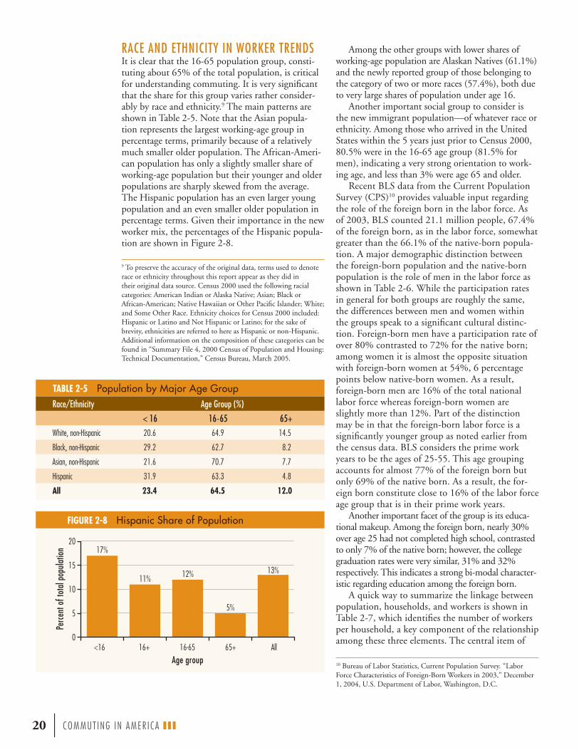
Among the other groups with lower shares of working-age population are Alaskan Natives (61.1%) and the newly reported group of those belonging to the category of two or more races (57.4%), both due to very large shares of population under age 16.
Another important social group to consider is the new immigrant population—of whatever race or ethnicity. Among those who arrived in the United States within the 5 years just prior to Census 2000, 80.5% were in the 16-65 age group (81.5% for men), indicating a very strong orientation to work-ing age, and less than 3% were age 65 and older.
Recent BLS data from the Current Population Survey (CPS)10 provides valuable input regarding the role of the foreign born in the labor force. As of 2003, BLS counted 21.1 million people, 67.4% of the foreign born, as in the labor force, somewhat greater than the 66.1% of the native-born popula-tion. A major demographic distinction between the foreign-born population and the native-born population is the role of men in the labor force as shown in Table 2-6. While the participation rates in general for both groups are roughly the same, the differences between men and women within the groups speak to a significant cultural distinc-tion. Foreign-born men have a participation rate of over 80% contrasted to 72% for the native born; among women it is almost the opposite situation with foreign-born women at 54%, 6 percentage points below native-born women. As a result, foreign-born men are 16% of the total national labor force whereas foreign-born women are slightly more than 12%. Part of the distinction may be in that the foreign-born labor force is a significantly younger group as noted earlier from the census data. BLS considers the prime work years to be the ages of 25-55. This age grouping accounts for almost 77% of the foreign born but only 69% of the native born. As a result, the for-eign born constitute close to 16% of the labor force age group that is in their prime work years.
Another important facet of the group is its educa-tional makeup. Among the foreign born, nearly 30% over age 25 had not completed high school, contrasted to only 7% of the native born; however, the college graduation rates were very similar, 31% and 32% respectively. This indicates a strong bi-modal character-istic regarding education among the foreign born.
A quick way to summarize the linkage between population, households, and workers is shown in Table 2-7, which identifies the number of workers per household, a key component of the relationship among these three elements. The central item of
TABLE 2-5 Population by Major Age Group
RACE AND ETHNICITY IN WORKER TRENDS It is clear that the 16-65 population group, consti-tuting about 65% of the total population, is critical for understanding commuting. It is very significant that the share for this group varies rather consider-ably by race and ethnicity.9 The main patterns are shown in Table 2-5. Note that the Asian popula-tion represents the largest working-age group in percentage terms, primarily because of a relatively much smaller older population. The African-Ameri-can population has only a slightly smaller share of working-age population but their younger and older populations are sharply skewed from the average. The Hispanic population has an even larger young population and an even smaller older population in percentage terms. Given their importance in the new worker mix, the percentages of the Hispanic popula-tion are shown in Figure 2-8.
20 | COMMUT ING IN AMER I CA III
10 Bureau of Labor Statistics, Current Population Survey. “Labor Force Characteristics of Foreign-Born Workers in 2003,” December 1, 2004, U.S. Department of Labor, Washington, D.C.
FIGURE 2-8 Hispanic Share of Population
0
5
10
15
20
All 65+16-6516+<16
17%
11% 12%
5%
13%
Perce
nt o
f tot
al p
opul
atio
n
Age group
9 To preserve the accuracy of the original data, terms used to denote race or ethnicity throughout this report appear as they did in their original data source. Census 2000 used the following racial categories: American Indian or Alaska Native; Asian; Black or African-American; Native Hawaiian or Other Pacific Islander; White; and Some Other Race. Ethnicity choices for Census 2000 included: Hispanic or Latino and Not Hispanic or Latino; for the sake of brevity, ethnicities are referred to here as Hispanic or non-Hispanic. Additional information on the composition of these categories can be found in “Summary File 4, 2000 Census of Population and Housing: Technical Documentation,” Census Bureau, March 2005.
Race/Ethnicity Age Group (%)
< 16 16-65 65+
White, non-Hispanic 20.6 64.9 14.5
Black, non-Hispanic 29.2 62.7 8.2
Asian, non-Hispanic 21.6 70.7 7.7
Hispanic 31.9 63.3 4.8
All 23.4 64.5 12.0

Roughly 70% of the workers in America live in households with at least one other worker. This affects their op-tions and choices in commuting behavior in many ways.
great importance in this table is that roughly 70% of the workers in America live in households with at least one or more other workers. This affects their options and choices in commuting behavior in many ways. Note that 24 million workers live in households of three or more workers. This is particularly significant in the interaction with immigrant status. Although those workers who had been living outside the United States 5 years before Census 2000 constituted only 2.8% of workers, they constituted almost 5% of workers living in households of three or more workers.
When we think of work, there is a tendency to assume that the 40-hour week is standard. Only a bit more than half the worker population works the
“regular” 33- through 40-hour week with roughly 20% working less and 30% more than that as shown in Table 2-8. A further distribution by worker gender shows that men tend to work more than average and women less, as shown in Figure 2-9. These results are supported by the recent BLS American Time Use Survey (ATUS), which shows men working an
COMMUT ING IN AMER I CA III | 21
TABLE 2-7 Households and Population by Workers in Household (Millions)
FIGURE 2-9 Workers by Hours Worked and Gender, 1999
GenderForeign Born Native Born
Population (Thousands)
Civilian Labor Force (Thousands)
Participation Rate (%)
Population (Thousands)
Civilian Labor Force (Thousands)
Participation Rate (%)
Male 15,669 12,634 80.6 90,766 65,603 72.3Female 15,662 8,482 54.2 99,072 59,790 60.4All 31,331 21,117 67.4 189,837 125,393 66.1Source: BLS, Current Population Survey, 2003.
TABLE 2-6 Role of the Foreign Born in the Labor Force, 2003
TABLE 2-8 Distribution of Hours Worked per Week, 1999
Hours/Week Workers Percent1 through 8 1,814,996 1.47
9 through 24 10,687,829 8.65
25 through 32 9,370,184 7.59
33 through 40 63,872,119 51.71
41 through 48 12,824,312 10.38
49 through 56 15,132,230 12.25
57 through 64 6,174,702 5.00
65 through 72 2,237,437 1.81
73 through 80 951,102 0.77
81 through 99 461,649 0.37
Total 126,936,755* 100.00
*Includes 3,410,195 workers recorded as not in the universe, did not work in 1999, or under age 16.
0
5
10
15
20
25
30
35
55+
41 th
rough
55
35 th
rough
40
21 th
rough
34
15 th
rough
20
<15
Hours worked/week
Work
ers (
millio
ns) Male Female
Source: CTPP.
Workers/ Household Households Population Workers
0 27.8 50.7 01 38.9 91.0 38.92 31.6 99.5 63.93+ 7.2 32.5 24.0Unrounded Total 105.4 273.6 126.7

average of about 8 hours a day, about an hour per day more than women at 7.06 hours, averaging out to 7.6 hours per day for the entire workforce. Part of the explanation for the difference is that women tend to work more part-time hours than men. Table 2-9 provides a summary of the ATUS findings.
ABOUT THE SURPRISES IN WORKER GROWTHEarlier discussion identified that the decennial census had shown a surprising lack of growth in workers in the period from1990-2000, both in percentage and absolute terms. A decline in the percentage growth rate was expected, but not to the levels actually found in the census. Preliminary examination of the 2000 decennial statistics by the Census Bureau has shown that the disparity between the census results and other surveys also conducted by the Bureau that report labor-force-related statistics (most notably, the BLS Monthly Employment Statistics) were substan-tial. The main household survey that supports the BLS reporting system is called the Current Popula-tion Survey (CPS), which provides 60,000 observa-tions per month. In addition, an establishment-based survey of 160,000 businesses and government agen-cies also is conducted to get information from the employer side. Each of these surveys reports slightly different amounts of employment. Over the decades, the decennial census typically reported fewer workers
than the CPS. Given the nature of the surveys, and the fact that the CPS, which is the national source of closely watched monthly unemployment statistics, is designed specifically to obtain work-related data with more questions and greater probing by interviewers to get complete and accurate information, this is not surprising. What was surprising was the degree of dif-ference between the two surveys observed this time, greater than any time since the 1950 census. The percentage differences in each decade had declined over time, but in 2000 the difference was three times the previous census and was exceeded only by the 1950 difference. The long-term pattern is shown in Table 2-10.
The findings of one internal review11 of the differences, based on the April 2000 CPS results, presented the following observations:
1. The 2000 decennial census estimate of the num-ber of employed people, 129.7 million, was about 7.2 million, approximately 5%, lower than the April 2000 CPS estimate of 136.9 million.
2. The 2000 decennial census estimate of the num-ber of unemployed people, 7.9 million, was about 2.7 million, or over 50%, higher than the CPS estimate of 5.2 million.
3. The “civilian labor force” is the sum of the employed and unemployed values, and therefore the disparities balanced somewhat with the differ-ence of the decennial census at 137.7 million, at about 3.1%, or 4.5 million below the CPS value of 142.2 million.
4. The decennial census also showed disparities in all of the usual rate measures that accompany these statistics.
Because the interest here is only in the worker side of the equation, for the purposes of commuting analyses these disparities do not balance out. The number of workers observed by the decennial census who worked the previous week was 128.3 million. This varies slightly from the number of civilian employed of 129.7 million observed by the census. The small difference is attributable to those people with jobs but who were not at work in the survey week for various reasons (e.g., sickness, vacation, job stoppage, weather, etc.). Since BLS does not produce an estimate of those employed but not at work, an adjustment for this difference would place CPS employed and at-work estimates at about 135.4 mil-lion, which is roughly 7 million (5.5%) more than reported by the decennial census.
One problem that led to sharp disparities were the anomalies in the group quarters statistics in the
22 | COMMUT ING IN AMER I CA III
In each decade the gap between
the census and other sources of
employment statis-tics, primarily the
BLS, had declined over time, but in 2000 the differ-ence was three
times the previous population census and was the big-
gest gap since 1950.
TABLE 2-10 Civilian Labor Force Comparison
TABLE 2-9 Average Hours Worked per Day, 2003
11 Census Bureau, “Comparing Employment, Income, and Poverty: Census 2000 and the Current Population Survey,” September 2003, U.S. Department of Commerce, Washington, D.C.
Job Status All Male Female
All jobs 7.59 8.01 7.06
Full time 8.09 8.33 7.72
Part time 5.40 5.74 5.19
Source: BLS, American Time Use Survey, 2003.
Year Decennial Census(Millions) CPS (Millions) Absolute
Difference (Millions) Difference (%)
1950 58.2 61.5 3.3 5.671960 67.5 69.1 1.6 2.371970 80.1 82.0 1.9 2.371980 104.4 105.6 1.2 1.151990 123.5 124.8 1.3 1.052000 137.7 142.2 4.5 3.27Source: BLS, Current Population Survey, December 2004.

decennial census as a result of very odd reporting by group quarters members, notably college students. This resulted in vast overstatements of the college unemployed on the order of one-half million. One effect of this was dramatic unemployment rates in college towns. When the group quarters population is excluded from the analysis, the values of the two surveys are closer together. For example, just as a result of dropping out group quarters, the decen-nial unemployment rate drops from 5.8% to 5.2%, bringing it closer to the CPS. Because the focus of this work is on the household-based population, this shift is a positive development.
The disparities do seem to be relatively stable by demographic groups in that there is some unifor-mity in the differences. However, differences for men, women, and age were more uniform with the notable difference that those over 65 were closer than other age groups. In the case of the African-American and Hispanic populations, there tended to be greater gaps between the decennial census and the CPS as measured by employment/population (E/P) ratio statistics and shown in Table 2-11. The E/P is a ratio of civilian employed population to total noninstitutional population over age 16. Another important facet of the differences is that although the national levels are as shown, the volatility in individual states can be great. In no state is the CPS lower than the census. In 32 states, the two estimates were not statistically significant in their difference. Some states, such as California (1.3 million fewer employed), Florida (525,000 fewer), and Texas (716,000 fewer), however, saw substantial scale differences in total employment. The significant undercount of Hispanics may have affected these states particularly.
There are many facets to the process of compari-son between the surveys. Attempting to compare the data for common years can lead to a degree of
misunderstanding because the CPS-based BLS report for a year is an average of 12 monthly reports, each of which reports one week in the month. The census ostensibly reports employment for the week previous to the reporting date occurring on April 1, but in fact census forms are collected in April through July and so the employment statistics repre-sent a composite of that period. In that degree, they cannot fully be comparable with, for example, the April employment
reports from BLS used here for comparison. Another notable difference in the surveys is that
in comparison to the census, the CPS observes a continued higher rate of labor force growth (13.9% contrasted to 11.5% for the census) and a lower rate of population growth (12.3% contrasted to 13.2% for the census).
ADJUSTMENTS TO THE 2000 DECENNIAL CENSUSIt may be desirable to consider adjustments to the 2000 decennial census numbers in some cases in metropolitan areas or states where disparities seem great based on local data; at the national level it does not seem appropriate, given the need to maintain comparability within and between national sources. In cases where it seems significant, note will be made of these potential differences throughout this text.
It must be remembered that the main population benchmark control of the CPS is the decennial cen-sus. Since 2000, the CPS has been adjusted several times to bring it into alignment with the decennial benchmark and with population estimates produced each year since. This does not affect the E/P ratio observed in the CPS but rather the population to which it is applied. Since the end of the 2001 reces-sion, the trend has been for the CPS to show a rise in employment as a function of population increases, although the E/P ratio itself has declined. An impor-tant facet of these considerations is that the new ACS process is now intended to replace the decennial cen-sus as an annual survey of population characteristics. This will mean that both the CPS and ACS should be in closer alignment because they are both funda-mentally benchmarked to the same sources.
COMMUT ING IN AMER I CA III | 23
TABLE 2-11 Comparison of E/P Ratios
In the case of the African-American and Hispanic populations, the gaps between the decennial census and the BLS, as measured by employment/population ratio statistics, were greater than for the population in general.
Although national levels are stable, the volatility in individual states can be great. In no state is the Current Popula-tion Survey of the BLS lower than the census. In 32 states, the two estimates were not statistically significant in their difference.
E/P Ratio
Variable Census 2000 April 2000 CPS Difference
All 61.2 64.6 3.4
Age 25+ 62.2 65.7 3.5
Age 65+ 13.1 12.5 –.6
Male 68.1 71.8 3.7
Female 54.9 57.9 3.0
White 62.4 65.1 2.7
Black 55.5 61.4 5.9
Hispanic 56.4 66.1 9.7

GEOGRAPHIC DISTRIBUTION OF GROWTH Chapter 3 noted that the 2000 census delivered something of a surprise in terms of the total popu-lation of the nation, counting at least 6 million more people than expected. This chapter elaborates, describing the geographic distribution of the popula-tion observed in the census and its demographic characteristics. The many facets of population and household change as they bear on commuting and its attributes now and in the future are discussed.
Regional Growth An important facet of national population growth, critical to commuting, has been the regional popula-tion shift that has been occurring at least since the end of World War II. Figure 2-10 shows that together the Northeast and Midwest (as pictured on Figure 1-8) gained only a little more than one-quarter of the last half century’s population growth, with the West gain-ing one-third and the South the remainder. Continu-ing this trend in the last decennial period, the South and West each increased their share of the national population by 1 percentage point as the Northeast and the Midwest each gave up 1 percentage point—a pattern that has repeated roughly each decade since 1960. About 45% of growth from 1990-2000 went to the South and another 32% to the West. When com-pared to the 1980s, this actually represents a slowing of the share of growth going to those regions. In the fi rst half of the 1980s, the South and West obtained 94% of the nation’s growth, dropped to about 83% in the later half of the decade, and arrived at about the present rate early in the 1990s. The long-term decade trend is shown in Figure 2-11. Note that by Census 2000, the West surpassed the Northeast and closed on the Midwest. By 2002, the West surpassed the Midwest. The South continues to expand its lead and reached 100 million by the end of 2000.
Population growth since 2000 has basically continued this trend. From July 2003 to July 2004 all 10 of the fastest growing states were in the South or West and those 10 accounted for half the national growth. The share of population change since 2000 has roughly held constant for the Northeast and the South but the Midwest dropped from a 14% growth share in the 1990s to less than 11% in the fi rst years of the new decade and all of that lost share was gained by the West rising from 32% of the growth in the 1990s to almost 35% in the new decade. These trends clearly suggest that the Northeast and Midwest continue to lose share while the South and West gain.
The national population was estimated by the Census Population Division to be slightly more than 293.5 million in July 2004, an addition of approxi-mately 11.5 million people since the decennial cen-sus. This represents a growth rate of almost exactly
24 | COMMUT ING IN AMER I CA III
4 Population and Household Trends
FIGURE 2-10 Regional Shares of National Growth, 1950-2000
FIGURE 2-11 Regional Population Growth, 1950-2000
Regional population
shares continue their strong
pattern of sharp growth in the
South and West and stability or
decline in share in the Northeast
and Midwest up through
available data as of 2004.
0
20
40
60
80
100
120
Northeast Midwest South West
200019901980197019601950
Popu
latio
n gr
owth
(mill
ions
)
33%
11%
41%
15%
Northeast Midwest South West

1% per year. The estimated rate for the most recent year available, from July 2003 to July 2004, was just slightly under 1%. The Census Bureau population clock showed an estimated 296 million in June 2005 with the prospect of crossing 300 million some time in 2006. At such rates, the population increase for this decade will be less than 30 million, considerably lower than that observed in the last decade, unless there is another demographic surprise at the end of
the decade. Figure 2-12 shows the estimated total amount and the share of population by region as of July 2004. Long-term projections out to 2030 place 88% of the nation’s population growth in the South and West.12
State Growth In the decennial period from 1990-2000, all states except Washington, D.C. (which, for the sake of com-pleteness, is reported as a state by the Census Bureau) gained in population. At the extremes, California added more than 4 million and North Dakota gained less than 4,000. This was a very positive change from past decennial trends where there had been signifi cant loses among several states. More recently, the growth rates for the period from 2000-2004 were still sharply skewed by state, although only North Dakota (and again Washington, D.C.) showed actual declines in population. Of the states showing lower-than-average national growth, fi ve were below 1%, and eight were between 1% and 2%. The 20 states showing greater growth than the national average, accounting for over 76% of the nation’s growth, are presented in Table 2-12. With the exception of New Hampshire, all of these states are in the West or South. The three states
COMMUT ING IN AMER I CA III | 25
FIGURE 2-12 Regional Population, 2004
TABLE 2-12 Growth by States Exceeding National Growth Rate
Current population has been growing at about 1% per year, putting the United States at over an estimated 296 million in June 2005, an addition of about 15 million since the 2000 census, and with the pros-pect of crossing 300 million some time in 2006. This rate will not produce as many additions to popu-lation as did the past decade.
12 Census Bureau Projections Release, April 21, 2005.
67,409,44023%
55,401,51119%
65,729,85222%
105,114,60136%
Northeast Midwest South West
Note: ACS data for 2004; does not include qroup quarters population.
State July 1, 2000 Population July 1, 2004 Population Growth Growth Rate (%)Nevada 2,018,104 2,334,771 316,667 15.69
Arizona 5,165,765 5,743,834 578,069 11.19
Florida 16,047,807 17,397,161 1,349,354 8.41
Texas 20,949,316 22,490,022 1,540,706 7.35
Georgia 8,230,094 8,829,383 599,289 7.28
Idaho 1,299,610 1,393,262 93,652 7.21
Utah 2,243,129 2,389,039 145,910 6.50
Colorado 4,326,872 4,601,403 274,531 6.34
North Carolina 8,077,662 8,541,221 463,559 5.74
Delaware 786,397 830,364 43,967 5.59
California 33,999,879 35,893,799 1,893,920 5.57
Virginia 7,104,852 7,459,827 354,975 5.00
Washington 5,911,043 6,203,788 292,745 4.95
Oregon 3,430,706 3,594,586 163,880 4.78
New Hampshire 1,240,472 1,299,500 59,028 4.76
Maryland 5,311,531 5,558,058 246,527 4.64
New Mexico 1,821,544 1,903,289 81,745 4.49
Alaska 627,576 655,435 27,859 4.44
South Carolina 4,023,129 4,198,068 174,939 4.35
Hawaii 1,212,343 1,262,840 50,497 4.17
Total (20 states) 133,827,831 142,579,650 8,751,819 6.54
United States 282,177,754 293,655,404 11,477,650 4.07

that have dominated national growth for decades, California, Texas, and Florida, continued in that role with almost 5 million of the total growth (42%). Current Census Bureau projections indicate that approximately 46% of population growth through 2030 will go to those three states. In addition, Nevada and Arizona continue their extraordinary growth rates, as shown in the table.
Metropolitan Growth Figure 2-13 shows the long-term trend in Ameri-can metropolitan development. It is clear that we are a predominantly metropolitan and suburban nation today. In round numbers, the nation is half suburban with the nonsuburban half divided 30% in central cities and only 20% in nonmetropolitan areas, according to current census definitions. There were only 85 million people living in all metro-politan areas in 1950 and 140 million by 1970. By 2000, the suburbs alone held about 140.6 million
out of the 226 million people now in metropolitan areas. From 1950-2000, nonmetropolitan areas have declined from 65 to 55 million, losing 10 million over the period. In that same timeframe, the parts of metropolitan areas that are not central cities, termed suburbs, gained 75% of national growth, with cen-tral cities gaining the remainder. The details of this pattern by decade are shown in Figure 2-14.
One can easily be misled by statistics presented in this form. They are as much a product of changes in geographic definitions as of real trends. First, one could conclude from these data that nonmetropoli-tan areas have been in a sorry state of decline, with major migrations to the metropolitan complexes of the nation for 50 years. Although there may be some truth to that statement for the early years of the period, in recent decades the opposite is true. What is really happening (and may mislead the analyst) is that much of the growth labeled metropolitan is in fact the rapid growth of nonmetropolitan counties on the fringes of the metropolitan areas. As these counties grow and mature they are joined to the metropolitan areas as they meet metropolitan criteria, resulting in a decline in nonmetropolitan population. In fact, for commuting analysis purposes, it is critical to realize that actual migration data show that more people are moving from metropolitan areas to non-metropolitan areas than the reverse. Another effect of this pattern is to add large areas of geography to the metropolitan areas with a consequent impression that population densities are declining as the fringe areas are averaged with the historical metropolitan area.
Each decennial census obtains migration data for the previous 5 years. Those data show that from 1975-1980 nonmetropolitan areas gained about 1 million migrants from metropolitan areas, only about 50,000 from 1985-1990, and more than 500,000 from 1995-2000. These gains by nonmetropolitan
areas are not evenly distributed; large por-tions of these changes concentrated in the nonmetropolitan fringes of rapidly grow-ing metropolitan areas such as Atlanta, Phoenix, and Denver. A simple key to the patterns is that in each 5-year, end-of-decade period for 30 years, about 12 million people have traded places between metropolitan and nonmetropolitan areas. In some periods, 1985-1990 for example, almost exactly 6 million moved from each area to the other, with only a swing of 50,000 in favor of the nonmetropolitan areas. In other periods, the swing from metropolitan to nonmetropolitan was greater. Clearly, the nonmetropolitan areas are displaying far healthier growth than that depicted by the broad data picture due to changes in geographic definitions.
26 | COMMUT ING IN AMER I CA III
FIGURE 2-13 Long-Term Population Trends, 1950-2000
FIGURE 2-14 Population Shifts, 1950-2000
In round numbers, the nation is half
suburban; 30% live in central cities and the remaining 20% in nonmetro areas.
The moving rates between metro and
nonmetro areas show that nonmetro
areas are gaining population from
metro areas.
0
50
100
150
200
250
300
200019901980197019601950
50%
30%
20%
23%
33%
44%
Popu
latio
n (m
illon
s)
Note: Standard census geography used.
Suburbs Central city Nonmetro area
-10
-5
0
5
10
15
20
25
30
1990-20001980-19901970-19801960-19701950-1960
Note: Standard census geography used.
Central city Suburbs Nonmetro area
Popu
latio
n ch
ange
(mill
ions
)

A second element that can mislead is that the definitional boundaries of central cities, as well as the definition of what constitutes a central city, have varied over time, usually in favor of the central cities. Thus, the numbers shown here tend to overstate the growth in central cities. One of the effects is to place all growth in the period from 1990-2000 in metropolitan areas with a slight decrease in nonmet-ropolitan areas. In effect, all of the variation attribut-able to changes in definition in 1990 and 2000 has been removed. Table 2-13 shows a comparison of the census data as reported for 1990 and 2000 using the post-1980 standard geographic terminology and data adjusted to reflect the definitions employed in
1980 for the same period.13 The 1990 adjustment showed that, instead of gains, central cities showed small loses, and the growth attributed to central cities was shifted by the adjustment to the suburbs and the nonmetropolitan areas. The further adjustment of the 2000 numbers does the same thing, shifting popula-tion from central cities again to suburbs and nonmetro-politan areas, but the effects are quite different. There are two separate effects that need to be identified. The first is a small one, shifting some of the small towns in suburbs that are labeled central cities, back to a suburban definition. This
explains the small decline in central city population between the actual and adjusted data in the table. The larger shift is from suburbs to nonmetropoli-tan areas, recognizing that a great deal of suburban growth is in fact growth around metropolitan areas in the formerly nonmetropolitan fringe counties. As a result, the suburban growth rate drops considerably. The effect of both of these changes overall is to shift a population of 7.1 million from the central cities to the suburbs and to shift a population of 11.8 million from suburbs to nonmetropolitan areas. The first is really simply redistribution of existing population; the second is actual metropolitan growth.
With all of this under consideration, the trend now looks like that shown in Figure 2-15. The figure helps clarify what the trends are: more or less long-term stability in the nonmetropolitan areas abetted by recent growth, some recent growth in central
COMMUT ING IN AMER I CA III | 27
In the period from 1995-2000, over 62 million people moved within metropolitan areas, about 15 million moved within nonmetropolitan areas, and more than 23 million moved between metropolitan areas. In reality, a number equal to half the population moved in that period. So, the small net shifts between areas are in fact a very minor element in what is happening. A key message is that when only small population shifts are observed from one decade to another, observers might be tempted to believe that nothing much has happened, and that the population’s char-acteristics are about the same, but in fact a stable count in population may mask dramatic changes in age, gender, income, and ethnic composition. In the data provided for 1985-1990, it was shown that about equal numbers of 6 million people shifted in each direction between metropolitan and nonmetropolitan areas. As a result, it would appear that nothing happened in terms of population when, in fact, there were 12 million people in different places. Perhaps the best example is Atlanta, which saw a shift in population of less than 10,000 over 20 years but that small change masked dramatic changes in the demography of the population in terms of age, race, education, and income.
Looking Beyond the Numbers—Gross and Net Flows
TABLE 2-13 Calculating Population Trends Using Standard versus 1980 Geographic Definitions
13 These adjustments were prepared for this report by the Journey to Work Division of the Census Bureau.
Adjustments for changes in geography show that suburban growth is still predominant and that central cities are showing real growth but not enough to retain their share of the population.
Area Population Change (Millions) by Decade Change (%)
1950 1960 1970 1980 1990 2000
Metro 84.9 112.9 139.5 171.8192.7 226.0 17.28
*188.7 *214.2 *13.51
Central Cities
49.7 58.0 63.8 72.477.8 85.4 9.77
*71.9 *78.3 *8.90
Suburbs 35.2 54.9 73.6 99.3114.9 140.6 22.37
*116.8 *135.9 *16.35
Nonmetro 66.5 66.4 63.8 54.856.0 55.4 –1.07
*60.0 *67.2 *12.00
All U.S. 151.3 179.3 203.3 226.5248.7 281.4 13.15
*248.7 *281.4 *13.15*Note: These adjusted data reflect 1980 geographic definitions.

cities that appears to be real rather than a product of defi nitional change, and continued growth in suburbs that has been happening for at least 50 years. In fact, early census data show that suburban growth has been happening for 100 years. The notion of America being a nation of cities that were abandoned in the post–World War II era to create suburbs is not very accurate. Central cities (or just cities) have never been the dominant population group. The nation had been fundamentally rural—called nonmetropolitan here—throughout its history. Just about the time that central cities surpassed the rural population in numbers, the suburban population surpassed both.
But perhaps the most signifi cant story is that cen-tral cities in this defi nitional context show signifi cant population growth over the decennial period with a growth rate of just under 9% that added 6.7 million people in the decade. Although this was not enough to hold population share, it is still a very positive shift. More recent data through 2004 indicate that these trends were limited and many cities have reversed and resumed population decrease, particularly in the Northeast. Again, gaps in immigration monitoring may be a signifi cant factor as in the 1990s.
An important ameliorating factor in metropolitan growth has been foreign immigration, often acting to balance domestic outward migration trends. Al-though the new immigration pattern has seen heavy fl ows directly to suburbs, there is still sizeable inward migration to central cities that serves to balance the outward migration of residents. Figure 2-16 shows this broad trend. Note that immigration to nonmet-ropolitan areas is small and that suburban migration roughly is on a par with that of central cities.
A more signifi cant facet of this trend is that the strongest domestic outward migration is that from
28 | COMMUT ING IN AMER I CA III
FIGURE 2-15 Adjusted Census Population Trends
FIGURE 2-16 Immigrant Arrivals in the 1990s
FIGURE 2-17 Major Metropolitan Migration Trends, 1995-2000
Central city Suburbs Nonmetro area
0
20
40
60
80
100
120
140
160
200019901980197019601950
Popu
latio
n (m
illio
ns)
Note: Data adjusted to reflect 1980 geographic definitions.
0.0
0.5
1.0
1.5
2.0
2.5
3.0
3.5
4.0
Nonmetro areaSuburbsCentral city
1990-1995 1995-2000
Imm
igra
nt a
rriva
ls (m
illio
ns)
-1000
-800
-600
-400
-200
0
200
400
600
800
Houston-Galveston
Dallas-Fort Worth
DetroitBostonPhiladelphiaSan FranciscoWashington, D.C.-Baltimore
ChicagoLos AngelesNew York
Domestic migration Central city immigration Suburban immigration
Migr
atio
n (th
ousa
nds)

the largest cities and that is exactly where the stron-gest foreign inward migration occurs. Of the roughly 6.8 million immigrants to metropolitan areas from 1995-2000, about half went to the metropolitan areas of over 5 million in population. It was those areas of over 5 million that suffered most from out-ward migration. With the exception of Dallas-Fort Worth, all of the 10 largest metropolitan areas in the nation suffered substantial outward migration. This is evident in Figure 2-17, which shows the immigrant flows into the nation’s top 10 metropolitan areas bal-anced by their domestic outward migration. The only metropolitan areas in the top 20 that had domestic inward migration greater than foreign inward migra-tion were Atlanta, Phoenix, Denver, and Tampa-St. Petersburg. Another facet of this phenomenon is the sense that what is being observed is a “bounce” effect as immigrants arrive in the major port regions—the “immigrant magnet metros” of New York, Los Angeles, San Francisco, Chicago, Washington, and Miami14—and, after a brief period of time, move on to smaller, more inland metropolitan areas.
Table 2-14 expands on the previous discussion to show that the nation’s population living in large met-ropolitan areas has grown more rapidly than overall national growth patterns. However, the growth rates were very mixed by size, but not so much to substan-tially change shares of national population by area size. Because of shifts between size categories of given metropolitan areas, the differences in growth rates are not as critical as they might appear.
Again, there is a certain tendency for the statistics to mislead, given the standard geographic definitions. The table notes that areas over 5 million added over 8 million inhabitants in the period for a growth rate of just under 11%. More significantly, the table does not note that as of Census 2000 there were nine areas
of the nation over 5 million, not five as in 1990, and the 1990 figure shown here reflects that new base. The population as presented in 1990 for the five areas over 5 million was under 52 million. So for the purposes of transportation analysis, the key number is that the population living in metropolitan areas over 5 million has grown by over 32 million, or about 60% growth—8 million in change in the same area over 10 years and 24 million as a result of shifts of areas into the 5-million category. One part of this was the result of the decision to merge the Washington, D.C. and Baltimore areas together, thus creating a new area over 5 million. June 2005 preliminary estimates put the number at 12 areas over 5 million with over 100 mil-lion population. The added areas are Miami, Atlanta, and Houston. It does not appear that any additional areas will be added in the coming years.
Similarly, there are now 50 metropolitan areas over 1 million in population (including Richmond, although the census showed it to be about 3,500 short; see Appendix 4), in contrast to 39 in 1990. That population was over 162 million in 2000 contrasted to about 124 million in 1990, a dramatic increase. More than 40 counties were added to the metropolitan areas included in the top 50 between 1990 and 2000. Table 2-15 supports the further
COMMUT ING IN AMER I CA III | 29
TABLE 2-14 Population Growth by Metropolitan Area Size, 1990-2000
TABLE 2-15 Central City-Suburban Distribution by Metropolitan Area Size
14 William H. Frey, “Metropolitan Magnets for International and Domestic Migrants,” The Brookings Institution, Washington, D.C., 2003.
The strongest outbound moving rates are in the largest metro areas over 5 million—precisely where foreign inward migration is greatest.
Population
Metro Area Size (Thousands) No. of Areas 1990 2000 Change Growth Rate (%) Share 1990 (%) Share 2000 (%)
>5,000 9 75,874,152 84,064,274 8,190,122 10.8 31 30
2,500-5,000 10 25,481,490 30,796,862 5,315,372 20.9 10 11
1,000-2,500 31 39,720,135 46,606,763 6,886,628 17.3 16 17
>1,000 50 141,075,777 161,467,899 20,392,122 14.5 57 57
250-1,000 96 39,871,391 45,076,105 5,204,714 13.1 16 16
<250 133 17,455,812 19,387,675 1,931,863 11.1 7 7
All metro areas 279 198,402,980 225,931,679 27,528,699 13.9 80 80
Nonmetro areas 50,306,893 55,440,227 5,133,334 10.2 20 20
All areas 248,709,873 281,371,906 32,662,033 13.1 100 100
Metro Area Size(Thousands) Central Cities Suburbs All Central City
Share (%)
>5,000 31,187,895 52,876,390 84,064,285 37.10
2,500-5,000 10,532,135 22,846,240 33,378,375 31.55
1,000-2,500 16,999,035 28,072,745 45,071,780 37.72
500-1,000 8,336,460 12,806,325 21,142,785 39.43
250-500 9,382,660 13,554,175 22,936,835 40.91
<250 8,961,680 10,425,995 19,387,675 46.22
All 85,399,865 140,581,870 225,981,735 37.79

point that most of these metropolitan areas are predominantly suburban with a tendency for greater suburban shares with increasing metropolitan size. The apparent exception is the category for the larg-est areas, which is sharply affected by New York.
The complete list of population change in the decade for the metropolitan areas over 1 million is shown in Table 2-16. Among the important observa-tions to be made about the results are that four areas in the period from 1980-1990 actually lost popula-tion. Before the major population shift caused by Hurricane Katrina, two of these—Portland and New Orleans—had regained population in this decade.
The other two—Pittsburgh and Buffalo—continued to lose population, although in both cases far more slowly than in the 1980s. In general, all population groups grew significantly faster than in the 1980s. Growth is driven largely by the South and the West; of the top 10 areas in growth rate none are outside the South and West. Of the 26 areas growing faster than the national average, only four—Minneapolis-St. Paul, Indianapolis, Grand Rapids, and Colum-bus—are not from the South or West.
30 | COMMUT ING IN AMER I CA III
TABLE 2-16 Metropolitan Areas with Population Over 1 Million
Population Rank
Metro AreaApril 1, 1990
(Millions)
April 1, 2000
(Millions)
Change (Millions)
Change (%)
Population Rank
Metro AreaApril 1, 1990
(Millions)
April 1, 2000
(Millions)
Change (Millions)
Change (%)
1 New York 19.55 21.20 1.65 8.44 26 Milwaukee 1.61 1.69 0.08 5.13
2 Los Angeles 14.53 16.37 1.84 12.68 27 Orlando 1.22 1.64 0.42 34.27
3 Chicago 8.24 9.16 0.92 11.14 28 Indianapolis 1.38 1.61 0.23 16.44
4 Washington, D.C.-Baltimore 6.73 7.61 0.88 13.10 29 San Antonio 1.32 1.59 0.27 20.20
5 San Francisco 6.25 7.04 0.79 12.57 30 Norfolk 1.44 1.57 0.13 8.75
6 Philadelphia 5.89 6.19 0.30 5.01 31 Las Vegas 0.85 1.56 0.71 83.33
7 Detroit 5.46 5.82 0.36 6.67 32 Columbus 1.35 1.54 0.19 14.47
8 Boston 5.19 5.46 0.27 5.19 33 Charlotte 1.16 1.50 0.34 29.02
9 Dallas-Fort Worth 4.04 5.22 1.18 29.34 34 New Orleans 1.29 1.34 0.05 4.08
10 Houston 3.73 4.67 0.94 25.15 35 Salt Lake City 1.07 1.33 0.26 24.41
11 Atlanta 2.96 4.11 1.15 38.93 36 Greensboro 1.05 1.25 0.20 19.16
12 Miami 3.19 3.88 0.68 21.42 37 Austin 0.85 1.25 0.40 47.69
13 Seattle 2.97 3.55 0.58 19.68 38 Nashville 0.99 1.23 0.25 25.00
14 Phoenix 2.24 3.25 1.01 45.27 39 Providence 1.13 1.19 0.05 4.78
15 Minneapolis-St. Paul 2.54 2.97 0.43 16.94 40 Raleigh 0.86 1.19 0.33 38.85
16 Cleveland 2.86 2.95 0.09 3.01 41 Hartford 1.16 1.18 0.03 2.21
17 San Diego 2.50 2.81 0.32 12.64 42 Buffalo 1.19 1.17 –0.02 –1.61
18 St. Louis 2.49 2.60 0.11 4.46 43 Memphis 1.01 1.14 0.13 12.74
19 Denver 1.98 2.58 0.60 30.37 44 West Palm Beach 0.86 1.13 0.27 31.00
20 Tampa 2.07 2.40 0.33 15.86 45 Jacksonville 0.91 1.10 0.19 21.37
21 Pittsburgh 2.39 2.36 –0.04 –1.51 46 Rochester 1.06 1.10 0.04 3.36
22 Portland 1.79 2.27 0.47 26.30 47 Grand Rapids 0.94 1.09 0.15 16.06
23 Cincinnati 1.82 1.98 0.16 8.89 48 Oklahoma City 0.96 1.08 0.12 12.99
24 Sacramento 1.48 1.80 0.32 21.32 49 Louisville 0.95 1.03 0.08 8.09
25 Kansas City 1.58 1.78 0.19 12.20 50 Richmond 0.87 1.00 0.13 15.12
Note: Full-length names for the above metropolitan areas can be found in Appendix 4.

POPULATION BY AGE AND GENDER Many of the labor force aspects of population growth are covered elsewhere in this text. Therefore, the following treatment touches on some of the key trends that will illuminate the nature of the travel-ing population and the population to be served by transportation. Figure 2-18 shows the growth trend by relatively detailed age groups for the national population over the last 20 years.
This figure shows the background trend of the baby boom bubble as it slides through the differ-ent age cohorts. Note that the 60-65 age group has remained relatively constant over 20 years due to the Depression Era baby generation, which was the smallest age group on record moving through those age brackets. The beginnings of the baby boomers’ arrival is shown by the increase in the 55-60 age
group, followed by the very significant jump in the 45-55 age group from 1990-2000 (almost doubling) as the main baby boomer group arrived. The 25-45 tail shows the last of the baby boomers and perhaps the arrival of the large immigrant population con-centrated in those age groups.
Also important is that the younger, entry-level workforce population has declined over this 20-year period. But also to be noted is a surge in the younger school-age population in the last decade.
Figure 2-19 shows an even more detailed age breakdown by gender for year 2000. One of the key points to recognize is the shift from more male to
COMMUT ING IN AMER I CA III | 31
Population Rank
Metro AreaApril 1, 1990
(Millions)
April 1, 2000
(Millions)
Change (Millions)
Change (%)
Population Rank
Metro AreaApril 1, 1990
(Millions)
April 1, 2000
(Millions)
Change (Millions)
Change (%)
1 New York 19.55 21.20 1.65 8.44 26 Milwaukee 1.61 1.69 0.08 5.13
2 Los Angeles 14.53 16.37 1.84 12.68 27 Orlando 1.22 1.64 0.42 34.27
3 Chicago 8.24 9.16 0.92 11.14 28 Indianapolis 1.38 1.61 0.23 16.44
4 Washington, D.C.-Baltimore 6.73 7.61 0.88 13.10 29 San Antonio 1.32 1.59 0.27 20.20
5 San Francisco 6.25 7.04 0.79 12.57 30 Norfolk 1.44 1.57 0.13 8.75
6 Philadelphia 5.89 6.19 0.30 5.01 31 Las Vegas 0.85 1.56 0.71 83.33
7 Detroit 5.46 5.82 0.36 6.67 32 Columbus 1.35 1.54 0.19 14.47
8 Boston 5.19 5.46 0.27 5.19 33 Charlotte 1.16 1.50 0.34 29.02
9 Dallas-Fort Worth 4.04 5.22 1.18 29.34 34 New Orleans 1.29 1.34 0.05 4.08
10 Houston 3.73 4.67 0.94 25.15 35 Salt Lake City 1.07 1.33 0.26 24.41
11 Atlanta 2.96 4.11 1.15 38.93 36 Greensboro 1.05 1.25 0.20 19.16
12 Miami 3.19 3.88 0.68 21.42 37 Austin 0.85 1.25 0.40 47.69
13 Seattle 2.97 3.55 0.58 19.68 38 Nashville 0.99 1.23 0.25 25.00
14 Phoenix 2.24 3.25 1.01 45.27 39 Providence 1.13 1.19 0.05 4.78
15 Minneapolis-St. Paul 2.54 2.97 0.43 16.94 40 Raleigh 0.86 1.19 0.33 38.85
16 Cleveland 2.86 2.95 0.09 3.01 41 Hartford 1.16 1.18 0.03 2.21
17 San Diego 2.50 2.81 0.32 12.64 42 Buffalo 1.19 1.17 –0.02 –1.61
18 St. Louis 2.49 2.60 0.11 4.46 43 Memphis 1.01 1.14 0.13 12.74
19 Denver 1.98 2.58 0.60 30.37 44 West Palm Beach 0.86 1.13 0.27 31.00
20 Tampa 2.07 2.40 0.33 15.86 45 Jacksonville 0.91 1.10 0.19 21.37
21 Pittsburgh 2.39 2.36 –0.04 –1.51 46 Rochester 1.06 1.10 0.04 3.36
22 Portland 1.79 2.27 0.47 26.30 47 Grand Rapids 0.94 1.09 0.15 16.06
23 Cincinnati 1.82 1.98 0.16 8.89 48 Oklahoma City 0.96 1.08 0.12 12.99
24 Sacramento 1.48 1.80 0.32 21.32 49 Louisville 0.95 1.03 0.08 8.09
25 Kansas City 1.58 1.78 0.19 12.20 50 Richmond 0.87 1.00 0.13 15.12
FIGURE 2-18 Population Trends by Age Group
FIGURE 2-19 Population by Age and Gender
Working women have stabilized at about 46% of the workforce.
0
20
40
60
80
100
65+60-6555-6045-5525-4520-2515-205-15< 5
Age group
1980 1990 2000
Popu
latio
n (m
illio
ns)
Age group
Popu
lation
(milli
ons)
Male Female
0
2
4
6
8
10
12
14
85+80-85 75-80 70-7565-7060-6555-60 50-55 45-50 40-45 35-40 30-35 25-30 20-25 15-2010-155-10<5

more female population somewhere around the age of 30. If larger numbers of the older population are going to be attracted into the workforce, it is clear that these will occur signifi cantly among women. Using the ratio of women to men for the different age groups shows that by the 55-65 age group there are roughly 11 women for every 10 men; for the 65-75 age group there are about 12 women to 10 men; and at age 75 and older there are more than 16 women to 10 men. About 14% of all women are age 65 and older whereas only 10% of men are in that age category.
The Impact of the Immigrant Population The age distribution for recent immigrant arrivals, as shown in Figure 2-20, is dramatically different than that of the general population. Immigration is sharply skewed toward the younger working-age groups, particularly between the ages of 20 and 35. A more signifi cant way to express this is shown in Figure 2-21, which shows the percentage of the population attained by the recent immigrants by age category. In the age groups for immigrants between 20 and 30 years old, immigrants account for more than 6% of the population.
Households and Population Many transportation activities are driven by household structure and work travel is no excep-tion. This section addresses the changing trends
32 | COMMUT ING IN AMER I CA III
FIGURE 2-20 Age Distribution of Immigrant Population, 1995-2000 Arrivals
FIGURE 2-21 Immigrant Shares of Total Population by Age Group, 1995-2000
FIGURE 2-22 Trends in Household Size, 1970-2000
0
1
2
3
4
5
6
785
+
80-85
75-80
70-75
65-70
60-65
55-60
50-55
45-50
40-45
35-40
30-35
25-30
20-25
15-20
10-155-1
0
Perce
nt o
f tot
al p
opul
atio
n
Age group
0.0
0.2
0.4
0.6
0.8
1.0
1.2
1.4
85+80-85 75-80 70-7565-7060-6555-60 50-55 45-50 40-45 35-40 30-35 25-30 20-25 15-2010-155-10
Age group
Imm
igra
nt p
opul
atio
n (m
illio
ns)
0
20
40
60
80
100
120
2000199019801970
Num
ber o
f hou
seho
lds (
mill
ions
)
Persons in household: 1 2 3 4 5 6+

in American households, their composition, and structure. Census 2000 reported 105.5 million households. Figure 2-22 shows the long-term trend in households by size for the last 30 years. What is clear is the continuing growth of the small house-hold containing one or two people. Households have grown at twice the rate of the population over the last 40 years, generating a sharply declining household size as shown in Figure 2-23, resulting in the average household size of 2.59 persons per household for the year 2000.
The focus on smaller households can be mis-leading, as seen in Figure 2-24. The one-person households comprise 26% of households but only 10% of the population. Households of six persons and above, which only comprise 4% of households, account for a greater population than do the one-person households. The fi gure shows the relative proportions of households and population held by the different household size classes.
Households and Housing Of the 105.5 million households in America, two-thirds live in their own homes, approximately 70 million households, representing roughly 75% of the population. At the 1940 census, home owner-ship was at its lowest level as a result of the Depres-sion (43.6%), by 1960 it had reached 60% and has climbed slowly ever since. Home ownership is above 60% in all four census regions, with the West lowest at 61.5%, followed by the Northeast at 62.4%, and then the other regions with home ownership greater than the national average in the South at 68.4% and the Midwest at 70.2%. West Virginia leads all states in home ownership at over 75%.
The distribution of housing units across the nation is shown in Figure 2-25. One of the key points in the fi gure is the strong emphasis on single-family units. About 70 million among the
COMMUT ING IN AMER I CA III | 33
FIGURE 2-23 Average Household Size, 1960-2000
FIGURE 2-24 Household and Population Shares by Persons per Household
FIGURE 2-25 Housing Units by Type of Structure
Of the 105.5 million households in America, two-thirds live in their own homes, approximately 70 million house-holds, representing roughly three-fourths of the population.
In each of the four census regions, more than 60% of house-holds owned their own homes.
0
20
40
60
80
100
120
2.0
2.2
2.4
2.6
2.8
3.0
3.2
3.4
Household Household size
20001990198019701960
Hous
ehol
ds (m
illio
ns)
Perso
ns in
hou
seho
ld
05
10152025303540
7+654321
Number of persons in household
Perce
nt o
f tot
al 26%
10%
25%
33%
19%17%22%
14% 13%7%
6%2% 5%2%
HouseholdsPopulation
0
10
20
30
40
50
60
Nonmetro areaSuburbsCentral city
Housing types: 1, detached 10 through 19 units 1, attached 20 through 49 units 2 units 50+ units 3 or 4 units Other (mobile home, 5 through 9 units RV, boat, etc.)
Hous
ing
units
(mill
ions
)

homes exceeds the number living in apartment complexes with 50 units or more.
There are strong linkages between housing ownership, structure type, vehicle ownership, and workers that are beyond the scope of this report and will be only sketched here. Figure 2-26 shows the relationship between vehicle and housing ownership. The largest share of households without vehicles are renters, and their share declines with increas-ing vehicles per household. Figure 2-27 shows the relationship between workers per household and housing tenure with sharp reductions in shares of households that are renters with increasing numbers of workers per household.
34 | COMMUT ING IN AMER I CA III
116 million housing units in the nation are single-family detached units (i.e., a stand-alone home on its own lot), and another 6.5 million are single-family attached units (generally two units sharing a common wall). Even in central cities, single-family units are the majority. Another point worth noting is that just the single-family units in suburbs out-number all units in central cities. An extraordinary fact is that the number of persons living in mobile
About 70 million among
the 116 million housing units in
the nation are single-family
detached units and another
6.5 million are single-family
attached units. Even in central
cities, single-family units are the
majority.
Suburban single-family
units exceed the number of all
central city housing units.
The number of persons living in mobile homes
exceeds the number living in apartment
dwellings of 50 units or
larger.
FIGURE 2-26 Vehicle and Housing Ownership
FIGURE 2-27 Housing Renters and Owners by Workers per Household
0
5
10
15
20
25
30
35
40
45
5+43210
Number of vehicles per household
Hous
ehold
s (mi
llions
)
OwnedRented
0
20
40
60
80
100
All3+ 210
Workers per household
Perce
nt of
hou
seho
lds
Rented Owned

DRIVER LICENSING A critical consideration in the analysis of commut-ing is vehicle ownership and the availability, among the adult population, of a license to drive. Because the decennial census does not obtain licensing data, discussions here are all based on the 2001 NHTS performed by US DOT. The following discussion of vehicles owned draws on both the census and NHTS as sources.
Possession of a driver’s license has become perva-sive in America today; about 89% of men and 84% of women—an overall average of 86%—are licensed drivers. On an age basis, 80% of those early in the licensing years (16-25) or late (65 and older) have licenses, with the averages well over 90% for the age groups in between. The best way to understand what gaps exist in licensing is that for both men and women about 60% of those adults without licenses are in the 16-25 and over-65 age groups. One key to the future is the immense gap in licenses between women 65 and older and those approaching 65—a difference of 18 percentage points. This suggests a
dramatic surge in older women driving will occur as those approaching 65 age. It is unclear whether this will affect commuting. At about 95%, the baby boomers in the 35-55 age group represent the peak of licensed drivers.
The only groups where licensing is not near universal, as shown in Figure 2-28, are women age 65 and older and men age 85 and older. Lack of licenses among older women is at three times the rate for older men, refl ecting the social patterns of 45 or 50 years ago. Women still constitute two-thirds of the population without licenses with signifi cant divergence from men starting at about 50 years of age. About one-third of the women without licenses are over 65. This pattern for women has persisted over time, largely because of social patterns prevalent among immigrant populations.
The central issue for commuting with respect to driver’s licensing patterns remains the levels of licensing for minorities. The apparent ubiquity in licensing cited earlier does not yet fully apply among certain racial and ethnic groups, particularly among
COMMUT ING IN AMER I CA III | 35
Vehicle Availability Patterns and Trends
5
FIGURE 2-28 Driver Licensing by Age and Gender
Holding of a driver’s license has become close to pervasive in adult America today but women still lag in licens-ing—about 89% of men and 84% of women have a driver’s license, for an overall average of 86%.
The baby boomers in the 35-55 age group represent the peak of license ownership at about 95%.
0
10
20
30
40
50
60
70
80
90
100
85+80-8575-8070-7565-7060-6555-6050-5545-5040-4535-4030-3525-3020-2516-20
Male Female
Perce
nt
Age group

drivers, especially in the older age groups. Note how sharply license holding drops off with increas-ing age for the Hispanic population as shown in Figure 2-30. However, these also tend to be the age groups that are under-represented in the Hispanic community. Figure 2-31 shows how sharply skewed Hispanic license holding is in contrast to driver licensing for the non-Hispanic population. This fi gure shows the distribution of license holding by
36 | COMMUT ING IN AMER I CA III
the women in those groups. Figure 2-29 shows part of this pattern. Although the White population averages over 90%, the Asian population is at 82%, and the African-American pop-ulation is at 74%. Differentia-tion to show license holding by gender is revealing. The licens-ing of both White and African-American women is relatively close to men’s (a differ-ence of 3-6 percentage points), refl ecting native-born characteristics, but the Asian and Other Races reveal disparities greater than 10 percentage points as shown in Table 2-17.
As a general rule, racial and ethnic groups other than White and African-American non-Hispanic groups, generally those who are more likely to be recent immigrants, tend to have fewer women
FIGURE 2-29 Driver Licensing by Age and Race
TABLE 2-17 Licensed Drivers by Race and Gender
FIGURE 2-30 Share of Hispanic Population with Licensed Drivers
The central issue for commuting with
respect to driver’s licensing patterns
remains the levels of licensing of minori-ties. The apparent ubiquity in licens-ing does not yet
fully apply among certain racial and ethnic groups and
particularly among the women in those
groups. Although the White popula-tion averages over
90%, the Asian population is at
82%, and the African-American
population is at 74%.
African-American Asian Other White
0
10
20
30
40
50
60
70
80
90
100
65+55-6545-5535-4525-3516-25
Perce
nt
Age group
0
10
20
30
40
50
60
70
80
90
100
85+ 80-85 75-80 70-75 65-70 60-65 55-60 50-55 45-50 40-45 35-40 30-35 25-30 20-25 16-20
Perce
nt o
f Hisp
anic
popu
latio
n
Age group
Licensed Drivers (%)
Gender White African-American Asian Other All
Male 91.8 77.9 87.2 82.3 88.9
Female 88.8 72.0 76.6 70.3 83.7
Total 90.2 74.4 81.9 76.2 86.2

age within the groups shown. Note that among non-Hispanics, the age groups with the highest share are those around age 40, but they represent little more than 10% to 11% of all license holders. For Hispan-ics, however, both men and women show that the 20-35 age groups are the largest groups generally above 15% of the total. Both Hispanic men and women represent 65% of license holders under the age of 40. In contrast, this fi gure is about 44% for the non-Hispanic population. The broader picture is displayed in Figure 2-32, which permits the recogni-tion that in the younger age groups Hispanic drivers represent upwards of 20% of all drivers.
More directly and importantly for commuting purposes, Table 2-18 focuses on the licensing of workers by race, ethnicity, and gender and shows that worker licensing in every population group tends to be considerably higher than the average for all persons in the group. This is consistent with the age-related data shown earlier.
COMMUT ING IN AMER I CA III | 37
FIGURE 2-31 Age Distribution of Licensed Hispanic and Non-Hispanic Drivers
FIGURE 2-32 License Composition by Age, Gender, and Hispanic Ethnicity
Hispanic, male Hispanic, female Non-Hispanic, male Non-Hispanic, female
0
2
4
6
8
10
12
14
16
18
20
85+80-8575-8070-7565-7060-6555-6050-5545-5040-4535-4030-3525-3020-2516-20
Perce
nt o
f lice
nsed
driv
ers
Age group
0
5
10
15
20
25
85+ 80-8575-80 70-75 65-70 60-65 55-60 50-55 45-50 40-45 35-40 30-35 25-30 20-25 16-20
Age group
Licen
sed
drive
rs (m
illio
ns)
Hispanic, male Hispanic, female Non-Hispanic, male Non-Hispanic, female

at which the 23 million vehicles added exceeded the numbers of people added to the population. Although the growth in vehicles in the 1990s exceeded that of the 1980s, it was short of the popu-lation growth by quite a bit.
Of the roughly 30 million vehicles added between 1990 and 2000, more than 13 million were added in households that already had two or more vehicles; about 12 million were added to one-vehicle households that became two-vehicle households; and 5 million were in households of first-time vehicle owners (out of 13.5 million new households estab-lished in the decade). These shifts represent net val-ues; in some cases one-vehicle households may have dropped down to one from owning two or three. In these cases, greater increases elsewhere would be required to have the values balance out. Despite this shift, the number of zero-vehicle households grew by approximately 400,000 to about 10.7 million. Such growth stems predominantly from two sources: immigrant households who are recent U.S. arrivals and persons, usually in older single-person house-holds, relinquishing their vehicles. Figure 2-34 depicts the levels of vehicle ownership per household over the last 40 years.
Figure 2-35 makes clear that until 1990 all the growth in vehicles had been in households containing two or more vehicles. What is fascinating is that the numbers of one-vehicle and zero-vehicle households have remained roughly constant for 30 years. (In abso- lute numbers about the same number of households had no vehicle in 1960 as in 2000 but with the decrease in household size, fewer people are affected—in 1960, 38 million people lived in zero-vehicle house-holds, compared to only 28 million people in 2000.15) The group of households without vehicles has remained roughly constant at between 10-11 million households for the entire 40-year period, dropping sharply as a percentage of all households. But the one-vehicle household, after 30 years at a level of about 30
38 | COMMUT ING IN AMER I CA III
Income, of course, is an important factor; the possession of a driver’s license by workers increases with income rising to above 90% at about $20,000 per year in income and never dropping below that afterward, but even those with incomes around $10,000 have licensing levels around 80%. These shares vary significantly by race and ethnicity: Whites and Asians reach 90% at or near $10,000 but African-Americans and Hispanics do not reach that level until above $30,000.
VEHICLE OWNERSHIP From Figure 2-33 it is clear that while the growth in vehicles in the last decade has been substantial, the peak in growth occurred from 1970-1980. The decade from 1980-1990 also stands out as the time
TABLE 2-18 Workers Who Are Licensed Drivers by Race/Ethnicity and Gender
FIGURE 2-33 Vehicles Added per Decade
Of the roughly 30 million
vehicles added between 1990
and 2000, more than 13 million were added in
households that already had two or more vehicles; about 12 million
were added in one-vehicle house-
holds becom-ing two-vehicle
households; and 5 million were
in households of first-time vehicle
owners.
FIGURE 2-34 Vehicle Fleet
15 Personal correspondence with Nancy McGuckin of NHTS, 2005.
0
10
20
30
40
50
60
2000199019801970
Vehi
cles (
mill
ions
)
0
50
100
150
200
20001990198019701960
Vehicles/household: 1 2 3+
Vehi
cles (
mill
ions
)
Workers/Licensed Drivers (%)
Gender White African-American Asian American
Indian Hispanic
Male 97.3 89.9 95.4 91.5 93.8
Female 96.8 85.3 90.4 93.1 91.9

million, took a very substantial jump of over 5 million in the last census decade, almost certainly attribut-able to minority and immigrant households obtaining vehicles for the fi rst time. The ACS indicated that one-vehicle households have reached over 36 million in 2004, and households without vehicles dropped to about 9.6 million.
One way to see that some degree of stability exists in vehicle ownership is to look at the overall percentages of households by number of vehicles owned. Figure 2-36 shows that after the surge in vehicle ownership that occurred between 1970 and 1980, the percentages of households by vehicles owned have tended to be relatively stable at high levels. ACS data indicate continued stability out through 2003, with only slight declines in share among zero-vehicle households and slight gains by households with more than three vehicles. This continuing stability for over 20 years suggests that
future vehicle growth will be largely a function of house-hold growth.
Vehicle Type and AgeThe American public is fully aware of the trends in the vehicle fl eet over the years: away from the automobile per se and to the van, the sport utility vehicle (SUV), and the pickup. These three gained share from 31% of the vehicle fl eet in 1995 to 40% by 2001. The distribution of the fl eet by trip purpose clearly indicates that the automobile is used less for work than it is for other travel purposes. The van is also less used, but pickups are used in greater proportion. This is prob-ably because those who use a pickup as part of their work will use it as the means to get to the work site. The category of “other vehicles” can include work vehicles (such as a school bus) kept at home and used by workers to get to their base of operations. This category also includes motorcycles and scooters, which are frequently used for work travel.
Another critical factor regarding the vehicle fl eet is vehicle age. The average age of vehicles has been climbing for years and now is reaching close to 9 years. As a general statement, older vehicles are used more for work than aver-age. One reason for this is that more men than women tend to use older vehicles and there are more men who work than women. One of the dramatic changes in American technology in the latter part of the past century was the engineering of vehicles that last longer. This has made serviceable vehicles avail-able to lower income populations. It does mean that the ability to introduce new technological improve-ments, such as guidance and antipollution controls, are limited by the long life spans of the fl eet.
FIGURE 2-35 Number of Households by Vehicles Owned
FIGURE 2-36 Trends in Shares of Households by Vehicle Ownership
There had been about 30 million one-vehicle house-holds for 30 years prior to a very substantial jump of over 5 million in the last census decade, almost certainly attributable to minority and immigrant house-holds obtaining vehicles for the fi rst time.
ACS data indicate continued stability in rates of owner-ship through 2003, with only slight declines in share among zero-vehicle households and slight gains by households with over three vehicles. This continuing stability for over 20 years suggests that future vehicle growth will be largely a function of household growth.
0Vehicles owned: 1 2 3+
05
1015202530354045
20001990198019701960
Hous
ehol
ds (m
illio
ns)
0Vehicles owned: 1 2 3+
Perce
nt
0
10
20
30
40
50
60
20001990198019701960
COMMUT ING IN AMER I CA III | 39

$100,000 per year, the great majority of households without vehicles—almost two-thirds—have incomes below $25,000 per year. Above $35,000 per year in household income, the predominance of the one-vehicle household shifts to two vehicles, and remains in that mode up to the highest levels of income.
Link between Home Ownership and Vehicle OwnershipThe previous chapter indicated that the United States has very high levels of home ownership.
40 | COMMUT ING IN AMER I CA III
Vehicle Ownership and Income Not surprisingly, household vehicle age diminishes as a function of income. However, it is inappropri-ate to assume that older cars are owned exclusively by households in lower income brackets. A better characterization is that lower income households tend to own only one vehicle, usually an older vehicle, but high-income households will have mul-tiple vehicles, some new but many older vehicles. Thus, the high-income population owns a sub-stantial share of the older vehicle fl eet. As a general rule, they are not as dependent on their vehicles as are the lower-income households.
Perhaps the most obvious factor to consider when examining vehicle ownership trends is household income. Figure 2-37 shows that, as expected, vehicle ownership is strongly related to income. At the $25,000 per household threshold, zero-vehicle house-holds drop below 10% of households, and continue to decline thereafter, until the highest income levels where slight increases in households without vehicles are noted. This may be a statistical anomaly, or refl ect that households with very high incomes (from 2.5% of households above $100,000 to 3.5% above $200,000), especially in New York or other high-den-sity areas, may use taxis, limousines, or rental vehicles instead of maintaining a vehicle. Although roughly 4% of zero-vehicle households have incomes above
FIGURE 2-37 Vehicle Ownership by Household Income
FIGURE 2-38 Vehicle Ownership by Home Ownership
High-income households with annual incomes
above $100,000 comprise roughly 4% of households without vehicles.
At the $25,000 household income threshold, house-
holds without vehicles drop to less than 10%. After $35,000
per year in house-hold income, the predominance of
the one-vehicle household shifts to two vehicles, and remains in
that mode up to the highest levels
of income.
0102030405060708090
100
$20
0,00
0–$1
,000
,000
$150
,000
–$20
0,00
0
$12
5,00
0–$1
50,0
00
$10
0,00
0–$1
25,0
00
$75,
000–
$100
,000
$60
,000
–$75
,000
$50
,000
–$60
,000
$45
,000
–$50
,000
$40,
000–
$45,
000
$35,
000–
$40,
000
$30
,000
–$35
,000
$25
,000
–$30
,000
$20,
000–
$25,
000
$15
,000
–$20
,000
$10
,000
–$15
,000
<$10
,000
Vehicles owned: 0 1 2 3 4 5 6+
Note: Each bar does not represent equal shares of the population.
Perce
nt
0
10
20
30
40
50
60
70
80
Renter Homeowner
Vehicles owned: 0 1 2
3 4 5+
Hous
ehol
ds (m
illio
ns)

That level, one of the highest in the world, con-tinues to increase. In 1990, only about 36% of all households were renters; in 2000, this dropped to below 34%. This has continued to drop, reaching just above 33% in 2003. There are two facets of considerable interest regarding home ownership and vehicles: 1.) renters constitute a substantial portion of those households without vehicles; and 2.) vehicle ownership within the renter group is increasing, but only slowly.
Renters account for more than 70% of the zero-vehicle households and almost half of the one-vehicle households. Although those age 65 and older account for only 2.2 million of the 7.7 million renters without vehicles, they constitute more than half of the limited number of homeowners without vehicles. Therefore, because one-third of all house-holds without vehicles are headed by those age 65 and older, they probably have only limited impact on commuting.
Vehicle ownership has increased slowly among renters; the percentage of renter households that are without vehicles has dropped slightly from 22.7% in 1990 to 21.6% in 2000. For comparison, the level for homeowners stands at 4.5%. Given that half are over age 65, as noted above, this indicates that only perhaps 2% of homeowners of working age are without vehicles in their households. Figure 2-38 shows the shares of households by vehicle owner-ship differentiated by renters and owners. Figure 2-39 shows vehicles available to workers according to Census 2000.
VEHICLES AND WORKERSThere is a close linkage between workers and vehicles. It continues to be true that, on average, the majority of households have access to a number of vehicles equal to or greater than the number of workers in the household, as shown in Table 2-19. About 93% of one-worker households have one or more vehicles; 87% of two-worker households have two or more vehicles; 73% of three-worker households have three or more vehicles; and 55% of four-worker households have four or more. Only in that very small segment of households where there are fi ve or more workers does the relationship drop below 50%.
Table 2-19 shows that roughly 4% of workers live in households with no vehicles and another 12% live where there are more workers than vehicles. Thus, there are roughly 23 million workers, (only between 16% and 17% of all workers) in households where vehicles are not directly available to them, at least numerically. Almost half of all workers are in households where they have the same number of workers as vehicles and, fi nally, there are 35% of workers where vehicles available exceed the number of workers. Overwhelmingly, it is the case that where workers exceed vehicles in a household, the house-hold has only one worker more than the number of vehicles. In the most distinct case, that of house-holds with workers and without vehicles, more than half are one-worker households.
As noted earlier, the households without vehicles tend not to be worker households. As Figure 2-40 shows, 57% of households without vehicles also have no workers. But there are still signifi cant numbers of workers in such households; 31% are one-worker households and the remainder are in two- and even three-worker households. A key commuting concern must be with serving those workers who are without vehicles. The following material further investigates the location and char-acteristics of zero-vehicle households.
COMMUT ING IN AMER I CA III | 41
FIGURE 2-39 Distribution of Workers by Vehicle Availability
TABLE 2-19 Workers and Vehicles
23%
44%
19%
6%5%2% 1%
Vehicles: 0 1 2 3
4 5 6+
Vehicle Status in Worker Households Workers (Thousands)
No vehicles 5,267
More workers than vehicles 18,024
Equal workers and vehicles 70,962
More vehicles than workers 50,914
Total 145,167Source: Special tabulation of NHTS 2001 data by author.
There is a close link-age between workers and vehicles. On average, the majority of households have access to a number of vehicles equal to or greater than the number of workers in the household.
Roughly 4% of work-ers live in households with no vehicles and another 12% in households with more workers than vehicles. Thus, there are roughly 23 mil-lion workers, about 16% of all workers, in households where vehicles are, at least numerically, not directly available to them. Almost half of all workers are in households where they have the same number of workers as vehicles and, fi nally, there are 35% of workers in house-holds where vehicles available exceed the number of workers.

slowly began to rise again to reach 10.6 million in 1990 and 10.9 million in 2000. Since the number of households has doubled in this period, the share of zero-vehicle households has dropped from 22% of all households to slightly above 10%. Most of that decline occurred from 1960-1980 when the percent-age dropped to just under 13%. In the last 20 years, the trend has been for the share of zero-vehicle house-holds to drop at about 1 percentage point per decade. The current pattern through 2003 appears to be sustaining that trend, suggesting that the vehicle-less share would be well below 9% by 2010 if immigra-tion levels continue at their current pace. Increases in 2005 fuel prices to the $3 per gallon range, however, raise the threshold income level for fi rst-time vehicle ownership and could suppress this trend.
As shown in Figure 2-41, of the 10.9 million households without vehicles, more than one-third are in the Northeast, although this region has less than 20% of the nation’s households. Eighteen percent of households in the Northeast are without vehicles. This is more than double the percentages in the other regions of the country, which lie in the
42 | COMMUT ING IN AMER I CA III
FIGURE 2-40 Zero-Vehicle Households by Number of Workers
FIGURE 2-41 Zero-Vehicle Households by Region
Of the 10.9 million zero-vehicle
households, more than one-third
are in the North-east, although this region has less than 20% of the nation’s
households.
Metro AreaZero-Vehicle Households
Cumulative Households
Cumulative Households (%)
Metro AreaZero-Vehicle Households
Cumulative Households
Cumulative Households (%)
New York 2,216,217 2,216,217 20.4 Miami 172,514 4,784,213 44.0
Los Angeles 537,885 2,754,102 25.4 Houston 127,166 4,911,379 45.2
Chicago 450,547 3,204,649 29.5 Pittsburgh 125,087 5,036,466 46.4
Philadelphia 355,220 3,559,869 32.8 Cleveland 117,223 5,153,689 47.5
Washington D.C.-Baltimore 343,841 3,903,710 35.9 Dallas-Fort Worth 115,724 5,269,413 48.5
Boston 272,748 4,176,458 38.5 Atlanta 110,401 5,379,814 49.5
San Francisco 253,425 4,429,883 40.8 Seattle 107,574 5,487,388 50.5
Detroit 181,816 4,611,699 42.5
TABLE 2-21 Metropolitan Areas with More Than 100,000 Zero-Vehicle Households
ZERO-VEHICLE HOUSEHOLDSWhere Are the Vehicle-Less?As already stated, zero-vehicle households have been steady at about 11 million for more than 40 years. In 1960, households without vehicles stood at 11.3 million and remained roughly at that number in 1970, dropped to a low of 10.4 million in 1980, and
3%
57%
31%
10%
Workers/household: 0 1 2 3+
3,634,59334%
1,867,96217%
2,081,89219%
3,239,43330%
Northeast Midwest South West
TABLE 2-20 Vehicles per Household by Region
Vehicles per Household
Region (%)
Northeast Midwest South West National
0 17.98 8.46 8.55 8.37 10.31
1 34.54 33.42 35.42 33.95 34.47
2 34.53 40.17 39.32 38.79 38.49
3 9.90 13.32 12.67 13.73 12.51
4 2.47 3.70 3.32 4.05 3.40
5 0.57 0.93 0.73 1.11 0.82
6+ 0.35 0.49 0.38 0.59 0.45
All 100.00 100.00 100.00 100.00 100.00

range between 8% and 9%. The key is that the New York metropolitan area has 2.2 million households without vehicles (this is more than the entire West region of the nation and equal to the Midwest) and totally distorts the Northeast picture. In fact, New York has about 20% of the nation’s zero-vehicle households and the rest of the Northeast the other 14%. Without including New York, the Northeast’s share is more like 7% of households without vehi-cles, and looks very much like, or is even lower than, the other regions of the country. In 1990, there were 21 states with more than 10% of their households without vehicles; that dropped to 13 states in 2000. Only four states saw meaningful increases in the shares of households without a vehicle, most notably California and Nevada.
The shares of households with one vehicle, as shown on Table 2-20, are roughly the same in all regions—slightly above one-third of all households. The Northeast’s differences all lie in the shares of households with two, three, or more vehicles.
Nonetheless, the nation has added slightly more than one-quarter million households without vehicles in the decade. Of the 50 metropolitan areas with a population of over 1 million in America, 30 saw increases in the numbers of households with-out vehicles. Only two, Los Angeles and Las Vegas, actually incurred increases in share, both with an increase of about 1 percentage point.
The major metropolitan areas with more than 100,000 households without vehicles are shown in Table 2-21. As expected, the New York metropoli-tan area heads the list with more than 2 million, or 20%, of all households without vehicles. Los Angeles and Chicago add another million; Phila-delphia, Washington, D.C., and Boston add a fourth million; and the remaining nine areas provide the balance. In all, these 15 areas account for just about half of all of the households without vehicles in the nation. Together, the 50 metro-politan areas of over 1 million in population, with about 60% of the nation’s population, account for
two-thirds of all households without vehicles. This means there is a sizeable number of households in rural areas without vehicles.
Who Are the Vehicle-Less?There have already been some very significant clues to who occupies zero-vehicle households. Earlier, Figure 2-37 made a key point that income is a strong factor in ownership. Once the household income level of $25,000 per year is reached, the lack of a vehicle is down to 10% of households; by about $45,000 it drops to below 5%.
Not all households without vehicles are low income; 27% of households with no vehicles have annual incomes exceeding $30,000 and 21% of households without vehicles have annual incomes over $30,000 and have workers in the household.
Associated with income levels is the immigrant status of household members. Figure 2-42 shows that the foreign born seem to retain an almost permanent difference in vehicles available in contrast to those native-born members of the population. However, new arrivals (i.e., those arriving within 5 years before the census) exhibit very high levels of around 18% without vehicles. This drops to about 16% for those here between 5 and 10 years, and into the 12% range for those here more than 10 years. The high levels of immigrant arrivals in our major metropolitan areas in the last 10 years, and notably in the last 5 years, largely explains the increases in households without vehicles in 60% of the metropolitan areas with a population of over 1 million. Those who were outside the United States 5 years before Census 2000 only constituted 2.5% of the population but were 5.5% of the households without vehicles.
Linked to the foreign-born element of the story is the racial and ethnic structure of the households without vehicles. Figure 2-43 shows that there are sharp differences in vehicle ownership by race and ethnicity. This suggests that one way to under-stand the meaning of the 10.3% of all households
without vehicles is to see it as a product of the varying levels of ownership among the racial and ethnic groups that compose the overall popula-tion. Many of the Hispanic and Asian households shown here may be in the immigrant population and, over time,
FIGURE 2-42 Foreign-Born Persons without Vehicles by Year of Arrival
0
5
10
15
20
1995-20001990-19951980-19901980 and before
Not foreign born
Year of arrival
Perce
nt
The New York metro-politan area, with 2.2 million households without vehicles, more than the entire West region of the nation and equal to the Mid-west, totally distorts the Northeast picture. New York has about 20% of the nation’s zero-vehicle house-holds and the rest of the Northeast the other 14%. Without New York, the Northeast shares—with more like 7% of households without vehicles—look very much like, or are even lower than, the other regions of the country.
The nation has added slightly more than one-quarter million households without vehicles in the decade. Of America’s 50 metro areas with over 1 million in population, 30 saw increases in the numbers of house-holds without vehicles. Although only two, Los Angeles and Las Vegas, actually incurred increases in share, both saw an increase of about 1 percentage point.
COMMUT ING IN AMER I CA III | 43

their patterns may well follow the trends shown in Figure 2-42. Those with a greater likelihood of being native born (White non-Hispanics, African-Americans, and American Indians) would tend to demonstrate a different pattern.
That trend does not follow the pattern that might be expected. Figure 2-44 shows that very important pattern changes have occurred in the past 10 years. The most signifi cant of which is the sharp drop in the percentage of African-American house-holds without vehicles. Although still at the highest level of households without vehicles, almost 24%, this fi gure represents a sharp decline from the almost 31% recorded in 1990. Similarly, American Indian households increased ownership as their zero-vehicle rate shifted downward from 17% to below 15%. Hispanic households also decreased their zero-vehicle percentage from 19% to 17%; Asian house-
44 | COMMUT ING IN AMER I CA III
FIGURE 2-43 Zero-Vehicle Households by Race and Ethnicity
FIGURE 2-44 Trends in Zero-Vehicle Households by Race and Ethnicity, 1990-2000
FIGURE 2-45 Zero-Vehicle Households by Race, Ethnicity, and Location
0
5
10
15
20
25
30
AllAmerican IndianAsian HispanicBlackWhite, non-Hispanic
Perce
nt o
f hou
sesh
olds
7.3 %
23.8 %
17.2 %12.7 % 14.9 %
10.3 %
0
5
10
15
20
25
30
35
Nonmetro areasSuburbsCentral citiesMetro areasU.S. total
White, non-Hispanic Asian Hispanic African-American
Perce
nt o
f hou
seho
lds
White, non-Hispanic Asian AllHispanic Black American Indian
Perce
nt o
f hou
seho
lds
0
5
10
15
20
25
30
35
20001990
The most signifi cant event
regarding vehicle ownership is the
sharp drop in the percentage of
African-American households without vehicles. While still at the highest level of households with-out vehicles, almost
24%, that represents a sharp decline from
the almost 31% in 1990.

holds changed little. One part of the explanation for the sharp drop in zero-vehicle households among the African-American population is that this is largely a native-born group. When changes in demography occur for the African-American population, such as improvements in income, it is not substantially reduced by new immigrant arrivals. Median house-hold incomes for full-time workers among African-American households reached above $27,000 in 1999. As noted earlier, an annual income of $25,000 seems to be a critical household threshold regarding vehicle purchases.
In conclusion, Figure 2-45 extends the data from the previous fi gure and shows households without vehicles by race and location. Of particular note is that under all geographic conditions, including suburbs, African-Americans have very high levels of zero-vehicle households. What is of particular importance is that African-American households in nonmetropolitan areas are at 20%, twice the level of any other group. Figure 2-46 further details these groupings by metropolitan size, clearly demonstrat-ing that the households without vehicles are pre-dominantly located in the largest metropolitan areas.
COMMUT ING IN AMER I CA III | 45
FIGURE 2-46 Percentage of Zero-Vehicle Households by Metropolitan Area SizeAmerican Indian households without vehicles decreased from 17% to below 15%, Hispanic households without vehicles decreased from 19% to 17%, but Asian households changed little.
a. in central cities
100-250250-500500-1,0001,000-2,5002,500-5,0005,000+0
2
4
6
8
10
12
14
16
White, non-Hispanic Asian Hispanic African-American
Perce
nt o
f hou
seho
lds
Metro area population (thousands)
0
5
10
15
20
25
30
35
40
45
100-250250-500500-1,0001,000-2,5002,500-5,0005,000+
White, non-Hispanic Asian Hispanic African-American
Perce
nt o
f hou
seho
lds
Metro area population (thousands)
b. in suburbs

Describing commuting flows is an activity best done at the individual metropolitan level. Many metropolitan area planning agencies provide detailed flow maps of work travel from small residence zones to work zones from which complex patterns can be individually treated and qualified. Further, readers may be person-ally familiar with the geography, if not with the actual routes and patterns. At the national level, the process must be more abstract; metropolitan areas must be grouped in convenient clusters and the flows need to be synthesized into homogeneous groupings. Although the goal is to overcome the distinctions among individual areas and look at items as a group, some precision is inevitably lost in the process.
PRESENT STATE OF COMMUTING PATTERNSAt its simplest level, the pattern analysis system employed here uses four main flows describing activ-ity within metropolitan areas formed into a two- by-two flow matrix as follows:
this more extensive treatment. This can make for a large and sometimes confusing table. To avoid this, the flow elements are treated in logical parts: first, commuting within metropolitan areas; then com-muting across metropolitan borders; and, finally, commuting based on the destinations of workers.
As a starting point for the discussion of com-muting flows, Table 3-1 looks at all workers by their residence location for 2000, and also shows 1990 data for reference. An important facet of these pat-terns is that fewer new workers were added in this decade than in the previous one. Consequently, the potential impact of new workers on shares was less in 2000 than in 1990. Note that the distribution between metropolitan and nonmetropolitan workers has changed only slightly with the more considerable differences between the central cities and suburbs as central cities lost share and suburbs gained.
Of the 128 million commuters in 2000, almost 100 million were in metropolitan areas and the remaining 29 million in nonmetropolitan areas. Note that these numbers vary from those appearing in other applications for purposes of comparability in flows measurement; they are based on the 1980 definitions rather than the 2000 definitions that distort geographic flow patterns. They also exclude the minor number of workers that work outside the United States. In terms of percentages, almost 80% of workers are metropolitan and the remainder are in nonmetropolitan areas. America’s suburbs continue as the residence of roughly half of all workers. Most of the shift in percentages came from central cities where the share of commuters declined slightly from 28.0% to 26.8%. Based on the restructured defini-tions employed here, nonmetropolitan areas gained slightly in share, returning to the share held in 1980.
Table 3-2 isolates the metropolitan portion of the
46 | COMMUT ING IN AMER I CA III
6 Commuter Flow Patterns
PART 3 COMMUTING IN THE NINETIES
central city to central city central city to suburbs
suburbs to central city suburbs to suburbs
This basic matrix is expanded to include those patterns flowing beyond the metropolitan area to the suburbs and central cities of other metropolitan areas and to nonmetropolitan areas. And, finally, includes the travel flows of nonmetropolitan resi-dents that work in their own areas or commute into the central cities and suburbs of metropolitan areas.
All of these elements can be displayed in a large comprehensive matrix as in the sample layout in Figure 3-1. The increases over the years in commut-ing from one metropolitan area to another requires
Of the 128 million
commuters in 2000, almost
100 million were in metro areas and the
remaining 29 million in
nonmetro areas.
FIGURE 3-1 Comprehensive Commuting Flow Matrix
Own Metro Area Other Metro AreaNonmetro Area
Central City Suburbs Other Central City Suburbs
Central city
Suburbs
Nonmetro area
DestinationOrigin

flow matrix and identifies the major internal patterns of metropolitan travel.
After considering more than 89 million internal metropolitan flows throughout the nation, there is a residual of 2.34 million workers leaving the central city and 7.29 million leaving the suburbs, or almost 10 million total, going beyond their metropolitan borders to work. The details on cross-metropolitan commuting are provided in Table 3-3.
In this flow pattern, commuting from suburbs to suburbs accounts for 46% of metropolitan com-muting activity (including the flow to suburbs in other metropolitan areas), with the “traditional” commute from suburb to central city at 19%. Commuting within a central city accounts for 25.5%, and “reverse commuting” from central city to suburb accounts for 9%. Suburbs now account for the majority of metropolitan job destina-tions with more than 53 million of the 97 million intrametropolitan commutes. These continue
important trends in the pat-terns. Two flow patterns have gained share and two have lost. Flows with a suburban destination have grown while flows with a central city desti-nation have declined in share. The suburb-to-suburb share has grown by 1 percentage point, as has reverse commut-ing. The traditional commute from suburb to central city has lost share from 20% to 19%. The sharpest decline occurred in flows from cen-tral city to central city, which receded from a 28% share in 1990 to their present 25.5%.
The largest intermet-ropolitan flows focus on suburbs and may be short trips from one suburb to a nearby suburb of an adjacent metropolitan area, but they could also represent very long trips. The trips from central city to central city, presum-
ably are between adjacent metropolitan areas, and are a very small contingent of travelers taking what must, almost by definition, be long trips in that they must traverse the suburbs of both areas. (Note that according to the rules employed in the census, it is possible that some of these travelers were at work temporarily in different cities than their home residence.)
The remaining group of commuters to consider lives in nonmetropolitan areas and contains more than 29 million workers. Their travel destinations are very much internally oriented, and are shown in Table 3-4. Obviously, travel between nonmetropoli-tan areas could involve major distances.
The overall metropolitan pattern, discussed earlier and shown in Figure 3-2, indicated that the typical flow is predominantly within one’s own central city (71%) or suburban area (64%), with the great majority of residents staying in their area to work. The nonmetropolitan pattern even further
COMMUT ING IN AMER I CA III | 47
TABLE 3-1 Commuters (Millions) by Residence Location TABLE 3-1 Commuters (Millions) by Residence Location
Commuting from central city to suburb, so-called “reverse commuting” was the other growth area with a 9% share in 2000, accommodating 20% of growth in commuting.
The “traditional” commute obtained about a 14% share of growth, considerably below its present share of all travel, which is 19%.
1990 2000
Worker Residence No. % No. %
All workers 115.0 100.0 128.3 100.0
In metro area 89.6 77.9 99.1 77.2
In central city 32.2 28.0 34.4 26.8
In suburb 57.4 49.9 64.7 50.4
In nonmetro area 25.4 22.1 29.2 22.8
Note: Data adjusted to reflect 1980 geographic definitions.
TABLE 3-2 Basic Metropolitan Commuter Flow (Millions)Origin Workers No. of Workers
Central City
Who work in same central city 24.5
Who work in same suburb 7.5
Who work outside home metro area 2.3
Total (rounded) living in a central city 34.4
Suburb
Who work in same central city 16.6
Who work in suburb of same metro area 40.8
Who work outside home metro area 7.3
Total (rounded) living in a suburb 64.7
TABLE 3-3 Commuters Leaving Home Metropolitan Area (Millions)Other Metro Area
Nonmetro Area No. of WorkersCentral City Suburbs
Central cities 0.68 1.14 0.52 2.34
Suburbs 2.19 3.53 1.56 7.29
Total leaving 2.87 4.67 2.08 9.63
OriginDestination
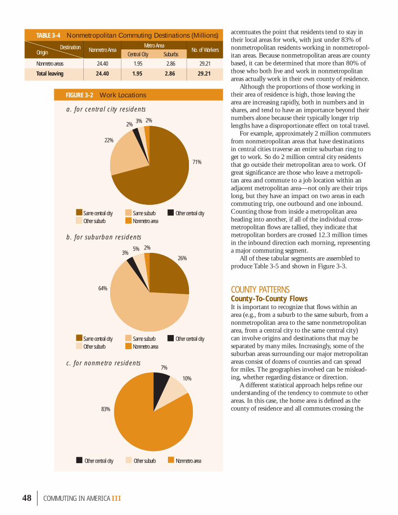
accentuates the point that residents tend to stay in their local areas for work, with just under 83% of nonmetropolitan residents working in nonmetropol-itan areas. Because nonmetropolitan areas are county based, it can be determined that more than 80% of those who both live and work in nonmetropolitan areas actually work in their own county of residence.
Although the proportions of those working in their area of residence is high, those leaving the area are increasing rapidly, both in numbers and in shares, and tend to have an importance beyond their numbers alone because their typically longer trip lengths have a disproportionate effect on total travel.
For example, approximately 2 million commuters from nonmetropolitan areas that have destinations in central cities traverse an entire suburban ring to get to work. So do 2 million central city residents that go outside their metropolitan area to work. Of great signifi cance are those who leave a metropoli-tan area and commute to a job location within an adjacent metropolitan area—not only are their trips long, but they have an impact on two areas in each commuting trip, one outbound and one inbound. Counting those from inside a metropolitan area heading into another, if all of the individual cross-metropolitan fl ows are tallied, they indicate that metropolitan borders are crossed 12.3 million times in the inbound direction each morning, representing a major commuting segment.
All of these tabular segments are assembled to produce Table 3-5 and shown in Figure 3-3.
COUNTY PATTERNSCounty-To-County FlowsIt is important to recognize that fl ows within an area (e.g., from a suburb to the same suburb, from a nonmetropolitan area to the same nonmetropolitan area, from a central city to the same central city) can involve origins and destinations that may be separated by many miles. Increasingly, some of the suburban areas surrounding our major metropolitan areas consist of dozens of counties and can spread for miles. The geographies involved can be mislead-ing, whether regarding distance or direction.
A different statistical approach helps refi ne our understanding of the tendency to commute to other areas. In this case, the home area is defi ned as the county of residence and all commutes crossing the
48 | COMMUT ING IN AMER I CA III
FIGURE 3-2 Work Locations
TABLE 3-4 Nonmetropolitan Commuting Destinations (Millions)
Nonmetro AreaMetro Area
No. of WorkersCentral City Suburbs
Nonmetro areas 24.40 1.95 2.86 29.21
Total leaving 24.40 1.95 2.86 29.21
OriginDestination
a. for central city residents
b. for suburban residents
c. for nonmetro residents
Other central city Other suburb Nonmetro area
Same central city Same suburb Other central city Other suburb Nonmetro area
Same central city Same suburb Other central city Other suburb Nonmetro area
2%3%2%
22%
71%
7%
10%
83%
2%5%3%
26%
64%

county boundary are tallied. These data indicate that in 2000, 73% of all commuters worked within their county of residence. Of course, the use of counties has its own ability to mislead; east of the Mississippi they tend to be useful units of geography by which to study travel patterns but western counties can be very large, often as large as some eastern states. Moreover, a trip crossing county lines could be quite short while one within a county could be quite long. Especially as areas expand, it is likely that workers from a county newly added to a metropolitan area will reside near the boundary with counties closer in than on its opposite edge.
The percentage of workers leaving their residence county for metropolitan counties and for nonmetro-politan counties mirrors the national average. How-ever, signifi cant variation exists among those living in central cities or suburbs. Central city residents are more home-area-oriented with over 82% working in their home county, while suburbanites are much less so oriented with slightly more than 68% remaining in their residence county. It is important to recog-nize that central cities may lie wholly within one county or be spread across several counties. About 72% of nonmetropolitan dwellers remain in their home county to work, but urban cluster (i.e., small town) residents in nonmetropolitan areas are the most locally oriented, with more than 80% working in the county where they live.
From the small towns just cited to the megalo-politan centers, the tendency to work within one’s home county declines as the size of the metropolitan area increases. Figure 3-4 demonstrates that point rather decisively for both central city and suburban counties, showing the percentage of commuters leaving their home county roughly doubles between areas below 100,000 and areas over 1 million. This matters greatly because crossing county boundar-ies at least permits the inference that such trips are longer than trips wholly inside the county borders, although that cannot be determined conclusively. However, years of steadily rising average work trip length in miles bear this out.
COMMUT ING IN AMER I CA III | 49
TABLE 3-5 Commuting Flow Summary (Millions)
FIGURE 3-3 Metropolitan Flow Map (Millions of Commuters)
FIGURE 3-4 Percentage Commuting Out of Home County
Own Metro Area Other Metro Area
Nonmetro Area AllCentral City Suburbs Other Central City Other Suburbs
Central city 24.5 7.5 0.7 1.1 0.5 34.4
Suburbs 16.6 40.8 2.2 3.5 1.6 64.7
Nonmetro areas 1.9 2.9 24.4 29.2
Total 41.1 48.3 4.8 7.5 26.5 128.3
OriginDestination
0
5
10
15
20
25
30
35
40
50-10
0
100-
250
250-
500
500-1
,000
1,000
-2,50
0
2,50
0-5,
000
5,00
0+
Central cities Suburbs
Perce
ntag
e of
wor
kers
in co
unty
Metro area population groups (thousands)
Own metro area
Other metro area
Nonmetro area
Suburbs
Central city
Central city
Suburbs
3.5
0.524.5
1.1
0.72.2
1.9
2.9
1.6
16.6
7.5
40.9
24.4

50 | COMMUT ING IN AMER I CA III
County TrendsThe 1990s witnessed dramatic increases in the num-bers of workers leaving their home county to work. That share has risen from under 24% to almost 27% in 10 years, as shown in Figure 3-5. Of the new work-ers added in the decade, about 51% worked outside their home county, an extraordinary change. At the state level, no state had a decrease in share of workers leaving their residence county to work. Some states—like New Hampshire and Delaware—had prodigious increases and several other states more than doubled the percentage of those leaving. West Virginia, Rhode Island, and Kansas were close to doubling. Virginia leads the nation with more than half of workers
FIGURE 3-5 Commuting Out of Home County Trend
Of the new workers added in the decade,
about 51% worked outside
their home county.
FIGURE 3-6 Counties with More Than 25 Percent Commuting Outside the County
a. 1990
b. 2000
0
5
10
15
20
25
30
20001990198019701960
Perce
nt
0% – 25% 25% – 100%
0% – 25% 25% – 100%

leaving their county of residence to work; Maryland and New Jersey are close to that. More than one-third of the workers in 11 states leave their residence county to work.
In 2000, more than 94 million commuters worked within their county of residence, but that leaves more than 34 million who leave their home county each day to go to a work site, compared to an estimated 20 million in 1980. This is approxi-mately an 85% increase for that period and more than three-and-one-half times the number in 1960. Figure 3-5 depicts this 40-year trend.
Figure 3-6 shows counties where more than 25% of workers commuted outside their home county in 1990 and 2000. Even in the West, the number of additions are quite signifi cant.
CHANGING WORK TRIP LENGTHSMany of the tools used to measure commuting fl ows are rather blunt instruments. The notion of a suburban area is vague and amorphous and even the central city concept is not always as clear as might be expected. The preceding discussion of county-to-county fl ows noted that these data vary sharply from the East to the West and, even in a given location, can mislead as fringe areas develop. Explicit work trip length measurements are limited. Most data have their detailed address information suppressed and are aggregated to large areas, either to protect respondent confi dentiality or to assure statistical quality. The NHTS, however, provides very help-ful support based on reported distance data from respondents and has, in fact, three ways of measur-
ing work trips, each of which shows increases of roughly the same amount. Figure 3-7 shows that work trip lengths have increased over time, roughly by almost 14% from 1990-2000. Therefore, at constant speeds, travel times should have increased about the same percentage. Note that trips for other purposes have increased in length also, but not as much as work trips.
Figure 3-8 presents trip length patterns by area size and confi rms that work trip
COMMUT ING IN AMER I CA III | 51
FIGURE 3-7 Trip Length Trend
FIGURE 3-8 Average Work Trip Length by Metropolitan Area Size
More than 94 million commuters, 73% of all commuters, work within their county of residence. That leaves more than 34 million who are exported each day from their home county to work, compared to an estimated 20 million in 1980, an 85% increase in that period, and more than three-and-one-half times the number in 1960.
0
2
4
6
8
10
12
14
AllNot in MSAor CMSA
In an MSA(CMSA) of
3,000+
In an MSA(CMSA) of
1,000-3,000
In an MSA(CMSA) of 500-1,000
In an MSA(CMSA) of 250-500
In an MSA (CMSA) of <250
Metro area size groups (thosands)
Miles
Note: Data from 2001 NHTS.
Work All purposes
Miles
Note: Data from 2001 NHTS.
02468
101214
200520001995199019851980
8.68
8.54
9.47
10.65
9.13
11.63
10.03
12.11
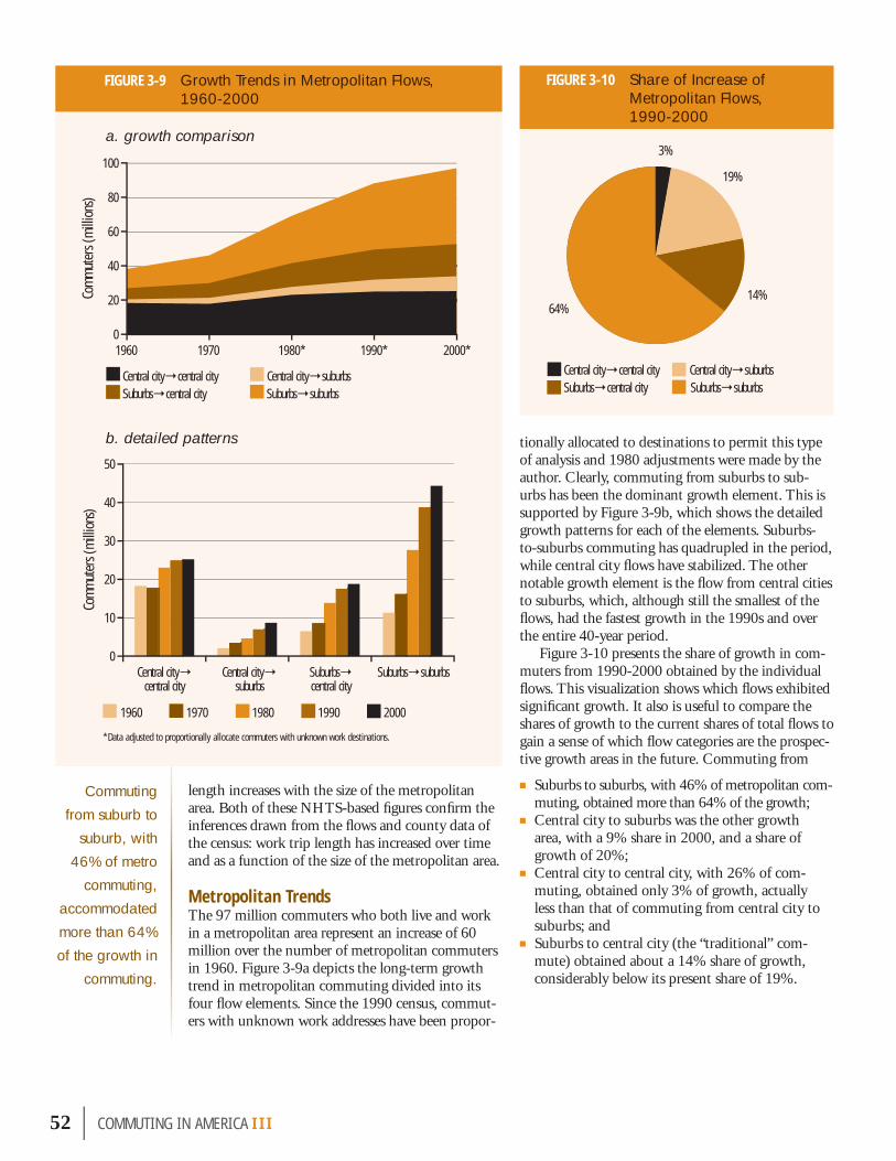
length increases with the size of the metropolitan area. Both of these NHTS-based fi gures confi rm the inferences drawn from the fl ows and county data of the census: work trip length has increased over time and as a function of the size of the metropolitan area.
Metropolitan TrendsThe 97 million commuters who both live and work in a metropolitan area represent an increase of 60 million over the number of metropolitan commuters in 1960. Figure 3-9a depicts the long-term growth trend in metropolitan commuting divided into its four fl ow elements. Since the 1990 census, commut-ers with unknown work addresses have been propor-
tionally allocated to destinations to permit this type of analysis and 1980 adjustments were made by the author. Clearly, commuting from suburbs to sub-urbs has been the dominant growth element. This is supported by Figure 3-9b, which shows the detailed growth patterns for each of the elements. Suburbs-to-suburbs commuting has quadrupled in the period, while central city fl ows have stabilized. The other notable growth element is the fl ow from central cities to suburbs, which, although still the smallest of the fl ows, had the fastest growth in the 1990s and over the entire 40-year period.
Figure 3-10 presents the share of growth in com-muters from 1990-2000 obtained by the individual fl ows. This visualization shows which fl ows exhibited signifi cant growth. It also is useful to compare the shares of growth to the current shares of total fl ows to gain a sense of which fl ow categories are the prospec-tive growth areas in the future. Commuting from
■ Suburbs to suburbs, with 46% of metropolitan com-muting, obtained more than 64% of the growth;
■ Central city to suburbs was the other growth area, with a 9% share in 2000, and a share of growth of 20%;
■ Central city to central city, with 26% of com-muting, obtained only 3% of growth, actually less than that of commuting from central city to suburbs; and
■ Suburbs to central city (the “traditional” com-mute) obtained about a 14% share of growth, considerably below its present share of 19%.
52 | COMMUT ING IN AMER I CA III
FIGURE 3-9 Growth Trends in Metropolitan Flows, 1960-2000
Commuting from suburb to
suburb, with 46% of metro
commuting, accommodated more than 64% of the growth in
commuting.
FIGURE 3-10 Share of Increase of Metropolitan Flows, 1990-2000
0
20
40
60
80
100
2000*1990*1980*19701960
Central city→central city Central city→suburbsSuburbs→central city Suburbs→suburbs
0
10
20
30
40
50
Suburbs→suburbsSuburbs→central city
Central city→suburbs
Central city→central city
*Data adjusted to proportionally allocate commuters with unknown work destinations.
1960 1970 1980 1990 2000
Com
mut
ers (
mill
ions
)Co
mm
uter
s (m
illio
ns)
Central city→central city Central city→suburbsSuburbs→central city Suburbs→suburbs
64%
3%
19%
14%
a. growth comparison
b. detailed patterns

It can be seen from the figure that all suburban destinations obtained an overall share of 83% of metropolitan commuting growth. This is actually an increase in share from that of the 1990s and a return to the 83% share for the period from 1970-1980. At 64%, the suburbs-to-suburbs share of growth again represented an increase from the 1990s and a return to its share of growth from 1970-1980. Perhaps the most significant shift, however, was the sharp decline in the growth share for the traditional commute from suburbs to central city, which, at 14%, is significantly less than its 20% share in the 1990s and 25% share in the 1980s. This indicates a continuing decline in share for the central-city-oriented commute.
In terms of destinations, the suburbs were the location of more than 8 million of the 13.3 million new jobs, or about 61% of the total national growth in jobs. A more complete measurement would include much of the nonmetropolitan growth shown previously in Table 3-1 as about 3.8 million (as defined in 1980), much of which is now defined as suburban. The overall share of national job growth obtained by central cities was just a 16% share.
Intermetropolitan TrendsAs metropolitan areas expand, they become closer to other metropolitan areas, sometimes with metropoli-tan boundaries abutting or with one county—labeled nonmetropolitan—separating them. In this envi-ronment, the substantial growth of flows between metropolitan areas is not surprising. Outbound flows to other metropolitan areas and to nonmetropolitan areas amounted to about 5.4% of all commuting in 1980, rose to over 7.5% in 1990 and are now at 7.8% (using current geography; or 8.3% in 1980 geography). Intermetropolitan flows grew at a rate of more than 28% in the period, more than double the 11.5% growth rate for commuting overall in the same period.
Suburbs were the destination of almost precisely half of all intermetropolitan flows, with the remain-der split 2:1 between central cities and nonmetro-politan areas. This pattern exhibited very little change from 1990. Since 1980, the dominant flow has been “cross-suburb” commuting (i.e., the flow from one suburb to another suburb of a different metropolitan area). Cross-suburb commuting rose from 31% of intermetropolitan commutes in 1980 to 39% in 1990, and has remained at that level since. In general, for the last 20 years, cross-suburb commuting has grown at double the pace of subur-ban commuting.
Table 3-6 presents total flows listed by metropoli-tan area size. This table begins to describe what can be considered the nation’s commuting markets, some of which are very large and others considerably smaller. The recent restructuring by the Census Bureau has created a set of nine mega-metropolitan areas over 5 million in population that dominates consideration. Houston and Atlanta were both just below 5 million in 2000 but have since crossed this boundary. Two of the nine areas, New York and Los Angeles, are over 10 million and a third, Chicago, is very close to that level. New York, the most populous megalopolitan area, stands alone at more than 20 million.
Although this study frequently has noted that the suburban flows are the strongest part of the vari-ous commuter flow categories, this table and Figure 3-11a, which uses percentages to provide a better means of visualization, in fact show that the patterns vary sharply with metropolitan area size.
■ Contrary to what some might expect, it is the smaller metropolitan areas that show strong cen-
COMMUT ING IN AMER I CA III | 53
TABLE 3-6 Commuter Flow Trends by Metropolitan Area Size Groups
The “traditional” commute obtained about a 14% share of growth, considerably below its present share of all travel, which is 19%.
Outbound flows to other metro areas and to nonmetro areas, about 5.4% of all commuting in 1980, rose to over 7.5% in 1990 and are now at 8.3%.
Intermetro- politan commuting increased at a rate almost three times that of internal metropolitan growth.
Metro AreaPopulation
Central City to Central City
Central City to Suburbs
Central City to Outside Metro Area
Suburbs to Central City
Suburbs to Suburbs
Suburbs to Outside Metro Area Total
(Thousands) (Millions)
50-100 0.40 0.06 0.05 0.15 0.12 0.05 0.82
100-250 2.76 0.57 0.26 1.72 2.15 0.73 8.08
250-500 3.13 0.87 0.24 2.20 3.29 0.73 10.45
500-1,000 2.76 0.82 0.15 2.11 3.65 0.47 9.97
1,000-2,500 5.74 1.76 0.29 4.23 8.07 0.81 20.88
2,500-5,000 3.49 1.16 0.18 3.02 7.20 0.84 15.88
5,000+ 9.15 2.74 1.24 4.75 16.28 4.14 38.30
All 27.43 7.98 2.41 18.18 40.76 7.77 104.38

tral city dominance. In areas below a population of 100,000, the combination of fl ows from central city to central city and from suburbs to central city constitute more than two-thirds of all fl ows. The internal central city fl ows alone are about half of all fl ows, but drop from almost a 50% share for the smallest areas to below 24% for the largest metropolitan areas.
■ At the same time, as shown in Figure 3-11a, suburbs-to-suburbs fl ows grow from a share of 15% to 43% as area size increases. This represents a dramatic increase in scale, from a 15% share of less than 1 million commuters to 43% of over 38 million (i.e., the total for areas of more than 5 million population as shown in Table 3-6).
■ The most stable pattern is the fl ow from suburbs to central city, which hovers around 20% of fl ows across all size groups, typically ranging between 18% and 21%, dropping sharply to around 12% in the areas with a population of more than 5 million.
■ An interesting component of the fl ows is that outbound fl ows from the suburbs to other areas are high (in the range of 9%) among the smallest metropolitan areas, then fall with increasing area size down to the 3% and 4% levels, but then rise again reaching over 10% in the largest metropoli-tan areas. The outbound fl ows from central cities follow a similar pattern.
■ It must be noted that, as shown in Figure 3-11b, the fi rst column represents less than 1 million commuters but the last column represents more than 38 million, almost 50 times bigger.
This understanding of the scale and scope of fl ows then permits the development of a list of the top 10 commuting markets in the nation, shown in Table 3-7. This list is dominated by the internal fl ows of the suburbs and central cities in various metropolitan size groups. The fl ow from suburbs to central city (the traditional commute) only appears at the sixth and seventh markets on the list, but this exceeds 1990 when only one fl ow made the list. The scale of the mega-metropolitan areas almost overwhelms the chart in that just about every fl ow in the category of 5 million plus is included. These 10 markets represent more than two-thirds of all metropolitan commuting in the nation.
DESTINATION PATTERNS Most household- or person-related statistical reporting is residence-based with the data aggre-gated at the residence geographic units. Commut-ing is unique in that it provides the opportunity
54 | COMMUT ING IN AMER I CA III
FIGURE 3-11 Commuter Flow by Metropolitan Area Size
a. shares
Suburbs→outside metro area Central city→outside metro area Suburbs→suburbs Central city→suburbs Suburbs→central city Central city→central city
0
5
10
15
20
25
30
35
40
50-1
00
100-
250
250-
500
500-
1,00
0
1,00
0-2,
500
2,50
0-5,
000
5,00
0+
Suburbs→outside metro area Suburbs→suburbs Suburbs→central city Central city→outside metro area Central city→suburbs Central city→central city
0
20
40
60
80
10050
-100
100-
250
250-
500
500-
1,00
0
1,00
0-2,
500
2,50
0-5,
000
5,00
0+
Perce
nt o
f com
mut
ers
Com
mut
ers (
mill
ions
)
Metro area population groups (thousands)
Metro area population groups (thousands)
b. volumes

occurred in the 10-year period. The following dis-cussion provides data that permit the disaggregation of these destination flows into their constituent origins.
Central City DestinationsTable 3-9 provides the details regarding central city flows. The table indicates that about 24.5 million of the roughly 46 million of those working in a central city, or about 53%, are residents
of that city, a slight decline in share from 1990. About 36% arrive from the suburbs of the same metropolitan area and the remainder, about 11%, arrive from outside the metropolitan area—both up slightly in share. These shifts in locational charac-teristics have implications for the trip lengths of workers and their choice of mode. It would appear that the shifts involve greater trip lengths, all else being equal. Figure 3-12 depicts the pattern.
COMMUT ING IN AMER I CA III | 55
TABLE 3-8 Summary of Commuting by Destination
FIGURE 3-12 Residence Distribution for All Central City Destinations
About 11% of work trips to the central city arrive from outside the metro area.
0
5
10
15
20
25
30
Live and work in same central city
Live in central city, work in central city of other metro area
Live in suburbs, work in central city
Live in surburbs, work in central city of other metro area
Live outside metro area,
work in central city
Wor
kers
(mill
ions
)
54%
1%
36%
5% 4%
TABLE 3-7 Top 10 Commuting “Markets”
Rank Flow TypeArea Size Workers
Millions1 Suburbs→suburbs 5+ 16.3
2 Central city→central city 5+ 9.1
3 Suburbs→suburbs 1-2.5 8.1
4 Suburbs→suburbs 2.5-5 7.2
5 Central city→central city 1-2.5 5.7
6 Suburbs→central city 5+ 4.7
7 Suburbs→central city 1-2.5 4.2
8 Suburbs→outside metro area 5+ 4.1
9 Suburbs→suburbs .5-1 3.6
10 Central city→central city 2.5-5 3.5
Total 66.5Note: Data based on 2000 geography have not been adjusted to 1980, so it somewhat overstates central city role.
Destination 2000 (Total) 1990 (%) 2000 (%)All central cities 45,926,265 38.20 35.80
All suburbs 55,874,305 41.50 43.56
All nonmetro areas 26,478,660 20.30 20.64
Total 128,279,230 100.00 100.00
TABLE 3-9 Where Central City Workers Live
Residence Location WorkersCentral city of same metro area 24,506,065
Central city of other metro area 681,395
Suburbs of same metro area 16,598,820
Suburbs of other metro area 2,192,460
Nonmetro area 1,947,525
All destinations 45,926,265
to tabulate and review information at the destina-tion end of the commute. Table 3-8 provides that summary picture showing total flows by commuter destination, as well as percentage shares for both the 1990 and 2000 data. The share comparison indicates that although there was no change in the nonmetropolitan destinations over the period, a shift from central city to suburban destinations did take place. Roughly, a 2-percentage-point shift
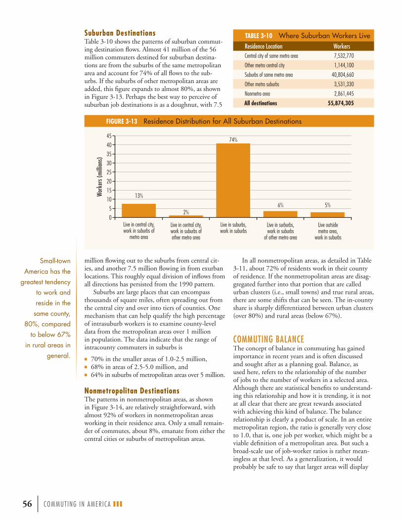
Suburban Destinations Table 3-10 shows the patterns of suburban commut-ing destination flows. Almost 41 million of the 56 million commuters destined for suburban destina-tions are from the suburbs of the same metropolitan area and account for 74% of all flows to the sub-urbs. If the suburbs of other metropolitan areas are added, this figure expands to almost 80%, as shown in Figure 3-13. Perhaps the best way to perceive of suburban job destinations is as a doughnut, with 7.5
56 | COMMUT ING IN AMER I CA III
FIGURE 3-13 Residence Distribution for All Suburban Destinations
TABLE 3-10 Where Suburban Workers Live
million flowing out to the suburbs from central cit-ies, and another 7.5 million flowing in from exurban locations. This roughly equal division of inflows from all directions has persisted from the 1990 pattern.
Suburbs are large places that can encompass thousands of square miles, often spreading out from the central city and over into tiers of counties. One mechanism that can help qualify the high percentage of intrasuburb workers is to examine county-level data from the metropolitan areas over 1 million in population. The data indicate that the range of intracounty commuters in suburbs is
■ 70% in the smaller areas of 1.0-2.5 million, ■ 68% in areas of 2.5-5.0 million, and ■ 64% in suburbs of metropolitan areas over 5 million.
Nonmetropolitan Destinations The patterns in nonmetropolitan areas, as shown in Figure 3-14, are relatively straightforward, with almost 92% of workers in nonmetropolitan areas working in their residence area. Only a small remain-der of commutes, about 8%, emanate from either the central cities or suburbs of metropolitan areas.
Small-town America has the
greatest tendency to work and reside in the
same county, 80%, compared
to below 67% in rural areas in
general.
In all nonmetropolitan areas, as detailed in Table 3-11, about 72% of residents work in their county of residence. If the nonmetropolitan areas are disag-gregated further into that portion that are called urban clusters (i.e., small towns) and true rural areas, there are some shifts that can be seen. The in-county share is sharply differentiated between urban clusters (over 80%) and rural areas (below 67%).
COMMUTING BALANCEThe concept of balance in commuting has gained importance in recent years and is often discussed and sought after as a planning goal. Balance, as used here, refers to the relationship of the number of jobs to the number of workers in a selected area. Although there are statistical benefits to understand-ing this relationship and how it is trending, it is not at all clear that there are great rewards associated with achieving this kind of balance. The balance relationship is clearly a product of scale. In an entire metropolitan region, the ratio is generally very close to 1.0, that is, one job per worker, which might be a viable definition of a metropolitan area. But such a broad-scale use of job-worker ratios is rather mean-ingless at that level. As a generalization, it would probably be safe to say that larger areas will display
Live in central city, work in suburbs of
metro area
Live in central city, work in suburbs of other metro area
Live in suburbs, work in suburbs
Live in surburbs, work in suburbs
of other metro area
Live outside metro area,
work in suburbs
0
5
10
15
20
25
30
35
40
45
Wor
kers
(mill
ions
)
13%
2%
74%
6% 5%
Residence Location WorkersCentral city of same metro area 7,532,770
Other metro central city 1,144,100
Suburbs of same metro area 40,804,660
Other metro suburbs 3,531,330
Nonmetro area 2,861,445
All destinations 55,874,305

something closer to a 1:1 ratio than smaller areas. The significance of the statistic inheres in its varia-tion in relatively small areas—counties or smaller units such as individual communities or emerging centers. Political units of government may delineate boundaries that are arbitrary with respect to the pat-terns of jobs and workers.
Historically, small towns in nonmetropolitan areas tended to be in rough balance regarding jobs and workers. That pattern still holds true today (note the earlier mention that in such towns 80% of commuters worked in their home county). Central cities nearly always have more jobs than workers—that could be construed as the definition of a city. Traditionally, job-rich cities have imported workers each day while suburban bedroom communities had more workers than jobs. This gave rise to the more symbolic than real notion of the suburbanite rushing downtown to work each day.
The metropolitan pattern has changed as job growth in the suburbs has dominated development in recent decades. An important factor was that jobs became more acceptable to the residential areas of the suburbs because of the shift toward technical services that were clean and attractive in contrast to the larger, sometimes noisier and more polluting job sites of the past. More importantly, skills-mix issues became more significant as employers competed for skilled employ-
ees, and sought to locate in areas most attractive to those employees with skills that were in short supply.
Manhattan Island, which is effectively New York City’s central county, has a job-worker ratio of almost 2.8 and Washington, D.C. has a ratio of almost 2.6, both greater than in 1990. Overall, the national job-worker ratio for central cities is 1.34, down from 1.36 in 1990. The overall national job-worker ratio for suburbs is .84, up from .83 in 1990; for nonmet-ropolitan areas it is .92, which is slightly lower than it was in 1990. Review of national patterns suggests that something closer to the notion of balance is occurring in both central cities and suburbs, and at least as a general statement, that has to be seen as positive (although there is no certainty that a number closer to one is necessarily a sign of progress). A city such as Washington, D.C., for instance, can be los-ing jobs and workers but if the workers are leaving faster than the jobs, the ratio would “improve.” The trend over time indicates that suburbs are moving up toward 1.0 as central cities approach it from the other direction, with something closer to balance in both cities and suburbs. Workers are increasing faster than jobs in central cities; and workers are increasing slower than jobs in suburbs.
At the outset it should be asserted that the phys-ical conjunction of jobs and workers does not tell us everything we need to know about the linkage between residences and job sites. The critical ques-tion is the match-up of skills and job requirements. If workers are not of the necessary skill and salary levels—whether greater or lesser than required by available jobs—it does not matter that jobs are nearby. Even with comparable skill levels there
COMMUT ING IN AMER I CA III | 57
FIGURE 3-14 Residence Distribution for All Nonmetropolitan Destinations
TABLE 3-11 Where Nonmetropolitan Workers Live
All areas are showing a greater balance of workers and jobs. Overall, central cities have 134 jobs for every 100 workers, down from 136 in 1990. For suburbs, the rate is 85 jobs per 100, up from 83 in 1990.
Live in surburbs, work in nonmetro area
Live in central city, work in nonmetro area
Live outside metro area, work in nonmetro area
0
5
10
15
20
25
30W
orke
rs (m
illio
ns)
2% 6%
92%
Residence Location Workers
Metro central city 517,610
Metro suburbs 1,561,515
Nonmetro area 24,399,535
All destinations 26,478,660

58 | COMMUT ING IN AMER I CA III
The example of Fairfax County, a rapidly developing Virginia suburb in the Washington, D.C. metropolitan area with a population of about 1 million, is a useful case study mirroring many suburban counties around the country.
In 1990, the ratio of jobs in the county to the number of workers in the county (i.e., the job-worker ratio) was close to 79 jobs per 100 workers, roughly 4 jobs for every 5 workers residing in the county. This was calculated using census data to divide the number of commuter destinations in the county by the number of commuters counted in the census. One way to interpret these data is that if all jobs were taken by residents, then 21% of workers residing in the county would still have to leave the county to work each day. This is a useful measure of the county’s ability to fi ll its own job needs—its job potential. This was a dramatic improvement over 1980 when the job-worker ratio was 54 jobs per 100 workers (or roughly 1 job for every 2 workers—a
classic “bedroom suburb”) as jobs in the county increased by about 100,000, substan-tially greater than worker growth.
In fact, the percentage of resident workers who actually worked in the county (the live-work ratio) was about 50% in 1990, a great increase from only around 35% in 1980. As a result, about 240,000 workers had to leave the county each day, not 70,000, the ideal. In addition, about 170,000 workers had to be imported each day. Thus, an almost sixfold increase in total fl ow across the borders con-trasted to the ideal potential. By contrast, even in 1990, the neighboring county of Arlington, which is more a part of the central city than a bedroom community, had a job-worker ratio of about 1.5, higher than many cities. However, its live and work percentage was more like 30%, far less than that in Fairfax and almost certainly attributable to a considerable skills mismatch between workers and jobs. In per-centage terms, Arlington generated much more cross-border fl ow than Fairfax.
By 2000, the Fairfax job-worker ratio was effectively 1.0, that is, the “perfect” situation of one job per worker. At this time, if every worker in the county worked at one of the jobs available in the county, there would have been no one entering or leaving the county to work. So, were the goal to reduce conges-tion by minimizing the need for work travel, the county ostensibly would have been close to achieving it. In reality, only about 53% of county resident workers worked in the county in 2000, a steady increase from 1990, but this still yielded a considerable need for imports and exports. The fact that large numbers of workers were moving in both directions is a measure of the differences in skills and attractions, and certainly not some kind of failure. As the fi gure shows, the live-and-work pattern has grown, more than keeping pace with worker growth; the number of workers exported each day has grown but at a considerably slower pace than in the past. But, as a result of job growth well beyond worker growth, the need to import workers was tremendous. Thus, the county saw a surge of imported workers of about 50,000 per day as a result of the apparent “improve-ment” in the job-worker ratio.
Examples of other suburban counties and their job-worker ratios include the following:
■ Westchester County, a New York City suburb with a job-worker ratio of .94;
■ Waukesha County, a suburb west of Milwau-kee, Wisconsin, that has reached 1.09 and exceeded balance;
■ Boulder, Colorado, which has reached 1.15 and exceeded balance; and
■ Leavenworth County, west of Kansas City, Kansas, which remains a bedroom suburb at .77.
Looking Beyond the Numbers—The Case of Fairfax County, Virginia
Fairfax County Commuting Balance Trends
Jobs Live and work WorkersExports Imports
0
100
200
300
400
500
600
200019901980
Wor
kers
(thou
sand
s)
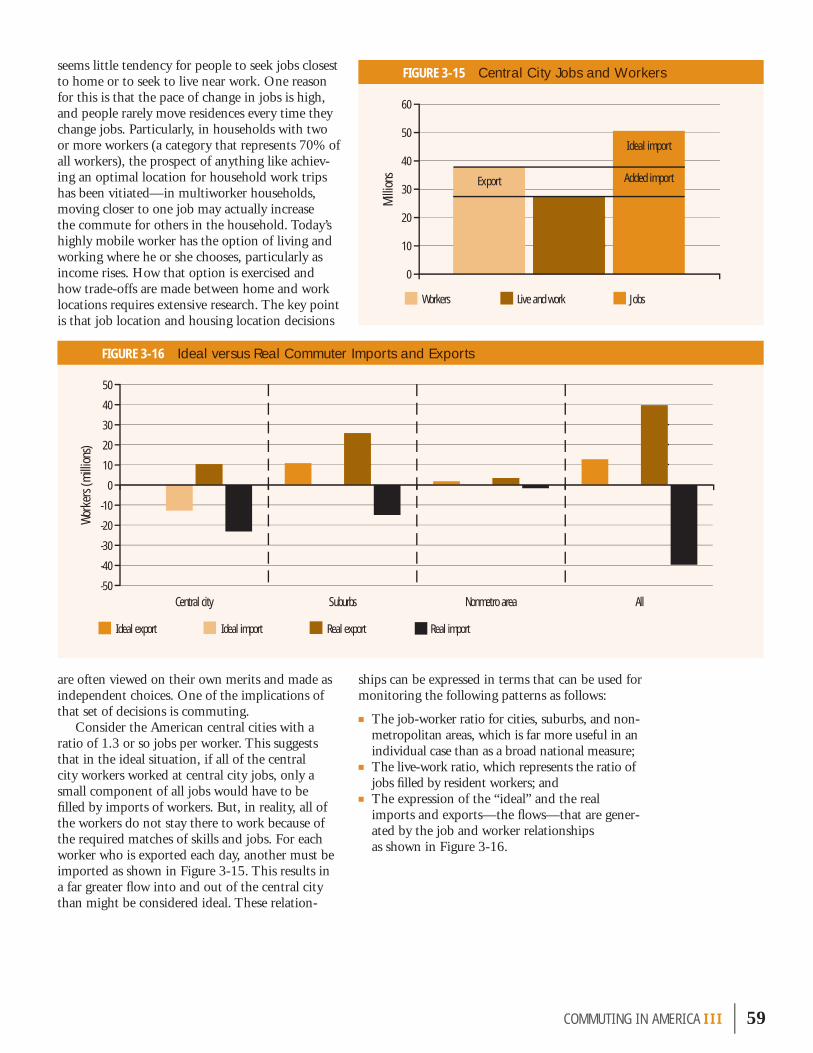
seems little tendency for people to seek jobs closest to home or to seek to live near work. One reason for this is that the pace of change in jobs is high, and people rarely move residences every time they change jobs. Particularly, in households with two or more workers (a category that represents 70% of all workers), the prospect of anything like achiev-ing an optimal location for household work trips has been vitiated—in multiworker households, moving closer to one job may actually increase the commute for others in the household. Today’s highly mobile worker has the option of living and working where he or she chooses, particularly as income rises. How that option is exercised and how trade-offs are made between home and work locations requires extensive research. The key point is that job location and housing location decisions
ships can be expressed in terms that can be used for monitoring the following patterns as follows:
■ The job-worker ratio for cities, suburbs, and non-metropolitan areas, which is far more useful in an individual case than as a broad national measure;
■ The live-work ratio, which represents the ratio of jobs fi lled by resident workers; and
■ The expression of the “ideal” and the real imports and exports—the fl ows—that are gener-ated by the job and worker relationships as shown in Figure 3-16.
COMMUT ING IN AMER I CA III | 59
FIGURE 3-15 Central City Jobs and Workers
FIGURE 3-16 Ideal versus Real Commuter Imports and Exports
are often viewed on their own merits and made as independent choices. One of the implications of that set of decisions is commuting.
Consider the American central cities with a ratio of 1.3 or so jobs per worker. This suggests that in the ideal situation, if all of the central city workers worked at central city jobs, only a small component of all jobs would have to be fi lled by imports of workers. But, in reality, all of the workers do not stay there to work because of the required matches of skills and jobs. For each worker who is exported each day, another must be imported as shown in Figure 3-15. This results in a far greater fl ow into and out of the central city than might be considered ideal. These relation-
0
10
20
30
40
50
60
Workers Live and work Jobs
Export
Ideal import
Added import
Milli
ons
-50
-40
-30
-20
-10
0
10
20
30
40
50
AllNonmetro areaSuburbsCentral city
Ideal export Ideal import Real export Real import
Wor
kers
(mill
ions
)

The term modal split is often used to describe the statistical depiction of the shares of commuter travel using the different modes of transportation. Because there is a strange kind of “competition” between modes, the percentages are watched very closely—more closely perhaps than present statistical quality can support. They are scrutinized carefully by analysts for indicators of prospective shifts in trends. Primarily, this is because public investments and policies often are keyed to these shifting patterns. Because public policy often is focused on affecting modal choices—in carpooling, transit, and telecom-muting promotion programs, for instance—modal shares are seen as a barometer of the effectiveness of those programs. In a broader (and perhaps more useful) sense, they do provide some insight into the ability of public actions to infl uence private behavior.
Understanding what is happening is often a function of the level of detail at which a subject is examined. From the broadest to the most detailed treatment, there are variations that occur within socio-economic groups and geographic areas, and there are different levels of geographic precision. This chapter addresses modal usage patterns as the broad sweep of trends over time and varying demographic groups; it is extensive but not exhaustive. Chapter 8 will address each modal group individually and in greater detail, often mining the varying levels of the topic in terms of the geography involved. The goal here is not to
champion any particular outcome, but to effectively describe how commuters are using the different modes of transportation.
Figure 3-17, which depicts the long-term trend in modal usage at the broadest level, reveals no signifi -cant variation in the 40-year trend. In effect, it shows that for this entire 40-year study period of American commuting (which encompasses landmark events such as the baby boom generation’s progression through the workforce years to the start of retire-ment and the dramatic surge of women entering the workforce), it is the private vehicle that has met all of the extraordinary growth in the journey to work.
While this statement is fundamentally correct, it masks a world of change that has occurred in the period, including the following:
■ The private vehicle trend line masks the decline in carpooling and the advent of the single-occupant vehicle (SOV) and the solo driver.
■ The walk-to-work/work-at-home trend line masks the decline and then rise in working at home, which is partly hidden by the continuous fall in walking throughout the period.
■ The transit trend line masks the variability of transit usage, where transit has declined in some areas while gaining in others, and further misses the stabilization of transit usage in general after a long period of decline. Moreover, it misses the point that transit usage can only be judged where there is transit service. Transit use is infl uenced sharply by service availability, which is governed by public policy.
In fact, what it is telling us is that the national pattern tells less of a story than it has in the past. To understand what is happening requires an examina-tion of a host of demographic factors—such as age, gender, income, home ownership, occupation, and other commuter characteristics—that have immense impact on modal usage patterns. Although public policy may be seeking to keep score on changes in modal trends for public investment purposes, these
60 | COMMUT ING IN AMER I CA III
7 Broad Modal Usage Patterns
FIGURE 3-17 Long-Term Commuting Trend
Over its 40-year span,
the baby boom generation’s
coming of age and entry into the workforce, accompanied by the surge
of women into the workforce,
has been funda-mentally served
by the private vehicle.
0
20
40
60
80
100
120
20001990198019701960
Private vehicle Transit Walk or work at home
Com
mut
ers (
mill
ions
)

investments can be undone by the shifting ages, incomes, and other characteristics of the population. Overlaid on all of these determinative trends is the simple reality of changing tastes and preferences in society. These are among the topics explored in this and subsequent chapters throughout Part 3.
Because travel modes based on the personal vehicle, which include about 88% of work travel, make it diffi cult to see what is happening in the other modal alternatives, Figure 3-18 depicts the modal share pattern for all but SOVs, with large carpools shown to provide a sense of scale. The sharp share declines in walking and the lesser declines in transit are evident, as is the growth in working at home. Note that in 2000, working at home exceeds
walking to work. Even at this scale, the trend in the lesser modes, all below 1% in their shares, is masked. These elements will be discussed in the following chapter on individual modal patterns.
Table 3-12 summarizes the 20-year trend and shows that driving alone gained more than the total number of workers added in the 20-year period, and carpooling lost almost 4 million users by 1990 but gained back some in 2000. The table also introduces the concept of modal shares expressed as percentages. Many policy concerns focus on
COMMUT ING IN AMER I CA III | 61
FIGURE 3-18 Modal Usage Trends, 1980-2000
a. broad trends in modal usage (excludes private vehicles)
b. detailed modal usage (excludes SOVs and 2-person carpools)
The national pattern for the 1990s presents a far more variable picture than the monolithic pat-terns of the 1970s and 1980s and tells us less than it has in the past. There have been gains and losses in carpooling, gains and losses in transit. These shifts in patterns make the national trend less of a template for individual local trends.
Perce
nt
0
1
2
3
4
5
6
7Transit
Taxi
Motorcycle
Bike
Other
Walk
Work at home
200019901980
0
1
2
3
4
5
6
Work
at ho
me
Othe
r
Walk
Bike
Motor
cycleTaxi
Ferry
Railro
ad
Subw
ay
Stree
tcar
Bus
5-pers
on+
carpo
ol
4-pers
on ca
rpool
3-pers
on ca
rpool
1980 1990 2000
Wor
kers
(mill
ions
)

62 | COMMUT ING IN AMER I CA III
TABLE 3-12 Long-Term Modal Usage Trends (Thousands)
FIGURE 3-19 Net Modal Change
-5
0
5
10
15
20
25
Work
at ho
me
Othe
r
Walk
Trans
it
Carpo
ol
Drive
alon
e
Total
work
ers
-2
0
2
4
6
8
10
12
14
Work
at ho
me
Othe
r
Walk
Trans
it
Carpo
ol
Drive
alon
e
Total
work
ers
Work
ers (
millio
ns)
Work
ers (
millio
ns)
Mode Mode
Mode1980 1990 2000 20-Year Change
No. % No. % No. % No.Drive alone 62,193 64.37 84,215 73.19 97,102 75.70 34,909
Carpool 19,065 19.73 15,378 13.36 15,634 12.19 −3,431
Transit 6,008 6.22 5,889 5.12 5,869 4.58 −139
Taxi 167 0.17 179 0.16 200 0.16 33
Motorcycle 419 0.43 237 0.21 142 0.11 −277
Bike 468 0.48 467 0.41 488 0.38 20
Other 703 0.73 809 0.70 901 0.70 198
Walk 5,413 5.60 4,489 3.90 3,759 2.93 −1,654
Work at home 2,180 2.25 3,406 2.96 4,184 3.26 2,004
Total workers 96,616 100.00 115,069 100.00 128,279 100.00 31,663
a. 1980-1990 b. 1990-2000

share as much as the absolute values. Note that carpooling, despite making gains in numbers in the period from 1990-2000, continued to lose share as its growth rate was lower than the growth rate of total workers. As long as a mode’s growth rate is less than the worker growth rate, it will show a loss in share. The gain in share of those who drive alone was substantial, about 11 percentage points, but when calculated with carpool, the total gain of modes based on the personal vehicle was only about 4 percentage points, indicating that this was not so much a shift to the private vehicle but a shift within the private vehicle group. Perhaps the most significant trend is the sharp decline in walking to about half its share in 1980.
Surprisingly, past trends have persisted into the recent decade, at least in broad terms—the SOV continues to increase in share; carpooling, transit, and walking continue to lose share; and the only other growth “mode” has been working at home. After the 1990 census, it seemed that the alterna-tive modes had dropped to a near base level and were down about as far as they would go. The discussion in the next chapter, where the details of modal usage are examined more closely, suggests that something closer to stability is at least begin-ning to occur.
If the trend for the 1980s and the trend for the 1990s are looked at side by side there is little at first glance to suggest anything like a significant differ-ence. It seems like business as usual. Figure 3-19a,
which shows the net changes in the broad modal categories during the 1980s, reveals that in the 10-year period from 1980-1990 driving alone rose while carpooling dropped sharply, and working at home was the only mode other than driving alone that rose in number. One of the key factors to observe is that the increase in driving alone actually exceeded the increase in total workers, in effect absorbing all of the new workers and gaining transfers from other modes.
Figure 3-19b shows the net changes in the broad modal categories for the 1990s. Although both figures are similar in general character, the following trend changes are real and significant:
■ The SOV increase, while substantial, was less than total worker growth;
■ Carpooling reversed 30 years of decline and showed small but real growth, not enough to hold share, but an increase nonetheless;
■ Transit gained in some areas, lost in others, and posted a trivial net loss that was one-fifth that of the previous decade; and
■ Perhaps the most significant factor was the decline in overall scale, in both the number of workers added and the number of those who drove alone (22 million new solo drivers added in the 1980s and over 12 million added in the 1990s).
There is another level at which the informa-tion presented in Figure 3-19a and b is even more different. The national chart for 1980-1990 exhib-
COMMUT ING IN AMER I CA III | 63
Carpooling shares have dropped from 20% in 1980 to about 12% in 2000.
The census asks workers how they usually travel to work; traditional transportation surveys ask how respondents traveled yesterday. The NHTS, which asks the question in both ways, bridges this informational gap. The matrix shown here cross-classifies these responses. These com-parisons of what respondents answer as their “usual mode” to work and what they actually do on a randomly assigned travel day are instructive.
People who say that they usually drive are very stable in their behavior—99% of those who say they usually drive alone and 97% of those who usually drive with others are in private vehicles
on any given work day. Their actual adherence to the usual is very strong. People who usually take transit, walk, or bike are less likely to be on that mode on any given work day.
Overall, 4.6% of the NHTS respondents said that they usually take transit to get to work. A bit more than two-thirds (69%) of those who said they usually take transit actually rode transit to work on the travel day for which they were interviewed. Of all the respondents who worked on the assigned travel day, 3.7% actually took transit.
The break-out of the actual mode to work for people who usually ride transit shows 7.8% drove alone, 9.7% rode with somebody, 69.4% actually took transit, 10.1% walked, 0.5% biked, and 2.5% took a taxi or some other mode.
Walkers, at 80%, have a higher level of loyalty to their mode than all others except the solo driver. When they vary from walking, carpooling is their major alternative, followed by driving alone. Those who bicycle exhibit a similar pattern.
Looking Beyond the Numbers—Usual versus Actual Mode Used
Is the Usual Mode the Actual Mode?
Usual ModeOn Travel Day (%)
Drove SOVDrove with
OthersTook Transit Walked Biked
Gave No Report/Other
Drive alone 90.0 9.3 0.2 0.3 0.1 0.2
Carpool 22.2 74.8 1.0 1.4 0.4 0.3
Take transit 7.8 9.7 69.4 10.1 0.5 2.5
Walk 8.1 9.2 2.6 79.5 0.2 0.4
Bike 6.7 8.4 1.7 6.1 77.1 0.0

ited a pattern that was so uniform throughout the nation, it could have applied to any metropolitan area in America. There were slight variations but, effectively, the local pattern was the national pattern. The picture is signifi cantly changed in the 1990-2000 cycle. Some localities have lost carpools, some
gained; some have lost transit, some gained; some have actually lost SOV share—something unheard of in the 1980s. The national pattern is a composite net picture of the many disparate state and local pat-terns, not a template for them. There are surprises galore—albeit small statistical surprises.
64 | COMMUT ING IN AMER I CA III
FIGURE 3-20 Regional Modal Usage Patterns
a. modal change
b. percent modal change
The national pattern is a
composite net picture of the
many disparate state and local
patterns, not a template
for them.
-1
0
1
2
3
4
5
6
Work at homeOtherWalkBikeMotorcycleTaxiTransitCarpoolDrive alone
Northeast region Midwest region South region West region
Wor
kers
(mill
ions
)
Mode
Northeast region Midwest region South region West region
Perce
nt ch
ange
Mode
Work at homeOtherWalkBikeMotorcycleTaxiTransitCarpoolDrive alone-50
-40
-30
-20
-10
0
10
20
30
40
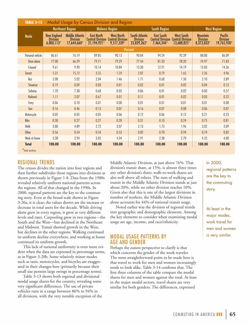
COMMUT ING IN AMER I CA III | 65
TABLE 3-13 Modal Usage by Census Division and Region
REGIONAL TRENDSThe census divides the nation into four regions and then further subdivides those regions into divisions as shown previously in Figure 1-8. Data from the 1980s revealed relatively uniform national patterns across the regions. All of that changed in the 1990s. In 2000, regional patterns are the key to the commut-ing story. Even at the broad scale shown in Figure 3-20a, it is clear; the values shown are the increase or decrease in total users for the decade. While driving alone grew in every region, it grew at very different levels and rates. Carpooling grew in two regions—the South and the West—but declined in the Northeast and Midwest. Transit showed growth in the West, but declines in the other regions. Walking continued its uniform decline everywhere, and working at home continued its uniform growth.
This lack of national uniformity is even more evi-dent when the data are expressed in percentage terms, as in Figure 3-20b. Some relatively minor modes such as taxis, motorcycles, and bicycles are exagger-ated in their changes here (primarily because their small size permits large swings in percentage terms).
Table 3-13 shows both regional and divisional modal usage shares for the country, revealing some very significant differences. The use of private vehicles runs in a range between 86% to 94% in all divisions, with the very notable exception of the
Middle Atlantic Division, at just above 76%. That division’s transit share, at 15%, is almost three times any other division’s share; walk-to-work shares are also well above all others. The sum of walking and transit in the Middle Atlantic Division stands at just about 20%, while no other division reaches 10%. Given also that this is one of the largest divisions in number of workers, the Middle Atlantic Division alone accounts for 44% of national transit usage.
Noted earlier was the division of regional trends into geographic and demographic elements. Among the key elements to consider when examining modal usage are age, income, and race/ethnicity.
MODAL USAGE PATTERNS BY AGE AND GENDERPerhaps the easiest perspective to clarify is that which concerns the gender of the work traveler. The most straightforward point to be made here is that travel to work for men and women increasingly tends to look alike. Table 3-14 confirms that. The first three columns of the table compare the modal shares for men and women against the total. At least in the major modal sectors, travel shares are very similar for both genders. The differences, expressed
In 2000, regional patterns are the key to the commuting story.
At least in the major modes, work travel for men and women is very similar.
Mode
Northeast Region Midwest Region South Region West Region
New England Division
6,800,113*
Middle Atlantic Division
17,644,660*
East North Central Division21,194,921*
West North Central Division
9,517,339*
South Atlantic Division
23,829,263*
East South Central Division
7,464,344*
West South Central Division13,688,825*
Mountain Division
8,373,833*
Pacific Division
19,765,930*
PercentPersonal vehicle 86.61 76.19 89.85 90.13 90.84 94.24 92.39 88.80 86.09
Drive alone 77.00 66.29 79.71 79.29 77.54 81.33 78.20 74.97 71.83
Carpool 9.61 9.90 10.14 10.84 13.30 12.91 14.19 13.83 14.26
Transit 5.31 15.12 3.55 1.59 2.87 0.79 1.65 2.26 4.96
Bus 2.08 5.02 2.04 1.46 1.71 0.68 1.50 2.10 3.89
Streetcar 0.19 0.09 0.03 0.01 0.02 0.01 0.02 0.04 0.13
Subway 1.70 7.38 0.68 0.03 0.86 0.01 0.02 0.03 0.57
Railroad 1.11 2.07 0.67 0.01 0.11 0.01 0.02 0.03 0.22
Ferry 0.06 0.10 0.01 0.00 0.01 0.01 0.01 0.01 0.08
Taxi 0.16 0.46 0.13 0.07 0.16 0.07 0.08 0.06 0.07
Motorcycle 0.05 0.05 0.05 0.06 0.12 0.06 0.12 0.21 0.23
Bike 0.30 0.27 0.27 0.28 0.31 0.10 0.24 0.75 0.81
Walk 3.80 4.89 2.72 3.07 2.13 1.73 1.96 3.02 3.09
Other 0.56 0.54 0.54 0.53 0.82 0.70 0.94 0.74 0.82
Work at home 3.38 2.94 3.02 4.34 2.91 2.38 2.70 4.22 4.00
Total 100.00 100.00 100.00 100.00 100.00 100.00 100.00 100.00 100.00
*Total workers

as the ratio of female to male modal usage, are shown in the last column. Women still have a ten-dency to use transit and taxicabs more than men and are more likely to work at home. Motorcycle and bicycle usage are two areas where the differences are still very sharp, although the level of usage for these modes by both genders is still minor. In driving alone, women’s travel tendency is up to about 99% of men’s, effectively identical, rising from 97% in 1990. Overall carpooling is also just about identical, but with women favoring smaller carpools and men more involved in the larger group carpools. In the tendency to trip-chain on the way to work and the return, women are far more active users of linking together other errands as part of the trip than their male counterparts.
Age also is a signifi cant factor in modal usage. What is most apparent in Figure 3-21 is that walk-ing is prevalent among young workers, declines with age, and then rises again with further increases in age. Working at home is minor at younger ages and grows dramatically in higher age groups. Working
66 | COMMUT ING IN AMER I CA III
Looking Beyond the Numbers—Modal Usage in Group Quarters
The noninstitutionalized group quarters population numbers almost 4 million and consists mostly of college students and members of the military. This group has a very distinct set of work trip patterns—typically very much oriented to an internal facility or campus. As a result, walking and working at home are strong but have special meanings. The trend since 1990 indicates that the personal vehicle has gained signifi cantly as has transit use at the expense of walking and working at home. As noted in Part 1, there were serious problems in the responses of college students regarding their work activities in the 2000 census, which may have distorted these responses.
TABLE 3-14 Modal Usage by Age and Gender
FIGURE 3-21 Modal Usage by Age Group
Women are still more likely than
men to use transit and taxis and to
work at home.
At present, workers over 55 constitute
only 14% of all workers but 26% of those working
at home. Working at home will be
a key factor among the aging
population in the future.
All75+
70-75
65-70
60-65
50-60
40-50
30-40
20-30
16-20
Age group
0
10
20
30
40
50
60
70
80
90
100
Perce
nt
Other Work at home Walk Bike Motocycle TaxiTransit Private vehicle
ModeTotal Male Female
Female/Male RatioPercent
Drive alone 75.73 76.17 75.22 98.8
Carpool 12.18 12.21 12.15 99.6
2-person 9.43 9.31 9.57 102.8
3-person 1.68 1.68 1.69 100.8
4-person+ 1.07 1.22 0.89 73.1
Transit 4.55 4.11 5.07 123.2
Bus 2.51 2.10 2.98 142.3
Streetcar 0.05 0.05 0.05 107.1
Subway 1.45 1.36 1.56 114.7
Railroad 0.51 0.57 0.45 79.0
Ferry 0.04 0.04 0.03 62.0
Taxi 0.16 0.14 0.18 130.3
Motorcycle 0.12 0.20 0.02 9.3
Bike 0.38 0.57 0.16 27.9
Walk 2.93 2.90 2.96 102.0
Work at home 3.27 2.88 3.72 129.1
Other 0.69 0.83 0.53 63.1
Percent Modal Usage by Group Quarters Population
Group Quarters 1990 (%) 2000 (%)
Private vehicle 34.36 38.74
Transit 5.18 6.35
Bicycle 1.24 1.31
Walk 46.37 44.73
Work at home 10.71 5.78
Other 2.14 3.10
All 100.00 100.00

at home will be a key factor in the future among the aging population. At present, workers 55 and older constitute only 14% of all workers but 26% of those working at home. These two modes in their different age periods act as the signifi cant alternative to the private vehicle. Transit use also has a signifi cant age composition with greatest usage among the young, particularly in the bus and subway modes. With age, transit use diminishes and incurs shifts toward increases in the railroad and ferry modes.
Figure 3-22a shows the age composition of users of the various modes. The last column in this chart
provides a useful sense of scale showing the age dis-tribution for all modes to work. It shows that about half of workers are above and half below 40 years of age. This can be used as a basis for comparison in examining the other modes. For instance, note that in the most extreme cases, bicycles and motorcy-cles, those below age 50 account for between 85% and 90% of users, whereas for working at home it drops to about 35%. The carpooling segment of private vehicle travel is strongly oriented to youth and declines in all size groups as travelers age as illustrated in Figure 3-22b.
COMMUT ING IN AMER I CA III | 67
FIGURE 3-22 Age as a Factor in Modal Usage
a. composition of modes by age of users
b. carpooling by age of commuter and size of carpool
Age group
Perce
nt
0
2
4
6
8
10
12
14
16
2 people
3 people
4 people
5 or 6 people
7+ people
75+65-7555-6545-5535-4525-3516-25
Carpool size:
Mode
Perce
nt
0
10
20
30
40
50
60
70
80
90
100
75+
70-75
65-70
60-65
50-60
40-50
30-40
20-30
16-20All
Othe
r
Work
at ho
meWalk
Bike
Motor
cycleTaxi
Ferry
Railro
ad
Subw
ay
Stree
tcar
Bus
Priva
te ve
hicle
Age group:

that group only rose about 12%. As that group’s share of the population increases sharply after 2010, a key question for commuting will be the extent to which persons in that age group continue to work. Note that in Table 3-15 the share of workers drops sharply with age. The ques-tion, however, will be whether that pattern will persist in the
age groups just now reaching retirement age. Focusing on the modal usage of the over-55
worker population shows that the orientation of the older worker shifts away from the SOV signifi cantly with age, as shown in Figure 3-25a. There are slight gains in carpooling, but a major shift to walking and working at home. Clearly, this seems to be a product of changes in the character of jobs as much as shifts in mode preference. A detailed treatment of transit in Figure 3-25b shows that bus travel gains some-what as workers age and other transit modes tend to lose minor shares.
The Effect of Hours Worked The effect of older workers on modal usage in com-muting is intertwined with declining levels of hours worked as age increases. Figure 3-26 shows that there are sharp shifts away from the 40-hour week with the increasing age of the working population. Less than half of those over 65 and about one-third of those over 75 who work, work a full 40-hour week. As Figure 3-27 shows, the work pattern shifts signifi cantly toward walking and working at home for those who work very short or very long hours.
Workers Over Age 55 An increasingly important aspect of work and age is the baby boom cohort’s aging out of the workforce. The oldest baby boomers are approaching age 60 and by 2010 will begin turning 65. At present, the workforce can be divided almost perfectly into four equal age groups: 16-30; 30-40; 40-50; and 50 and older. Figure 3-23 shows that about 7% of workers are now age 60 and older.
When investigation shifts to the older age groups, the impending change is more clear. Figure 3-24 shows that half of all workers 55 and older are in the 55-60 age group. Of course many of these workers will retire in the coming years and so will not have as dramatic an effect as the chart suggests, but we have already seen sharp increases in the older worker population. The population at work among those age 65 and older rose by roughly 750,000 from 3.5 million in 1990 to 4.25 million in 2000; about half of the growth coming from those 75 and older. The number of workers age 65 and older rose by over 21% in the period while the population in
FIGURE 3-23 Age Distribution of Workers FIGURE 3-24 Age Distribution of Workers Age 55 and Older
TABLE 3-15 Workers and Nonworkers Age 55 and Older
The number of workers over
65 rose by more than 21% in the period while the
population in that group only rose about 12%. As
that group’s share of the population increases sharply
after 2010, a key question for commuting will be the extent to
which persons in that age group
continue to work. One-half of all
workers 55 and older are in the
55-60 age group.
The orientation of the older
worker shifts away from the
SOV signifi cantly with age, with slight gains in
carpooling but with the major
shift to walking and working
at home.
Age group: 16-20 20-30 30-40 40-50 50-60 60-65 65-70 70-75 75+
20.63%
25.12%25.64%
16.58%
3.70%1.61%
0.97%0.74%
5.01%
Age group: 55-60 60-65 65-70 70-75 75+
49%
27%
5%7%
12%
Age GroupPopulation
Age 55+ (No.)Workers
Age 55+ (No.)Workers
Age 55+ (%)55-60 13,311,624 8,443,988 63.43
60-65 10,776,487 4,747,536 44.05
65-70 9,240,140 2,068,272 22.38
70-75 8,945,204 1,246,434 13.93
75+ 16,758,059 947,673 5.66
55+ 59,031,514 17,453,903 29.57
68 | COMMUT ING IN AMER I CA III

The census data do not permit the inspection of modal use for workers with more than one job. Although with a limited sample, the NHTS does permit some understanding of the effect that hold-ing more than one job has on modal usage. Table 3-16 shows that the effects overall are relatively minor, but to the extent they have any effect it is toward greater use of the private vehicle. This is understandable given that those with more than one job may have very diverse locations to reach and limited time in which to do so. The data in the table
are stratifi ed by full-time and part-time workers. One of the small insights provided by the NHTS is that many of these extra jobs are apparently related to driving a school bus. School bus usage takes a pronounced jump in both full-time and part-time work for those with more than one job. The small sample sizes make any conclusions uncertain.
COMMUT ING IN AMER I CA III | 69
FIGURE 3-25 Modal Usage for Workers Age 55 and Older
a. private vehicle modes b. nonprivate vehicle modes
FIGURE 3-26 Hours Worked by Age of Worker
FIGURE 3-27 Modal Usage by Hours Worked per Week
Drive alone 3-person carpool 5- or 6-person carpool2-person carpool 4-person carpool 7-person+ carpool
Perce
nt
0102030405060708090
75+65-7555-65Age group
Bus Taxi Work at homeSubway Walk
Perce
nt
Age group
0
2
4
6
8
10
12
14
75+70-7565-7060-6555-60
0
20
40
60
80
100
75+65-7555-65<55
Age group
Perce
nt
<20 20 through 30 30 through 40 40 through 50 50+
Hours:
Hours worked/week
Perce
nt
25 th
rough
32
1 thr
ough
8
9 thr
ough
24
49 th
rough
56
33 th
rough
40
41 th
rough
48
73 th
rough
80
81 th
rough
99
57 th
rough
64
65 th
rough
72
Private Vehicle
BikeFerryBus
MotorcycleRailroadStreetcar
TaxiSubway
Work at homeWalk Other
0
10
20
30
40
50
60
70
80
90
100
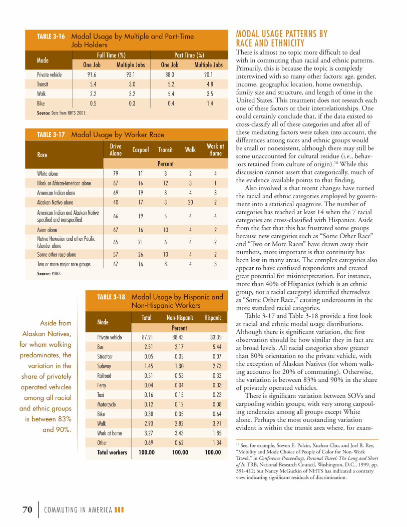
MODAL USAGE PATTERNS BY RACE AND ETHNICITY There is almost no topic more difficult to deal with in commuting than racial and ethnic patterns. Primarily, this is because the topic is complexly intertwined with so many other factors: age, gender, income, geographic location, home ownership, family size and structure, and length of time in the United States. This treatment does not research each one of these factors or their interrelationships. One could certainly conclude that, if the data existed to cross-classify all of these categories and after all of these mediating factors were taken into account, the differences among races and ethnic groups would be small or nonexistent, although there may still be some unaccounted for cultural residue (i.e., behav-iors retained from culture of origin).16 While this discussion cannot assert that categorically, much of the evidence available points to that finding.
Also involved is that recent changes have turned the racial and ethnic categories employed by govern-ment into a statistical quagmire. The number of categories has reached at least 14 when the 7 racial categories are cross-classified with Hispanics. Aside from the fact that this has frustrated some groups because new categories such as “Some Other Race” and “Two or More Races” have drawn away their numbers, more important is that continuity has been lost in many areas. The complex categories also appear to have confused respondents and created great potential for misinterpretation. For instance, more than 40% of Hispanics (which is an ethnic group, not a racial category) identified themselves as “Some Other Race,” causing undercounts in the more standard racial categories.
Table 3-17 and Table 3-18 provide a first look at racial and ethnic modal usage distributions. Although there is significant variation, the first observation should be how similar they in fact are at broad levels. All racial categories show greater than 80% orientation to the private vehicle, with the exception of Alaskan Natives (for whom walk-ing accounts for 20% of commuting). Otherwise, the variation is between 83% and 90% in the share of privately operated vehicles.
There is significant variation between SOVs and carpooling within groups, with very strong carpool-ing tendencies among all groups except White alone. Perhaps the most outstanding variation evident is within the transit area where, for exam-
70 | COMMUT ING IN AMER I CA III
TABLE 3-16 Modal Usage by Multiple and Part-Time Job Holders
TABLE 3-17 Modal Usage by Worker Race
TABLE 3-18 Modal Usage by Hispanic and Non-Hispanic Workers
Aside from Alaskan Natives,
for whom walking predominates, the
variation in the share of privately operated vehicles among all racial
and ethnic groups is between 83%
and 90%.
16 See, for example, Steven E. Polzin, Xuehao Chu, and Joel R. Rey, “Mobility and Mode Choice of People of Color for Non-Work Travel,” in Conference Proceedings, Personal Travel: The Long and Short of It, TRB, National Research Council, Washington, D.C., 1999, pp. 391-412; but Nancy McGuckin of NHTS has indicated a contrary view indicating significant residuals of discrimination.
ModeFull Time (%) Part Time (%)
One Job Multiple Jobs One Job Multiple JobsPrivate vehicle 91.6 93.1 88.0 90.1
Transit 5.4 3.0 5.2 4.8
Walk 2.2 3.2 5.4 3.5
Bike 0.5 0.3 0.4 1.4
Source: Data from NHTS 2001.
RaceDrive Alone Carpool Transit Walk Work at
Home
PercentWhite alone 79 11 3 2 4
Black or African-American alone 67 16 12 3 1
American Indian alone 69 19 3 4 3
Alaskan Native alone 40 17 3 20 2
American Indian and Alaskan Native specified and nonspecified 66 19 5 4 4
Asian alone 67 16 10 4 2Native Hawaiian and other Pacific Islander alone 65 21 6 4 2
Some other race alone 57 26 10 4 2
Two or more major race groups 67 16 8 4 3
Source: PUMS.
ModeTotal Non-Hispanic Hispanic
PercentPrivate vehicle 87.91 88.43 83.35
Bus 2.51 2.17 5.44
Streetcar 0.05 0.05 0.07
Subway 1.45 1.30 2.73
Railroad 0.51 0.53 0.32
Ferry 0.04 0.04 0.03
Taxi 0.16 0.15 0.23
Motorcycle 0.12 0.12 0.08
Bike 0.38 0.35 0.64
Walk 2.93 2.82 3.91
Work at home 3.27 3.43 1.85
Other 0.69 0.62 1.34
Total workers 100.00 100.00 100.00

ple, the African-American population shows levels of transit use four times that of the White alone population. Asians also show a strong tendency for transit as do the “other race” categories.
Among other differences in walking, biking, and working at home, examination of the His-panic/non-Hispanic ethnicity grouping in Table 3-18 indicates strong differences in transit where Hispanics use transit (8.6%) at more than double the rate for non-Hispanics (4.1%). However, perhaps the most signifi cant difference is in the use of personal vehicles. The overall numbers are close but that masks tremendous differences in carpooling. Table 3-19 shows that strong dispar-ity. The category of non-Hispanics who drove
alone is about 17 percent-age points greater than SOV usage by Hispanics. But it is carpooling by Hispanics that is extraordinary—double non-Hispanic patterns (23% versus 11%) with very strong carpooling tendencies in the larger carpools. In fact, carpooling in groups greater than two is 8% of commut-ing among Hispanics, four times the non-Hispanic rate. It may very well be the 3 mil-lion Hispanic carpoolers that effected the turnaround in U.S. carpooling.
The Effect of Years in the United StatesThe factors that surface in the race and ethni-city analyses may really simply be related to the amount of time a person has been in the United States. Figure 3-28 presents fi ndings based on a question in the census as to the years respon-dents have resided in the United States. As can be seen in the fi gure, recent arrivals show greater emphasis on carpooling, transit, and walking, all of which diminish with increasing length of residence. Interestingly, it seems that foreign-born citizens never really meld completely into the native-born patterns. Another approach is to look at the results of a census question that asks
where the respondent was 5 years ago, which is aimed at examining movers within the United States, but also identifi es those who were not U.S. residents in 1995. Those respondents who were not resident in 1995 show a similar marked tendency for carpooling, almost reaching a 26% share, and driving alone at only 49%. Transit, at almost 13%, also enjoys a huge market among this group of recent U.S. arrivals; similarly walking and biking
TABLE 3-19 Private Vehicle Usage by Hispanic and Non-Hispanic Workers
FIGURE 3-28 Modal Usage by Immigrants by Years in the United States
Perhaps the most outstanding variation evident is within the transit area where, for example, the African-American population shows levels of transit use four times that of the White non-Hispanic population. The Asian population also shows a strong tendency for transit as do the “other race” categories.
It is Hispanic carpooling that is extraordinary—it is double non-Hispanic patterns (23% versus 11%)—with very strong carpooling tendencies in the larger carpools. In fact, carpooling in groups greater than two is 8% of commuting among Hispanics, four times the non-Hispanic rate.
Years in U.S.
Perce
nt
Other Work at home Walk BikeTransit Carpool Drive alone
0
10
20
30
40
50
60
70
80
90
100
20+
15-20
10-15
5-10< 5
Nativ
ebo
rn
ModeTotal Non-Hispanic Hispanic
Percent
Drive alone 75.73 77.45 60.64
2-person carpool 9.43 8.83 14.71
3-person carpool 1.68 1.39 4.27
4-person carpool 0.60 0.43 2.05
5- or 6-person carpool 0.28 0.19 1.09
7-person+ carpool 0.19 0.14 0.59
2-person+ carpool 2.75 2.15 8.00
All carpools 12.18 10.98 22.71
COMMUT ING IN AMER I CA III | 71

Given that this part of the population constitutes about 13.5% of the total work population, their shares in some modes, such as large carpools, are very substantial.
MODAL USAGE PATTERNS BY INCOME AND VEHICLE OWNERSHIPIt should not be surprising that household income affects the mode chosen to commute to work. One factor, of course, is the link between income and vehicle ownership. There are other factors as well, including home ownership and loca-tion. Figure 3-30 shows the marked shift toward driving alone as income rises. Also of note is the working at home activity that declines and then rises again with income. Transit usage displays a rather special variation, declining with income except for the shift to commuter rail that becomes apparent in the higher income strata.
Another way to view this, and other relation-ships, is displayed in Figure 3-31, which shows the income distribution within each mode. The income distributions shown can be compared to the total column to gain a sense of scale. The modes with greater levels of usage among the low-income population are the carpool modes, bus travel, bicycling, walking, and—surprisingly—taxi-cabs. The very substantial tendency for commuters with higher incomes to use ferry and commuter rail is strongly apparent.
Vehicles available to a household and household income are strongly related, but consideration of modal usage by vehicles available provides some
72 | COMMUT ING IN AMER I CA III
have strong utilization. Note that in Table 3-20 only about 3 million working respondents are counted, which could be appreciably fewer than actual recent arrivals.
Figure 3-29 shows the share of usage for vari-ous modes of work travel activity by immigrants.
TABLE 3-20 Modal Usage of Recent Immigrants
FIGURE 3-29 Foreign Born as a Share of Modal Usage
Immigrants who were not resident in 1995 show a
marked tendency for carpooling,
reaching an almost 26% share, with
driving alone at only 49%. At
almost 13%, transit also enjoys a huge market among this
group of those who arrived in the
United States no more than 5 years
ago. Similarly, walking and biking
also have strong utilization.
Native born Foreign born
Mode
Perce
nt
0
20
40
60
80
100
All
Othe
r
Work
at ho
meWalk
Bike
Motor
cycleTaxi
Ferry
Railro
ad
Subw
ay
Stree
tcar
Bus
7-pers
on+
carpo
ol
5- or
6-pers
onca
rpool
4-pers
onca
rpool
3-pers
onca
rpool
2-pers
onca
rpool
Drive
alon
eMode Outside U.S.
in 1995 Share (%)
Drive alone 1,617,944 48.74
2-person carpool 493,899 14.88
3-person carpool 172,852 5.21
4-person carpool 98,316 2.96
5- or 6-person carpool 56,057 1.69
7-person+ carpool 32,618 0.98
Bus 270,273 8.14
Streetcar 3,270 0.10
Subway 130,814 3.94
Railroad 24,135 0.73
Ferry 2,261 0.07
Taxi 10,807 0.33
Motorcycle 4,892 0.15
Bike 51,627 1.56
Walk 224,166 6.75
Work at home 69,280 2.09
Other 56,569 1.70
Total 3,319,780 100.00

COMMUT ING IN AMER I CA III | 73
FIGURE 3-30 Modal Usage by Household Income
FIGURE 3-31 Composition of Modes by Income of Users
<$25,000 $25,000-$75,000 $75,000-$100,000 $100,000+
Mode
Perce
nt
0
20
40
60
80
100
5- or
6-pers
on ca
rpool
4-pers
on ca
rpool
3-pers
on ca
rpool
2-pers
on ca
rpool
Drive
alon
e
7-pers
on+
carpo
ol Bus
Stree
tcar
All tr
ansit
Work
at ho
me
Othe
r
Motor
cycleTaxi
Walk
Bike
Ferry
Railro
ad
Subw
ay
Household income
Perce
nt
0
20
40
60
80
100
$150
,000
+
$125
,000
-$150
,000
$100
,000
-$125
,000
$75,
000-$
100,
000
$60,
000-$
75,0
00
$55,
000-$
60,0
00
$50,
000-$
55,0
00
$47,
500-$
50,0
00
$45,
000-$
47,5
00
$42,
500-$
45,0
00
$40,
000-$
42,5
00
$37,
500-$
40,0
00
$35,
000-$
37,5
00
$32,
500-$
35,0
00
$30,
000-$
32,5
00
$27,
500-$
30,0
00
$25,
000-$
27,5
00
$22,
500-$
25,0
00
$20,
000-$
22,5
00
$17,
500-$
20,0
00
$15,
000-$
17,5
00
$12,
500-$
15,0
00
$10,
000-$
12,5
00
$ 5,
000-$
10,0
00
< $5
,000
Work at home Other Motorcycle Taxi Walk Bike Ferry Railroad Subway Streetcar Bus 7-person+ carpool 5- or 6-person carpool 4-person carpool 3-person carpool 2-person carpool Drive alone

A stark distinction is conveyed by examining modal usage by vehicle availability as shown in Figure 3-33. Households without vehicles provide the one case where private vehicle usage of less than 50% has been registered. Strong walking and transit use are emphasized.
74 | COMMUT ING IN AMER I CA III
additional useful insights. Figure 3-32 shows the dis-tribution of all workers by household vehicle owner-ship. Only about 5% of workers are in households without vehicles; most, 44%, are in households with two vehicles; about 23% with just one vehicle; and the remainder with three or more vehicles. There is a strong correlation between incomes and vehicle ownership here. The modes where workers in house-holds without vehicles are heavily represented are the bus and subway modes as well as walking and biking and, again, the taxicab.
FIGURE 3-32 Composition of Modes by Vehicle Ownership of Users
FIGURE 3-33 Modal Usage by Vehicles Owned
Zero-vehicle households is the one group where
private vehicle usage of less than
50% has been registered.
Perce
nt
0
20
40
60
80
100
All
Othe
r
Work
at ho
meWalk
Bike
Motor
cycleTaxi
Ferry
Railro
ad
Subw
ay
Stree
tcar
Bus
Priva
te ve
hicle
0 vehicles 1 vehicle 2 vehicles 3 vehicles 4 vehicles 5 vehicles 6+ vehicles
ModeVehicles in household:
Drive alone 2-person carpool 3-person carpool 4-person carpool 5- or 6-person carpool Ferry 7-person+ carpool Bus Streetcar Subway Railroad Other Taxi Motorcycle Bike Walk Work at home
Vehicles in household
0
20
40
60
80
100
6+543210
Perce
nt

GEOGRAPHIC CONSIDERATIONS IN MODAL SHARES State Modal Usage Assessing the modal patterns of the states with their broad array of situations and contexts is a difficult task. Given that breadth, there is a substantial degree of uniformity to the patterns observed. Some pat-terns and comparisons of 1990 and 2000 data are summarized below.
■ Driving alone (see Figure 3-34) ■ Solo drivers had a share over 80% in 14 states. ■ Most states (33) were between 70% and 80%
solo drivers. ■ Michigan had the highest SOV share at over 83%. ■ New York is in a class by itself with the lowest
share, 56%. ■ Other states below 70% are Hawaii and Alaska
(also D.C. and Puerto Rico). ■ Five states added more than 5 percentage points,
including North Dakota at over 6 (Puerto Rico was almost 7).
■ Another 28 states gained between 2 and 5 per-centage points. Only two states declined (very slightly) in share: Oregon dropped two-tenths of a percent and Washington six-tenths.
■ California and Arizona were close to holding share constant.
■ Many changes appear to be in geographic clus-ters as noted in the earlier discussion of changes to Census regions.
■ A lot of this change is a result of shifts between driving alone and carpooling.
■ Carpooling ■ All states except Hawaii (19%) are between 9%
and 15% share. ■ Only six states—Montana, Idaho, Alaska, South
Dakota, Arizona, and Washington—all west of the Mississippi, gained in share.
■ All gains were minor with Washington just over one-half percentage point.
■ Big volume gainers were the high-growth states: Texas almost 200,000; Arizona over 100,000; California, Colorado, Georgia, Florida, and Washington over 50,000; and Nevada just under 50,000.
■ Alabama, Virginia, and West Virginia dropped more than 3 percentage points and states around them—Pennsylvania, Maryland, South Carolina, North Carolina, and Missouri—lost more than 2 percentage points.
■ Clustering of changes in the Mid-Atlantic States shows Pennsylvania lost over 100,000 while Vir-ginia, Maryland, and New Jersey lost over 50,000.
■ Transit ■ Transit shares were relatively stable in most states
(within 1 percentage point of their 1990 shares). ■ There are 10 states plus Puerto Rico that exceed
the national average transit share. ■ New York (24% share) and Washington, D.C.
(33% share) are two significant transit users. ■ Transit share otherwise ranges between just
below 10% (New Jersey) to below 1% (17 states). ■ Of the 13 states that posted gains, only Nevada
gained more than 1 percentage point. ■ Of the 37 states that lost share, 34 lost less than
1 percentage point. ■ Volume increases show 8 states gained over
10,000 users; 6 gained between 1,000-10,000; and 10 gained less than 1,000.
■ Volume losses show 5 states (plus D.C. and Puerto Rico) lost over 10,000; 19 lost between 1,000-10,000; and 3 lost less than 1,000.
■ Gains tended to be in the West and losses in the East.
COMMUT ING IN AMER I CA III | 75
FIGURE 3-34 Drive Alone Shares by State, 2000
Geographic patterns of modal usage are clustered in certain regions. Sharp drops in the carpooling rates in the Middle Atlantic States centered around Virginia; growth in transit and carpooling was evident in the West.
Note: States appear in alphabetical order.
Perce
nt d
rive
alon
e
55
60
65
70
75
80
85
USA
WINE NC
ND
UT VT
SC
SD TX
WV
VA
WAWY
PA
OR
NY
NM
NVMTNJ
RIOKTN
OH
MS
NHMO
MN
MDMA
LAME
MI
IO
KYKSIN
IDGAFLDECT
COAZ
CAIL
HI
AK
AR
AL

76 | COMMUT ING IN AMER I CA III
Metropolitan Modal Usage Housing location and its associated demography has a substantial effect on choice of mode. Proximity to jobs is one factor, as is access to higher levels of transit availability. It is useful to note how similar behavior is before examining the contrasts. Table 3-21 shows that the range between metropolitan (87%) and nonmetropolitan (91%) use of the private vehicle is only about 4 percentage points. Effectively, all of that difference is attributable to transit usage. The similarity between suburban and nonmetropolitan is striking: their use of the personal vehicle is identical, with some greater emphasis on carpooling in the nonmetropolitan sector. Differ-ences among the other alternatives show that transit use in the suburbs substitutes for walking in non-metropolitan areas, and there is a greater tendency toward working at home in nonmetropolitan areas.
The real distinctions are between cities and suburbs. Personal vehicle use varies by 10 percentage points (81% to 91%); about 70% of that differ-ence is addressed by transit and the remainder is attributable to walking. There is a tendency toward
TABLE 3-21 Modal Usage by Metropolitan Ring
The real distinctions are
between cities and suburbs. Personal vehicle use varies by 10 percentage
points (81% to 91%); about 70%
of that difference is addressed by transit and the
remainder is attributable to
walking.
FIGURE 3-35 Modal Shares by Metropolitan Ring
Drive alone 2-person carpool Other carpool Transit Walk OtherWork at home
Suburbs
Central city
Nonmetro
ModeCentral City
37,811,560*Suburbs
66,572,070*Metro Area
104,383,630*Nonmetro Area23,895,595*
Total128,279,225*
PercentPrivate vehicle 80.52 90.95 87.17 91.00 87.88
Drive alone 67.51 79.70 75.28 77.49 75.70
2-person carpool 9.87 8.87 9.23 10.29 9.43
3-person carpool 1.87 1.48 1.62 1.96 1.68
4-person carpool 0.70 0.50 0.57 0.71 0.60
5- or 6-person carpool 0.35 0.24 0.28 0.33 0.29
7-person+ carpool 0.22 0.16 0.18 0.21 0.19
Transit 10.21 2.84 5.51 0.49 4.57
Bus 5.55 1.51 2.97 0.44 2.50
Streetcar 0.12 0.04 0.07 0.01 0.06
Subway 4.13 0.48 1.80 0.01 1.47
Railroad 0.36 0.78 0.63 0.02 0.51
Ferry 0.05 0.03 0.04 0.01 0.03
Other 6.50 2.93 4.22 4.53 4.28
Bike 0.68 0.25 0.41 0.26 0.38
Walk 4.58 1.87 2.85 3.27 2.93
Taxi 0.33 0.08 0.17 0.08 0.16
Motorcycle 0.14 0.11 0.12 0.08 0.11
Other means 0.77 0.61 0.67 0.84 0.70
Work at home 2.77 3.28 3.10 3.98 3.26
*Total workers

carpooling in central cities that is more akin to nonmetropolitan than suburban patterns; all of the larger carpools are more typically found in cities and nonmetropolitan areas. Figure 3-35 depicts the relationships among the modal patterns.
When the metropolitan patterns are stratified by size group, the differences are more distinct. Table 3-22 provides a sense of the scale of metropolitan groupings by size class. Table 3-23 shows the sharp increase in transit use in both suburbs and central cities as metropolitan area size increases. Thus, the average for cities at between 10% and 11% transit share is not really typical of any place.
By contrast, carpooling is much more stable in share across cites and suburbs and across area-size groups. In the seven size categories, the average carpool share for cities is 13%, with a range of from 13.9% to 11.3%; for suburbs the average is 11.2% with a range of 11.9% to 10.8% generally running from higher shares in the larger areas to lower shares as metropolitan size declines. Thus, the overall aver-age for all areas is about 12% with a very narrow range from a maximum of 11% to 14%.
Metropolitan Vehicle AccumulationsGiven the high percentage of private vehicles engaged in commuting, it is of some significance to recognize how many vehicles are in motion and how many accumulate as part of the diurnal flow. First, there are 104 million private vehicles engaged each day in delivering people to work. Given the 24-hour nature of work, it cannot be said that all of these vehicles
accumulate at one time, but if the measurement of the accumulation is stopped at noon and a count taken, the resulting values are an excellent estimate of vehicle accumulations. This calculation yields an estimate of 90 million vehicles at work sites across the country. Figure 3-36 shows the national accu-mulation with the details of the volumes generated each half-hour during the peak parts of the travel day. Note that almost 33 million vehicles are in motion between 7-8 a.m.
The vehicle accumulations vary sharply by met-ropolitan area as a function of area scale and transit usage. Los Angeles has the largest vehicle accumula-tion in a central city with over 1.9 million vehicles, greater than New York’s 1.5 million. However, the overall New York accumulation, including suburban areas, leads the nation with over 5 million vehicles per day. Other metropolitan areas with major accumulations of or approaching one-half million in their central cities are listed in Table 3-24.
COMMUT ING IN AMER I CA III | 77
TABLE 3-22 Population by Metropolitan Ring and Metropolitan Area Size
TABLE 3-23 Transit Share by Metropolitan Area Size
Metro Area Size (Thousands)
Central City Suburbs AllCentral City Share (%)
Population5,000+ 31,187,895 52,876,390 84,064,285 37.10
2,500-5,000 10,532,135 22,846,240 33,378,375 31.55
1,000-2,500 16,999,035 28,072,745 45,071,780 37.72
500-1,000 8,336,460 12,806,325 21,142,785 39.43
250-500 9,382,660 13,554,175 22,936,835 40.91
< 250 8,961,680 10,425,995 19,387,675 46.22
All 85,399,865 140,581,870 225,981,735 37.79
Metro Area Size (Thousands)
Central City Suburbs Metro Area
Percent
5,000+ 23.1 5.5 11.5
2,500-5,000 6.9 2.5 3.8
1,000-2,500 4.5 1.5 2.6
500-1,000 3.0 0.8 1.6
250-500 2.1 0.6 1.2
100-250 1.6 0.5 1.0
50-100 1.1 0.4 0.8
All Metro Areas 10.5 2.9 5.7

Another accumulation worth identifying is the number of carpools entering central cities. Table 3-25 shows all the central cities in the nation receiving more than 50,000 carpools each day. Again, Los Angeles leads with over 180,000 carpools.
Modal Shares in Urban Clusters of Nonmetropolitan AreasA new entity was defi ned by the Census Bureau for Census 2000. The creation of urban clusters in rural areas, which are defi ned as densely settled areas with a census population of 2,500-49,999, provides a new and useful way to look at non-metropolitan commuting. The data in Table 3-26 show that the nonmetropolitan population divides roughly 60-40 between true rural populations and urban clusters in nonmetropolitan areas.17 These urban clusters can be thought of as small-town America. Some of the attributes of the urban clus-ters apparent in the table are those characteristics one would expect to see when differentiated from true rural populations, such as:
■ Less orientation to working at home (farming),■ A substantially greater orientation to walking, and■ Greater orientation, but still limited in degree, to
transit, taxi, and bicycling.
All of these attributes offset the effect of less working at home. Beyond that, the orientation to the private vehicle, at above 90%, is equally strong in all areas and shows only slight variation.
78 | COMMUT ING IN AMER I CA III
FIGURE 3-36 Private Vehicle Accumulation by Time of Day
TABLE 3-24 Major Metropolitan Vehicle Accumulations
17 Note that these two categories do not add to the total for all nonmetropolitan population. There is a small residual of about 1.2 million, which is urbanized area populations outside metropolitan areas, a rather odd geographic entity. Since this area had no signifi cantly discernible differences from the other groups, it is not discussed here.
TABLE 3-25 Major Metropolitan Carpool Accumulations
Time of day
Vehi
cle a
ccum
ulat
ion
(mill
ions
)
02468
1012141618
0
20
40
60
80
100
120
4:00
P.M.-1
2:00
A.M.
12:0
0-4:0
0 P.M
.
11:0
0 A.M
.-12:
00 P.M
.
10:0
0-11:
00 A.M
.
9:00
-10:0
0 A.M
.
8:30
-9:00
A.M.
8:00
-8:30
A.M.
7:30
- 8:0
0 A.M
.
7:00
-7:30
A.M.
6:30
-7:00
A.M.
6:00
-6:30
A.M.
5:30
-6:00
A.M.
5:00
-5:30
A.M.
12:0
0-5:0
0 A.M
.
Vehi
cle co
unt (
mill
ions
)
Vehi
cle a
ccum
ulat
ion
(mill
ions
)Ve
hicle
acc
umul
atio
n (m
illio
ns)
Location Central City Suburbs
Los Angeles 1,918,590 2,807,580
New York 1,491,210 3,602,445
San Francisco 1,095,205 1,242,115
Dallas-Fort Worth 1,081,215 854,915
Houston 1,008,070 544,145
Chicago 860,985 1,911,435
Washington, D.C. 737,880 1,926,395
Boston 667,160 1,387,550
Philadelphia 467,025 1,435,590
Detroit 459,935 1,417,320
Central City Carpools
Los Angeles 182,205
New York 165,470
San Francisco 106,770
Dallas-Fort Worth 87,740
Houston 86,870
Washington, D.C. 85,635
Chicago 84,455
Phoenix 77,105
Seattle 50,345

Modal Shares by Flow PatternsFigure 3-37 takes the commuter fl ows data devel-oped in Chapter 6 and melds them with the modal usage data in this chapter. This provides a quick visual guide to the relative scale of the various com-muter fl ows and their associated modal usage. The dominant fl ows are the internal fl ows from suburb to suburb, central city to central city, and nonmet-ropolitan area to nonmetropolitan area. The other two key fl ows are from suburbs into their central cities and the rapidly growing reverse-commute fl ow from central cities outbound to their suburbs. All other elements are relatively minor but growing rapidly. Because mode shares shown graphically in this format are only able to provide a small sense of the scale of the roles of the different modes, they are fully described in this section.
Inverting the pattern provides insight into the fl ow composition of the various modes. This is shown in broad overview in Figure 3-38 and in greater detail in Figure 3-39 for transit. Driving alone and carpool-ing have almost identical patterns, strongly parallel to the total distribution of fl ows. Note the stronger role for carpooling in outbound fl ows from central city (reverse commuting), and its smaller role in fl ows from suburb to suburb. All of the levels of carpooling, from two-person to more than seven-person carpools, show an almost identical pattern. As expected, transit exhibits a strong orientation to internal central city fl ows as well as fl ows from suburb to central city. What may be surprising is the role that transit fi lls in commuting from suburb to suburb, which represents a 10% share of all transit.
COMMUT ING IN AMER I CA III | 79
TABLE 3-26 Modal Usage in Urban Clusters in Nonmetropolitan Areas
FIGURE 3-37 Modal Usage by Flow Pattern
Mode
United States Nonmetro Area Urban Cluster Rural
128,279,228*281,421,906†
23,895,597*55,440,195†
8,355,917*19,975,298†
14,314,141*32,755,647†
Percent
Private vehicle 88 91.00 90.84 91.14
Drive alone 76 77.49 77.19 77.66
Carpool 12 13.51 13.65 13.48
Transit 5 0.57 0.75 0.40
Taxi 0 0.08 0.16 0.02
Motorcycle 0 0.08 0.10 0.06
Bike 0 0.26 0.47 0.12
Walk 3 3.27 4.37 2.57
Other 1 0.84 0.86 0.84
Work at home 3 3.98 2.62 4.86
Total 100 100.00 100.00 100.00*Workers†Population
Other Work at home Walk Bike Transit Carpool Drive alone
0
5
10
15
20
25
30
35
40
45
Not in
metr
o area
, work
in a
nonm
etro a
rea
Not in
metr
o area
, work
in a
subu
rb
Not in
metr
o area
, work
in ce
ntral
city
Live i
n sub
urbs,
work
in no
nmetr
o area
Live i
n sub
urbs,
work
in su
burbs
of ot
her m
etro a
rea
Live i
n sub
urbs,
work
in ce
ntral
city o
f othe
r metr
o area
Live i
n sub
urbs,
work
in su
burbs
Live i
n sub
urbs,
work
in ce
ntral
city
Live i
n cen
tral c
ity, w
ork in
nonm
etro a
rea
Live i
n cen
tral c
ity, w
ork in
subu
rbs of
othe
r metr
o area
Live i
n cen
tral c
ity, w
ork in
centr
al cit
y of o
ther m
etro a
rea
Live i
n cen
tral c
ity, w
ork in
subu
rbs of
metr
o area
Live i
n cen
tral c
ity, w
ork in
same
centr
al cit
y
Wor
kers
(mill
ions
)

Figure 3-40 provides a simplifi ed description of modal usage within the various fl ows that feed into central cities. Note that as in the previous fi gures showing central cities, the large differences in scale of these bars must be recognized; for example, the fi rst bar comprises more than half of all fl ows to the central city. Effectively, there are two sets of fl ows, one with a transit orientation that includes fl ows between metropolitan areas and those within central cities; and the more vehicle-oriented fl ows coming from rural areas and suburbs. The overall vehicle orientation varies from 97% to 75%.
80 | COMMUT ING IN AMER I CA III
Figure 3-39 shows that transit modes are very different in their orientation to the various fl ow markets. Bus and streetcar are the most similar modes, although streetcar shows a greater orienta-tion to the commute from suburb to central city. The subway mode is most strongly oriented to the central city internal fl ow (the role of the fi ve boroughs of New York City must be remembered). Railroads provide the expected strong orientation to fl ows from suburb to central city and to inter-metropolitan fl ows.
FIGURE 3-38 Composition of Modes by Flow Pattern of Users
FIGURE 3-39 Composition of Transit Modes by Flow Pattern
Perce
nt
0
20
40
60
80
100
Othe
r
Work
at ho
meWalk
Bike
Trans
it
Carpo
ol
Drive
alon
e
Total
Mode
Not in metro area, work in a nonmetro area Not in metro area, work in a suburb Not in metro area, work in central cityLive in suburbs, work in nonmetro area Live in suburbs, work in suburbs of other metro area Live in suburbs, work in central city of other metro areaLive in suburbs, work in suburbsLive in suburbs, work in central cityLive in central city, work in nonmetro areaLive in central city, work in suburbs of other metro areaLive in central city, work in central city of other metro areaLive in central city, work in suburbs of metro areaLive in central city, work in same central city
0
20
40
60
80
100
Ferry
Railro
ad
Subw
ay
Stree
tcar
Bus
Note: These data have been adjusted to be consistent with 1980 geographic definitions.
Mode
Perce
nt
Not in metro area, work in a nonmetro area Not in metro area, work in a suburb Not in metro area, work in central cityLive in suburbs, work in nonmetro area Live in suburbs, work in suburbs of other metro area Live in suburbs, work in central city of other metro areaLive in suburbs, work in suburbsLive in suburbs, work in central cityLive in central city, work in nonmetro areaLive in central city, work in suburbs of other metro areaLive in central city, work in central city of other metro areaLive in central city, work in suburbs of metro areaLive in central city, work in same central city

Figure 3-41 provides a different perspective to show the sources of the modal fl ows into the central city. Note that although the internal central city fl ow is much less private-vehicle-oriented than is the suburban fl ow to the central city, the share of vehicles within the central city is greater than that of the suburbs because of the central city’s larger share of total travel. Also note that carpooling has a strong central city component, and transit gains signifi cantly from fl ows from suburbs to central cities in other metropolitan areas.
As expected, fl ows to suburban destinations are strongly oriented to the private vehicle, with heavy emphasis on carpooling outbound from central cities and inbound from rural areas and other metropoli-tan areas. Transit usage is also a signifi cant factor in outbound and cross-metropolitan fl ows. Except for working at home, the three fl ows from within suburbs, from other suburbs, and from rural areas are virtually the same. If working at home is excluded, the range of vehicle use is from 94% to 98% for these three fl ow categories. The vehicle-based range for all fl ows is from 91% to 98%. Figures 3-42 and 3-43 cover these topics.
COMMUT ING IN AMER I CA III | 81
FIGURE 3-40 Modal Usage to Central City Destinations by Residence of Workers
FIGURE 3-41 Origin of Workers Going to Central City Destinations by Mode
FIGURE 3-42 Modal Usage to Suburban Destinations by Residence of Workers
Perce
nt
0
20
40
60
80
100
All central city destinations
Not in metro area, work in a central city
Live in suburbs, work in central city of other metro area
Live in suburbs, work in central city
Live in central city, work in central city of other metro area
Live in central city, work in same central city
Drive alone Carpool Transit Bike Walk Work at home Other
Mode
0102030405060708090
100Ot
her
Work
at ho
meWalk
Bike
Trans
it
Carpo
ol
Drive
alon
e
Perce
nt
Not in metro area, work in central city Live in suburbs, work in central city of other metro areaLive in suburbs, work in central cityLive in central city, work in central city of other metro areaLive in central city, work in same central city
Perce
nt
All suburban destinations
Not in metro area,work in suburbs
Live in suburbs, work in suburbs
of other metro area
Live in suburbs, work in suburbs
Live in central city,work in surburbs
of other metro area
Live in central city, work in suburbs of metro area
Drive alone Carpool Transit Bike Walk Work at home Other
0
20
40
60
80
100

The values for work trips destined for nonmet-ropolitan areas by the three fl ow categories involved are effectively the same except for a limited amount of transit outbound from central cities and also other modes. These are shown in Figures 3-44 and 3-45. It is diffi cult to assess what the category for “other” might be indicating. One possibility is that when large trucks or buses (e.g., school buses) are kept at home and used to get to work, they are counted in this category.
RECENT TRENDS IN MODAL SHARES When fully implemented, the new ACS will provide extremely valuable observations of annual changes in modal usage, as well as other com-muting attributes. Although operating with less than the full-scale sample intended, the survey has provided viable national perspectives since 2000. The full-scale design was instituted after Congress completely funded the survey for 2005 with data to become available late in 2006. Annual data for the years 2000-2004 from the new ACS show sharp decreases in all modes except driving alone and working at home. This suggests that the new pat-terns of usage are more typical of the 1980s than the 1990s, as shown in Figure 3-46.
In absolute terms, the growth in total workers, shown in Figure 3-47, has been limited, given the
82 | COMMUT ING IN AMER I CA III
FIGURE 3-43 Origin of Workers Going to Suburban Destinations by Mode
FIGURE 3-44 Modal Usage to Nonmetropolitan Destinations by Residence of Workers
Mode
Perce
nt
0
10
20
30
40
50
60
70
80
90
100
OtherWork at homeWalkBike TransitCarpoolDrive alone
Not in metro area, work in suburbs Live in suburbs, work in suburbs of other metro area Live in suburbs, work in suburbsLive in central city, work in suburbs of other metro area Live in central city, work in suburbs of metro area
0
10
20
30
40
50
60
70
80
90
100
All nonmetro destinations
Not in metro area, work in
nonmetro area
Live in suburbs, work in
nonmetro area
Live in central city, work in
nonmetro area
Drive alone Carpool Transit Bike Walk Work at home Other
Perce
nt

COMMUT ING IN AMER I CA III | 83
FIGURE 3-45 Origin of Workers Going to Nonmetropolitan Destinations by Mode Annual data for the years 2000-2004 from the new ACS show sharp decreases in all modes except driving alone and working at home. This suggests that the new patterns of usage are more typical of the 1980s than the 1990s.FIGURE 3-46 Net Change in Modal Usage, 2000-2004
recession early in the decade, the aftershocks of 9/11 in 2001, and significant recovery in 2004. Overall growth measured by the ACS was about 2.5% worker growth for the entire 4-year period. Job growth in 2004 equaled the growth in the previous 4 years of the decade. Among the modes, only driving alone (4%) and working at home (22%) grew faster than total worker growth and thus, continued to gain share as in previous decades. At least some part of the increase in working at home can be attributed to reg-ular job losses. All other modes declined in numbers and in share. Substantial declines were again observed in carpooling and walking.
Table 3-27 presents the annual share summaries from the ACS; the 2000 decennial census results appear for comparison. Note that there are some differences between the two survey vehicles for the same year, as is to be expected, particularly in car-pooling and transit. This, at least in part, is because
we watch these numbers so closely. If the values shown are rounded to whole numbers, many of the differences disappear. The slight understatement of carpooling and the slight overstatement of transit with respect to the census can be attributed to the surveying by ACS Supplemental in only about one-third of the counties in the country, with greater emphasis on metropolitan counties, in the ACS surveys reported here. The counties chosen were selected for many reasons but representativeness of modes of work travel was not one of them. As a result, the survey at this stage is a better measure of trends among the five annual surveys than as
Work at homeWalkTransitCarpool Drive aloneWorkers 16+
Note: Data exclude group quarters population.
-2
-1
0
1
2
3
4
5
Wor
kers
(mill
ions
)
Other
Perce
nt
0102030405060708090
100
OtherWork at homeWalkBike TransitCarpoolDrive alone
Not in metro area, work in nonmetro area Live in central city, work in nonmetro area Live in suburbs, work in nonmetro area

absolute measures. The 2005 ACS will survey all counties and should give a more complete picture. The personal vehicle remains at 88% of total travel with continuing shifts from carpooling toward driving alone. Working at home continues to be
84 | COMMUT ING IN AMER I CA III
FIGURE 3-47 Increase in Commuters, 2000-2004 FIGURE 3-48 Modal Usage Trends Excluding Private Vehicles, 2000-2004
the other gainer, while transit, walking, and biking decline. Figure 3-48 describes the decade’s trends to date for the non-private-vehicle modes. Note the slight upticks from 2003-2004 in the categories for walking and other.
TABLE 3-27 Recent Mode Share Trends, 2000-2004
Perce
nt
Source: ACS 2000-2004 Summary, August 30, 2005.
0
1
2
3
4
5
6
20042003200220012000
Transit Work at homeWalk Bike, motorcycle, taxi, and other
5.19% 5.07% 4.96% 4.82%4.57%
3.21% 3.38% 3.46%3.50%
3.84%
2.68% 2.55%2.48% 2.27% 2.38%
1.58% 1.54%1.43% 1.33% 1.45%
Mode
Census 2000128,279,228*
2000 ACS127,731,766*
2001 ACS128,244,898*
2002 ACS128,617,952*
2003 ACS129,141,982*
2004 ACS130,832,187*
Percent
Private vehicle 87.88 87.51 87.58 87.81 88.20 87.76
Drive alone 75.70 76.29 76.84 77.42 77.76 77.68
Carpool 12.19 11.22 10.74 10.39 10.44 10.08
Transit 4.57 5.19 5.07 4.96 4.82 4.57
Bus 2.50 2.81 2.79 2.71 2.63 2.48
Streetcar 0.06 0.07 0.06 0.06 0.06 0.07
Subway 1.47 1.57 1.51 1.45 1.44 1.47
Railroad 0.51 0.55 0.54 0.56 0.53 0.53
Ferry 0.03 0.04 0.04 0.04 0.04 0.03
Taxi 0.16 0.16 0.13 0.14 0.12 0.12
Motorcycle 0.11 0.12 0.12 0.11 0.11 0.15
Bike 0.38 0.44 0.42 0.36 0.37 0.37
Walk 2.93 2.68 2.55 2.48 2.27 2.38
Other 0.70 0.85 0.87 0.82 0.72 0.81
Work at home 3.26 3.21 3.38 3.46 3.50 3.84
All 100.00 100.00 100.00 100.00 100.00 100.00*Total workersNote: ACS excludes group quarters population.
Note: ACS data exclude group quarters population.
126.0
126.5
127.0
127.5
128.0
128.5
129 0
129.5
130.0
130.5
131.0
131.5
2004 ACS
2003 ACS
2002 ACS
2001 ACS
2000 ACS
Census 2000
Wor
kers
(mill
ions
)

PRIVATE VEHICLE USAGE Overall, the private vehicle share of all national commuting is just below 88%, with roughly 87% in metropolitan areas versus 91% in nonmetropolitan areas. Figure 3-49 shows that with the exception of the group of nine areas above 5 million in popula-tion in which private vehicle use is closer to 80%, all other metropolitan area groups and the nonmet-ropolitan population are fundamentally identical in their shares. The 10 percentage points difference between metropolitan areas over 5 million and all
others are made up by increases in transit (about 9 percentage points) and walking (1 percentage point). About half of the transit share difference is explained by New York. Without New York the transit share of all metropolitan areas over 5 million drops to 7% from 11.5%.
Driving alone to work continues to increase its dominance in commuting behavior. However, there are signs of stabilization occurring as growth rates slacken. Table 3-28 shows that the historical trend
Individual Modal Patterns 8
FIGURE 3-49 Private Vehicle Shares by Metropolitan Area Size
pattern effectively continues across the board. In most categories cited in the table, the gain in share was between 2.0-2.5 percentage points. As noted in the previous chapter, indications from the ACS are that the driving alone share has continued to grow, at least through 2004. Whether the high fuel prices of 2005 and 2006 have had sufficient impact to slow the trend is unclear at this time.
Another way to consider the gain in share is to look at what happened in 2000 among the 10 metropolitan areas that were most or least oriented
TABLE 3-28 Drive Alone Shares by Geography
AreaModal Share
1990 2000
Nationwide 73.2 75.7
Nonmetro areas 73.8 77.5
All metro areas 73.0 75.3
Metro areas over 1 million 71.0 73.6
Central cities 65.3 67.5
Suburbs 77.9 79.7
Drive alone Carpool
Metro area size (thousands)
Perce
nt
0
20
40
60
80
100
Nonm
etro a
rea
50-1
00
100-
250
250-
500
500-
1,00
0
1,00
0-2,
500
2,50
0-5,
000
5,00
0+
Metro
area
Driving alone to work continues to increase. Private vehicle shares were over 80% for 14 states with Michigan highest at over 83%. There were 33 states between 70% and 80%. New York is in a class by itself at 56%.
With the exception of the group of nine areas above 5 million in population, which stand at closer to 80%, all other metro area groups and the nonmetro popula- tion are fundamen- tally identical in their shares, around 90%. The 10 percentage points difference between metro areas over 5 million and all others are made up by increases in transit of about 9 percentage points and walking at 1 percentage point given the major role of New York.
COMMUT ING IN AMER I CA III | 85

This having been said, there are signs that the trend has softened and some degree of saturation is being reached. Note that the largest gains shown in Table 3-29 were in the 1980s. Figure 3-50 shows the trend in metropolitan areas over 1 million in popula-tion for census years 1980, 1990, and 2000; met-ropolitan areas are ranked from highest to lowest in share for 1980. This illustration reveals that most of the gains occurred in the fi rst decade of the 20-year period, and differences between 2000 and 1990 are far less signifi cant. Moreover, whereas there was almost no case where 1980 and 1990 shares were very much alike, that is more true than not in the
86 | COMMUT ING IN AMER I CA III
to driving alone. Table 3-29 shows the trend over 20 years in these areas. That change is substan-tial, showing a shift on the order of 10 percentage points in most cases, and even more among the least SOV-oriented metropolitan areas. It is signifi cant that those areas of greatest overall growth are show-ing less growth in share. This suggests that there is something of an upper limit—some kind of satura-tion—that may be being reached. There are now 23 metropolitan areas over 1 million that have a drive alone share of 80% or above; the remainder are in the range of 70% to 80%, with the sole exceptions of San Francisco (68.1%) and New York (56.3%).
TABLE 3-29 Twenty-Year Trend for Metropolitan Areas with Highest and Lowest Drive Alone Shares
There are signs of private
vehicle saturation. The greatest gains were achieved in
the 1980s. The differences
between 2000 and 1990 are far
less signifi cant. Most current
gains are in the East among areas
of traditionally low usage.
FIGURE 3-50 Trends in Driving Alone Modal Share, 1980-2000
0
10
20
30
40
50
60
70
80
90
100
New
York
Wash
ington
, D.C.
Chica
goPh
ilade
lphia
Norfo
lkBo
ston
Pittsb
urgh
New
Orlea
nsSa
n Fran
cisco
Minn
eapo
lisSa
n Dieg
oSe
attle
Roch
ester
Denv
erPo
rtland
Milw
auke
ePro
viden
ceRa
leigh
Salt L
ake C
ityJa
ckso
nville
Buffa
loSa
n Anto
nioHa
rtford
St. L
ouis
Austi
nAtl
anta
Nash
ville
Kans
as Ci
tyCh
arlott
eSa
crame
ntoLo
uisvil
leMe
mphis
Hous
tonCin
cinna
tiOr
lando
Miam
iPh
oenix
Los A
ngele
sCle
velan
dInd
ianap
olis
Colum
bus
West
Palm
Bea
chGr
eens
boro
Dalla
sLa
s Veg
asTa
mpa
Oklah
oma C
ityGr
and R
apids
Detro
it
Drive alone, 1980 Drive alone, 1990 Drive alone, 2000
Perce
nt
SOV Rate Metro Area 1980 (%) 1990 (%) 2000 (%) Change (Percentage Points)
Highest incidence of driving alone
Detroit 74.7 83.0 84.2 +9.5
Grand Rapids 73.1 82.8 84.0 +10.8
Oklahoma City 72.6 80.7 81.8 +9.2
Tampa 71.9 79.7 79.7 +7.8
Las Vegas 71.1 75.4 74.5 +3.4
Lowest incidence of driving alone
Philadelphia 60.2 69.4 73.3 +13.1
Chicago 59.1 67.8 70.5 +11.4
Washington, D.C. 56.5 66.3 70.4 +13.9
San Francisco 62.9 68.3 68.1 +5.2
New York 48.7 55.7 56.3 +7.6

second period. There are five metropolitan areas where driving alone shares actually declined from 1990, whereas there were none in the period from 1980-1990. These five were heavily distributed on the West Coast and were largely from among those areas at the lower end in shares. All of the losses were quite small, under 1 percentage point, with the exception of Seattle with a decline of about 1.5 percentage points. Those with declines of less than 1 percentage point were San Francisco, Phoenix, Portland, and Atlanta (the only area not in the West). Four other areas—Los Angeles, Dallas-Fort Worth, Sacramento, and Las Vegas—effectively held shares constant. Another five—Denver, Tampa, Salt Lake City, West Palm Beach, and New York—held gains in driving alone to less than 1 percentage point.
Although all of these changes seem quite small, as will most of the other modal changes observed later on among the top 50 metropolitan areas, the fact that they are happening at all is quite signifi-cant. Even the fact that changes, whether positive or negative, tend to be quite small is of interest. All this suggests a stabilization of trends as had been expected to some degree.
Another way to consider these patterns is to look at those areas that gained most and least over the 20-year period. Only 18 of the areas showed a gain of less than 10 percentage points over the 20 years measured as shown in Table 3-30. With the significant exceptions of New York (the area least oriented to the SOV) and Detroit (the most), these areas are in the West and South. This suggests that these areas began with large SOV shares. There were eight metropolitan areas that gained more than 15 percentage points, all in the East and Midwest, and all of which were from the lower half of SOV use rankings in 1980.
CARPOOLINGAfter losing more than 3.6 million carpoolers between 1980 and 1990, the small gain of 250,000 from 1990-2000 almost has the appearance of a renaissance in carpooling. Just as the drastic drop was led by the larger carpools, so was the rebound. It is probably safe to characterize carpooling as two different phenomena. There are the two-person carpools that dominate, constituting about 77% of all carpools. These are largely “fam-pools” comprised of about 80% household members. Although there may be some mixed transitioning in the three- person category, carpools with more than two people are largely long-distance arrangements of nonrelated persons using carpooling as a money-saving approach to commuting, a way to qualify for special HOV lanes, or a form of mini-transit for people with job destinations located in dispersed areas or that vary (such as construction sites). The large carpools, which constitute less than a quarter of all carpools, suffered two-thirds of the losses in the 1980s as lower-income populations gained access to individual vehicles. Many of the large-size groups, such as four-person carpools, were cut in half. All of them have rebounded, and although they are nowhere near their previous levels, they are showing significant gains in the 8% and 9% range.
Despite the growth levels noted, carpooling generally failed to gain or retain share. Nationally, this mode of commuting is now down to just above 12% in contrast to 20% in 1980. Of the metropoli-tan areas with a population of over 1 million, only four—Phoenix, Seattle, Dallas-Fort Worth, and Atlanta—actually gained share, and the gain was less than 1 percentage point. In addition, six of these met-ropolitan areas—including San Antonio, Houston, Sacramento, San Francisco, and Los Angeles—all west
of the Mississippi and showing high levels of Hispanic immigration, did not suffer major losses as supported by Figure 3-51. It is clear that some of these gains were a trade-off with SOV growth.
As shown in Figure 3-52, carpooling shares are amaz-ingly stable across all met-ropolitan size groups. The variation is starkly limited with the highest value at 13.8%, the lowest at 10.8%, and
COMMUT ING IN AMER I CA III | 87
TABLE 3-30 Smallest Increases in Drive Alone Shares by Metropolitan Areas, 1980-2000
Whereas there was almost no case where 1980 and 1990 shares were very much alike; that is more true than not in the sec-ond period. There are five metro areas where drive alone shares actually declined from 1990, whereas there were none in the period from 1980-1990. These five were heavily distributed on the West Coast and were largely from among those areas at the lower end in shares. All of the losses were quite small, under 1 percentage point, with the exception of Seattle with a decline of about 1.5 percentage points.
Metro Area Percentage Point Gain Metro Area Percentage
Point Gain
Detroit 9.49 Houston 7.64
San Antonio 9.46 Seattle 7.64
Oklahoma City 9.16 New York 7.60
Austin 8.91 Miami 6.95
West Palm Beach 8.89 Sacramento 6.42
Atlanta 8.46 San Francisco 5.16
Tampa 7.78 Phoenix 4.87
Portland 7.74 Las Vegas 3.41
Dallas-Fort Worth 7.67 Los Angeles 2.21

16th), which has both high carpooling and transit. Among the top 15 carpooling metropolitan areas, the highest transit share is registered by pre-Katrina New Orleans at 5.6%. San Francisco, with a joint share of 22% for carpooling and transit combined, is among the highest in the nation behind only Chicago and New York. Similarly, the bottom of the list is entirely comprised of old and eastern areas with those below an 11% share including 20 areas of which the farthest west is Kansas City. Not one of the major Eastern metropolitan areas is above 11%.
The relationship between the immigrant popula-tion and carpooling is seen in Figure 3-53, which
shows that carpooling rates decline as a function of years resident in the United States. The carpooling rate among those in the country less than 5 years is almost double the rate for the native born (15.8% versus 8.9%). The ratio is even higher among the larger carpool groups: 4 for 3-person carpools and ranging upward from 7 to 10 for the larger carpools.
A related attribute of the immigrant effect is that
88 | COMMUT ING IN AMER I CA III
an average of 11.9%. Among the 50 metropolitan areas with a population of over 1 million, a similar range of stability applies. The highest carpool share is registered in Phoenix at 15.3% and the lowest in Cleveland at 8.7%. Those two cities are emblematic of the characteristics of the high and low groups in carpooling. Almost all of the metropolitan areas with high carpooling rates are in the West or South and strongly associated with Hispanic populations. Those not only include all of the major metropolitan areas of Texas and California, but also Miami and Atlanta. Signifi cantly, none of the top-ranked carpooling areas have substantial transit until San Francisco (ranked
FIGURE 3-51 Change in Percentage of Workers Who Carpool, 1990-2000
FIGURE 3-52 Carpool, Transit, and Work-at-Home Modal Shares by Metropolitan Area Size
The joint shares of carpooling and
transit are an important mea-sure to monitor. Few areas are
above 20%. The bottom of the list all tend to be in
the East.
FIGURE 3-53 Carpool Use by Years in United States
3-person carpool 4-person carpool5- or 6-person carpool 7-person+ carpool
Perce
nt
Years in U.S.
0
1
2
3
4
5
6
Native born20+ 15-2010-155-10< 5
5,000+ 2,500-5,000 1,000-2,500 500-1,000 250-500 100-250 50-100 Nonmetro area
Metro area size (thousands)
Perce
nt
0
2
4
6
8
10
12
14
16
Work at homeTransitCarpool
Percentage point change from 1990-2000:
0 to 0.6 -1 to 0 -1.5 to -1 -2.5 to -1.5 -3.5 to -2.5

central cities and nonmetropolitan areas have more in common regarding carpooling than either have in common with the suburbs. Table 3-31 shows roughly the same levels of carpooling in central cities and nonmetropolitan areas—a contrast to suburban commutes where carpools represent a smaller share of activity. The suburbs, with 52% of commut-ers, has only 48% of carpoolers, a difference of 4 percentage points. The central cities and nonmetro-politan areas share that difference with carpooling increases of 2 percentage points each.
PUBLIC TRANSPORTATIONJust as in the discussion of carpooling, transit reveals some pleasant surprises as well. Overall, transit rider-ship and transit share in the nation remained about the same, decreasing only slightly according to the census and illustrated in Figure 3-54. It is important to note that instead of an almost uniform decline among all areas, the small decline noted was the product of some very sharp differences in trend in individual areas. There were some signifi cant gainers and losers—with the net result a statistically insig-nifi cant loss. In general, buses lost and rail transit gained riders. In areas where both existed it was unclear which would countervail. Usually in those areas, rail gains exceeded bus losses.
It should be noted that just as vehicle users do not drive unless there are roads, transit users cannot ride unless service is provided. Although most mode selection can be examined as based on demograph-ics, transit selection must be seen as a combination of demographics and service availability. Improve-ments in ridership in any area will often be the result of the interaction of these two elements. This report focuses on the demographic and trip attribute aspects of the determinants of commuting. An assessment of the levels of service available in transit, or any other mode, and their linkage to actual work trips made is well beyond the scope of this research. It is undoubt-edly important—in transit, perhaps more than in all other modes. Most modes are relatively ubiquitous,
at least as studied here. Streets and highways serve private vehicle trips, carpools, biking, and walking, at least in broad terms. Only transit is truly subject to the timing, routing, quality, and costs of service. Later in this section, for the fi rst time in the Commuting in America series, the discussion of transit will focus on service into downtowns and along well-served transit corridors. All of these descriptions will demonstrate the effectiveness of transit under those conditions.
Clearly, transit is a metropolitan activity. For con-venience, the census includes taxicabs with transit in some reporting. These two very different activities are kept separately here. Transit use reported by the 2000 census was on the order of 5.9 million riders nation-ally (with the approximately 200,000 taxi users added, the transit number becomes about 6.07 million). Of the 5.9 million, about 120,000 were nonmetropolitan users. Given the limited service in those areas, this could be seen as a surprising fi nding. Table 3-32 sum-marizes all of the detailed classes of transit provided by the census for the main metropolitan area size groups. Figure 3-52, discussed previously, presents the shares that transit obtains by these same metropolitan size groups and makes the further point that transit is not only metropolitan but heavily large metropolitan, as seen in Figure 3-55, which shows the shares by area size with New York presented separately. The New York metro-politan area obtains a 38% share of national transit use to work, up from 37% in 1990. The group of all other
COMMUT ING IN AMER I CA III | 89
FIGURE 3-54 Change in Percentage of Workers Who Use Transit, 1990-2000
TABLE 3-31 Carpool Shares by Ring
The New York metro area obtains a 38% share of national transit use to work; this is up from 37% in 1990.
Personsin Carpool
Central Cities Suburbs Nonmetro
Areas
Percent2 9.87 8.87 10.29
3 1.87 1.48 1.96
4 0.70 0.50 0.71
5 or 6 0.35 0.24 0.33
7+ 0.22 0.16 0.21
All (rounded) 13.01 11.25 13.51
Percentage point change from 1990-2000:
0 to 1.3 -0.5 to 0 --0.75 to -0.5 -1 to -0.75 -3.45 to -1
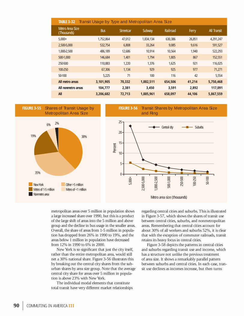
90 | COMMUT ING IN AMER I CA III
TABLE 3-32 Transit Usage by Type and Metropolitan Area Size
FIGURE 3-55 Shares of Transit Usage by Metropolitan Area Size
FIGURE 3-56 Transit Shares by Metropolitan Area Size and Ring
regarding central cities and suburbs. This is illustrated in Figure 3-57, which shows the shares of transit use between central cities, suburbs, and nonmetropolitan areas. Remembering that central cities account for about 30% of all workers and suburbs 52%, it is clear that with the exception of commuter railroads, transit retains its heavy focus in central cities.
Figure 3-58 depicts the patterns in central cities and suburbs regarding transit use and income, which has a structure not unlike the previous treatment of area size. It shows a remarkably parallel pattern between suburbs and central cities. In each case, tran-sit use declines as incomes increase, but then turns
metropolitan areas over 5 million in population shows a large increased share over 1990, but this is a product of the large shift of areas into the 5 million and above group and the decline in bus usage in the smaller areas. Overall, the share of areas from 1-5 million in popula-tion has dropped from 26% in 1990 to 19%, and the areas below 1 million in population have decreased from 12% in 1990 to 6% in 2000.
New York is so signifi cant that just the city itself, rather than the entire metropolitan area, would still net a 30% national share. Figure 3-56 illustrates this by breaking out the central city shares from the sub-urban shares by area size group. Note that the average central city share for areas over 5 million in popula-tion is above 23% with New York.
The individual modal elements that constitute total transit have very different market relationships
0
5
10
15
20
25
50-10
0
100-
250
250-
500
500-1
,000
1,00
0-2,
500
2,50
0-5,
000
5,00
0+Central city Suburbs
Perce
nt
Metro area size (thousands)
Metro Area Size (Thousands) Bus Streetcar Subway Railroad Ferry All Transit
5,000+ 1,752,864 47,012 1,834,134 630,386 26,851 4,291,247
2,500-5,000 532,754 6,808 33,264 9,085 9,616 591,527
1,000-2,500 486,189 12,686 10,914 10,564 1,940 522,293
500-1,000 146,684 1,401 1,794 1,805 867 152,551
250-500 110,883 1,220 1,376 1,625 921 116,025
100-250 67,306 1,134 929 925 977 71,271
50-100 5,225 71 100 116 42 5,554
All metro areas 3,101,905 70,332 1,882,511 654,506 41,214 5,750,468
All nonmetro areas 104,777 2,381 3,450 3,591 2,892 117,091
All 3,206,682 72,713 1,885,961 658,097 44,106 5,867,559
New York Other >5 million Metro of 1-5 million Metro of <1 millionNonmetro area
38%
2%6%
19%
35%

upward again at the highest incomes. The central city shift, because of its higher levels of usage in general, drops more sharply but still maintains a substantial lead over the suburbs throughout the income range.
Another parallel pattern is generated by a review of immigration patterns of transit use as a function of years in the United States. Figure 3-59 shows the sharp trend shifts in use with years of residence in the United States for both bus and subway.
But as noted at the beginning of this transit use discussion, average patterns are not as useful as in the past in describing transit trends accurately. Figure 3-60 demonstrates that point perfectly by showing the shifts in usage for each metropolitan area over 1 million in population ranked from high-
est gains to highest losses. What is clear is that there are sharp swings at both ends of the spectrum and a large middle ground with little trend either way. Some inspection of the individual areas shows that a fair characterization is that the losses are all gener-ally in the East and the gains are all generally in the West. As a result, the share of all transit usage by the West has jumped from 17% to 19% in 2000, taking 1 percentage point each from the Northeast and Midwest. What is happening can be character-
FIGURE 3-58 Central City and Suburban Transit Shares by Income
Immigrant patterns of usage are key, with high levels of usage of vehicle alternatives among early arrivals diminishing with increased time in the United States.
Inspection of gains and losses suggests that there are substantial swings at both ends of the spectrum and a large middle ground of little change. The transit gains typically are in the West and losses in the East; the share of the nation’s transit has jumped from 17% in 1990 to 19% in 2000 in the West. Areas of low transit usage are gaining whereas losses tend to be among high transit usage areas.
FIGURE 3-57 Composition of Transit by Metropolitan Ring
Household income
0
2
4
6
8
10
12
14
16
18
20
$150
,000
+
$75,
000-
$100
,000
$50,
000-
$55,
000
$42,
500-
$45,
000
$35,
000-
$37,5
00
$27,5
00-
$30,
000
$20,
000-
$22,
500
$12,
500-
$15,
000
< $5
,000
Central city transit Suburban transit
Perce
nt
0 10 20 30 40 50 60 70 80 90 100
Central city Suburbs Nonmertro area
Percent
Trans
it
Bus
Streetcar
Subway
Railroad
Ferry
COMMUT ING IN AMER I CA III | 91

92 | COMMUT ING IN AMER I CA III
FIGURE 3-60 Metropolitan Area Transit Use Trends, 1990-2000
FIGURE 3-59 Transit Usage by Years in United States ized as a true regression toward the mean in which areas with generally lower transit shares (the West) are growing up and gaining some share and areas with generally higher transit shares (the East) are losing some share, so that the dispersion around the national average will be reduced.
In most cases, rail transit has gained and bus transit has lost riders with the issue of whether there is net gain or loss only a function of whether rail growth can offset the bus losses. New York, Boston, and San Francisco succeed; Chicago and Washing-ton, D.C. do not. The only clear loss is Philadelphia, which posted losses in both bus and rail use, and was the sole rail transit site that lost significant ridership (there were a few other losers, but none saw mean-ingful changes). The bus side of the picture was less
0
2
4
6
8
10
Native born20+15-2010-155-10< 5
8.93%
6.67%5.75%
4.70%
2.02%
3.46%5.35%4.44% 4.01%
1.02%
3.47%4.24%
Bus Subway
Perce
nt
Years in U.S.
Bus gain/loss Rail gain/loss Net change
Wor
kers
(mill
ions
)
-60
-40
-20
0
20
40
Chica
goPh
ilade
lphia
Wash
ington
, D.C.
Pittsb
urgh
Cleve
land
Detro
i tBu
ffalo
New
Orlea
nsMi
lwau
kee
Roch
ester
Kans
as Ci
tyHa
rtford
Memp
hisSt
. Lou
isLo
uisvil
leNa
shvil
leInd
ianap
olis
Cincin
nati
Jack
sonv
illeNo
rfolk
Colum
bus
San A
ntoni o
Dalla
sCh
arlott
eGr
eens
boro
Miam
iPro
viden
ceGr
and R
apids
Oklah
oma C
ityTa
mpa
Hous
tonWe
st Pa
lm B
each
Minn
eapo
lisRa
leigh
Atlan
taAu
stin
Los A
ngele
sSa
n Dieg
oOr
lando
Salt L
ake C
itySa
crame
ntoPh
oenix
Denv
erNe
w Yo
rkLa
s Veg
a sPo
rtland
Bosto
nSa
n Fran
cisco
Seatt
le
-80
-60
-40
-20
0
20
40
60
Atlan
ta
Bosto
n
Phila
delph
ia
San F
rancis
co
Wash
ington
, D.C.
Chica
go
Los A
ngele
s
New
York
Wor
kers
(thou
sand
s)
a. shifts in transit usage for metropolitan areas over 1 million in population
b. detail

positive; of the areas over 1 million only 15 gained in actual numbers, again almost all of which were in the West. The top gainers attracted the following new bus riders:
■ Seattle—25,239,■ Las Vegas—19,944,■ Portland—17,193,■ Denver—16,248, and■ Phoenix—7,410.
Again, with the exception of Los Angeles, all of the major bus losses occurred in the East—includ-ing, basically, every major city in the Midwest and Northeast. In terms of market share, the pattern is more negative but still indicates important improve-ments in the overall trend. In all, 12 metropolitan areas with populations over 1 million gained in tran-sit share. Again, in a mostly western grouping, the following metropolitan areas gained in transit share:
■ Las Vegas,■ Portland,■ Seattle,■ Boston,■ Denver,■ Sacramento,■ Orlando,■ San Francisco, ■ San Diego,■ New York, ■ West Palm Beach, and■ Los Angeles.
Although many of the gains are minor, most less than 1 percentage point, this is an exceptional change from 1990. Note that several of the cities achieved share gains with bus systems only. Las Vegas is a sig-nificant story in itself with an increase in share of 2.1 percentage points over a 1990 share of 1.9%, more than a 100% increase, to reach a transit share of almost 4% in a city that was America’s fastest grow-ing metropolitan area (83% increase) for the decade.
Figures 3-56, 3-57, and 3-58 show the sharp distinction between suburban and central city com-muters who use transit. It should be emphasized that these are travel measures concerning residents of those areas. When transit usage is reviewed based on those who are destined to the central city rather than resident there, the picture changes somewhat, as shown in Table 3-33, which lists the 22 metro-politan areas with population over 1 million and more than 5% transit share of work trips to the central city. Actually, residents of central cities have higher transit usage shares than do those destined
to the central city. About 9.4% of those destined to a central city use transit in contrast to over 10% of those emanating from central cities.
COMMUTING TO DOWNTOWNSThe census data permit the construction (perhaps reconstruction is a better word) of a concept that had been used in the past known as the central business district (CBD). The CBD commonly consisted of the heavily built-up office complexes of the central city and was generally the predominant destina-tion of commuters to the central city. The Census Bureau gave up on the concept because it could not structure a consistent identification mechanism for the CBD across all metropolitan areas. It was very much a locally understood and defined concept. With present technology, transportation planners are able to demarcate what they, in the local com-munity, consider to be their CBD, recognizing its lack of uniformity from place to place. Even on an ad hoc basis, given the powerful geographic and data structure of the census and the analytical expertise of local metropolitan transportation planners, some very useful insights can be gained.18 Table 3-34 documents and confirms the tremendous impor-tance—the dominance—of transit in serving these key areas. In several downtown areas, more than 50% of arrivals are by transit.
New York, as always, is the highest with a share of over 76%. Note that the area defined for the New York CBD is very tightly drawn, at only slightly
TABLE 3-33 Transit Share for Central City Destinations
18 Data compiled by Charles Purvis of MTC, San Francisco, former chair of the TRB Urban Data Committee, working with members of the committee and others, and presented on January 10, 2005 as “Commuting to Downtown in America: Census 2000,” a status report to the TRB Subcommittee on Census Data for Transportation Planning [ABJ30(1)].
In transit, the vast majority of states had only limited swings of within 1 percentage point of their 1990 shares. There are only 10 states that exceed the national average transit share. There are two significant transit users: New York at 24% share and Washington, D.C. at 33%; otherwise, the range of transit share operates between just below 10% (New Jersey) to below 1% (17 states).
Metro Areas Central City Destinations (%) Metro Areas Central City
Destinations (%)
New York 45.43 New Orleans 9.33
Chicago 24.97 Denver 7.51
Philadelphia 21.73 Buffalo 7.24
Washington, D.C.-Baltimore 20.80 Cleveland 6.90
Boston 19.45 Los Angeles 6.68
Pittsburgh 18.19 Milwaukee 6.67
Portland 18.19 Cincinnati 6.65
San Francisco 15.11 Sacramento 6.65
Seattle 11.94 Miami 6.50
Minneapolis-St. Paul 11.84 Hartford 6.37
Atlanta 9.47 St. Louis 5.13
COMMUT ING IN AMER I CA III | 93

94 | COMMUT ING IN AMER I CA III
TABLE 3-34 Transit Commuting to Downtowns (as Defined)
FIGURE 3-61 Distribution of Work Travel by Population Density
a. transit share b. all work travel
Area
Total Commuters
to Entire Metro Area,
2000
Total Commuters to Central
City
Total Transit Commuters to Central
City
Transit Share to Central City (%)
Total Downtown
Commuters, 2000
Total Transit Commuters
to Downtown, 2000
Downtown Land Area (Square Miles)
Transit Share of
Downtown Commuters
(%)
Worker Density
(Commuters per Square
Mile)
New York 9,429,080 4,545,645 2,065,120 45.43 379,380 290,390 1.08 76.5 351,277.80
Chicago 4,263,430 1,686,150 420,975 24.97 341,014 210,490 1.13 61.7 301,782.30
San Francisco 3,523,465 1,809,120 273,430 15.11 320,170 156,764 2.55 49.0 125,556.90
Washington, D.C. 3,876,675 1,296,840 269,685 20.80 409,505 154,658 3.99 37.8 102,632.80
Boston 2,977,665 1,143,960 222,500 19.45 270,315 137,701 2.32 50.9 116,515.10
Philadelphia 2,790,705 875,785 190,310 21.73 230,358 105,387 2.40 45.7 95,982.50
Seattle 1,785,935 841,560 100,500 11.94 147,905 54,435 2.99 36.8 49,466.60
Los Angeles 6,744,860 2,776,585 185,515 6.68 215,340 43,656 3.78 20.3 56,968.30
Portland 1,107,080 549,160 49,940 9.09 104,810 28,839 2.11 27.5 49,673.00
Houston 2,078,465 1,354,610 62,665 4.63 155,050 25,874 1.68 16.7 92,291.70
Dallas 2,569,405 1,430,395 37,475 2.62 91,786 12,493 0.85 13.6 107,983.50
San Diego 1,293,940 801,530 29,830 3.72 75,850 8,675 2.16 11.4 35,115.70
Sacramento 802,455 308,235 14,855 4.82 64,830 7,959 1.26 12.3 51,452.40
San Antonio 708,445 582,675 18,045 3.10 53,440 3,842 1.15 7.2 46,469.60
Austin 657,455 506,750 15,514 3.06 76,150 2,913 0.95 3.8 80,157.90Note: Areas shown are those that provided special calculations.Source: Adapted from “Commuting to Downtown in America: Census 2000,” status report to the TRB Subcommittee on Census Data for Transportation Planning [ABJ30(1)], January 10, 2005.
0
5
10
15
20
25
30
35
40
45
25,0
00-1,
000,
000
10,0
00-25
,000
4,00
0-10,
000
2,00
0-4,0
00
1,00
0-2,0
00
500-1
,000
100-5
00
0-100
Population density
Perce
nt
0.23% 0.31% 0.80% 1.40% 2.15%5.29%
13.74%
39.14%
3.57%
0
5
10
15
20
25
25,0
00-1,
000,
000
10,0
00-25
,000
4,00
0-10,
000
2,00
0-4,0
00
1,00
0-2,0
00
500-1
,000
100-5
00
0-100
Population density
Perce
nt
14.55% 15.18%
8.50%
11.61%
17.83%
21.24%
7.44%
3.57%

greater than one square mile. If it is focused on the entire so-called “midtown” the share rises slightly to 78% and the Wall Street area of Lower Manhat-tan is very close at 74%. In fact, the entire island of Manhattan as a work destination has a transit share that is not much lower at just about 70%.
The last column of the table, which shows the rather colossal levels of job density in these areas, illustrates the high correlation between transit rider-ship shares and job densities. A further illustration of the role of density is shown in Figure 3-61a, which, using rather limited population density information for the nation as a whole from the NHTS, shows the very strong increases in transit share with increas-ing population density. An analysis by job density would be even stronger. Figure 3-61b, which shows how work travel is actually distributed, reveals that about 32% of all workers live in areas with more than 4,000 persons per square mile and that group generates 80% of transit use. Figure 3-62 provides the distribution of transit travel by density level.
Commuting in Transit CorridorsSan FranciscoSince the San Francisco Bay Area has natural cor-ridors as a function of its geography, it lends itself to an examination of fl ows along certain corridors. Although only the third largest worker destination in the Bay Area (after Santa Clara and Alameda Counties), San Francisco County is still perceived to
be the downtown area of the San Francisco metro-politan area. Its location at the tip of a peninsula makes it almost an island like Manhattan. Among its main corridors are the Marin County to San Francisco Corridor across the Golden Gate Bridge; the Alameda County to San Francisco Corridor across the Oakland Bay Bridge; and the San Mateo Corridor up the peninsula into San Francisco. Each of these corridors has signifi cant stories to tell about commuting to downtown.
A tremendous proportion of the region’s transit users, roughly two-thirds, have a destination in San Francisco County. Transit’s share of total commuting in the Bay Area was at just about 9.7%, but slightly over 36% of all workers commute to San Francisco jobs by public transportation with the Alameda to San Francisco Corridor fl ow at 51% of all work-ers on transit; Contra Costa to San Francisco with almost 48%; Marin to San Francisco at 30%, and Santa Clara to San Francisco at 23%. Excluding San Francisco, the transit share in the region was 3.7%.19
Boston The Boston Red Line North is highly effective as an example of a transit corridor serving the down-town area. Data were compiled for the six stations in Cambridge and Somerville based on a 1-mile and a half-mile buffer zone around the stations. Transit shares to downtown and to all destinations in the metropolitan area also were identifi ed as shown in Table 3-35. Note that within the half-mile zone around the stations, travel to downtown Boston has an 80% transit share.20
Transit industry statistics during the 1990s made an important distinction from the census data. In a sense, the industry data fi lled in the
COMMUT ING IN AMER I CA III | 95
Job density and population density are signifi cant factors in transit. About 32% of commuting occurs in areas over 4,000 persons per square mile but 80% of transit occurs in that range.
FIGURE 3-62 Distribution of Transit Usage by Population Density
TABLE 3-35 Transit Use in the Red Line North Rapid Transit Corridor
19 Census 2000, “The Journey-to-Work in the San Francisco Area,” Report No. 5, Metropolitan Transportation Commission, June 2005. 20 The special tabulations used in this section were provided by Paul Reim, Central Transportation Planning Staff, Boston Metropolitan Planning Organization.
TripsDistance from Red
Line
No. of Workers
Transit Share (%)
To downtown Boston
½ mile 5,935 79.20
1 mile 13,800 73.20
All areas 285,695 49.40
To all destinations
½ mile 85,079 24.20
1 mile 127,426 21.30
Entire MPO area 1,793,000 13.90
9%
24%
32%
1% 1%
4%
27%
2%
0-100 100-500 500-1,000 1,000-2,000 2,000-4,000 4,000-10,000 10,000-25,000 25,000-1,000,000
Population density:

gaps between the annual census data for 1990 and 2000. Industry data showed declining passengers throughout the first part of the decade bottom-ing at about 7.5 million passengers in 1993-1995 and then revealed significant gains in ridership up through 2001 that produced a 21% increase in that period. The data in Figure 3-63 show continued ridership above the level of 9 billion passenger trips until 2003 when it decreased again. (Recent indus-try data indicate that ridership in 2004 returned to a level above 9 billion.) It should be recognized that this is a measure of riders, whereas the cen-sus measures persons who use the mode for work travel. One difference could be in increasing transit ridership for nonwork purposes, yielding a declin-ing share of work travel in overall transit, which has been observed from other surveys. A second factor, increasing transfers by transit riders, such as more transfers from bus to rail, also would increase the number of separate trips counted but not change the number of persons using the system as mea-sured by the census.
WORKING AT HOME Working at home has been an area of consistent increase for over 20 years in virtually every area of the country. Only the growth in SOVs has shown similar breadth of growth. Masked overall by the declines in farming in the 1960s and 1970s, the increase in working at home became apparent in the 1980s when working at home and driving alone were the only categories to increase. There are now about 4.2 million workers who work at home and therefore, from a public policy view, make no demands on the transportation system as
96 | COMMUT ING IN AMER I CA III
FIGURE 3-63 Unlinked Passenger Transit Trips, 1985-2004
Looking Beyond the Numbers— Transit and Carpooling
In some cases it can be observed that transit and carpooling may be competing for the same riders. However, there are areas where they are increasing together, particularly in the West. A useful guide is the value of the sum of transit and carpooling. There are just a handful of areas where carpooling plus transit exceeds 20% of commuting, as listed in the table displayed here. The average for all areas over 5 million is about 23% and almost 36% in the central cities of those areas. The metropolitan areas of Boston, Houston, and Atlanta provide an interesting point in contrast. They all have composite shares ranging from 17% to 17.5%, but coming from very different directions; Boston has a transit share of almost 9% and the other two areas are in the range of 3% to 3.5%.
From a national point of view, the gains in carpooling and transit were strongly manifested in the western region of the country as shown in the maps presented in Figures 3-51 and 3-54, which provide strong evidence of that pattern.
U.S. Metropolitan Areas with the Highest Combined Carpooling and Transit Shares
TABLE 3-36 Share of Workers Working at Home by Metropolitan Ring
Unlin
ked
trips
(mill
ions
)
Source: National Transit Summaries and Trends; National Transit Database, Federal Transit Administration.
7,000
7,500
8,000
8,500
9,000
9,500
2004
2003
2002
2001
2000
1999
1998
1997
1996
1995
1994
1993
1992
1991
1990
1989
1988
1987
1986
1985
Area No. of Workers Share (%)
Central city 1,047,590 2.77
Suburbs 2,186,060 3.28
Metro area 3,233,650 3.10
Nonmetro area 950,570 3.98
All 4,184,220 3.27
Metro Area Combined Transit and Carpooling Shares (%) Metro Area Combined Transit and
Carpooling Shares (%)
New York 33.4 New Orleans 19.9
Chicago 22.2 Los Angeles 19.8
San Francisco 22.2 Seattle 19.0
Washington, D.C. 21.9 Las Vegas 19.0

a part of their work travel. (Some researchers have suggested that those who work at home often make more nonwork trips during the day; other research has disputed the claim.) The number of those who work at home increased by 2 million workers, almost doubling from 1980-2000. The working-at-home share of commuting is now considerably larger than walking to work and equal to about two-thirds of transit use.
The majority (52%) of workers working at home are in the suburbs, roughly in proportion with all workers in the suburbs. Nonmetropolitan areas with less than 19% of workers have 23% of those who work at home, with just under 1 million workers as shown in Table 3-36. In central cities, the propor-
tion is therefore lower. Figure 3-64 depicts the distribution for working at home and other minor commuting modes.
Among the 50 metropolitan areas over 1 million in population only three areas showed a decline in the share of working at home. Those three were two metropolitan areas, San Diego and Norfolk, which have major military bases with strong emphasis on working at home and where “home” is a naval base, and Jacksonville, which also has sig-nificant military facilities. It can be surmised then that these declines probably have a military basis.
This points out the need to examine working at home much more closely than other “commuting modes” in order to understand the nature of the work and the workers who engage in this activity. The distinctions between men and women are key to an effective understanding. Most notable is that women comprise about 53% of the workforce that works at home and tend to be younger than their male counterparts. Women comprise almost 60% of all who work at home under age 45 but as work-ers at home reach over age 45 there is a shift and men comprise the 60% figure. Table 3-37 details some of the more telling distinguishing attributes of the groups.
There is perhaps a romanticized notion of those who work at home—the author, the systems pro-grammer—whereas the statistics indicate a more mundane world. A significant component of men’s work-at-home activities involve occupations associated with extractive industries such as farm-
COMMUT ING IN AMER I CA III | 97
Among the 50 metro areas over 1 million in population only three showed declines in work at home; this appears related to heavy orientation to military workers in those areas.
FIGURE 3-64 Composition of Minor Modes by Metropolitan Ring
TABLE 3-37 Attributes of Workers at Home
Attribute Male (%) Female (%)
Age 30-45 31.3 40.4
Age 50+ 44.5 33.4
College educated 42.7 32.1
White 90.1 86.6
Work 35+ hours/week 76.3 55.0
Work 15 through 34 hours/week 14.1 27.4
Work less than 14 hours/week 9.6 17.6
Business/financial management 33.3 16.5
Other professional 21.5 19.1
Office and administrative support 3.6 17.5
Service occupation 1.9 23.3
Administrative support 3.6 17.5
Agriculture 2.2 0.9
Income $50,000+ 31.9 11.0
Mode
0 10 20 30 40 50 60 70 80 90 100
Bike
Walk
Taxi
Motorcycle
Other
Work at home
Central city Suburbs Nonmetro area
Percent

men who work at home tend to be older profes-sionals, typically working full-time, earning higher incomes, whereas women are often in service occu-pations, working part-time with less education and lower incomes. The growing shift in the age distri-bution toward older workers will be a key factor in the future in determining even greater shares for working at home.
Race does not appear to be a strong distinction within those who work at home. Male workers tend to be more White and less Hispanic than female workers but neither are significantly differ-ent to any strong degree. What is significant is that, in general, working at home is a predominantly White, non-Hispanic activity. Among the White
non-Hispanic population, working at home accounts for 3.8% of the work mode whereas it is only 1.4% among African-Americans and 1.8% among the His-panic population. White non-Hispanics constitute 3.6 million of the 4.2 million who work at home. This is clearly linked to the rural and suburban emphasis noted above.
WALKING TO WORKIn some ways, walking to work is the antithesis of working at home. It has been declining steadily in
all areas for at least as long as working at home has been growing. Importantly there are at least two significant facets to walking just as there were in working at home. Just as the romanticized notion of working at home—the person writing a novel or creating software—is belied by an emphasis on service activities such as daycare, similarly the notion that walking is associated with an enviable urban working environment where homes and jobs are in propinquity has only partial validity at best.
There are now fewer walkers (less than 3.8 mil-lion) than those working at home (4.2 million). This is down sharply from 4.5 million in 1990 and 5.4 million in 1980. Its share of travel has declined from 5.6% in 1980 to less than 3% today. The emphasis remains a mixed one where both central city and
98 | COMMUT ING IN AMER I CA III
ing, mining, and fishing. A significant component of women’s activities are in service occupations such as healthcare, administrative support activi-ties, and daycare. Within the professional occu-pations, men are heavily represented in business management and financial activities. The one area where women are almost as well represented as men is in so-called “other professional” occupa-tions. This includes computer-related, community service, scientific, education, legal, and arts-related occupations. These comprise roughly 20% of the occupations for men and women and are the occu-pations that many associate with working at home.
The simple way to characterize the differences between men and women working at home is that
FIGURE 3-65 Walk to Work Shares by Metropolitan Area Size
FIGURE 3-66 Workers Who Walk to Work by Years in United States
Walking continues its decline. All
metro areas over 1 million lost
share. It is now lower in share than working
at home.
0.0
0.5
1.0
1.5
2.0
2.5
3.0
3.5
4.0
Nonm
etro a
rea
50-10
0
100-2
50
250-5
00
500-1
,000
1,00
0-2,5
00
2,50
0-5,0
00
5,00
0+
Metro
area
Perce
nt
Metro area size (thousands)
0
1
2
3
4
5
6
7
8
Native born20+15-2010-155-10< 5
Perce
nt
Years in U.S.

nonmetropolitan workers exhibit a greater tendency to walk than do suburbanites. Central city shares are at 4.6% versus 3.3% in nonmetropolitan areas—both considerably higher than the 1.9% among suburban workers.
Among the metropolitan areas over 1 million, declines in walkers were sharp. All lost share and about half of all areas incurred losses of more than 25% of walkers. Walking is still strongest in the larg-est metropolitan areas above 5 million, in the small-est metropolitan areas, and in the nonmetropolitan areas as shown in Figure 3-65. Areas over 5 million, with 30% of all workers, had 36% of walkers. The new urban clusters within nonmetropolitan areas show the greatest walking tendency of all areas with a walking share of 4.37%.
The Hispanic population shows a walking share of just about 4%. In contrast, White non-Hispanic walkers were at 2.5% and African-Americans were midway between both groups at 3.2%. Again,
immigrants exhibit a tendency toward decreasing walking as a means of commuting to work with number of years in the country, as indicated in Figure 3-66.
ALL NONMOTORIZED TRAVEL AND OTHER MEASURES OF MODAL USAGEOne scorecard some people keep is the number and share of total commuting in major metropolitan areas by all nonmotorized means. This includes walking, biking, and working at home. Because, as has been seen earlier, walking is shrinking but working at home is growing, the nonmo-torized numbers have tended to remain relatively stable. Nationally, nonmotorized travel stands at about 6.6% of travel, a signifi cant decrease from the 7.3% in 1990, but with about 8.4 million people using these means, this is actually slightly more than the number in 1990.
As expected, the shares are strongest in central cities
with higher walking and biking and only slightly lower levels of working at home. As can be seen in Table 3-38, bicycling, predominantly a young male activity, is a very minor part of the picture. Although it should be noted that bicycling showed some small increases nationally, this mode still has fewer than one-half million users.
Another very strong component of the nonmo-torized picture is in nonmetropolitan areas where shares reach about 7.5% both in urban clusters and rural areas where walking and working at home interchangeably take on strong leading roles.
Again, consideration of the role of recent immigrants is useful. Figure 3-67 shows a set of interesting patterns. Both walking and bicycling are very high in use among recent immigrants but
COMMUT ING IN AMER I CA III | 99
TABLE 3-38 Nonmotorized Shares by Area Type
FIGURE 3-67 Nonmotorized Modal Shares by Years in United States
0
1
2
3
4
5
6
7
8
Native born20+ 15-2010-155-10< 5
Bike Walk Work at home
Perce
nt
Years in U.S.
AreaBike Walk Work at Home
TotalNonmotorized
Travel
Percent
Metro area 0.41 2.85 3.10 6.36
Central city 0.68 4.58 2.77 8.03
Suburbs 0.25 1.87 3.28 5.41
Nonmetro area 0.26 3.27 3.98 7.51
Urban clusters 0.47 4.37 2.62 7.46
Rural 0.12 2.57 4.86 7.55
All 0.38 2.93 3.26 6.57

tially. Table 3-39 shows the trend among the metro-politan areas over 5 million. Note that the areas west of the Mississippi have all maintained their ratios as both transit and carpooling have seen some gains, whereas all of the ratios in the East have declined.
OTHER MODESA small note is needed regarding the continuing endurance of the taxi and the decline of the motorcycle.
The taxi continues at a share of about .16% (less than one-sixth of 1%) of work travel. For 20 years its total ridership has grown from about 170,000 to just over 200,000. The taxi has roles in big cities and small towns and has a use pattern that is strong both among high- and low-income riders but shows little use in the middle-income ranges. About 44% of those who use taxis to get to work have incomes below $20,000 and about 17% have incomes over $75,000. There is a heavy orientation to African-American users, and 55,000 of the 200,000 users are in central cities and nonmetropolitan areas.
The motorcycle continues its decline. Although it was never a major element in commuting in the United States, it is now one-third of its 1980 level, declining from over 400,000 to approximately 140,000, presumably replaced by other vehicles. Of the remaining motorcycle travel, most tends to be in trip lengths that have grown shorter over the past 20 years.
100 | COMMUT ING IN AMER I CA III
decline sharply with years in the United States. For example, walking drops from over 7% to less than 3% over a 20-year span of U.S. residency. The drop in percentage terms is even greater in bicycling, but the more interesting story is how working at home rises with increasing years in the United States until reaching levels consistent with those for native-born residents.
Another measure of interest is the ratio of total workers traveling to total personal vehicles employed to do the moving. This number was 1.37 workers per vehicle in 1980, which declined to 1.26 in 1990 and to 1.23 in 2000. Clearly, this can be attributed to the growth of SOVs relative to carpooling in the 1990s, but resulting in a much smaller drop in the 1990s than in the 1980s. In metropolitan areas, the ratio is 1.27 and largely can be attributed to a 1.35 ratio in areas over 5 million in population. The areas in the population range from 2.5 million to 5 million have a ratio of 1.21, and those over 1 million but below 2.5 million have a ratio of 1.18. The New York met-ropolitan area, the national leader at 1.76, has declined to 1.65 but still leads the nation substan-
TABLE 3-39 Worker/Vehicle Ratios
All nonmotor-ized modes of
work travel (walk, bicycle, work at home) showed a
small gain in absolute numbers
but declines in shares of usage
from 1990-2000.
Taxi usage shows higher
levels of usage among the lower
and higher income groups.
Metro Area 1990 2000
New York 1.76 1.65
Los Angeles 1.26 1.26
Chicago 1.37 1.33
Washington, D.C.-Baltimore *1.43 1.31
San Francisco 1.35 1.35
Philadelphia 1.34 1.28
Boston 1.34 1.28
Detroit 1.14 1.13
Dallas-Fort Worth 1.18 1.18
*In 1990, Baltimore was not included in the Washington, D.C. metro area.

One of the central concerns about commuting is the amount of time workers spend traveling to work. In recent years, traffi c congestion often has been cited as number one on the list of problems in many communities. It is important early on to make a distinction between congestion questions and work trip travel times. Although obviously related, they are not synonymous and are discussed separately here. A key way to think of these two perspectives is that travel time is an attribute of commuters, whereas congestion is an attribute of facilities. It is therefore, not a surprise that mea-sures of travel times and measures of congestion do not necessarily converge. Further, worker travel
time is a function of both speed and distance. The NPTS indicates that in the recent past, work trip distances have been increasing as well as travel times, indicating an actual improvement in work travel speeds in past studies. More recently, speeds inferred from the survey have declined as travel times increased faster than distance traveled.
Figure 3-68 provides the basic picture of what has happened with average national travel times over the last 20 years in the very broadest terms. In short, average national travel times grew by about 40 seconds from 21.7 minutes in 1980 to 22.4 minutes in 1990, with more than 22 million SOV drivers added; followed by a gain of at least 3 minutes to 25.5 minutes from 1990-2000, despite an increase of on the order of only 13 million new SOV users. If trip lengths have remained roughly constant, this indicates many are sharply affected by roadway congestion or, hard to conceive, driving slower vol-untarily. Although cross-survey comparisons are haz-ardous, it is worth noting that the NHTS indicates
that between 1990 and 2001, work travel distances esti-mated by respondents grew by about 13% to 14%, about the same percentage amount as the increase for travel times recorded in the census.
Having said this, some immediate adjustment is in order. Each of the three travel time numbers were correctly reported at the time by the Census Bureau as they under-stood it, but it was found in 2000 that by recording the actual number of minutes in an unconstrained response, a signifi cant proportion of responses exceeded 100
minutes. This led to concern for previous answers, in that the 1990 response-coding mechanisms only recorded up to two digits of travel time (99 min-utes).21 This “top coding” could have unintentionally abbreviated a substantial share of the high responses in 1990. When the 2000 responses were truncated at 99 minutes as a test, they lopped a full minute off the national average travel time. As a result, the best estimate seems to be that the 1990 data were under-stated by as much as a minute. Or, perhaps it is best
COMMUT ING IN AMER I CA III | 101
FIGURE 3-68 Reported and Adjusted National Travel Time Trend, 1980-2000
21 I am embarrassed to say that I was one of the people who told the Bureau staff that 99 minutes was plenty of top room. The older reader will remember that in 1990 saving a digit in a computer fi le mattered a lot; the younger will be astonished.
In short, average national travel times grew by about 40 seconds, from 21.7 minutes in 1980 to 22.4 minutes in 1990, with more than 22 million SOVs added. This was followed by a gain of a nominal 3 minutes to 25.5 minutes from 1990-2000, despite an increase of on the order of only 13 million new SOV users.
National Adjusted national
Aver
age
trave
l tim
e (m
inut
es)
19
20
21
22
23
24
25
26
200019901980
21.722.4
23.4
25.5
Commuter Travel Times 9

tion. Most tabulations of census data summarize at 5-minute increments but there are tabulations available at the 1-minute level for those who are fascinated by such things.
TRAVEL TIMES LESS THAN 20 MINUTES OR MORE THAN 60 MINUTESFor many years, the share of all commuters complet-ing their commute in less than 20 minutes (which includes those working at home) hovered around 50% of the worker population. It seems safe to think that when more than half of the population can get to work in under 20 minutes they would be quite satisfied with their commute. Such a statistic would be the envy of most places in the world. The data show that in 1990, the national average was just at 50% and Census 2000 shows the national average has now dropped to just above 47%.
The other measure that helps provide a sense of scale is the percentage of workers commuting more than 60 minutes. This is one measure of the time extremes in commuting. The value of interest here has been how the averages compare to 10%, on the theory that less than 10% seems acceptable but above that value there are clear signs of problems. One question that arises is: To what extent do those who commute more than 60 minutes do so because their travel times have deteriorated over time from some more desirable travel time, or because their interests or values (such as being near water or mountains or just enjoying a different lifestyle, reduced housing costs, or access to better schools) make such a trade-off acceptable?
Table 3-40 summarizes some of the 2000 travel time values for a broad geographic distribution of the nation. Note that all U.S. regions are below 25 minutes except for the Northeast (more than 27 minutes), which strongly affects the national aver-age. This again shows that nothing is more subject to distortion by averaging than travel times. National averages or even the other area statistics shown in the table are subject to sharp variations because of spikes in one area or another.
Looking at the percentage of commuters whose travel time takes less than 20 minutes or more than 60 minutes adds appreciably to understanding. The great difference in the percentages is that 58% of nonmetropolitan workers reach work in under 20 minutes, contrasted to between 42% and 49% for metropolitan workers. Although this is the first time the United States fell below 50% of workers getting to work in under 20 minutes, the Midwest is still well above 50%. Note also that the North-east is sharply higher than all other regions regard-ing the percentages of commuters traveling more than 60 minutes.
102 | COMMUT ING IN AMER I CA III
to say that the actual value stated for 2000 (25.5 minutes) is correct; and the real difference between 1990 and 2000 travel times is more like 2 minutes rather than 3 minutes.
RELIABILITY OF COMMUTER ESTIMATES Since 1980, the census has provided data derived from a general question that asks: How many minutes did it usually take for your trip to work last week? Such a question elicits a response in 5-min-ute increments with strong rounding at 10-minute intervals and, of course, at the half-hour mark. Not surprisingly, “15 minutes” constitutes about 90% of all answers received in the range of 11-19 min-utes. Although this might lead some to see these data as terribly flawed, they still have a definite value. In effect, asking commuters to provide their average travel time can lead to a sense of false preci-sion. However, over time, looking at the shifts in the percentages of people giving rounded answers at 5, 10, 15 minutes, etc., can be quite telling. The probability of people being able to give an answer accurate to the minute is very questionable to begin with, especially when the question asks about “the usual” average (maybe typical is a better word) for last week. As noted elsewhere, the NHTS observes that large segments of the work population, espe-cially women, frequently make stops on the way to work; estimating work travel times by deducting for these diversions would certainly add further uncertainty to travel time estimates.
A clear way to gain a sense of the trends in travel time other than just comparing averages is to examine some of the distributional patterns. Frequently, this chapter will focus on percentages of the population in two particular parts of the distribution of travel times: commuters getting to work in less than 20 minutes and commuters tak-ing more than an hour to reach their work destina-
TABLE 3-40 Average Travel Times by Geography
All regions were below 25 minutes
except for the Northeast at over
27 minutes. The entire
nation’s average is affected by
New York.
After hovering around 50% for many decades,
the percentage of workers reaching
work in under 20 minutes is at 47%. Nonmetro workers average 58%, contrasted to between 42%
and 49% in metro areas.
AreaAverage Travel Time (Minutes)
Less Than 20 Minutes (%)
More Than 60 Minutes (%)
United States 25.54 47.01 7.98
Northeast region 27.31 44.49 11.08
Midwest region 22.38 53.46 5.79
South region 24.93 47.20 7.11
West region 24.62 49.12 7.86
In metro area 26.14 44.48 8.13
In central city of metro area 24.82 48.70 7.67
In suburb of metro area 26.89 42.07 8.39
In nonmetro area 22.90 58.09 7.29

There is slightly more than a 3-minute differ-ence between metropolitan and nonmetropolitan area travel times, and a 2-minute difference between central city and suburban residents. If metropolitan areas are differentiated further by size group, the sharp shifts in travel times are even more clear, as shown in Figure 3-69. What is signifi cant is that suburban travel times appear to be less sensitive to size of area than do central city travel times. The larg-est central cities actually have higher travel times than their suburbs, whereas in all other cases central cities enjoy a 3- to 5-minute advantage over their suburbs. (Again, the distorting infl uence of New York must be taken into consideration.) Another point is that metropolitan areas under 100,000 in population seem to enjoy the best overall travel times, better than nonmetropolitan times, probably as a product of a greater local orientation of jobs in small cities.
The ACS for 2000 through 2004 indicate that travel times showed no signifi cant changes over this 4-year period; thus, the travel time estimates here can be deemed current through 2004. (The actual values center around 24.4 minutes, 1 minute lower than the decennial value. This is a product of signifi cant differ-ences in the survey methodologies, rather than a sign of a trend. The central point is that the numbers from the ACS have not changed from 2000 through 2004.) Potentially, this lack of signifi cant change was attribut-able to very slow job growth or actual job losses around the country during that period. The values for the percentages under 20 minutes and over 60 minutes through 2004 also showed no appreciable change.
An extension of the perspective on the averages is obtained by looking at the shares below 20 minutes and above 60 minutes for the same metropolitan area size groups. Figure 3-70 shows that the percent-age commuting under 20 minutes varies sharply with area size. Among metropolitan areas, the values
COMMUT ING IN AMER I CA III | 103
FIGURE 3-69 Travel Time by Metropolitan Area Size
FIGURE 3-70 Percent of Commuters Traveling Less Than 20 Minutes and More Than 60 Minutes by Metropolitan Area Size
Central city Suburbs
Minu
tes
0
5
10
15
20
25
30
35
50-100100-250250-500500-1,0001,000-2,5002,500-5,0005,000+
31.5
29.7
28
24.9
24.2
20.6
23.6
19.4
21.2
16.222.8
17.3
25
22.7
Metro area size (thousands)
50-100100-250250-500500-1,0001,000-2,5002,500-5,0005,000+
% less than 20 minutes % more than 60 minutes
Perce
nt
0
10
20
30
40
50
60
70
80
37.35%
70.17%
45.63% 50.03%54.48% 61.62%
40.02%
12.23% 3.61%5.01% 4.75% 4.59% 4.40%7.28%
Metro area size (thousands)

are much higher in the smaller areas (over 60% in areas under 100,000) but drop to just above 30% for the largest metropolitan areas. The pattern for the shares commuting more than 60 minutes are quite different. As expected, the largest metropolitan areas are well over 10%, at about 15%, but drop sharply to around 5% to 6% for areas under 2.5 million and for all areas below that. It may be that this 5% to 6% number does represent the proportion that commutes long distances more as a matter of choice. On the other hand, areas smaller in size will tend to send at least some portion of commuters to other metropolitan areas, adding to those who commute more than 60 minutes.
These travel time shifts by metropolitan area size should not be surprising for a number of reasons. Obviously, the option to travel long distances almost does not exist in a small community, whereas large metropolitan areas can have diameters of 50 miles or more. The NHTS shows that work trip distances increase significantly with area size. Work trip distances rise from about 9.5 miles in metropolitan areas below 250,000 to 13.3 miles for areas over 3 million for more than a 40% increase in distance covered. This would seem to explain all of the travel
104 | COMMUT ING IN AMER I CA III
Looking Beyond the Numbers—The “Extreme” Commute
Recently, extreme commutes have generated interest. The highest numbers recorded in Census 2000 were approaching 3 hours. The measure used here typically is 1 hour of commuting one way (the morning trip to work) as a measure of time extremes in commuting. The 2003 ACS identi-fied as extreme those commutes beyond 90 minutes, one way to work. By that measure, Census 2000 identified about 3.5 million commuters, roughly 2.8% of workers, with commutes greater than 90 minutes.
The ACS listed the 10 states with the highest percentage of commutes over 90 minutes ranging from New York (4.3%) down to Florida (1.5%). That list is very similar to the states over 60 minutes presented later in this section. The ACS list of cities and counties with high percentages of commutes over 90 minutes clearly falls into a set of patterned situations. On the list are the following:
1. All of the counties that comprise New York City, excluding Manhattan;
U.S. States, Cities, and Counties with the Highest Percentage of Extreme Commutes
Geographic AreaPercent of
Commutes Over 90 Minutes
Geographic AreaPercent of
Commutes Over 90 Minutes
Geographic AreaPercent of
Commutes Over 90 Minutes
States
New York 4.3
Cities
Baltimore, MD 5.6
Counties
Richmond, NY 11.8
New Jersey 4.0 New York, NY 5.6 Orange, NY 10.0
Maryland 3.2 Newark, NJ 5.2 Queens, NY 7.1
California 2.8 Riverside, CA 5.0 Bronx, NY 6.9
Washington 2.7 Los Angeles, CA 3.0 McHenry, IL 6.7
Virginia 2.3 Philadelphia, PA 2.9 Nassau, NY 6.6
Georgia 2.3 Chicago, IL 2.5 Kings, NY 5.0
Illinois 2.2 Washington, D.C. 2.2 Contra Costa, CA 4.6
Washington, D.C. 2.2 San Francisco, CA 1.5 Prince William, VA 4.5
Massachusetts 1.8 Miami, FL 0.7 Prince George’s, MD 3.8
Florida 1.5 Montgomery, MD 2.2
Will, IL 2.0
2. That set of counties that are often second-tier or even third-tier counties out from the center of major megalopolitan areas, usually areas with significant commuter rail usage;
3. Cities and counties that have extensive flows outbound to other metropolitan areas or to their own suburbs, such as Baltimore; and
4. Counties with extensive suburb-to-suburb flows, sometimes to adjacent metropolitan areas, such as Prince George’s and Montgomery in Maryland.
Not well represented are rural counties with large numbers of long-distance commuters into major metropolitan areas, but these are often masked by very short trips within the same area by other commuters.

time differences between area size groups, but it is treacherous to make such cross-survey comparisons. The NHTS has shown considerable volatility in the estimates of distance made by respondents. Work trip lengths have grown faster than all other trip purposes in the decade, according to the NHTS, but the increase in the mean trip length rises between 25% and 50% depending on how the question is structured.
Another way to approach the topic of travel times is to look at the time groups’ contribution to the composition by each area size group. Note that in Figure 3-71 the categories for 45 minutes and above are a major component of the travel time distribution among large areas but their share dimin-ishes as the size of area diminishes. Conversely, it is the 5- to 20-minute groups that rise with diminish-ing area size.
As shown in Figure 3-72, if this dataset is inverted to determine what shares each metropolitan area group gains in the minutes of travel groups, the sharp rise is clear in the share of travel for the largest group (5 million and more) as travel time increases from about 30% of the 5-minute trips to 60% of the 60- to 90-minute trips. But there is also a signifi cant rise among the smaller metropolitan areas in the very long distance trips given the commuting to distant metropolitan areas from the smaller areas.
It is diffi cult to characterize the 50 individual metropolitan areas over 1 million in population with respect to travel times. Table 3-41 summarizes
COMMUT ING IN AMER I CA III | 105
FIGURE 3-71 Composition of Metropolitan Area Size Group by Travel Time Segment
FIGURE 3-72 Composition of Travel Time Segments by Metropolitan Area Size
Perce
nt
Metro area size (thousands): 5,000+ 2,500-5,000 1,000-2,500 500-1,000 250-500 100-250 50-100
Travel time (minutes)
0
20
40
60
80
100
90+60-9045-6040-4535-4030-3525-3020-2515-2010-155-10< 5
Perce
nt
Metro area size (thousands)
0
20
40
60
80
100
50-1
00
100
-250
250
-500
500
-1,00
0
1,00
0-2,5
00
2,5
00-5,
000
5,0
00+
Minutes: <5 5-10 10-15 15-20 20-25 25-30 30-35 35-40 40-45 45-60 60-90 90+ Work at home

some of the main elements and Figure 3-73 shows a number of patterns discernible that lend the follow-ing insights:
■ There is a relatively tight clustering of 1990-2000 travel time increases across all size groups: 33 of
the 50 areas were in the range of 2- to 4-minute increases.
■ Only eight areas had an increase of less than 2 minutes, all of them located in the middle of the country and generally low-growth metropolitan areas. The area under 2 minutes with the highest
106 | COMMUT ING IN AMER I CA III
TABLE 3-41 Metropolitan Areas with Greatest and Least Gains in Travel Time
Central city travel times are
lower than suburban times
in all metro size groups with the exception of the
largest group over 5 million in
population.
FIGURE 3-73 Metropolitan Area Travel Time Increases by Travel Times in 1990
Metro Area 2000 Population
1990 Population
Population Change,
1990-2000
Population Change
(%)
2000 Travel Time (Minutes)
1990 Travel Time (Minutes)
Travel Time Difference (Minutes)
Travel Time Difference (%)
Atlanta 4,112,198 2,959,950 1,152,248 39 31.20 25.95 5.25 20.22
Miami 3,876,380 3,192,582 683,798 21 28.90 24.06 4.84 20.10
West Palm Beach 1,131,184 863,518 267,666 31 25.70 20.89 4.81 23.05
Raleigh 1,187,941 855,545 332,396 39 24.90 20.20 4.70 23.27
Charlotte 1,499,293 1,162,093 337,200 29 26.13 21.61 4.52 20.91
Boston 5,819,100 5,455,403 363,697 7 27.80 23.57 4.23 17.95
Orlando 1,644,561 1,224,852 419,709 34 27.00 22.81 4.19 18.37
New York 21,199,865 19,549,649 1,650,216 8 34.04 29.96 4.08 13.62
Jacksonville 1,100,491 906,727 193,764 21 26.60 22.55 4.05 17.95
Indianapolis 1,607,486 1,380,491 226,995 16 23.80 21.80 2.00 9.16
Columbus 1,540,157 1,345,450 194,707 14 23.20 21.23 1.97 9.27
Cincinnati 1,979,202 1,817,571 161,631 9 24.33 22.43 1.90 8.48
Oklahoma City 1,083,346 958,839 124,507 13 22.00 20.29 1.71 8.41
Buffalo 1,170,111 1,189,288 -19,177 -2 21.10 19.43 1.67 8.60
Kansas City 1,776,062 1,582,875 193,187 12 22.92 21.49 1.43 6.65
Louisville 1,025,598 948,829 76,769 8 22.73 21.31 1.42 6.67
Rochester 1,098,201 1,062,470 35,731 3 21.10 19.77 1.33 6.72
Travel time in 1990
Trave
l tim
e in
creas
e (m
inut
es)
15 17 19 21 23 25 27 29 310
1
2
3
4
5
6
Rochester
New York
Atlanta
Buffalo
Miami
Note: All East Coast metropolitan areas are above 4 minutes; all low-growth metropolitan areas are below 2 minutes.

growth rate was Indianapolis with over a 16% population growth.
■ Nine areas posted increases of above 4 minutes (Atlanta was actually above 5); all of the nine were Eastern Seaboard areas, four in the state of Florida and two in North Carolina.
■ Population growth had a lot to do with gains in travel time; seven of the nine areas over 4 minutes had growth rates above 20%; the other two were New York and Boston (New York with one of the highest absolute population gains).
■ Of all the metropolitan areas with more than a 20% population growth rate, two Texas metro-politan areas, Houston and San Antonio, had the lowest percentage increases in travel times.
Table 3-42 shows the percentage of workers with commutes greater than 60 minutes in the major metropolitan areas of the nation.
COMMUT ING IN AMER I CA III | 107
TABLE 3-42 Workers with Greater Than 60-Minute Commutes for Major Metropolitan Areas
AreaTotal Over 60-Minute Travel
Time
Total Work Outside Home
Greater Than60 Minutes (%) Area
Total Over 60-Minute Travel
Time
Total Work Outside Home
Greater Than60 Minutes (%)
New York-Northern New Jersey-Long Island, NY-NJ-CT-PA CMSA 1,662,414 9,042,068 18.39 Jacksonville, FL MSA 30,256 515,651 5.87
Chicago-Gary-Kenosha, IL-IN-WI CMSA 540,116 4,096,437 13.19 Portland-Salem, OR-WA CMSA 60,434 1,054,294 5.73Washington-Baltimore, DC-MD-VA-WV CMSA 475,509 3,704,993 12.83 Nashville, TN MSA 34,261 601,234 5.70
San Francisco-Oakland-San Jose, CA CMSA 388,872 3,292,677 11.81 St. Louis, MO-IL MSA 67,492 1,203,672 5.61
Atlanta, GA MSA 234,292 1,988,669 11.78 Las Vegas, NV-AZ MSA 35,972 686,059 5.24Los Angeles-Riverside-Orange County, CA CMSA 727,543 6,526,168 11.15 Raleigh-Durham-Chapel Hill, NC MSA 31,245 596,100 5.24
Boston-Worcester-Lawrence, MA-NH-ME-CT CMSA 276,744 2,807,063 9.86 San Antonio, TX MSA 34,187 680,739 5.02
Philadelphia-Wilmington-Atlantic City, PA-NJ-DE-MD CMSA 259,176 2,735,588 9.47 Norfolk-Virginia Beach-Newport
News, VA-NC MSA 36,201 740,059 4.89
Houston-Galveston-Brazoria, TX CMSA 186,504 2,029,963 9.19 Cleveland-Akron, OH CMSA 62,847 1,339,156 4.69
Seattle-Tacoma-Bremerton, WA CMSA 154,220 1,701,619 9.06 Cincinnati-Hamilton, OH-KY-IN CMSA 42,715 925,726 4.61
Miami-Fort Lauderdale, FL CMSA 140,869 1,597,208 8.82 Hartford, CT MSA 25,156 558,684 4.50
New Orleans, LA MSA 44,213 556,672 7.94 Richmond-Petersburg, VA MSA 21,306 478,204 4.46
Dallas-Fort Worth, TX CMSA 191,227 2,452,248 7.80 Indianapolis, IN MSA 34,354 772,342 4.45
Pittsburgh, PA MSA 70,778 1,031,612 6.86 Memphis, TN-AR-MS MSA 22,107 499,982 4.42
Sacramento-Yolo, CA CMSA 51,266 767,710 6.68 Salt Lake City-Ogden, UT MSA 27,238 618,443 4.40
Detroit-Ann Arbor-Flint, MI CMSA 160,856 2,425,776 6.63 Greensboro-Winston-Salem-High Point, NC MSA 25,863 604,027 4.28
West Palm Beach-Boca Raton, FL MSA 29,740 456,118 6.52 Minneapolis-St. Paul, MN-WI MSA 64,856 1,534,939 4.23Tampa-St. Petersburg-Clearwater, FL MSA 66,760 1,030,612 6.48 Columbus, OH MSA 31,757 754,876 4.21
San Diego, CA MSA 79,491 1,242,321 6.40 Milwaukee-Racine, WI CMSA 30,265 796,076 3.80
Phoenix-Mesa, AZ MSA 88,752 1,412,735 6.28 Oklahoma City, OK MSA 18,232 494,818 3.68Providence-Fall River-Warwick, RI-MA MSA 33,885 543,921 6.23 Kansas City, MO-KS MSA 31,181 851,197 3.66
Orlando, FL MSA 47,427 763,736 6.21 Rochester, NY MSA 17,947 501,901 3.58
Austin-San Marcos, TX MSA 38,366 626,278 6.13 Louisville, KY-IN MSA 17,143 481,234 3.56Charlotte-Gastonia-Rock Hill, NC-SC MSA 44,428 730,647 6.08 Grand Rapids-Muskegon-Holland,
MI MSA 17,176 515,495 3.33
Denver-Boulder-Greeley, CO CMSA 77,588 1,282,540 6.05 Buffalo-Niagara Falls, NY MSA 16,441 509,457 3.23

STATE TRAVEL TIMESAs expected, state travel times changes are even more tightly concentrated than metropolitan areas. Figure 3-74 demonstrates the following:
■ Travel times changes for 40 of the 50 states and Washington, D.C. were between 2 and 4 minutes.
■ At 1.8 minutes, only one state, Kansas, had less than a 2-minute increase.
■ Nine areas were above 4 minutes and two—West Virginia with 5.2 minutes and Georgia, strongly affected by Atlanta, with exactly a 5-minute increase—were above 5 minutes.
■ Of those above 4 minutes, three—Georgia, Florida, and North Carolina—were to be expected given the large increases in their major metropolitan areas, and the remainder, including Massachusetts, New Jersey, Delaware, and Maryland, are largely East Coast states.
■ Two of the states with increases of 4 minutes or more are hard to explain: Mississippi and West Virginia did not have major metropolitan area travel time increases. It must be assumed that their growth is a product of long-distance commuting within and perhaps more signifi cantly outside the state. In the case of West Virginia, with the nation’s largest travel time increase of 5.2 minutes, it is clear that large segments of the state popula-tion commute to jobs on the peripheries of the expanding major metropolitan centers in Virginia, Pennsylvania, and even Ohio. Mississippi also has signifi cant metropolitan areas across the state borders in Alabama, Louisiana, and Tennessee.
Shifting away from averages to the two measures of travel time used earlier in metropolitan analyses, the picture developed regarding the states is con-fi rmed. Figure 3-75 shows the trends for both the percent below 20 minutes and the percent above
108 | COMMUT ING IN AMER I CA III
FIGURE 3-74 State Travel Time Change, 1990-2000
FIGURE 3-75 Percent of Commuters Traveling More Than 60 Minutes and Less Than 20 Minutes by State
% below 20 minutes in 2000 % above 60 minutes in 2000 % below 20 minutes in 1990 % above 60 minutes in 1990
Perce
nt
State*
*Ranked by percent under 20 minutes in 1990.
0
10
20
30
40
50
60
70
80
90
Maryl
and
New
York
New
Jerse
yIlli
nois
Virgin
iaCa
liforni
aHa
waii
Georg
iaFlo
rida
Massa
chus
etts
Texas
Arizo
naTe
nnes
see
Wash
ington
Misso
uriPe
nnsy
lvania
Alaba
maMi
chiga
nLo
uisian
aOh
ioCo
nnec
ticut
South
Carol
inaNe
w Ha
mpsh
ireCo
lorad
oDe
laware
West
Virgin
iaKe
ntuck
yInd
iana
North
Carol
inaMi
ssissi
ppi
Neva
daRh
ode I
sland
Minn
esota
Oreg
onOk
lahom
aUta
hMa
ineArk
ansa
sNe
w Me
xico
Verm
ont
Wisc
onsin
Kans
asIda
hoNe
brask
aIow
aAla
ska
Monta
naW
yomi
ngSo
uth D
akota
North
Dak
ota
Change in travel time from 1990-2000:
4.6 to 5.3 3.6 to 4.6 2.6 to 3.6 1.9 to 2.6 0 to 1.9
Note: Data not available for Alaska.

60 minutes for 1990 and 2000 sorted from the high-est to the lowest percentage below 20 minutes in 1990. The first point that is clear from the figure is that no state improved in the shares below 20 min-utes and similarly no state improved in the shares over 60 minutes. Other facts to note are as follows:
■ In 1990, 40 states had more than 50% of their workers commuting to work in under 20 minutes;
in 2000 this dropped to 22 states, but those states have less than 20% of the workers in the nation.
■ There was only one state (New York) with over 10% of workers commuting over 60 minutes in 1990; three more states were added in 2000 and an additional one (California) was very close, as shown in Table 3-43.
■ There are only 10 states that exceed the national average of 8% over 60 minutes (up from 6% in 1990), indicating a sharp skewing of travel times.
■ The three states worst in under 20 minutes—New York, New Jersey, and Maryland—are also worst in the percentage over 60 minutes (note, these were also the top three states in the ACS extreme commute listings).
TRAVEL TIMES BY MODE OF TRANSPORTATIONOne way to better understand travel times is to decompose the averages into the travel times for the individual modes used to get to work. The first thing to note in Table 3-44 is that almost all travel times have increased from 1990. The exception is interesting: motorcycling, which has shown dramatic declines in usage for commuting over the years, also was the only mode to display improved travel times. It is possible that those declines occurred significantly in the longer trips, in which motorcycles were replaced by private vehicles. Therefore, one would expect that distances traveled by motorcycles also have been reduced. The overall increases in travel time may be attributable in part to congestion delay, but also to longer trip lengths. There are data trends that would support both of these as factors. The largest increases in travel time were obtained by buses and commuter railroads. In both cases, increasing times could be attributable partly to congestion delays, but also to increasing route structures, and even to loading delays where ridership has increased.
Another important point is that the SOV is about 1.5 minutes faster than the overall national average travel time. Given that more than three-quarters of the work population travels by that mode, it suggests that most of the alternatives have to be considerably longer in travel time. As can be seen in the table, most of the major alternatives—particularly the carpool and transit modes—take considerably longer. All of the modes that show travel times lower than the private vehicle (walk, bike, taxi, and motorcycle) are most certainly low trip distance modes, and together add up to less than 5% of travel.
COMMUT ING IN AMER I CA III | 109
Forty of the states were between 2 and 4 minutes in gains. Only Kansas gained less than 2 min-utes. No state lost travel time. Those gaining more than 4 minutes were all in the East.
Only New York State had more than 10% of workers commuting over 60 minutes in travel in 1990, but New Jersey, Maryland, and Illinois joined the group in 2000—and California came close. Extreme commutes (more than 90 minutes) were typical in the same set of states.
TABLE 3-43 States with More Than 10% of Workers Commuting Over 60 Minutes, 1990-2000
TABLE 3-44 Average Travel Time by Mode (Minutes)
StatePercent of Commutes Over 60 Minutes
1990 2000
New York 13.78 15.41
New Jersey 9.42 13.18
Maryland 8.61 12.22
Illinois 8.54 10.47
California 7.60 9.75
Mode 2000 1990
Private vehicle 24.68 *
Drive alone 24.06 21.10
2 people 27.06 23.99
3 people 30.93 28.62
4+ people 37.67 34.80
4 people 34.07 *
5 or 6 people 38.84 *
7+ people 47.34 *
Bus 45.88 37.98
Subway 47.78 44.92
Streetcar 43.88 *
Subway 47.92 *
Railroad 70.64 58.53
Ferry 65.66 58.37
Taxi 20.13 17.20
Motorcycle 21.66 22.53
Bike and Walk 12.40 10.91
Bike 18.55 *
Walk 11.60 *
All 25.54 22.38
*Data not available.

Another reading on the topic appears in Figure 3-76, which shows the 20- and 60-minute percent-ages for each mode. Obviously, Table 3-44 and Figure 3-76 say as much about distance as they do about speed. For instance, over 80% of walkers reach their destination in under 20 minutes whereas 70% of commuter railroad users spend more than 60 minutes in travel in the morning. The
110 | COMMUT ING IN AMER I CA III
FIGURE 3-76 Percent of Commuters Traveling More Than 60 Minutes and Less Than 20 Minutes by Mode
private vehicle mode in the fi gure, which accounts for the major share of all travel, is further detailed in Figure 3-77. Here, an impor-tant pattern emerges. Car-pools take much longer than SOVs and take longer with increasing carpool size. A quick estimator of travel times for carpooling is that each additional person in the carpool adds 3-4 minutes to the trip. This is in part due to the need for each carpool to make rounds picking up passengers, but it also clearly indicates that persons mak-ing long-distance trips tend toward the use of larger car-pools perhaps to share costs,
perhaps to relieve the tedium of solo travel. When cross-classifi ed by vehicles available to the house-hold, the number of vehicles available has effectively no impact on the average vehicle travel times.
Figure 3-78 provides more detail for carpools showing that an appreciable share of travel by large carpools is in the 2-hour range. It is just as pertinent to note that most larger carpools make almost no short trips. There is clearly a trade-off occurring between the inconvenience of traveling with others and the advantages of carpooling, which become more valuable as distances grow.
FIGURE 3-77 Percent of Commuters Traveling More Than 60 Minutes and Less Than 20 Minutes by Carpool Size
Mode
Perce
nt
0
20
40
60
80
100
Othe
r
Walk
Bike
Motor
cycleTaxi
Ferry
Railro
ad
Subw
ay
Stree
tcar
Bus
Priva
te ve
hicleAll
% less than 20 minutes % more than 60 minutes
% less than 20 minutes % more than 60 minutes
Perce
nt
0
5
10
15
20
25
30
35
40
45
50
7-person+carpool
5- or 6-personcarpool
4-personcarpool
3-personcarpool
2-personcarpool
Drive alone
Travel time is an attribute
of commuters, whereas
congestion is an attribute of
facilities.

travel times. There are clearly two different worlds portrayed here. The short travel time modes have been separated and display a very distinct set of patterns. Perhaps the most notable is that walking shows almost half of workers with travel times of 5 minutes or less. Other (a category that includes truck
COMMUT ING IN AMER I CA III | 111
Figure 3-79 displays a similar pattern for the other modes. The transit modes show a remarkable distinction. The bus and subway modes exhibit a similar time distribution, streetcars have a some-what shorter travel time, but then railroad and ferry show dramatically different—and longer—
FIGURE 3-78 Composition of Private Vehicle Usage by Travel Time Segments
Percent0 20 40 60 80 100
7+ people
5 or 6 people
4 people
3 people
2 people
Drive alone
120+ 90-120 75-90 60-75 55-60 50-55 45-50 40-45 35-40 30-35 25-30 20-25 15-20 10-15 5-10 <5
Minutes:
FIGURE 3-79 Composition of Modal Usage by Travel Time Segments
Perce
nt
Mode
120+ 90-120 75-90 60-75 55-60 50-55 45-50 40-45 35-40 30-35 25-30 20-25 15-20 10-15 5-10 <5
Minutes:
0
20
40
60
80
100
Othe
r
Walk
Bike
Motor
cycleTaxi
Ferry
Railro
ad
Subw
ay
Stree
tcar
Bus
Priva
te ve
hicleAll

112 | COMMUT ING IN AMER I CA III
DEMOGRAPHIC ATTRIBUTES AND TRAVEL TIMESFigure 3-81 depicts the distinct female–male differ-ences in travel times. Women constitute the greater share of commutes under about 20 minutes, after that men predominate. Given that women have about an equal probability of using vehicles and a slightly greater probability of using transit, these travel times can be explained by women having trips that are typically shorter in distance (or they drive faster). A related factor discussed later is that men tend to be earlier travelers while women travel more in the late peak period. Looking at the 20- and 60-minute distributions by age and gender in Figure 3-82 it is clear that women in all age groups have more trips under 20 minutes and fewer over 60 minutes. The overall average for men for trips under 20 minutes
or school bus drivers who use that vehicle to get to their base of operations from home) displays a travel time pattern more like the vehicle-based modes.
Another way to envision modal travel and travel times is shown in Figure 3-80, which provides the modal composition of different time segments. Although the private vehicle is the major factor in all time periods, it begins to decline in share for trips over 30 minutes in which buses and railroads play a larger role. It is at travel times above 60 minutes where, for the fi rst time, private vehicle usage drops below 80% (note that about half of all trips are rep-resented by the fi rst four columns of this fi gure).
FIGURE 3-80 Composition of Travel Time Segments by Mode Used
Perc
ent
Minutes
Other Walk Bike Motorcycle Taxi Ferry Railroad SubwayStreetcar Bus Private vehicle
0
20
40
60
80
100
120+
90-12
0
75-90
60-75
55-60
50-55
45-50
40-45
35-40
30-35
25-30
20-25
15-20
10-15
5-10
< 5
Georgia and West Virginia
led all states with gains greater
than 5 minutes.

COMMUT ING IN AMER I CA III | 113
FIGURE 3-81 Male–Female Composition of Travel Time Segments
0102030405060708090
100
120+
90-12
0
75-90
60-75
55-60
50-55
45-50
40-45
35-40
30-35
25-30
20-25
15-20
10-15
5-10
< 5
Work
at ho
me
Male Female
Travel time (minutes)
Perce
nt
FIGURE 3-82 Percent of Commuters Traveling More Than 60 Minutes and Less Than 20 Minutes by Age and Gender
Male, commute less than 20 minutesMale, commute more than 60 minutesFemale, commute less than 20 minutesFemale, commute more than 60 minutes
Perce
nt
Age group
0
10
20
30
40
50
60
70
75+65-7555-6545-5535-4525-3516-25
is about 43% and for women it is above 50%. For travel greater than 60 minutes, the average is only about 6% for women and 9% for men. The fi gure also shows that the less time-consuming trips are taken by younger and older workers of both genders, with the peaks in terms of travel time length in the 25-45 age groups. Finally, the gaps between men and women workers are greatest in the middle years where the trips are the longest.
Income effects on travel time are a bit surpris-ing. One might call it an egalitarian effect in that higher incomes tend to lead to longer travel times on average. This can obviously be deceptive and needs much fuller treatment, but it is clear that the percentage of trips under 20 minutes declines with increases in income (i.e., in this case, personal income dollars directly associated with the com-muter as opposed to household income dollars from summing all incomes in the household, which may be more diffused in their effects) and the percentage of trips greater than 60 minutes increase, as shown in Figure 3-83. This is not an accidental effect of choosing those particular measures; Figure 3-84 shows that the trend is pronounced throughout the time spectrum. Inverting these data and examining them by time segment confi rms these views except that in the longest trip segments—those well over 60 minutes—lower income commuters begin to regain share of travel.

114 | COMMUT ING IN AMER I CA III
FIGURE 3-83 Percent of Commuters Traveling More Than 60 Minutes and Less Than 20 Minutes by Income
FIGURE 3-84 Composition of Income Groups by Travel Time Segments
FIGURE 3-85 Percent of Commuters Traveling More Than 60 Minutes and Less Than 20 Minutes by Hours Worked per Week
Income
% less than 20 minutes % more than 60 minutes
Perce
nt
0
10
20
30
40
50
60
70
$125
,000
+
$100
,000
-$1
25,0
00
$75,
000-
$100
,000
$60,
000-
$75,
000
$50,
000-
$60,
000
$40,
000-
$50,
000
$30,
000-
$40,
000
$15,0
00-
$30,
000
$10,
000-
$15,
000
< $1
0,00
0
Hours worked/week
% less than 20 minutes % more than 60 minutes
Perce
nt
0
10
20
30
40
50
60
70
81 th
rough
99
73 th
rough
80
65 th
rough
72
57 th
rough
64
49 th
rough
56
41 th
rough
48
33 th
rough
40
25 th
rough
32
9 thr
ough
24
1 thr
ough
8
Perce
nt
Income
0
10
20
30
40
50
60
70
80
90
100
$125
,000
+
$100
,000
-$125
,000
$75,
000-$
100,
000
$60,
000-$
75,0
00
$50,
000-$
60,0
00
$40,
000-$
50,0
00
$30,
000-$
40,0
00
$15,
000-$
30,0
00
$10,
000-$
15,0
00
< $1
0,00
0
Minutes: 120+ 90-120 75-90 60-75 55-60 50-55 45-50 40-45 35-40 30-35 25-30 20-25 15-20 10-15 5-10 <5 Work at home

A key related factor is hours worked. Figure 3-85 makes that point. There is a heavy concentration of short trips among those with short work hours, dropping sharply as work hours increase. This seems to fit into a very reasonable rationale that each of us would understand—many of these jobs are held by time-constrained people—students with part-time jobs, mothers with school-aged children, etc. Moreover, it would seem evident that one would not be willing to travel for a very long time for a job that is very short in work time. Another fascinat-ing element of these datasets suggests that lower income and part-time jobs may be relatively broadly distributed across the population. Therefore, if one is willing to accept them, such jobs are relatively ubiquitous and readily substitutable for similar jobs farther away. In contrast, high-value jobs may be far less broadly distributed—in a research park, a university center, or downtown—where commuters would need to, and be willing to, travel consider-able distances to access the more desirable jobs. This fits well with the data shown earlier regarding travel times and incomes.
Racial and ethnic variations in travel times are significant. Considering all the factors that may impinge on these times, it is almost inappropriate to simply present the data on averages. These averages, as demonstrated in other previous discussions, are highly affected by a myriad of factors. These include the following:
■ Age and gender of workers,■ Immigrant status and time in country, ■ Income, ■ Education and skill levels,■ Vehicle ownership,■ Work hours,■ Geographic location by size, ■ Geographic location by type (i.e., central city
versus suburbs or rural),■ Region of the country, and■ Choice of mode.
The values for the major racial and ethnic groups presented in Table 3-45 show that the White population has the highest share under 20 minutes and the lowest over 60 minutes. As is often the case, the Hispanic population seems to fit into an area midway between the White and African-American populations. It is notable that Asian and African-American populations with very different income structures have very similar travel time attributes.
COMMUT ING IN AMER I CA III | 115
TABLE 3-45 Travel Time by Race and Ethnicity
RaceLess Than 20
MinutesMore Than 60 Minutes
Percent
White 48.27 7.13
African-American 38.98 10.62
Asian 38.58 10.29
Hispanic 43.98 9.14
Driving alone remains the lowest in travel time of the major modes; commuter rail is the longest. Average transit travel times remain roughly double that of driving alone.

116 | COMMUT ING IN AMER I CA III
Looking Beyond the Numbers—Isolating Travel Time and Distance
Much of the foregoing has employed census data to discuss travel times. Because the census does not collect distance data, the relationship between the two has to be inferred. Changes in travel time can be a product of increased congestion, increased times to travel the same distance, shifts in the distances being traveled, or even shifts between modes.
Multnomah County, Oregon, was selected for study because easy access to zonal data for two time periods was available. The data for this county have been examined closely to resolve the question of why travel times have changed. First, the examination focused solely on comparing 1990 and 2000 work trips for workers driving alone; this nullifi es the impact of shifts in mode. Driving alone is selected because it also nullifi es other internal modal factors such as waiting times, pick-up time variations in carpools, etc. Although the census does not ask for travel distance information, it does obtain both the work address and the home address of each traveler. This information is aggregated into small zones consisting typically of a limited number of blocks for metropolitan transportation planning purposes. Travel between any two zones over time can be assumed to be constant in distance and therefore any travel time changes can be attributed to increased diffi culty in traversing the same distances.
For Multnomah, almost 6,000 pairs of zones were aggregated by their percentage changes in travel times. To avoid confl icting percentage effects, they were further stratifi ed by those trips greater than and less than 20 minutes and then stratifi ed by the numbers of workers traveling between the pairs. The results are shown in the tables and fi gure below.
Note how many workers indicate an improvement in travel times in both the commute classes for long and short travel time. Among com-mutes of 20 minutes or less, about half of commuters had the same or lower travel times in those zones where a low number of commuters lived; this dropped only slightly with increased size of the zone. Among commutes greater than 20 minutes, fully 70% were commutes of the same or lower travel times that dropped down to about 50% with increased zone size.
From 1990-2000, the overall increase in travel times for workers reporting in the zone-to-zone pairs was only 1.4 minutes. This is contrasted to a 2.7-minute increase for all workers who drive alone and travel from anywhere to Multnomah. It would seem to suggest that those solo drivers traveling the same distances in 1990 and 2000 in the county endured about half of the increase in travel time as those drivers traveling from all areas. This could be attributable to greater changes in congestion outside the county or to shifts in the distances of people arriving from outside, but it seems to suggest that distance changes were an important factor.
Short Commute: Less Than or Equal to 20 Minutes Percent Commutes More Than or Less Than 20 Minutes
Travel Time Change (%)
No. of Commuters
Less Than 25 25-50 50-100 Over 100 Total
Less by >10% 670 165 80 20 935
Less by 1% - 10% 83 59 22 6 170
Same 527 55 6 … 588
More by 1% - 10% 105 60 26 8 199
More by 10% - 25% 231 92 36 10 369
More by >25% 901 275 113 25 1,314
Grand Total 2,517 706 283 69 3,575
Long Commute: More Than 20 Minutes
Percent ChangeNo. of Commuters
Less Than 25 25-50 50-100 Over 100 Total
Less by >10% 631 181 66 15 893
Less by 1% - 10% 71 47 14 7 139
Same 298 39 6 2 345
More by 1% - 10% 48 40 20 6 114
More by 10% - 25% 127 55 29 7 218
More by >25% 252 97 35 8 392
Grand Total 1,427 459 170 45 2,101
Perce
nt
0
10
20
30
40
50
60
70
80
90
100
More than 20 minutesLess than or equal to 20 minutes
Worse by more than 25% Worse by 10% - 25%Worse by less than 10% No change in travel timeBetween 1% - 10% improvement More than 10% improvement
Travel time

The time distribution of work travel is a critical factor that affects congestion, transit services, facility design, pollution emissions, and many other items of public concern. If travel is heavily peaked, it will have strong impacts on capacity needs, transit scheduling, and equipment needs. More dispersed travel is easier to deal with in almost every sense. Although transportation capacity is sufficient on average, dealing with concentrations in certain hours is what makes for the issues that need to be addressed. Nonetheless, all societies function on a relatively diurnal basis that will always tend to cause significant peaking.
The central question addressed in this chapter is: How is the peak changing and, perhaps more signifi-cantly, why? Is it because
■ Heavy congestion and delays in the desired travel periods are forcing people to the shoulders of the peak?
■ Job characteristics are changing in response to the American job market’s greater orientation to services?
■ Demands by workers for greater flexibility in their schedules are occurring for reasons independent of traffic problems?
In 1990, the census introduced a question asking workers what time they left home (TLH) for work. This question, which aroused many complaints about privacy invasion from respondents, was
deemed crucial because of the need to know more about work travel peaking characteristics.
Using that data, Figure 3-86 provides a link between the travel time material discussed in the previous chapter and the times at which commuters start their travel day. The share of those commuting in less than 20 minutes during the very early hours is clearly lower than later in the day. This suggests that these commuters have to be at work at that hour rather than they are people getting an early start on a difficult commute. There are a very high percentage of people starting out at these times with very long commutes—more than 10% starting before 5 a.m. and more than 8% of those starting between 5-6 a.m. have a greater than 60-minute commute. This drops to just above 5% in the time period between 6-7 a.m. and then stabilizes at around 3% for the rest of the day.
A related factor of interest stemming from knowledge of TLH is the ability to gain understand-ing about peak spreading—the idea that as travel times get worse more workers will spread their travel out from the peak period by starting earlier or later. It is known that the peak “hour” or rush “hour” as it was understood years ago no longer exists, but Census 2000 provides the first opportunity to see a time series of the distribution of travel by time of day and to test whether peak spreading is a real concept, and to what extent it is happening. Figure 3-87 depicts the 2000 pattern, confirming that work
COMMUT ING IN AMER I CA III | 117
FIGURE 3-86 Percent Less Than 20 Minutes and More Than 60 Minutes by TLH
Perce
nt
0
10
20
30
40
50
60
All tim
es
12 P.
M.-
12 A.
M.
10 A .
M .-
12 P.
M.
9-10
A.M.
8-9 A .
M .
7-8 A.
M.
6-7 A.
M.
5-6 A.
M.
12-5
A.M.
% under 20 minutes % over 60 minutes
Travel period
Time Left Home 10

118 | COMMUT ING IN AMER I CA III
travel spreads well beyond any particular hour. The single hour with the peak of travel, the period from 7-8 a.m., comprises about one-third of all work travel. If there is an accepted definition of the peak period among traffic analysts it is the period from 6-9 a.m. That period lost share from about 67% of all work travel in 1990 to just above 64% in 2000. This does not mean that the number of travelers declined, rather this number grew by over 5 million travelers, gaining a 47% share of growth. Again, judgments about congestion as the cause of this peak spreading are inferential. Early and late starts can be the product of many factors: new home locations, trip chaining of activities before work, and chang-ing start times in employment (like those due to the shift to service-oriented jobs) may be shifting travel to later time periods. For example, the majority of
starts from midnight to 5 a.m. start after 4 a.m. On the other hand, there are limits to how much people can shift their times of travel. It is clear that the degree of flexibility in job start times is limited, and this may be another case where the commuter is nearing the end of one of the degrees of freedom available as part of a coping strategy.
Figure 3-88 attempts to answer the question about peak spreading by showing the 1990 distribution and adding the 2000 growth in work trip start times from 1990-2000. This chart does indicate some peak spreading but does not fully answer the question. Looking at the growth rates in each time period helps gain a better explanation of the trend. Figure 3-89
2000 data provide the first
opportunity to examine trends
in time left home. Data indicate
that the peak is spreading both
before and after the peak periods
of the past.
FIGURE 3-87 Worker Distribution by TLH
TLH
Wor
kers
(mill
ions
)0
5
10
15
20
25
4:00
P.M.
-12:0
0 A .M
.
12:0
0-4:0
0 P .M
.
11:0
0 A.M
.-12:
00 P.
M.
10:0
0-11:
00 A.
M.
9:00
-10:0
0 A.M
.
8:30
-9:00
A .M .
8:00
-8:30
A .M .
7:30
-8:00
A .M .
7:00
-7:30
A.M.
6:30
-7:00
A.M.
6:00
-6:30
A.M.
5:30
-6:00
A.M.
5:00
-5:30
A.M.
12:0
0-5:0
0 A.M
.
3% 3% 5%
9%
11%
15% 16%
11%
5% 6%2%
1%
7% 7%
FIGURE 3-88 Change in TLH Distribution, 1990-2000
0
5
10
15
20
25Wo
rk at
home
4:00
P.M.
-12:0
0 A.M
.
12:0
0-4:0
0 P.M
.
11:0
0 A.M
.-12:
00 P.
M.
10:0
0-11:
00 A.
M.
9:00
-10:0
0 A.M
.
8:30
-9:00
A.M.
8:00
-8:30
A.M.
7:30
-8:00
A.M.
7:00
-7:30
A.M.
6:30
-7:00
A.M.
6:00
-6:30
A.M.
5:30
-6:00
A.M.
5:00
-5:30
A.M.
12:0
0-5:0
0 A.M
.
Change, 1990-2000 1990
Wor
kers
(mill
ions
)
TLH
FIGURE 3-89 Change in TLH Share, 1990-2000
TLH
Perce
nt
0
5
10
15
20
25
30
Work
at ho
me
9:00
-11:0
0 A.M
.
5:00
-6:30
A.M.
Befor
e 5:0
0 A.M
.
1990
Share of change
2.4%
11.2%
24.9%
14.7% 12.4%
6.9% 5.9%3%
Those starting for work before
5 a.m. were only 2.4% of travel in 1990 but gained
over 11% of the growth from
1990-2000.

provides further understanding of the peak spreading trend, but must be read with care. It addresses the time periods just outside the peak period and shows that in 1990, those starting for work before 5 a.m. constituted about 2.4% of travel, but this category gained over 11% of the growth from 1990-2000 with the result that travel in this period grew by more than 50%. Because the base is so much larger than one decade’s growth, the share in this period only rose to about 3.3% of all travel. Similarly, the period from 5:00-6:30 a.m., which constituted 14.7% of travel in 1990, gained about 25% of all the growth in the decade, rising to a share of 15.8% in 2000. On the later side of the peak travel period, the 9-11 a.m. category gained over 12% of the growth and its share in that period rose to 7.5% from 6.9%. This seems small, but in terms of growth it constituted a 20% growth of commuters in this period.
COMMUT ING IN AMER I CA III | 119
Those starting from 5:00-6:30 a.m., which constituted under 15% of travel, gained about 25% of the growth in the decade.
FIGURE 3-90 Distribution by Gender
TLH
Male
Female
Wor
kers
(mill
ions
)
0
2
4
6
8
10
12
4:00
P.M.-12
:00
A.M.
12:0
0-4:
00 P.M
.
10:0
0 A.M
.-12:
00 P.M
.
9:30
-10:0
0 A.M
.
9:00
-9:30
A.M.
8:30
-9:00
A.M.
8:00
-8:30
A.M.
7:30
-8:00
A.M.
7:00
-7:30
A.M.
6:30
-7:00
A.M.
6:00
-6:30
A.M.
5:30
-6:00
A.M.
5:00
-5:30
A.M.
4:30
-5:00
A.M.
4:00
-4:30
A.M.
12:0
0-4:
00 A.M
.
PATTERNS BY GENDEROne of the key attributes of TLH observed in 1990 when the data were fi rst available was that time distributions were sharply different for women and men. Figure 3-90 confi rms that this distinction remains in 2000. Perhaps a better way to illustrate this phenomenon is to view the shares held by men and wom-en by time period. Figure 3-91 shows that women constitute a rather small share of early morning travelers. It is not until 7:30 a.m. that women reach about half of travel, but then they exceed that share throughout the remainder of the morning, even though they only comprise about 46% of all out-of-home work-ers. Overall, women’s later work times may be governed by family responsibilities (such as putting children on a school bus, taking children to daycare, or other childcare duties).
When the year 2000 distri-butions for men and women are compared to their 1990 patterns, the distinctions persist, but women, just as men, are also shifting toward earlier hours. The share of commuters traveling before
7 a.m. rose from 36% to over 37% for men, but jumped from below 21% to almost 23% for women, still well behind men but growing faster in that time range. Figure 3-92 depicts that pattern. Note that men’s travel shows a signifi cant decline in the peak percentages with strong shifts to the shoulders; it also suffered actual declines in the total amount. Table 3-46 shows the actual values by time period for men and women and shows that women’s work travel grew in all time periods.
FIGURE 3-91 Male–Female Commuting Distribution by Time of Day
4:
00 P.M
.-12:
00 A.
M.
12:
00-4:
00 P.M
.
11:
00 A.
M.-12
:00
P.M.
10:
00-11
:00
A.M.
9:
00-10
:00
A.M.
8:
30-9:
00 A.
M.
8:
00-8:
30 A.
M.
7:
30-8:
00 A.
M.
7:
00-7:
30 A.
M.
6:
30-7:
00 A.
M.
6:
00-6:
30 A.M
.
5:
30-6:
00 A.
M.
5:
00-5:
30 A.
M.
12:
00-5:
00 A.
M.
100
0102030405060708090
Male Female
TLH
Perce
nt
Note: Excludes work at home.

120 | COMMUT ING IN AMER I CA III
PATTERNS BY AGE It has not been clear that age is signifi cantly related to TLH, but as the worker population ages there are factors that need examination. There seem to be strong interactions between TLH and the youngest and oldest age groups. This is depicted in Figure 3-93 showing that the 16-25 age group has very limited representation in the early morning hours but is heavily represented after 10 a.m. There clearly is a large after-school component. The older worker cohort, age 55 and above, is very strongly represented in the group working at home and in the group starting later in the morning. Older work-
ers may have fewer household obligations that permit later starts and also may have more senior status permit-ting a greater degree of fl exibility.
An important interrelated facet of this pattern is the linkage to hours worked shown in the parallel chart in Figure 3-94, which shows the time distribu-tion of TLH by hours worked. Note that people who work long hours have early start times and also tend to work at home. Working at home has the odd pattern of heavy orientation to few hours worked and to very long hours worked with limited representation in the intermediate hours.
TABLE 3-46 Men’s and Women’s Travel by Time Period, 1990-2000
Travel Time1990 2000 Change
Men Women Men Women Men Women
12:00-5:00 A.M. 2,034,081 713,407 2,959,975 1,215,497 925,894 502,090
5:00-5:30 A.M. 2,061,020 663,355 2,722,760 1,001,188 661,740 337,833
5:30-6:00 A.M. 3,133,593 1,287,978 3,857,234 1,756,184 723,641 468,206
6:00-6:30 A.M. 6,796,596 3,009,933 7,174,932 3,552,144 378,336 542,211
6:30-7:00 A.M. 8,187,742 4,826,193 8,004,404 5,300,563 -183,338 474,370
7:00-7:30 A.M. 10,384,389 7,360,812 9,965,508 8,567,988 -418,881 1,207,176
7:30-8:00 A.M. 8,391,072 9,210,347 9,011,229 10,525,665 620,157 1,315,318
8:00-8:30 A.M. 5,984,808 6,848,818 6,179,467 7,198,102 194,659 349,284
8:30-9:00 A.M. 2,271,087 3,762,613 2,613,489 3,889,393 342,402 126,780
9:00-10:00 A.M. 2,457,556 3,334,799 3,031,605 3,717,829 574,049 383,030
10:00-11:00 A.M. 926,242 1,323,718 1,254,090 1,532,612 327,848 208,894
11:00 A.M.-12:00 P.M. 484,857 682,776 597,732 724,230 112,875 41,454
12:00-4:00 P.M. 4,239,794 3,725,366 4,369,713 3,951,468 129,919 226,102
4:00 P.M.-12:00 A.M. 4,140,634 3,420,663 4,479,734 3,670,201 339,100 249,538
Total 61,493,471 50,170,778 66,221,872 56,603,064 4,728,401 6,432,286
FIGURE 3-92 TLH Percent Distribution by Gender, 1990-2000
Male, 1990 Male, 2000 Female, 1990 Female, 2000
TLH
Perce
nt
0
5
10
15
20
4:00
P.M.-12
:00
A.M.
12:0
0-4:
00 P.M
.
11:0
0 A.M
.-12:
00 P.M
.
10:0
0-11
:00
A.M.
9:00
-10:0
0 A.M
.
8:30
-9:00
A.M.
8:00
-8:30
A.M.
7:30
-8:00
A.M.
7:00
-7:30
A.M.
6:30
-7:00
A.M.
6:00
-6:30
A.M.
5:30
-6:00
A.M.
5:00
-5:30
A.M.
12:0
0-5:
00 A.M
.
The distinctions between TLH
patterns for men and women
remain. Women start their work
travel later than men. Women
are a small share of work travel
before 7:30 a.m. but comprise about half of
all work travel thereafter.

COMMUT ING IN AMER I CA III | 121
FIGURE 3-94 TLH Composition by Hours Worked per Week
Perce
nt
0
10
20
30
40
50
60
70
80
90
100
All
81 th
rough
99
hours
73 th
rough
80
hours
65 th
rough
72
hours
57 th
rough
64
hours
49 th
rough
56
hours
41 th
rough
48
hours
33 th
rough
40
hours
25 th
rough
32
hours
9 thr
ough
24
hours
1 thr
ough
8 ho
urs
<16
years
old
Work at home 12:00-5:00 A.M. 5:00-5:30 A.M. 5:30-6:00 A.M. 6:00-6:30 A.M.6:30-7:00 A.M. 7:00-7:30 A.M. 7:30-8:00 A.M. 8:00-8:30 A.M. 8:30-9:00 A.M.9:00-10:00 A.M. 10:00-11:00 A.M. 11:00 A.M.-12:00 P.M. 12:00-4:00 P.M. 4:00 P.M.-12:00 A.M.
The youngest and oldest age groups tend more to travel in the off-peak periods. This is linked to the tendency to work shorter hours.
FIGURE 3-93 Age Composition of TLH Segments
TLH
Perce
nt
12:0
0-4:0
0 P.M
.
11
:00
A.M.-1
2:00
P.M.
10:0
0-11:
00 A.M
.
9:00
-10:0
0 A.M
.
8:30
-9:00
A.M.
8:00
-8:30
A.M.
7:30
-8:00
A.M.
7:00
-7:30
A.M.
6:30
-7:00
A.M.
6:00
-6:30
A.M.
5:30
-6:00
A.M.
5:00
-5:30
A.M.
12:0
0-5:0
0 A.M
.
Work
at ho
me
4:
00 P.M
.-12:
00 A.
M.
0102030405060708090
100 Age group: 75+ 65 - 75 55 - 65 45 - 55 35 - 45 25 - 35 16 - 25

122 | COMMUT ING IN AMER I CA III
The vehicle is predominant in
off-hours travel at about 92% from
midnight to 8 a.m. and 90% after noon. Walking
and transit play a bigger role from 8 a.m. to noon
when nonvehicle shares rise to
between 10% and 13% of all work
travel.
FIGURE 3-95 TLH Percent Distribution by Race and Ethnicity
Perce
nt
White alone Black or African-American aloneAsian alone Hispanic
0
2
4
6
8
10
12
14
16
18
4:00
P.M.-1
2:00
A.M.
12:0
0-4:
00 P.M
.
11:0
0 A.M
.-12:
00 P.M
.
10:0
0-11
:00
A.M.
9:00
-10:0
0 A.M
.
8:30
-9:00
A.M.
8:00
-8:30
A.M.
7:30
-8:00
A.M.
7:00
-7:30
A.M.
6:30
-7:00
A.M.
6:00
-6:30
A.M.
5:30
-6:00
A.M.
5:00
-5:30
A.M.
12:0
0-5:
00 A.M
.
Work
at ho
me
TLH
Perce
nt
0
2
4
6
8
10
12
14
All
4:00
P.M.-1
2:00
A.M.
12:0
0-4:0
0 P.M
.
11:0
0 A.M
.-12:
00 P.M
.
10:0
0-11:
00 A.M
.
9:00
-10:0
0 A.M
.
8:30
-9:00
A.M.
8:00
-8:30
A.M.
7:30
-8:00
A.M.
7:00
-7:30
A.M.
6:30
-7:00
A.M.
6:00
-6:30
A.M.
5:30
-6:00
A.M.
5:00
-5:30
A.M.
12:0
0-5:0
0 A.M
.
Other Walk Bike Motorcycle Taxi Ferry Railroad Subway Streetcar Bus
FIGURE 3-96 Nonprivate Vehicle Travel by TLH

COMMUT ING IN AMER I CA III | 123
FIGURE 3-97 Distribution of TLH by Mode
Mode
0
10
20
30
40
50
60
70
80
90
100
Other WalkBikeMotorcycleTaxiFerryRailroadSubway Streetcar Bus
12:00-5:00 A.M. 5:00-5:30 A.M. 5:30-6:00 A.M. 6:00-6:30 A.M. 6:30-7:00 A.M. 7:00-7:30 A.M. 7:30-8:00 A.M. 8:00-8:30 A.M. 8:30-9:00 A.M. 9:00-10:00 A.M.10:00-11:00 A.M. 11:00 A.M.-12:00 P.M. 12:00-4:00 P.M. 4:00 P.M.-12:00 A.M.
Perce
nt
TLH:
PATTERNS BY RACE AND ETHNICITYThe 2000 data provide an opportunity to inspect time schedules by race and ethnicity. These are shown in Figure 3-95 for the main racial and ethnic groups in the nation. There are clearly signifi cant variations, most notably for the Asian population. Asians show a marked shift toward later starting hours; almost double the percentage of Asians start work in the 9-10 a.m. time period as do the other racial groups. This is likely related to the nature of the occupations engaged in by the different groups. Note the substantial differences among the groups for working at home and also late-day work hours. These hours would suggest people working on a shift basis in factories or other large establishments such as hospitals. There is a very strong emphasis within the African-American population in these hours and, to a lesser extent, among the Hispanic population.
PATTERNS BY MODE OF TRANSPORTATION USED The dominance of the private vehicle, whether used by a single occupant driving alone or in carpools, is illustrated sharply when examined by TLH. From midnight to 8 a.m., the private vehicle accounts for roughly 92% of all work travel; in the 12 hours from noon to midnight, it constitutes roughly 90% of travel. The impact of walking (in particular), transit, and other alternatives has its infl uence in the time period from 8 a.m. until noon when alterna-tive shares rise above 12% or 13% for parts of the period. This rather remarkable pattern is shown in Figure 3-96.
Another way to look at the time distributions in the nonvehicle modes is shown in Figure 3-97, which illustrates the TLH distribution for each mode throughout the day. The modes are clustered into three similarly structured groups as follows:
Individual modes exhibit separate signature patterns with respect to start times.

need to organize a large group, but more signifi -cantly it is that those needing to make long commutes early in the day are more likely to seek a way to share the effort. The longer the trip, the greater the motivation to seek both companionship and a way to share driving burdens.
124 | COMMUT ING IN AMER I CA III
1. The traditional urban tran-sit group, which shows a similar TLH pattern with, for example, 50% of the rail transit travel between 7:00-8:30 a.m.;
2. Railroad and ferry, which have a different pattern with earlier start times for what are usually much lon-ger trips in travel time; and
3. The incidental modes, with a very heavy emphasis on mid-day and late-day travel.
The carpool-related modes have a separate story to tell. They are a key percentage of travel in the early morning hours—and the bigger the carpool, the more oriented to early hours it is. Figure 3-98 shows that about 16% of all travel in the early hours is carpools, dropping off to less than 10% during the normal peak period around 8 a.m., but rising again at about noon, back to a range around 14%. A very important fact to recognize about the big carpools is shown in Figure 3-99: almost half of the carpools with seven or more persons begin their day before 6:30 a.m. Some part of this is simply the logistical
FIGURE 3-99 Percent of Work Departures before 6:30 A.M. by Number of Vehicle Occupants
05
101520253035404550
7+ 5 or 6 432Drive alone
Persons in carpool
19.27%22.99%
26.52%31.15% 34.56%
47.37%
Perce
nt
Big carpools are major factors in
the early hours—the bigger the
earlier—compris-ing 16% of travel
before 8 a.m., dropping to less
than 10% and rising again to
around 14% after the peak.
FIGURE 3-98 Carpool Share of Total Commuting by TLH
Persons in carpool: 2 3 4 5 or 6 7+
02468
1012141618
TLH
4:00
P.M.
-12:0
0 A.M
.
12:0
0-4:0
0 P.M
.
11:0
0 A.M
.-12:
00 P.
M.
10:0
0-11:
00 A.
M.
9:00
-10:0
0 A.M
.
8:30
-9:00
A.M.
8:00
-8:30
A.M.
7:30
-8:00
A.M.
7:00
-7:30
A.M.
6:30
-7:00
A.M.
6:00
-6:30
A.M.
5:30
-6:00
A.M.
5:00
-5:30
A.M.
12:0
0-5:0
0 A.M
.
Perce
nt

On the topic of commuting, traffic congestion is the public issue that dominates all others in the new mil-lennium. Although studies based on traffic monitor-ing have shown declining speeds due to increasing volumes and a broadening of peak hours into peak periods for more than 20 years, as noted earlier, the measures of person travel based on reported travel times have only begun to reflect those trends recently. There are reasons for the difference between the mea-sures of facilities and the measures of people’s travel. For one, the public is often highly flexible, shifting trips between modes and facilities that offer faster alternatives. Thus, a freeway may be doing poorly in engineering terms but the people on it may be doing much better themselves, having come to the freeway from an option that was even slower.
This chapter focuses on those facility measures and examines some of the trends in how conges-tion measurement systems have evolved in recent years. The effects on people’s actual travel times were addressed in Chapter 10; this chapter will examine some of the interactions. Since national statistics for congestion (crowding) and reliability (schedule adherence) on transit are not available, this chapter is confined to a discussion of highway facilities only. Undoubtedly, crowding exists in many transit sys-
tems and affects both buses and rail vehicles. Since buses use the road system, their schedules are at least as affected by road congestion as are private vehicles.
CONGESTION COMPONENTSMuch of the development of the general public’s enhanced understanding of congestion and its character has been the result of the work of the Texas Transportation Institute (TTI). Over the years, TTI has created and improved many different ways of looking at the varying dimensions of the congestion problem. In fact, the very focused study of conges-tion, structuring it typologically, and measuring its elements, is relatively recent. Some of the elements of the structure of congestion, as discussed here, will demonstrate that there is some distance yet to go before definitive structuring of the topic emerges.
It is generally recognized that congestion has three dimensions that need to be expressed statisti-cally to gain a complete understanding. These are intensity, extent, and duration, as described in Table 3-47. Various measures are employed to express these dimensions statistically.
The most recent TTI study22 describes the 20-year changes in these three dimensions. All measures have increased as follows:
■ Average annual delay per peak-period traveler rose to 46 hours per year in 2002, versus 16 hours in 1982—almost triple;
■ Peak travel affected in 2002 was 67%, versus 33% in 1982; and
■ Hours each day deemed congested on average reached 7 hours per day now, versus 4.5 hours in 1982.
The linkage between annual hours of delay per driver and average driver travel time as presented in the previous chapters is shown in Figure 3-100 and indicates a strong relationship between delay and travel time. Some of the measures are not as clear-cut as others—notably, New York, where a large part of the long travel times endured are a product
COMMUT ING IN AMER I CA III | 125
TABLE 3-47 Dimensions of Congestion
Congestion 11
Congestion statistics are getting worse in all three dimensions: intensity, extent, and duration.
Congestion is rising not only in the largest areas but is now a factor in the smaller metro areas.
22 2004 Annual Urban Mobility Study, David Schrank and Tim Lomax, Texas A&M University, Texas Transportation Institute, College Station, Texas, September 2004.
Dimension Selected Measures
Intensity/depth/severity
■ Ratio of congested speeds to “typical” speeds
■ Average delay per vehicle/driver/peak driver/population
■ Average travel time per vehicle/driver/peak driver/population
Extent/breadth
■ Number of travelers/vehicles affected■ Number of roads affected■ Percent of travelers/vehicles affected■ Percent of roads affected■ Area affected■ Percent of area affected
Duration ■ Duration of peak period■ Hours of day affected■ Percent of hours affected

for that matter) even without congested travel volumes, generally, it is the interacting effects of incidents occur-ring in an environment of facility congestion that really threaten reliability. Based on the theory that what many commuters really need is a predictable speed, rather than a rapid one, reliability has become a goal that is a substitute for reduced congestion in some cases.
MEASUREMENTThe long-term trend in congestion intensity is usually measured by the eponymous TTI (Travel Time Index), employed by TTI (the Texas Transportation Institute). Figure 3-101 shows the trend in the TTI over 20 years, stratifi ed by urbanized area size. The index expresses the ratio of travel time in the peak period to off-peak travel time (an index of 1.60 means that travel time in the peak is 60% greater than off-peak; e.g., an off-peak 20-minute trip would take 32 minutes during the peak). Among the more signifi cant points derived from the fi gure are that while the bigger problems are in the bigger urban areas, urban areas of all size levels are experiencing increasing travel time ratios in the peak. Note the dip in 1994 among the largest areas. This is instructive; it is apparently a combination effect of a large economic recession in California and an extensive freeway construction program in Texas.
It is important to recognize that among the 85 areas measured in the TTI study there is consider-able variation in the index that may mislead read-ers looking only at the fi gure. Figure 3-102 shows that within each metropolitan area size group there is a considerable range of travel times resulting in substantial overlap between size groups. Note, for example, that an urban area with a TTI of 1.15 could be in three of the four area groups. It is worth
126 | COMMUT ING IN AMER I CA III
of transit usage and do not refl ect delay fi gures per driver; conversely, Los Angeles seems to have high levels of delay without dramatically long average travel times, indicating that off-peak access speeds in Los Angeles would be very good.
A fourth element being added to the discussions of congestion with increasing frequency is the concern for reliability. Reliability is one of those concepts that we always knew had value in a rather vague and soft way, but now as it is threatened more by poor service and choked facilities, this element needs to be rigorously defi ned and measured, and its benefi ts quantifi ed. Reli-ability is presently expressed as the assurance of arrival at a destination within a reasonable range of time around the anticipated travel time. TTI has devel-oped a buffer index that calculates the amount of extra time one must allocate to assure on-time arrival at an appointment 95% of the time. Although reliability can be threatened by any incident on a roadway (or railway,
FIGURE 3-100 Annual Hours of Delay per Driver versus Travel Time
FIGURE 3-101 Twenty-Year Trend in Congestion Intensity
Area size (thousands):
Source: Texas Transportation Institute.
Trave
l Tim
e In
dex
5,000+ 1,000-5,000 500-1,000 < 500
1.00
1.10
1.20
1.30
1.40
1.50
1.60
1.70
1.8020
02
2000
1998
1996
1994
1992
1990
1988
1986
1984
1982
Travel time (minutes)
Hour
s of d
elay/
drive
r
20 22 24 26 28 30 32 34 360
20
40
60
80
100
120Los Angeles
Atlanta
Washington, D.C.
New York

observing that the index of 1.80 held by Los Angeles has not shown signifi cant growth in the last decade or so, almost suggesting that some kind of grand upper limit on congestion has been reached.
There is growing research into the nature and characteristics of congestion. Of course, the theoretical elements of a freeway’s behavior in the presence of vol-ume have been understood for many years; what is new is that a large part of that research concerns developing a sound taxonomy of the elements of congestion. Some of the work in that area is discussed below.
RECURRING AND NONRECURRING CONGESTION The central distinction made today regarding road congestion, usually freeway congestion but also applicable to other major arterials, is between recurring and nonrecurring congestion. Recurring congestion is that component of congestion that the public most readily connects with the word. It is the result of inadequate capacity—a bridge that is constrained, a road too narrow, an inadequately designed interchange, or a set of poorly timed traffi c lights—that impedes travel fl ow at certain times every weekday. These are highly predictable events, thus the term recurring. It is these problem areas that give rise to the term bottlenecks and are the subject of Unclogging America’s Arteries, another well-known study series on congestion23 that looks at the major
problem areas in the country. This study disting-uishes four types of bottlenecks.
■ Type 1: Visual effects such as driver distractions, rubbernecking;
■ Type 2: Alignment changes such as sharp curves or hills;
■ Type 3: Intended interruptions such as tollbooths or signals; and
■ Type 4: Vehicle merging effects in merging areas or lane mismatches.
The major bottlenecks in the country as detected by the study, those with more than 10 million hours of delay each year and based only on Type 4 bottle-necks, are shown in Table 3-48.
COMMUT ING IN AMER I CA III | 127
FIGURE 3-102 Travel Time Index Range for Urbanized Areas, 2000
23 Unclogging America’s Arteries: Effective Relief for Highway Bottlenecks, American Highway Users Alliance, Washington, D.C., February 2004.
TABLE 3-48 Worst* Physical Bottlenecks in the United States
Recurring and nonrecurring congestion have now become separate key measures of congestion characteristics.
Trave
l Tim
e In
dex
Area size (thousands)
Source: Texas Transportation Institute.
1.0
1.1
1.2
1.3
1.4
1.5
1.6
1.7
1.8
1.9
5-,00
0+
1,000
-5,
000
500-
1,000
< 50
0
1.19
1.04 1.06 1.08
1.37
1.81
1.59
1.24
Rank Area Location Annual Hours of Delay (Thousands)
1 Los Angeles US 101 at I-405 27,144
2 Houston I-610 at I-10 25,181
3 Chicago I-90/94 at I-290 25,068
4 Phoenix I-10 at SR 51/SR 202 22,805
5 Los Angeles I-405 at I-10 22,792
6 Atlanta I-75 South of I-10 Interchange 21,045
7 Washington, D.C. I-495 at I-270 19,429
8 Los Angeles I-10 at I-5 18,606
9 Los Angeles I-405 at I-605 18,606
10 Atlanta I-285 at I-85 17,072
11 Chicago I-94 at I-90 16,713
12 Phoenix I-17 at I-10 16,310
13 Los Angeles I-5 at SR 22/SR 57 16,304
14 Providence I-95 at I-195 15,340
15 Washington, D.C. I-495 at I-95 15,035
16 Tampa I-275 at I-4 14,371
17 Atlanta I-285 at I-75 14,333
18 Seattle I-5 at I-90 14,306
19 Chicago I-290 at Exits 17b and 23a 14,009
20 Houston I-45 at US 90 13,944
21 San Jose US 101 at I-880 12,249
22 Las Vegas US 95 West of I-15 11,152
23 San Diego I-805 at I-15 10,922
24 Cincinnati I-75 to I-71 10,088
*Defined as bottlenecks with more than 10 million annual hours of delay.Source: Unclogging America’s Arteries: Effective Relief for Highway Bottlenecks, American Highway Users Alliance, February 2004.

A broader look at shares of congestion gener-ated by both recurring and nonrecurring sources is shown in two different views from top-level analytical efforts in Figure 3-103. The fact that these approaches differ is not a criticism of either, but rather an indication of the early stages of inves-tigation we are in today. These numbers must be considered as estimates, and are very preliminary in character in both their values and structure.
Note that the ORNL approach gives a smaller share to demand-exceeding-capacity problems (labeled bottlenecks in the Cambridge Systematics, Inc./TTI work), and also to weather problems. ORNL gives a greater share to incidents and work zones. Part of the mismatch is the appearance of special events in the Cambridge Systematics, Inc./TTI work, which does not appear in the ORNL reporting.
128 | COMMUT ING IN AMER I CA III
Several points about the table are worth noting. The number of cities mentioned more than once is substantial (Los Angeles leads with fi ve mentions; Washington, D.C. had four but two are in the process of being addressed and have been dropped from the list). Almost all of the bottlenecks cited are Interstate interchanges. New York is surprisingly absent from the list (New York is strongly affected by toll plaza delays on its many bridges and tun-nels—a Type 3 bottleneck that was not addressed by the methodology employed in the study.
The second category of congestion, nonrecur-ring delay, is a label assigned to those transitory events that affect the fl ow capacity of the facility. Such events may be planned, such as a work zone or a special sporting event, or more likely, unplanned, such as a severe weather problem, a disabled vehicle in traffi c, or other incident. Another term used for these events is temporary loss of capacity (TLC). A key issue is getting the terminology and taxonomy of elements and their interrelationships right to guide future research.
An extensive taxonomy of TLC elements is listed in Table 3-49, which was produced for FHWA by the Oak Ridge National Laboratory.24
24 Temporary Losses of Highway Capacity and Impacts on Performance, S.M. Chin, O. Franzese, D.L. Greene, and H.L. Hwang of Oak Ridge National Laboratory with R.C. Gibson of the University of Tennessee, No. ORNL/TM-2002/3, May 2002.
Demand > capacity Poor signal timing Incidents Work zones Weather Other
29%
42%
6%
17%
6% 0%
Bottlenecks Poor signal timing Traffic incidents Work zones Bad weather Special events, other
40%
5%25%
10%
15%
5%
FIGURE 3-103 Delay
a. Oak Ridge National Lab approachOne of the
central fi ndings of research in this area is that many of the congestion
problems we face are a
product of vehicle breakdowns,
construction and repair activities
on the roadway, weather, and
poor signal timing—all of
which have ameliorative
solutions that do not involve
building new facilities. TABLE 3-49 Share of Delay by
Nonrecurring Events
Type of Event Share (%)
Crashes
Fatal 0.40
Nonfatal 45.50
Breakdowns 12.00
Work zones 24.30
Adverse weather (fog, rain, snow, ice) 9.00
PUD activities (pick-up/delivery, double parking) 0.03
Railroad crossings 0.10
Toll facilities 0.60
Signal timing 8.10
Source: Temporary Losses of Highway Capacity and Impacts on Performance, S.M. Chin, O. Franzese, D.L. Greene, and H.L. Hwang of Oak Ridge National Laboratory with R.C. Gibson of the University of Tennessee, No. ORNL/TM-2002/3, May 2002.
b. Cambridge Systematics, Inc./TTI approach
Source: Oak Ridge National Laboratory, Center for Transportation Analysis.
Source: Cambridge Systematics, Inc./Texas Transportation Institute.

Certainly, one of the central fi ndings of this work is that many of the congestion problems we face are a product of vehicle breakdowns, construction and repair activities on the roadway, weather, and poor signal timing—all of which have ameliorative solutions that do not involve building new facili-ties. It is this fi nding that has given rise to efforts at better management of facilities, improved informa-tion, and more rapid response to unexpected events. Having said that, it is clear that the effects of these events are exacerbated by congestion of a recurring nature. A breakdown on an empty road makes little contribution to congestion, but the same breakdown on a central city bridge at 7 a.m. creates a very dif-ferent scenario. The increasing age of vehicles also may have a lot to do with aspects of congestion. It may be critical to recognize that in the new world of
high-speed, high-volume travel each traveler should make an implicit compact with other vehicle opera-tors that his or her vehicle is appropriately equipped to be on that facility in terms of fuel, tires, state of repair, etc. Unfortunately, this is not the case and at those times, delays and accidents can result.
ATTITUDES TOWARD CONGESTIONIrate drivers caught in traffi c on a recurring basis each day wonder why someone doesn’t do some-thing. One reason is that, despite press attention, etc., theirs is a relatively isolated problem. If consid-ering all of the travel that occurs, where it occurs, and when, the fi nding is that only segments of the trip are in fact severely affected by congestion. More of it each day to be sure—growing in the three dimensions described above—and yet still limited. Figure 3-104, developed from the recent 2001 NHTS survey,25 shows that almost half of all work-ers think congestion is just a little problem or not
COMMUT ING IN AMER I CA III | 129
It may be critical to recognize that in the new world of high-speed, high-volume travel, each traveler should make an implicit compact with other vehicle operators that his or her vehi-cle is appropriately equipped to be on that facility in terms of fuel, tires, state of repair, etc.
FIGURE 3-104 How Big a Problem Is Congestion?
TABLE 3-50 Distribution of Congestion by Peak and Off-Peak Travel and Delay
a problem at all. Perhaps this is related to the point made earlier about travel time that showed roughly half of workers had a travel time under 20 minutes. Recognizing the shares of workers who are not out in the peak periods, or who may live in rural areas, or areas of limited traffi c confl icts, this should not be too surprising.
Paralleling this perspective is the following distri-bution of vehicle miles of travel (VMT) in Table 3-50 by congested and noncongested on-peak and off-peak periods. Although both may seem sur-prising to some, they support one another rather strongly. A key point in all of this is that there is sharp variation by individual areas and classes of areas. While the broad averages indicate only 5% of VMT is affected by congestion, it is 9% in the larg-est areas, and ranges down to 3% in smaller urban communities.
Another example of the linkage between public views and congestion measures is provided by recent
25 National Household Travel Survey, Susan Liss and Nancy McGuckin, FHWA, US DOT, Washington, D.C., 2001.
Not a problem A little problem Somewhat of a problem Very much of a problem A severe problem
29%
19%23%
13%
16%
Source: Data from NHTS.
Attribute Peak Congestion
Peak Noncongestion Peak Total Off-Peak Peak Total (%) Peak
Congestion (%)Congestion Total (%)
VMT (billions) 71.2 421.5 492.7 958.7 33.95 16.89 4.90
Delay (millions of vehicle hours) 462.0 992.0 1,454.0 2,181.0 0.40 46.57 12.71
Delay/1,000 hours 6.5 2.4 2.3
Source: Temporary Losses of Highway Capacity and Impacts on Performance, S.M. Chin, O. Franzese, D.L. Greene, and H.L. Hwang of Oak Ridge National Laboratory with R.C. Gibson of the University of Tennessee, No. ORNL/TM-2002/3, May 2002.
It is clear that the effects of nonrecurring events are exacerbated by congestion of a recurring nature. A breakdown on an empty road makes little contribution to congestion con-trasted to the same breakdown on a central city bridge at 7 a.m.

driving on a freeway, driving on another arterial, entering a garage, and walking to a jobsite. In such a trip, the freeway might take 40% of the elapsed time when congested. The difference between the freeway speed at 60 mph in the off-peak and 30 mph in the peak could have quite a minor impact on the overall trip.
All of the material in this chapter suggests that congestion dynamics, like so many subjects today, are more complex than expected at fi rst viewing. It further suggests that there are no easy solutions and congestion will be with us for a while.
130 | COMMUT ING IN AMER I CA III
Houston survey data that compare the 20-year trend of the TTI and an annual survey of public views regarding the severity of traffi c congestion, as can be seen in Figure 3-105.
The contrast between congestion and travel time can be made best by envisioning a situation in which a commuter takes a freeway as an alternative to local streets where the freeway is an improve-ment for the particular commuter but the freeway itself is increasingly congested by their presence and that of others. A fi ne example26 of this is a person’s total travel time, which encompasses walk-ing to the car, driving to a collector street from a local neighborhood street, driving on an arterial,
FIGURE 3-105 Congestion Case Study
26 Brian Taylor, “Rethinking Congestion,” Access, No. 21, pp. 8-16, Fall 2002.
% Ye
s
0
10
20
30
40
50
60
Trave
l Tim
e In
dex
Trave
l Tim
e In
dex
Trave
l Tim
e In
dex
Biggest problem is congestion Houston Travel Time Index value
Source: Texas Transportation Institute and Klineberg Survey of Houston.
1.15
1.20
1.25
1.30
1.35
1.40
1.45
2004
2003
2002
2001
2000
1999
1998
1997
1996
1995
1994
1993
1992
1991
1990
1989
1988
1987
1986
1985
1984
1983
1982
Congestion, while growing,
is still a relatively small part of work
travel. Many workers suggest that they enjoy
their work travel.

TRANSPORTATION AND CONSUMER EXPENDITURESTransportation is a signifi cant component of household expenditures, and commuting tends to be one of the most important determinants of trans-portation spending in most households. The BLS Consumer Expenditure Survey (CEX) is the defi ni-tive national source of spending behavior. The 2002 CEX showed transportation spending by consumer units27 at an average of $7,759 per year out of total spending of $40,600. Both of these numbers grew by less than 1% from 2002-2003, rising to $7,781 and $40,817. These amounts include all spend-ing other than that which is reimbursed by others, which would exclude a trip or meal paid for by an employer or other group. Consumption expendi-tures do not include spending on taxes, but certain transportation fees are included such as driver’s licenses, vehicle registrations, inspections, and fuel taxes that are part of fuel purchases. Although this amount of transportation spending goes well beyond that spent solely for travel to work, this chapter documents the close connection between household transportation spending and work. Figure 3-106 shows that the expenditure for transportation comprises just about 19% of all expenditures, about the same as food and healthcare combined, and is only surpassed by housing expenditures. All of the expenditures category percentages were identical for 2002 and 2003. The transportation percentage has tended to vary in a range between 18% and 19% for the last 20 years, only once rising above 20% (1986) and dropping down to the 17% to 18% range three times in the early 1990s. It has been at 19% since 1998. Past inspections of CEX data suggest that transportation spending is affected somewhat dur-ing economic slowdowns as vehicle purchases are postponed, which may explain the almost identical spending in 2003 and 2002.
Greater understanding of transportation spending is obtained by studying spending by low- to high-income groups called quintiles and shown in Figure 3-107. Quintiles divide all households into fi ve groups equal in size and ranked on income. Total spending in the quintiles ranges from just below $20,000 to just under $80,000. The highest income group spends on average 4.16 times the amount of the lowest income group; this quintile spending ratio provides a help-ful measure of the patterns observed. Transportation spending has almost the same range of expenditures as total spending across income brackets, 4.19, from about $3,200 to over $13,700. The percentages of transportation spending of total spending by quintile are shown in Table 3-51. A rather obvious observa-tion is that spending for transportation rises as income rises. Importantly, the table shows that not only does transportation spending rise with rising income but
Commuter Costs 12
27 BLS uses the term consumer unit, which is almost indistinguishable from the term household as used for the decennial census. The major distinction is that unrelated persons living together who do not share meals or other expenses would be considered separate consumer units whereas, depending on other factors, they might be considered a single household in demographic census defi nitions. BLS counted 109,367,000 consumer units in contrast to 105,480,000 households in the decennial census.
The share of transportation spending of total consumer spending has ranged between 18% and 19% for 20 years. This goes well beyond the spending for just work travel but is strongly related to it.
The ratio of spending for transportation by the highest income groups to the lowest is the same as it is for spending for all purposes.
FIGURE 3-106 Consumer Expenditures by Type, 2003
Food Housing Transportation Healthcare Entertainment Personal insurance and pensions Apparel and services All miscellaneous
34%
19%
6%
5%
10%
4%13%9%
COMMUT ING IN AMER I CA III | 131

a similar pattern, with basic needs being key at lower incomes and grander housing and second homes becoming signifi cant at higher incomes. Expenditure categories that are more basic, such as food expendi-tures, drop as a share of spending as income rises and have a ratio of 2.85; whereas entertainment expendi-tures are at a quintile ratio of 5.67, rising faster than total expenditures.
132 | COMMUT ING IN AMER I CA III
that the share of spending for transportation also rises until the highest income range. Households in the lowest income quintile only spend about 17% of their income on transportation, rising to over 20% in the upper brackets before dropping again, as a percentage, in the highest bracket. This pattern, which has been apparent for many years, reveals several points about transportation expenditures; transportation expendi-tures are composed of both necessities and discretion-ary spending. There is a fundamental component of transportation spending that is a product of job needs, school, health, etc. Then there are expenditures that are more discretionary, such as new, more expensive vehicles, purchases of other transportation equipment, vacation travel, cruises, etc. Housing, of course, has
FIGURE 3-107 Total Expenditures by Income Group, 2002
TABLE 3-51 Consumer Spending by Income Group
Transportation spending rises with
income in both amount and even in the percentage
of spending. Lower income groups
spend about 17% of income, rising to almost
21% for the next-to-highest income
level, before drop-ping off among
the highest income groups.
FIGURE 3-108 Consumer Unit Spending for Transportation by Type
Income quintile
Annu
al e
xpen
ditu
res
0
$20,000
$40,000
$60,000
$80,000
$100,000
UpperUpper middleMiddleLower middleLowest
Transportation Housing Food Healthcare Entertainment Personal insurance and pensions Apparel and services All miscellaneous
Cars and trucks, new Cars and trucks, used Gasoline and motor oil Vehicle finance charges Maintenance and repairs Vehicle insurance Vehicle rental, leases, Public transportation licenses, other charges
23%
24%
16%
5%
9%
12%
6%5%
Attribute All LowestLower Middle
MiddleUpper Middle
Upper
Persons 2.5 1.7 2.2 2.5 2.8 3.2
Earners 1.4 0.7 1.0 1.4 1.8 2.1
Vehicles 2.0 1.0 1.5 2.0 2.5 2.9
Average annual spending $40,676 $19,061 $27,140 $36,881 $50,432 $79,199
Transportation spending $7,759 $3,285 $5,013 $7,472 $10,369 $13,769
Transportation (%) 19.07 17.23 18.47 20.26 20.56 17.39

The dominant transportation expenditure by households is for the acquisition, use, and upkeep of vehicles. Figure 3-108 shows the distribution by type of expenditure in 2002. Of note is that pur-chases of used cars and trucks surpass spending on new vehicles. Also of signifi cance is that gas and oil constitute about 16% of transportation spending or roughly 3% of total household expenditures. This was in 2002 before the fuel price increase bubble of 2005 and 2006. Public transportation, cited here, includes all commercial modes of transportation such as air, rail, sea, and taxi, as well as transit services.
As expected, some expenditures (e.g., new car versus used car purchases, car leasing, air travel, and cruises) rise dramatically with increasing incomes. Some expenditures rise with income but less than proportionately to the ratio of all expenditures; these include gas and oil and local transit fares.
VEHICLE COSTSVehicle purchase costs are the dominant costs in household transportation and in commuting. As further detail to the spending shares shown in the previous pie chart, Figure 3-109 depicts the cost of purchasing a new automobile of average cost mea-sured in terms of the ratio of weeks of required aver-age earnings to cost of the average vehicle. This ratio has remained broadly constant in a narrow range of between 20 and 23 weeks over the last 35 years. In 2001, the cost dipped below 20 weeks of earnings for the fi rst time since the late 1970s.
The costs shown in the fi gure are keyed to new cars. An important additional factor is used car prices. As mentioned earlier, the increased longevity of vehicles has contributed to the increased value of used vehicles. That longevity has substantially con-tributed to the availability of low-cost, dependable
transportation to the lower income population and was certainly one of the most signifi cant develop-ments in surface transportation technology in the later half of the twentieth century.
TRANSPORTATION SPENDING BASED ON WORKERS IN THE CONSUMER UNIT The key theme so far has been that transporta-tion expenditures rise with rising income. Figure 3-110 goes beyond the question of commuting and transportation costs and makes the robust point that incomes, expenditures, earners, and vehicles per household are all strongly interrelated. Perhaps the central point is that household incomes in America
COMMUT ING IN AMER I CA III | 133
FIGURE 3-109 New Car Costs Expressed as Weeks of Work
Household workers, vehicle ownership, and transportation expenditures all rise together with income.
FIGURE 3-110 Linkage among Incomes, Earners, Vehicles, and Expenditures
0
5
10
15
20
25
30
2001
1999
1997
1995
1993
1991
1989
1987
1985
1983
1981
1979
1977
1975
1973
1971
1969
1967
Wee
ks o
f ear
ning
s
0.0
0.5
1.0
1.5
2.0
2.5
3.0
3.5
Earners Vehicles Average annual expenditures
Income quintile
Inco
me
Earn
ers/
hous
ehol
d or
veh
icles
/hou
seho
ld
$0
$10,000
$20,000
$30,000
$40,000
$50,000
$60,000
$70,000
$80,000
$90,000
UpperUpper middleMiddleLower middleLowest

are often simply the product of the number of work-ers in the household—more than one person earning a lot of money. The highest income households average three times as many workers as the lowest income households.
Stratifying spending for transportation by the number of workers in the unit provides a further understanding of spending linked to commuting. Figure 3-111 shows spending by the number of workers per consumer unit, stratified by the number of persons in the unit. Among single consumers, the shift from a single nonworker to a single worker raises spending from about $2,200 by an additional $2,700, more than doubling, when the single person is a worker. The single nonearner spends about only 12% of income on transportation contrasted to about 17.5% for single earners. Of course, many other factors beyond work enter in, including sharp differences in age, income, and home ownership. One way to consider the income effect is that working
134 | COMMUT ING IN AMER I CA III
FIGURE 3-111 Transportation Expenditures by Number of Workers, 2002
Incomes in the United States are
worker-related; the households
in the highest income fifth of the
population have three times as
many workers as the households in
the lowest income fifth.
TABLE 3-52 Transportation Spending by Workers
singles expend greater than $10,000 a year more than nonworking singles for all purposes and about 27% of that incremental spending goes to transportation.
A straightforward way to understand the spending relationship in round numbers among multiperson units is that a multiperson household without earners has a base transportation expen-diture of on the order of $5,300 per year and adds roughly another $2,300-$2,700 to total expenditures for each additional worker in the household. It is notable that nonworker, multiperson households spend almost 18% of their income on transportation and this rises significantly in share with increasing workers, as shown in Table 3-52.
These values, of course, are strongly linked to the vehicle-worker relationship. This is depicted in Figure 3-112. Note that single worker units vary
FIGURE 3-112 Vehicles Owned by Number of Workers
Trans
porta
tion
expe
nditu
res
Note: Numbers in parentheses represent the average number of persons per household.
$0
$2,000
$4,000
$6,000
$8,000
$10,000
$12,000
$14,000
$16,000
Multip
le co
nsum
ers,
3+ ea
rners
(4.4
)
Multip
le co
nsum
ers,
2 ea
rners
(3.1
)
Multip
le co
nsum
ers,
1 ea
rner
(2.9
)
Single
cons
umer,
1 ea
rner (
1 )
Multip
le co
nsum
ers,
no ea
rner (
2.3 )
Single
cons
umer,
no ea
rner (
1)
Vehi
cles
Note: Numbers in parentheses represent the average number of persons per household.
0
0.5
1.0
1.5
2.0
2.5
3.0
3.5
Multip
le co
nsum
ers,
3+ ea
rners
(4.4
)
Multip
le co
nsum
ers,
2 ea
rners
(3.1
)
Multip
le co
nsum
ers,
1 ea
rner
(2.9
)
Single
cons
umer,
1 ea
rner (
1)
Multip
le co
nsum
ers,
no ea
rner (
2.3)
Single
cons
umer,
no ea
rner (
1)
0.80
1.80
1.20
2.00
2.50
3.20
Feature
All Consumer Units Single Consumers Consumer Units of Two or More Persons
National Average
No Earner
One Earner
No Earners
One Earner
Two Earners
Three or More Earners
Number of consumer units (thousands)
112,108 12,289 20,766 9,448 22,535 36,558 10,512
Earners 1.4 0 1 0 1 2 3.3
Vehicles 2.0 0.8 1.2 1.8 2.0 2.5 3.2
Average annual expenditures $40,676 $17,607 $28,076 $29,721 $39,923 $52,991 $60,843
Average transportation expenditures $7,759 $2,173 $4,906 $5,330 $7,576 $10,384 $13,372
Transportation as a percent of all spending 19.08% 12.34% 17.47% 17.93% 18.98% 19.60% 21.98%

signifi cantly in their vehicle ownership based on number of persons per unit. Single workers in a single-person unit have on the order of 1.2 vehicles, whereas those single workers in multiperson con-sumer units (averaging 2.9 persons per unit) aver-aged two vehicles. Each additional worker tended to add about 0.5 vehicles to the unit.
As expected, transportation expenditures parallel workers per household and vehicles per household as illustrated in Figure 3-111, which follows the same pattern of growth. This spending pattern is broken down by type of transportation spending. Figure 3-113 details the effects of vehicle expenses.
A key topic of concern as this report is being prepared is the cost of fuel and its impact on com-
muting and transportation in general. Figure 3-114 depicts the long-term trend in gas and oil costs as a share of automobile operating expenses.
OTHER COMMUTING COSTSCEX also provides limited insight into some of the other detailed expenditures of workers. Specifi cally, there are four areas of interest where the survey sheds some limited light: parking fees, tolls, and taxi and transit fares. These numbers, like all expenditures in the CEX, exclude any expenditures that are reim-bursed by one’s employer or client, for example, for going to a business meeting or making a professional call. The expenditures used here further exclude travel outside one’s usual environment (i.e., out-of-town travel). In addition, the parking values also exclude any parking fees paid at one’s residence.
This having been said, these values still could include some activities that are not attributable to the journey to work, such as cabs, parking, transit, or toll facility expenditures to go to other activi-ties (e.g., a sporting event). Thus, these values
as estimates of commuter spending may be signifi cantly overestimated. Given that, perhaps the key observation then is how small these values are, summing on average to just above $100 per year per unit, or slightly more than 1% of average spending. The detailed average values are shown in Table 3-53.
COMMUT ING IN AMER I CA III | 135
Multiworker households without earnersspend a base of about $5,300 per year on transportation and an extra $2,300-$2,700 per additional worker.
According to BLS, spending on tolls, non-residential parking, transit, and taxis for all purposes averages slightly above $100 per year or slightly more than 1% of average spending.
FIGURE 3-113 Transportation Spending by Number of Workers
FIGURE 3-114 Gas and Oil as a Percent of Auto Operation Cost
Vehicle purchases Gasoline and motor oil Other vehicle expenses Public transportation
$0$2,000$4,000$6,000$8,000
$10,000$12,000$14,000$16,000
Multip
le co
nsum
ers, 3
+ ea
rners
Multip
le co
nsum
ers, 2
earne
rs
Multip
le co
nsum
ers, 1
earne
r
Single
cons
umer,
1 ea
rner
Multip
le co
nsum
ers, n
o earn
er
Single
cons
umer,
no ea
rner
Trans
porta
tion
spen
ding
Perce
nt
0
5
10
15
20
25
2003
2001
1999
1997
1995
1993
1991
1989
1987
1985
1983
1981
1979
Type of Expenditure
Average Annual Expenditures ($) per Consumer Unit
All White and Other Black Hispanic
Tolls 10.59 10.80 9.08 13.94
Nonresidential parking 24.24 25.20 17.30 18.79
Local public transit 49.97 45.87 79.83 96.10
Taxi 18.95 19.25 16.82 15.47
Source: 2002 Consumer Expenditure Survey.
TABLE 3-53 Annual Expenditures for Selected Transportation Costs by Race and Ethnicity
Source: Transportation Energy Data Book, 24th ed., Oak Ridge National Laboratory, Oak Ridge, Tennessee, 2004.

It must be recognized that these types of spend-ing are being averaged over all consumer units when they are often limited in their extent among selected workers. These values are based on limited sampling and should be used with care. If applied to any of the individual categories of race, income, etc., these values provide only broad guidance at best. For instance, tolls may only be paid by 5% of all workers. Thus, if these expenditures were $200 per year, on average for the 5% of workers incur-ring such costs, it would come out to about $10 per worker averaged over all workers.
When the average consumer unit expenditures are further detailed per worker, it is apparent that the number of workers has a clear but declining effect on each category of expenditures. This also seems to suggest that many one-worker/one-person units tend to be more urban than multiperson units, as expected, in that their parking, transit, and taxi spending is greater. Figure 3-115 shows the levels of spending by number of workers in the household for the selected costs.
TRANSIT FARE COSTS Average transit fare costs per rider have remained almost constant between 1990 and 2000 on an infl ation-adjusted basis. Calculations based on boardings and revenues show an increase in fares per rider from 67 cents to 93 cents in actual fares paid in the 10-year period. Since 2000, fares have dropped to about 90 cents, as shown in Figure 3-116, reaching 89 cents in 2002.28 When adjusted for infl ation, the trend is from 86 cents in 1990 to 93 cents in 2000, and then a return to 86 cents in 2002 (in 2000 dollars).29 This seems consistent with the long-term trend shown in Figure 3-117, in which the period from 1990-1995 seems to be a continuation of the trend from 1980-1990, where-as the shift after 1995 could be seen as a reversion to the more stable period from 1960-1980.
Although varying over the period, the ratio of user fares to total operating costs has remained above its low point of 36% in 1991 and was at almost 38% in 2001.
136 | COMMUT ING IN AMER I CA III
FIGURE 3-115 Annual Expenditures per Worker for Selected Activities by Number of Workers
FIGURE 3-116 Average Transit Passenger Fare, 1990-2002
28 National totals, fi scal year 2002, APTA, Washington, D.C. 29 Calculations based on Table 66, APTA 2004 website and CPI indexes from BLS.
FIGURE 3-117 Long-Term Trend in Average Transit Fare
Single consumer, 1 earner (1) Multiple consumers, 1 earner (2.9) Multiple consumers, 2 earners (3.1) Multiple consumers, 3+ earners (4.4)
0
10
20
30
40
50
60
TaxiTransit (local)Parking (except residents
in town)
Tolls
$
Expense
Fare
Source: APTA, Table 66.
$0.00$0.10$0.20$0.30$0.40$0.50$0.60$0.70$0.80$0.90$1.00
2002
2001
2000
1999
1998
1997
1996
1995
1994
1993
1992
1991
1990
Fare
Source: Data provided by APTA.
$0.00$0.10$0.20$0.30$0.40$0.50$0.60$0.70$0.80$0.90$1.00
2000
1995
1990
1985
1980
1975
1970
1965
1960
Note: Numbers in parentheses represent the average number of persons per household.

If Census plans continue as scheduled, the ACS, used as a supplement here to extend understand- ing beyond the 2000 decennial dataset, will be the only source of journey-to-work data from the Census Bureau. The decennial long form will be gone. As a result, the transportation community is going through a revolution in its analysis and planning tools. Several conferences and NCHRP research projects have already begun to deal with the changes. The costs will be in the millions as states, metropolitan planning organizations (MPOs), and transit agencies learn how to deal with the new datasets and make revisions to their models and other analytical processes. The main distinction will be smaller annual sampling contrasted to large samples every 10 years. This new process presents both chal- lenges that the transportation community must address and opportunities on which it must capitalize, to provide for a more effective transportation planning process and—perhaps more importantly—a more sound public understanding of the trends in commuting and their determinants.
This brief section is intended to provide a historical context for the evolution over several decades of the transportation-related questions in the decennial census long form and its transition to this new system of continuous measurement. The data from the census long form have played a critical role in transportation. The long form was devel-oped almost in parallel with the Interstate System 50 years ago. In fact, it was the 1962 Highway Act, with its requirement mandating an ongoing metro-politan transportation planning process, that began the extensive interest in commuting data. Over the years, the census transportation data have evolved and become embedded in the day-to-day activities of most MPOs, especially the smaller agencies that have less independent capabilities. States also have increas-ingly found great value in the highly refined statis-tical products of the Census Transportation Planning Package (CTPP) developed from the long form.
THE CENSUS LONG FORM AND ITS ROLE IN TRANSPORTATION The concept of a secondary survey associated with the basic counting of the population conducted every decade by the Census Bureau has been with us for a long time. The first occasion was the 1940 census in which a small 5% sample of the popula-tion was asked questions in addition to those asked of everyone. It was in the 1960 census that what might be called “the modern era of the long form” began with a 25% sample of the counted households with the intent of providing small-area statistics for areas as small as census tracts.
It was also the 1960 census that introduced trans-portation questions for the first time. Although these were quite limited, their immense value, particularly as many federally mandated metropolitan trans-portation studies were getting underway, generated tremendous interest and support from the transporta-tion community. This set in motion the succession of events that eventually yielded a national “wall-to-wall” set of several hundred special tabulations from the 2000 census. These tabulations, sponsored by AASHTO, are in three parts that serve to point up the special character of the transportation requirement.
Part 1 is most similar to a traditional set of census tabulations based on the residence location of households tabulating the following key trans-portation variables for workers associated with both person and household demographic variables:
■ Mode of transportation to work,■ Time left home, and ■ Travel time.
Part 2 tabulates these same variables but by aggregating the data at the workplace location— a very rare and specialized use of the census data. Part 3 tabulates the flows from worker residence to workplace, stratifying these flows by some of the key variables such as vehicles owned, time left home, and mode of transportation. This is a unique exercise of transportation interest.
COMMUT ING IN AMER I CA III | 137
New Approaches To Commuting Data
13
PART 4 CLOSING PERSPECTIVES

138 | COMMUT ING IN AMER I CA III
share tabulation of the 1960 journey-to-work statis-tics in the format employed then, with the footnotes showing all of the expansions made since.
Throughout these decennial cycles, the transpor-tation community has been abetted by another party of interest. The White House Office of Management and Budget (OMB), charged with the responsibility for defining the nature and extent of metropolitan and urbanized areas, has recognized the central role of commuter sheds in defining these areas and has been a major user of the transportation flows delineated in the census. Had the OMB not had an intensive interest in these data, it is not clear that the transportation interest alone would have been sufficient to assure their continuation and growth in application.
It is essential to assert, once again, that the great strength of the process is the production of cen-sus demographics associated with work travel at a very small level of geography—the census tract or traffic zone level. This literally requires millions of observations.
THE ACS AND THE CONTINUOUS MEASUREMENT CONCEPTDuring the 1990s, the Census began to experiment with the concept of something called continuous measurement, that is, the idea of conducting a lim-ited sample survey each year so that broad national annual data would be much more current than every
TABLE 4-1 Evolution of the Census-Based Transportation Tabulation Program
Any of these tabular sets contain far more detail and complexity than standard census products. All are highly specialized in content and geographic characteristics.
A series of conferences30 begun after the 1970 decennial census to review experience with the recent census and prepare recommendations for the next census, and continuing for three decades until the present, has served to benchmark progress, facilitate the exchange of experience among states and MPOs, introduce new concepts, and develop plans for the next census decennial cycle. These conferences have been highly influential in their continuing cooperative planning for transportation and census programs.
The report of the 1973 conference provided guidance and support for the staff of the new Jour-ney to Work Division, officially created within the Census Bureau in 1978, to support the activities of the program. This has remained a strongly coopera-tive and user-driven program ever since.
Table 4-1 traces the main elements in the history of the special tabulation process from ad hoc, indi-vidually designed and paid for requests, to an Urban Transportation Planning Package (UTPP), to the current CTPP, the largest census special tabulation program.31 Table 4-2 presents the primary modal
30 Conferences were held in 1973 (“Census Data and Urban Transportation Planning,” TRB Special Report 145), 1984 (“Proceedings of the National Conference on Decennial Census Data for Transportation Planning,” TRB Special Report 206), 1994 (“Decennial Census Data for Transportation Planning,” TRB Conference Proceedings 4), 1996 (“Decennial Census Data for Transportation Planning: Case Studies and Strategies for 2000,” TRB Conference Proceedings 13, Vols. 1 and 2), and 2005 (Proceedings in press).31 A short history of the whole program written by Ed Christopher, Chair of the TRB Urban Data Committee, is at www.trbcensus.com/articles/ctpphistory.pdf.
Census Date Technical Change Institutional Change
1960 First data; broad geography. First step stimulated by OMB.
1970First detailed data; street address geography of work collected; first ACG/DIME geographic coding system; local traffic zones (TAZs) possible.
First “package,” “UTPP” 43 tabulations; 112 buyers on a caveat emptor, first-come-first-served approach; $600,000; first DOT support funding.
1980Greater data detail, first travel time data; better geographic quality, imputation of JTW characteristics.
Census JTW staff; improved geographic quality control; improved UTPP delivery speed,152 buyers of 82 tabulations; $2 million; first use of TAZ geography.
1990Greater data detail; first time-left-home data; first state package; first CD-ROM; first nationwide TIGER geographic system.
Wall-to-wall AASHTO funding; $2.5 million; CTPP package; 120 tabulations; TAZ as standard geography.
2000First opportunity for time-left-home trend data; national county-to-county flow files, parallel ACS development.
Continued AASHTO funding and support; $3.1 million and 203 tabulations.
Note: The less common acronyms used here are defined as: address coding guide/dual independent map encoding (ACG/DIME), urban transportation planning package (UTPP), and topographically integrated geographic encoding and ranging (TIGER).
Source: Adapted from Conference Proceedings 4: Decennial Census Data for Transportation Planning, TRB, National Research Council, Washington, D.C., 1995.

10 years, with geographically detailed data developed by averaging data accumulated over several years. Begun originally as a substitute for the traditional long-form sample planned for 2000, in order to reduce conflicts with the main purposes of the decennial census and to reduce costs, this approach quickly gave way to a more realistic plan to conduct the continuous measurement process in parallel with the decennial census to fully test the new concepts. As a result, the ACS came into being.
In the 1990s when the ACS was still called Continuous Measurement, the transportation world took the opportunities and the challenges of the concept very seriously. Because the decennial census products were so heavily embedded in state and local transportation agency planning activi-ties, the prospect of so dramatic a change had to be examined very carefully. A special study32 on the implications of the program change was commis-sioned to assist the planning process. Transporta-
tion agencies could not take the risk of losing the major source of transportation plan-ning data available, not even for the prospective gain of an annual view of journey-to-work activity.
Prudence demanded that the decennial and ACS would be performed in parallel in 2000 to test and demon-strate comparability and, most importantly, to assure continuity. Given the uncer-tainties, the transportation community took the step of staging two national confer-ences in the 1990s to review past efforts and prepare for future census products. Mat-ters were so uncertain that the second conference was scheduled 2 years after the first in the hope that census plans and congressional deci-sions would be more defini-tively established. Table 4-1 is derived from the first of those conferences.
As of this writing, the situation is at least somewhat parallel to the intercensal period in the 1990s. The Census Bureau has estab-lished that continuous mea-
surement, which is now known as the ACS, can be done and done well. There are real ACS data prod-ucts to test and compare. Research underway on the transportation side is examining the needs and benefits of applying ACS data to the metropolitan and state transportation planning process.33 Guide-books are being prepared on both sides. This will lead to millions of dollars of model development, calibration, and other planning tool development. But the ACS decisions today parallel the trade-offs of 1994-1996 that were driven as much by funding issues in Congress as by technical concerns. The full funding of the ACS was achieved only after the Census Bureau served notice to Congress that it must fund the survey fully or the agency would have to shift back to planning for the traditional decennial approach.
COMMUT ING IN AMER I CA III | 139
TABLE 4-2 Means of Transportation to Work, 1960 Census
32 “Implications of Continuous Measurement for the Uses of Census Data in Transportation Planning,” BTS, US DOT, Washington, D.C., April 1996.33 “Using American Community Survey Data for Transportation Planning: A Guidebook,” TRB, NCHRP 8-48.
Means of Transportation to Work1960 Census
Number Percent
Workers 14 years and over 64,655,805 100.0
Car, truck, or van6 41,368,062 64.0
Drove alone3 N/A …
Carpooled4 N/A …
Public transportation 7,806,932 12.1
Bus or trolley bus2 5,322,651 8.2
Streetcar or trolley car2 N/A …
Subway or elevated7 2,484,281 3.8
Railroad7 N/A …
Ferryboat1 N/A …
Taxicab8 N/A …
Motorcycle5 N/A …
Bicycle5 N/A …
Walked only 6,416,343 9.9
Other means 1,619,842 2.5
Worked at home 4,662,750 7.2
Not reported (1960 only) 2,781,876 4.3
Note: See Appendix 1, mode, for current terms. N/A indicates either not available or not applicable.1. This category was included in “Other means” prior to 1990.2. This category was “Bus or streetcar” in 1980, 1970, and 1960.3. This category was “Private automobile, driver” in 1970.4. This category was “Private automobile, passenger” in 1970.5. This category was included in “Other means” in 1970 and 1960.6. This category was “Private automobile or carpool” in 1960.7. This category was “Railroad, subway, or elevated” in 1960.8. This category was included in “Other means” in 1960.

The new ACS process moves ahead while still creating great concerns about the future for the trans-portation community. At the same time, the future of the other of the two central national sources of trans-portation information—the NHTS, which is again being referred to as the NPTS—is also uncertain. The uses of the NPTS demonstrated in this study are only a small indicator of its power and importance.
This program is critical to our understanding of travel behavior. Should the NPTS be lost, the impact to our understanding of national travel patterns and trends would be incalculable. In the coming years, billions of dollars in public and private investment will be under consideration; the loss of the central data sources that inform the transportation decision process would leave that process severely damaged.
■ The ACS is a monthly survey asking demographic ques-tions fundamentally identical to the 2000 decennial census long-form questionnaire.
■ All households in the nation are eligible to be selected for surveying; 1 in 480 will be selected each month in perpetuity.
■ Starting with 2005, about 3 million households per year (approximately 2.5% of all households) will be selected.
■ This will be sufficient to present sound data for areas over 65,000 in population; approximately 82.5% of the nation’s population lives in counties with more than 65,000 in population.
■ Three-year accumulations will permit reporting of areas over 20,000 in population.
■ It will take 5-year accumulations to provide adequate data for small areas: census tracts, block groups, and traffic analysis zones (TAZs).
■ The long-form census surveyed approximately 17% of households; thus it would take 7 years to accumulate an identical scale sample in the ACS.
■ All transportation uses will receive fewer observations than under the previous long-form system.
■ At this point, ACS questions are identical to the 2000 long form. The process for changing them will be more complex than the decennial because of the overlap in years to gain enough observations to use for small areas. The earliest occasion for the introduction of new questions to the survey is 2008.
■ In 2006, group quarters surveying will become part of the survey and will further emulate the decennial census.
■ Testing on a broad national scale (one-third of counties in the nation) in 2000-2004 has provided valuable experience with the data.
■ Experienced interviewers and extensive follow-up are producing superior data to the census in many respects, such as fewer nonresponses and unusable data.
■ Survey results are being published 8 months after the survey year.
■ With group quarters added, costs will be approximately $170 million per year.
Looking Beyond the Numbers—The Basic ACS Program Approach
140 | COMMUT ING IN AMER I CA III

One of the great strengths of the ACS approach is that trained Census Bureau staff is now performing the survey with greater experience and knowledge of the meaning of questions and their appropriate responses. There is more assiduous follow-up by phone to clarify confusing mail responses and even household visits to obtain further responses, all of which improve quality at increased costs. This means that it will be critical to assure continued funding at necessary levels to permit that degree of focus. It is clear from this brief exposition that there are chal-lenges—and opportunities—ahead for the transpor-tation profession.
WHAT ARE THE TRANSPORTATION OPPORTUNITIES?The greatest opportunity provided by the ACS is the prospect for annual data. This has already been dem-onstrated by the utility of the 2000-2004 annual data employed in this document. Annual data will permit current monitoring of the following:
■ Population growth and change,■ Workers at residence and workplace, ■ Vehicle ownership trends,■ Modal usage to work, and■ Work travel times and times of departure.
Instead of a snapshot of travel every 10 years, an annual picture will seem like a motion picture. This means that as state and metropolitan transportation agencies need to respond to present issues; update transportation, environmental, or environmental justice planning; or meet other needs, they will have available the most current data possible. It should be noted that these annual data will be relatively broad-scale and insufficient for almost all small-area local data needs.
Another benefit of the ACS approach is that the survey data are collected throughout the year. This means that annual averages will be the prod-uct of complete, statistically balanced observations throughout the year and will not suffer from sea-
sonal distortions. In contrast, the decennial census official response date of April 1, and actual data col-lection roughly from April to July of the decennial year, made the data somewhat imprecise and subject to seasonal distortions. A snowstorm or transit strike at the critical time could perturb the data for 10 years. A further advantage might be to actually have reports regarding the seasonal data observed, which would have immense value in areas of the country with significant seasonal population and employ-ment differences.
Another benefit will be the improved quality of data given the professional skills of interview-ers hired on a full-time basis and dedicated to this survey. The methods of follow-up regarding hard-to-understand answers or nonresponse will also be a benefit. This will be a trade-off of unclear nature with the smaller sample sizes in this process.
WHAT ARE THE TRANSPORTATION CHALLENGES?First, it is inappropriate to judge national experience so far with the ACS except in the case of the limited, controlled tests in selected counties. The surveys have only been conducted at a full national scale starting in 2005. Previous data for research purposes in selected counties have been very useful. The supplementary surveys seeking to provide national coverage have shown consistent differences from the decennial census to which they are automatically compared. These have shown systematic differences in carpooling, transit use, and travel times largely as a product of a sample based on roughly one-third of the nation’s more than 3,000 counties.
That said, deep concerns emanate not from US DOT’s concerns regarding its own needs, but rather from the very detailed and specific data needs at a very real operational and planning/policy level in the thousands of small government agencies throughout the country. There are 36,000 government entities that own roads in America, hundreds of transporta-tion planning agencies, and thousands of transit properties. All are prospective users of these data. In contrast, for example, a recent Department of Housing and Urban Development (HUD) study of the ACS exclusively focused on that federal agency’s
Opportunities and Challenges 14
COMMUT ING IN AMER I CA III | 141

needs. Like HUD, the needs of US DOT are rela-tively minor and can be met with far smaller scale efforts than the ACS. It is the local/state needs that will be a critical consideration. To produce such data, annual data will have to be aggregated over as much as 5 years to develop the sampling densities required.
Many of the transportation community’s ques-tions are those that are shared with other functions of government regarding ACS and small-area demo-graphic data needs. Embedded in that, for example, are questions concerning what 5-year averaging really means and how one uses it. For example, in a small transit corridor, how does one use 5-year aver-age vehicle ownership, or 5-year average household incomes, and how can these data be employed in transportation analysis and forecasting? As rolling averages are developed with the new year added and the oldest year dropped off, analysts will have to learn new methods and approaches for dealing with a dataset that has always been limited. These generalized demographic data application questions are shared with others and can be addressed jointly. It will be beneficial for transportation users to join with other users and seek ways to improve under-standing by joint analyses and research. A users group or similar institutional mechanism for sharing experiences would be very helpful. A key topic will be any data items that are dollar denominated, such as incomes. In addition to needing to address how these data can be used when in the form of 3-year and 5-year averages, these values will also be adjusted for inflation so that they represent current-year dol-lars. This will certainly add uncertainty to planning estimates and forecasts.
Another issue that could create difficulties involves the location of respondents. Because the ACS is conducted in each month of the year, the estimates of people’s locations will be based on their current residence when surveyed. This will not necessarily be the respondents’ permanent resi-dence. Thus, the average for a Florida area would incorporate those increased populations that visit in the winter months and correspondingly reduce the population counts elsewhere. This may conflict with other population estimation processes.
Beyond these general questions, there lie the special transportation-specific, journey-to-work needs that must be the focus of the transportation community. Preeminent in that is a very broad and critical area: worker counts. Although transportation has the same focus on population in the decennial
census and the ACS as do others, for transporta-tion purposes, the surveys in large part constitute a survey of workers. As such, it is essential that the census process get that number right. There has been great concern within the transportation community, as expressed elsewhere here, regarding the conflicts between the decennial survey and CPS with respect to labor force and worker counts. Because the ACS seeks to replicate the results of the decennial census, it suffers the same problems. Although the ACS may be more effective in this regard, it will be critical to transportation planning needs that the ACS and CPS are brought into greater alignment regarding work-ers. It is understood that the surveys are different and that some level of different outcomes should be expected, but it will be very beneficial to have those differences explicated and rationalized each year as results are published so that users know the what, why, and how of the differences. Part of this may lie in greater transparency about how the surveys are benchmarked against, and expanded to, population estimates. Similarly, the new American Time Use Survey (ATUS) may well become part of a triad of surveys that are of great value to transportation. Fur-ther increased value would be derived from treating these as linked surveys and assuring users in under-standing their relationships and differences. The hundreds of millions of dollars expended on these programs are diminished by their lack of linkage.
The other great concern is with those areas of transportation in the ACS related to the flows of workers. The concept of flows is standard in trans-portation but not readily understood by many other analytical disciplines. The standard reports from the census tabulate at the residence location, as do almost all other tabular approaches. However, there are also tabulations by aggregating workers at their work-end geography and, ultimately, especially at the metropolitan level, there is the need to examine the aggregate flow groups from home origin to work destination. These are critical re-aggregations of census information for transportation practitioners. This calculation of the major component of daytime populations is a valuable, but largely unappreciated, census product. For example, its use for national security purposes is obvious. But more than that, transportation agencies need to be able to produce special tabulations by user-defined tract-like geogra-phy to make the data fully usable for local purposes.
For more than 20 years, the great issue about this level of tabulation has been how to address prospec-tive disclosure of individual information in these very detailed tabulations. Perhaps because this kind of tabulation is rare, the disclosure principles that have been applied seem—in the view of transporta-tion practitioners—inappropriate to the actual uses and could render the tabulations worthless. Trans-
142 | COMMUT ING IN AMER I CA III
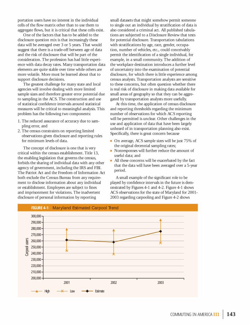
portation users have no interest in the individual cells of the fl ow matrix other than to use them to aggregate fl ows, but it is critical that these cells exist.
One of the factors that has to be added to the disclosure question mix is that increasingly these data will be averaged over 3 or 5 years. That would suggest that there is a trade-off between age of data and the risk of disclosure that will be part of the consideration. The profession has had little experi-ence with data decay rates. Many transportation data elements are quite stable over time while others are more volatile. More must be learned about that to support disclosure decisions.
The greatest challenge for many state and local agencies will involve dealing with more limited sample sizes and therefore greater error potential due to sampling in the ACS. The construction and use of statistical confi dence intervals around statistical measures will be critical to meaningful analysis. This problem has the following two components:
1. The reduced assurance of accuracy due to sam-pling error, and
2. The census constraints on reporting limited observations given disclosure and reporting rules for minimum levels of data.
The concept of disclosure is one that is very critical within the census establishment. Title 13, the enabling legislation that governs the census, forbids the sharing of individual data with any other agency of government, including the IRS and FBI. The Patriot Act and the Freedom of Information Act both exclude the Census Bureau from any require-ment to disclose information about any individual or establishment. Employees are subject to fi nes and imprisonment for violations. The inadvertent disclosure of personal information by reporting
small datasets that might somehow permit someone to single out an individual by stratifi cation of data is also considered a criminal act. All published tabula-tions are subjected to a Disclosure Review that tests for potential disclosure. Transportation tabulations with stratifi cations by age, race, gender, occupa-tion, number of vehicles, etc., could conceivably permit the identifi cation of a single individual, for example, in a small community. The addition of the workplace destination introduces a further level of uncertainty into the examination of potential disclosure, for which there is little experience among census analysts. Transportation analysts are sensitive to these concerns, but often question whether there is real risk of disclosure in making data available for small areas of geography so that they can be aggre-gated by transportation analysts more usefully.
At this time, the application of census disclosure and reporting thresholds regarding the minimum number of observations for which ACS reporting will be permitted is unclear. Other challenges in the use and application of data that have been largely unheard of in transportation planning also exist. Specifi cally, there is great concern because
■ On average, ACS sample sizes will be just 75% of the original decennial sampling rates;
■ Nonresponses will further reduce the amount of useful data; and
■ All these concerns will be exacerbated by the fact that the data will have been averaged over a 5-year period.
A small example of the signifi cant role to be played by confi dence intervals in the future is dem-onstrated by Figures 4-1 and 4-2. Figure 4-1 shows ACS observations for the state of Maryland for 2001-2003 regarding carpooling and Figure 4-2 shows
COMMUT ING IN AMER I CA III | 143
FIGURE 4-1 Maryland Estimated Carpool Trend
Low EstimateHigh
200320022001
Carp
ool u
sers
200,000
210,000
220,000
230,000
240,000
250,000
260,000
270,000
280,000
290,000
300,000

transit usage for the same period. In the carpool case, the observations indicate that carpooling in the state rose from 261,600 to about 275,500, a growth of over 5% but still within the range where the appro-priate answer would be that we cannot say with con-fi dence that any change has happened. In the transit case there is signifi cant difference shown for the change from 2001-2002, an increase of almost 16%, and again from 2002-2003, a decrease of almost 14%, but the overall difference for the total period is small and insignifi cant. It is not clear whether the change in 2002 is to be trusted and whether the assumption that transit use is around 214,000 is the best statistical observation without outside statistical corroboration. The staff analyst who suggests that transit use is 214,000 with 90% confi dence that the true answer lies between plus or minus 15,259 of that estimate will run the risk of losing his or her audience very quickly. These are challenges to be addressed in the profession.
All of these and other factors are sources of great concern to many in the transportation planning community at state and local levels regarding the transportation journey-to-work statistical future. Given the added uncertainties of the continuity of congressional support, fears are compounded. Many argue from a strategic point of view that a continu-ing, stable, annual program is preferable in a budget-ing sense to a “lumpy” fi nancial decennial spike; but it is certainly possible to make exceptions “this year” and cut programs with the plan of making it up “next year.” An attractive concept may be to parallel the concept in the surface transportation authoriza-tion process in which programs are largely set for a 6-year period. The Census Bureau and the metro-politan and state transportation planning processes would benefi t greatly from a long-term commitment so that program plans can be developed in a stable environment. Annual exceptions “this year” in the fi nancial process have impeded effi cient planning in the past. If fi nancial cuts sacrifi ce procedures relating to maintaining quality in the survey, such as detailed follow-up of weak responses, or cuts in sample sizes, the transportation planning utility of the system could be placed in serious jeopardy.
144 | COMMUT ING IN AMER I CA III
FIGURE 4-2 Maryland Estimated Transit Trend
Low EstimateHigh
Trans
it us
ers
190,000
200,000
210,000
220,000
230,000
240,000
250,000
260,000
270,000
200320022001

Historically, the Commuting in America series has concluded with a section in which I have been free to remark on the nature of trends and their direc-tion. This section permits me to be a bit more speculative in seeking to discern meaning in present patterns and trends.
One part of this opportunity that will not be squandered is to point out where this work is not as comprehensive as I would have liked. This docu-ment is larger than past versions of Commuting in America, partly because there are greater opportuni-ties today to assemble the data of interest quickly. But the main reason is that the topics of interest continue to expand. We expect much more of trans-portation today than in previous years. Therefore, analyses must expand to match these new expecta-tions. It becomes easy to get lost in individual data points without a compass to guide judgment and selection. I can only observe that what appears here is just a small part of the extensive body of material that was developed, reviewed, and set aside for one reason or another. I encourage others to join in this very interesting research.
PAST PATTERNSIn the 1996 Commuting in America report, a list of “patterns to watch” was presented based on our understanding at that time. It seems appropriate to examine these past patterns. Were they the impor-tant patterns? How have they fared?
1. Will the force of immigration continue or taper off?Certainly, the force of immigration in the past decade has been far stronger than expected by almost anyone. Part 2 revealed that the Census Bureau clearly underestimated the increase in immigration, such that Census 2000 delivered a 6-million-person surprise—effectively all of it attributable to immi-gration. The present data at the halfway mark in the decade show that immigration continues at its very strong pace, accounting for at least one-third and perhaps as much as one-half of population increase and an even greater percentage of the workers from 2000-2003. How these forces will play out in the
future is an immensely political question, but it would appear that no matter what happens, foreign immigration will continue at strong levels for the foreseeable future. Its content and structure may change, but the pace seems set to continue on the order of 10 million people per decade.
2. Will immigrants join the typical patterns of vehicle ownership and travel behavior or will new patterns emerge?The answer here is a tentative yes. All analyses shown in Part 2, among others, illustrate this pattern. The census data do a brilliant job of describing the fac-tors involved, underscoring again their immense value as a national resource. The main point is that the tendencies for use of transit, walking, biking, and carpooling for work travel decline with years of residence in the country. In the meantime, carpool-ing especially has been given a very helpful boost by many immigrants. This is particularly notable in the South and Southwest. Other factors discovered are pertinent. The data seem to indicate that although immigrants’ usage of modes not requiring a private vehicle declines with years present in the country, it never reaches the same levels attained by native-born residents. This seems to contradict past observa-tions and needs further analysis to assess whether income, family size, or other factors intervene. One would think that at some point—whether 10, 20, or perhaps 30 years—immigrant behavior would be indistinguishable from that of native-born residents.
3. Will greater suburban jobs/worker balance occur or will things stabilize at present levels?Two things seem to be happening. One is that most suburbs are slowly moving closer to job/worker bal-ance rising from the classical bedroom suburb ratios, as many central city ratios also tend toward a ratio closer to 1.0 from the opposite direction. Overall, the national job-worker ratio for central cities is 1.34, down from 1.36 in 1990; for suburbs it is
COMMUT ING IN AMER I CA III | 145
Patterns To Watch 15
.85, up from .83 in 1990; and for nonmetropolitan areas it is .92, slightly lower. At face value, this seems good because there is the potential for shorter work trip lengths. But it almost seems to matter less. The astonishing rise in out-of-residence-county commut-ing seems to contradict the notion that balances are approaching closer to a 1:1 ratio, or that it matters. As noted in Part 3, sometimes this can be mislead-ing. Jobs may leave a central city faster than workers are leaving, pushing the ratio closer to 1.0, but more commuting across county borders would result.
One explanation may lie in the fact that multiple-worker households are just less likely to seek or to find jobs close to home. Certainly, the presence of multiple workers in a household diminishes the ability to make a simple choice to live near work. Other factors also intervene—do some suburbs lack a skills balance (i.e., are the workers and the jobs in a given suburb ill-matched) as well as a jobs balance? Is the velocity of change in jobs so great that workers see no reward in locating close by or moving to solve a commute problem? There is an immense amount of room for fruitful research here.
4. Will racial and ethnic minorities fully join the mainstream car-owning classes? It is my view that perhaps the most significant change emerging from the census has been the dramatic decline in households without a vehicle among African-American households. Another factor worth tracing more than has been done here is the concomitant rise of a suburbanized, African-American middle class. (One of the extraordinary statistics of the period has been that the majority of people moving into the Atlanta suburbs in the 1990s were African-American.) The previous Commuting in America report noted that the African-American population was reaching those levels of income where experience had shown first vehicles began to be obtainable. This is clearly what has happened. The gaps between the Hispanic and African- American populations and the White non-Hispanic and Asian populations are still great, but moving toward similarity, if not becoming effectively identical.
5. Will technological fixes continue to be effective in responding to environmental concerns?This is not a topic that really has been addressed here, but it can be observed that every source of statistics and forecasting regarding these trends indi-
cates that for at least the next 20 years the present technological fixes to the vehicle fleet in place now will continue to improve air quality as the old fleet is replaced, even without the influx of hybrid tech-nologies or alternative fuels. Further improvements are possible even within the present framework of current internal combustion technologies. The pres-ent average age of the vehicle fleet is on the order of 9 years old. This indicates that the turnover to a new fleet—whether in fuel savings technologies, environ-mental improvements, or safety benefits—takes a very long time.
6. Will telecommunications and the growth in working at home abet dispersal and take the edge off commuting problems in many areas?This question has at least two parts—maybe more—all of them quite speculative at this stage. The facts are that working at home continues to be the fastest growing of the “modes” to work. As such, it certainly contributes to reduced congestion, but if so it seems invisible. This should not be surprising—the effects of things that didn’t happen are rather difficult to trace or assign. There are more than 4 million people who work at home, more than those who walk to work. If one assumed that they all joined the traveling mainstream in proportion to other users, their impact would be substantial and equal at least 2 years growth in travel. Maybe those who work at home deserve a silent thank you because they use neither resources nor infrastructure and exert pretty much zero cost on society, at least as far as work travel is concerned.
The role of telecommunications seems even more speculative at this stage. It is hard to believe that people will be staying home and using electronic communication to interact with their coworkers, but it is apparent that many workers with high-speed Internet, e-mail, and cell phones are able to take their work with them wherever they may be—home or elsewhere. In these respects, the forces of technology do abet the freedom to work at home and to live far-ther from the nominal workplace. In many respects, it seems that the technological capabilities are mov-ing faster than institutions are willing to employ them or accept them. If these technologies permit the occasional day at home for workers, then that can have considerable impact on congestion, if business management is supportive, especially given that those most interested in occasional work-at-home options would tend to be those with the longer-distance commutes. Of course, in the longer term, this could promote living farther away, as would any change that reduces the penalties of distance. These options
146 | COMMUT ING IN AMER I CA III

add to the variability of the traffic flow, which will be an increasing factor in the future. Whether this will be an improvement or not to traffic patterns is unclear but the expansion of freedom of choice to live and work where we want has to be seen as a posi-tive factor socially and probably economically.
7. Will ITS technologies begin to assert an influence on travel times or other factors of commuting?The Intelligent Transportation Systems (ITS) world and the agencies that employ it are paying greater attention to measuring the influence of ITS tech-nologies on traffic. Recent studies have shown that many of the tools developed have a very positive influence at relatively low cost. In their conges-tion studies, TTI has recently begun to attempt to identify this influence. Focusing on just four of the myriad technologies available (freeway entrance ramp metering, freeway incident management, traffic signal coordination, and arterial street access management), their research indicates that the pres-ent level of utilization of these technologies provided 336 million hours of delay reduction and $5.6 bil-lion in congestion savings in 2003 for the 85 areas that they monitor.34 If these treatments were fully deployed to all areas, the benefits would roughly double. A key component of this work, as discussed in Part 3, is that given the important impacts of traffic incidents on congestion, rapid response to dis-ruptive events saves hours of delay and its associated costs, and provides important safety benefits. An important longer-term policy facet of this work is its value in assuring the public that every effort is being made to wrest maximum capacity out of the current investment in the existing system. In the future, demonstrating effective use of existing capacity will be seen as a critical predicate to justifying investment in any form of new capacity.
8. Will aging commuters generate shifts in the style of commuting?One of the main themes of this report, paralleling the impact of immigrants in significance, has been the aging of the baby boomer workforce. We are now seeing the leading edge of the baby boomer generation approaching age 60, and some early indicators of more extensive changes to come are becoming visible. What we are seeing could be sum-marized quickly as: more workers working after 65; more older workers working limited hours; more older workers shifting away from the private vehicle; and more older workers shifting to working at home
and walking, with mixed effects on transit (gains in buses but losses in rail). At the moment, this can be seen as minor, but will grow in scale over the years.
9. Will population growth shift toward the lower end of the metropolitan size spectrum?Logic would suggest that as the large metropolitan areas become more congested, there would be a shift in population migration toward the intermediate and smaller metropolitan areas—those more in the range of 1 million rather than the megalopolitan areas over 5 million. Indications so far support this supposition but not in any dramatic ways. Areas between 1 and 5 million grew at a considerably faster rate—in the range of 17% to 21% for the decade—while those over 5 million grew at about 11%, actually below the overall national rate. The growth rates among those areas that were above 5 million in 1990 were considerably below the rates of those areas just reaching that threshold in 2000—Dallas-Fort Worth and Houston grew at a rate of almost 30%. The others were below the national average. Again, as in 1990, large western areas, Los Angeles and San Francisco, grew far faster than midwestern or eastern areas, but even they were below the national rate. As a result, there was a small (1 percentage point) shift in shares between the size groups. This pattern is likely to continue, particularly as the mid-sized areas of the South and West—Atlanta, Austin, San Antonio, Phoenix, Las Vegas—continue to grow at dramatic levels. Meanwhile, as a result of shifts between area size groups and the clustering of some formerly separate areas, such as Washington, D.C.-Baltimore, the numbers of the population who are living in areas over 5 million has risen dramatically. Given that these are the areas most likely to suffer severe congestion and to support rail transit, this matters considerably.
10. Will the public find the new, higher density communities attractive alternative lifestyles?There certainly seems to be anecdotal evidence all around us of the popularity of more walking- oriented lifestyle preferences and the development that supports it. Sometimes the statistical evidence does not support the appearances that we see each day because what we are not observing personally
COMMUT ING IN AMER I CA III | 147
34 The 2005 Urban Mobility Report, Texas A&M University, Texas Transportation Institute, College Station, Texas, May 2005.
are developments occurring somewhere else that are even greater in impact, such as exurban growth.
The question remains whether significant num-bers of baby boomers will tire of crabgrass and home care and opt for a more clustered-living lifestyle with less vehicle dependence and fewer household care concerns. There are immense governmental pressures trying to create these patterns and clear preferences for them on the part of some segments of households. The net effects over time would be likely to be minor with increases in density in the suburbs in some areas and declines in central city densities acting to balance out. Very few things are as central to how people live, or how they choose to live, as the residential density at which they live. In America, affluence has always been associated with declining density of living and increased ownership of land, including multiple homes. At the same time, the desire for walking and walkability is very real and I would expect it to grow (but as noted in Commuting in America II, don’t be shocked if people drive to where they want to walk!). The main public policy concern would be to assure that these pro-spective genuine market forces are not thwarted by contravening regulation at the local level that limits private-sector response to a real demand for this lifestyle approach.
EMERGING PATTERNS It is important to recognize that the 10 questions posed in the mid-1990s, and only partially answered here, are still relevant questions for the coming decade. We cannot say, “case closed” about any one of them. The definitive answers will take years to work themselves out. Looking back 10 years from now we certainly will have a better understanding of the patterns, but probably not the final answers, even then. In 2015, the later stages of the baby boom will be just arriving at the retirement years, perhaps following, perhaps shifting sharply away from the lifestyle preferences of their aging prede-cessors. Assuming too much behavioral uniformity among the various segments of the baby boom could be a large error.
Another question to consider is, Are these still the 10 questions about which we will be concerned 10 years from now or will they simply be among many such questions? What new candidate questions, perhaps more important questions, need to be examined? Some thoughts on these issues are identified in the following sections.
Who and Where Will the Workers Be? Certainly the most critical questions for the future for commuting, but more significantly for the national economy, will be
■ Who will be our workers? ■ Where will they come from? ■ What skill levels will they have and how well
matched to the needs of the economy will they be?
These questions are bigger and broader than can be answered here, but the outlines of the answers are apparent. The Census Bureau projections from 2000-2010 show almost no growth in the new work-ing age groups. About 10% of increase is among those under 4 years of age and the remainder, except for a minuscule number, are above 45 and represent the aging out of the baby boomers. These values are depicted in Figure 4-3 with the projections out to 2050 shown. One of the key elements in the growth projections is that while the population as a whole grows by just about 30% from 2000-2030, the population over age 65 doubles (note that the entire age group from 45-65 actually declines in the period from 2020-2030). More significantly, the population from age 18-65, the basic population from which our workforce will be drawn, expands by almost 20 million in the present decade from 2000-2010, but by only a total of 12 million in the two decades after that, from 2010-2030. All states will show a declin-ing percentage of their population in this age group between 2000 and 2030, and more than a dozen will show absolute declines in the population in this work-ing age group.
These projections are, of course, severely depen-dent on immigration estimates that have been wrong before and are likely to be wrong again, given the dramatic volatility of the situation. Of all of the ele-ments of population change, the only one that is not tied to demographic realities is foreign immigration, which can change at the stroke of a pen. Accepting these projections as they are indicates there will be a serious lack of population in the working-years age groups. To compensate and retain a reasonable scale of workforce will require increased shares of men and women in the labor force among those under 65, as well as a substantial change in the share of workers 65 and older who remain in the labor force. Even without that percentage increase, the share of workers in the labor force over age 65 will expand spectacularly.
A related concern, which may prove to be more significant in the long run, will be the skill levels and the related education levels of the population. Current data, as discussed in Part 3, indicate a sharply bi-modal distribution among the immigrant
148 | COMMUT ING IN AMER I CA III

population, with high percentages without high school educations, but with the percentage of col-lege graduates almost identical to the general U.S. population. So it may be mid-level skills that are lacking rather than higher education levels. How immigration policies respond to these needs, or how domestic education policies shift will be central to our ability to sustain and expand our high levels of productivity and associated prosperity in the future. Within the transportation sector, there already are signs of the need for action to assure a future replacement supply of the skilled engineers and others who are leaving the workplace in increasing numbers every day.
Where the workers will be is as important as who they might be. We are seeing the development of patterns unique in our history; immigrants are arriv-ing and going directly to suburban areas, in contrast to central city clusters of immigrants with descen-dants in the second and third generations mak-ing it to the suburbs. Where the jobs are for these immigrants will sharply affect commuting patterns. If they are in services to households their work will remain mostly in the suburbs, but business services and operations have a better prospect of being center-city oriented. Given the fact that immigrants are likely to be at the lower rungs of the economic ladder, along with other minorities, their home own-ership opportunities will likely be on the fringes of the regions where they live where housing costs are prone to be lowest. This will be part of the fuel for the long-distance commuting trend discussed next.
Will Long-Distance Commuting Continue to Expand?There are multiple forces at work in defi ning the nature of work trip lengths. First, it must be stated that this is an area of extreme weakness in our national dataset. The census only traces travel times, not distances. It does collect actual home and work location references but these are always masked by aggregation to varying levels of geography. The abil-ity to trace trip lengths for trips to work, and for all other trip purposes as well, will be a key concern for the future. The NPTS will bear the greatest respon-sibility for meeting these needs.
What can we make of the apparent present trends? It is useful to list what we know in a non-normative way as follows:
■ Average work trip lengths seem to be growing, based on trend data from the NPTS. This sug-gests that increases in length may, in some ways, ameliorate the fi nding of increased travel times, suggesting that speeds may not be declining as fast as believed. Previous NPTS trend data prior to 2000 indicated that speeds were actually improv-ing. This reversed in 2001.
■ We have seen dramatic increases in shares of workers leaving their home county to work. Although admittedly a weak measure, this would seem to be an indicator that trip distance lengths are growing.
■ Shifts of jobs to suburbs that are closer to workers seem to be creating an environment where it is
COMMUT ING IN AMER I CA III | 149
FIGURE 4-3 Census Bureau Population Change Projections
Pop
ulat
ion
(mill
ions
)
0-5 5-20 20-45 45-65 65-85 85+
-5
0
5
10
15
20
25
30
35
2040-20502030-20402020-20302010-20202000-2010
Source: Census Bureau Interim Projections, April 2005.
Age group:

expanding the feasibility for suburban workers to live even farther out.
■ Rising housing prices are forcing many to the edges of their regions and beyond in search of affordable housing.
■ Rural workers are increasingly able to participate in suburban job opportunities.
■ Attempts to preserve land space inside regions stimulates shifts to beyond the region’s limits.
■ We are seeing a boom in exurban housing stimu-lated by many of these trends.
It is clear that we are witnessing the interaction effects of several of the trends. One of these is the central question of worker availability. More workers are coming long distances from metropolitan periph-eries, or even rural areas, to work in metropolitan suburbs. Some of this is metropolitan workers leap-frogging development (or development restraints) and seeking housing beyond the high-cost edges of the region. But, in parallel, it is also rural workers being attracted to metropolitan jobs as those jobs move out to be closer to skilled suburban workers. Chapter 9 noted that the state with greatest increase in travel times in 2000 was West Virginia. Those increases were not the product of internal congestion but rather the long-distance travel of West Virgin-ians to the jobs in Pittsburgh; Washington, D.C.; and some of the Ohio metropolitan areas. Many rural workers are frozen into their family homes either because metropolitan housing is beyond their reach financially, opportunities to sell are poor in their areas, or they just don’t want to leave. New Hampshire displays similar patterns. Getting the rural labor force more actively involved in metropol-itan job markets may be one way of expanding the worker base available to employers and may prove a positive economic force.
Another aspect is the arrival of automobile plants and other major manufacturers in the small towns and cities of the South that are attracting large num-bers of workers from astonishing distances. The new BMW plant in South Carolina “seeks” to employ their workers from within a 50-mile radius as part of the development arrangement for the facility. It would take an industrial historian to determine whether this is better than the situation where, 50 or 75 years ago, employees lived outside the fac-tory gates and shopped at the company store. It also seems clear that these arrangements would be very
sensitive to transportation costs. Gas prices and the cost of vehicles will define the acceptable “commuter shed” for many of these opportunities. Vanpool-ing and transit services will play a role here as well, especially as costs rise.
The interplay between the cost of driving and the value of time is an important one. For years, the trend has been to give greater weight to the value of time (see below) but recent fuel price increases may be realigning the trade-offs. The desire for increased home sizes seems insatiable. One strength operat- ing here is that if housing and transportation costs are looked at as a joint cost, then CEX has demon-strated that rural populations win out over suburban or central city residents; despite higher transportation costs, lower housing costs and lower total costs make rural living more affordable. Among younger house-holds this may be particularly acute in that they can trade their time in a vehicle for higher mortgage levels for which they may not qualify.
It is not clear at this time whether there is an exurban trend going on here independent of housing costs and job attractions. That is, is there an interest in, and a trend toward, more rural exurban living, in and for itself? One aspect of this phenomenon noted in the Washington, D.C. metropolitan area is that soon-to-retire baby boomers are already buying and jumping to their planned retirement homes in the Shenandoah Mountains or at the Chesapeake shore, willing to spend the last few years of their work lives in long-distance travel in order to gain a price jump on their intended retirement housing. It would not be surprising to see this practice playing out in other areas as well. The interest in walkable spaces, discussed previously, is a countervailing trend that could tend to reduce trip lengths, but it is not clear to what extent this is a worker-based or a retiree-based trend.
Beyond housing and trip length, there is a question of whether there is something more of value worth consideration in all this. Today, we have metropolitan areas with 25 and 30 counties—Atlanta, Washington, D.C., and Minneapolis come to mind—each county with its own variations on a job/worker ratio. As these ratios tend toward 1:1 and, let’s suppose, at that ratio most workers actually worked in their residence county (using county here as a surrogate for some area unit), that would clearly be better for the transportation system in terms of congestion, but would it be better for the region as an entity? Wouldn’t a region with 30 counties, all of which had worker populations that largely worked in their own residence counties, be a set of 30 hamlets and not a region? Isn’t the strength—the
150 | COMMUT ING IN AMER I CA III
COMMUT ING IN AMER I CA III | 151
hallmark—of a region based on its ability to provide a market in the millions? For example, an employer in a very specialized sphere locating in a large region has a market of prospective employees measuring in the millions. This is also true of an exotic restaurant, great art gallery, or any specialty store. This suggests that transportation policies that would suppress longer distance travel and encourage short-distance trips are destroying part of what makes a big region a great region.
Will the Role of the Work Trip Decline, Grow, or Evolve?The journey to work as studied here for a lot of years is not in jeopardy of decline, but it is declining as a share of all travel. Does that mean that the work trip matters less or that our interest in work trips is misplaced? Not quite yet. Yes, the work trip is no longer the dominant factor in local metropolitan and rural travel that it was in past years. Yes, other trip purposes have grown faster and may even claim a bigger share of travelers’ time than work trips. Certainly, as the age of the population shifts to the retirement-age groups, work travel will decline in significance for that group, even though members of the group may work more than any other over-65 cohort in our history. Yes, the work trip is now fes-tooned with associated and integrated trips in what has become a well-known phenomenon called the work trip chain—dropping off things in the morn-ing and picking them up on the way home—all of this tightly tied to the continuing pressures of time on the average worker. But the work trip still defines much of what we need to know about travel to make our transportation systems work better. Part 3 showed the impact that workers have on household transportation spending. The home and workplace are the two anchors for many of those other trips that now claim increasing prominence. Trips to the gym and market, drop-offs/pick-ups, etc.—are as likely to start from work as home in many house-holds. Thus, for the majority of adults who work, the workplace location is a major force in the stimu-lus for travel, the direction, location, and time of travel and—often—the mode of travel as well.
Will the Value of Time in an Affluent Society Be the Major Force Guiding Decisions?It is probably not possible to assert too strongly the influence of the value of time on our actions regarding commuting and other elements of local diurnal travel as well. We each have the same allot-ment of time in a day and the current pace of living seems to squeeze all of us for time. This may seem hard to believe when we see people sitting in traffic
apparently valuing their time at zero. The impress of time has grown as a force since the beginnings of the greater involvement of women in the workforce. Seeking to juggle multiple tasks and household roles has created tremendous pressures to get things done on the way to something else. During the energy crises of the 1970s this was driven by the need to conserve fuel; today it is driven by the need to conserve time. This has probably been the central factor in the growth of the SOV versus carpooling and other alternatives—the speed and flexibility of operating alone in a vehicle has strong appeal in an environment that values the ability to multitask.
There is another part of this: as incomes rise, the value of time increases. That means that many people, if not most, will have increasing values of time that they apply to their transportation deci-sions. Hence, the same system next year will be less acceptable to users than it is today because their value of time increases even if the system does not change. Parenthetically, this has shown to be true on the freight side as well, as the value of goods shipped increase. Thus, the providers of transporta-tion services must recognize that they are responding to an increasingly stringent set of demands from the using public.
Will the Value of Mobility in Our Society Be Recognized?As this is being written, Congress has just completed the reauthorization of the surface transportation pro-gram after several years of delay. Although comment here on the issues involved in that process is inap-propriate, it is useful to make note that this tends to reaffirm the point of how little transportation bears on the public consciousness. The debates and delays are not because transportation is so important but because it does not seem to matter very much and can be put off for another day. This is one more indicator that mobility, which I would argue is the centerpiece of our national productivity, is neither highly valued nor understood among public officials. It is perpetually Number 11 on the nation’s list of top-10 public topics. The failure of transportation, much less commuting, to be mentioned in presi-dential campaigns, debates, or state-of-the-union speeches for the last 20 or 30 years is also very telling. The public has a sense of mobility’s value but it is one that is poorly articulated and more implicit than explicitly stated and understood. Just like an efficient public water supply, mobility goes

152 | COMMUT ING IN AMER I CA III
unnoticed until it is restricted. We must more fully understand and quantify the value of mobility and improve our ability to transmit that understanding to others. As we celebrate the 50th anniversary of the Interstate in 2006, it would be good to regain that sense of the importance of mobility that guided the development of that system.
CONCLUSIONWhat a privilege it is to work on a subject that is a source of endless interest. The ways in which human needs and preferences play out in a spatial context, given changes in technological possibilities, in the demography of the population, and in the larger society, generates an almost endless array of patterns to investigate and stories to tell.
This work began more than 20 years ago with the intent of using the census data to describe the new patterns of commuting behavior that were then emerging. In the intervening years, it has evolved into the continuing story of changing commuting behavior and has parenthetically documented the effects of the baby boom generation on many aspects of transportation as this demographic bubble rose to prominence, dominated the scene for several decades, and is now slowly moving off stage. That group, which has dominated most of our profes-sional lifetimes, has had an immense impact on transportation, as well as on a myriad of other ele-ments in our society. The real story is not about how those people got to work but about jobs—jobs that our society generated in tremendous numbers to provide for the millions of job-hungry baby boomers emerging from schools and colleges. This series could have been about the documentation of the immense unemployment spawned by a demographic
bubble. It is a tribute to our society’s vitality and creativity that this is the story of traffic congestion among the affluent rather than about unemploy-ment lines among the job hungry.
In many ways, addressing the needs of the future should be more operable, more achievable, than in the past. So many of the major forces of change in the past have diminished: The explosive growth of drivers’ licenses and vehicle ownership, the rise of female participation in the workforce, the subur-ban boom, and the boom in baby boomer workers themselves are all behind us. This is not to say that the road ahead will be easy (just catching up on the backlog of work to be done will take at least a decade). In addition, new forces of change will inevi-tably arise. The needs of a new society—more afflu-ent, more involved in global issues, more free to live and work when and where they want—will remain a substantial challenge for the future.
The change from the decennial census format to the ACS suggests that we can make more frequent and, in some ways, more careful examinations of the final stages of the baby boom pattern. Watching the final stages of the baby boomers’ work life and the rise of the new populations that will replace them should be equally fascinating.

COMMUT ING IN AMER I CA III | 153
ACS: See AMERICAN COMMUNITY SURVEY.
AMERICAN COMMUNITY SURVEY (ACS): A relatively new Census Bureau annual survey similar in content and structure to the “long form” of the decennial census in which extensive questions are asked of the American public, including the questions on work travel that are fundamental to this study. Several years of ACS results will need to be accumulated to replicate the number of observations obtained in the decennial census. After many years of development, the full-scale survey, without group quarters, began in 2005.
CARPOOL: A term increasingly loosely used to describe any vehicle traveling to work with more than a single occupant driving alone, rather than the more useful concept of a group of workers sharing the cost or driving chores on a regular basis. The term has become almost meaningless.
CBD: See CENTRAL BUSINESS DISTRICT.
CBSA: See CORE-BASED STATISTICAL AREA.
CENSUS REGION: The states of the United States are grouped into four main regions for purposes of cen-sus data presentation. These four regions are further subdivided into nine divisions (see Figure 1-8).
CENSUS TRACT: A census-defined area of relatively homogeneous character within a metropolitan area circumscribing a population of about 4,000 inhabit-ants. Thus, tract areas vary significantly in geogra-phic size with population density.
CENTRAL BUSINESS DISTRICT (CBD): The central commercial core of a central city. This conceptual geographic unit is no longer identified or used as a reporting unit by the Census Bureau. This study employs several locally defined CBDs to assess com-muting behavior in the central core of regions.
CENTRAL CITY: Generally, the central, incorporated, densely populated city around which a metropolitan area is structured. In the past, there were some cases where more than one central city existed inside a metropolitan area. Part of the Census changes in geographic definitions for 1990 and continued in 2000 included making any city with greater than 25,000 population within a metropolitan area a cen-tral city if it met certain other commuting criteria. This resulted in the development of a large number
of new central cities within metropolitan areas. There were 525 central cities in metropolitan areas in 1990 compared to 429 in 1980. In the 2000 cen-sus, the number reached 554 and was in the range of 600 when the cities and metropolitan areas were redesignated after the census in 2003 and 2004.
CIVILIAN LABOR FORCE: Consists of those persons employed and those persons unemployed but seek-ing work, and only includes those who are not part of the armed forces.
CMSA: See CONSOLIDATED METROPOLITAN STATISTICAL AREA.
CONSOLIDATED METROPOLITAN STATISTICAL AREA (CMSA): Previously described as a Standard Consoli-dated Statistical Area (SCSA), the term CMSA refers to a large metropolitan complex having a popula-tion of over 1 million and containing identifiable, separate metropolitan groups that might otherwise be freestanding. The individual parts of these clus-ters are called primary metropolitan statistical areas (PMSAs). For example, the New York CMSA con-sists of 12 separate PMSAs. There were 20 CMSAs with 71 component PMSAs in 1990. Since 2000, this has risen to 73 PMSAs in a reduced number of 18 CMSAs as further consolidations have occurred.
CORE-BASED STATISTICAL AREA (CBSA): This new concept defined and introduced in 2003 is similar, but not identical, to metropolitan area. This term is not used in this study.
GROUP QUARTERS POPULATION: The group quarters population is defined by the Census Bureau to include all people not living in households. Two general categories of people in group quarters are recognized: 1) the institutionalized population that includes people under formally authorized, super-vised care or custody in institutions (such as cor-rectional institutions, nursing homes, and juvenile institutions) at the time of enumeration and 2) the noninstitutionalized population that includes all people who live in group quarters other than institu-tions (such as college dormitories, military quarters, and group homes). It is the latter group that has work travel potential and is of interest in this study.
HOUSEHOLD: A group of persons sharing a separate housing unit, characterized by eating and sharing other activities together, as differentiated from persons living in group quarters (e.g., barracks, dormitories,
Glossary of Terms
APPENDIX 1

154 | COMMUT ING IN AMER I CA III
MODE: A loosely defined means of transportation. Public transportation may be considered a mode, with bus, subway, and commuter rail as submodes, or each may be considered modes of travel in their own right. For this study, the census categories for iden-tifying how people usually get to work are treated as separate modes and are sometimes expressed as shown here in an abbreviated form, especially in tabular material. The census data do not permit iden-tification of work trips using more than one mode (e.g., auto to bus to train) and sometimes referred to as multimodal trips. In such cases, the mode used for most of the distance is used to describe the total trip. Walking is considered a mode only if it is the sole means of travel to work. The NHTS does count all modes used in the trip to work.
Census Terms Abbreviated Terms Used Here
Car, truck, or van Private vehicle
Public transportation Transit
Bus or trolley bus Bus
Streetcar or trolley car Streetcar
Subway or elevated Subway
Railroad Railroad
Ferryboat Ferry
Taxicab Taxi
Bicycle Bike
Walked Walk
Worked at home Work at home
Other means Other
MSA: See METROPOLITAN STATISTICAL AREA.
NATIONAL HOUSEHOLD TRAVEL SURVEY (NHTS): See NATIONWIDE PERSONAL TRANSPORTATION SURVEY.
NATIONWIDE PERSONAL TRANSPORTATION SURVEY (NPTS): This survey has been conducted roughly every 5-6 years since 1969 to obtain the daily trip patterns of the American public. For the 2001 cycle, it was briefly called the National Household Travel Survey (NHTS).
NHTS: See NATIONAL HOUSEHOLD TRAVEL SURVEY.
NPTS: See NATIONWIDE PERSONAL TRANSPOR-TATION SURVEY.
O-D: See ORIGIN-DESTINATION.
etc.). Families constitute the majority of households. Single individuals living alone or unrelated persons sharing a housing unit also constitute households.
IMMIGRANTS: As used here, includes foreign-born population that entered the United States before 2000. As of 2000, the United States had a foreign-born population of 31.1 million of whom 13.2 million arrived between 1990 and 2000. Persons born abroad of American parents are considered native born.
JOBS: In this study, the count of workers is some-times used as a surrogate for the count of jobs at the work end of their journey to work. This is useful as an estimate only. Specifically, because multiple jobs are not counted in the census workers are an under-estimate of jobs and, therefore, of commuting.
LABOR FORCE: That part of the noninstitutional population over 16 that is working, temporarily absent from work, or actively seeking work.
LABOR FORCE PARTICIPATION RATE: Defined by the Bureau of Labor Statistics as the labor force as a percent of the civilian noninstitutional population. The definition therefore excludes those in the mili-tary and those in institutionalized settings such as correctional institutions, nursing homes, or juvenile institutions.
METROPOLITAN AREA: The definitions and names for metropolitan units used for standard statistics of the 2000 census are effectively comparable to the 1990 definitions. The main geographic entities employed in the census and used here are metropolitan area, a broad term for all things metropolitan; and then further delineated into metropolitan statistical area (MSA), primary metropolitan statistical area (PMSA), and consolidated metropolitan statistical area (CMSA), as defined in this appendix. These statistical aggregations of counties around a major city or cities seek to encompass the areas with strong social and economic relationships in the commuter shed of a central city. This term is now used to distinguish metropolitan America from nonmet-ropolitan America. Because the building blocks of metropolitan areas are counties, their configuration may vary substantially as a function of county size.
METROPOLITAN STATISTICAL AREA (MSA): This refers to a freestanding metropolitan area, as distinguished from a metropolitan area cluster known as a consoli-dated metropolitan statistical area. There were a total of 264 MSAs in the 1990 census and 276 in the 2000 census.
Glossary of Terms

COMMUT ING IN AMER I CA III | 155
ORIGIN-DESTINATION (O-D): A method of describing trips in terms of their starting and ending points. Generally, but not necessarily, for work trips the home is the origin, and the workplace the destina-tion. Students working after school, workers travel-ing to various client locations, or construction work sites are examples of exceptions.
PERSON MILES OF TRAVEL (PMT): Total person trips made multiplied by their lengths.
PERSON TRIP: One trip made by one person. A trip is the one-way travel from an origin to a desti-nation (usually a change of address), a visit to a neighbor, to the store, or to work. The return would be another trip.
PMT: See PERSON MILES OF TRAVEL.
POV: See PRIVATELY OPERATED VEHICLE and VEHICLE OCCUPANCY.
PRIVATELY OPERATED VEHICLE (POV): Also called pri-vately owned vehicle; previously called an automo-bile, but with the advent of pick-up trucks, vans, etc., this more general term is employed.
PUBLIC USE MICRODATA SAMPLE (PUMS): The Census Bureau has extracted a sample of 1% and 5% of all decennial census records with complete detail of the actual individual census forms so that researchers can examine detailed person and household informa-tion from the census. Geographic identification is removed from the files so that individual privacy is protected. The smallest geographic units available are large enough to assure anonymity of the respondents. These files have been made available on CD to dra-matically improve the use of the data for research.
PUMS: See PUBLIC USE MICRODATA SAMPLE.
REVERSE COMMUTE: A term often used by transporta-tion professionals to denote the travel of central city residents to suburban work locations in the opposite direction of the traditional main volume of traffic flow.
RURAL AREA: A term almost devoid of useful mean-ing in the census definitional structure. Parts of met-ropolitan areas may be rural. Nonmetropolitan areas are predominantly rural but also contain urban, nonmetropolitan units. Under Census 2000, rural is that area not in an urban cluster or urbanized area.
SINGLE-OCCUPANT VEHICLE (SOV): See VEHICLE OCCUPANCY.
SOV: See SINGLE-OCCUPANT VEHICLE.
START TIME: A new data item in the 1990 census identifies the time to the minute when the com-muter left home for work. Sometimes the alternate term time left home (TLH) is used. This valuable information permits better analysis of traffic load-ings around peak periods for local traffic modeling of travel demand and air quality analysis. The 2000 census provides the first opportunity for compara-tive trend analysis. Survey respondents often object vigorously to providing this information but it is crucial to assessing system adequacy. Sometimes time arrived at work (TAW; equaling TLH + travel time) is employed as a destination measure.
SUBURB: A nontechnical term that the Census, OMB, and others are investigating to establish a somewhat more rigorous definition along with other concepts such as inner suburb, outer suburb, exurb. In this study, the term suburb is used to describe the ring around the central city, the remainder of the metropolitan area, within various metropolitan defi-nitions. This would make it equivalent to the census term metropolitan area outside central cities.
TAZ: See TRAFFIC ANALYSIS ZONE.
TRADITIONAL COMMUTE: The pattern of commuting from a suburb-like area outside the city to a down-town location.
TRAFFIC ANALYSIS ZONE (TAZ): A small area unit designated by metropolitan transportation planning agencies, defined by the configuration of the road system and homogeneous traffic patterns (i.e., a traffic-based neighborhood). Generally about one-third to one-quarter the size of a census tract, traffic zones do not have specific population characteristics but tend to be around 1,000 persons in population.
TRANSIT MODES: The census employs a generic set of transit mode categories that include bus or trol-ley bus, streetcar or trolley car, subway or elevated railroad, and ferryboat. These categories seek to cover the full array of kinds of transit available in most areas. However, the technical names employed around the country for transit facilities and the popular names will vary tremendously, sometimes leading to confusion on the part of transit users. The terms Metro, the T, etc., have become part of popular understanding in many areas. As a result, some unavoidable confusion could arise as to how to correctly code one’s activities when answering census questions.

156 | COMMUT ING IN AMER I CA III
TRAVEL TIME: An estimate by the commuter of the time in minutes that it usually took to get from home to work in the week prior to the census. This data item was first collected in 1980; thus in 2000 there is an opportunity to make trend comparisons for a 20-year period. The census only collects work trip distance in time; the NHTS obtains both distance to work in time and distance in miles. It would be inappropriate to assume that total daily commute time would be twice the morning average given the significant variation in morning and evening travel.
TRIP END: Either end of a trip. Used to describe trips in terms of their common origins or destinations (e.g., in this study, all work trips with a destination in the suburbs).
UA: See URBANIZED AREA.
UC: See URBAN CLUSTER.
URBAN AREA: Collective term referring to all areas that are urban. For Census 2000, there are two types of urban areas: urban clusters and urbanized areas. There are now 3,638 urban areas.
URBAN CLUSTER (UC): A densely settled territory that has at least 2,500 people but fewer than 50,000. New term for Census 2000 with more than 3,000 urban clusters named.
URBANIZED AREA (UA): An area consisting of one or more central places and adjacent territory with a general population density of at least 1,000 people per square mile of land area that together have a mini- mum residential population of at least 50,000 people. The Census Bureau uses published criteria to deter-mine the qualification and boundaries of UAs. In 2000, there were 453 urbanized areas, contrasted to fewer than 400 in 1990.
VEHICLE MILES OF TRAVEL (VMT): Vehicle trips made multiplied by their length. Two people in a vehicle going one mile generates one VMT and two PMTs.
VEHICLE OCCUPANCY: The number of occupants in a vehicle, including the driver. Generally, this figure is lower for work trips than for other trip purposes. A term increasingly in use in regard to vehicle occu-pancy is single-occupant vehicle (SOV), a vehicle in which the driver is the only passenger. The term POV, meaning privately owned or operated vehicle, is increasingly employed to identify a private vehicle (i.e., a vehicle that is neither part of a public trans-portation system nor for hire).
VEHICLE TRIP: A trip made in a private vehicle.
VEHICLES: Between 1960 and 1980 data were collected in the census on automobiles available at occupied housing units. In 1980, for the first time, the census separately identified and counted vans and trucks of one-ton capacity or less in addition to the traditional count of automobiles. The 1990 census merged the two separate questions into one question using the term vehicles, without differentiating type. The 2000 census follows that arrangement. Vehicles are counted if kept at home for use by members of the household. Therefore, company cars or leased vehicles available for use are included. Accordingly, the count does not conform with vehicles owned by the household, but means vehicles available to the household. This broader concept is more valid for the purposes of this study.
VMT: See VEHICLE MILES OF TRAVEL.
WORK AT HOME: In the census, a person who, in the week prior to the census, had the usual place of work in his/her residence, is counted as working at home. Those who have variable work locations such as con-struction workers, or who periodically work at home, are not included in the work-at-home group. A popu-lar new, related term that has come into vogue is tele-commuter, which refers to someone who has a regular workplace away from home, but works at home on an occasional basis (i.e., once or twice a week).
WORKERS: That part of the population at work or temporarily absent from work. In the decennial census, a person is defined as a worker if he or she worked full- or part-time during the week previous to the taking of the census. A worker is counted once regardless of the number of jobs held. Multiple jobs are not counted separately.
WORKING AGE POPULATION: That part of the popula-tion of an age to be considered eligible for the labor force. Most definitions typically use the number of persons over 16, feeling that persons over 65 may well still be potential members of the workforce. As our population ages, this number will be increasingly misleading. It is felt that even now, but certainly in the future, the large numbers of those over 65 will cause misinterpretation of that statistic. In this study, the population between the ages of 16 and 65 is identified as the workforce age group. Although it is increasingly true that workers will be over 65, the age group from 16-65 is still a very useful estimator of the potential labor force age group. Where appro-priate, workers over 65 are identified separately.
Glossary of Terms

COMMUT ING IN AMER I CA III | 157
Census Questions
APPENDIX 2
21
22
LAST WEEK did this person do ANY work for either pay or profit? Mark the “Yes” box even if the person worked only 1 hour, or helped without pay in a family business or farm for 15 hours or more, or was on active duty in the Armed Forces.
Yes
No Skip to 25a
At what location did this person work LAST WEEK?If this person worked at more than one location, print where he or she worked most last week.a. Address (Number and street name)
(If the exact address is not known, give a description of the location such as the building name or the nearest street or intersection.)
b. Name of city, town, or post office
c. Is the work location inside the limits of that city or town?
Yes
No, outside the city/town limits
d. Name of county
e. Name of U.S. state or foreign country
f. ZIP Code
✗

158 | COMMUT ING IN AMER I CA III
23
a. How did this person usually get to work LAST WEEK?If this person usually used more than one method of transportation during the trip, mark the box of the one used for most of the distance.
Car, truck, or van
Bus or trolley bus
Streetcar or trolley car
Subway or elevated
If “Car, truck, or van” is marked in 23a, go to 23b. Otherwise, skip to 24a.
b. How many people, including this person, usually rode to work in the car, truck, or van LAST WEEK?
Drove alone
2 people
3 people
4 people
5 or 6 people
7 or more people
a. What time did this person usually leave home to go to work LAST WEEK?
: a.m. p.m.
b. How many minutes did it usually take this person to get from home to work LAST WEEK?
Minutes
Source: Census Bureau, “United States Census 2000,” at www.census.gov/dmd/www/2000quest.html
24
23
✗
Railroad
Ferryboat
Taxicab
Motorcycle
Bicycle
Walked
Worked at home Skip to 27
Other method
Census Questions

COMMUT ING IN AMER I CA III | 159
CENSUS TRANSPORTATION PLANNING PACKAGE (CTPP) 2000Standard Tabulations—Sorted by Table Number
CTPP Tabulations
APPENDIX 3
Table Content Universe Cells
Part 1: Tabulations by Place of Residence
1-001 Time leaving home to go to work (40) All workers 40
1-002 Sex (3) by Means of transportation to work (18) All workers 54
1-003 Sex (3) by Occupation (25) All workers 75
1-004 Sex (3) by Industry (15) All workers 45
1-005 Sex (3) by Class of worker (8) All workers 24
1-006 Sex (3) by Worker earnings in 1999 (12) All workers 36
1-007 Sex (3) by Hours worked per week in 1999 (7) Workers in 2000 who worked in 1999 21
1-008 Disability status for persons age 16 and over (3) by Means of transportation to work (11) All workers 33
1-009 Occupation (25) by Means of transportation to work (11) All workers 275
1-010 Industry (15) by Means of transportation to work (11) All workers 165
1-011 Industry (15) by Worker earnings in 1999 (12) All workers 180
1-012 Class of worker (8) by Means of transportation to work (11) All workers 88
1-013 Worker earnings in 1999 (12) by Means of transportation to work (11) All workers 132
1-014 Age (8) by Means of transportation to work (11) All workers 88
1-015 Occupation (25) by Industry (15) All workers 375
1-016 Occupation (25) by Time leaving home to go to work (14) All workers 350
1-017 Industry (15) by Time leaving home to go to work (14) All workers 210
1-018 Length of US residence (5) by Worker earnings in 1999 (12) All workers 60
1-019 Worker earnings in 1999 (12) by Travel time to work (17) All workers 204
1-020 Length of US residence (5) by Means of transportation to work (11) All workers 55
1-021 Means of transportation to work (11) by Time leaving home to go to work (14) All workers 154
1-022 Means of transportation to work (11) by Travel time to work (17) All workers 187
1-023 Hispanic origin (3) by Race of person (5) by Occupation (25) All workers 375
1-024 Hispanic origin (3) by Race of person (5) by Industry (15) All workers 225
1-025 Hispanic origin (3) by Race of person (5) by Class of worker (8) All workers 120
1-026 Hispanic origin (3) by Race of person (5) by Worker earnings in 1999 (12) All workers 180
1-027 Hispanic origin (3) by Race of person (5) by Means of transportation to work (8) All workers 120
1-028 Hispanic origin (3) by Race of person (5) by Travel time to work (17) All workers 255
1-029 Table deleted—all cells are zero 33
1-030 Household income in 1999 (11) Workers in households 11
1-031 Number of workers in household (6) by Household size (5) Workers in households 30
1-032 Vehicles available (6) by Poverty status in 1999 (4) Workers in households 24
1-033 Age (8) by Worker earnings in 1999 (12) All workers 96
1-034 Household income in 1999 (26) by Means of transportation to work (11) Workers in households 286

160 | COMMUT ING IN AMER I CA III
Table Content Universe Cells
1-035 Vehicles available (6) by Means of transportation to work (11) Workers in households 66
1-036 Poverty status in 1999 (4) by Means of transportation to work (11) Workers for whom poverty status has been determined 44
1-037 Number of workers in household (6) by Means of transportation to work (11) Workers in households 66
1-038 Age group of youngest child in the household (5) by Means of transportation to work (11) Workers in households 55
1-039 Household income in 1999 (11) by Worker earnings in 1999 (12) Workers in households 132
1-040 Poverty status in 1999 (4) by Time leaving home to go to work (14) Workers for whom poverty status has been determined 56
1-041 Vehicles available (6) by Length of US residence (5) Workers in households 30
1-042 Household income in 1999 (5) by Vehicles available (6) by Means of transportation to work (8) Workers in households 240
1-043 Household income in 1999 (5) by Number of workers in household (6) by Age group of youngest child in the household (5) Workers in households 150
1-044 Household income in 1999 (5) by Hispanic origin (3) by Race of person (5) by Means of transportation to work (8) Workers in households 600
1-045 Vehicles available (3) by Hispanic origin (3) by Race of person (5) by Means of transportation to work (8) Workers in households 360
1-046 Poverty status in 1999 (4) by Hispanic origin (3) by Race of person (5) by Means of transportation to work (8)
Workers for whom poverty status has been determined 480
1-047 Total number of persons (1) All persons 1
1-048 Number of people sampled (1) Sampled persons 1
1-049 Percentage of people sampled (1) All persons 1
1-050 Hispanic origin (3) by Race of person (5) All persons 15
1-051 Sex (3) by Age (12) All persons 36
1-052 Age (12) by Minority status (3) All persons 36
1-053 Age (8) by School enrollment (7) All persons 56
1-054 Sex (3) by Employment status (7) Persons age 16 and over 21
1-055 Age (12) by Disability status for persons age 16 and over (3) Persons age 16 and over 36
1-056 Employment status (7) by Disability status for persons age 16 and over (3) Persons age 16 and over 21
1-057 Table deleted—all cells are zero 36
1-058 Table deleted—all cells are zero 36
1-059 Poverty status in 1999 (4) by Disability status for persons age 5 and over (3) by Minority status (3) by Age (4)
Persons age 5 and over for whom poverty status has been determined 144
1-060 Total number of households (1) All households 1
1-061 Tenure (5) All households 5
1-062 Household size (5) by Number of workers in household (6) All households 30
1-063 Household size (5) by Vehicles available (6) All households 30
1-064 Household size (5) by Household income in 1999 (26) All households 130
1-065 Number of workers in household (6) by Vehicles available (6) All households 36
1-066 Number of workers in household (6) by Household income in 1999 (26) All households 156
1-067 Vehicles available (6) by Household income in 1999 (26) All households 156
1-068 Vehicles available (6) by Number of persons 16 or over in household (5) All households 30
1-069 Vehicles available (6) by Number of units in structure (7) All households 42
1-070 Vehicles available (6) by Age of householder (9) All households 54
CTPP Tabulations

COMMUT ING IN AMER I CA III | 161
Table Content Universe Cells
1-071 Vehicles available (6) by Poverty status in 1999 (4) All households 24
1-072 Vehicles available (6) by Length of US residence (5) All households 30
1-073 Poverty status in 1999 (4) by Telephone availability (3) All households 12
1-074 Household size (5) by Number of workers in household (6) by Vehicles available (6) All households 180
1-075 Household size (5) by Number of workers in household (6) by Household income in 1999 (11) All households 330
1-076 Household size (5) by Vehicles available (6) by Household income in 1999 (11) All households 330
1-077 Household size (5) by Vehicles available (6) by Number of units in structure (7) All households 210
1-078 Household size (5) by Vehicles available (6) by Tenure (5) All households 150
1-079 Number of workers in household (6) by Vehicles available (6) by Household income in 1999 (11) All households 396
1-080 Vehicles available (6) by Race of householder (5) by Hispanic origin of householder (3) All households 90
1-081 Race of householder (5) by Hispanic origin of householder (3) by Telephone availability (3) All households 45
1-082 Household size (5) by Household income in 1999 (11) by Race of householder (5) by Hispanic origin of householder (3) All households 825
1-083 Total number of housing units (1) All housing units 1
1-084 Number of housing units sampled (1) Sampled housing units 1
1-085 Percent of housing units sampled (1) All housing units 1
1-086 Occupancy status (3) by Number of units in structure (7) All housing units 21
1-087 Vacancy status (6) All housing units 6
1-088 Median household income by Number of workers in household (6) All households 6
1-089 Median household income by Vehicles available (6) All households 6
1-090 Mean household income by Number of workers in household (6) All households 6
1-091 Mean household income by Vehicles available (6) All households 6
1-092 Standard deviation of household income by Number of workers in household (6) All households 6
1-093 Standard deviation of household income by Vehicles available (6) All households 6
1-094 Median earnings by Means of transportation to work (11) Workers with earnings in 1999 11
1-095 Median earnings by Means of transportation to work (11) Workers with earnings in 1999 residing in households 11
1-096 Mean earnings by Means of transportation to work (11) Workers with earnings in 1999 11
1-097 Mean earnings by Means of transportation to work (11) Workers with earnings in 1999 residing in households 11
1-098 Standard deviation of earnings by Means of transportation to work (11) Workers with earnings in 1999 11
1-099 Standard deviation of earnings by Means of transportation to work (11) Workers with earnings in 1999 residing in households 11
1-100 Median travel time by Means of transportation to work (11) All workers 11
1-101 Median travel time by Means of transportation to work (18) All workers 18
1-102 Mean travel time by Means of transportation to work (11) All workers 11
1-103 Mean travel time by Means of transportation to work (18) All workers 18
1-104 Standard deviation of travel time by Means of transportation to work (11) All workers 11
1-105 Standard deviation of travel time by Means of transportation to work (18) All workers 18
1-106 Median travel time by Means of transportation to work (11) by Time leaving home to go to work (14) All workers 154
1-107 Mean travel time by Means of transportation to work (11) by Time leaving home to go to work (14) All workers 154

162 | COMMUT ING IN AMER I CA III
Table Content Universe Cells
1-108 Standard deviation of travel time by Means of transportation to work (11) by Time leaving home to go to work (14) All workers 154
1-109 Aggregate number of vehicles in households (1) Occupied housing units 1
1-110 Aggregate number of vehicles used (1) by Time leaving home to go to work (4) Vehicles used in travel to work 4
1-111 Mean number of workers per vehicle (1) by Time leaving home to go to work (4) Workers using a car, truck, or van 4
1-112 Aggregate number of carpools (1) by Time leaving home to go to work (4) Carpools 4
1-113 Mean number of workers per carpool (1) by Time leaving home to go to work (4) Workers in carpools 4
1-114 Aggregate household income by Number of workers in household (6) All households 6
1-115 Aggregate household income by Vehicles available (6) All households 6
1-116 Aggregate earnings by Means of transportation to work (11) Workers with earnings in 1999 11
1-117 Aggregate earnings by Means of transportation to work (11) Workers with earnings in 1999 residing in households 11
1-118 Aggregate travel time by Means of transportation to work (11) All workers 11
1-119 Aggregate travel time by Means of transportation to work (18) All workers 18
1-120 Aggregate travel time by Means of transportation to work (11) by Time leaving home to go to work (14) All workers 154
Part 2: Tabulations by Place of Work
2-001 Time arriving at work (40) All workers 40
2-002 Sex (3) by Means of transportation to work (18) All workers 54
2-003 Sex (3) by Occupation (25) All workers 75
2-004 Sex (3) by Industry (15) All workers 45
2-005 Sex (3) by Class of worker (8) All workers 24
2-006 Sex (3) by Worker earnings in 1999 (12) All workers 36
2-007 Sex (3) by Hours worked per week in 1999 (7) Workers in 2000 who worked in 1999 21
2-008 Disability status for persons 16 years of age and older (3) by Means of transportation to work (11) All workers 33
2-009 Occupation (25) by Means of transportation to work (11) All workers 275
2-010 Industry (15) by Means of transportation to work (11) All workers 165
2-011 Industry (15) by Worker earnings in 1999 (12) All workers 180
2-012 Class of worker (8) by Means of transportation to work (11) All workers 88
2-013 Worker earnings in 1999 (12) by Means of transportation to work (11) All workers 132
2-014 Age (8) by Means of transportation to work (11) All workers 88
2-015 Occupation (25) by Industry (15) All workers 375
2-016 Occupation (25) by Time arriving at work (14) All workers 350
2-017 Industry (15) by Time arriving at work (14) All workers 210
2-018 Length of US residence (5) by Worker earnings in 1999 (12) All workers 60
2-019 Worker earnings in 1999 (12) by Travel time to work (17) All workers 204
2-020 Length of US residence (5) by Means of transportation to work (11) All workers 55
2-021 Means of transportation to work (11) by Time arriving at work (14) All workers 154
2-022 Means of transportation to work (11) by Travel time to work (17) All workers 187
2-023 Hispanic origin (3) by Race of person (5) by Occupation (25) All workers 375
2-024 Hispanic origin (3) by Race of person (5) by Industry (15) All workers 225
CTPP Tabulations
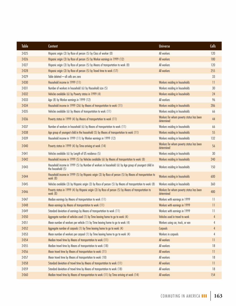
COMMUT ING IN AMER I CA III | 163
Table Content Universe Cells
2-025 Hispanic origin (3) by Race of person (5) by Class of worker (8) All workers 120
2-026 Hispanic origin (3) by Race of person (5) by Worker earnings in 1999 (12) All workers 180
2-027 Hispanic origin (3) by Race of person (5) by Means of transportation to work (8) All workers 120
2-028 Hispanic origin (3) by Race of person (5) by Travel time to work (17) All workers 255
2-029 Table deleted—all cells are zero 33
2-030 Household income in 1999 (11) Workers residing in households 11
2-031 Number of workers in household (6) by Household size (5) Workers residing in households 30
2-032 Vehicles available (6) by Poverty status in 1999 (4) Workers residing in households 24
2-033 Age (8) by Worker earnings in 1999 (12) All workers 96
2-034 Household income in 1999 (26) by Means of transportation to work (11) Workers residing in households 286
2-035 Vehicles available (6) by Means of transportation to work (11) Workers residing in households 66
2-036 Poverty status in 1999 (4) by Means of transportation to work (11) Workers for whom poverty status has been determined 44
2-037 Number of workers in household (6) by Means of transportation to work (11) Workers residing in households 66
2-038 Age group of youngest child in the household (5) by Means of transportation to work (11) Workers residing in households 55
2-039 Household income in 1999 (11) by Worker earnings in 1999 (12) Workers residing in households 132
2-040 Poverty status in 1999 (4) by Time arriving at work (14) Workers for whom poverty status has been determined 56
2-041 Vehicles available (6) by Length of US residence (5) Workers residing in households 30
2-042 Household income in 1999 (5) by Vehicles available (6) by Means of transportation to work (8) Workers residing in households 240
2-043 Household income in 1999 (5) by Number of workers in household (6) by Age group of youngest child in the household (5) Workers residing in households 150
2-044 Household income in 1999 (5) by Hispanic origin (3) by Race of person (5) by Means of transportation to work (8) Workers residing in households 600
2-045 Vehicles available (3) by Hispanic origin (3) by Race of person (5) by Means of transportation to work (8) Workers residing in households 360
2-046 Poverty status in 1999 (4) by Hispanic origin (3) by Race of person (5) by Means of transportation to work (8)
Workers for whom poverty status has been determined 480
2-047 Median earnings by Means of transportation to work (11) Workers with earnings in 1999 11
2-048 Mean earnings by Means of transportation to work (11) Workers with earnings in 1999 11
2-049 Standard deviation of earnings by Means of transportation to work (11) Workers with earnings in 1999 11
2-050 Aggregate number of vehicles used (1) by Time leaving home to go to work (4) Vehicles used in travel to work 4
2-051 Mean number of workers per vehicle (1) by Time leaving home to go to work (4) Workers using car, truck, or van 4
2-052 Aggregate number of carpools (1) by Time leaving home to go to work (4) Carpools 4
2-053 Mean number of workers per carpool (1) by Time leaving home to go to work (4) Workers in carpools 4
2-054 Median travel time by Means of transportation to work (11) All workers 11
2-055 Median travel time by Means of transportation to work (18) All workers 18
2-056 Mean travel time by Means of transportation to work (11) All workers 11
2-057 Mean travel time by Means of transportation to work (18) All workers 18
2-058 Standard deviation of travel time by Means of transportation to work (11) All workers 11
2-059 Standard deviation of travel time by Means of transportation to work (18) All workers 18
2-060 Median travel time by Means of transportation to work (11) by Time arriving at work (14) All workers 154

164 | COMMUT ING IN AMER I CA III
Table Content Universe Cells
2-061 Mean travel time by Means of transportation to work (11) by Time arriving at work (14) All workers 154
2-062 Standard deviation of travel time by Means of transportation to work (11) and Time arriving at work (14) All workers 154
2-063 Aggregate earnings by Means of transportation to work (11) Workers with earnings in 1999 11
2-064 Aggregate travel time by Means of transportation to work (11) All workers 11
2-065 Aggregate travel time by Means of transportation to work (18) All workers 18
2-066 Aggregate travel time by Means of transportation to work (11) by Time arriving at work (14) All workers 154
Part 3: Tabulations of Place of Residence by Place of Work
3-001 Total workers (1) All workers 1
3-002 Vehicles available (4) by Means of transportation to work (8) Workers residing in households 32
3-003 Poverty status in 1999 (4) Workers for whom poverty status has been determined 4
3-004 Minority status (3) All workers 3
3-005 Household income in 1999 (9) Workers residing in households 9
3-006 Means of transportation (18) All workers 18
3-007 Household income in 1999 (5) by Means of transportation to work (5) Workers residing in households 25
3-008 Mean travel time by Means of transportation to work (8) and Time leaving home to go to work (4) All workers 32
3-009 Median travel time by Means of transportation to work (8) and Time leaving home to go to work (4) All workers 32
3-010 Aggregate number of vehicles used (1) by Time leaving home to go to work (4) Vehicles used in travel to work 4
3-011 Mean number of workers per vehicle by Time leaving home to go to work (4) Workers using car, truck, or van 4
3-012 Aggregate number of carpools by Time leaving home to go to work (4) Carpools 4
3-013 Mean number of workers per carpool by Time leaving home to go to work (4) Workers in carpools 4
3-014 Aggregate travel time by Means of transportation to work (8) and Time leaving home to go to work (4) All workers 32
Note: THRESHOLD FOR WORKER FLOWS IN PART 3As part of the Census Bureau’s disclosure avoidance process, some of the tables in Part 3 have been subjected to a threshold or minimum size criterion for each worker flow. The tables affected are 3-003 through 3-007. For these five tables, if the unweighted count of workers making up the flow is less than three, then all the cell values for the tables have been set to zero. Tables 3-001, 3-002, and 3-008 through 3-014 are not subject to the threshold.Source: Adapted from US DOT, “CTPP 2000 Standard Tabulations,” at www.fhwa.dot.gov/ctpp/content.htm
CTPP Tabulations

COMMUT ING IN AMER I CA III | 165
Major Metropolitan Area Names and Population in 2000
APPENDIX 4
Complete Name of Metropolitan Statistical Area
Shortened Name of Metropolitan Statistical Area 2000 Population
New York-Northern New Jersey-Long Island, NY-NJ-CT-PA CMSA New York 21,199,865
Los Angeles-Riverside-Orange County, CA CMSA Los Angeles 16,373,645
Chicago-Gary-Kenosha, IL-IN-WI CMSA Chicago 9,157,540
Washington, D.C.-Baltimore, DC-MD-VA-WV CMSA Washington, D.C. 7,608,070
San Francisco-Oakland-San Jose, CA CMSA San Francisco 7,039,362
Philadelphia-Wilmington-Atlantic City, PA-NJ-DE-MD CMSA Philadelphia 6,188,463
Boston-Worcester-Lawrence, MA-NH-ME-CT CMSA Boston 5,819,100
Detroit-Ann Arbor-Flint, MI CMSA Detroit 5,456,428
Dallas-Fort Worth, TX CMSA Dallas 5,221,801
Houston-Galveston-Brazoria, TX CMSA Houston 4,669,571
Atlanta, GA MSA Atlanta 4,112,198
Miami-Fort Lauderdale, FL CMSA Miami 3,876,380
Seattle-Tacoma-Bremerton, WA CMSA Seattle 3,554,760
Phoenix-Mesa, AZ MSA Phoenix 3,251,876
Minneapolis-St. Paul, MN-WI MSA Minneapolis 2,968,806
Cleveland-Akron, OH CMSA Cleveland 2,945,831
San Diego, CA MSA San Diego 2,813,833
St. Louis, MO-IL MSA St. Louis 2,603,607
Denver-Boulder-Greeley, CO CMSA Denver 2,581,506
Tampa-St. Petersburg-Clearwater, FL MSA Tampa 2,395,997
Pittsburgh, PA MSA Pittsburgh 2,358,695
Portland-Salem, OR-WA CMSA Portland 2,265,223
Cincinnati-Hamilton, OH-KY-IN CMSA Cincinnati 1,979,202
Sacramento-Yolo, CA CMSA Sacramento 1,796,857
Kansas City, MO-KS MSA Kansas City 1,776,062
Milwaukee-Racine, WI CMSA Milwaukee 1,689,572
Orlando, FL MSA Orlando 1,644,561
Indianapolis, IN MSA Indianapolis 1,607,486
San Antonio, TX MSA San Antonio 1,592,383
Norfolk-Virginia Beach-Newport News, VA-NC MSA Norfolk 1,569,541
Las Vegas, NV-AZ MSA Las Vegas 1,563,282
Columbus, OH MSA Columbus 1,540,157
Charlotte-Gastonia-Rock Hill, NC-SC MSA Charlotte 1,499,293
New Orleans, LA MSA New Orleans 1,337,726
Salt Lake City-Ogden, UT MSA Salt Lake City 1,333,914
Greensboro-Winston-Salem-High Point, NC MSA Greensboro 1,251,509

166 | COMMUT ING IN AMER I CA III
Complete Name of Metropolitan Statistical Area
Shortened Name of Metropolitan Statistical Area 2000 Population
Austin-San Marcos, TX MSA Austin 1,249,763
Nashville, TN MSA Nashville 1,231,311
Providence-Fall River-Warwick, RI-MA MSA Providence 1,188,613
Raleigh-Durham-Chapel Hill, NC MSA Raleigh 1,187,941
Hartford, CT MSA Hartford 1,183,110
Buffalo-Niagara Falls, NY MSA Buffalo 1,170,111
Memphis, TN-AR-MS MSA Memphis 1,135,614
West Palm Beach-Boca Raton, FL MSA West Palm Beach 1,131,184
Jacksonville, FL MSA Jacksonville 1,100,491
Rochester, NY MSA Rochester 1,098,201
Grand Rapids-Muskegon-Holland, MI MSA Grand Rapids 1,088,514
Oklahoma City, OK MSA Oklahoma City 1,083,346
Louisville, KY-IN MSA Louisville 1,025,598
Note: All data are sorted in the decreasing order of 2000 population of Metropolitan Statistical Area (MSA).Source: Journey to Work Trends in the United States and Its Major Metropolitan Areas, 1960-2000. Publication No. FHWA EP-03-058, Table 1, p. P-2.
Major Metropolitan Area Names and Population in 2000
COMMUT ING IN AMER I CA III | 167
FIGURESFIGURE 1-1 A Taxonomy of Travel
FIGURE 1-2 Daily Trips per Capita
FIGURE 1-3 Person Trip Rates by Purpose and Income
FIGURE 1-4 Work as a Percentage of All Travel Measures
FIGURE 1-5 Trip Distribution by Day of Week
FIGURE 1-6 Travel Shares by Hour of the Day
FIGURE 1-7 Trip Chain Conceptual Layout
FIGURE 1-8 Census Regions and Divisions
FIGURE 1-9 Sample Metropolitan Area Map
FIGURE 2-1 Population Change, 1950-2050
FIGURE 2-2 Workers by Age Group
FIGURE 2-3 Population and Labor Force Trends, 1960-2000
FIGURE 2-4 Male–Female Labor Force Trends, 1960-2000
FIGURE 2-5 Population and Labor Force Increase, 1950-2000
FIGURE 2-6 Net Population Change, 1990-2000
FIGURE 2-7 Male–Female Labor Force Increase, 1960-2000
FIGURE 2-8 Hispanic Share of Population
FIGURE 2-9 Workers by Hours Worked and Gender
FIGURE 2-10 Regional Shares of National Growth, 1950-2000
FIGURE 2-11 Regional Population Growth, 1950-2000
FIGURE 2-12 Regional Population, 2004
FIGURE 2-13 Long-Term Population Trends, 1950-2000
FIGURE 2-14 Population Shifts, 1950-2000
FIGURE 2-15 Adjusted Census Population Trends
FIGURE 2-16 Immigrant Arrivals in the 1990s
FIGURE 2-17 Major Metropolitan Migration Trends, 1995-2000
FIGURE 2-18 Population Trends by Age Group
FIGURE 2-19 Population by Age and Gender
FIGURE 2-20 Age Distribution of Immigrant Population, 1995-2000 Arrivals
FIGURE 2-21 Immigrant Shares of Total Population by Age Group, 1995-2000
FIGURE 2-22 Trends in Household Size, 1970-2000
FIGURE 2-23 Average Household Size, 1960-2000
FIGURE 2-24 Household and Population Shares by Persons per Household
FIGURE 2-25 Housing Units by Type of Structure
FIGURE 2-26 Vehicle and Housing Ownership
FIGURE 2-27 Housing Renters and Owners by Workers per Household
FIGURE 2-28 Driver Licensing by Age and Gender
FIGURE 2-29 Driver Licensing by Age and Race
FIGURE 2-30 Share of Hispanic Population with Licensed Drivers
List of Figures and Tables
2
3
4
4
6
7
7
8
13
15
16
17
18
18
19
19
20
21
24
24
25
26
26
28
28
28
31
31
32
32
32
33
33
33
34
34
35
36
36

FIGURE 2-31 Age Distribution of Licensed Hispanic and Non-Hispanic Drivers
FIGURE 2-32 License Composition by Age, Gender, and Hispanic Ethnicity
FIGURE 2-33 Vehicles Added per Decade
FIGURE 2-34 Vehicle Fleet
FIGURE 2-35 Number of Households by Vehicles Owned
FIGURE 2-36 Trends in Shares of Households by Vehicle Ownership
FIGURE 2-37 Vehicle Ownership by Household Income
FIGURE 2-38 Vehicle Ownership by Home Ownership
FIGURE 2-39 Distribution of Workers by Vehicle Availability
FIGURE 2-40 Zero-Vehicle Households by Number of Workers
FIGURE 2-41 Zero-Vehicle Households by Region
FIGURE 2-42 Foreign-Born Persons without Vehicles by Year of Arrival
FIGURE 2-43 Zero-Vehicle Households by Race and Ethnicity
FIGURE 2-44 Trends in Zero-Vehicle Households by Race and Ethnicity, 1990-2000
FIGURE 2-45 Zero-Vehicle Households by Race, Ethnicity, and Location
FIGURE 2-46 Percentage of Zero-Vehicle Households by Metropolitan Area Size
FIGURE 3-1 Comprehensive Commuting Flow Matrix
FIGURE 3-2 Work Locations
FIGURE 3-3 Metropolitan Flow Map (Millions of Commuters)
FIGURE 3-4 Percentage Commuting Out of Home County
FIGURE 3-5 Commuting Out of Home County Trend
FIGURE 3-6 Counties with More than 25 Percent Commuting Outside the County
FIGURE 3-7 Trip Length Trend
FIGURE 3-8 Average Work Trip Length by Metropolitan Area Size
FIGURE 3-9 Growth Trends in Metropolitan Flows, 1960-2000
FIGURE 3-10 Share of Increase of Metropolitan Flows, 1990-2000
FIGURE 3-11 Commuter Flow by Metropolitan Area Size
FIGURE 3-12 Residence Distribution for All Central City Destinations
FIGURE 3-13 Residence Distribution for All Suburban Destinations
FIGURE 3-14 Residence Distribution for All Nonmetropolitan Destinations
FIGURE 3-15 Central City Jobs and Workers
FIGURE 3-16 Ideal versus Real Commuter Imports and Exports
FIGURE 3-17 Long-Term Commuting Trend
FIGURE 3-18 Modal Usage Trends, 1980-2000
FIGURE 3-19 Net Modal Change
FIGURE 3-20 Regional Modal Usage Patterns
FIGURE 3-21 Modal Usage by Age Group
FIGURE 3-22 Age as a Factor in Modal Usage
FIGURE 3-23 Age Distribution of Workers
FIGURE 3-24 Age Distribution of Workers Age 55 and Older
FIGURE 3-25 Modal Usage for Workers Age 55 and Older
FIGURE 3-26 Hours Worked by Age of Worker
FIGURE 3-27 Modal Usage by Hours Worked per Week
FIGURE 3-28 Modal Usage by Immigrants by Years in the United States
FIGURE 3-29 Foreign Born as a Share of Modal Usage
168 | COMMUT ING IN AMER I CA III
List of Figures and Tables37
37
38
38
39
39
40
40
41
42
42
43
44
44
44
45
46
48
49
49
50
50
51
51
52
52
54
55
56
57
59
59
60
61
62
64
66
67
68
68
69
69
69
71
72

FIGURE 3-30 Modal Usage by Household Income
FIGURE 3-31 Composition of Modes by Income of Users
FIGURE 3-32 Composition of Modes by Vehicle Ownership of Users
FIGURE 3-33 Modal Usage by Vehicles Owned
FIGURE 3-34 Drive Alone Shares by State, 2000
FIGURE 3-35 Modal Shares by Metropolitan Ring
FIGURE 3-36 Private Vehicle Accumulation by Time of Day
FIGURE 3-37 Modal Usage by Flow Pattern
FIGURE 3-38 Composition of Modes by Flow Pattern of Users
FIGURE 3-39 Composition of Transit Modes by Flow Pattern
FIGURE 3-40 Modal Usage to Central City Destinations by Residence of Workers
FIGURE 3-41 Origin of Workers Going to Central City Destinations by Mode
FIGURE 3-42 Modal Usage to Suburban Destinations by Residence of Workers
FIGURE 3-43 Origin of Workers Going to Suburban Destinations by Mode
FIGURE 3-44 Modal Usage to Nonmetropolitan Destinations by Residence of Workers
FIGURE 3-45 Origin of Workers Going to Nonmetropolitan Destinations by Mode
FIGURE 3-46 Net Change in Modal Usage, 2000-2004
FIGURE 3-47 Increase in Commuters, 2000-2004
FIGURE 3-48 Modal Usage Trends Excluding Private Vehicles, 2000-2004
FIGURE 3-49 Private Vehicle Shares by Metropolitan Area Size
FIGURE 3-50 Trends in Driving Alone Modal Share, 1980-2000
FIGURE 3-51 Change in Percentage of Workers Who Carpool, 1990-2000
FIGURE 3-52 Carpool, Transit, and Work-at-Home Modal Shares by Metropolitan Area Size
FIGURE 3-53 Carpool Use by Years in United States
FIGURE 3-54 Change in Percentage of Workers Who Use Transit, 1990-2000
FIGURE 3-55 Shares of Transit Usage by Metropolitan Area Size
FIGURE 3-56 Transit Shares by Metropolitan Area Size and Ring
FIGURE 3-57 Composition of Transit by Metropolitan Ring
FIGURE 3-58 Central City and Suburban Transit Shares by Income
FIGURE 3-59 Transit Usage by Years in United States
FIGURE 3-60 Metropolitan Area Transit Use Trends, 1990-2000
FIGURE 3-61 Distribution of Work Travel by Population Density
FIGURE 3-62 Distribution of Transit Usage by Population Density
FIGURE 3-63 Unlinked Passenger Transit Trips, 1985-2004
FIGURE 3-64 Composition of Minor Modes by Metropolitan Ring
FIGURE 3-65 Walking to Work Shares by Metropolitan Area Size
FIGURE 3-66 Workers Who Walk to Work by Years in United States
FIGURE 3-67 Nonmotorized Modal Shares by Years in United States
FIGURE 3-68 Reported and Adjusted National Travel Time Trend, 1980-2000
FIGURE 3-69 Travel Time by Metropolitan Area Size
FIGURE 3-70 Percent of Commuters Traveling Less Than 20 Minutes and More Than 60 Minutes by Metropolitan Area Size
FIGURE 3-71 Composition of Metropolitan Area Size Group by Travel Time Segment
FIGURE 3-72 Composition of Travel Time Segments by Metropolitan Area Size
FIGURE 3-73 Metropolitan Area Travel Time Increases by Travel Times in 1990
COMMUT ING IN AMER I CA III | 169
73
73
74
74
75
76
78
79
80
80
81
81
81
82
82
83
83
84
84
85
86
88
88
88
89
90
90
91
91
92
92
94
95
96
97
98
98
99
101
103
103
105
105
106

170 | COMMUT ING IN AMER I CA III
FIGURE 3-74 State Travel Time Change, 1990-2000
FIGURE 3-75 Percent of Commuters Traveling More Than 60 Minutes and Less Than 20 Minutes by State
FIGURE 3-76 Percent of Commuters Traveling More Than 60 Minutes and Less Than 20 Minutes by Mode
FIGURE 3-77 Percent of Commuters Traveling More Than 60 Minutes and Less Than 20 Minutes by Carpool Size
FIGURE 3-78 Composition of Private Vehicle Usage by Travel Time Segments
FIGURE 3-79 Composition of Modal Usage by Travel Time Segments
FIGURE 3-80 Composition of Travel Time Segments by Mode Used
FIGURE 3-81 Male–Female Composition of Travel Time Segments
FIGURE 3-82 Percent of Commuters Traveling More Than 60 Minutes and Less Than 20 Minutes by Age and Gender
FIGURE 3-83 Percent of Commuters Traveling More Than 60 Minutes and Less Than 20 Minutes by Income
FIGURE 3-84 Composition of Income Groups by Travel Time Segments
FIGURE 3-85 Percent of Commuters Traveling More Than 60 Minutes and Less Than 20 Minutes by Hours Worked per Week
FIGURE 3-86 Percent Less Than 20 Minutes and More Than 60 Minutes by TLH
FIGURE 3-87 Worker Distribution by TLH
FIGURE 3-88 Change in TLH Distribution, 1990-2000
FIGURE 3-89 Change in TLH Share, 1990-2000
FIGURE 3-90 Distribution by Gender
FIGURE 3-91 Male–Female Commuting Distribution by Time of Day
FIGURE 3-92 TLH Percent Distribution by Gender, 1990-2000
FIGURE 3-93 Age Composition of TLH Segments
FIGURE 3-94 TLH Composition by Hours Worked per Week
FIGURE 3-95 TLH Percent Distribution by Race and Ethnicity
FIGURE 3-96 Nonprivate Vehicle Travel by TLH
FIGURE 3-97 Distribution of TLH by Mode
FIGURE 3-98 Carpool Share of Total Commuting by TLH
FIGURE 3-99 Percent of Work Departures before 6:30 a.m. by Number of Vehicle Occupants
FIGURE 3-100 Annual Hours of Delay per Driver versus Travel Time
FIGURE 3-101 Twenty-Year Trend in Congestion Intensity
FIGURE 3-102 Travel Time Index Range for Urbanized Areas, 2000
FIGURE 3-103 Delay
FIGURE 3-104 How Big a Problem Is Congestion?
FIGURE 3-105 Congestion Case Study
FIGURE 3-106 Consumer Expenditures by Type, 2003
FIGURE 3-107 Total Expenditures by Income Group, 2002
FIGURE 3-108 Consumer Unit Spending for Transportation by Type
FIGURE 3-109 New Car Costs Expressed as Weeks of Work
FIGURE 3-110 Linkage among Incomes, Earners, Vehicles, and Expenditures
FIGURE 3-111 Transportation Expenditures by Number of Workers, 2002
FIGURE 3-112 Vehicles Owned by Number of Workers
FIGURE 3-113 Transportation Spending by Number of Workers
108
108
110
110
111
111
112
113
113
114
114
114
117
118
118
118
119
119
120
121
121
122
122
123
124
124
126
126
127
128
129
130
131
132
132
133
133
134
134
135
List of Figures and Tables

COMMUT ING IN AMER I CA III | 171
FIGURE 3-114 Gas and Oil as a Percent of Auto Operation Cost
FIGURE 3-115 Annual Expenditures per Worker for Selected Activities by Number of Workers
FIGURE 3-116 Average Transit Passenger Fare, 1990-2002
FIGURE 3-117 Long-Term Trend in Average Transit Fare
FIGURE 4-1 Maryland Estimated Carpool Trend
FIGURE 4-2 Maryland Estimated Transit Trend
FIGURE 4-3 Census Bureau Population Change Projections
TABLES TABLE 1-1 Travel Shares by Purpose, 2001
TABLE 1-2 Detailed NHTS Day-Trip Travel Purpose Codes
TABLE 1-3 Workers’ Share of Total Travel
TABLE 2-1 Worker and Population Increase, 1950-2000
TABLE 2-2 Workers Age 65 and Older
TABLE 2-3 Population Growth Rates by Age Group, 1990-2000
TABLE 2-4 Nonworker and Worker Population by Age Group
TABLE 2-5 Population by Major Age Group
TABLE 2-6 Role of the Foreign Born in the Labor Force, 2003
TABLE 2-7 Households and Population by Workers in Household (Millions)
TABLE 2-8 Distribution of Hours Worked per Week, 1999
TABLE 2-9 Average Hours Worked per Day, 2003
TABLE 2-10 Civilian Labor Force Comparison
TABLE 2-11 Comparison of E/P Ratios
TABLE 2-12 Growth by States Exceeding National Growth Rate
TABLE 2-13 Calculating Population Trends Using Standard versus 1980 Geographic Definitions
TABLE 2-14 Population Growth by Metropolitan Area Size, 1990-2000
TABLE 2-15 Central City-Suburban Distribution by Metropolitan Area Size
TABLE 2-16 Metropolitan Areas with Population Over 1 Million
TABLE 2-17 Licensed Drivers by Race and Gender
TABLE 2-18 Workers Who Are Licensed Drivers by Race/Ethnicity and Gender
TABLE 2-19 Workers and Vehicles
TABLE 2-20 Vehicles per Household by Region
TABLE 2-21 Metropolitan Areas with More Than 100,000 Zero-Vehicle Households
TABLE 3-1 Commuters (Millions) by Residence Location
TABLE 3-2 Basic Metropolitan Commuter Flow (Millions)
TABLE 3-3 Commuters Leaving Home Metropolitan Area (Millions)
TABLE 3-4 Nonmetropolitan Commuting Destinations (Millions)
TABLE 3-5 Commuting Flow Summary (Millions)
TABLE 3-6 Commuter Flow Trends by Metropolitan Area Size Groups
TABLE 3-7 Top 10 Commuting “Markets”
TABLE 3-8 Summary of Commuting by Destination
TABLE 3-9 Where Central City Workers Live
TABLE 3-10 Where Suburban Workers Live
TABLE 3-11 Where Nonmetropolitan Workers Live
TABLE 3-12 Long-Term Modal Usage Trends (Thousands)
135
136
136
136
143
144
149
3
5
6
16
16
17
19
20
21
21
21
22
22
23
25
27
29
29
30
36
38
41
42
42
47
47
47
48
49
53
55
55
55
56
57
62

TABLE 3-13 Modal Usage by Census Division and Region
TABLE 3-14 Modal Usage by Age and Gender
TABLE 3-15 Workers and Nonworkers Age 55 and Older
TABLE 3-16 Modal Usage by Multiple and Part-Time Job Holders
TABLE 3-17 Modal Usage by Worker Race
TABLE 3-18 Modal Usage by Hispanic and Non-Hispanic Workers
TABLE 3-19 Private Vehicle Usage by Hispanic and Non-Hispanic Workers
TABLE 3-20 Modal Usage of Recent Immigrants
TABLE 3-21 Modal Usage by Metropolitan Ring
TABLE 3-22 Population by Metropolitan Ring and Metropolitan Area Size
TABLE 3-23 Transit Share by Metropolitan Area Size
TABLE 3-24 Major Metropolitan Vehicle Accumulations
TABLE 3-25 Major Metropolitan Carpool Accumulations
TABLE 3-26 Modal Usage in Urban Clusters in Nonmetropolitan Areas
TABLE 3-27 Recent Mode Share Trends, 2000-2004
TABLE 3-28 Drive Alone Shares by Geography
TABLE 3-29 Twenty-Year Trend for Metropolitan Areas with Highest and Lowest Drive Alone Shares
TABLE 3-30 Smallest Increases in Drive Alone Shares by Metropolitan Areas, 1980-2000
TABLE 3-31 Carpool Shares by Ring
TABLE 3-32 Transit Usage by Type and Metropolitan Area Size
TABLE 3-33 Transit Share for Central City Destinations
TABLE 3-34 Transit Commuting to Downtowns (as Defined)
TABLE 3-35 Transit Use in the Red Line North Rapid Transit Corridor
TABLE 3-36 Share of Workers Working at Home by Metropolitan Ring
TABLE 3-37 Attributes of Workers at Home
TABLE 3-38 Nonmotorized Shares by Area Type
TABLE 3-39 Worker/Vehicle Ratios
TABLE 3-40 Average Travel Times by Geography
TABLE 3-41 Metropolitan Areas with Greatest and Least Gains in Travel Time
TABLE 3-42 Workers with Greater Than 60-Minute Commutes for Major Metropolitan Areas
TABLE 3-43 States with More than 10 Percent of Workers Commuting Over 60 Minutes, 1990-2000
TABLE 3-44 Average Travel Time by Mode (Minutes)
TABLE 3-45 Travel Time by Race and Ethnicity
TABLE 3-46 Men’s and Women’s Travel by Time Period, 1990-2000
TABLE 3-47 Dimensions of Congestion
TABLE 3-48 Worst* Physical Bottlenecks in the United States
TABLE 3-49 Share of Delay by Nonrecurring Events
TABLE 3-50 Distribution of Congestion by Peak and Off-Peak Travel and Delay
TABLE 3-51 Consumer Spending by Income Group
TABLE 3-52 Transportation Spending by Workers
TABLE 3-53 Annual Expenditures for Selected Transportation Costs by Race and Ethnicity
TABLE 4-1 Evolution of the Census-Based Transportation Tabulation Program
TABLE 4-2 Means of Transportation to Work, 1960 Census
172 | COMMUT ING IN AMER I CA III
65
66
68
70
70
70
71
72
76
77
77
78
78
79
84
85
86
87
89
90
93
94
95
96
97
99
100
102
106
107
109
109
115
120
125
127
128
129
132
134
135
138
139
List of Figures and Tables

Acronyms used without definitions in TRB publications
AASHO American Association of State Highway Officials
AASHTO American Association of State Highway and Transportation Officials
ADA Americans with Disabilities Act
APTA American Public Transportation Association
ASCE American Society of Civil Engineers
ASME American Society of Mechanical Engineers
ASTM American Society for Testing and Materials
ATA American Trucking Associations
CTAA Community Transportation Association of America
CTBSSP Commercial Truck and Bus Safety Synthesis Program
DHS Department of Homeland Security
DOE Department of Energy
EPA Environmental Protection Agency
FAA Federal Aviation Administration
FHWA Federal Highway Administration
FMCSA Federal Motor Carrier Safety Administration
FRA Federal Railroad Administration
FTA Federal Transit Administration
IEEE Institute of Electrical and Electronics Engineers
ISTEA Intermodal Surface Transportation Efficiency Act of 1991
ITE Institute of Transportation Engineers
NASA National Aeronautics and Space Administration
NCHRP National Cooperative Highway Research Program
NHTSA National Highway Traffic Safety Administration
NTSB National Transportation Safety Board
SAE Society of Automotive Engineers
SAFETEA-LU Safe, Accountable, Flexible, Efficient Transportation Equity Act: A Legacy for Users (2005)
TCRP Transit Cooperative Research Program
TEA-21 Transportation Equity Act for the 21st Century (1998)
TRB Transportation Research Board
TSA Transportation Security Administration
US DOT United States Department of Transportation
ACRONYMS