Embed Size (px)
Citation preview

Colours 2008 – Bridging Science with Art Évora, 10-12 July 2008
1
COLOURS 2008
Bridging Science with Art
10-12 July 2008
Colégio do Espírito Santo University of Évora Évora, Portugal

Colours 2008 – Bridging Science with Art Évora, 10-12 July 2008
2
Project “Pigmentos e práticas históricas da pintura mural: caracterização dos materiais e das tecnologias da cor no Património urbano do Alentejo“ (POCI/HEC/59555/2004) - Fundação para a Ciência e Tecnologia under Programa Operacional Ciência e Inovação 2010 (POCI2010) co-funded by FEDER.
Colours 2008 – Bridging Science with Art Évora, 10-12 July 2008
3
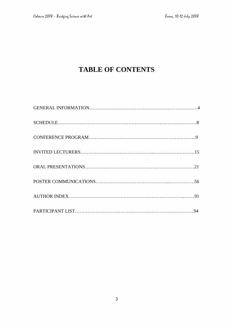
TABLE OF CONTENTS
GENERAL INFORMATION……………………………………………………………4
SCHEDULE……………………………………………………………………..………8
CONFERENCE PROGRAM………………………………………………….………..9
INVITED LECTURERS………………………………………...……………………..15
ORAL PRESENTATIONS……………………………………….……………………21
POSTER COMMUNICATIONS………………………………………...…………….56
AUTHOR INDEX………………………………………………………………...……91
PARTICIPANT LIST………………………………………………………………….94

Colours 2008 – Bridging Science with Art Évora, 10-12 July 2008
4
GENERAL INFORMATION
Chair
Ana Isabel Seruya, (Lisbon FCT/UNL)
Vice-Chair
António Candeias, (Évora University)
Local organization committee
M. Luisa de Carvalho (Lisbon University), José Aguiar (Lisbon FAUTL), Milene Gil D.
Casal (Lisbon FCT/UNL), J. P. Marques (Lisbon University), Patrícia Monteiro
(Secretariat), Sofia Pessanha (Lisbon University).
Scientific advisory committee
Paolo Scarzella (Politécnico di Turim, Italy), Ulderico SantaMaria (Universitá degli
studi della Tuscia, Italia), Aviva Burnstok (Conservation Restoration Department,
Courtauld Institute, England), Michel Rautureau (Université d’ Orléans, France),
Rui Pedroso (CEPMR, France), José Mirão (Evora University, Portugal), Cristina Costa
(Evora University, Portugal), Manuel Ribeiro (Evora University, Portugal), Alexandra
Soveral Dias (Evora University, Portugal), Joaquim Caetano (Evora Museum, Portugal),
Isabel Ribeiro (IMC, Lisbon, Portugal), Isabel Raposo de Magalhães (IMC, Lisbon,
Portugal), Delgado Rodrigues (LNEC, Lisbon, Portugal), M. Rosário Veiga (LNEC,
Lisbon, Portugal), Paulo Fiadeiro (Beira University, Covilhã, Portugal), Vitor Serrão
(Lisbon University, Portugal).
Scientific program
The scientific program will consist of Invited Talks (30 minutes in length plus 10
minutes for discussion), Oral Contributions (20 minutes in length plus 5 minutes for
discussion) and Poster

Colours 2008 – Bridging Science with Art Évora, 10-12 July 2008
5
COLOURS 2008
Bridging Science with Art
CONFERENCE PROGRAM

Colours 2008 – Bridging Science with Art Évora, 10-12 July 2008
6
Thursday 10th July
8.30 - Registration
9.30 - Opening Session
Session 1
10.00 - Invited talk – M. Zerbinatti
Physical polychromy, architectural and environmental colour.
10.40 – C. Dejoie
Synthesis and characterization of Maya Blue analogous hybrid pigments.
11.00 – Coffee break
Session 2
11.30 – A. Bidarra
New formulations for white mineral pigments in restoration.
11.50 – G. Cavallo
Alteration of azurite into paratacamite on wall paintings: a case study.
12.10 – J. M. Rincón
Colours from the glazed tiles inserted in the plaster mudejar façade of Pedro I, Sevilla
Royal Palaces.
12.30 – Lunch
Session 3
14.00 - Invited talk – E. Nery
Síntese da comunicação sobre cor
14.40 – R. Bordalo
Caracterização analítica de pigmentos irradiados por radiação laser de excímetro

Colours 2008 – Bridging Science with Art Évora, 10-12 July 2008
7
15.00 – S. Edrah
Synthesis and characterization of new O-MERCAPTO AZO complex dyes
15.20 – A. Le Gac
Gold and blue: the characteristic dichromy of the main altarpiece of the Sé Velha of
Coimbra.
15.40 – Coffee break
16.00 – M.Gil, A.Seruya, J. Aguiar, M.Ribeiro
Multimedia presentation - Les couleurs de L’Alentejo, un voyage entre la science et la tradition
17.30 – Poster session

Colours 2008 – Bridging Science with Art Évora, 10-12 July 2008
8
Friday, 11th July
Session 4
9.00 – Invited talk – F. Ferreira
Spectral Imaging Systems in Art Paintings: A Review of Principles and Techniques.
9.40 – A. Manhita
Mordant analysis in an historical Portuguese tapestry from the 18th century.
10.00 – F. Henriques
Photogrametric methods applied to easel paintings.
10.20 – L. Bravo Pereira
High dynamic range (HDR) images of radiographies: modern digital replacement of
negatoscopes?
10.40 – A. Fialho Conde
Restoration of mobile heritage in Évora in the context of XVIth century: the Panos de
Armar of D. Maria de Castro.
11.00 – coffee break
Session 5
11.30 – M. Fernandes
The earth colour finishes in earthen architecture.
11.50 – J. Pestana
Results of a study project on wall painting material characterization for chromatic
integration.
12.10 – A. Candeias
Comparative study of the polychromy of the 17th century painters Josefa d’Óbidos and
Baltazar Gomes Figueira by in-situ XRF, optical microscopy and SEM-EDS
12.30 – Lunch

Colours 2008 – Bridging Science with Art Évora, 10-12 July 2008
9
Session 6
14.00 – Invited talk - G. Van der Snickt
Discovery of a hidden Van Gogh painting by means of elemental Synchrotron XRF
maps.
14.40 – J. Mendes
The colours of the 15th century paintings attributed to Nuno Gonçalves.
15.00 – S. Barros Santos
New pigments in the 19th century painting according to the technical treatises published in Portugal
15.20 – C. Falcão
The significance of colour in painting – the consequences of its loss or alteration and the
possibilities of integration
15.40 – Coffee break
Session 7
16.10 – A. Cudell
The colours of the Portuguese contemporary art: the paints used on a neorealist painting
by Júlio Pomar.
16.30 - H. Pinheiro Melo
The colours of a 16th century panel painting, attributed to Francisco João, from the church of Pavia (Mora, Portugal)
16.50 – A. Rosado
O papel da historia da arte técnica no processo de autenticação de obras de arte: um
estudo preliminar
17.10 – I. Valverde, J. Sá, J.Aguiar
Multimedia presentation - External renderings conservation: Methodology and Intervention Techniques
18.30 – Poster session

Colours 2008 – Bridging Science with Art Évora, 10-12 July 2008
10
Saturday, 12th July
Session 8
9.00 – Invited talk – P. Monteiro
Studies on pigments in Portuguese treatises, from middle ages until 1850
9.40 – S. Salema
Sgrafitto and colour in Alentejo.
10.00 – R. Marcelino
The discovery of color and its symbolism in a Balinese painting from the Museu
Nacional de Etnologia (Portugal)
10.20 - C. Barata
A rare pigment in an unexpected place: realgar in Portuguese Baroque sculpture with
non-erudite features.
10.40 – L. Loureiro
Colour in coated papers: the case study of a 19th century sewing box.
11.00 – coffee break
Session 9
11.30 – E. Gomes
Les Cerâmiques peintes de l’âge du fer.
11.50 – S. Caldeira
The use of X-ray Fluorescence spectroscopy for understanding the original decoration
of 18th century Portuguese keyboards
12.10 – M. O. Figueiredo
Colouring by iron and beryl.
12.30 – Lunch

Colours 2008 – Bridging Science with Art Évora, 10-12 July 2008
11
Session 10
14.00 – J. Pernão
Colour studies for the urban rehabilitation of Alagoas quarter, Peso da Régua.
14.40 – M. Vitiello
Dal “piano del colore” al “piano di conservazione”. Problemi teorici e approcci
metodologici.
15.00 – M.L. Carvalho
Pigment identification on 17th-18th century handpainted paper artworks by EDXRF.
15.20 – Closing session

Colours 2008 – Bridging Science with Art Évora, 10-12 July 2008
12

Colours 2008 – Bridging Science with Art Évora, 10-12 July 2008
13
INVITED LECTURERS

Colours 2008 – Bridging Science with Art Évora, 10-12 July 2008
14
I1 Marco Zerbinatti PHYSICAL POLYCHROMY, ARCHITECTURAL AND ENVIRONMENTAL COLOR
I2 Eduardo Nery SÍNTESE DA COMUNICAÇÃO SOBRE COR
I3 Francisco Ferreira SPECTRAL IMAGING SYSTEMS IN ART PAINTINGS: A REVIEW OF PRINCIPLES AND TECHNIQUES
I4 Geert van der Snickt DISCOVERY OF A HIDDEN VAN GOGH PAINTING BY MEANS OF ELEMENTAL SYNCHROTRON XRF MAPS
I5 Patrícia Monteiro STUDIES ON PIGMENTS IN PORTUGUESE TREATISES, FROM MIDDLE AGES UNTIL 1850

Colours 2008 – Bridging Science with Art Évora, 10-12 July 2008
15
I1 - PHYSICAL POLYCHROMY, ARCHITECTURAL AND
ENVIRONMENTAL COLOR.
Marco Zerbinatti
Politecnico di Torino, Dept. of Construction and Territorial System Engineering, Corso Duca degli Abruzzi, 24, 10129, Torino, Italy
Many aspects of color can be investigated, from color as a combination of its essenses or chromatic signs, or in other words, color as syntagma, to its codification through processes of geometric organization and physical measurement, i.e., color as system. Nevertheless, it is interesting to return to the clear and constant relationship that exists between physical cause and esthetic perception, both by using interpretations advanced by Romanticism, by Positivism, by Symbolism or by Structuralism, and through an examination of interpretations which are closer to our own time, and which remind us of a key concept that has wide currency among those who work with architecture and its preservation: color plays a fundamental role in the esthetic evaluation of art because it is not only a question of hue (or multiple hues), but is also expressive as regards the dimension of the work of art and its relationship with its setting, the relationship between the work’s parts and the parts’ relationship with the work in its entirety. As we go beyond the supposed opposition of form and color, the latter, which is signifier and signified at one and the same time, suggests itself as a potential means of achieving gesamkunstvölle, or the fullness of the work as a whole. A formal apprehension of art can make use of the opportunities afforded by a material, and here we see color as a material, helping us understand an expression of formative intention through the particular perceptual features that color offers through hue and tint, light and shade.
Color as a material for art and as a means of determining a formative intention, then, brings us back to the higher concept of the unity of the arts, because a material (and hence color) is independent of the form taken by art until such time as it is adopted for its inherent formal qualities. Thus, given that “the boundaries between the arts and shifting and uncertain” [1], we intend to underscore the importance of the concept of taste, here again as it applies to color, as a “factor that mediates between the beginning of artistic gestation and the final production of form” [2], with the interplay and mutual contributions of the different arts.
Any attempt to translate these ideas into practical applications in architecture and preservation passes inescapably through processes of interpretation (or reinterpretation) of canons of taste – canons of color, canons of form, canons of setting – that are embedded in the cultural climate prevailing at the time it is made.
[1] L. Pareyson, “Estetica. Teoria della formatività”, Bompiani, II edition, Milano, 1998, p. 43.
[2] A. Cavallari Murat, “Gusto ed unità artistica” and “Colore estetico, non policromìa fisica” in: “ Come carena viva”, Bottega d’Erasmo, Torino, 1982, Vol. V; pp. 30-38 and pp. 144-150.
Colours 2008 – Bridging Science with Art Évora, 10-12 July 2008
16
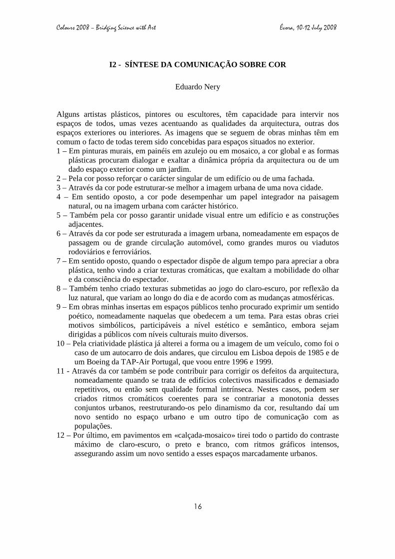
I2 - SÍNTESE DA COMUNICAÇÃO SOBRE COR
Eduardo Nery
Alguns artistas plásticos, pintores ou escultores, têm capacidade para intervir nos espaços de todos, umas vezes acentuando as qualidades da arquitectura, outras dos espaços exteriores ou interiores. As imagens que se seguem de obras minhas têm em comum o facto de todas terem sido concebidas para espaços situados no exterior. 1 – Em pinturas murais, em painéis em azulejo ou em mosaico, a cor global e as formas
plásticas procuram dialogar e exaltar a dinâmica própria da arquitectura ou de um dado espaço exterior como um jardim.
2 – Pela cor posso reforçar o carácter singular de um edifício ou de uma fachada. 3 – Através da cor pode estruturar-se melhor a imagem urbana de uma nova cidade. 4 – Em sentido oposto, a cor pode desempenhar um papel integrador na paisagem
natural, ou na imagem urbana com carácter histórico. 5 – Também pela cor posso garantir unidade visual entre um edifício e as construções
adjacentes. 6 – Através da cor pode ser estruturada a imagem urbana, nomeadamente em espaços de
passagem ou de grande circulação automóvel, como grandes muros ou viadutos rodoviários e ferroviários.
7 – Em sentido oposto, quando o espectador dispõe de algum tempo para apreciar a obra plástica, tenho vindo a criar texturas cromáticas, que exaltam a mobilidade do olhar e da consciência do espectador.
8 – Também tenho criado texturas submetidas ao jogo do claro-escuro, por reflexão da luz natural, que variam ao longo do dia e de acordo com as mudanças atmosféricas.
9 – Em obras minhas insertas em espaços públicos tenho procurado exprimir um sentido poético, nomeadamente naquelas que obedecem a um tema. Para estas obras criei motivos simbólicos, participáveis a nível estético e semântico, embora sejam dirigidas a públicos com níveis culturais muito diversos.
10 – Pela criatividade plástica já alterei a forma ou a imagem de um veículo, como foi o caso de um autocarro de dois andares, que circulou em Lisboa depois de 1985 e de um Boeing da TAP-Air Portugal, que voou entre 1996 e 1999.
11 - Através da cor também se pode contribuir para corrigir os defeitos da arquitectura, nomeadamente quando se trata de edifícios colectivos massificados e demasiado repetitivos, ou então sem qualidade formal intrínseca. Nestes casos, podem ser criados ritmos cromáticos coerentes para se contrariar a monotonia desses conjuntos urbanos, reestruturando-os pelo dinamismo da cor, resultando daí um novo sentido no espaço urbano e um outro tipo de comunicação com as populações.
12 – Por último, em pavimentos em «calçada-mosaico» tirei todo o partido do contraste máximo de claro-escuro, o preto e branco, com ritmos gráficos intensos, assegurando assim um novo sentido a esses espaços marcadamente urbanos.
Colours 2008 – Bridging Science with Art Évora, 10-12 July 2008
17
I3 - SPECTRAL IMAGING SYSTEMS IN ART PAINTINGS:
A REVIEW OF PRINCIPLES AND TECHNIQUES
F. M. P. B. Ferreira, P. T. Fiadeiro and M. J. T. Pereira
Universidade da Beira Interior, Physics Department, Rua Marquês d'Ávila e Bolama, 6201-001 Covilhã
Unidade de Detecção/Centro de Óptica, Departamento de Física, Covilhã - Portugal The spectral and colorimetric characterization of art paintings with high accuracy and precision has been and still is an object of study and investigation. Several imaging systems have been implemented, during the last decade, to achieve this purpose. Grassmann, in 1853 stated that only three independent variables are necessary to characterize a color [1]. However, when tri-chromatic systems are used to characterize a piece of art, the principle of three-dimensionality of color has some limitations such as, metamerism and the impossibility to obtain a device-independent color [2]. Increasing the number of wavelength bands, in the acquisition systems, these limitations can be overcame and improves the spectral and colorimetric quality of reproduction of color. The increase of number of spectral bands leads to the appearance of multi and hyperspectral systems. Both systems provide information about a number of spectral bands; however the accuracy of the retrieved information depend the number and the spectral distribution in a visible spectrum of the band. While multispectral systems provide information with a reduced number of bands typically six to nine, hyperspectral systems can use thousands of wavelength bands to provide spectral and colorimetric information. Nevertheless, these systems have many applications such as, development of spectral archives of art, monitoring of degradation, to help restoring and conservation process, pigment identification and classification, varnish study, and visualization of a virtual restoration [3]. This method of investigation to retrieved important colorimetric information has shown to be a useful technique for study and conservation of works of art [4]. In this paper, is described the evolution of the spectral systems, from tri-chromatic to hyperspectral, their principles, techniques, advantages and disadvantages to recover spectral and colorimetric information from art paintings. Additionally, an overview of current research and potential applications, to study of art paintings, with some practical examples will be presented. [1] Wyszecki, G. and W.S. Stiles, Color Science: Concepts and Methods, Quantitative Data and
Formulae. 2nd
Edition ed. 1982, New York: John Wiley & Sons. [2] Hardeberg, J.Y., F. Schmitt, and H. Brettel, Multispectral color image capture using a liquid crystal tunable filter. Optical Engineering, 2002. 41(10): p. 2532-2548. [3] Fischer, C. and I. Kakoulli, Multispectral and hyperspectral imaging technologies in conservation: current research and potential applications. Reviews in Conservation, 2006. 7: p. 1-16. [4] Ferreira, F.M.P.B., et al., Spectral characterization of a hyperspectral system for imaging of large art paintings. 3rd European Conference on Colour in Graphics, Imaging, and Vision, 2006: p. 350-354.

Colours 2008 – Bridging Science with Art Évora, 10-12 July 2008
18
I4 - DISCOVERY OF A HIDDEN VAN GOGH PAINTING BY MEA NS OF ELEMENTAL SYNCHROTRON XRF MAPS
Geert Van der Snickt1, Joris Dik2, Koen Janssens1, Karen Rickers3, Luuk Van der Loeff4
1University of Antwerp, Department of Chemistry, Universiteitsplein 1, 2610 Wilrijk, Belgium 2 Delft University of Technology, Materials Science, Rotterdamseweg 137, 2628 AL Delft, the Netherlands 3 DESY, Hamburger Synchronstrahlungslabor, D-22607 Hamburg, Germany 4 Kroeller-Mueller Museum, Houtkampweg 6, 6731 AW Otterlo, the Netherlands
The painter Vincent Van Gogh (1853-1890) is generally considered as one of the most important painters of the 19th-C. As a result, his short but very productive career is subject of intensive study by art historians, historians, (conservation) scientists, etc. In the past, traditional radiographies made clear that Van Gogh covered several of his paintings with a new composition. The recycling of canvases might have been prompted by his difficult financial situation. In addition, his style changed so dramatically at certain moments in time that he might have regarded preceding works of art as obsolete and thus eligible for overpainting.
An examination of the Van Gogh paintings and the corresponding radiographies of the Kröller-Müller museum (NL) confirmed the existence of these concealed compositions. However, radiographies usually allow only to discern some coarse outlines but prevent to observe further details. The visualization of such covered compositions would be of great interest to both Van Gogh specialists as the public audience.
This talk discusses the first successful attempt to re-establish a hidden portrait by means of elemental mapping with synchrotron based µ-XRF. A small canvas (ca. 30 x 40cm), representing a patch of grass (ca. 1886-‘87) was selected for transport to beam line L at the Hasylab synchrotron facilities in Hamburg. The traditional radiography displayed the outlines of a human face but no identification or correlation with the existing oeuvre of the artist was feasible. A square area of ca. 15x15 cm2, corresponding to the position of the head, was scanned with a primary, quasi monochromatic X-ray beam of 35.5 keV.
In this way, the elemental distribution maps allowed to visualize the covered portrait of a peasant woman in unprecedented detail. On-going spectroscopic research is focused on the identification of the nature of the pigments with which the head was painted, whereas art historians are currently involved in a stylistic comparison with Van Gogh’s existing oeuvre, identification of the woman and correlation with the preserved letters of Van Gogh in which this portrait may have been discussed.
Colours 2008 – Bridging Science with Art Évora, 10-12 July 2008
19
I5 - STUDIES ON PIGMENTS IN PORTUGUESE TREATISES, FROM
MIDDLE AGES UNTIL 1850
Patrícia A. R. Monteiro
Rua Capitão Leitão, n.º 42, 1950-052 Lisboa
The research concerning the materials used in painting, specifically pigments, presents several difficulties. First of all, it’s a subject which concerns strictly the painter’s daily practices. In fact, aspects regarding the painter’s methods or materials generally circulated internally, within their working contexts, without a specific intention of revealing or publishing those procedures. Besides the well known treaty Arte da Pintura (1615), from Filipe Nunes, there is a great ignorance regarding documental sources. On the other hand it’s a subject that interests to several areas of Science such as Conservation, Chemistry, Physics and History of Art, which compels us to a higher level of understanding between investigators in order to achieve better results. This essay will present some conclusions that result from the project The Images Materials: pigments on Portuguese Treatises since Middle Ages until 1850 [1]. The project was developed in association between the Faculty of Arts and the Sciences Faculty of the Lisbon University. Our main objective was to find in libraries and archives recipes for the pigments preparation, leaving intentionally to other phase of this project the recipes for mixtures such as inks or varnishes.
Therefore, we had some caution combining what was the purpose of the project, the expectations of the investigators team and the documental materials at our disposal. In the end we tried to define a clearer image of Portuguese “treatises”, their level of originality and what kind of recipes they were made.
[1] Cf. Patrícia A. R. Monteiro, and Luís Urbano Afonso, “Fontes para o estudo dos pigmentos na tratadística portuguesa: da Idade Média a 1850” in Artis (Revista do Instituto de História da Arte da FLUL), n.º 6, Lisboa, Centro de História da Universidade de Lisboa, 2007, pp. 161-186.

Colours 2008 – Bridging Science with Art Évora, 10-12 July 2008
20
Colours 2008 – Bridging Science with Art Évora, 10-12 July 2008
21
ORAL PRESENTATIONS

Colours 2008 – Bridging Science with Art Évora, 10-12 July 2008
22
O1
C. Dejoie, E. Dooryhée, P. Martinetto, S. Blanc, P. Bordat,
R. Brown, F. Porcher, P. Richardin, E. Van Elslande, M.
Sanchez del Rio
SYNTHESIS AND CHARACTERIZATION OF MAYA BLUE ANALOGOUS HYBRID PIGMENTS
O2 Ana Patrícia Bidarra Lourenço,
José Lopes Velho, João Coroado NEW FORMULATIONS FOR WHITE MINERAL PIGMENTS IN RESTORATION
O3 Giovanni Cavallo ALTERATION OF AZURITE INTO PARATACAMITE ON WALL PAINTINGS: A CASE STUDY
O4 J. Ma. Rincón, Mª. T. Blanco, Mª. I. Sanchez- Rojas and M. Romero
COLOURS FROM THE GLAZED TILES INSERTED IN THE PLASTER MUDEJAR FAÇADE OF PEDRO I, SEVILLA ROYAL PALACES
O5 Rui Bordalo, Paulo J. Morais, Luís F. Santos, Ana M. Silva,
Helena Gouveia, Rui M. Almeida
CARACTERIZAÇÃO ANALÍTICA DE PIGMENTOS IRRADIADOS POR RADIAÇÃO LASER DE EXCÍMERO
O6 Salem Edrah, Numan Almonasy, Radim Hrdina, Ladislav Burgert,
SINTHESIS AND CHARACTERIZATION OF NEW O-MERCAPTO AZO COMPLEX DYES
O7 A. Le Gac, A. I. Seruya,
M. Lefftz, A. Alarcão
GOLD AND BLUE: THE CHARACTERISTIC DICHROMY OF THE MAIN ALTARPIECE OF THE SÉ VELHA OF COIMBRA
O8
A. Manhita, H. Vargas, I. Ribeiro, T. Pacheco, J. Mirão, J. Pedro, T. Ferreira, C. Costa, A.
Candeias
MORDANT ANALYSIS IN AN HISTORICAL PORTUGUESE TAPESTRY FROM THE 18TH CENTURY
O9 Frederico Henriques, Ana Calvo,
João Luís Matos, Ana Falcão, Ana Bailão
PHOTOGRAMMETRIC METHODS APPLIED TO EASEL PAINTINGS
O10 Luís Bravo Pereira HIGH DYNAMIC RANGE (HDR) IMAGES OF RADIOGRAPHIES: MODERN DIGITAL REPLACEMENT OF NEGATOSCOPES?
O11 Antónia Fialho Conde
RESTORATION OF MOBILE HERITAGE IN ÉVORA IN THE CONTEXT OF XVI TH CENTURY: THE PANOS DE ARMAR OF D. MARIA ANA DE CASTRO

Colours 2008 – Bridging Science with Art Évora, 10-12 July 2008
23
O12 Maria Fernandes THE EARTH COLOUR FINISHES IN EARTHEN ARCHITECTURE
O13
José Pestana, Nuno Proença, Ana Cardoso, Helena Vargas,
Sara Valadas, Milene Gil, António Candeias, José Mirão ,
Isabel Ribeiro
RESULTS OF A STUDY PROJECT ON WALL PAINTING MATERIAL CHARACTERIZATION FOR CHROMATIC INTEGRATION
O14
S. Valadas, J. Mirão, D. Tavares, A. Guilherme, M.L. Carvalho,
J. Coroado, Rolf Simon, A.S. Silva, A. Candeias
STUDY OF THE FRESCOES FROM THE MISERICORDIA CHURCH OF ODEMIRA (PORTUGAL) BY IN-SITU XRF, SEM-EDS AND CONFOCAL SYNCHROTRON µµµµ-XRF
O15 José Mendes, António João Cruz, Ana Guilherme, Sofia Pessanha,
Maria Luísa Carvalho
THE COLOURS OF THE 15TH CENTURY PAINTINGS ATTRIBUTED TO NUNO GONÇALVES
O16 Sónia Barros dos Santos,
António João Cruz
NEW PIGMENTS IN THE 19 TH CENTURY PAINTING ACCORDING TO THE TECHNICAL TREATISES PUBLISHED IN PORTUGAL
O17 Cláudia Falcão
THE SIGNIFICANCE OF COLOUR IN PAINTING – THE CONSEQUENCES OF ITS LOSS OR ALTERATION AND THE POSSIBILITIES OF INTEGRATION.
O18 Ana Cudell, António João Cruz,
Jorgelina Carballo Martínez, Sandra Saraiva
THE COLOURS OF THE PORTUGUESE CONTEMPORARY ART: THE PAINTS USED ON A NEOREALIST PAINTING BY JÚLIO POMAR
O19 Helena Pinheiro Melo, António
João Cruz
THE COLOURS OF A 16TH CENTURY PANEL PAINTING, ATTRIBUTED TO FRANCISCO JOÃO, FROM THE CHURCH OF PAVIA (MORA, PORTUGAL)
O20 Alessandra Rosado Luiz A.C. Souza
O PAPEL DA HISTORIA DA ARTE TÉCNICA NO PROCESSO DE AUTENTICAÇÃO DE OBRAS DE ARTE: UM ESTUDO PRELIMINAR
O21 Sofia Salema, José Aguiar SGRAFITTO AND COLOUR IN ALENTEJO

Colours 2008 – Bridging Science with Art Évora, 10-12 July 2008
24
O22 M. R., Marcelino, A. Le Gac,
J. Amaral, J. Pais de Brito
THE DISCOVERY OF COLOR AND ITS SYMBOLISM IN A BALINESE PAINTING FROM THE MUSEU NACIONAL DE ETNOLOGIA (PORTUGAL)
O23 Carolina Barata, António João
Cruz, M. H. Mendonça, Jorgelina Carballo
A RARE PIGMENT IN AN UNEXPECTED PLACE: REALGAR IN A PORTUGUESE BAROQUE SCULPTURE WITH NON-ERUDITE FEATURES
O24 Leonor Loureiro, Isabel Ribeiro, Mark Sandy, Ana Isabel Seruya
COLOUR IN COATED PAPERS: THE CASE STUDY OF A 19TH CENTURY SEWING BOX
O25 Esmeralda Helena Gomes LES CERÂMIQUES PEINTES DE L’ÂGE DU FER
O26
Susana Henriques Caldeira, Maria Helena Trindade, Marta Manso, Sofia Pessanha, Maria
Luisa de Carvalho
THE USE OF X-RAY FLUORESCENCE SPECTROSCOPY FOR UNDERSTANDING THE ORIGINAL DECORATION OF 18 TH CENTURY PORTUGUESE KEYBOARDS
O27 Figueiredo M. O, Pereira da
SilvaT, VeigaJP COLOURING BY IRON IN BERYL
O28 João Pernão, José Aguiar COLOUR STUDIES FOR THE URBAN REHABILITATION OF ALAGOAS QUARTER, PESO DA RÉGUA
O29 Maria Vitiello DAL “PIANO DEL COLORE” AL “PIANO
DI CONSERVAZIONE”. PROBLEMI
TEORICI E APPROCCI METODOLOGICI
O30
Sofia Pessanha, Ana Guilherme, Marta Manso, Milene Gil, José Mendes, António Cruz, António
Candeias, José Mirão, Mário Costa, Maria Luisa Carvalho
PIGMENT IDENTIFICATION ON ARTWORKS BY EDXRF

Colours 2008 – Bridging Science with Art Évora, 10-12 July 2008
25
O1 - SYNTHESIS AND CHARACTERIZATION OF MAYA BLUE ANALOGOUS HYBRID PIGMENTS
C. Dejoie1, E. Dooryhée1, P. Martinetto1, S. Blanc2, P. Bordat2, R. Brown2, F. Porcher3, P. Richardin4, E. Van Elslande4, M. Sanchez del Rio5
1 Institut NEEL CNRS & Université Joseph Fourier, 25 rue des Martyrs, 38042 Grenoble Cedex 9, France. Corresponding author: [email protected] 2 Institut de recherches pluridisciplinaires sur l'environnement et les matériaux, CNRS & Université de Pau et des pays de l'Adour, Pau, France 3 Laboratoire de Cristallographie et Modélisation des Matériaux Minéraux et Biologiques, Faculté des Sciences, Université de Nancy, Vandoeuvre-les-Nancy, France 4 Centre de Recherche et de Restauration des Musées de France, CNRS et Ministère de la Culture, Palais du Louvre, Paris, France 5 European Synchrotron Radiation Facility, Grenoble, France The "Maya Blue" pigment (ca. 800 A.C.) is one of the most ancient organic-inorganic hybrids designed in the past; it is present on numerous frescoes and decorated objects of Meso-America. The good state of conservation of this pigment, in spite of hostile climatic conditions, held the attention of the scientists since 1960 [1]. The colouring agent was identified as indigo, confined in a particular porous clay matrix. This hybrid pigment combines the colour of the organic component with the chemical resistance, and the thermal and mechanical stabilities of the mineral [2]. The structure of this organic-mineral composite and the indigo-clay interactions remain however controversial [3-5]. The complexity of the matrix, as observed in the as-found archaeological samples, obscures the interpretation of the results. In the present work, we offer to examine composite replicates, by inserting organic colouring agents (e.g. indigo) inside the cages and channels of appropriate alumino-silicates (e.g. zeolites). Our aim is thus to mimic the exceptionally high colour stability of the Maya Blue, and to underline the physi-sorption process of the organic molecule within the model microporous matrix. We succeed in producing stable composite analogues, whose colour and stability resemble those of the Maya Blue; the synthetic pigments are characterized by fluorescence, UV-Vis absorption, Raman spectroscopy, and X-ray diffraction. In some indigo@zeolite complexes, we show the poly/mono-merisation of the organic molecule at the surface and/or in the bulk of the substrate, depending on the microstructure and the conditions of synthesis. The present spectroscopic/structural experimental description is accompanied with Molecular Dynamics modelling. In fine, we aim at understanding such non toxic and durable hybrid pigments, as a possible solution for replacing faded and aged pigments on ancient painted artefacts. [1] R. J. Gettens, American Antiquity, 7 (1962). [2] P. Gomez-Romero, C. Sanchez, New J. Chem., 29 (2005). [3] A. Domenech, M. T. Domenech-Carbo, M. L. Vazquez de Agredos Pascual, J. Phys. Chem. C, 111, 4585 (2007). [4] G. Chiari, R. Giustetto, J. Druzik, E. Doehne and G. Ricchiardi, Appl. Phys. A, 90, 3 (2008) [5] L. A. Polette-Niewold, F. S. Manciu, B. Torres, M. Alvarado, Jr. and R. R. Chianelli, J. Inorg. Biochem., 101, 1958 (2007).

Colours 2008 – Bridging Science with Art Évora, 10-12 July 2008
26
O2 - NEW FORMULATIONS FOR WHITE MINERAL PIGMENTS IN RESTORATION
Ana Patrícia Bidarra Lourenço (1); José Lopes Velho (1) & João Coroado (2)
1 Universidade de Aveiro, Departamento de Geociências, Campus Universitário de Santiago, 3810-193 Aveiro, Portugal 2 Instituto Politécnico de Tomar, Departamento de Conservação e Restauro, Campus Tomar – Quinta do Contador - Estrada da Serra, 2300-313 Tomar, Portugal The aim of this research consisted on studying the ability of white mineral pigments, mainly used by plastic and paper industries, applied in polychrome layers restoration, as an alternative to the traditional ones. The following pigments were tested: precipitated calcium carbonates (PCC), ground calcium carbonates (GCC), calcined kaolin, talc, titanium dioxide and a commercial pigment (titanium and zinc oxide, mastic resin and turpentine based). In these pigments, physical and technological properties were characterized and they were applied alone and blended with each other in several proportions. The methodology first consisted on preparing the support by cutting several wood boards (20x30cm) and covered them with two applications of encollage and four applications of a traditional ground layer. Afterwards, the pigments and mixtures were blended with different mediums - a medium for restoration (ketone resin, heated oil and rectified turpentine based), a retouching varnish (acrylic and ketone resin and rectified turpentine based) and a copolymer of ethyl methacrylate and methyl acrylate (Paraloid B72®-commercial reference - 3% in xylene) - and then applied over the ground layer. Several characteristics were studied such as easy application (with brush and spatula), easy medium blending, good covering power, stability, compatibility with new and traditional conservation and restoration materials, compatibility with different polychromies and simple buying access. Then a coloured pigment was added - yellow ochre - to the selected pigments and mixtures, which were again analysed for the characteristic above specified. After the experimental phase, in order to understand the behaviour and stability of the selected pigments and mixtures several techniques were performed: cross-section, aging tests, colorimetry (Hunter-Lab method), SEM (scanning electron microscopy) and XRD (X-ray diffraction). One of the goals of this research was to evaluate colour consistency of different white pigments and blend formulations and for that aging tests were carried out. In conclusion, the best pigments were titanium dioxide and ground calcium carbonate (GCC), applied isolated and also in a blending formulation of 25% TiO2: 75% GCC. This formulation allows the conservator-restorer to adapt it to different situations, since this blend formulation, that shows a very high colour consistency, can be applied as a ground layer, creating textures, such as impastos, or applied in a thin layer as paint.

Colours 2008 – Bridging Science with Art Évora, 10-12 July 2008
27
O3 - ALTERATION OF AZURITE INTO PARATACAMITE ON WALL PAINTINGS: A CASE STUDY
Giovanni Cavallo1
1University of Applied Sciences of Southern Switzerland, Dept. Environment, Construction and Design, LTS, Trevano P.O. Box 12 CH-6952 Canobbio (Ticino) [email protected]
The pigment azurite was used to paint the blue drapes of the figures represented on the 16th century wall paintings in the St. Alessandro Church at Lasnigo (Italy). The pigment azurite, mixed to a proteinaceous binder, was applied on a support layer obtained using red earth and charcoal black (morellone) [1]. The decoration of the chancel arch revealed an irregular alteration green coloured. It is well known that azurite can transform into green malachite when the humidity is high and in alkaline conditions. Microanalysis of cross-sections showed the presence of Cl and Cu as main elements: this was clearly related to basic copper chloride minerals, not excluding malachite and other copper green. In situ Raman spectrometry pointed out the presence of clinoatacamite [2, 3]. The application of X-Ray Diffraction showed the presence of paratacamite as also reported on experimental works carried out on other Italian wall paintings (Scrovegni Chapel, Padua; the St Magno Cave in the Cathedral of Anagni; The New Chapel or St. Brizio Chapel at Orvieto’s Dome; Cimabue wall paintings at Assisi). The transformation of azurite into paratacamite has been also referred in Austrian churches. The hexagonal paratacamite and the monoclinic zincian paratacamite have been detected; in addition, green Cu-sulphate Brochantite has been detected too. It is not possible to exclude that the transformation of azurite into paratacamite may have required an intermediate state due to the presence of malachite. The alteration of azurite into paratacamite on wall paintings is not an isolated case, probably due to an insufficient analytical investigation.
[1] G. Cavallo, E. Dal Bianco and G. Luzzana I dipinti murali cinquecenteschi della chiesa di Sant’Alessandro a Lasnigo: nuovi dati sui materiali originali e le tecniche esecutive in Proceedings of the conference COLORE 2007 held in Florence (in press). [2] S. Bruni, V. Guglielmi. La spettroscopia Raman per lo studio delle opere d’arte. La chimica e l’industria, 87, 2005.
[3] S. Bruni, V. Guglielmi 2007. Application of a compact portable Raman Spectrometer for the field analysis of pigments in works of art. Paper presented at LACONA VI – 6th International Congress on Lasers in the Conservation of artworks, Vienna 2005.

Colours 2008 – Bridging Science with Art Évora, 10-12 July 2008
28
O4 - COLOURS FROM THE GLAZED TILES INSERTED IN THE PLASTER MUDEJAR FAÇADE OF PEDRO I, SEVILLA ROYAL PALACES
J. Ma. Rincón, Mª. T. Blanco, Mª. I. Sanchez- Rojas and M. Romero
IETcc, CSIC, Madrid, Spain
There has been characterized the composition and microstructure of several glazes colored in green, blue and violet intense from the Mudejar façade of the Palace of Pedro I in the Royal Palaces, Seville. For it, there has been used the XRF and SEM/ EDX analytical methods. The above mentioned front was realized in the 12th century in stucco by Mudejar craftsmen, by what the teselas and blue rollers of glazed ceramics inserted among the drawings of the above mentioned façade can be considered of Islamic origin, as well as the coloured glazes of the above mentioned ceramic materials that, though they represent a small percentage in the accomplishment of this constructive system, contribuye to the colour to the beauty of the above mentioned Mudejar front. The Lab colours coordenates have been determined for these coloured tiles and related to the composition. From the experimental information there has been verified that the base of all the glazes is formulated in the system PbO-SiO2 and the colours being contributed by diverse combinations of the following oxides: MnO, Fe2O3, CuO and SnO2. In general, the microstructure is glassy though very altered by corrosion, scratches, stings, etc ... due to its permanency to the interperie for already 800 years and the action of the atmospheric pollution increased by a growing population, traffic and industrial activity in Sevilla since last centurias.
• I. Queralt and J. Ma. Rincón, 2007. TECHNART 2007, Lisboa, Ed. University of Lisboa, pp.167.
• J.Molera, M. Vendrell and J. Pérez-Arantegui, 2001. Journal of Archeological Science , 28, pp. 331-340.
• G. Monrós, J. A. Badenes, A. García y M. A. Tena, El color en la cerámica, 2003. Ed. Universidad Jaume I, Castellón
• J.Ma. rincón y M. Romero, 2000. En: Jornadas Nacionales sobre Restauración y Conservación de Vidrios, Ed. Fundación Centro Nac. del Vidrio, la Granja, Segovia, pp. 49-64.

Colours 2008 – Bridging Science with Art Évora, 10-12 July 2008
29
O5 - CARACTERIZAÇÃO ANALÍTICA DE PIGMENTOS IRRADIAD OS POR RADIAÇÃO LASER DE EXCÍMEROS
Rui Bordalo1, Paulo J. Morais1, Luís F. Santos2, Ana M. Silva2, Helena Gouveia1,
Rui M. Almeida2 1Instituto de Soldadura e Qualidade, Av. Prof. Dr. Cavaco Silva 33, 2740-120 Porto Salvo, Portugal 2 Departamento de Engenharia de Materiais / ICEMS, Instituto Superior Técnico / TU Lisbon, Av. Rovisco Pais, 1049-001 Lisboa, Portugal Non-destructive cleaning is a major concern in the conservation of works of art. Laser technology is presently an alternative cleaning method, but its application on paints still requires further research. The present study presents the results obtained in the analytical characterisation performed to a set of artistic paint materials irradiated by laser. A set of different samples with historic pigments dispersed in linseed oil have been prepared and artificially aged. The selected pigments were Prussian blue, bone black, viridian green, chrome yellow, yellow ochre, vermilion, lead white and rose madder. The samples were then treated with a KrF excimer laser (λ = 248 nm), using different experimental parameters in order to understand the effect of the laser irradiation on the materials. Physical-chemical changes induced on the surface of the samples were analysed by colorimetry, micro-Raman spectroscopy, infrared spectroscopy (FTIR) and X-ray photoelectron spectroscopy (XPS). The effect of the laser radiation on the sample surface was analysed. Their surface topography was also studied by perfilometry and atomic force microscopy (AFM). It is shown that the oil pigment matrix has a different behavior than the pigments and oil alone. The samples show a very distinctive behavior: some reveal the absence of a discoloration threshold, being only ablated at high fluences, while others reveal a high sensitivity to laser radiation. The thresholds and their analytical characterisation are discussed in this study.
Colours 2008 – Bridging Science with Art Évora, 10-12 July 2008
30
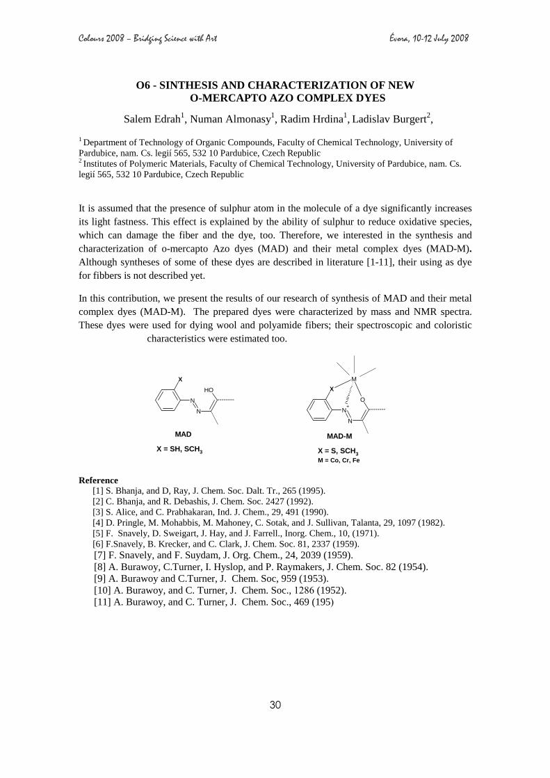
O6 - SINTHESIS AND CHARACTERIZATION OF NEW O-MERCAPTO AZO COMPLEX DYES
Salem Edrah1, Numan Almonasy1, Radim Hrdina1, Ladislav Burgert2, 1 Department of Technology of Organic Compounds, Faculty of Chemical Technology, University of Pardubice, nam. Cs. legií 565, 532 10 Pardubice, Czech Republic 2 Institutes of Polymeric Materials, Faculty of Chemical Technology, University of Pardubice, nam. Cs. legií 565, 532 10 Pardubice, Czech Republic
It is assumed that the presence of sulphur atom in the molecule of a dye significantly increases its light fastness. This effect is explained by the ability of sulphur to reduce oxidative species, which can damage the fiber and the dye, too. Therefore, we interested in the synthesis and characterization of o-mercapto Azo dyes (MAD) and their metal complex dyes (MAD-M). Although syntheses of some of these dyes are described in literature [1-11], their using as dye for fibbers is not described yet.
In this contribution, we present the results of our research of synthesis of MAD and their metal complex dyes (MAD-M). The prepared dyes were characterized by mass and NMR spectra. These dyes were used for dying wool and polyamide fibers; their spectroscopic and coloristic
characteristics were estimated too.
N
N
OH
X
--------
N+
N
O
M
X
--------
X = SH, SCH3 X = S, SCH3
MAD MAD-M
M = Co, Cr, Fe
Reference [1] S. Bhanja, and D, Ray, J. Chem. Soc. Dalt. Tr., 265 (1995). [2] C. Bhanja, and R. Debashis, J. Chem. Soc. 2427 (1992). [3] S. Alice, and C. Prabhakaran, Ind. J. Chem., 29, 491 (1990). [4] D. Pringle, M. Mohabbis, M. Mahoney, C. Sotak, and J. Sullivan, Talanta, 29, 1097 (1982). [5] F. Snavely, D. Sweigart, J. Hay, and J. Farrell., Inorg. Chem., 10, (1971). [6] F.Snavely, B. Krecker, and C. Clark, J. Chem. Soc. 81, 2337 (1959). [7] F. Snavely, and F. Suydam, J. Org. Chem., 24, 2039 (1959). [8] A. Burawoy, C.Turner, I. Hyslop, and P. Raymakers, J. Chem. Soc. 82 (1954). [9] A. Burawoy and C.Turner, J. Chem. Soc, 959 (1953). [10] A. Burawoy, and C. Turner, J. Chem. Soc., 1286 (1952). [11] A. Burawoy, and C. Turner, J. Chem. Soc., 469 (195)

Colours 2008 – Bridging Science with Art Évora, 10-12 July 2008
31
O7 - GOLD AND BLUE: THE CHARACTERISTIC DICHROMY OF THE MAIN ALTARPIECE OF THE SÉ VELHA OF COIMBRA
A. Le Gac 1*, A. I. Seruya1, M. Lefftz2, A. Alarcão3
1 Departamento de Conservação e Restauro, Faculdade de Ciências e Tecnologia, Universidade Nova de Lisboa, Campus de Caparica, 2829-516 Caparica, Portugal. 2 Département d’Histoire de l’Art, Faculté Universitaires de Notre-Dame de la Paix, Rue de Bruxelles, 61, B-5000 Namur, Belgium. 3 Rua do Castelo 2, 3230-085 Espinhal, Portugal. * Corresponding author: [email protected] / [email protected]
Since its creation at the dawn of the 16thC, the main altarpiece of the Sé Velha (old cathedral) of Coimbra (Portugal) never failed to manifest the characteristic chromatism of that time, which made abundant use of gold and blue. It is clearly understood that this dichromy, characteristic of flamboyant Gothic, was systematically renovated in that piece during three subsequent interventions, but with specific purposes: in 1582-1583, during a cleaning of the altarpiece, with the intention of reaffirming its style and refresh the already altered colours; in 1685, during the application of a new polychromy in the baroque period – by default of the almost exclusive use of gilding – to stir up the political and spiritual messages conveyed by this work of art in that diocese, before the Protestant Reformations; in 1900, during its restoration, to perpetuate its artistic and iconographic expressions, considered original at the time, always according to its almost unaltered formal aspect. The study of the paint layers by various examination and analytical techniques brought to light the material and technical resources applied in each intervention. By cross examination of the laboratory data and the available archival sources, the research tried to demonstrate the importance of the options made at each period in order to maintain the famous Jean d’Ypres’dichromy. What stands out from the retrieved information is the unwonted recourse to smalt in such great amounts in a polychrome wooden altarpiece, at the end o f the 17thC, but also the degree of brightness then required for its execution and the variations in blue resulting from the application of different coloured underlayers. This research shows subtle shades in colours, textures and brilliance between the original gothic polychromy and the baroque “repolychromy”, deeply different in an aesthetic point of view.

Colours 2008 – Bridging Science with Art Évora, 10-12 July 2008
32
O8 - MORDANT ANALYSIS IN AN HISTORICAL PORTUGUESE T APESTRY FROM THE 18TH CENTURY
A. Manhita1, H. Vargas2, I. Ribeiro2, T. Pacheco3, J. Mirão4, J. Pedro4, T. Ferreira1,5
C. Costa1, A. Candeias1
1Chemistry Department and Évora Chemistry Centre, University of Évora, Rua Romão Ramalho 59, 7000-676 Évora, Portugal 2Museums and Conservation Institute, Materials Studies Department, Portugal. 3National Museum of Ancient Art (MNAA), Lisboa, Portugal. 4Geosciences Department and Évora Geosciences Centre, University of Évora, Rua Romão Ramalho 59, 7000-676 Évora, Portugal 5Univ. of Lisbon, Chemistry and Biochemistry Dept. & CCMM, Lisboa, Portugal
The story of dyes parallels the technological, economic, and aesthetic history of mankind from prehistoric times. Dyers used natural dyes until the end of the nineteenth century when synthetic dyes took over. Most natural dyes must be used in conjunction with mordants, which act to bind the dye to the fibre. Aluminium and iron salts were the most common traditional mordants, with copper, tin and chromium coming into use later.
Mordants not only improved the washing fastness of the dyed fibres but have also a strong influence in the final colour of the fibre. Careful manipulation of the dyeing bath conditions could yield an array of hues which we can nowadays see in museum collections worldwide.
Arraiolos tapestries are probably one of the richest artistic Portuguese expressions in terms of textile heritage. These wool embroidery rugs were produced in the south of Portugal from the late 1600’s as they are listed in the inventories of Portuguese aristocratic households in the beginning of the 18th century. Several references in the mid 18th century proved the existence of a flourishing industry employing about 300 people . However, this activity suffered a steady decline from the XIX century on and by the second half of that century it had almost disappeared.
In this work, we present the results of microanalysis by SEM-EDS and µ-PIXE of fibres sampled from an Arraiolos tapestry from the 18th century belonging to collection of the National Museum of Ancient Art. Fibre identification and degradation assessment was performed by SEM analysis while mordant identification was performed by 2D elemental mapping by EDS and µ-PIXE. The results on the historic samples showed that linen was used for the support (warp threads) and wool for the embroidery. In general, the wool fibres display the typical scale structure of wool presenting, in some cases, transversal cracking and longitudinal splitting which are indicative of wear. EDS and µ-PIXE analysis showed the presence of aluminium evenly distributed over the majority of the analyzed wool fibres dyed in different colours which is consistent to the use of alum as mordant. Significant amounts of aluminium and iron were found together with iron in a yellow coloured yarn, while only iron was detected in the brown coloured yarns. Unexpectedly, aluminium was also detected in the blue fibres which might be an indication of a pre-mordanting procedure irrespective of the wool final colour.

Colours 2008 – Bridging Science with Art Évora, 10-12 July 2008
33
O9 - PHOTOGRAMMETRIC METHODS APPLIED TO EASEL PAINTINGS
Frederico Henriques1, Ana Calvo1, João Luís Matos2, Ana Falcão2, Ana Bailão1
1Universidade Católica Portuguesa (UCP) 2 Instituto Superior Técnico (IST)
The aim of this research is to describe photogrammetrics applications to easel paintings.
We propose to describe the photogrammetric methodology used, as well the achievement process of orthophotos. We intend to submit the orthophotos that contain all the metric information to a geo-referenced system [1, 2, 3].
With this system we can obtain accurate and measurable co-ordinates of the paintings and make orthophotomaps. These photogrammetric methods applied to paintings can contribute to create new opportunities in documentation, measuring and conservation of paintings.
With the obtained photogrammetric results we can measure co-ordinates of points, distances and areas for diagnostically proposes and for note down the precise location where was done others examination methods (ED-XRF; Raman spectroscopy; microchemical and stratigraphical analysis) used for paintings technique characterization.
Also, the obtained spatial information by this method can be helpful for others researches like colours investigations.
Referencies [1] Berberan, A., “Elementos de Fotogrametria”, edited by autor, Lisboa, 2003. [2] Matos, J. L., “Fundamentos de Informação Geográfica”, Lidel, Lisboa, 2001. [3] Lerma, J. L., “Fotogrametria Moderna: Analitico y digital”, Valência, Editorial Universidad Politécnica de Valência, 2002.
Colours 2008 – Bridging Science with Art Évora, 10-12 July 2008
34
O10 - HIGH DYNAMIC RANGE (HDR) IMAGES OF RADIOGRAPH IES: MODERN DIGITAL REPLACEMENT OF NEGATOSCOPES?
Luís Bravo Pereira1
[email protected] One problem with traditional film radiography of works of art is the large difference in density of the images between areas of different radiopacity, also described as dynamic range, principally with three dimensional works, like wood sculptures. To be possible to scientists, historians and conservators analyze radiography with all their differences in density, usually it is necessary to use negatoscopes, a special type of light-box that presents a potentiometer to control the light intensity. Usually this kind of device is expensive and size limited, commonly smaller than the total area of the X-rayed image, do not allowing a general perception of the entire work of art with is entire tonal range. Recently, with the advent of computers and scanner devices, it was possible to digitalize a radiography and improve the contrast/brightness of the image, improving the readability of the information but usually the darker areas (corresponding to more dense areas) or the lighter ones do not show their full information simultaneously, like it would happen with the use of negatoscopes. With this paper we are presenting a new promising approach to digitalization of radiographic image in film, using common photographic cameras as device to digitalize with different levels of exposure (allowing, in some cases, to read information from the darker/denser areas of the image) and combing those images with the new techniques of High Dynamic Range (HDR), increasing the exposure latitude of the final image. This new approach is possible today because the most recent generations of image treatment software present this new feature. Examples of software presenting this tool are the market leader Adobe Photoshop (presenting this HDR capacity since CS2 version) or the most HDR specialized Photomatix, among others. The resulting images seem to show in some cases more interesting results than the single pass digitalization of images, with or without post-processing improvement, and can in some cases be a good alternative to the use of negatoscopes on the exam of radiographies. [1] ALDROVANDI , Alfredo; PICOLLO, Marcello. Metodi di documentazione e indagini non invasive sui dipinti. Il Prato: Padova, 2001. [2] CASTELLANO , Alfredo; QUARTA, Stefano. «Le Tecniche radiografiche per l’archeometria.», In CASTELLANO, Alfredo; MARTINI, Marco; SIBILIA, Emanuela, coord. – Elementi de Archaeometria. Metodi fisici per i beni culturali. Milano, 2002, ESEA, pp. 131-153. [3] SCHOUTE, Rogier Van; VEROUGSTAETE, Hélène. «Radiography», In VAN SCHOUTTE, Roger; VEROUGSTRAETE-MARCQ, Hélène, coord. - Scientific Examination of Ease Paintings. Strasbourg, Council of Europe:1986, PACT 13, pp. 131-153.

Colours 2008 – Bridging Science with Art Évora, 10-12 July 2008
35
O11 - RESTORATION OF MOBILE HERITAGE IN ÉVORA IN TH E
CONTEXT OF XVI TH CENTURY: THE PANOS DE ARMAR OF D. MARIA
ANA DE CASTRO
Antónia Fialho Conde
Dep. História da Universidade de Évora/CIDEHUS-UE
The action what today we recognize as restore and the values that justify and mobilize it are, historically speaking, atemporal. It wasn’t the official character of this attitude of safeguard, specially consecrated in the legislation, national and international, the only in charge for which today we are more awake for this problems. The persons and the institutions, along the History, managed to demonstrate, as some documents proof, how sensitive they can be to preservation of the heritage. The concerning with the repair of tapestries that were making part of his estate, resorting to a local official, they prove preoccupation which D. Maria Ana de Castro, in 1597, that she was conscious of what Évora was representing culturally in this period: city of intellectuals, of writers, humanists and poets, of painters, sculptors and musicians, but also of weavers and upholsterers, in a world of artists and craftsmen who were multiplying to give answer to the solicitations of a public whom one had used to be demanding.

Colours 2008 – Bridging Science with Art Évora, 10-12 July 2008
36
O12 – EARTH COLOUR FINISHES IN EARTHEN ARCHITECTURE
Maria Fernandes
CEAUCP – Centro de Estudos Arqueológicos das Universidades de Coimbra e Porto Instituto de Arqueologia, Palácio de Sub-Ripas, 3000-305 COIMBRA
Apart from their function as wall protection, both indoors and outdoors, earth surface coatings play a decorative architectural role. This aspect of the rendering in finishing and decorating building is apparent in many countries and has been exploited for long time ago. It includes customary techniques and motions just as must as the texture or grain of the finishing coat, reliefs worked in the bulk of the wall, colour, and flashing with various other materials. Decoration constitues the identity of the community, passing on the symbols necessary to the moral and the ethical system of a people. For example in Africa earth decoration is both aesthetic, magical, religious (like offering protection against demoniac influences) or has functional purpose [1]. The earth decoration calls form, relief of the wall, and colour (variety of natural pigments) play a shadow and ligh role. To mention just a few examples: the zoomorphic reliefs of Chan Chan (Peru), the geometrical floral and plant reliefs of urban housing in Niger and ethnic groups in Dogon (Mali). Ther diversity on geometric decoration, painted, modelled, moulded in the thickness of the wall are numerous and still practised today. The specific purpose of the present paper is to show some examples of aesthetical and functional aspects of earth colour finishes in earthen architecture in Africa and Asia, their traditional maintenaince (ex. Shiban - Iemen and Dogon - Mali), and some examples of conservation projets on world cultural heritage sites like Mopti (Mali), Abomey (Benin), Chan Chan and Huaca de la Luna y del Brujo (Peru).
[1] H. Houben and H. Guillaud, “Earth construction a comprensive guide”, ed. Intermediate Techhnology Publications, London, 1994, pp.352-3.

Colours 2008 – Bridging Science with Art Évora, 10-12 July 2008
37
O13 - RESULTS OF A STUDY PROJECT ON WALL PAINTING M ATERIAL
CHARACTERIZATION FOR CHROMATIC INTEGRATION
José Pestana1,a, Nuno Proença2 , Ana Cardoso3, Helena Vargas3, Sara Valadas3, Milene Gil2 , António Candeias3, José Mirão4 , Isabel Ribeiro3
1Mural da História, R. Duques de Bragança,nº8, Atelier B,1200-162 Lisboa, Portugal 2 Nova Conservação Lda., Calçada do Marquês de Abrantes, 111, 1º, 1200-718 Lisboa, Portugal 3Instituto dos Museus e da Conservação – Laboratório José de Figueiredo, R. das Janelas Verdes, 37, 1249-018 Lisboa, Portugal 3Chemistry Department and Evora Chemistry Center, University of Évora,, R. Romão Ramalho 59, 7000-676 Évora, Portugal 4Geosciences Department and Evora Geophysics Center, University of Évora, R. Romão Ramalho 59, 7000-676 Évora, Portugal aCorresponding author: [email protected] Keywords: wall paintings, Pigments, painting media, Characterization The Convent of the Order of Christ of Tomar (Portugal) is one of Portugal's most important historical and artistic monuments and was classified as World Heritage by UNESCO in 1983. The original Convent was built in the 12th century and since then the convent suffered numerous interventions and amplifications, particularly in the 15th and 16th century that rendered the Convent its actual appearance. Among the initial Convent nucleus is the Charola, or Templars Oratory, which is inspired in the Holy Sepulchre Round Church in Jerusalem. The magnificent mural paintings that cover the stone walls of the Templars Charola date back to the 16th century and were restored several times since 1989. The study of these mural paintings has been carried out by a joint collaboration between the Nova Conservação (conservation-restoration private enterprise), the Portuguese Institute of Museum and Conservation (Instituto dos Museus e da Conservação – Laboratório de Conservação e Restauro José de Figueiredo) and the University of Évora, and encompasses the characterization of the painting media and the pigments identification. This work presents the study of colorimetric measurement of original paintings and previously restored areas. Microfragments of multilayer films were collected from the “colorimetric areas”, and their cross sections were characterized by optical microscopy and scanning electron microscopy coupled with an energy dispersive spectrometer (SEM-EDS). The pigments elemental analysis were performed by microchemical analysis and optical properties and the painting media were characterized by Fourier Transform Infrared µ-spectrometry (µ-FTIR) and High Performance Liquid Chromatography (HPLC). The combined analysis of the results from the different techniques allowed not only their material identification and the identification of previous undocumented restoration works but also helped the restoration, giving the answers to achieve an adequate intervention.

Colours 2008 – Bridging Science with Art Évora, 10-12 July 2008
38
O14 - STUDY OF THE FRESCOES FROM THE MISERICORDIA CHURCH OF ODEMIRA (PORTUGAL) BY IN-SITU XRF, SEM-EDS AND CONFOCAL
SYNCHROTRON µµµµ-XRF
S. Valadas1, J. Mirão2, D. Tavares3, A. Guilherme4, M.L. Carvalho4, J. Coroado5, Rolf Simon6, A.S. Silva7, A. Candeias1
1 Chemistry Department and Évora Chemistry Centre, Universidade de Évora, Rua Romão Ramalho 59, 7000-676 Évora, Portugal 2 Geosciences Department and Évora Geophysics Centre, Universidade de Évora, Rua Romão Ramalho 59, 7000-676 Évora, Portugal 3 Direcção Regional Cultura Alentejo, Rua de Burgos 5, 7000-863 Évora, Portugal 4 Atomic Physics Centre, Universidade de Lisboa, Av. Prof. Gama Pinto 2, 1649-003 Lisbon, Portugal 5Conservation Department, Polytechnic Institute of Tomar, Quinta do Contador, 2300-313 Tomar, Portugal 6Forschungszentrum Karlsruhe idHG, ANKA Synchrotron, FLUO beamline, Karlsruhe, Germany 7Materials Department, Laboratório Nacional Engenharia Civil, Av. Brasil 101, 1700-066 Lisbon, Portugal The Misericórdia Church of Odemira in Alentejo was built in the second half of the 16th century and presents uncommon features that makes it unique among the religious architectural heritage in this Portuguese region. The frescoes that cover completely the entire church walls were only discovered in the late 1990’s but their artistic value was immediately recognized. A joint collaboration between several leading Portuguese institutions is ongoing to allow uncover completely and preserve these unique paintings. This involved not only the study of the mortars [1] but also the study of the frescoes polychromy. In this work, we present the elemental analysis results by in-situ X-ray fluorescence spectrometry of two panels of the mural paintings. The different colours were also sampled as microfragments (approx. 1 mm2) that were analyzed as taken or mounted in epoxy resin (2.5 cm diameter circular sections) in order to expose the different paint layers. The microfragments of paint layers and their cross-sections were characterized by Optical Microscopy and Scanning Electron Microscopy coupled with Energy Dispersive Spectrometry (SEM-EDS). Furthermore, 2D and 3D elemental mapping was obtained with spatially resolved confocal Synchrotron Radiation micro X-ray fluorescence spectrometry performed at ANKA synchrotron FLUO beamline. The combined analysis of the results from the different techniques allowed not only the pigments identification but also, in some cases, the evaluation of colour changes due to degradation processes and, considering the Southern Portugal geology, the identification of their possible provenance. [1] S. Valadas, D. Tavares, J. Coroado, A. Silva, J. Pedro, J. Mirão and A. Candeias, “Characterisation of the mural paintings from the Misericordia Church of Odemira (Portugal)”, Materials Science Forum, accepted for publication (2008).

Colours 2008 – Bridging Science with Art Évora, 10-12 July 2008
39
O15 - THE COLOURS OF THE 15TH CENTURY PAINTINGS ATTRIBUTED
TO NUNO GONÇALVES
José Mendes1, António João Cruz 1,2 Ana Guilherme3, Sofia Pessanha3, Maria Luísa Carvalho3
1 Centro de Investigação em Ciência e Tecnologia das Artes (CITAR), Universidade Católica Portuguesa, R. Diogo Botelho, 1327, 4169-005 Porto, Portugal 2 Departamento de Arte, Conservação e Restauro, Escola Superior de Tecnologia de Tomar, Instituto Politécnico de Tomar, Estrada da Serra, 2300-313 Tomar, Portugal 3 Centro de Física Atómica da Universidade de Lisboa, Av. Professor Gama Pinto, 2, 1649-003 Lisboa, Portugal The Polyptych of St Vincent, now attributed to Nuno Gonçalves, is one of the most important Portuguese paintings and one of the masterpieces of the 15th century Western art. Since its discovery, a century ago, it has been the subject of important polemics concerning to its authorship and date, the identification of the portrayed personages and the meaning of the painting. It was also in the origin of a suicide. However, from a technical point of view, very little is known about it. The support and the drawing techniques were already studied with some detail, but on the painting techniques and the used materials only is known what was obtained through the study of six samples of just one of the six paintings that make up the polyptych. In relation to the colours, the analysis of the Panel of the Knights (the mentioned painting), done through microchemical tests, allowed the detection of white lead, vermillion, a red lake (possibly madder), lead-tin yellow, brown ochre, azurite, green pigments of copper (possibly malaquite and copper resinate) and bone black [1]. In the context of a study of the materials and the techniques employed in the paintings attributed to Nuno Gonçalves, just started, the six paintings of the Polyptych were analysed by energy dispersive X-ray fluorescence spectrometry. A portable non invasive equipment that allow in situ analysis was employed and, therefore, the restrictions that a high valuable work like the Polyptych put to other analytical techniques were avoided. In first place, we intended to identify the pigments employed in the Panel of the Knights with a method complementary to that used before. Due to the reduced number of points previously analysed, we specifically intended to determine if in different areas with the same colour the same pigments were used, or not. Secondly, we wanted to verify if those results can be generalized to the whole group of six paintings. On the other hand, we analysed the other paintings also attributed to Nuno Gonçalves, namely a group of four paintings portraying four saints and a group of two paintings representing the martyrdoms of St Vincent, both from the collection of the Museu Nacional de Arte Antiga, Lisbon, like the Polyptych. It is possible that the 12 paintings that compose the three groups were part of the same altarpiece and we intended to compare the results between them. J.M. thanks FCT for the scholarship (SFRH/BD/37215/2007). [1] L. M. P. Alves, in “Estudo da Técnica da Pintura Portuguesa do Século XV” (Instituto José de Figueiredo, Lisboa, 1974), pp. 49-63.

Colours 2008 – Bridging Science with Art Évora, 10-12 July 2008
40
O16 - NEW PIGMENTS IN THE 19TH CENTURY PAINTING ACCORDING TO THE TECHNICAL TREATISES PUBLISHED IN PORTUGAL
Sónia Barros dos Santos1, António João Cruz1,2
1C.I.T.A.R. - Centro de Investigação em Ciência e Tecnologia das Artes, Escola das Artes, Universidade Católica Portuguesa, Rua Diogo Botelho, 1327, 4169-005 Porto, Portugal 2Departamento de Arte, Conservação e Restauro, Instituto Politécnico de Tomar, Estrada da Serra, 2300-313 Tomar, Portugal The great development of chemistry that begins in the late 18th century and the subsequent discovery of new chemical elements led to the appearance of a large number of new pigments for artists. Throughout the 19th century, compounds of cobalt, chromium, cadmium or zinc, among others elements, gradually replaced many of the traditional pigments available until then. The chemical industry development, the establishment of several manufacturers of artists’ materials and the collapsible tubes invention during the 1840s are among the various factors contributing to the spreading of the new pigments through Europe.
These new pigments were intended to have better properties than the traditional ones – namely in colour range, intensity and stability – and to be economically more advantageous. However, both the expensiveness of some pigments and the initial deficiencies of some processes of manufacture – which led to materials with inferior quality – explain why new pigments were not always rapidly adopted by the painters. Moreover, even if some painters enjoyed the artistic innovation permitted by the use of new pigments, others, resistant to the changes, avoided them and others had no access to them, due to trade market limitations.
Nothing is known about these questions in the Portuguese painting, namely how the new pigments were regarded or when they began to be used. Integrated in a larger research recently initiated with the purpose of clarifying these issues, using both different perspectives and methodologies, references to the new pigments have been collected from technical treatises published in Portugal during the 19th century. For each pigment, aspects such as the year it was first mentioned, its importance according to the number of found references and its advantages and disadvantages were determined. These results are discussed in the context of the 19th century technical literature published in countries such as France or Great Britain where these new pigments were first prepared and commercialized.
S.B.S. thanks FCT for the grant (SFRH/BD/36209/2007). This work is also supported by FCT through the project POCI/EAT/58065/2004.

Colours 2008 – Bridging Science with Art Évora, 10-12 July 2008
41
O17 - THE SIGNIFICANCE OF COLOUR IN PAINTING – THE CONSEQUENCES OF ITS LOSS OR ALTERATION AND THE
POSSIBILITIES OF INTEGRATION.
Cláudia Falcão1
1Instituto Politécnico de Tomar, Departamento de Arte, Conservação e Restauro, PT-2300-313 TOMAR, [email protected]
The practice of image evaluation in Painting Restoration illustrates the will for a more meticulous conservation assessment and allows us to establish an effective work methodology. Image analysis seeks to acknowledge the principal instruments of pictorial language and to find the meaning of its loss or modification. This practice demands for an artificial deconstruction to observe the different mechanisms of visual reading aiming a better sustained interpretative reconstruction [1], that is, it aspires for the profound understanding of the object and its significations. In painting, more than in other forms of artistic expression, colour plays a key role and, considering the specific case of painting restoration, we expect to find the reasons for the visual message defective performance, seeking to reestablish the proper viewing by correcting the chromatic values, in absolute and constant respect for the painting’s historicity and authenticity, and considering with equity all the object values, namely its historical or aesthetical values, not allowing none of them to get emphasized [2].
The Ressurrection is a mid 16th century oil painting, made by a portuguese artist - Ambrósio Dias, Mestre de Romeira [3]. The restoration process of this painting turned out to be a paradigmatic case, not only for this piece specific context and function (devotional object), or for its historic and artistic relevance, but also for the unquestionable challenges that the intervention offered. In effect, the painting presented numerous pictorial discontinuities of various natures and different characteristics, which offered a large range of integration difficulties and demanded distinct solutions.
The working methodology, along with the results of the intervention itself, accentuated the importance of visual perception in the assessment of the object formal characteristics, in an absolute sense and in terms of conservation, and reassures the need for using a series of perceptive principles in the resolution of chromatic integration questions [4].
[1] Martine Joly, Introdução à Análise da Imagem, Colecção Arte&Comunicação, Edições 70, 1994 (p 18, 19, 25, 38-49, 60-69, 97-111). [2] Cesare Brandi, Teoria de la Restauración, Colección Arte y Musica, Alianza Editorial, Madrid, 1999, 7ª Edição (p 15). [3] Maria Teresa Desterro, O Mestre de Romeira e o Maneirismo Escalabitano, Coimbra, Minerva, 2000. [4] Chiara Rossi Scarzanella, Teresa Cianfanelli, La percepzione visiva nel restauro dei dipinti. L’intervento pittorico in PROBLEMI DI RESTAURO – RIFLESSIONE E RICHERCHE, Edifer, 1992 (p185-211).

Colours 2008 – Bridging Science with Art Évora, 10-12 July 2008
42
O18 - THE COLOURS OF THE PORTUGUESE CONTEMPORARY ART: THE PAINTS USED ON A NEOREALIST PAINTING BY JÚLIO POMAR
Ana Cudell1,2, António João Cruz2,4 ,Jorgelina Carballo Martínez1,2,
Sandra Saraiva3 1Centro de Conservação e Restauro da Escola das Artes, Universidade Católica Portuguesa, R. Diogo Botelho, 1327, 4169-005 Porto, Portugal. E-mail: [email protected]. 2CITAR - Centro de Investigação em Ciências e Tecnologias das Artes, R. Diogo Botelho, 1327, 4169-005 Porto, Portugal. 3Departamento de Química da Faculdade de Ciências da Universidade do Porto, Rua do Campo Alegre, 687, 4169-007 Porto, Portugal. 4Departamento de Arte, Conservação e Restauro, Escola Superior de Tecnologia de Tomar, Estrada da Serra, 2300-313 Tomar, Portugal. Júlio Pomar (born 1926) is a Portuguese painter who, for more than 50 years, developed an outstanding style. Among its paintings, “O Cabouqueiro” (1949), painted at the beginning of his career, is a good example of the Portuguese neorealist art. This painting was analysed as part of a scientific study of Portuguese contemporary painting which is taking place at the moment. One of the goals is to identify and to characterize the paints and materials. This information is useful for the better understanding of the degradation processes presented by the paintings and detection of ancient conservation treatments. A radiograph and a fluorescence ultraviolet photograph were obtained. The pigments were identified by optical microscopy, energy dispersive X-ray fluorescence spectrometry (EDXRF) and Fourier transform infrared spectroscopy (FTIR), and the binder was identified by FTIR. The artist was interviewed and gave relevant information about the materials, the working process and the way of handling with the colours. Zinc white, ultramarine blue, viridian, brown ochre, red ochre or, probably, Mars red, cadmium yellow, cadmium red, minium and bone black were identified. Some of them have barium white as a filler or extender. As binder, an oil was detected. According to Pomar, the colours should be artists’ colours from Lefranc et Bourgeois. He recognizes a non-deliberated use of the colour in this painting, which was a rapid executed work whose expressiveness was reinforced by the textures, successive paint layers, and intense and chromatically pure colours. He mentions a French influence (The Paris School). In a repaint, cobalt green and zinc white were identified. A.C. thanks FCT for the grant (SFRH/BD/37616/2007).
Colours 2008 – Bridging Science with Art Évora, 10-12 July 2008
43
O19 - THE COLOURS OF A 16th CENTURY PANEL PAINTING, ATTRIBUTED TO FRANCISCO JOÃO, FROM THE CHURCH OF PA VIA
(MORA, PORTUGAL)
Helena Pinheiro de Melo1 e António João Cruz1,2
1 Centro de Investigação em Ciência e Tecnologia das Artes (CITAR), Universidade Católica Portuguesa, R. Diogo Botelho, 1327, 4169-005 Porto, Portugal 2 Departamento de Arte, Conservação e Restauro, Escola Superior de Tecnologia de Tomar, Instituto Politécnico de Tomar, Estrada da Serra, 2300-313 Tomar, Portugal
The main altar of the church of Pavia (Mora, in the region of the Alentejo, South of Portugal) exhibits a 16th century panel painting depicting The Conversion of Saint Paul attributed to Francisco João (act. 1565-1595), a local painter born in Évora. This work belongs to a group of about forty paintings made by Francisco João or attributed to him that are currently known in the Alentejo. Some of these paintings are the subject of a scientific program, just started, that aims at the identification and characterization of the materials and the techniques used in the regional painting workshops of the Alentejo, in the second half of the 16th century. In this context, the colours of the panel of Pavia were investigated through surface examination of the painting and analysis of nine paint samples. The samples cross-sections were analysed by optical microscopy and information concerning the pigments, the pigments’ mixtures and the paint stratigraphy was obtained. The pigments were identified by scanning electron microscopy - energy dispersive X-ray spectrometry (SEM-EDX). The following pigments were found: lead white, lead-tin yellow, minium, vermillion, yellow and red ochre, azurite, carbon black and a copper green pigment, probably copper resinate. All the pigments are common to the second half of the 16th century. A red lake was also found but it could not be identified due to its small amount in the sample. Seven out of the nine samples show a succession of two or three layers of paint over the ground (made of gypsum) and only two samples show a single layer. While in seven cases the superimposed layers reveal the modelling work of the painter to achieve the final colour, in only two samples the sequence of layers is the result of overlapping motives. It must be noted that not all of the colours were sampled yet. In general, in each layer, the colours were created by simple mixtures that combine a coloured pigment only with white. In one case, the blue pigment (azurite) was used pure. Just the red colours show a mixture of two coloured pigments (plus white and, in one case, black): according to the desired hue, the painter associated two different reds - minium and red ochre, vermillion and red ochre or vermillion and a red lake. We thank Andrés Sanchez-Ledesma, from Art-Lab, Madrid, for the analysis. H.P.M. thanks FCT for the scholarship (SFRH/BD/37033/2007).

Colours 2008 – Bridging Science with Art Évora, 10-12 July 2008
44
O20 - O PAPEL DA HISTORIA DA ARTE TÉCNICA NO PROCES SO DE AUTENTICAÇÃO DE OBRAS DE ARTE: UM ESTUDO PRELIMINAR
Alessandra Rosado, Luiz A C Souza
LACICOR – Conservation Science Laboratory – CECOR – Center for Conservation and Restoration of Cultural Movable Properties – School of Fine Arts – Federal University of Minas Gerais , Av. Antonio Carlos 6627 – Belo Horizonte 31270-901 – MG – Brazil
E-mail: [email protected]
A avaliação de objetos artísticos para averiguar uma provável atribuição autoral era feita quase que exclusivamente por connaisseur ou peritos com formação em História e/ou História da Arte, através basicamente da análise dos aspectos formais, estilísticos e dos dados documentais sobre a obra. A introdução de exames científicos como ferramentas analíticas, para o estudo de obras de arte, a partir do século XIX intensifica-se consideravelmente nos séculos XX e XXI, sendo um novo tipo de avaliação de objetos artísticos através de uma metodologia interdisciplinar, envolvendo o emprego da conservação preventiva, da restauração, da Ciência da Conservação e da História da Arte. Essa abordagem contribuiu para a composição do campo de estudo denominado de História da Arte Técnica [1]. Define-se como objeto da pesquisa o estudo relacionado ao desenvolvimento da metodologia sobre preservação e análises de obras de arte produzida pelos cientistas e historiadores da arte ocidentais entre os anos de 1850 a 2005. Articulada ao processo de análise científica de obras de arte, a partir do século XIX. Tal metodologia integra o conjunto de cinco importantes práticas que orientaram a produção de novas bases de atuação das ciências da conservação e humanas no contexto de autenticação de obras de arte. São elas: introdução de laboratórios de análise científica e conservação em instituições museológicas, traduções de manuais técnicos artísticos antigos, submissão das obras de arte a exames científicos para identificação dos materiais e técnicas empregados na feitura da obra, trabalhos realizados em parceria entre cientistas, historiadores da arte e connaisseurs no estudo de pinturas de grandes mestres, estabelecime nto de princípios norteadores da relação entre as ciências puras e humanas, dados os pressupostos fundamentados na arqueometria e história da arte técnica. Através da análise dessas práticas procura-se identificar, a partir da temática da autenticação de obras de arte, os pontos de contato entre a produção de uma estrutura fortemente vinculada à História da Arte e a consolidação de uma prática interdisciplinar afinada com as diretrizes da História da Arte Técnica. É por meio da prática da História da Arte Técnica que tal metodologia busca, nos processos de autenticação de obras de arte reivindicar para as ciências naturais e humanas a tarefa de analisarem conjuntamente a obra de arte.
[1]. AINSWORTH, M. W. From connoisseurship to Technical Art History- The Evolution of the Interdisciplinary Study of Art. In: The Getty Conservation Institute Newsletter, v.20, n. 1, 2005.
Colours 2008 – Bridging Science with Art Évora, 10-12 July 2008
45
O21 - SGRAFITTO AND COLOUR IN ALENTEJO
Sofia Salema 1, José Aguiar2
1CHAIA-UE (Research Center of Art and Artistic Research - University of Évora), Portugal, PhD scholarship from FCT (Foundation for Science and Technology), [email protected] 2 FA-UTL (Faculty of Architecture of the Technique University of Lisbon), Portugal, [email protected]
In the last years, hundreds of buildings with sgraffito application in external façades have been discovered in Alentejo. One of the most important results of our research on sgraffito in the Alentejo Region[1] is the fact that the majority of the listed sgraffito ornaments have been painted over so many times, that today we can hardly identify its original aspect, its chromatic values or its textures. Since sgraffito is a decorative technique with external plaster, some of its values, such as the dual colour variation and the aesthetical tension given by different textures and colours, which are intrinsic to the nature of this mural covering, must not be forgotten.
Although the current restoration culture assumes as a sine qua non condition the conservation of the substance as a cultural certification, interventions in sgrafitto, it often use criteria deriving from renovation building techniques rather than careful preservation. Unfortunately, a strong unfamiliarity to its particular values and to its specific techniques is usually the case, resulting in inadequate recovering processes. An example is the application of painting layers over those ornaments, causing loss of authenticity, and also loss of aesthetical and historical values of the building.
This article intends to provide awareness of the architectonic value of sgraffito and summarize its risks, emphasizing the need to change intervention methodologies, promoting its safeguard and material its authenticity.
General concept and particular techniques of execution of sgraffito are described, establishing the panorama of sgraffito in Alentejo, illustrated with examples where original colour, texture and surfaces were not modified. We show a few interventions where an adequate restoration was accomplished, comparing those cases with countless examples where sgraffito technique was completely subverted. Finally, we present a set of recommendations to help changing the quality of interventions on sgraffito.

Colours 2008 – Bridging Science with Art Évora, 10-12 July 2008
46
O22 - THE DISCOVERY OF COLOR AND ITS SYMBOLISM IN A BALINESE
PAINTING FROM THE MUSEU NACIONAL DE ETNOLOGIA (PORTUGAL)
M. R. Marcelino1*, A. Le Gac1, J. Amaral2, J. Pais de Brito2
1 Departamento de Conservação e Restauro, Faculdade de Ciências e Tecnologia, Universidade Nova de Lisboa, Campus de Caparica, 2829-516 Caparica, Portugal, Telf/Fax: (+351) 212 948 322 2 Museu Nacional de Etnologia, Avenida Ilha da Madeira, 1400-203 Lisboa, Portugal, Telf: (+351) 21 304 11 60, Fax: (+351) 21 301 39 94 * Corresponding author: [email protected]
The analysis and characterization of the Balinese painting (AZ.760) from the Museu Nacional de Etnologia (Portugal) was based on the examination of several samples and allowed a familiarization with the technological process of the traditional Balinese paintings and the identification of the materials used in different stages of its execution.
In the present study, different non destructive techniques of exam and analysis were used: microscope Zeiss Axioplan 2 Imaging with high resolution digital camera to analyse the paint cross sections and the support; Fourier Transformed Infrared Spectroscopy (FT-IR), Raman Spectroscopy and X-ray Fluorescence Spectrometry (EDXRF) to identify the pigments and FT-IR to study the binding-media and varnish.
Each one of these techniques was useful in the study of the painting AZ.760 and its final results can be compared with the bibliography [1,2] allowing the distinction between the original materials from the ones used in a restoration intervention.
The study of this painting made it possible to get in touch with an ethnographic object belonging to the Portuguese cultural inheritance with such specific characteristics so distinct from the ones of the western culture.
[1] Fisher, J., Cooper, T., The folk art of Bali: the narrative tradition, New York: Oxford University Press, (1998). [2] Ramseyer, U., The Art and Culture of Bali, Switzerland: Oxford University Press, (1977).

Colours 2008 – Bridging Science with Art Évora, 10-12 July 2008
47
O23 - A RARE PIGMENT IN AN UNEXPECTED PLACE: REALGA R IN A PORTUGUESE BAROQUE SCULPTURE WITH NON-ERUDITE FEATU RES
Carolina Barata1,2, António João Cruz2,3, M. H. Mendonça4, Jorgelina Carballo1,2
1 School of Arts, Portuguese Catholic University, R. Diogo Botelho, 1327, 4169-005 Porto, Portugal. E-mail: [email protected]. 2 Research Center for Science and Technology in Art (CITAR), R. Diogo Botelho, 1327, 4169-005 Porto, Portugal. 3 Department of Art, Conservation and Restoration, Polytechnic Institute of Tomar, Estrada da Serra, 2300-313 Tomar, Portugal. 4 CCMM and Department of Chemistry and Biochemistry, Faculty of Sciences, University of Lisbon, Campo Grande, 1749 – 016 Lisboa, Portugal.
One polychrome wooden sculpture from the Museum of Santa Maria de Lamas (Northern Portugal), representing St Stephen, with non-erudite features and produced in the first half of the 18th century, was studied for the identification of the materials and techniques employed [1]. Making use of optical microscopy, the cross sections revealed that the orange tone of the drapery is attributable to a superficial layer of an orange pigment, with very fine granulometry, mixed with larger red particles. The X-ray fluorescence spectra obtained with non-invasive equipment show peaks of As that appear to be related to the orange pigment, as they were only detected in those areas. This suggests the use of realgar (As2S2). However, this is a rare pigment that, until a short time ago, had not been detected in a group of 161 Portuguese works dating from the Middle Ages to 1900 [2]. Only recently has it been identified in paintings dating from the second half of the 19th century [3]. Therefore, its use in a sculpture of low artistic quality is unexpected. To confirm if realgar was actually employed, X-ray powder diffraction and scanning electron microscopy associated with energy-dispersive X-ray spectroscopy analysis (SEM-EDX) were carried out, in order to obtain a structural, morphological and chemical characterisation of the tested sample. Diffraction lines were indexed according to the ICDD files [4], and realgar seems to be the major crystalline phase present in the analysed sample. Other crystalline phases were detected and indexed to duranusite and minium, and some peaks may be attributed to quartz and gipsita. SEM-EDX analysis shows some elements that support the presence of the crystalline phases. Arsenium, sulphur, silicon and lead, among others elements, were detected, as was expected. This work was funded by the Fundação de Ciência e Tecnologia (Portugal) through the project POCI/EAT/58065/2004. [1] C. Barata, A. J. Cruz, J. Carballo, M. E. Araújo, and V. Teixeira, Imagem Brasileira, 5 (accepted). [2] A. J. Cruz, Artis - Rev. Inst. Hist. Arte Fac. Letras Lisboa, 6, 139 (2007). [3] A. M. Correia, M. J. V. Oliveira, R. J. H. Clark, M. I. Ribeiro, and M. L. Duarte, Anal. Chem., 80, 1482 (2008). [4] Power Diffraction File Alphabetical Index, ICDD, International Center for Diffraction Data, Swarthmore, PA, 1988.

Colours 2008 – Bridging Science with Art Évora, 10-12 July 2008
48
O24 - COLOUR IN COATED PAPERS: THE CASE STUDY OF A 19TH CENTURY SEWING BOX
Leonor Loureiro1,2,3, Isabel Ribeiro2, Mark Sandy3 and Ana Isabel Seruya4
1Paper Conservator, Rua de S. Mamede, 13, 4ºDto, 1100-532 Lisboa, Portugal 2IMC, Laboratório de Conservação e Restauro José de Figueiredo, Rua das Janelas Verdes, 37, 1249-018 Lisboa, Portugal 3Camberwell College of Arts, University of the Arts London, Wilson Road, London SE5 8LU, UK 4 Departamento de Conservação e Restauro, FCT/UNL, Lisboa, Portugal
The development of the coated papers industry began during the nineteenth century, as demand for special papers for decorative purposes increased. Different improvements in paper machines were being installed that led to different methods for the application of coatings and a wider variety of coating formulations. In these machine-coated papers, the main components of the thin coating layer were white pigments held together by an adhesive, or binder, but different colouring materials could be added and embossing could also be applied, therefore increasing the appeal for box coverings application. Functional wrapping boxes were simple in colour and decoration, but others could be extremely elaborate. A preliminary study of a fine example of a 19th century sewing box, on which up to sixteen different coated or gilded papers were skilfully applied, will be presented. The focus of this study was the identification of the papers’ coloured components, and also a comparison with published information on similar material.
[1] B.L. Browning, “The Analysis of Paper” (Marcel Dekker Inc., New York, 1977).
[2] D. Van der Reyden, E. Mosier and M. Baker, “Pigment Coated Papers I: History and Technology, in “ICCOM Committee for Conservation 10th Triennial Meeting Washington”, D.C. USA (1993), Preprints Vol. II (22-27) August, pp. 491-98.
[3] H.H. Murray, “Paper Coating Pigments”, (Mack Printing Company, Easton, USA, 1966), TAPPI Monograph Series No 30.
[4] J. T. Loomer. “Coated Papers”, in “Handbook of Pulp and paper Tecknology” edited by Kenneth W. Britt (2nd ed. Van Nostrand Reinhold Company, New York, 1970), pp. 517-528.
[5] M. J. Landberge, “Colorants for Aqueous Mineral Coatings”, in “Paper Coating Pigments”, edited by H.H. Murray (Mack Printing Company, Easton, USA, 1966), TAPPI Monograph Series No 30, pp. 125-140.
[6] R. H. Mosher and D.S. Davies, in “Industrial and Specialty Papers Vol. I Technology (Chemical Publishing Company, Inc., New York, 1968).
[7] R. Prosser, “Pigment Coated Printing Papers”, in “Modern Art: the restoration and techniques of modern paper and paints”, UKIC 1989, pp. 8-12.

Colours 2008 – Bridging Science with Art Évora, 10-12 July 2008
49
O25 - LES CÉRAMIQUES PEINTES DE L’ÂGE DU FER
Esmeralda Helena Gomes
Direcção Regional de Cultura do Alentejo, [email protected]
Le présent travail aborde les types décoratifs, à base de aiguade ou couleur à l’eau et peintures, appliqués dans les vases céramiques utilisés à l’Âge du Fer dans le territoire méridional portugais, ayant comme référence ceux qui proviennent de Alcácer do Sal.
Les céramiques en question se présentent décorées avec une gamme de tonalités en général insérées dans la sphère des marrons aux orangés, passant par les beiges.
Le Sud de la Péninsule Ibérique présente une grande richesse d’artefacts archéologiques relatifs à cette période et, à Alcácer do Sal, cette variété de pièces et motifs décoratifs sont bien évidents.
Pour l’archéologie, principalement dans le Sud-péninsulaire, il est important d’étudier ces céramiques peintes pour une meilleure connaissance du commerce phénicien-punique dans la Méditerranée, vue que coexistent les fabriques orientales avec les régionaux.
Colours 2008 – Bridging Science with Art Évora, 10-12 July 2008
50
O26 - THE USE OF X-RAY FLUORESCENCE SPECTROSCOPY FOR UNDERSTANDING THE ORIGINAL DECORATION OF 18 th CENTURY
PORTUGUESE KEYBOARDS
Susana Henriques Caldeira1, Maria Helena Trindade2, Marta Manso3, Sofia Pessanha3, Maria Luisa de Carvalho3
1Currently working as an Assistant Conservator at The Metropolitan Museum of Art, The Sherman Fairchild Center for Objects Conservation, 1000 Fifth Avenue, New York, N. Y. 10028-0198. Formerly conservator at the Museu da Música, in Lisbon. 2 Director of Museu da Música, Rua João de Freitas Branco, Estação do Metropolitano do Alto dos Moínhos, 1500-359 Lisboa. 3Centro de Física Atómica da Universidade de Lisboa Av. Professor Gama Pinto Nº 2, 1649-003 Lisboa
Looking at 18th Century Portuguese keyboards at the Museu da Música collection, one most likely will see green painted instruments and up-side-down heart shaped stands. The green paint, often named as “merde d’oie”, is said to have been part of a strategy for giving a non-attractive appearance to the instruments during the French invasions in the beginning of the 19th century, although this is oral information with no scientific basis.
The Museu da Música of Lisbon has in its collection a small size harpsichord dated from 1724 and maybe built in Portugal. During the initial examination for conservation and restoration work of this instrument, a yellow paint with simple black arabesques hidden under the yellowish-green color caught our attention. The inside of the lid, lid flap and nameboard were decorated with yellow and green brush work imitating a marble texture while the soundboard presented floral motives. Another original decoration can be seen through a rectangular window on the actual green paint at the tail of a Portuguese harpsichord built by Joaquim José Antunes, in Lisbon in the year 1758. Also a piano-forte of Portuguese origin in the same collection shows a much lighter green color under a small missing area of the dark green overcoat.
Energy dispersive X-ray fluorescence was used to analyze the pigments present in these instruments. The main advantages of this technique are being non-destructive and enabling the analysis in situ. The analysis indicates mostly the presence of lead and cooper based pigments but others were also identified.
Although important for organology, this study may be helpful for making decisions concerning conservation, especially when one needs to know what the original pigments were. It was possible to gain more information about the little known but very important 18th century Portuguese school of keyboard making.

Colours 2008 – Bridging Science with Art Évora, 10-12 July 2008
51
O27 - COLOURING BY IRON IN BERYL
M.O. Figueiredo 1,2, T. Pereira da Silva 1,2 & J.P. Veiga 2,1
1Cryst. Miner. Centre (IICT) & Geological Data Centre (INETI/IGM), Apt. 7586, 2721-866 Alfragide, 2 CENIMAT, Materials Sci. Dept., Fac. Sci. Technology, New University of Lisbon, 2829-516 Caparica,
Portugal
Beryl (ideally Be3 Al 2 Si6 O18) is a mineral with a remarkable set of gemmological varieties: goshenite (colourless to white), aquamarine (blue), emerald (green), heliodor (golden yellow), morganite (pink) and bixbite, a rare red variety. Originally determined in 1926, the crystal structure of beryl (space group P6/mcc) was recently refined [1]. The atomic arrangement contains superimposed Si6O18 hexagonal rings of tetrahedra; each SiO4 tetrahedron shares two oxygen atoms with neighbour tetrahedra within the same ring, being further are interlinked by BeO4 tetrahedra and AlO6 octahedra, each one of these sharing three edges with neighbour Be-tetrahedra. The channels running through the ring centres along the c-axis may host molecules (e.g., H2O, CO2, CH4 and NH4), oxo-anions like nitrate and carbonate groups, plus large cations like Cs+ or even NH3
+. The colours of natural and synthetic beryl have been attributed either to the presence of chromophore ions partially replacing Al and/or Be (Cr3+, Fe2+/3+, Mn2+) or to the occurrence of colour centers related to multi-atomic groups within the channels [2]. A colour change under irradiation by a synchrotron beam was reported for powdered samples of green beryl and attributed to iron oxidation [3]. However, no chromatic damage could be noticed for natural blue beryl single crystals even after a long term irradiation when collecting Fe K-edge XAFS spectra [4]. An overview is presented on the actual status of knowledge concerning the causes of beryl colouring as ascertained by a diversity of physical techniques − optical absorption, Fourier-transform infrared (FTIR) and Raman spectroscopy, electron paramagnetic resonance (EPR) and X-ray near-edge (XANES) plus extended (EXAFS) absorption spectroscopy using synchrotron radiation. The likely locations of iron ions in blue and green natural beryl are further discussed and compared to the possible structural site of manganese ions in pink beryl.
[1] G. Artioli, R. Rinaldi, C.C. Wilson and P.F. Zanazzi, Acta Crystallographica B, 51, 733 (1995).
[2] C. Castañeda “Mineralogical characterization of natural and treated tourmaline and morganite samples from Araçuai pegmatitic district, State of Minas Gerais, Brazil”. Ph.D. thesis nr. 049, Univ. Brasilia (2002), abstract.
[3] S.G. Eeckhout, T. Neisius and C. Castañeda, Nuclear Instr. and Methods in Phys. Res. B, 229, 73 (2005).
[4] M.O. Figueiredo, T. Pereira da Silva, J.P. Veiga, C. Leal Gomes and V. Andrade, 9th Internat. Congr. Appl. Min. ICAM 2008, Brisbane/Austrália, September 8-10. Poster, preliminary paper list.

Colours 2008 – Bridging Science with Art Évora, 10-12 July 2008
52
O28 - COLOUR STUDIES FOR THE URBAN REHABILITATION O F ALAGOAS QUARTER, PESO DA RÉGUA
João Pernão, José Aguiar
FAUTL, Lisbon, [email protected], [email protected]
This colour planning process was developed as an integration of a general (physical and social) rehabilitation of the Alagoas quarter that was decaying, included in the project: Projecto E.F.T.A. Velhos Guetos Novas Centralidades. It was based in a close participation process, including continuous contact with the resident population through plenary sessions to propose ideas and monitor the development of the project. Knowledge of the socio-cultural reality of the inhabitants through these meetings and understanding their urban image and life expectations was crucial to the framework of the study. The general consensus pointed to the need to revamp the neighbourhood image and give it a nobler appearance. Arising under these assumptions, renewal, identity and integration of the neighbourhood in the city were the main points of our work. The plan started with a morphological analysis of the natural and built environment stating the fundamental chromatic characteristics of the region, at close and distant range. The morphological characteristics of buildings, their situation in the territory and the relations between them, as well as the relationship with the city, were also very important elements on the grounds of our work. There were considered three different hypotheses, discussed first with representatives from the inhabitants and with the technical staff persons from IHRU, Project Alagoas, and Régua Municipality, from which the chosen solution had the welcomed consensus of the population. The final solution has kept the identity of the neighbourhood (already known as the “green quarter”) making its colour clearer within similar but lighter hue, and using colour accentuations to qualify interesting architectural and urban situations inherent in the existing buildings. During the process the team acknowledged that it is difficult to work with colour in an abstract way without the context with other materials. We used very simple representation solutions (tinted digital photographs form very precise an recognisable directions), and that “low tech” approach was invaluable to allow everybody to understand and to have a better and clear opinion about the different proposals in discussion. We’ve also concluded that a colour plan should be designed at an early stage of the rehabilitation planning process so that it can be articulated with other project decisions in terms of materials and constructive solutions.
Colours 2008 – Bridging Science with Art Évora, 10-12 July 2008
53
O29 - DAL “ PIANO DEL COLORE ” AL “ PIANO DI CONSERVAZIONE ”. PROBLEMI
TEORICI E APPROCCI METODOLOGICI
Maria Vitiello
1Lungotevere Flaminio, 46 - 00196 Roma - [email protected]
The 1972 is a time limit, a time from which deals with greater awareness of the problem color Cities and particularly of historic centres. It is the year in which they are kept at a distance of a few average second, two important conferences in Rome open debate about Ricoloriture problem. This is a problem that will have much luck in decades to follow, and there will be various events who with exaltation. Will talk about plans Color of historic cities, who, instead, Otherwise, they will immediately limits and inconsistencies. The problem was and still is binding, just think of the question routine maintenance of buildings has often involved replace the total or through the topcoat. The subsequent application of materials sometimes incongruous, certainly unsustainable from a building that had historical characters immediate note. In 1978 was the first color plan, drawn up at national level. And proposed by John Brino for the city of Turin. A tool essential for those who want to regulate through a series of procedures interventions uporabljena of fronts. The intenction is to return to the city, through the plan, "Colours original" through an instrument which is standardisation precisely the plan of color. The transition from research archival color palette is a process is not linear, indeed extremely complex, but that leads to the imposition of a particular colours. You can now start to their accounts, and make sure the first results between "embellishments" and daily life of the buildings. Precisely on the basis of these assessments, it seems to be very spend the urgent issue of color ' "urban environment" through wider screening of "urban renewal". It is, in other words, complex set of plans, in which both necessary to address the problem of colours within a breath broader, where these are not evaluated outside the complexity of the environment within which they go. The step towards the urban conservation plan is short. PUno using planning within which colours are a factor at all, given the materials of the buildings, their finishes kinds elemeneti industry, the colour of roads and roofs, then even vegetation. The Communication therefore concludes with an alternative proposal to plan of color.

Colours 2008 – Bridging Science with Art Évora, 10-12 July 2008
54
O30 - PIGMENT IDENTIFICATION ON ARTWORKS BY EDXRF
Sofia Pessanha, Ana Guilherme, Marta manso, Milene Gil, José Mendes, António Cruz, António Candeias, José Mirão, Mário Costa, Maria Luisa Carvalho
Centro de Física Atómica da Universidade de Lisboa, Faculdade de Ciências, Av. Prof. Gama Pinto, 2, 1649-003, Lisboa, Portugal
Pigment identification on paintings, manuscripts and wallpaper, are essential in dating, authentication, conservation and restoration. In art world, the use of a non-destructive technique in these studies is critical. In this study several paper based artworks were analyzed by Energy Dispersive X-ray Fluorescence (EDXRF) in order to identify the elemental composition of their pigments: two coloured maps from XVIIth and XVIIIth centuries, a room decorated with Chinese wallpaper from the XVIIIth century and the inks present in a XVIIIth century document. Three EDXRF equipments were used: a non-portable one, with high power (50 kV, 20 mA; beam diameter1.5 cm), and a tri-axial geometry which decreases the continuous background and it is more efficient for high Z elements; and a portable one (25 kV, 50 µA), with a more collimated beam (2 mm diameter) which enables the study of small pigment areas and has a better efficiency for low Z elements, and finally a portable one with a vacuum chamber (30 kV, 0,5 mA) with a spot size beam (200 µm diameter) ideal for the analysis of written text, that allows the detection of lighter elements. Pigments like minium, orpiment, massicot and atacamite were found in both maps. As for the hand painted wallpaper the pigments used were yellow ochre, malachite and azurite. Cinnabar was a red pigment common in all the analyzed pieces. As for the paper document, two different inks were found, one for the text and other for the signature.
Colours 2008 – Bridging Science with Art Évora, 10-12 July 2008
55
POSTER COMUNICATIONS
MEDIA PRESENTATION
Colours 2008 – Bridging Science with Art Évora, 10-12 July 2008
56
P1 Alessandra Rosado,
Luiz A C Souza GAINSBOROUGH’S LAST PAINTING OR A GENUINE COPY OF A LOST WORK?
P2 Alessandra Rosado,
Luiz A C Souza
CONSERVAÇÃO PREVENTIVA DA ESCULTURA COLONIAL MINEIRA EM CEDRO: UM ESTUDO PRELIMINAR PARA ESTIMAR FLUTUAÇÕES PERMISSÍVEIS DE UMIDADE RELATIVA
P3 Alina Maria Garau1,2 CHROMATIC DETERIORATIONS OF THE WOOLS IN MOIST ENVIRONMENT
P4
J. Mirão, S. Valadas, T. Ferreira, C.T. Costa, A. Guilherme,
S.Pessanha, M. L. Carvalho, J. Caetano, A. Candeias
COMPARATIVE STUDY OF THE POLYCHROMY OF THE 17 TH CENTURY PAINTERS JOSEFA D’OBIDOS AND BALTAZAR GOMES FIGUEIRA BY IN-SITU XRF, OPTICAL MICROSCOPY AND SEM-EDS
P5 R. Martins, S. Fialho, S. Valadas,
A. Candeias, D. Tavares, M. Botto, A.S. Silva, J. Mirão
POLYCHROMY ANALYSIS AND BIODEGRADATION ASSESSMENT OF THE 16TH CENTURY FRESCOES FROM THE CASA DE FRESCO DOS SANCHES BAENA (VILA VIÇOSA, PORTUGAL)
P6 A.F. Batista dos Santos, S.
Vicente-Palomino, D.J. Yusá-Marco, L. Fuster-López,
ANNATTO AND CURCUMINE IN SPANISH 18 TH CENTURY FABRICS: IDENTIFICATION AND OPTIMIZATION OF DYEING TECHNIQUES
P7
M.L.Vázquez de Ágredos-Pascual, A.F. Batista dos Santos, S. Vicente-Palomino, D.J. Yusá-
Marco
ANNATTO IN AMERICA AND EUROPE TRADITION, TREATISES AND ELABORATION OF AN ANCIENT COLOUR
P8 Bogdan Constantinescu COMPOSITIONAL STUDIES ON CUCUTENI AND IZNIK CERAMICS PIGMENTS
P9 Assunção Lemos,
Cristina Fernandes THE COLOURS OF FAMALICÃO
P10 Conceição Linda de França, Luiz Antonio Cruz Souza
OBRAS DE PLÁSTICO EM MEU ACERVO – E AGORA, O QUE FAZER?
P11 Daniel Fabian, Giuseppino
Fortunato LEAD WHITE AND -ISOTOPE PROJECT

Colours 2008 – Bridging Science with Art Évora, 10-12 July 2008
57
P12 N. Arbues-Fandos, S. Vicente-Palomino, D.J. Yusá-Marco,
M.A. Bonet Aracil
THE COLOUR IN THE EMBROIDERED SHAWL ROUTE
P13
F. Figueira, S. Pessanha, M. Afonso, A. C. Rocha,
A. Guilherme, M. Manso, M. L. Carvalho
MORPHOLOGICAL CHARACTERIZATION OF PAPER STAINS AND TREATMENT METHODOLOGIES
P14 Firan Irinela THE RESISTANCE OF THE DYE STUFFS FROM THE SILK FIBRAS OF SOME ETHNOGRAPHIC TEXTILES AT THE LIGHT ACTION
P15
G. Van der Snickt, B. Vekemans, M. Alfeld, K. Janssens, N. Gao, D. Gibson, S. Röhrs, J. Salomon,
L. Pichon, Ph. Walter
APPLICATION OF CONFOCAL µ-PIXE TO THE STUDY OF MULTILAYER PAINT SAMPLES
P16 Geert Van der Snickt, Olivier Schalm, Koen Janssens, Lizet
Klaassen, Herwig Todts
IN SITU PIGMENT IDENTIFICATION ON 19TH-CENTURY PAINTINGS BY JAMES ENSOR USING A PORTABLE X-RAY FLUORESENCE SPECTROMETER
P17
Helena David, Maria Luisa Martinez-Bazán, Maria Teresa Doménech Carbó, Maria Pilar
Roig Picazo
CONTRIBUTION FOR PREHISTORIC ROCK ART CONSERVATION
P18 Inês Cardoso, Eduardo Miranda, Milene Gil, Isabel Ribeiro, Nuno
Proença
“LARGO DE SÃO MAMEDE” AND “RUA DE ALCONCHEL” FOUNTAINS: REDISCOVERY, CONSERVATION AND RESTORATION OF MURAL PAINTING
P19 Irina Crina Anca Sandu, Susanna
Bracci, Ion Sandu
COLORIMETRIC INVESTIGATION OF ANCIENT ICONS: CHARACTERISTICS OF THE CHROMATIC PALETTE AND EVALUATION OF CLEANING EFFECTS
P20 Isabel Valverde, Jorge Sá,
José Aguiar
EXTERNAL RENDERINGS CONSERVATION: METHODOLOGYS AND INTERVENTION TECHNIQUES
(A SCIENTIFIC DOCUMENTARY)
P21 Kleumanery de Melo Barboza ,
Luiz Antônio Cruz Souza
FERRAMENTAS DE DIAGNÓSTICO PARA GERENCIAMENTO DE RISCOS: APLICAÇÃO EXPERIMENTAL DA ABC SCALE NO ACERVO DO MUSEU REGIONAL DE CAETÉ –MG - BRASIL

Colours 2008 – Bridging Science with Art Évora, 10-12 July 2008
58
P22 João Santa Rita, Maria Goreti Margalha, Pedro Lebre, Telma
Teixeira
THE RESTORATION OF THE ARCHITECTURAL SURFACES OF THE LIDADOR PALACE IN BEJA
P24 M. Gil, A.I. Seruya
A BIBLIOGRAPHIC SURVEY ON PIGMENTS PORTUGUESE SOURCES (18TH-20THcentury ): FROM EARTH PIGMENTS TO MALAQUITE/AZURITE
P25 M.Gil, J.Aguiar
“POSTURAS” AND MUNICIPAL
REGULATIONS FROM 18TH TO 20TH
CENTURY: ITS INFLUENCE IN THE CHROMATIC PALETTE OF ALENTEJO URBAN HERITAGE
P26 M. Gil, A.I. Seruya , J. Aguiar, M.Ribeiro
COLOUR STUDIES IN CONSERVATION OF ARCHITECTURAL HERITAGE: POSSIBILITIES AND DIFFICULTIES OF VISUAL AND COLORIMETRIC MEASUREMENTS AND PHOTOGRAPHIC REPRODUCTION OF LIMEWASHING PAINTINGS
P27 M. Gil, A.I. Seruya, J.Aguiar, M.Ribeiro
LES COULEURS DE L’ALENTEJO : UN VOYAGE ENTRE LA SCIENCE ET LA TRADITION
(A MULTIMEDIA PRESENTATION)
P28 Pedro Alexandre dos Santos
Leitão Caetano Alves
“THE CHEMICAL EVIDENCE FOR THE INFLUENCE OF PIGMENTS IN THE DRYING, MATURING AND AGEING OF POPPYSEED OIL PAINTS”
P29 Rodica Opritescu DEGRADATIONS OF BLACK (FERROGAELIC) INKS
P30 Simona Violeta Gheorghe INCISED CERAMICS (1650-1250 B.C.) – DEGRADATIONS OF WHITE DÉCOR
P31 Vanessa Henriques Antunes SEEING A PAINTING-AN ACTIVE PROCESS
P32
V. Pimenta, A. Manhita, H. Vargas, I. Ribeiro, T. Pacheco, J. Mirão, C. Costa, A. Candeias, T.
Ferreira
EVALUATION OF SOME PARAMETERS AFFECTING COLOUR AND FADING OF FIBERS DYED WITH NATURAL DYES

Colours 2008 – Bridging Science with Art Évora, 10-12 July 2008
59
P1 - GAINSBOROUGH’S LAST PAINTING OR A GENUINE COPY OF A
LOST WORK?
Alessandra Rosado, Luiz A C Souza
LACICOR – Conservation Science Laboratory – CECOR – Center for Conservation and Restoration of Cultural Movable Properties – School of Fine Arts – Federal University of Minas Gerais , Av. Antonio Carlos 6627 – Belo Horizonte 31270-901 – MG – Brazil
E-mail addresses: [email protected]
In 1787 Thomas Gainsborough, the prominent British Painter, painted his last work of art, entitled ‘The Woodman’. Gainsborough’s notes about this painting tell us about the time and effort he devoted to producing the painting in spite of the fact that he was ill. Thomas Gainsborough died in 1788. The original painting unfortunately disappeared in a fire at Exton Park, UK, in 1810. In 2004 the owners of ‘The Woodman’ brought the painting to LACICOR - Conservation Science Laboratory - in order to identify its origin and authorship. Standard procedure at LACICOR includes the analysis of materials and painting techniques, not only in support of conservation treatments but also to investigate and document the evolution of painting materials and techniques in Brazil. In this particular case, it was soon clear to our group that the painting under investigation was of a remarkable quality. There are no pictorial records of Gainsborough’s original ‘The Woodman’ painting, except for a engraving and a small painting by Peter Simon, produced in 1791[1]. The preliminary studies performed at LACICOR (initially at the stylistic and formal levels) have shown a strong correlation between the painting under investigation and the work authored by Peter Simon. One aspect is particularly intriguing: the quality of the painting being studied is much higher than the work by Peter Simon. Based on the initial results of the stylistic and formal analysis of the painting, we performed a systematic investigation into materials and techniques used in the execution of the painting, along with a meticulous evaluation of its state of conservation. The results of these analyses demonstrate clearly that the work in question was produced in the XVIII century using techniques and materials similar to those employed by Gainsborough in some of his works. Nevertheless, other questions about the authorship of the painting were raised during the study which has yet to be answered. New analyses are currently being carried out and discussion of the results in collaboration with restorers, art historians, connoisseurs and curators from the Tate Gallery, Gainsborough’s House and the São Paulo Museu de Arte in São Paulo are considered essential in order to come to definitive conclusions founded on interdisciplinarity and scientific analysis. [1] VAUGHAN, W. Gainsborough. London; Thames & Hudson, 2002

Colours 2008 – Bridging Science with Art Évora, 10-12 July 2008
60
P2 - CONSERVAÇÃO PREVENTIVA DA ESCULTURA COLONIAL M INEIRA
EM CEDRO: UM ESTUDO PRELIMINAR PARA ESTIMAR FLUTUAÇ ÕES
PERMISSÍVEIS DE UMIDADE RELATIVA
Alessandra Rosado, Luiz A C Souza
LACICOR – Conservation Science Laboratory – CECOR – Center for Conservation and Restoration of Cultural Movable Properties – School of Fine Arts – Federal University of Minas Gerais , Av. Antonio Carlos 6627 – Belo Horizonte 31270-901 – MG – Brazil
E-mail addresses: [email protected]
O controle dos fatores ambientais é uma das principais ações adotadas na preservação de objetos patrimoniais – como o controle da umidade relativa, temperatura e da incidência da luz. No caso da preservação dos objetos em madeira, um dos fatores ambientais que merece maior atenção é a umidade relativa (UR) dos ambientes onde esses objetos ficam expostos. Variações inadequadas de UR podem provocar danos físicos irreversíveis a esses objetos devido ao comportamento higroscópico da madeira. Este trabalho, nesse contexto, teve como objetivo contribuir para a estimativa de valores de umidade relativa permissíveis para esculturas coloniais mineiras em cedro, a partir de experimentos que determinam o teor de umidade e a caracterização elástica do cedro submetido a variações de umidade relativa. Foi adotada uma abordagem interdisciplinar dentro dos moldes da Arqueometria, através da qual, além dos ensaios, estudaram-se aspectos históricos sobre a técnica escultórica setecentista e caracterizaram-se as tipologias de degradação relacionadas ao comportamento higroscópico da madeira através da análise comparativa entre 71 esculturas policromadas esculpidas em cedro. A madeira em cedro (cedrela sp) utilizada nos experimentos foi originária da cidade de São João Evangelista, Minas Gerais, tendo idade aproximada de 21 anos. Toda a metodologia experimental seguiu, no geral, as normas técnicas prescritas pela Associação Brasileira de Normas Técnicas (ABNT)- NBR 7190/97 [1]. Considerando ser este um trabalho referencial inicial, os resultados obtidos nos ensaios estabelecidos para a conservação preventiva de objetos em madeira, permitiram um estudo sobre a possibilidade do emprego de flutuações de UR (entre 45% e 65%) especificadas neste estudo para a conservação das esculturas mineiras em cedro.
[1] ASSOCIAÇÃO BRASILEIRA DE NORMAS TÉCNICAS – ABNT. NBR 7190. Projeto de
estruturas de madeiras. Rio de Janeiro, 1997.

Colours 2008 – Bridging Science with Art Évora, 10-12 July 2008
61
P3 - CHROMATIC DETERIORATIONS OF THE WOOLS IN MOIST ENVIRONMENT
Alina Maria Garau1,2
1Adress_str Gheorghe Donici, no16, Craiova, Dolj, Romania 2Adress_Oltenia Museum, str Madona Dudu, no44, Craiova, Dolj, Romania
In Romanian popular art, the wools, having a functional but also a decorative character, they have a refined, harmonious aspect mostly due to their colouring. The chromatic range is made of some natural colours of the wool threads (white, black, brown to dark brown and even reddish) and a multitude of vegetal and mineral colours. The colour of the wool threads is given by the pigments existing in its cortical stratum, but also in the scale stratum and even in its medullary channel [1]. Vegetal dyeing, using tinctorial plants was done in the old farm houses at the end of the 19 th century, being based on the knowledge of the plants properties, choosing the best moment for the harvest and knowing very well the processing recipes in order to give certain force to the colour in calm shades, harmonies [2]. After The First World War the discovery of synthetic colours that made dyeing a much easier procedure, determined the appearance of some strong shades of colours that enrich the decorative colours from the wools. The poster shows the study on a group of carpets, pillow cases, women and man coats, tissues, handkerchiefs acquired by the Oltenia Museum, from the region Oltenia, located in the South of Romania. On the entire surface, or on certain parts of the pieces, the unstable colours of same wools threads showed migration in the neighboring areas, staining the material. The appearance of migration is caused by the deficient way in which fixing solution of the mordant colour have been used in the dyeing bath, by the lade of concordance between the procedure of dye stabilization and the cleaning method used for the respective fabric, by the use the cleaning solutions (detergent) with high alkalinity and a high temperature in the washing process [3]. This kind of deterioration does not appear in case of the natural threads, but only for those vegetal dyed and mostly for those dyed with anilines. The results of the study are presented in digital pictures of some ethnographical pieces with technological vices in some period of dyeing of the wool threads, presenting massive migration of colour and also stereomicroscopic images with samples of natural, vegetal and synthetic dyed threads.
[1] A. Moldoveanu, Conservarea preventiva a bunurilor culturale, Bucuresti, 2003, pp. 109-112. [2] De la fibra la covor, Editura Fundatiei Culturale Romane, Bucuresti, 1998, pp. 65-69. [3] F. Pertegato, I tessili. Degrado e restauro, Nardini Editore, Firenze, 2004, pp.49-50

Colours 2008 – Bridging Science with Art Évora, 10-12 July 2008
62
P4 – COMPARATIVE STUDY OF THE POLYCHROMY OF THE 17 TH CENTURY PAINTERS JOSEFA D’OBIDOS AND BALTAZAR GOMES FIGUEIRA BY IN-SITU XRF, OPTICAL MICROSCOPY AND SEM-EDS
J. Mirão1, S. Valadas2, T. Ferreira2, C.T. Costa2, A. Guilherme3, S.Pessanha3 M.L. Carvalho3, J. Caetano4, A. Candeias2
1Geosciences Department and Évora Geosciences Centre, Universidade de Évora, Rua Romão Ramalho 59, 7000-676 Évora, Portugal 2Chemistry Department and Évora Chemistry Centre, Universidade de Évora, Rua Romão Ramalho 59, 7000-676 Évora, Portugal 3Atomic Physics Centre, Universidade de Lisboa, Av. Prof. Gama Pinto 2, 1649-003 Lisbon, Portugal 4Museu de Évora, Largo Conde de Vila Flor, 7000-804 Évora, Portugal
Josefa d’Óbidos is a renowned Portuguese painter from the 17th century, daughter of Baltazar Gomes Figueira, also a famous painter, who worked in Spain with Velásquez and Zurbarán. Despite the national and international recent increased interest in their work, it is sometimes difficult to assign the authorship of the paintings and no systematic material study of their works has never been done. Évora Museum has in its collection 8 easel paintings, 3 attributed to Josefa d’Obidos and 1 signed by her, and the others attributed to Baltazar Gomes Figueira. This communication is part of a major project started in 2008 that intended to understand and characterise each painter’s technique and palette.
In this work, we present preliminary results of polychromy analysis of the paintings belonging to the Evora Museum. Elemental analysis was performed by non-destructive in-situ X-ray fluorescence spectrometry using an Amptek X-ray source Eclipse II and XR-100CR detector. Microfragments were collected in selected areas and mounted in epoxy resins in order to expose the cross-sections of the paint layers. The cross-sections were observed by optical microscopy allowing the quantification and characterisation of the paint layers as well as the identification of the pigments microchemical analysis tests following the Plesters [1] and Gettens [2] analytical methodology. The results were corroborated by point analysis and 2D elemental mapping using Scanning Electron Microscopy coupled with an Energy Dispersive Spectrometry (SEM-EDS).
[1] Plesters, Studies in Conservation, 2 (1956) 110-157.
[2] R. J. Gettens, E. W. FitzHugh Studies in Conservation, 11(1966) 54-61.

Colours 2008 – Bridging Science with Art Évora, 10-12 July 2008
63
P5 - POLYCHROMY ANALYSIS AND BIODEGRADATION ASSESSM ENT OF THE 16TH CENTURY FRESCOES FROM THE CASA DE FRESCO DOS
SANCHES BAENA (VILA VIÇOSA, PORTUGAL)
R. Martins1, S. Fialho1, S. Valadas1, A. Candeias1, D. Tavares2, M. Botto2, A.S. Silva3, J. Mirão4
1Chemistry Department, Universidade de Évora, Rua Romão Ramalho, 59, 7000-676 Évora, Portugal 2Direcção Regional de Cultura do Alentejo, Rua de Burgos, 5, 7000-863 Évora, Portugal 3Materials Department, Laboratório Nacional Engenharia Civil, Av. Brasil 101, 1700-066 Lisbon, Portugal 4Geosciences Department and Évora Geophysics Centre, Universidade de Évora, Rua Romão Ramalho, 59, 7000-676 Évora, Portugal The Casa de Fresco dos Sanches Baena is located in the town of Vila Viçosa (Southeast Portugal) and is a small semi-underground building constructed in a garden over a well and used as a cool refreshing place by the owners. The frescoes that cover the ceilings and the walls present rich mythological scenes together with musical angels, shells, porcelain and other decorative elements, which make them an especially rich and unusual example of this art form [1]. The paintings possess an intense polychromy suggesting the use of a rich palette comprised of different pigments to obtain various colours and hues. Unfortunately, due to partial abandonment and lack of repair the paintings are in an advanced state of degradation exhibiting partial detachment of paint layers and mortars, salt efflorescence and abundant biological colonisations. This work was performed, on one hand, to gain a better insight on the material composition of these paintings, particularly pigments, and on the other, to identify the different microorganism populations and to assess their role in the deterioration of these paintings. Microsampling of paint layers was performed with a small chisel and the correspondent cross-sections were characterized by optical microscopy, microchemical analysis and scanning electron microscopy coupled with energy dispersive spectrometry (SEM-EDS) allowing pigment identification and stratigraphy. For the microorganism sampling, sterile cotton buds and chisels were used and the biological materials collected in sterile recipients. The microbiological study by optical microscopy and scanning electron microscopy allowed the isolation of 34 fungi strains and 32 bacterial strains in the four painted panels that compose the frescoes. The predominant bacterial strains were bacillus Gram+ and Gram- strains, from the genera Bacillus and Pseudomonas, respectively. As to the fungi populations, the dominant strains identified were from the genera Cladosporium spp. and Penicillium spp. The microbial activity in the 4 panels was assessed by enzymatic essays, namely, desidrogenase (DHA). The results showed that there is a strong correlation between microbial activity and decay areas of the painting.
[1] H. Silva, Monumentos, 27, 126-133 (2007).

Colours 2008 – Bridging Science with Art Évora, 10-12 July 2008
64
P6 - ANNATTO AND CURCUMINE IN SPANISH 18 TH CENTURY FABRICS: IDENTIFICATION AND OPTIMIZATION OF DYEING TECHNIQUE S
A.F. Batista dos Santos1,2, S. Vicente-Palomino2, D.J. Yusá-Marco2, L. Fuster-López2
1IPHAN - Instituto do Patrimônio Histórico e Artístico Nacional, Bolsista da CAPES - Coordenação de Aperfeiçoamento de Pessoal de Nível Superior. 2 Instituto Universitario de Restauración del Patrimonio, Universidad Politécnica de Valencia.
Valencia (Spain) has been a crucial city in the history of textiles, the manufacture of fabrics, the development of dyeing procedures as well as the vast trade of fabrics among cultures.
Embroidered silks were produced massively in Valencia in the 18th century, being characterized by floral designs and vibrant colors. The relationships between Spain and both the middle East and South America made natural colorants be widely available by that time. Such colorful fabrics were obtained by dying with colorants such as pure curcumine and annatto as well as mixtures elaborated with them, providing a hughe variety of colors and shades. Great examples of such silk textiles are still preserved in museums and churches all around Spain.
This research is focused on the optimization of the dyeing processes with two natural colorants by means of the extraction of the colored compounds, the preparation of the dyeing vats as well as the reproduction of ancient techniques used by Valencian craftsmen according to the Tratado instructivo y practico sobre el arte de la tintura edited in 1778 by Don Luís Fernandez, main dyer at the Real Fabrica de las Sedas in Valencia.
Acknowledgements
Financial support from the Valencian Regional Government “I+D Generalitat Valenciana” GV/2007/212 and the Research and Development Support Programme of the Universidad Politécnica de Valencia PAID-06-06 Project 20070325 (Cod.4720) and PAID-08-07 (Acciones Especiales) are gratefully acknowledged. The authors want to acknowledge the Museum Conservation Institute for equipment loan as well.
To finish, the grant to D. Antonio Fernando Batista Dos Santos funded by the PhD Scholarship Program of the Ministério da Educação - Brazil - Geld- CAPES (Coordenação de Aperfeiçoamento de Pessoal de Nivel Superior)-IPHAN (Instituto do Patrimonio Histórico e Artístico Nacional) is also acknowledged.

Colours 2008 – Bridging Science with Art Évora, 10-12 July 2008
65
P7 - ANNATTO IN AMERICA AND EUROPE, TRADITION, TREA TISES AND ELABORATION OF AN ANCIENT COLOUR
M.L. Vázquez de Ágredos-Pascual, A.F. Batista dos Santos, S. Vicente-Palomino, D.J. Yusá-Marco
The ancient civilizations of America had an abundance of colourants, ranging from the yellows and oranges derived from various carotonoid and flavonoid vegetable species (Bixa orrellana L. or Cloropha ticntoria L. among many others), red and violets from anthocyanin pigments (Haematoxlon brasiletto Karst and Haematoxylon campechanium L., to name just the more well known), quinine reds and oranges, including those of animal origin (Dactylopius coccus costa and Dactylopus confussus cockerell) and indigoid blues and purples (Indigofera suffruticos Mill. or Purpura patula L.). The vast majority of these colourants served for all manner of purposes in these pre-Hispanic cultures, ranging from standard dying processes (textile dye), medical uses (pharmocopea), painting (preparation of lake pigments for suitable artistic use), ritual celebrations (body paint) and more domestic or everyday uses (cosmetics and food colourants and condiments).
Annatto (Bixa orrellana L.), known as achiote throughout much of Latin America and as achíotl in the Nahuatl language of central Mexico, oox among the Maya, chaya in Guatemala, bija in the Antilles or guandyr, huantura, mandur, shambuquiro or urucú in Peru, was one of the colourants that most attracted the attention of those chroniclers arriving in the New World during the times of the Spanish colonization. The high quality of annatto and the plethora of products derived from the plant by the indigenous population is reflected in numerous references to the species and its orange dye extract in chronicles throughout the sixteenth, seventeenth and eighteenth centuries and where it was frequently referred to as “West Indian saffron”. The manuscripts of Gonzalo Fernández de Oviedo, Francisco Hernández, Fray Toribio de Benavente, Martín de la Cruz or Fray Bernardino de Sahagún, among others, reveal abundant information on the methods employed to process annatto to produce the dying substance (bixin) which was classified as a “lesser or false dye” in the technical manuals published in eighteenth-century Europe, that is to say, one of the many dyes of unstable nature that were so widely employed to obtain different hues from the same colour and reduce costs. However, the particularly warm and bright colours produced by annatto on mixing with different concentrations of other colourants goes to explain why this one of the most appreciated and widely employed dye for silk dyeing in eighteenth-century Spain. This emulated one of the main uses of this colourant in ancient times, namely that as a cotton dye, and one still employed among many indigenous communities to this very day. The study of this ethnographic persistence (tradition), the research on the cited ethnohistoric sources (treatises) and the knowledge recently gained at the physical-chemical and environmental laboratory for the analysis of works of art at the Polytechnic University of Valencia (elaboration), has made it possible to present this paper which provides a detailed study of the origin, properties and uses of one of the oldest and most highly valued colourants in America and Europe.

Colours 2008 – Bridging Science with Art Évora, 10-12 July 2008
66
P8 - COMPOSITIONAL STUDIES ON CUCUTENI AND IZNIK CE RAMICS PIGMENTS
Bogdan Constantinescu
Institute of Nuclear Physics and Engineering, POB MG-6, Bucharest, Romania
The Synchrotron Radiation X-Ray Diffraction (SR-XRD) is a powerful tool for detailed structural determination and mineral phase studies. We used it in order to distinguish the different clays and glosses of various pottery-producing centres in the case of some Romanian neolithical ceramics. The measurements were performed using the Huber G670 imaging-plate Guiner camera installed on crystallgraphy beamline I7114 at the MAX II synchrotron. The obtained information help us for the identification of black pigment composition from two Cucuteni sherds (Northern Moldavia) – 5000 – 3500 B. Chr. - as a mixture of hausmannite (MnMn2O4) and bixbyite (Mn,Fe)2O3 – for high-temperature (more than 800°C) fired pottery (“advanced” Cucuteni ceramics) and psilomelane (MnO + MnO2 + H2O in variable proportions) for low temperature (below 400°C) fired pottery (“primitive” pre-Cucuteni). All these minerals have their origin in North Moldavia mineral deposits of Iacobeni, leading to the conclusion that neolithic trade routes already existed covering approx. 500 km with the crossing of the Carpathians along the Bistritza river. In the same samples no evidence of pyrolusite (MnO2) and manganite [MnO(OH)] – main components of Ukrainian Nikopol Mn deposit (used as black pigment source by contemporary Tripolye Neolithic culture) was found. Iznik glazed ceramics - samples of vessels, plates for wall decorations found in Moldova’s capital Suceava, in prince Vasile Lupu (1600-1640) palace and others from an excavation site from a Danube ford - Piua Pietrii, a renowned commercial center during the XVIIth Century - were studied using an ED2000 high-resolution ED-XRF spectrometer from Oxford Instruments, based on an 50 kV X-ray tube with a silver anode and a Si(Li) detector, at INFN Genova and an ED-XRF set-up based on a 30 mCi 241Am annular source at NIPNE Bucharest. The most interesting case is the one of the Co based blue pigments. The origin of the raw material for these pigments could be the mining district of Schneeberg in Germany, characterized by the presence of smaltite and erythrite minerals ({Co, Ni}As2-3, and {Co, Ni}3{AsO4} 2 respectively). After the analysis performed in Genoa, a correlation between the Co and Ni elemental concentrations was revealed, in agreement with the previous measurements performed on other samples of Mediterranean origin. As is of a special importance in the case of Co blue pigments, since it was observed to appear mostly in samples dated after the year 1520. Our measurements reveals As only in some of the samples. The As absence in others could suggest that the ore was the same as the ore of the As-Ni group, but manufactured with a different process. It would be a roasted compound of Ni and Co such as smaltite or erythrite but roasted a higher temperature than that of the Co-As-Ni ore. In the first case the As is completely removed, whereas in the second case most of the As is conserved. In the future measurements, we must also consider the possibility of the use of the relatively pure Co ores, with the main deposits in Iran mines of Kashan

Colours 2008 – Bridging Science with Art Évora, 10-12 July 2008
67
P9 - THE COLOURS OF FAMALICÃO
Assunção Lemos, Cristina Fernandes
Faculdade de Arquitectura e Artes da Universidade Lusíada de Famalicão Vila Nova de Famalicão
What is (are) the colour of Famalicão. Through an historic approach and operating in the field, it is possible to draw the predominance of a chromatic palette used in the second half of the 20th century until nowadays, establishing its variables, rupturs and assessing the operated change.
In this very first moment, for analysis, it has only been explored the exterior of private and public buildings, streets, gardens of Famalicão (city and surroundings), in direct connotation from the micro to the macro space, offered by the urbanization and landscape in the same period.

Colours 2008 – Bridging Science with Art Évora, 10-12 July 2008
68
P10 - OBRAS DE PLÁSTICO EM MEU ACERVO – E AGORA, O QUE FAZER?
Conceição Linda de França 1, Luiz Antonio Cruz Souza 2
1Universidade Federal de Minas Gerais, Mestrado em Artes visuais, Laboratório de Ciência da Conservação - LACICOR 2 Universidade Federal de Minas Gerais, Escola de Belas Artes, Laboratório de Ciência da Conservação - LACICOR
Os acervos museológicos no Brasil foram, durante muito tempo, constituídos por materiais bastante conhecidos pelos conservadores/restauradores como esculturas em madeira, pedra ou metal, pinturas sobre tela, documentos em papel e gravuras entre outros. Porém, este perfil começou a se modificar a partir de meados do século XX com a aquisição, por parte das instituições, de obras de arte elaboradas em material plástico (PVC, PMMA, PE, PS, etc...). E, aos poucos, estes acervos foram aumentando de acordo com o crescimento da utilização e difusão deste material entre os artistas, sendo o pico máximo as décadas compreendidas no intervalo entre 1960 e 1980. Inicialmente, considerado por muitos como um material indestrutível, as obras de arte em plástico não obtiveram por parte dos colecionadores e conservadores os mesmos cuidados dispensados as coleções tradicionais. Estes acervos apresentam-se carentes de projetos de conservação/restauração uma vez que grande parte dos profissionais desconhece os processos de degradação dos mesmos bem como técnicas seguras de intervenção, já que no país não existe curso de formação que abranja este tipo de material. Também não existem grupos de pesquisas voltados a Conservação/Restauração deste tipo de acervo. Em 2007 foi realizado por FRANÇA [1] um estudo sobre os processos de fabricação e degradação dos plásticos de maneira geral, mas com destaque para os acrílicos (PMMA), além de uma contextualização histórica dos mesmos, porém, foi um estudo inicial necessitando de uma investigação mais aprofundada. Tendo em vista este cenário, estamos desenvolvendo um estudo ao nível de mestrado, pioneiro no País, que tem por objetivos mapear as instituições que possuem acervos significativos de obras de arte em material plástico, identificar os materiais plásticos mais freqüentes nos acervos (PVC, PMMA, PE, PS, etc...) e as técnicas utilizadas pelos artistas, catalogar as tipologias de degradação que as obras apresentam e, propor medidas de conservação e intervenção nestas obras. [1] FRANÇA, Conceição Linda de. Caranguejo: complexidades e dificuldades na conservação/restauração de um objeto em plástico. 111 f. Monografia (Especialização) Escola de Belas Artes. UFMG. Belo Horizonte, MG 2007.

Colours 2008 – Bridging Science with Art Évora, 10-12 July 2008
69
P11 - LEAD WHITE AND -ISOTOPE PROJECT
Daniel Fabian1, Dr.Giuseppino Fortunato2
1FABIAN RESTAURATOREN, Grundstr. 83, CH-8712 Stäfa, Switzerland 2 EMPA St. Gallen Lerchenfeldstr. 5, CH-9014 St. Gallen, Switzerland
Lead white has been used as an artist’s pigment since antiquity. It is present in almost every painting throughout the centuries and has only recently been replaced by other white pigments. It has been possible for some years to identify trace elements contained in the lead white and to categorize the different lead isotopes. There has been little comparative research done in this area. These variations can be linked to particular locations and time periods, which would hopefully lead us to the original sources for the different lead whites. The main focus of the project will be on the use, distribution and availability of lead white to artists and artist’s suppliers in the North and South concentrating on the use of lead white in the Flemish and Italian Schools of the 17th c. with particular emphasis on the artist P. P. Rubens and his contemporaries. The Flemish painter Pieter Paul Rubens travelled extensively during his long career as an artist. Many of his important works of art were commissioned by the great European courts and executed during his well documented travel periods. The project focuses on the analysis of paint samples of major Northern artists of the 17th century. The results are compared to the paint samples from Southern schools. The analysis gained from pigment samples are compared to samples taken from important mining sources of lead ores. The aim of the project is to find out and trace the origin of the source of the pigment. Since there has been surprisingly little technical and analytical research on this important field of research, we have been encouraged to further investigate and follow up our initial research. During research we encountered interesting questions such as whether artists used lead white form local sources or was the pigment they used produced from imported ore. Would the analysis of the pigment and the lead isotope shed light into the question of origin? Can a minute sample of lead white carry enough information about the history, age and possibly the origin of the pigment? The questions raised focus not only on a particular artist’s working habits, but more specifically on the origins of the pigments (where they were mined and manufactured into pigments) and the ensuing trade routes. Analysis of early Rubens paintings and his fellow artist such as Van Dyck, and Jordaens will be presented.

Colours 2008 – Bridging Science with Art Évora, 10-12 July 2008
70
P12 - THE COLOUR IN THE EMBROIDERED SHAWL ROUTE.
N. Arbues-Fandos, S. Vicente-Palomino*, D.J. Yusá-Marco, M.A. Bonet Aracil Instituto Universitario de Restauración del Patrimonio de la Universidad Politécnica de Valencia, Laboratorio de Análisis Físico-Químicos y Control Medioambiental de Obras de Arte. Camino de Vera s/n, 46022-Valencia, Spain, [email protected] The embroidered shawl is the mirror of a reality that has evolved at the same time than the world around, this work is an artistic and social reflection of the taste and the tradition that has been transformed from the eastern exquisiteness to west modernism, going from continent to continent, changing in each stay, evolving and diversifying its appearance in shape and colour. The colour has suffered a constant evolution in these works of art. The embroidered shawl route involved a way between Eastern and West ports established to carry out a commercial and cultural exchange. In Macao (China), the shawls show exquisiteness and fineness in their silks and colours as a reflection of their eastern origin, with little floral motif embroideries, surrounded in a great symbolism and iconography, unavoidable feature of a religious and reflexive people, where each motif captured in the clothes has an intention and a metaphor. These motives are elaborated with stitches that blend exceptionally the colour. Background colours always surround harmonizing the set. When the embroidered shawl arrived at Oaxaca (Mexico), it suffered spectacular transformations at a chromatic level; this was the transformed element of an indigenous people that were fascinated by its colours and embroideries. At the same time the embroidered shawls suffered transformations that turned them into unique specimens; the size of the embroideries was increased and extended; and the small Chinese embroideries were replaced by big floral motives full of an exotic flora, typical in a tropical climate characterized by a colour blast.Once in Spain the embroideries, completely full of the Latin American flora, were refined coming back a harmonized taste of chromatic combination. The study of the colour in the embroidered shawl is a research that offers information about the taste, the use and the colour’s technique throughout more than two centuries. Spain was the starting point of embroidered shawl’s expansion towards Europe, and nowadays this garment is a sole symbol of the Spanish costume, but there is evidence of the European taste regarding shawls in uncountable pictures and photographical works at the beginning of XIX century. Acknowledgements Financial support from the Valencian Regional Government “I+D Generalitat Valenciana” GV/2007/212 and the Research and Development Support Programme of the Universidad Politécnica de Valencia PAID-06-06 Project 20070325 (Cod.4720), is gratefully acknowledged.

Colours 2008 – Bridging Science with Art Évora, 10-12 July 2008
71
P13 - MORPHOLOGICAL CHARACTERIZATION OF PAPER STAIN S AND TREATMENT METHODOLOGIES
F. Figueira1, S. Pessanha2, M. Afonso1, A. C. Rocha1, A. Guilherme2, M. Manso2, M. L. Carvalho2
1. Instituto Português dos Museus, Rua das Janelas Verdes, 37, 1249-018 Lisboa, Portugal 2. Centro de Física Atómica da Universidade de Lisboa, Faculdade de Ciência, Av. Prof. Gama Pinto 2, 1649-003 Lisboa, Portugal The main goal of this work is to collect scientific data on the morphological characterization of stains (discolorations) present in papers from drawings ranging from the XV - XIX centuries in three state collections, located in Lisboa and Funchal, namely the Museu Nacional de Arte Antiga (MNAA), Museu do Chiado (MC) and Arquivo Regional da Madeira (ARM). In MNAA only drawings to Portuguese artists were considered, taking into account that the collection is now over 7000 drawings. In order to have a search tool and better be acquainted with the occurrence and types of discolorations found on papers from these centuries, a database was created for the collection condition survey containing descriptive and image information on the drawings. The survey on the Portuguese artists from the MNAA is now finished with approximately 1600 drawings. A selection of the most relevant discolorations (40 drawings) was chosen to carry out their morphological characterization and study their interaction with the paper support. From this survey the most important remarks are: i) the drawings have been mounted in window mats for over 40 years, 28 under uncontrolled room conditions and 14 under air conditioned system. ii) papers are mostly found to be in a good or stable state of conservation and only a small percentage has been treated. iii) the most recurrent stains were found to be from adhesive tape, followed by those from glue, finally the drawings dated from XVIth-XVIII th centuries present less intrusive or no staining from foxing when compared with XIXth century drawings.
Colours 2008 – Bridging Science with Art Évora, 10-12 July 2008
72
P14 - THE RESISTANCE OF THE DYE STUFFS FROM THE SILK FIBRAS OF SOME ETHNOGRAPHIC TEXTILES AT THE LIGHT ACTION
Firan Irinela
Adress:_Str. Popa Sapca nr.8, Craiova 200422, Romania
The colouring of the ethnographic pieces appears very detailed on the whole, due to the combination and the alternation of some primary culours in which accents of some tones preferred by the popular producer interfere. Silk is known and has been used in Romania since the Middle Age as well as for the popular pieces but also for the decorative cloths. The beauty of the chromatic gama of the silk strings used for the popular costumes decoration is explained by using the vegetal dye stuff; by using these dye stuffs, warm and resistant nuances were obtained in the same time. The resistance of the proteic fibre such as silk at the action of the microclimatic factors is reduced, the deterioration rhythm being variable according to their values [1]. The invisible UV rays of the solar light are the main cause of the silk discoloration which has in it organic dye stuff. The sensibility of these dye stuffs varies according to the colour, resulting high differences towards the initial aspect of the piece through the strong discoloration of some in contrast to the insignificant discoloration or some imperceptible others. The degradations produced by the light over the silk strings colours are absolutely irreversible, the discoloration doesn’t allow the coming back of the piece initial state. Even if we don’t talk about a discoloration, but about an alteration of the pieces colours exposed to the solar radiations, this thing is because of the progressive degradation of the chemic connections of the dye stuffs under the photons action, bearers of a very big quantity of energy. Any irradiation being energy bearer, there isn’t any way of establishing the dye stuffs when it comes to the light action than by putting the pieces outside the light [2]. The poster represents explicit images of the light action over the entire surface of some ethnographic pieces which have silk strings and images with areas where the light worked directly. [1] A. Huber, Problem-zone “Window” in Contributions to the conference in Copenhagen 19-23 November 2007, pp.199-206. [2] A. Moldoveanu, Conservarea bunurilor patrimoniului cultural, Bucuresti, 2003, pp.121-129.

Colours 2008 – Bridging Science with Art Évora, 10-12 July 2008
73
P15 - APPLICATION OF CONFOCAL µ-PIXE TO THE STUDY O F MULTILAYER PAINT SAMPLES
G. Van der Snickt2, B. Vekemans2, M. Alfeld1, K. Janssens2, N. Gao3, D. Gibson3, S. Röhrs4, J. Salomon4, L. Pichon4 and Ph. Walter4
2Universität Hamburg, Department of Chemistry, Martin-Luther-King-Platz 6, D-20146 Hamburg, Germany. 1University of Antwerp, Department of Chemistry, Universiteitsplein 1, B-2610 Wilrijk, Belgium 3X-ray Optical Systems, Inc., 15 Tech Valley Drive, US-12061-4134 East Greenbush, New York, U.S.A. 4Centre de Recherche et de Restauration des Musées de France (C2RMF), Quai F. Mitterrand 14, F-75001 Paris, France Recent extension of conventional µ-XRF to confocal µ-XRF technique allows the direct 3-dimensional observation of major and trace element distributions in various materials. Next to synchrotron sources and micro-focus X-ray tubes (i.e. laboratory sources), ion beams (e.g. PIXE) may be employed to study depth profiles of multilayered materials. The Centre de recherche et de restauration des musées de France (C2RMF) is located at the Louvre Museum in Paris, and uses ion beam analysis techniques for the study of objects of cultural heritage among other methods, provided by the accelerator called AGLAE. External beam operation in air is possible, and experiments at this beamline can be performed on objects of unrestricted size and shape with great flexibility of analytical conditions. For this experiment, the arrangement of the AGLAE set-up was altered from the conventional 0/45 degree to the 45/45 degree geometry. This was necessary for accurate alignment of the polycapillary with a motorized holder to select a specific excited volume from which fluorescent radiation can enter the detector. In this work, the analytical characteristics of this new depth-profiling technique are shown and compared with laboratory and synchrotron radiation based confocal XRF set-ups. Thus, the capability of confocal PIXE is demonstrated for studying multilayered paint samples taken from 15th century paintings. The paint samples were attached to adhesive tape without any sample prepaparation and measured from both sides. The results allowed to distinguish separate layers in the sample: (1) a Ca-based ground layer, (2) an organic layer, (3) a layer with a copper pigment and lead (most probably lead white: (2PbCO3.Pb[OH]2), (4) a layer with a copper pigment and lead-tin yellow (Pb2SnO4 or PbSn2SiO7) and finally (5) a Ca-based, non-original layer (retouching). These results were consistent with the analyses performed by confocal SR-XRF and with the X-ray mappings (SEM-EPMA) which were recorded afterwards on the imbedded cross-sections of the samples. Although this technique is still in an experimental stage, confocal PIXE proved to be a promising tool for the characterization of paint samples. These measurements were carried out in the framework of the EU-ARTECH network (Access Research and Technology for the conservation of the European Cultural Heritage, contract no.: RII3-CT-2004-506171).

Colours 2008 – Bridging Science with Art Évora, 10-12 July 2008
74
P16 - IN SITU PIGMENT IDENTIFICATION ON 19TH-CENTUR Y PAINTINGS BY JAMES ENSOR USING A PORTABLE X-RAY
FLUORESENCE SPECTROMETER
Geert Van der Snickt1, Olivier Schalm1, Koen Janssens1, Lizet Klaassen2 and Herwig Todts2
1 University of Antwerp, Department of Chemistry, Universiteitsplein 1, B-2610 Antwerp, Belgium 2 Royal Museum of Fine Arts Antwerp, Leopold De Waelplaats, 2000, Antwerp, Belgium Paintings from the 19th-Century constitute an interesting field of research from an analytical point of view. In this period, numerous new synthetic pigments and dyes were developed and produced as a result of the expanding chemical knowledge. The occurrence of a synthetic pigment in a painting is often employed to question the date or authenticity of a painting. In that case, conservators usually verify whether there is a discrepancy between the assumed date of the painting and the date of invention/introduction of the pigments present. Nevertheless, the difference between the date of discovery of a pigment and the moment when artists actually introduced it in their paintings has not yet been investigated systematically. In this work, a series of paintings by the Flemish painter James Ensor were analyzed in situ by means of Portable X-Ray Fluorescence (PXRF) analysis. The paintings belong to the collection of the Royal Museum of Fine Arts in Antwerp and represent all aspects of the intriguing oeuvre of James Ensor. He was one of the most important Belgian avant-garde painters, lived in the second half of the 19th- and the beginning of the 20th-Century and influenced many of his contemporaries and successors. The main advantage of PXRF is the flexibility of the method, as it is no longer necessary to transport or sample precious artworks. The PXRF instrument can simply be mounted in situ on an X-Y-Z-stand and positioned before the paintings. Since no mechanical contact with the analyzed surface is required and the measurements are non-destructive, a substantial number of analyses can be performed in a relatively short time. Drawbacks of this technique are the low lateral resolution (ca. 1 cm) and the fact that only element-specific information is obtained. Also, the penetration of the X-rays in the multi-layered paint system sometimes prevent the identification of the pigments. In spite of these technical limitations, the analytical results demonstrated that the evolution of the artist, from a gloomy to a more luminescent painting style, also involved a change in pigment usage. Whereas rather traditional pigments (e.g., earth pigments, lead white, cinnabar) were identified in his early work, Ensor made use of modern, synthetic materials (such as chrome yellow, cerulean blue, zinc white) to realize the vibrant colors in his paintings of the 20th-Century.

Colours 2008 – Bridging Science with Art Évora, 10-12 July 2008
75
P17 - CONTRIBUTION FOR PREHISTORIC ROCK ART CONSERV ATION
Helena Davida, Maria Luisa Martinez-Bazánb, Maria Teresa Doménech Carbóc, Maria Pilar Roig Picazod
aPhD student of Departamento de Conservación y Restauración de Bienes Culturales, UPV, Scolarship from Capes, Ministério da Educação, Brasil bLaboratório de Óptica y Colorimetría, Universidad Politécnica de Valencia, Espanha cLaboratorio de Análisis Físico-Químico y Control Medioambiental de Obras de Arte, UPV dLaboratorio de Conservación y Restauración de Pintura Mural, UPV The prehistoric rock art is a common cultural manifestation to all the people of the humanity, being found on the five continents. Despite the many examinations carried through, until the moment it is not possible to determine the binders used in the preparation of paintings. With the objective to deepen into the knowledge of this patrimony and to guarantee better procedures of conservation interventions, had been prepared simulations using pigments similar to the originals mixed with naturals organics substances. This article presents the results of the colourimetric and chemicals alterations observed after accelerated aging tests using the Optical Microscopy, Fourier Transform Infrared Spectroscopy and Visible Spectrophotometry.
Colours 2008 – Bridging Science with Art Évora, 10-12 July 2008
76
P18 - “LARGO DE SÃO MAMEDE” AND “RUA DE ALCONCHEL” FOUNTAINS: REDISCOVERY, CONSERVATION AND RESTORATIO N OF
MURAL PAINTING
Inês Cardoso1, Eduardo Miranda2, Milene Gil2, Isabel Ribeiro2, Nuno Proença4
1Nova Conservação, Calçada do Marquês de Abrantes, 111, 1º, 1200-718 Lisboa, Portugal [email protected] 2Instituto dos Museus e da Conservação – Laboratório José de Figueiredo, R. das Janelas Verdes, 37, 1249-018 Lisboa, Portugal- [email protected]; [email protected] 3Câmara Municipal de ÉvoraPraça de Sertório, 7004 – 506 Évora Codex, Portugal [email protected] In order to protect the hydraulic heritage of Évora, a restoration project was carried on eighteen fountains with different typologies (wall fountains, free standing fountains, drinking fountains) characterized by different historical value and state of conservation. The main objectives of the work promoted by the Municipality of Évora and developed by the company Nova Conservação, Lda. were the conservation, restoration and reactivation of these structures in order to give them back to the public. Particular emphasis was given to the fountains of “Largo de São Mamede” and “Rua de Alconchel” due to the rediscovery of decorative mural paintings underneath layers of limewash. To attest the pictoric technique used in the faint marbles painted on Alconchel foutain, samples were taken for pigments and liant chemical identification and stratigraphie. The treatment of these surfaces included the lime layers removal, surfaces’ cleaning, lacunas filling and chromatic reintegration. The restoration of the two fountains brought the attention to the importance and visibility of the ancient renders and the need to deepen its knowledge in the Historic Centre of Évora. It’s the Municipality of Evora’s intention to develop a new recovery program, starting with a group of exemplary pilot-interventions.

Colours 2008 – Bridging Science with Art Évora, 10-12 July 2008
77
P19 - COLORIMETRIC INVESTIGATION OF ANCIENT ICONS: CHARACTERISTICS OF THE CHROMATIC PALETTE AND EVALUA TION
OF CLEANING EFFECTS
Irina Crina Anca Sandu1), Susanna Bracci1), Ion Sandu2)
1) ICVBC-CNR, Florence, Via Madonna del Piano, 500019 Sesto Fiorentino (Fi), Italy 2) “Al.I.Cuza” University, Arheoinvest Platform for Interdisciplinary Training and Research, Iasi, Romania. Ancient icons are claiming an interdisciplinary approach mainly when the study of pigments and dyes is concerned, because behind the specific use and way of application of a color on the wooden panel there is a rich spiritual significance and symbolism. In this respect, diagnostic tools such as: microscopic, spectroscopic and colorimetric techniques can be a valuable instrument for a thorough study of the pigment’s provenance and composition and of their degradation/deterioration in time, due to ageing, restoration or falsification interventions [1-4]. The present paper reports the studies conducted on eight Russian icons (XVIIth century, stilistically assigned to Northern Russia - Carelia?) belonging to a private Italian collection; the icons underwent to conservation processes in the laboratory of the President of the Cultural Association “Icone: ricerca e conoscenza”, Mariella Lobefaro (Biella - Italy). The eight icons, illustrating Saint Prophets, were painted on entire wooden panels (Coniferous species of wood), with gilded layer, the painting technique being the canonical one: egg tempera and “mecca gilding” (for the halos of the saints) [3]. At the moment of their arrival in the Laboratory of the Association, over-painting, puttying and cleaning interventions were identified on the eight icons, probably done by “fake restorers”. The over-paintings regarded both the entire surface of the background around the Saints figures and their fleshes. This latter could be attributed to a stylistic change, known to be developed during the second half of XVIIth century but spread to the most far provinces during the XVIIIth century. The restoration interventions in the laboratory focused mainly on a careful removal of the added paint layers. The paint layers of the icons were studied by optical (OM) and electronic (SEM) microscopy, FT-IR spectroscopy and colorimetry. The latter one was a useful tool for better understanding the cleaning’s effect on the surface layers of color and the composition of the chromatic pallette. The measures were perfomed on 4 icons, in areas selected in order to investigate all the main colours of the chromatic palette (8 points for each of the four icons) [4]. To accurately evaluate the treatment, the colorimetric parameters (L*a*b*) were compared before and after cleaning [5]. The microscopic observation at various magnifying degrees under reflected light or with SEM microprobe provided additional information about the changes occurred during the treatment in the stratigraphical section of the paint and about the uniformity and chromatic characteristics of the selected areas. [1] V. Ganitis, E. Pavlidou, F. Zorba, K.M. Paraskevopoulos, D. Bikiaris, “A post-Byzantine icon of St. Nicholas painted on leather support. Microanalysis and characterisation of technique” in Journal of Cultural Heritage, Elsevier, 5 (2004), p.349-360; [2] Sister Daniliia, D.Bikiaris, P. Gavala, R.J.H. Clarck, Y.Chryssoulakis, “An extensive non-destructive and micro-spectroscopic study of two post-Byzantine overpainted icons of the 16th century”, in Journal of Raman Spectroscopy, 33 (2002), p. 807-814. [3] M. Lobefaro, “La tecnica esecutiva di base delle icone antiche”, in Lo Stato dell’arte: Conservazione e restauro, confronto di esperienze - Atti del Primo Congresso Nazionale dell’IGIIC, Torino, 2003; [4] I. C. A. Sandu, S. Bracci, I. Sandu, “Instrumental analyses used in the authentication of old paintings. I. Comparison between two icons of XIXth century”, in Review of Chemistry, Bucharest, vol. 57, n. 7 (2006), p. 796 – 803; [5] I. Sandu, I.C.A. Sandu, I. G. Sandu, Colorimetry in art, Corson (ISBN 973-8225-28-0), Iasi, 2002, 430 p.

Colours 2008 – Bridging Science with Art Évora, 10-12 July 2008
78
P20 - EXTERNAL RENDERINGS CONSERVATION: METHODOLOGY S AND INTERVENTION TECHNIQUES
A SCIENTIFIC DOCUMENTARY
Isabel Valverde1, Jorge Sá1, José Aguiar,2
1Adress_1 [email protected] 2 Adress_2 [email protected], FAUTL, Lisbon
In the frame-work of the Project MITR (Intervention Methodology’s and Rehabilitation Technology), organized by Albufeira Municipality and CCDR-Algarve, it will be show a digital documentary about tradicional construction in Algarve and vernacular techniques applied to mortars and renderings restoration and renovation.
Directed to the general public, that documentary was made with the participation of deferent actors, from University Professors and Scientifically Researchers, to Architects and Craftsman’s, with the collaboration of ICOMOS-Portugal, LNEC – Laboratoróio Nacional de Engenharia Civil and Beja Municipality (C.M. Beja).

Colours 2008 – Bridging Science with Art Évora, 10-12 July 2008
79
P21 - FERRAMENTAS DE DIAGNÓSTICO PARA GERENCIAMENTO DE RISCOS: APLICAÇÃO EXPERIMENTAL DA ABC SCALE NO ACER VO DO
MUSEU REGIONAL DE CAETÉ –MG - BRASIL
Kleumanery de Melo Barboza1, Luiz Antônio Cruz Souza2 1Universidade Federal de Minas Gerais, Mestrado em Artes visuais, Laboratório de Ciência da Conservação - LACICOR 2 Universidade Federal de Minas Gerais, Escola de Belas Artes, Laboratório de Ciência da Conservação – LACICOR O gerenciamento de riscos tem se tornado um assunto de extrema importância nos diversos meios e, é através da identificação e administração dos riscos potenciais que as instituições empresariais, financeiras e de outras áreas tem reduzido o impacto provocado pelas perdas de bens tangíveis e intangíveis das instituições.
Na área museológica não tem sido diferente. Os gestores têm se preocupado cada vez mais com a salvaguarda dos acervos e, a possibilidade de identificar os fatores de riscos gerenciá-los a curto, médio e longo prazo deu origem a duas ferramentas de diagnóstico que vem sendo utilizadas por algumas instituições museológicas européias, a Ratio Scale e a ABC Scale.
A Ratio Scale criada por Robert Waller em 2003 [1], é baseada no cálculo da magnitude de riscos, que é obtido através da susceptibilidade da coleção aos danos, a probabilidade de ocorrência em 100 anos, a extensão dos danos e a perda do valor do objeto ou coleção afetada.
A ABC Scale, desenvolvida por Stefan Michalsky em 2006, é baseada no somatório dos valores de risco atribuídos para cada uma das etapas definidas e a determinação do nível de prioridade para cada objeto ou coleção se dá através de uma tabela de riscos pré-definida.
O que se pretende através deste artigo é demonstrar a aplicação destas ferramentas em acervos pertencentes a países de clima tropical, visto que cada país apresenta especificidades em seu meio ambiente que são determinantes para a análise, diagnósticos dos problemas e de suas causas. [1] BROKERHOF, Agnes W, et all. Risk assessment of Museum Amstelkring: application to an historic building and its collections and the consequences for preservation management. In: CONSELHO INTERNACIONAL DE MUSEUS. COMITE PARA CONSERVAÇÃO. MEETING: 14.: 2005. Edinburgh, Scotland. 14th triennial meeting: preprints. London: James & James, c2005. 2v. [2] BARBOZA, Kleumanery de Melo. Tecnologia construtiva, estado de conservação e ações para a preservação de um oratório mineiro. Monografia (Especialização em Conservação/Restauração de Bens Culturais Móveis) Escola de Belas Artes, Universidade Federal de Minas Gerais, Belo Horizonte, 2007. 115p. [3] SOUZA, Luiz Antônio Cruz. Diagnóstico de Conservação: Modelo proposto para avaliar as necessidades de gerenciamento ambiental em museus. Belo Horizonte: Escola de Belas Artes – UFMG, 2000. 39f [4] WALLER, Robert; MICHALSKI, Stefan. A paradigm shift for preventive conservation, and a software tool to facilitate the transition. In: CONSELHO INTERNACIONAL DE MUSEUS. COMITE PARA CONSERVAÇÃO. MEETING: 14.: 2005. Edinburgh, Scotland. 14th triennial meeting: preprints. London: James & James, c2005. 2v.

Colours 2008 – Bridging Science with Art Évora, 10-12 July 2008
80
P22 - THE RESTORATION OF THE ARCHITECTURAL SURFACES OF THE LIDADOR PALACE IN BEJA
João Santa Rita1, Maria Goreti Margalha2, Pedro Lebre1, Telma Teixeira3
[email protected] 2 [email protected] 3 [email protected] There has been a lack of recognition of the importance of render, plaster and their colours as a value of the building’s architecture itself, and that is the reason why it has been constantly destroyed or replaced. The Lidador Palace, recently conserved by the local authorities of Beja (south of Portugal), to accommodate a Social Centre, disclosed in the external architectural surfaces, under multiple layers of white lime wash, a secco painting with several colors and some decorative pictures that were probably made during the 19th century or in the early 20th century. In Beja, like in other cities, as a consequence of new fashion trends or regulatory requirements, many buildings lost their original decorations, or they were covered in cement renders or other paintings. In 1981, architect Vasco Massapina already referred to the “comfortable decision of advising white and bleaching, as a result of the impositions of the beginning of the century” (1), in the Protection Plan of Beja. Taking into consideration the importance of the maintenance of the original surfaces of the Lidador Palace, both due to the technique and the richness of its colors, it was decided to proceed to its restoration. In a first stage, the work consisted of an analysis of the state of conservation of the outer façades. After the collection of some samples that were stratigraphically analyzed, there was an identification of the used materials and techniques that were essential in the methodology that was adopted for the execution of the works. Bearing in mind the probable construction date of the building and the results of the collected samples, intervention methodologies were adopted with a predominant use of lime. These techniques were employed both in the mortar repairs and decoration lacunaes, and in the consolidation processes to reestablish cohesion and adhesion. It was not intended for the building to look like a new work in terms of the external image. One tried to preserve its original appearance resulting from time and respecting the values and its old age. [1] António Vasco Massapina, et. al.- Centro Histórico- Plano de Salvaguarda e Recuperação de Beja, Fadepa, Câmara Municipal de Beja. (1981),
Colours 2008 – Bridging Science with Art Évora, 10-12 July 2008
81
P24 - A BIBLIOGRAPHIC SURVEY ON PIGMENTS PORTUGUESE SOURCES (18TH-20THcentury): FROM EARTH PIGMENTS TO
MALAQUITE/AZURITE
M. Gil, A.I. Seruya
Conservation and Restoration Department, Faculdade de Ciências e Tecnologia, Universidade Nova de Lisboa, Monte de Caparica 2829-516 Caparica, Portugal, milenegil@gmail; [email protected]
The raw material sources for pigment manufacturing from yellow and red ochres and other earth pigments ( ex. shadow earth, green earth, black earth) to the minerals cinábrio, azurite and malaquite (among others) in Portuguese territory, passed unnotest from almost all the International and National Art bibliography. Besides the brief mentions in Plínio (c.I) [1], Pedro Nunes (c.XVI) [2] and Francisco Pacheco (c.XVII) [3], a renew image of Portuguese geological richness was reveal by academic naturalist journeys published in the XVIII century (mainly by the Royal Science Academy of Lisbon) [eg.4], Industrial Exposition Catalogues from 1862-1929 [eg.5], Geology, Mineralogy articles and manuals as well as Mines reports from the end of the XVIII-XX century [eg.6]. This paper gives an insight look on raw materials sources of painting pigments, which could have been used by Portuguese artists throughout three centuries
[1]PLINIO, Secondo- “Della Storia Naturale”. Libri XXXVII, Veneza, Tip. G. Antonelli, 1844; e PLÍNIO, Natural History, Harvard University, Cambridge, 1965 (Também trans. D. E. Eichhoiz, Londres, W. Heinemann [2] NUNES, Philippe- “ Arte da Pintura, symmetria, e perfpectius” Lisboa, 1615.
[3] Pacheco, F., El Arte de la Pintura, edição de B. Bassegoda i Hugas, 2.ª ed., Madrid, Ediciones Cátedra, 2001.
[4] VANDELLI, Domingos “Memorias sobre algumas produções naturaes deste reino, das quaes se poderia tirar utilidade” in Memórias Economicas da Academia Real das Sciencias de Lisboa, para o adiantamento da Agricultura, das Artes, e da Indústria em Portugal e suas Conquistas, tomo I, Lisboa, Officina da Academia Real das Sciencias, 1789.
[5] Catalogo Descriptivo da Secção de minas (Grupo I e II). Associação Industrial Portuguesa, Exposição Nacional das Industrias Fabris, Lisboa:Imprensa Nacional, 1889.
[6] MOURA, José Eduardo da Costa, CARVALHO, José Leonardo da Silva- Catálogo das Minas de Fe
Acknowledgments
The authors wish to acknowledge the Fundação para a Ciência e Tecnologia for financial support (PhD grant SFRH/BD/1263/2003 and project POCI/HEC/59555/2004) through Program Ciência e Inovação 2010 (POCI2010) co-financed by the EU trust FEDER. rro do Continente. Tomo II. Direcção Geral das Minas e Serviços Geológicos,1952

Colours 2008 – Bridging Science with Art Évora, 10-12 July 2008
82
P25 - “POSTURAS” AND MUNICIPAL REGULATIONS FROM 18 TH TO 20THCENTURY: ITS INFLUENCE IN THE CHROMATIC PALETTE OF
ALENTEJO URBAN HERITAGE
M.Gil1, J.Aguiar2
1 Conservation and Restoration Department, Faculdade de Ciências e Tecnologia, Universidade Nova de Lisboa, Monte de Caparica 2829-516 Caparica, Portugal, milenegil@gmail; [email protected] 2 Fac. de Arquitectura, Rua Sá Nogueira, Pólo Universitário Alto da Ajuda, 1349-055 Lisboa Portugal, [email protected]
White colour is normally associated to Alentejo Urban Heritage. From limewash painting to modern paints (ex.plastic or water paint), in conjunction or not with others tonalities- mainly blue or yellow (nowadays standard colours)- the white is present in the historical façades of almost every building typology and from different social classes. Its history of use is ancient and it was determined by many factors. Among them, the role play by municipal regulations was (and still is) determinant in the building owner choice and explains the colour tradition and maintenance. From 1728 until 1950, this paper shows the available documentation that have ruled the façade care and maintenance in the four Alentejo districts ( Portalegre, Évora, Beja e Sétubal).
Acknowledgments
The authors wish to acknowledge the Fundação para a Ciência e Tecnologia for financial support (PhD grant SFRH/BD/1263/2003 and project POCI/HEC/59555/2004) through Program Ciência e Inovação 2010 (POCI2010) co-financed by the EU trust FEDER.

Colours 2008 – Bridging Science with Art Évora, 10-12 July 2008
83
P26 - COLOUR STUDIES IN CONSERVATION OF ARCHITECTUR AL HERITAGE: POSSIBILITIES AND DIFFICULTIES OF VISUAL AND
COLORIMETRIC MEASUREMENTS AND PHOTOGRAPHIC REPRODUCTION OF LIMEWASHING PAINTINGS
M. Gil1, A.I. Seruya1, J. Aguiar2, M.Ribeiro3
1Conservation and Restoration Dep, Fac. Ciências e Tecnologia da Univer. Nova de Lisboa, Monte de Caparica 2829-516 Caparica, Portugal, [email protected]; [email protected] 2Fac. de Arqruitectura, Rua Sá Nogueira, Pólo Universitário Alto da Ajuda, 1349-055 Lisboa Portugal,[email protected]
3Professional Photographer, Quinta Cabeça da Guarda, 22 7005-828 Évora Portugal, [email protected] . The onset of the problematic of colour significance and conservation in architectural heritage is quite recent, and a consequence of the evolution of urban conservation and rehabilitation theories, which were put to practice since the 80’s in some European countries[1]. The façades chromatism is of great importance as regards the composition and expression of the buildings, considered both individually and inserted in their urban space [2]. Colour is intimately related to the type of material and the pictorial technique used, as well as to the physical and chemical characteristics of its behaviour in situ in the short and long term. In the case of lime washing with pigments, the transparency factor is crucial to the colour perception. How to study it and reproduce it accurately for treatment purposes of the polychrome layer is a concern of both restorers and all the professionals which, directly or indirectly, are confronted with this issue. The perception factor is impossible to bypass when evaluating colour and continues to generate discussion, thus making a consensus for the adoption of a standard of evaluation/measurement/reproduction impossible. Progress in digital photography, although in its first stages, opens numberless possibilities of experimentation in the measurement and reproduction of colour. Digital handling using adequate software and the use of colour scales as a means of calibration makes it possible to measure/reproduce colour independently of the illuminant, within limits. Comparison between colour measurements with a calibrated colorimeter, evaluation by comparison with scales/catalogues (NCS or other) and measurement using digital photography are encouraging, in the sense of investigating and developing this last method, even if only to combine the subjective (perception) and objective (measurement) factors.
[1] I. Valverde. Policromias a sul. Casas de Portugal, 21, Set-Out 2000
[2] A. José, Cor e a cidade histórica: estudos cromáticos e conservação do património. Faup publicações, Porto, 2º impressão, 2005.
Acknowledgments
The authors wish to acknowledge the Fundação para a Ciência e Tecnologia for financial support (PhD grant SFRH/BD/1263/2003 and project POCI/HEC/59555/2004) through Program Ciência e Inovação 2010 (POCI2010) co-financed by the EU trust FEDER.

Colours 2008 – Bridging Science with Art Évora, 10-12 July 2008
84
P27 - LES COULEURS DE L’ALENTEJO : UN VOYAGE ENTRE LA SCIENCE ET LA TRADITION
A MULTIMEDIA PRESENTATION
M. Gil1, A.I. Seruya1, J.Aguiar2, M.Ribeiro3 1 Conservation and Restoration Department, Faculdade de Ciências e Tecnologia, Universidade Nova de Lisboa, Monte de Caparica 2829-516 Caparica, Portugal, milenegil@gmail; [email protected] 2Fac. de Arquitectura, Rua Sá Nogueira, Pólo Universitário Alto da Ajuda, 1349-055 Lisboa Portugal, [email protected] 3Professional Photographer, Quinta Cabeça da Guarda, 22 7005-828 Évora Portugal, [email protected] Au sud de Portugal, la finition la plus courante des immeubles, qui constituent le patrimoine urbain, se composait simplement d'un lait de chaux ou d'une peinture à base de chaux, à laquelle pourrait être ajoutée des pigments, naturels, naturels processés ( almagres, ocres, terras roxas, terras pretas, etc) ou oxides synthétiques.( azul ultramarins, oxides de fer noir, rouges et jaunes) Parmis les plus importants employés, se trouvent les pigments fabriqués avec les terres minérales, plus au moins argileuses, á base d’oxi-hidroxides de fer. Avec les terres colorées, il était possible d’obtenir une assez grande variété de tonalités ocres ( du rouge foncé à l’olive jaune ) qui ont été utilisées dans la peinture murale à l'extérieur et intérieur (monochromatique ou décorative) des habitations des quatre districts de l’Alentejo ( Setúbal, Évora, Beja e Portalegre) . De l’histoire de l’utilisation des pigments, á la source géologique de la matière- première, de l’extraction à la préparation des terres colorées pour la peinture jusqu’ á l’étude scientifique des pigments et des couches picturales des façades historiques, toutes les phases, d’un « savoir faire » presque perdu, sont repérées et expliquées par le témoignage de la population Alentejana et par le travail d’une équipe pluridisciplinaire. Le film Les Couleurs de l’Alentejo, un voyage entre la science et la tradition en présente les résultats rehaussant l’importance de la Conservation et Restauration de cet héritage national .
Acknowledgments
The authors wish to acknowledge the Fundação para a Ciência e Tecnologia for financial support (PhD grant SFRH/BD/1263/2003 and project POCI/HEC/59555/2004) through Program Ciência e Inovação 2010 (POCI2010) co-financed by the EU trust FEDER.

Colours 2008 – Bridging Science with Art Évora, 10-12 July 2008
85
P28 - “THE CHEMICAL EVIDENCE FOR THE INFLUENCE OF PIGMENTS IN THE DRYING, MATURING AND AGEING OF
POPPYSEED OIL PAINTS”
Pedro Caetano Alves
Instituto dos Museus e da Conservação – Laboratório José de Figueiredo e Centro de Química e Bioquímica –GEMAP (Grupo de Espectrometria de Massa Ambiental e Biológica - Faculdade de Ciências da Universidade de Lisboa
The evidence of ageing can be observed easily by several techniques. The standards, with known effective age, are possible to analyze from the start of the process of drying, in chemical composition of the initial Oil and its oxidation products/drying products/hydrolysis products, throughout maturing and ageing. Historically this was achieved with peroxide value determination, weight changes, or Gas Chromatography- Mass Spectrometry (GC/MS). Nowadays, with the availability of high standard analytical technology, it is possible in Spectrometry to determine qualitatively and semi-quantitatively ( microinvasive/non-destructive) the :
a) Fatty Acid (FA) value with one, two or three unsaturation ( Cis/Trans), b) b) position (DMDS-GC/MS or Py-GC/MS), c) c)to determine their loss(FTIR/DSC/NMR), or even d) d)other moieties/bonds, trough the Cision/Formation of these bonds, selectively
monitoring/measuring the presence of molecular markers . This will permit, theoretically and in practice, to determine the (physico-chemical) molecular structure of the different phases of the ageing of the many paints processes studied and the influence of several pigments in these processes. Therefore, a possible reactional map for the different phases of the molecular chemical mechanism of drying, maturing and ageing, of oil paints, is presented. This study enables, thereby, the chemical justification of the practical use of bleached poppyseed oil within the different lighter/softer colours studied and especially white paints. 1-van den Berg, J.D.J., Vermist, N. D., Carlyle, L., Holcapek, M., Boon, J. J., “Effects of tradicional processing methods of linseed oil on the composition of its triacilglycerols”, J. Sep. Sci. , 2004 , 27, 181-199
Colours 2008 – Bridging Science with Art Évora, 10-12 July 2008
86
P29 - DEGRADATIONS OF BLACK (FERROGAELIC) INKS
Rodica Opritescu - Oltenia Museum
Str. Popa Sapca nr. 8, Craiova 200422, Romania
Since ancient times inks were used all over a wide geographic area. The comparison between the recipes of inks and the dyes used for different materials (leather, fabrics, etc.) reveals important similitudes, suggesting the derivation of writing liquids from natural dyes. The writing supports of organic nature summarily processed (papyrus, bones, ivory, wood) were followed by the writing support materials that required a complex processing (the parchment and the paper). Antiquity used as a writing liquid the carbon ink prepared from soot, vegetal glue and water. [1] The researches of the scholars during antiquity and Middle Age resulted in the obtaining and improvement of a new type of ink, that is ferrogaelic ink, formed also by a metallic compound having the role of dye. This ink is superior, in certain respects, to the carbon ink and was more adequate for the new writing support that was the parchment. The poster presents the study of degradations of black (ferrogaelic) inks, made on some parchments from the Oltenia Museum collection. The ferrogaelic ink from the texts of these parchments contains iron galotanate, resulted from the combination of two organic acids (gaelic and tanic) with the iron sulphate. [2] There is an excess of ferrous sulphate in the ink which in combination with air in a wet atmosphere results in the formation of ferric basic sulphate and ferric oxydes. These rusty-coloured compounds gradually influence the iron black galotanate, transforming it into a ferric compound that explains the brown colour of the ink on documents. The excess of ferrous sulphate can also lead, in conditions of increased humidity, to the formation of sulphuric acid that affects the structure of the support by an action of chemical corrosion. The effect of this chemical process is the so-called lacing of the writing support even on the contour of the letters. The quality of ferrogaelic ink depends on the sources and methods of extracting the organic acids, as well as on the multitude of recipes used. The poster shows digital and stereomicroscopic images of the degradations of ferrogaelic ink.
[1] D.N. Carvalho, „Forty Centuries of Ink”, Kessinger Publishing, 2004
[2] C. Karnes, „How to make ink”, Conservation Division, Library of Congress, in Ink Corrosion Website. http://www.knaw.nl/ecpa/ink/make_ink.ht

Colours 2008 – Bridging Science with Art Évora, 10-12 July 2008
87
P30 - INCISED CERAMICS (1650-1250 B.C.) – DEGRADATIONS OF WHITE DÉCOR
Simona Violeta Gheorghe
Oltenia Museum, Str. Popa Sapca nr. 8, Craiova 200422, Romania
Along the Middle and Inferior Danube, several cultural groups were defined having in common the technique of ceramics decoration, precisely the method of intarsia with white paste. This archeological phenomenon was described differently by the researchers in the neighbouring countries. In Romania this type of ceramics was called Garla Mare - Carna culture. [1] The poster presents a study made on a lot of 50 pieces of ceramics belonging to this category and dated 1650 - 1250 B.C. The objects were brought to the laboratory to be re-restored, because the first intervention happened in the 80’s but their preservation status was so deteriorated that they could not be exhibited. The white paste used for the incised décor is based on calcium carbonate (CaCO3). This is the most usual natural chemical combination of calcium being the main component of sedimentary rocks. Among the natural chemical compounds of calcium, the gypsum had been used succeessfully since ancient times to obtain the white colour. [2] By studying the excessive ageing of the white paste, we draw the conclusion that the degradations had been caused by a wrong microclimate because this type of ceramics is vulnerable to changes in temperature and humidity. The poster presents digital and stereomicroscopic images of the studied degradations, together with explanations. It also shows the analysis for the composition of the white paste used for decorating this type of ceramics. [1] M. Nica, “The Thracian world at the crossroads of civilizations. Proceedings of the Seventh International Congress of Thracology, Constanta-Mangalia-Tulcea, 20-26 May 1996, Bucuresti, 1998 [2] L. Colombo, “I colori degli antichi”, Nardini Editore, Firenze, 2003

Colours 2008 – Bridging Science with Art Évora, 10-12 July 2008
88
P31 - SEEING A PAINTING-AN ACTIVE PROCESS
Vanessa Henriques Antunes
The human being cannot look without activation or creation. Multiple brain systems are developed and matured when we look at a painting. It’s not enough to explain the meaning between arts and science. Both of them use de right and the left side of the brain to make an interpretation of a painting, based on cumulative results. The perception of a painting is a privileged way to understand our brain. Seeing a painting is creating. Our brain is prepared to see and create art as a cognitive challenge, interacting with the environment that surrounds him, as the defended by the constructivist Piaget’s theory. The neurologist Semir Zeki says, “No theory of aesthetics is likely to be complete, let alone profound, unless it is based on an understanding of the workings of the brain.” [1]. The visual input is worked by the brain in a complex and creative neural processing of constructing and reconstructing that information, responding to different shapes and colors with distinct, coherent and selected feelings- seeing a painting is an active process! It requires a sense that integrates our prior knowledge, with the selective perception of the image. Those factors allow us to see something and to remember how it should look, “what is and what could be”[2],using memory and cognition to construct a personal way to see a painting. Organizational perception explored by Gestalt defends that depends of the visual effects the perception of the form. The visual challenges to the brain are several: our two dimensional retina leads the brain to improve a three dimensional interpretation according to learned construction rules (biases) acquired from our personal experience. Perception has a tendency to organize groups of elements by structuring the visual field in proximity, similarity, continuity and symmetry of shapes. Research projects show that forms with black and white colors are harder to recall than other forms of color, the same with unrealistic colors-a realistic color is easier to memorize. Color processing is influenced by the context [3] and consequently in our interpretation of the painting. Creating new meanings and reinterpretations for a painting leads to a limbic activation. This strong biological evidence reinforce the link between the emotional system and the painting and opens doors to the meaning-making process, increasing the pursuit of interaction between the object and it´s conservation or restoration as a living memory. The restoration of a painting is to perpetuate memory and changes, in certain way, our feeling about it. Art gives a form to the feelings and physical degradation changes the expression of what could be the painting’s language. The attention oriented to the painting deeps perception in is inborn and learned aspects and brightens up memory. That’s why a painting is more than a language of feelings- it´s a precious instrument to understand and improve human behavior, individual thinking and cultural memory.
[1] Zeki, S. “Art and the brain” in “Journal of Consciousness Studies, 6” (1999), p. 94. [2] E. Jensen, “Arts with the Brain in Mind”,(Association for Supervision and Curriculum Development Alexandria, Virginia USA, 2001), p55. [3] L. H. Berry, “Visual complexity and pictorial memory: A fifteen year research perspective”. Paper presented at the annual meeting of the Association for Educational Communications and Technology,(ERIC Document Reproduction Service No. ED 334 974,1991).
Colours 2008 – Bridging Science with Art Évora, 10-12 July 2008
89
P32 - EVALUATION OF SOME PARAMETERS AFFECTING COLOU R AND FADING OF FIBERS DYED WITH NATURAL DYES
V. Pimenta1, A. Manhita1, H. Vargas2, I. Ribeiro2, T. Pacheco3, J. Mirão1,4,
C. Costa1, A. Candeias1, T. Ferreira1,5 1Chemistry Department and Évora Chemistry Centre, University of Évora, Rua Romão Ramalho 59, 7000-676 Évora, Portugal 2Museums and Conservation Institute, Materials Studies Department, Portugal. 3National Museum of Ancient Art (MNAA), Lisboa, Portugal. 4Geosciences Department and Évora Geosciences Centre, University of Évora, Rua Romão Ramalho 59, 7000-676 Évora, Portugal 5Univ. of Lisbon, Chemistry and Biochemistry Dept. & CCMM, Lisboa, Portugal. Nature expresses itself in a magnificent variety of colours, very hard to reproduce. Since ancient times man is fascinated by the hues and shades that surround him and tried, beyond his imagination, to mimic them or even to create original ones. The alchemy of natural dyeing was only beat in the middle 1800’s by the advent of synthetic dyes. Nowadays, the art of colouring tissues with dyes obtained from plants and animals has conquered a noticeable position in the folk art. Earlier understanding of dyeing techniques and their applications was empirical and not backed by scientific reasoning. Natural dyes work best with natural fibres such as wool, cotton, linen, silk, to refer some, and wool clearly takes advantages over all of them, since it grabs the dyes more easily. Not only a range of hues can be obtained with the same dyestuff and different metal ions as mordant, but also the intensity of colourfast shades depend on their proportion. Nevertheless, the exposure to the sunlight bleaches and weakens the colours of the textiles and promotes changes in the tensile strength and elasticity of the fibres. Analysing the pattern of transformation undergone by the dye structure in distinct conditions of nature and concentration of mordant ion and dyeing procedure may provide interesting information for textile conservation [1, 2]. Samples of wool fibers were mordanted with different amounts of aluminium, copper or iron and were dyed with weld (Reseda luteola L.) and onions skins (Allium cepa L.), commonly used as yellow dye sources. Colour fading was obtained by simulating natural ageing of the fibers and colour evaluation was done by analysis of L*, a*, b* parameters. The procedure of wool mordanting and dyeing in simultaneous provides more lively colours than when it is done sequentially. Larger quantities of mordant ion used give rise to more intense and even deeper shades. Mordant quantification in the dyed fibers was done by flame atomic absorption spectroscopy (AAS) and AAS-graphite furnace for aluminium. Mordant concentration proved to be well below the expected value, especially when higher amounts of metal salts were used. Dye´s chromophores analysis was carried out by LC-DAD-MS, showing that fibers with distinct quantities of metallic ions also present different proportion in dyes’ chromophores. [1] P.S. Vankar, Resonance, 5 (2000) 73. [2] G.J. Smith, I.J. Miller, V. Daniels, J. Photochem. Photobiol. (A), 169 (2005) 147.
Colours 2008 – Bridging Science with Art Évora, 10-12 July 2008
90
AUTHOR INDEX

91
Afonso M – P13 Dejoie C. – O1
Aguiar J. – P20; P25; P26 P27; O15; O28 Dik J - I4 Alarcão A. – O7 Doménech-Carbó M. T. – P17 Alfred M. – P15 Dooryhée E. – O1
Almeida R. – O6 Edrah S. – O7
Almonasy N - O7 Fabian D. – P11
Alves P. L. C – P28 Falcão A. – O9
Amaral J. – O22 Falcão C. – O17
Antunes V. – P31 Fernandes C. – P9
Arbues-Fandos N – P12 Fernandes M. – 012
Bailão A – O9 Ferreira F. – I3 Barata C. – O23 Ferreira T– P32; O8; P4
Barboza K. M. – P21 Fialho S - P5
Blanc S. – O1 Figueira F – P13
Blanco, M. – O4 Figueiredo M. O. – O27 Bonet Aracil M. A – P12 Firan I. – P14
Bordalo R - O5 Fortunato G. - P11
Bordat, P. – O1 França C. L. – P10
Botto M. – P5 Fuster-López, L – P6
Bracci S. – P19 Gao N. – P15
Brown R. – O1 Garau A. M. - P3
Burgert L – O7 Gheorghe S. – P30
Caetano J – P4 Gibson D. – P15
Caldeira S. – O26 Gil M. – P18; P24; P25; P26 P27; O13 Calvo A – O9 Gomes E. – O25
Candeias A. - P4; P5; P32; O8; O13; O14 Gouveia H. – O6
Carballo J. – O23 Guilherme A. – O14; O15; O26; O30; P4; P13
Cardoso I. – P18 Henriques F. – O9
Cardoso, A – P18; O13 Hrdina R – O7
Carvalho M. L. – O14; O15; O26; O30; P4; P13 Janssens K. – P15; P16; I4
Cavallo G. – O3 Klaassen L. – P16
Conde A. F. – O11 Le Gac A. – O7; O22
Constantinescu B – P8 Lebre P. – O12
Coroado J. – O14; O2 Lefftz M. – O7
Costa C. – P32; O8; P4 Lemos A. – P9 Costa M. – O30 Loureiro L. – O24
Cruz A.J. – O15; O16; O18; O19; O23 Lourenço A. – O2
Cudell A. – O18 Manhita A. – P32; O8
David H. – P 17 Manso M. – P13; O26; O30

Colours 2008 – Bridging Science with Art Évora, 10-12 July 2008
92
Marcelino M. R. – O22 Sá J. – P20
Margalha M. G. – P22 Salema S. – O15
Martinetto P. – O1 Salomon J. – P15
Martinez- Bazán M. L. – P17 Sanchez del Rio M. – O1
Martinez J. C. – O18 Sanchez- Rojas M. – O4
Martins R – P5; Sandu I. C. – P19
Matos J.L. – O9 Sandy M. – O24
Melo H. P. – O19 Santa Rita J. – O12
Mendes J. - O15 Santos . A. B. – P6; P7
Mendonça M. H. – O23 Santos L. – O6
Miranda E. – P18 Santos P.A. – P28
Mirão J - P4; P5; P32; O8; O13; O14 Santos S. B. – O16
Monteiro P. – I5 Saraiva S. – O18
Morais P – O5 Schalm O – P16
Nery E. – I2 Seruya A. - P24; P26 P27; O7; O24
Opritescu R – P29 Silva A. M. – O6
Pacheco T – P32; O8 Silva A. S. – O14; P5;
Pais de Brito J. – O22 Simon R. – O14
Palomino V. – P6; P7; P12; Souza L. A. C. - P1; P2; P10; P21; O20
Pedro J – O8 Tavares D. – O14; P5;
Pereira L. B. – O10 Teixeira T. – O12
Pereira Silva T. – O27 Todts H. - P16
Pernão J. – O28 Trindade M. H. – O26
Pessanha S. –O14; O15; O26; O30; P13 Valadas S. - P4; P5; O13; O14
Pestana J – O13 Valverde I. – P20
Picazo M. P – P17 Van der Loeff L. – I4 Pichon L. – P15 Van der Snickt G. – P15; P16; I4
Pimenta V. – P32 Van Elslande E. – O1
Porcher F. – O1 Vargas H – P32; O8;O13
Proença , N – P18;O13 Vázquez de Ágrados-Pascual M. L. – P7
Ribeiro I – P18; O8; O13; O24 Veija J. P. – O27
Ribeiro M. – P26;P27 Vekemans M. – P15
Richardin P. - O1 Velho J. – O2
Rickers K. – I4 Vitiello M. – O29
Rincón, J. M. – O4 Walter Ph – P15
Rocha A. C – P13 Yusá-Marco D. J. – P6; P7; P12
Röhrs S. – P15 Zerbinatti M. – I1
Romero M. – O4 Rosado A. - P1, P2; O20

Colours 2008 – Bridging Science with Art Évora, 10-12 July 2008
93

Colours 2008 – Bridging Science with Art Évora, 10-12 July 2008
94
PARTICIPANT LIST

Colours 2008 – Bridging Science with Art Évora, 10-12 July 2008
95
Alves P. L. C Grupo de Espectrometria de Massa Ambiental e
Biológica - Faculdade de Ciências da Universidade de Lisboa, Portugal
Antunes V. Politécnico de tomar [email protected]
Arbues-Fandos N Instituto Universitario de Restauración del
Patrimonio de la Universidad Politécnica de Valencia, Spain
Barata C. Universidade Católica do Porto, Portugal [email protected]
Barboza K. M. Universidade Federal de Minas Gerais,
Laboratório de Ciência da Conservação - LACICOR, Brazil
Bordalo R Instituto de Soldadura e Qualidade, Portugal [email protected]
Caldeira S. The Metropolitan Museum of Art, The Sherman Fairchild Center for Objects Conservation, New
York, USA
Candeias A. Universidade de Évora, Portugal [email protected]
Cardoso I. Nova Conservação, Portugal [email protected]
Carvalho M L Centro Física Atómica da Universidade de Lisboa, Portugal
Cavallo G. University of Applied Sciences of Southern
Switzerland, Dept. Environment, Construction and Design, Switzerland
Conde A. F. Universidade de Évora, Portugal [email protected]
Constantinescu B Institute of Nuclear Physics and Engineering, Romania
Cudell A. Universidade Católica do Porto, Portugal [email protected]
David H. Departamento de Conservación y Restauración de Bienes Culturales, Brazil
Dejoie C. Institut NEEL CNRS & Université Joseph Fourier, Grenoble, France
Edrah S. Faculty of Chemical Technology, University of Pardubice, Czech Republic
Fabian D. FABIAN RESTAURATOREN, Switzerland [email protected]
Falcão C. Instituto Politécnico de Tomar, Portugal [email protected]
Fernandes C. Faculdade de Arquitectura e Artes da Universidade Lusíada de Famalicão, Portugal
Fernandes M. CEAUCP – Centro de Estudos Arqueológicos das Universidades de Coimbra e Porto, Portugal
Figueiredo M. O. Cryst. Miner. Centre (IICT) & Geological Data Centre (INETI/IGM), Portugal
Firan I. Romania [email protected]
França C. L. Universidade Federal de Minas Gerais, Mestrado
em Artes visuais, Laboratório de Ciência da Conservação - LACICOR, Brazil
Garau A. M. Romania [email protected]
Gheorghe S. Oltenia Museum, Romania [email protected]
Gil M. Faculdade de Ciências e Tecnologia da Universidade Nova de Lisboa, Portugal
Gomes E. Direcção Regional de Cultura do Alentejo, Portugal
Henriques F. 1Universidade Católica Portuguesa, Portugal frederico.painting.conservator
@gmail.com
Colours 2008 – Bridging Science with Art Évora, 10-12 July 2008
96
Le Gac A. Faculdade de Ciências e Tecnologia, Universidade Nova de Lisboa, Portugal
Lemos A. Faculdade de Arquitectura e Artes da Universidade Lusíada de Famalicão, Portugal
Loureiro L. IMC, Laboratório de Conservação e Restauro José de Figueiredo, Portugal
Lourenço A. Universidade de Aveiro, Portugal [email protected]
Manhita A. Universidade de Évora, Portugal [email protected]
Marcelino M. R. Faculdade de Ciências e Tecnologia, Universidade Nova de Lisboa, Portugal
Margalha M. G. Camâra Municipal de Beja [email protected]
Martins R Universidade de Évora, Portugal [email protected]
Melo H. P. Centro de Investigação em Ciência e Tecnologia
das Artes (CITAR), Universidade Católica Portuguesa, Portugal
Mendes J. Centro de Investigação em Ciência e Tecnologia
das Artes (CITAR), Universidade Católica Portuguesa, Portugal
Monteiro P. Faculdade de Letras de Lisboa patriciamonteiro76@gmail.
com
Opritescu R Romania [email protected]
Pereira L. B. Universidade Católica Portuguesa, Portugal [email protected]
Pernão J. FAUTL, Lisbon, Portugal [email protected],
Pimenta V. Universidade de Évora [email protected]
Rincón, J. M. IETcc, CSIC, Madrid, Spain [email protected]
Rosado A.
LACICOR – Conservation Science Laboratory – CECOR – Center for Conservation and
Restoration of Cultural Movable Properties – School of Fine Arts – Federal University of
Minas Gerais, Brazil
alessandra.rosado67@yahoo. com.br
Salema S. 1CHAIA-UE (Research Center of Art and Artistic Research - University of Évora),
Portugal [email protected]
Sandu I. C. ICVBC-CNR, Florence, Italy [email protected]
Santos S. B.
C.I.T.A.R. - Centro de Investigação em Ciência e Tecnologia das Artes, Escola das Artes,
Universidade Católica Portuguesa, Portugal
Seruya A. Faculdade de Ciências e Tecnologia, Universidade Nova de Lisboa, Portugal
Valadas S. Chemistry Department and Évora Chemistry Centre, Universidade de Évora, Portugal
Valverde I. Camâra Municipal de Albufeira
Van der Snickt G.
Universität Hamburg, Department of Chemistry, Germany
Vitiello M. Italy [email protected]
Yusá-Marco D. J. Instituto Universitario de Restauración del
Patrimonio, Universidad Politécnica de Valencia, Spain
Zerbinatti M. Politecnico di Torino, Dept. of Construction and Territorial System Engineering, Italy

Colours 2008 – Bridging Science with Art Évora, 10-12 July 2008
97