Embed Size (px)
Citation preview

COLOUR
A Brief history of our modern understanding of colour
and it’s practical applications in affecting the mood &
choices of modern consumers.
By Hugh Shelley
Critical study in Art / Design - 063G
2017

Table of contents
List of Photographs 1
Abstract 2
Introduction 3
Chapter 1 4
Early understanding of colour. 4
Newton 5
Johann Wolfgang Von Goethe 6
Chapter 2 7
Modern refinement of theories. 7
Johannes Itten 7
Josef Albers 8
Chapter 3 12
Contemporary applications of colour 12
Practical applications in design. 14
Conclusion 16
Appendices 17
Appendix A - Primary Research Images 17
Appendix B - Bibliography 18
Appendix C - Research links 18
List of Photographs
1 - Cover image - Business Tech
2 - Aristotle’s colour chart http://www.colour-affects.co.uk/history-of-colour
3 - Colour through Black & White
4 - Newton's light prism
5 - Goethe’s colour wheel
6 - Itten’s colour sphere
7-9 - Albers, J. Relativity of colour 1-3
10 - Retail environment effects on consumers
11-12 - Ryanair colour ceiling
13 - Primary research evidence
14 - 15 Gra Design business card
1

Abstract
In this essay I explore how colour can be used to influence decisions and mood in our everyday lives, including its
use in health and retail. I begin in chapter 1 with an exploration of the origins of our understanding of colour and
its physical and psychological effects on us. I then conduct a review of literature in this field including analysis of
studies and reports as presented in chapter 2. In chapter 3, Primary research conducted also gives an insight into
the approach of contemporary designers to the use of colour, provided in figure 13, and explore how an
understanding of colour relates to my work.
To gain a measure of understanding of why colour has such an impact on our lives it is important to explore the
history of our understanding of colour, so to this end I look at some key moments in our history and the people
involved in the exploration of the properties of colour .
I also explore the methods used by business to affect our experience, decisions and purchasing choices and the
reasons behind why those methods are so successful.
2

Introduction
There are so many ways colour has influence on our daily lives and an equal number of research studies to explain
what colours have which effect on a particular type of person, and make suggestions as to how this can be used to
increase sales. But where did this knowledge come from? In this essay I look at the key figures through history who
have furthered our knowledge and understanding of colour such as Aristotle, Isaac Newton, Johann Wolfgang von
Goethe, Johannes Itten, Josef Albers and Angela Wright.
Our awareness of colour goes back a long time, there is evidence of shell beads, bits of ochre, and ostrich shells
carved with geometric designs dating from about 70,000 to 100,000 years ago. The cave paintings at El Castillo on
the Cantabrian sea coast of spain, and the cave paintings of Chauvet in France which are believed to be at least
40,800 years old and 37,000 years old respectively. They are a tangible example of someone making a conscious
decision to grind differing pigments (red ocher, umber) and things like charcoal into a paste or more watery
substance resembling paint. This was then applied either by brushing on or blowing through a hollowed out bone,
an early airbrushing technique, often over things like a hand or twigs to create an image.
What was the purpose of these early artists attempts, and do we still use colour to communicate to one another.?
In his introduction to the book Beginner's Guide to Colour Psychology by Angela Wright, Chris McManus states “A
world without colour is not just a drab and dreary world, it is also a dangerous, unpredictable world in which it is
easy to be poisoned.” (McManus, C. 2017) by which he explains that colour created learned associations with
things like danger. Or, it could be as simple as “We were here” or “Look what I saw today”! Whatever the reasons,
it is clear that from probably our earliest ancestors, humans used colour to express themselves and as a way of
communicating with others.
This essay aims to show the historical progression of our understanding of colour and detail how it has evolved
into a key tool in how we interact with our world. With it, I offer an insight into the effects colour has on our
choices and perhaps create a greater awareness of how we can use it to our advantage as well as increase the
knowledge of how it is being used to influence us.
3
Chapter 1
Early understanding of colour.
Our understanding of colour in a more modern sense has been expanded by a number of key people through our
history, but you can attribute some of the earliest advances to Aristotle, the Greek philosopher, who recorded his
observations of the colours in the world around him. This led to his theory of colours and their origins. Aristotle
believed in Blue & Yellow being the two primary colours relating as they do to life’s polarities: Yellow from the sun
and daylight, Blue from the moon and night time. He also associated colours with the four elements: fire, water,
earth and air. He observed the way light changes throughout the day, and from this study, developed a linear
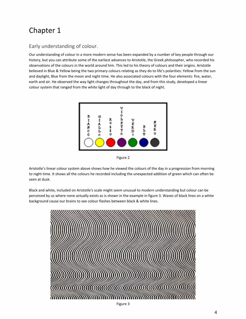
colour system that ranged from the white light of day through to the black of night.
Figure 2
Aristotle’s linear colour system above shows how he viewed the colours of the day in a progression from morning
to night time. It shows all the colours he recorded including the unexpected addition of green which can often be
seen at dusk.
Black and white, included on Aristotle's scale might seem unusual to modern understanding but colour can be
perceived by us where none actually exists as is shown in the example in figure 3. Waves of black lines on a white
background cause our brains to see colour flashes between black & white lines.
Figure 3
4

However strange Aristotle’s ideas may seem to our modern sensibilities, and with the benefit of nearly two and a
half thousand years of further research, his observations lead to a greatly accepted paradigm and set the
groundwork for studies by people such as Sir Isaac Newton, Johannes Itten and Johann Wolfgang Von Goethe.
Some of Aristotle’s contemporaries such as Empedokles compared the eye to a lamp radiating light: “As the lamp
radiates rays of light, so does the eye, which contains eternal fire shut up within it” (Benson J.L. 2000)
This assumed that we see external objects by virtue of a fire-like emanation from the eye. An early supporter of
this theory was the Pythagorean, Alcmaeon of Croton (5th century B.C.), who gave as evidence the flashes of light
and color seen when the eye is struck. However, it is refuted by Aristotle who argued that if this was the case then
our night vision would be as good as our day vision.
Aristotle's theories certainly didn’t stand the test of time, although traces did remain up until the 18th century.
Though some of Aristotle’s suggestions were based on what would over time be shown to be accurate
observations. For instance, while some of his suggestions as to the origin of certain colours may not have been
wholly accurate he did observe that colour was altered, changed or mixed when it came in contact with others
through reflection or transmittance. So a white wall for instance, would take on a reddish tint or hue if a red object
were to be placed next to it. Likewise for other colours that, when mixed, would result in a tertiary colour tint.
(Ibid)
This is an observation which is still very much observed today and is often used to guide colour choice in
everything from clothing to architecture. What clothes to wear with an outfit, what colour to paint a wall that gets
no direct sunlight.
Newton
When Sir Isaac Newton (1642 - 1727) was elected Lucasian Professor of Mathematics in 1669 he chose to begin his
lectures not on mathematics, but on his “New theory of light and colours”, a subject he had been developing since
1668 and first wrote about in 1672, theories and experiments that would form the basis for a new understanding
of the properties of light.
Newton’s experiments showed that, rather than colour being a product of the four elements Earth, Wind, Fire and
Water, as proposed by Aristotle, colour was actually a property of light itself. His experiments showed that as light
was passed through a refraction device such as a soap bubble, glass or his favorite instrument, the glass prism, it
was refracted at different angles into separate “Colourific Rays”. His critics’ arguments that the prism was actually
colouring the light were addressed when Newton passed the refracted rays through a second prism showing that
they returned to white light.
Figure 4
5

Guerlac writes: “The relation or "analogy," as he {Newton} calls it, between colors and the degree of refrangibility
he described as "very precise and strict." Colors, Newton clearly recognized, have no extra-mental existence, but
are internal sensations of our sensory apparatus evoked by the light from luminous or illuminated bodies.”
(Guerlac, 1986, pp. 3-20)
Here I believe Guerlac is explaining how Newton believes there is no further meaning, property or effect of light
other than the exact properties that can be deduced by scientific experiment, and that other implied, non-scientific
effects have no relation to light itself.
Johann Wolfgang von Goethe, (1749 - 1832) widely recognised as Germany’s greatest poet, playwright, novelist
and essayist – comparable to Shakespeare and Dante, didn’t entirely agree with a lot of what Newton had to say
on light and colour.
Johann Wolfgang Von Goethe
In the preface to the First Edition of Goethe’s Theory of Colours (1840, Translated from German by Eastlake,
Charles Lock), Goethe compares Newton’s works to be like a castle that has been revered for so long only because
it has never been adequately challenged or taken. The great theory of Newton had been revered and
recommended to school children for so long it had become an institution to be defended at all costs despite the
fact that science has advanced since, and he recommended clearing away the old bastion to be replaced by newer
scientific theories.
Having misinterpreted some of Newton’s experiments however, Goethe created his own version of Newton's
colour wheel based on his own experiments, seeking to derive laws of color harmony, ways of characterizing
physiological colors (how colors affect us) and subjective visual phenomena in general. He studied after-images,
colored shadows and complementary colors.
Figure 5
6

Goethe’s theories were not solely centered around the properties of colour in the Newtonian sense however:
“Where Newton had viewed color as a physical problem, involving light striking objects and entering our eyes.
Goethe realizes that the sensations of color reaching our brain are also shaped by our perception - by the
mechanics of human vision and by the way our brains process information. Therefore, according to Goethe, what
we see of an object depends upon the object, the lighting and our perception.” (Web exhibits.org. Author
unknown.)
So where Newton’s breakthrough concerned the physical breakdown and properties of light, Goethe gave us the
first insights into the human interaction with light, how we perceived it individually, the effect it had on us and in a
more modern sense how it could be applied to create a desired effect among targeted groups such as would be
found in the age of the consumer.
Our perception of colour relies on varying subjective conditions. For instance, in his text “Theory of colours”
Goethe states that seen together, objects of a different colour can have a perceived effect on each other.
A dark object appears smaller than a bright one of the same size. Let a white disk be placed on a black ground, and
a black disk on a white ground, both being exactly similar in size; let them be seen together at some distance, and
we shall pronounce the last to be about a fifth part smaller than the other. If the black circle be made larger by so
much, they will appear equal.” (Goethe, 1970)
Here Goethe explains an example of perceptual phenomenon that can trick the eye into seeing something other
than what the facts are showing. In a similar way, Josef Albers explains our perception of colour as I show later in
this essay in Figure 7.
Chapter 2
Modern refinement of theories.
Johannes Itten
Our more modern understanding of colour & its practical applications in the area of consumer psychology began to
be more fully understood in the early 20th century with the explorations of artists such as Johannes Itten and Josef
Albers, and the critical studies of people such as John Gage and Angela Wright.
The explorations of Itten on the nature of colour and its subjective meaning has informed our understanding and
influenced artists throughout the 20th century. His approach to the subject involved a closer look at the artist or
viewer and considered the impact of personality on the subject matter. It was this approach that set him both
apart from, and at odds with his peers. (Ekperigin, N. 2000).
His book, the art of colour remains an influential text to this day in which he discusses his theories on colour
contrasts as being a furthering of Adolf Hölzel's colour wheel and goes on to develop his own colour sphere (figure
6) which attempts to explain the relationship between colours and their contrasts.
7

Figure 6
Itten also believed strongly that colours had more than just physical properties and that they each had a physical
and emotional resonance in the viewer. Itten explains: “Colors are forces, radiant energies that affect us positively
or negatively, whether we are aware of it or not” ( Itten, J 1970)
His studies in the Bauhaus led him to conclude that there were four distinct personality types which could be
associated with distinct colour palettes. In an exercise during one of his classes at the Bauhaus, Itten required his
students to paint their impression of the seasons through colour. The resulting works were both very different but
still recognisable to each other. He was able to group the resulting works into 4 different colour palettes which he
named after the seasons.
Josef Albers
Another artist who broke new ground in the area of understanding colour was Josef Albers who wrote:
“Colour is the most relative medium in art” (Albers. 1963, Pg:8)
By this I believe he means that colour is not just a fixed value but depends entirely on the viewer's perception,
viewing condition, it’s placement with or near other colours and other variables that can affect a person’s
perception of a colour.
Josef Albers book “Interaction of Colour” was probably the most in depth study of its time, of the relationship
between colours themselves and of our perception of colours in differing situations and conditions. Though his
work was not immediately praised by his peers it was to become essential reading by anyone with an interest in
the field.
8

In his text Albers shows the interaction of colour and perception in an exercise similar to Goethe’s above (chapter
1, page 7).
“A colour has many faces, and 1 colour can be made to appear as 2 different colours. In the original design for the
study here, horizontal dark blue & yellow stripes were on a flap which could be lifted to show that a vertical strip
of ochre is the same colour at the top as it is at the bottom. Here it is almost unbelieveable that the upper small
and the lower small squares are part of the same stripe and are therefore the same colour. And no human eye is
able to see both squares - alike.” (Albers. 1963, Pg:76)
Figure 7
Albers is proving von Goethe’s assertions that colour is not a fixed valued property but is subject to conditions and
perception.
9
Through an explanation of two interesting phenomena, After Image and Optical Mixture, Albers tells how colours
can be perceived as different even when placed in proximity to each other. For instance, the Impressionist painters
would rarely use a green pigment to represent green but would instead place very small blobs of yellow & blue on
the canvas and when viewed from a distance would be perceived as, or give the impression of, green. This
technique was also favored by practitioners of Pointillism.
Two further experiments of Albers students show how the effect of Optical Mixing can be used in a practical sense,
rather than just artistically, to alter our perception of colours in products, packaging or even promotional material.
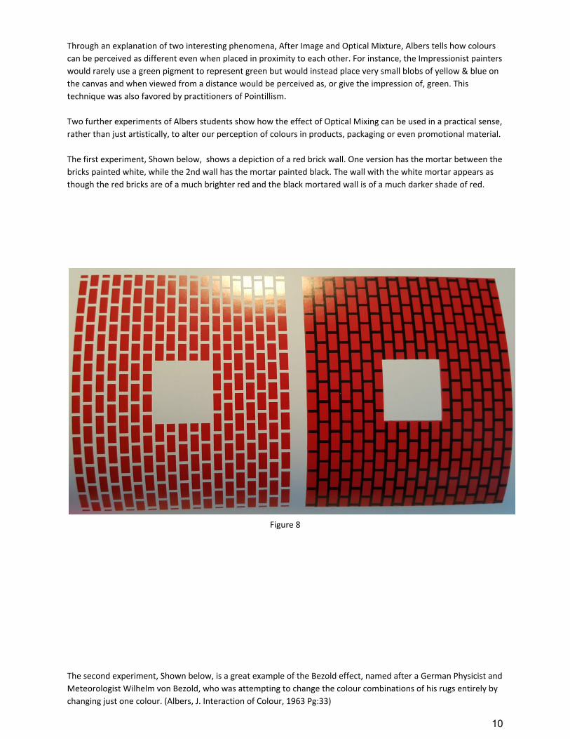
The first experiment, Shown below, shows a depiction of a red brick wall. One version has the mortar between the
bricks painted white, while the 2nd wall has the mortar painted black. The wall with the white mortar appears as
though the red bricks are of a much brighter red and the black mortared wall is of a much darker shade of red.
Figure 8
The second experiment, Shown below, is a great example of the Bezold effect, named after a German Physicist and
Meteorologist Wilhelm von Bezold, who was attempting to change the colour combinations of his rugs entirely by
changing just one colour. (Albers, J. Interaction of Colour, 1963 Pg:33)
10

It shows a textile pattern with a rose coloured background with red shapes placed in the pattern. In one half of the
textile the red shapes are bordered by black and in the other half they are bordered by white. The effect of
bordering the shapes with white entirely brightens all the colours on the textile and is a perfect example of the
Bezold effect and shows how the interrelationship of colours can affect our perception of them.
Figure 9
The subject is also expanded upon by Johannes Itten in his explanation of colour contrasts. Through his research he
devised seven methodologies for coordinating colors utilizing the hue's contrasting properties. These contrasts add
other variations with respect to the intensity of the respective hues; i.e. contrasts may be obtained due to light,
moderate, or dark value. (Itten, Karp. 1972)
These contrasting values are:
● The contrast of saturation
● The contrast of light and dark
● The contrast of extension
● The contrast of complements
● Simultaneous contrast
● The contrast of hue
● The contrast of hue - primaries
● The contrast of warm and cool
It is evident that the approach of both Itten and Albers is very similar, indeed both had a direct or close working
relationship with one of the pioneers of this thinking Franz von Stuck, whose pupils included Wassilly Kandinsky &
Paul Klee. With Itten working alongside Paul Klee at the Bauhaus it was not unlikely that these theories would find
a fertile ground.
11
Chapter 3
Contemporary applications of colour
The work of both Albers and Itten in explaining the effects of proximity, harmony and contrasts to affect our perception of colour provides a solid basis for our contemporary understanding and a grounding for the research done by people such as Angela Wright to expand our understanding of colour psychology and its uses in modern consumerism. This idea that colour has a physical & emotional effect on people forms the basis for modern marketing principles where colour is used to influence how consumers make their choices and what they feel about their experiences.
Research carried out by British researcher Angela Wright since the early 70’s took the prevailing paradigm a step
further. Wright suggested that not only did colour have an emotional and physical effect on people that was
influenced by more than just the main colours but differed depending on the hue or shade, and that this effect
wasn’t just random but was in fact predictable. (Wright, A. 2003) This predictability would allow designers an
effective tool in designing products & packaging aimed at specific markets.
Wright’s findings show that rather than the few major colours on the colour wheel having a specific effect, the
effects can vary according to any one of the many hues of a colour and is specifically related to the intensity of a
colour. So a low saturation blue would have certain level of response while a much higher saturated and intense
blue would have another level of response altogether. (Wright. 2003)
12

A research study by Shun Yin Lam also shows that colour is effective in attracting certain types of customers as well
as influencing their purchasing decisions. The section of infographic below shows how people react to each colour
as well as the types of customer they can attract. (Shun Yin Lam. 2017) Consumers place appearance and colour
above all other factors when shopping, with 85% of shoppers citing colour as their main reason for buying a
product.
Figure 10
(The effects of a store environment on shopping behaviours: A critical review by Shun Yin Lam The profit of colour by colour marketing group. The psychology of colour in marketing by June Campbell,
DirJournal.com & Colour Matters.com)
13

We can also have learned associations with colour, so that not only can we be naturally influenced by our reaction
to a colour we can also be conditioned through environmental cues. For instance, red stop lights, emergency
vehicles and teachers red pens teach us caution and danger. These trends can also carry over to our
receptivity to consumer packaging and marketing messages.
Practical applications in design.
When we have come far in terms of marketing products & services in the last 200 years. When products
were packaged and sold as commodities and not brands they were packaged in cloth or brown paper,
there was no thought given to making packaging attractive to consumers. Now, almost every
opportunity is taken to make use of advertising space and the promotion of a brand. I believe that the
biggest tool in this never ending race is the use of colour, with over 600 billion dollars being spent
globally on advertising in 2014. (Emarketer.com. 2017).
One example of colour being used in a positive fashion is Ryanair, who purchased new aircraft with a
system built into the ceiling of the cabin that can be programed to emit any colour light based on
whether the crew want the passengers soothed or energised, or even made to feel hungry.
Figure 11 Figure 12
To get the perspective of someone in the industry I interviewed Dr. Christine Mullan-Jensen, a
psychologist for Spark Market Research, Dublin, about the importance of colour to a brand in today's
marketplace. When dealing with one client in particular Spark did research on a range of colours to use
on a product with a number of different price levels.
“We ranked different concepts in colours from Gold to Green, Blue & Red in order of their premium
product to the standard one, with the more expensive product being the gold. So they were trying to
guide the buying decision to the premium product.“ (Mullen-Jenson, Dr. Christine. Interview on blog)
I believe this shows a very considered approach of using colour to increase the sales of a premium
product over a less expensive one.
Consumers are also being “trained” to recognise value items or sale items through the use of colour in signage and
even decor. The colour you paint your store can relax people and make them more likely to spend more time
browsing, or the colour of the signage in a particular area can attract attention simply because people associate
that colour palette with a good deal.
14

The relationship between consumer perception of quality and the food industry's drive to satisfy consumer needs
is complex and involves many different components. Emphasis is placed on perception at point of sale particularly
the intrinsic quality cues of colour. (Direct, 2017, Abstract)
Color is ubiquitous and is a source of information. People make up their minds within 90 seconds of their initial
interactions with either people or products. About 62-90 percent of the assessment is based on colors alone. So,
prudent use of colors can contribute not only to differentiating products from competitors, but also to influencing
moods and feelings – positively or negatively – and therefore, to attitude towards certain products. One can use
colors to increase or decrease appetite, enhance mood, calm down customers, and, reduce perception of waiting
time, among others. (Emeraldinsight.com, 2017)
I carried out some primary research to see if any of the lessons learned from my research were being employed in
a practical sense by retailers. I observed a number of retailers in the Pavillions Shopping Centre, Swords, Co.Dublin,
to see if any patterns emerged. The images taken in this research can be seen in index A.
The table below shows the Type of store, General colour palette, Lighting and General market.
Figure 13
I believe from this observation you can see that stores of a similar type are using very similar colour palettes to
attract their customers. For instance, food outlets and supermarkets are using quite earthy, relaxing colours which
will offer a calming influence to try get people to spend longer in the store. Two of these introduce red which can
enhance a feeling of hunger. The clothes outlets are almost all using the same colour palette of earth colours, Blue,
Green and Brown.
15

Conclusion
It is clear to see the progression from scientific explorations to modern application. There is hardly a single part of
our day that is not affected by colour in some way. As Johannes Itten stated, “Colour affects us, whether we are
aware of it or not”. (Ekperigin, N. PDF. Itten’s Color Wheel. 2000.)
The role of the designer has evolved over time from being someone to place text and an image to being someone
who understands the many layers of colour psychology and uses it as a tool to refine their designs, often
incorporating colour into the function of a design. Whether you are a designer targeting specific consumer
markets, or deciding what colour to use in hospitals and other health facilities to encourage recovery, colour is a
tool as important as any other in the process.
When designing my own brand I gave a lot of consideration to what colour palette I would choose and selected a
minimal palette of Blue, Orange and Black. The blue and orange were specifically chosen for their impact as much
as for the physical and psychological reaction to them. My business card now gets an instantly positive response.
Figures 14 & 15
We use colour to communicate in almost every aspect of our daily lives whether we realise it or not. Nature has
conditioned us to respond to many stimuli and colour is no different. As a designer it is hugely important to have
an understanding of those responses as we would any other language.
Hugh Shelley
Graphic Design HND2
2017
16

Appendices
Appendix A - Observations of colour use in retail spaces in Swords, Co. Dublin.
17

References Albers, J. (2006). Interaction of color. 1st ed. New Haven [Conn.]: Yale University Press.
Anon, (2017). [online] Available at: http://www.theimagearchitect.com/articles/TheFourSeasonsofColor.pdf
[Accessed 17 Apr. 2017].
Anon, (2017). How do colors affect purchases? Infographic. [online] Available at:
https://blog.kissmetrics.com/color-psychology/ [Accessed 27 Apr. 2017].
Anon, (2017). How do colors affect purchases? Infographic. [online] Available at:
https://blog.kissmetrics.com/color-psychology/?wide=1 [Accessed 27 Apr. 2017].
Bailey, C. and Bailey, C. (2017). The exact color to paint your office to become the most productive – A Life of
Productivity. [online] Alifeofproductivity.com. Available at: http://alifeofproductivity.com/angela-wright-interview/
[Accessed 20 Jan. 2017].
Colour Blind Awareness. (2017). Colour Blindness. [online] Available at:
http://www.colourblindawareness.org/colour-blindness/ [Accessed 29 Jan. 2017].
Colour-affects.co.uk. (2017). History Of Colour - Colour Affects. [online] Available at:
http://www.colour-affects.co.uk/history-of-colour [Accessed 27 Feb. 2017].
Colour-affects.co.uk. (2017). History Of Colour - Colour Affects. [online] Available at:
http://www.colour-affects.co.uk/history-of-colour [Accessed 28 Feb. 2017].
Colour-affects.co.uk. (2017). The Wright Theory - Colour Affects. [online] Available at:
http://www.colour-affects.co.uk/the-wright-theory [Accessed 28 Feb. 2017].
Colour-affects.co.uk. (2017). The Wright Theory - Colour Affects. [online] Available at:
http://www.colour-affects.co.uk/the-wright-theory [Accessed 28 Feb. 2017].
Direct, S. (2017). Consumer perception and the role of science in the meat industry. [online] Sciencedirect.com.
Available at: http://www.sciencedirect.com/science/article/pii/S0309174010001865 [Accessed 27 Apr. 2017].
Emarketer.com. (2017). Advertisers Will Spend Nearly $600 Billion Worldwide in 2015 - eMarketer. [online]
Available at:
https://www.emarketer.com/Article/Advertisers-Will-Spend-Nearly-600-Billion-Worldwide-2015/1011691
[Accessed 17 Apr. 2017].
Emeraldinsight.com. (2017). Impact of color on marketing: Management Decision: Vol 44, No 6. [online] Available
at: http://www.emeraldinsight.com/doi/abs/10.1108/00251740610673332 [Accessed 27 Apr. 2017].
Gage, J. (2013). Colour and meaning. 1st ed. London: Thames and Hudson.
Goethe, J. (1970). Theory of colours. 5th ed. The MIT Press.
18

Homepage.tinet.ie. (2017). blueonred. [online] Available at: http://homepage.tinet.ie/~billydixon/index.htm
[Accessed 7 Nov. 2016].
Itten, J. and Karp, A. (1972). The Elements of Color. Leonardo, 5(2), p.180.
Jstor.org. (2017). Can there Be Colors in the Dark? Physical Color Theory before Newton on JSTOR. [online] Available
at: http://www.jstor.org/stable/2709592 [Accessed 17 Feb. 2017].
Meggs, P. and Purvis, A. (2016). Meggs' history of graphic design. 1st ed. Hoboken: Wiley.
Newton.ac.uk. (2017). Isaac Newton's Life | Isaac Newton Institute for Mathematical Sciences. [online] Available
at: https://www.newton.ac.uk/about/isaac-newton/life [Accessed 21 Nov. 2017].
Penelope.uchicago.edu. (2017). ps‑Aristotle • de Coloribus. [online] Available at:
http://penelope.uchicago.edu/Thayer/E/Roman/Texts/Aristotle/de_Coloribus*.html [Accessed 21 Nov. 2016].
Reference. (2017). What did Isaac Newton find out about light?. [online] Available at:
https://www.reference.com/science/did-isaac-newton-out-light-621ed6b8db87225f# [Accessed 2 Mar. 2017].
Sawaya, L. (2017). - TheLandofColor.com. [online] TheLandofColor.com. Available at:
http://thelandofcolor.com/color-theorist-johannes-itten/ [Accessed 16 Apr. 2017].
Scholarworks.umass.edu. (2017). "Chapter 2: Greek color theory" by J.L. Benson. [online] Available at:
http://scholarworks.umass.edu/art_jbgc/6 [Accessed 23 Nov. 2016].
ScienceDaily. (2017). Effect Of Colors: Blue Boosts Creativity, While Red Enhances Attention To Detail. [online]
Available at: https://www.sciencedaily.com/releases/2009/02/090205142143.htm [Accessed 27 Apr. 2017].
ScienceDaily. (2017). Effect Of Colors: Blue Boosts Creativity, While Red Enhances Attention To Detail. [online]
Available at: https://www.sciencedaily.com/releases/2009/02/090205142143.htm [Accessed 8 Dec. 2016].
Sciencedirect.com. (2017). Quality as influenced by color - ScienceDirect. [online] Available at:
http://www.sciencedirect.com/science/article/pii/095032939400026R [Accessed 23 Apr. 2017].
Shun Yin Lam, (2017). How do colors affect purchases? Infographic. [online] Available at:
https://blog.kissmetrics.com/color-psychology/?wide=1 [Accessed 27 Apr. 2017].
Sparkmr.com. (2017). Spark - Full Service Market Research Agency - Ireland. [online] Available at:
http://www.sparkmr.com/ [Accessed 27 Apr. 2017].
Tandfonline.com. (2017). Children's Emotional Associations with Colors: The Journal of Genetic Psychology: Vol 155,
No 1. [online] Available at: http://www.tandfonline.com/doi/abs/10.1080/00221325.1994.9914760 [Accessed 21
Apr. 2017].
The colour journal. (2017). Johannes Itten 1888-1967. [online] Available at:
https://thecolourjournal.wordpress.com/2014/09/29/johannes-itten-1888-1967/ [Accessed 13 Mar. 2017].
Tomellard.com. (2017). Aristotle and Newton on Colour. | Ellard. [online] Available at:
http://tomellard.com/wp/2014/01/artistotle-and-newton-on-colour/ [Accessed 12 Jan. 2017].
Webexhibits.org. (2017). Goethe's Color Theory. [online] Available at:
http://www.webexhibits.org/colorart/ch.html [Accessed 15 Mar. 2017].
19

Worqx.com. (2017). Johannes Itten's Color Contrasts. [online] Available at: http://www.worqx.com/color/itten.htm
[Accessed 17 Apr. 2017].
Worqx.com. (2017). Johannes Itten's Color Contrasts. [online] Available at: http://www.worqx.com/color/itten.htm
[Accessed 13 Mar. 2017].
Writer, S. and Writer, S. (2017). Operators hunger for spectrum: report. [online] Businesstech.co.za. Available at:
https://businesstech.co.za/news/mobile/49966/operators-hunger-for-spectrum-report/ [Accessed 21 Mar. 2017].
Zifcak, S., Poitras, M., Vega, D. and Hundley, J. (2017). Johannes Itten - Kaufmann Mercantile. [online] Kaufmann
Mercantile. Available at: https://www.kaufmann-mercantile.com/field-notes/johannes-itten/ [Accessed 7 Apr.
2017].
20