Embed Size (px)
Citation preview

Color ManagementHandbookStrategies to master color managementin the digital workflowStart applying them today
ver.3

32 Color Management Handbook
Is that really the correct color?
Photographer
Retoucher
Designer
Printer
Is the image displayed on the monitor really accurate?
Is the photograph edited the way it was intended?
Are the application settings on the monitor correctly adjusted and does the color match the printed image?
Do the colors in the design comp and color proof match?
“Is this color good to go?” — A hesitation we often have before making prints in the digital workflow.
The first time I laid eyes on Terry Lennox he was drunk in a Rolls-Royce Silver Wraith outside the terrace of The Dancers. The parking lot attendant had brought the car out and he was still holding the door open because Terry Lennox's left foot was still dangling outside, as if he had forgotten he had one. He had a young-looking face but his hair was bone white. You could tell by his eyes that he was plastered to the hairline, but otherwise he looked like any other nice young guy.
The first time I laid eyes on Terry Lennox he was drunk in a Rolls-Royce Silver Wraith outside the terrace of The Dancers. The parking lot attendant had brought the car out and he was still holding the door open because Terry Lennox's left foot was still dangling outside, as if he had forgotten he had one. He had a young-looking face but his hair was bone white. You could tell by his eyes that he was plastered to the hairline, but otherwise he looked like any other nice young guy.
54 Color Management Handbook
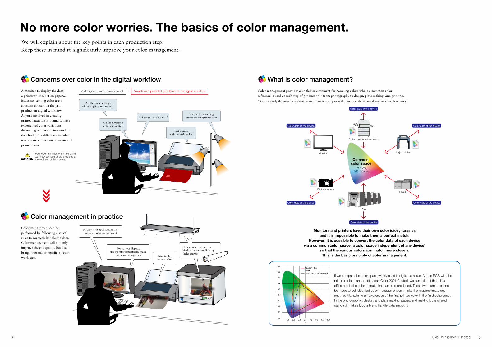
No more color worries. The basics of color management.
Concerns over color in the digital workflow What is color management?
Color management in practice
Poor color management in the digital workflow can lead to big problems at the back end of the process.
A monitor to display the data,
a printer to check it on paper….
Issues concerning color are a
constant concern in the print
production digital workflow.
Anyone involved in creating
printed materials is bound to have
experienced color variations
depending on the monitor used for
the check, or a difference in color
tones between the comp output and
printed matter.
Color management provides a unified environment for handling colors where a common color
reference is used at each step of production, *from photography to design, plate making, and printing.
Monitors and printers have their own color idiosyncrasies and it is impossible to make them a perfect match.
However, it is possible to convert the color data of each device via a common color space (a color space independent of any device)
so that the various colors can match more closely.This is the basic principle of color management.
If we compare the color space widely used in digital cameras, Adobe RGB with the
printing color standard of Japan Color 2001 Coated, we can tell that there is a
difference in the color gamuts that can be reproduced. These two gamuts cannot
be made to coincide, but color management can make them approximate one
another. Maintaining an awareness of the final printed color in the finished product
in the photographic, design, and plate making stages, and making it the shared
standard, makes it possible to handle data smoothly.
*It aims to unify the image throughout the entire production by using the profiles of the various devices to adjust their colors.
Color management can be
performed by following a set of
rules to correctly handle the data.
Color management will not only
improve the end quality but also
bring other major benefits to each
work step.
We will explain about the key points in each production step.Keep these in mind to significantly improve your color management.
A designer’s work environment
Are the color settingsof the application correct?
Display with applications that support color management
For correct display, use monitors specifically made
for color management Print in the correct color!
Check under the correct kind of fluorescent lighting(light source)
Are the monitor’s colors accurate?
Is it printedwith the right color?
Is my color checkingenvironment appropriate?Is it properly calibrated?
Awash with potential problems in the digital workflow
Color data of the device
Monitor
Color data of the device
Color data of the device
WARNING
Color data of the device Color data of the device
Color data of the device
Color multifunction device
Inkjet printer
DDCPDigital camera
Common color space
CIE XYZ, CIE L*a*b, etc.
76 Color Management Handbook
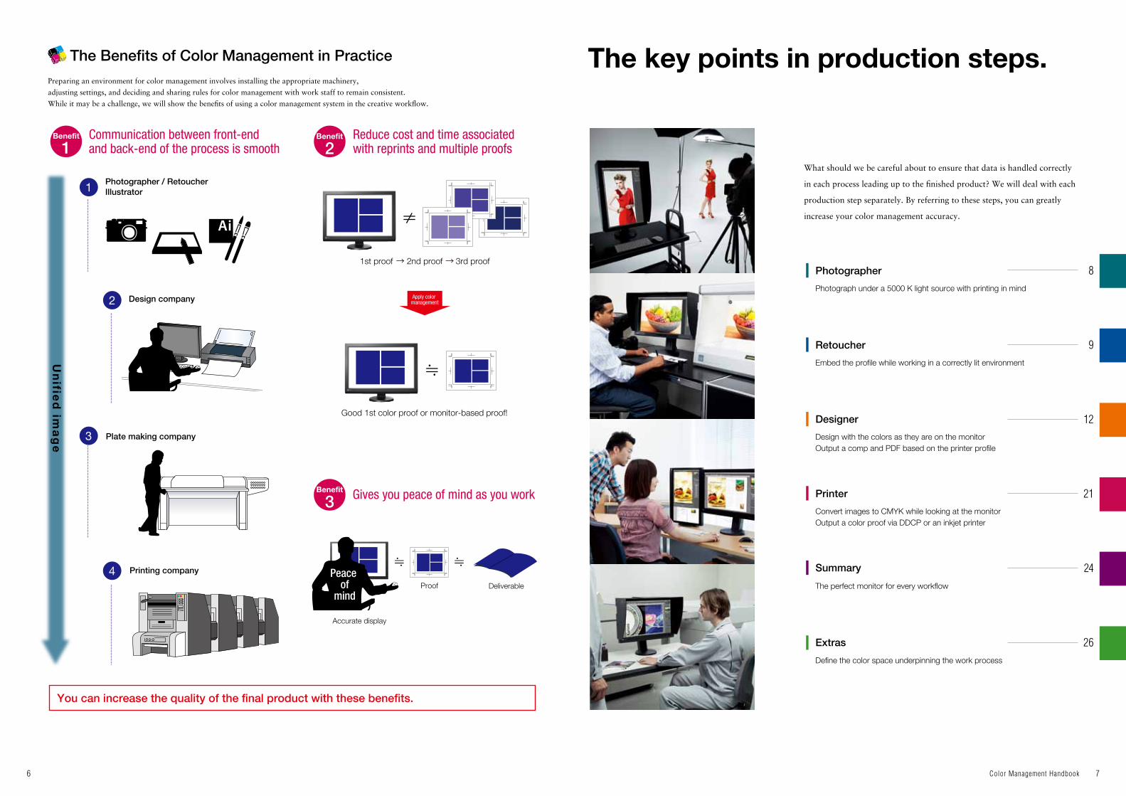
The key points in production steps.The Benefits of Color Management in Practice
Communication between front-endand back-end of the process is smooth
Photographer / Retoucher Illustrator
Design company
Plate making company
Printing company Peace of
mind
1st proof
Good 1st color proof or monitor-based proof!
Accurate display
Proof Deliverable
2nd proof
Apply color management
3rd proof
Reduce cost and time associated with reprints and multiple proofs
Gives you peace of mind as you work
Un
ified
ima
ge
You can increase the quality of the final product with these benefits.
Preparing an environment for color management involves installing the appropriate machinery,
adjusting settings, and deciding and sharing rules for color management with work staff to remain consistent.
While it may be a challenge, we will show the benefits of using a color management system in the creative workflow.
What should we be careful about to ensure that data is handled correctly
in each process leading up to the finished product? We will deal with each
production step separately. By referring to these steps, you can greatly
increase your color management accuracy.
Photographer
Retoucher
Designer
Printer
Summary
Extras
Photograph under a 5000 K light source with printing in mind
Embed the profile while working in a correctly lit environment
Design with the colors as they are on the monitorOutput a comp and PDF based on the printer profile
Convert images to CMYK while looking at the monitorOutput a color proof via DDCP or an inkjet printer
The perfect monitor for every workflow
Define the color space underpinning the work process
12
9
8
21
24
26

98 Color Management Handbook
Photographer Retoucher
Photography
Key points when comparing the subject at the shoot and how it looks on the monitor
Settings for color sample comp output and proof printing
Photograph under a 5000 K light source with printing in mind Embed the profile while working in a correctly lit environment
Retouching
In ISO international standards and Japanese printing standards,
“D50” is adopted as the light source for evaluating the color
tones in printed materials. This value, determined by sampling
based on the human sense of color, is a color temperature of
5000 K. For proper color management it is vital to keep this
5000 K in mind right from the photography stage.
The document profile (source profile) used in the digital printing
workflow is Adobe RGB or sRGB. The white point in these
profiles is set as D65 and, based on this, some people hold that
the color temperature of the monitor should be 6500 K.
However, as was stated earlier, ISO and Japanese printing
standards stipulate viewing under D50 light source and in
Set the camera’s white balance to sunlight (it varies according to the camera
but usually around 5000 K)
Make the monitor setting 5000 K.
Make the monitor setting 5000 K.
Check under the correct kind of fluorescent lighting
Output with the right print setting
Photoshop
Adobe RGB or sRGB
Embed the profile when saving
The Photoshop print window(select "Normal Printing")
The Photoshop print window(select "Hard Proofing")
Printer color management window
Use a light source at the shoot that is close
to 5000 K.
Use a fluorescent light designed for color appraisal when you compare the subject and its image on the monitor at a shoot.The color temperature of the fluorescent light is important, but you must pay just as much attention to the color rendering index (Ra). Accurate color reproduction requires Ra90 or above. The colors of the monitor and the subject will match when viewed in fluorescent light with high color rendering properties.
When outputting a color sample comp to send to the back-end printing process, select “Normal Printing” in the Photoshop Print dialog box and choose “Photoshop Manages Colors” for color handling and specify a printer profile compatible with the paper. When you do so, make sure that ColorSync is checked. However, in the case of proof printing (color proof), select “Hard Proofing” instead of “Normal Printing”. This automatically sets the CMYK working space of the Photoshop color settings as the proof’s profile so, depending on the printing method, choose Coated FOGRA39 for a sheet-fed press or Web Coated FOGRA28 for a rotary press.
Modeling lamps with a low color temperature are usually used in studios.
If you illuminate the subject with a fluorescent desk lamp designed for color appraisal, the colors will match those on the monitor.
It is possible to maintain color consistency from the photography
stage to printing by making the color temperature of the light
source during the shoot as close to 5000 K as possible, and by
using 5000 K as a yardstick in the white balance settings of the
camera and in the RAW development.
Photoshop, the white point is also processed at 5000 K. When
retouching photographs, it is essential to prepare a 5000 K
work environment that accords with these standards. In
addition, always embed the profile when saving a file so that
the colors of the image can be accurately conveyed to the
back-end of the process.
Photographer
Retoucher

1110 Color Management Handbook
Use a display monitor specificallyfor color management.
Using a dedicated monitor
What is monitor color?
Why is a dedicated monitor necessary?
There are many different types of LCD monitors, from inexpensive
ones to high performance models. However, the display properties
of the monitor are very important for accurate display and proper
color handling. The ColorEdge series shown in has clear
gradations for each RGB color, but the monitors shown in and
Every ColorEdge monitor is individually
adjusted at the factory for displaying the
entire RGB color space, giving each one
a smooth, consistent display.
When print output is being evaluated in a 5000 K environ-
ment, adjusting the monitor to 5000 K enables good color
matching and correct use of color. ColorNavigator, dedicated
calibration software for ColorEdge, facilitates accurate and
quick monitor adjustments to the target color temperature
and brightness.
A high-precision calibration can be performed in just a few minutes by
simply choosing the 5000 K and 80 cd/m2 target values that were set
previously.
Setting an accurate monitor profile is essential for accurate color matching.
With its dedicated calibration software, ColorEdge is able to automatically
generate and store an accurate profile.
The newest ColorEdge models come with a built-in sensor
that automatically adjusts the monitor at user-determined
intervals. This gives the user a consistent display that is
easy to setup and maintain.
ColorEdge uses ColorNavigator, its dedicated calibration software, in combination with a commercially available sensor or the in-built sensor, so the monitor’s internal settings are adjusted directly and its color display adjusted. This is known as hardware calibration.
Unlike software calibration, where computer output is adjusted in a general purpose LCD monitor by a combina-tion of a commercially available calibration sensor and software, hardware calibration performs more accurate monitor adjustment with no gradation loss or color shift.
Sometimes LCD monitors may display uneven levels of
brightness and color across the screen. Monitors with a
dedicated circuit to rectify this enables work efficiency with
a uniform display.
Of the many adjustable color settings, “brightness” and “color temperature” are especially important.
Just like the color of paper can look different depending on the lighting conditions, different monitors will display different colors.
Correct use of color is possible by adjusting the monitor to the reference.
Brightness: Color temperature: Brightness of the monitor display. Expressed in cd/m2 (candela).
Color tone when white is displayed on the monitor. Expressed in a unit called K (kelvin).
have uneven and fluctuating gradations. This not only means that
they cannot display images correctly, but there is also the danger of
corrupting good quality data. It is essential to employ a display
monitor specifically for color management in the digital workflow.
ColorEdge high-end graphics monitors
Dark 40 cd/m2 80 cd/m2
Initial settings
Paper color Monitor color
Print according to reference
Adjust according to reference
Provide a color reference also for
monitorsEvaluate under the correct light source of
5000 K/Ra 90 or more
Adjust to preference
Adjust darker
Color shifts over time
120 cd/m2 4500 K 5000 K 6500 KBright Yellowishwhite
Blueish white
Other graphics monitors Other low-end monitors
Individual adjustment prior to shipping
Easy setup using dedicated software
Color management with an automatic internal sensor
Hardware calibration that doesn’t sacrifice gradation expression is possible with ColorEdge.
5000 K/Ra 90 or more
Dedicated circuit for display correction
Evaluationunder a 5000 K
light source
Automatically generate accurate profilesAutomatically generateand storemonitor profiles
5000 K
Profile
Adjusted to 5000 K
CG Series built-in calibration sensor
CX Series built-in correction sensor
Software Calibration
Hardware Calibration
Gamma Curve
Gamma Curve
Brightness
Brightness
256 Gradations
256 Gradations
Retoucher
Retoucher

浪漫潮風
印刷における色校正は現在、平台
校正や本機校正、D
DCP
、インクジ
ェットなどを用途に合わせて使い分
けています。中でもD
DCP
は最近の
主流です。D
DCP
やインクジェット
は従来の校正と違って色の変動が少
なく、カラーマネージメントにも対
応しているので、モニターと比較し
てもかなり色が合って見えます。紙
に出力された色校正を確認する場合
に重要となるのが、デザイナーやク
ライアントの環境光です。ポイント
2(P10-11
)の説明にあるように、
それぞれの環境光を整備すると色の
見え方が揃います。色についてのコ
ミュニケーションが円滑になれば、
高品質な印刷物を効率的に制作でき
ます。
印刷における色校正は現在、平台
校正や本機校正、D
DCP
、インクジ
ェットなどを用途に合わせて使い分
けています。中でもD
DCP
は最近の
印刷における色校正は現在、平台
校正や本機校正、D
DCP
、インクジ
ェットなどを用途に合わせて使い分
けています。中でもD
DCP
は最近の
主流です。D
DCP
やインクジェット
は従来の校正と違って色の変動が少
なく、カラーマネージメントにも対
応しているので、モニターと比較し
てもかなり色が合って見えます。紙
に出力された色校正を確認する場合
に重要となるのが、デザイナーやク
ライアントの環境光です。ポイント
2(P10-11
)の説明にあるように、
それぞれの環境光を整備すると色の
見え方が揃います。色についてのコ
ミュニケーションが円滑になれば、
高品質な印刷物を効率的に制作でき
ます。
印刷における色校正は現在、平台
校正や本機校正、D
DCP
、インクジ
ェットなどを用途に合わせて使い分
けています。中でもD
DCP
は最近の
主流です。D
DCP
やインクジェット
印刷における色校正は現在、平台
校正や本機校正、D
DCP
、インクジ
ェットなどを用途に合わせて使い分
けています。中でもD
DCP
は最近の
主流です。D
DCP
やインクジェット
は従来の校正と違って色の変動が少
なく、カラーマネージメントにも対
応しているので、モニターと比較し
てもかなり色が合って見えます。紙
に出力された色校正を確認する場合
に重要となるのが、デザイナーやク
ライアントの環境光です。ポイント
2(P10-11
)の説明にあるように、
それぞれの環境光を整備すると色の
見え方が揃います。色についてのコ
ミュニケーションが円滑になれば、
高品質な印刷物を効率的に制作でき
ます。
印刷における色校正は現在、平台
校正や本機校正、D
DCP
、インクジ
ェットなどを用途に合わせて使い分
けています。中でもD
DCP
は最近の
主流です。D
DCP
やインクジェット
は従来の校正と違って色の変動が少
なく、カラーマネージメントにも対
応しているので、モニターと比較し
てもかなり色が合って見えます。紙
に出力された色校正を確認する場合
に重要となるのが、デザイナーやク
ライアントの環境光です。ポイント
2(P10-11
)の説明にあるように、
それぞれの環境光を整備すると色の
ちょっと贅沢な
金沢の秋を味わう。
色校正の出力において、短納期、低コストの流れから、徐々にインクジェットのニーズが高まっています。10~12色のインクを搭載した最新のプリンタは、通常の4色印刷の色域はもちろん、PANTONEなど特色の再現も可能となっています。さらにカラーマネージメントによって入口から出口までトータルで色を合わせら
色校正の出力において、短納期、低コストの流れから、徐々にインクジェットのニーズが高まっています。10~12色のインクを搭載した最新のプリンタは、通常の4色印刷の色域はもちろん、PANTONEなど特色の再
ちょっと贅沢な
金沢の秋を味わう。
豪華絢爛。金沢の秋の海原を贅沢に味わう。
1312 Color Management Handbook
Designer
Design
Use the same profile embedded in the image in the design process.
Design with the colors as they are on the monitor
Color management has seen revolutionary changes in both the input
(photography, scanning etc.) and output (printing) processes.
However, in the design process, which lies directly between them,
the traditional method of determining colors by CMYK values is
still going strong, while there are many cases where people who use
monitors with a low level of accuracy are swayed by their visible
Sometimes the profile embedded in the photographic data is deliberately removed by the designer. This is probably due to an incomplete understanding of systemic color management. Removing an image’s profile puts the colors in an undetermined state and can cause problems in the back-end process. It is important for the designer to use the photographic data as it is, without removing the profile. The safest way to do it is to select “Europe Prepress 3” in the InDesign or Illustrator color settings.
perception of the colors. However, by using a monitor with
excellent tone and color reproducibility, and introducing color
management, it becomes possible to simulate the print finish on the
monitor. Both creativity and productivity are boosted when design
work is just as it’s shown on the monitor.
The monitor is set to 5000 K The right fluorescent lighting
Measure the paper with the sensor.
An intuitiveuser-friendly interface
A profile better suited for the matching purpose
White of the paper
Example) 5000 K/Ra.99
- Base-color of the paper - Reflection of the wall color- Multiple light sources
White on the monitor
5000 KFine tuning complete
Fine tuning complete
Profile
5266 K98 cd/m2
γ 2.2
Status is measured with the calibration sensor
5000 K
When compared with the paper, the white does not match!
Either method can be used with ColorEdge.
ColorNavigator’s manual adjustment function makes fine tuning white color very easy!
It is possible to regenerate profiles to match the objective.
In this case, fine tuning the monitor’s white to match the paper will improve color accuracy.
Just move the pointer towards the desired color.The white color is adjusted accordingly!
Repeats status measurement and profile generation upon completion of fine tuning.
Influencers
Illustrator or InDesign
Adobe RGBor sRGB
Arrange PSD or TFF files embedded with the profile just as they are.
By selecting “Europe Prepress 3”, you will be able to select “Preserve Embedded Profiles” for RGB under Color Management Policies.
The InDesign color settings
Adjust the monitor to match printed material.
Color matching between prints and monitor
Fine tuning after adjusting to 5000 K
Color matching between the printed material and the monitor (evaluate side-by-side) can be done by:
* The ColorEdge internal sensors cannot perform paper white measurement. To use this method of measurement, it is necessary to prepare a separate external calibration sensor.
Even with the color temperature of the monitor set to 5000 K, its white may still not match that of the paper. In this case, fine tuning the monitor’s white to match the paper will improve color accuracy.Calibrating the monitor using target
values that have been standardized under a 5000 K light source as described on Page 11, to create and set the monitor profile
Adjusting the monitor so the white of both the paper and monitor match (Paper White Measurement*)
With ColorEdge, fine tuning the display is possible even after calibration. By visually reselecting the white color, it is possible to derive a calibration target value that is better suited for the matching application.
With ColorEdge, it is possible to regenerate a profile to better match the objective by performing a remeasurement based on the target values obtained from manual fine tuning.
Designer
Designer

1514 Color Management Handbook
Designer
Designer
Matching the monitor color for all workers.
Comp and PDF
Output a comp and PDF based on the printer profile
Once the design is finished, the comp is output using a laser
printer or inkjet printer. This is a very important stage where the
designer and the client both look at the printed output and do a
comprehensive check of the composition, color coordination and
so on. This cannot be done efficiently if the color tones on the
monitor and in the comp output are different. Recently it’s
becoming more common to export a PDF file and send it to the
client. This is a very convenient way of doing things if the
printing colors can be simulated at the PDF stage. Outputting a
comp and PDF based on the printer profile makes it possible to
share the finished image with the client.
Color quality in the digital workflow can be improved by matching the color of each monitor and having the workers share a common image. There are also two methods by which the color of monitors may be matched.
By using each of these methods appropriately for a given purpose, accuracy in the use of color can be improved.
Not compatible outside the company but very convenient for in-house color unification!
Provides a high level of compatibility but may not match print output.
Matching them to the printed output
Matching them to the printed output
Matching them to an industry reference value
Matching them to an industry reference value
Illustrator or InDesign
PDF output in the
printer profile color gamut
5266 K98 cd/m2
γ 2.2
5000 K80 cd/m2
γ 2.2
6500 K80 cd/m2
γ 2.2
By taking the adjustment value to match the white of the printer paper obtained in and applying it to all monitors in the company, theoretically, the display color of all monitors will be matched.
[ISO12646] is a core standard for “soft proofing”, the practice of performing print color proofing on a monitor. The Japanese printing industry also often follows this standard.
5000 K 80 cd/m2 γ2.26500 K 80 cd/m2 γ2.2In-house matching
Communicating with design company AData submission to printing company BFor sRGB workflow
etc.
...
With ColorEdge, it is possible to store monitor adjustment settings for each application and easily switch between them depending on the job.
An international standard on color gamut. A standard set for CRT monitors, but many manufacturers still conform to this standard. The large installed base provides high compatibility thus making it useful in applications such as web content development.
[ISO 12646:2008]Characteristics of a proofing monitor and observation conditions
5000 K 80 cd/m2 or above γ2.2 [ISO 12646]
6500 K 80 cd/m2 γ2.2 sRGB standard
With ColorEdge, ColorNavigator makes it easy to share target values between different monitors using its target adjustment value import/export function.
Settings may be slightly different between each monitor due to model differences.
By adjusting all in-house monitors to an industry standard, a basic color management environment can be established. This may not meet necessary requirements in terms of matching with actual print output.
5266 K98 cd/m2
γ 2.2
5266 K98 cd/m2
γ 2.2
5266 K98 cd/m2
γ 2.2
5266 K98 cd/m2
γ 2.2
The appropriate fluorescent lighting The appropriate fluorescent lighting
The client’s environment The designer’s work environment
Comp output in the printer profile color gamut The monitor is set to 5000 K
Acrobat 8 or later

1716 Color Management Handbook
Display using applications thatsupport color management.
For accurate color management, it is necessary to check the data and simulate printing on the
display using applications that support color management.
To correctly view an image in accordance with color management rules, the application must
load each of the profiles for the monitor and the image, and perform accurate color conversion.
For precise color utilization, color settings are first adjusted to the requirements of each job.
Open Creative Suite and select “Creative Suite Color Settings” under Edit. A window for selecting settings for all applications will appear.
The color settings you choose in Bridge will stay consistent with every Adobe application so “Europe Prepress 3” will also carry over.
You can adjust the color settings in any software individually, but with Adobe Bridge you can save settings across all Adobe programs at once.
Select Europe “Prepress 3” and click “Apply”.
Applications that support color
management will automatically load
the monitor profile set in the OS.
NOTE: Some applications may require manual setup.
Displaying images using applications
Loading the monitor profile
First, check the application’s color settings
< Recommended Photoshop color settings >
< Recommended Illustrator/InDesign color settings >
Working Spaces
Color Management Policies
Working Spaces
Color Management Policies
Use the profile embedded in the image Use the profile specified in “Color Settings”
Select “Color settings” under “Edit”.
Select “Color settings” under “Edit”.
It is convenient to have the profile for your normal digital workflow set up in advance.RGB: Typically, “sRGB” or “Adobe® RGB”. CMYK: Select according to the color standard used in the workflow. When re-embedding the image profile, make selections based on the back-end workflow and the type of end deliverable.
For both RGB: and CMYK:, select “Preserve Embedded Profiles.”
It is convenient to have the profile for your normal digital workflow set up in advance.RGB: Typically, “sRGB” or “Adobe® RGB”.CMYK: Select according to the color standard used in the workflow. When re-embedding the image profile, make selections based on the back-end workflow and the type of end deliverable.
For RGB: select “Preserve Embedded Profiles.”For CMYK: select “Preserve Numbers (Ignore Linked Profiles).”
When opening the file in the application, select “Use the embedded profile (instead of the working space)”. By maintaining the embedded profile, an image can be handled with the same color setting throughout the digital workflow. When a file’s embedded profile matches the working space, checking is not necessary as the file opens automatically.
The image can be viewed in the working space specified in the application’s “Color Settings”. This is a useful function utilizing data that come from various external organizations or devices, or when it is necessary to switch profiles depending on the back-end process.
This screen will appear if you attempt to open an image that does not match the Photoshop working space.
- CMYK differs from RGB in that it does not define color spaces, but prioritizes percentage values.
Select all check boxes so it is possible to make positive identification either when files that have embedded profiles do not match the “Working Spaces”, or when files without an embedded profile are being opened. (Recommended)
ColorEdge will automatically set accurate monitor profiles in the OS.
Monitor profile
Image profile
Color conversion
LCD Monitor
Applications supporting color management
Image data
Monitor profile
Profile is set Referenced automatically
Automatically set
Bridge is useable with CS2 and above.
Loading the image profile
To open an image file correctly while referencing a profile,
select one of the following two methods.
Use the profile embedded in the image.
Use the profile specified in “Color settings”.
In normal digital work, the embedded profile should be used by
selecting method .
Open the image file
Designer
Designer

1918 Color Management Handbook
Designer
Designer
Output a comp to a printer with the correct settings.
Check the color under the correct light source.
For precise color management it is necessary to prepare the printer you will be outputting the comp to with the correct settings.
In order to manage colors using your image software, you must specify a printer profile.
While referring to the printer profile and the image profile within the software, we can
change the colors for output.
The printed material reflects the light from the light source
so colors look different depending on the environmental light (ambient light).
Even with a clear image of the desired color, a change in environment can result in the following:
Work created under improper lighting
Correcting colors to match the comp
When printed under proper lighting conditions,
it’s different from what was envisioned
Laser printers are equipped with a RIP (raster image processor). We will apply the output
profile directly to the laser printer (DTP full color all in one printer-copier) so there will be
no need to manage color settings in your image software. -Settings as they would go through a RIP to output.
If you want to use an inkjet printer to print color proofs for work, select “Hard Proofing” instead of “Normal Printing.” Then, by selecting “Coated FOGRA39”, you can print with the colors as they are on the monitor.
Using an inkjet printer
Why the light source must be controlled
Using a laser printer
Using an inkjet printer to print proofs
Output
Output
Photoshop print settings
Illustrator print settings
Photoshop print settings
Printer profile
Natural light (sunny)
Incandescent light
The creator’s intended colors
Send to Printer
At the printing companyAt the design company
Natural light (cloudy)Reference color in
the publishing/printing industry
Color tone of regular
televisions
Color tone of regular LCD monitors
6500 K5000 K 9300 K
To correctly control color in the digital workflow, it is
necessary to evaluate printed material according to set
standards with appropriate lighting conditions.
Cool fluorescent light
?
Printer profile
Image profile
Image profile
Choose “Photoshop Manages Colors” under Color Handling and the paper profile you will be using under Printer Profile
Software with color management
Select “PostScript color settings” for Color Handling
Select “Photoshop manages colors” for Color Handling
Colorchange
Color change

2120 Color Management Handbook
Designer
Printer
(1) Fluorescent light with a high color rendering index and appropriate color temperature.
(2) Block outside light and view solely under fluorescent lighting as much as possible.
The image profile and evaluation environment of the printed
output are the staples that provide a common output image across
different steps in the digital workflow.Installing a dedicated color evaluation system will make it
possible to perform color checks of printed material in a
more optimal environment.
Under proper lighting,color evaluation can be
performed with confidence
Light source approximately 5000 K.
Photograph taken with printing in mind
Correct color under5000 K light source
Final check under5000 K light source.
Start printing
Hanging fluorescent light module for color proofing designed to reduce unevenness in color and illumination
Color viewing system
Printed output is checked under
5000 K light source
Monitor is displayed at
5000 K
Calibration at 5000 K
Thecolors
match!
Controlling environmental light
High quality comes from sharing the same image!
Use of color evaluation systems can be very effective!
High Color Rendering Fluorescent Lights*
Solution!
In the printing digital workflow, confirm your prints using fluorescent light with the following specs:
Toshiba Lighting & Technology Panasonic
Type Type
High Color Rendering FluorescentLamp
High Color Rendering FluorescentLights
*Availability outside of Japan may vary.
20”
40”
40”
40”
20”
40”
40”
FL20SN-EDL
FL40SN-EDL
FLR40SN-EDL/M
FLR40SN-EDL/M.NU
FL20SN-EDL
FL40SN-EDL
FLR40SN-EDL/M
5000 K 5000 K99 99
Size SizeName NameRa RaColor Temp.
Color Temp.
Example) 5000 K/Ra.99
Desktop color viewing light box
Printed material
Color Temp: 5000 K CRI (RA): 99
Photographer Designer Client Plate making company
Printing company
Printer
Printed color simulation using Photoshop’s “Proof Colors” command
Convert images to CMYK while looking at the monitor
Plate making
In today’s digital printing workflow, it is the norm to submit
RGB data. Dedicated conversion software is sometimes used to
convert RGB to CMYK, but it’s more common to do the
conversion in Photoshop. Generally speaking, the profile
embedded in the image data in commercial printing is Adobe
Make the monitor setting 5000 K The right fluorescent lighting
Photoshop
Adobe RGB or sRGB
RGB CMYK
Printer profile
Color conversion
The Photoshop proof settings
Converting RGB data to CMYK means revising the image from the wide RGB color gamut to the narrower CMYK one. The image quality deteriorates if this is done repeatedly. Rather than first converting the image to CMYK to perform retouching during the plate making process, you can get better results if you finish the retouching while it is still in RGB form and then convert it to CMYK and make any minute adjustments required. If you select “Working CMYK” in the Photoshop “Proof Setup”, and use “Proof Colors” to switch between them as you work, you can run simulations of the print colors while still in RGB, which makes for more efficient retouching.
RGB, however sRGB data is sometimes submitted. Whichever
kind of data it is, as long as you have color conversion software
that supports color management, such as Photoshop, and a
monitor calibrated to D50 (5000 K), you can do your work with
a fairly good idea of how the final print will look.

2322 Color Management Handbook
Printer
Printer
What is DDCP?
Characteristics of DDCP
Output a color proof via DDCP or an inkjet printer
Color proof
Before sending material to be printed, you should check the color proof. Even in an environment appropriately
prepared for color management and color properly checked on the monitor, the texture and whiteness of the printer
paper, and the reproducibility of the ink used can cause different results. Thus, it is necessary to output a color proof on
paper. Here we introduce various kinds of color proofs and their characteristics.
Install a suitable light sourceCheck that the
color proof is at 5000K
The right fluorescentlighting
The right fluorescentlighting
The right fluorescentlighting
A large Epson printer equipped with many colored inks
color proofcolor proof color proof
DDCP printing includes hardware such as laser, thermal, and inkjet. Traditionally in terms of color proofs, DDCP refers to a system required to satisfy the need for high precision output. However, recently it has come to also refer to digital output. Depending on the type, DDCP can be affected by ambient lighting. In order to accurately evaluate a color proof, it is important to maintain a properly lit environment.
Dot reproducibility Same as the printer
High-end DDCP Inkjet
DDCP
Differs from the printer
Paper Dedicated paper type (fewer types) Dedicated paper type (including newspaper coating)
Color space Slightly narrower than general offset printing Wider than general offset printing
Spot color NonePANTONE, DIC Color Guide, etc. (Difficulty with metallic and fluorescent colors)
Color stability over time Good reproducibilityGood matching with printer when printing in standard 4-color.
Good reproducibilityGood matching with printer when printing in standard 4-color.
Cost Cost increases with mass production Lower cost(Takes more time for mass production)
A flat-bed proof, press proof, DDCP (Direct Digital Color Proofing), or inkjet can be used for printing color proofs to
match purpose, cost, and speed. Recently, high-end DDCP is capable of reproducing each dot and is the most popular
while inkjet is lower cost by comparison. The main types of proofs are detailed in the chart below.
The environmental light of the designer and the client is very important when checking printed color proofs. As was explained in
pages 19-20, the colors will look the same when the environmental lighting in their respective locations is controlled. The efficient
creation of high-quality printed materials is possible when communication about color goes smoothly.
Color proof trends
Lighting in the designer’s and client’s environment is important
Color proofs: from flat-bed proof presses to DDCP, and now ink-jet is mainstream
Illustrator or InDesign
DDCP or ink-jet color proof
The environments at the plate-making and printing companies
The designer’senvironment
The client’senvironment
The need for inkjet output of color proofs is gradually increasing, but
paper type is limited and they cannot reproduce moire patterns.
When compared to printed color proofs, there are still limitations to
its reproducibility. Soft proofing, where proofs are done on a display
monitor, may be a way to resolve these technical challenges.

2524 Color Management Handbook
Summary
Color Management Setup
Review
Photographer
Recommended Monitors
Recommended Monitors
Recommended Monitors
Designer
Printer
Highly recommended!Highly recommended!
Highly recommended!
For Professionals Who Need the Best in Color Accuracy
Maintain Settings with the Built-In Correction Sensor
Wide Color Gamut
More Efficient Calibration
Maintain Settings with the Built-In Correction Sensor
Professional Level
Standard Level
Standard Level
Entry Level
Professional Level
Standard Level
Retoucher
The power to reproduce nearly all Adobe RGB
Automatic color management at regular intervals
Complete matching between prints and a correct color display
Save multiple adjustment values with ColorNavigator
Stable, uniform display
Design freely in a wide workspace
Automatic color adjustment at regular intervalsStabilized display in only 7 minutes* from startup.
The perfect monitor for every workflow
So far we have followed each workflow to a finished final product by covering correct use of data and putting color management into practice.
Here we will introduce the best monitors for using color management in the workflow.
Produces intended colors and texture detail in a rich, smooth display. Increases the quality of materials with the ability to retouch work further.
The internal correction sensor of the CX series saves your calibration settings and will automatically readjust your display over time with no additional effort.
Able to reproduce a wide color gamut according to printing industry standards. Each function supports color reproduction to create a display that accurately matches the image.
List and create several project goals such as printed materials, web contents, and comp output. With one button you can easily create materials on a suitable monitor and carry out smooth color communications.
A circuit corrects unevenness in the screen as well as brightness, chromacity, and gradation to maintain a high quality display, supporting the delicate nature of image work.
The 24.1” CX241 and CX240 can display a full A4 size screen and a color palette making DTP work simple. A flexible stand can be adjusted to suit your needs making long work hours easy.
The internal sensor will automatically readjust the monitor’s colors to the correct values even when it is not being used, increasing work efficiency.
The time it takes for the monitor to stabilize from the moment it is connected to the power is 4 minutes less than other monitors. Increases work efficiency in studios where movement is frequent allowing for quick continuation of image work.
Take photographs under a 5000 K light source
with printing in mind
Use a display monitor specifically for color management to perform
reliable calibration
Display using applications that support color management
ISO12646:5000 K, 80 cd/m2, gamma 2.2
Construct a viewingenvironment that conforms
to industry standards
Convert to the printer profile on a monitor
capable of accurate display
Printed output is checked under a
5000 K light source
Check the color under the correct
light source Print accurately on proofing paper
A high-quality finished product
Work with the embedded image profile retained
Comp output based on the printer profile
Check under correctlighting conditions
Create an appropriatelylit environment and embed the profile
Built-in calibration sensorColorNavigator calibration software and monitor hood included
Built-in correction sensorColorNavigator calibration softwareincluded, hood optional
Built-in calibration sensorColorNavigator calibration software and monitor hood included
Built-in correction sensorColorNavigator calibration software included, hood optional
*Varies depending on measurement conditions.
Client
A high-performance calibration sensor is built in so you can calibrate to 5000 K without an external sensor. A monitor hood is also included to shield the screen from the studio’s ambient light for more accurate color.
The CX series has display capabilities on a par with the CG series and has a wide color gamut that reproduces most of Adobe RGB. With an external sensor, you can calibrate using ColorNavigator software and maintain your settings with the built-in correction sensor for an accurate color display environment.
The CX series and CS240 have a wide color gamut that reproduces most of Adobe RGB as well as common print color standards such as U.S. Web Coated. With an external sensor, you can calibrate using ColorNavigator software. The CX series lets you maintain your settings with the built-in correction sensor for an accurate color display environment.
The built-in calibration sensor of each CG series monitor is individually adjusted at the factory to ensure no deviance. Compared to conventional monitors, this reduces the time required for maintenance while meeting the need for strict color control.
The CX series has display capabilities on a par with the CG series and has a wide color gamut that reproduces most of Adobe RGB. With an external sensor, you can calibrate using ColorNavigator software and maintain your settings with the built-in correction sensor for an accurate color display environment.
Series
Series
Series
Series
Series
Summ
ary
Summ
ary

2726 Color Management Handbook
Extras
Creating digital content
Viewing the colors in the same way would be ideal…
Color matching for digital devices
Workplace issues in the creation of digital content
Color management of web content
New devices are constantly being
released, and a compatible
creative environment needs to be set up.
Emulation display Emulation display Digital signageDelivered in the
intended color tones
Matching Matching
ColorNavigator 6.1 or above comes with a function to create an ICC profile for external devices
Company A: monitor Company B: OSCompany C: browser
Company D: all-in-one computerCompany E: browser
Company F: laptopCompany G: browser
Embed a profile for users of OS or browsers that are compatible with color management
Check the images with the sRGB gamut,which closely resembles those of many devices
Adjust the monitor used for creative work to versatile sRGB with its large population of users
6500 K80 cd/m2
γ2.2
Deliver in the right colors to as many
people as possible
Company H: tablet
Measuring the status of a device’s display and creating a profile
Reference points are needed for the
color of Web content that is viewed
in various different display environments.
Compatibility with web browser color management
Device emulation
Define the color space underpinning the work process
As IT has become more widespread and sophisticated in recent
years, printers and designers who used to create content mainly
aimed at printed materials are now having more and more
opportunities to become involved in the creation of digital content.
Most of the end-use display devices, such as tablets and digital
signage, do not have a color space or profile that can act as a
reference when creating content. Nor are they installed with a color
management function that would use such benchmarks.
There is an increasing need to create web content with accurate
color display, particularly for e-commerce sites. However, the color
tones on the devices displaying the web content depend on the web
Product advertising that uses digital media and e-commerce is
expanding in scale and becoming more important with every passing
year, and color reproduction in digital content is now a problem
that cannot be ignored.
It is therefore necessary to do the creative work on a monitor which
can reproduce the tones of the display device in order to produce a
design with the intended final color tones.
display environment of each user. It is thus effectively impossible to
have all users view the content in the correct color tones.
There is great diversity in the color tones of the devices that display web content so recently more and more browsers are equipped with a color management function. Browsers such as Safari, the Mac standard, and Firefox in the Windows environment are compatible with color management functions, so it is desirable that images for use in web content be embedded with a profile. On the other hand, there are still many environments, such as the long-established Internet Explorer, that are incompatible with color management functions so it is probably safer to create images using the sRGB color gamut.
Using ColorNavigator, the dedicated calibration software, ColorEdge monitors provide an emulation function for the color tones of devices such as tablet computers. Emulation is performed by reading color patches displayed in the web browser of the emulated device, and creating an ICC profile which is adopted for the ColorEdge’s internal parameters. This function can be used with a variety of devices such as smartphones, portable game terminals, and CRT monitors as well as tablets.
ColorNavigator automatic measurement technology used to display on Web browsers is EIZO patented technology.
When creating web content it is
necessary to conform to the highly
versatile sRGB, designated as the web
standard by the World Wide Web
Consortium (W3C) and to think about
how to enable as many people as
possible to see the intended colors.
View on a tablet or portable device
Actual subject matter
Advertisement signage
Reproduce the signage materials
Reproduce a tablet display
Viewing conditions on various monitors using sales websites
Paper sales promotion materials
Extras
Extras
Designer
Creative environment Digital signage Creative environment Tablet

All product names are trademarks or registered trademarks of their respective companies.ColorEdge and EIZO are registered trademarks of EIZO Corporation. Adobe productscreenshots reprinted with permission from Adobe Systems Incorporated.Specifications are subject to change without notice.
© 2014 EIZO Corporation
153 Shimokashiwano, Hakusan, Ishikawa 924-8566 Japan
Phone +81-76-277-6792 Fax +81-76-277-6793
www.eizo.com


![Pediatric neurology, a color handbook bale jr., james f. [srg]](https://img.dokumen.tips/doc/110x75/55b88b98bb61ebcf558b47ac/pediatric-neurology-a-color-handbook-bale-jr-james-f-srg.jpg)


