Embed Size (px)
Citation preview

Chapter Four: Univariate Statistics
Univariate analysis, looking at single variables, is typically the first procedure one does when examining data for the first time. There are a number of reasons why it is the first procedure, and most of the reasons we will cover at the end of this chapter, but for now let us just say we are interested in the “basic” results. If we are examining a survey, we are interested in how many people said, “Yes” or “No,” or how many people “Agreed” or “Disagreed” with a statement. We aren't really testing a traditional hypothesis with an independent and dependent variable; we are just looking at the distribution of responses.
The IBM SPSS tools for looking at single variables include the following procedures: Frequencies, Descriptives and Explore, all located under the Analyze menu.
This chapter will use the GSS14A file used in earlier chapters, so start IBM SPSS and bring the file into the Data Editor. (See Chapter 1 if you need to refresh your memory on how to start IBM SPSS.) To begin the process, start IBM SPSS and open the GSS14A data file. Under the Analyze menu, choose Descriptive Statistics and the procedure desired: Frequencies, Descriptives, Explore, Crosstabs.
Frequencies
Generally a frequency is used for looking at detailed information for nominal and ordinal (categorical) data that describes the results. Categorical data is for variables such as gender, i.e., males are coded as “1” and females are coded as “2.” Frequencies options include a table showing counts and percentages, statistics including percentile values, central tendency, dispersion and distribution, and charts including bar charts and histograms. The steps for using the frequencies procedure is to click the Analyze menu, choose Descriptive Statistics then from the sub menu, choose Frequencies and select your variables for analysis. You can then choose statistics options, choose chart options, choose format options, and have IBM SPSS calculate your request.
For this example we are going to check out attitudes on the abortion issue. The 2014 General Social Survey, GSS14A, has the variable abany with the label ABORTION--FOR ANY REASON. We will look at this variable for our initial investigation.
Figure 4-1

Choosing Frequencies Procedure:
From the Analyze menu, highlight Descriptive Statistics, Figure 4-1, then move your mouse across to the sub menu and click on Frequencies.
A Dialog box, Figure 4-2, will appear providing a scrollable list of the variables on the left, a Variable(s) choice box, and buttons for Statistics, Charts and Format options.1
Selecting Variables for Analysis:
First select your variable from the main Frequencies Dialog box, Figure 4-2, by clicking the variable name on the left side. (Use the scroll bar if you do not see the variable you want.) In this case abany is the first variable and will be selected (i.e., highlighted). Thus, you need not click on it.
Click the arrow on the right of the Variable List box, Figure 4-2, to move abany into the Variable(s) box. All variables selected for this box will be included in any procedures you decide to run. We could click OK to obtain a frequency and percentage distribution of the variables. In most cases we would continue and choose one or more statistics.
Choosing Statistics for Variables:
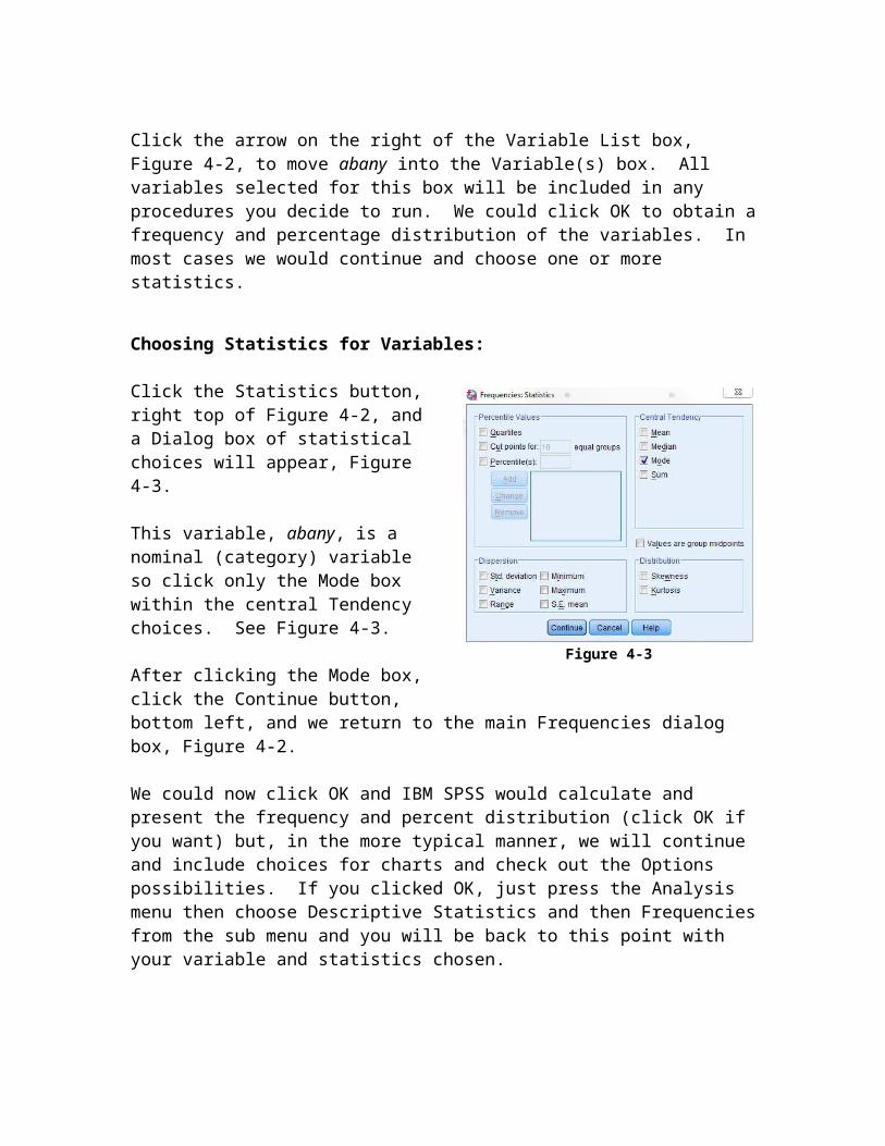
Click the Statistics button, right top of Figure 4-2, and a Dialog box of statistical choices will appear, Figure 4-3.
This variable, abany, is a nominal (category) variable so click only the Mode box within the central Tendency choices. See Figure 4-3.
After clicking the Mode box, click the Continue button, bottom left, and we return to the main Frequencies dialog box, Figure 4-2.
We could now click OK and IBM SPSS would calculate and present the frequency 1 If you want to change the display to labels or know more information about a variable, the label, codes,
etc., place the mouse pointer on the variable name in the Variable List, right click the mouse button.
Figure 4-2
Figure 4-3
and percent distribution (click OK if you want) but, in the more typical manner, we will continue and include choices for charts and check out the Options possibilities. If you clicked OK, just press the Analysis menu then choose Descriptive Statistics and then Frequencies from the sub menu and you will be back to this point with your variable and statistics chosen.
Choosing Charts for Variables:
On the main frequencies window, click the Charts button, Figure 4-2, and a Dialog box of chart choices, Figure 4-4, will appear.
Click Bar Chart, as I have done, since this is a categorical variable, then click Continue to return to the main Frequencies window box. If you have a continuous variable, choose Histograms and the With Normal Curve option would be available. Choose the With Normal Curve option to have a normal curve drawn over the distribution so that you can visually see how close the distribution is to normal. Note: Frequencies is automatically chosen for chart values but if desired you could change that to Percentages, bottom Figure 4-4.
Now click OK on the main frequencies dialog box and IBM SPSS will calculate and present a frequency and percent distribution with our chosen format, statistics, and chart. (Note: We could look to see if additional choices should be made by clicking the Format button. In this case we don't need to do this because all the Format defaults are appropriate since we are looking at one variable.)
Looking at Output from Frequencies:
We will now take a brief look at our output from the IBM SPSS frequencies procedure. (Patience, processing time for IBM SPSS to perform the analysis in the steps above will depend on the size of the data set, the amount of work you are asking IBM SPSS to do and the CPU speed of your computer.) The output outline, left side, and the output, right side, will appear when IBM
Figure 4-5
Figure 4-4

SPSS has completed its computations. Either scroll down to the chart in the right window, or click the Bar Chart icon in the outline pane to the left of the output in Figure 4-5.
Interpreting the Chart:
We now see the chart, Figure 4-6. The graphic is a bar chart with the categories at the bottom, the X axis, and the frequency scale at the left, the Y axis. The variable label ABORTION IF WOMAN WANTS FOR ANY REASON is displayed at the top of the chart. We see from the frequency distribution that there are more “no,” 35.9%, answers
than “yes,” 29.6% answers (see Figure 4-7), when respondents were asked if a woman should be able to get an abortion for any reason. A much smaller number, which does not appear on this chart, 1.7% (see Figure 4-7), selected “don't know,” “DK.” If a chart were the only data presented for this variable in a report, you should look at the frequency output and report the total responses and/or percentages of YES, NO and DK answers. You should also label the chart with frequencies and/or percentages. There are a lot of possibilities for enhancing this chart within IBM SPSS (Chapter 9 will discuss presentation).
If we choose to copy our chart to a word processor program for a report, first select the chart by clicking the mouse on the bar chart. A box with handles will appear around the chart. Select Copy Special from the Edit menu and choose the format that you want to use (JPG is a good choice). Start your word processing document, click the mouse where you want the chart to appear then choose Paste Special from the down arrow on Paste. Choose an option in the paste special dialog box that appears and click OK to paste the chart into your document.
Interpreting Frequency Output:
To view the frequency distribution, move the scroll bar on the right of our output window to view the table. Another way is to click the Frequencies icon in the Outline box to the left of the output window. To view a large table you may want to click on the Maximize
Figure 4-7Figure 4-6

Arrow in the upper right corner of the IBM SPSS Output Navigator window to enlarge the output window. Use the scroll bars to display different parts of a large table. The most relevant part of the frequency distribution for abany is in Figure 4-7.
We can now see some of the specifics of the IBM SPSS frequencies output for the variable abany. At the top is the variable label ABORTION IF WOMEN WANTS FOR ANY REASON. The major part of the display shows the value labels (YES, NO, Total), and the missing categories, IAP (Inapplicable), DK (Don’t Know), and NA (Not Answered), Total and the Frequency, Percent, Valid Percent, Cumulative Percent (the cumulative % for values as they increase in size), for each classification of the variable. The “Total” frequency and percent is listed at the bottom of the table. When asked if a woman should be able to have an abortion for any reason, 35.9% responded no. DK, don’t know, was chosen by 1.7% and .7% were NA [Not Answered]. The 34.4 % “IAP [Inapplicable], was that portion of the sample that was not asked this question. In a written paper, you should state that the “Valid Percent” excludes the “missing” answers.
Variable Names, Variable Labels, Values, Value Labels, Oh My!
Options in Displaying Variables and Values:
It is important to use these concepts correctly so a review at this point is appropriate. A Variable name is the short name you gave to each variable, or question in a survey. The table below is designed to help you keep these separate.
Variable Name Variable Label Value Value LabelSEX Respondent's gender. 1 or 2 (1) Male, (2) FemaleAGE Respondent's age at
last birthday.18, 19, 20, 21… 89, 98, 99
None needed
AGED Should aged live with their children.
1, 2, 3, 0, 8, 9 (1) A good idea, (2) Depends, (3) A bad idea (0) IAP [Inapplicable], (8) DK [Don't Know], (9) NA [Not Answered]
BIBLE Feelings about the bible
1, 2, 3, 4, 0, 8, 9 (1) Word of God, (2) Inspired Word, (3) Book of Fables, (4) Other, (0) IAP, (8) DK, (9) NA
Understanding these allows you to intelligently customize IBM SPSS for Windows so that it is easier for you to use. You can set IBM SPSS so that you can see the variable names when you scroll through a listing of variables, or so that you can see the variable labels as you scroll through the listing. You can set IBM SPSS so that you get only the

values, only the labels, or both in the output. Below are two examples of a Frequencies Dialog box.
Figure 4-8 Figure 4-9
Figure 4-8 shows the listing as variable labels. This is the default setting when IBM SPSS for Windows is installed. This example has the cursor on the variable label ABORTION IF WOMAN WANTS FOR ANY REASON (is displayed). You can change the listing however, so that you see only variable names, abany, as in Figure 4-9. Changing this is a matter of personal taste. This chapter uses variable names, Figure 4-9.
You can change the display listing when running a procedure by right clicking on the list in the left box of a procedure and choosing a display format, Figure 4-9. For this chapter we choose Display Names and Alphabetical so that variable names will be displayed alphabetically as in Figure 4-9.
Changing the display option for the Variable Selection dialog box, as well as other display formats, can be done for all dialog choices before running a procedure. After starting IBM SPSS, to set the display option, click Edit then choose Options. The General tab on the Options dialog box will appear, Figure 4-10. Under Variable Lists section, top right quadrant, click your choices, again we choose Display Names and Alphabetical, then click OK.
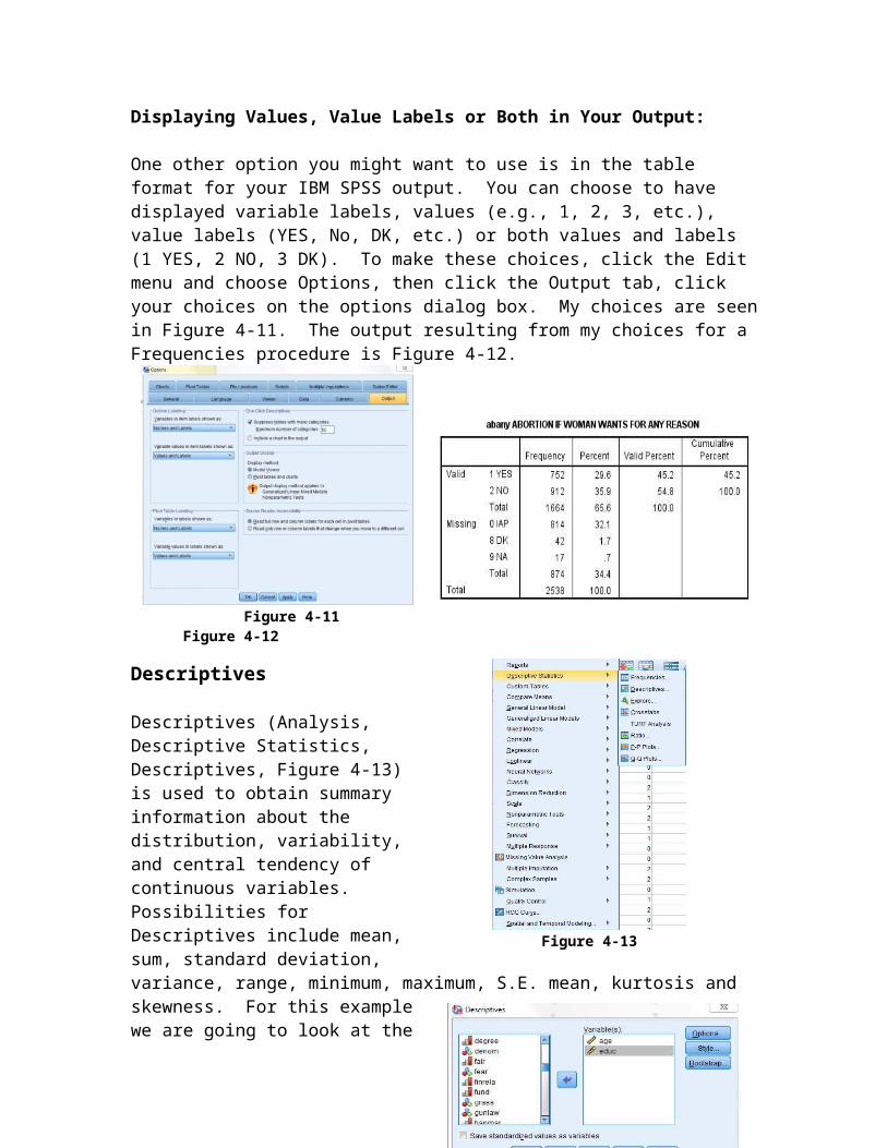
Displaying Values, Value Labels or Both in Your Output:
One other option you might want to use is in the table format for your IBM SPSS output. You can choose to have displayed variable labels, values (e.g., 1, 2, 3, etc.), value labels (YES, No, DK, etc.) or both values and labels (1 YES, 2 NO, 3 DK). To make these choices, click the Edit menu and choose Options, then click the Output tab, click your choices on the options dialog box. My choices are seen in Figure 4-11. The output
Figure 4-10

resulting from my choices for a Frequencies procedure is Figure 4-12.
Figure 4-11 Figure 4-12
Descriptives
Descriptives (Analysis, Descriptive Statistics, Descriptives, Figure 4-13) is used to obtain summary information about the distribution, variability, and central tendency of continuous variables. Possibilities for Descriptives include mean, sum, standard deviation, variance, range, minimum, maximum, S.E. mean, kurtosis and skewness. For this example we are going to look at the distribution of age and education for the General Social Survey sample. Since both these variables were measured at interval/ratio level, different statistics from our previous example will be used.
Choosing Descriptive Procedure:
First click the Analyze menu and select Descriptive Statistics, then move across to the sub menu and select Descriptives (see Figure 4-13). The Variable Choice dialog box will appear (see Figure 4-14).
Selecting Variables for Analysis:
First click on age, the variable name for AGE OF RESPONDENT. Click the select arrow in the middle and IBM SPSS will place age in the Variable(s) box. Follow the same steps to choose educ, the variable name for HIGHEST YEAR OF SCHOOL
Figure 4-13
Figure 4-14

COMPLETED. The dialog box should look like Figure 4-14.
We could click OK and obtain a frequency and percentage distribution, but we will click the Options button and decide on statistics for our output. The Options dialog box, Figure 4-15, will open.
Since these variables are interval/ratio measures, choose: Mean, Std. deviation, Minimum and Maximum. We will leave the defaults for the Distribution and Display Order.
Next, click the Continue button to return to the main Descriptives dialog box, (Figure 4-14). Click OK in the main Descriptives dialog box and IBM SPSS will calculate and display the output seen in Figure 4-16.
Interpretation of the Descriptives Output:
In the Interpretation of Figure 4-16, AGE OF RESPONDENT has a mean of 47.46 and a standard deviation of 17.242. The youngest respondent was 18 and the oldest was 89. Look at your IBM SPSS output for HIGHEST YEAR OF SCHOOL COMPLETED. It has a mean of 13.68 (a little more than 1 year beyond high school) and a standard deviation of 3.071. Some respondents indicated no “0” years of school completed. The most education reported was 20 years.
Explore
Explore is primarily used to visually examine the central tendency and distributional characteristics of continuous variables. Explore statistics include M-estimators, outliers, and percentiles. Grouped frequency tables and displays, as well as Stem-and-leaf and box-plots, are available. Explore will aid in checking assumptions with Normality plots and Spread vs. Level with the Levene test.
Choosing the Explore Procedure:
From the Analyze menu choose Descriptive Statistics, drag to the sub menu and select Explore.
Figure 4-15
Figure 4-16

Selecting Variables:
As in the other procedures, find and click the variable you want to explore, and then click the select arrow to include your variable in the Dependent List box. Choose the variable educ and move into the Dependent List box. The dialog box should look like Figure 4-17.
Selecting Displays:
In the Display box on the bottom left, you may choose either Both, Statistics, or Plots. We left the default selection, Both, to display statistics and plots.
Selecting Statistics:
Click the Statistics button and the Explore: Statistics dialog box will open, Figure 4-18.
Leave checked the Default box for Confidence Interval for the Mean 95%, and click the Outliers box so we can look at the extreme observations for our variable. Click Continue to return to the main explore dialog window.
Selecting Plots:
Click the Plots button on the main Explore Dialog box, Figure 4-17, and the Explore: Plots dialog box, Figure 4-19, will open.
The default choices in the Boxplots box are good so click Stem-and-leaf and Histogram in the Descriptive box. Click on Normality Plots with Test so we can see how close the distribution of this variable is to normal. Leave the default for Spread vs. Level with Levene Test. Click Continue to return to the main explore dialog box, Figure 4-17.
Figure 4-17
Figure 4-18
Figure 4-19
Selecting Options:
Click the Options button in the main explore dialog box, Figure 4-17, and the Explore: Options dialog box, Figure 4-20, will be displayed.
No changes are needed here since the default of Exclude cases listwise is appropriate. Now click Continue to return to the main Explore dialog box, Figure 4-17. Click OK in the main Explore dialog box and IBM SPSS will perform the chosen tasks and display the data in the IBM SPSS Output.
Interpretation of Explore Output:
Use the scroll bar to view any part of the output. The first part of the output is the Case Processing Summary, Figure 4-21.
We can see that 2537 (99.9%) of our respondents answered this question. Only one, .1% of the sample, was Missing. The GSS often uses a split sample where not all respondents in the sample are asked the same questions. This is a question where all respondents were asked the question, so the total sample size was 2638.
The Descriptives statistics output should look like Figure 4-22.
We can see all the typical descriptive statistics on this output: mean (13.68), lower bound (13.56) and upper bound (13.80) for a 95% confidence of the mean (in polling terminology this says that we are 95% confident that the mean for the population is between 13.56 and 13.80). Also shown, the median (14.00), variance (9.428), standard deviation (3.071), minimum (0), maximum (20), range (20), interquartile range (4.00), skewness (-.450), kurtosis (1.621). A narrative describing the education of the sample respondents would be somewhat like the following:
Our sample from the 2014 General Social Survey indicates that the average education for those over 18 was 13.68 years with a 95% confidence that the population average would
Figure 4-20
Figure 4-21
Figure 4-22

fall between 13.56 and 13.80 years. The least years of education reported was found to be 0 and the most was 20. The exact middle point of the population with 50% falling below and 50% above, the median was 14.00.
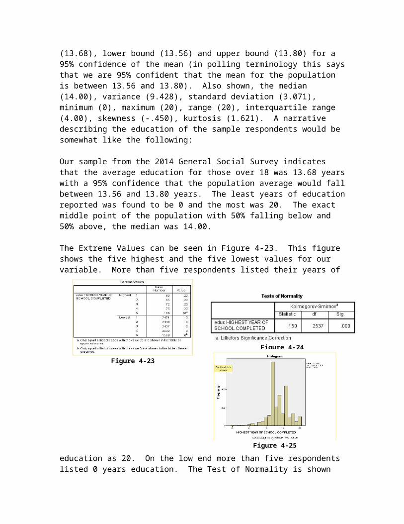
The Extreme Values can be seen in Figure 4-23. This figure shows the five highest and the five lowest values for our variable. More than five respondents listed their years of education as 20. On the low end more than five respondents listed 0 years education.
The Test of Normality is shown next (see Figure 4-24). This shows that this distribution is significantly different, not likely at .000, from the expected normal distribution. This is a pretty stringent test; most researchers would not require the distribution to be this close to normality.
The histogram, Figure 4-25, shows a rough bell shaped distribution. IBM SPSS divided our distribution into twenty-one groups with a width of one year of education for each group.
The largest group has a little less than 700 cases, a visual estimate. The smallest group has very few cases (we know there are a few respondents who reported 0 years of education from our Extreme Values table). The statistics on the histogram tell us that the standard deviation is 3.071 with a mean of 13.68 for a total N of 2536.6. The
Figure 4-23
Figure 4-24
Figure 4-25
Figure 4-26

Stem-and-Leaf is next. Figure 4-26, again, shows a close but not quite normal distribution with outliers on the ends of the distribution and a high number of observations above the mode. We saw this in our earlier output. We also see that 12, high school; 14, junior college; and 16, college are clear stopping points.
Interpretation of the Q-Q Plot of Age:
Continue scrolling down the IBM SPSS Output Navigator to the Normal Q-Q Plot of HIGHEST YEAR OF SCHOOL COMPLETED (see Figure 4-27).
A Q-Q plot charts observed values against a known distribution, in this case a normal distribution. If our distribution is normal, the plot would have observations distributed closely around the straight line. In Figure 4-27, the expected normal distribution is the straight line and the line of little boxes is the observed values from our data. Our plot shows the distribution deviates somewhat from normality at the low end. The high end of the distribution is pretty much normal.
The Detrended Normal Q-Q plot, shows the differences between the observed and expected values of a normal distribution. If the distribution is normal, the points should cluster in a horizontal band around zero with no pattern. Figure 4-28, of HIGHEST YEAR OF SCHOOL COMPLETED, indicates some deviation from normal especially at the lower end. Our overall conclusion is that this distribution is not normal. Most researchers would see this as close enough to treat as a normal distribution.
Interpretation of the Boxplot:
In the IBM SPSS Output, scroll to the boxplot of HIGHEST YEAR OF SCHOOL COMPLETED. The boxplot should look like Figure 4-29.
Once again the major part of our distribution deviates from normal. There are significant outliers, the cases
Figure 4-27
Figure 4-28
Figure 4-29

beyond the lower line of our boxplot. Our outliers are at the lowest end of the distribution, people with little or no education. There are also more observations above than below the mode.
Conclusion
In performing univariate analysis, the level of measurement and the resulting distribution determine appropriate analysis as well as further multivariate analysis with the variables studied. The specific output from IBM SPSS one uses in a report is chosen to clearly display the distribution and central tendencies of the variables analyzed. Sometimes you report a particular output to enable comparison with other studies. In any case, choose the minimal output that best accomplishes this goal. Don’t report every IBM SPSS output you obtained.
Univariate Analysis as Your First Step in Analysis
Why do univariate analysis as your first step in data analysis? There are five reasons:
1. As discussed at the beginning of this chapter, the frequency distribution may actually be all you are interested in. You may be doing research for people with little statistical background or they are really only interested in the percentage or count of people that said “Yes” or “No” to some question.
2. You can check for “dirty” data. Dirty data is incorrectly entered data. “Data cleaning” is correcting these errors. Remember, in Chapter 2 you were instructed to give each case an ID number. One primary reason for the ID number is to help us clean our data in case there are data entry or logically inconsistent errors. One way to do this is by determining when there are codes in the data outside the range of the question asked and determining which cases, the ID number, is in error. You can then check all the way back to the original questionnaire and correct the entry or, if that’s not possible, change the erroneous code to the “Missing values” code.
An example might be if you had a question in a questionnaire where responses were coded in the following way:
Global warming is a scientific fact.1. Strongly Agree2. Agree3. Neutral 4. Disagree 5. Strongly Disagree
But suppose you run a frequency distribution and find that two respondents have a code of “6.” That wasn’t one of the codes! What happened? Your data entry person, who may have been you, hit the 6 on the keyboard instead of some other

number. We can correct this error. In fact, when we locate this error, we may find others because often errors occur in streaks. The data entry person gets something out of order, or they get their fingers on the wrong keys. These problems can happen to any of us. Our goal is to correct the errors as best possible.
You can have IBM SPSS select only those cases that have the code of “6” (see Chapter 3) for that variable, and then tell it to do a Frequencies on the variable ID. This will tell you the case numbers that have the error and you can correct it. Be sure to double check the codes, before and after, to make sure they are correct.
3. A third reason for running a Frequencies on your variables as your first step in analysis is that you can tell if you need to combine categories and, if so, what codes should be combined. You would know if there were too few respondents giving “Strongly Agree” or “Strongly Disagree” and for analysis they should be folded into either “Agree” or “Disagree.” Another common combination of categories is for age groups. For example, you would do this if you wanted to compare age groups born before and after a significant event (i.e., those born before Vietnam compared to those born after Vietnam).
4. You can also determine if everything that should be defined as “Missing” is actually defined as missing. For example, if you find that 8 “Don’t Know” is a response that has been left in your calculations, your analysis will include all of the eight’s. Even your mean statistics will have these “extra” eight’s included in the calculation. You need to go into the definition of the variable and make these codes “Missing values” or recode these so they are not included, say as a “System Missing” value (Chapter 3).
5. Finally, you may want to examine the distributions for your variables. This should help you determine characteristics of your sample, make some conclusions, and decide further steps in your analysis. You might find that in a 1-5 agree/disagree question, discussed in Step 2 above, almost everyone disagreed. You may discover you do not have a normal distribution and should not use statistics requiring normal distributions. You could also decide that you want to “fix” the distribution using various transformation techniques to convert the data into a normal distribution. These and related techniques are often referred to as “exploratory data analysis” and are beyond the scope of this text.

Chapter Four Exercises
Use the GSS14A.sav data set for all these exercises.
These exercises are designed to familiarize you with the IBM SPSS univariate procedures. They are open-ended with no specific answers. Use the GSS14A.sav data set for all these exercises.
1. In this chapter we looked at abany (ABORTION—FOR ANY REASON), one of the variables in the GSS14A data measuring people’s attitudes about abortion. There are other variables measuring different aspects of the abortion issue. These are:
abdefect (ABORTION--STRONG CHANCE OF SERIOUS DEFECT) abhlth (ABORTION--WOMAN'S HEALTH ENDANGERED) abnomore, (ABORTION--MARRIED, WANTS NO MORE CHILDREN), abpoor (ABORTION--LOW INCOME, CAN’T AFFORD MORE CHILDREN) abrape (ABORTION--PREGNANT AS RESULT OF RAPE) absingle (ABORTION--NOT MARRIED)
Pick one of these variables and perform the appropriate techniques discussed in this chapter for the variable. Write up a short narrative explaining what you found about this variable. (Looking back at what we did with abany should help you with this. Your write up should be designed to best explain what you found, so do not report all the IBM SPSS output, just that output necessary to clearly and accurately describe your findings.)
2. In this chapter we looked at educ (HIGHEST YEAR OF SCHOOL COMPLETED). There are similar variables measuring respondent’s parents’ education:
paeduc (HIGHEST YEAR SCHOOL COMPLETED, FATHER) maeduc (HIGHEST YEAR SCHOOL COMPLETED, MOTHER)
Pick one of these variables and perform the appropriate techniques discussed in this chapter for describing the variable. Write up a short narrative explaining what you found about this variable. (You might want to look back at what we did with educ. Your write up should be designed to best explain what you found so do not report all the IBM SPSS output, just that output necessary to clearly and accurately describe your findings.)
3. The GSS14A file provides answers to a wide range of questions from a sample of respondents in the U.S. in 2014 on their lifestyle and attitudes. Look over the attitude variables in the survey. You can do this by clicking the Utilities menu and choosing Variables. This will provide a dialog box, which can be used to examine the variable and value labels for our data file. There is also a codebook for this data set in Appendix A that lists all the variable information. Pick a couple of interesting attitude questions and use an appropriate IBM SPSS univariate procedure discussed
in this chapter to describe the responses for these variables by this sample. Write a narrative description of your IBM SPSS output. (You might want to take another look at what we did in this chapter. Your write up should be designed to best explain what you found so do not report all the IBM SPSS output, just that output necessary to clearly and accurately describe your findings.)
4. One way to evaluate how close a sample is to the population from which it was drawn is by a comparison of known variables of the population with the same variables in the sample. The 2014 General Social Survey has variables for which we pretty much know the US population distribution (age, race, gender, etc.) from the census. Pick a few of these and find their distribution in our GSS sample. Use the procedures we learned in this chapter. See how close the sample distribution for the variables you choose comes to matching the U.S. population distribution for the same variables. You can find US distributions by checking a library or Internet source for US census data (for example, the American Fact Finder). If there is a difference, try and speculate why. Write a short narrative, explaining the differences you found and why you think this difference occurred. Explaining the difference between the sample and the population may be a challenge. You might want to look at the web site for the General Social Survey to determine how the survey was conducted and who was chosen.)